Aleph=X, or contemporary Hebrew bad type
This talk is about Hebrew Latinized type. It is an attempt to demonstrate why Latinized Hebrew type is problematic, both from cultural and functional aspects. Assuming most here are not familiar with the Hebrew letter and further assuming it may be difficult to talk about bad type while it is not at all clear what good type is, we will begin with a brief description of the Hebrew script and an overview of the differences between the Latin and Hebrew scripts; we will then continue with a review of milestones in the history of Hebrew type’s Latinization and finally discuss the occurrence of Latinization in the contemporary type design scene. Among other things, we will illustrate why the Hebrew Aleph cannot be replaced by the Latin letter X.
Since the exile of the Jewish people from their land in 70 AD, until the Zionist revolution and the renaissance of the Hebrew language in the nineteenth century, Hebrew was a frozen and essentially dead language. Hebrew was used solely for religious and ritual purposes. During the 2,000 Diaspora years, Hebrew resided in a foreign context. Jews around the world were living within different cultures and using different languages. Inevitably, the Hebrew script was influenced by local scripts and writing techniques. With the Hebrew language revival and the reestablishment of a Jewish national home in Israel, one could have assumed that the Hebrew script would liberate itself, disengage from external influences and develop in its own right, based on its heritage.
Well it did happen, to a certain extent. However, it seems that today the Hebrew script is once again influenced by external forces. This time it is Americanization and Globalization.
The Jewish medieval Sephardic poet, Yehudah Ha-levi, sitting in Spain, wrote in his longing to the holy land: ‘My heart is in the east, and I in the uttermost west’. Too frequently today, the hearts of Israeli designers are located in the west rather than the east.
What is this Hebrew script (in short)?
Modern Hebrew consists of twenty-two letters, five of which have alternate final forms. The script is read from right to left and has no upper case letters, nor any other typographic ‘tools’ such as traditional italics or small caps (nowadays, slanted uprights are sometimes used as ‘italics’).
Three different hands exist in Hebrew: a formal ‘square’ letter, used as an official book hand, a semi cursive for rabbinical commentaries, and a cursive flowing hand for correspondence and everyday writing . It is mostly the official book hand (in its mediaeval Sephardic style) that influenced printing types. The most popular contemporary ‘serif’ text type, the Frank-Rühl, which I will use in my next few slides, is based on this Sephardic model. Note that The Hebrew script does not have true serifs. However, as it is common practice in Israel to use the term ‘serif’ to describe the small in-strokes residing on the ‘x-height’ horizontal strokes (and for lack of a better, agreed term) I retained this term here.
The different hands of the Hebrew script: (top to bottom) the formal ‘square’ letter (serif and sans-serif), the semi-cursive and the cursive. Orange letters are final alternate letterforms.
And why are they so different?
The Hebrew and Latin scripts differ in many ways. The formal dissimilarities discussed below influence letterforms as well as overall texture, rhythm and colour.
Directionality
The Hebrew – read from right to left – has most of its counters (or apertures), facing leftwards. The Latin is reversed. Both scripts have several counters facing upwards or downwards, but the majority in both cases are facing the reading direction.
Stress
Hebrew is usually thought of as a horizontally stressed script, as opposed to the Latin being a vertical stressed script. One can usually notice the two heavy horizontal bars apparent in Hebrew text, on both the upper ‘x-height’ and the lower baseline zones. It should be noted however that early inscriptions, as well as many contemporary ‘sans-serif’ typefaces show a vertical stress or no contrast at all.
Extenders
Five descenders and one ascender exist in Hebrew, mostly on low frequency letters. Latin has a dozen extenders that occur much more often. Most of the Hebrew extenders belong to alternate final form letters.
Capital letters
As mentioned before, Hebrew has no capital letters.
Geometrical formation
As opposed to the Latin, Hebrew is not made from any simple geometrical forms. Most significant in their absence are the circular forms so prevalent in the Latin script.

Differences between the Hebrew and Latin scripts:
- Directionality. Most of the Hebrew open counters face leftwards (orange letters), while most of the Latin counters face rightwards (blue letters).
- Stress. When blurred, each script reveals its stress: the Hebrew is left with a clear horizontal movement, while the remaining parts of the Latin are mostly vertical segments.
- Extenders. Hebrew has fewer extenders mostly occurring on low frequency letters.
- Capital letters. Hebrew is a mono-case script and has no capitals.
- Geometrical formation As opposed to the Latin, Hebrew is not made from any simple geometrical forms and lacks the circular shapes.
Milestones of Latinization
The first time Latin script influenced Hebrew was most probably during Gothic times. From the thirteenth century onwards, a new Hebrew style was created in Germany and Northern France: the Ashkenazic style. This style, with its dense texture, monotonous rhythm and contrasted letterforms, was clearly influenced by the Gothic blackletter of the time. It is noteworthy that the vertical high contrast stress present in the Latin was converted into a horizontal equivalent.

Hebrew and Latin ‘Gothic’ writing hands compared.
The next milestone was the influence of the Didot-Bodoni Modern style. This trend, popular from the end of the eighteenth to the beginning of the nineteenth centuries in Europe had a destructive influence on Hebrew. The adoption of this highly contrasted style in Hebrew resulted in fragile, illegible types. Similarly to the Ashkenazic style, this Hebrew style had extremely heavy horizontal strokes and hairline vertical strokes. Henri Friedlaender, the renowned typographer, said that while in Latin script it was mostly the serifs that were reduced to a minimal width, in Hebrew the exaggerated contrast of thicks and thins damaged the very basic structure of the type. A Hebrew text line of the time looked like two heavy horizontal lines with nothing between them. Moreover, this extreme slenderness of the verticals aggravated problems of letter differentiation – already present in Hebrew – and hence hindered legibility. Many of the Hebrew letters’ identifying marks are located on the joints of the horizontals and verticals. With the vanishing of the verticals, differentiation became scarcely possible.
As this Hebrew style was practically the only type style in use during the nineteenth century, one can easily recognize how dramatic this influence was.

‘Didot-Bodoni’ Hebrew. Note the vanishing vertical stems and the deplorable letter differentiation (three pairs of similar letters are shown).
Now as we approach the twentieth century things become increasingly interesting. It was during the century’s second decade that the first Hebrew ‘sans-serif’ – a monolinear design by Raphael Frank named Miryam – was released. Miryam was most probably influenced by the Latin Grotesque letters previously published in Europe, as well as by Art Nouveau. Its stripped-down skeletal forms, constructed nature and slightly rounded terminals, all showed traces of Latinization. Nevertheless, the more interesting, unprecedented phenomenon was the emergence of five perfectly symmetrical letters. Until that date, symmetry was alien to the Hebrew letter, and it is more than reasonable to believe that this was the Latin script’s influence.
This issue of symmetry is crucial. Vertical axis symmetry in letterforms creates an exaggerated and overly static stability. As the Hebrew has this clear sense of horizontal continuity and leftward movement, a symmetrical letter abruptly breaks the reading flow. It puts a spoke in the wheel.

The Miryam typeface shows, for the first time in Hebrew, five symmetrical letterforms.
In the following two decades, many Latinization attempts were seen in commercial lettering, as well as in some of the most prevalent display types. It was in bilingual lettering where Latinization was found in its extreme: new extenders emerged and rotated stress (i.e. vertical stress) came into sight, all in order to match the Latin. The added new extenders were undoubtedly created in order to imitate the Latin word shapes.

1930s bilingual commercial lettering samples. Note the new added ascenders at the two upper signs.
During the 1930s three new display faces were published, two of which were designed in Poland and carry more than a touch of Latinization: The Haim typeface designed by Jan LeWit, and the Sapir typeface whose designer is unknown.
Both typefaces are clearly influenced by the Bauhaus and early modernism and involve simplified, constructed and more geometrical forms. The Haim typeface holds seven symmetrical letterforms while the Sapir has eight of them. The Sapir brings on stage several additional important features. First, as a monolinear ‘sans-serif’, it is far more constructed than the Miryam. The Sapir is basically made of simple geometrical shapes, similarly to many Latin faces of the time (e.g. Futura). Second, it uses identical forms, rotated, to make different letters. Third, it introduces – probably for the first time – convex curves instead of flat x-height horizontal strokes. The design of those curves might have been inspired by Hebrew semi-cursive or cursive handwriting, but it is more likely an attempt to simulate the Latin script’s x-height curved nature.

Symmetrical letters on the Haim and Sapir typefaces.
Two oddities that must be mentioned are the Hebrew typographical experiences of Hugh Schonfield and Eric Gill. Both created in the 1930s they are cases of extreme Latinization. Schonfield’s book New Hebrew Typography suggested new Hebrew alphabets that were made of Latin typefaces’ parts. Luckily, this fantasy enterprise of unreadable types has never been realized. Gill Hebrew, on the other hand, was a real type cut in the 1950s by the Jerusalem Type Foundry. Designed by Gill while he was residing in Israel, this type had two peculiarities: it had a very poor letter differentiation and, it carried symmetrical ‘serifs’ instead of the traditional in-strokes. As it seems, Gill tried to implement the Latin script’s serifs, rotated, on the Hebrew letters. Henri Friedlaender, here again, said that by using the serifs vertically, Gill interrupted the natural flow of the word, whereas in the Latin the serifs help to bridge the gap between individual letters.

Hebrew alphabet of Hugh Schonfield and Eric Gill’s Gill Hebrew.
In 1966, a new era began. Published that year, the Oron typeface was the first Hebrew typeface deliberately designed as a counterpart, or derivative, of an existing Latin typeface (in this case Adrian Frutiger’s Univers). Asher Oron, the designer, declared he wished to reshape the monotone and boring Hebrew ‘x-height’ zone, and make it somewhat closer to the Latin curved and varied one. Moreover, he spoke decisively in favour of adding circular parts to the Hebrew letter. He believed this could contribute to letter differentiation as well as make the letterforms softer and more pleasing. In describing the design process of the type, Oron said that at a certain stage he found his letterforms too similar to the Latin ones. He ascribed this to his disregard for the Hebrew writing direction as well as to the design of symmetrical high frequency letters. Therefore, later on in the process he did two things: one was to make all symmetrical letters asymmetrical again, and the other was to redesign most of the vertical strokes’ upper terminals. Oron believed that in changing the terminals from pure vertical line-ends (i.e. symmetrical and static) to slightly leftward-leaning terminals, he enhanced the reading flow.

Oron and Univers types. The bottom line shows a preliminary stage of the design (left), compared with the final letterforms (right). Note how the designer changed the symmetrical letters, as well as the upper terminals of vertical stems.
The last step before the outburst of the digital revolution was the 1979 release of the Narkis New typeface by the distinguished designer Zvi Narkis. Although this type is surely a ‘good’ type, made by the hands of a master, it is still worth mentioning in this essay. Narkis New shows one letter (the Samech) that became a pure geometric ellipse (or perhaps a Latin ‘O’?), as well as many curved ‘x-height’ strokes. Surely, as Narkis said in an article describing this type design, his inspiration was the cursive and semi-cursive hands, but could it be that Latin type was also an influence? Earlier in the very same article, Narkis praised the Latin script’s letterforms, mentioning the shared origins of both scripts and discussing bilingual publications.

Narkis New type. Note the elliptical letter Samech as well as the many curved ‘x-height’ strokes.
Latinization today and Hibrish types
In Israel of recent years, the Hebrew type scene (following in the footsteps of its Latin counterpart abroad) has drastically changed. Type design was greatly facilitated by accessible computer applications, and the design process became shorter. Many more people are designing more and more types. Design was democratized.
Some of the new types are more radically Latinized than ever. Some are indeed made by amateurs, but many can be found in catalogues of the biggest foundries. Frequently in these types, one can find a borrowed Latin ‘X’ replacing a Hebrew Aleph (the Aleph should never be symmetrical), a Latin ‘O’ as a Samech, a ‘W’ as a Shin, a rotated ‘G’ as a Peh and many more letters that are symmetrical. This kind of types can easily be categorized under Hibrish types.

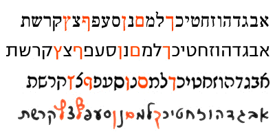
Contemporary Hebrew types. All letters on the top line are Alephs, not latin X. The five following words (in black) are all Hebrew, set in contemporary types created by major foundries. The pale Hebrew letters underneath are set in somewhat more canonical typefaces, for comparison. The two types at the bottom left are based – fully or partially – on the Hebrew cursive hand writing style.
This extreme Latinization is probably derived from three main reasons: Israel’s process of Americanization, widespread Globalization and on another level, the extreme ease of ‘copy-pasting’ in the design practice.
Americanization is highly dominant in Israeli society and culture. Israelis wish to feel they belong to the western culture: they want the American (or European, for that matter) style of life. The vast majority of Israeli fashion, food and retail chains have changed their names in recent years to English brand names. The Hebrew language is absorbing more English terms, names and even verbs increasingly everyday. Thus, it is natural to find this influence diffusing into the language’s visual form, the type. Beside types that make use of Latin letters’ parts, the latest and trendiest Latin types are converted into Hebrew. Many Emigre types for instance, have distant relatives in Israel. In most cases, these are rather poor derivatives that both ignore tradition and offer inferior legibility.

Hebrew versions for international brands’ logotypes: Carlsberg, Sprite and Fanta.
In addition, there is the globalization factor. In the past two decades, many international mega-brands entered the local market and brought, among other things, plenty of ‘converted-to-Judaism’ logotypes. Most of these logotypes are grotesque (in the non-typographical sense). In most of these cases, the Hebrew letter is heavily distorted in order to match the Latin counterpart. The mass distribution and exposure of these logotypes prepare and train the public eye to accept typefaces based on similar principals. This kind of logotype design influences contemporary type design in the same manner commercial lettering and sign painting changed type design in the past.
Finally, it is the technology. The ease of ‘copy-pasting’, as well as the simple reconstruction and deformation of typefaces, quickly resulted in selected amputated parts of Latin letters migrating to Hebrew types.
True, Hebrew Latinized types are mostly display or ‘sans-serif’ types. Yet, they are rather prevalent and on the rise. As letterforms relate closely to conventions and readership habits, we would better not get used to these kinds of types.
As seen in this essay, Latinization may hinder legibility and formal fluency. This, as well as the fact that it erodes the tradition, should evoke alertness. Awareness must be given to the scope and depth of this trend.
The Hebrew language and script were miraculously reborn some hundred years ago. This unique script must find ways to renew and revitalize itself based on its own heritage rather on external forces. Some of the cases shown here are absurdities that render the Hebrew script obsolete. The Aleph-‘X’, regarded today as a funny habit, may well become tomorrow’s standard.
Adi Stern is a faculty member at the Bezalel Academy of Art and Design in Jerusalem, Israel, where he teaches Hebrew typography. He is a graduate of the MA programme in Typeface Design at Reading University. Since 1994 he has run a Tel Aviv based studio, which focuses on design for the cultural domain. Adi has won various design prizes including ‘Chosen artist of the year, 2003’ from the Israel Cultural Excellence Foundation, and the New York Type Directors Club ‘Award for typographic excellence’.