|

|

|
|
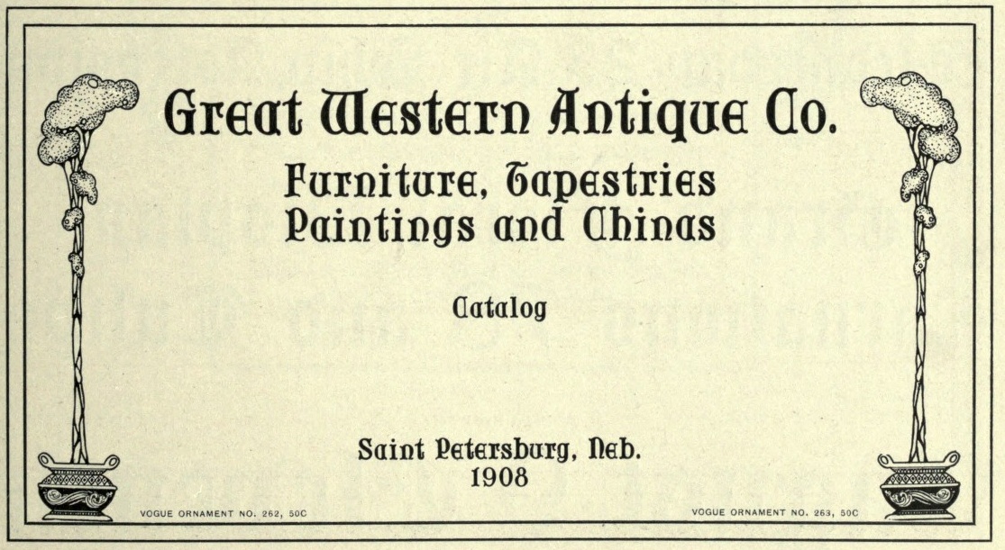
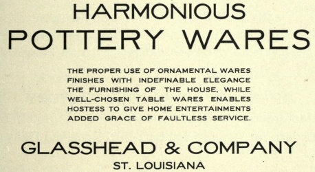
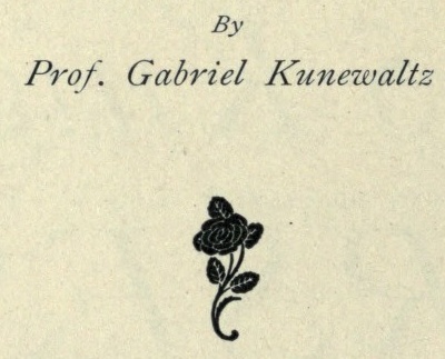
The cover page.
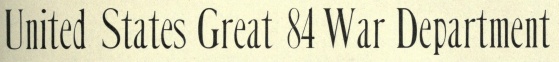
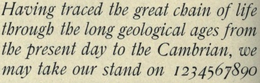
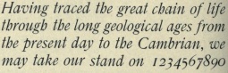
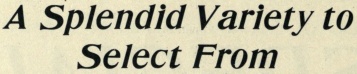
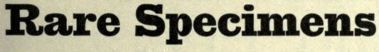
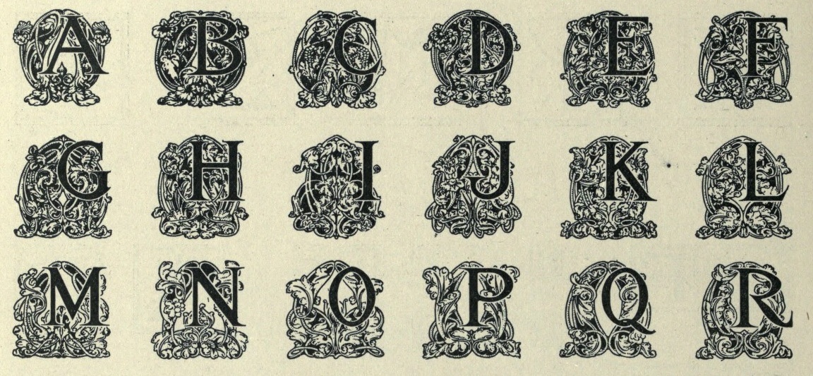
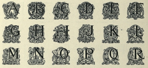
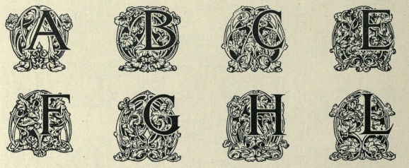
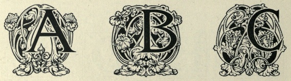
I tried the impossible--to fit that 1000-page book into one web page. It forced me to make choices about the images, but I think I managed to show all typefaces in the book by selecting for each face just one or at most two optical sizes. It is not helpful to show the faces in page order---I think readers will appreciate alphabetical order much more. So, here we go, the famous Chicago typefoundry at its height of productivity and fame!
|
|
The cover page. | ||||
|
| ||||||
|
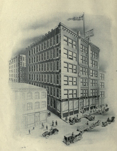
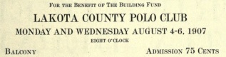
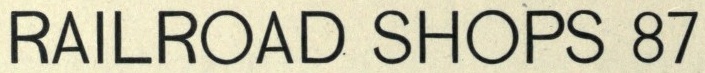
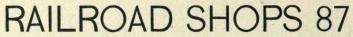
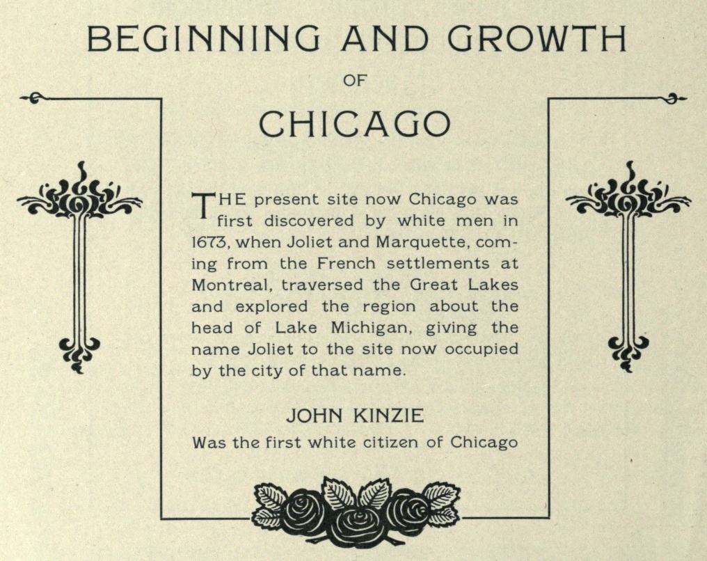
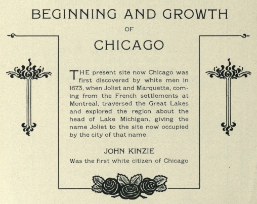
The building in Chicago in 1907. | ||
|
| |||
|
|
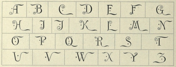
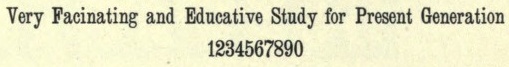
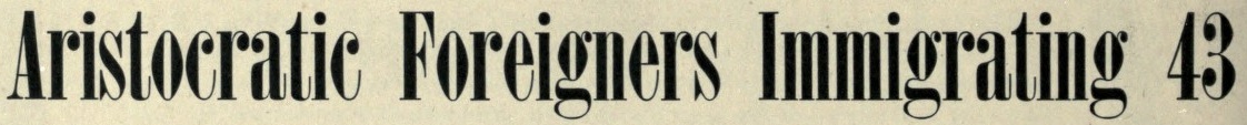
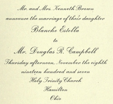
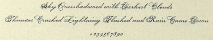
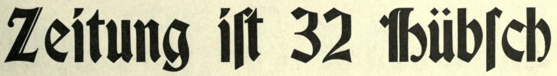
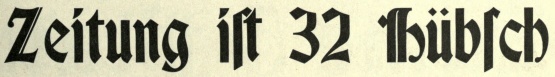
Adstyle, Adstyle Black. adstyle is a creation of Sydney Gaunt (1874-1932). Mac McGrew: It is a square-serif design but shows strong traits of its Clarendon ancestry; although most serifs on major strokes are squared, elsewhere they are bracketed or rounded, and there is moderate contrast between thick and thin strokes. The first member, identified in specimens as Adstyle Series, was designed about 1906; its proportions would ordinarily be called condensed, and it is rather heavy. Several variations appeared in the period 1907 to about 1911, including: Adstyle Condensed, just a little narrower than the original; Adstyle Extra Condensed, still narrower and also lighter in weight; Adstyle Headletter, a title version of the Extra Condensed; Adstyle Wide, a greatly extended version; Adstyle Italic, about the same weight as Adstyle but a normal width; Adstyle Lightface,. Adstyle Black, only a little heavier than the original but not as narrow; and Adstyle Black Outline, cut to register with Adstyle Black for two-color work. Another version, Adstyle Shaded, was also designed by Gaunt and introduced in 1914. Compare John Hancock, Bold Antique, Contact Bold Condensed. | ||||
|
| ||||||
|
|
Adstyle Condensed and Italic. | ||||
|
| ||||||
|
|
Adstyle Outline and Wide. | ||||
|
| ||||||
|
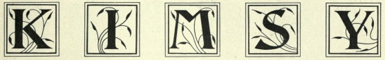
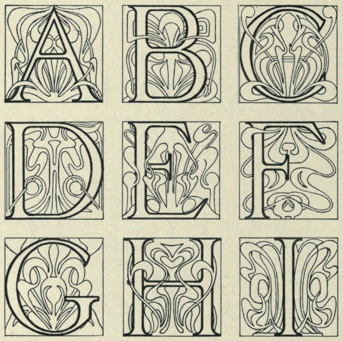
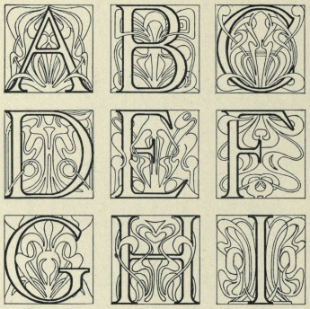
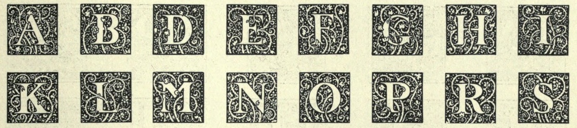
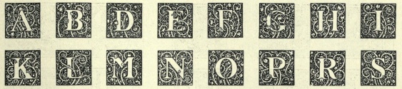
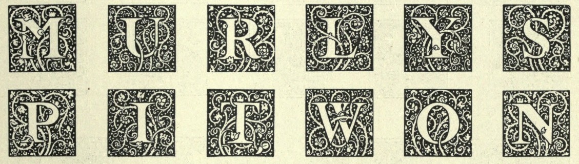
Anglo Initials. | ||
|
| |||
|
|
Antique Condensed No. 52 and No. 55. | ||||
|
| ||||||
|
|
Antique Extended No. 53 and No. 56. | ||||
|
| ||||||
|
|
Antique No. 53 (left) and No. 7 (right). | ||||
|
| ||||||
|
Arno No. 2. | ||
|
| |||
|
Authors Old Style. All the Authors typefaces are due to Sydney Gaunt. | ||
|
| |||
|
|
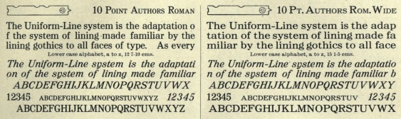
Authors Roman. | ||||
|
| ||||||
|
Authors Roman Bold. | ||
|
| |||
|
|
Authors Roman Italic and Wide. | ||||
|
| ||||||
|
|
|
Bard and Bard Open. | ||||||
|
| |||||||||
|
|
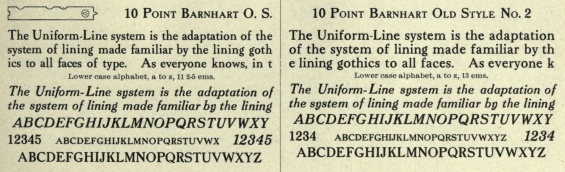
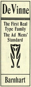
Barnhart Old Style. Mac McGrew writes: Barnhart Oldstyle was designed in 1906 by Sidney Gaunt for BB&S, followed by the italic and Barnhart Oldstyle No.2 the next year. The latter appears to have the same caps as the first face but larger lowercase with shorter ascenders. There is also Barnhart Lightface, advertised in 1914 but perhaps designed earlier. This series seems undistinguished, but the original roman and italic were popular enough to be shown as much as twenty years later. Ascenders are long, and some characters have a bit of the irregularity that was popular at that time. The italic apparently was one of the first faces cast by BB&S on its offset body, which provided mortises to avoid overhanging kerns in italic designs. | ||||
|
| ||||||
|
|
More Barnhart Old Style examples. | ||||
|
| ||||||
|
|
|
Barnhart Old Style No. 2. | ||||||
|
| |||||||||
|
Barnhart Old Style Italic. | ||
|
| |||
|
Bismarck. | ||
|
| |||
|
Black Condensed No. 55. | ||
|
| |||
|
|
|
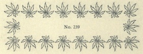
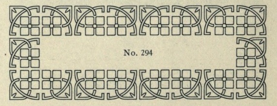
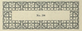
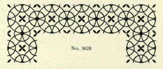
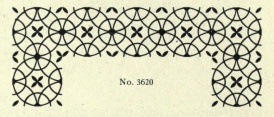
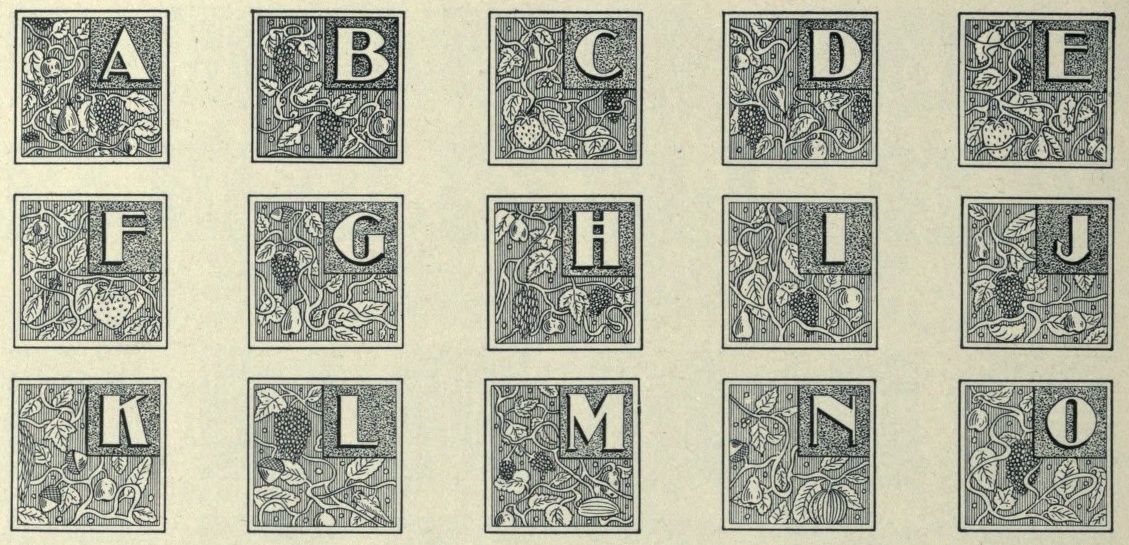
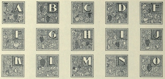
Beginning of a series of borders, each with their own number (embedded in the name of the image file). | ||||||
|
| |||||||||
|
|
The rightmost border is called Adstyle Border, designed by T.C. Robinson (McGrew gives the date 1908, but that is clearly wrong). McGrew adds: Although these are primarily decorative border units rather than type fonts, they had considerable popularity for expressing names and slogans in the borders of ads and otherwise. Designed by T. C. Robinson in 1908, the letters are a plain gothic style, somewhat thick and thin, similar to nineteenth-century designs. There are seven series: No.1: negative characters in rimmed circle. No.2: positive characters in circle. No.3: negative characters in plain circle. No.4: positive characters in square. No.5: negative characters in square. No.6: positive characters in diamond. No.7: negative characters in diamond. Monotype Special Reversed Figures No. 132S are very similar to Adstyle Border No.5, and in the 12-point size they include X, period, and comma, and single and double figures to 20. | ||||
|
| ||||||
|
|
Cadillac Condensed. | ||||
|
| ||||||
|
|
Left: Caledonian No. 55. This became Clarendon Medium after this book was published. Right: Carbon Text. | ||||
|
| ||||||
|
|
|
Caslon Old Roman. | ||||||
|
| |||||||||
|
|
Caslon Old Roman Italic. | ||||
|
| ||||||
|
|
|
Caslon Old Style. | ||||||
|
| |||||||||
|
Caslon Old Style Italic. | ||
|
| |||
|
|
Catalog Old Style. | ||||
|
| ||||||
|
|
Circular Gothic No. 44. | ||||
|
| ||||||
|
|
Clarendon Extra Condensed No. 5, and Clarendon No. 5 (right). | ||||
|
| ||||||
|
|
Club (left) and Composite Condensed No. 5 (right). | ||||
|
| ||||||
|
|
|
Condensed, from left to right, No. 54, No. 51 and No. 53. | ||||||
|
| |||||||||
|
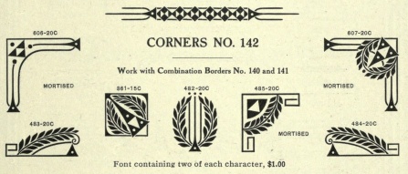
Corners No. 142: ornaments were numbered. | ||
|
| |||
|
Cosmos. | ||
|
| |||
|
|
|
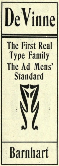
De Vinne Bold, Compressed and Extra Compressed. | ||||||
|
| |||||||||
|
|
De Vinne Initials and Dearborn Initials (right). | ||||
|
| ||||||
|
|
Degree Gothic No. 1 and No. 2. | ||||
|
| ||||||
|
|
Dennison Script (left) and Design. Dennison Script is a BB&S original probably from the last part of the 19th century. | ||||
|
| ||||||
|
Dolsen Initials No. 8. | ||
|
| |||
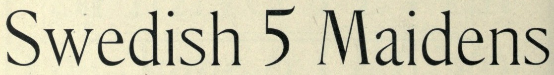
|
|
Elzevir No. 5. | ||||
|
| ||||||
|
|
Elzevir Condensed No. 50, and Elzevir Italic No. 5. | ||||
|
| ||||||
|
Elzevirine Initials. | ||
|
| |||
|
|
Engravers Old Black, designed by Sydney Gaunt. | ||||
|
| ||||||
|
Engravers Roman Condensed. | ||
|
| |||
|
|
Engravers Title and Engravers Title Condensed (right). | ||||
|
| ||||||
|
|
Expanded No. 4 and No. 5. | ||||
|
| ||||||
|
|
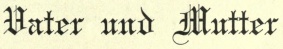
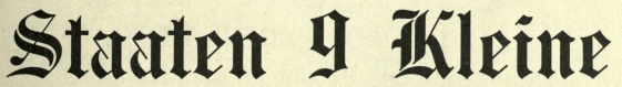
Left: Extra Condensed No. 56. Right: Faust Text (1898). This face was based on uncial, and was renamed Missal Text in the 1925 BB&S specimen book. | ||||
|
| ||||||
|
Franklin Roman. | ||
|
| |||
|
|
|
French Old Style No. 3 and No. 56 (rightmost). | ||||||
|
| |||||||||
|
|
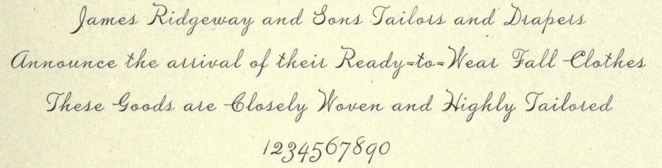
French Plate (by Sydney Gaunt, 1904) and French Title. McGrew: French Plate Script (or French Plate) was designed by Sidney Gaunt for BB&S in 1904. It is an upright script, otherwise similar to the same founder's Wedding Plate Script, both derived from types cut by Mayeur of Paris which were based on eighteenth-century engraving. Both are connecting scripts, the former being similar to Typo Upright (q.v.). Inland Type Foundry showed a similar French Script in 1905, patented by William Schraubstadter, and later listed by ATF. Douglas C. McMurtrie, in his book Type Designs, calls this "one of the finest script types ever produced." | ||||
|
| ||||||
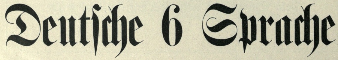
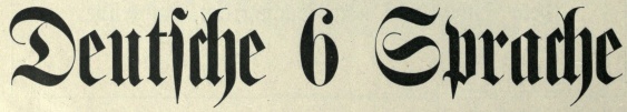
|
|
German title Condensed (left) and Goethe No. 5. | ||||
|
| ||||||
|
|
Gothic Compressed No. 7 and No. 8. | ||||
|
| ||||||
|
|
Gothic Compressed Title No. 7 and No. 8. | ||||
|
| ||||||
|
Guard | ||
|
| |||
|
|
Headletter Condensed (a BB&S original from ca. 1900), and Inclined DeVinne (right). Keystone had Head Letter No.2, similar to the Barnhart face. | ||||
|
| ||||||
|
Inclined Gothic No. 120. | ||
|
| |||
|
|
Kaiser. | ||||
|
| ||||||
|
|
Köln Text (left) and Latin Condensed No. 1. | ||||
|
| ||||||
|
|
Latin No. 5 and No. 52. Mac McGrew has a long discussion about Latin: Latin is a general name for a number of typefaces which originated in the 1880s or earlier. Most of them were made by various foundries, sometimes under other names. Some had little or no apparent design relationship to each other. ATF's Latin Antique No. 520 was Marder, Luse's Latin Antique No. 12O. Other founders had it simply as Latin Antique, though BB&S originally called it Latin No.5. It is a wide, medium-weight face with very small, rounded serifs, and lacks the curlicues of Latin Modern or Modern Antique. Latin Bold Condensed is now the most common name of the most prominent survivor of this group, but most recent fonts were imported from England, although ATF had at least two sets of matrices in its vaults for many years. ATF formerly made the face as Modern Antique No.2, originating at Cincinnati Type Foundry. BB&S in its later years called the same face Latin Modern, but earlier had also called it Latin Antique. Inland simply called it Latin series. From whatever source, it is a bold, compact display face, characterized by heavy, triangular serifs. The strokes of several lowercase letters terminate in pointed curlicues. In the 1950s or 1960s, fonts imported from Stephenson Blake achieved some popularity; this is the source of the specimen shown here. Latin Condensed, Extra Condensed, Elongated, and Compressed are much narrower versions of this design, though a little lighter and with fewer curlicues. The New York Times has used a version of Latin Condensed for news heads for many years. In its 1898 book, ATF applied the name "Baskerville" to Latin Condensed! Light Modern has curlicues and long triangular serifs but is much lighter, while Latin Expanded (formerly called Guard) is the same but wider. ATF called the latter design Lightface Celtic No. 40, shown in 1886 by Marder, Luse, while Keystone had a similar Keystone Expanded, and Linotype had Celtic No.1. The BB&S Latin Lightface is a much lighter version of Latin Antique; it was formerly called Light Latin. Latin Oldstyle Bold has the least relationship to other Latin faces. It was formerly known as Modern Title, and before that Monarch, shown in 1893 or earlier; ATF called the same face Eastman Oldstyle. Also see Emperor. | ||||
|
| ||||||
|
|
Law Italic No. 5 and Legal Italic No. 5 (right). Mac McGrew about Law Italic: Law Italic is said to have originated as an imitation of formal styles of penmanship used for legal documents. The most common of several substantially different varieties is ATF's Law Italic No. 520, which originated with Marder, Luse about 1870. Several of the capitals are swash-like, while lowercase f and g have distinctive shapes. It has long thin serifs and sharp contrast between thick and thin strokes. Inland called the same design Caledonian Italic. Hansen had Barrister Italic. Monotype's Law Italic No. 23 is a sloped roman, somewhat similar to Ronaldson. Other Law Italics are obsolete. | ||||
|
| ||||||
|
|
Light Latin (left) and Light Plate Gothic (right). McGrew about Plate Gothic: Plate Gothic was advertised by BB&S as "new" in 1900, and other versions were added within several years. It is somewhat similar to Copperplate Gothic, but not as well proportioned, and has even tinier serifs. Some members of the Steelplate Gothic family (q.v.) of the same foundry have the same characteristics, and appear to be a rename or at least a replacement for members of this family. Note that the colon and semicolon are full cap height, which is very unusual. Plate Gothic is also Ludlow's name for Copperplate Gothic (q.v.). | ||||
|
| ||||||
|
|
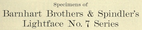
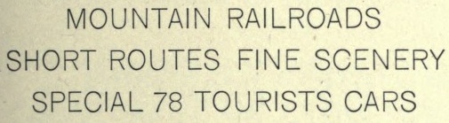
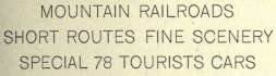
Lightface No. 7. | ||||
|
| ||||||
|
|
Lightface No. 54 (left) and No. 45 (right). | ||||
|
| ||||||
|
|
Lightface Post. | ||||
|
| ||||||
|
|
|
Lining Aldine. On the right, Lining Aldine Condensed. | ||||||
|
| |||||||||
|
|
Lining Anglo. | ||||
|
| ||||||
|
Lining Antique Condensed. | ||
|
| |||
|
|
Lining Antique No. 6. | ||||
|
| ||||||
|
|
Lining Antique Pointed (left) and Lining Arcade. | ||||
|
| ||||||
|
|
Lning Archer and Lining Bank Script. | ||||
|
| ||||||
|
|
Lining Bank Script No. 2 and No. 3. | ||||
|
| ||||||
|
|
|
Lining Bisque (leftmost) and Lining Bisque No. 2. | ||||||
|
| |||||||||
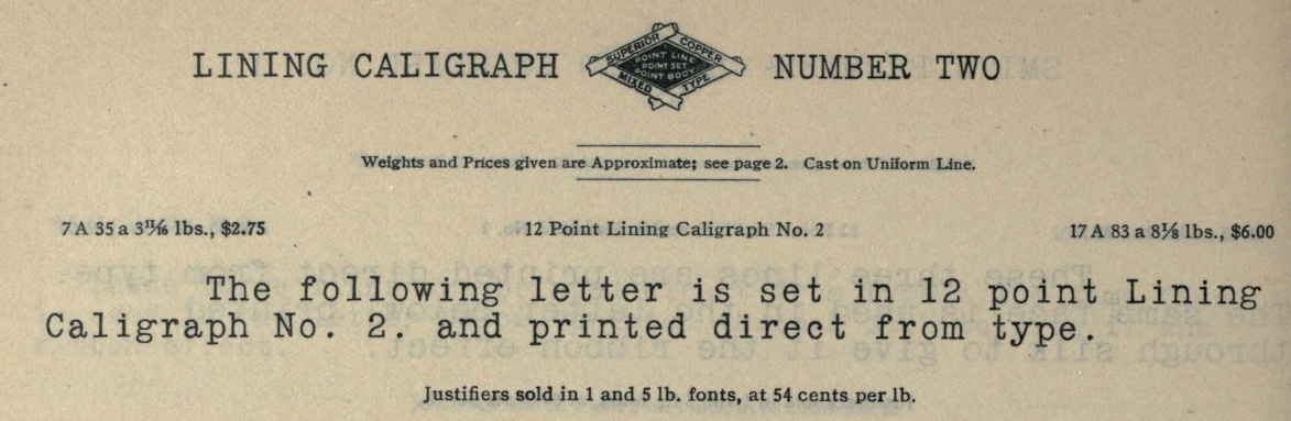
|
Lining Caligraph No. 2. | ||
|
| |||
|
|
Lining Celtic No. 1 (left) and Lining Chamfer. | ||||
|
| ||||||
|
|
Lining Concave (left) and Lining Condensed. | ||||
|
| ||||||
|
|
Lining DeVinne and Lining Doric (right). | ||||
|
| ||||||
|
|
Lining Egyptian: Extended and Extra Condensed. | ||||
|
| ||||||
|
|
Lining Elite (left) and Lining Emerald. | ||||
|
| ||||||
|
|
Lining Engravers Roman. | ||||
|
| ||||||
|
|
Lining Facade Condensed (left) and Lining Facade Condensed No. 1. | ||||
|
| ||||||
|
|
Lining Fair Open (left) and Lining French Antique Extended. | ||||
|
| ||||||
|
Lining French Clarendon. | ||
|
| |||
|
|
|
Lining German, Lining German No. 2 and Lining German Title. | ||||||
|
| |||||||||
|
|
Various versions of Lining Gothic follow: No. 111 (left), No. 117 (right), | ||||
|
| ||||||
|
|
|
No. 47 (leftmost), No. 60, | ||||||
|
| |||||||||
|
|
|
No. 71 (left), No. 82 (middle) and No. 90 (right). | ||||||
|
| |||||||||
|
|
Various versions of Lining Gothic Title: No. 1117 9left), No. 60, | ||||
|
| ||||||
|
|
No. 82 (left) and No. 90. | ||||
|
| ||||||
|
|
Lining Grace Script (left) and Lining Grant. | ||||
|
| ||||||
|
|
Lining Hazel Script (left) and Lining Hazlett Script (right). Hazel Script inspired Paul D. Hunt to make the digital typeface P22 allyson in 2006. | ||||
|
| ||||||
|
|
|
From left to right: Lining Ionic, Lining Lakeside Script, and Lining Light Modern. | ||||||
|
| |||||||||
|
|
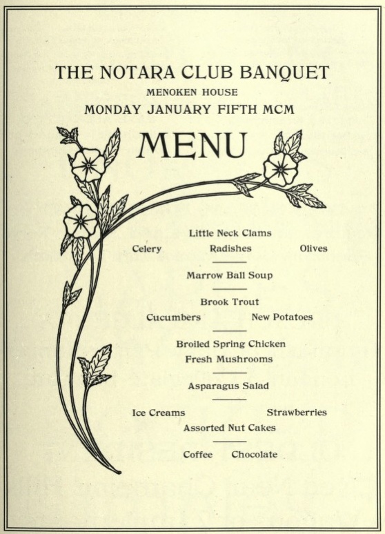
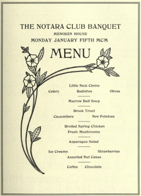
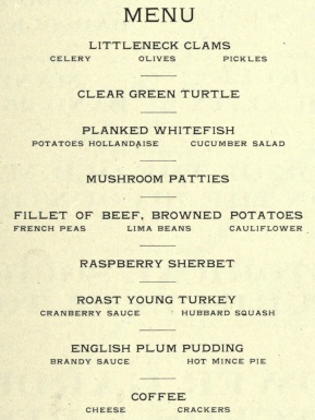
Left: Lining Mayo. Right: Lining Menu. Seems to have been "borrowed".... Mac McGrew writes: Menu Roman is the BB&S rename, for the 1925 specimen book, of Skinner, which was shown by Inland Type Foundry about 1885, and ascribed to John K. Rogers as well as to Nicholas J. Werner. Menu Title, formerly Lining Menu, was Inland's Bruce Title, by Werner. Menu Shaded was Acme, designed in 1886 or earlier. The latter has only a very general relationship to the other faces which are nearly monotone, with long serifs tapering to sharp points. Compare Paragon. | ||||
|
| ||||||
|
|
Lining Modern Antique (left) and Lining Myrtle Script. | ||||
|
| ||||||
|
|
|
Lining Nadall (left) and Lining Nestor Script. | ||||||
|
| |||||||||
|
Lining Oblique Gothic. | ||
|
| |||
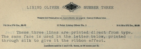
|
|
Left: Lining Oliver No. 3. Right: Lining Pantagraph Script (1893). | ||||
|
| ||||||
|
|
|
Lining Plate Gothic. | ||||||
|
| |||||||||
|
Lining Plate Script. This is similar to Typo Script. | ||
|
| |||
|
|
Lining Plate Script No. 2 and No. 3, just slightly heavier than Lining Plate Script. | ||||
|
| ||||||
|
|
Lining Premier Script (left) and Lining Princess Script (right). | ||||
|
| ||||||
|
|
Lining Racine. | ||||
|
| ||||||
|
|
Lining Remington (left), and Lining Remington No. 2. | ||||
|
| ||||||
|
|
Lining Remington No. 6 (left), and Lining Remington No. 7. | ||||
|
| ||||||
|
|
|
Lining Runic (leftmost) and Lining Southey. | ||||||
|
| |||||||||
|
|
Lining Spenser and Lining Wide Spenser. | ||||
|
| ||||||
|
|
Lining Standard Script (left) and Lining Sterling. | ||||
|
| ||||||
|
|
Left: Lining Stillson. Mac McGrew says: Stillson was introduced by BB&S about 1899, and patented by R. L. Stillson in 1900. It is a set of rather crude caps, thick-and-thin with generally very small serifs. Particularly noticeable are the high crossbars of E and F, the tall upright stroke on G, and the very short vertex on M. There are three sizes each of 6- and 12-point. Right: Lining Tasso. | ||||
|
| ||||||
|
|
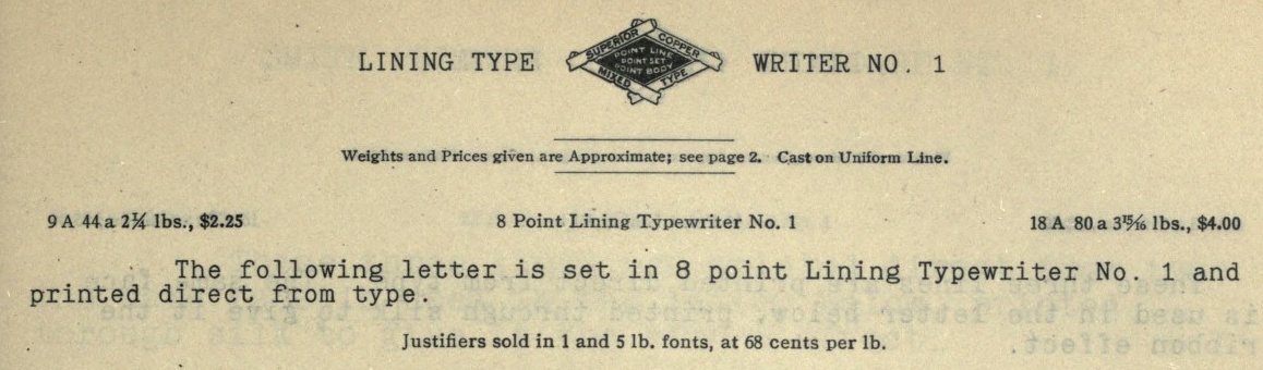
Left: Lining Tasso No. 2. Right: Lining Typewriter No. 1. | ||||
|
| ||||||
|
|
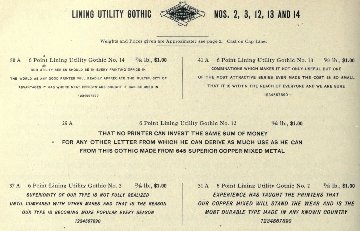
Left: Lining Utility Gothic No. 2, No. 3, No. 12, No. 13 and No. 14. Right: Lining Venetian. | ||||
|
| ||||||
|
Lining Vulcan. | ||
|
| |||
|
|
|
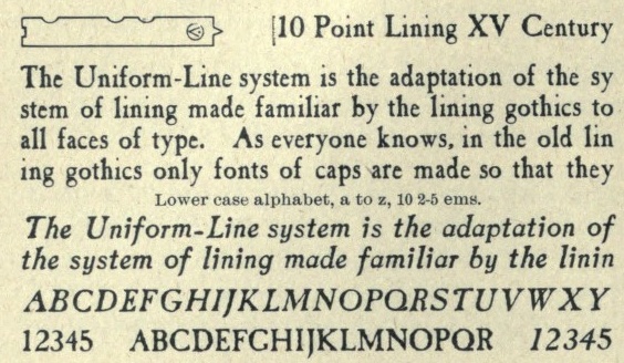
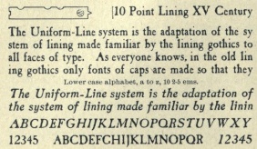
Lining XVth Century: this was originally Caslon Antique and Italic by Berne Nadall before BB&S took over the faces in 1896-1898. | ||||||
|
| |||||||||
|
|
Lining XVth Century Italic. | ||||
|
| ||||||
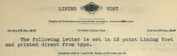
|
Lining Yost. | ||
|
| |||
|
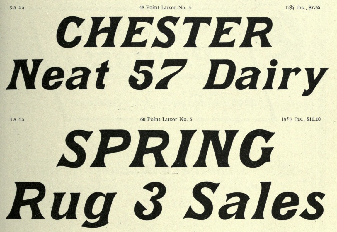
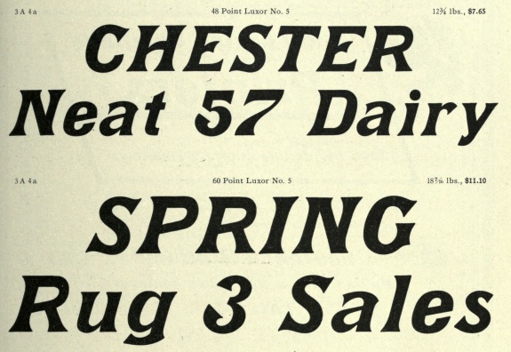
|
Left: Luxor No. 5. Right: Marshall Italic No. 5. | ||||
|
| ||||||
|
|
Mazarin Initials No. 1 and No. 2. | ||||
|
| ||||||
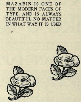
|
Mazarin Italic No. 5: BB&S introduced Mazarin in 1895-1896, as a revival of the Golden type, redesigned by our artist. [Golden Type was by William Morris.] But it was a poor copy, and was replaced by Morris Jensonian. Inland's Kelmscott, shown by them in 1897, was bought by BB&S and renamed Morris Jensonian in 1912. Mazarin Italic was introduced a year after Mazarin, but both faces did not last long. | ||
|
| |||
|
|
|
Mazarin No. 5. | ||||||
|
| |||||||||
|
Merit. | ||
|
| |||
|
|
|
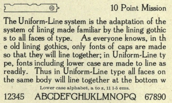
Mission was designed by Sydney Gaunt for BB&S in 1905. It was patented by George Oswald Ottley. | ||||||
|
| |||||||||
|
|
More examples of Mission. | ||||
|
| ||||||
|
|
Left: Mode. Right: Modern Fraktur No. 5. | ||||
|
| ||||||
|
|
Modern Gothic. Mac McGrew sketches the past and the future of this typeface: Modern Gothic originated with BB&S about 1897. It appears to be a modernization of older nineteenth-century gothics, although it has considerable resemblance to the much later European design, Helvetica Bold. It has the horizontal endings to curved strokes which typify Helvetica, but the more typically American double-bowl g. However, it is much more loosely fitted and not as refined as either Helvetica or the American Franklin Gothic, which originated in 1902. The entire series is called Gothic Modern in some specimens. Modern Condensed Gothic is probably the best member of this family. It was copied by Monotype at an early date, with 6- to 12-point sizes substantially modified to fit the unit system; however, unlike many early Monotype copies, display sizes are virtually exact copies of the foundry original. In 1928 Sol Hess drew a set of alternate capitals for this face, and the name was changed to Tourist Gothic (q. v.) in display sizes, 14-point and larger. This face is often called Franklin Gothic Condensed, but this is not correct as there is only a general resemblance. Medium Condensed Gothic Outline, cut by Triangle Type Foundry in Chicago, is an open version, without lowercase, of this face; some other sources inaccurately call it Franklin Gothic Condensed Outline (q.v.). The larger sizes of Gothic No. 13 (q.v.) on Linotype and Intertype are very similar. Monotype also has Tourist Gothic Italic, and an adaptation of Modern Gothic Italic under the name of Bold Inclined Gothic. | ||||
|
| ||||||
|
|
Modern Gothic Condensed. | ||||
|
| ||||||
|
|
Modern Gothic Italic. | ||||
|
| ||||||
|
|
Modern Gothic Title (left) and Modern Title. | ||||
|
| ||||||
|
|
Monitor No. 5 (left) and Mortised Initials. | ||||
|
| ||||||
|
|
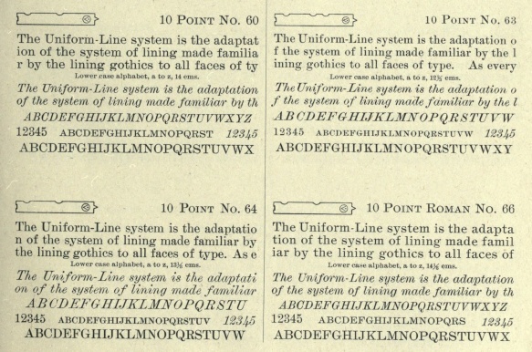
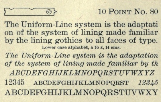
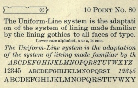
Nameless body types: No. 60, 63, 64, 66, and 80. | ||||
|
| ||||||
|
|
|
Old Roman Bold. | ||||||
|
| |||||||||
|
|
Old Roman Black and Black Italic. | ||||
|
| ||||||
|
|
Old Roman Bold Condensed and Old Roman Semitone. | ||||
|
| ||||||
|
|
Old Roman Condensed. The entire Old Roman superfamily was designed by Sidney Gaunt. However, its creation was not linear. Mac McGrew tells the story: Old Roman was designed about 1895 by T[homas] W[hite] Smith, manager of the foundry of H. W. Caslon & Company in England, where it was cast in small sizes, and copied by BB&S about 1903 with Caslon's permission. Sizes above 16-point were originated by BB&S. It is a modernized antique letter, with a little more weight than many romans, and became popular for advertising, especially for work that was to be reduced or reproduced photographically, before photolithography or etched letterpress plates had been developed to the point of sharp, accurate reproduction of typefaces. It has somewhat the feeling of Bookman, but serifs are unbracketed and longer with rounded ends, and some characters are less formal. This face was called Caslon Old Roman in some BB&S specimens, and copied by Monotype only under that name. Some versions were put on Linotype in 1913. A number of variations of this face were drawn by Sidney Gaunt for BB&S in 1907 to 1909, making a substantial and popular family, especially for display advertising. These variations include Old Roman Condensed,. Bold, which is about the proportion of Condensed; Bold Condensed, which is much narrower and heavier; Black and Black Italic, which are about the proportion of the original faces; and a unique Semitone, which is the Bold with a series of diagonal white lines cut through all strokes without an outline, making a shaded effect. This Semitone is also unusual among shaded faces in that the number of white lines is the same for any given letter, regardless of size; thus the shading is coarse in large sizes and fine in small sizes. | ||||
|
| ||||||
|
|
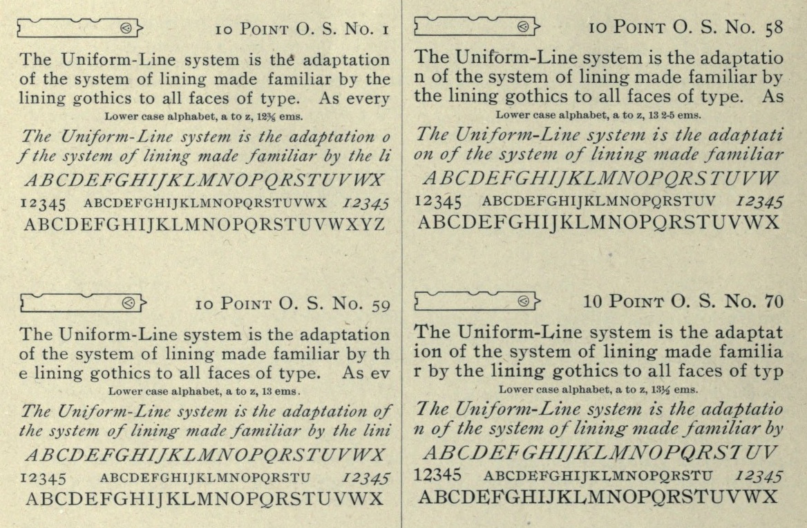
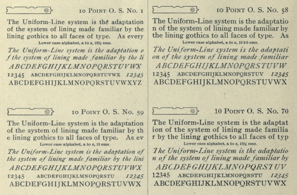
Old Style No. 1, No. 58, No. 59 and No. 70. Right: Old Style No. 90 and No. 100. Mac McGre writes: Catalog Old Style is a BB&S face, formerly known as Old Style Antique, which probably dates from the 1890s. It is similar to Bookman but heavier and less refined; in fact it is much like the face from which Bookman was derived. A condensed version, known as Monitor No.5, was later re- named Bookman Bold Condensed (q.v.). | ||||
|
| ||||||
|
|
Old Style No. 59. | ||||
|
| ||||||
|
|
|
Old Style Condensed No. 52 (left), No. 50 and No. 59. | ||||||
|
| |||||||||
|
|
Left: Old Style No. 1. Right: Oliver Printype. | ||||
|
| ||||||
|
|
|
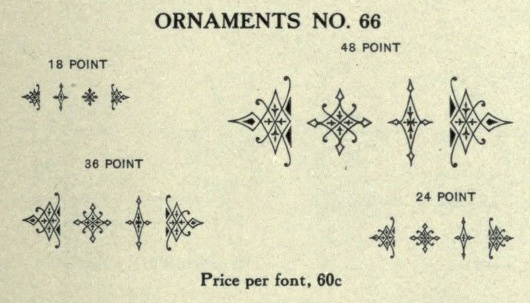
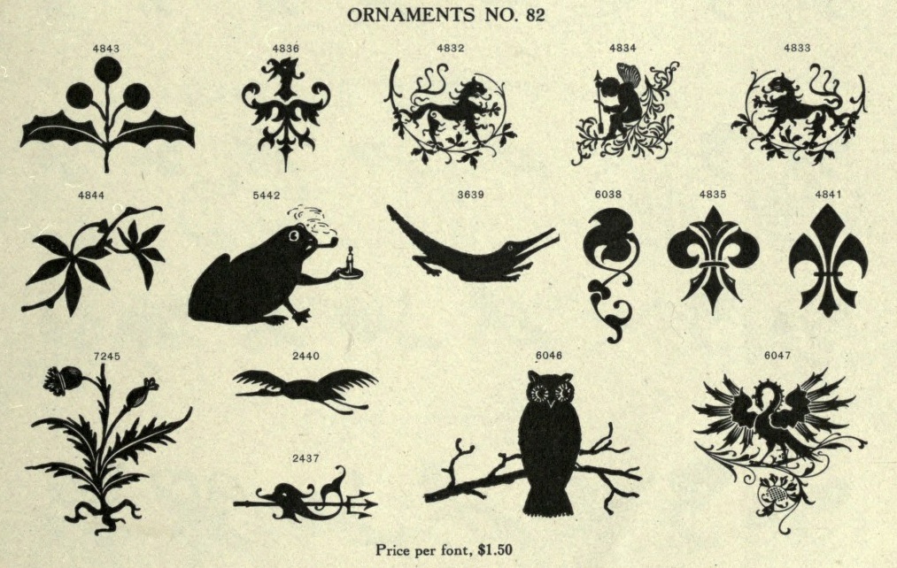
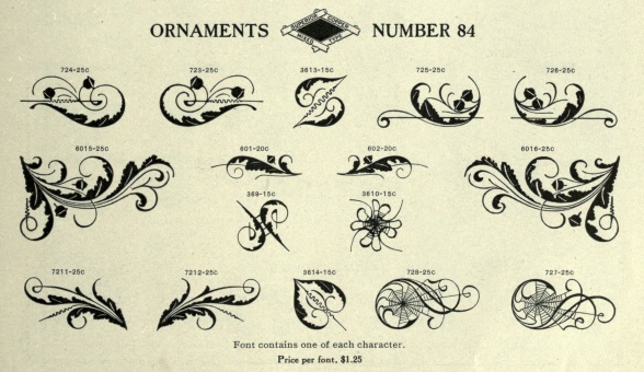
Let's show a number of ornaments here. | ||||||
|
| |||||||||
|
|
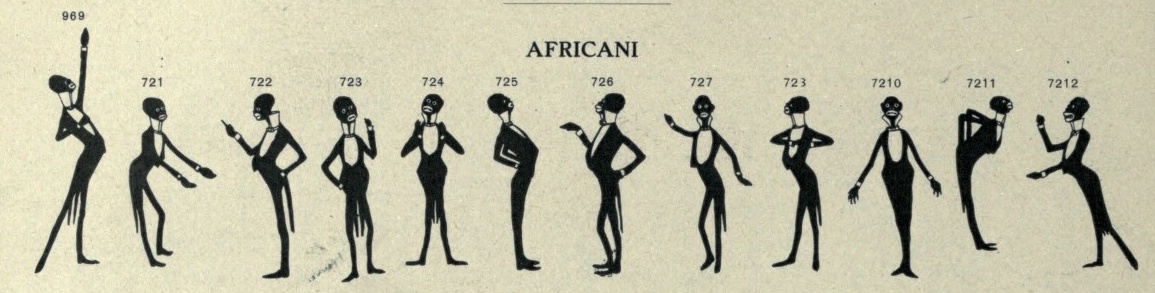
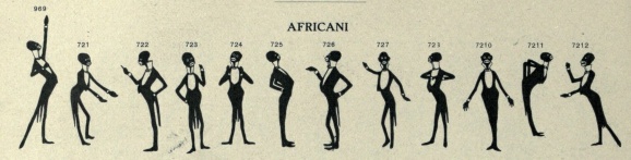
The leftmost set is called Africani. | ||||
|
| ||||||
|
|
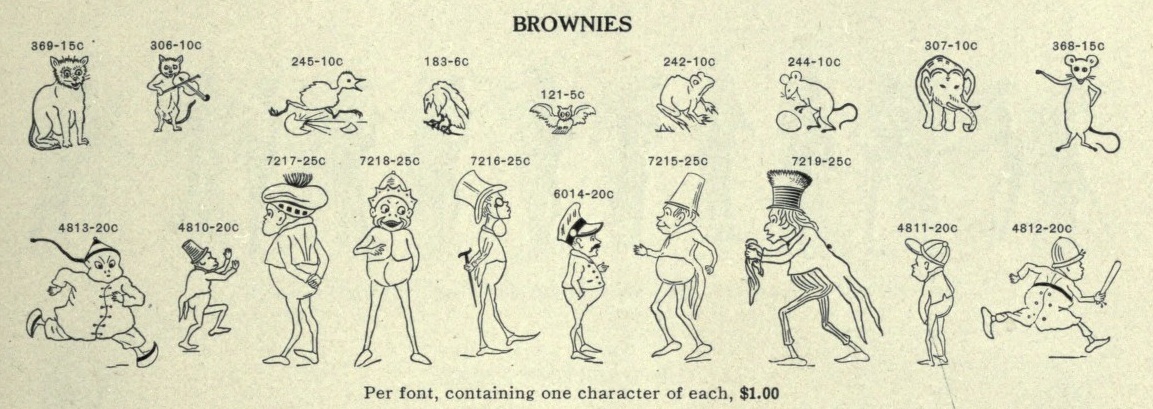
At the right, we find a collection called Brownies. | ||||
|
| ||||||
|
|
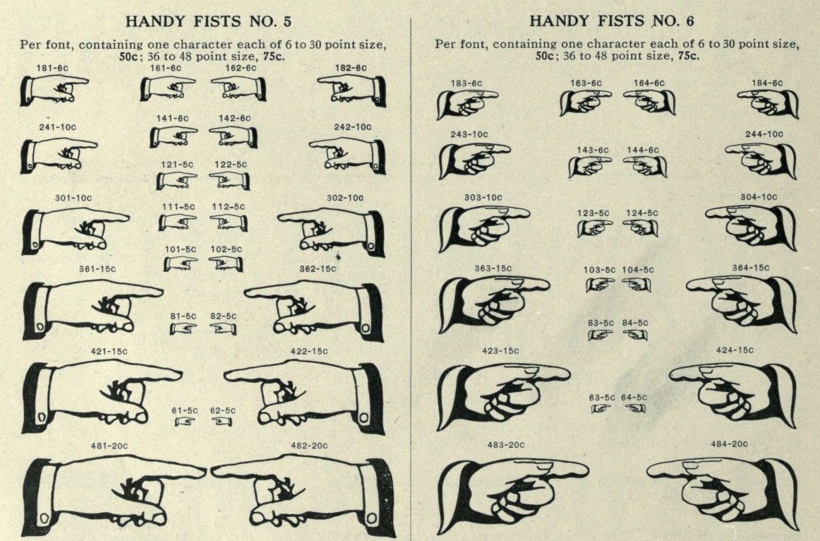
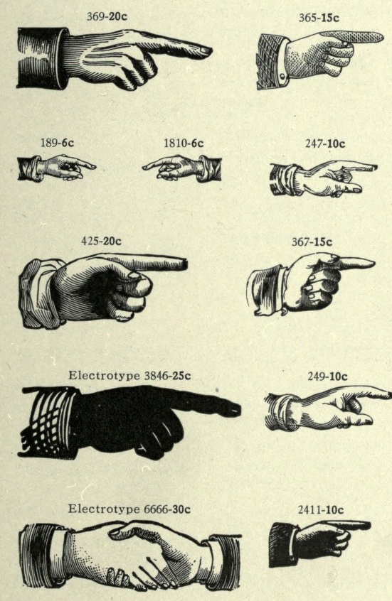
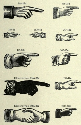
Every foundry had a large supply of fists. These are called Handy Fists No. 5, No. 6 (both left) and No. 7 (right). | ||||
|
| ||||||
|
|
Handy Fists No. 7. | ||||
|
| ||||||
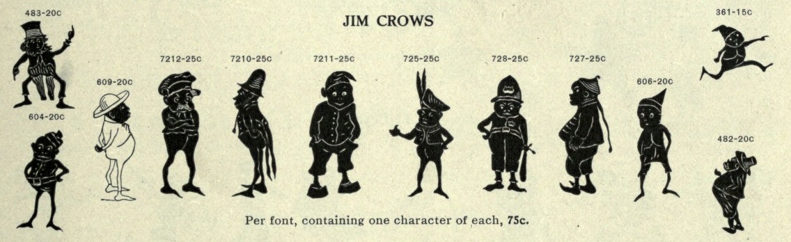
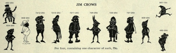
|
These are called Jim Crows. | ||
|
| |||
|
|
|
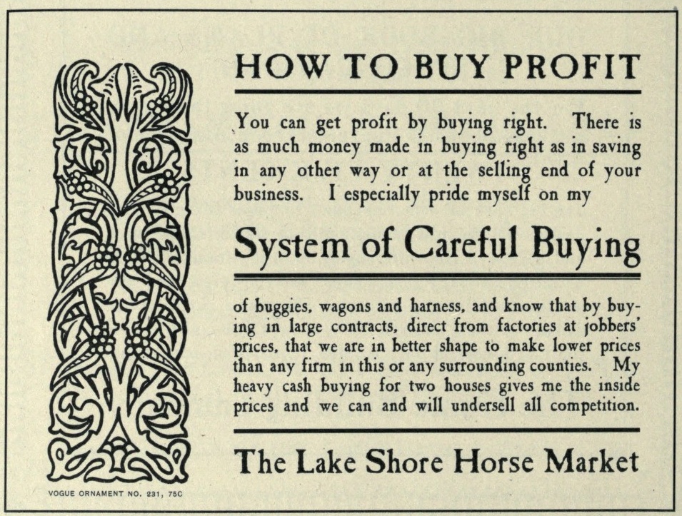
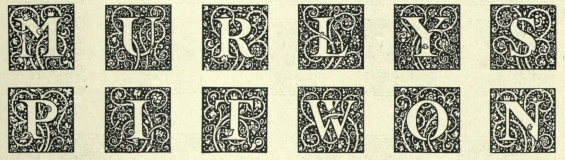
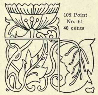
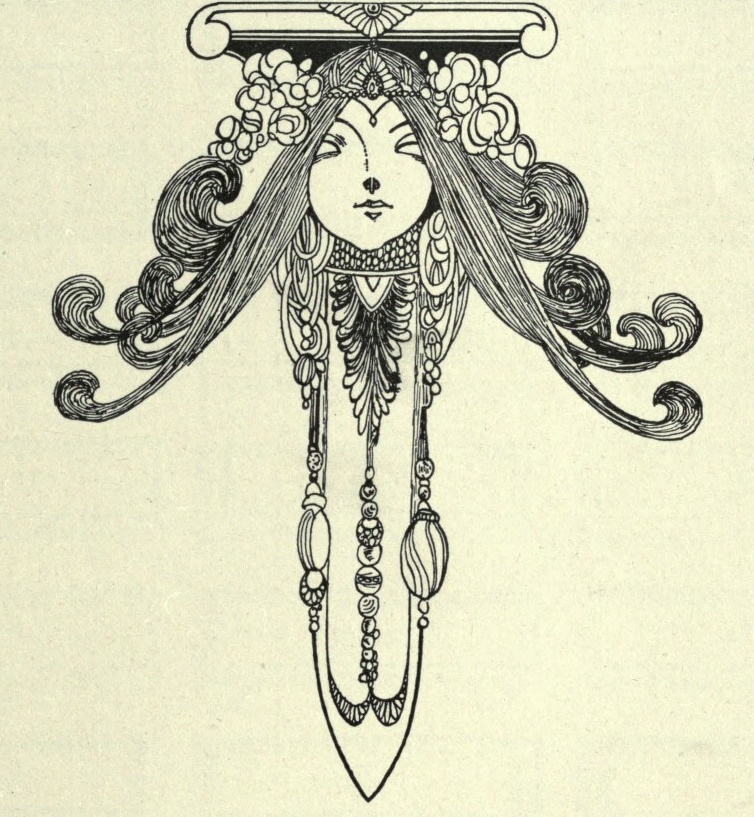
Start of a series of ornaments called Vogue Ornaments. They all had numbers, which I put in the name of the image file for your convenience. | ||||||
|
| |||||||||
|
|
Art nouveau influences. These are the last Vogue Ornaments. | ||||
|
| ||||||
|
|
| ||||
|
| ||||||
|
And this is the last ornament. | ||
|
| |||
|
Outline Gothic No. 61. | ||
|
| |||
|
|
|
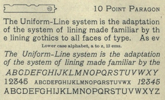
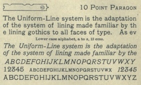
Paragon (1901) and Paragon Italic (1902, a sloped version of the former). Do not confuse with Paragon (1935, C. H. Griffith for Linotype). | ||||||
|
| |||||||||
|
|
Pastel. The history of Pastel, as told by McGrew: Pastel began as Era, designed for BB&S about 1892 by Nicholas J. Werner and Gustav Schroeder. Lightface Era and Era Open were added about 1895, and Era Condensed about 1898. Around the turn of the century the name was changed to Pastel, perhaps when Pastel Bold was added in 1903. Era and Pastel are identical, except that Era had only the characters with extended strokes, shown as Auxiliaries with Pastel, where they were replaced with more conventional characters in regular fonts. Pastel is virtually a monotone design, with tiny, pointed serifs. There are several unusual characters, including the splayed M and the N with the curved diagonal. Pastel was quite popular for subtitles in motion pictures, before the advent of sound. It was recast by ATF in 1954. Intertype's cutting of Pastel is essentially the same as the foundry's Pastel Lightface. Intertype also cut a sloped version as Pastel Italic. | ||||
|
| ||||||
|
|
Pastel Lightface. | ||||
|
| ||||||
|
|
Pastel Bold. | ||||
|
| ||||||
|
Pastel Open. | ||
|
| |||
|
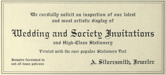
Pen Text No. 5. | ||
|
| |||
|
|
Plate Text and Plate Text No. 4. McGrew: Plate Text is an Old English design made in several varieties by BB&S about 1902. Plate Text itself is a shaded face, similar to Typo Text (q.v.); Plate Text No.4 is a fairly light design, just a little heavier than Wedding Text (q.v.), but not as well drawn. Compare Shaw Text. | ||||
|
| ||||||
|
|
Plymouth. McGrew: Plymouth and Plymouth Italic were cut by BB&S in 1900 with Plymouth Condensed and Plymouth Bold following in 1901. They are prime examples of the "rugged" style popular at that time, and are said to have been based on lettering being used for headings by the Curtis Publishing Company (see Post). The italic is freely drawn, with a number of swash-like characters, and is even more rugged than the roman. The condensed is simply a narrow version of Plymouth, but the bold is also more rugged or irregular. Plymouth was later known as Rugged Black, while Plymouth Bold became Rugged Extra Black and later AdcraftBlack (q.v.).Plymouth and Plymouth Italic were adapted by Monotype in 1913, with the keyboard sizes (6- to 12-point) being modified as usual to fit mechanical requirements. Monotype display sizes of Plymouth appear to match the foundry original, but the so-called Plymouth Italic on Monotype (14- to 36-point) is a copy of ATF's Post Oldstyle Italic, probably due to a misidentification when punches were prepared. | ||||
|
| ||||||
|
|
|
Plymouth Bold. | ||||||
|
| |||||||||
|
|
Plymouth Condensed. | ||||
|
| ||||||
|
Plymouth Italic. | ||
|
| |||
|
|
|
Post (leftmost) and Post Open. | ||||||
|
| |||||||||
|
|
Program Italic (left) and Radial Italic No. 5. | ||||
|
| ||||||
|
Reed Text. | ||
|
| |||
|
|
Rococo Initials No. 5 and No. 6. | ||||
|
| ||||||
|
Rococo Initials No. 7. | ||
|
| |||
|
|
Schiller No. 5 (left) and Schwabacher No. 5. | ||||
|
| ||||||
|
|
Left: Sheridan. Right: Skeleton Antique No. 55. | ||||
|
| ||||||
|
|
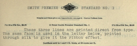
Left: Slope Gothic No. 50. Right: Smith Premier Standard No. 1. | ||||
|
| ||||||
|
Spire No. 5. | ||
|
| |||
|
|
Left: Stationers Plate---McGrew says that it has the effect of Stymie. Right: Stationers Text No. 5. | ||||
|
| ||||||
|
|
Left: Steelplate Text No. 5. Right: Sylvan Text No. 5. | ||||
|
| ||||||
|
|
|
Grunge in 1900? Maybe so---the Talisman (and Talisman Italic) faces were created by Sidney Gaunt around the turn of the century. | ||||||
|
| |||||||||
|
Tell Text No. 5. | ||
|
| |||
|
|
|
Teuton Black No. 5 (left), Teuton Extended No. 5 (middle) and Teutonic No. 5 (right). | ||||||
|
| |||||||||
|
|
Title No. 10 (left) and No. 9. | ||||
|
| ||||||
|
|
Title No. 52` and No. 36 (right). | ||||
|
| ||||||
|
Topic No. 5. | ||
|
| |||
|
|
|
The Tudor family: Bold (left) and No. 5 (two others). | ||||||
|
| |||||||||
|
|
Left: Tudor Text No. 5. Right: Two-Line No. 56. | ||||
|
| ||||||
|
|
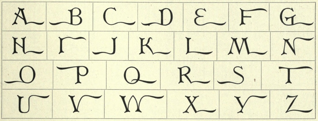
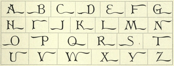
Universal Initials. | ||||
|
| ||||||
|
|
Wedding Plate (left, by Sidney Gaunt, 1904) and Wesel (right). Wedding Plate Script is like a sloped version of BB&S's French Plate Script, similar to Typo Slope (ATF, 1905). | ||||
|
| ||||||
|
|
|
West Lining Gothic (leftmost) and West Old Style No. 70. | ||||||
|
| |||||||||
|
Wide Germania No. 5. | ||
|
| |||
|
|
Wide Lining Gothic No. 520 (left) and Wide Old Style. | ||||
|
| ||||||
|
|
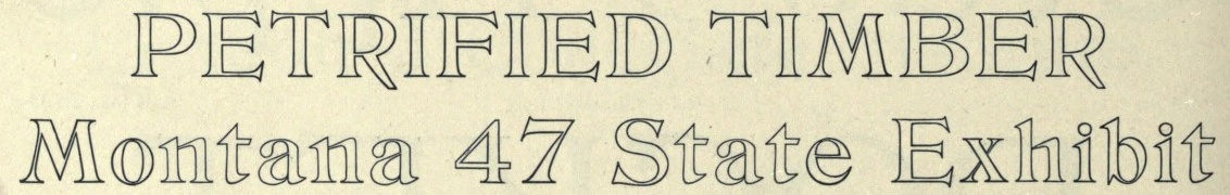
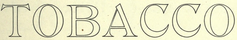
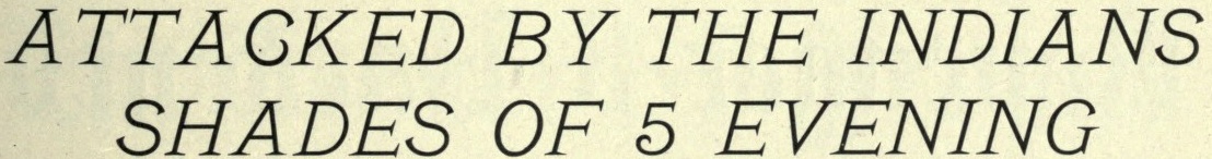
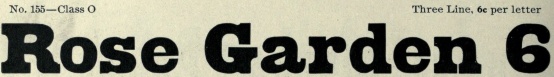
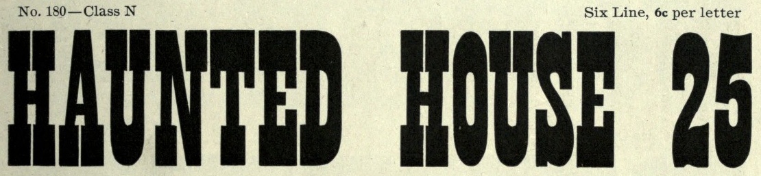
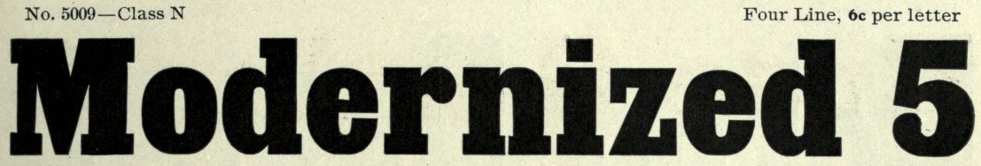
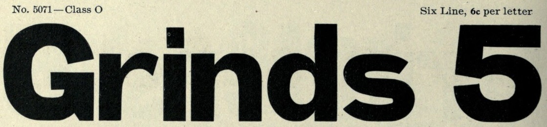
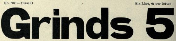
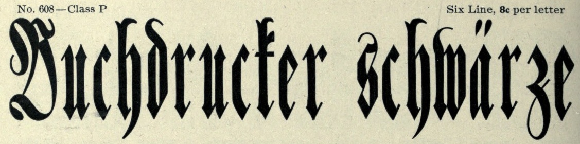
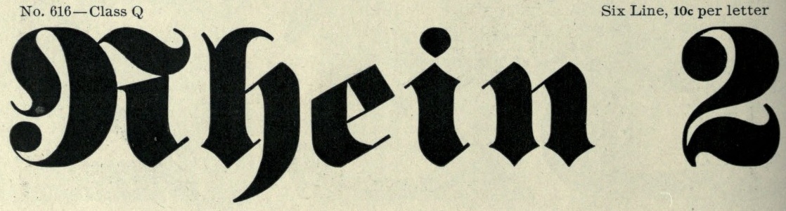
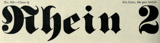
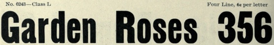
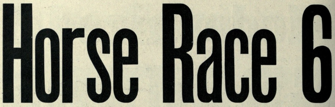
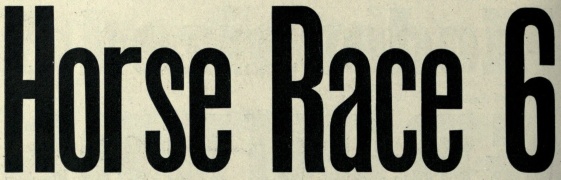
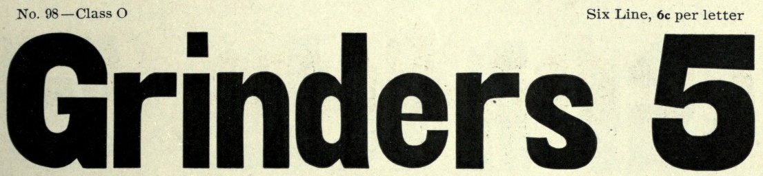
From here on down, we have various wood types. Each has a number and a class, which I put in the name of the image for consistency. | ||||
|
| ||||||
|
|
| ||||
|
| ||||||
|
|
| ||||
|
| ||||||
|
|
| ||||
|
| ||||||
|
|
| ||||
|
| ||||||
|
|
| ||||
|
| ||||||
|
|
| ||||
|
| ||||||
|
|
| ||||
|
| ||||||
|
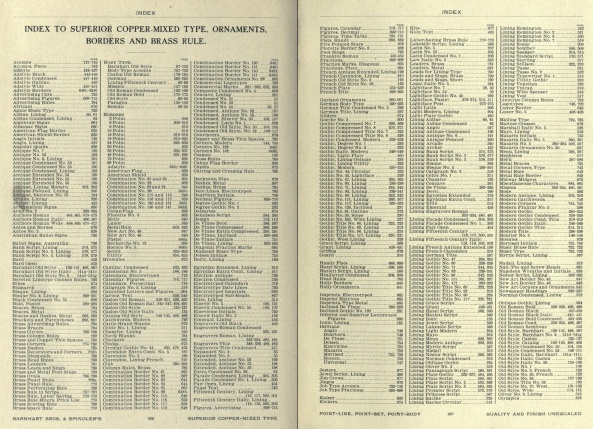
|
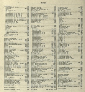
Index of typefaces. | ||||
|
| ||||||
| Contact |
Luc Devroye |