The conference |
 ATypI's annual conference
was held from 10-14 October 2012 in Hong Kong.
Hosted by the School of Design of the Hong Kong Polytechnic University,
the big boss and smooth master of ceremonies was HK Poly's own Keith Tam,
who joined the faculty in 2006.
ATypI's annual conference
was held from 10-14 October 2012 in Hong Kong.
Hosted by the School of Design of the Hong Kong Polytechnic University,
the big boss and smooth master of ceremonies was HK Poly's own Keith Tam,
who joined the faculty in 2006.
A bit in the background, but nevertheless very present was the
co-organizer, the Central Academy of Fine Arts, or CAFA, in Beijing.
Think of CAFA as the Reading or KABK of China.
|
Mega |
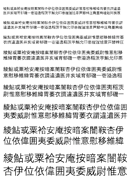
The word is mega---big, huge, astronomical, oversized.
Those designing Latin typefaces have no idea, no clue, of
the amount of work involved in making a Chinese typeface.
The sheer size of some of today's Chinese font projects
took my breath away. Min Wang, a Yale grad
who returned to China in 2003 to teach at CAFA, captured the numbers best in his talk:
- In 2011, China had over one million design students. [Gasp.]
- In 1990, China had 421 typefaces. In 1978, there were only 40 typefaces. [Huh?]
- 2000 Unicode contains about 27,500 Chinese characters. The standard 2005 GB norm has 70,000 characters. Even simplified Chinese requires 6,000 characters. The Chinese character set occupies 67.8% of the Unicode table slots. [We will all be Chinese one day.]
- A recent Chinese government project involves the design of a 500,000 character typeface, divided into 300,000 kai (calligraphic) characters, 100,000 ancient characters, and 100,000 characters for minority languages.
|
The old guys |
 The four most striking talks were given by old timers, who each grabbed the
opportunity---the first ATypI meeting held in Asia---to describe their careers
and design philosophies. Katsumi Asaba
(b. 1940), a design icon in Japan,
opened the fireworks in his patented red shoes.
[Note: The portrait is by Frank Kawamata.]
The four most striking talks were given by old timers, who each grabbed the
opportunity---the first ATypI meeting held in Asia---to describe their careers
and design philosophies. Katsumi Asaba
(b. 1940), a design icon in Japan,
opened the fireworks in his patented red shoes.
[Note: The portrait is by Frank Kawamata.]
 Henry Steiner, an Austrian from New York,
has been designing multicultural logos,
bank notes, posters and identities in Hong Kong since 1951.
While his body of work is impressive, I was disappointed to hear him say that he never
did posters for self-fulfillment, but only when commissioned.
Henry Steiner, an Austrian from New York,
has been designing multicultural logos,
bank notes, posters and identities in Hong Kong since 1951.
While his body of work is impressive, I was disappointed to hear him say that he never
did posters for self-fulfillment, but only when commissioned.
On the last afternoon of talks, we faced Chinese type design head-on when
two of Hong Kong's finest type designers explained their work.
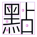
Kenneth Kwok, who has been designing type for 40 years, explained just how he
goes about the design of a Chinese typeface, starting with 12 base characters, tests
for thickness, an expansion to 1600 characters, and then final production. Stroke
components, or radicals, are the heart of the matter, but early exhaustive tests
are the key, according to Kwok.
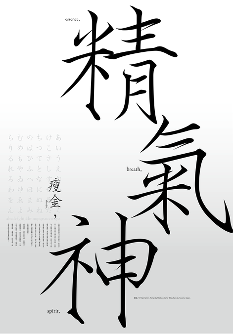 Sammy Or is one of the most prolific and important designers of contemporary Chinese typefaces.
Or began his work in typeface design as a Sign Systems Designer for the Mass Transit Railway Corporation (MTR) in Hong Kong in the 1980s.
He created the first Chinese (type 3) PostScript font on a Macintosh, the Li family
[Li Song and Li Hei are still Mac fonts today.]
He created tens of very popular typefaces, so I was surprised to see
him very emotional on three occasions in his talk, first when he spoke about the joy
of developing the first Chinese PostScript font, then about the sheer beauty of
Zhaujinti, Sammy's re-interpretation of Song emperor Huizong's Zhaujiin calligraphic style---its strokes are thin and mannered; Matthew Carter designed matching Latin and Osamu Torinoumi (Jiyokobo) created gorgeous kana characters for it---,
and finally about the simplicity of Xin Gothic (2000ff) done with Julius Hui.
Sammy Or is one of the most prolific and important designers of contemporary Chinese typefaces.
Or began his work in typeface design as a Sign Systems Designer for the Mass Transit Railway Corporation (MTR) in Hong Kong in the 1980s.
He created the first Chinese (type 3) PostScript font on a Macintosh, the Li family
[Li Song and Li Hei are still Mac fonts today.]
He created tens of very popular typefaces, so I was surprised to see
him very emotional on three occasions in his talk, first when he spoke about the joy
of developing the first Chinese PostScript font, then about the sheer beauty of
Zhaujinti, Sammy's re-interpretation of Song emperor Huizong's Zhaujiin calligraphic style---its strokes are thin and mannered; Matthew Carter designed matching Latin and Osamu Torinoumi (Jiyokobo) created gorgeous kana characters for it---,
and finally about the simplicity of Xin Gothic (2000ff) done with Julius Hui.
 Xin means trust, communication---Xin Gothic should be ideal for wayfinding, and many
e-books are already using it. He left Hong Kong in 2008 for Canada, disappointed
because of declining font prices due to a burst bubble as well as copyright violations in
China. Today, he pursues simplicity. Sammy Or's presentation was by far
the best of the meeting---it came straight from the heart.
Xin means trust, communication---Xin Gothic should be ideal for wayfinding, and many
e-books are already using it. He left Hong Kong in 2008 for Canada, disappointed
because of declining font prices due to a burst bubble as well as copyright violations in
China. Today, he pursues simplicity. Sammy Or's presentation was by far
the best of the meeting---it came straight from the heart.
|
Germans and their groupies |
 The young Germans caused a small ruckus. Germany has a few young China specialists:
Christoph Stahl has been teaching at CAFA in Beijing since 2003.
Florian Wittig has been investigating Pinyin, romanized Chinese.
Roman Wilhelm, the third German musketeer, who now works in Geneva, has in fact
designed a 21,000 glyph Chinese font himself. He is fluent in Chinese and
not afraid of podium antics. He was mobbed by a gaggle of pretty
admirers every time he set foot in the conference room.
The young Germans caused a small ruckus. Germany has a few young China specialists:
Christoph Stahl has been teaching at CAFA in Beijing since 2003.
Florian Wittig has been investigating Pinyin, romanized Chinese.
Roman Wilhelm, the third German musketeer, who now works in Geneva, has in fact
designed a 21,000 glyph Chinese font himself. He is fluent in Chinese and
not afraid of podium antics. He was mobbed by a gaggle of pretty
admirers every time he set foot in the conference room.
All three saxons gave wonderful and lively presentations---Christoph discussed the
problem of mixing Latin and Chinese, and he was not referring to Wilhelm and his
groupies. Since Chinese uses less space, he suggested aligning three lines of Chinese
with four lines of Latin, or similar multiline alignments, as opposed to Henry Steiner,
the keynote speaker, who preferred a line per line alignment but advocated making
the Chinese column widths narrower.
Florian pointed out that Pinyin, which requires many diacritics to cover the
variety of Chinese tones, could work with Latin fonts, if we could just---please---
design Latin fonts with a few additional accented vowels.
Roman's theme was multicultural typography, or the lack of it.
Mike in hand, he "owned" the stage. By Sunday afternoon, he looked tired.
|
The incident |
 The ATypI goodie bag contained a beautifully prepared set of fliers
for Typeproject.com's Axis and Axis Mincho CJK [CJK = Chinese,
Japanese, Korean] families. By accident, George Gu,
a Toronto-based CJK font designer who graduated from Musashino Art
University in Tokyo, centered his presentation around the flaws of
Axis.
The ATypI goodie bag contained a beautifully prepared set of fliers
for Typeproject.com's Axis and Axis Mincho CJK [CJK = Chinese,
Japanese, Korean] families. By accident, George Gu,
a Toronto-based CJK font designer who graduated from Musashino Art
University in Tokyo, centered his presentation around the flaws of
Axis.
If I were George, I'd be checking my sushi for Polonium 210.
|
News |
 It was a wonderful meeting, absolutely necessary for my personal education
on the history of the Chinese scripts, and the challenges facing
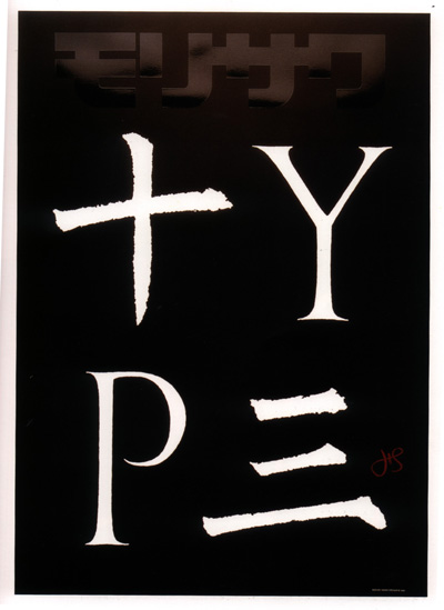
CJK type designers. I was shocked to learn from Shinya Yagami,
Morisawa's spokesperson, that this was the first ATypI conference ever attended by
Morisawa. I think that ATypI's politburo has realized this.
It was a wonderful meeting, absolutely necessary for my personal education
on the history of the Chinese scripts, and the challenges facing
CJK type designers. I was shocked to learn from Shinya Yagami,
Morisawa's spokesperson, that this was the first ATypI conference ever attended by
Morisawa. I think that ATypI's politburo has realized this. They are
talking about having a second ATypI meeting in Asia, possibly in Mumbai.
But the next two venues seem fixed, 2013 in Amsterdam and 2014 in Toronto.
|
 TYPE DESIGN INFORMATION PAGE last updated on
Sun Oct 21 01:47:29 EDT 2012
TYPE DESIGN INFORMATION PAGE last updated on
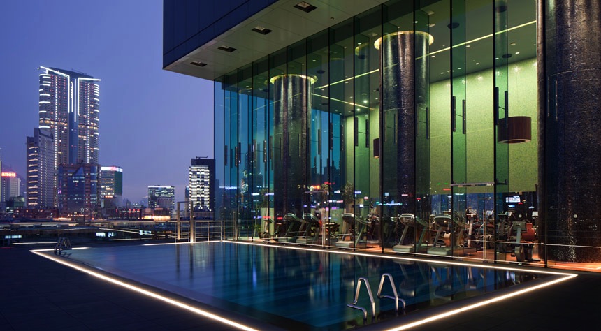
Sun Oct 21 01:47:29 EDT 2012 The setting is the Icon Hotel, stylish and grand. Sipping a vodka
martini in the bar on the 28th floor while viewing the light show
at 8pm across the Hong Kong harbour.
Oriental beauties waiting in the lobby.
Alone in the elevator with a mysterious elder Japanese guy in red shoes.
The setting is the Icon Hotel, stylish and grand. Sipping a vodka
martini in the bar on the 28th floor while viewing the light show
at 8pm across the Hong Kong harbour.
Oriental beauties waiting in the lobby.
Alone in the elevator with a mysterious elder Japanese guy in red shoes.