The best commercial typefaces of 2015: Luc's selection
|
 This is my own selection of the best commercial typefaces published in 2015, grouped by category.
 Text typefaces:  Strato Pro (Olivier Gourvat). Strato Pro (Olivier Gourvat).  Trueca (Senso Type). Humanistic and very legible. Trueca (Senso Type). Humanistic and very legible.  Marco (Toshi Omagari, 2011; produced by Type Together in 2015). A humanist text family with calligraphic roots for Latin, Cyrillic and Greek. Marco (Toshi Omagari, 2011; produced by Type Together in 2015). A humanist text family with calligraphic roots for Latin, Cyrillic and Greek.  Brenta (Ludwig Ubele). A sharp-edged wedge serif typeface family. Brenta (Ludwig Ubele). A sharp-edged wedge serif typeface family.  Neacademia Subhead (Sergei Egorov, Rosetta Type). Neacademia is Egorov's impressive revival of Aldine / Venetian types, first developed in 2009. Its Subhead subfamily for Latin and Cyrillic was added in 2015. Neacademia Subhead (Sergei Egorov, Rosetta Type). Neacademia is Egorov's impressive revival of Aldine / Venetian types, first developed in 2009. Its Subhead subfamily for Latin and Cyrillic was added in 2015.
| Sans typefaces: - URW Geometric (Jörn Oelsner). Inspired by the German geometric typefaces of the 1920s.
 Cobalte (Jean-Baptiste Levée). Lapidary and flared, and very warm and legible in long texts. Cobalte (Jean-Baptiste Levée). Lapidary and flared, and very warm and legible in long texts. 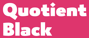 Quotient (James Montalbano). James describes it as Trajan Sans. Quotient (James Montalbano). James describes it as Trajan Sans.  Mallory (Tobias Frere-Jones). Mallory (Tobias Frere-Jones). - Comspot and Comspot Tec (Nils Thomsen at TypeMates). A useful and readable rounded sans for mobile devices and advertizing.
 Quenda (Marc Lohner). Quenda (Marc Lohner).  Gill Sans Nova (George Ryan, Monotype). A 48 weight extension of Gill Sans, with coverage of Greek and Cyrillic, and plenty of fancy styles such as Deco, Inline and Shadow. Gill Sans Nova (George Ryan, Monotype). A 48 weight extension of Gill Sans, with coverage of Greek and Cyrillic, and plenty of fancy styles such as Deco, Inline and Shadow.  Setimo (Fernando Caro, at Dalton Maag). In the corporate sans category. Setimo (Fernando Caro, at Dalton Maag). In the corporate sans category. - Core Sans GS (S-Core). A rounded version of the earlier Core Sans G typeface family.
 Woodford Bourne (Paulo Goode). A 19th century grotesque family. Woodford Bourne (Paulo Goode). A 19th century grotesque family.  Bill Corporate (Oliver Jeschke, OGJ Type Design). A geometric family inspired by Max Bill. Bill Corporate (Oliver Jeschke, OGJ Type Design). A geometric family inspired by Max Bill.  Objektiv (Bruno Mello at Dalton Maag). Objektiv (Bruno Mello at Dalton Maag). 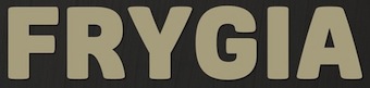 Frygia (Stawix Ruecha and Kawisara Vacharaprucks). A soft industrial sans family. Frygia (Stawix Ruecha and Kawisara Vacharaprucks). A soft industrial sans family.  Akko Pro Condensed (Akira Kobayashi, Linotype). Akko Pro Condensed (Akira Kobayashi, Linotype).  Abrade (Jason Vandenberg). A 12-style geometric sans with medium x-height and perfect rhythm. Abrade (Jason Vandenberg). A 12-style geometric sans with medium x-height and perfect rhythm.  PF Centro Sans Condensed (Parachute). PF Centro Sans Condensed (Parachute).  Vito (Thomas Gabriel, Typejockeys): Masculine and sporty for adrenaline junkies, reliable and elegant for serious typographers, but with a touch of bling for high snobiety. Vito (Thomas Gabriel, Typejockeys): Masculine and sporty for adrenaline junkies, reliable and elegant for serious typographers, but with a touch of bling for high snobiety.  Diodrum (Indian Type Foundry). A great set of organic / spurless sans typefaces with inflated outlines and a friendly character. Diodrum (Indian Type Foundry). A great set of organic / spurless sans typefaces with inflated outlines and a friendly character.  Druk, Druk Text, Druk Wide, Druk Condensed and Druk Text Wide (Berton Hasebe, Commercial Type). An unbelievable collection with extreme styles that will appeal to all tastes. My favorite in this bold collection is Druk XX Condensed Super. Druk, Druk Text, Druk Wide, Druk Condensed and Druk Text Wide (Berton Hasebe, Commercial Type). An unbelievable collection with extreme styles that will appeal to all tastes. My favorite in this bold collection is Druk XX Condensed Super.  Canal (Étienne Aubert Bonn). A workhorse sans designed to recreate the atmosphere of blue collar America in the 19th and 20th centuries, named after the industrial Lachine Canal in Montreal. Canal (Étienne Aubert Bonn). A workhorse sans designed to recreate the atmosphere of blue collar America in the 19th and 20th centuries, named after the industrial Lachine Canal in Montreal.  Muller (Radomir Tinkov, Fontfabric). Twenty styles from hairline to heavy, and a wider glyph projection than normal. Muller (Radomir Tinkov, Fontfabric). Twenty styles from hairline to heavy, and a wider glyph projection than normal.  Scandia (Eric Olson, Process Type Foundry). Scandia (Eric Olson, Process Type Foundry).  Geomanist (Atipo). Nine styles from hairline to black, clean and stylish---the geometric parent clearly dominated its humanist partner. Geomanist (Atipo). Nine styles from hairline to black, clean and stylish---the geometric parent clearly dominated its humanist partner.  Nordikka Sans (Luciano Vergara). Normally I do not like tall x-height or Scandinavian look, but I will make an exception for this one while waiting for a Norwegian ferry in the North Sea fog. Nordikka Sans (Luciano Vergara). Normally I do not like tall x-height or Scandinavian look, but I will make an exception for this one while waiting for a Norwegian ferry in the North Sea fog. 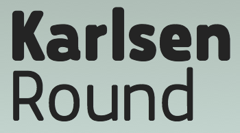 Karlsen Round (Type Union). A 14-style rounded mobile device sans family. Karlsen Round (Type Union). A 14-style rounded mobile device sans family. 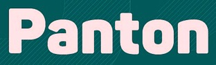 Panton (Fontfabric). A broad 34-weight sans family with softened geometric forms. With icons and a Cyrillic and a made-for-iphone look, this is sure to be a mega-hit. I mean a blockbuster. Panton (Fontfabric). A broad 34-weight sans family with softened geometric forms. With icons and a Cyrillic and a made-for-iphone look, this is sure to be a mega-hit. I mean a blockbuster.  Amsi Pro (Stawix Ruecha). Inspired by Block Berthold, this rounded sans with dwarfy descenders shines in the narrow and ultra fat corner of the spectrum. Amsi Pro (Stawix Ruecha). Inspired by Block Berthold, this rounded sans with dwarfy descenders shines in the narrow and ultra fat corner of the spectrum.  Don Sans (Andreas Stötzner). Like good wine and Billie Holiday, anything Andreas touches sparkles. An industrial sturdy workhorse no-nonsense sans. Don Sans (Andreas Stötzner). Like good wine and Billie Holiday, anything Andreas touches sparkles. An industrial sturdy workhorse no-nonsense sans.
| Type systems: 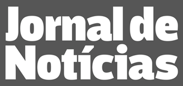 Jornal de Notícias (Pedro Leal). A complete set of newspaper types with special attention paid to the condensed and agate (micro) styles. Jornal de Notícias (Pedro Leal). A complete set of newspaper types with special attention paid to the condensed and agate (micro) styles. 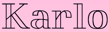 Karlo (Sans, Serif, Open) designed by Sofie Beier for Die Gestalten. Karlo (Sans, Serif, Open) designed by Sofie Beier for Die Gestalten.
| | Art deco typefaces: | | Hipster typefaces: | | Script typefaces: | Sketched, Layered or Poster typefaces:  Triump Rough (Enrique Hernandez at Latinotype). Triump Rough (Enrique Hernandez at Latinotype). 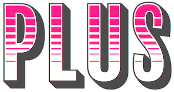 Balboa Plus (Jim Parkinson). An extension of his earlier condensed sans headline typeface Balboa (2001). Balboa Plus (Jim Parkinson). An extension of his earlier condensed sans headline typeface Balboa (2001).  Mrs Onion (Hipopotam Studio). Mrs Onion (Hipopotam Studio).  Smile Pro (Rodrigo Araya and Andrey Kudryavtsev). Smile Pro (Rodrigo Araya and Andrey Kudryavtsev).  Brim Narrow (Jamie Clarke). Brim Narrow (Jamie Clarke).  Intro Rust (Ani Petrova, Svetoslav Simov and Radomir Tinkov at Fontfabric). A 214-style roughened version of Intro. Intro Rust (Ani Petrova, Svetoslav Simov and Radomir Tinkov at Fontfabric). A 214-style roughened version of Intro. - Le Havre Hand (Jeremy Dooley). A large sketched layered typeface family.
- Granz (Pintassilgo). Based on the beatnik style retro lettering on David Stone Martin's jazz album covers.
 Bazaruto (Brian J. Bonislawsky and Jim Lyles). Bazaruto (Brian J. Bonislawsky and Jim Lyles).  Natura (Giuseppe Salerno, Resistenza). This has a fountain pen script and accompanying icons, stamps and notebook styles. Natura (Giuseppe Salerno, Resistenza). This has a fountain pen script and accompanying icons, stamps and notebook styles.  Irrlicht (Ari Hausel, Aarhaus) is based on Christian Heinrich Kleukens's 1923 typeface Judith Type. The is pure German expressionism for the 21st century. Perfection. Irrlicht (Ari Hausel, Aarhaus) is based on Christian Heinrich Kleukens's 1923 typeface Judith Type. The is pure German expressionism for the 21st century. Perfection.  Babar (Oscar Guerrero). Babar (Oscar Guerrero).  Crafty Caps (Art of Sun). Crafty Caps (Art of Sun).  Signpost (Keith Tricker). Signpost (Keith Tricker).
| | Blackletter typefaces: | | Dingbats and ornaments: | Garalde typefaces:  Guillaume (George Tulloch). Guillaume (George Tulloch). 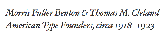 ATF Garamond (Mark van Bronkhorst, Igino Marini, & Ben Kiel). An 18-style family based on the Garamond designed between 1918 and 1923 by Morris Fuller Benton and Thomas M. Cleland at ATF. ATF Garamond (Mark van Bronkhorst, Igino Marini, & Ben Kiel). An 18-style family based on the Garamond designed between 1918 and 1923 by Morris Fuller Benton and Thomas M. Cleland at ATF.
| Display typefaces:  ATC Duel (Alex Sheyn). ATC Duel (Alex Sheyn). 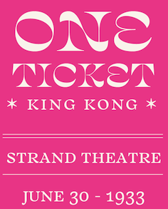 Salvaje (Cristian Vargas). An exuberant flashy in-your-face typeface family inspired by Birds of Paradise and designed at the KABK in Den Haag. Salvaje (Cristian Vargas). An exuberant flashy in-your-face typeface family inspired by Birds of Paradise and designed at the KABK in Den Haag.  Moholy Sans (Laszlo Mihaly Naske). Moholy Sans (Laszlo Mihaly Naske).  Stolzl Display (Mariya V. Pigoulevskaya) and Stolzl. Named after Gunta Stölzl, the Bauhaus's only female master. Stolzl Display (Mariya V. Pigoulevskaya) and Stolzl. Named after Gunta Stölzl, the Bauhaus's only female master.  Dalat (Kasper Pyndt). Dalat (Kasper Pyndt). 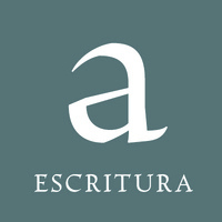 Escritura (Ricardo Santos). Display text type with renaissance elements. Escritura (Ricardo Santos). Display text type with renaissance elements. - Emeritus (Galen Lawson). A lapidary typeface family.
 OCR-T (Martin Tiefenthaler). OCR-T (Martin Tiefenthaler). - Proza Display (Jasper de Waard, Bureau Roffa). The flashy sister of Proza (2013).
 Gosdin (Andrew Walsh, TypeTrough). An elegant inline serif titling typeface. Gosdin (Andrew Walsh, TypeTrough). An elegant inline serif titling typeface.  RNS Obesa Fat Font (Yorlmar Campos). RNS Obesa Fat Font (Yorlmar Campos). - Nord Form (Letterwerk). A beveled typeface with three accompanying styles.
 Piepie (Ryoichi Tsunakawa). Fat was never this beautiful. Piepie (Ryoichi Tsunakawa). Fat was never this beautiful. 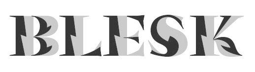 Blesk (Ksenya Samarskaya). Blesk (Ksenya Samarskaya).  Bautype (Malwin Béla Hürkey). Bautype (Malwin Béla Hürkey).
| Slab serif typefaces:  Calanda (Dieter Hofrichter). Calanda (Dieter Hofrichter). - Clarendon Graphic (François Rappo, Optimo). With 26 styles including stencils and all necessary Opentype features, this optically optimized typeface family replaces all previous Clarendons.
| Copperplate:  Dolcetto (Drew Melton). Dolcetto (Drew Melton).  Glade (Alison Argento). A formal calligraphic copperplate script a useful suite of widths. Glade (Alison Argento). A formal calligraphic copperplate script a useful suite of widths.  Valentia (Olcar Alcaide). Valentia (Olcar Alcaide).  Barracuda (Vates Design). Barracuda (Vates Design).
| Wood type revivals: 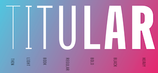 Titular (Latinotype). Not a revival, but a large headline family inspired by wood type. Titular (Latinotype). Not a revival, but a large headline family inspired by wood type. 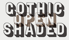 Gothic Open Shaded (Matt Braun, Wood Type Revivals). After a typeface shown in George Nesbitt's 1838 catalog. Gothic Open Shaded (Matt Braun, Wood Type Revivals). After a typeface shown in George Nesbitt's 1838 catalog.
| Letterpress emulation:  Racon (Ahmet Altun). Racon (Ahmet Altun). 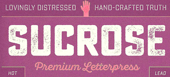 Sucrose (Ryan Martinson). Sucrose (Ryan Martinson).  Bronn Rust (Fontfabric). Bronn Rust (Fontfabric). - Caston (Gearwright). A revival of Morris Fuller Benton's Card Litho (1917).
- True North Textures (Cindy Kinash and Charles Gibbons).
| | Didone typefaces: | Fashion mag typefaces:  D'Lotus (Kevin He). D'Lotus (Kevin He).  Rastignac Black (Tomato Kosir). A fat face didone. Rastignac Black (Tomato Kosir). A fat face didone.  Grandesque (Julian Hrankov). Grandesque (Julian Hrankov).  Lingerie (Moshik Nadav). Lingerie (Moshik Nadav).  Revista (Paula Nazal Selaive, Marcelo Quiroz and Daniel Hernandez, at Latinotype) is a fashion mag typographic system. It has Revista Script (connected style), Revista Stencil, Revista Dingbats, Revista Inline and the didone Revista all caps set of typefaces. Revista (Paula Nazal Selaive, Marcelo Quiroz and Daniel Hernandez, at Latinotype) is a fashion mag typographic system. It has Revista Script (connected style), Revista Stencil, Revista Dingbats, Revista Inline and the didone Revista all caps set of typefaces. - Poster (Inigo Jerez, Textaxis). A fat face didone. Developed between 2008 and 2014 and published in 2015.
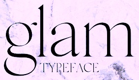 Glam (Rakel Thomas). This typeface is used in Glamour Iceland Magazine. Glam (Rakel Thomas). This typeface is used in Glamour Iceland Magazine. 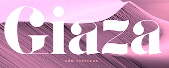 Giaza (Anthony James). A fashion mag didone with a free Stencil style. Giaza (Anthony James). A fashion mag didone with a free Stencil style.  Jules (Dino dos Santos and Pedro Leal). This fat fashion mag didone in 45-styles is inspired by several plates from Portuguese calligrapher Antonio Jacintho de Araujo. Jules (Dino dos Santos and Pedro Leal). This fat fashion mag didone in 45-styles is inspired by several plates from Portuguese calligrapher Antonio Jacintho de Araujo.  Lince (Typomancer). A 16-style display family rooted in didones. Lince (Typomancer). A 16-style display family rooted in didones. 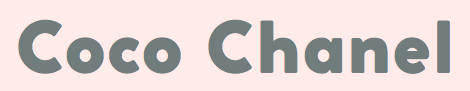 Coco Gothic (Cosimo Lorenzo Pancini, Zetafonts), a small x-height geometric fashion mag sans family named after Coco Chanel: elegant, beautiful, wonderful. Coco Gothic (Cosimo Lorenzo Pancini, Zetafonts), a small x-height geometric fashion mag sans family named after Coco Chanel: elegant, beautiful, wonderful.  Lust Hedonist (Neil Summerour), with Didone, Italic and Script sub-styles. The ultimate fashion mag typeface. Lust Hedonist (Neil Summerour), with Didone, Italic and Script sub-styles. The ultimate fashion mag typeface. - Model (Maximiliano Sproviero).
- Couture (Neil Summerour).
| Stencil typefaces:  Trepa (Josep Patau). Inspired by commercial signs and the 1960s French art movement Graphie Latine. Trepa (Josep Patau). Inspired by commercial signs and the 1960s French art movement Graphie Latine.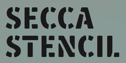 Secca Stencil (Andreas Seidel). Secca Stencil (Andreas Seidel).
| Multilingual typefaces: - Croogla (Sergiy Tkachenko). An informal rounded sans with an almost unicase Latin part that harmonizes perfectly with its Cyrillic companion.
- Koppla (Minjoo Ham). Her graduation typeface at KABK, Koppla covers Latin and Hangul in multiple styles.
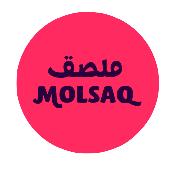 Molsaq Pro (Ali Almasri). An Arabic / Latin rounded poster typeface family with perfect interplay between the different scripts. Molsaq Pro (Ali Almasri). An Arabic / Latin rounded poster typeface family with perfect interplay between the different scripts.  Noort (Juan Bruce). For Latin, Greek and Bengali. Another superb effort by the graduates of the University of Reading. Noort (Juan Bruce). For Latin, Greek and Bengali. Another superb effort by the graduates of the University of Reading.  Lida for Perso-Arabic and Latin. By Borna Izadpanah at the University of Reading. Lida for Perso-Arabic and Latin. By Borna Izadpanah at the University of Reading. - Levnam (Manvel Shmavonyan, Paratype). A flared terminal sans of wide proportions for setting small text. Covers Latin and Cyrillic.
 Kazimir (CSTM, Ilya Ruderman and Yury Ostromentsky). A didone family for Latin and Cyrillic, designed for short texts and headlines. Kazimir (CSTM, Ilya Ruderman and Yury Ostromentsky). A didone family for Latin and Cyrillic, designed for short texts and headlines. - HS Headline by Gunnlaugur Briem and Hasan Abu Afash. This fat calligraphic didone display typeface covers Latin (Briem's contribution) and Arabic (by Afash, based on the simple lines of Naskh calligraphy).
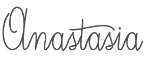
 Finos (Anastasia Dimitriadi and Iordanis Passas). A gorgeous typeface family based on Greek retro cinema. Finos (Anastasia Dimitriadi and Iordanis Passas). A gorgeous typeface family based on Greek retro cinema.
| Technical drawing:  R&C (Jean Boyault). R&C (Jean Boyault).
| Wonderful, adorable, refreshing typefaces:  Marquesa (Mario Mimoso). Marquesa (Mario Mimoso).  Stuffed Crust (Drew Melton). Described by Drew as follows: Big and greasy never looked so good. Stuffed Crust (Drew Melton). Described by Drew as follows: Big and greasy never looked so good.
| [Google]
[More] ⦿
|
The best free typefaces of 2015: Luc's selection
|
 This is my own selection of the best free typefaces published in 2015, grouped by category.
 Text typefaces: - Clara (Séamas Ó Brógáin). This typeface family also covers Greek and Cyrillic.
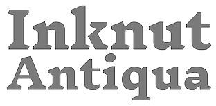 Inknut Antiqua (Claus Eggers-Sørensen). An angular text typeface that will survive earthquakes and tsunamis. Inknut Antiqua (Claus Eggers-Sørensen). An angular text typeface that will survive earthquakes and tsunamis.  Caslon OS (Alfredo Marco Pradil). A revival typeface for those who can't afford Adobe Caslon. Caslon OS (Alfredo Marco Pradil). A revival typeface for those who can't afford Adobe Caslon.
| | Sans typefaces: | | Type systems: | | Art deco typefaces: | | Hipster typefaces: | | Script typefaces: | Sketched, Layered or Poster typefaces:  Pelmeshka (Cyril Mikhailov). A handcrafted fat didone for Latin and Cyrillic. Pelmeshka (Cyril Mikhailov). A handcrafted fat didone for Latin and Cyrillic.  HB Sketch (Mehmet Abaci, Studio Typo). A gorgeous sketched didone. HB Sketch (Mehmet Abaci, Studio Typo). A gorgeous sketched didone. - Flowers Power Nega (imagex). A textured ornamental caps typeface by the prolific free font designer simply known as imagex. Shall we ever know his or her identity?
 Monstre Display (Lev Berry). A stackable system based on a model from 1882. Monstre Display (Lev Berry). A stackable system based on a model from 1882. - Ahoj. A free all caps layered typeface family made in 2015 by the crew at Type Together, namely, Veronika Burian, Jose Scaglione, Sonja Stange, Elena Veguillas and Irene Vlachou. Ahoj is a bold display sans serif inspired by images of old signs and lettering found in different cities. The typeface family was produced in a four-day workshop in Prague. Voluntary contributions will be used to help the victims of the 2015 quake in Nepal.
 Plump (Steven Whitfield). Plump (Steven Whitfield). 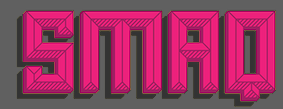 ALT Smaq (Andreas Leonidou). Eight beveled styles for Latin and Greek. Download link. ALT Smaq (Andreas Leonidou). Eight beveled styles for Latin and Greek. Download link.  Chubby (Anders Kristoffersen). Download link. Chubby (Anders Kristoffersen). Download link.
| | Blackletter typefaces: | Dingbats and ornaments:  Asap Symbol (Tania Quindos, Marcela Romero, Elena Gonzalez Miranda and Pablo Cosgaya at Omnibus Type). Asap Symbol (Tania Quindos, Marcela Romero, Elena Gonzalez Miranda and Pablo Cosgaya at Omnibus Type).
| Garalde typefaces:  Cormorant (Christian Thalmann, Open Font Library). See also CTAN. Cormorant (Christian Thalmann, Open Font Library). See also CTAN.
| Display typefaces:  rBH (Morten Rostgaard Olsen, Ole Søndergaard and Henrik Birkvig). A typeface family custom designed for the identity of the city of Copenhagen. rBH (Morten Rostgaard Olsen, Ole Søndergaard and Henrik Birkvig). A typeface family custom designed for the identity of the city of Copenhagen.  Infini (Sandrine Nugue). A lapidary typeface family, winner of a contest for CNAP in France in 2014. Infini (Sandrine Nugue). A lapidary typeface family, winner of a contest for CNAP in France in 2014.  Blackentina (Sergiy Tkachenko). Blackentina (Sergiy Tkachenko).  Red Velvetica Shadows Bold (Jeff Bensch). Red Velvetica Shadows Bold (Jeff Bensch).  Zacatecas (Fernando Haro). For that special condensed title. Zacatecas (Fernando Haro). For that special condensed title.  Kayfabe (Steven Waring). Download site. Kayfabe (Steven Waring). Download site. - Kanji PA (Pedro Azedo). A bilined logo font inspired by kanji.
 Pxl Supercondensed (Alberto Malossi). In Wim Crouwel's piano key style. Pxl Supercondensed (Alberto Malossi). In Wim Crouwel's piano key style.  Slot (by Adrien Coquet and Hugo Dath). Slot (by Adrien Coquet and Hugo Dath). 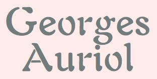 George A Rebours and Georges Labeur Corps 8 (Ivan Louette). An impeccable reproduction of Georges Auriol's first typeface, a precursor of the iconic art nouveau typeface Auriol. George A Rebours and Georges Labeur Corps 8 (Ivan Louette). An impeccable reproduction of Georges Auriol's first typeface, a precursor of the iconic art nouveau typeface Auriol.
| Slab serif typefaces:  Ansley Display (Kady Jesko). Ansley Display (Kady Jesko).  Bariol Serif (Atipo). This wonderful rounded typeface family accompanies the sans family Bariol (2012) and is specifically designed for screen, mobile applications and the web. Two weights are tweetware, and the others are donationware. Bariol Serif (Atipo). This wonderful rounded typeface family accompanies the sans family Bariol (2012) and is specifically designed for screen, mobile applications and the web. Two weights are tweetware, and the others are donationware.
| | Copperplate: | | Wood type revivals: | Letterpress emulation:  Bernier (Ryan Pyae). Bernier (Ryan Pyae). - Cocogoose Letterpress (Cosimo Lorenzo Pancini at Zetafonts). Great design---too bad the free version is crippled (no numerals).
| Didone typefaces:  Libre Bodoni (Pablo Impallari and Rodrigo Fuenzalida). Based on Morris Fuller Benton's Bodoni types, this 4-style family was developed in 2014 and published in 2015 by Open Font Library. Libre Bodoni (Pablo Impallari and Rodrigo Fuenzalida). Based on Morris Fuller Benton's Bodoni types, this 4-style family was developed in 2014 and published in 2015 by Open Font Library.  Chonburi (Cadson Demak). Covers Latin and Thai. Chonburi (Cadson Demak). Covers Latin and Thai.  Goral (Ofir Shavit). A 12-style Peignotian (sans) and didone (serif) typeface family, which was made with his own software, FontArk. Goral (Ofir Shavit). A 12-style Peignotian (sans) and didone (serif) typeface family, which was made with his own software, FontArk. - Burlesque (Fernando Paravela). In the fat face style, this typeface has great carved out design details.
| | Fashion mag typefaces: | | Stencil typefaces: | Multilingual typefaces:  Catamaran (Pria Ravichandran, Google Fonts). This family covers Latin and Tamil. Catamaran (Pria Ravichandran, Google Fonts). This family covers Latin and Tamil. 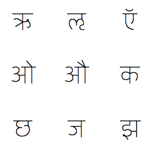 Yantramanav (Erin McLaughlin, Google Web Fonts) is a Devanagari typeface family designed to accompany Christian Robertson's Roboto. Yantramanav (Erin McLaughlin, Google Web Fonts) is a Devanagari typeface family designed to accompany Christian Robertson's Roboto. - Shumi (Ivan Shumikhin). A macho octagonal typeface for Latin and Cyrillic.
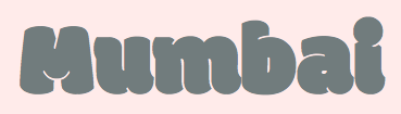 Modak (Ek Type; Google Fonts). The chubbiest bubblegumiest Devanagari typeface in existence today. Modak Devanagari was designed by Sarang Kulkarni and Maithili Shingre and Modak Latin by Noopur Datye with support from Girish Dalvi and Pradnya Naik. Modak (Ek Type; Google Fonts). The chubbiest bubblegumiest Devanagari typeface in existence today. Modak Devanagari was designed by Sarang Kulkarni and Maithili Shingre and Modak Latin by Noopur Datye with support from Girish Dalvi and Pradnya Naik.
| Wonderful, adorable, refreshing typefaces:  Iosevka (Belleve Invis). This monospaced programming font for Latin, Greek and Cyrillic is generated by code using the parametric paradigm. A tour de force. Iosevka (Belleve Invis). This monospaced programming font for Latin, Greek and Cyrillic is generated by code using the parametric paradigm. A tour de force.
| [Google]
[More] ⦿
|

 Miasto (
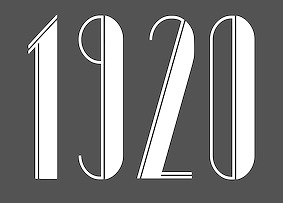
 Voltaire (
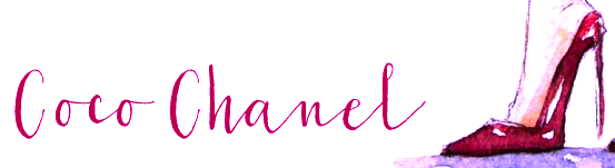

 Biplo (
 Magellan (


 Sen (
Sen (

