Text typefaces: 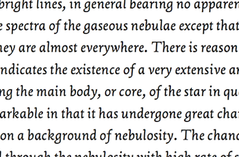 Cambium (James Todd). Based on roman inscriptional lettering. Cambium (James Todd). Based on roman inscriptional lettering.  Goluska (Rod McDonald and Canada Type). A text typeface inspired by Dwiggins and named after Glenn Goluska. Goluska (Rod McDonald and Canada Type). A text typeface inspired by Dwiggins and named after Glenn Goluska. 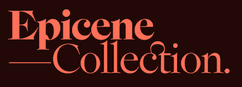 Epicene Text & Display (Dave Foster and Noe Blanco, KLIM Type). Epicene Text & Display (Dave Foster and Noe Blanco, KLIM Type). 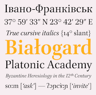 Brill (+Greek, + Cyrillic) (Tiro Typeworks: John Hudson, Alice Savoie, Paul Hanslow and Karsten Luecke). Started as a custom typeface in 2011, it went finally retail in 2021. Brill (+Greek, + Cyrillic) (Tiro Typeworks: John Hudson, Alice Savoie, Paul Hanslow and Karsten Luecke). Started as a custom typeface in 2011, it went finally retail in 2021. 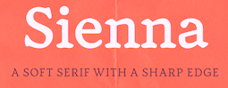 Sienna (Paulo Goode). Sienna (Paulo Goode).  Indigo Antiqua 2 (Johan Ström). Indigo Antiqua 2 (Johan Ström).  Capricho (Dieter Hofrichter). In the style of the post-Romain du Roi period. Capricho (Dieter Hofrichter). In the style of the post-Romain du Roi period. 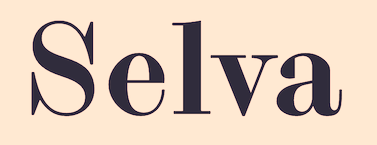 Selva (Fanny Hamelin at Colophon). A Scotch roman and accompanying script. Selva (Fanny Hamelin at Colophon). A Scotch roman and accompanying script.  Avona Serif (Alanna Munro). Avona Serif (Alanna Munro). |
Sans typefaces:  Adapt (Supertype). Adapt (Supertype). ![]() Escalator and Elevator (Jesse M. Ragan). Two geometric sans families. Escalator and Elevator (Jesse M. Ragan). Two geometric sans families.  Urbanist (Corey Hu). A geometric sans family, together with two variable fonts. Urbanist (Corey Hu). A geometric sans family, together with two variable fonts.  Grato and Gratimo (Mona Franz and Jakob Runge, TypeMates). Grato and Gratimo (Mona Franz and Jakob Runge, TypeMates).  Muoto (Matthieu Cortat, Anthony Franklin and Sander Vermeulen). Muoto (Matthieu Cortat, Anthony Franklin and Sander Vermeulen).  ABC Gravity (Robert Janes at Dinamo). With a variable font and styles that vary from wide to compressed. ABC Gravity (Robert Janes at Dinamo). With a variable font and styles that vary from wide to compressed.  Ingeo (Juan Luis Blanco). Ingeo (Juan Luis Blanco). 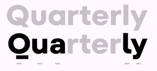 TT Fors (Antonina Zhulkova, Pavel Emelyanov and Yulia Gonina). TT Fors (Antonina Zhulkova, Pavel Emelyanov and Yulia Gonina).  Code Next. A 20-style geometric sans by Svetoslav Simov, Mirela Belova and Stan Partalev. Code Next. A 20-style geometric sans by Svetoslav Simov, Mirela Belova and Stan Partalev.  Otterco (Adam Ladd). A 32-style condensed geometric sans. Otterco (Adam Ladd). A 32-style condensed geometric sans. 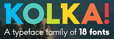 Kolka (Andrejs Kirma). Kolka (Andrejs Kirma). 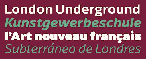 Arpona Sans (Felix Braden). A 20-style humanist sans with rhombic tittles. Arpona Sans (Felix Braden). A 20-style humanist sans with rhombic tittles. 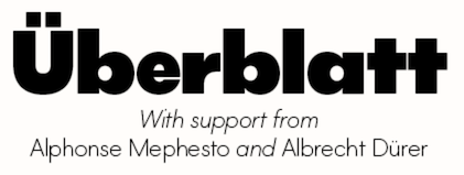 Lightbox21 (Ben Jones, Protimient). Lightbox21 (Ben Jones, Protimient). 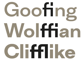 Inklination (Eduardo Manso). Inklination (Eduardo Manso).  Apparat (Botio Nikoltchev). Apparat (Botio Nikoltchev). |
Rounded sans typefaces: 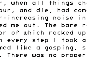 Graut (Arve Båtevik). Graut (Arve Båtevik). 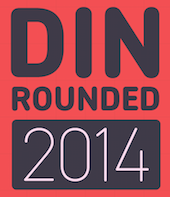 DIN 2014 Rounded (Isabella Chaeva, Vasily Biryukov and Alexander Lubovenko at Paratype). DIN 2014 Rounded (Isabella Chaeva, Vasily Biryukov and Alexander Lubovenko at Paratype).  GT Maru (Thierry Blancpain for Grilli Type). Exporting Japanese roundness. GT Maru (Thierry Blancpain for Grilli Type). Exporting Japanese roundness. |
| Type systems: |
Art deco typefaces: 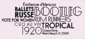 Interbellum (Kristof Van Proeyen). Interbellum (Kristof Van Proeyen).  Parafina (Mario Feliciano). Parafina (Mario Feliciano). 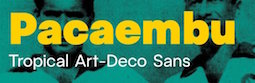 Pacaembu. Advertized as a tropical art deco sans, this seven-style sans serif typeface by Alvaro Franca and Felipe Casaprima finds its roots in Brazilian soccer. Pacaembu. Advertized as a tropical art deco sans, this seven-style sans serif typeface by Alvaro Franca and Felipe Casaprima finds its roots in Brazilian soccer.  Sharf (Barbara Bigosinska, Blast Foundry). Sharf (Barbara Bigosinska, Blast Foundry).  Tankobon (Studio Aurora). Tankobon (Studio Aurora). |
| Hipster typefaces: |
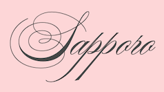
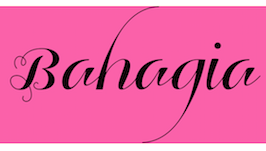
| Script typefaces: |
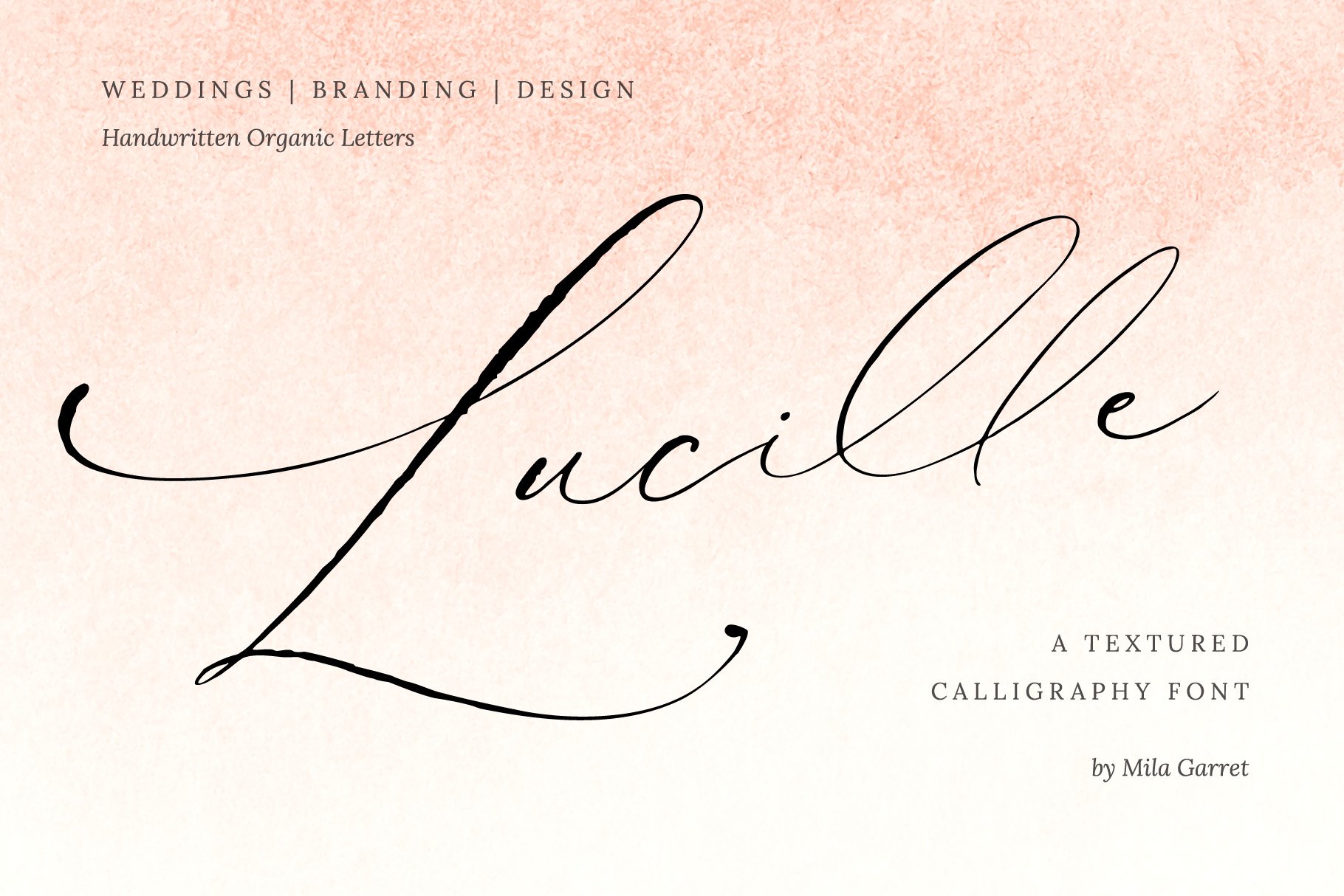
| Calligraphic typefaces: |
| Brush typefaces: |
| Sketched, Layered or Poster typefaces: |
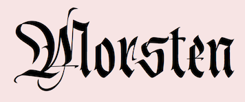
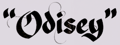
| Blackletter typefaces: |
| Dingbats and ornaments: |
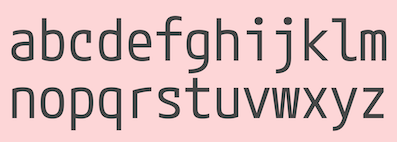
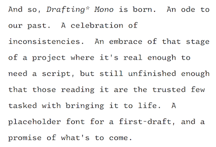
| Programming fonts or typewriter type: |
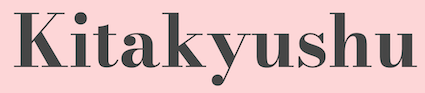
Garalde typefaces:  Graveur (Juanjo Lopez). Based on Robert Granjon's typefaces at the Plantin-Moretus Museum in Antwerp. Graveur (Juanjo Lopez). Based on Robert Granjon's typefaces at the Plantin-Moretus Museum in Antwerp.  Chassi (Rui Abreu). Chassi (Rui Abreu).  Change Serif (Mateusz Machalski). Change Serif (Mateusz Machalski). |
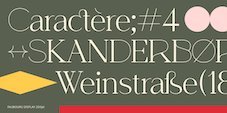
Display typefaces:  Miju (Jérémie Gauthier). Miju (Jérémie Gauthier). 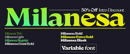 Milanesa Serif (Andres Felipe Ramirez at Vastago, published by Sudtipos). Milanesa Serif (Andres Felipe Ramirez at Vastago, published by Sudtipos).  Northway (Damelev Studio). Northway (Damelev Studio).  Eliptico (Tien-Min Liao). Eliptico (Tien-Min Liao). 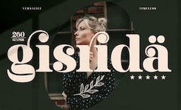 Gisrida (Storytype). Gisrida (Storytype).  Kolligio (Khair Unnas). Kolligio (Khair Unnas).  West (Daniel Perraudin, Fontwerk). West (Daniel Perraudin, Fontwerk).  PP Eiko (Caio Kondo for Pangram Pangram). PP Eiko (Caio Kondo for Pangram Pangram).  Granblue (Diana Ovezea). Granblue (Diana Ovezea).  Lucette Black (Alice Savoie). Lucette Black (Alice Savoie).  Monumentum (Eugene Bunin). Monumentum (Eugene Bunin). 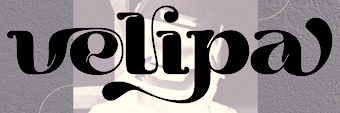 Burgie (Alit Suarnegara). Burgie (Alit Suarnegara).  Procerus (Ceyrun Birinci). An 18-style ultra-compressed movie credit font family. Procerus (Ceyrun Birinci). An 18-style ultra-compressed movie credit font family.  Nyck (Marko Hrastivec, Hot Type). A fun display family inspired by Josef Tyfa and Addison Dwiggins. Nyck (Marko Hrastivec, Hot Type). A fun display family inspired by Josef Tyfa and Addison Dwiggins.  Kofffi (Ryan Thomas). Kofffi (Ryan Thomas). 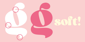 Geeeki Soft (Ryan Thomas). Geeeki Soft (Ryan Thomas).  Hugh (Wisnu Cipto Wibowo, Fateh Lab). Hugh (Wisnu Cipto Wibowo, Fateh Lab). |
Slab serif typefaces: 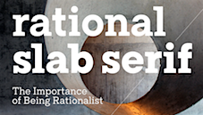 TT Rationalist (Marina Khodak and the TypeType Team). TT Rationalist (Marina Khodak and the TypeType Team). 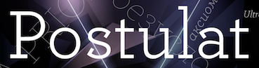 Postulat (Alexey Chekulaev at Paratype). A 16-style geometric slab serif. Postulat (Alexey Chekulaev at Paratype). A 16-style geometric slab serif. 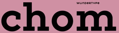 Chom (Stawix Ruecha). Chom (Stawix Ruecha). |
| Copperplate: |
Wood type revivals:  Paraiso (Lucas Descroix). Paraiso (Lucas Descroix). 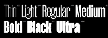 Manuka (Dave Foster and Noe Blanco, KLIM). Compressed typefaces for large sizes. Described by Klim Type: With deviant details pilfered from Teutonic timber type, Manuka grafts a contemporary antipodean aesthetic onto 19th century German root-stock. Tight spacing, closed apertures and sharp joins make a compelling texture, like sunlight sparkling through a forest canopy. Manuka (Dave Foster and Noe Blanco, KLIM). Compressed typefaces for large sizes. Described by Klim Type: With deviant details pilfered from Teutonic timber type, Manuka grafts a contemporary antipodean aesthetic onto 19th century German root-stock. Tight spacing, closed apertures and sharp joins make a compelling texture, like sunlight sparkling through a forest canopy. |
| Letterpress emulation: |
Didone typefaces:  NN Didot Moderne (Arnaud Chemin at Nouvelle Noire). NN Didot Moderne (Arnaud Chemin at Nouvelle Noire).  Fiona Pro (Sebastian Hilgetag). An extra-condensed set of fonts. Fiona Pro (Sebastian Hilgetag). An extra-condensed set of fonts.  Bw Pose (Alberto Romanos). Bw Pose (Alberto Romanos).  Magari (Alejandro Paul). In the fat face and Normande genres. Magari (Alejandro Paul). In the fat face and Normande genres. |
| Baroque typefaces: |
| Fashion mag typefaces: |
Revivals: - Companion Old Style (Steve Matteson). A revival of Frederic Goudy's Companion Old Style (1927). .
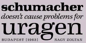 Margaret Neue (Tibor Szikora). After Zoltan Nagy's Margaret (1963). Margaret Neue (Tibor Szikora). After Zoltan Nagy's Margaret (1963).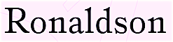 Ronaldson Pro (Patrick Griffin at Canada Type). A revival and extension of Alexander Kay's Ronaldson Old Style (1884, MacKellar, Smiths and Jordan, Philadelphia, PA), which is widely viewed as America's first original text typeface. Ronaldson Pro (Patrick Griffin at Canada Type). A revival and extension of Alexander Kay's Ronaldson Old Style (1884, MacKellar, Smiths and Jordan, Philadelphia, PA), which is widely viewed as America's first original text typeface. 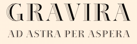 Gravira (Ralph M. Unger). A revival of Herbert Thannhaeuser's Gravira from 1935. Gravira (Ralph M. Unger). A revival of Herbert Thannhaeuser's Gravira from 1935.  LaFarge (Gregory Shutters). Reviving (and extending to 15 styles) the historic mosaic titling capitals found in the New York City Subway, designed by architect Squire J. Vickers and his staff between 1915-1927. LaFarge (Gregory Shutters). Reviving (and extending to 15 styles) the historic mosaic titling capitals found in the New York City Subway, designed by architect Squire J. Vickers and his staff between 1915-1927.  Neon Nbl (Alessandro Colizzi for, CAST). A revival of Giulio da Milano's Neon (1933-1934, at Nebiolo). Neon Nbl (Alessandro Colizzi for, CAST). A revival of Giulio da Milano's Neon (1933-1934, at Nebiolo).  Tuppence (Roberto de Vicq de Cumptich). A revival of the Victorian typeface Blackfriars (1910, Stephenson Blake). Tuppence (Roberto de Vicq de Cumptich). A revival of the Victorian typeface Blackfriars (1910, Stephenson Blake).  Tekst (Lewis McGuffie). A revival and extension of the famous Russian book typeface Literaturnaya. Tekst (Lewis McGuffie). A revival and extension of the famous Russian book typeface Literaturnaya. 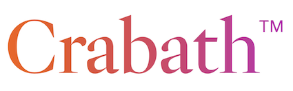 Crabath (Tomas Brousil). Rather an exponential expansion than a revival, this 72-strong family is based on the 1761 specimen book of Czech typefounder Vaclav Jan Krabat. Crabath (Tomas Brousil). Rather an exponential expansion than a revival, this 72-strong family is based on the 1761 specimen book of Czech typefounder Vaclav Jan Krabat.  P22 Graciosa (Matthias Beck). P22 Graciosa (Matthias Beck).  Mercure (Charles Mazé at Abyme). Mercure is based in part on Beaudoire's Elzevir, and also goes back to the epigraphic origins of Perrin's Augustaux. Mercure (Charles Mazé at Abyme). Mercure is based in part on Beaudoire's Elzevir, and also goes back to the epigraphic origins of Perrin's Augustaux.  Oceanwide (Dave Lawrence). A revival and modification of a forgotten geometric sans by Adrian Frutiger for British Petroleum. Oceanwide (Dave Lawrence). A revival and modification of a forgotten geometric sans by Adrian Frutiger for British Petroleum. ![]() P22 Glaser Houdini (Richard Kegler). A layerable family, after Milton Glaser's Houdini from 1964. P22 Glaser Houdini (Richard Kegler). A layerable family, after Milton Glaser's Houdini from 1964.  Werner (Claudio Rocha, Now Type). A revival of A.D. Werner's art deco inline typeface Dubbeldik (1972, Mecanorma). Werner (Claudio Rocha, Now Type). A revival of A.D. Werner's art deco inline typeface Dubbeldik (1972, Mecanorma).  Normandia (Patrick Griffin and Hans van Maanen at Canada Type). This revives Alessandro Butti's fatface Normandia (1946-1949, at Nebiolo). Normandia (Patrick Griffin and Hans van Maanen at Canada Type). This revives Alessandro Butti's fatface Normandia (1946-1949, at Nebiolo).  Orla (Pedro Leal, DSType). Based on Skeleton Antique No2 by Stephenson Blake. Orla (Pedro Leal, DSType). Based on Skeleton Antique No2 by Stephenson Blake.  P22 Underground Pro by Richard Kegler (1997), Paul D. Hunt (2007), Dave Farey (2021), James Todd (2021) and Patrick Griffin (2021). The ultimate implementation of Johnston's Underground? P22 Underground Pro by Richard Kegler (1997), Paul D. Hunt (2007), Dave Farey (2021), James Todd (2021) and Patrick Griffin (2021). The ultimate implementation of Johnston's Underground? |
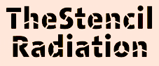
| Stencil typefaces: |
Variable fonts:  Baikal. A 132-style Swss sans by Ian Party (Newglyph). Baikal. A 132-style Swss sans by Ian Party (Newglyph).  GT Ultra (Noël Leu, Grilli Type). A sans and serif family with three axes---weight, italic angle and contrast. GT Ultra (Noël Leu, Grilli Type). A sans and serif family with three axes---weight, italic angle and contrast.  Flexible (Art Grootfontein). Flexible (Art Grootfontein).  Seiva (Fabio Haag Type). Seiva (Fabio Haag Type). ![]() Stadio Now (2020). A revival by the Zetafonts team of Aldo Novarese's Stadio (1974), a reverse contrast sans that was published only as a rub-on transfer typeface. It comes with a multi-axis variable font that greatly enlarges the design space. Stadio Now (2020). A revival by the Zetafonts team of Aldo Novarese's Stadio (1974), a reverse contrast sans that was published only as a rub-on transfer typeface. It comes with a multi-axis variable font that greatly enlarges the design space.  PF DIN Max (Panos Vassiliou). With weight, width and italic axes, this superfamily covers Latin, Greek and Cyrillic. PF DIN Max (Panos Vassiliou). With weight, width and italic axes, this superfamily covers Latin, Greek and Cyrillic.  Garet (Stan Partalev and Mirela Belova at Spacetype). Garet (Stan Partalev and Mirela Belova at Spacetype). |
Multilingual typefaces:  Kairouan (Tarek Alsawwa). Kairouan (Tarek Alsawwa).  Tashweeq (Mostafa El Abasiry). Tashweeq (Mostafa El Abasiry).  Dardashah (Mostafa El Abasiry). Dardashah (Mostafa El Abasiry).  Awesome Pro (Diab Jaser). Awesome Pro (Diab Jaser).  Ploni (Avraham Cornfeld). An 8-style geometric sans designed for simultaneous use of Latin, Hebrew and Cyrillic. Ploni (Avraham Cornfeld). An 8-style geometric sans designed for simultaneous use of Latin, Hebrew and Cyrillic.  Waon Pro (Kazuo Kanai). Harmonizing Latin and Japanese. Waon Pro (Kazuo Kanai). Harmonizing Latin and Japanese. | Wonderful, adorable, refreshing typefaces: 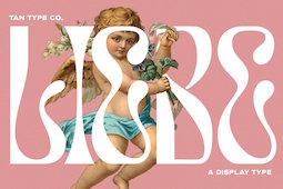 Liebe (Tan Type). In the art nouveau-inspired intestinal style that characterized 2021. Liebe (Tan Type). In the art nouveau-inspired intestinal style that characterized 2021.  Bumpy (Beatrice Caciotti). Bumpy (Beatrice Caciotti).  Nellie Display (Break Maiden). Nellie Display (Break Maiden).  Astronef Super (Jean-François Porchez). Astronef Super (Jean-François Porchez). 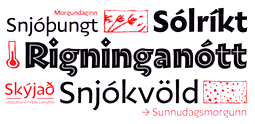 PGF Americas (Pedro Gonzalez). Lifting the carved lettering of Rudolf Koch to new heights. PGF Americas (Pedro Gonzalez). Lifting the carved lettering of Rudolf Koch to new heights. 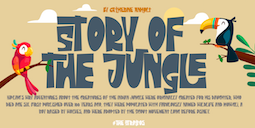 The Strattos (Suandana ipandemade). The Strattos (Suandana ipandemade). 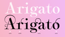 Plethora (Alejandro Paul). A variable font family influenced by Julius Herriet Sr.'s Old Style Ornamented. Plethora (Alejandro Paul). A variable font family influenced by Julius Herriet Sr.'s Old Style Ornamented. 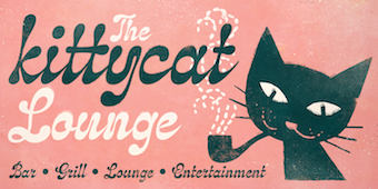 Klangfarbe Script (Mott Jordan). Klangfarbe Script (Mott Jordan). |
[
 This is my own selection of the best commercial typefaces published in 2021, grouped by category. The list will grow until December 31, 2021.


 This is my own selection of the best free typefaces published in 2021, grouped by category. The list will grow until December 31, 2021.