I dedicated a little project to my daughter, Birgit. It involved the creation of an analytic font for connected handwriting and other purposes. The letters would have to fit together nicely, for which I had to address questions of continuity and carefully selected derivatives. The glyphs themselves evolved from analytical descriptions (basically, I typed in each coordinate of each outline by hand based on a paper drawing), and I used a small semi-language to provide instructions. The letters are not described by outlines, but centerlines. Various pens are placed around the centerline to create various effects. The metrics files were carefully generated by the same PostScript program used to create the fonts. Oh, and sorry, but these fonts are in type 3, and are only useful in PostScript files (for printers, and in ghostscript or Acrobat) or in TEX/LATEX environments or in X-Windows on UNIX/Linux. Enjoy.
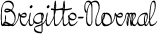
| Brigitte-Normal | |
The Brigitte series has connected handwriting, and all accents for use in European languages. | PFA file | AFM file | TFM file | ZIP file | |
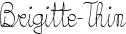
| Brigitte-Thin | |
Note how the connections remain intact even for thin strokes. | PFA file | AFM file | TFM file | ZIP file | |
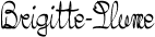
| Brigitte-Plume | |
Same story for any angle of the nib of a pen. | PFA file | AFM file | TFM file | ZIP file | |
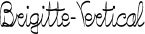
| Brigitte-Vertical | |
| PFA file | AFM file | TFM file | ZIP file | |
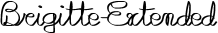
| Brigitte-Extended | |
| PFA file | AFM file | TFM file | ZIP file | |
| Birke |  |
Birke was the forerunner of Brigitte. I am showing it to prove how necessary it was in this case to try and make the letters connect. | PFA file | AFM file | TFM file | ZIP file | |
| Birke-Accent | 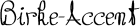 |
Oh, and Birke is what we call Birgit at home. | PFA file | AFM file | TFM file | ZIP file | |
| Birgit-Ballpoint |  |
The Birgit font was analytic too, and was my attempt at creating an unusual sans-serif font. Considering that each centerline of each glyph was keyed in by hand, not a bad attempt. The different weights are obtained by combinations of pen nibs, stroke thicknesses and character compressions and transformations. | PFA file | AFM file | TFM file | ZIP file | |
| Birgit-Black |  |
A nib with a very heavy contrast creates a severe face. | PFA file | AFM file | TFM file | ZIP file | |
| Birgit-Bold | 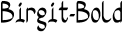 |
This nib ratio between thickest and thinnest side is much better and softer. | PFA file | AFM file | TFM file | ZIP file | |
| Birgit-BoldItalic | 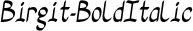 |
Not a true italic--I should have called this Oblique, as the letters were only tilted. | PFA file | AFM file | TFM file | ZIP file | |
| Birgit-Extended |  |
Extending the letters may have applications in some ads and headlines. | PFA file | AFM file | TFM file | ZIP file | |
| Birgit-Hairline |  |
Try using regular or medium weights with hairline weights in some text. It can make quite a visual impact. It is like shouting and whispering. | PFA file | AFM file | TFM file | ZIP file | |
| Birgit-Medium | 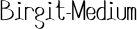 |
Good weight, nice pace of the characters. | PFA file | AFM file | TFM file | ZIP file | |
| Birgit-Normal |  |
| PFA file | AFM file | TFM file | ZIP file | |
| Birgit-OK | 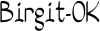 |
| PFA file | AFM file | TFM file | ZIP file | |
| Birgit-OKItalic | 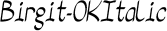 |
| PFA file | AFM file | TFM file | ZIP file | |
| Birgit-OKSmallCaps |  |
Great for envelopes. | PFA file | AFM file | TFM file | ZIP file | |
| Birgit-Thin |  |
| PFA file | AFM file | TFM file | ZIP file | |
| Birgit-Vertical | 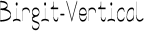 |
| PFA file | AFM file | TFM file | ZIP file | |
Luc Devroye
School of Computer Science
McGill University
Montreal, Canada H3A 2K6
luc@cs.mcgill.ca
http://jeff.cs.mcgill.ca/~luc