
Commentary
December 20, 2002
Bruce Type Foundry
History
![]()
Perhaps the history is best told by Maurice
Annenberg, from whom I cite:
[British period.]
"This type foundry is another example of a tail wagging the dog;
stereotyping was prior to type founding.
David and George Bruce, who with Edwin Starr were the
embryos from which this plant was developed were both born in
Scotland, with David, date of birth December 12, 1770, being
eleven years older than his brother. David's early yearning was to
become a sailor but an initial cruise cured him of the desire when he
was impressed into the English navy under Admiral Howe, serving
in the Channel Fleet.
At nineteen he returned to Scotland and was fortunate to receive
an apprenticeship in the King's printing office. Upon completion of
his training he decided to emigrate to the United States, and with his
parent's approval he reached New York in 1793. He found printing
at a low ebb in this city of 10,000. All type was imported from either
England or Scotland, as well as most of the paper and ink. The only
work he could find was as a pressman on a newspaper, and realizing
the lack of opportunities he moved to Philadelphia the following
year, working in the plant of Hall and Sellers, successors to Franklin
and Hall.
David had another brother, John, who had been drafted to fight
in the Napoleonic Wars in Egypt. George, the remaining and
youngest brother, was approaching an age where under English laws
he could be drafted to serve in the army or navy. The family made a
quick decision. His baggage was packed, and at the age of fourteen
he was shipped to Philadelphia to join his brother David, in 1795."
[New immigrants in the United States.]
Annenberg continues:
"He was first apprenticed to a bookbinder, but in a few months
left that work to learn the printing trade in the print shop of Thomas
Dobson, and later as a pressman at the Philadelphia Gazette. In
1798, as yellow fever was ravaging the Philadelphia area, both
brothers fled north and returned to New York, first stopping in
Albany where they worked on the Centinal newspaper, then back to
New York City where George was employed as a printer on the Daily
Advertiser, and David divided his time between any plant in the area
that needed an all-around journeyman.
By 1806 they had pooled enough money to start their own
printing business, providing excellent work at competitive prices
using a new method of dry-pressing sheets instead of doing this work
at a bookbinder. In a short time they had more work than they could
handle, at one time continuously operating nine Ramage presses,
and becoming the largest plant in the city."
[Invention of stereotyping.]
"Word of the experiments and work with stereotyping of John
Watts fascinated David and in 1812 he determined to find more
information about the new craft. He sailed for England to acquire
knowledge from Charles Mahon, third Earl of Stanhope, who had
introduced stereotyping into England, although he was not the inventor. The Earl refused to reveal the secret of the invention, but David
secured enough information from a former employee of Foulis and
Tilloch, who were making stereotypes in Scotland as early as 1794,
to return to New York and start his own experimenting. He started
commercial stereotyping in 1814, subsequently inventing a new
method to make plates level by a machine to plane the backs. He then
proceeded to make plates for other printers and publishers as well as
for his own use.
Type founders imagined that the new process would interfere
with their business and refused to furnish the high spaces and quads
for better molding. Their actions caused him to decide to enter the
type founding business, and with the help of Edwin Starr, our little
industrial espionage genius (q. v. White Type Foundry) he was soon
in full operation. For a short period the firm name was Bruce & Starr.
Business expanded rapidly. Printers liked their product and in
1816 the brothers discarded the printing business to devote full time
to type founding and stereotyping under the name of
D. & G. Bruce, Letter-founders. Their first specimen book, 11 leaves, appeared
around 1815."
[David's death.]
"David retired in 1822, and except for a short period in 1824
when he returned to the plant to experiment with newer methods of
casting type, was content to leave his brother George own and run the
business with David Wolfe Bruce, son of George, and the part-time
help of David Bruce, Jr. when he was not experimenting on newer
methods of casting type with automatic machines. The original
partnership had been dissolved in 1820; in 1822 due to the volume of
work in the type founding division it was decided to sell the
stereotyping section. David died in 1857 at the age of eighty-seven."
[Standardization of type sizes.]
"George Bruce is credited with being the first in America to
attempt standardization of sizes in the manufacture of type. At that
period each type foundry had established their own standards and
type of one foundry would not be equal in size to another foundry .
His idea was fifty years early and was not accepted by other foundries until Nelson Crocker Hawks persuaded the Marder, Luse & Co.
to standardize sizes after the Chicago fire of 1871."
[George's death.]
"George developed
to become a designer and punchcutter of many useful and
beautiful faces of type, and at the late age of seventy-eight was still
cutting punches. He died in 1866 at the age of eighty-five."
[David Bruce Jr.]
"David Bruce, Jr. was in and out of the plant. Originally
apprenticed to the plant of William Fry of Philadelphia, at that time the
foremost printer in the United States, he ran away to return to his
father's plant where he had been formerly employed in different
divisions. He remained long enough to thoroughly learn the trade as
a letter-cutter, matrix-fixer, and caster, then in 1828 went to Albany
to take charge of a type foundry, and during the same year improved
and repaired some discarded punches at the Boston Type &
Stereotype Foundry. He returned to New York City in 1831 to the
renamed plant of George Bruce & Co., remaining until he retired in
1834.
He was obsessed with the idea of inventing a faster method of
casting type, and at that period everyone was trying to invent a faster
method of either casting or setting type. His first type casting'
machine was patented in March 1838 and sold to and used by his
uncle George until 1845. Meanwhile, he had patented another
machine in 1843 which he also first offered to his uncle. This was
rejected, so the invention was demonstrated and used in the plant of
the Boston Type & Stereotype Co. Through that plant's encouragement the invention became a success and was soon in general use in
all American and European type foundries. William Hagar of the
Hagar Type Foundry in New York City became international distributor with the exception of foundries along the East coast."
[David Wolfe Bruce]
"David Wolfe Bruce, son of George Bruce, who always fancied
himself as a patron of the arts, took over management of the plant
upon the death of his father in 1866. The Civil War was just over, the
industrial and mechanization period had just started, and there was a
great demand for type and printing machinery. Everyone was experimenting with mechanized methods of setting type and the Bruce
foundry furnished special types that could be used in machinery that
would eliminate hand typesetting.
In 1878 he conceived the idea of incorporating his friend Theodore Low De Vinne's book, The Invention of Printing, as an addenda
to his type catalog and it was bound in as an additional 168 leaves.
The idea was repeated in 1882 and David always termed this catalog
the crowning work of his career.
Mr. Bruce retired in 1890, disposing of his stock and the
good-will to three long-time employees, Harry M. Hall, Vilinder B.
Munson, and Robert Lindsay. He died in 1895."
[The demise of the foundry.]
"Robert Lindsay died shortly afterwards and the company operated under the name of V. B. Munson ,successor to George Bruce's
Son & Co. The company started into a business decline. In 1892 they
had refused to join the American Type Founders Company in their
consolidation plan and continued to operate as an independent until
1900 when it was finally purchased by the ATF. They operated as a
separate branch until 1906 when the machinery was dismantled and
moved to the new plant in Jersey City.
Around 1899 the company had issued a 448 page catalog using
the name Munson. The next year they issued a 592 page catalog
under the name of Bruce Type Foundry. Those pages that have the
imprint "V. B. Munson, successor" are types that were manufactured by Bruce; those minus the name of Munson were made by other
ATF divisions."
The Bruce Type Foundry in New York was founded in 1813,
and lasted until 1901, when it was acquired by ATF.
It has a colorful history [do I hear movie?],
and plays a pivotal role in the history of typography
through its introduction and
improvement of the stereotyping process.
I checked them out in McGill's Colgate collection,
and found their specimen book extremely well-done and
carefully prepared. Judging from the production,
the Bruce brothers must have been true perfectionists.
For all these reasons, I thought that it would be nice to have
a web page dedicated to Bruce.
George Bruce as a man
George Bruce was a man of great integrity.
George was mainly concerned with type-founding,
while his brother David was preoccupied by stereotyping.
When David's health failed, George spent all his energy on
type-founding, and introduced valuable improvements into
the business. He cut his own punches,
made many new beautiful designs, and
paid a lot of attention to the size of the body of the type relative
to the size of the letters.
Quoting from
George Bruce's biography,
"The last set of punches he cut was for a great primer script. He was at the time in his seventy-eighth year, but for beauty of design and neatness of finish, the type in question has rarely been excelled. Mr. Bruce was a man of large benevolence, of unflinching integrity, and great decision of character. He was president for many years of the Mechanics' institute, and of the type-founders' association, and an active member of. and contributor to, the historical society, St. Andrew's society, the typographical society, and the general society of mechanics and tradesmen."
Modern day fonts
There are a few foundries that
offer versions of Bruce originals.
A partial list:
One can always check MyFonts
for updates to this list.
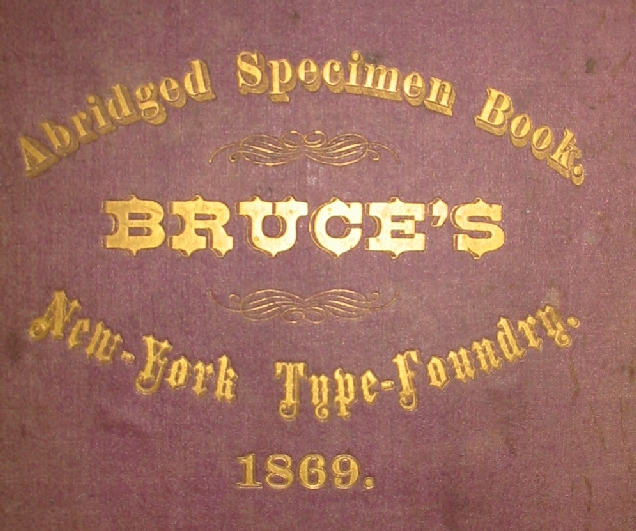
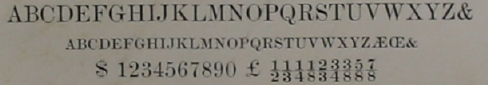
The 1869 catalog
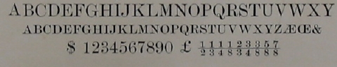
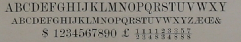
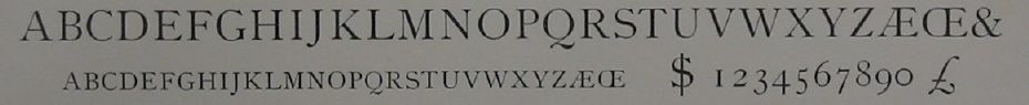
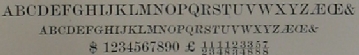
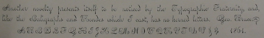
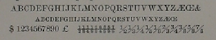
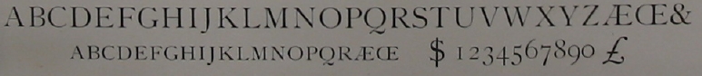
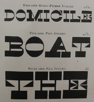
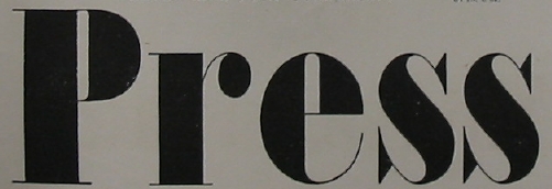
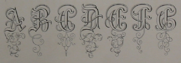
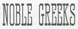
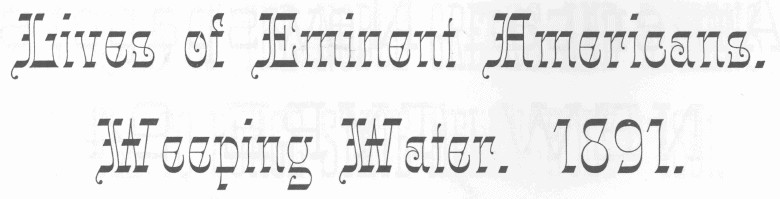
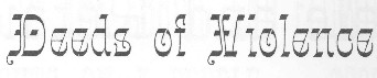
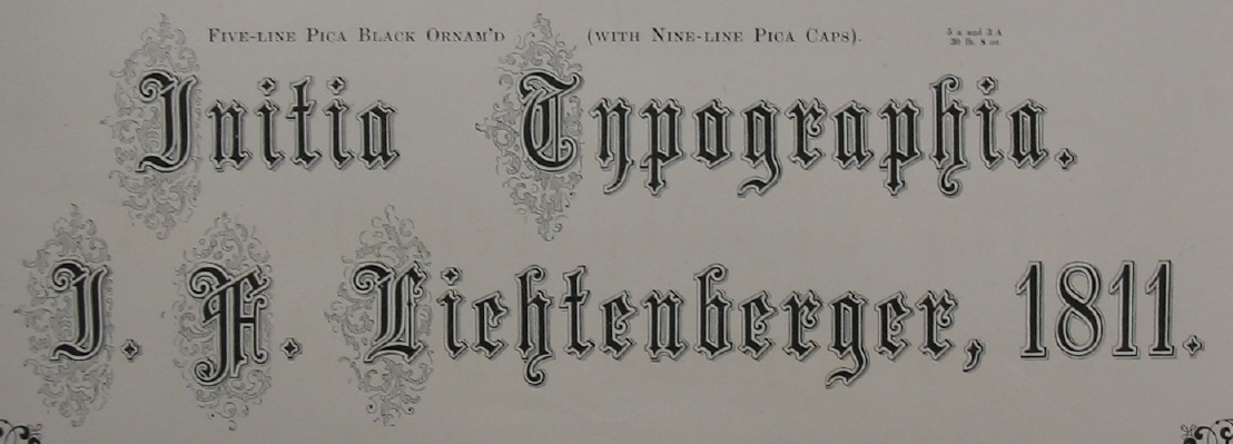
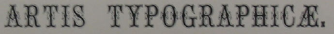
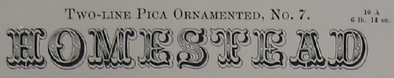
In this section, I will merely show some pictures of
their typefaces, taken from the 1869
catalog "An abridged specimen book
Bruce's New York Type Foundry".
That catalog has some vignettes as well. It
is characterized by an impressive number of
ornamented types, many of which have yet to be
discovered by the digital media. Some pictures are
shown in the next section.
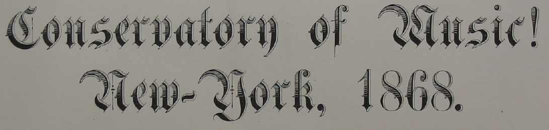
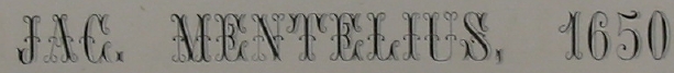
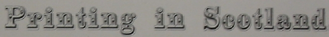
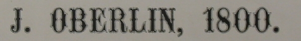
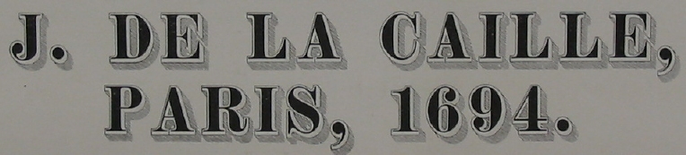
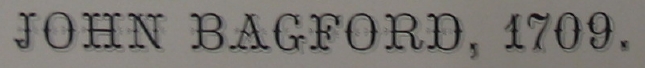
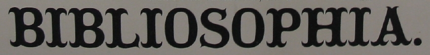
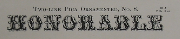
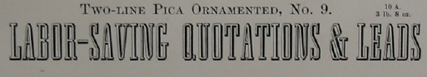
Antique No. 311.
Double Small Pica No. 20.
Double Pica Graphotype.
Double Pica Title Extended.
English No. 16.
English No. 19.
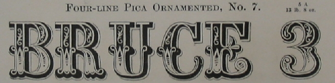
Four Line Pica Condensed.
Great Primer No. 20.
Heavyface Long Primer No. 13.
Italian Secretary.
Large Face Brevier No. 14.
Modern Old Style Great Primer No. 20.
Modern Old Style Double Small Pica No. 20.
Pica Antique No. 2.
Two-Line Great Primer Italian, Five-Line Pica Italian, and Seven-Line Pica Italian.
Pica Italic Hairline.
Pica No. 18.
Seven Line Pica Condensed.


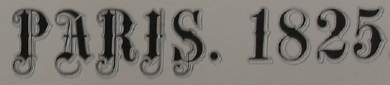
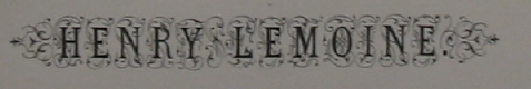
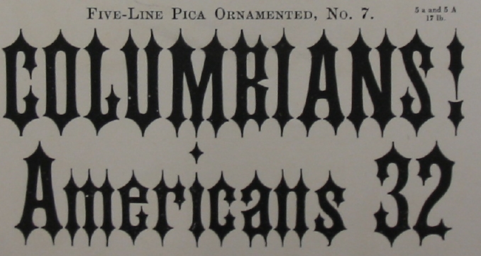
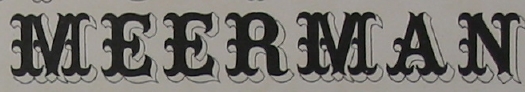
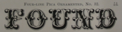
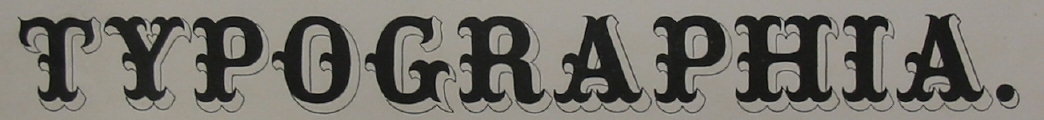
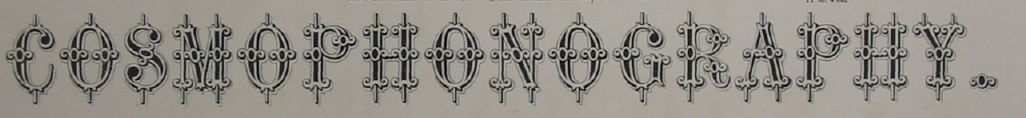
Ornamented types
Bourgeois Ornamented No. 21.
Canon Black Rim Shaded.
Canon Teutonic Ornamented.
Double English Ornamented No. 14.
Double Pica Ornamented No. 17.
Double Pica Ornamented No. 32.
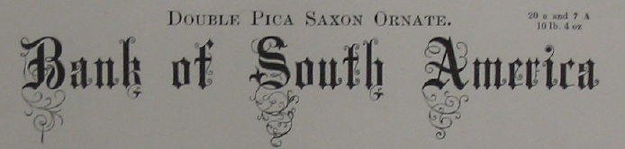
Double Pica Saxon Ornate.
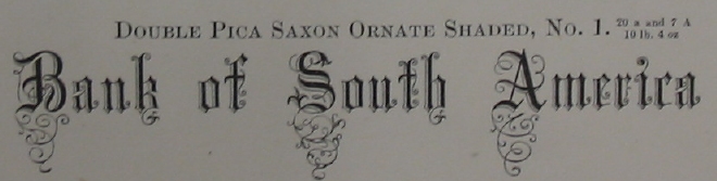
Double Pica Saxon Ornate Shaded No. 1.
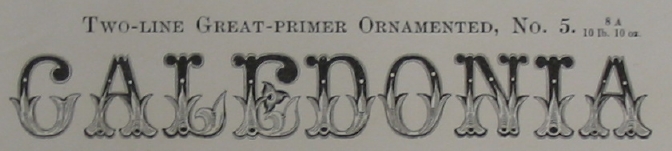
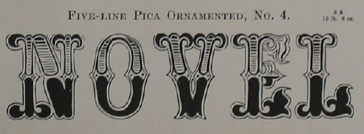
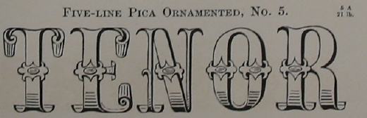
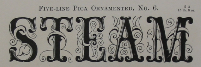
Great Primer Ornamented No. 5.
Great Primer Ornamented No. 6.
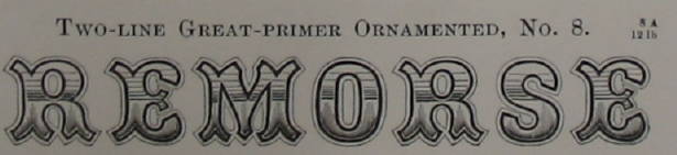
Great Primer Ornamented No. 8.
Great Primer Ornamented No. 18.
Great Primer Ornamented No. 25.
Great Primer Ornamented No. 30.
Great Primer Ray Shaded.
Long Primer Ornamented No. 19.
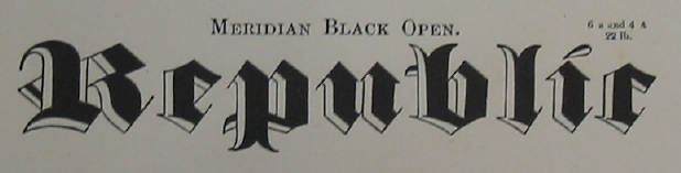
Meridian Black Open.
Meridian Black Outline.
Ornamented No. 1089.
Ornamented No. 1566.
Ornamented No. 544.
Ornamented No. 544.
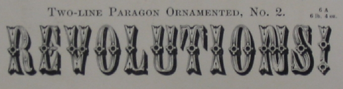
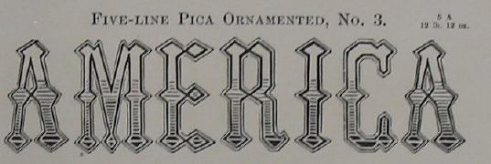
Paragon Ornamented No. 2.
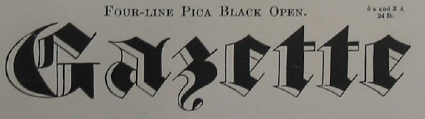
Pica Black Open.
Pica Black Ornamented.
Pica Black Ornamented.
Pica Ornamented No. 3.
Pica Ornamented No. 4.
Pica Ornamented No. 5.
Pica Ornamented No. 6.
Pica Ornamented No. 6.
Pica Ornamented No. 7.
Pica Ornamented No. 7.
Pica Ornamented No. 7.
Pica Ornamented No. 11.
Pica Ornamented No. 12.
Pica Ornamented No. 13.
Pica Ornamented No. 19.
Pica Ornamented No. 20.
Pica Ornamented No. 31.
Two Line Pica Ornamented No. 7.
Two Line Pica Ornamented No. 8.
Two Line Pica Ornamented No. 9.


Symbols and vignettes
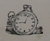
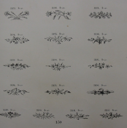
From the many vignettes, we sampled a few:
a clock,
an eagle,
floral vignettes,
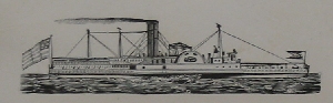
a steamship,
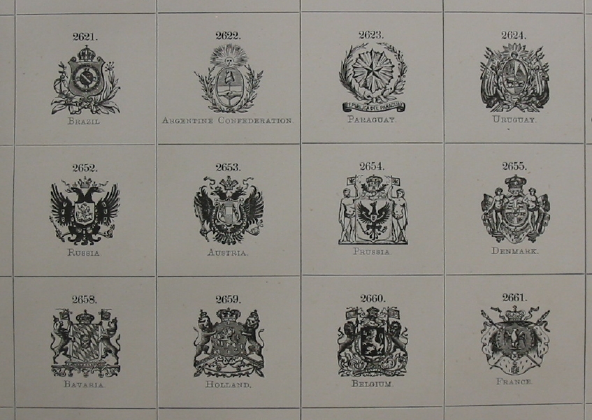
emblems for countries,
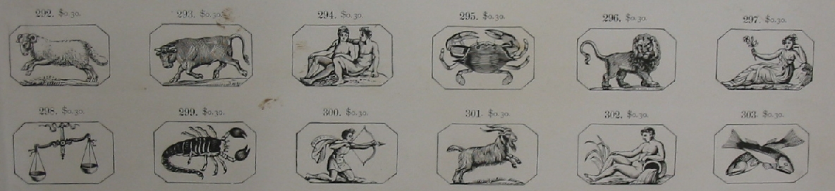
and the zodiac signs.
Typesizes
Since that is what Bruce is known for, here are
the type sizes as shown in the catalog. He introduced
them in 1822 and pushed for their acceptance all his life.
This is the (scanned) table as suggested by George Bruce in 1822.
Shown are the number of ems in a running foot.
There are several four-tuples that are in the
ratio 1:2:4:8, to each other. [See the table below.]
Furthermore, the ratio between consecutive groups is
about 1.122. To be mathematically
precise, the constant ratio is
2^{1/6} = 1.12246204830937298142...
| Canon | Double Pica | Pica | Nonpareil |
| Meridian | Double Small-Pica | Small-Pica | Agate |
| Double Paragon | Paragon | Long Primer | Pearl |
| Double Great-Primer | Great-Primer | Bourgeois | Diamond |
| Double Columbian | Columbian | Brevier | Half Brevier |
| Double English | English | Minion | Half Minion |
¶ If you are a mathematician, then here is the exact formula of George Bruce: let c be the column number in the table above, starting with 0 on the left, and ending with 3 on the right. Let r be the row number starting with 0 on top and ending with 5 at the bottom. Then the ems/foot size for the entry in position (column c, row r) is
20 times 2^{(r-1)/6} times 2^c .
Copyright © 2002
Luc Devroye
School of Computer Science
McGill University
Montreal, Canada H3A 2K6
luc@cs.mcgill.ca
http://jeff.cs.mcgill.ca/~luc/index.html