2003.10.14 – I have now returned, via superexecutive jet airliner, from the 28th conference of the Association Typographique Internationale (ATypI) in bustling, mountain-encroaching Vancouver. It was a case of keeping the faith among our highly-dispersed tribe. As a brush with near-fatal illness will turn a wayward father straight, it has caused me to resolve to be a better typographer. (And now to explicitly claim to be one.)
I had two goals for the conference: Give a good presentation and grease the wheels for a long-cherished typographic business deal. And I can say I scored big on both counts.
These are my stories.
September 25 found absolute chaos as my book designer and occasional business partner Marc Sullivan – also speaking at the conference – simply could not be found. For some reason we had taken successive flights out of Toronto (with 20 Japanese tourists on my flight, who got out of my way right smartly in the airport as I bellowed “Sumimasen! Sumimasen! Sumimasen!”), and the place where he was to be billeted could not be raised. I used the airport’s WiFi (“Wiffy”) to send a couple of snatchmails on the off chance.
It was then a superexclusive flat-rate “limousine” ride to the conference hotel. Except here they really mean limousine – we’re talking stretch Town Cars of the sort that ferry tipsy, underage high-school graduates to and from prom night. It’s not like Toronto; a taxi is a better deal.
Thus did one’s search for Marc begin. Anxiety and resignation hit the redline, after which I resigned myself to noodling on the computer and waiting for him to magically appear, which he eventually did. Fortunately I was looking upward at that precise moment.
Not an auspicious start.
After checking in at my billet, which was arranged, 21st-century-style, purely through online connections, we returned to the hotel for the conference’s opening mixer.
Giant of the graphic-design and wayfinding industries Erik Spiekermann was spotted early on, and an unduly reluctant and self-effacing Marc was dragged over for an introduction. Erik and I engaged in a war of attrition to see who could swear the most within sentences related to the topic of graphic design. Fellow luminary David Lemon of Adobe was re-met, and we had a good round of ribbing at the expense of tidy, serious Jean-François Porchez, who couldn’t have been more echt-French in his russet pantalon and matching jacket and russet patterned shirt. (JFP would later be seen wearing an actual beret and clutching a rolled-up poster, which I told him was effectively a baguette. Next thing you know he’ll up and start miming.)
|
|
After getting rat-arsed on a cranberry cocktail (to wash out the filthy mouth I had developed in my war of attrition with Spiekermann?), we were ushered into the hyperelegant hotel ballroom, whereupon keynote speeches would be received.
As at any conference, badge-cruising was nothing short of endemic. I kept looking at people’s (tasteful, blue, well-typeset) badges before their faces; typography is a field based on name recognition as much as font recognition, and I’ll be damned if I knew what any of these people looked like save for JFP and suave, debonair Roger Black (“Roger Lenoir”), whom I had both met before.
And in fact if you were present at the opening soirée and overheard someone muttering “There’s Roger Black cruising the life out of me,” you know who that was. A bit unfair to Roger, but with a grand total of three out inverts in a packed hotel ballroom, we need to do a full-on sweep for Our People. (None of us was properly dressed for a ball, you see. Think Cinderella.)
I jotted down as accurate a Doctorow-style liveblog transcription as I could achieve without real-time captioning, which would have been beneficial.
ATypI president Mark Batty deployed his credible, authoritative British accent to welcome us to the conference. It was, he said, still
very early days, but so far it’s been a very fine experience... and so has the interest of the Canadian design community at large. And these things have contributed what I think will be a very positive conference containing more than 260 people.
The conference sponsors were noted:
(“Together these two companies describe a metaphor of ATypI of now, if I may say that: Microsoft, a big company with a serious interest in type, and Tiro, a two-man shop [John Hudson and Ross Mills], but also with a serious interest in type. Indeed, the topic of generous, sincere, winsome, borderline-adorable John Hudson drew a bit of a laugh: “Others will know him for his many erudite contributions to the typographic discussion online.”)
Vancouver represents the 47th year ATypI has met “nearly without interruption.” The organization was formed in 1957.
Thirty percent Canadian attendance, “which is about equal to our speaker ratio of Canadians.” (What’s gonna happen next year in Prague?)
The president of Emily Carr College, the venue for conference sessions, delighted the 1.4% of British Columbians able to speak French as he declared, in a passable accent while looking dead at JFP, “C’est un plaisir de vous souhaiter la bienvenue.
“I’m not gonna do the whole thing in French. I’m just showing off.”
Emily Carr College is located on a peninsula curiously known as Granville Island. “There are also, by the way, a lot of rats down there, and if there were an earthquake, the island would liquefy. But we try not to think about that.”
John Hudson “is almost de facto a relative of Emily Carr. His father Tom Hudson was instrumental in setting up a lot of the programming you now see in the various areas.... His contribution was a very important one, so I’m not surprised that his son has taken up and gone as far as he has. Tom is known as our dean emeritus; he and I never met, but we have passed in the night, as it were, but I have seen the relevance of his work to Emily Carr.”
“The theme of our conference is ‘Between Text and Reader.’ That means there is a lot of text, and you should read it.” (His wife’s reaction to the theme was “It’s about air?”) “It’s a very generous topic open to a great deal of interpretation....
|
“I’m hoping that ‘Between Text and Reader’ will fare a little better [than errors in the conference program]. It was three years ago in Leipzig when Mark Batty asked if the rumours that Ross and I wanted to put on a conference in Vancouver were true, and I had already had a few drinks so I said yes.”
Hudson recounted the tale of Peter Bilak’s movie of scenes, filmed from a moving train Michel Gondry–style, of the Dutch landscape interrupted by actual punctuation – commas, parens, and the like. “To him, the designer is a reader. The process of the designer is a process of reading, and I found that very interesting.” The next time you read a book and get the impression nobody actually read it during the design process (as with every computer book under the sun save for mine), think back to this.
For the conference program, Jeremy Tankard donated Shaker Sans and Matthew Carter donated Fenway. John Downer painted signs at Emily Carr. Brian Morgan did most of the design. Hudson presented Morgan with a commemorative book.
As part of my covenant to be a better typographer, it is encumbent on myself to articulate the first known criticism of Robert Bringhurst.
Everybody’s got his book, with its grand and seemingly definitive title The Elements of Typographic Style. I look at it about once a year when I feel like producing some kind of report with page margins in the proportions of the Golden Section (1:[(1+√5)/2]). That’s pretty much all it’s good for, since the whole thing is a recapitulation of a 1950s-era Monotype-style hot-metal typesetting manual. I know this because I borrowed the Moncton Public Library’s Monotype-style hot-metal typesetting manual easily five times when growing up.
I’ve never seen a book of design instruction with so few illustrations, or one intended to be read and used that is so very difficult to read and use. It’s of no help to a designer with a middling level of knowledge and software fluency who wishes simply to improve his or her practice to an expert level, and for the beginning designer, all it teaches you is how to typeset an antiquated classic of world literature in the antiquated style of British metal typography. Software fluency barely comes into the picture; the book hardly acknowledges that half the world uses Quark, and nearly the other half Microsoft Word. (All the professional designers in existence who prefer the demonstrably superior InDesign were present at the conference.)
Even the physical form of the book frustrates, since it adamantly refuses to stay open. If you try to crib from its too-few passages of empirical advice, you have to prop it open in your lap.
Bringhurst’s ATypI presentation was a colossal bore, not to mention pretentious and counterfactual. Some of his remarks:
“I haven’t come to the meetings very much over the years because I am a hermit, and because a lot of you have become remarkably younger over the years....
“Vancouver has no old typographic tradition, but it is a place where people have lived, and lived quite well, for at least 10,000 years. When Europeans first came here, this was a chain of beachfront houses speaking the Alqamada family of languages... It was an oral culture like the culture of ancient Greece, a culture in which the book existed only in spoken form. If you follow any of the world’s great literary cultures back to their beginnings, you will find an oral culture....”
That’s what Bringhurst actually said. When I mailed him to clarify the word “Alqamada,” he rewrote himself thus:
When Europeans started coming here, this city was a chain of beachfront villages speaking the Halkomelem language – one of roughly thirty languages that belong to the Salish family. This harbor was pretty much the centre of that family of languages, and so in a sense the centre of the stories their speakers used to tell. It was an oral culture, like the culture of ancient Greece: a culture in which the book existed only in spoken form.
“Except for China and Iraq, writing came to every one of these countries from somewhere else, but literature was always there already. The book changes in many ways when it shifts from oral to written or printed form, and it shifts again when it changes from printed to digital form.” Bringhurst here seems to confuse stories with books. Even a grade-schooler can tell you they’re different.
“But looking isn’t reading. When something is understood, we say in English that it comes across or that we grasp it. We think of meaning and understanding in physical terms. To read, you have to come to grips with reading. You have to somehow get your hands on it.”
Meaning, in this view, is largely a physical thing, “like water or sunlight or love,” to the extent that love is physical. (We’re already in trouble.) “It has an abstract side, of course, like water or sunlight or love, but it seems to me that when we treat it as purely abstract, as information in the modern sense of that [word], we are in danger of losing the meaning of meaning.”
The visual part of this bringhurstian audiovisual spectacular begins. “These are genuine vintage 35-millimetre slides. You may never have seen one.”
“Ordinary mirrors are pretty slippery, like computer screens. I’m interested in mirrors that let meanings stick... that let me get my hands on them....
“There is life in this writing,” he added, referring to scratches on urns and walls, “just as there is in the tracks of birds.... Birds, like well-trained, practices scribes, are comfortably efficient, fluent in their movements, never stopping to retouch them or running out to buy a new pair of shoes, with a more fashionable pattern.
“[The mind] seems to work best when it’s full but not too full, just like this bookcase [in an allegedly-famous Korean painting]. A bookshelf... is partly a place to keep your prosthetic brain. It’s where you can keep things while you don’t need them.... Texts are like that, too.” (Books don’t contain texts?) “The best texts, anyway, are well worth getting lost in,” while texts like, I dunno, automotive owner’s manuals and Allô Police are not.
“The interactive text, which the computer has made possible, is supposed to combine several modes of getting lost: in the mirror of the self and the human spirit all at the same time. It doesn’t seem to me to have worked out as well as it was supposed to, but perhaps someday it will.” The interactive text is “[mostly] a dirty mirror of the [one] we left behind.”
“In a well-made letterform you can hear that voice: the silent voice of a fluent hand.... More readers were connoisseurs and fewer readers were consumers....
“The book matured into a liminal organism, plant enough to have leaves, but animal enough to have a head and a foot and a spine.
“The book has become an industrial product, as far removed from handmade books as a carton of chocolate milk is from a cow.” (Good thing I’m a veganist.)
“We know what books are really supposed to look like. We still have the original models.... So anytime we get tired of these imitation books, we can make better ones. We can do it before and we will do it again.
“The problem is this: The computer is never handmade the way the physical book is handmade....
“The linguist’s favourite metaphor is speech: all languages to the linguist are spoken. But speech can mean many things. The languages of the deaf, like ASL or LSQ” – and here he tries to pronounce “Langue des signes québécoise,” not succeding very well; some acronyms should go unexpanded – “are spoken by movement.... The languages of mathematics are spoken by moving things around in their head.... They’re really talking about gesture, symbolic gesture. Talking out loud is a way of gesturing with the tongue rather than the hands.”
Bringhurst declares “all languages have scripts.” Writing systems “all in a sense have more than one compartment, and none of these compartments is ever full. I’ve looked at hundreds of different scripts, and every one of them gives you more than one kind of information, but they never give you all the information that they might; they give you what you need and let you figure out the rest.”
The speaker then embarked on a predictable exegesis on aboriginal languages, a topic of longstanding serious scholarship for Bringhurst and also an excellent method of showing off. (Bringhurst’s Cree accent is much worse than mine in French.) Cree and Inuktitut syllabics are “a writing system that was designed for the printing press first and humans secondarily.... This is a script that just hasn’t passed through those stages, the engraving on stone... and the broad-pen stage that are absolutely crucial to the history of the European script.
“Scripts will evolve and it will take as long as it takes. But it will evolve in a world where [the keyboard rules]. The keyboard doesn’t give one damn about what the letter looks like; the keyboard isn’t human. I would like to live a thousand years from now in order to see what happens to this script.
“We human beings were reading wind and rain and clouds and the tracks of... rabbits and grouse and hair long before we were reading words. We were also reading stories with our ears 100,000 years before the reading was in writing.
“And then there were things to read that one could never have heard spoken, and literature was born.
“And there is still something uncanny about listening in silence... to symbols on a page, to someone else’s breathing.
“Typography helps to make that wholeness possible. So... thank you.”
And thus endeth the monologue by the renowned Robert Bringhurst, and let me be the first and quite possibly the only listener to call bullshit on it. The oral tradition by definition is not reading. Bringhurst seems bent on a back-to-the-future redefinition of the oral tradition into a kind of Fahrenheit 451 Classic. In that case, citizens memorized books because they are banned and burned. In the false history Bringhurst presents, books do not exist but reading does. It occurs through spoken rendition of tales, or, he allows, through signed rendition thereof.
But as he himself allows in the dying breaths of his presentation (the ATypI newsletter headline told us “Bringhurst muses sonorously,” which was another way of saying “Bringhurst’s audience snoozes noisily”), “there were things to read that one could never have heard spoken,” conceding that books are different from speech. The very idea that a senior theorist in graphic design, believed by some thousands of people to be an expert in the form of the book, would advance false and ludicrous claim that oratories are books goes to show that some luminaries of our field are overly coddled.
Bringhurst, like Tufte, is due for a critical appraisal. Not reappraisal, either: I’m not convinced he’s ever had one before.
September 26, 2003. $7.50 cab ride with a Pakistani driver who, like Imram Khan, looks Caucasian, with the fair skin, high cheekbones, narrow nose, and bright (though in this case still brown) eyes.
That is, Roger Lenoir. Dapper, fair-skinned, renowned, beloved, competent, and filthy rich, Black is also possibly fun to be around. But I wouldn’t know about that, really. I reintroduced myself as having interviewed him some ten years ago, and apart from reasserting our invert qualifications to each other in that ancient nonverbal way, nothing came of it. Whom do I have to blow to be invited up to Roger Lenoir’s hospitality suite?
Black’s disquisition today concerned newspaper design, as so many of his disquisitions do. (He’s pretty much run out of A-list magazines to hire him for an Egyptian-heavy, Scotch-ruled, red-and-Black redesign; now he’s stepping through the newspaper demimonde slug by slug.)
“The conference is astonishing. I got a lot out of Mr. Bringhurst last night,” M. Lenoir rather generously claimed. “Thanks to all the people, and their wives, who organized this.
“What I’m gonna try to do today is not so much a historical lecture on type for newspapers or any kind of real typographical study, but just throw up on the screen a lot of American newspaper types that we’ve seen over the last 100 [or so] years that have kind of piled up in the environment.”
And here my notes are not thorough. Story of my life, really. Plus the display screen was jumping and flickering insanely.
“I hasten to say that I’m not a[n] historian, and... there will be much discussion on the ATypI discussion board about various dates that are wrong and this sort of thing, and people will correct my various misinformation. But I’m doing this to help you... think about this field, which has been pretty much ignored, because there was a big gap in mid-century Europe where there were pretty much no newspaper types developed.”
Oldstyles evolved into Egyptians, then Grotesks, Black told us. (Roger Black spontaneously uttered the term grots, a word we never, ever hear but only ever read or, on rare occasion, write. We’re gonna come back to that.)
“The Modern letterform took over as the text type for all newspapers, but – and this is my own impression – because of the vagaries of printing, the smeariness of printing, in 1895–1900 when they began to use rotary press and paper, they started to look for letterforms that would perform better under bad conditions. We’re really at the exact opposite of the [state] that Mr. Bringhurst was talking about last night. This has nothing to do with the smell of the paper... The removal of the hand and how the newspaper field has moved toward digitization is the [real] story of type design....
“Surprisingly, the Rupert Murdoch of that era, William Randolph Hearst, had the most vigorous influence on typography for newspapers of that era.... They went berserk. The common laws of book typography were thrown away, and type was mixed with whatever they had,” Black stated, tossing up on the soon-to-be-jitterbugging screen a late-19th-century layout with grey body copy and screaming capital boldface sans heds. “We talk about how pathetic the type quality is in the modern era, and this is pathetic, but it is so strong.”
Through this era of riotous competition, newspaper owners got rich by 1915 and, as a result, got serious: The Etruscans and Grecians and so forth, “these bizarre letterforms.” DeVinneys for heds, Ionics for text.
The Moderns were restored as a way of showing those institutions as conservative, as a way of showing how “reliable a newspaper was.”
(Black notes that the Washington Post has “updated their typefaces but have really not changed their look.”)
Times Roman, he says, “slowly, by the 1930s, became known as the enlightened typeface, because it printed so well.”
Printing technology bears a strong role here, as it so often does. “Letterpress typefaces perform differently from offset typefaces, and Times is really a letterpress typeface.... Times does not work very well as an offset typeface. The little thin serifs erode.... nevertheless, the choice of typefaces is always done by – I dunno, what would you say... reputation... by trend in the newspaper business much more than any kind of logic.
“So Times became the standard until late in the last century, until 1989, when the Poynter Institute, which is a very influential little – I think they call it a school for journalists, it’s an academic training centre, that owns the St. Petersburg Times, the local newspaper. Mario Garcia.... put together a [project] in 1989 to take a look at the typography of newspapers.
“It had an astonishing influence on typography.” Gerard Unger, David Berlow, and Matthew Carter were among the superstars who came to meetings.
Poynter did a test of printing of various typefaces at different newspapers. “Production has much more impact on the ultimate look of a newspaper typeface than they were aware of – that I was aware of. That tracking and leading and column width... in U.S. newspapers, [as] Erik Spiekermann is always complaining about, that permit too much letterspace, and the columns are much too narrow....
“And sadly, the PR dept at Poynter put to a newsletter that said ‘Nimrod chosen as best typeface for papers.’ Who told them that? Nimrod had become the British answer to this, but didn’t perform well in offset. In some cases it’s OK.”
So Tobias Frere-Jones and Berlow designed Poynter, and “to my astonishment, the New York Post picked it up. What more endorsement do you want? Hilariously, the Post uses it with some really crappy ATF Bodoni, and you’re sort of wondering, What are they up to? But of course I guess they know what they’re up to....
“So a whole train of Moderns and a whole train of of oldstyles [were] led by Poynter in the 21st century. A whole third current is the Ionics, used for text.” The L.A. Times used Metro for heds, Corona for body.
Now we get to the unthorough part of the notes. Black jitterbugged a slide into existence – and I will vow from now on to use reverse text on all projected slides, since it reads so much more nicely and is so very much classier – dividing newspaper typography into what I assume are actual timelines as follows:
“Then suddenly to everyone’s surprise Latin returns. Everybody had forgotten about them, except the New York Times, which uses a very narrow Latin condensed for headlines, mostly on the front page. I hear they’re gonna banish that.” Cyrus Highsmith and Eduardo Benito designed Zocalo and Quiosco. Lucky, the Latin face by Matthew Carter originally for El País, is now called Rocky at the Rocky Mountain News.
But, Black adds, “my assumption as an American newspaper designer is Ionic Nº 5. Ionic Nº 5 will probably work and they’ll probably like it,” as at the L.A. Times. Well, showing a client a mockup that you do not like or could not live with is the worst idea going. How is starting a design process from the basis of a default typeface any different from, let alone better than, declaring Nimrod as best face for newspapers?
And the punchline? Sansserifs are considered “downmarket” by U.S. papers. I wonder why the Tubby uses them.
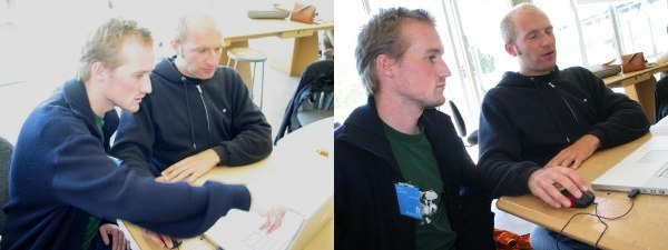
Oh, good heavens, were these lads ever the star of the show. I enjoyed every millisecond of their fun-filled, action-packed, anti-twee, yet indisputably solid and hugely credible presentation, which I liken to the best theatrical performances of Just-N-Erik. Those two are still in type development, but we don’t see them in these parts all that often. Are Underware the new LettError?
But something else happened, actually. I underwent retrospective joy in recollecting the Underware presentation. It happened after sitting around the computer room with the lads and chatting them up. The strange combination of name, eyebrow and hair colour, voice, accent, wardrobe, and 17″ PowerBook usage of Akiem (“Acham”) and Bas won me over. They’re so hideously goddamned talented and clever, yet also so unprepossessing and fun to be around – packed to the gunwales with original ideas in type development and more joie de vivre than a nightclub packed to the gunwales with raver kids on E, or whatever they have over in Europe, not that I know anything about that.
|
And here begins my practice of Situational Bad Journalism. Whenever an ATypI session was particularly interesting or hideously dull, I took either no notes whatsoever or entirely inadequate notes. It seems that only the middling sessions got the full treatment. Since nobody else was taking significant notes, and the presentations were not recorded in any way save for Bringhurst’s (the sound tech sat around playing solitaire on his Windows box), it appears I have ended up shirking my role as sole bulwark against institutional forgetfulness.
Here’s what I’ve got about Underware. Our presentation was given by Bas Jakobs and Akiem Helming; Sami Kortemäki was back home in Finland or somewhere. They ran their G3 and G4 PowersBook rather like turntables, presenting an oddball interactive Flash animation with keywords in rectangles suspended by onscreen wires. You can move the keywords around to emphasize them, or, in one case, to cover up a fellow’s naughty bits. And on occasion the screen would show inset photos of the Underware boys which would, of course, turn their heads to follow the keywords around the screen.
It’s one of those “a six-year-old would love it” creations that works so very well for a middle-aged audience.
Now, the Underware lads are famous for their font Sauna and the specimen book they published to promote it – the one that could only be properly read while seated inside a sauna. (Heatproof paper and binding and heat-activated inks!) “We also try that whatever we do is understandable by our mothers,” one of the interchangeable lads told us. “If you cannot explain what you are doing to your mother, you have to explain what you are doing to yourself there,” the other interchangeable lad replied.
Underware’s brilliant idea is to take type design out of the academy, to the extent it even exists there, but also out of the designer’s desktop and into a crash course for design students, the Type Workshop (.com). Since the guys all live in different cities and work from their homes (we saw a slide of one of their bay-windowed sitting rooms, looking all studenty), the Type Workshop resists Underware’s own practice in type development. Anything that gets you out of the house I approve of.
It’s an amazing idea, and they make it work, seemingly through manifest seriousness and organization. Akiem may be blond (even blond-eyebrowed), but if he tells you that everybody’s going to design a font in a week, then it’s gonna happen.
After the presentation, my socks were charmed off and I had to mosey up to say hello. My Maritime “Are you workin’?” gene came to the fore and I verified that they have enough commercial work to keep themselves afloat and to carry out their wonderful Workshops. Then I asked my second question, “Blue card or red card?” and Bas immediately asked for the red one. (Which one will you get next time I see you?)
Akiem explained how one of the assignments went. I won’t tell you which one yet. It’s the best idea I’ve ever heard in typography. Patience.
Top that, Dutch Type Library with your thousand-euro fonts.
My J-school-dropout-calibre notes record the following from their presentation:
Extracurricular activities? How about finding the worst shop window in town and fixing it? The students did a drive-by shooting of the vitrine, beavered away in secret, and “after one week they just went back and said to the owner ‘We have a surprise for you today.’ ” But it was a shock to the shop because nobody could speak Finnish or English well – and they thought this marauding gang of art students were the immigration police.
(Which is really worse, getting busted or using shitty type? I kid. I kid.)
The Underware lads did Detroit. This I gotta see. I want to see Bas and Akiem driving down the Interstate in a beat-up Ford Ranger pickup with AM/FM radio. It would be just their style.
This American Type Workshop had a fun theme: Stencil fonts. The apparently have quite the history, and Underware, abetted by these poncy design students living in an industrial state, were gonna add to it.
The full-on Underware® Type Workshop™ Process was applied, resulting in an italicized stencil font with oddball letterforms that I quite love. And it’s got the absolute best name for a font in the history of typography: Chopshop. You should hear Akiem pronounce that word. It’s priceless.
And during this one-week whirlwind gestation process, the students had enough time to make an actual stencil out of good solid wood, nuts, and bolts (twee? in Detroit? never), hoist it like a banner held by standard-bearing guys in fezzes from the Turkish-Canadian Friendship Society at the annual Turkish Day Parade, and hand it to some kids for the best type photo of 2003.
OMIGOD I love the Underware boys.
This giant of the fields of graphic, information, and type design is not the fancy-schmancy, money-grubbing, status-obsessed bastard I had always assumed. I had assumed that based purely on the prestige of his commissions (howcum I didn’t get to redesign the Berlin subway signage?!) and the rarity with which he answered my snatchmails. (Twice! Ever!)
Then Marc and I hit the mixer on the Thursday night. Not fifteen minutes had passed before I had interrupted “Doktor” Spiekermann’s conversation, introduced myself, and dragged Marc over. We got to chatting. He “left” MetaDesign ages ago (news travels slowly here in the provinces) and now has this new hotness going, United Designers Network. It’s all about putting freelancers together. You have to be a good designer, he has to know you, and you have to have worked with him already. “I’m 0 for 3 there,” I told Herr Doktor, “but he isn’t,” pointing to Marc.
The next day, Spiekermann (nobody calls him Erik) followed the Underware boys and told us, “Every generation, every five or six years, we get a new bunch of weirdos from Holland, but in a really good way. Also they have no space for wide people in Holland, unlike in America of course. They have this solid training and they never, unlike us Germans, forget their sense of humour, but of course if we had a sense of humour, you would never know the difference, because you do not speak German.”
He uttered that sentence in five seconds flat. He talks faster than I do, in this odd German-American Friendship accent (though his -tter words are especially British: “We know as designaz we can do dis bet·tah”).
| Every nation has its own version of DIN... |  |
|---|---|
| ...and every nation has its own most-legible-in-the-world sign font. |  |
| Border crossing? You’d never know it by the absurdly mismatched signage. |  |
| Swiss(-designed) signage, using Frutiger, that Spiekermann considered mostly adequate. |  |
| An “unhackable” font made for license plates: Letterforms are created so that no shape may be home-altered into another. The problem is this font “already looks hacked!” |  |
Information design “has almost become a style,” he explained. A while back a client called him up and “they wanted that Spiekermann design, so I did the red bars and used Officina 9.” (Spiekermann’s big on red bars or banners, and he designed Officina.)
In information design, “you want them to not even notice the information.... I’ve always seen it as my job to go in there and fight the redundancy and fight the ugliness.”
His redesign of the Berlin subway signage was a bit of an odyssey. Twelve years ago, he showed photos of the existing signage to the subway managers, who were shocked and offended and banished him from the premises. Then the Wall came down, and suddenly the East and West Berlin metros had to be unified. The original signs said “ ‘We dont want you in the subway. Go buy a Mercedes-Benz and drive to work,’ ” Spiekermann said, giving us some unexpectedly hideous examples. (Spiekermann also redesigned the Düsseldorf airport after a dozen people could not find the fire exits and died. He noticed that the Vancouver airport – or YVR, as it calls itself even on taxicab advertising – uses the same yellow, though of course with Helvetica, because who needs any other font?)
If it took the Berlin subway twelve years to figure out the obvious, what Spiekermann wants to know is: Why? “Why don’t these people know what we know? Or why don’t we tell them? I don’t know how to go about this.”
I have my own theories, as does Marc, who would present on that topic at a quarter to nine in the morning the next day.
I’d seen Gerard Unger (imagine the Dutch pronunication; I can halfway manage it) in action once before many years ago when he was in town. I will now recount, for permanent record, somebody else’s anecdote. (Thomas Vree, if you’re conducting autogooglatio, long time no hear.)
Anyway, during the type conference, Gerard Unger, Just van Rossum, and Erik van Blokland were walking down Queen West at around Peter St. My acquaintance Thomas Vree, a Dutch-Canadian who did the occasional type design (I would give him a portfolio evaluation about twice a year), happened to be coming up the other way and shocked the hell out of the Dutchmen when he walked right up to them and told them, in Dutch, “You’re Gerard Unger, Just van Rossum, and Erik van Blokland! You’re type designers. So am I. I know your stuff.”
Only in Toronto.
(Unger confirmed this story when I interviewed him for “Reviled Fonts.”)
|
At ATypI, he was here to present on national characteristics in type design. I could see going in where he was coming from, but only just. At best there are mild trends, and there’s always a square peg to frustrate some country’s round hole, but Unger made a decent case.
“Letterforms are very abstract things and it is not so easy to attach national characteristics to them. So how does this work?” he asked, in his gentle English-language manner. He’s terribly charming and avuncular.
Unger showed a sample of (if memory serves) Organica by Gabriel Martínez Meave. “You don’t start immediately bouncing the rumba when you look at this typeface, but there is a sort of lightness and, what do I call it, South Americannness to this typeface.”
All French type design is based on the shape of the olive, Unger credits Spiekermann as saying. The Citroën DS; Antique Olive (note well the name).
“There are some peoples on earth who have no problem designing national characteristics,” as the Greeks and the Czechs, who sometimes modify their fonts so their myriad spiny diacritics flow more harmoniously. Unger compared Czech and Mexican type designs in this regard, which seems to me more accident than design.
House Industries fonts are more “American” than, say, late-20th-century American designs like Arbitrary Sans.
“Very characteristic of Danish type designs is sort of the amputated g. So if you see a g with a little bit missing, it must be Danish,” he concluded, not noticing how many other faces he’d shown us that day had unclosed bottom bowls of the g but were designed somewhere else. (I have some tiny bit of knowledge here. I take credit, and in fact at the conference took credit, for introducing Signa to Canada in my book. I suppose I should be paying more attention to Danish fonts, since if their gs are “amputated,” doesn’t that make them disabled?)
Shortly I will finish this entry. I’ll piece together what I have in my notes and add to this posting later. It may not be much. And I’m upset with myself for that.
I’ve got a page up already about my presentation. It too requires completion. 