| | |
100 Beste Schriften aller Zeiten
|
 German FontShop-sponsored site listing the hundred best fonts of all times, compiled by a jury in 2007. There is a lot of good information about each of the fonts mentioned. PDF file compiled by the jury: Stephen Coles, Jan Middendorp, Veronika Elsner, Roger Black, Ralf Herrmann, Claudia Guminski (FontShop) and Bernard Schmidt-Friderichs. Visualization of the list. The list:
 - (1) Helvetica
- Garamond
- Frutiger
- Bodoni
- Futura
- Times
- Akzidenz Grotesk
- Officina
- Gill Sans
- Univers
- (11) Optima
- Franklin Gothic
- Bembo
- Interstate (1993, Tobias Frere-Jones)
- Thesis
- Rockwell
- Walbaum
- Meta
- Trinité
- DIN
- (21) Matrix
- OCR A und B
- Avant Garde
- Lucida
- Sabon
- Zapfino
- Letter Gothic
- Stone
- Arnhem
- Minion
| | - (61) Blur
- Base
- Bell Centennial
- News Gothic
- Avenir
- Bernhard Modern
- Amplitude
- Trixie
- Quadraat
- Neutraface
- (71) Nobel
- Industria, Insignia, Arcadia
- Bickham Script
- Bank Gothic
- Corporate ASE
- Fago
- Trajan
- Kabel
- House Gothic 23
- Kosmik
- (81) Caecilia
- Mrs Eaves
- Corpid
- Miller
- Souvenir
- Instant Types
- Clarendon
- Triplex
- Benguiat
- Zapf Renaissance
| - (91) Filosofia
- Chalet
- Quay Sans
- Cézanne
- Reporter
- Legacy
- Agenda
- Bello
- Dalliance
- Mistral
| Follow-up in English. Credit for some images below: Danielle West. [Google]
[More] ⦿
|
A2 Type
[Henrik Kubel]

|
 A2-Type (or simply, A2) is a type foundry set up in the autumn of 2010 by the London based design studio A2/SW/HK. The designers are Henrik Kubel and Scott Williams. A2's bespoke type design is mainly the responsibility of Henrik Kubel, though every typeface is developed and approved by both partners. Kubel is self-taught, making his first typefaces while studying at Denmark's Design School from 1992 until 1997. Their typefaces:
 - 4590
- 60 Display.
- Amplify (2013) won an award at TDC 2014.
- Antwerp (2011). A readable text family designed by Kubel during an Expert Type Design Class in 2011 at Plantin Genootschap in Antwerp.
- A2 Archi (2005, Henrik Kubel): an octagonal face.
- A2 Aveny-T (2000, Henrik Kubel): Poster typeface commissioned as aprt of the identity of the Aveny-T theatre in Copenhagen.
- Agriculture.
- Archi.
- Banknote.
- A2 Battersea (1999, Henrik Kubel): inspired by Meta, DIN and Transport Alphabet. Followed in 2012 by Battersea Slab.
- Bauhouse.
- A2 Beckett (2008). A condensed sans family with the masculinity of Impact.
- Boing.
- Copenhagen
- A2 CPH Tram (2009, Henrik Kubel): revival of an odd mini-serifed type found on the exterior of Danish trams, ca. 1920.
- A2 CWM (2008, Henrik Kubel): constructivist type designed for the headlines and cover of Cold War Modern Design 1945-1970. Octagonal.
- Dane.
- A2 Danmark (2008, Henrik Kubel): a display stencil family.
- A2 Ergonomics (2011).
- Flavin Medium. A neon tube font.
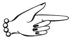
- A2 Flowers (2005, Henrik Kubel): arrows, fists, flourishes, ornaments.
- A2 FM: slab serif family.
- Foundation (2018) in Sans (Number 44, Condensed, Wide), Serif, and Serif Didot subfamilies. These are all revivals of skeletal typefaces. Foundation Sans Number 44 was inspired by Circular Gothic No. 44 (1879, Charles E. Heyer, for the Great Western Type Foundry). Foundation Sans Condensed and Foundation Sans Wide are derived from two types described as Caractères pour Marques de Linge (typefaces for marking on linen) in the Signes section of the first volume of Spécimen Général des Fonderies Deberny et Peignot (ca. 1934). Foundation Serif is based on Caractère No. 7, another Caractère pour Marques de Linge in that 1934 Deberny & Peignot specimen book. Kubel's inspiration for Foundation Serif Didot was a sheet of lettering (dated 1939) he discovered in the archive of the influential Danish architect and graphic/industrial designer Gunnar Biilmann Petersen, 1897-1968.
- Grand. A stencil typeface.
- A2 Grot 10 (2009, Henrik Kubel): a take on the Grot Series by Stephenson Blake. Grot 12 followed in 2015.
- A2 Impacto (2005-2011, Henrik Kubel): Impact?
- A2 Klampenborg (1997, Henrik Kubel): industrial style sans.
- Kunstuff.
- London (2010).
- Magna.
- Maximum.
- A2 Mazarin (2017). A2 writes: Originally designed as a Garamond-inspired metal typeface by Robert Girard ca. 1921-1923, and published under the name Astrée by Deberny Peignot, the typeface was soon recut and renamed Mazarin by the English foundry Stephenson Blake in 1926. That single style original has now been expertly restored and reimagined as a contemporary typeface in multiple styles.
- Melissa Script (2010).
- A2 Monday (2003-2016, Henrik Kubel): based on 19th century English vernacular serif signage type.
- Moscow Sans (2014-2015). Award winning custom fonts and pictogram system for Moscow Metro. Art directed and designed by A2 (Scott Williams and Henrik Kubel) with Margaret Calvert as type and pictogram consultant. Cyrillic script designed in collaboration with Ilya Ruderman.
- Naive.
- New Grotesque Square series (2015). A newspaper typeface modeled after a Stephenson Blake typeface. Followed by New Grotesque Round in 2015-2016.
- New Rail Alphabet (2009). A refreshed and expanded version of Margaret Calvert's alphabet from the 1960s which saw nationwide use with British Rail, BAA, and the NHS. Developed in cooperation with Margaret Calvert.
- New Transport (with Margaret Calvert). A digital version of Transport, the Jock Kinnear and Margaret Calvert typeface for the British road signs. New Transport will be commercially released in September 2013.
- Register (2012-2017). A text typeface family inspired by French renaissance types.
- Regular (2012-2016). Think Futura in new clothes. Accompanied by Regular Slab.
- Sans, Slab and Serif typefaces for a redesign of The New York Times Magazine in 2015. The starting point for the Serif font is the Stephenson Blake Garamond-ish metal typeface Mazarin also known as Astrée from French foundry Deberny & Peignot. The slab fonts used for pull quotes and headlines are a continuation of the magazines existing Stymie font but in a condensed format. The sans fonts are linked to the industrial grotesque types, with metal type specimen versions of Futura and Akzidenz fonts as loose models for inspiration.
- Nosferato.
- Ole.
- Outsiders (+Outsiders Light and many other weights). A slab serif family.
- Parsons Green Medium.
- A2 Record Gothic (2019, Henrik Kubel), after Robert H. Middleton's American grotesk, Record Gothic (1027, Ludlow). Kubel writes: In celebration of Record Gothic's eclectic history, we designed four related but independent styles: Slab, Mono, Stencil and Outline.
- Square.
- Staton.
- Tagstyle.
- Test.
- Triumph.
- A2 Typewriter (2000, Henrik Kubel): based on Olivetti Typewriter 22.
- A2 Vogue Floral: a fashion mag modern display face in two styles.
- Vogue Paris. Granshan 09 Type Design Competition. 1st Prize, Display fonts.
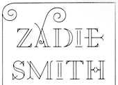
- A2 Zadie (2005, Henrik Kubel): inspired by Edwardian railings surrounding the Royal Army Military College in London. Used on the cover of the Zadie Smith bestseller On Beauty (2005, Penguin Press, NY). Granshan 10 Type Design Competition. 3rd Prize, Display fontt described as an ornamental blackboard bold type.
- In 2014, Scott Williams and Henrik Kubel (A2 Type) co-designed A23D, a 3d-printed letterpress font. It was fabricated by model making specialists Chalk Studios. The font is presented by New North Press, which specializes in traditional letterpress printing. Adrian Harrison made a short film about the birth of the font, charting its progress from preliminary sketches to first inking and printing at New North Press. A23D won an award in the TDC 2015 Type Design competition.
- English 1766 (2017). Kubel's take on Caslon.
- Regular (2017). A sans family inspired by Memphis, Karnak, Stymie and Futura.
- Schwiss (2018). Inspired by Akzidenz Grotesk and Helvetica.
Custom type by them include an alphabet for Qantas Airlines (2017), a masthead for Toronto Life (2010), a custom typeface for Banca Sella (2018), Qualcomm (2017), Arne Jacobsen (2018?), Evening Standard Newspaper (2018: 43 fonts), New York Times Magazine's Olympics issue (2018: a monowidth font for stacking), Eurosport Pyeongchang 2018, Weekendavisen (2007-2010), Design Museum London (2010), Faber&Faber (2009-2010), Afterall Publishing (2006-2010), Faulkner Browns Architects (2007), Penguin Press (2005), and Norrebro Bryghus (2005). At ATypI 2013 in Amsterdam, he spoke about New Transport. Winner of the type design prize at the Tokyo Type Directors Club TDC 2019, with Matt Willey, for the New York Times Magazine Olympic font. [Google]
[MyFonts]
[More] ⦿
|
Aaron Bell
[Saja TypeWorks]
|
 [MyFonts]
[More] ⦿
[MyFonts]
[More] ⦿
|
Adrián Fernández
|
Spanish graphic designer who made DIN Stencil (2011). [Google]
[More] ⦿
|
Adrian Talbot
[Talbot Type]
|
 [MyFonts]
[More] ⦿
[MyFonts]
[More] ⦿
|
Akira Kobayashi
|
 Born in 1960 in Niigata, Japan. Studied at the Musashino Art University in Tokyo. He also studied calligraphy at the London College of Printing. He became a freelance designer in 1997. Akira Kobayashi, who was based in Tokyo prior to his move to the Franfurt area, is an accomplished type designer who has created numerous typefaces for Sha-Ken, Dainippon Screen (where he made the kanji font Hiragino Mincho), TypeBank (from 1993-1997), ITC and Linotype, where he is Type Director since 2001. Interview. His numerous awards include the Type Directors Club awards in 1998 (ITC Woodland), 1999 (the art deco styled ITC Silvermoon, and ITC Japanese Garden), and 2000 (FF Clifford), the 1999 Kyrillitsa award for ITC Japanese Garden, the 3rd International Digital Type Design Contest by Linotype Library (for the informal and quirky 4-style Linotype Conrad (1999): Linotype states that Kobayashi took his inspiration from a print typeface of the 15th century created by two German printers named Konrad Sweynheim and Arnold Pannartz), and the 5th Morisawa International Typeface Competition (in which he received an Honourable Mention for his typeface Socia Oldstyle). CV at bukvaraz. Interview in 2006. His typefaces:
 - Helvetica Neue eText Pro (2013).
- Dainippon Screen: the kanji font Hiragino Mincho.
- ITC: ITC Scarborough (1998), ITC Luna, ITC Silvermoon, ITC Japanese Garden, ITC Seven Treasures (1998), ITC Magnifico Daytime and Nighttime (1999), ITC Vineyard (1999), ITC Woodland Demi (1997).
- Adobe: Calcite Pro (sans-serif italic at Adobe, in OpenType format).
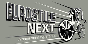
- Linotype: Akko Sans and Akko Rounded (2011; Akko Rounded is situated between DIN, Isonorm and Cooper Black, while Akko Sans is an elliptical organic sans related to both DIN and Neue Helvetica), Akko Condensed (2015), Akko Pro Condensed (2015), Akko Pan-European (2015), Eurostile Next (2008, after Aldo Novarese's original), Eurostile Candy and Eurostile Unicase, Cosmiqua (2007, a lively didone serif family based on 19th century English advertising types, and in particular Miller&Richard's Caledonian Italic), Metro Office (2006, a severe sans after a family of Dwiggins from the 20s), Neuzeit Office (2006, modeled after the original sans serif family Neuzeit S, which was produced by D. Stempel AG and the Linotypes design studio in 1966. Neuzeit S itself was a redesign of D. Stempel AG's DIN Neuzeit, created by Wilhelm Pischner between 1928 and 1939), DIN Next (2009, based on the classic DIN 1451), Times Europa Office (2006, modeled after the original serif family produced by Walter Tracy and the Linotypes design studio in 1974. A redesign of the classic Times New Roman typeface, Times Europa was created as its replacement for the Times of London newspaper. In contrast to Times New Roman, Times Europa has sturdier characters and more open counter spaces, which help maintain readability in rougher printing conditions. Times Europa drastically improved on the legibility of the bold and italic styles of Times New Roman.), Trump Mediaeval Office (2006), Linotype Conrad (1999), Optima Nova (2002, a new version of Optima that includes 40 weights, half of them italic), Linotype Avenir Next (2003, 48 weights developed with its original creator, Adrian Frutiger, and to be used also by the city of Amsterdam from 2003 onwards), Avenir Next Rounded (2012, in conjunction with Sandra Winter), Avenir Next Paneuropean (2021: 56 styles), Zapfino Extra, Palatino Sans and Palation Sans Informal (2006, with Hermann Zapf; won an award at TDC2 2007). Frutiger Serif (2008) is based on Frutiger's Meridien and the Frutiger (sans) family. Diotima Classic (2008, with Gudrun Zapf von Hesse) revives Gudrun's Diotima from 1951. In 2008-2009, Akira Kobayashi and Tom Grace unified and extended Trade Gothic to Trade Gothic Next (17 styles). Neue Frutiger (2009, with Adrian Frutiger) has twice as many weights as the orifinal Frutiger family. Later in 2009, the extensive DIN Next Pro, co-designed with Sandra Winter, saw the light. I assume that this was mainly done so as to meet the competition of FontShop's FF DIN (by Albert-Jan Pool).
- Fontshop: Acanthus (2000, large Fontfont family), FF Clifford (gorgeous text face!). In 2009, he and Hermann Zapf cooperated on Virtuosa Classic, a calligraphic script that updates and revives Zapf's own 1952-1953 creation, Virtuosa.
- Typebox: TX Lithium (2001, The Typebox).
- Oddities: Skid Row (1990), Socia Oldstyle.
- Suntory corporate types (2003-2005), developed with the help of Matthew Carter and Linotype from Linotype originals: Suntory Syntax, Suntory Sabon, Suntory Gothic, Suntory Mincho.
- In 2014, Akira Kobayashi, Sandra Winter and Tom Grace joined forces to publish DIN Next Slab at Linotype.
- Alexey Chekulaev and Akira Kobayashi (Monotype) won a Granshan 2014 award for the Cyrillic typeface SST.
- In 2016, Akira Kobayashi and Sandra Winter co-designed Applied Sans (32 styles) at Monotype. It is in the tradition of vintage sans typeface such as Venus and Ideal Grotesk and competes with Rod McDonald's splendid Classic Grotesque (2011-2016)..
- Member of a type design team at Monotype that created the Tazugane Gothic typeface in 2017. Designed by Akira Kobayashi, Kazuhiro Yamada and Ryota Doi of the Monotype Studio, the Tazugane Gothic typeface offers ten weights and was developed to complement Neue Frutiger. It is the first original Japanese typeface in Monotype's history. Followed in 2018 by the more restrained Tazugane Info. Variable fonts published in 2022: Tazugane Gothic Variable, Tazugane Info Variable.
- SST (2017). A set of fonts for Latin, Cyrillic, Thai, Vietnamese, Arabic and Japanese.
- DIN Next Stencil (2017). Developed together with Sabina Chipara.
- DIN Next Decorative (mostly textured styles such as Rust, Slab Rust, Stencil Rust and Shadow).
- Univers Next Cyrillic and Univers Next Paneuropean, both released in 2020, extending Adrian Frutiger's Univers.
- Shorai Sans (2022) and Shorai Sans Variable (2022). A 10-style Latin / Japanese sans by Akira Kobayashi, Monotype Studio and Ryota Doi, designed as a companion typeface to Avenir Next.
At ATypI 2008 in St. Petersburg, he ran a Linotype student type design workshop. Speaker at ATypI 2012 in Hong Kong: Rounded sans in Japan. View Akiro Kobayashi's typefaces. Klingspor link. FontShop link. Eurostile Next review. Linotype link. Monotype link. MyFonts interview in 2017. [Google]
[MyFonts]
[More] ⦿
|
Albert-Jan Pool
[FF DIN]
|
 [More] ⦿
|
Albert-Jan Pool
|
Dutch writer and designer, b. 1960, Amsterdam, who currently lives in Hamburg. He studied at the Royal Academy of Arts in The Hague. From 1987 until 1991 he was the type director at Scangraphic, and from 1991-1994, he was the type manager at URW in Hamburg, at which time he completed URW Imperial, URW Linear, and URW Mauritius. In 1994 he started his own studio Dutch Design in Hamburg, and finally he co-founded FarbTon Konzept+Design with Jörn Iken, Birgit Hartmann and Klaus-Peter Staudinger, a professor at the University of Weimar, but Pool, Iken and Hartmann left FarbTon in 2005. Their corporate partners were DTL (Frank Blokland), URW++ (mainly for hinting), and Fontshop International. They also got freelance help from Nicolay Gogol and Gisela Will. Up until today, FarbTon has made about ten corporate types. He has worked at URW++ as a freelancer, contributing text and classification expertise to the book URW++ FontCollection. He has been teaching typeface design at the Muthesius Kunsthochschule in Kiel between 1995 and 1998 and has taken up that job again in 2005. Fonts done by Pool include FF DIN (DIN-Mittelschrift is used on German highway signs, 1995; image, another image: for more images, see FF DIN Round at issuu.com), FF DIN Round (2010; +Cyrillic; in use; sample), FF DIN Web (2010), Jet Set Sans (for JET/Conoco gas stations), DTL Hein Gas (for Hamburger Gaswerke GmbH), Regenbogen Bold (for a radical left party in Hamburg, a roughened version of Letter Gothic), and Syndicate Sans (2012, for Syndicate Design). He also made FF OCR-F. In 2022, FontFont released a major set of updates and extensions of the FF DIN family, all co-designed by Albert-Jan Pool and Antonia Cornelius. These include: Together with type-consultant Stefan Rugener of AdFinder GmbH and copywriter Ursula Packhauser he wrote and designed a book on the effects of type on brand image entitled Branding with Type (Adobe Press). An expert on DIN typefaces, he spoke about DIN 16 and DIN 1451 at ATypI 2007 in Brighton, and wrote an article entitled FF DIN, the history of a contemporary typeface in the book Made with FontFont. Speaker at ATypI 2013 in Amsterdam: Legibility according to DIN 1450. Pic. Interview. [Google]
[MyFonts]
[More] ⦿
|
Alberto Romanos
[Branding with Type]
|
 [MyFonts]
[More] ⦿
[MyFonts]
[More] ⦿
|
Alexander Lubovenko
|
 Talented Russian graphic and type designer who works for ParaType in Moscow. His typefaces:
 - In 2015, he and Alexandra Korolkova co-designed Circe Rounded, which is an extension of the Circe typeface (2011), both published by Paratype. Circe is named for the circular nature of many of its glyphs.
- In 2015, Alexandra Korolkova and Alexander Lubovenko published Aphrosine at Paratype, a typeface based on pointed pen script and situated somewhere between handwriting and calligraphy. Many alternatives and smart OpenType features help Aphrosine look like real handwriting.
- Carol Gothic (2015, Alexandra Korolkova and Alexander Lubovenko, Paratype) is a traditional blackletter face closest to Linotype's Old English.
- Liberteen (2015) is a playful tongue-in-cheek take on 19th century slab serifs, including Clarendons. For Latin and Cyrillic, from Thin to Black. Dessert Script (2015, Paratype). A smooth-outlined advertising script for Latin and Cyrillic.
- In 2016, Alexander Lubovenko and Manvel Shmavonyan co-designed the 30-style Latin / Cyrillic workhorse sans typeface family Mediator which was followed in 2017 by Mediator Serif. Later in 2016, Alexander Lubovenko designed the heavy slab serif family Bombarda.
- Hypocrite (2017, Paratype).
- He created some additional styles for Zakhar Yaschin's Mojito script font.
- in 2018, he designed Clincher at Paratype, a set of monospaced and duospaced fonts that were specifically developed for program coding and user interface design.
- Wak (2018). By Aleksander Lubovenko and Viktor Fitzner.
- Journal Sans New (2018).
- Six Hands (2018). This is a collection of six handcrafted typefaces: Black, Brush, Chalk, Marker, Condensed and Rough, by Alexandra Korolkova, Alexander Lubovenko, and the Paratype team.
- Stapel (2020, Paratype). A 57-style Latin / Cyrillic sans family with a sci-fi look and thin stroke joints.
- Vast (2021, Paratype). A 56-style sans family, and three variable fonts, by Manvel Shmavonyan and Alexander Lubovenko. Choices are from thin to black and regular to extra wide.
- In 2021, Paratype designers Isabella Chaeva, Vasily Biryukov and Alexander Lubovenko created DIN 2014 Rounded, an extension of the industrial sans serif DIN 2014. The six-style typeface supports all European languages based on Latin, Cyrillic, and Asian Cyrillic (Tatar, Kazakh and Kyrgyz) and has a variable version.
Paratype link. [Google]
[MyFonts]
[More] ⦿
|
Alexandra Kociak
|
Bydgoszcz, Poland-based graphic designer who created bubbly initials for DIN Neuzeit Grotesk Light in 2014. [Google]
[More] ⦿
|
Alexey Popovtsev
[Aronetiv]
|
 [MyFonts]
[More] ⦿
[MyFonts]
[More] ⦿
|
Alvaro Thomáz Oliveira
[Alvo Type (or: ATF, or: Alvaro Thomaz Fonts)]
|
 [MyFonts]
[More] ⦿
[MyFonts]
[More] ⦿
|
Alvo Type (or: ATF, or: Alvaro Thomaz Fonts)
[Alvaro Thomáz Oliveira]
|
 Ipatinga, Minas Gerais-based (or Santa Barbara-based, or Belo Horizonte-based) designer of these typefaces in 2011: Gogating Book (a Helvetica-like face), Mytupi, Pirates Writers, Chapenettoer 8 Thin, a large x-height and large-bowl minimalist sans face. This was followed by the bold caps sans typeface Laranja Pro and Laranjha Pro Fraco, Aovel Cool (geometric monoline sans), Aovel Sans Rounded, Aovel Sans Light, Aovel Neo (based on Avant Garde), Yagora (humanist sans), Salika, Sheep Sans (2011), Mariana Family, Extrememame, Timo Roman, AvantFox (based on Avant Garde), Brasil (based on ITC Lubalin), Hasteristico (monoline geometric typeface based on Avant Garde), Amiju Book, DMF Arreia Black (fatted up Helvetica), DMF Cantell, DMF Handwriter, DMF Handatme, BDP Sergipe, BDP Fox, BDP Clien, BDP Up, and BDP Gelly.
 Typefaces made in 2012: Flex Display (a free thin sans), Meva (geometric sans), Duase Light (a thin rounded avant-garde geometric sans), Tenue Sans (a distinguished sans---tuxedo required), Cridigo Sans, Cogga (a display sans face), Homizio (a free 6-style geometric sans family), Aliquam, Regencie, Blouding (from blood samples?), Quinfo (avant garde family), Frugal Sans, Agnele Modern (a didone titling face), Salutino, Bondoluo (geometric avant-garde sans, +Light, +Display), Duase (rounded monoline sans). Typefaces from 2013: Panjo (humanist titling sans inspired by Eric Gill), Grieff (a DIN-like sans), Burne (a geometric all caps sans with elements of Futura and Avant Garde), Suicca (hairline sans), Datidi (custom slab face). Typefaces from 2014: Homizio Nova (sans), Amper. Typefaces from 2015: Savass Sans. Typefaces from 2016: Cerko (a gemoetric circle-based futuristic typeface). Typefaces from 2017: Beaga (a slab serif named after Belo Horizonte). Typefaces from 2019: Antropil (a rounded sans), Finis Grotesk (inspired by the Bauhaus movement), Finis Text, Finis Text Soft. Typefaces from 2020: Dumont (a 27-style structural geometric sans named after Brazilian aviation pioneer Alberto Santos dumont), Hauslan (a sans family). Home page. Fontspace link, where he is known as authimie. Another Fontspace link. About me page. Behance link. Another Behance link. About Me link. Dafont link. Aka Alvaro Ovelha. Creative Market link. Future URL. Home page of Alvaro Thomaz. [Google]
[MyFonts]
[More] ⦿
|
Andreas Carlsson
[NoFont]
|
[More] ⦿
|
Andreas Larsen
|
 Copenhagen-based designer (b. 1986) of Tal (2014), a full set of numerals in many weights for use on small devices. Tal is advertized as free, but there are no download buttons anywhere.
 In 2014, he also created the Open Source fonts Gidole Play (later renamed Gidolinya) and Gidole Sans [micropage], which is patterned after DIN 1451 and uses Euler spirals. Dedicated page for Gidole Sans. Github link for Gidole. In 2015, he published Gidole Regular and the monoline sans programming font families Monoid and Mono 16, which cover Latin, Greek and Cyrillic. Gidole was forked and extended in 2016 at Open Font Library by Cristiano Sobral as Normung. He modified the free M+ font to design MonoMusic for chords and tabs. Behance link. Dafont link. Open Font Library link. Use Modify link. [Google]
[More] ⦿
|
Andrew Keating
|
Dublin, Ireland-based creator of a custom sans typeface for the Memento Circus Museum in 2013. In 2015, he designed the DIN-like typeface Persona. Behance link. [Google]
[More] ⦿
|
Andy Budd
|
Managing Director of Clearleft in Brighton, UK. He has a blog, where people were prompted for the names of type families, if they could only buy six of them. Continued here and here. The totals are tallied for you: - Akzidenz Grotesk (2 votes): Akzidenz Grotesk is the classic alternative to its dowdy and overused relation, Helvetica. If you ever feel the need to use Helvetica, resist the urge and try Akzidenz instead.
- Avenir or Avenir Next (2 votes): Futura is a wonderful typeface, although is can feel slightly sterile at times. Adrian Frutiger set about humanizing Futura and created Avenir in 1988. Avenir is a beautiful typeface but is restricted to just 12 weights. In 2004 the typeface was completely revised and Avenir Next was released with a stunning 96 weights. If you are looking for a modern sans, you need look no further.
- Neutraface (2 votes): Designed by Christian Schwartz for House Industries, Neutraface captures the 1950s stylings of architect Richard Neutra in a beautiful typeface meant for application on the screen, in print, and in metalwork. If you are ever in need of a classy retro face, they don't get any more polished than this. [...] Tired of Futura and Gill Sans? Neutraface is a beautiful art-deco alternative. Modern yet retro, this typeface comes with loads of ligatures and 7 beautiful figure styles. If this typeface was a drink it would be a Vodka Martini, shaken, not stirred.
- Engravers Gothic: For a period of about two years, I attempted to inject this font into every single project I worked on. Even if I couldn't fit it into the main scene, I screened it back somewhere in the distance just to feel better about myself. For a brief time, I was actually creating design projects for the sole purpose of using Engravers Gothic in them. It was at this point that I sought professional help.
- Myriad: Its quite simply the most readable sans-serif typeface ever invented for print at least. On the web, that'd be Lucida Grande, but thanks to Apple, I don't really have to buy that now, do I?
- Meta: Like a good mullet, this typeface has something for everyone. Its clean lines make it ideal for logotype, headings, and other professional applications, but its curvy flourishes keep it from looking sterile or uptight.
- Agency: Originally designed in 1932, and then expanded to multiple weights and widths in the 1990s by David Berlow, this typeface can be made to look futuristic or retro. Im partial to flexible typefaces, and Agency is second-to-none in this regard. Use it for old movie posters. Use it for your pathetic Star Trek Convention flyers. Agency feels at home in any environment.
- Palatino: Also abused in both web and print work, Palatino is undeniably versatile and (imho) a much better option overall than Times.
- Proxima Nova: I am counting down the minutes until this typeface is available. No joke.
- Dynasty Light: Someone please give me an excuse to use this in my next project. I take that back: no excuse needed.
- Trajan Pro: I am a sucker for classic Roman letterforms, and it doesn't get much better than Trajan.
- Warnock Pro Light Italic: I stumbled across this gorgeous typeface just recently, and its one of the hottest italics I have had the pleasure of using in recent months.
- Frutiger: Originally designed for the signage at Charles De Gaulle Airport in Paris, Frutiger is a beautifully fluid and legible typeface. Without doubt the most influential typeface in the past 30 tears, Frutiger has been the inspiration for many amazing fonts including the excellent Myriad Pro.
- DIN Schriften: DIN stands for Deutsche Industrie-Norm, the German industrial standard. Originally used for German road signage, this typeface was the darling of 90s graphic designers, and like FF Meta, is starting to make a comeback. With its wide open letter forms DIN is am extremely clear and legible typeface, great at any size.
- Mrs Eaves: If I had to choose one serif typeface it would be Mrs Eaves. Named after John Baskervilles wife, this stylised version of Baskerville is loved by graphic designers around the world. Mrs Eaves is a modern serif that retains an air of antiquated dignity. Playful without being too scripty, its a fully featured typeface with a beautiful collection of ligatures.
[Google]
[More] ⦿
|
Anton Koovit
[Fatype]
|
 [MyFonts]
[More] ⦿
[MyFonts]
[More] ⦿
|
Antonia Cornelius
|
 German type and communication designer, lecturer and researcher with a special interest in legibility and readability (b. 1989). She obtained a Bachelor's in communication design with Jovica Veljovic at Hamburg University of Applied Science, where her thesis was entitled The Letters in my Head. What Creatives should know about reading processes in order to design joyful reading experiences. She also did a Master's with Veljovic, which led to her Legilux typeface family (a transitional serif with optical sizes as well as a sans serif) and further research on legibility. She graduated in 2017. Antonia joined Dutch Design in 2017 and extended the FF DIN family to FF DIN Slab. Furthermore, she re-engineered the whole FF DIN family itself to make variable fonts; she also added Bulgarian Cyrillic and other characters; finally, she also made FF DIN Stencil into a functional three axis variable font. Since 2018, she teaches type design at Muthesius University of Fine Arts and Design in Kiel.
 Her typefaces: - Legilux (2016). A transitional serif with optical sizes as well as a sans serif developed during her Masters studies at Hamburg University of Applied Science.
- FF DIN Slab (2022). With Albert-Jan Pool.
- FF DIN Slab Variable (2022). With Albert-Jan Pool.
- FF DIN Stencil (2022). With Albert-Jan Pool and Achaz Reuss.
- FF DIN Stencil Variable (2022). With Albert-Jan Pool and Achaz Reuss.
- FF DIN Paneuropean (2022). With Albert-Jan Pool, Achaz Reuss, Aleksei Chekulaev and Panos Haratzopoulos. See also and FF DIN Paneuropean Variable (with Achaz Reuss, Aleksei Chekulaev, Albert-Jan Pool and Panos Haratzopoulos).
Antonia Cornelius won the People's Choice award for Legilux in 2016 at the Morisawa Type Design Competition 2016. Speaker at ATypI 2018 in Antwerp on the topic of legibility: Typeface designers Antonia Cornelius and Björn Schumacher conducted a preliminary study for their final master's projects. They set up a reading-speed test by reverting to well-tried test material, which they set in their new typefaces Legilux and Text Type as well as the common Walbaum Standard. Focusing on the effect of the optical scaling method, the typefaces were tested in two sizes: 1.5 mm and 1 mm x-height. The results tend to show a positive effect for optical adjustments in type designs. [Google]
[MyFonts]
[More] ⦿
|
Aparat
[Domen Fras]
|
 Domen Fras completed his masters at London's Central Saint Martin's College of Art & Design in 2000. In 2002 he founded the type & design studio Aparat in Ljubljana, Slovenia. Since 2011 he is a full-time assistant professor at the Faculty of Natural Sciences at the University of Ljubljana. Speaker at ATypI 2014 in Barcelona. His largely experimental work:
 - Brutildo (2006): squarish headline lettering.
- Butalci (1998, a pixel font) is a part of Domen's diploma project at Faculty of Architecture in Ljubljana, supervised by Janez Suhadolc.
- Gyro (1998-2001) is an octagonal monospace font with 3 weights.
- Exlibris (2001-2003) is an experimental face.
- Pozor (1999) is a squarish sans, as for traffic signage.
- Terragni (1998) is an alphabet study based on the floor plan composition analysis of the house 'Casa del Fascio' in Como by the architecta Giuseppe Terragni.
- DinoUnicase (1997) is a variation on DIN Mittelschrift.
- Narod (2003) was made for designing commemorative coins at 60th anniversary of Kocevje Summit.
- JH Luzern (1999) is based on a scan of a hotel room card.
- Pesjan Debu (2011) is a fat angular poster typeface created during TipoBrda 2011.
- Narod Krepak (2010) is an art deco sans titling typeface created during TipoBrda 2010000000
[Google]
[More] ⦿
|
Arlette Boutros
|
 Lebanese type designer who runs the London-based Boutros Foundry with Mourad Boutros. She created or co-created the Arabic typefaces Boutros Ads Pro, Boutros Advertising, and Boutros Thuluth Light. She also was one of the four co-designers (with Mourad Boutros, Richard Dawson and Dave Farey) of Tanseek Pro (2008, Monotype), a typeface family for Latin and Arabic. It contains Tanseek Modern and Tanseek traditional.
 In 2017, Arlette Boutros designed Boutros Futura, or Futura Arabic, at URW to work harmoniously with the URW-Latin whilst respecting Arabic calligraphic and cultural rules. URW's Futura Arabic contains, of course, as a subset, the regular Latin Futura. Still in 2017, Boutros Fonts added URW Geometric Arabic to Joern Oelsner's URW Geometric. In 2019, Volker Schnebel (URW) and Arlette Boutros joined forces and published URW DIN Arabic. She also published the ten-style Latin/Arabic humanist sans typeface Boutros Angham in 2019. Klingspor link. [Google]
[MyFonts]
[More] ⦿
|
Arne Meyer
|
 Berlin-based designer who studied at Hochschule Hannover. In 2016, he created DIN Blind (2016) which is a monospaced DIN adapted to Braille. It follows the E-DIN 32976 norm for tactile writing. [Google]
[More] ⦿
Berlin-based designer who studied at Hochschule Hannover. In 2016, he created DIN Blind (2016) which is a monospaced DIN adapted to Braille. It follows the E-DIN 32976 norm for tactile writing. [Google]
[More] ⦿
|
Aronetiv
[Alexey Popovtsev]
|
 Or Aleksey Popovtsev. Graphic designer in Kiev, Ukraine, who made the Latin / Cyrillic sans typefaces Nachalnaya (2016) and Rothko (2018: a sans).
 Typefaces from 2019: Jheronimus (a neo-humanistic grotesque variable font), Jheronimus Contrast, Ezlo Sans. Typefaces from 2020: Genau (a 9-style geometric sans influenced by the constructivist schools of Vkhutemas and Bauhaus; contains a variable font), Nomenclatur (2020: a sans family for information design and engineering, inspired by DIN). Typefaces from 2021: Wolfgang (a six-style bare-bones text typeface influenced by renaissance types such as Garamond, Bembo and Jenson). Typefaces from 2022: Rottko (a ten-style static grotesque). [Google]
[MyFonts]
[More] ⦿
|
Authentic
[Julius Wiescher]
|
German foundry, est. 2009 by Julius Wiescher (b. 1991), who is the youngest son of famous type designer Gert Wiescher. His font Thin Pen (2009) is based on an ancestor of the German DIN-Schrift. The font was traced with a plastic template on transparent paper, scanned and worked over carefully to keep the handmade, authentic touch. Other fonts by him: DonJulio and Donna Julia (2008, Autographis, calligraphic script fonts made with Gert), Flatpen (2008, Autographis, with Gert), Norm Pen (2011, based on an ancestor of DIN Schrift), Bold Pen (2011, bold version of Norm Pen), Groucho (2011, a high-contrast flowing script), Authentic (2011, a connected copperplate script), Oldhand (2011, shaky handwriting), Holz Caps (2011, an irregular wood type simulation face), Poing (2011, a flowing calligraphic script), Cri Cri (2011, slab serif comic book face). Klingspor link. [Google]
[MyFonts]
[More] ⦿
|
Benjamin Varin
|
French type designer who created these typefaces in 2011: Al-kimiya Font (typewriter style with fun variations), Le Méliès SOFT, Le Méliès (sans), Dinette Ultra (rounded and fat), Dinette (based on DIN), Archipel (thin slab face). . Typecache link. [Google]
[More] ⦿
|
Botio Nikoltchev
[Lettersoup]
|
 [MyFonts]
[More] ⦿
[MyFonts]
[More] ⦿
|
Braille DIN
[Jochen Evertz]
|
Braille DIN (2005, Fontshop) is due to Jochen Evertz. It follows the DIN specs 32980 and the packing standards of the German pharmaceutical industry. The price (159 Euros) is outrageous for a bunch of dots. [Google]
[More] ⦿
|
Branding with Type
[Alberto Romanos]
|
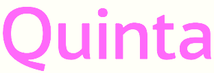
 Alberto Romanos is a Zaragoza, Spain-based type designer who is co-located in London. First he founded the type foundry Alberto Romanos. In 2015, that morphed into Branding with Type.
 Alberto designed a font for an imaginary language. For his MA degree, he worked on variations of Frutiger (2009). His first commercial typeface is Bw Quinta Pro (2015, a sans family). In 2015, he created the variable width condensed grotesque and poster typeface Bw Stretch, and the bespoke retro-futuristic elliptical sans typeface Flat Sans for the Spanish digital agency Flat101. During Typeclinic 11th International Type Design Workshop, he created the typeface Stretch Caps (2015). In 2016, he designed Bw Darius (a sharp-edged high-contrast 4-style typeface family), Bw Surco (humanist sans for Latin and Cyrillic), Bw Modelica (a minimal, robust, reliable and pragmatic geometric sans in 64 styles), Bw Modelica Ultra Condensed, Bw Modelica Condensed, Bw Modelica Expanded, and Bw Mitga (a sans with strong personality and a 16 degree angle that dominates the design). Typefaces from 2017: Bw Nista (Grotesk, International and Geometric), the Cyrillic / Greek expansion of Modelica, called Modelica LGC, Bw Helder (an 18-style sans typeface developed with Thom Niessink), Bw Gradual (an eccentric ink-trapped hipster sans), Bw Glenn Sans and its Egyptian companion, Bw Glenn Slab. Typefaces from 2018: Bw Seido Round (a rounded almost-but-not-quite monoline sans in 12 styles that takes elements from DIN 1451; fiollowed in 2019 by Bw Seido Raw), Bw Vivant (a Peignotian typeface co-designed wih Moritz Kleinsorge). Typefaces from 2019: Bw Beto (a text family in two optical sizes, the larger one being called Bw Beto Grande), Bw Aleta (geometric sans). Typefaces from 2021: Bw Pose (Bw Pose No 3 and Bw Pose No 5, two times twelve fonts: didone typefaces with additional features such as uninterrupted slabs in the No3 family, and occasional wedges in the uppercase). Behance link. Creative Market link. Home page of Alberto Romanos. Typefaces from 2022: Bw Fusiona (a workhorse sans family). [Google]
[MyFonts]
[More] ⦿
|
Brass Fonts
[Guido Schneider]
|
 Cologne-based group of type designers, founded in 1996: Guido Schneider, Hartmut Schaarschmidt, Martin Bauermeister, René Tillmann, Rolf Zaremba. There are many original free fonts here: Amnesia (René Tillmann; now also sold by URW), Anorexia (G. Schneider, 1996), Battery, Battery Seriph, Battery Leak (Tuschemann, 1996), Matula (G. Schneider, 1997), Nobody (G. Schneider), Paul D (Guido Schneider, 1996), Sanctus, SubZero (Guido Schneider, 1996), SynkopSemi, Veto, Visitor (R. Zaremba, 1996), BiaBia (very avant-garde, G. Schneider, 1996), Corpa Gothic (sold by URW++), Cuba (G. Schneider, 1997), Hone (Piano Dog, 1996), Saw, SoloSans (G. Schneider, 1996), Souper, Styptic, Fluxgold (slabserif, G. Schneider 1999), Rotwang (G. Schneider 1998), Styptic (Tuschemann, 1995), Stoneman (Tuschemann, 1998), Jaruselsky (1997, G. Schneider). Well, that is, these fonts have just the basic alphabet and all numbers 3 and 6 have been removed. The full versions are ultra-expensive, at about 110DM per weight (typically, 4 weights per font). More fonts: Temptice (dingbat by A. Groborsch/G. Schneider 98/99, 80DM), Tara (G. Schneider, 1998, 240DM), Corpa Serif (G. Schneider 1998), Fiona Serif, Slab and Script family (2003, G. Schneider). URW marketed these fonts: BF Anorexia, BF Corpa Gothic, BF Corpa Serif, BF Cuba, BF Fluxgold, BF Invicta, BF Jaruselsky, BF Matula, BF Nobody, BF Paul'D, BF Rotwang, BF Solo Sans, BF Stoneman, BF Stypic, BF SubZero, BF Tara.
 Custom fonts by Schneider: Girato (Giraffentoast), Fiona (MDR - Mitteldeutscher Rundfunk), Sion Script (Sion Brauerei), Supralux (Super RTL). He is working on Veltro Pro (a script) and Breite Kanzlei (blackletter). MyFonts sells BF Anorexia (a grunge typeface by Schneider), BF Corpa Gothic (a DIN-like family done in 1997 by Schneider), Corpa Gothic Pro (a 2019 revival of Corpa Gothic), BF Corpa Serif (1997, a slab serif family by Schneider), BF Cuba (a pixel typeface by Schneider), Fiona Script (2006, connected), Fiona Serif, BF Fiona Slab (2006, Guido Schneider), BF Fluxgold (1998, Schneider), BF Invicta (2006, a roman inscriptional family by Schneider), BF Jaruselsky (1997, Guido Schneider), BF Matula (1996, an organic typeface by Guido Schneider), BF Nobody (1995, a roman typeface by Schneider with pointy experimental serifs), BF Paul D (a grunge blackletter typeface by Schneider), BF Rotwang (1997, a transitional typeface by Guido Schneider), BF Solo Sans (1995, Schneider's grotesk family), BF Stoneman (1997, a decorative poster typeface by Schneider), BF Styptic (a grunge paperclip typeface by Schneider), BF Sub Zero (experimental, by Schneider), BF Tara (1999, a humanist sans family by Schneider), BF Girando Pro (a garalde made by Guido Schneider in 2010). Typefaces from 2018: BF Rotwang Pro (a redesign by Schneider of his 1997 typeface, BF Rotwang; named after C.L. Rotwang, the inventor of the Mensch-Maschine from the film Metropolis (1925/1926), BF Rotwang relates to the high-contrast transitional and didone styles), BF Konkret Grotesk Pro (a 16-style grotesk family by Guido Schneider with over 1500 glyphs per font). Typefaces from 2021: BF Garant (a 20-style geometric sans with open counters, tapered spurs and diagonal cut ascenders and descenders). Klingspor link. View Guido Schneider's typefaces. [Google]
[MyFonts]
[More] ⦿
|
Brownfox
[Gayaneh Bagdasaryan]
|
 A graduate of Moscow State University of Printing Arts, Gayaneh has designed Cyrillic localizations for most major type libraries, including Linotype, Bitstream, The Font Bureau, ITC, Berthold, Typotheque, Emigre, and ParaType. She began her type design career at ParaType in 1996 and started Brownfox (her type foundry) in 2012.
 Brownfaox specializes in the design and production of Latin and Cyrillic fonts for print and for screen. They are the organizers of the first Russian international type conference Serebro Nabora. Their first typefaces in 2012, all posted at Google Web Fonts, include Simonetta (readable angular typeface: see here), Sevillana (curly upright script by Olga Umpeleva), Geometria (a geometric sans by Vyacheslav Kirilenko and Gayaneh Bagdasaryan), and Henny Penny (a playful decorative typeface, also by Olga Umpeleva). In 2013, we also find Super Disco (an art disco layered typeface family by Gayaneh Bagdasaryan). Institut (2013) is an industrial-strength sans typeface designed by Vyacheslav Kirilenko with participation of Gayaneh Bagdasaryan. In 2013-2014, Gayaneh Bagdasaryan and Dmitry Rastvortsev created the Latin / Cyrillic sans typeface family Brutal Type (Brownfox) that is genetically linked to DIN. Typefaces from 2014: Gerbera (a sans face co-designed with Vyacheslav Kirilenko), Formular (by Vyacheslav Kirilenko and Gayaneh Bagdasaryan: a Swiss sans family for Latin and Cyrillic), Activist (a minimalist all caps typeface commissioned by the Anticorruption Foundation). Typefaces from 2015: Nolde (a Latin / Cyrillic titling typeface named after german-Danish printer Emil Nolde; by Vyacheslav Kirilenko and Gayaneh Bagdasaryan). Typefaces from 2016: Wermut (a dagger-serifed transitional Latin / Cyrillic text typeface family by Gayaneh Bagdasaryan and Vyacheslav Kirilenko, published at Brownfox). Typefaces from 2017: Aeroport (by Gayaneh Bagdasaryan & Vyacheslav Kirilenko). Typefaces from 2022: Jet (the authors, Gayaneh Bagdasaryan and Vyacheslav Kirilenko, write: Jet is an assertive italic sans that anticipates the return of the simpler, optimistic times when progress was considered positive and forward seemed to be the only way to go). Behance link. Fontspace link. [Google]
[MyFonts]
[More] ⦿
|
Bruno Franco
|
Graphic designer and photographer in Caldas da Rainha, Portugal. Based on DIN 1451, he created Geometrische in 2010. Flickr page. [Google]
[More] ⦿
|
Büro Dunst
[Christoph Dunst]
|
 Christoph Dunst is a graphic and type designer living and working in Berlin, Germany. He studied at the Royal Academy of Fine Arts in Den Haag, The Netherlands, where he graduated with a degree in graphic and typographic design and a masters in type design. In 2006 he founded the design studio Büro Dunst in Den Haag, which he moved in 2009 to Berlin, lock, stock and barrel. In 2012, he set up Atlas Font Foundry.
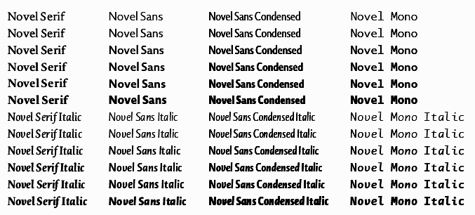
 Designer of the text family Novel, which won an award at TDC2 2009. He calls his Novel Sans Pro (2011) a new humanist grotesque face---a contradictio in terminis. In 2011, he added Novel Mono Pro, a monospaced grotesk family, and Novel Sans Condensed Pro, a great family for information design. In 2012, Novel Sans Rounded Pro followed. In 2015, Christoph added Novel Sans Rounded Italics Pro. Other typefaces: Heimat Sans (2010, a monoline sans family), FF DIN Round (2010), Heungkuk Sans (the corporate typeface of the Heungkuk Finance Group, Seoul, South Korea). Klingspor link. Atlas Font Foundry link. [Google]
[MyFonts]
[More] ⦿
|
Cameron Roll
[Typefaces no one gets fired for using]
|
[More] ⦿
|
Carsten Strinkau
|
Graduate of Kunstschule Wandsbek in Hamburg, Germany. Designer at URW++ of FontForum CSPaket, CSCourtHandD (medieval calligraphy based on the handwriting of monks in the 16th century), CSFuzzyLogD and CSTakahashiD (oriental simulation, a hommage to the Japanese Manga artist Katsuhiro Otomo and his character/figure Takashi from the Akira-Manga). His fonts are sold under the name CS Fonts, and through URW++, and through MyFonts.com. [Google]
[MyFonts]
[More] ⦿
|
Carsten Waldeck
|
German designer of the 300-strong Deen pixel font family (2006). Deen is a contraction of DIN and screen. [Google]
[More] ⦿
|
CAT Design Wolgast
[Peter Wiegel]
|
 Wolgast-based type designer Peter Wiegel (b. 1955) runs CAT Design Wolgast. Designer of these free fonts:
 - In 2019: Kufi Pattern.
- In 2018: Aurach Tri (a trilined typeface), Googee (monoline circle-themed sans), Gianna (medieval script), Hamburger Schwabacher.
- In 2017: Eyechart (heavy slab serif), Border Control (inline), Espresso Dolce (rounded sans), Gotisch Weiss, Halt (a dry brush typeface after Walter Hoehnisch's Stop from 1939), Kanzler, Llewie (rounded sans), Schulze Werbekraft (expressionist, after Arthur Schulze, 1926).
- In 2016: Ronaldson Gothic (after a MacKellar, Smiths & Jordan Co original), Vorgang (a great 1920s geometric sans), 5by7 (LED pixel font), BP 12-22 (industrial sans), u DIN 1451 Mittelschrift, Flubby, Gaeilge (Irish / uncial), Junior CAT (after Hans Heimbeck, 1936), CAT Liebing Gotisch (after Kurt Liebing), Tippa (an old typewriter font based on Adler Tippa 1).
- In 2015: Nuernberg (blackletter), CAT Schmalfette Thannhaeuser (blackletter), Offenbacher Reform (a revival of Offenbacher Reform, a blackletter typeface by Roos & Junge), Autobahn (blackletter), Barloesius Schrift (after Georg Barloesius's Barlösius Schrift, 1906), CAT-Franken-Deutsch (after Alfons Schneider, 1936), Fuckin Gwenhwyfar, CAT Kurier (a script after Herbert Thanhaeuser's Kurier from 1939), CAT Linz, CAT Rhythmus (a sharp-edged black grotesk after a Schriftguss AG original), DIN Schablonierschrift (DIN-based stencil), CAT North Licht, Feronia, Fette National Fraktur (after Walter Hoehnisch, 1934), Grobe-Plakat-Fraktur, CAT Childs (fifties style cursive typeface), Jena Gotisch (decorative caps), Kabinett Fraktur (after Johann Friedrich Unger, 1793-1794), Wattauchimma (heavy hipster sans), Friedolin (blackletter), Lorem Ipsum, Symphonie (a calligraphic script, reviving Imre Reiner's Symphonie (1938), also called Stradivarius (1945)), Power (a retro techno typeface), Krugmann Brush, Omega.
- In 2014: BernerBasisschrift1, BernerBasisschrift2 (school script), Berolina, Brausepulver (after Brause & Co., 1912), Fette Mikado (psychedelic style oriental look), Germanica, Gloria, HentimpsCirclet (blackletter), Hofstaetten (blackletter), Kleinsemmering, KuenstlerGotisch (blackletter), LacledeCAT (psychedelic), NeptunCAT, Neue Zier Schrift (a mischievous curly script), Pommern Gotisch, Reclame, CAT Report (retro brush script), Rueck-Italic, Rueck, RueckLeft, RueckLicht, RundschriftCAT (hairline ronde), Standard Graf (German expressionist and hexagonal typeface), Teutonic, VerzierteFavorite, VictoriaCAT, AdmiralCAT (a retro script), Dynamo (poster font), Des Malers Fraktur, Kanzleyrath (blackletter), Ober-Tuerkheim (art nouveau), PopplFrakturCAT (blackletter), Rundkursiv, Modeschrift (fifties script), Biedermeier Kursiv, Ehmcke Federfraktur (after a 1935 font by F.H. Ehmcke), Wernicke Schwabacher (after an original by Emmi Wernicke), Gotische Missalschrift, Hand Textur (after a 1935 font by F.H. Ehmcke), Renata (after a 1914 bastarda by Bauersche Giesserei), Rundgotisch Rauh (possibly after a Schelter & Giesecke design from 1903), Offenbacher Schwabacher (after Kurt Wanschura's bastarda from 1900), Incopins Clusters (multilined typeface), BadGong, Bernardo Moda (Bold, Semibold, Moda, Contrast: modeled after Lucian Bernhard's Bernhard fashion), CAT-Hohenzollern (after a 1902 art nouveau font by Bauersche), CATNorth, CATNorthLicht, CATNorthShadow, CAT Zentenaer Fraktur UNZ1 (a blackletter after a 1937 original by F.H.E. Schneidler), Coggers-Tariqa, EirikRaude, Fabrik (a geometric sans), Grobe Deutschmeister (German expressionist face), Harry Piel (or Piehl--a tattoo font), Kanalisirung, Klaber-Fraktur, Peter Obscure, Rumburak (a fat retro script), Flottflott (retro script), Indira K, Regent UNZ (a Schwabacher), Postamt, TGL 0-1451 Engschrift (a DIN-like font).
- In 2013: Spartakus (+Round), Cut Me Out (white on black sans), 5by9 (dot matrix face), Tartlers End (high-contrast ball terminal face), Alpha 54 (rounded flared script face), Chunk Five Ex (slab serif; he writes: With permission of Meredith Mandel, the original author of the ASCII-Font Chunk Five, I have extended Chunk Five Ex to a full featured unicode font with all figures used in Latin and Cyrillic writing), Simple Print (simple sans), Fette Bauersche Antiqua (a didone fat face), Manuskript Gothisch (after Manuskript Gotisch (1899, Bauersche), which was modeled after Wolfgang Hopyl's 1514 Textura), Quast (hairy font).
- Still in 2013, he published a number of school scripts, including Neue Rudelskopf, Deutsche Normalschrift, Imrans School, Rastenburg (German school font), and Bienchen.
- In 2012: Hardman (connected fifties script), Immermann (a quaint slab serif), Quast (grunge), Fundamental Brigade (sans family), DiffiKult (a bilined face), Men Nefer (a Memphis lookalike), Fette Unz Fraktur (like Fette Fraktur), Mutter Krause (for the reconstruction of the 1929 silent movie "Mutter Krausens Fahrt ins Glück", where it is used for intertitles, that where missing. The font is redrawn from the original intertitles), Youbilee (a font with laurels).
- In 2010: Alfabilder (dingbats), Gondrin (athletic lettering with a 3d effect), Helvetia Verbundene (making Helvetica into a school script? The original typeface was by Carl Albert Fahrenwaldt 1901), Proletarsk (a grotesk face), Vis-à-vis (great idea--a double-storied serif face), ApolloASM (Victorian), BertholdrMainzerFraktur, Doergon-Regular (license plate font), DoergonBackshift, DoergonShift, Eureka (Victorian, ornamental face), GoeschenFraktur (1880-style Fraktur used in Sammlung Göschen books), Makushka, MakushkaKontura, MakushkaQuadriga, MakushkaSecunda, Moderne3DSchwabacher, ModerneGekippteSchwabacher, StrassburgFraktur, TGL0-16 (same as DIN 16), TGL0-17 (same as DIN 17), TGL0-17Alt, Tank (emblems of gas companies), EricaType-Bold, EricaType-BoldItalic, EricaType-Italic, EricaType-Regular (typewriter), ErikaOrmig, Fibel Vienna (2012, a high-legged sans), GreifswalderTengwar-Regular, GreifswalerDeutscheSchrift (German Schreibschrift), Midroba-Regular (a strong mechanical octagonal face), MidrobaSchatten, MMX2010 (futuristic), Präsent60, Rotunda Pommerania (blackletter), TengwarOptime, TengwarOptimeDiagon, cbe-Bold, cbe-BoldItalic, cbe-Italic, cbe.
- In 2009: 18thCenturyInitials, 18thCenturyKurrent-Regular, 18thCenturyKurrentAlternates, German writing from the 18th century), CentreClaws, CentreClawsBeam1, CentreClawsSlant, Cöntgen Kanzley Regular (blackletter), Cöntgen Kanzley Aufrecht (2009), ElficCaslin, H1N1, Loxembourg1910Shadow (an art nouveau-influenced stencil face), Luxembourg1910, Tschichold, VarietScala (an art deco sans family), Varietee, VarieteeArtist, VarieteeCabaret, VarieteeCascadeur, VarieteeCasino, VarieteeCirque, VarieteeColege, VarieteeConferencier, VarieteeFolies, VarieteeIkarier, VarieteeJongleur, VarieteeMirage, VarieteeRevue, VarieteeTheatre, KochFetteDeutscheSchrift (blackletter), MoradoFelt-Regular (upright connected script), MoradoMarker (2009), MoradoNib, PreussischeVI9 (DIN-like family), PreussischeVI9Linie, PreussischeVI9Schatten-Linie, PreussischeVI9Schatten, SchatternvonPreussischeVI9, Stage (art deco), Ring Matrix (dot matrix), Nathan, Amptmann Script (2009, upright connected script), Cat Shop, Blankenburg (blackletter), Murrx (arched face), Schwaben Alt (1988, bastarda), Vrango, 14LED (Regular, Phattt-Heavy, Rised-Black), 24LED (+Bright, +Grid, +Modul), DIN1451fetteBreitschrift1936-Regular, FibelNord (basic sans family with an architectural twist), FibelSued (family), PaneuropaBankette, PaneuropaCrashbarrier-Black, PaneuropaFreeway, PaneuropaHighway, PaneuropaRoad, PaneuropaStreet, PaneuropaWrongWay, Quirkus (family), RingMatrix (dot matrix family), RingMatrix3D, RingMatrixTwo, DiscipuliBritannica (connected script), GruenewaldVA-Regular (connected school script), Rudelskopfdeutsch-Aufrecht, WiegelLatein (connected school script), WiegelLateinMedium (2009), Morado, Moebius Bicolor (art deco), Elbaris (sans), ElbarisOutline, Nomitais (multiline face), RostockKaligraph, Waschkueche, WaschkuecheGrob-Ultra, WiegelKurrent (traditional German school script), WiegelKurrentMedium, XAyax, XAyaxOutline (2009), Kaufhalle (squarish), Quimbie (art deco), CasaSans-Regular, Elb-Tunnel, MeyneTextur (blackletter), Yiggivoo, TGL 31034-1 (futuristic sans), Beroga (a simple organic sans).
- Before 2009: Xayax, PreussischeIV44Ausgabe3 (2006, a severe sans), Utusi Star (1989, very condensed all-caps face), Avocado (2006, script face), CbeNormal (2006, script face), Leipzig Fraktur (+Bold) (2006), Berlin Email (2006, a condensed sans family, followed in 2009 by Berlin Email Serif), MaassslicerItalic (2006, a futuristic typeface made for Rudolf Maass + Partner GmbH), Powerweld (a gorgeous avant-garde typeface made for OPTI Pumpen und Technik GmbH), WolgastScript (2005), WolgastTwo (2006, connected script), WolgastTwoBold, ZeichenDreihundert-Regular, ZeichenHundert-Regular, ZeichenVierhundert-Regular, ZeichenZweihundert-Regular (2006, traffic dingbats), Djerba simplified (Arabic font, Computer and Technologie, Hamburg, 1995; it can be downloaded here), Titus FrakturBaltic (1998), TITUS FrakturEast Normal (1998), and TITUS FrakturWest Normal (1998) [which used to be downloadable here; these fonts were retired and the Titus name dropped; most of the glyphs made it to Schwaben Alt].
Dafont link. One more URL. Fontspace link. Yet another URL. Font Squirrel link. Fontsy link. The list of his truetype and opentype typefaces as of 2011: 18thCenturyInitials, 18thCenturyKurrentStart, 18thCenturyKurrentText, Alfabilder, AlteDIN1451Mittelschrift, AlteDIN1451Mittelschriftgepraegt, AmptmannScript, ApolloASM, Avocado, Barnroof, BerlinEmail, BerlinEmail2, BerlinEmailBold, BerlinEmailBold, BerlinEmailHeavy, BerlinEmailHeavy, BerlinEmailOutline, BerlinEmailOutline, BerlinEmailSchaddow, BerlinEmailSchaddow, BerlinEmailSemibold-Bold, BerlinEmailSemibold-Bold, BerlinEmailSerif, BerlinEmailSerif, BerlinEmailSerifSemibold, BerlinEmailSerifSemibold, BerlinEmailSerifShadow, BerlinEmailWideSemibold, BerlinEmailWideSemibold, Beroga, Beroga, BerogaFettig-Bold, BerogaFettig-Bold, BertholdMainzerFrakturUNZ1A-Italic, BertholdMainzerFrakturUNZ1A, BertholdrMainzerFraktur, Blankenburg-Regular, BlankenburgUNZ1A-Italic, BlankenburgUNZ1A, CasaSans-Regular, CasaSans, CasaSansFettig-Bold, CatShop, CentreClaws, CentreClawsBeam1, CentreClawsSlant, ChunkFiveEx, CntgenKanzley-Regular, CntgenKanzleyAufrecht, DIN1451fetteBreitschrift1936-Regular, DiscipuliBritannica, DiscipuliBritannicaBold, Doergon-Regular, DoergonBackshift, DoergonShift, DoergonWave-Regular, Elb-Tunnel, Elb-TunnelSchatten, Elbaris, ElbarisOutline, ElficCaslin, EricaType-Bold, EricaType-BoldItalic, EricaType-Italic, EricaType-Regular, ErikaOrmig, Eureka, FibelNord-Bold, FibelNord-BoldItalic, FibelNord-Italic, FibelNord, FibelNordKontur, FibelSued-Bold, FibelSued-BoldItalic, FibelSued-Italic, FibelSued, FibelSuedKontur, GoeschenFraktur, GoeschenFrakturUNZ1A-Italic, GoeschenFrakturUNZ1A, Gondrin, GreifswalderTengwar-Regular, GreifswalerDeutscheSchrift, GruenewaldVA-Regular, GruenewaldVA1.Klasse, GruenewaldVA3.Klasse, H1N1, HelvetiaVerbundene, KochFetteDeutscheSchrift, KochFetteDeutscheSchriftUNZ1A-Italic, KochFetteDeutscheSchriftUNZ1A, LeipzigFrakturBold, LeipzigFrakturHeavy-ExtraBold, LeipzigFrakturLF-Bold, LeipzigFrakturLF-Normal, LeipzigFrakturNormal, LeipzigFrakturUNZ1A-Bold, LeipzigFrakturUNZ1A-BoldItalic, LeipzigFrakturUNZ1A-Italic, LeipzigFrakturUNZ1A, Luxembourg1910, Luxembourg1910Contur, Luxembourg1910Ombre, MMX2010-Regular, Maassslicer3D, Maassslicer3D, MaassslicerItalic, MaassslicerItalic, Makushka, MakushkaKontura, MakushkaQuadriga, MakushkaSecunda, MeyneTextur, MeyneTexturUNZ1A-Italic, MeyneTexturUNZ1A, Midroba-Regular, MidrobaSchatten, Moderne3DSchwabacher, ModerneFetteSchwabacher, ModerneFetteSchwabacherUNZ1A-Italic, ModerneFetteSchwabacherUNZ1A, ModerneGekippteSchwabacher, MoradoFelt-Regular, MoradoMarker, MoradoNib, MoradoSharp-Regular, Murrx, Nathan-CondensedRegular, Nathan-ExpandedRegular, Nathan-Semi-expandedRegular, Nathan, NathanAlternates-CondensedRegular, NathanAlternates-ExpandedRegular, NathanAlternates-Semi-expandedRegular, NathanAlternates, Nomitais, Nomitais, Numikki, Numukki-Italic, Numukki-Italic, Numukki, Powerweld, PreussischeIV44Ausgabe3, PreussischeIV44Ausgabe3, PreussischeVI9, PreussischeVI9Linie, PreussischeVI9Schatten-Linie, PreussischeVI9Schatten, Proletarsk, Prsent60, Quimbie, Quimbie3D, QuimbieShaddow, QuimbieUH, Quirkus-Bold, Quirkus-BoldItalic, Quirkus-Italic, Quirkus, QuirkusOut, QuirkusUpsideDown, RostockKaligraph, RotundaPommerania, RotundaPommeraniaUNZ1A-Italic, RotundaPommeraniaUNZ1A, Rudelskopfdeutsch-Aufrecht, SchatternvonPreussischeVI9, Schulfibel-Nord-Linie-2, SchwabenAlt-Bold, SchwabenAltUNZ1A-Italic, SchwabenAltUNZ1A, Stage, StrassburgFraktur-Regular, TGL0-16, TGL0-17, TGL0-17Alt, TGL31034-1, TGL31034-1, TGL31034-2, TGL31034-2, Tank, TengwarOptime, TengwarOptimeDiagon, TitilliumMaps29L-1wt, TitilliumMaps29L-400wt, TitilliumMaps29L-800wt, TitilliumMaps29L-999wt, TitilliumText22L-1wt, TitilliumText22L-250wt, TitilliumText22L-400wt, TitilliumText22L-600wt, TitilliumText22L-800wt, TitilliumText22L-999wt, TitilliumTitle20, UtusiStar-Bold, UtusiStar, VarietScala, Varietee, VarieteeArtist, VarieteeCabaret, VarieteeCascadeur, VarieteeCasino, VarieteeCirque, VarieteeColege, VarieteeConferencier, VarieteeFolies, VarieteeIkarier, VarieteeJongleur, VarieteeMirage, VarieteeRevue, VarieteeTheatre, Via-A-Vis, Vrng, Waschkueche, Waschkueche, WaschkuecheGrob-Ultra, WaschkuecheGrob-Ultra, WiegelKurrent, WiegelKurrent, WiegelKurrentMedium, WiegelKurrentMedium, WiegelLatein, WiegelLateinMedium, WolgastScript, WolgastScript, WolgastTwo, WolgastTwo, WolgastTwoBold, WolgastTwoBold, XAyax, XAyax, XAyaxOutline, XAyaxOutline, YiggivooUnicode-Italic, YiggivooUnicode-Italic, YiggivooUnicode, YiggivooUnicode, YiggivooUnicode3D-Italic, YiggivooUnicode3D-Italic, YiggivooUnicode3D, YiggivooUnicode3D, ZeichenDreihundert-Regular, ZeichenDreihundertAlt, ZeichenHundert-Regular, ZeichenHundertAlt, ZeichenVierhundert-Regular, ZeichenZweihundert-Regular, ZeichenZweihundertAlt, cbe-Bold, cbe-BoldItalic, cbe-Italic, cbe, kaufhalle, kaufhalle, kaufhalleblech, kaufhalleblech, moebius. His type 1 fonts as of 2011: Avocado, BerlinEmail, BerlinEmail2, BerlinEmailBold, BerlinEmailHeavy, BerlinEmailOutline, BerlinEmailSchaddow, BerlinEmailSemibold-Bold, BerlinEmailSerif, BerlinEmailSerifSemibold, BerlinEmailSerifShadow, BerlinEmailWideSemibold, Beroga, BerogaFettig-Bold, CasaSans, Elb-Tunnel, Elb-TunnelSchatten, Maassslicer3D, MaassslicerItalic, Numukki-Italic, Numukki, Powerweld, PreussischeIV44Ausgabe3, Quimbie, QuimbieUH, RostockKaligraph, TGL31034-1, TGL31034-2, UtusiStar-Bold, UtusiStar, Waschkueche, WaschkuecheGrob-Ultra, WolgastScript, WolgastTwo, WolgastTwoBold, YiggivooUnicode-Italic, YiggivooUnicode, YiggivooUnicode3D-Italic, YiggivooUnicode3D, cbe-Bold, cbe-BoldItalic, cbe-Italic, cbe, kaufhalle, kaufhalleblech. A list of typefaces in alphabetical order, with descriptive comments provided by Reynir Heidberg Stefansson from Iceland: 18th Century Kurrent (Kurrent-style handwriting, Wiegel-coded), Alfabilder (Alphabetic picture font for the German alphabet), Amptmann Script (Partly-connected, upright writing, used on Prussian Railways pattern drawings), ApolloASM (Jugendstil, vaguely resembling an ornate Bocklin), Avocado (Handwriting, broad-nib pen-style), Berlin Email (Narrow sans-serif, based on emailled signage; Wiegel-coded), Berlin Email Serif (Narrow serif, based on emailled signage; Wiegel-coded), Beroga (All-minuscule, rounded marker-style sans-serif with ca. 8° slope), Berthold Mainzer Fraktur (Fraktur in Wiegel (Regular only) and UNZ1(A) coding), Blankenburg (Semicondensed Tannenberg in Wiegel (Regular only) and UNZ1(A) coding), Casa Sans (Squarish, broad-nib pen-style block writing), CatShop (Serif, soft of an acid-washed didone), cbe Normal (Sans-serif, narrow, somewhat cuneiform), Centre Claws (Sans-serif, Art Deco display, a bit like Broadway), Cöntgen Kanzlei (Cöntgen Kanzley) (Fraktur-based calligraphy by Heinrich Hugo Cöntgen, Wiegel coding), DiffiKult (Sans-serif, display, no horizontal lines), DIN 1451 fette Breitschrift 1936 (The now-withdrawn Wide version of DIN 1451 traffic font), Discipuli Britannica (UK school handwriting), Doergon (Slab-serif, narrow-ish, all majuscule), CAT Eckmann, Elabris (Elbaris) (Sans-serif, caps/smallcaps, shades of DIN1451 Engschrift), Elb-Tunnel (Sans-serif, based on signage in the old Elbe tunnel in Hamburg), Elbic Caslon (Elfic Caslon, Elfic Caslin) (a Caslon for the Queen Galadriel), Erika Type (Erica Type) (Slab-serif, typewriter, comes from Wiegel's old Erika typewriter), Eureka (Serif, caps/smallcaps, Art Deco/Jugendstil), Fibel Nord (2009, sans-serif, based on German school primer), Fibel Sued (2009, sans-serif, based on German school primer), Fibel Vienna (Sans-serif, based on Austrian school primer), Fundamental Brigade (Sans-serif, geometric, some UNZ1 ligatures), Göschen Fraktur (Goeschen Fraktur) (Fraktur with a biblical feel, Wiegel (Rg only) and UNZ1 coding), Gondrini (Gondrin) (Sans-serif, geometric, display, shaded outlines, cookie-cutter), Greifswalder Deutsche Schrift (Handwriting, based on Rudolf Koch's Offenbacher Kurrent, Wiegel coding), Greifswalder Tengwar (Tengwar handwriting in Offenbach style), Gruenewald VA (Latin-style schoolhand, Wiegel coding), H1N1 (Heavy display typeface made of parallel wavetrains), Hardman (Heavy, wide, squarish logotype with connecting letters), Helvetia Verbundene (Swiss handwriting), Immermann (Display, resembles a seriffed Radio/Rundfunk, UNZ1 coding), Kaufhalle (Display, recreation of HO Kaufhalle logotype), Koch Fette Deutsche Schrift (Very plain fraktur, Wiegel (Rg only) and UNZ1 coding), Leipzig Fraktur (Fraktur for bread text, Wiegel coding), Leipzig Fraktur UNZ1A (Fraktur for bread text), Luxembourg 1910 (Sans-serif, Jugendstil display typeface from old spice drawers), Maass Slicer (Maassslicer) (Sans-serif, oblique display face, orig. logotype), Makushka (Sort-of an Elabris with minuscules, looks overlayable), Men Nefer (Slab-serif, geometric, UNZ1 coding), Midroba (Spur-serif, display, all-majuscule, heavy, octal), MMX2010 (Sans-serif, display, caps/smallcaps, TV game machine feel), Moderne Schwabacher (Heavily reworked, Wiegel coding), Moderne Fette Schwabacher UNZ1A (Heavily reworked, Wiegel coding), Möbius (moebius) (Sans-serif, display, bicolour (u/c = non-spacing fills, l/c = spacing outlines)), Morado (Connected handwriting with nib or marker pen), Murrx (Heavy display typeface made from ellipsoids on NE-SW axis), Mutter Krause (Serif, slanting, Jugendstil-feel), CAT Neuzeit and CAT Neuzeit Schatten (2012-2014), Nathan (Slab-serif, hand-drawn.), Nomatais (Nomitais) (Elabris with multiple levels of outlines), Numukki (Conlang, knotted-line, good for separators and scenebreaks), Powerweld (Sans-serif, Bauhaus style, all-minuscule), Präsent 60 (PI font with various East German logos), Preussische IV 44 (PreussischeIV44Ausgabe3) (Repro of Prussian Railways pattern type IV 44 version 3), Preussische VI 9 (Repro of Prussian Railways pattern type VI 9 version 2), Proletarsk (Sans-serif, monoline, doubled-up questionmark), Quast (Brush type, all-majuscule, very rough outline), Quimbie (Sans-serif, all-majuscule, resembles Amelia), Quirkus (Sans-serif), Ring Matrix (LED matrix with ring LEDs, solid LEDs and ring LEDs with shadow), Rostock Kaligraph (Very round calligraphy, resembles rotunda), Rotunda Pommerania (Rotunda style, Wiegel-code (Regular only) or UNZ1-coded), Rudelskopf deutsch (Sans-serif, based on Kurrent-style letterforms), Schwaben Alt (Schwabacher in Wiegel- (Rg only) or UNZ1-coding.), Stage (Sans-serif, narrow, Art Deco, fleeting taste of Broadway), Strassburg Fraktur (Handwritten fraktur, ornate majuscules, Wiegel-coding), Tank (PI font with (gas/petrol) tank station logos), TengwarOptime (Optima for Tengwar), TGL 0-16/0-17 (East German versions of DIN 16 and DIN 17 blueprint types), TGL 31034-1, TGL 31034-2 (East German versions of DIN 6776 / DIN EN ISO 3098 blueprint types), Utusi Star (Sans-serif, slight resemblance with Rundfunk), Varieté (Sans-serif, all-majuscule or caps/smallcaps), Vis-A-Vis (Serif, all-majuscule, split in middle), Volk Redis (Kurrent handwriting, anno 1930-1941), Vrångö (LED matrix type like Ring Matrix), Waschküche (Serif, resembles Antykwa Torunska), Wiegel Kurrent (Kurrent-style handwriting), Wiegel Latein (Latin-style handwriting), Wolgast Script (Sloppy-looking handwriting with a broad-nib pen), Wolgast Two (Latin/Cyrillic handwriting), XAyax (Serif, Jugendstil, narrow, all-majuscule), Yiggivoo Unicode (Sans-serif, wide, tall x, board game packaging feel), Youbilee (PI font with various jubilee laurels), Verkehrszeichen (Zeichen) (PI fonts with traffic signs (in layers)), Verkehrszeichen alt (Zeichen Alt) (PI fonts with old traffic signs (in layers)). Abstract Fonts link. Dafont link. Kernest link. Klingspor link. CAT Fonts link. Fontesk link. [Google]
[More] ⦿
|
C.E. Fetzer
|
In 1871-1872, C.E. Fetzer proposed a mathematically defined (raster-based) grotesk called Runde Groteskschrift. It was not a complete alphabet, but according to Albert-Jan Pool, it was the ancient ancestor of FF DIN. [Google]
[More] ⦿
|
Charles Nix
[New Fonts]
|
 [MyFonts]
[More] ⦿
[MyFonts]
[More] ⦿
|
CheapProfonts
[Roger S. Nelsson]
|
 Started in 2008, this web place by Norwegian entrepreneur Roger S. Nelsson (based in Honningsvåg, Norway) sells fonts by Ray Larabie, Brian Kent, Nick Curtis, Derek Vogelpohl and Kevin King that were originally freeware fonts. Nelsson reworked them (more glyphs, more multilingual) and asks about 10 dollars per font now. He says his fonts now cover these Latin languages: Afrikaans, Albanian, Basque, Belarusian (Lacinka), Bosnian, Breton, Catalan, Chamorro, Chichewa, Cornish, Croatian, Czech, Danish, Dutch, English, Esperanto, Estonian, Faroese, Filipino (Tagalog), Finnish, French, Frisian, Galican, German, Greenlandic, Guarani, Hungarian, Icelandic, Indonesian, Irish (Gaelic), Italian, Kashubian, Kurdish (Kurmanji), Latvian, Lithuanian, Luxembourgian, Malagasy, Maltese, Maori, Northern Sotho, Norwegian, Occitan, Polish, Portuguese, Rhaeto-Romance, Romanian, Saami (Inari), Saami (Lule), Saami (North), Saami (South), Scots (Gaelic), Serbian (latin), Slovak(ian), Slovene, Sorbian (Lower), Sorbian (Upper), Spanish, Swedish, Tswana, Turkish, Turkmen, Ulithian, Walloon, Welsh, Yapese.
 Designer at FontStruct in 2008 of cowboy_hippie and Syndrome X (DNA-look typeface inspired by Syndrome BRK by Brian Kent). Nelsson's fonts are Classic Trash BRK Pro, Dynamic BRK Pro, Galapogos BRK Pro, Genotype BRK Pro, King Cool KC Pro (kid's hand; done with Kimberly Geswein), Lamebrain BRK Pro, Matrise Pro and Matrise Text Pro (dot matrix), Phorfeit BRK Pro, Syndrome BRK Pro, Technique BRK Pro, Vigilance BRK Pro, Grapple BRK Pro. The "BRK" refers to Brian Kent, the original free font designer. In 2009, he added a number of fonts that were done by Nick Curtis some years before that (hence the "NF"): Boogie Nights NF Pro (art deco face), Copasetic NF Pro, Coventry Garden NF Pro, Pro, Fontleroy NF Pro, Hamburger Heaven NF Pro, Monterey Popsicle NF Pro, and Wooden Nickel NF Pro. Trypewriter Pro (2009) is based on Kevin King's Trypewriter. Helldorado Pro (2009) is a Tuscan wood type style typeface based on a font by Levente Halmos. Designer of Isbit Pro (2012, a magnificent melting ice cube-shaped superlliptical typeface family), Familiar Pro (2011, designed with the same metric as Helvetica but "better than Arial"), Bloco Pro (2010, fat counterless face), Trump Town Pro (2009, athletic lettering slab serif), Geometric Soft Pro (2009), Geometry Script Pro (2010, upright connected script), DIN Fun Pro (2011), Infantometric Pro (2012), Foobar Pro (2012) and Cheap Pro Fonts Serif (2009). Typefaces from 2013: Adultometric Pro (narrow monoline sans). Dafont. Fontspace link. Fontsquirrel link. Catalog of Nelsson's bestselling typefaces. [Google]
[MyFonts]
[More] ⦿
|
Chiharu Tanaka
|
 Chiharu Tanaka was born and raised in Japan. She completed her Bachelor's degree of Textile Design in Tokyo and worked at design companies for a few years. She subsequently received her MFA in Graphic Design from the Academy of Art University in San Francisco in 2009, and remained in San Francisco area ever since. She worked as a graphic and type designer for John McNeil Studio (2009-2010), Landor Associates (2009-2010), Psy/Ops (2010-present) and Morisawa (2016-present). Her typefaces:
 - The roman and ornamental retail typeface family HaruNami (2010, Psy Ops). She writes: HaruNami (spring wave) is a family of decorative typefaces which fuse together Japanese ornamentation with the Roman alphabet. My purpose with this project is to find a balance between the designs of the West and the East. My hope is to share the Japanese aesthetic with an International audience. HaruNami has a unique stylistic system that ranges from Simple to Ornate.
- Corporate typefaces for Tokyu Hands (an icon set, dated 2002), Landor (San Diego Zoo), Psy/Ops (Chevrolet; Bollinger Motors). Louis, done for Chevrolet under the creative direction of Rodrigo Cavazos at Psy/Ops, is a six-style DIN-like industrial grotesque for Latin and Cyrillic.
- The corporate typefaces Reitmans Script.
- Tegaki. An experimental brush script.
- Mie. A hand-drawn font that attempts to obfuscate the border between letters and art.
- Txt 1010 (2014). An experimental typeface to make fancy borders using opentype prowess. Done together with Carolina de Bartolo while working at Psy/Ops.
[Google]
[MyFonts]
[More] ⦿
|
Christian Bordeaux
|
Swiss type designer at Fontnest who designed these fonts: Neuro (2006), Lubmin (2008). He writes: The Lubmin typeface is a product of adaption of a standard character set (by VEB Typoart, Dresden) that was applied on roadname signs in the former Democratic Republic of Germany. It is, as far as documented, a production of early Prussian standard typefaces, which were also pattern for nowadays DIN font. The type went into action in many ways: Road signs, railway and military signals and also car plates; so almost anywhere a functional, easy reproduceable type was needed. The original letters were often different from road sign to road sign, because the signpainters had a variable elaborateness in painting the letters; some shapes are much more angular than others. So it had been a way of finding a compromise in this case. Also some points were interpreted in a new way, curves had been changed a little bit to accord readability aspects; but all in all, the Lubmin type is as original as in the time of the #Iron Curtain#. His future site. [Google]
[More] ⦿
|
Christian Schwartz
|
 Christian Schwartz was born in 1977 in East Washington, NH, and grew up in a small town in New Hampshire. He attended Carnegie Mellon University in Pittsburgh, Pennsylvania, where he graduated in 1999 with a degree in Communication Design. After graduation, he spent three months as the in-house type designer at MetaDesign Berlin, under the supervision of Erik Spiekermann. In January 2000, he joined Font Bureau. Near the end of 2000, he founded Orange Italic with Chicago-based designer Dino Sanchez, and left Font Bureau in August 2001 to concentrate full-time on developing this company. Orange Italic published the first issue of their online magazine at the end of 2001 and released their first set of typefaces in the beginning of 2002. Presently, he is an independent type designer in New York City, and has operated foundries like Christian Schwartz Design and Commercial Type (the latter since 2009). He has designed commercial fonts for Emigre, FontShop, House Industries and Font Bureau as well as proprietary designs for corporations and publications. In 2005, Orange Italic joined the type coop Village.
 His presentations. At ATypI 2004 in Prague, he spoke about "The accidental text face". At ATypI 2006 in Lisbon, he and Paul Barnes explained the development of a 200-style font family for the Guardian which includes Guardian Egyptian and Guardian Sans. FontShop's page on his work. Bio at Emigre. At ATypI 2007 in Brighton, he was awarded the Prix Charles Peignot. Jan Middendorp's interview in October 2007. Speaker at ATypI 2009 in Mexico City, where he announced his new type foundry, simply called Commercial. FontShop link. Font selection at MyFonts. A partial list of his creations: - FF Bau (2001-2004): Art direction by Erik Spiekermann. Released by FontShop International. He says: Bau is based on Grotesk, a typeface released by the Schelter&Giesecke type foundry in Leipzig, Germany at the end of the 19th century and used prominently by the designers at the Bauhaus. Each weight was drawn separately, to give the family the irregularity of the original, and the Super is new.
- Neutraface (2002, House Industries) and Neutraface Condensed (2004). Art directed by Ken Barber and Andy Cruz. MyFonts offers Neutraface Slab Text, Neutraface Slab Display, Neutraface Display and Neutraface Text. Schwartz states: Neutraface was an ambitious project to design the most typographically complete geometric sans serif family ever. We didn't have many actual samples of the lettering that the Neutras used on their buildings, so it ended up taking a lot of interpretation. There was no reference for the lowercase, so it's drawn from scratch, looking at Futura, Nobel, and Tempo for reference. Stephen Coles reports: Reminiscent of the recent FB Relay and HTF Gotham, Neutraface is an exaggerated Nobel with nods to Bauhaus and architectural lettering. Yes, and maybe Futura? Maggie Winters, Ioana Dumitrescu, Nico Köckritz, Nico Kockritz and Michelle Regna made great Neutraface posters.
- Neutraface No. 2 (2007), discussed by Stephen Coles: By simply raising Neutrafaces low waist, most of that quaintness is removed in No. 2, moving the whole family (which is completely mixable) toward more versatile, workhorse territory. This release is surely Houses response to seeing so many examples of Neutraface standardized by its users. Also new is an inline version. Who doesn't love inline type? It so vividly recalls WPA posters and other pre-war hand lettering. There are other heavy, inlined sans serifs like Phosphate, but one with a full family of weights and text cuts to back it up is very appealing. A typophile states: Designed by Christian Schwartz for House Industries, Neutraface captures the 1950s stylings of architect Richard Neutra in a beautiful typeface meant for application on the screen, in print, and in metalwork. If you are ever in need of a classy retro face, they don't get any more polished than this.
- At House Industries, Christian Schwartz, Mitja Miklavcic and Ben Kiel co-developed Yorklyn Stencil.
- Farnham (2004, Font Bureau) and Farnham Headline (2006, Schwartzco). Commissioned by Esterson Associates and de Luxe Associates. Winner of an award at TDC2 2004. Based on work by Johannes Fleischman, a German punchcutter who worked for the Enschedé Foundry in Haarlem in the mid-to-late 1700s. Schwartz: Truly part of the transistion from oldstyle (i.e. Garamond) to modern (i.e. Bodoni) Fleischman's romans are remarkable for their energy and "sparkle" on the page, as he took advantage of better tools and harder steel to push the limits of how thin strokes could get. In the 1800s, Fleischman's work fell into obscurity as tastes changed, but interest was renewed in the 1990s as digital revivals were designed by Matthew Carter, the Hoefler Type Foundry, and the Dutch Type Library, each focusing on a different aspect of the source material. I think the DTL version is the most faithful to the source, leaving the bumps and quirks inherent to metal type untouched. I've taken the opposite approach, using the source material as a starting point and trying to design a very contemporary text typeface that uses the basic structure and character of Fleischman without duplicating features that I found outdated, distracting, or unttatractive (i.e., the extra "spikes" on the capital E and F, or the form of the y).
- FF Unit (2003-2004, Fontshop, designed with Erik Spiekermann). A clean and blocky evolution of FF Meta intended as a corporate typeface for the Deutsche Bahn (but subsequently not used).
- Amplitude (2001-2003, Font Bureau), Amplitude Classified and Amplitude Headline. A newspaper-style ink-trapped sans family, unfortunately given the same name as a 2001 font by Aenigma. Winner of an award at TDC2 2004. The typeface selected by the St Louis Post Dispatch in 2005. One of many agates (type for small text) successfully developed by him. This page explains that they've dumped Dutch 811 and Bodoni and Helvetica and Franklin Gothic and News Gothic (whew!) for various weights of Amplitude, Poynter Old Style Display and Poynter Old Style Text. AmplitudeAubi was designed in 2002-2003 by Schwartz and Font Bureau for the German mag AutoBild.
- Simian (2001, House Industries): SimianDisplay-Chimpanzee, SimianDisplay-Gorilla, SimianDisplay-Orangutan, SimianText-Chimpanzee, SimianText-Gorilla, SimianText-Orangutan. Designed at Font Bureau. Art Direction by Ken Barber and Andy Cruz. Schwartz: "Although Simian's roots are in Ed Benguiat's logos for the Planet of the Apes movies, Simian wound up veering off in its own direction. The display styles look very techno, and we really went nuts with the ligatures, since this was one of House's first Opentype releases."
- Publico (2007): A predecessor of Guradian Egyptian. Schwartz writes: During the two year process of designing the typeface that would eventually become Guardian Egyptian, Paul Barnes and I ended up discarding many ideas along the way. Some of them were decent, just not right for the Guardian, including a serif family first called Stockholm, then renamed Hacienda after the legendary club in the Guardian's original home city of Manchester. Everyone involved liked the family well enough, but it didn't fit the paper as the design evolved, and several rounds of reworking left us more and more unsure of what it was supposed to look like. In the summer of 2006, Mark Porter and Esterson Associates were hired to redesign Publico, a major Portuguese daily newspaper, for an early 2007 launch. He asked us to take another look at Hacienda, to see if we might be able to untangle our many rounds of changes, figure out what it was supposed to look like in the first place, and finish it in a very short amount of time. Spending some time away from the typeface did our eyes a world of good. When we looked at it again, it was obvious that it really needed its "sparkle" played up, so we increased the sharpness of the serifs, to play against softer ball terminals, and kept the contrast high as the weight increased, ending up with an elegant and serious family with some humor at its extreme weights. As a Spanish name is not suitable for a typeface for a Portuguese newspaper, Hacienda was renamed once more, finally ending up as Publico. Production and design assistance by Kai Bernau. Commissioned by Mark Porter and Esterson Associates for Publico
- Austin (2003): Designed by Paul Barnes at Schwartzco. Commissioned by Sheila Jack at Harper's&Queen.
- Giorgio (2007): Commissioned by Chris Martinez at T, the New York Times Sunday style magazine. Small size versions produced with Kris Sowersby. Not available for relicensing. A high contrast condensed "modern" display typeface related to Imre Reiner's Corvinus. Ben Kiel raves: Giorgio, like the fashion models that it shares space with in T, the New York Times fashion magazine, is brutal in its demands. It is a shockingly beautiful typeface, one so arresting that I stopped turning the page when I first saw it a Sunday morning about a year ago. [...] Giorgio exudes pure sex and competes with the photographs beside it. The designers at T were clearly unafraid of what it demands from the typographer and, over the past year, kept on finding ways to push Giorgio to its limit. Extremely well drawn in its details, full of tension between contrast and grace, it is a typeface that demands to be given space, to be used with wit and courage, and for the typographer to be unafraid in making it the page.
- Empire State Building (2007): An art deco titling typeface designed with Paul Barnes for Laura Varacchi at Two Twelve Associates. Icons designed by Kevin Dresser at Dresser Johnson. Exclusive to the Empire State Building.
- Guardian (2004-2005): Commissioned by Mark Porter at The Guardian. Designed with Paul Barnes. Not available for relicensing until 2008. Based on an Egyptian, this 200-style family consists of Guardian Egyptian (the main text face), Guardian Sans, Guardian Text Egyptian, Guardian Text Sans and Guardian Agate.
- Houston (2003): Commissioned by Roger Black at Danilo Black, Inc., for the Houston Chronicle. Schwartz: As far as I know, this typeface is the first Venetian Oldstyle ever drawn for newspaper text, and only Roger Black could come up with such a brilliant and bizarre idea. The basic structures are based on British Monotype's Italian Old Style, which was based on William Morris's Golden Type. The italic (particularly the alternate italic used in feature sections) also borrows from Nebiolo Jenson Oldstyle, and there is a hint of ATF Jenson Oldstyle in places as well.
- Popular (2004): Commissioned by Robb Rice at Danilo Black, Inc., for Popular Mechanics. An Egyptian on testosterone.
- Stag (2005): Commissioned by David Curcurito and Darhil Crooks at Esquire. Yet another very masculine slab serif family. Schwartz writes I showed them a range of slab serifs produced by French and German foundries around 1900-1940, and synthesized elements from several of them (notably Beton, Peignot's Egyptienne Noir, Georg Trump's Schadow, and Scarab) into a new typeface with a very large x-height, extremely short ascenders and descenders, and tight spacing. Also, we find Stag Sans (2007, Village) and Stag Dot (2008, Village).
- Plinc Hanover (2009, House Industries). A digitization of a blackletter font by Photo Lettering Inc.
- Fritz (1997, Font Bureau). Schwartz: "Fritz is based on various pieces of handlettering done in the early 20th century by Ozwald Cooper, a type designer and lettering artist best known for the ubiquitous Cooper Black. Galapagos Type foundry's Maiandra and Robusto are based on the same pieces of lettering."
- Latino-Rumba, Latino-Samba (2000, House Industries). Art Direction by Andy Cruz. Designed with Ken Barber. Jazzy letters based on an earlier design of Schwartz, called Atlas (1993).
- Pennsylvania (2000, FontBureau). A monospaed family inspired by Pennsylvanian license plates. Schwartz: "Thai type designer Anuthin Wongsunkakon's Keystone State (1999, T26) is based on the exact same source."
- Plinc Swiss Interlock (by Christian Schwartz and Adam Cruz for House Industries). Based on originals by PhotoLetteringInc.
- Luxury (2002, Orange Italic, co-designed with Dino Sanchez). Gold, Platinum and Diamond are the names of the 1930s headline typefaces made (jokingly) for use with luxury items. The six-weight Luxury family at House Industries in 2006, contains three serif text weights called Luxury Text, as well as three display typefaces, called Platinum (art deco), Gold, and Diamond (all caps with triangular serifs).
- Los Feliz (2002, Emigre). Based on handlettered signs found in LA.
- Unfinished typefaces: Masthead, Reform, Bitmaps, Bilbao, Boyband, Addison, Elektro, Sandbox, Vendôme, Bailey.
- Fonts drawn in high school: Flywheel (1992, FontHaus), Atlas (1993, FontHaus, a "a fairly faithful revival of Potomac Latin, designed in the late 1950s for PhotoLettering, Inc"), Elroy (1993, FontHaus), ElroyExtrasOrnaments, Hairspray (1993, "a revival of Steinweiss Scrawl, designed in the mid-1950s by Alex Steinweiss, best known for his handlettered record covers": HairsprayBlonde, HairsprayBrunette, HairsprayPix, HairsprayRedhead), Twist (1994, Precision Type and Agfa), Zombie (1995, Precision Type and Agfa), Morticia (1995, Agfa/Monotype), Gladys (1996, an unreleased revival of ATF's turn-of-the-century Master Script).
- Ant&Bee&Art Fonts (1994-1995): three dingbat fonts, Baby Boom, C'est la vie, and Raining Cats&Dogs, based on drawings by Christian's aunt, Jill Weber. Released by FontHaus.
- Digitizations done between 1993-1995: Dolmen (Letraset), Latino Elongated (Letraset), Regatta Condensed (Letraset), Fashion Compressed (Letraset), Jack Regular (Jack Tom), Tempto Openface (Tintin Timen).
- Hand-tuned bitmap fonts: Syssy, Zimmer's Egyptian, Elizzzabeth, Newt Gothic, Trags X, Tibia, Fibula, Tino, Digest Cyrillic (based on Tal Leming's Digest). Free downloads of the pixel typefaces Newt Gothic, Tibula and Fibia here.
- At Village and Orange Italic, one can get Local Gothic (2005), now in OpenType, a crazy mix of Helvetica Bold, Futura Extra Bold, Franklin Gothic Condensed and Alternate Gothic No. 2. It is a collection of alternates one can cycle through---thus a for of randomization.
- FF Oxide (2005), a Bank Gothic style stencil family. FF Oxide Light is free!
- Graphik (2008), a sans between geometric and grotesk made for thew Wallpaper mag. Kris sSwersby writes: In a sweltering typographic climate that favours organic look-at-me typefaces bursting with a thousand OpenType tricks, Graphik is a refreshing splash of cool rationality. Its serious, pared-back forms reference classic sans serifs but remain thoroughly modern and never get frigid. Any designer worth their salt needs to turn away from the screen&pick up the latest copy of Wallpaper magazine. There you will find one of the most beautiful, restrained sans serifs designed in a very long time. See also Graphik Wide (2018).
- In 2011, he created a 22-style revival of Helvetica called Neue Haas Grotesk (Linotype), which offers alternates such as a straigt-legged R and a differently-seriffed a. It is based on the original drawings of Miedinger in 1957.
Schwartz also made numerous custom fonts: [Google]
[MyFonts]
[More] ⦿
|
Christoph Bergleiter
|
Graphic designer in Ulm. Behance link. He created the horizontally striped typeface DIN Cut (2010). [Google]
[More] ⦿
|
Christoph Dunst
[Büro Dunst]
|
 [MyFonts]
[More] ⦿
[MyFonts]
[More] ⦿
|
Christoph Koeberlin
|
 Active type expert and type designer, who created FF Mark in 2013 together with Hannes von Döhren and the FontFont team. This 10-style font family spanning hairline to black is marketed as Ze new Germanetric sans. The FF Mark Ultra weight, published in 2015, is absolutely stunning. One of the weights of FF Mark is free.
 In 2016, he designed Fabrikat, which had creative input of Hannes von Döhren. This simple geometric sans serif family is based on the DIN style used in the 20th century by German engineers: It has a plain and precise appearance, and is a textbook example of a compass-and-ruler typeface. The monospaced almost-typewriter version Fabrikat Mono followed in 2017. In 2020, Fabrikat Normal was released at Hans von Doehren Fonts. In 2020, he released Pangea and Pangea Text at Fontwerk. He writes: Pangea is a symbol of not only living together but of global cooperation. While Gergo Kokai from Hungary supported him in the design of the upright characters, he brought Tanya George from India on board to work on the italics (work in progress). He consulted with Irene Vlachou from Greece and Ilya Ruderman from Russia to ensure the quality of the Greek and Cyrillic characters. The spacing and the kerning of the font would not have been possible without Igino Marini from Italy and his iKern tool. A broad foreign language extension seems obligatory for this omnicultural approach and in fact, extended Latin, Cyrillic, Greek and Vietnamese are already included. Arabic, Hebrew and other languages are to follow. In 2021, he added the free 20-style Pangea Afrikan family with coverage of most of Africa's languages. In 2016, he set up Sportsfonts, and promptly published the 24,000-glyph 49-font athletic lettering superfamily, Winner. Behance link. Fontfont link. [Google]
[MyFonts]
[More] ⦿
|
Christoph Koeberlin
[Christoph Koeberlin: Best of 2010]
|
[More] ⦿
|
Christoph Koeberlin: Best of 2010
[Christoph Koeberlin]
|
 German page by Christoph Koeberlin, who names his "best fonts of 2010".
 - Eames Century Modern, by Erik van Blokland&House Industries.
- FF DIN Round, by Albert-Jan Pool [FontFont].
- Business Penmanship, by Ale Paul [Sudtipos].
- Publico, by Paul Barnes, Christian Schwartz, Kai Bernau&Ross Milne [Commercial Type].
- Friska, by Sascha Timplan [Stereotypes].
- Sense&Sensibility, by Nick Shinn [Shinntype].
- Herb, by Tim Ahrens [Just Another Foundry].
- Charlie, by Ross Milne [Typotheque].
- Williams Caslon, by William Berkson [The Font Bureau].
- FF Amman&FF Amman Sans, by Yanone [FontFont].
[Google]
[More] ⦿
|
Christopher Widdowson
[Monospace fonts: Christopher Widdowson]
|
[More] ⦿
|
Claudio Barandun
|
Swiss type designer, b. 1979, Winterthur. He studied graphic design at the Hochschule für Gestaltung und Kunst Luzern. His typefaces: Together with Megi Zumstein, he set up Hi. [Google]
[More] ⦿
|
Codesign (or: Aviation Partners, or AVP)
[Nicholas Garner]
|
 Nicholas Garner (b. 1949, Windsor) runs Codesign (or: Aviation Partners), a small London-based design firm which has created these commercial type families:
 - Cerafino (2005): informal sans.
- Delamere (2005): more classical sans.
- Kensington (2005): titling sans related to Gill Sans.
- Maisee (2005): an open, wide, generous and broadly smiling sans family.
- Tenison (2005): connected formal script.
- Fiendstar (2006, 16 styles; +Cameo (white on black), +Shaded) (after Gill Sans Schoolbook).
- Rosie (2010): a connected cosy script, in the Mistral style.
- Norwich (2006): a grungy version of Tenison. Outrage (2006) is more grunge.
- Cashback (2006).
- Crystal (2006): a slab serif family.
- Autobahn (2011) is a monoline elliptical sans family. Garner writes: Autobahn is a robust masculine sans of near monoline thickness and angular characteristics. Autocode (2011) is a monoline monospaced (for programs) elliptical sans based on Autobahn.
- LaCarte (2007): inspired by a series of handwritten menus produced in 1980. Further extended to La Carte Pen in 2010.
- Midas (2007).
- Sky Sans (including hairline weights) (2007).
- Lamoreli (2007).
- Backstage (2007). A stencil face.
- Amy (2010). Nicely hand-printed.
- Atria (2010) An ink-trapped sans-serif.
- Blocksta (2010). A rounded fat sans.
- The elegant script typeface Jacqueline (2010).
- New Fiendstar (2010).
- Omniscript (2010).
- Cambridge (2010). An elegant sans family with a misbehaving lower case q. Accompanied by a Cambridge Round family. It is designed as a schoolbook font, and is useful for dyslexics, since there are no ambiguities between letterforms.
- Central (2011). A rounded geometric sans family. Followed in 2012 by Central Inline.
- Combi (2011). This is a wonderful effort, as described by Garner himself: The Combi collection includes Sans, Sans Oblique, a true Italic, Serif, Serif Oblique and a set of Openface capitals. Combi fonts have 5 compatible weights and metrics allowing them to be used in free combination. Inspiration came from Jan Van Krimpen's Romulus (Enschedé, 1931). In addition to the Roman style, Van Krimpen created a set of open capitals, a simple oblique variant and subsequently, an attractive calligraphic italic, Cancelleresca Bastarda. In addition to Van Krimpen's idea, Combi has been influenced by features from many typefaces including Bembo, Melior and Optima. The object was to create a versatile family of body text and titling typefaces for use in books, magazines and on the web.
Polaris (2012) is a rounded sans family that reads well in print and on screens. Mensa (2012) is a 36-weight large x-height sans body family. - Beaulieu (2012).
- Clocktime (2012). A dingbat font with clocks.
- Chokey Pro (2012). A tall connected script face.
- Alleyn (2013). A soft geometric sans family. Followed in 2021 by the 12-style Alleyn Pro (2021).
- Corsica (2013). Corsica is an all-purpose geometric sans-serif typeface of visually uniform stroke thickness. The family contains six weights, two widths and three lowercase size options, together with an italic variant for each.
- Intrinseca (2014). An incised sans with some contrast and flaring, but still quite readable thanks to a good x-height.
- Browser Serif and Browser Sans (2014). These families were designed for use on screen.
Arethusa (2014) and Arethusa Pro (2014) are 12-style transitional typeface families. - Gimbal Egyptian (2018). Characterized by some asymmetric slabs and curvy italics. It covers Latin and Cyrillic and comes in several widths. See also Gimbal Grotesque (2018).
- Cadmium (2020). A 48-style grotesk family influenced by DIN.
- Varisse (2021). A 60-style superfamily consisting of Baskerville and transitional serifs on one end and Gill Sans-inspired humanist sans typefaces at the other end.
- Fielding (2022). A 12-style confident flared text and titling serif family.
MyFonts site. Klingspor link. Showcase of Nicholas Garner's typefaces. [Google]
[MyFonts]
[More] ⦿
|
Cristiano Sobral
|
 Designer of the free font Germano (2016): Germano is based on Open Sans Condensed by Google: it was changed to OpenType CFF curves, and a Bold Oblique weight was added.
 In 2016, he published Rising Sun, a further step in the development of the successful free sans typeface family Raleway, initially designed by Matt McInerney as a single thin weight, and then expanded into a 9-weight family by Pablo Impallari and Rodrigo Fuenzalida in 2012 and iKerned by Igino Marini. In 2016, he extended Andika New Basic (by Victor Gaultney, Annie Olsen and Pablo Ugerman) and published it as the free typeface Quebec. Still in 2016, he extended Hector Gatti's Archive (2012-2015, Omnibus Type), and called it Ushuaia (Open Font Library). Andreas Larsen's DIN emulation typeface Gidole was extended by Cristiano to Normung (2016). One of URW's GhostLib fonts was extended in 2016 by Cristiano to the U001 sans typeface family. Typefaces from 2017 include Miedinger (a take on Helvetica, actually first conceived in 2015) and Petra Sans (based on Cantarell). In 2018, he adapted Philipp H. Poll's Libertinus Mono (2012) to add a slashed zero, and called it Corbi Mono S. In 2020, he published Mulinito, which is based on Vernon Adams's Muli and Nunito Sans. Storia Sans (2020) is a slight modification of Titillium. Metropolitano (2020) tweaks Chris Simpson's Metropolis (2015). [Google]
[More] ⦿
|
Cyrus Highsmith
[Occupant Fonts]
|
 [MyFonts]
[More] ⦿
[MyFonts]
[More] ⦿
|
Dan Rhatigan
[Intel]
|
[More] ⦿
|
Daniel Adamko
|
Hungarian designer of HUN-DIN 1451 (2012). [Google]
[More] ⦿
|
Darren Embry
[Darren Embry's list of technical drawing fonts]
|
[More] ⦿
|
Darren Embry's list of technical drawing fonts
[Darren Embry]
|
Darren Embry's list of technical drawing fonts in 2020: [Google]
[More] ⦿
|
Dave Farey
[HouseStyle Graphics]
|
[More] ⦿
|
Designers talk: favorite fonts
|
 Favorite fonts as listed by designers, with votes tallied:
 - 4 votes: Helvetica Neue
- 2 votes: Clarendon, Eurostile, Futura, Optima
- 1 vote: Avenir, Avant Garde, Bliss, Bryant, Chevin, Da Plume, Egyptienne, DIN Engschrift, Frutiger, FS Clerkenwell, FS Albert, Gill Sans, Haas Unica, Haettenschweiler, Humanist, Interface, Interstate (1993, Tobias Frere-Jones), ITC Garamond, Klavika, Miller, Mister Giacco, Mostra, Officina Serif, Requiem, Sabon, Sansa, VAG, Whitney
[Google]
[More] ⦿
|
Deutsches Institut für Normung e.V. (DIN)
|
German institute based in Berlin. Owners of Fette Engschrift D (URW++). [Google]
[More] ⦿
|
Digital Type Company (DTC)
[Volker Schnebel]
|
 Volker Schnebel is a German type designer, b. 1950. He started out in 1977 at URW. In 1981, he was consultant for Compugraphic, where he developed 800 bitmap fonts for DEC. With Fritz Renzo Heinze, he founded the Digital Type Company in 1985 in Hamburg. He digitized the 50 basic type families of Monotype, including Arial and Times. He developed the Latin portion of Hiragino Mincho. From 1990 until 1993, he developed 1000 Gravurfonts for Scripta, Paris. After that, he joined URW++, where he is type director and chief type designer. He also is a type designer for Profonts.
 Catalog of Volker Schnebel's typefaces. He designed Kronos-Trilogie, DTC Hermes, Imperial and Joker DTC (now at URW++). He digitized Hunziker's Siemens family, and made custom type for Swiss Re and ZF. He created FAZ-Fraktur (with G.G. Lange, at URW, the house font of the Frankfurter Allgemeine Zeitung based on Fette Gotisch; well, Times Ten and Eighteen are the other house fonts of that newspaper) and Biblica (with Kurt Weidemann). He created the Handelsblatt newspaper headline font and corporate type for Swiss Re, ZF, Fujitsu, A1 Easy, and other companies. At MyFonts, one can buy Black Market DTC, Hermes DTC and Imperial DTC as well as the SoftMaker families Dirty, Funky, Rough, which come in a total of 37 mostly grungy styles and are dated 1999. In 2010, he created Linda (hand-printed, Profonts), Marita Pro (Profonts), Manuel Pro (Profonts) and Martin (a sans; Profonts). In 2011, he published Justus Pro at URW, a modern Egyptienne with a humanist touch. In 2014, Profonts published his text typeface Martin Pro. In 2008, Volker Schnebel designed all the fonts in Nimbus Sans ME, the Middle East range of Nimbus Sans, including Arabic, Farsi, Cyrillic and Hebrew. It was published by URW Global at MyFonts in 2016. In 2016, URW++ published Schnebel's 48-style typeface family Kronos Sans Pro and Kronos Sans ME (covering Latin, Greek, Cyrillic, Hebrew and Arabic), and his 48-style URW DIN. Still in 2016, URW publised Bernd Möllenstädt's text typeface Classica Pro, which was unfinished when Möllenstädt died in 2013. The missing styles and details were filled in under the guidance of Volker Schnebel. Typefaces from 2017: URW Form (80 styles, based on Futura), and Schnebel Sans Pro (48 styles), actually designed in 2016, and perhaps his crowning achievement. He writes: It took me 12 years to bring this extensive font family to completion. A lot has been changed, transformed, peeled and developed in all those years. For many of my projects I used it as my quarry and so it might have become something like a synthesis of all my imaginations and experiences. To me Schnebel Sans represents the optimal design of a contemporary grotesque that perfectly unites dynamics with statics. For copy text the typefaces are very legible, neutrally and remain in the background, but despite this generate the necessary tension when set as headlines. It is available as a Pro Font, containing West, East Greek, and Cyrillic or as the Schnebel Sans ME, also containing Arabic and Hebrew. It is perhaps a renaming of Kronos Sans Pro. In 2018, he published the 36-style family Schnebel Slab Pro at URW. In 2019, Volker Schnebel (URW) and Arlette Boutros joined forces and published URW DIN Arabic. Catalog of DTC's typefaces. [Google]
[MyFonts]
[More] ⦿
|
DIN 1451
|
German highway, railway and industrial typeface that is based on strict specifications. It was used on German cars for license plates, as well as on German trains. Linotype writes: The abbreviation "DIN" stands for Deutsches Institut für Normung (The German Institute for Industrial Standards). In 1936, this standards committee settled upon DIN 1451 as the primary lettering style for use in the areas of technology, traffic, administration, and business. The committee chose a sans serif design because of its legibility, and because its forms are also easy to reproduce. This typefaces design was not foreseen to be used in advertisements or other "artistically oriented purposes," and there were disagreements about its aesthetic qualities. Nevertheless, the DIN typeface has been set everywhere in Germany since its adoption, especially on signs for town names and traffic directions. Over the decades, it has managed to make its way into advertisements, too, perhaps because of its ease of recognition. The contemporary font version of DIN 1451 has been adopted and used by designers in other countries as well, solidifying its world-wide design reputation. Try it out today for signage, magazine layouts, book covers, or flyers. DIN 1451s industrial heritage makes it surprisingly functional in just about any conceivable application. Poster by Federico Arguissein (2013). [Google]
[More] ⦿
|
DIN 1658
|
Dead link. DIN type classification system. [Google]
[More] ⦿
|
DIN 17
|
One of the later specifications of the Deutsches Institut für Normung, from 1938. A typeface that follows it was made by Scangraphic, DIN 17 SB. [Google]
[More] ⦿
|
DIN and Klothoids
|
Frenchman Marie Alfred Cornu proposed his famous Cornu spirals in 1874, also known as Klothoids. They have the desirable property that curves can blend smoothly into lines, much more so than Bezier curves can blend into straight lines. Bezier-based outlines thus exhibit the characteristic kinks. To avoid them, one has to resort to design by hand. This has annoyed the designers of FF DIN Round (Albert-Jan Pool, FontShop). Clearly, there is a need to broaden the palette of curves from which type designers can choose. The FF DIN Round designers "simulated" the klothoid by using more Beziers than normal, to trick the eye. However, the designers failed to note a remarkble property of Bezier curves. If one places the first three Bezier points on a line (the start point and two control points), and the last (end) point off the line, then the transition away from the line is "cubic", not "quadratic". Now, a simple math exercise shows that klothoids have precisely this cubic behavior that is so eye-pleasing. Did Pool try this trick? Why was it not used? [Google]
[More] ⦿
|
DIN specifications
|
DIN is a set of typeface norms set by the Deutsches Institut für Normung (The German Institute for Industrial Standards). In 1919, Germany had its first (Grotesk) typeface for technical drawings that followed strict norms, the DIN 16. This was followed in 1927 by DIN 1451. The latter set of raster-based specifications was developed under the guidance of Siemens engineer Ludwig Goller in 1926-1927. The DIN 1451 would be further developed and broadened over the years, leading to DIN Engschrift and DIN Mittelschrift (1931). Various modifications led to DIN 1451 (1936), DIN 17 (1938) and the "new" DIN 16 (1934). The DIN was heavily used in Germany from 1936 until the 1980s in stencils, sold by companies such as Faber-Castell, Rotring, Staedtler, and Standardgraph. Articles on DIN: Poster by Federico Arguissein (2013). [Google]
[More] ⦿
|
Dmitry Rastvortsev
|
 Ukrainian type designer (b. 1977, Buryn) who graduated from Sumy State University in 1999. Since 2002, he creates digital fonts. He also works at Dancor advertising in Sumy, Ukraine, since 1997. Very prolific, his work includes a substantial number of commissioned typefaces for magazines and companies.
 He received a TypeArt 05 award for the display family DR Galushki (and DR Galushki Hole, 2011), which was designed for children's books. Other creations: LQ Wow and LQ Anisett (2010, for women's magazine LQ), LQ Didot (2011, also for LQ), Dekapot (grunge), Gomorrah (2013), Usquaebach (2013), Kinescope (2013), Goshen (2013), Rhode Black (2014), UT Magazine (2014), Madmix (2014, for Esquire), Variety Square (2015, for the nmagazine Variety), DR Agu (comic book face), DR Agu Sans (2013), DR Agu Script (2016), DR Trafaret (army stencil face), DR Vixi, DR UkrGotika Sans, DR UkrGotika Serif, Tsar Peter, Pelican (for Esquire magazine), Fugue. In 2014, Gayaneh Bagdasaryan and Dmitry Rastvortsev created the Latin / Cyrillic sans typeface family Brutal Type (Brownfox) that is genetically linked to DIN. His funny DR Krokodila won an award at Paratype K2009. In 2014, Dmitry Rastvortsev, Lukyan Turetsky, and Henadij Zarechnjuk cooperated on the design of the free Latin / Cyrillic handwriting typeface Kobzar KS, which is based on the handwriting of Taras Shnvchenko, a famous Ukrainian poet, artist and philosopher. In 2016, he designed the op-art typeface family DR Lineart. In 2017, he published the military stencil font DR Zhek. In 2018, he designed DR Ukrainka, which is inspired by the lettering works of these Ukrainian artists of the 1920s: Vasyl Yermilov, Vasyl Krychevscky, Heorhiy Narbut. He also designed Sumy for the branding type for the city of Sumy, Ukraine. Rastvortsev won an award in the kanji category at the 22nd Morisawa Type Design competition in 2019 for DR Kruk Single. In 2019, on commission for Banda for the National Art Museum of Ukraine, Dmitry Rastvortsev designed the Cyrillic (and Latin) family Namu, which has substyles according to various eras, from 1400 until today. On commission for Vinnytsia, he designed the free typeface family Vinnytsia ((a lapidary) Serif, Sans, City). He finished 2019 with the free sans-serif-display superfamily Kyiv Type, which consists of KyivType Variable, KyivType Sans, KyivType Serif, and KyivType Titling. Typefaces from 2020: DR Krapka Rhombus, DR Krapka Round, DR Krapka Square (a set of dot matrix typefaces). Behance link. Klingspor link. [Google]
[MyFonts]
[More] ⦿
|
Domen Fras
[Aparat]
|
[More] ⦿
|
Dominik Borner
|
Swiss graphic designer. Creator of My First Font (2012, based on DIN). Behance link. [Google]
[More] ⦿
|
Dutch Design
|
This was a studio started in 1994 by Albert-Jan Pool in Hamburg. I do not know of many public typefaces made there, but some brand-designed typefaces saw the light there. For example, SapientSans (1995) is a custom design based on FF DIN. It can be found here. [Google]
[More] ⦿
|
Eifoni
[Eivind Fonnaas Nilsen]
|
 Eifoni is the studio of Eivind Fonnaas Nilsen in Oslo. Elvind has done several complete typefaces. These include a corporate typeface called Supersexy (2010), for Laid, the only Norwegian producer of high-end sex toys. For his master project at KHiB (Bergen National Academy of the Arts), under the guidance of Andrea Thinnes and Rachel Troye, he used graffiti as a starting point to create the pair of typefaces called the Bomber and the Artist (2007). His typefaces include Supersexy and Oslo Sans.
 At Skin Design Studio, he created the all caps DIN-like typeface Skin Extra Regular for in-house use. Behance link. Typecache link. Cargocollective link. [Google]
[More] ⦿
|
Eivind Fonnaas Nilsen
[Eifoni]
|
[More] ⦿
|
European Space Agency
|
 Free custom-designed fonts for the European Space Agency:
 - The original set: ESAProgramme (1995), ESASubtitle (1996), ESATitle (1996). The designers are anonymous. I am hosting these here.
- NotesESA: the corporate font, used for titles, subheads and some special text. Developed between 2004 and 2008 by Ole Schaefer.
- Notes Style: A logo font by Ole Schaefer published in 2005.
- Din Pro Bold and Regular (Albert-Jan Pool for FontShop, 2005) which cover Latin, Greek and Cyrillic.
- The Sans (1994-2006): Four free weights by Lucas DeGroot.
- Reykjavik One (2001, Stefan Kjartansson) for captions.
- Verdana and Georgia used as system fonts.
[Google]
[More] ⦿
|
Evasion: Ten Best Typefaces of 2008
[Jérémie Werner]
|
 Jérémie Werner is a freelance graphic designer from Strasbourg, France, who runs graphic design studio Evasion. He published his list of the ten best typefaces of 2008 (in French). Here we go:
 - PF Centro Pro (Parachute)
- FF Netto (FontFont): a round minimalist sans typeface by Daniel Utz. Ideal for pictograms and signage.
- SOHO Gothic (Sebastian Lester, Monotype).
- Gloriola (Suitcase).
- Skolar (David Brezina), a multilingual typeface.
- Benton Modern Display (Dyana Weissman and Richard Lipton, for Font Bureau): inspired by Morris Fuller Benton's Century Expanded. A classy modern family.
- Archer (Hoefler): a versatile slab serif.
- Katarine (Suitcase), a poster font along the lines of DIN or Trade Gothic. (Isn't this from 2004?)
- Le Monde Sans, Le Monde Courrier, Le Monde Journal (Porchez) Le Monde Livre PTF (2008, Porchez).
- Leitura (Dino Dos Santos): a large and elegant family from 2007 (not 2008).
[Google]
[More] ⦿
|
F37 (or: Face37)
[Rick Banks]
|
 Rick Banks (b. 1985, Manchester, UK) established F37 (Face37) in 2010 in London, UK. His typefaces:
 - F37 Xan (2010). A counterless geometric typeface based on a geometric solid typeface from 1925 by André Vlaanderen.
- F37 Form (2010). A mimimalist circular experimental (Bauhaus?) font. He writes about Form: After looking at Armin Hoffman's Die Gute Form poster and Herbert Bayer's universal typeface I constructed an alphabet based on their letterforms. Inspired by Wim Crouwel's Soft Alphabet, I constructed a grid to create the modular alphabet and programmed very tight letterspacing into the font lending itself to the style of Die Gute Form.
- F37 Bella (2011). An extremely contrasted didone display typeface. He says that he was influenced not only by Didot, but also by Pistilli and by Tschichold's Saskia. F37 Bella won an award at TDC Tokyo 2012. See also F37 Bella Pro (2020), in Text, Hairline, Stencil and Display substyles.
- F37 Ginger (2013). A Swiss geometric sans inspired by the work of Herb Lubalin, Jan Tschichold and Paul Renner. The customized version of F37 Ginger, Boots Sharp (2019), was commissioned by Coley Porter Bell and True Story as part of an extensive rebrand. F37 Ginger Pro was released in 2019.
- F37 Neue Grotesque (2013).
- F37 Stencil Bella (2013).
- F37 Glaser Stencil (2015).
- F37 Bolton (2016). A sans family influenced by the style of Berthold's G.G. Lange.
- F37 Jan (2016). Inspired by Jan Tschichold's geometric sans-serif and Matthew Carter's Bell Centennial font, F37 Jan features pronounced ink traps.
- F37 Jagger (2017). A sans inspired by Edward Johnston's London Underground font.
- F37 Bergman (2017). A Peignotian typeface family that revives a revival Hans Möhring's Florida typeface. The Swedish director Ingmar Bergman consistently used Florida in his films.
- BHF Beats (2018): Working alongside Wolff Olins we were comissioned to create the new font for the British Heart Foundation. The letterforms are based on their iconic logo featuring waves of a heart beat.
- F37 Bobby (2018). A warm text typeface.
- F37 Ping Pong (2018). A 1970s style dot matrix font that was inspired by the 1970s Letraset font Pinball created by Alan Dempsey.
- F37 Factory (2019). Named after Andy Warhol's The Factory in New York City, F37 Factory was inspired by stencil letters etched into marble in what was once a Hovis flour mill in Ramsgate. That building was designed by E. W. Pugin. F37 Factory was originally conceived for a commercial development project for Want Marketing and commissioned by London design studio Bold & Bold.
- F37 Judge (2019). Banks's take on DIN and old wood types.
- F37 Moon (2019). Influenced by Avant Garde and Futura, in 14 styles.
- F37 Flux (2019). Experimental and intestinal.
- F37 Neuro (2019). A Swiss sans family.
- F37 Beckett (2020). A sans based on British road signs from the 1930s. F37 Beckett pays homage to the British Ministry of Transport's 1933 alphabet.
- F37 Stout (2020). An octagonal family base on a letterpress font called Stoutheart.
- F37 Gruffy (2020). A grotesque.
- F37 Hooj (2020). A geometric sans family.
- F37 Wicklow (2020). A 24-style wedge serif inspired by the Gaelic letter carvings by Irish sculptor Michael Biggs in Dublin. It includes a set of stencil fonts as well.
- F37 Snake (2020). an octagonal industrial stencil typeface inspired by John Carpenter's film Escape From New York.
- F37 Caslon (2020). He explains why the world needs another Caslon: F37 Caslon is our personal take on a stone-cold classic. Originally designed by William Caslon in 1726, this old-style serif has fascinated typographers ever since. Over the years, the font has been tweaked, reworked, modernised, pulled, stretched, squashed and embellished, as successive generations have created their own versions of Caslon, particular to their times and tastes. We have taken the best of these seminal Caslon revisions to create our own super family in a huge range of weights and styles. Our cut features a tall x-height, old-style numerals, capital italic swashes, ligatures and discretionary ligatures.
- F37 Grotesc (2021). Inspired by Pica Sans.
- F37 Attila (2021). A sans serif is inspired by Albert Auspurg's Krimhilde (1933).
- F37 Drago (2021). A serif typeface based on Columbus (1892).
- F37 Wyman (2021). F37 Wyman is based on lettering work created by graphic designer Lance Wyman in 1976, which was commissioned as part of the graphic identity marking 200 years of American Independence.
- Corporate typefaces include Dunlop Sans, F37 Selfridges (=F37 Bella), F37 Avid (=F37 Ginger), Pamela (for Foilco), F37 Zip (for the hotel chain), Pizza Pilgrims, Dar Headline (octagonal), Lloyds Bank (icons).
- F37 Lineca (2021). A fifteen-weight geometric sans with a strong emphasis on the horizontal.
- Ocado (2021). A custom sans done for a grocery company.
- Stonewall (2021). A sans font for Stonewall, a cmpany that has championed a world where LGBTQ+ people everywhere are free to be themselves and enjoy life fully.
- F37 Incise (2021). A heavy, experimental display font, inspired by stone cutting.
He also published Type Trumps, a set of playing cards that feature the main typefaces. Behance link. [Google]
[MyFonts]
[More] ⦿
|
Fabrizio Schiavi
[Fabrizio Schiavi Design (or: FSD)]
|
 [MyFonts]
[More] ⦿
[MyFonts]
[More] ⦿
|
Fabrizio Schiavi Design (or: FSD)
[Fabrizio Schiavi]
|
 Fabrizio Schiavi was born in Ponte dell'Olio in the Piacenza province in 1971. FSD Fabrizio Schiavi Design in Piacenza was opened in 1998. With Alessio Leonardi, he co-founded Fontology. He also co-launched the experimental graphics magazine Climax in 1994.
 Bio at FontFont where he made FF Mode 01, FF 0069, FF GeabOil, FF9600, FF Trade 01, FF Steel Mix, FF Steel Ring, FF Steel Jones. [T-26] designer of D44 (1994), Lithium (1994, dingbats), Moore895 (1994), Moore899 (1994), Sidewalker (1994), Exit (1988). Many of his typefaces are grungy such as Washed (1994). Some are minimalist, such as Monica Due (1999), Monica (1999), and Eco (2001, developed from a logo in the 70s for Ageco). The latter three fonts are very geometric in nature. Other fonts: Washed (1994), Parakalein, Aurora Nintendo (1995), Aurora CW (1995), Mode01 (1995), GeabOil (1995), 9600/0069 (1995), Fontology (1995), CP Company (2000: a corporate sans), FSDItems (2001), FSDforMantraVibes (2001), Pragmata (2001, monospace, designed for programs), PragmataFlash (2002, a pixel font), Pragmata Pro (2011, still monospaced), Sys (2002), SysFlash (2002, a pixel font), Sys 2.0 (2012, a condensed sans designed for very small print), Virna (2003, a multiline typeface for Italian MTV, discussed here). The Pragmata and Sys series were optimized for screen usage. In addition, Sys has many ink traps, so it prints well at small sizes, and is more legible than Verdana. He does some custom typeface design, such as the innovative sans serif family called CP Company (2000). Other clients include Al Hamra Complex Kuwait, Nike, MTV, YU, Beretta, Abitare magazine, Ferrari and Philip Morris. In 2007, he produced a stencil and signage font, Siruca (see also here), for the Al Hamra Complex, one of highest skyscrapers in the world, located in Kuwait. Siruca Pictograms (2008) is free. In 2015, he followed that up by a non-stencil rounded sans called Sirucanorm: Designed using golden ratio formulas, it's inspired to DIN and Isonorm typeface. In 2013, he published Sys Falso, Abitare Sans (30 weights, originally commissioned by the group Rizzoli Corriere della Sera. Abitare is an Italian magazine). Typefaces from 2014: Nove (a German expressionist typeface inspired by B movie typography: Nove freshly reworks exploitation film era movie poster lettering, refitting the genre to a contemporary audience. The expressive typeface was done for a Nike Italy spoof campaign featuring 1970s cult film director Enzo Castellari and a recently found film reel from his archives, featuring several current Italian athletes and American basketball star Kobe Bryant). The rounded sans typeface Widiba Bank (2015) was co-designed with Jekyll & Hyde in 2015 for the brand identity of the new bank of Gruppo Monte dei Paschi di Siena. In 2016, he designed the custom corporate typeface R&M in art nouveau style. In 2020, he released the (variable) retail version of CP Company called oook. In 2021, he released Nure (a 54-style sans font family that includes a three-axis (weight, optical, width) variable font). At ATypI in Rome in 2002, he spoke about the need for more fonts. Hellofont link. FontShop link. Font Squirrel link. Showcase of Fabrizio Schiavi's typefaces. [Google]
[MyFonts]
[More] ⦿
|
Falschungserschwerende Schrift
|
Karlgeorg Hoefer designed Fälschungserschwerende Schrift (or FE Schrift) in 1978, motivated in this manner: Following a spike in automobile thefts through the early 1970s---many of which involved tampering with stolen tag numbers to elude police detection---the German government commissioned a new license plate typeface. It was December 1977, and Germany was still raw from a recent rash of hijackings, murders and suicides associated with the Red Army Faction. Hoefer's typeface can be viewed here and here, in a wonderful article by Benjamin Tiven on Hoefer's FE Schrift, with all its odd asymmetries to render license plate forgeries difficult. After a four year testing period, FE Schrift was rejected, only to be resurrected in 1994 thanks to a directive by the EU to use nationally distinct license tags. [Google]
[More] ⦿
|
Fatype
[Anton Koovit]
|
 Foundry, est. in 2012 by Anton Koovit and Yassin Baggar in Berlin, and in Neuchatel, Switzerland. Fatype has designed typefaces for GQ France (such as GQ Baton), Derzeit (2012, Fashion Week Berlin Daily: a typeface by Yassin Baggar and Manuel Schibli), Google and Journal B. Their typefaces include U8 (2010, Anton Koovit: named after the ghost stations underground that were closed in the good old days of the GDR), Aleksei (Anton Koovit) and Adam BP (2008, Anton Koovit).
 U8 started out as a Berlin subway system signage project based on found lettering. Some glyphs had to designed from scratch. The result is an early modernist typeface with elements of DIN and Bauhaus. Anton Koovit and Yassin Baggar offer a new take on U8 in their UCity typeface family (2019). Typefaces from 2012 include Adam Serif (a book and magazine typeface family). In 2013, Anton Koovit and Yassin Baggar co-designed the low x-height typeface family Baton. In 2014, he created Aleksei. In 2017, he designed the free sans font family Aino (+Bold, +Headline) for use by the Estonian government. Behance link. Blog. Klingspor link. Google Plus link. [Google]
[MyFonts]
[More] ⦿
|
FE Schrift
|
 FE Mittelschrift and FE Engschrift are the German typefaces used on automobile license plates. The FE stands for fälschungserschwerend, or hard to forge: for example, it is no longer possible to make a P into an R or a 3 into an 8 with a black marker pen. Developed from 1978-1980 by Karlgeorg Hoefer with the assistance of others such as the University of Giessen. It replaced the old DIN in 1994 and is an absolute monstrosity showing to what extremes governments will go in the name of security. Incredibly, several digital fonts have been made to resemble it, as if anyone would want to use it for anything other than on toilet paper wrappers:
 - FE Mittelschrift and FE Engschrift (1997, Stephan Mueller, Lineto).
- Kraftfahrzeugkennzeichen (2008), a free font.
- FE-Font (1997), a free font by an unknown designer.
- Martin Core (Core.nu) claims his Sauerkrauto (2000) font was based on images of the German license plates.
- Gutenberg Labo made GL-Nummernschild-Eng and GL-Nummernschild-Mtl to replace FE Engschrift and FE Mittelschrift, respectively.
[Google]
[More] ⦿
|
FF DIN
[Albert-Jan Pool]
|
 The story of Albert-Jan Pool's information design type family FF DIN, told by FontShop: i, ii, iii, iv. [Google]
[More] ⦿
The story of Albert-Jan Pool's information design type family FF DIN, told by FontShop: i, ii, iii, iv. [Google]
[More] ⦿
|
Fontfabric
[Svetoslav Simov]
|
 Fontfabric is the foundry of Svetoslav Simov, a visual designer who is located in Sofia, Bulgaria, b. 1984. They design highly innovative typefaces that have lots of style and flair. Most fonts cover both Latin and Cyrillic. Until 2022, their fonts were sold through MyFonts, but gradually they switched to their own independent shop.
 - Typefaces from 2008: Cubic (3d face), Clou (cloud-like letters), Colo (double-lined and geometric), Snail, Blou (very thick and counterless letters).
- Typefaces from 2009: Uni Sans (first called United Sans), Kare (psychedelic), File (fat face), Zag (7-style monoline sans with tear drop terminals; it include Zag Drps and Zag Deco), Clou (cloudy letters), Facet (Black and Ultra: paper fold typefaces), Noveu (psychedelic, art nouveau), Pastel (brush face), Rolka (round ultra-fat and curly lettering), Val (rounded fat), Kvant (severe and octagonal), Duplex (fat techno), Avatar (ultra fat black), Dovde (bubbly, co-designed by Maria Karkova), LOT (fat art deco), MOD (ultra-fat), Oval (rounded sans), Quad (octagonal outline), Portal Strips and Portal Black (hyper-experimental geometric typefaces), Prisma (more ultra-fat experimentation) and Wigan (Wigan Thin and Bold of this paperclip typeface appeared in 2014).
- Creations in 2010: Hero (free sans family), Null (ultra fat, free), Aston (a modern high-contrast rounded display face), DAN (free piano key font; Dan Pro is not free though), Solomon (headline sans family) [Images of Solomon: i, ii, iii, iv, v, vi, vii, viii], Dox (ultra fat geometric poster face), Sudoku (a geometric display family with several biline and triline styles, done with Fontan2), VAL Stencil (a stencil in which repeating letters makes them tilt the other way; free), Code (2010, a fantastic monoline sans family; images: i, ii, iii, iv, v), Dekar (techno), Clipdings Web, Clipdings Travel, Clipdings Graphic Arts, Babydings, Artdings, Reader (Light, Bold: avant garde sans), SAF2010 (comic book/signage: well, Jan Erasms, the designer in 2006 of Menyaka for FIFA WC 2010 is not happy, calling SAF a blatant imitation), Age Free (free fat organic face), GOTA (a free fat finger sans face).
- Typefaces from 2011: Gabriel Sans (grotesk family), La Boheme (signage face), Qero Mite (an organic monoline sans), Code Pro (caps only clean sans headline family), Solomon Sans (a headline monoline sans family).
- Typefaces made in 2012: Nexa (a geometric sans in 16 styles), Nexa, Rex (free octagonal family for Latin and Cyrillic), Hagin (free), Intro (26-style superfamily in the Futura style) and Intro Inline (free Futura-style family for Latin and Cyrillic). Intro Condensed was created in 2014.
- Typefaces from 2013: Nexa Slab, Nexa Slab XBold, Nexa Slab Bold, Nexa Slab Book, Nexa Slab Light. [Recognize the typeface by the a and the g (an 8 with a small piece missing).
- Typefaces from 2014: Nexa Rust (a weathered letterpress emulation family of 83 typefaces by Radomir Tinkov, Ani Petrova, Svetoslav Simov and Vasil Stanev).
- Typefaces from 2015: Bronn Rust, Bronn Script and Bronn Rust Extras is a handcrafted collection of 22 typefaces created on the coat tails of the hugely popular Nexa Rust and other typefaces in the grungy worn letterpress and layering vogue. The roundish tightly set broad-ranged sans typeface family Panton is sure to make waves for years to come---it is the typeface for mobile devices. Sensa (2015, Radomir Tinkov and Svetoslav Simov) is a handcrafted 21-style family divided into the subfamilies Sensa Brush, Sensa Pen, Sensa Wild, Sensa Sans, Sensa Serif and Sensa Goodies.
View Fontfabric's typefaces. In 2015, Ani Petrova, Svetoslav Simov and Radomir Tinkov co-designed the 214-style mammoth font system Intro Rust, a rough version of Fontfabric's Intro. The fonts are partitioned over Intro Rust, Intro Script, Intro Head and Intro Goodies. Still in 2015, we find Nexa Script. In 2017, Plamen Motev and Svetoslav Simov co-designed Uni Neue, a total remake of Fontfabric's earler typeface Uni Sans (2009). Svetoslav Simov, Plamen Motev and the Fontfabric team (Vladislav Jordanov, Stan Partalev, Mirela Belova, Jacklina Jekova, Nikolay Petroussenko) produced Zing Rust, Zing Sans Rust and Zing Script Rust in the same year: it consists of 521 handmade typefaces. In 2018, Mirela Belova and Svetoslav Simov co-designed the 20-style geometric sans typeface family Mont. Svet Simov and Svetlin Balezdrov co-designed the humanist sans family Squad, and Simov published the free all caps flared terminal font Colus in 2018. Gilam was designed in 2018 by Ivan Petrov, Plamen Motev and Svetoslav Simov---it is based on DIN, but is more geometric and has obliquely cut terminals. In 2019, Svet Simov, Radomir Tinkov and Stan Partalev designed the 72-strong Noah family of geometric sans typefaces, which is partitioned into four groups by x-height from small (Noah Grotesque) to medium (Noah and Noah Text) to large (Noah Head). Codesigner of Mozer (2019, by Svetoslav Simov, Ani Petrova, Mirela Belova and Nikolay Petrousenko: a condensed headline sans family that covers Latin, Greek and Cyrillic; Mozer SemiBold is free). In 2021, Svetoslav Simov and Vika Usmanova dusted off the 18-style update of Mont called Mont Blanc. It has very short descenders and medium-sized ascenders, two variable styles, and some redesigned glyphs. Its biggest problem will be the name---surely, the famous Swiss pen maker Mont Blanc will complain sooner or later about its trademark. I am puzzled about MyFonts, which did not catch this problem when they announced the typeface. In 2021, Simov also co-designed Code Next (a 20-style geometric sans by Svetoslav Simov, Mirela Belova and Stan Partalev; it includes two variable fonts). Fontsquirrel link. [Google]
[MyFonts]
[More] ⦿
|
FontShop: Best Fonts of 2010
|
 FontShop's best of 2010, among the fonts that can be bought there:
 - Sans typefaces: Panno Text (Bold Monday: tightest text type), FF DIN Round (Albert-Jan Pool: longest anticipated rounded variant), FF DIN Web + FF DIN Web Condensed (Albert-Jan Pool: most popular web font), Sense and Sensibility (Nick Shinn: best double team), Vinkel (Jarno Lukkarila: masculine angularity), Brevia (Hans van Dohren: most generous x-height), Aktiv Grotesk (Dalton Maag: Best alternative for Helvetica), Depot New (Chris Dickinson: best neutral humanist sans).
- Sans&Serif combined: FF Amman (Jan Gerner: simultaneous Latin-Arabic release), Parry (Artur Schmal, 2006: best extreme weight additions), Museo (Jos Buivenga: best-selling semi-serif).
- Serif: Tanger Serif (Jarno Lukkarila: best combined text/headline font), FF Suhmo (Alex Rütten: friendliest correspondence face), Magneta (Neil Summerour: best book cover font), Skolar (David Brezina: most scholarly serif font), Tabac (Tomas Brousil: sharpest serifs, Fayon (Peter Mohr: freshest interpretation of the Didot style), Harfang Pro (André Simard: Best arctic bird name), Lavigne Text&Display (Ramiro Espinoza: sensuous serif font).
- Display: Balduina (Circulo de Tipografos: most Mexican Dutch type collection), Ambicase Modern (Craig Eliason: best bi-curious font), Geotica (Jos Buivenga: most playful), Margarita (Alejandro Lo Celso: most extreme contrast).
- Script: Dear Sarah (Christian Robertson: best font for secret love letters), Suomi Hand Script (Tomi Haaparanta: least font-like font), Affair (Alejandro Paul: wedding invitation worthy), Compendium (Alejandro Paul: emulation of 19th century American penmanship).
[Google]
[More] ⦿
|
Francesco Mistico Canovaro
[Zetafonts (or: Studio Kmzero, or: ZeroFont)]
|
 [MyFonts]
[More] ⦿
[MyFonts]
[More] ⦿
|
Frank Adebiaye
[Velvetyne Type Foundry (or: VTF)]
|
 [More] ⦿
|
Fraugerlach
[Verena Gerlach]
|
German designer (b. Berlin, 1971) who studied Visual Communication at Kunsthochschule Berlin Weissensee from 1993-1998. Shortly after finishing art school in 1998 and two visits to the UK as an exchange student, she founded her own studio for graphic design, type design and typography. She has lectured on type design and typography at Designakademie Berlin since 2003. In 2005, she started Fraugerlach. At ATypI 2006 in Lisbon, she spoke about type in the streets of Berlin (PDF of Verena's presentation). At ATypI 2010 in Dublin, she spoke about her personal experiences with cultural oppression (censorship) in Algeria in 2009. Speaker at ATypI 2013 in Amsterdam: Ala has a pen - a remixed type workshop in Katowice [a report on a type design workshop held in Poland in 2012]. Author of Karbid From lettering to type design (2013, coauthored with Fritz Grögel and published by Ypsilon Éditeurs). This book was released on the occasion of the ATypI 2013 conference. The PTL fonts in the list below were published at Primetype in 2002. Verena Gerlach created these typefaces: - LT Pide Nashi (1997). An Arabic simulation font.
- EF Aranea (1996). A script face.
- The FF Karbid family, 1999-2011. Includes FF Karbid Slab (2011) and Ff Karbid Display (2011). FF Karbid Text was published in 2011.
- She co-designed CstBerlin-West with Ole Schaefer in 2000 at FontFont.
- FF Citystreet Types East, FF Citystreet Types West.
- PTL Blinkenlights (2001). Free at Primetype, this pixel font commemorates a happening in Berlin organized by Verena's hacker friends who made a tall building in Berlin into a computer screen in which pixels could be controlled by cell phones).
- PTL Touja Sans, PTL Touja Slab (2002). These are comic book or dishwasher ad types.
- PTL Trafo (2002).
- PTL Tephe (2002).
- PTL Lore (2002). A stencil family.
- PTL Bugis (2002).
- In 2008, she published the 8-style sans family FF Chambers Sans (one free weight).
- In 2009, she finally completed Vielzweck at Primetype, described by Christoph Koeberlin as a DIN Schrift with personality.
- In 2017, she published the sans typeface FF Sizmo in which some rounded and foliate letterforms reveal an organic concept.
- In 2019, she released Kommune at Laic and wrote: Kommune is a display typeface inspired by the vernacular shop- and promotion letterings of Burkina Faso. Originally designed as a stencil typeface for the solo show and accompanying catalogue of Burkina Faso born Architect Francis Kéré (famous for his Laongo Opera Village and communal school buildings) at the Pinakothek der Moderne in Munich, it is now also available in a new version as a normal, non stencil typeface.
Klingspor link. Linotype link. Fontshop bio. View Verena Gerlach's typefaces. [Google]
[MyFonts]
[More] ⦿
|
Fred Bordfeld
|
German designer of GP.F La Muerte (2005, with Ollie Peters), GP.F Bitur 1.0 (2005, bitmap fraktur font), GP.F Mudam (2005, with Ollie Peters) and Jado (2005, FF DIN modified for Jadolabs GmbH). GP.F Bitur 1.0 is on the CD that comes with Fraktur Mon Amour (Hermann Schmidt Verlag, 2006). MyFonts link. Creator of Deja Rip and Deja Web (2010, with Elena Albertoni; Cyrillic included), a family of eight sans typefaces sold via Anatoletype. [Google]
[MyFonts]
[More] ⦿
|
Gayaneh Bagdasaryan
[Brownfox]
|
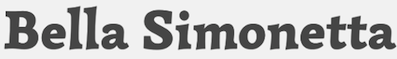 [MyFonts]
[More] ⦿
[MyFonts]
[More] ⦿
|
German numberplates font
|
 FE Mittelschrift is the German car plate font designed between 1978 and 1980 by Karlgeorg Hoefer (1914-2000) together with the University of Giessen (Dept. of Physiology and Cybernetic Psychology). FE is the abbreviation of the German word fälschungserschwerend (difficult to forge). Characters were designed individually so that a C could not be made into an O and so forth. The typeface was first used on cars in 1994. Article by Susanne Schaller, with comments by a number of people. Martin Core claims his Sauerkrauto (2000) font was based on images of the license plates. Spiekermann dislikes the typeface because the letters have no relationship to each other: he calls it a complete forgery. [Google]
[More] ⦿
FE Mittelschrift is the German car plate font designed between 1978 and 1980 by Karlgeorg Hoefer (1914-2000) together with the University of Giessen (Dept. of Physiology and Cybernetic Psychology). FE is the abbreviation of the German word fälschungserschwerend (difficult to forge). Characters were designed individually so that a C could not be made into an O and so forth. The typeface was first used on cars in 1994. Article by Susanne Schaller, with comments by a number of people. Martin Core claims his Sauerkrauto (2000) font was based on images of the license plates. Spiekermann dislikes the typeface because the letters have no relationship to each other: he calls it a complete forgery. [Google]
[More] ⦿
|
Gesine Todt
|
 Gesine Todt is a Berlin-based graphic and typeface designer. She studied type design under Lucas De Groot at FH Potsdam from 2004 until 2006, where she created the sans typeface Gabelle. At HTW Berlin University she studied graphic design and graduated in 2007.
 In 2009 she graduated with an MA in Typeface Design from the University of Reading. Since then she works as a freelancer and enjoys the view from her studio in Berlin Kreuzberg. Her graduation project at Reading involved the sans typeface You Are Here. This typeface was made for wayfinding, and was compared in her thesis with famous wayfinding typefaces such as FF Info Display, FF DIN, Folio, Frutiger, ITC Johnston, Simple, Univers, Vectora, OfficinaSans, and Interstate. In 2011, she put her typefaces up for free download at Google Web Font Directory: Amaranth (an upright italic; see also Open Font Library), Bigshot One (a showy didone display face), Snippet (2011), Leckerli One (2011: a fat signage typeface). Fontspace link. Klingspor link. Fontsquirrel link. Google Plus link. [Google]
[More] ⦿
|
Gina Grittner
|
Graphic designer in Cincinnati, OH. She writes about her typeface Abe (2012): Abe Regular was designed to give the classic typeface Din a humanist touch. With a focus on subtle contrast, natural curves and a dancing baseline; Abe is the less intense, country version of the rigid classic. Behance link. [Google]
[More] ⦿
|
Greg Ponchak
[SINDSINDSIND]
|
 [MyFonts]
[More] ⦿
[MyFonts]
[More] ⦿
|
Guido Schneider
[Brass Fonts]
|
[MyFonts]
[More] ⦿
|
Hannes von Döhren
[HVD Fonts]
|
 [MyFonts]
[More] ⦿
[MyFonts]
[More] ⦿
|
Harrisson
[Open Source Publishing (or: OSP)]
|
 [More] ⦿
|
Hasan Abu Afash
[Hiba Studio]
|
[MyFonts]
[More] ⦿
|
Hashim Padiyath Mohemmadali
|
Indian type designer (b. 1969) from Cochin in Kerala. He designed IndusLL (1994, a roman typeface with features of Lithos) for Linotype's TakeType library "based on the still undeciphered pictographic script of the Indus Valley civilization, circa 5000 BC". He designed the dingbat typeface Chihnangal, and the following commercial Malayalam fonts: Puthuma, Unniyarcha, Indulekha, Ravivarma, Ambili, Kingini, Thulasi, Orma, Harisri, Atham, Aarcha, Unniyarcha, Nila, Chirutha, Thumba, Vartha&Pampa. He studied under R.K. Joshi. He runs Design Difference, which has created these typefaces (text almost literally taken from their site): - While working at C-DAC Gist, Pune during 1993-1994, Hashim P M had designed the monoweight semi-condensed Indulekha in 6 variants (Normal, Oblique, Bold, Bold Oblique, Heavy and Heavy Oblique), the calligraphic script Ravivarma in 4 variants (Normal, Italic, Bold and Bold Italic) and the calligraphic serifed Ambili in 4 variants (Normal, Italic, Bold and Bold Italic) apart from Chihnangal a collection of Symbols and Cliparts pertaining to Kerala. Indulekha has become the most favourite display typeface in Malayalam, lapped up by advertisements and publications, Ravivarma is the chosen one for invitations and citations while Ambili retains its uniqueness as the first serif typeface in Malayalam and is used only when a touch of class is asked for.
- While working at Malayala Manorama, Kottayam during 1994-1997, Hashim P M had designed 8 exclusive Malayalam typefaces for them which are stile in use and determine their typographic flavour after several layout revamp exercises. Vartha, Kingini, Puthuma, Chirutha, Nila, Thulasi, Aarcha and Unniyarcha belong to text and display categories. Unniyarcha was used as a text typeface in the daily only for a brief time, while its display counterpart Aarcha is still their headline typeface along with Kingini. The group's other publications including Vanitha, Manorama Weekly, Balarama, Karshakasri, Bhashaposhini, Yearbook also use these typefaces.
- While redesigning Mathrubhumi Daily, its was imperative that their decadent typefaces were also given a contemporary flavour. They took up the challenge, cleaned up their half-century-old designs and made a whole new family out of it which was suited for web-offset printing on newsprint. Mathrubhumi 760 and 762 were the final products which take less space and prints better. For Mathrubhumi Weekly, a new monoweight typeface (Mathrubhumi 560) was created which worked well for text and display and which followed their unique keymap. The end result was so appealing that even the daily and some of their magazines have started using it extensively. Ambadi, a typeface they had developed earlier was used in the recent redesign of Mathrubhumi Weekly.
- Thejas, Malayalam's youngest daily wanted a brand new headline typeface to announce that they are different. Thejas, the headline typeface they designed for them is compressed and dark enough to stand out in the crowd. Instead of giving a lighter version of this, they designed Kadali, a second headline typeface which is more conventional, albeit with a semi-condensed form. Together they create the necessary visual tension in headlines, making Thejas one of the best-looking dailies in the language. Later they also developed an expanded version of Thejas for them.
- For the Signage design of Amrita Institute of Medical Sciences, Cochin they needed a typeface that matched with the Roman typeface wde had selected to use. They developed Amrita modifying Keli. Sakshi is inspired by communist wall-grafitti letters with a dripping paint-brush touch. Ambadi has curled terminals and ink-traps at junctions. Pingala is inspired by DIN Mittleschrift and its bare features.
- They had designed a headline typeface for Deepika daily (the oldest in Malayalam) when we undertook the redesign of the daily. Deepika (nee Atham) is a robust typeface with condensed form loosely inspired by Frankin Gothic. A Normal and Bold version with Oblique make a strong family. The typeface is still the main display typeface for the group's publications even after so many years. They consider it among one of their best type designs to date. They also licensed Orma on a non-exclusive basis to them during the project.
- The display typeface Mangalam was designed for Mangalam Group of Publications when wde redesigned their daily. Thick and thin and condensed in nature, the typeface is currently used by the group in all their publications. They have also licensed Pampa on a non-exclusive basis to Mangalam, which has also become a hot favourite in their publications.
- They developed Thumba as a corporate typeface for D C Books after wde used a draft version of it in the Malayalam CD-ROM Encyclopedia wde developed for them. The very modern Thumba is monoweight, sufficiently expanded and has a relaxed air about it. Regular, Bold and Heavy with their Obliques make a handsome family. Thumba is loosely inspired by Frutiger and is one of their best type designs to date. They had also licensed Pampa and Orma on a non-exclusive basis, for use in their publications. When they were redesigning and streamlining their corporate visual identity, they also put together their logos and symbols as a handy font D C Logos.
Klingspor link. FontShop link. Google Plus link. [Google]
[MyFonts]
[More] ⦿
|
Hausschriften
|
 A list (in German) of typefaces used by companies (often specially designed). Translated and partially reprodused here. We also took info from this subpage.
 | Company | Type | Alternate type | Yet another type | Still another type | | | | | | | ARD | The Sans | The Serif | | | | AirBerlin | Meta | | | | | Airbus | Helvetica Neue | Times New Roman | Arial | | | Akzo Nobel | Symbol | | | | | Aral | Aral V2 Medium | Baskerville BQ | | | | Audi | Audi Antiqua | Audi Sans | | | | BMW | BMW Helvetica | | | | | Bonnfinanz | Frutiger | Adobe Garamond | Bodoni Book | | | Bosch | Bosch Sans/Serif | | | | | Bundesregierung | Demos | | | | | CDU | FF Kievit | | | | | Credit Suisse | Credit Suisse Type | | | | | DHL | Frutiger | Minion | | | | DRK | Gill Sans | Rockwell | | | | DSK | The Sans5 | | | | | DaimlerChrysler | Corporate ASE | | | | | Deutsche Bahn | Helvetica | | | | | Deutsche Bank | DeuBa Univers | | | | | Deutsche Post | Frutiger | Helvetica | | | | E.ON | Polo | | | | | Ford | Ford Light/Bold | | | | | Heineken | Heineken Sans/Serif | | | | | Henkel | Helvetica Neue | Swift EF | Arial | Times New Roman | | IKEA | Ikea | | | | | Langenscheidt | Trade Gothic | | | | | Linde AG | Linde Dax | | | | | Lufthansa | Helvetica | | | | | Mephisto | Futura Book | | | | | Mercedes | Corporate A/E/S | | | | | Mitsubishi | Alpha Headline | | | | | Nissan | NissanAG | | | | | Nivea | Nivea Sans | | | | | Nokia | Nokia Sans/Serif | | | | | Opel | Opel Sans | | | | | Pioneer | Meta | | | | | Porsche | Franklin Gothic | | | | | Roche | Minion | Imago | | | | School | Chevin | | | | | Shell | Futura LT Bold | | | | | Siemens | Siemens Sans/Serif/Slab Serif | | | | | Sparkass | Sparkasse Lt/Rg | | | | | TUI | Tui | | | | | Tengelmann | Syntax | | | | | UBS | UBS Headline | Frutiger 45 | | | | UPS | Dax | | | | | VW | VW Headline | Utopia | | | | Velux | Futura | | | | | Volvo | Volvo Broard | | | | | WDR | Meta | Minion | | | | Zeche Zollverein | Chevin | | | | | Company | Typeface | Foundry | Designer | Basis | Application | | | | | | | | Škoda | Skoda Sans | Dalton Magg | | | | | 3Sat | Gill Sans | Monotype | Eric Gill | | | | ADAC | Franklin Gothic | Linotype | Morris Fuller Benton | | | | AEG | Rotis | Agfa | Otl Aicher | | | | AMD | Gill Sans | Monotype | Eric Gill | | | | ARD | The Sans | LucasFonts | Lucas de Groot | | | | ARD | The Serif | LucasFonts | Lucas de Groot | | | | AVM | Info | FontFont | Erik Spiekermann, Ole Schäfer | | | | AVM | Meta | FontFont | Erik Spiekermann | | | | AWD | AWD | | | Interstate | | | AXA | Eras | ITC | | | | | Adidas | AdiHaus | | | DIN | | | Adobe | Myriad | Monotype | | | | | Adobe | Minion | Agfa | Robert Slimbach | | | | AirBerlin | Meta | FontFont | Erik Spiekermann | | | | Airbus | Times New Roman | Monotype | | | | | Airbus | Arial | Monotype | Patricia Saunders, Robin Nichols | | | | Airbus | Neue Helvetica | Linotype | | | | | Akzo Nobel | Symbol | | | | | | Aldi | Futura | Elsner+Flake | Paul Renner | | | | Allianz | Formata Condensed | | | | Headlines | | Apple | Apple Myriad | | | | | | Aral | Baskerville BQ | | | | | | Aral | Aral V2 Medium | | | | | | Arcor | Memphis | Linotype | Chauncey H. Griffith | | | | Arvato | Bliss | | | | | | Audi | Audi Antiqua | | | | | | Audi | Audi Sans | | | Univers | | | B.Braun Melsungen AG | Rotis | Agfa | Otl Aicher | | | | BMW | BMW Type | | | Helvetica | | | Beck's | Syntax | Linotype | Hans Eduard Meier | | | | Berliner Zeitung | Walbaum | Linotype | J. E. Walbaum | | Headlines | | Berliner Zeitung | Utopia | Monotype | | | Text | | Bertelsmann | Utopia | Monotype | | | | | Bertelsmann | Univers | Linotype | Adrian Frutiger | | | | Bonnfinanz | Bodoni Book | Bitstream | Giambattista Bodoni | | | | Bonnfinanz | Adobe Garamond | Agfa | Claude Garamond, Robert Slimbach | | | | Bonnfinanz | Frutiger | Linotype | Adrian Frutiger | | | | Bosch | Bosch Serif | | | | | | Bosch | Bosch Sans | | | | | | Bulthaup | Rotis | Agfa | Otl Aicher | | | | Bundesagentur für Arbeit | Corporate S | URW++ | Kurt Weidemann | | | | Bundesregierung | Neue Demos | | | | | | Bundesregierung | Neue Praxis | | | | | | C&A | CA Info Type | | | | | | C&A | CA Corporate Type | | | | | | CDU | CDU Kievit | | | Kievit | | | Canon | DendaNew | | | | | | Commerzbank AG | Commerzbank Headline | | | Stymie Black | | | CosmosDirekt | Geometric Slabserif 703 | Bitstream | | | Logo | | CosmosDirekt | Univers Condensed | Linotype | Adrian Frutiger | | | | Credit Suisse | Credit Suisse Type | | | | | | DA direkt | Frutiger | Linotype | Adrian Frutiger | | Fliesstext | | DA direkt | Linotype Ergo | Linotype | | | Logo | | DAB Bank | DAB Bank Officina | | | Officina | | | DHL | Frutiger | Linotype | Adrian Frutiger | | | | DHL | Minion | Agfa | Robert Slimbach | | | | DRK | Helvetica | Linotype | Max Miedinger | | | | DRK | Arial | Monotype | Patricia Saunders, Robin Nichols | | | | DSK | The Sans | LucasFonts | Lucas de Groot | | | | Delta Airlines | Delta | Dalton Magg | | | | | Der Spiegel | Spiegel Sans (a 32 style American gothic family) | LucasFonts | Lucas de Groot | Franklin Gothic | | | Der Spiegel | Spiegel Serif | LucasFonts | Lucas de Groot | Linotype Rotation | | | Detax | Frutiger | Linotype | Adrian Frutiger | | | | Deutsche Bahn AG | DB Sans Condensed | URW++ | | | | | Deutsche Bahn AG | DB Sans | URW++ | | | | | Deutsche Bahn AG | DB Head | URW++ | | | | | Deutsche Bahn AG | DB News | URW++ | | | | | Deutsche Bahn AG | DB Serif | URW++ | | | | | Deutsche Bank | Deutsche Bank Univers | | | Univers | | | Deutsche Post AG | Frutiger Condensed | Linotype | Adrian Frutiger | | Headlines | | Deutsche Post AG | Minion | Agfa | Robert Slimbach | | Fliesstext | | Deutsche Telekom | TeleAntiqua | URW++ | | | | | Deutsche Telekom | TeleGrotesk | URW++ | | | | | Deutsche Telekom | TeleLogo | URW++ | | | | | Deutsche Welle | Bembo | Agfa | Francesco Griffo, A. Tagliente | | Fliesstext | | Deutsche Welle | DW Interstate | | | Interstate | | | Die Grünen | Corpus Gothic | Fountain | Peter Bruhn | | | | Die Linke/PDS | Meta | FontFont | Erik Spiekermann | | Fliesstext | | Die Welt | Franklin Gothic | Linotype | Morris Fuller Benton | | | | Die Welt | Excelsior | Linotype | Chauncery H. Griffith | | Text | | Die Welt | TimesBQ | | | | Headlines | | Direct Line | Gill Sans | Monotype | Eric Gill | | | | Dr. Oetker | Dr. Oetker Tiffany | | | Tiffany | | | Dänisches Bettenlager | Futura | Elsner+Flake | Paul Renner | | | | E-Plus | Frutiger | Linotype | Adrian Frutiger | | | | E-Plus | OCR Plus | Linotype | Adrian Frutiger | OCR F | | | EnBW AG | DIN | FontFont | | | | | Erco | Univers | Linotype | Adrian Frutiger | | | | Erco | Rotis | Agfa | Otl Aicher | | | | Eurex (Deutsche Börse AG) | Syntax | Linotype | Hans Eduard Meier | | | | Ev. Johanneswerk | Arial | Monotype | Patricia Saunders, Robin Nichols | | | | Ev. Johanneswerk | Helvetica | Linotype | Max Miedinger | | | | FC Bayern München AG | FCB Interstate | | | Interstate | | | FSB | News Gothic | Linotype | Morris Fuller Benton | | | | FSB | Univers | Linotype | Adrian Frutiger | | | | Festo AG | Meta | FontFont | Erik Spiekermann | | | | Financial Times | Utopia | Monotype | | | | | Financial Times | Walbaum | Linotype | J. E. Walbaum | | | | Ford | Ford Extended | | | Helvetica | | | Frankfurter Allgemeine Zeitung | Eighteen | | | | | | Frankfurter Allgemeine Zeitung | Times Ten | | | | | | Frankfurter Allgemeine Zeitung | FAZ Fraktur | URW++ | | Fette Gotisch | | | Fraunhofer-Gesellschaft | Frutiger | Linotype | Adrian Frutiger | | | | Fujitsu Siemens Computer | Rotis | Agfa | Otl Aicher | | | | GE (General Electric Company) | GE Inspira | | | | | | Germanwings | Bliss | | | | | | Gothaer (Versicherung) | Meta | FontFont | Erik Spiekermann | | | | Heidelberg Gruppe | Heidelberg Gothic | | | News Gothic | | | Heidelberg Gruppe | Heidelberg Antiqua | | | Swift | | | Heineken | Heineken Sans | | | | | | Heineken | Heineken Serif | | | | | | Henkel | Swift | | | | | | Henkel | Neue Helvetica | Linotype | | | | | Henkel | Arial | Monotype | Patricia Saunders, Robin Nichols | | | | Henkel | Times New Roman | Monotype | | | | | IGEPA | IGEPA Raldo | URW++ | | | | | ING DiBa | Stone Sans | | | | | | Ikea | Ikea Sans | | | Futura | | | Ikea | Ikea Serif | | | New Century Schoolbook | | | Industrie- und Handelskammer | Rotis Sans | Agfa | Otl Aicher | | | | Industrie- und Handelskammer | Rotis Serif | Agfa | Otl Aicher | | | | J.M. Voith AG | Voith Helvetica | | | Helvetica | | | Jaguar | DIN | FontFont | | | | | Jet (Tankstelle) | JetSans | | | | | | Kabel Deutschland | Kabel Unit | | | FF Unit | | | LBS | LBS The Sans | | | The Sans | | | Langenscheidt | Trade Gothic | Linotype | Jackson Burke | | | | Lekkerland | LL Sari | | | FF Sari | | | Linde AG | Linde Dax | | | FF Dax | | | Linotype Library GmbH | Univers | Linotype | Adrian Frutiger | | | | Lufthansa | Helvetica | Linotype | Max Miedinger | | | | MINI | MINITypeRegular | Dalton Maag | | | Fliesstext | | MINI | MINITypeHeadline | Dalton Magg | | | Headlines | | Mazda | BaseTwelve Sans | | | | Headlines | | Mazda | Frutiger | Linotype | Adrian Frutiger | | Text | | McDonald's | Akzidenz Grotesk | | | | | | Mecklenburg Vorpommern | Myriad Pro | | | | | | Mecklenburg Vorpommern | Lithograph | | | | | | MediaMarkt | Franklin Gothic | Linotype | Morris Fuller Benton | | | | Mephisto | Futura Book | Elsner+Flake | Paul Renner | | | | Mercedes | Corporate E | URW++ | Kurt Weidemann | | | | Mercedes | Corporate A | URW++ | Kurt Weidemann | | | | Mercedes | Corporate S | URW++ | Kurt Weidemann | | | | Mitsubishi | Alpha Headline | | | | | | Mobilcom | Neue Helvetica Extended | Linotype | | | | | Müller (Drogerie) | MuellerSchrift | | | Gill Sans | | | Münchner Rück | Univers | Linotype | Adrian Frutiger | | | | N-TV | Info Office | FontFont | Erik Spiekermann, Ole Schäfer | | Laufbänder | | NDR | NDR Sans | | | | | | Nissan | NissanAG | | | | | | Nissan | Nissan Standard | URW++ | | | | | Nivea | Nivea Sans | | | | | | Nokia | Nokia Sans | | Erik Spiekermann | | | | Nokia | Nokia Serif | | Erik Spiekermann | | | | OBI | Obi Sans | Elsner+Flake | | | | | Opel | Opel Sans | | | Futura | | | PAGE (Magazin) | GST Polo | TypeManufactur | Georg Salden | | | | Paul Hartmann AG | Frutiger Next | Linotype | Adrian Frutiger | | | | Peugeot | Gill Sans | Monotype | Eric Gill | | | | Pioneer | Meta | FontFont | Erik Spiekermann | | | | Plus (Supermarkt) | The Sans | LucasFonts | Lucas de Groot | | | | Porsche | News Gothic | Linotype | Morris Fuller Benton | | | | Porsche | Franklin Gothic | Linotype | Morris Fuller Benton | | | | Postbank AG | Frutiger | Linotype | Adrian Frutiger | | | | Premiere World | Premiere Gothic | | | Franklin Gothic | | | Puma | Puma Pace | Dalton Magg | | | | | Quelle (Versandhaus) | Quelle Interstate | | | Interstate (1993, Tobias Frere-Jones) | | | RBB | Interstate (1993, Tobias Frere-Jones) | Font Bureau | Tobias Frere-Jones | | | | RTL aktuell | Bank Gothic | Bitstream | Morris Fuller Benton | | | | RWE | RWE Corporate | | | | | | Rama | Rama Typo | | | | | | Ravensburger | The Sans | LucasFonts | Lucas de Groot | | | | Roche | Minion | Agfa | Robert Slimbach | | | | Roche | Imago | | | | | | Roche | Minion | Agfa | Robert Slimbach | | | | Roche | Imago | | | | | | SPD | The Sans | LucasFonts | Lucas de Groot | | | | Saab | Gill Sans | Monotype | Eric Gill | | | | Sat.1 | SAT1DigitalSans | | | Digital Sans | | | School | Chevin | | | | | | Schwäbisch Hall AG | Charlotte Sans | | | The Sans | | | Shell | Futura LT Bold | Elsner+Flake | Paul Renner | | | | Siemens | Siemens Serif | URW++ | | | | | Siemens | Siemens Sans | URW++ | | | | | Siemens | Siemens Slab | URW++ | | | | | Smart | Smart Courier | | | Courier | | | Sparda Bank | Clarendon | Linotype | H. Eidenbenz | | Headlines | | Sparda Bank | ITC Officina Sans | Agfa | Erik Spiekermann | | Fliesstext | | Sparkasse | Sparkasse Light | Dalton Magg | | | | | Sparkasse | Sparkasse Regular | Dalton Magg | | | | | Stuttgarter Zeitung | DTL Argo | | | | | | Stuttgarter Zeitung | Gulliver | | | | | | Süddeutsche Zeitung | Excelsior | Linotype | Chauncery H. Griffith | | Text | | Süddeutsche Zeitung | Helvetica | Linotype | Max Miedinger | | Headlines | | TU Dresden | DIN Bold | FontFont | | | | | TU Dresden | Univers 45 | Linotype | Adrian Frutiger | | | | TUI | Tui | Dalton Magg | | | | | Tagesspiegel (Berlin) | Franklin Gothic | Linotype | Morris Fuller Benton | | | | Tagesspiegel (Berlin) | Poynter | Font Bureau | | | Fliesstext | | Tagesspiegel (Berlin) | Californian | Font Bureau | Frederic W. Goudy, David Berlow | | Headlines | | Talkline | Neue Helvetica | Linotype | | | Text | | Talkline | Rockwell | Monotype | F. H. Pierpoint | | Headlines | | Taz (Berlin) | Taz III | LucasFonts | Lucas de Groot | | | | Taz (Berlin) | LF Taz | LucasFonts | Lucas de Groot | | | | Taz (Berlin) | The AntiquaE | LucasFonts | Lucas de Groot | | | | Taz (Berlin) | TazText | LucasFonts | Lucas de Groot | | | | Tchibo | Interstate (1993, Tobias Frere-Jones) | Font Bureau | Tobias Frere-Jones | | | | Tengelmann | Syntax | Linotype | Hans Eduard Meier | | | | UBS | Frutiger 45 | Linotype | Adrian Frutiger | | | | UBS | UBS Headline | | | | | | UPS | UPS Sans | | | | | | VW | Utopia | Monotype | | | | | VW | VW Headline | | | | | | Vattenfall | Interstate | Font Bureau | Tobias Frere-Jones | | | | Velux | Futura | Elsner+Flake | Paul Renner | | | | Vobis | Interstate (1993, Tobias Frere-Jones) | Font Bureau | Tobias Frere-Jones | | | | Vodafone | Vodafone Font Family | Dalton Magg | | InterFace | | | Volvo | Volvo Broard | | | | | | WDR | Minion | Agfa | Robert Slimbach | | | | WDR | Meta | FontFont | Erik Spiekermann | | | | Wilo AG | Wilo Plus | | | FF Plus | | | Xbox 360 | Convection | | | | | | Xerox | Walbaum | Linotype | J. E. Walbaum | | | | Yello Strom | Yello DIN | | | FF DIN | | | ZDF | Handel Gothic | URW++ | | | Logo | | ZDF | Swiss 721 | | | Helvetica | | | ZF Friedrichshafen | ZF Serif | URW++ | | | | | ZF Friedrichshafen | ZF Sans | URW++ | | | | | Zeche Zollverein | Chevin | | | | | | comdirect | Dax | FontFont | Hans Reichel | | | | dm Drogeriemarkt | DM Cochin | | | Cochin | | | dm Drogeriemarkt | DM The Sans | | | The Sans | | | e·on | GST Polo | TypeManufactur | Georg Salden | | | | kabel eins | DIN 1451 | FontFont | | | | | mdr (Mitteldeutscher Rundfunk) | can you (read me?) | | | | | | tegut... | tegut-Sans | | | Officina Sans | | Credit for some images below: Danielle West. [Google]
[More] ⦿
|
Henrik Kubel
[A2 Type]
|
 [MyFonts]
[More] ⦿
[MyFonts]
[More] ⦿
|
Hi
[Megi Zumstein]
|
Hi is the foundry of Swiss type designer Megi Zumstein, b. 1973, together with Claudio Barandun. Megi is the creator of Albis (2005, squarish, Bringolf Irion Vögeli), Dorfbeiz (2009, HI), Idol Stencil (2004, Bringolf Irion Vögeli), V&A-Outline (2003, Graphic Thought Facility). All her typefaces are in the orbit of DIN and VAG Rounded. House typefaces include New Elante (2007), Roxy (2008), and Countdown (2008, experimental). [Google]
[More] ⦿
|
Hiba Studio
[Hasan Abu Afash]
|
 Arabic typography web site and font foundry established in 2007 by Hasan Abu Afash, an Arab designer living in Gaza/Palestine. Typefaces: HS Dream (2019), HS Gold (2018), HS Almisk, HS Almisk Serif (2018: modern kufi style), HS Aleman (2018: a kufi /naskh hybrid), HS Alnasma (2017), HS Alhoson (2017), HS Alwajd (2016), HS Almajd (2016), HS Rahaf (2015, covering Pashtu, Persian, Urdu, Kurdish Sorani, Kurdish Kirmanji, and Arabic), HS Alnada (2015, kufi), HS Headline (a fat calligraphic didone display typeface by Gunnlaugur Briem (Latin) and Hasan Abu Afash (Arabic, based on the simple lines of Naskh calligraphy), HS Ali (2015; designed using equal amounts of anger and sorrow, Hasan writes: HS Ali was designed in memoriam of my brother---Ali Abu Afash who was martyred during the last aggression on Gaza in summer 2014), HS Alhuda (2014, Kufi font), HS Almaha (2014: this font combines the features of linear Naskh and modern Kufi), HS Almidad (2014), HS Ishraq (2013), HS Alkitab (2013), HS Albadr (2013), HS Almohandis (2007-2011, Arabic display face), HS Alhandasi (2007 and 2011), Hasan AlQuds family (2004, a display typeface done with Mamoun Sakkal), Hasan Hiba, Hasan Enas (Arabic text typeface), Hasan Elham (2006, a modern Kufi art deco face), Hasan Ghada (2007-2008, based on modern Kufi calligraphy--first known in 2002 as KactTitle), Hasan Manal (2008, Kufi style), Hasan Aya (2007, Kufi style famaily based on Corel's 1992 typeface Bedrock), Kouffi Fatemic, Safwat, HS Amal. In 2008, Hasan Hiba and Hasan Noor (a classic squarish Kufi face) were upgraded to the DecoType font format for use in WinSoft Tasmeem which is now bundled with InDesign CS4---thanks to a cooperation with Mirjam Somers. Still with Somers, he upgraded the Basim Marah display typeface (2008) for Tasmeem. Basim Marah was drawn by Basim Salem Al Mahdi from Iraq and then digitized by Hasan himself. The same year, Hasan developed an OpenType project for Alinma TheSans fonts which are based on TheMix Arabic (designed by Luc(as) de Groot and Mouneer ElShaarani for Al Inma Bank, Saudi Arabia). Later he developed the OpenType features for Jumeirah Arabic which was designed by Pascal Zoghbi (29letters) and Huda AbiFares (Khatt) for Jumeirah International, UAE. He developed the OpenType layout features needed for the Arabic script system in the Seria Arabic fonts family which was designed by Pascal Zoghbi for FontShop International, as well as the Chams fonts family which was designed by Al Mohtaraf Assaudi for the redesign of the Shams Newspaper in Saudi Arabia and the Arajhi fonts for Alrajhi Bank. Since 2002 Hasan has worked and collaborated with Mamoun Sakkal in several projects, such as the Burj Dubai Shilia project, Sakkal Baseet and the Microsoft project which included the updating of the OpenType instructions for fonts such as Tahoma, Microsoft Sans Serif (1997), Arial, Times New Roman, Segoe, Courier, Time New Roman, Ms Uighur and Majalla UI. In 2009-2010, he cooperated with Parachute to make DIN Text Arabic.
 Releases in 2012 include HS Future Sans (with Abdulsamie Rajab Salem), HS Amal, HS Alfaris, HS Al Basim A, and HS Almohandis. Typefaces from 2013: HS Alwafa, HS Masrawy (a display typeface done with Abdulsamiea Rajab Salem), HS Elham (Kufi). Behance link. MyFonts link. Klingspor link. [Google]
[MyFonts]
[More] ⦿
|
Highway signage fonts
|
Discussion of highway signage fonts by John Berry, who reports: - FF DIN: a FontShop font. DIN stands for Deutsche Industrie Norm. FF DIN is based on DIN-Mittelschrift, the German Autobahn's typeface. FF DIN is Albert-Jan Pool's reworking of DIN-Mittelschrift.
- Interstate: a Font Bureau font by Tobias Frere-Jones, based on the US highway system signs. [Personal note: for similar type, see Blue Highway]
- ClearviewOne: James Montalbano's font for highway signs developed with Don Meeker of Meeker&Associates. In 2002, the USA decided to start using ClearviewHwy for its road signs.
- Expressway (2005, Typodermic), which includes Expressway Free (4 free weights). Expressway is in the style of Interstate (1993, Tobias Frere-Jones). [Google]
[More] ⦿
|
HouseStyle Graphics
[Dave Farey]
|
Type home of Dave Farey and Richard Dawson, est.2005, to develop and repair type. Based in London. Commissioned typefaces: CWS Script, DIN Display, McDonalds (a typeface in use by that chain since 1998, based on an idea of Geoff Halpin), The Times (1999). [Google]
[More] ⦿
|
Hugo Cavalheiro d'Alte
|
 Born in Porto, Portugal, in 1975. From 1994 until 1999 he studied graphic design at the Escola Superior de Artes e Design. In 2000 he became a postgraduate student at the KABK where he wrote a Masters thesis entitled "Type&Media". He joined Underware in the same year. At ATypI 2005 in Helsinki, he spoke on On the edge of legibility, which in fact is a talk about blackletter. Affiliated since 2002 with Underware. He lives in Finland. Also doing business at Incubator at Village Type.
 Cargo collective link. Link at Underware. Alternate URL: This is playtime. His typefaces: - For Thirstype, he made Kaas (2005), a blackletter typeface for the 21st century, with Latin, Cyrillic, and Hebrew alphabets.
- Still in 2009, he created a transitional type, Rolland (+Rolland Text, Rolland Small, Rolland Text Italic), about which he writes: Rolland is a digital interpretation of some of the printing types used at the "Typografia Rollandiana" in Lisbon at the end of the XVIII century. The printing and publishing house was established by Francisco Rolland after he moved to Lisbon (from France) in the second half of the XVIII century becoming one of the most successful publishers of his time.
- Kalevala (2009): a custom sans type family for Finnish jewelry brand Kalevala Koru. The starting point for this project was a book printed and published by Francisco Rolland in 1797: "Escolha das Melhores Novellas e Contos Moraes; Escritos em Francez por MM, d'Arnaud, Marmontel, Madama de Gomez, e outros".
- In 2009-2010, he made a DIN-like corporate font for Centro Portugues de Design, CPD Sans. This was accompanied by the CPDSerif family, which evolved from Rolland.
- In 2009, he created the squarish unicase typeface Flexibility: Custom typeface commissioned by the portuguese design studio R2 for the identity of an exhibition that took place in Torino (Italy) in 2008 (World Design Capital 2008).
- Kaas (2005, Incubator) is a modern geometric/constructed blackletter with a historically-accurate set of titling capitals, a large collection of accents, and Cyrillic and Hebrew alphabets.
- Arabia (2015) is a custom typeface for Arabia Finland (for the identity renewal work by Ilkka Kärkkäinen).
[Google]
[MyFonts]
[More] ⦿
|
HVD Fonts
[Hannes von Döhren]
|
 Hannes von Döhren (b. 1979, Berlin) is a Berlin-based designer (b. 1979). His foundry is HVD Fonts. He started out with free handwriting and grunge fonts such as HVD Comic Serif Pro (2009, an alternative to Comic Sans, according to HVD), The Subway Types (2009, a graffiti family: Shik (New York), Deon (Paris) and Etan (Berlin) came together to show the typical tag styles of their respective metropolitan areas. The fonts were digitized, spaced, kerned and programmed by Hannes von Döhren).
 Later he went commercial, first at T-26, and then under his own label, HVD Fonts. His typefaces: Shelton (2008, T-26), HVD Peace (2008, an army stencil font), HVD Comic Serif (2007, a serifed spoof on Comic Sans), HVD Rowdy (2007), HVDSpencils-Block (2007, stencil), HVDSpencils (2007, stencil), HVD Steinzeit (2005), HVD Edding 780, HVD Rawcut (2005), HVD Age 11 (2006), HVD Shelton (2008, T-26: wood type grunge), HVD Bodedo (2009, potato-Bodoni lettering), Quench Pro (2008, Linotype), HVD Peace (2008), and HVD Poster (2006, grunge). Typefaces made in 2009: Grandma (great hand-printed style---move over, Comic Sans), Christmas Dingbats, ITC Chino (a soft-edged signage and sans family, done with Livius Dietzel), Klint (sans family, +Rounded), Brevia (a soft sans in seven styles), Cowboyslang (a Western slab serif family), Embryo (superblack), Embryo Open, and Opal, a classy old style text family with tall ascenders. Bumper (2009) is an ultra-black sans family in a style related to Impact. Typefaces from 2010: FF Basic Gothic (a grotesk family done with Livius Dietzel), Reklame Script, Shelton (grunge), Blow Up is a fat balloon font. His masterpiece of 2010 and perhaps of his career thus far is the Brandon Grotesque family that relives the 20s and 30s. [A year after I wrote the previous sentence, Brandon Grotesque won an award at TDC2 2011, and all during 2011, it was the most sold typeface at MyFonts. It was followed in 2018 by Brandon Grotesque Condensed.] Livory (2010, with Livius Dietzel) is a rounded serif type family of four fonts influenced by the French Renaissance Antiquas from the 16th century. Production in 2011: Brix Slab (2011, with Livius Dietzel), Brix Slab Condensed (2011, with Livius Dietzel:(24 styles in all), Pluto (16-style semi-scriptish sans family, +Italics), Cheap Pine (a wood type caps family), Supria Sans (free web font family; +Black). Together with Supria Sans Condensed, this 36-style family is a basic sans workhorse. It won an award at TDC2 2011. Typefaces from 2012: Shelton Slab (eroded wood type or dirty letterpress look), Diamonds (geometric caps only family), Pluto Sans, Love Potion No. 10. Typefaces from 2013: Embryo Tiny, Niveau Serif (an engravers / copperplate style typeface), Niveau Grotesk, Mikado (signage family for games, food and advertising with a lot of genetic material from Brandon Grotesque: Mikado Bold Demo is free), Brandon Text (similar to, but with a higher x-height and more rounded corners than Brandon Grotesque, it is more appropriate for long texts and small print), FF Mark (together with Christoph Koeberlin and the FontFont team: this font is marketed as Ze new Germanetric sans; one weight is free). Typefaces from 2014: Brix Sans (2014, created using precisely engineered glyphs for corporate or information design; with Livius Dietzel), Brandon Printed (a caps-only letterpress version of Brandon Grotesque). Typefaces from 2015: Brandon Grotesque Office (screen-optimized; specially designed for Microsoft Office applications, it has 4 styles), Brandon Text Office (also made for Microsoft Office applications), Goodlife (a hand-lettered collection, consisting of Brush, Sans, Script, and Serif styles), Americane Condensed and Americane (based on American wood types). In 2016, Christian Koeberlin designed Fabrikat, which had creative input of Hannes von Döhren. This simple geometric sans serif family is based on the DIN style used in the 20th century by German engineers. It has a plain and precise appearance, and is a textbook example of a compass-and-ruler typeface. The monospaced almost-typewriter version Fabrikat Mono followed in 2017. Typefaces from 2018: Giulia (a creamy cutesy baby shampoo font family). Typefaces from 2020: Brandon Text Condensed (in 12 styles), Bouba Round (a round sans family for small devices and wayfinding), Fabrikat Normal. Typefaces from 2021: Palast (Text, Display, Poster; with Bernd Volmer). Abstract Fonts link. Another URL. Font Squirrel link. I Love Typography link. Fontsy link. View Hannes von Döhren's typefaces. [Google]
[MyFonts]
[More] ⦿
|
Incinerator
[Scott Ulrich]
|
Scott Ulrich (Incinerator) is the designer of freeware/shareware fonts in 1993: CheapSignage-Standard, CriminalHand, DINGarbageschrift, Distemper, EvilClown, Garbageschrift, Garden, GeekSkinny, Misfortune, SeverelyExtreme, TapeGun, Thickhead. Fontspace link. Dafont link. Fontspace link. [Google]
[More] ⦿
|
Indra Kupferschmid
|
German type personality (b. 1973, Fulda) who studied visual communication at the Bauhaus University in Weimar. She is involved in type at the Museum für Druckkunst Leipzig and in the DIN committee for type classification. Founder of Kupferschrift, a type expertise firm based in Weimar and Düsseldorf. Alternate URL. She is a professor of Kommunikationsdesign und Typografie and head of the department FB Design at the HBK (Hochschule der Bildenden Künste) Saar. She researches the classification of typefaces, the history of grotesks and legibility. She is co-author of Helvetica Forever (Lars Müller Publishers) and Buchstaben kommen selten allein, a typographic reference book. Speaker at ATypI 2011 in Reykjavik. Speaker at ATypI 2013 in Amsterdam. At the latter meeting she introduces Type Record, a data base on typefaces run by her and Nick Sherman. Speaker at ATypI 2016 in Warsaw. Speaker at ATypI 2017 Montreal. [Google]
[More] ⦿
|
Ingo Krepinsky
[Typonauten]
|
[MyFonts]
[More] ⦿
|
Intel
[Dan Rhatigan]
|
 Intel, with the help of Monotype, produced the free sans typeface family Clear Sans in 2013. Another download link. Clear Sans was designed by Daniel Ratighan at Monotype under the direction of the User Experience team at Intel's Open Source Technology Center. Clear Sans is available in three weights (regular, medium, and bold) with corresponding italics, plus light and thin upright (without italics). Clear Sans has minimized, unambiguous characters and slightly narrow proportions.
 The Typophile comments are all scathing: some say it is too close to DIN or Transport, too conservative. They also ask how the name can survive given that there are already typefaces named Clear Sans (2013: the infinitely more interesting sans typeface by Neil Summerour) and Clearview (2004: the famous American road signage typeface family by James Montalbano and Don Meeker)? Additional download link: CTAN mirror. Open Font Library link. In 2017, we find a slight modification of Clear Sans at Open Font Library, called Lorenzo Sans. [Google]
[More] ⦿
|
Isabella Chaeva
|
 Russian type designer called Olga Chaeva at MyFonts. She graduated from Moscow Academy of Print (former Moscow Printing Institute, now Moscow State University of Printing).
 Staff type designer of ParaType, where she worked on Pragmatica. Paratype writes: The typeface was designed at ParaType (ParaGraph) in 1989-2004 by Vladimir Yefimov and Olga Chaeva. A spin-off from Encyclopedia-4 type family of the Polygraphmash type design bureau (1987, Vladimir Yefimov and Isay Slutsker). Inspired by Helvetica (Neue Haas Grotesk) of Haas type foundry, 1957 by Eduard Hoffman and Max Miedinger. Based on the 19th century Grotesque designs, Helvetica brought a new level of mathematical accuracy to the sans serif category. Widely used for many applications, from magazines and books to advertising and headlines. Four basic styles of Pragmatica were developed in 1989 by Vladimir Yefimov. Eight additional styles were developed in 2003 by Olga Chaeva. Condensed styles were developed in 1993-2004 by Vladimir Yefimov, Alexander Tarbeev and Manvel Shmavonyan, with participation of Dmitry Kirsanov. Extended styles were developed in 2004 by Olga Chaeva and Manvel Shmavonyan. She made the Cyrillic version of Licko's Quartet (2003). She also created Engravers Gothic, an extended grotesque family (Paratype) based on the Bitstream original. In 2003, Isabella Chaeva added a Bold version. Other cyrillizations include FF Meta, ITC Officina Sans and Serif, and Bell Gothic (1999; after Bell Gothic, 1938, Chauncey H. Griffith). About Pragmatica, Paratype writes: The typeface was designed at ParaType (ParaGraph) in 1989-2004 by Vladimir Yefimov and Olga Chaeva. A spin-off from Encyclopedia-4 type family of the Polygraphmash type design bureau (1987, Vladimir Yefimov and Isay Slutsker). Inspired by Helvetica (Neue Haas Grotesk) of Haas type foundry, 1957 by Eduard Hoffman and Max Miedinger. Based on the 19th century Grotesque designs, Helvetica brought a new level of mathematical accuracy to the sans serif category. Widely used for many applications, from magazines and books to advertising and headlines. 4 basic styles of Pragmatica were developed in 1989 by Vladimir Yefimov. Eight additional styles were developed in 2003 by Olga Chaeva. Condensed styles were developed in 1993-2004 by Vladimir Yefimov, Alexander Tarbeev and Manvel Shmavonyan, with participation of Dmitry Kirsanov. Extended styles were developed in 2004 by Olga Chaeva and Manvel Shmavonyan. In 2006, she created the jagged script Jaggy (Paratype). In 2007, she added Vermicello (Paratype). Textbook New (2008, Paratype) is based on Bukvarnaya (TextBook) photocomposing version designed in 1987 by Emma Zakharova. The initial Bukvarnaya for metal composition was created at Polygraphmash in 1958 by Elena Tsaregorodtseva. It was developed for primers and the first level school textbooks. An early sans serif (Grotesque) with half-closed static letterforms. Kuenstler 165 (2008, Paratype) was extended by Isabella Chaeva: Two weights of Cyrillic version including alternative lc characters were developed by Isabella Chaeva and released in 2008 by ParaType. In 2010, Vladimir Yefimov and Isabella Chaeva extended and cyrillicized Kuenstler 480 (Bitstream) at Paratype, which in turn was the digital version of Trump Mediaeval (Georg Trump, 1954-1960). In 2011, she created the lovely curly swashy script typeface Rosabella (ParaType). Together with Isabella Chaeva, she made PT Mono (2012, Google Web Fonts). In 2013, Isabella Chaeva and Vladimir Yefimov created a Cyrillic version of Roundhand BT (1966, Matthew Carter) for ParaType. In 2014, she co-designed Stem, a geometric large x-height Latin / Cyrillic sans serif with optical sizing, with Alexandra Korolkova and Maria Selezeneva at Paratype. This was followed in 2015 by Stem Text. Codesigner of Kudryashev Display (2015, Isabella Chaeva, Alexandra Korolkova and Olga Umpeleva). Kudryashev Display is a set of light and high-contrast typefaces based on Kudryashev text typeface. In addition to Kudryashev Display and Kudryashev Headline typefaces, the type family includes also two Peignotian sans-serif typefaces of the same weight and contrast, with some alternates. The serif styles were designed by Olga Umpeleva in 2011, the sans styles were created by Isabella Chaeva in 2015 with the participation of Alexandra Korolkova. In 2020, she released the chancery-style humanist italic typeface Reed and Titul (a titling font family that includes an engraved money font, and solid and blackboard bold styles) at Paratype. In 2021, Paratype designers Isabella Chaeva, Vasily Biryukov and Alexander Lubovenko created DIN 2014 Rounded, an extension of the industrial sans serif DIN 2014. The six-style typeface supports all European languages based on Latin, Cyrillic, and Asian Cyrillic (Tatar, Kazakh and Kyrgyz) and has a variable version. FontShop link. Klingspor link. [Google]
[MyFonts]
[More] ⦿
|
Ivan Petrov
|
 Ivan Petrov is based in Saint Petersburg, Russia. Bulgarian codesigner with Julia Zhdanova of the free typeface Artifika at Cyreal and Google Font Directory in 2011. He is currently located in Moscow.
 At Cyreal, he published the free font Volkhov (2011; download at Fontsquirrel), a low-contrast serifed typeface with a robust character, and the didone typeface Prata (2011; for a free version, see here). He also created a number of beautiful experimental typefaces in 2011. Bolgariy (2012) is a warm display typeface made for advertising Bulgaria. In 2014, he published the 18-style sans serif typeface system Glober at Fontfabric. Inspired by strong German grotesques such as DIN and Dax, it has a great spectrum, from hairline (called Thin) to Heavy. Glober won an award at Modern Cyrillic 2014. Typefaces from 2015: Stimul (a monoline unicase san). Typefaces from 2016: Tavolga (a curvy sans family), Rossiya (a corporate Peignotian Cyrillic / Latin typeface for the rebranding of Rossiya Air Company). Typefaces from 2017: Fungis, Creata (a wide sans family), Kvyat (a speed emulation sans typeface named after Russian racer Daniil Kvyat, developed for branding at ONY), Fungia (display style). Typefaces from 2018: Gilam (by Ivan Petrov, Plamen Motev and Svetoslav Simov: based on DIN, but more geometric and with obliquely cut terminals). Behance link. [Google]
[MyFonts]
[More] ⦿
|
Ivo Grabowitsch: Best of 2010
|
 Ivo Grabowitsch presents the ten best fonts of 2010 and the honorable mentions. Ivo works at FontShop, so there is a bit of a bias towards FSI fonts, but it is still a good list.
 - Eames Century Modern, by Erik van Blokland&House Industries.
- FF Amman&FF Amman Sans, by Yanone [FontFont].
- Fakt, by Thomas Thiemich [OurType].
- Tabac, by Tomas Brousil [Suitcase].
- Forza, by Jonathan Hoefler and Tobias Frere-Jones [HFJ].
- Lavigne Text, by Ramiro Espinoza [ReType].
- Tierra Nueva, by Sebastian Nagel [FDI].
- Dala Floda, by Paul Barnes [Commercial].
- ITC New Esprit, by Jovica Veljovic [ITC].
- Liebe Erika, by Ulrike Wilhelm [Liebe Fonts].
His honorable mentions: FF Basic Gothic, by Hannes von Döhren und Livius Dietzel (FontFont). Balduina, by Boudewijn Ietswaart and Circulo de Tipografos (Circulo de Tipografos). Calypso E, by Jarno Lukkarila (Typolar). Custodia Pro, by Fred Smeijers (OurType). FF DIN Round, by Albert-Jan Pool (FontFont). MvB Embarcadero, by Mark van Bronkhorst (MvB Fonts). Founders Grotesk, by Kris Sowersby (Klim Type Foundry). Horst, by Ricardo Marcin and Erica Jung (PintassilgoPrints). Ibis, by Cyrus Highsmith (Font Bureau). Lirico Press, by Hendrik Weber (OurType). Margarita, by Alejandro Lo Celso (Pampatype). FF Massive, by Donald Beekman (FontFont). Panno, by Pieter van Rosmalen (Bold Monday). Ode, by Martin Wenzel (MartinPlusFonts). Ratio Display, by Mark Caneso (p.s. type). Sense&Sensibility, by Nick Shinn (ShinnType). FF Suhmo, by Alex Rütten (FontFont). Tiina, by Valentin Brustaux (OurType). MvB Verdigris Pro, by Mark van Bronkhorst (MvB Fonts). 21 Cent, by Yuri Gordon (Letterhead). [Google]
[More] ⦿
|
Jérémie Werner
[Evasion: Ten Best Typefaces of 2008]
|
[More] ⦿
|
Joao Pedro Jacques
[Type classification systems]
|
[More] ⦿
|
Jochen Evertz
[Braille DIN]
|
[More] ⦿
|
Joris Budel
[Versch Ontwerp]
|
[More] ⦿
|
José Manuel Urós
|
 Aka Josema Uros. Self-taught programmer in Barcelona, b. 1956, who set up the type foundry Type-O-Tones in 1992. He is also involved in Neue in Barcelona. Since 1993 he has been teaching at Eina, Elisava, ESDI and IDEP. His typefaces:
 - Arboria (2013). An art deco or architectural sans family published by Type O Tones. Its skeleton was used in the art deco sans stunner, Arbotek (2013).
- Designer at type-o-tones in Barcelona of Ebu Script (2007). This is a techno script created together with Joan Barjau.
- Chico (2009). Chico was by designed by Javier Mariscal and Josema Uros specifically for the final roll of credits in the animated film Chico y Rita. It was commercially released in 220 by Type-O-Tones as Chico.
- Hannover Modern (1996, Type o Tones). Part of a series of fonts used at the Estudio (Javier) Mariscal in Barcelona.
- Joost (1995-2010). Also done at Type o Tones, this is a monoline geometric / organic family with an odd Futura Black style piano key Stencil thrown in. He writes that the inspiration came from the Bauhaus Dessau im Gewerbemuseum Basel exhibition poster, designed in 1929 by Franz Ehrlich after a sketch by Joost Schmidt, and hence the name Joost.
- Memimas (2007). A connected upright script, done with Joan Barjau at Type o Tones.
- Matricia (2007). A dot matrix typeface done at TypeOTones done with Pera Ribalta.
- Mundo Demibold (1997, Type o Tones). This comic book typeface is inspired by a series of drawings used in the Señor Mundo comic strip of the 1990s. It is in the style of Javier Mariscal.
- Vulcano (2007, TypeOTones). A typeface developed together with Tori Alimbau and Luis Mendo.
- At KABK in Den Haag, where he did graduate work in type design, he created Rumba as a final project (2004).
- DINosaur (2016, Type-o-Tones). A rounded sans related to the DIN norm.
- Skope (2019, Type-o-Tones). Skope is an experiment in horizontal stress and the extreme lettering style of comic masters such as Josep Coll or Manuel Urda from his cartoons in the pages of the classic TBO (Barcelona, 1917-1998). Some of the features of Skope are borrowed from the masthead of the magazine Triunfo (Valencia, Spain, 1946-1982), and remind this reviewer of the work of Lucian Bernhard in the 1910s.
- Rothwood (2020). A slab serif family.
- Final Six (2021, Type-o-Tones). A commercial adaptation of lettering developed for the European Waterpolo Final in 2014.
Interview by MyFonts. Klingspor link. FontShop link. [Google]
[MyFonts]
[More] ⦿
|
jpFonts
|
German type foundry and type engineering company founded in Hamburg in 2021 by Peter Rosenfeld, Volker Schnebel and Juergen Willrodt, after their former employer, URW, was absorbed by Monotype. Their typefaces: - Bartosh (2021, Volker Schnebel). An organic sans.
- DIN Vario (2021, Volker Schnebel). A 3-axis variable version of DIN.
- Vernacular Clarendon, Vernacular Serif, and Vernacular Sans (2021, H.-J. Hunziker and Volker Schnebel).
- Hanyi. A full collection of Chinese fonts: HY Bai Qi Jian, HY Bai Qing Jian, HY Cai Die Jian, HY Cai Yun Jian, HY Chang Mei Hei Jian, HY Chang Yi Jian, HY Chen Pin Jian, HY Da Li Shu Jian, HY Dai Yu Jian, HY Deng Xian, HY Die Yu Jian, HY Du Du Jian, HY Fang Die Jian, HY Fang Li Jian, HY Fang Song, HY Gan Lan Jian, HY Ha Ha Jian, HY Hai Yun Jian, HY Hei, HY Hei Mi Jian, HY Hei Qi Jian, HY Hu Po Jian, HY Hua Die Jian, HY Huo Chai Jian, HY Jia Shu Jian, HY Kai Ti, HY Li Hei Jian, HY Ling Bo Jian, HY Ling Xin Jian, HY Luo Bo Jian, HY Man Bu Jian, HY Mi Mi Jian, HY Nan Gong Jian, HY Qing Yun Jian, HY Shen Gong Jian, HY Shou Jin Shu Jian, HY Shu Hun Jian, HY Shu Tong Jian, HY Shuang Xian Jian, HY Shui Bo Jian, HY Shui Di Jian, HY Song, HY Tai Ji Jian, HY Wa Wa Zhuan Jian, HY Wei Bei Jian, HY Xiao Li Shu Jian, HY Xing Kai, HY Xing Shi Jian, HY Xiu Ying Jian, HY Xue Feng Jian, HY Xue Jun Jian, HY Ya Ya Jian, HY Yan Ling Jian, HY Yuan, HY Yuan Die Jian, HY Zhong Li Shu Jian, HY Zhu Jie Jian, HY Zong Yi Jian.
- Tensen Type. A full collection of Chinese fonts from the Beijing-based company, Tensen Type: TX Cao Shu, TX ChaoHei, TX ChaoYuan, TX FanKai, TX GangBi, TX Hei, TX Hei VF, TX JianDu, TX JinZhuanHei, TX KaTong, TX LingHei, TX MaiHei, TX MingKe, TX Qian, TX RuiHei, TX ShiTou, TX Shu Song, TX SongTi VF, TX TieKai, TX XianBo, TX XingKai, TX YingLi, TX YouEr, TX Yuan, TX ZhiHei, TX ZhiLi.
[Google]
[More] ⦿
|
Julius Klinkhardt
[Julius Klinkhardt Schriftgiesserei]
|
 [More] ⦿
|
Julius Klinkhardt Schriftgiesserei
[Julius Klinkhardt]
|
 Julius Klinkhardt designed typefaces such as the blackletter font Neue Schwabacher (1922, Berthold). He ran the Julius Klinkhardt Schriftgiesserei in Leipzig in the late 19th century, after having acquired the type foundry of Gustav Schelter in 1871. It was taken over by Berthold in 1920. Their typefaces include Flora Ornamente (1906), Lithographia (1895), Secessions Schriften (1906), Baldur (1903, art nouveau; for a digital revival, see Alan Presott's New Baldur APT, 1996, and Dieter Steffmann's Baldur from 2000), Britania-Gotisch (1900, also known as Altgotish, and as Kloster Gotisch, and as Mammut Gotisch), Breitkopf Fraktur (just like versions of this typeface at C.F. Rühl (1912)), Helios Reklameschrift (revived by Ralph M. Unger in 2017 Affiche), Stempel (1912) and Berthold (1919)), Rosen Zierat (ca. 1910), Negro (1908), Elvira (1908), Cornelia Einfassung (1908), Hubertus Schmuck (1909), Filigran Ornamente (1910), Doris Ornamente (1917), Stigma Ornamente (1911), Bastard gross (a Kanzlei typeface with mager and fett versions), Werkschrift Germanisch (ca. 1880), Tango-Cursiv (1914), and Bismarck-Gotisch gross, all digitally revived by Gerhard Helzel. His TipTop (ca. 1900) was digitized under the same name by Petra Heidorn (2004). Tip Top Pro (2008, URW++) is a commercial revival of the same typeface by Ralph M. Unger.
 On EBay, they were selling the specimen book: See here. Their main specimen books are Gesamt-Probe der Schriftgiesserei Julius Klinkhardt in Leipzig und Wien (1885, 690 pages) and Oktav-Probe II (1890, 452 pages). See the cover of an earlier specimen book. Some type designers: - Richard Grimm-Sachsenberg: Grimm-Antiqua und Schmuck (1914), Neue römische Antiqua (1907), Saxonia (1907), magere römische Antiqua (1912).
- Heinz König: Rundine (1913).
- Hermann Delitsch: Ramses (1912, an Antiqua face), Delitsch-Kanzlei (1903), Delitsch Antiqua (1911).
- Julius Nitsche: Unger Fraktur (1910; Wetzig says 1907), Neudeutsche Ornamente (1911), Buchschmuck (1905), Akzidenz-Zierat (1905).
- Remarkable typefaces: Schmale Runde Grotesk (1885, a forerunner of DIN?).
- Gadso Weiland: Toscana Schriften und Schmuck (1908).
Examples from their catalog from 1890: Fette Universal, Garnitur XII and XIII, Garnitur XIV, Kurrentschrift, Verzierte Merkur Kanzlei, and Neue Cursiv Zierschrift, Antika and Italia Grotesk Versalien, drawing of a boudoir, Enge Egyptienne, Fette Cursiv, Fraktur, Halbfette Fraktur, Holz Schriften (wood type), more wood type, drawing of horses, Moderne Fette Fraktur, monograms, Neue Fette Fraktur and Victoria Gotisch, Neue Fette Fraktur, Neue Schmale Fette Egyptienne, Romanische Gotisch, Rundschrift Polytypen, Schmale Antiqua, Schmale Fraktur, Schmale Halbfette Grotesk, Schwabacher, Silhouette Initialen, Stickmuster Typen, vignetten, more vignetten, Zierschriften, more Zierschriften, Zweifarben-Schriften. [Google]
[More] ⦿
|
Julius Wiescher
[Authentic]
|
[MyFonts]
[More] ⦿
|
Justin Bost
|
Justin Bost (Washington, DC) graduated from the Corcoran College of Art + Design in Washington, DC, with a degree in Graphic Design. He morphed DIN and Didot together, two genetically incompatible parents, and created the mutant typeface Balance (2011). [Google]
[More] ⦿
|
Karl Petter Sandbæk
|
 Designer of the lettering for traffic signs in Norway, called Trafikkalfabet (1965). This was digitized in 2006 by Jacob Øvergaard and from 2014-2020 by Arve Båtevik as Store Norske Trafikk. Examples here and here. In the last link, Ralf Herrmann explains the flaws: It bears a resemblance to the German DIN typeface, but it also has some unique features, some of them are good, some are bad. Both typefaces share a very simple geometric design and they are good examples of typefaces, that look like they were made on the drawing-board of an engineer rather than designed by a type designer. [...] A type designers knows how to optically adjust geometrical shapes to make them look right. The tip of the M needs to go below the baseline and the dot of the i needs to be wider than the stem. But the design of the Trafikkalfabetet typeface rather aims at consistent values. As a result, the dot of the i is way too small, especially for a typeface that should be legible at great distance. The spacing of the typeface has the similar problems. Uniform values for left and right sidebearings cannot create uniform spacing. [Google]
[More] ⦿
Designer of the lettering for traffic signs in Norway, called Trafikkalfabet (1965). This was digitized in 2006 by Jacob Øvergaard and from 2014-2020 by Arve Båtevik as Store Norske Trafikk. Examples here and here. In the last link, Ralf Herrmann explains the flaws: It bears a resemblance to the German DIN typeface, but it also has some unique features, some of them are good, some are bad. Both typefaces share a very simple geometric design and they are good examples of typefaces, that look like they were made on the drawing-board of an engineer rather than designed by a type designer. [...] A type designers knows how to optically adjust geometrical shapes to make them look right. The tip of the M needs to go below the baseline and the dot of the i needs to be wider than the stem. But the design of the Trafikkalfabetet typeface rather aims at consistent values. As a result, the dot of the i is way too small, especially for a typeface that should be legible at great distance. The spacing of the typeface has the similar problems. Uniform values for left and right sidebearings cannot create uniform spacing. [Google]
[More] ⦿
|
Klavika
|
Eric Olson's sans family Klavika (2004) has many followers. Yves Peters writes: Klavika is a versatile workhorse typeface. Despite its clean design, it manages to retain a certain warmth and openness. The roman sports a lovely lowercase a, a cute little alternate ampersand, and one of the most beautiful lowercase g's I have seen in this type of design. The fact that it is released as fat OpenType is just icing on the cake and gives the competition a serious run for its money. Eric Olson explains: I was a little reluctant about the typeface for several months and even shelved it completely at one point. Anytime you apply some amount of simple geometry (in this case, straight sides) to a typeface the chances for stylistic overlap become great. Faces like DIN, Sophisto, Bell Gothic etc. have straight sides so the push to differentiate from them was tough. In the end I just forgot about it and tried to make an open, solid and logical typeface. Hopefully something flexible and rugged. Similar typefaces, as listed by Stephen Coles: [Google]
[More] ⦿
|
Kostic Type Foundry
[Nikola Kostic]
|
 Nikola Kostic is a graphic design graduate from the Faculty of Applied Arts (Belgrade), 2003. He works as graphic and type designer in Belgrade, Serbia. Together with his father, type designer Zoran Kostic, he set up Kostic Type Foundry in 2010. His first commercial font there is the Old Slavonic simulation face Taurunum (2011). He also made the Battlefin text family (2011), the organic Pagewalker (2011), and the slab family Battleslab (2011).
 Typefaces from 2012: Kostic Serif (2012) is a classical transitional family co-designed by Nikola and Zoran. Argumentum is a balanced and stylish display face. Breakers is a sans typeface family that covers all weights, from Thin to Ultra. Its companion is Breakers Slab. Typefaces from 2013: Bicyclette (a wonderful sans family, from Thin to Black, with small x-height, wide spacing, and gentle understated rounding). Typefaces from 2014: Taurunum Ferrum (an octagonal iron and steel style typeface), Chiavettieri (a robust text typeface that won an award at Modern Cyrillic 2014), Briller (a gorgeous extra-wide display sans typeface in six weights). Typefaces from 2016: Mongoose (a great condensed sans serif made for posters, headlines and logotypes). Typefaces from 2017: Altivo (a wiorkhorse sans family with wide proportions, generous x-height, loose spacing, ink traps, large apertures and low stroke contrast, ideal for information design). Typefaces from 2018: Rizado Script (a great copperplate calligraphic script that coording to Kostic epitomizes la dolce vita: it won an award at the Type Directors Club's Type Design Competition 2019), Monotalic, Roc Grotesk (a sans serif grotesk inspired by American wood types). Typefaces from 2020: Allotrope (a 100-strong technical sans family ranging from Compressed to Wide). Klingspor link. Behance link. Behance link. Fontspring link. View the Kostic Foundry typeface library. [Google]
[MyFonts]
[More] ⦿
|
Latinotype
|
 Latinotype was founded in 2007 by Felipe Soto and Miguel Hernández, and is based in Concepción, Chile. Catalog of their typefaces. Latinotype now also includes the work of Daniel and Enrique Hernandez, Luciano Vergara and Joaquín Contreras. Their typefaces:
 - Stgotic Textura and Pintana (Daniel Hernandez) are pixel font award winners at Tipos Latinos 2008.
- Patagon (2011, Latinotype) is a rounded wood-inspired poster typeface done with Daniel Hernandez and Luciano Vergara.
- Selaive (2011, Paula Nazal) is a geometric monoline sans with an extreme hairline weight, Selaive Light.
- Sanchez (2011) is a large slab serif family. The Regular weight is free at Fontsquirrel.
- In 2011, he cofounded Los Andes Type, and published the fat round typeface Fatta (2011) there.
- Mija (2011). Inspired by vernacular signs.
- The Google Web Font Ceviche One (2011). This is an angular yet curvy extra black expressionist sans serif type.
- Sail (2012). A didone script.
- Sofia (2012). An upright script, free at Fontsquirrel.
- Tikal Sans (2012).
- Lolita (2012, Miguel Hernandez). A playful rounded sans family.
- Chela One (2012). A bold condensed brush script, free at Google Web Fonts.
- Arquitecta (2014, by Daniel Hernandez ad Miguel Hernandez). A 1930s sans with small x-height, great readability and an odd g, promoted as an alternative for Futura, Kabel or Avant Garde. It was followed later in 2014 by Arquitecta Office and Arquitecta Standar.
- Via Sans (2014, Daniel Peralta). A wayfinding typeface family inspired by Steile Futura and DIN 1451.
- In 2014, he co-designed Uomo with Tania Chacana at Latinotype. Uomo is a contemporary typographic system that explores the geometric sans style and Italian art deco in combinations of four widths and three weights.
- In 2014, Daniel and Miguel Hernandez co-designed Texta, a geometric sans for all.
- In 2015, the Latinotype team developed the 60-style semiserif typeface family Corporative [Corporative was developed by Javier Quintana and Cesar Araya, under the supervision of Luciano Vergara, and Daniel Hernandez], the 64-font family Corporative Sans, the 64-style Corporative Soft [Corporative Soft was developed by Javier Quintana, Eli Hernandez and Rodrigo Fuenzalida, under the supervision of Luciano Vergara and Daniel Hernandez], the 32- style Corporative Sans Round Condensed (dated 2016; developed by Elizabeth Hernandez and Rodrigo Fuenzalida, under the supervision of Luciano Vergara and Daniel Hernandez], and the 28-style headline wood-inspired Titular.
- Revista (2015, Paula Nazal Selaive, Marcelo Quiroz and Daniel Hernandez, at Latinotype) is a typographic system that brings together all the features to undertake any fashion magazine-oriented project. It has Revista Script (connected style), Revista Stencil, Revista Dingbats, Revista Inline and the didone Revista all caps set of typefaces. Revista won an award at Tipos Latinos 2016.
- Lota Grotesque (2017).
- Inter Sans (2017). An information design sans. In 2021, they released Inter, which was advertized as a sans Rockwell.
- Letteria Pro (2021). A script/sans/slab font trio by the Latinotype team.
- Rebrand (2021). A 33-style Latin sans in Text and Display versions.
- Osbourne (2021). A 20-font wedge serif that revives Keystone Type Foundry's Salem.
View the Latinotype typeface library. View Miguel Hernandez's typefaces. Fontsquirrel link. [Google]
[MyFonts]
[More] ⦿
|
Lettersoup
[Botio Nikoltchev]
|
 Also written Botjo Nikoltchev, b. 1978, Sofia, Bulgaria. Botio studied graphic and type design in Potsdam. He is living and working as a freelance designer in Berlin. He studied communication design at the University of Applied Science Potsdam and took type design classes with Luc(as) de Groot. After his studies Botio worked with Ole Schäfer (Primetype) on the Cyrillic characters of PTL Manual, PTL Manual Mono and PTL Notes. Since 2010 he has been collaborating with Ralph du Carrois and Erik Spiekermann as type designer and art director at Carrois Type Design, focusing on Cyrillic, Greek and Arabic language extensions and CI projects. In 2014, he set up the commercial type foundry Lettersoup.
 Creator of the free font Ropa Sans (2012, Google Web Fonts, +Arabic, +Ropa Soft, 2014). The typeface is in DIN's circle of friends. Sofadi One is a scriptish font that is free at Google Web Fonts. Share Tech Mono (2012, Google Web Fonts) is a monospaced sans face. Share Tech (2012, Google Web Fonts) is its proportional version. Both are derived from Share (2012, Google Web Fonts). He helped with the Greek and Cyrillic portions of FF Meta Serif. Corporate fonts by Botio include MMH Netrange Cyrillic + Greek + Arabic, Cisco, Meta Science and Exploratorium Sans. He designed the icons for Museo de Art de Ponce. In 2014, Botio designed the humanist sans typeface family PTL Manohara (Primetype) for Latin and Cyrillic. In 2016, a team of designers at Lettersoup that includes Ani Petrova, Botio Nikoltchev, Adam Twardoch and Andreas Eigendorf designed an 8-style Latin / Greek / Cyrillic stencil typeface, Milka, which is based on an original stencil alphabet from 1979 by Bulgarian artist Milka Peikova. Later in 2016, he published the nearly geometric sans family Quasimoda, which covers a full range of weights, from Hairline to Heavy. Typefaces from 2017: Attractive (a free sans, done with Ani Petrova), Ropa Mix Pro. Typefaces from 2019: Rouse Sans (by Botio Nikoltchev and Ani Petrova: based on Sofia Sans). Typefaces from 2021: Apparat (an 88-style geometric sans family that was given a humanistic treatment). FontShop link. I Love Typography link. Fontsquirrel link. [Google]
[MyFonts]
[More] ⦿
|
License Plate Fonts
|
A partial list of fonts used on or inspired by license plates: AFCarplates, Alpha Headline Pro Bold, Alpha Headline, Bryant-BoldCondensed, CPMono, DIN 1451 Engschrift LT Alternate, DIN 1451 Mittelschrift LT Alternate, Europe Numberplates (Belgium, France, Italy, Switzerland) [later renamed LL Numberplate at Lineto], FB Pennsylvania, FE-Mittelschrift, FirstUSA, FTNSauerkrauto, FTNSauerkrauto-Alternative, FTNSauerkrauto-Regular, FTNSauerkrauto-SC, Fucked Plate, Garage Gothic, Hydra-Bold, HydraText-Black, HydraText-Bold, Italian Plates 1999, Kenteken, KeystoneState-Native, KeystoneState-Relative, License Plate, Licenz, Mandatory, Misproject, Motorway, Penitentiary Gothic, PlateletHeavy, PTF-Nordic, Route66CondensedNF, Route66NF, SNV Becker, SNV Display, UK Number Plate, Zurich Cn BT Bold. [Google]
[More] ⦿
|
Lourdes Garcia Traverso
|
Graphic designer in Buenos Aires, who made a nice DIN poster (2010) and is working on a script face (2010). [Google]
[More] ⦿
|
Lucile Basso
|
During her studies in Toulouse, France, Lucile Basso designed an eroded version of DIN Condensed Bold (2016). [Google]
[More] ⦿
|
Ludwig Goller
|
Engineer at Siemens who developed the raster specifications for DIN 1451 in 1926-1927. Among the tens of DIN implementations, let us cite a free one at Open Font Library, uDIN 1451 Mittelschrift (2016, Peter Wiegel), which is based on Peter Wiegel's Alte DIN 1451 (2009), with a slightly modified letter t. See also Alte DIN 1451 Mittelschrift on Github and here. [Google]
[More] ⦿
|
Lukas Schneider
[Revolver Type Foundry]
|
 [MyFonts]
[More] ⦿
[MyFonts]
[More] ⦿
|
Magwerk
|
Encore magazine. In issues 13 through 18, we find articles by Albert-Jan Pool on the history of DIN typefaces and in particular, FF DIN. Annoying background noise when this site is open. [Google]
[More] ⦿
|
Marian Steinbach
|
German designer of DIN Schablonierschrift (1997, stencil). Free, but uppercase only. [Google]
[More] ⦿
|
Marko Maljkovic
|
Split, Croatia-based designer of Pynkei DIN (2006, handwriting). Dafont link. [Google]
[More] ⦿
|
Mathias Vandenbempt
|
Graphic design student in Hasselt, Belgium, who was inspired by a World War I monument when he created the typeface 1948 (2012, Ten Dollar Fonts). He designed the DIN-like corporate typeface Belgie (2012) for Kunstencentrum Belgie, which is based on Bebas. Diano (2012) is a blackletter typeface. [Google]
[More] ⦿
|
Matjaz Tomazic
|
Ljubljana, Slovenia-based designer of a Bauhaus/DIN style font (2003). [Google]
[More] ⦿
|
Matthew Anderson
|
 Or Matthew Hinders-Anderson. Climate activist and lead designer for 350.org. His abridged CV in his own words: Born in Columbus, Ohio. Played with Legos. Loved to draw. Played drums in a high school band. Started messing around in Photoshop. Became a vegetarian. Studied green architecture at Western College (Oxford, OH). Discovered that making posters and websites was more fun than building models. Moved to Washington DC to intern at Free Range. Moved to San Francisco to work for 350. Made some good friends. Ate too many burritos. Moved to Brooklyn for the hell of it.
 In 2014, Matthew created the free sans typeface family Klima for the climate movement: Klima is my version of a more relaxed DIN: slightly wider, with a similar geometric foundation but more plainspoken. In three weights with obliques, free for non-commercial, non-climate denial use. It is exquisite and quite good, except perhaps that the italics are just obliques (slanted romans). In 2015, he made OCR-B, extending Adrian Frutiger's 1968 design towards more languages (by adding accents of all sorts) and making the weight lighter. The all caps sans typeface Graph was used in websites, signs and posters for the 2014 People's Climate March in New York City. It is designed to be a display-oriented companion to Klima. It was inspired by typefaces like DIN 1451 Engschrift, Tungsten and Trade Gothic Bold Condensed. In 2015, Graph was supplemented with Graph Paris in view of the major U.N. climate conference in Paris. It is characterized by the curvy elliptical A, V and W. Graph FF Condensed (2017). A flat-sided, condensed display face, good for headlines and titles. Originally created for the Fossil Free project identity. Includes icons from the Fossil Free icons set. Katwijk Mono (2018). Folsom (2018). Matthew writes: Wide, chunky, and super-double-extra-bold. Modern, but with a little bit of that old-time wood type flavor. Great for giant, unignorable headlines. Probably horrible for paragraphs or fine print. Originally created for the 'RISE' mass climate action happening around the Global Climate Action Summit in 2018. [Google]
[More] ⦿
|
Maurice Van de Stouwe
|
Dutch graphic designer student (b. 1982) who is based in Zwolle. He no longer makes type. His typefaces: - Squirrel (2003, Union Fonts): a sans font that used to be free, and that was discussed here.
- A DIN Regular style face (2003).
- Soupertrouper (2004).
- YTunc03 (2003, ultra fat artsy).
- Illegal Edding (2006, graffiti font).
- Maurits (2004, sans).
- Escapé (2004, sans).
- Funkyplain (2002, pixel simulation font).
Defunct Dafont link. Defunct URL. [Google]
[More] ⦿
|
Mecanorma
|
 French graphics lettering company initially involved in instant lettering (made by Trip Productions), and some original typeface designs. From 1989 until 1994, Mecanorma worked with another Dutch company Visualogik to create digital versions of their typefaces, all having MN in their names. Monotype licensed and digitized some of Mecanorma's typefaces. In 1995, Mecanorma got out of graphics and stepped into home decoration. In 1999, Trip Productions, a Dutch Company located in Lisse, purchased the Mecanorma brand and what was left of the company. In 2004, International TypeFounders from Cedars, PA, licensed the typefaces from Trip Productions and released them as the Mecanorma Collection.
 Their collection includes some great fonts: Access, Artdeco, Artworld, BalloonMN, Brio, BusoramaMN, Campus, CardCamio, Carplate, CaslonAntiqueVL, ChocMN, CircusMN, ComicStripMN, DynamoMN, Galba, Globe-Gothic-Outline, Glowworm, Jackson, LibraMN, MtPlacard, Ortem, Renault, RoslynMN, Sayer, SayerScriptMN, SquashMN, Sully-Jonquieres, Watch-Outline. You can also buy through Atomic Type. Projected new URL, which I am afraid will never be activated because in 1999, the company was bough by the Dutch company Trip Productions. MyFonts sells these typefaces: Access, American Uncial, Anatol, Arnold Bocklin (art nouveau), Artdeco, Artworld (an embossed font), Aster, Balloon (brush font), Blippo Black, Brio, British Inserat, Brush, Bulletin Typewriter, Caligra (blackletter), Campus (athletic lettering), Cardcamio, Carplate, Caslon Antique, Celtic (in the style of University Roman), Chicago (dot matrix / marquee typeface), Chinon, Choc (brush script), Circus (Western font), Classic Script (a copperplate calligraphic script), Comic Strip, Commercial Script, Contest, Cooper Black, Dubbeldik, Dynamo, Egyptienne, Estro (Western font), Eurostile, Forelle, Fumo Dropshadow MN, Galba (Trajan typeface), Globe Gothic, Glowworm (a bubblegum font), Gothique (blackletter), Hansson Stencil, Hillman, Hotel (multilined art deco), Isonorm, Jackson, Jubilee Lines (an engraved money font), Latina, Leopard, Libra (uncial), Michelina (anthroposophic), Milton, Mistral, Normalise Din, Old Style, Olive, Orator, Organda, Ortem, Polka (a brush typeface), Renault, Rondo (retro script), Roslyn, Sayer Interview (old typewriter font), Sayer Script, Sayer Spiritual, Squash, Stencil, Stop (stencil typeface), Studio, Swaak Centennial (pure art nouveau), Tzigane, Viant, Vivaldi, Voel Beat (beveled), Watch Outline (LED font), Windsor, Zambesi (African look font). Designers include Albert Boton, J.H. Crook, Jan van Dijk, J. Dresscher, Roger Excoffon, U. Fenocchio, L. Fumarolo, William Gillies, N. Glason, Lennart Hansson, B. Jaquet, K. Kochnowicz, J. Larcher, C. Mediavilla, José Mendoza y Almeida, L. Meuffels, Aldo Novarese, Georges Renevey, F. Robert, Manfred Sayer, M. Schmidt, J.P. Thaulez, J. Werner and Bogdan Zochowski. The Western slabby font Figaro MT (2004) is ascribed to Mecanorma. A list culled from the web: AccessMN-Bold, AccessMN-Medium, AmericanUncialMN, AnatolMN, ArnoldBocklinMN, ArtdecoMN, ArtworldMN, AsterMN-Demi, AsterMN-Roman, BalloonMN-Bold, BalloonMN-ExtraBold, BlippoBlackMN, BrioMN, BritishInseratMN, BritishInseratMNCondensed, BrushMN, Bulletin-Typewriter, BusoramaMN-Bold, CaligraMN, CampusMN, CardcamioMN, CarplateMN, CaslonAntiqueVL, CelticMN-Bold, CelticMN-Italic, CelticMN, CenturyMNCondensed-BoldItalic, CenturyMNCondensed-Bold, CheltenhamMN-Book, CheltenhamMN-BookItalic, CheltenhamMN-Ultra, ChicagoMN, ChinonMN, ChocMN, CircusMN, ClassicScriptMN, ComicStripMN-Italic, ComicStripMN, CommercialScriptMN, ContestMN, Cooper-Black-Italic, Cooper-Black-Outline, CooperBlackMN, CushingMN-Book, CushingMN-Heavy, CushingMN-HeavyItalic, CushingMN-Medium, DubbeldikMN, DynamoMN-Bold, DynamoMN-Medium, DynamoMN-Shadow, EgyptienneMNCondensed-Bold, ElanMN-Extended, ElanMN-Light, ElanMN-Medium, EnrouteVL, ErasMN-Book, ErasMN-Demibold, ErasMN-Ultra, ErasMN, EstroMN, EurostileMN-Extended, EurostileMN-ExtendedBold, EurostileMN-Medium, FidelioMN, FolioMN-Bold, FolioMN-Extrabold, ForelleMN, FranklinGothicMN-Book, FranklinGothicMN-BookItalic, FranklinGothicMN-Heavy, FrizQuadrataMN-Bold, FrizQuadrataMN, Fumo-DropshadowMN, FuturaBlackMN, GalbaMN, Gillies-Gothic-Bold, Gillies-Gothic-Light, Gillies-Gothic-Ultra-Shadow, Gillies-Gothic-Ultra, GlobeGothicMN-Bold, GlobeGothicMNCondensed-Bold, GlobeGothicMNOutline, GlowwormMN, GlowwormMNCompressed, GorillaVL-Bold, GothiqueMN, HanssonStencilMN-Bold, HanssonStencilMN, HillmanMN, HillmanMNCondensed, HotelMN, IrishUncialVL, IsonormMN, Italia-Bold, Italia-Book, Italia-Medium, JacksonMN, JubileeLinesMN, LatinaMN, LeopardMN, LibraMN, MRunic-Condensed, MSwingBold, MachineMN-Bold, MachineMN, MichelinaMN, MiltonMN-Demibold, MistralVL, MtPlacard-Condensed, NormaliseDinMN, OklahomaState, OliveCompactMN, OliveMNBold, OliveNordMN, OratorMN, OrgandaMN-Bold, OrgandaMN, OrtemMN, PascalMN, PolkaMN-Bold, PolkaMN, PopplExquisitMN, PopplExquisitMN-Alternative, RenaultMN, RenaultMNBold, RondoMN, RoslynMN-Bold, RoslynMN-Bold, RoslynMN-Outline, RoslynMNMedium, SaphireMN, SayerMN-Interview, SayerScriptMN-Black, SayerScriptMN-Bold, SayerScriptMN-Light, SayerSpiritualMN-Italic, SayerSpiritualMN, SloganMN, SquashMN-Outline, SquashMN, StencilAntiqueMN, StencilAntiqueVL, StencilMN, StencilMNOutline, StopMN, StudioMN, SullyJonquieresMN-Bold, SullyJonquieresMN, SwaakCentennialMN, Syntax-Bold, Syntax-Roman, ToucheVL, TziganeMN, ViantMN-Bold, VivaldiMN, VoelBeatMN, WashSymbolVL-Light, WatchMN-Outline, WindsorMN, WindsorMNElongated, ZambesiMN. MyFonts link. View Mecanorma's typefaces. [Google]
[MyFonts]
[More] ⦿
|
Megi Zumstein
[Hi]
|
[More] ⦿
|
Michel & Michel
|
 Graphic designers in Paris. Behance link.
 Creators of a type family in 2007 called DIN Interpretation, which comes with a stencil style. Before that, they created PacBit (2009, pixel font), BlaBla (2003, a script typeface for comic books), Empowered (2009, a comic book family for the series BD Empowered), SamSam (2007, hand-printed), Crush (2006, pixelish), Blake & Mortimer (2008, based on the comic books series by E.P. Jacobs entitled Blake & Mortimer), and Caron (2006, a geometric sans family created for the Croulay vineyard). [Google]
[More] ⦿
|
Miriam Sørli Onarheim
|
Graphic Design graduate of Solent University in Southampton, UK, who lives and works in Bergen, Norway. Her experimental typeface Mir Sans (2012 and 2013, vol. 1 and 2) is based on DIN. Behance link. [Google]
[More] ⦿
|
MoMA 2011
|
 A rather puzzling news item reached us in January 2011---the MoMA in New York has acquired 23 digital typefaces for its collection. I wonder how one acquires a typeface? Is there only one original? The typefaces were chosen with a foresight of the scope of the digital revolution, and they all significantly respond to the technological advancements occurring in the second half of the twentieth century. Each is a milestone in the history of typography. One can easily set up a web site that shows those 23 fonts, so what is the point of all this? The 23 acquired typefaces are:
 - American Type Founders: OCR-A (1966)
- Wim Crouwel: New Alphabet (1967)
- Matthew Carter: Bell Centennial (1976-78)
- Matthew Carter:ITC Galliard (1978)
- Erik Spiekermann: FF Meta (1984-1991)
- Zuzana Licko: Oakland (1985)
- Jeffery Keedy: Keedy Sans (1991)
- Erik van Blokland and Just van Rossum: FF Beowolf (1990)
- Barry Deck: Template Gothic (1990)
- P. Scott Makela: Dead History (1990)
- Jonathan Hoefler: HTF Didot (1991)
- Neville Brody: FF Blur (1992)
- Jonathan Barnbrook: Mason (1992)
- Matthew Carter: Mantinia (1993)
- Tobias Frere-Jones: Interstate (1993-95)
- Matthew Carter: Big Caslon (1994)
- Albert-Jan Pool: FF DIN (1995)
- Matthew Carter: Walker (1995)
- Matthew Carter: Verdana (1996)
- Jonathan Hoefler and Tobias Frere-Jones: Mercury (1996)
- Matthew Carter: Miller (1997)
- Jonathan Hoefler&Tobias Frere-Jones: Retina (1999)
- Tobias Frere-Jones and Jesse Ragan: Gotham (2000)
There are obvious biases here towards certain designers. The destructionist era of Brody and Emigre is overrepresented, and Zapf and Frutiger are underrepresented. This is not meant to be a list of best fonts, only those that had a technological design element, but then why is Monaco not there? And if impact is at least a partial criterion, why is Helvetica missing? Also interesting to note that about 50% of the typefaces in the list are interpretations of older designs. [Google]
[More] ⦿
|
Monospace fonts: Christopher Widdowson
[Christopher Widdowson]
|
Christopher Widdowson (Quiji, Australia) listed, showed, and compared these monospaced fonts for showing computer code, but that page disappeared. Here is that list. - Andale Mono - Version 2.00 (Agfa, Microschoft, Ascender)
- Bitstream Vera Sans Mono (Bitstream, Gnome)
- Consolas (Microschoft)
- Courier New (Microschoft)
- Crisp (Proggy Fonts)
- DIN Schablonierschrift (sendung.de)
- DPCustomMono2 (Distributed Proofreaders)
- FigurineCrrCB (comes with ChessBase)
- Futurist Fixed-width (WSI)
- HellasCour (Pouliadis Associates)
- HyperFont (Hilgraeve Inc)
- Publisher Hilgraeve Inc
- TR Larabiefont Bold (FontShop Sherlock)
- Letter Gothic (WSI)
- Letter Gothic MT (Monotype)
- Lucida Console (Bigelow&Holmes)
- Lucida Sans Typewriter (Bigelow&Holmes)
- Monospac821 BT (Bitstream)
- MS Mincho (Ricoh, Microsoft)
- OCR A Extended (WSI)
- Orator10 BT (Bitstream)
- Prestige (IBM)
- SImPL (Amadeus Information Systems)
- Ti92Pluspc (Texas Instruments)
- VerdanaMono
[Google]
[More] ⦿
|
Monotype Web Font Awards
|
Monotype Imaging Holdings Inc. is accepting entries through Nov. 7, 2010 for the first Web Font Awards, an international competition designed to recognize web sites that incorporate exceptional use of Web fonts. Prizes include two $3,000 cash awards, Apple iPad mobile digital devices and various typeface offerings from Monotype Imaging. Winning entries will be determined at a live judging event on Nov. 16, 2010, during the Future of Web Design conference, Nov. 15-17, in New York City. Winning entries of the Webfont Awards, in order: (1) The fifth issue of the German design magazine, Design Made in Germany, set in FF DIN, and designed by Martin Rack, (2) Armin Vit's Quipsologies, a division of UnderConsideration, uses Typekit fonts, (3) The German real estate database Markert Immobilien, which uses DIN Web Pro. A brief post mortem: This contest was all about web page design---it had nothing to do with type design. I will not report on similar contests in the future. [Google]
[More] ⦿
|
Montse Galbany
|
 Graphic designer in Barcelona, who created the grotesque typeface Panamericana (2012) for information signage. It is based on DIN. [Google]
[More] ⦿
Graphic designer in Barcelona, who created the grotesque typeface Panamericana (2012) for information signage. It is based on DIN. [Google]
[More] ⦿
|
Morten Krogstad
|
Norwegian designer in Oslo. He created Oslofonten (2005), a DIN Engschrift type of beast. Codesigners: Thomas Thiis-Evensen, Per Jæger. [Google]
[More] ⦿
|
MyFonts: DIN
|
 Most relevant typefaces at MyFonts for the keyword DIN. View a longer list of DIN fonts. [Google]
[More] ⦿
Most relevant typefaces at MyFonts for the keyword DIN. View a longer list of DIN fonts. [Google]
[More] ⦿
|
Namrata Goyal
|
 Namrata (Bangalore and later Ahmedabad, India) graduated as a visual communication designer from Srishti School of Art, Design and Technology in Bangalore, India. After a couple of years of drawing type at Indian Type Foundry, she went on to pursue the discipline further at Cooper Union in New York and received her Masters in Type and Media at KABK Den Haag, The Netherlands, in 2018. Her typefaces:
 - For a study project, Namrata Goyal designed a DIN-like sans typeface in 2013.
- At Indian Type Foundry in 2015, she created Volte, a workhorse geometric sans in five weights for Latin and Devanagari. Volte Rounded followed in 2016.
- In 2015, Namrata Goyal designed the Gurmukhi part of the free geometric sans font Roundo at Indian Type Foundry. Shiva Nallaperumal designed its Latin.
- In 2018, she graduated from the TypeMedia program at KABK in Den Haag with the newspaper typeface Qutub News for Latin, Urdu Nastaliq and Devanagari.
- In 2019, she released the rectangular-counter typeface Biblio at Future Fonts and wrote: This project began as a signage typeface for the KABK's bibliotheek in Den Haag. Inspired by the space, Biblio is a clean, modern sans with geo-humanist proportions. Its narrow and space-saving letterforms make it suitable for signage or text in headline settings.
Future Fonts link. [Google]
[MyFonts]
[More] ⦿
|
Nate Halley
[Total Font Geek]
|
[More] ⦿
|
NEN 3225
|
In 1962, NEN (the Dutch Institute for Normalization) published a guide for a sans and a serif design. It is rumoured that Visualogik has digitized this, but no one can confirm this. The typeface has been used on signage in Amsterdam. The committee that decided on the details of the design, according to Kuitenbrouwer: - Ir. H.G.J. Schelling, architect at NV. Nederlandsche Spoorwegen, Utrecht (chairman)
- Prof. Dr. G.W. Ovink, estethic advisor at Lettergieterij "Amsterdam" v/h Tetterode (secretary)
- S.L. Hartz, graphic designer at Joh. Enschede, Haarlem
- Jan van Krimpen, typographer, Joh. Enschede, Haarlem
- H.C. Warmelink, notary and type specialist, Amsterdam
- Prof. Ir. C. Wegener Sleeswijk, architect, Amsterdam
NEN 3225 is often referred to as the Dutch DIN. It is defined and described in SWOV-Rapport_1970-7 entitled Verkeertekens op borden (1970, D.J. Griep and A. Kranenburg, Stichting Wetenschappelijk Onderzoek Verkeersveiligheid, Voorburg, The Netherlands). There are four sets of capitals in NEN 3225, called Alfabet Serie C, D, E, and F, which vary from narrow (C) to wide (F). In addition, there is one set of lowercase glyphs, called series "e", which is adapted to Series E in width. The SWOV document mentions that these letter types were developed after consultation with Ovink. Local download of that report from 1970 (in Dutch). Letter proofs at Lettergieterij Tetterode (at the University of Amsterdam). Visualogik produced a related digital font called Ovink D VL, dated 1995, after the D series. A later date, 2004, was added that refers to copyright by Novatype, a subsidiary of Visinova. Ovink D VL appears to match the font used on many of Amsterdam's street name plates (in 2020). HR Groep in the Netherlands is using a digiatl font called Ovink Ee, which matches the NEN 3225 Series E and e. That font is used on some street and traffic signs in the country. [Google]
[More] ⦿
|
neobarocco
|
Type designer who is working on a DIN-style typeface called DIN 6776 (2010). [Google]
[More] ⦿
|
New Fonts
[Charles Nix]
|
 New York-based foundry run by Charles Nix (b. 1967, Ohio), who studied tye design at The Cooper Union. Charles Nix is professor of Typography and Book Design at the Parsons School of Design, New York. His foundry was helped by Wong Chee (digitization) and Stefano Arcella (ornament design). Fonts: Melaka, Batak, Nani, Tuk Tuk, Christmas (a softened blackletter with Christmas ornaments), Nix Rift (serif: the official typeface of the Cooper Union), Huta Bulon, Samosir, Island Special. Batak became ITC Batak (2002).
 Charles Nix digitized the Augereau family for George Abrams in 1997 and manages the Abrams Legacy Collection, which also offers Abrams Venetian. Typefaces in the New Fonts collection are derived from a rich variety of sources---from 15th century Spain to 21st century Sumatra. The Sumatran Series of fonts is inspired by hand-painted letterforms from commercial signage in the tiny village of Tuk Tuk on the island of Samosir in Northern Sumatra. The series consists of six typefaces: Batak, Nani, Tuk Tuk, Samosir, Melaka, and Huta Bolon. In May, 2015, Charles joined Monotype as a Senior Type Designer, and later became its Type Director. His work at Monotype: - In 2017, Charles Nix designed the free typeface family D-DIN that is based on DIN 1451. He writes: Datto uses a DIN-font as primary corporate font and commissioned Monotype to create several styles, for internal use and to be open sourced under a SIL OFL v1.1 license. Nix then went on to design these for Monotype, and thus for Datto Inc.
- In 2018, he published Hope Sans (Monotype), which mixes retro sans styles with 1970s playfulness. Hope Sans won an award at the Type Directors Club's Type Design Competition 2019.
In 2018, Monotype's Carl Crossgrove, Charles Nix, Juan Villanueva and Lynne Yun co-designed Walbaum, a reimagined superfamily with 69 total fonts, in five optical sizes. Monotype writes: Walbaum was meticulously crafted by Monotype's Carl Crossgrove, Charles Nix, and Juan Villanueva to bring Justus Erich Walbaum's high contrast didone style masterpiece to the 21st century. Walbaum has over 600 glyphs with OpenType typographic features like small capitals, old style and lining figures, proportional and tabular figures, fractions and ligatures. Also included in the family are three decorative and ornament fonts. - He was part of a team at Monotype that developed Helvetica Now in 2019 at Monotype, together with Jan Hendrik Weber and others. Monotype writes: Every single glyph of Helvetica has been redrawn and redesigned for this expansive new edition which preserves the typeface's Swiss mantra of clarity, simplicity and neutrality, while updating it for the demands of contemporary design and branding. Helvetica Now comprises 48 fonts, consisting of three distinct optical sizes: Micro, Text and Display.
- Ambiguity (2019, Charles Nix for Monotype). This large typeface family comes in five distinct subfamilies, Tradition, Radical, Thrift, Generous and Normate.
- Helvetica Now Variable (2021). Helvetica Now Variable was designed by Max Miedinger, Charles Nix, Monotype Studio, Friedrich Althausen, Malou Verlomme, Jan Hendrik Weber and Emilios Theofanous and published by Monotype. Monotype writes: Helvetica Now Variable gives you over a million new Helvetica styles in one state-of-the-art font file (over two-and-a-half million with italics!). Use it as an extension of the Helvetica Now family or make custom-blends from its weights (Hairline to ExtraBlack), optical sizes (four point to infinity), and new Compressed and Condensed widths. It contains 144 static styles.
FontShop link. Klingspor link. View Charles Nix's typefaces. Fontsquirrel link for D-DIN and Datto. [Google]
[MyFonts]
[More] ⦿
|
Nicholas Garner
[Codesign (or: Aviation Partners, or AVP)]
|
 [MyFonts]
[More] ⦿
[MyFonts]
[More] ⦿
|
Nick Cottrell
|
Designer and art director from San Diego, CA, who studied at San Diego State University. Working on this display sans face (2006) and on Stitch Gothic (2006, sans). This other display sans (2006) is a large family that competes with DIN, Franklin Gothic (slightly) and Interstate (1993, Tobias Frere-Jones). [Google]
[More] ⦿
|
Nicolai Gogoll
|
 Gogoll was born in Hamburg where he studied type design with Jovica Veljovic at the Fachhochschule Hamburg. He is a freelance graphic designer since 1997. Designer at Bitstream of the Drescher Grotesk family (2001-2002), a geometric design named after Arno Drescher, which consists of Drescher Grotesk Light, Book, Roman and Demi. This revival of Drescher's Super Grotesk of 1930 (Schriftguss) was awarded the 1999 Kurt Christians Award.
 He was at some point working on Klartext 128, a barcode font with 46 weights, the display typeface Kreiss and FF DIN Italic (with Albert-Jan Pool). In 2017, he published the headline font Gwent for the game Gwent (CD Projekt). In 2019, he designed Night Sans and Night Serif. FontShop link. [Google]
[MyFonts]
[More] ⦿
|
Nikiforos Kollaros
|
Athens, Greece-based designer of Ancor Pro (2010), a typeface in which some Bezier sections were removed in DIN. [Google]
[More] ⦿
|
Nikola Kostic
[Kostic Type Foundry]
|
 [MyFonts]
[More] ⦿
[MyFonts]
[More] ⦿
|
Nils Stigler
|
 Aachen, Germany-based designer of Neue Gill Sans (2016), a wayfinding font based on Gill Sans but also DIN 1450. [Google]
[More] ⦿
Aachen, Germany-based designer of Neue Gill Sans (2016), a wayfinding font based on Gill Sans but also DIN 1450. [Google]
[More] ⦿
|
NoFont
[Andreas Carlsson]
|
Nofont is an absolutely wonderful Swedish type experiment page with many pixel fonts. The free fonts by Solna, Sweden-based Andreas Carlsson include Artek-BloxFilledTwiggy (1998, pixel font), Artek-BloxFilled, Artek-BloxTwiggy, Artek-Blox, Artek-OutlineTwiggy, Artek-Outline, Artek-Regular, Artek-Twiggy, ChemicalBreakfast-Normal, ChemicalBreakfast-Outline (1999), CWebLarge (2000, pixel font), CWebSmall, Ihateyou (2000), MWeb (pixel font), Positions-AttheMovies (abstract forms). Commercial fonts: DIN Cafe, Megafat (pixel font), NoInitials (caps). Experimental/futuristic fonts: Distribution, Intershitty, Sentenced, Tube, Klum, Click Megafat. Dingbats: I Hate You, Positions. It seems the fonts are no longer available for distribution. Dafont link. [Google]
[More] ⦿
|
Occupant Fonts
[Cyrus Highsmith]
|
 Senior designer at Font Bureau since 1997, after graduating that year from the Rhode Island School of Design. Born in Milwaukee, WI, he now is a faculty member at RISD, where he teaches typography in the department of Graphic Design. He regularly offers a summer course on Digital Type Design, Summer Institute of Graphic Design, Rhode Island School of Design. His sketchbooks are now on line. In 2016, he set up Occupant Fonts as part of the Type Network.
 In September 2017, Morisawa announced the establishment of "Morisawa Providence Drawing Office" in Providence, RI, as its new base for developing Latin fonts. Cyrus Highsmith, who had served as a designer for Font Bureau for many years, and who started Occupant Fonts in 2015, has been appointed as its creative director. By this move, Morisawa acquired Occupant Fonts. Author of Inside Paragraphs, written for a foundational typography course. Matthew Carter writes: Cyrus Highsmith takes the lid off a paragraph of type and shows its inner workings. There is nothing you need to understand about using type that's not in this book. Cyrus explains the correct terms for the typographic components of form and space that make a letter, a word, a line, a paragraph, and he does it with clear drawings, simple language, and a legible typeface for the text. Interview at MyFonts. Cyrus created wonderful typefaces such as Loupot (1997, with Laurie Rosenwald, based on the lettering on Charles Loupot's St. Raphael poster from 1948), Eggwhite (2000-2018, for comics), Relay (2002, a somewhat art deco sans serif family that will be in vogue for years to come!), Benton Sans (1995-2003, with Tobias Frere-Jones, a revival of Benton's 1903 family, News Gothic; see also Benton Sans Wide, 2013), Occupant Gothic (2000-2018, angular), Prensa (2003, a simple 24-style serif family), Prensa Display (2012), Dispatch (1999-2000), Halo (2003), the 12-weight Stainless family (2001), and Daleys Gothic (1998). The Wall Street Journal uses his D4ScotchD4Scotch family (2001). He made a modified Palatino for the newspaper El Mercurio, and designed Zocalo or El Universal for the newspaper El Universal. He won Bukvaraz 2001 awards for Prensa and Relay. His Amira (Font Bureau) and (Spanish-feeling) Zocalo (Font Bureau) won awards at TDC2 2004. At ATypI 2004 in Prague, he spoke about the wealth of typefaces. In 2006, Escrow (Font Bureau) was published, an out-of-this-world 44-style subdued Scotch family that is used by The Wall Street Journal. In 2007, still at Font Bureau, he created Antenna, a 56-style sans family, as well as Biscotti, a delicate connected (wedding) script commissioned in 2004 by Gretchen Smelter and Donna Agajanian for Brides magazine. His calligraphic copperplate script Novia (2007, Font Bureau) was commissioned to grace the pages of Martha Stewart Weddings. Still in 2007, he won an award for his newspaper type family Quiosco (Font Bureau). Font Bureau writes: With Quiosco, Cyrus Highsmith continues an examination of themes and possibilities which he first explored in Prensa, inspired by the work of W. A. Dwiggins---specifically a dynamic tension between inner and outer contours. However, the crackling, electrical energy of Prensa here gives way to a more fluid, mercurial muscularity in Quiosco. See also Quiosco Display. In 2006, he designed Scout for Geraldine Hessler's redesign of Entertainment Weekly, under the influence of DIN, Venus and Cairoli. Scout is a utilitarian sans serif series that was followed in 2013 with Scout RE---four styles optimized for screen text and small sizes in print. In 2016, he added Scout Text. In 2010, at Font Bureau, he published the extensive families Ibis Text and Ibis Display, which he says were influenced by Walbaum (1919) and Melior (1952). The Webtype version IbisRE is poorly kerned / displayed in my browser though. From 2007 until 2010, he developed Salvo Sans and Salvo Serif (Font Bureau), which were originally called Boomer Sans and Serif. They were released in 2011. In 2012, he published Serge (an angular script family in three styles: a frisky, acrobatic typeface that dashes off decorative blurbs, signs, and headlines with a lively, angular zest), Heron Sans and Heron Serif at Font Bureau, which writes: Heron Serif and Sans are born of hard iron and steel, but galvanized with Cyrus Highsmith's warmth and energy. In 2013, he published Icebox at Font Bureau---a font that is based on a set of magnetic letters found at a variety store. Typefaces from 2014: Tick and Tock, two stencil styles. Typefaces from 2015: Antenna Serif. Typefaces from 2016: Gasket, Gasket Unicase, Gasket Uncial. Typefaces from 2017: Allium. Typefaces from 2018: Allium Text. Speaker at ATypI 2013 in Amsterdam: Don't design web fonts Its theme is: The successful type series of the future will be the ones that can move between media. He says that new typefaces should be smarter than the devices that use them. In 2015, he received the coveted Gerrit Noordzij Prijs. His illustrations were the subject of an exhibition and a book, both called Products Of A Thinking Hand (Typotheque / KABK, 2018). View Cyrus Highsmith's typefaces. Klingspor link. FontShop link. MyFonts interview. Old Font Bureau link. [Google]
[MyFonts]
[More] ⦿
|
OCR A: Wikipedia
|
Quoting: In the early days of computer optical character recognition, there was a need for a font that could be recognized by the computers of that day, and by humans. The resulting compromise was the OCR-A font, which used simple, thick strokes to form recognizable characters. The font is monospaced (fixed-width), with the printer required to place glyphs 0.254 cm (0.10 inch) apart, and the reader required to accept any spacing between 0.2286 cm (0.09 inch) and 0.4572 cm (0.18 inch). The OCR-A font was standardized by the American National Standards Institute (ANSI) as X3.4-1977. X3.4 has since become the INCITS and the OCR-A standard is now called ISO 1073-1:1976. There is also a German standard for OCR-A called DIN 66008. [Google]
[More] ⦿
|
OCR-A
|
 In 1968, American Type Founders produced OCR-A, one of the first optical character recognition typefaces to meet the criteria set by the U.S. Bureau of Standards. The design is simple so that it can be read by a machine, but it is slightly more difficult for the human eye to read. OCR-A follows the 1981 standard set by the American National Standards Institute (ANSI), X-3.17-1981 (size I). The same design is also specified for the German DIN 66008 standard. The letters are rounded and octagonal, a true monstrosity in vogue ca. 2001 in Swiss and German graphic design circles. [Google]
[More] ⦿
In 1968, American Type Founders produced OCR-A, one of the first optical character recognition typefaces to meet the criteria set by the U.S. Bureau of Standards. The design is simple so that it can be read by a machine, but it is slightly more difficult for the human eye to read. OCR-A follows the 1981 standard set by the American National Standards Institute (ANSI), X-3.17-1981 (size I). The same design is also specified for the German DIN 66008 standard. The letters are rounded and octagonal, a true monstrosity in vogue ca. 2001 in Swiss and German graphic design circles. [Google]
[More] ⦿
|
Open DIN
|
A project started by Open source supporters in Belgium (Pierre Huyghebaert, Harrisson, Philip May, Nicolas Maleve and Femke Snelting) and executed by Paulo Silva in Portugal in the form of the free typeface OpenDinSchriftenEngshrift (2009), which is based on the master drawing of DIN for the Prussian Railways. They state: In the coming year, we will be working on a new digital rendering of the classic DIN font with the aim to release it in the public domain. We chose DIN (often referred to as "the German Autobahn typeface") as a starting point for a few reasons. First of all, because it is one of the rare typefaces that was released into the public domain from the moment it was designed in 1932. While the original drawings remain freely available, various type foundries have copyrighted digital renderings (such as FontShop's FF DIN). Secondly because its particular history brings up many questions about standards, their political implications and relations to use. In 1936 the German Standard Committee decided DIN should be employed in technology, traffic, administration, and business, with the idea to facilitate the development of German engineering and industry. [Google]
[More] ⦿
|
Open Source Publishing (or: OSP)
[Harrisson]
|
 Free software project based in Belgium and run by four people (and I quote from their web page):
 - Harrisson: Graphic designer and typographer, based in Liege and Brussels. Started to use as much Open Source software as possible on his Macintosh, as part of a research project The Tomorrow Book at the Jan van Eyck Academy in Maastricht.
- Pierre Huyghebaert: Exploring for eighteen years several practices around graphic design, he currently drives his own studio Speculoos. Interested to use free sofware to re-learn to work in others way and collaboratively on cartography, type design, web interface, schematic illustration, teaching and book design.
- Nicolas Malevé: Systems- and software developer from Brussels with a long interest in the politics and practice of software. Uses Linux since 1998 and makes publishing- and distribution systems for collaborative work.
- Femke Snelting: Graphic designer and artist based in Brussels. Most of her current work is for the web. Recently switched to Linux after using Apple Macintosh for more than ten years.
Alternate URL. They also describe interesting autotrace software included in Inkscape and UNIX batch tools for good autotracing of images. Designers of free fonts: - Alfphabet (2009). Based on the Belgian road signage system in use from 1945 until 1975. It came from Minneapolis to Brussels with 3M.
- Broodthaers.
- Cimatics (2009). Totally experimental. This font was designed in July 2009, for the graphic identity of Cimatics A\V Platform. It gathers glyphs from FreeSerif, FreeSerifItalic, DejaVuSans, DejaVuSerif, the OSP_frog mascot, the Cimatics two piece heart, a baronchon_palm_tree from Open Clip Art Library and private use dingbats drawn for Cimatics (Cimatics_scare_eye, white_pentagon).
- Crickx. A digital reinterpretation of a set of adhesive letters.
- Distilled Spirit and Whisky Jazz. In September 2009, Harrisson and Jean Baptiste Parre from LPDME remixed URW Gothic (Avant Garde) and published the free fonts Distilled Spirit and Whisky Jazz.
- DLF. DLF stands for Dingbats Liberation Fest.
- Libertinage. In August 2008, Harrisson designed 26 variations on Philipp H. Poll's 2006 font Libertine, and called the new family Libertinage. It covers Greek, Latin and Cyrillic.
- Limousine. This font was made for a poster to support nine people accused of "criminal association for the purposes of terrorist activity". They were arrested the 11th of November 2008, in France. They and others are the victims of a witch-hunt where the word "terrorism" was applied to any idea or practice which challenges the status quo. An international movement is emerging in their support. For the poster, we re-mixed an open font, the Free Sans from Free UCS Outline Fonts. Open Font Library link.
- Logisoso. Logisoso is a reinterpretation of the Delhaize logo lettering.
- NotCourierSans. NotCourierSans is a reinterpretation of Nimbus Mono and was designed in Wroclaw at the occasion of Linux Graphics Meeting (LGM 2008). We took Nimbus as the base of the design. We proceeded to remove the serifs with raw cuts. We did not soften the edges. We are not here to be polite.
- OSP-DIN (2009). The first cut of OSP-DIN was drawn for the festival Cinema du réel.
- Polsku Regula (2010). Polsku Regula is inspired by polish signage, street signs and shop windows lettering.
- Reglo (2011) was used for the new identity of Radio Panik.
- Sans Guilt (2011). The three Sans Guilt fonts have been produced during "Read The Fucking Manual", an OSP workshop at Deparment 21 (Royal College of Art), using Gimp, Fonzie and Fontforge. They are different versions of Gill Sans based on three different sources. Sans Guilt MB: based on a rasterized pdf made with the Monotype Gill Sans delivered with Mac OSX. Sans Guilt DB: Based on early sketches by Eric Gill Sans Guilt LB: Based on lead type from Royal College of Arts letterpress workshop. Open Font Library link.
- Univers Else (2010-2012). A geometric sans, about which they write: Univers Else is an experiment, a first attempt to escape the post ’80 era of geometrical purity that is so typical of Postscript vector based font drawing. The shapes of Univers Else were obtained from scanning printed textpages that were optically composed by cheap phototypesetting machines in the sixties and seventies. Some of Univers Else beautiful features are: round angles, floating baselines, erratic kerning. More precisely in this case, George Maciunas of the Fluxus group used an IBM composer (probably a Selectric typewriter) for most of his own work, and as a former designer, for all Fluxus work. In the 1988 book Fluxus Codex, kindly given to Pierre Huyghebaert by Sylvie Eyberg, the body text is typeset in a charmingly rounded and dancing Univers that seems to smile playfully at its dry swiss creator. Different scans were assembled by Grégoire Vigneron following different grids. These huge bitmaps were processed with appropriate potrace settings by the Fonzie software* through a .ufo font format as a working format, and an OpenType as output. Some testing and fine-tuning was done by Pierre Marchand, Delphine Platteeuw and Pierre Huyghebaert in FontForge and the font was ready, in a finished state enough to typeset the book. The oblique versions was simply slanted on the fly.
- VJ12 (2009).
- W Droge. In 2008, they ran a workshop in Wroclaw, Poland, to design a font in a day with the free tools Inkscape, Gimp and FontForge---called W Droge. It was based on Polish traffic signs. Cooperation with Dave Crossland, Alexandre Prokoudine and Nicolas Spalinger. The designers were Malwina Pukaluk, Marcin Wajda, Anna Bartoszek, Kacper Lenczuk, and Ludivine Loiseau.
- Le Patin Helvète (2011) is a slab typeface derived from Nimbus L. It covers Latin, Greek, Cyrillic and Hebrew: Patin Helvete is a attempt to turn the slick propergol purity of the modernist lines back to the coal dirt of the iron horse by going backward in time and space through little pieces of rail. Designed by Harrisson, Ludi Loiseau and Sebastien Sanfilippo.
- Mill (2012) is an architectural style typeface that has been created for engraving building instructions into the wood of a bench.
- Sans Guilt Wafer (2012) is described by OSP as follows: Gill Sans eats a Gaufrette.
[Google]
[More] ⦿
|
Overtone
[Rasmus Lund Mathisen]
|
 Rasmus Lund Mathisen is a prolific Danish type designer who lived in Copenhagen. At the School of Design of KAKD (The Royal Danish Academy of Fine Arts), he obtained a BA (2008-2011) and an MA (2011-2014). After graduation Rasmus joined Overtone in Aarhus. Overtone specializes in branding and corporate type design.
 His typefaces include: - Nima. A free slab serif.
- Beika, Beika Leika. Free sans family.
- Bila. An angular German expressionist typeface.
- Dada. A stencil face.
- Enno. A lava lamp typeface.
- Cela.
- OLEW. A DIN-like technical typeface.
- At Overtone, and in cooperation with DR Design, Rasmus developed the bespoke sans type family DR Publik in 2019 for The Danish Broadcasting Corporation. DR Publik will be used uniformly on TV channels, streaming platforms, news services, radio channels, websites and apps. This classy Scandinavian typeface family is characterized by nearly monolinear stroke widths and horizontal or vertical terminals.
[Google]
[More] ⦿
|
Panos Vassiliou
[Parachute]
|
 [MyFonts]
[More] ⦿
[MyFonts]
[More] ⦿
|
Parachute
[Panos Vassiliou]
|
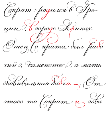 London, UK, and Athens and Kifissia, Greece-based type foundry started in 2001 by Panos Vassiliou. It specializes in fine multilingual (usually Latin, Greek and Cyrillic) typeface families. He is a graduate of the University of Toronto, Canada with a major in Applied Science and Engineering. Following his University of Toronto graduation, he studied Graphic Communications at Ryerson University. Panos Vassiliou has conducted numerous seminars for Canadian companies such as Bank of Nova Scotia, Royal Bank and Sony Canada. He graduated from the University of Toronto/Canada, where he studied Applied Science and Engineering. He has been Creative Director for the Canadian design firm AdHaus, former Publisher of the monthly magazine DNA (Greece) and Secretary-General for the Hellenic Canadian Congress (Ontario, Canada). He has been designing typefaces since 1993, including commercial fonts as well as commissions from Vodafone, Nestlé, Ikea and National Geographic. He started Parachute in 2001 setting the base for a typeface library that reflected the works of some of the best contemporary Greek designers, as well as creatives around the world obsessed with type. Apart from its commercial line of typefaces, Parachute offers bespoke branding services for corporate typefaces and lettering. Customers include Bank of America, the European Commission, UEFA, Samsung, IKEA, Interbrand, National Geographic, Financial Times, National Bank of Greece, Alpha Bank and many others.
 Myfonts link. Behance link. Other type designers at Parachute include Kanella Arapoglou, Alexandros Papalexis, Dimitris Foussekis, Aggeliki Skandalelli, Helen Gabara, Babis Touglis, Vangelis Karageorgos, George Toumbalis, Eva Karapidaki, Charis Tsevis, Pavlos Levendellis, Panos Vassiliou, and George Lygas. At Granshan 2010, Vassiliou won Second Prize in the Greek text typeface category for PF Encore Sans POro, and First and Second Prizes in the display typeface category for PF Regal Pro and PF Champion Script Pro, respectively. Typefaces: - Adamant
- PFAgora Pro: Agora Sans, AgoraSerif, AgoraSlab.
- Amateur
- PF Archive Pro (2004). He received a design award for his typeface Archive at the E AWARDS 2004. It has special typographic features and multilingual support for all European languages including Greek and Cyrillic.
- Armonia
- Astrobats
- Bague Universal and Bague Sans (2014). A geometric grotesk that dares to be different. Accompanied by Bague Slab Pro (2014), PF Bague Inline Pro (2014), and PF Bague Round Pro (2014).
- Baseline
- Beatnick
- Beau Sans (2011). Inspired by Bernhard Gothic.
- A custom didone font for Greece's Benaki Museum (2020-2021).
- PF Benchmark Pro (2014).
- Bodoni Script (2009).
- PF Brummell (2016). A sans characterized by sharp angled terminals and a diamond dot on the i.
- Bulletin Sans (2000-2005)
- Centro (Centro Sans, Centro Serif, Centro Slab) a typeface originally developed for the redesign of the Financial Times Deutschland. PF Centro Pro family (Sans, Serif, Slab, a trillion styles) won an European Design Award in May 2008 in Stockholm and at Paratype K2009. It was completed by PF Centro Serif Compressed, PF Centro Sans Condensed and PF Centro Sans Compressed in 2015. In 2016, he published PF Centro Slab Press.
- PFChampion Script Pro (2004-2008). A much lauded connected calligraphic script that is based on a calligraphic script by Joseph Champion, 1709-1765. Winner at Paratype K2009 and Granshan 2010. Images: i, ii iii, iv, v. The 4245-glyph family comprises Cyrillic, Latin and Greek subfamilies.
- Cosmonut (sic) (2002). A retro futuristoc typeface made by Dimitris Foussekis.
- PF Das Grotesk Pro (2014). Panos writes: Das Grotesk was inspired by earlier nineteenth-century grotesques, but it is much more related to American gothic designs such as those by M.F. Benton.
- DaVinciScript (2001-2006). A Treefrog-style script typeface by Vassiliou and Dimitris Foussekis.
- PF Dekka (2014). This solid elliptical sans family was influenced by Monaco's outline version called MPW. It includes PF Dekka Mono.
- PF DIN (2010): PF DIN Display (2002-2005), PF DIN Mono, PF DIN Serif (2016; this great serif version of DIN---a first---contains a wealth of goodies: just look at the great weather icons; it won an award at Granshan 2016), PF DIN Stencil Pro (2010), PF DIN Stencil, PF DIN Stencil B (2016), PF DIN Text Pro, PF DIN Text Condensed, PF DIN Text Compressed, PF DIN Text Arabic, and PF DIN Text Universal. With Latin, Cyrillic and Greek coverage, each font has about 1300 glyphs. The designs go back to the lettering of the Prussian railways around 1900. In 2013, PF Din Text Pro was published. In 2021, the three-axis (weight, width, italic) variable type system PF DIN Max saw the light.
- Eco Park. A 3d outline face.
- PF Encore Sans (2009). A rich and versatile sans family supporting Greek, Latin and Cyrillic.
- PF Fuel Pro
- PF Fusion Sans (1996-2006)
- PF Garamond Classic.
- PF Goudy Intials and PF Goudy Ornaments. A winner at Paratype K2009.
- PF Grand Gothik (2019). A large grotesque typeface family with three subfamilies and a variable font option. He writes: Grand Gothik is a postmodern, multiscript, multifaceted and variable type system which shines at its heavier extended versions with its hip, expressive, almost brutal energy. Grand Gothik's design space includes 3 axes for weight, width and one for italics. It is available as a variable font or as five separate opentype families---compressed, condensed, normal, wide and extended. Each family comes with 9 weights spanning from Extra Thin to Black plus italics.
- PF Handbook (2005-2007, sans family)
- HausSquare
- HellenicaSerif. Chiseled look, Greek simulation face.
- PF Highway Sans (2001-2015). Highway Sans Pro is based on the standard typefaces used for highway signs and other byways open to public travel in the United States. These standards were established by the US Federal Highway Administration in 1966 following several studies which were conducted at the California Department of Transportation in the 1940s. It covers Latin, Greek and Cyrillic.
- House Square. A Bank Gothic lookalike.
- PF Isotext (2005). Meant for technical documentation, it is modeled after Isonorm.
- Kids, KidsStuff
- Libera
- Lindemann and PF Lindemann Sans (2012).
- PF Marlet (2019). A sharp-edged humanist sans family fit for fashion mags: Marlet Titling, Marlet Finesse, Marlet Swash, Marlet Display, Marlet Text. PF Marlet, collected three awards one after the other, a year after appearing on Luc's best-of-2019 list. First, the coveted TDC Certificate of Typographic Excellence 2020 (at 23RDC), followed by another one from European Design Awards, a third distinction from Tokyo TDC and a fourth crown, Red Dot Award 2020, all in 2020.
- Mechanica A and B, 2002-2006. Octagonal families.
- PF Mellon (2019). A modernist variable grotesque influenced by nineteenth and early twentieth century condensed sans serif typefaces such as Stephenson Blake's Grotesque No.77 and ATF's Alternate Gothic.
- PF Monumenta (2002-2006). A majestic lapidary roman family.
- Muse
- Online (One, Two and Three). Pixelish family.
- PF Ornamental Treasures (2008). Byzantine ornaments and borders.
- PF Pixelscript
- Playskool
- Psychedelia (2003, Dimitris Foussekis). A psychedelic typeface.
- Regal Pro and Regal Finesse Pro: Award-winning high fashion display didone families, 2010-2012, originally designed for the Grazia magazine. Awards include Red Dot Awrd 2012, Communication Arts Annual Competition 2012, Creative Review Type Annual 2011, European Design awards 2011, EBGE awards 2011, Granshan Awards 2010. See also PF Regal Swash and PF Regal Stencil.
- PF Reminder Pro (2003). A hand-printed typeface.
- Scandal
- PF Spekk (2020). A simple versatile geometric sans for Latin, Greek and Cyrillic.
- PF Square Sans Pro, PF Square Sans Condensed Pro (2013).
- PF Stamps (2002-2006). A grungy stencil typeface by Panos Vassiliou and George Lygas.
- PF Synch Pro (2006). An industrial strength slab-serif typeface.
- PF UEFA Super Cup (2013).
- PF Uniform
- PF Venue (2017). Semi art deco, and free-spirited, a great poster typeface family.
- VideoText
- PF Wonderbats (2003). Funky and strange animals.
- Wonderland (2006). By Dimitris Foussekis.
Their type blog is called Upscale typography. Catalog. View all typefaces designed by Parachute. Klingspor link. MyFonts interview. [Google]
[MyFonts]
[More] ⦿
|
Paulo Silva
|
Portuguese type designer in Porto, b. 1972, who created NewBodonesque (2004-2005) as part of Pedro Amado's Typeforge open source font project. Creator of Gentesque (2009), an Open Font Library family based on a scan of the Gentium family. Aka Nitrofurano. In 2009, he and others started work on OpenDinSchriftenEngshrift, an open source typeface that is as close as possible to the original DIN font done for the Prussian Railways. It was made with open source tools such as Inkscape and FontForge. In 2014, he published Cyrillic versions of Not Courier Sans (2008, Ludivine Loiseau). One download site. And another one. Kernest link. Behance link. Old Typeforge link. [Google]
[More] ⦿
|
Per Jæger
|
Norwegian designer in Oslo. He created Oslofonten (2005), a DIN Engschrift type of beast. Codesigners: Thomas Thiis-Evensen, Morten Krogstad [Google]
[More] ⦿
|
Peter Wiegel
[CAT Design Wolgast]
|
 [More] ⦿
|
Philip Lammert
[Vibrant Types (was: Calligrafiction)]
|
 [MyFonts]
[More] ⦿
[MyFonts]
[More] ⦿
|
Phil's Fonts Top 25 Sellers in 2006
|
Here we go, in order: Freigh Text, Helvetica Condensed, Freight Sans, Helverica, Modus, Akzidenz-Grotesk, Metroflex Uni, Meta 1, Son Gothic, FF DIN, Bauer Text Initials, Interstate, District, Freight Micro, Mockingbird, Frutiger, Cezanne Pro, Clarice, Zapfino, Meta 2, Fono, Metroflex Narrow, Futura, The Sans Basic, Akzidenz-Grotesk Condensed. [Google]
[More] ⦿
|
Pietro Cesare Bologna
|
 At iFontMaker, Pietro Cesare Bologna designed these typefaces in 2016: Hand Din Engschrift, HandDin 2.0, HandDin 1.0, Pit 2016 Script, Pit 2016 Extrude, Manolibera, Walt Pit (Walt Disney script), Giovedi (a great poster script), Susanna, Hand Dillium, Bollicina. Earlier, he made HandtypeCondensed and Bollicina Type Hand (2010, hand-printed). Aka Pitbol. Old iFontmaker link. [Google]
[More] ⦿
At iFontMaker, Pietro Cesare Bologna designed these typefaces in 2016: Hand Din Engschrift, HandDin 2.0, HandDin 1.0, Pit 2016 Script, Pit 2016 Extrude, Manolibera, Walt Pit (Walt Disney script), Giovedi (a great poster script), Susanna, Hand Dillium, Bollicina. Earlier, he made HandtypeCondensed and Bollicina Type Hand (2010, hand-printed). Aka Pitbol. Old iFontmaker link. [Google]
[More] ⦿
|
Plamen Motev
|
 Type designer based in Sofia, Bulgaria. As a student working with Fontfabric in Sofia, Bulgaria, Plamen Motev designed the free circle-themed slightly condensed retro typeface Phenomena (done together with Radomir Tinkov) and the free 8-style narrow grotesque family Akrobat for Latin and Cyrillic in 2016.
 In 2017, Plamen Motev and Svetoslav Simov co-designed Uni Neue, a total remake of Fontfabric's earler typeface Uni Sans (2009). He was part of the Fontfabric team that designed the 521-font family Zing Rust, Zing Sans Rust and Zing Script Rust in 2017. Typefaces from 2018: Gilam (by Ivan Petrov, Plamen Motev and Svetoslav Simov: based on DIN, but more geometric and with obliquely cut terminals). Typefaces from 2019: Panton Rust and Panton Rust Script (by Plamen Motev, Stan Partalev and Ventsislav Djokov). Typefaces from 2020: Alkes (by Plamen Motev, Nikolay Petroussenko, Kaja Slojewska at Fontfabric: a 14-style text typeface for long passages, designed to harmonize between Latin, Greek and Cyrillic, and featuring a generous x-height, wide letter spacing, large open counters and angled stress contrast so that the typeface is quite readable and friendly). Typefaces from 2021: Silverstone (Display, Text) (2021). A custom type system for the Silverstone raceway and British Motorsports by Plamen Motev and Ventislav Dzhokov at Fontfabric. In 2022, Vika Usmanova and Plamen Motev co-designed the wayfinding sans family Ways at Fontfabric. Still in 2022, Plamen Motev and Pavel Pavlov released the vampire-serifed variable typeface family Gwen at Fontfabric. [Google]
[MyFonts]
[More] ⦿
|
Radostin Peshev
|
Sofia, Bulgaria-based designer of these Latin / Cyrillic typefaces in 2015: ADEC (influenced by DIN and constructivism), Declare, Attorney Bold (slab serif), Sense (sans). [Google]
[More] ⦿
|
Rasmus Lund Mathisen
[Overtone]
|
 [More] ⦿
|
Ray Larabie
[Ray Larabie's classification]
|
[More] ⦿
|
Ray Larabie's classification
[Ray Larabie]
|
Ray Larabie is upset with the lack of relevance of older type classification systems. There is not enough variation for the display, sans and decorative styles that are being produced nowadays. His classification proposal made in October 2011 [all comments are his]: - Old sans: Franklin Gothic and other sans with an ancient flavor.
- Geo-classical: Futura, Gill, Bernhard Gothic.
- Helveticas: Arial, and hundreds of other mid-century neutrals.
- Frutigers: Museo Sans, Verdana.
- Humanist sans: Easy. If the baseline is straight, it ain't humanist. Most of what I see categorized as humanist are just Franklins.
- Geo-gothic: Avant Garde.
- Square Sans: EF Digital, Bank Gothic, Chimes.
- Superelliptical: Microgramma, Eurostile.
- Brush Sans: Flash, Balloon.
- Technical: DIN, Highway Gothic, stencils, elevator buttons, template lettering, labels and other "ugly" lettering.
- Pixel: early computing retro, including segmented LED.
- MICR: Data 70.
- Rounded Sans: V.A.G., Arial Rounded.
- Compacta: Impact, Helv Inserat.
- Industrial slabs: Memphis, Museo.
- Stops: Stop and similar minimalist variants produced in the 70's and 80's. I didn't think it was a category until I moved to Japan. Bored font historians looking for a subject should try tracking Stop's influence on car emblems, videogames, graffiti and the circa 1990 4k demo scene.
- Geo slabs: Lubalin Graph.
- Structured scripts: Magneto, Deftone Stylus.
- Scripts: boo.
- Decorative: Actually decorative. Fonts that look like fire or chrome etc. It's often used as a catch-all category by the ancient ones.
- Misc: a better name for a catch-all category.
[Google]
[More] ⦿
|
Reviled Fonts
|
Joe Clark's article on reviled fonts, with selections of hated or poorly designed fonts offered by typographers. The list has Fago, Reiner Script, Rotis (hated by Unger), Helvetica, Chicago, DIN (hated by Porchez), Arial and Souvenir. [Google]
[More] ⦿
|
Revolver Type Foundry
[Lukas Schneider]
|
 German type designer born in Frankfurt in 1973. He studied in Offenbach at the Hochschule für Gestaltung. He assisted Akira Kobayashi with some projects, and still lives in Frankfurt. In 2017, Lukas Schneider set up Revolver Type Foundry.
 At Typeoff.de, he created the Western billboard typeface Jeans (2004), AT Stencil (2004) and the kitchen tile typeface Disco3000 (2004). At the Hochschule, he created Gazoline, a grotesk face. Lukas Schneider has free-lanced for companies in Frankfurt as well as for the magazine form and for Linotype. He runs his own studio in Frankfurt, called Protago Graphic, and most recently started Snider Inc, also in Frankfurt. In 2007-2008, his masterpiece appeared in the FontFont collection: FF Utility, 15 styles of Bank Gothicalized alphabets specially made for information design. See also YB Utility Slab. He custom designed in 2006-2007, under the supervision of Prof. Johannes Bergerhausen and Prof. Ulysses Voelker at Fachhochschule Mainz the Plus family (for the Plus supermarket). In particular, one font is called Plus Exklusiv Medium. Another custom design is DRAFTFB for Eikes Grafischer Hort, a hand-printed typeface that covers Latin and Cyrillic. In 2013, he graduated from the Type and Media program at KABK in Den Haag. His graduation typeface was the delicate and quite readable text family Damien, which was created for editorial design. In 2016, Lukas published Expose at Indian Type Foundry. This 4-style sans typeface is "constructed" or "engineered" for use in headlines. Free version at Fontshare. Typefaces at Revolver Type Foundry: Damien (2017, in Display and Text subfamilies), Dinamit (2016: a terrific DIN Breitschrift, abandoned by the German DIN norming institute around 1936), Mondial Text (2016: a striking didone based on Hans Bohn's Mondial from 1930), Mondial Display (2016), Newson (a low contrast wayfinding sans with plenty of dingbats---hey, Frankfurt Airport managers, is anyone paying attention?). Designer of DTL Gros Canon at Dutch Type Library, which writes: The first part of the DTL [Gros] Canon Project included the digitization of three types by the Flemish Renaissance punchcutter Hendrik van den Keere (ca.1540-1580): Gros Canon Flamande (textura type, 1571), Gros Canon Romain (roman type, 1573), and Canon d'Espaigne (rotunda type, 1574). The latter is almost ready for release. Typecache link. Klingspor link. FontShop link. Type Network link. Old Snider Inc link. [Google]
[MyFonts]
[More] ⦿
|
Richard Diaz Granados
[Stereo Type Haus]
|
[MyFonts]
[More] ⦿
|
Rick Banks
[F37 (or: Face37)]
|
 [MyFonts]
[More] ⦿
[MyFonts]
[More] ⦿
|
Roger S. Nelsson
[CheapProfonts]
|
[MyFonts]
[More] ⦿
|
Roman Buettner
|
At iFontMaker, Roman Buettner designed these typefaces in 2016: Roman Buettner Hand, Roman Buettner Unicode, Roman Buettner Secret. [Google]
[More] ⦿
|
Russell Bean
[Type Associates]
|
 [MyFonts]
[More] ⦿
[MyFonts]
[More] ⦿
|
Sabina Irina Chipara
|
 Sabina Chipara (or: Kipara) was born in 1987 near the seaside in Constanza, Romania. She moved to Bucharest to study graphic design at the National University of Arts in Bucharest, Romania, and at EINA Centre Universitari de Disseny i Art de Barcelona. She took the TDi program at the University of Reading, UK, in 2016. Speaker at ATypI 2018 in Antwerp, where she surveys the archaic Romanian alphabets. Sabina also helps with type design at MCKL Type, Jeremy Mickel's type foundry in Los Angeles. She is currently based in Amsterdam. Her typefaces:
 - MoRo (2012) and Arhaic Romanesc (2012). MoRo, or Modern Romanesc, is an artsy typeface. She writes: MoRo is a modern version of archaic Romanian types. The design of the MoRo letters combines the features of Cyrillic glyphs with Latin shapes.
- In 2012, during an Advanced Typography Masters at EINA, Barcelona, she developed Zagoris.
- DIN Next Stencil (2017) and DIN Next Shapes (2018). Done together with Akira Kobayashi at Linotype.
- Rosella (2017, Monotype). An engraved lettering typeface with textured, inline, beveled, shaded and filled versions.
- In 2018, she designed the 8-weight simplified sans family Bega (Indian Type Foundry) and the high-contrast calligraphic script Britney (done with Diana Ovezea), which was released as a free font at Fontshare.
- At Future Fonts, she published Bizzarrini (together with Diana Ovezea). Diana Ovezea writes about the wonderful Bizzarrini: Though the idea originates from a Stefan Schlesinger ad sketch for a Paris couture house, we straightened up this typeface and made it seem engineered and sharp. It gets its name from the Bizzarrini Manta, a wedge-shaped concept car designed in 1968 by Giorgetto Giugiaro. Bizzarrini has extremely long wedge serifs. Following Schlesinger's sketch, it features very tall capitals with an out-of proportion middle-line (very big heads on S, B and R).
- The connected monoline sans script Akin (2019), done with Diana Ovezea at Indian Type Foundry.
- The neo-grotesque typeface Amurg (2019).
- Anouk (2020). A reversed high contrast typeface designed to be used at large sizes.
- Aesop (2021). A despoke typeface for the brand identity of Iwoca. The Iwoca identity elements were influenced by the work of Wassily Kandinsky through geometric shapes and angles. The corners of the sans typeface are rounded and provide a smooth appearance on screens.
Facebook link. [Google]
[MyFonts]
[More] ⦿
|
Saja TypeWorks
[Aaron Bell]
|
 Aaron earned a Bachelor's degree in Asian Studies, with a minor in Japanese, at Whitman College in Walla Walla, WA. Aaron is a graduate of the University of Reading in 2011, where he earned an MA in typeface design. His graduation typeface was Saja (2011), which covered Latin and Korean. In the Fall of 2011, he joined the Microsoft Typography team.
 In 2015, at Microsoft, he designed the free sans typeface Selawik, which is metrically compatible with the infamous Segoe UI. Selawik now also exists as a variable font. In 2016, het up his own type foundry in Seattle, Saja TypeWorks. At Saja TypeWorks, he published the sans-serif typeface Salish, which is inspired by the art of the Salishan tribes in the Northwest Americas: It draws heavily on the concept of the ovoid, a wide ovular shape that is flat on the bottom and top heavy, that is central to the art style known as Formline. Language support includes some 200 Latin-based languages as well as the necessary orthographies for all Salishan languages, including: Comox, Sliammon, Klahoose, Pentlach, Sechelt, Squamish, Halkomelem, Nooksack, Straights Salish (Saanich), Lushootseed, S'Klallam, Quinault, Upper Chehalis, Lower Chehalis, Cowlitz, Bella Coola, Ditidaht, Tseshaht, Nuu-chah-nulth, Ehattesaht-Nuchatlaht, Kwak'wala, Shuswap, Lillooet, Thompson River Salish, Coeur d'Alene, Columbia-Moses, Colville, Okanagan, and Montana Salish. Haida (a non-Salishan language) is also supported. At FontStruct, he designed Syzygy. In 2017, he published HWT Aetna at P22. Aetna is a sturdy roman wood type first see in William H. Page's 1870 specimens. Aaron Bell digitized the free logo font Air America in 2018. He writes: This font was produced for William G. Sherman who recreated this alphabet from samples of the logo and other sources from the airline company Air America. In 2018, he published the free DIN-based sans typeface Bahnschrift for Microsoft at Open Type Library. The font posted at Open Font Library is flawed (look at the capital A), so I wonder if that post was done by an impostor. Bahnschrift was the basis of his 2021 typeface, Grandview, which could be tipped by Microsoft to replace Calibri---in use since 2007--in its Microsoft 365 apps and Office products. Typefaces from 2019: Industrial Spill (with Dave Savage), Tipsy Waitress (beatnik, cartoonish; with Dave Savage), Super Chill MC (with Dave Savage). For Microsoft's Windows 10, he designed the open source monospaced font Cascadia Code. The plan is to add support for Greek, Cyrillic, Vietnamese, Arabic and Hebrew during 2020. TeX support for Cascadia Code. Speaker at ATypI 2012 in Hong Kong: Seeking the Korean true italic. Speaker at ATypI 2013 in Amsterdam: Directionality in Korean type design. Fontsquirrel link. [Google]
[MyFonts]
[More] ⦿
|
Salty Creative
|
Bordeaux, France-based designer of the textured typeface Fontfull (2015), whose outlines are based on DIN. Behance link. [Google]
[More] ⦿
|
Samuel Willger
|
Student at the University of Kansas in Lawrence. Creator of the display typeface Strike (2012), which was designed on the basis of DIN. [Google]
[More] ⦿
|
Sandra Winter
|
 Sandra Winter is a German font designer and graphic artist based in Frankfurt am Main. After training in advertising, she studied Communication Design in Darmstadt, and type design at the University of Reading (where she graduated with an MA in 2006). She works now at Linotype, Germany, and as a freelance designer.
 Creator of Filia Latin, Filia Greek and Filia Italic (2006) as part of her thesis project. Typedia link. In 2009, while at Linotype with Akira Kobayashi, she worked on DIN Next, a typeface family inspired by the classic industrial German engineering designs, DIN 1451 Engschrift and Mittelschrift. It was published at Linotype as DIN Next Pro. In 2012, Sandra Winter and Akira Kobayashi published Avenir Next Rounded. In 2014, Akira Kobayashi, Sandra Winter and Tom Grace joined forces to publish DIN Next Slab at Linotype. In 2016, Akira Kobayashi and Sandra Winter co-designed Applied Sans (32 styles) at Monotype. It is in the tradition of vintage sans typeface such as Venus and Ideal Grotesk, and competes with Rod McDonald's splendid Classic Groyesque. Klingspor link. [Google]
[MyFonts]
[More] ⦿
|
Sans serif classification
|
 Several groups are generally distinguished:
 - Grotesque or Grotesk: These are the early sans-serif designs, but also include the 20th century work horses, Helvetica and Univers. Among the earlier ones, we list Akzidenz Grotesk, Bureau Grot, Grotesque, Franklin Gothic and Royal Gothic. The latter typefaces are sometimes classified as Gothic (two-story lowercase g, angled strokes on C and S).
- Humanist sans such as Johnston, Gill Sans, Frutiger and its copy, Myriad. These typefaces are alive with variations in width and calligraphic influences. Some appreciate them for beauty, others for legibility.
- Geometric sans: These typefaces are pregnant with geometric shapes, and are in some (most) cases less legible. On the other hand, they are more effective on posters and headlines. The main families in this category include Renner's Futura, and Lubalin's ITC Avant Garde. Other styles include Gotham, Spartan and Century Gothic.
- Neo-grotesque, transitional or realist: These are modern sans typefaces, often rather dull with little variation in line widths and lacking any extravagant features. Arial, Standard and Bell Centennial are in this group.
- Square Gothic, in the style of Bank Gothic: low contrast typefaces with straight lines and curved or rounded corners. Macho look.
In the DIN 16518 German classification, all sans typefaces are globbed together under the name Gruppe VI: Serifenlose Linear-Antiqua. Credit for some images below: Danielle West. [Google]
[More] ⦿
|
Sans typefaces at FontShop
|
Classic (mostly sans) typefaces at FontShop: FF Meta® is one of these — and the recent launch of headline and ultralight styles breathe new life into the Erik Spiekermann masterpiece. Other classics that look great on screen include Avenir, FF Dax®, Interstate, FF DIN®, and the Thesis Series (TheSans®, TheSerif®, and TheMix®). [Google]
[More] ⦿
|
Sarp Sozdinler
|
Graphic design student at the University of Applied Arts in Vienna. Before that, he was art director in his native Turkey (b. Izmir, 1989), where he studied computer engineering at Bahcesehir University. Behance link. Creator of the 3-weight type family Bled (2012), which has some rounded cornes and feels like a distant relative of DIN. A lot of design thought went into this typeface. We are promised a free download soon. Creator of the octagonal typeface family Tarnated (2012), which is based on vintage lettering by American artist Ed Ruscha. [Google]
[More] ⦿
|
Schrift der Eurokennzeichen
|
About the type used on German license plates. FE-Schrift by Karlgeorg Hoefer (1914-2000) replaces the older DIN-Schrift. FE Schrift is based on the letterforms of a little known typographer (the article does not say who). [Google]
[More] ⦿
|
Scott Ulrich
[Incinerator]
|
[More] ⦿
|
Sebastian Lester
|
 Graduate of Central Saint Martins College of Art and Design in London. He started out designing fonts for [T-26] and Garagefonts, but is also (or, perhaps, mainly) a letterer. In 2000, Lester joined Agfa Monotype. Typefaces:
 - [T-26]: EquipoizeSans, EquipoizeSerif, Zoroaster-Regular (1995), Cuban (1996-2000).
- Garagefonts: Rubber (2001), Gimp Round (2001) and Gimp Square (2001).
- Agfa/Monotype: Soho (2007, a 40-strong slab serif family), Soho Gothic (2007-2008, slab serif family perhaps based on the signage around Soho---this large fgamily has nice Compressed, Condensed and Extended subfamilies), Neo Sans (2004), NeoTech (2004), Scene (2000-2002, sans serif and semi-serif, 12 weights, 12 alternates) and Scene Black (2008). Scene has been lauded as eminently clean, open, and highly legible: it is a formidable family, and a competitor for Futura, Gill Sans, Helvetica, Univers, FF Bau, Intel's new identity font called Neo Sans Intel (2005) is based on Neo Sans and Neo Tech.
FontShop link. Linotype link. Interview in 2008 by iLT. Klingspor link. View Sebastian Lester's typefaces. [Google]
[MyFonts]
[More] ⦿
|
Simon Lemmerer
|
Graz, Austria-based designer of Graz T-Type (2014), a multiline typeface for traffic signage. Stratos Sans (2015) is inspired by geometric forms and the German Normschrift (DIN) that is typically used in architecture and engineering. [Google]
[More] ⦿
|
SINDSINDSIND
[Greg Ponchak]
|
 Greg Ponchak (SINDSINDSIND) is a graphic designer in North Royalton (Cleveland), OH. His company was called SINDSINDSIND, but in 2013, he sold his outfit to Thinkdust.
 He created the minimalist high-contrast Qag (2009, Mostar Design Company), Muneris (2010, squarish), some experimental typefaces, the minimalist geometric sans typeface Monolite (2013), Berque (2010, a minimalist rounded sans typeface with hints of DIN), Kolg Gothic (2011), Jirue (2011, high-contrast didone), Kajf (2011, piano key face), NERC (2011, avant-garde), ARGN (2011, a rounded monospaced stencil family), FOSU (2010, hairline avant-garde sans, at HypeForType), Kosumi (2014, experimental), Roxic (high contrast art deco typeface), Shine Pro (2014, a neutral sans), and Squoosh Gothic (2014, a headline sans). (Dead) Behance link. Klingspor link. [Google]
[MyFonts]
[More] ⦿
|
Smashing Magazine: 80 Beautiful typefaces for professional design
[Vitaly Friedman]
|
 Vitaly Friedman, editor-in-chief of Smashing Magazine, an online magazine dedicated to designers and developers, gives us his list of best commercial fonts in 2009:
 - Among the well-known types, they mention Helvetica, Helvetica Neue, Univers, Frutiger, Avenir, Myriad Pro, Neuzeit, Syntax, Proxima Nova, Proxima Sans, Glasgow, Charlotte Sans, Precious Sans, Gill Sans, Lisboa, Franklin Gothic, Futura, EF TV Nord 1, FF Scala, Rockwell, Eurostile, Warnock, FF DIN, FF Meta, Officina, FF Dax, DF Dynasty, Akzidenz-Grotesk, AG Book, Precious Serif.
- Lesser known typefaces: Locator, Seravek, FF Kievit, Ronnia, Stella, Le Monde Courrier, Parisine PTF, Freight, Guardian, Anomoly, PMN Caecilia, Leitura, The Mix, Stalemate, Neo Sans, Felbridge, Trade Gothic, Karmina, Source: FF Milo, Auto, Soho, Kepler, Depot, Relato Sans, Priva Pro, Relato Serif, Alber, Palatino Sans Informal, Fedra Sans, Olga, Depot, Whitman, Productus, Tempelhof, Amira, Krart, Tang, Dederon Sans, Samuels Family, Untitled, Greta Text, FF Sanuk, Houschka, Scene, Amplitude, Insider, Preface, Flex, Halvorsen, Xtra Sans.
- And typefaces for the future: Obliqua, Muestra Urbana, Wingardium (Prima Sans, really), Tauram Regular, Mello Sans.
[Google]
[More] ⦿
|
Start a design career
|
 The typophiles were asked in 2003 to list the 20 essential typefaces to start a design career. Here we go, unedited:
 - Sean Glenn: MetaPlus (FontShop), Helvetica Neue (Adobe), Mrs. Eaves (Emigre), Gotham (Hoefler Type Foundry), 20th Century (Monotype), Base (Emigre), Agency (Font Bureau), Simian (House Industries), Agenda (Font Bureau), OCR-B (Adobe), Formata (Adobe), Caxton (Adobe), Scala Sans (FontShop)
- Letter Tiep: Akzidenz Grotesk BQ, Univers, Frutiger Next (or Avenir?), Today Sans (or Syntax / Gill Sans?), The Sans, Trade Gothic (or News Gothic/Vectora?), Futura, Minion, Palatino, Berthold Baskerville (or Storm's John Baskerville / Monotype Bulmer), Filosofia, Lexicon nr2 ($$$), Officina Sans&Serif (or the FF Info series), Adobe Caslon, Bembo (or HTF Requiem), Stempel Garamond, Joanna (or Scala?), Clarendon (or Giza?)
- Jay Wilkinson: Akzidenz Grotesk BQ, Helvetica neue, Avenir (or Futura), Frutiger, Trade Gothic, Franklin Gothic, Optima, Bodoni (or Didot but not filosofia), Adobe Garamond, Adobe Caslon, Minion, Hoefler, Dante, Sabon, Perpetua, Requiem (or Bembo), Centaur, Clarendon, Shelly (or Snell Roundhand), Fette Fraktur (or Goudy Text)
- John Gordon: Blackletter, Centaur, Janson, HTF Requiem, Bembo, Caslon, Garamond, Baskerville, Palantino, HTF Didot, Perpetua, Electra, Clarendon, Akzidenz Grotesque, Helvetica Neue, Futura, Franklin Gothic, Trade Gothic, Poetica, Shelly
- Keith Chi'hnag tam: Minion Pro, Myriad Pro, Sabon Next, Monotype Baskerville (or Berthold), HTF Didot, Perpetua, Monotype Gill Sans, Berthold Akizidentz Grotesk, Thesis Sans, Swift, ITC Charter, FF Meta, PMN Caecilia, Adobe Caslon Pro, FB Miller, Adobe Syntax, ITC Franklin Gothic, Bitstream Futura, Monotype Bembo, Snell Roundhand
- H.D. Schnellnack: Neue Helvetica, FF DIN, Clarendon, Thesis Sans, Garamond Pro OTF or Neue Sabon, Myriad Pro OTF, Mrs Eaves OTF, FF OCR or FF Letter Gothic, Rotis Sans and SemiSans, Futura, Scala, TAZ III OTF, Univers, Bauer Bodoni, Franklin Gothic or Bureau Grotesque, Bell Gothic or Interstate (1993, Tobias Frere-Jones), Jenson Pro OTF or Warnock Pro or Kepler, Thesis Serif or Thesis Mono, Zapfino
[Google]
[More] ⦿
|
Stephen Coles
[The logos of Web 2.0]
|
[More] ⦿
|
Stereo Type Haus
[Richard Diaz Granados]
|
 Stereo Type Haus (or STH) is a commercial foundry in Brooklyn, NY, est. 2000, offering fonts by Rick D. Granados ((b. Miami, FL, 1970): Bucks (graffiti font), Bushwick (handwriting), Ballbuster, Bedford (2010, an award-quality dot matrix family inspired by mosaic lettering by Heins&LaFarge, architects of the IRT (Interborough Rapid Transit) in New York City: Bedford hints at the station names on platform walls which date back to 1904 but modernize it through a rigid grid system and rounded corners), Bockhold (2010, a humanist take on DIN), Broadcast (neat stencil face), Konstrukt (stencil), Construkt (2009, a unicase stencil), Falcon, Gran Torino, Roller Girl, Opera (2005, with Ros Knopov), Prisma 2012 (2010, an octagonal multiline face), Radiac (2010, a monoline squarish unicase face), Rukbat, Stylus, Schmearox, Tech Stencil (2000), Noise&Hum, STH Sirena (2006, inspired by hand-painted signage found in "Little Haiti" Miami, Florida), Boris Dworschak (Partisan East, Partisan West, Basic, Gaijin. Other designers include Nikola Djurek (Cornerset (pixel), Aiseman), Luis Valle&R.D. Granados (Lillian, a script face), Arnold Steiner (Statica, Organic Mechanic), Michael Clarke (Paris), Carlos Alfonso (Locut, 2Bit), Denise Wilton (Stereobitz, a stereo dingbat face), Nikola Djurek (Tribeca, Magasine, Soho, Novella) and unnamed author fonts such as Palleta, Rook, STH Kit 1, Stereobytes (audio dingbats), Stereobytes Vintage (hi-fi dings), Nomad (a deconstructivist stencil face).
 At FontStruct in 2009, he made the Victorian family Cartelle (+Inline), the pixel family Microdot, and Chico. Granados spends his time between New York City and Austin, Texas. Klingspor link. View Richard Granados's typefaces. [Google]
[MyFonts]
[More] ⦿
|
Stuart Hazley
|
British designer of the sans typefaces Ostent Rounded (2022) and Ostent (2019), which were influenced by DIN 1451. [Google]
[MyFonts]
[More] ⦿
|
Studio Charlie
|
 Italian graphic design group headed by Gabriele Rigamonti (b. Italy, 1976), Carla Scorda (b. Italy, 1976), Vittorio Turla (b. Italy, 1975). The company is located in Rovato, Brescia, Italy.
 Fonts sold by MyFonts: the DIN-inpired 6-style sans family Superbastone (2006), the futuristic Stereotype family (2005), the skull dingbat font Catacumbes (2006), the ransom note font Cavillus (2006), the dog dingbat font Charliedog (2006), the leafs dingbat font FontFoliae (2006), the Stencil G family (2006) and the rounded octagonal family Pied de Poule Text (2006) were co-designed by all three founders. In 2007, they added Insects (dingbats), Design We Like (dingbats), MyFace (an award-deserving collection of typefaces), Friz Biz (simple children's hand), Washing Machine (dingbats), Superbastone (sans family), Superclosed, Supersquared, Superstarlike, and Superwood. In 2008, we saw the publication of Retrofont, a very condensed high contrast sans. In 2009, the dot matrix typeface Superpois saw the light. Behance link. [Google]
[MyFonts]
[More] ⦿
|
Suitcase Type Foundry
[Tomás Brousil]
|
 Suitcase Type is a Czech foundry, est. 2003 by Tomas Brousil (b. 1975), who lives in Prague. He graduated from the Prague Academy of Arts, Architecture and Design (Type Design and Typography, MgA. 2009) where his graduation project was the 96-family Tabac typeface system, published in 2010. He teaches in the Type Design and Typography department of the Prague Academy of Arts, Architecture and Design.
 The Tabac family started with Tabac Sans in 2010. It was augmented in 2012 with Tabac Slab and Tabac Mono, which have a full range of weights from Hairline to Black. Tabac Glam, a fashionable Peignotian high contrast sans, was added in 2016, and Tabac Micro in 2018. In 2019, he published Tabac Big Glam, Tabac Big Sans, Tabac Big Slab and Tabac Big. Other typefaces from 2008-2010 include Monopol (a six-weight condensed sans that includes a hairline weight), Idealista (2010, organic, a mix of styles), Nudista (2009, a multistyle take on DIN with a superb fashion mag hairline, Nudista Thin), Kulturista (2009, a part slab part serif extension of Nudista), Comenia Sans (2008, a 12-style complementary family to Storm's Comenia Serif for school textbooks), Metalista (2008, unicase octagonal metallic face). 2007 was a successful year. Brousil created Bistro Script (2007, fifties diner style script), Corpulent (2007), and Gloriola (2007, a sans in 14 styles, including a hairline. The last typeface family won an award at TDC2 2008 and at Typographica's Best of 2007. Stephen Coles likes its position between the cool sterility of de Groot's monolinears and the warmth of Latin designers: With a broad range of weights, a complete Western character set, and a sack of ligatures and alternates, Gloriola has the depth required for complex identity systems and publication design. This shrewd response to the fashions of today is going to be useful for many years to come.). The year 2007 also saw Purista (a 10-style cousin of Eurostile), which includes hairline weights. Ellen Lupton says this about Purista: I've been feeling hungry for a stylish, edgy sans who enjoys evenings out on the town and long mornings of crisp conversation. In other words, I've been craving a font who likes to party but who can also help out with the dishes. Production in 2005-2006: Teimer's Antiqua (2006: a didone family based onn unpublished 1967 design by Pavel Teimer), Rokoko (2006, an octagonal custom typeface for the Rokoko Theatre in Prague), Sandwich (2006, a lively display caps set), Vafle (2006: based on an original concept by Marek Pistora from 1997, with minor adaptations and 11 new weights), Dederon Sans and Serif (2005, the sans version being inspired by TypoArt's Liberta; see also here for a comparison with Underware's Dolly), Dederon Serif. Typefaces from 2004 or earlier include Fishmonger (2004, a sans family), RePublic (a 2004 revival, done with Radek Sidun, of Public by Stanislav Marso, 1955. Note that Public was used to set the text of a Czechoslovak Communist party newspaper, Rudé Právo), Botanika (2005, a sans family including many typewriter styles and several mono weights), Atrament (2003, a narrowed grotesque inspired by the lettering used on the title of the almanac "Devetsil - Revolucni slovnik" (1922) edited by Karel Teige, in 30 styles!), Magion (2004, a simple geometric font), Fishmonger (2004, a broad 50-weight futuristic family), Katarine (2004, a warm sans family with appropriate dingbats added in), and Orgovan (2004-2005, a punk/brush family). Typefaces from 2013 include the roundish sans family Ladislav: The Ladislav font revitalises Sutnar's legacy, while not explicitly copying any of his original fonts. It however keeps true to their technicist character and initial principles of character creation - a simple modular system of combined geometrical segments. This approach affects all round shapes of capital and lowercase letters, as well as the shapes of the majority of numbers. The g consists of two disjoint circles. Typefaces from 2014: Urban Grotesk (a very airy, open grotesque typeface with large x-height and uniform grayness). Typefaces from 2015: Pacifista (stencil). Typefaces from 2016: BC Novatica (by Tomas Brousil and Marek Pistora (Briefcase Type): Novatica was created based on a commission from the Czech commercial television station Nova in 2007. Marek Pistora worked with Tomas Brousil to create an alternative to a readable, simply designed sans. They naturally called the typeface Novatica. In 2014 TV Nova decided to abandon Novatica for good, and in so doing it released the exclusive licence it had been using. Novatica thus became a new typeface offered by Briefcase Type Foundry. Typefaces from 2017: Jaroslav (monolinear sans, named after Jaroslav Benda, followed in 2020 by Benda), Pepi and Rudi (a sans and slab pair based on basic shapes such as circles, rectangles and triangles). Typefaces from 2020: Atyp BL (+variable), Atyp (+variable). A 25-style sans family remotely influenced by Bauhaus. Typefaces from 2021: Crabath (a 72-style transitional typeface family based on the 1761 specimen book of Czech typefounder Vaclav Jan Krabat; this family covers several optical ranges, from Subhead to Display to Text, and features wonderful initial caps). Typefaces from 2022: Atyp Kido (a 6-weight and variable rounded sans family for Latin, Greek and Cyrillic). Brousil made many corporate or identity fonts. Examples include Brzda (a custom font for Czech artist Pavel Brazda), Budovatel (a custom font for the Bohemian National Hall in New York), and Union (custom webfonts for the Czech graphic design union). MyFonts page. Behance link. Klingspor link. MyFonts interview. View Tomas Brousil's typefaces. [Google]
[MyFonts]
[More] ⦿
|
Svetoslav Simov
[Fontfabric]
|
 [MyFonts]
[More] ⦿
[MyFonts]
[More] ⦿
|
Tagir Safayev
|
Tagir Safayev is a Russian type and graphic designer. He created more than one hundred fonts, among which ITC Stenberg (1997, Cyrillic simulation face), which was originally called Rodchenko (a stencil font). Tagir Safayev is also active in book design and advertising. From 1991 until 2003 he worked as a type developer for ParaType. In 1995 he received the Rodchenko Award of the Society of Designers of Russia for Rodchenko typeface [look for Rodchenko here (italic version) and here, or for the ParaType family (1996-2002)]. He is a member of the Moscow Artists Union and of the Association Typographique Internationale (ATypI), and a co-founder of the Type Designers Association, Moscow. He won an award at Bukvaraz 2001 for Serp'n'Molot (2001, meaning hammer and sickle; forms inspired by lettering of Sergey Chekhonin (1878-1936)). Professor of the National Design Institute of the Designers Union of Russia. Teacher at the Higher Academic School of Graphic Design in Moscow. Currently staff designer at ParaType in Moscow. Faces: Bloc (designed at ParaType in 1997 by Tagir Safayev for advertising and display typography; based on Block of H. Berthold, 1908 by Heinz Hoffmann), Black Grotesk (1997, based on Gasetny Chorny ("Newspaper Black"), of the O.I. Lehmann foundry, St.Petersburg, 1874, and Kompakte Grotesk (Haas)), PT Courier (1990, ParaGraph), PT Courier Monotonic Greek (1990), PT Courier Polytonic Greek (1990), PT DIN Condensed (1997), Birch (1995, handwriting, ParaGraph), PT FreeSet (1991-2000, based on the Frutiger typeface family), LEF Grotesque (1999), PT Epsilon (1995, handprinting), Etienne (Kremlin Pro (2010, Paratype), PT Hermes (1993; Based on Placard MT Condensed typeface (Hermes Grotesk by Wilhelm Woellmer, 1911) of the Lange type foundry (St.-Petersburg), an adaptation of Hermes Grotesk, of the Woellmer type foundry (Berlin, 1911). This sans serif with its old-fashion stability looks well in advertising and display typography), Bitstream Humanist Cyrillic 521 (1999), PT Plain Script (1995, comic book lettering), PT Irina (1995, caps-only comic book face), ITC Kabel Cyrillic (1993, after the Original Kabel, 1976, Vic Caruso), Frutiger (1992, after the 1976 original), Meta+ Cyrillic (2000), Mirra (1999), ITC New Baskerville Cyrillic (1993, ParaGraph), ITC Banco (2000: the Cyrillic version of the font by Phill Grimshaw, 1997, which in turn was based on Roger Excoffon's Banco at Fonderie Olive in 1952), Bank Gothic (1997: a Cyrillic version of the 1930-1933 original by Morris Fuller Benton at ATF), ITC Officina Sans Cyrillic (1995), PT Proun (1993, a Cyrillic version of Choose One/Ten), PT Rodchenko (1996), ITC Stenberg (1997), ITC Stenberg Inline (1997), Swift Cyrillic (2002), PT Yanus (1999, originally created as a corporate identity for Aeroflot), PT Unovis (2001, inspired by the Russian avant garde of the 1920s), this unfinished Cyrillic version of Trajan (1994-1996), and Serp n'Molot (2001). At ATypI 2008 in St. Petersburg, he spoke about the various Cyrillic adaptations of Cheltenham done in the last century, prior to his own Cyrillic extension for NYTimes Cheltenham, done in 2008. View Tagir Safayev's typefaces. [Google]
[MyFonts]
[More] ⦿
|
Talbot Type
[Adrian Talbot]
|
 Adrian Talbot (b. 1964, Worthing, Sussex, England) heads the type foundry Talbot Type in London. He made the Bauhaus-style Bremner family in 2000 for the visual identity of Mute Records.
 In 2012, he designed these typefaces: Kinghorn 205 (Egyptian), Kinghorn 105, Kamerik105 (+Kamerik 105 Cyrillic, 2014), Kamerik205 (an avant garde type family with many weights, including a hairline), Karben, KarbenMono (a mono-width sans family in the style of DIN), Karben 205 Mono, Karben 205, Karben 105, Karben 105 Mono, Kessel105, Kessel205 (a geometric sans family influenced by Futura; see also Kessel 105 Remix, 2016, and Karben 105 Stencil, 2016), Kettering105, Kettering205 (a slabby almost typewriter typeface influenced by Lubalin and similar avant garde styles), Kiruna (a legible and very open sans family), Kursk105, Kursk205 (constructivist), Kaleko 105 and 205 (Gill Sans-style sans families with large x-heights; see also Kaleko 105 Remix (2016) and Kaleko 105 Round Remix (2016), and the more geometric and medium x-height families Kaleko 105 Text and Kaleko 205 Text (2018)). Typefaces from 2013: Kilburn (a gothic sans serif), Kroppen Round (a geometric stencil), Kampen (square-spaced family), Kaleko 205 Round, Kaleko 105 Round. Typefaces from 2014: Kelso (an outline font with outlines that consist of a single continuous line), Klef (a geometric sans influenced by Avant Garde), Kenwyn (a playful bullet-holed Egyptian; +Stencil), Korbin (a semi-geometric grotesque family), Kandel 105 and 205 (geometric, tri-line, display and headline font). Typefaces from 2015: Kinsey. Typefaces from 2016: Keith (a sans family with layerable Umbra-like shadow styles), Korto (a geometric sans inspired by Futura and Avant-Garde). Typefaces from 2017: Kittle Round (stencil), Kittle Rough, Kitami (monoline sans), Keymer (a sans typeface family inspired by Margaret Calvert's Transport typeface), Keymer Thug (distressed), Keymer Radius (a rounded version), Keymer Block (a grungy version). Typefaces from 2018: Kessel 105 Text, Klamp 105 (a tall geometric sans with a handicapped g, followed in 2019 by Klamp 105 Mono), Klamp 205 (a tall geometric sans with a fine two-storeyed g, Klamp 205 Mono). Typefaces from 2019: K-haus 105, K-haus 205 (to celebrate 100 years of Bauhaus, an organic typeface family based on Herbert Bayer's universal alphabet), Kong Script. Typefaces from 2020: Koi (an inline / outline typeface close to a paperclip font), Kamerik 105 Text, Kamerik 205 Text. Typefaces from 2021: Kelso Round (a paperclip font), Benelux (a 10-style rounded monolinear sans). View Adrian Talbot's typefaces. [Google]
[MyFonts]
[More] ⦿
|
The logos of Web 2.0
[Stephen Coles]
|
Stephen Coles identifies and classifies the fonts used in some of the best web-specific brands. He declares lime green to be the official color. His categories are - The Softies: A clear trend in new identities is the use of soft, rounded typefaces dominated by VAG Rounded (aka Rundschrift) [ClipShack, Zimbra, Wayfaring, Kajeet], but also including Helvetica Rounded [Skype], Arial Rounded [MySpace, TracksLife, Eventful, Spongecell], Bryant [Zopa, Pando], and FF Cocon [ShoZu, Tabblo].
- The Futurists: Some sites are reflecting the technological breakthroughs of Web 2.0 with a look that says tomorrows techno. Pixel typefaces, hard edges, and ultra simplified forms are not as common as the cozy shapes from the group above, but they represent a good portion of the latest internet startups. Here he cites Last.fm [ITC Ronda (customized)], Photobucket [Digital Sans], Plazes [Base 9], NewsGator [ITC Bauhaus], ReminderFeed [FF Dot Matrix], Technorati [Neo Sans], TagWorld [Handel Gothic], Shoutwire [Agency Bold].
- The classics: Safe standbys like Trade Gothic [Xanga, FeedBurner] and News Gothic, Frutiger [DropSend, Flickr], Avenir [PureVolume, Shutterfly], Interstate [Podzinger, Campfire], FF Meta {Newsvine], FF DIN [StandPoint], and the always ubiquitous Helvetica [9rules]. YouTube uses Alternate Gothic No. 2, Bloglines uses ITC Officina Bold, Weblogs Inc employs Syntax Bold, and Wikipedia is into Hoefler Text.
- New classics: Just as there will always be trends, there will also be those designers who break from them. The following logotypes eschew the popular styles mentioned above and use new typefaces that have the potential to become timeless classics. The typeface is then used throughout the site in headers and graphics. It is a great way to reinforce a brand and set it apart. Examples Coles uses for this include Socialtext [Lisboa sans], Facebook [Klavika], and Joyent [Proxima Nova].
[Google]
[More] ⦿
|
Thijs Janssen
|
Rotterdam-based graphic designer. In 2009, he made TJGO Crappy (hand-printed face). He also made a beautiful DIN poster in 2009. Behance link. [Google]
[More] ⦿
|
Thomas Thiis-Evensen
|
Norwegian designer in Oslo. He created Oslofonten (2005), a DIN Engschrift type of beast. Codesigners: Morten Krogstad, Per Jæger. [Google]
[More] ⦿
|
Tom Grace
|
 Born in Boston in 1976. Graduated with an MA in Typeface Design from-the University of Reading and studied at the Rhode Island School of Design. After graduation, he worked briefly for Jeremy Tankard and Font Bureau. In 2005, he worked briefly for Porchez Typofonderie. He currently lives in Heidelberg, Germany.
 He designed these typefaces: - Strela (2003). This typeface covers Latin, Cyrillic, Albanian, Belorussian, Bosnian, Catalan, Croatian, Czech, Estonian, Greenlandic, Hungarian, Latvian, Lithuanian, Macedonian, Maltese, Polish, Romanian, Sami, Serbian, Slovak, Slovenian, Turkish, Ukrainian, and Welsh.
- Deréon (2005, Porchez Typofonderie). This is a 6-font family done together with J.F. Porchez for House of Deréon, the clothing label of Beyoncé and Tina Knowles.
- Other typefaces done for Porchez: Henderson Serif (2006, black weight and production help), Verspieren (2007, for an insurance company), Le Monde Journal PTF (2007, help with the expansion of the 1994 original by J.F. Porchez), Le Monde Livre PTF (2008, help with the expansion of the 1997 original), Parisine PTF (2006, production assistance), Parisine Office (2006, production assistance), Sabon Next (2002, assistance), Mencken (2005, help with this font for The Baltimore Sun).
- In June 2007, he won the best Greek display typeface catgory at the Hellenic Alphabet competition.
- In 2008, he made a bastarda typeface Givry (Type-Together) created in the spirit of the bâtarde flamande as shown in the styles of the prominent scribes Jean Fouquet, Loyset Liédet, and Jean Bourdichon. It has Civilité influences.
- Trade Gothic Next (2008), with Akira Kobayashi at Linotype.
- In 2009, he created Alizé (Type-Together), a 3-weight italic beauty based on the chancery italic of the 16th century, with a Garamondesque "h".
- In 2012, Type Together published his typeface Iskra, a rounded family that covers Latin and Cyrillic. Iskra won an award at TDC 2013.
- Aeris (2010, Linotype). A flared sans family.
- Neue Helvetica Compressed (2014, Linotype).
- In 2014, Akira Kobayashi, Sandra Winter and Tom Grace joined forces to publish DIN Next Slab at Linotype.
- In 2018, Tom Grace and Steve Matteson published VAG Rounded Next at Monotype. It is an extension of the Volkswagen font VAG Rounded from the 1970s.
Speaker at ATypI 2017 Montreal. Behance link. Old URL. Klingspor link. View Tom Grace's typefaces. [Google]
[MyFonts]
[More] ⦿
|
Tomás Brousil
[Suitcase Type Foundry]
|
 [MyFonts]
[More] ⦿
[MyFonts]
[More] ⦿
|
Total Font Geek
[Nate Halley]
|
Nate Halley (aka Total font Geek) is the creator of free fonts, mostly made with FontStruct. The handwriting typefaces were made with MyScriptFont. Typefaces from 2014: Casale Finale NBP, Mozart NBP (pixel face). Typefaces from 2013: Halleyvetica Neue NBP (hand-printed), Grishenko Opiyat NBP (inspired by Spaceport, House Industries), Cinema Gothic NBP (octagonal), NBP Readout, Dexter NBP, Roentgen NBP (pixel face), Super Thing NBP, On Strike NBP, Quantifier NBP, Voyager NBP (sci-fi face), Cellblock NBP, Klassiq NBP, Rosenkrantz (pixel face), Octapost (octagonal), Snare Drum One NBP, Meyer Gothic NBP (octagonal), Mindfuct NBP (squarish), Miranda NBP, Spire NBP (squarish), Casale Two NBP (pixel face), Kernel Panic, Sebastian Gothic NBP, Theorem NBP, Signus Digital Round (pixel face), Signus Bold, Saville Row NBP, Kernel Panic NBP, Guru Meditation NBP (pixel face), Mayfair NBP (pixel face), Calibration Gothic NBP Latin (pixel face), Mercutio NBP Basic (pixel family), Plutonium NBP (octagonal), Mr. DNA NBP, Mr. Kamikaze NBP, Kraftwagen Grotesk (inspired by DIN). The list of typefaces made in 2012: Astragal NBP (pixel face), Nine by Five NBP (pixel font), Lionel Micro NBP (pixel font), Brighton NBP (2012), Brighton Two (2012, +Sans, +Serif, +Gothika), Synchronizer NBP (pixel face), Blackpool NBP, Forty Seven NBP, Motorik NBP, Spyware NBP, Balthasar Regular (pixel face), Kensington Gothic NBP (sci-fi), Energy Dome NBP, Mushroom Kingdom NBP, Nintendo Dingbats NBP, Skyline Beach NBP (octagonal), Book Report, Stevenage NBP, Northside NBP (fat finger face), Please Don't Leave NBP, Raven Sans NBP (inspired by Bank Gothic), Raven Serif NBP, Grishenko Novoye NBP (+Cyrillic), Nintendo Dingbats NBP, Wensleydale Gothic, Dear Katie (hand-printed), Prospero NBP (pixel font for game consoles), Middle School Crush NBP, Kinderarten NBP, Class Project NBP, Aristotelian NBP (Greek simulation font), Akron NBP (Akron Sans NBP, Akron Serif NBP), Erbos Draco Nova NBP (dot matrix font), Shylock NBP (dot matrix face), JustAnotherDay NBP, Soo Bawlz NBP (athletic lettering font based on the logotype from the Hardcore Devo albums), Beautiful World NBP, Basil Gothic NBP, Halleyvetica NBP, HalleyScriptThin NBP, GradeSkooler NBP, GrishenkoNBP (rounded techno sans), Glasstown NBP, Kinishinai NBP (octagonal), Corporate Gothic NBP, Erbos Draco Monospaced NBP (dot matrix face), Smart Patrol NBP (pixel face), Recombo NBP (+Round), Zarbville NBP (pixel face), Weird Science NBP (sci-fi typeface), Sharp Objects NBP, Casale Micro NBP, Dilithium Pixels NBP, Casale NBP, One Time NBP, Schutzgitterhaus-Grotesk NBP. Fontspace link. FontStruct link. Another Fontspace link. [Google]
[More] ⦿
|
Traffic System Typefaces
|
The typophiles are listing traffic system typefaces used in various countries. Here is a partial list extracted from that thread. Images collected by Ralf Herrmann. - USA and Canada: FHWA Series Fonts/Clearview
- Australia: FHWA Series Fonts (modified)
- Malaysia: FHWA Series
- Germany: DIN Mittelschrift/Engschrift
- Great Britain: Transport/Motorway
- The Netherlands: ANWB-Ee/ANWB-Uu
- Austria: Mittelschrift/Engschrift Austria
- Switzerland: ASTRA Frutiger
- Sweden: Tratex
- Norway: Trafikkalfabetet
- Italy: Traffic Type Spain, aka Carretera Convencional
- Spain: For signage on highways, freeways and normal car-roads, the Autopista font (Highway Gothic). For normal streets, urban sorroundings, the Carretera Convencional font (aka Traffic Type Spain 1, and as CCRIGE).
- Portugal: JAE.
- Denmark: Dansk Vejtavleskrift.
- France: L1/L2, L3/L4
- Greece, Czech Republik, Latvia: DIN
- Estonia: Arial
- Hong Kong: transport
- Belgium: SNV-regular or SNV-condensed (SNV: Association Suisse de Normalisation). SNV Extra Condensed is designed by Verein Schweizer in 1972.
- Poland: See here
[Google]
[More] ⦿
|
Type Associates
[Russell Bean]
|
 Russell Bean (Type Associates of Pyrmont, Australia, est. 1993) is an Australian type designer (b. Parkes, NSW, 1947). He worked in many ad agencies and later in the studios of the local photolettering houses, redrawing typefaces for filmfont setting as well as hand-composing headlines using photo-mechanical devices.
 In the early seventies, he designed a five-weight Avant-gardish family named Virginia (now also digitized). He then worked for the Los Angeles studio of Lettergraphics International in charge of lettering, logo design and converting type designs to film fonts. It was at this time (1973) that the Washington Family was completed. Upon his return to Australia that year, he teamed up with a long time colleague to form a design and art group in Sydney. Russell has been responsible for the creation of many Australian icons, including the Qantas logo. Russell Bean has served on the executive committees of The Australian Type Directors' Club and Australian Graphic Design Association. Typefaces available from MyFonts include Bougainville (1994-2005, a condensed sans family), Bougainville Neo (2021: 16 styles), Fremantle (1994), Beanwood Script (1997, a calligraphic script co-designed with David Wood), Craigie Halpen, Eumundi Sans [also available in the Agfa Creative Alliance], Eumundi Serif, Linear, Melissa, Rhodamine Blue, Sanguine (2004, handwriting), Semaphone (brush writing), Washington (1973, art deco family--really nice geometric letterforms with at least one hairline weight), and Xaltier. He designed ITC Christoph's Quill (2004), Billabong (2006, 1950s handlettering), Charleston Caps (2007, art deco) and the comic book lettering typeface Rhapsodie (2006). In 2007, he added the Threepoints East, North and West sans typefaces. About the Avant-Garde-style geometric sans family Virginia (2008), Bean writes: she was the most popular headline typeface around, at least in my home town in the year of her release circa 1970. That was the year my five-weight design won the inaugural (and only) Lettergraphics International Alphabet design competition and shut out 5000 competitors. Alas, Lettergraphics ceased to trade from its LA studios after the mid-80s and Virginia's two-inch film fonts were left to collect dust on the cutting room floor. The Koomerang family and Karmel (flare-legged retro display) were added in 2008. In 2009, Bean created Comp Sans 226, Argyle Rough, Empirical (12-style DIN-like sans family), Dotmap (pixel family) and Macquarie Heavy. In 2010, he made the poster signage typeface Hangtime. In 2013, he published the hand-printed typeface famiy Progeny. He is associated with Keith Morris in the type foundry Bean & Morris. In 2015, Russell created Macaroni Sans. In 2017, he added the calligraphic script typeface My Pimp. Typefaces from 2019: Aodaliya (an ultra-condensed typeface family). FontShop link. Klingspor link. [Google]
[MyFonts]
[More] ⦿
|
Type classification systems
[Joao Pedro Jacques]
|
Dead link. Joao Pedro Jacques' Brazilian page listing type classification systems: Maximilien Vox (1954), ATypI (1961), DIN 16518 (1964), BS 2961 (1967), Monotype (1970), Bitstream (1986), Linotype (1988), Adobe (1991), Microsoft (1991), URW++ (1996), PANOSE Latin (1997). [Google]
[More] ⦿
|
Typefaces no one gets fired for using
[Cameron Roll]
|
 Cameron Roll is a freelance new media designer, author, and speaker. He has a blog in which the most trustworthy typefaces are listed. Taking votes from 61 typophiles gave these results:
 - 13 Helvetica Neue.
- 9 Frutiger, Warnock Pro, Futura.
- 7 Avenir, Myriad.
- 6 FF DIN, Bodoni.
- 5 (Adobe or other) Garamond.
- 4 Jenson Pro, Sabon, Trade Gothic, Trajan Pro.
- 3 Gotham, Caslon Pro, Akzidenz Grotesk, Rosewood, Franklin Gothic, Meta, Mrs Eaves, Thesis / The Sans, Gill Sans.
- 2 Bembo, Univers, Humanist 521, Minion, Officina (Sans), Trebuchet, Verlag, Imago, News Gothic, Clarendon, Versa (Sans).
- 1 Balance, Chopin Script, Sprint, Stone Print, Georgia, Zapfino, Bureau Grotesque, Courier New, Agenda, Bell Gothic, Filosofia, Arriere Garde, Marcelle Script, Porcelain, Lido STF, Uni 05 53, Modern 20, ITC Stone Sans, Book Antiqua, Avant Garde, Klavika, ITC Legacy, ITC Berkeley Old Style, Parkinson, Verdana, Cooper, Bello, Huxley, Maiandra GD, Interdimensional, Garth Graphic, Neutraface, Interstate, Vendetta, Proxima Nova, Newscastle, Zurich, Swiss, Eurostile, Fago, Downcome, American Typewriter ITC, Handel Gothic, Scala, Fonce Sans Pro, Penumbra, Electra, Optima, Serlio, Spring Light, Conduit, Lexicon, Delicious, Trinité, Productus, Documenta, Bitstream Vera, Bickham Script Pro, Voluta Script, Apex Sans, Chaparral Pro, Meridien.
[Google]
[More] ⦿
|
Typeforum's best fonts
|
Typeforum presents the best fonts in the world. Ingo Preuss' list: - Anything from DTL, but in particular DTL Prokyon (Erhard Kaiser), DTL Documenta (Frank E. Blokland), DTL Elzevir (Gerard Daniels), and DTL Albertina (Chris Brand).
- Gentium (Victor Gaultney).
- Finnegan (Jürgen Weltin).
- Swift (Gerard Unger).
- Palatino (Hermann Zapf).
- Optima Nova (Hermann Zapf and Akira Kobayashi).
- Frutiger Next (Linotype).
- Many fonts from Psy/Ops, in particular Perceval (Michel Valois), Raykjavik (Stefan Kjartansson and Rodrigo Xavier Cavazos), Aperto (Paul Veres), Serus (Todd Masui), Leyden (Lars Bergquist), Aquamarine (Gábor Kóthay), and Eidetic Modern and Neo (Rodrigo Xavier Cavazos).
- Mrs. Eaves (Zuzana Licko).
- Democratica (Miles Newlyn).
- Fedra (Peter Bilak).
- FS Albert (Jason Smith, 2002).
Jakob, another reader, adds to this list some basic text fonts: - All fonts from Storm Type Foundry.
- From The Foundry: Foundry Sans, Sterling, Monoline, Gridnik.
- Jigsaw (Typotheque).
- Rayuela (Pampa Type).
- Stainless (Font Bureau).
- Tabula (ITC).
- FF Parango, FF Atma, FF Celeste, Ff Quadraat, FF Scala, FF Kievit.
- Syntax.
- Avenir.
- Rialto dF (DFType).
- From Underware, Dolly, and the upcoming "Stool".
- Today Sans or its clone, Cronos.
The interesting discussion ends with yet another reader adding some sans typefaces (Fago C, Foundry Form Sans, FF DIN, Triplex) and some serif typefaces (Corporate A, Foundry Form Serif), The Antiqua B, Sauna). [Google]
[More] ⦿
|
Typonauten
[Ingo Krepinsky]
|
 Ingo Krepinsky (b. 1976, Eschwege) graduated in 2000 from Fachhochschule Hannover, and in 20903 from Hochschule für Künste Bremen, where he specialized in typography. He is a cofounder and type designer at Typonauten, a Bremen-based commercial font foundry started in 1998 (together with Christoph Hanser and Stefan Krömer). MyFonts sells these fonts: Freakshow (2005, grunge), Nautilo Font System (2002, a futuristic font family), Oklahoma (2003, Wild West, handpainted look; the Pro version from 2012 was done with Gunnar Link), Toon Town (2005, a comic book typeface done with Stefan Kroemer), B-Movie Retro (2007 a brush font series with Florian Schick and Stefan Kroemer), B-Movie Splatter (2007, a grunge version of that family).
 Newsletter (2007) is an extensive no-frills sans family influenced by fonts like OCR-B and DIN. Newsletter Stencil was published at Volcano Type. Creator (with Gunnar Link and Stefan Kroemer) of Royal Oak Decor (Victorian ornaments), Royal Oak Sans (Edwardian headline sans) and Royal Oak Serif (Western headline face). Other commercial fonts: Dimitri (Cyrillic simulation), Flarrow, Grebbelinsky (nice dingbats), Killvetica, Litterae Diaboli, Mosaixxs, Nautilo (pixel font), Navtilo (pixel font), R2D2 (futuristic), Sheffield (sans), Singapur (2002, a gambling dingbat font), Oklahoma (2002, Egyptienne), Transarc, Uxmal (unicase with Mexican ornaments), Weimar (Bauhaus style), Estelec (Cyrillic simulation), Trixel (2002, free pixel font), Sport1, Spacelord (2013, sci fi face). In was waiting for this moment, but in 2015, Typonauten published the free slogan typeface Je Suis Charlie. Other free fonts include the dingbat face BremerSchriftkoffer (2010). View the typefaces made by Typonauten. Klingspor link. Dafont link. View the Die Typonauten typeface library. [Google]
[MyFonts]
[More] ⦿
|
Typophile: Engineering typefaces
|
 The typophiles suggest typefaces for the identity of an engineering firm. Mostly sans typefaces, but a few serif typefaces have crept into the list as well. Choices include DIN, NeoTech Sans, Klavika, Cachet, Router, Flama, Section, Morgan, Gravur Condensed, Isocteur, Isonorm, Meta Serif, Chevin, Serifa. [Google]
[More] ⦿
The typophiles suggest typefaces for the identity of an engineering firm. Mostly sans typefaces, but a few serif typefaces have crept into the list as well. Choices include DIN, NeoTech Sans, Klavika, Cachet, Router, Flama, Section, Morgan, Gravur Condensed, Isocteur, Isonorm, Meta Serif, Chevin, Serifa. [Google]
[More] ⦿
|
URW: DIN typefaces
|
URW's DIN-style typefaces include Engschrift DIN D, Fette Engschrift D, and Engschrift Austria D. [Google]
[More] ⦿
|
Vasily Biryukov
|
 Vasily Biryukov graduated from Stroganov University of Industrial and Applied Arts in Moscow as graphic designer specializing mostly in periodicals. Russian designer of Chift, a typeface that won an award at Paratype K2009. Chift (2009) was published by Alexandra Korolkova's foundry.
 In 2012, Biryukov and Korolkova co-designed the Christmas dingbat font Gingerbread House, together with a plump display face, Gingerbread. In 2013, he published the Peignotian typeface Romanovsky at Paratype: Romanovsky is a font developed on the base of samples from the catalogue of Osip Lehman foundry in Sankt Petersburg. Original Latin design that was used for Romanovsky can be found in Feder Grotesk by Jacob Erbar. The current digital font is not a scanned version of Lehman's samples but a newly drawn typeface that differ from the original in many details. In 2013, Vasily Biryukov and Alexandra Korolkova co-designed the soft roundish sans typeface Kiddy Kitty (link). In 2015, he designed the 18-style industrial sans serif DIN 2014 (Paratype), which was followed in 2017 by DIN 2014 Stencil. In 2021, Paratype designers Isabella Chaeva, Vasily Biryukov and Alexander Lubovenko added DIN 2014 Rounded, a six-style typeface that supports all European languages based on Latin, Cyrillic, and Asian Cyrillic (Tatar, Kazakh and Kyrgyz) and has a variable version. [Google]
[MyFonts]
[More] ⦿
|
Velvetyne Type Foundry (or: VTF)
[Frank Adebiaye]
|
 Velvetyne Type Foundry (or VTF) is the French foundry of Parisian Frank Adebiaye (b. 1982, Versailles). It used to be called Velvetyne TypeForgery because he uses FontForge to design all his free fonts, which come complete with FontForge sources. Originally, it had many free fonts by Frank Adebiaye himself. At some point, it became more of a coop, and started publishing experimental typefaces by several contributors and collaborators. These fonts are reported elsewhere on my pages under the names of their designers.
 Creator of some free (often experimental) fonts in 2010-2011. Cooperators include Sylvain Henri, Jérémy Landes-Nones, and Sébastien Hayez. Frank's typefaces: - Ajonc.
- Babacar (2012). He calls it an African fractur.
- Babbage.
- Backout (2012). He writes about this flared poster all-caps typeface: BackOut is what an African Albertus could be.
- Barjavel and Barjavel Mono.
- Basteljau.
- Bi-lined typefaces: Eighteen, Bachibouzouk.
- Bluff, Bold, Boxer, Cardinal, Grotesk, Jimmy: geometric experiments.
- Chaumont: ransom note family.
- Chedid.
- Combat (2015). A wedge serif based on the title of an early 20th century anarchist newspaper published in Limoges, France, called Le combat social.
- Compute, Elektron: computer-inspired typefaces.
- Coqnegre Perspective: angular face.
- Coqnegre Turismo, Stencil: art deco stencil typefaces.
- Experimental typefaces: Blanka, Courrrier (sic), Faber, Firenze, Five, Georges, Ink, Jake, Lenny, Normant.
- Fabuliste: an experimental modern face.
- Fersen.
- Forward (2021). A commercial futuristic font at Future Fonts, co-designed with Studio Triple.
- Frank: monospaced techno blackletter face.
- Geek, Inky, Marcelle, Ping: playful typefaces.
- Gegenwart.
- Gorki and Gorki Block: a pixel typeface and a constructivist brother.
- VTF Grotesk (2010).
- Format 1452: a DIN style typeface.
- Hangul: A Korean simulation font.
- Konzern: a texture font.
- Kravitz.
- Leyde.
- Lineal: clean sans.
- Lment.
- Mandeville.
- Mainz: Ornaments based on sewer plate designs in Mayence.
- Manset: a geometric sans.
- Meginhart.
- Mercandieu: grotesk.
- Metropolis.
- Mono (2011). A monoline sans.
- Mont Chauve: experimental.
- Mourier. Based on a geometric alphabet created in 1973 by Danish graphic designer Eric Mourier. The font uses square of 7 x 7 units and consists of unclosed lines. The first and only use was in the booklet The Myth about Bird B by Knud Holten. Sébastien Hayez was the first to digitize the typeface (in 2002). Published by Velvetyne in 2011.
- Murat.
- Mutations.
- New Wave: avant-garde.
- Nkm.
- Pierrafeu. A brush face.
- Pompidou.
- Prospective, Robusto Mechanica, Grey Charles: more geometric experiments.
- Radikal.
- Resistance (2016). A geometric sans serif created using Glyphr Studio by the students of ENSAD Paris at La Gééale.
- Rhinox.
- Rnic. A runic simulation typeface.
- Sagittaire.
- Slang.
- Stencil typefaces: Free Jazz, Rogue Leader, Rogue Two, Stencil.
- Steps Mono Mono (2015). An octagonal monospaced typeface created for the magazine Étapes.
- Therow.
- Thiefaine.
- Vielfalt: dingbats.
- Waltenberg.
- Wozniak.
- Zukunft (+Oblique): a geometric sans family.
Author of a book on the life and work of Fran+çois Boltana (2012, with Suzanne Cardinal). Behance link. Open Font Library link. Klingspor link. Home page. Future Fonts link. [Google]
[More] ⦿
|
Verena Gerlach
[Fraugerlach]
|
[MyFonts]
[More] ⦿
|
Versch Ontwerp
[Joris Budel]
|
Versch Ontwerp consists of Joris Budel (1984, Nijmegen, The Netherlands) and Yorick de Vries (1985, Lelystad, The Netherlands). Creators of the free font Habitat (2009), a grungy DIN "custo-made for Habitat de Rotte". Another URL. [Google]
[More] ⦿
|
Vibrant Types (was: Calligrafiction)
[Philip Lammert]
|
 Calligrafiction was a German type foundry that was founded in 2014 by Philip Lammert, who is based in Hamburg. Lammert studied communication design in Düsseldorf, Germany, and Guatemala City. In 2017, he embarked on a Masters program at the HAW Hamburg under the supervision of Jovica Veljovic. Philip's typeface Peter (2014) is a neo-grotesque sans. Very basic, it shows humanist touches in the heavier weights.
 In 2018, he published DIN Neue Roman, a serif experiment based on DIN 1451. DIN Neue Roman is part of his 2015 Masters Thesis at HAW Hamburg. In 2020, he changed the name of his foundry to Vibrant Types. In that same year, Lammert released the dynamic chiseled typeface family Slandic. Slandic includes a variable font. Typefaces from 2021: Adelbrook (a ten-style humanist text typeface with tapered asymmetric serifs, and an unclosed counter in the lower case b; the italics appear almost brushed; Adelbrook includes two variable fonts). [Google]
[MyFonts]
[More] ⦿
|
Vitaly Friedman
[Smashing Magazine: 80 Beautiful typefaces for professional design]
|
 [More] ⦿
|
Volker Schnebel
[Digital Type Company (DTC)]
|
 [MyFonts]
[More] ⦿
[MyFonts]
[More] ⦿
|
Walter van Rijn
|
 At Walter van Rijn's site, called Symbiotext, one finds a description of his Symbiote projects. One of these led to the grunge-style typeface Symlogidins (2012, free at OFL). This sans typeface is partially based on OSP-DIN.
 In 2014, Walter van Rijn created the Latin/Cyrillic typeface Putintin, showing both languages at the same time. He explains: If you type on a Latin keyboard the Latin letters appear on top and on a line underneath appears the Cyrillic, creating two lines of text at the same time. Please double the font size to get a readable text. If you type on a Cyrillic keyboard the Cyrillic appears on top with the Latin underneath. Putintin was created in response to the Russian annexation of the Crimea, which clearly breached UN resolutions and memoranda affirming Ukraine's territorial integrity, which Russia signed as well. To be precise, Resolution 2625 of 24 October 1970 and the Budapest Memorandum of 5 December 1994 (the Memorandum on Security Assurances in Connection with Ukraine's Accession to the Treaty on the Non-Proliferation of Nuclear Weapons). OK now it is confirmed that the UN is dead, we need to re-establish East West communication, for which I propose this font. It is free at Open Font Library. This typeface remixes work by Harrisson, Pierre Huyghebaert, Femke Snelting, Ivan Monroy-Lopez, Yi Jiang, Nicolas Malevé and Ludivine Loiseau. In 2016, in keeping with socially relevant type design, he published Sym Being Human, and writes: I have inserted words within the capitals of this digital font. Words which are only readable by us, humans, and not by the computers which use the font. The words relate to the human rights and freedoms as they are formulated in the Universal Declaration of Human Rights 1948. Open Font Library link. Home page. [Google]
[More] ⦿
|
Wilhelm C. Pischner
|
 German type designer, b. Offenbach, 1904, d. Offenbach, 1989. Creator of Neuzeit Grotesk (1928-1929, Stempel, 6 styles---leicht, mager, halbfett, fett, schmalhalbfett, schmalfett) while he worked at Stempel, where he was an apprentice from 1918-1922 and a full time employee from 1922-1940. See also Neuzeit Grotesk (URW++: the first four styles only), DIN Neuzeit (Linotype), Geometric 706 (Bitstream: the schmal styles), Peter Wiegel's free CAT Neuzeit (2012-2014), N692 Sans (SoftMaker), and Neutral Grotesk (2002, SoftMaker). In 2006, Akira Kobayashi produced Neuzeit Office (Linotype), modeled after the original sans serif family Neuzeit S, which was produced by D. Stempel AG and Linotype's design studio in 1966. Neuzeit S itself was a redesign of Pischner's DIN Neuzeit.
 Minor typefaces by him include Barcarole (1939, Stempel, a shadow caps face) and Tory Gotisch (unpublished blackletter). Digital versions and relatives of Neuzeit Grotesk: Neuzeit Grotesk (URW++), DIN Neuzeit Grotesk (Adobe), DIN Neuzeit Grotesk (Linotype), Neuzeit S (Linotype), Neuzeit Office (Linotype), Neuzeit S (Adobe), Heimat Display (Atlas Font Foundry), Karben 105 Stencil (Talbot Type), Heimat Mono (Atlas Font Foundry), Karben 205 (Talbot Type), Karben 105 (Talbot Type), Heimat Stencil (Atlas Font Foundry), Heimat Didone (Atlas Font Foundry), Peter (Calligrafiction), Heimat Sans (Atlas Font Foundry), Karben 105 Mono (Talbot Type), Karben 205 Mono (Talbot Type). After the second world war, he became an independent graphic designer in Offenbach. Sometimes his name is spelled C. Wilhelm Pischiner or Wilhelm C. Pischiner. FontShop link. Klingspor link. Linotype link. View Wilhelm Pischner's typefaces. View digital versions of Neuzeit Grotesk. [Google]
[MyFonts]
[More] ⦿
|
Yello DIN
|
The house font of Yello Strom, developed in 2005 by FontShop as a descendant of FF DIN. [Google]
[More] ⦿
|
Yiannis Karlopoulos
|
 Or John Karlopoulos, b. 1967, Thessaloniki. He studied graphic design in Athens and type design at Ecole Estienne in Paris.
 At Cannibal, he designed CF Block (1997), Bodoni Greek CF, CF Charlemagne (1996), Delta Carlo (2000, for Delta D Magazine), FF DIN (2002), Franklin Gothic ITC Hell (1999), CF Kaveros (1997), Klak CF (designed by Vassilis Georgiou, Yiannis Karlopoulos and Panos Haratzopoulos, based on Greek movie posters from the 40s, 50s and 60s), CF Leftism (1996), CF Matrix Dot (1999), CF Salamis (designed by Vassilis Georgiou, Yiannis Karlopoulos and Panos Haratzopoulos), CF Serpentine (1998), CF Suprematica (1998), and CF XRay (1995). In 2013, John Karlopoulos, Vassilis Georgiou, and Panos Haratzopoulos co-designed the Latin / Greek signage typeface CF Majestic (2013, Cannibal). In 2016, Vassilis Georgiou, Yiannis Karlopoulos and Panos Haratzopoulos co-designed the calligraphic script typeface CF Ariston and the connected script typeface CF Astir. In 2017, Vassilis Georgiou, Yiannis Karlopoulos and Panos Haratzopoulos co-designed the Greek brush script typeface CF Splendid (with two substyles, Serano and Special). [Google]
[More] ⦿
|
Yiannis Kouroudis
|
Greek designer (b. 1962, Soufli) of Greek versions of FontFont fonts, such as FF Providence Greek (2000) and FF Providence Office Greek (2001). In 1995, he cofounded Cannibal Fonts with Panagiotes (Panos) Haratzopoulos. At Cannibal, in 1995, he created CF Meneloas (children's font), CF Kouroudis Select (display face), CF Kouroudis Graffiti, CF Stamp, CF Urania, CF Venus (a wide caps face), CF Eteocles (1996), CF Criton and CF Compacta (a Greek version of Compact). Delta Kouroudis is a custom font done in 2000 for Delta Magazine. Klingspor link. [Google]
[More] ⦿
|
Zetafonts
|
Zetafonts is a font foundry created by Francesco Canovaro, Cosimo Lorenzo Pancini and Debora Manetti. Almost all of these fonts were created as part of the design process for logos and printed materials. Many were created for the experimental magazine ego[n]. Foundry in Florence, Italy, although the Behance page places them in the United States. [z]fonts is the font development section of Studio Kmzero, a Florence (Italy) based Design and Communication Agency. Studio Kmzero is an Italian design firm in Firenze consisting of three graphic designers, Francesco Canovaro, Debora Manetti, and Cosimo Lorenzo Pancini. Also called ZeroFont. Francesco Canovaro and Adolfo Monti are the designers of the simple bold sans typeface Arista (2007). They also made the basic sans typefaces Cibreo, zProzak-Bold, zProzak and zProzakLight in 2006, and Sugo in 2007. We also find Antipasto (2007, clean elegant sans, by Matteo Di Iorio), Arsenale White and ArsenaleBlue (2009, children's hands, done by Cosimo Lorenzo Pancini, Francesco Canovaro and Jonathan Calugi), Bistecca (2005, a bellissima extra-condensed serif font created for ego[n] 5 and for the cover of ego[n] 4), Braciola (2006; monospaced and octagonal, with stencil styles added), Bubblebody, Byron (2006, handwriting), Delizioso (2008, art deco), Docporn (comic book style), Duepuntozero Pro (2006-2008), Handvetica (2005, arched), Happyfruhzero, Modulo3 (2008, an artsy beauty), New Romantic (curly grunge), Prozak (2006), Sala de Fiestas (2005-2006, by Debora Manetti, free download at OFL), Senzacuore, Square80 (2009), Sugo, Taller Evolution (2009, geometric sans), Taller, Tallest (2009, ultra-condensed), Targa Monospace (inspired by license plate lettering), Targa (2002), TargaMS (2002), TargaMSHand (2002), Tutor (2006, rectangular, pixelish---what I call a piano key font), Toller (2009, ultra-condensed), Filetto (2009, a sans modeled after DIN 1451 done with Francesco Canovaro and Katiuscia Mari). In 2014, Cosimo Lorenzo Pancini and Francesco Canovaro co-designed Amazing Grotesk (+Ultra). The free font Amazing Infographic was published in 2016. Dafont link. MyFonts link. View the Zetafonts library. [Google]
[MyFonts]
[More] ⦿
|
Zetafonts (or: Studio Kmzero, or: ZeroFont)
[Francesco Mistico Canovaro]
|
 Italian design firm in Firenze consisting of three graphic designers, Francesco Canovaro, Debora Manetti, and Cosimo Lorenzo Pancini. It has evolved into Italy's premier and most prolific type foundry. Canovaro's Behance link. Also called ZeroFont and Zetafonts, this type foundry exhales joy---in every design and presentation, the passion of the designers bubbles to the surface. Blending a delicious sense of humour and a great aesthetic taste, Zetafonts is a typographic delight. Their typefaces:
 - Adlibitum (2018). A textura blackletter typeface family.
- Anaphora (2018). Anaphora is a contemporary serif typeface designed by Francesco Canovaro (roman), Cosimo Lorenzo Pancini (italic) and Andrea Tartarelli. It features a wedge serif design with nine weights from thin to heavy. Its wide counters and low x-height make it pleasant and readable at text sizes while the uncommon shapes make it strong and recognizable when used in display size. Anaphora covers Latin, Greek and Cyrillic.
- Aliens and Cows (2016). An ultra-condensed all aps sans family by Canovaro.
- Arturo (2018), by Francesco Canovaro.
- Atlantica (2017). A signage script family.
- Lightstrike (2016). A thin (and free) brush font by Canovaro.
- Byom (2016). A tweetware organic sans typeface family by Francesco Canovaro.
- Adlery (2016, +Cyrillic). A brush script by Cosimo Lorenzo Pancini.
- Adlibitum (2016). A blackletter typeface by Cosimo Lorenzo Pancini and Francesco Canovaro.
- Morbodoni (2016). A display didone by Cosimo Lorenzo Pancini and Francesco Canovaro.
- Altair (2016). A display sans by by Francesco Canovaro based on Digitalino.
- Aquawax (2015). A sans family by Canovaro and the Zetafonts team. Extended in 2019 to Aquawax Pro by Francesco Canovaro, Cosimo Lorenzo Pancini and Andrea Tartarelli.
- Armonioso (2014). A creamy connected signage script.
- A Day Without Sun (2014, by Cosimo Lorenzo Pancini).
- Another Shabby (2014, a primitive script by Francesco Canovaro).
- Antipasto (2007, by Matteo Di Iorio). A clean elegant sans by Canovaro.
- Arista (2007) and Arista 2.0 (2010). A simple rounded bold sans typeface designed by Francesco Canovaro and Adolfo Monti. In 2017, Francesco Canovaro updated these to Arista Pro.
- Arsenale White and Arsenale Blue (2009). Children's hands, done by Cosimo Lorenzo Pancini, Francesco Canovaro, Andrea Mi, Debora Manetti, Katiuscia Mari, and Jonathan Calugi.
- Beatrix Antiqua (2016, by Francesco Canovaro, Cosimo Lorenzo Pancini and Andrea Tartarelli). This humanist sans-serif typeface is part of the Beatrix family (Beatrix Nova, etc.) that takes its inspiration from the classic Roman monumental capital model. Its capitals are directly derived from the stone carvings in Florence's Santa Croce Cathedral. Beatrix keeps a subtle lapidary swelling at the terminals suggesting a glyphic serif, similar to Hermann Zapf's treatment in Optima. Some weights are free.
- Bimbo >(2018). A child emulation handwriting font developed as an extension and redesign of the original Arsenale White typeface created with italian illustrator Jonathan Calugi.
- Bistecca (2005). A bellissima extra-condensed serif font created for ego[n] 5 and for the cover of ego[n] 4.
- Braciola (2006). Monospaced and octagonal, with stencil styles added.
- Brushstrike (2015). By Canovaro.
- Byron (2006). Handwriting.
- In 2010, Canovaro designed the plumpish bubblegum typefaces Bubblebody Fat and Bubbleboddy Extra Light. These fonts were discontinued in 2016 and replaced by Bubbleboddy Neue.
- Bulletto (2015). A retro baseball script.
- Cibreo. A basic sans typeface by Canovaro and Monti.
- Cinematografica (2017). An ultra condensed small caps movie typeface used in the advertising campaign for Lucca Comics 2017 Festival. This film noir family features eight weights from thin to heavy with open type alternate glyphs and some full word ligatures.
- The rounded geometric sans family Cocomat (2015, Zetafonts, by Cosimo Lorenzo Pancini, Debora Manetti and Francesco Canovaro) was inspired by the style of the twenties and the visions of Italian futurists like Fortunato Depero, Giacomo Balla and Antonio Sant'Elia. Updated in 2019 as Cocomat Pro.
- Cocosignum (2017). Cocosignum Corsivo Italico and Cocosignum Maiuscoletto are both based on Italian art deco styles.
- Codec (2018) by Cosimo Lorenzo Pancini, Francesco Canovaro and Andrea Tartarelli is a geometric sans typeface family in which all terminal cuts are horiontal or vertical. See also Codec Pro (2019).
- Delizioso (2008). Art deco.
- Digitalino (2013).
- Docporn (comic book style).
- Duepuntozero Pro (2006-2008). A condensed rounded sans famly by Adolfo Monti and Francesco Canovaro. The Pro version was released in 2019.
- Filetto (2009). A sans modeled after DIN 1451 done by Canovaro, Debora Manetti and Katiuscia Mari.
- Florentia (2017). An 18-style lapidary typeface family influenced by the renaissance and luxury.
- In 2018, Debora Manetti and Francesco Canovaro designed the brush handwriting font Freehand Brush.
- Handvetica (2005). Arched.
- Happy Frush Zero (2014). A random note font.
- Happy Funghetto (2015). Fifties style lettering.
- Heading Pro (2017). A condensed sans typeface by Francesco Canovaro. Followed in 2018 by Heading Pro Ultra Compressed, Heading Pro Extended, and Heading Pro Text.
- Hello Script (2015). Curly and calligraphic.
- Modulo3 (2008). An artsy beauty.
- New Romantic (curly grunge).
- Panforte (2013) and Panforte Serif (2013): hand-drawn typefaces. Panforte Pro followed in 2017.
- Prozak. Consists of zProzak-Bold, zProzak and zProzakLight (2006). A basic sans typeface by Canovaro and Monti.
- Sala de Fiestas (2005-2006). Free download at OFL.
- Square80 (2009).
- Studio Gothic (2017, by Francesco Canovaro, Cosimo Lorenzo Pancini and Andrea Tartarelli) is an 8-style geometric sans family based on Alessandro Butti's geometric sans classic, Semplicita.
- Sugo (2007). By Canovaro and Monti.
- Taller (2009, ultra-condensed), Taller Evolution (2009), Tallest (2009, ultra-condensed).
- Targa Monospace. Inspired by license plate lettering.
- Targa (2002), TargaMS (2002), TargaMSHand (2002). Cosimo Lorenzo Pancini, who developed Targa in 2002, based his design on the peculiar sans serif monospace typeface with slightly rounded corners and a geometric, condensed skeleton that Italy had been using for its license plates. In 2022, Francesco Canovaro redesigned this font into a versatile multi-weight typeface, Targa Pro, which includes Targa Pro Mono (which keeps the original monospace widths), Targa Pro Roman (with proportional widths), both in five weights plus italics, the handmade version Targa Hand, and Targa Pro Stencil.
- Tutor (2006). Rectangular, pixelish---what I call a piano key font.
- Zerocalcare is a typeface family created for the branding of Lucca Comics & Games Festival 2016. It is based on the digitised handwriting of italian comic artist Zerocalcare, and it uses open type substitutions to mimick the flow of real handwriting. Free at Dafont.
- Double Bass (2018): A jazzy 4-style typeface family that pays tribute to Saul Bass's iconic hand lettering for Otto Preminger's The Man with the Golden Arm film title sequence and other movies, Bass's vibrating, almost brutal cut-out aestethics, and the cartoonish lettering and jazzy graphics of the fifties.
- Another Shabby (2018) is a brush script typeface family designed by Francesco Canovaro for Zetafonts with Cyrillic letters designed by Alina Golovan.
- Sugo Pro (2018, Francesco Canovaro, Andrea Tartarelli). It was designed in 2006 by Francesco Canovaro in two weights (regular and extralight) and later used by Cosimo Lorenzo Pancini as base inspiration for the design of the successful Zetafonts' Cocogoose Pro typeface. In 2018 the family was completely redesigned by Andrea Tartarelli, expanding the original glyph set to include Cyrillic and Greek and adding three extra weights and italics. The restored and revamped version is named Sugo Pro Classic. In 2020, Cosimo Pancini, Andrea Tartarelli and Mario De Libero drew the 60-style Cocogoose Pro Narrows family, which features many compressed typefaces as well as grungy letterpress versions.
- Extenda (2018) is a thin-to-wide grotesque advertising or movie credit family with some of the DNA of Impact or Compacta. By Francesco Canovaro and Andrea Tartarelli.
- In 2019, Blacker Sans (Francesco Canovaro, Andrea Tartarelli) and Blacker Pro (Cosimo Lorenzo Pancini and Andrea Tartarelli) were released. The 63-strong fashion mag powerhouse Blacker Sans Pro (Francesco Canovaro, Andrea Tartarelli) followed in 2020. Zetafonts writes: Blacker Pro is the revised and extended version of the original wedge serif type family designed by Cosimo Lorenzo Pancini and Andrea Tartarelli in 2017. Blacker was developed as a take on the style that Jeremiah Shoaf has defined as the "evil serif" genre: typefaces with high contrast, oldstyle or modern serif proportions and sharp, blade-like triangular serifs.
- The extreme wedge serif and reverse stress typeface family Blackest (2018, Andrea Tartarelli and Francesco Canovaro).
- In 2019, Cosimo Lorenzo Pancini, Francesco Canovaro and Andrea Tartarelli published the monolinear geometric rounded corner amputated "e" sans typeface family Cocogoose Classic and the condensed rounded monoline techno sans typeface family Iconic.
- Klein (2019) is (in their words) Zetafonts' love letter to the grandmother of all geometric sans typefaces, Futura. Starting from a dialogue with Paul Renner's iconic letterforms and proportions, Francesco Canovaro and Andrea Tartarelli decided to depart from its distinctive modernist shapes with slight humanist touches and grotesque solutions---with some design choices evoking the softness of humanist sans serifs like Gill Sans. The end result is a workhorse superfamily of 54 fonts with full coverage of Latin, Cyrillic and Greek. The original display-oriented family, developed in nine weights with matching italics (from the hairline thin to the sturdy black), has been paired with a text version (with slightly higher x-height, better readability and maximum legibility at small point size) and with a condensed version, to be used for space-saving display solutions in editorial and advertising formats. With a name that is both a nod to its humble functionality and an homage to French nouveau realiste artist Yves Klein, this typeface aims to become your next trusted companion in all your adventures in print, digital and motion design.
- Kitsch (2019, Francesco Canovaro, Andrea Tartarelli and Maria Chiara Fantini) mixes angular medieval elements and old style letterforms. Thicker (2020, by Francesco Canovaro and Andrea Tartarelli). They write: A geometric sans typeface on steroids, it was first designed in the muscular extrablack weight with the aesthetics of high-power dynamic typefaces used in sports communication, and then developed in the lighter weights where the shapes show some vintage-inspired proportions and the slightly squared look that nods to Novarese famous Eurostile, eponymous with retro-futurism..
- Stinger (2020, a 42-style reverse contrast family by Francesco Canovaro, Cosimo Pancini, Andrea Tartarelli and Maria Chiara Fantini).
- As part of the free font set Quarantype (2020), Francesco Canovaro designed Quarantype Chillout and Quarantype Sunshine. Sunshine Pro (2020, Zetafonts) was designed by Cosimo Lorenzo Pancini and Solenn Bordeau expanding the original Quarantype Sunshine design by Francesco Canovaro, which in turn was designed as a typeface for good vibes against Covid-19. Sunshine Pro is an experimental Clarendon-style font with variable contrast along the weight axis---contrast is reversed in light weight, minimized in the regular weight and peaks in the bold and heavy weights.
- Eastman (2020, by Francesco Canovaro and Andrea Tartarelli with help from Solenn Bordeau) is a 178-font geometric sans workhorse family with Bauhaus genes developed for maximum versatility both in display and text use, with a wide weight range and a solid monolinear design featuring a tall x-height. It comes with a two axis variable font (weight, italic angle). It was followed by the 46-style font Eastman Grotesque (2020, by Francesco Canovaro, Cosimo Pancini and Andrea Tartarelli), which comprises an interesting Eastman Grotesque Alternate subfamily with daring and in-your-face glyphs, and the 88-style Eastman Condensed (2021, by Francesco Canovaro, Cosimo Pancini and Andrea Tartarelli).
- Garbata (2020). A round typeface loosely based on Windsor and Cooper Black, having a variable type option that offers many weights. Between sans and serif.
- Bogart (2020, Francesco Canovaro and Andrea Tartarelli). An homage to the low-contrast oldstyle fat faces, like Cooper Black (Oswald Bruce Cooper, 1922), Windsor and Goudy Heavy Face (Frederic W. Goudy and Sol Hess, 1925-1932), and more recently, Bookman.
- Stadio Now (2020). A revival by the Zetafonts team of Aldo Novarese's Stadio (1974), a reverse contrast sans that was published only as a rub-on transfer typeface. It comes with a multi-axis variable font that greatly enlarges the design space.
- Amazing Slab (2021). A 20-style typeface family designed by Francesco Canovaro, Mario de Libero (who did the inline versions), Sofia Bandini and Andrea Tartarelli, developed from the Amazing Grotesk family designed by Cosimo Lorenzo Pancini. Characterized by outward-pointing top serifs, this typeface is designed for use in athletic lettering, logos and titling. Zetafonts writes: Mixing an Egyptian serif, low contrast approach with the curved endings and open shapes of humanist sans grotesques, it was developed to embody the energetic and friendly nature of the startup scene---a feeling of innovation, information and energy, with a desire for simplicity and straightforward communication. The basic design shapes for the font come from the strong personality of the extrabold letterforms drawn by Francesco Canovaro for his StartupItalia logo, that informed the display design of the four darkest weights (from medium to black).
- Coco Sharp (2021). A 62-style sans feast, and two variable fonts with variable x-height, by Francesco Canovaro, Cosimo Pancini and Andrea Tartarelli.
- Arsenica (2021). A 43-style decorative serif by Francesco Canovaro for Zetafonts, and developed by a design team that included Mario De Libero, Andrea Tartarelli and Cosimo Lorenzo Pancini. It comprises two variable fonts and subfamilies Display, Text, Alternate and Antiqua.
- Asgard (2021). A 72-strong experimental display sans superfamily with a 3-axis (weight, width, slant) variable font, designed by Francesco Canovaro, Andrea Tartarelli ans Mario De Libero.
- Heading Now (2021). A 160-strong titling font (+2 variable fonts) by Francesco Canovaro, Cosimo Pancini, Andrea Tartarelli and Mario De Libero that provides an enormous range of widths.
- Salad and Salad Interlock (2021-2022). These typefacea are based on vernacular signpainting, extending Debora Manetti's Sala de Fiestas.
- Bakemono (2021). Canovaro writes: the design space of fixed vs. proportional width, mixing the lessons of mechanical typewriter technology with the intuitions of eastern brush calligraphy. The name of the typeface comes from the Japanese shape-shifter monsters that could change their form freely between human and animal, and aptly describes the metamorphic nature of this wide superfamily coming in proportional, monospace and intermediate subfamilies. bakemono supports Latin, Cyrillic, Aarabic and kana, and comes with a variable font option.
Corporate typefaces were designed for Lucca Comics and Games, Digitalic Magazine, Kair, Unicoop, and Istituto Europeo di Design. Behance link. Zetafonts home page. View the Zetafonts library. Abstract Fonts link. I Love Typography link. MyFonts link. Type Department link. [Google]
[MyFonts]
[More] ⦿
|
Zoran Kostic
|
Zoran Kostic (b. Belgrade, 1947) graduated from the Faculty of Geodesy of Belgrade University and completed post graduate studies of photogrammetry at ITC Enschede, The Netherlands. He started out as a programmer for geodesy and photogrammetry, and then opened a DTP studio in Yugoslavia in 1987. In 1987, out of necessity, he designed a PostScript Cyrillic font in type 3. He cyrillicized many Latin typefaces: AvangardaCyr (Avantgarde), DINGraverCyr (DINEngshrift), ErazmoCyr (Eras), FuturCyr (Futura), FuturCyrCond (Futura Condensed), GilesCyr (GillSans), HelvetiaCyr (Helvetica), HelvetiaCyrCond (Helvetica Condensed), LitografCyr (Lithos), LubalinCyr (LubalinGraf), MasinaCyr (Industria). He also made these original typefaces: DesignerRound (Cyrillic and Roman), Resavac, KosticSans (Cyrillic and Roman), KosticSerif (Cyrillic and Roman), Sketch (Cyrillic and Roman), Oktoih. Oktoih is one of the few fonts that reproduce the earlist Slavonic printings. Designs at Linotype: Linotype SimpleSquare (Cyrillic and Roman) and Linotype DesignerSquare (Cyrillic and Roman), as well as Lapidary Capitals (2005, roman capitals), WhySquare (2004) and JustSquare (2004). The Square series, 56 weights in all, were designed during the Serbian war in 1999. So was the monoline geometric sans family Designer RD (1999). In cooperation with the Belgrade typographer Djordje Zivkovic who designed them, he made FlahScript, Garamond, LepiScript, Manasija, Naisus, Ravanica, Traian. Finally, he published "HilandarskiUstav", which was reconstructed on the basis of handwriting gospels "Cetvorojevandjelje of Patriarh Sava IV", found at the Monastery Chilandarios, Mount Athos, in the 14 century. It is a font with 4.356 glyphs and symbols. Old URL. He made the Old Slavic scripts Monah (6.400 characters), Glagoljica and Gradjanica. Together with his son Nikola Kostic, he set up The Kostic Type Foundry in 2010 in Belgrade, Serbia. He co-designed the Old Slavonic simulation face Taurunum with Nikola Kostic in 2011. Batke (2011) is a rounded sans family. Kostic Serif (2012) is a classical transitional family co-designed by Nikola and Zoran. Behance link. Klingspor link. Fontspring link. View the Kostic Foundry typeface library. [Google]
[MyFonts]
[More] ⦿
|

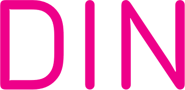
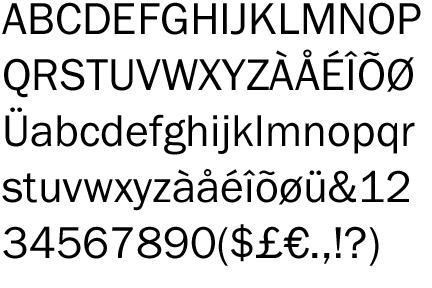
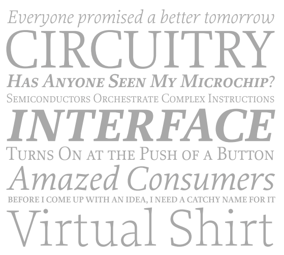
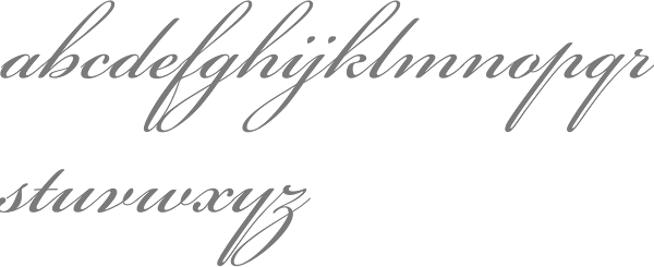
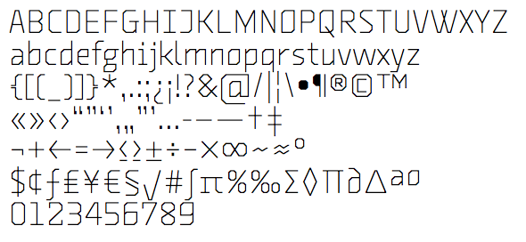
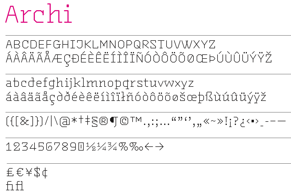
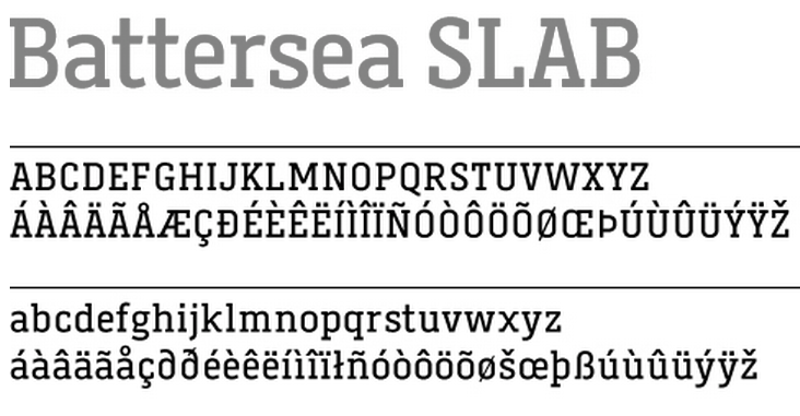
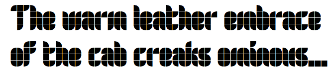
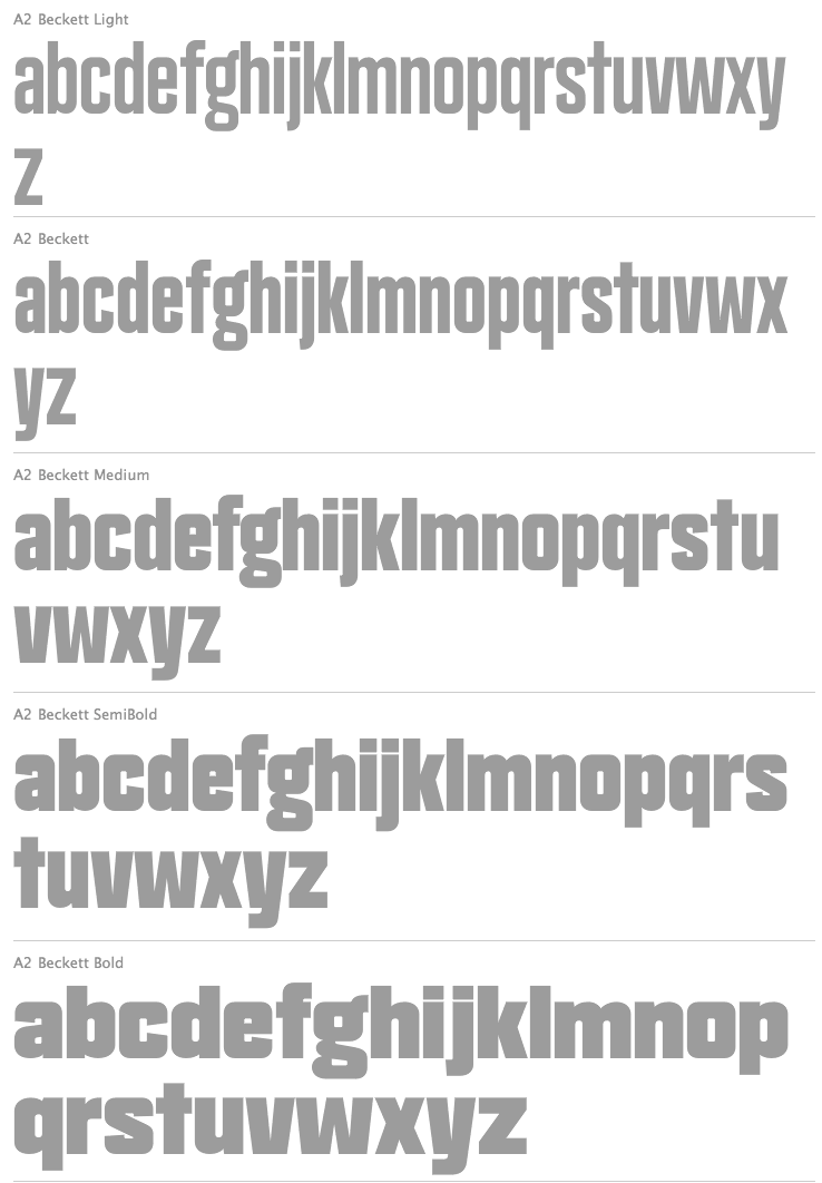
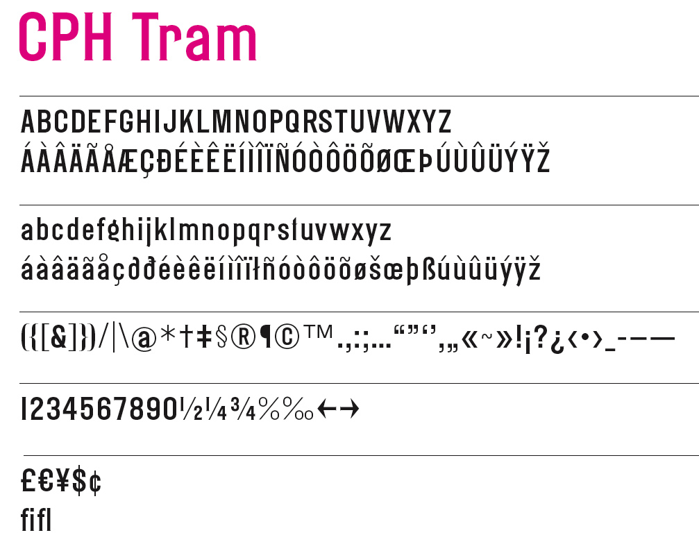
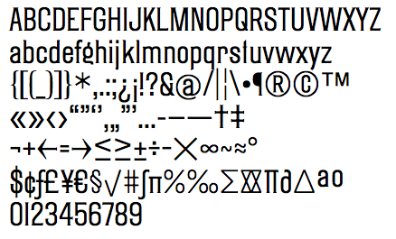
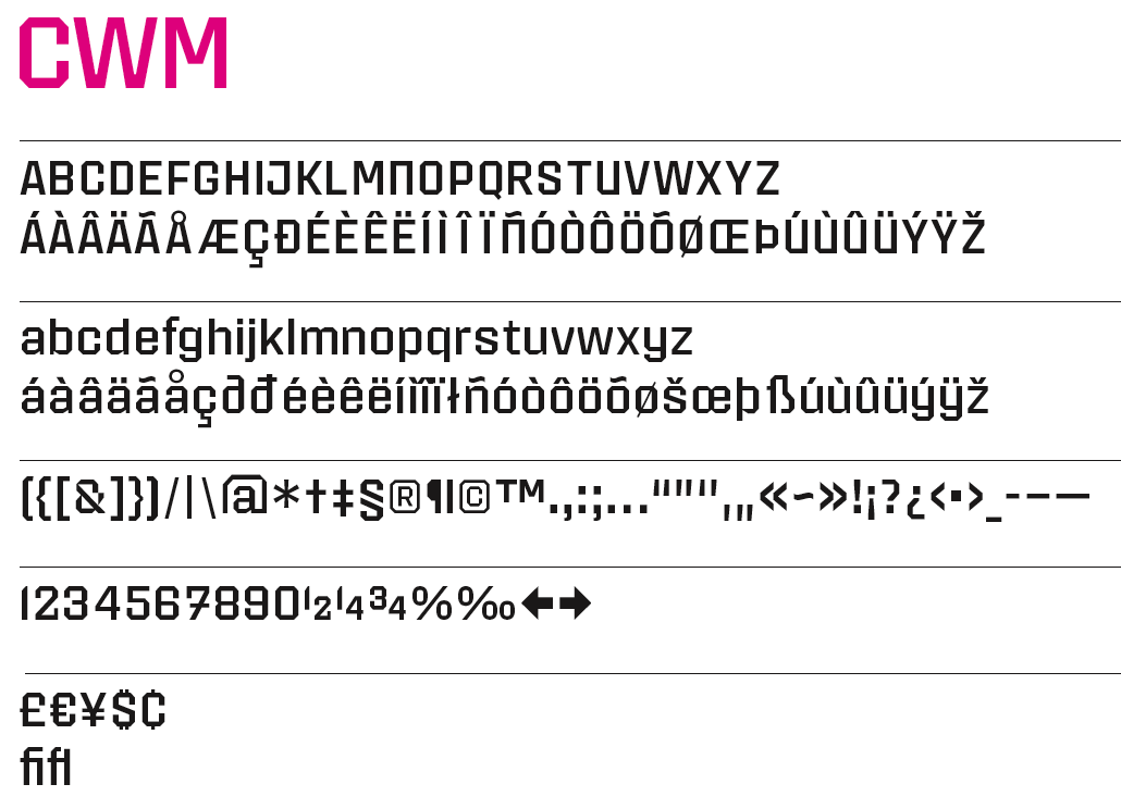
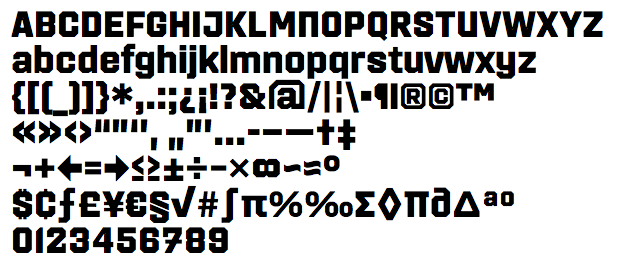
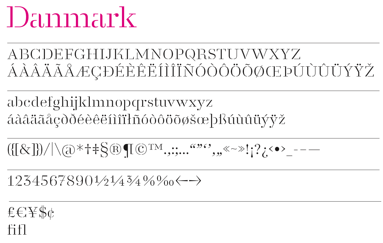
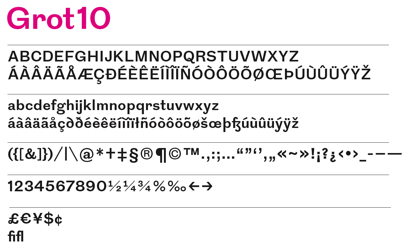
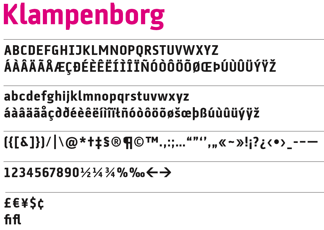
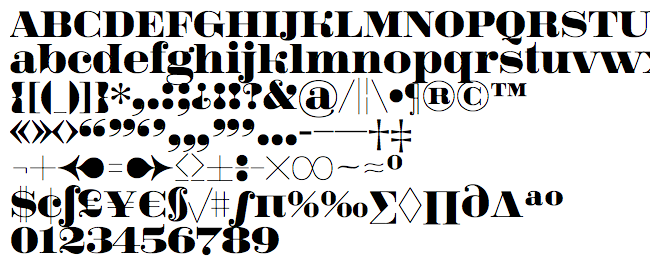
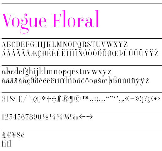
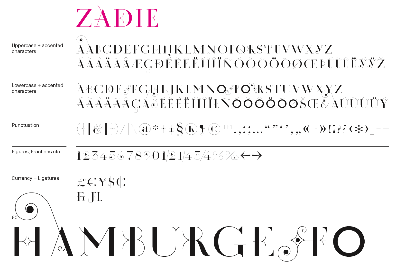
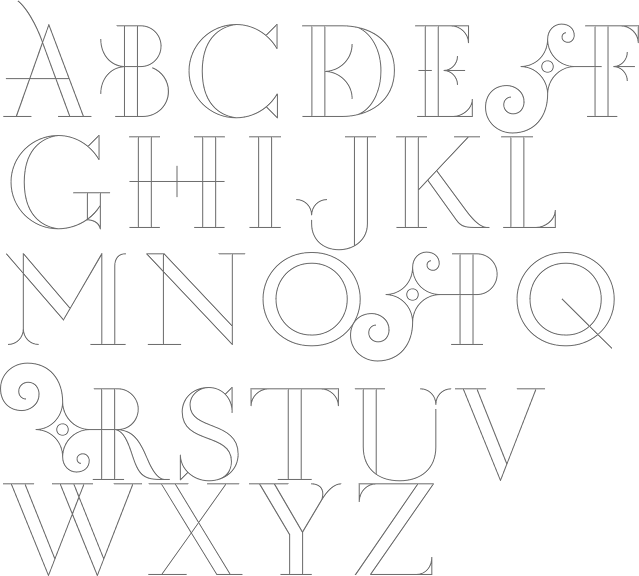
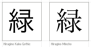
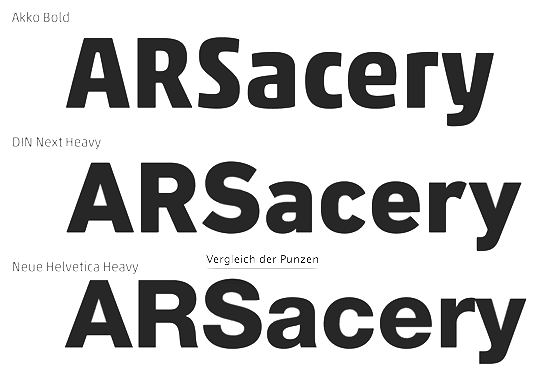
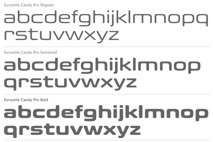
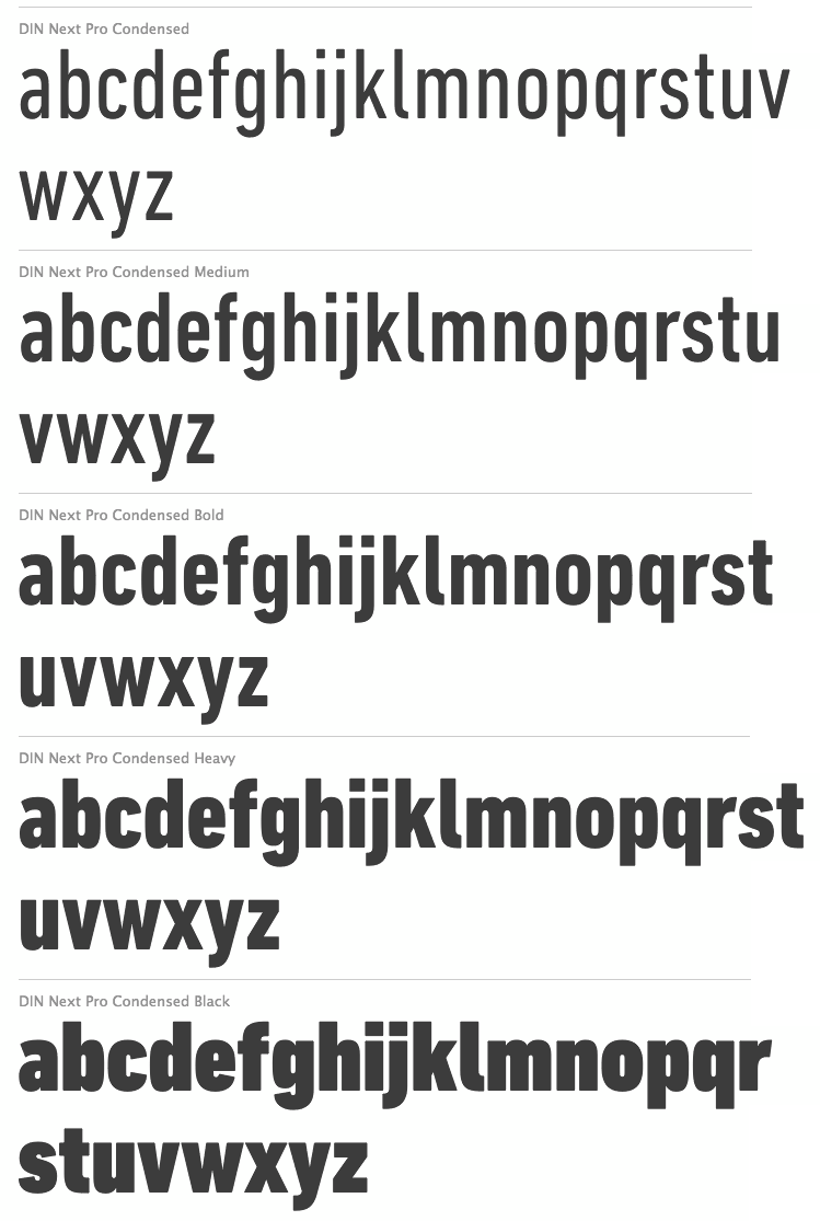
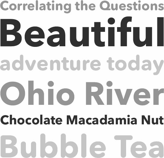
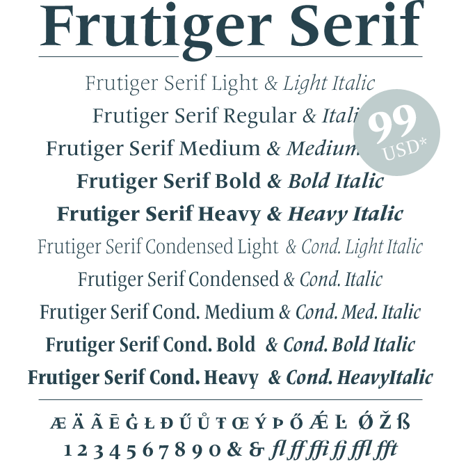
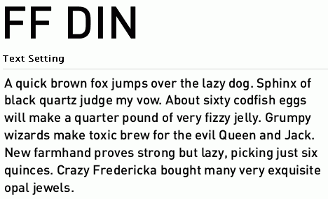
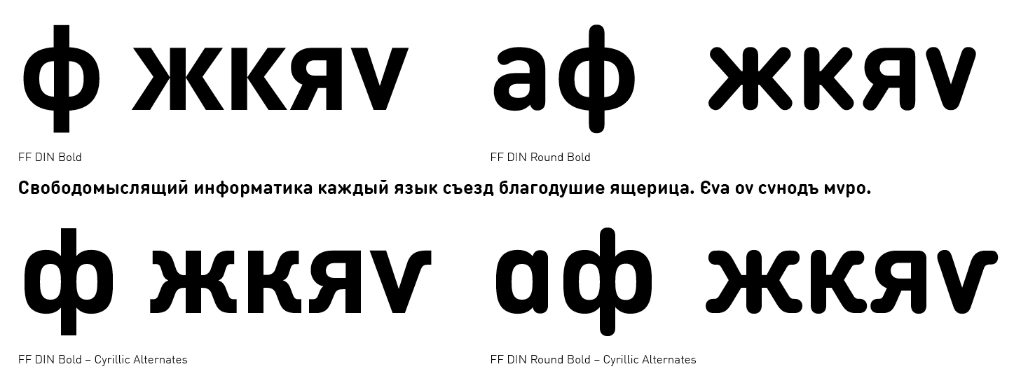
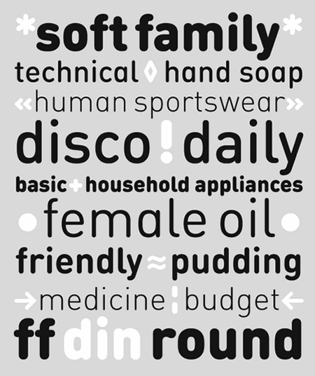
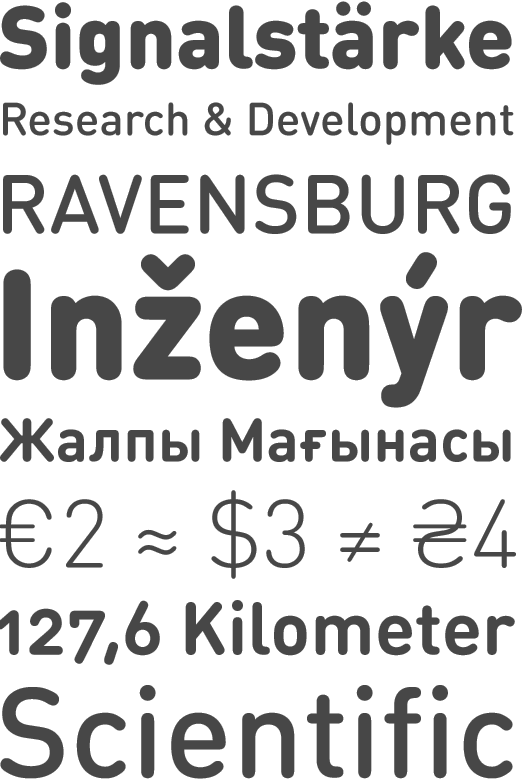
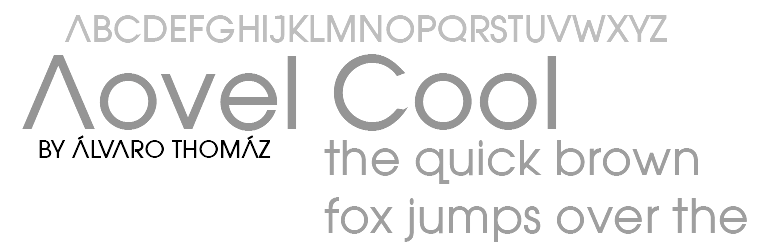
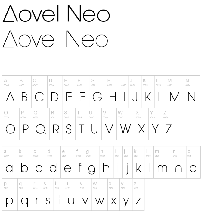
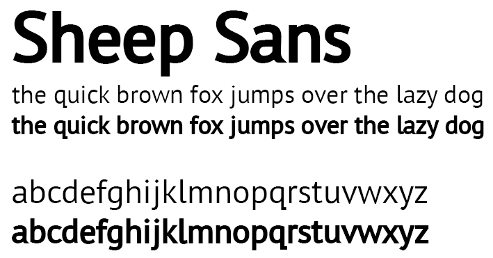
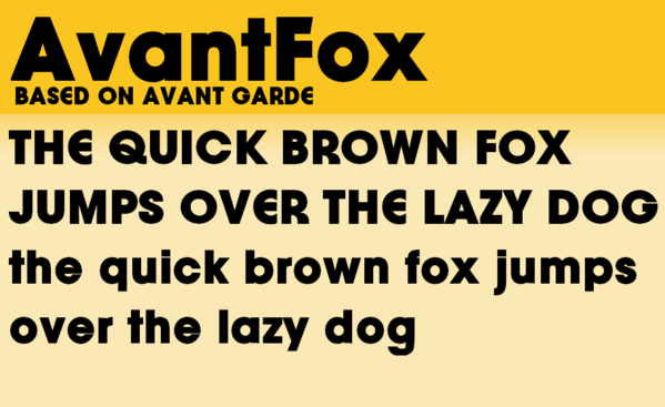
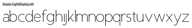
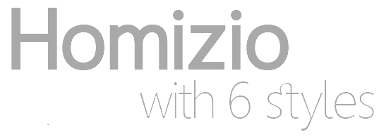
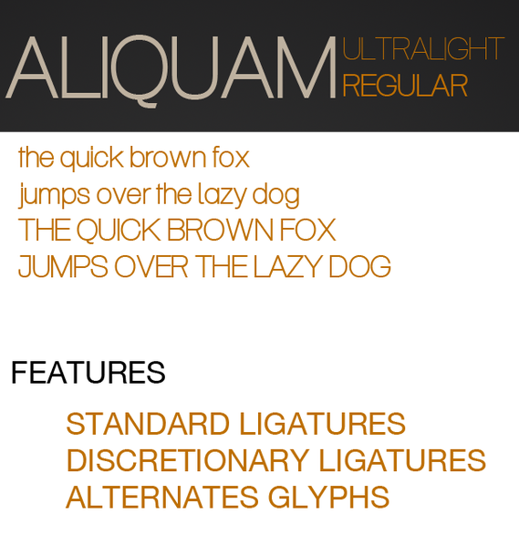
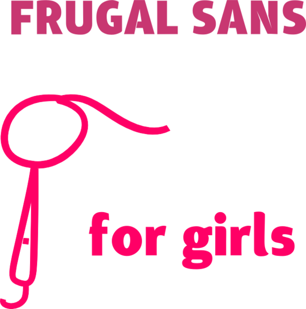
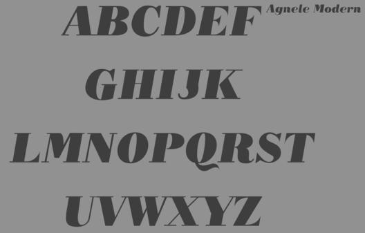
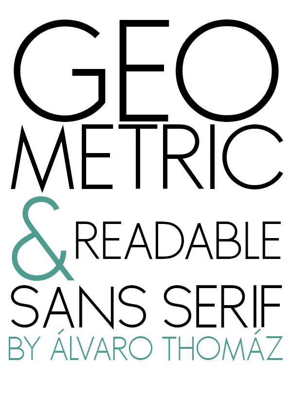
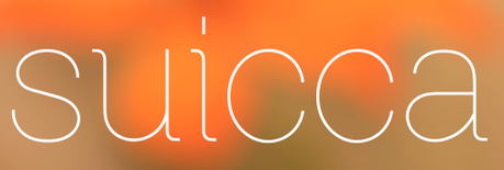
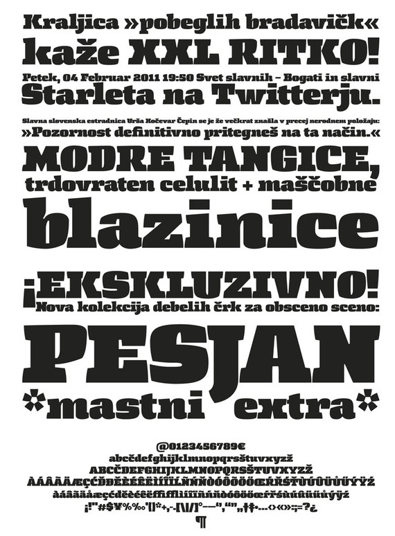
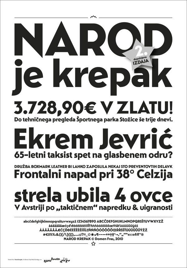
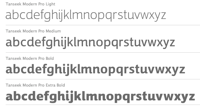
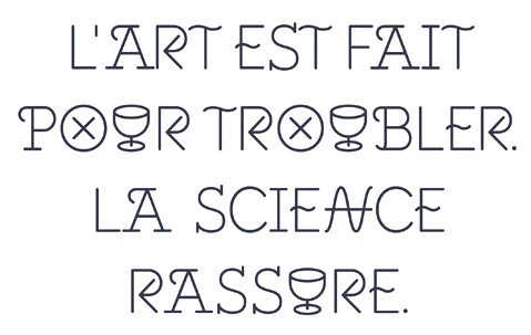
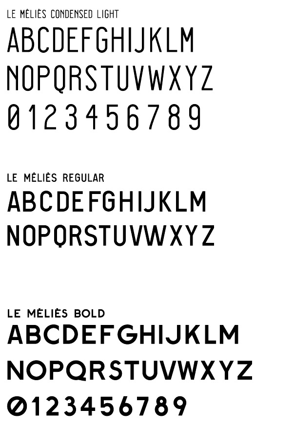
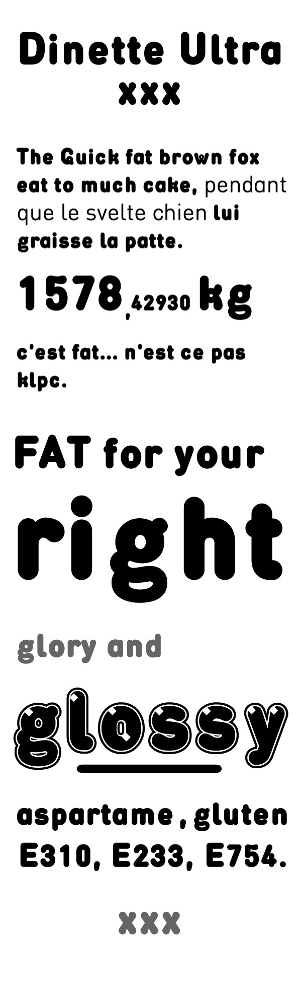
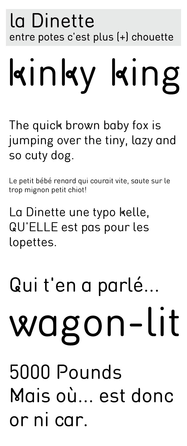
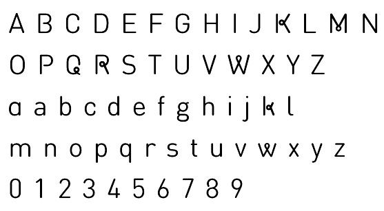
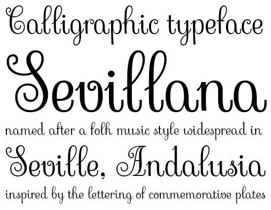
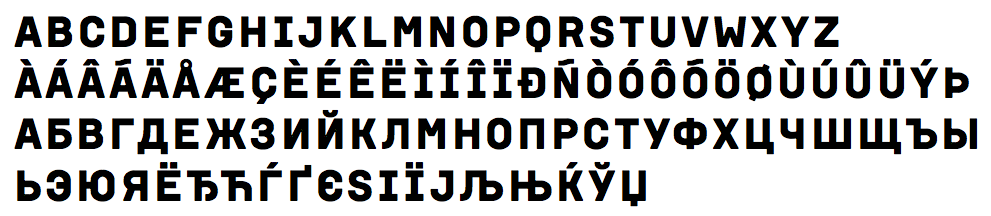
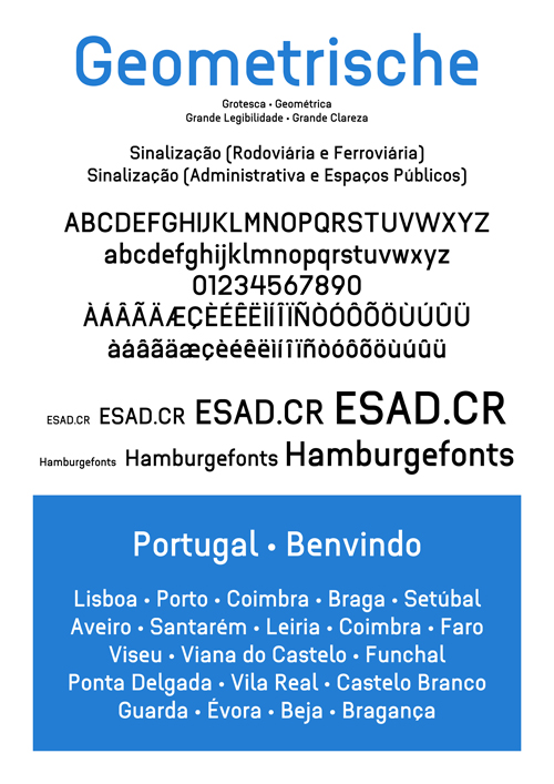
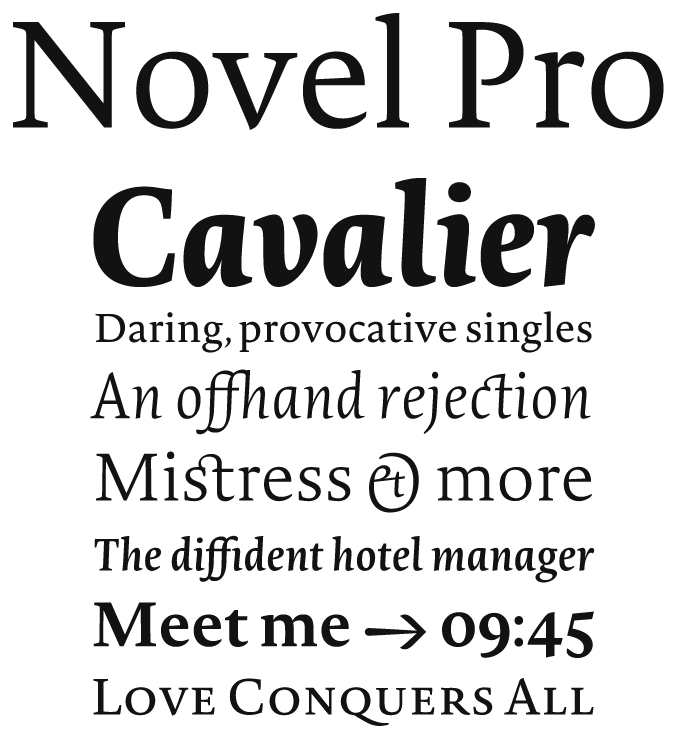
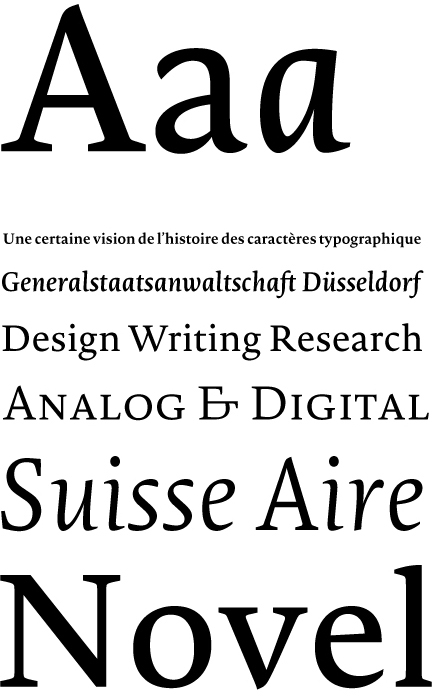
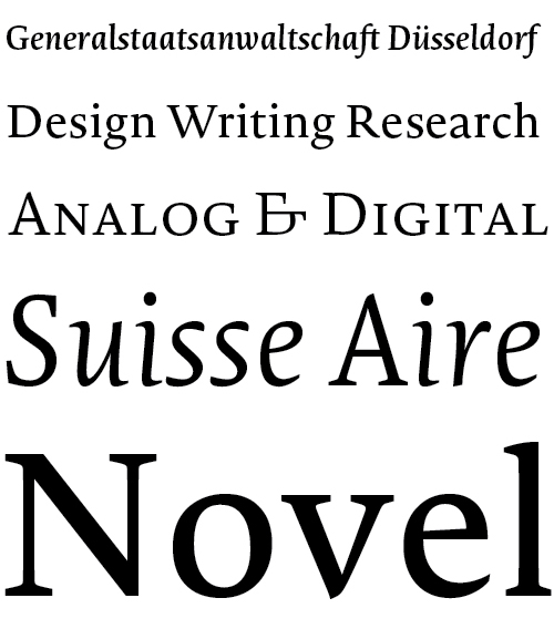
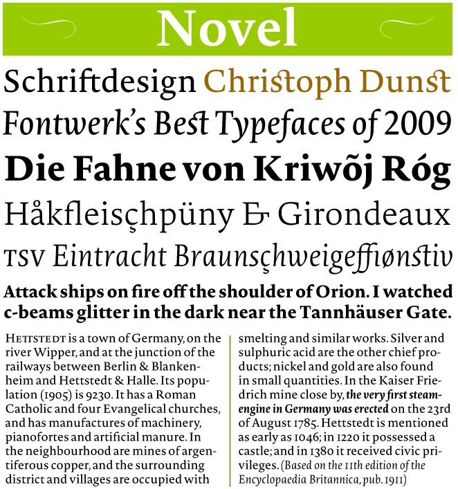
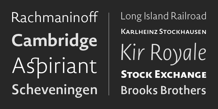
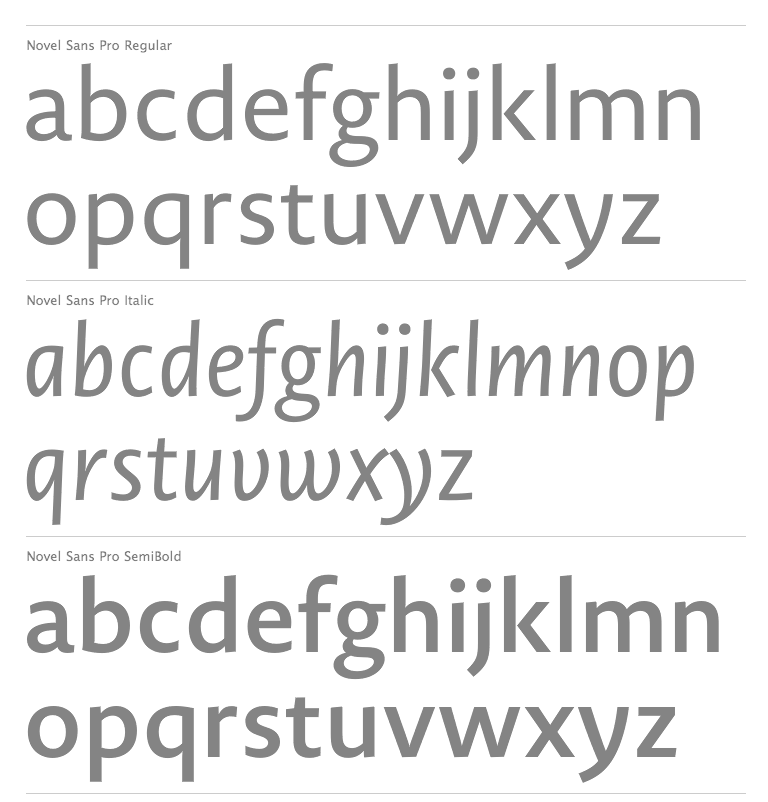
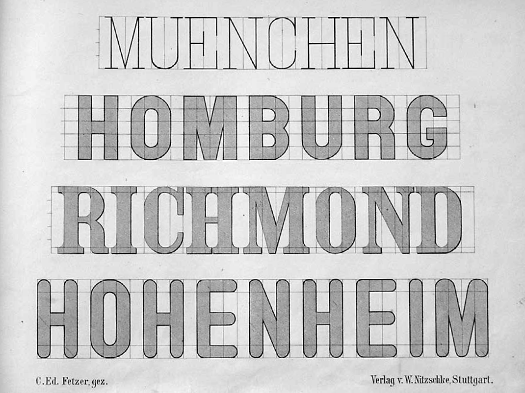
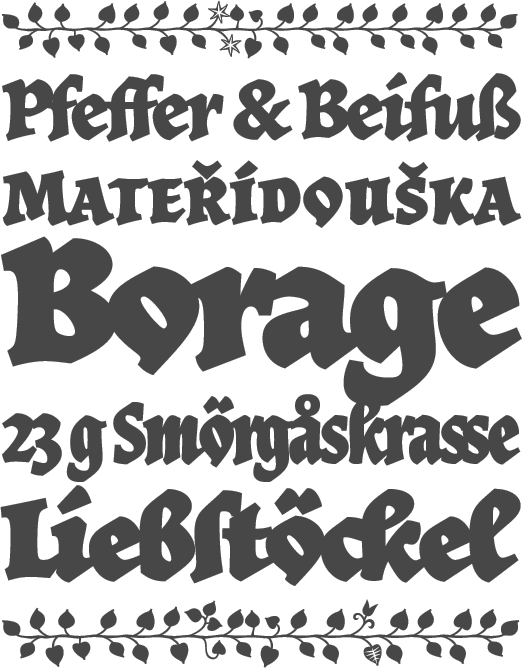
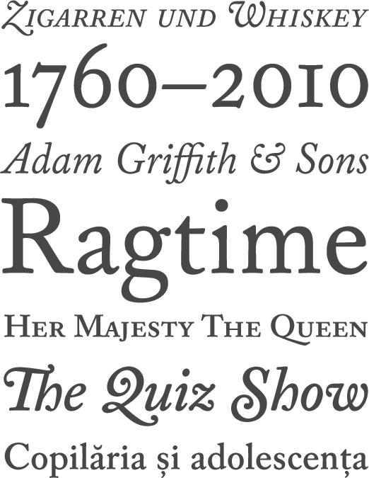
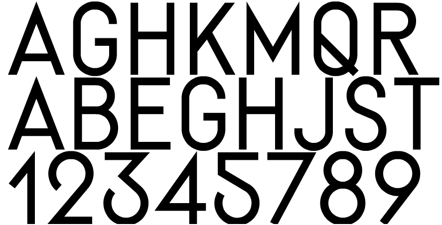
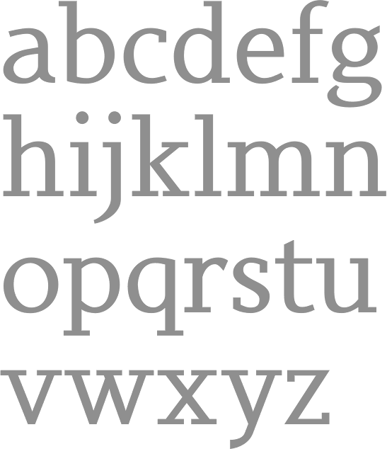
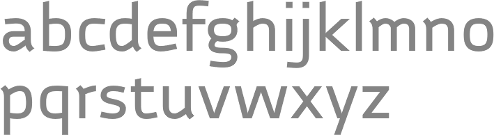
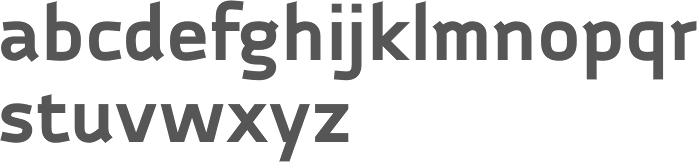
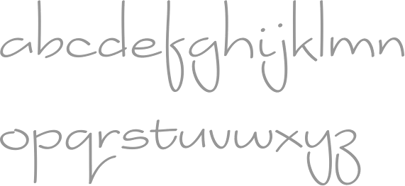
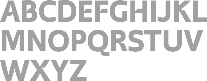
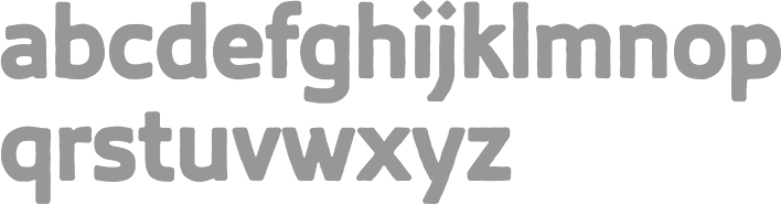
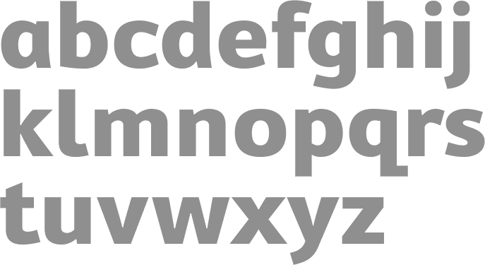
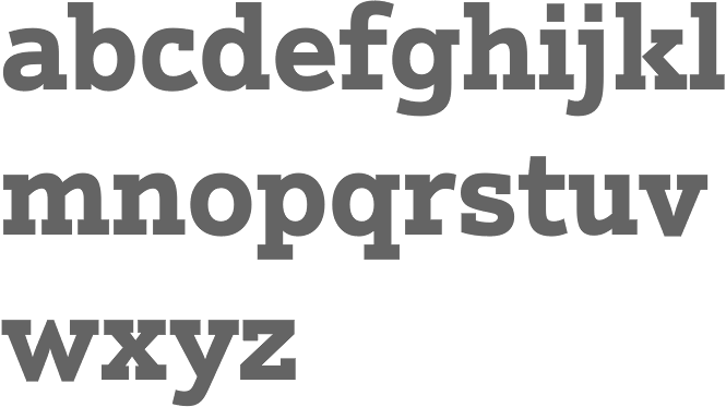
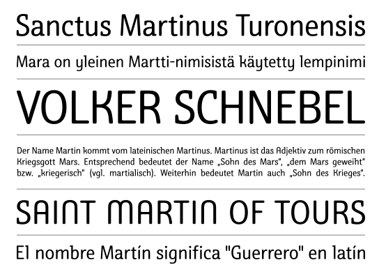
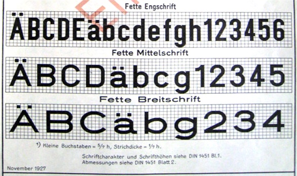
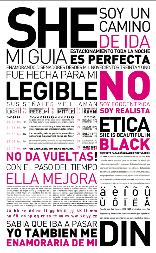
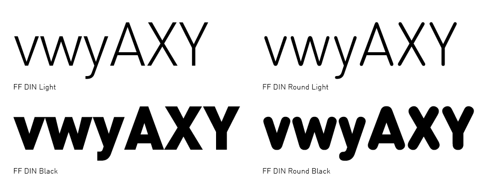
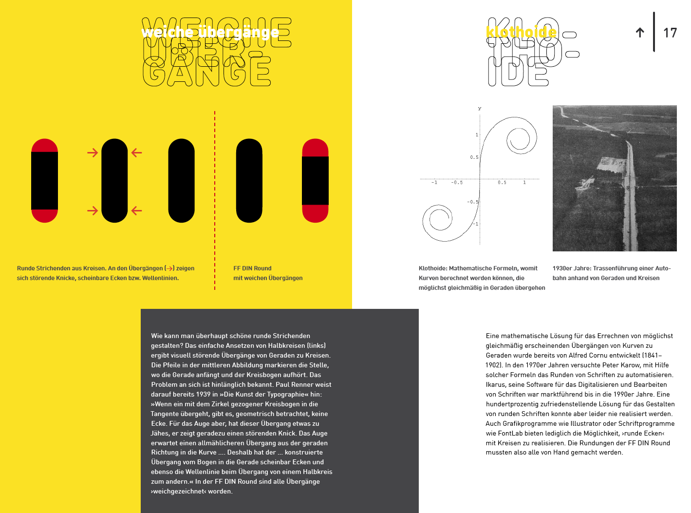
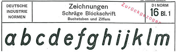
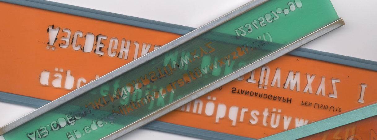
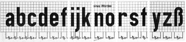
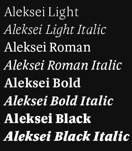
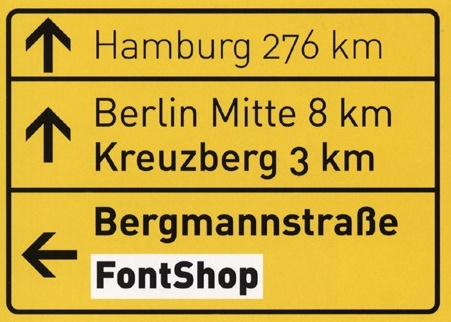
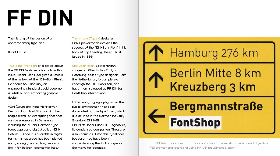
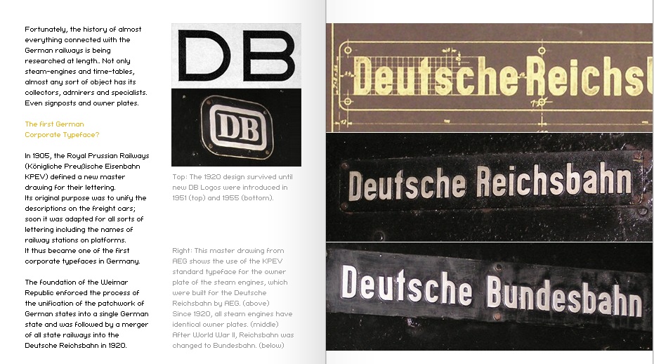
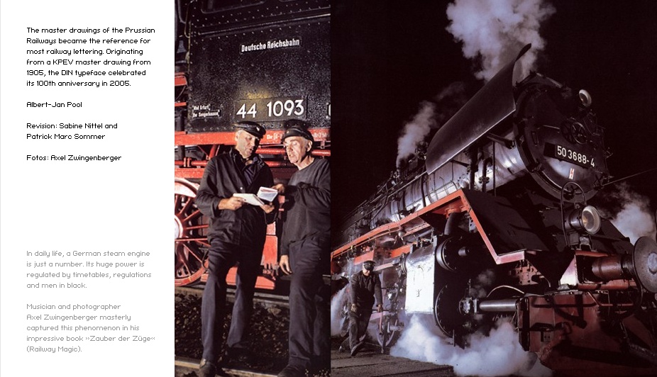
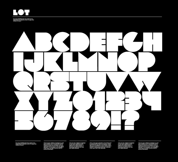
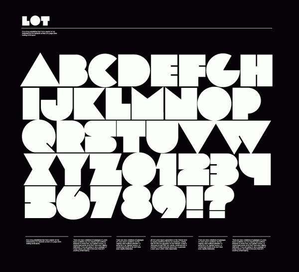
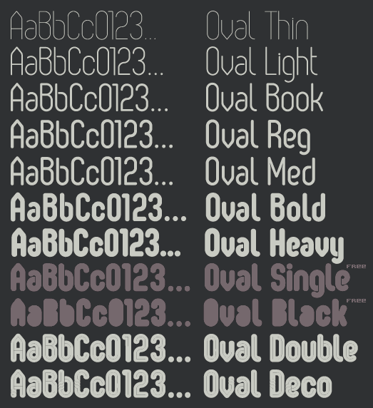
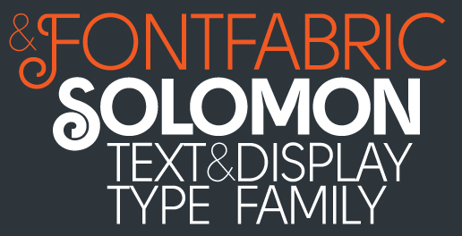
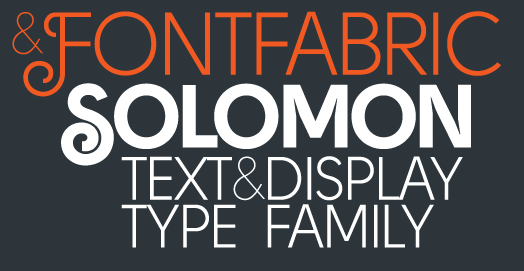
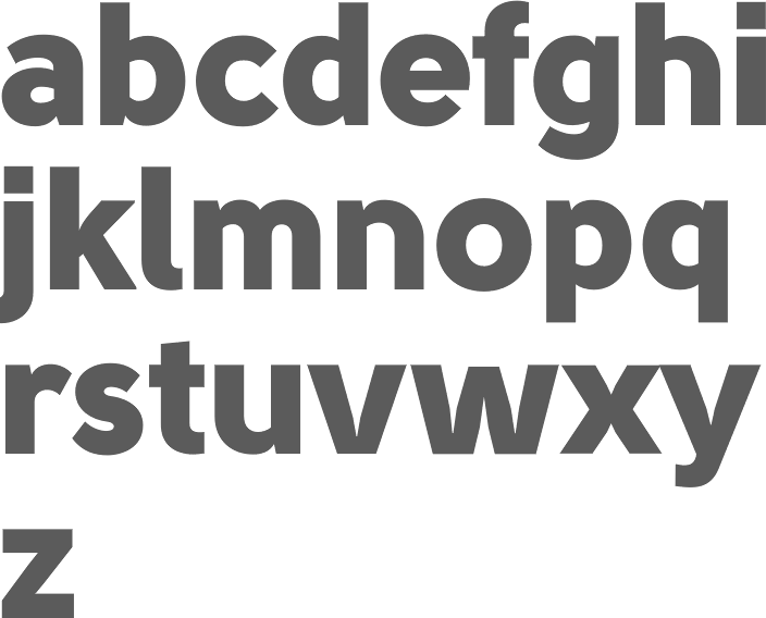
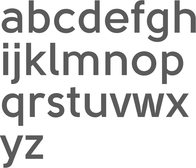
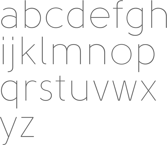
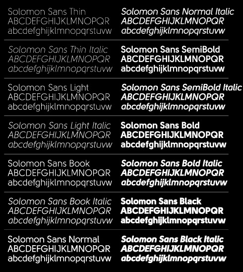
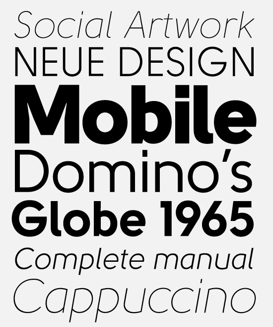
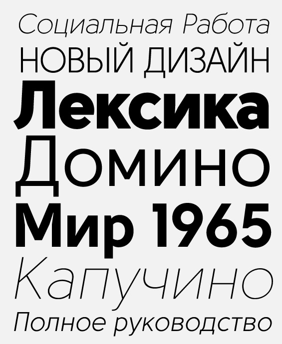
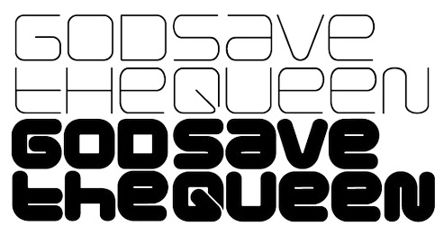
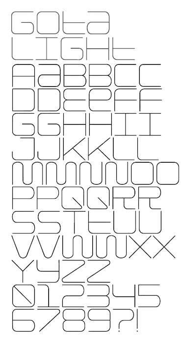
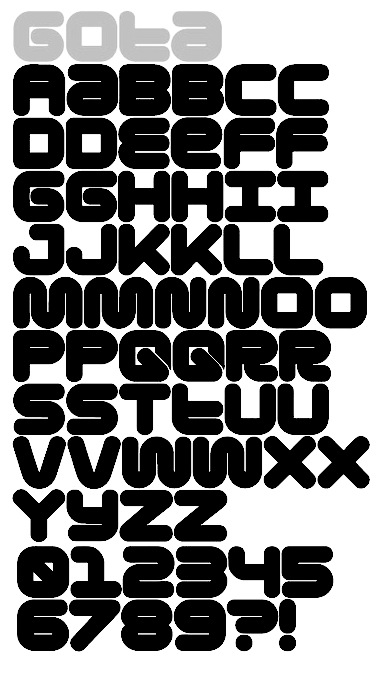
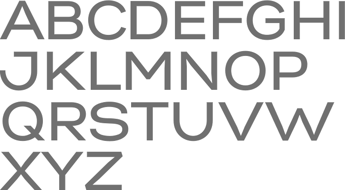
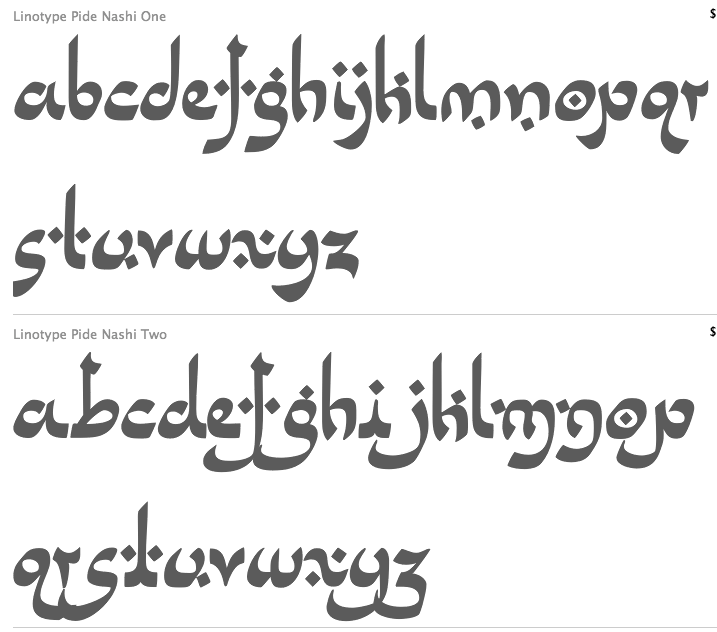
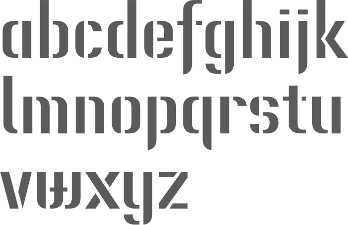
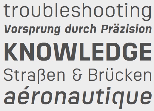
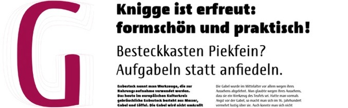
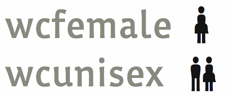
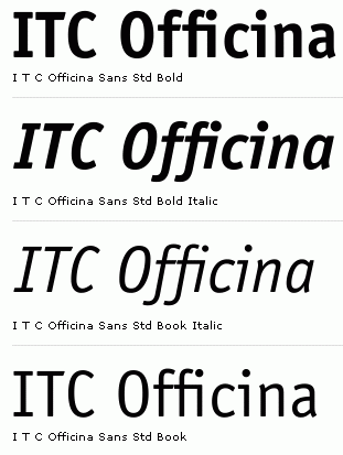
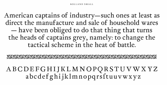
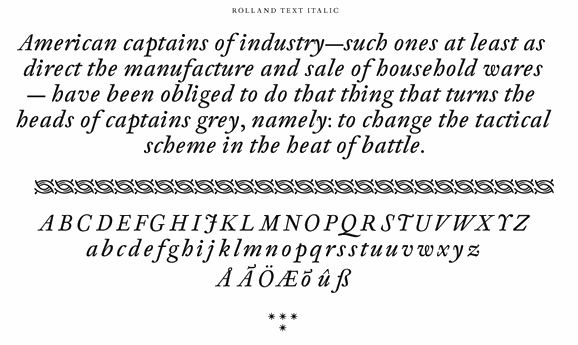
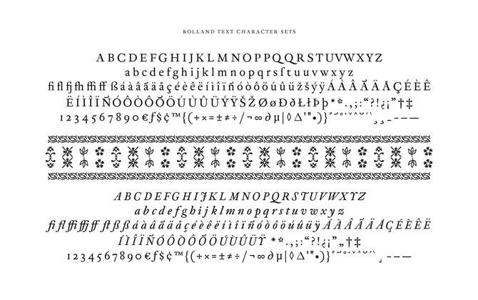
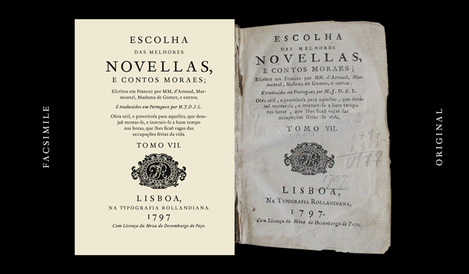
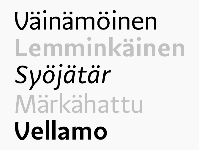
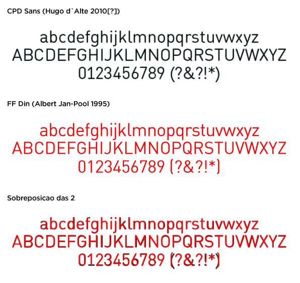
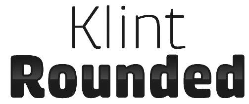
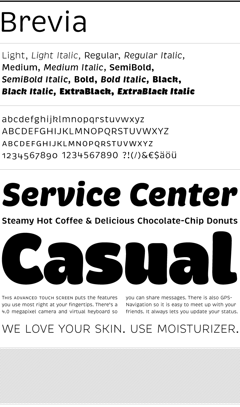
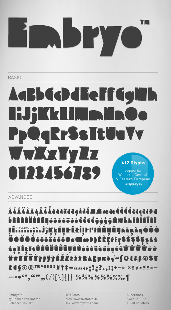
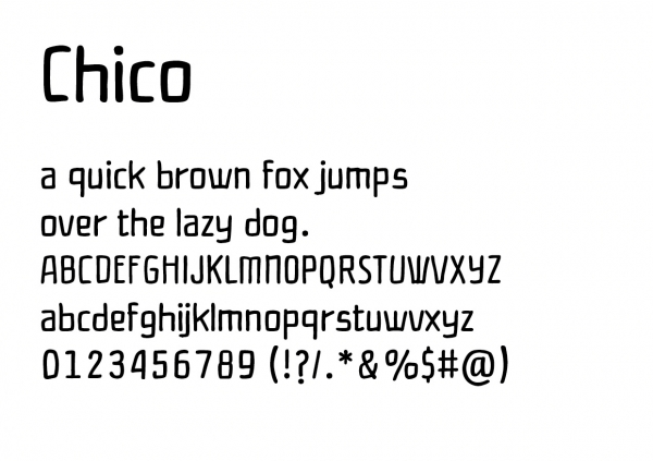
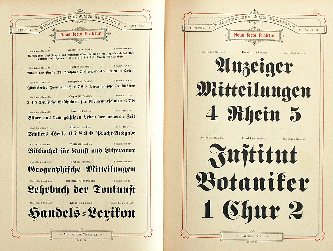
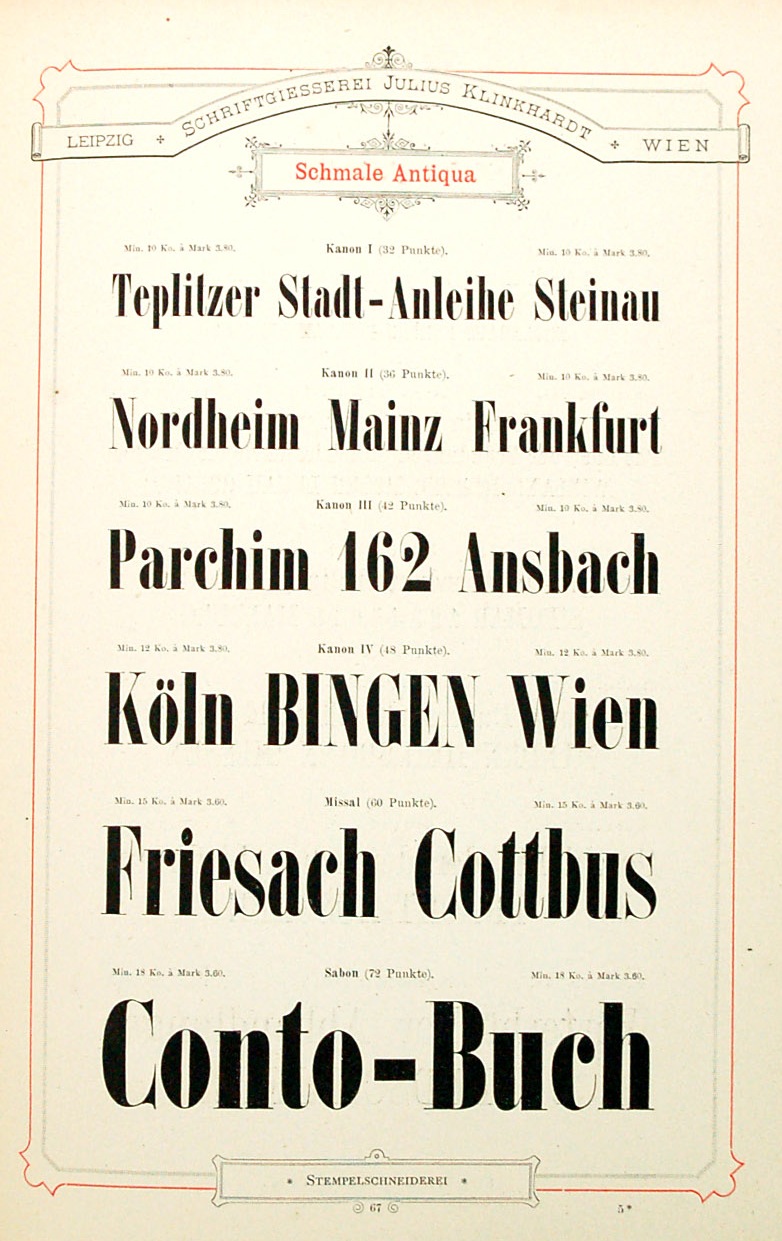
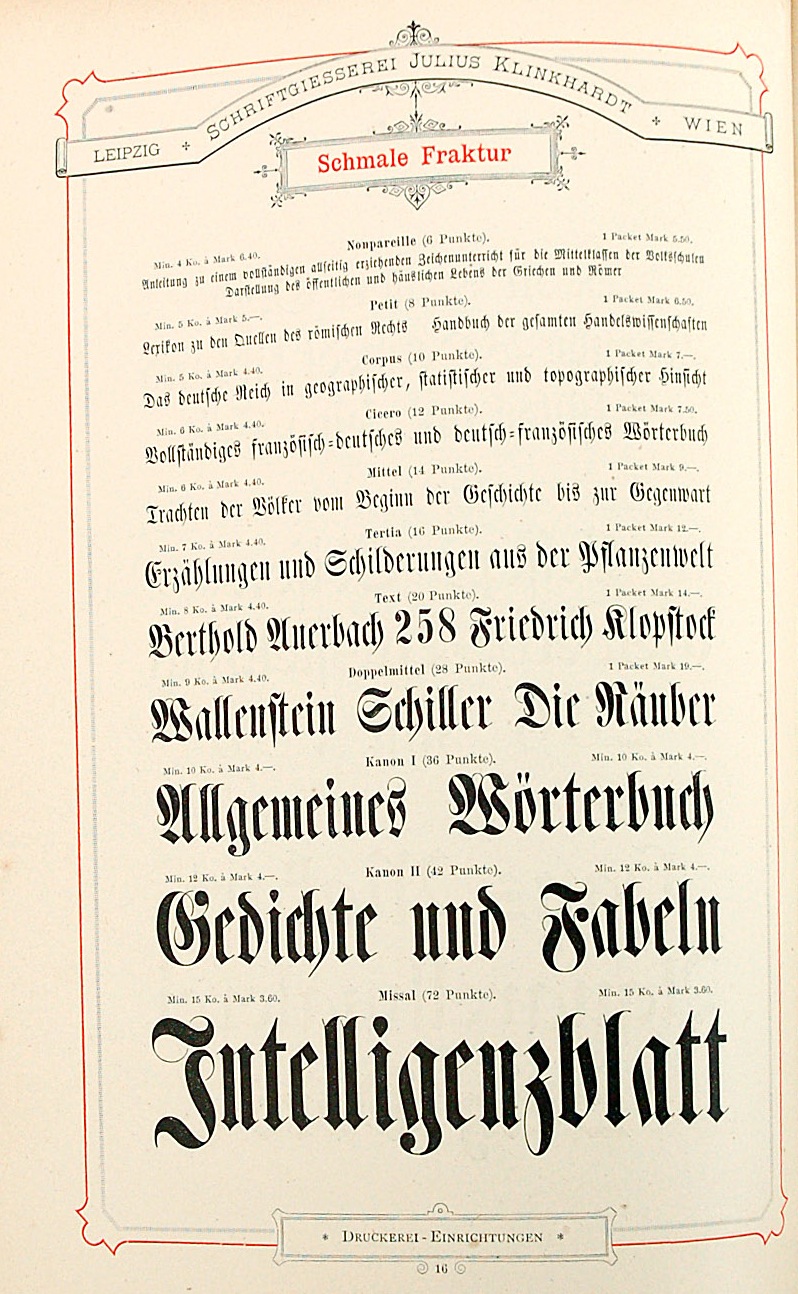
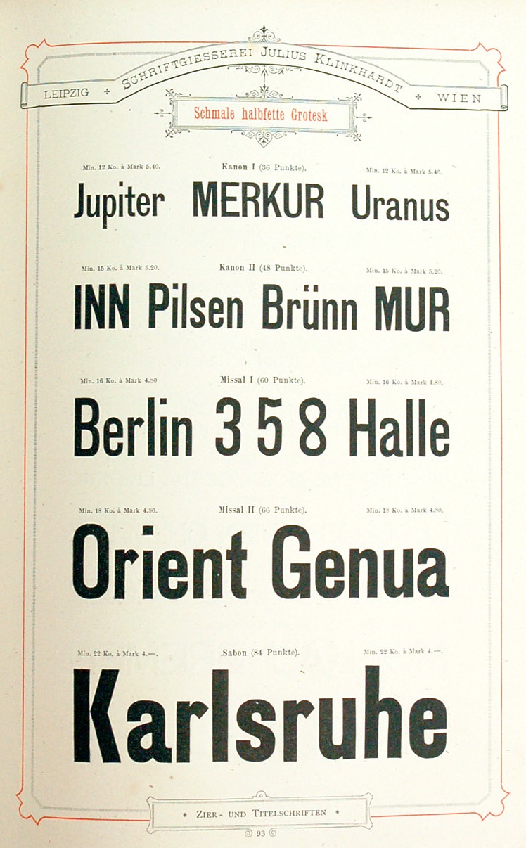
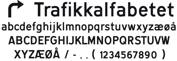
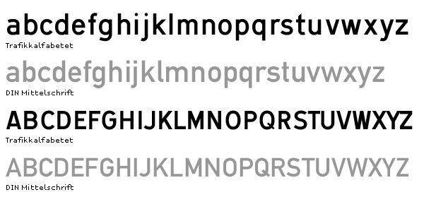
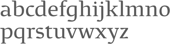
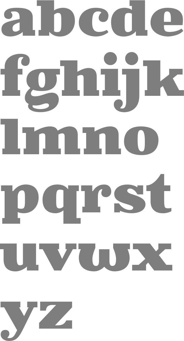
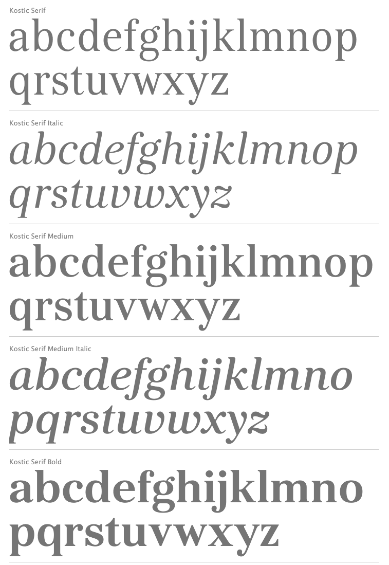
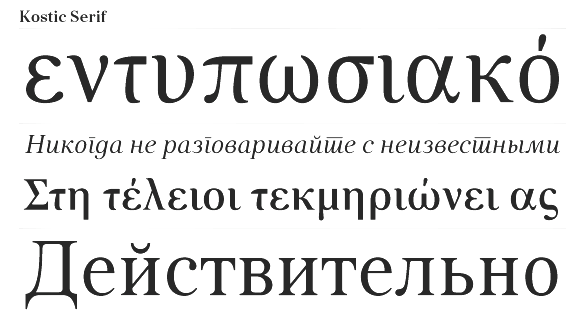
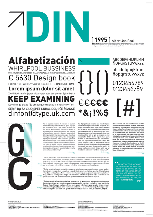
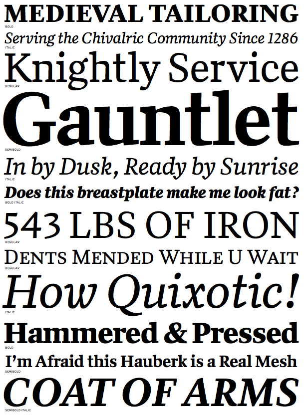
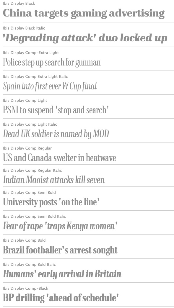
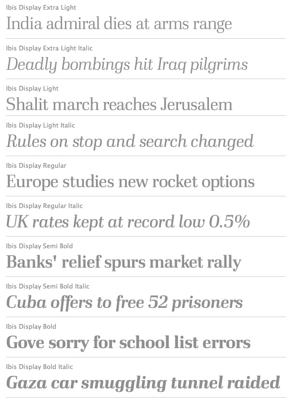
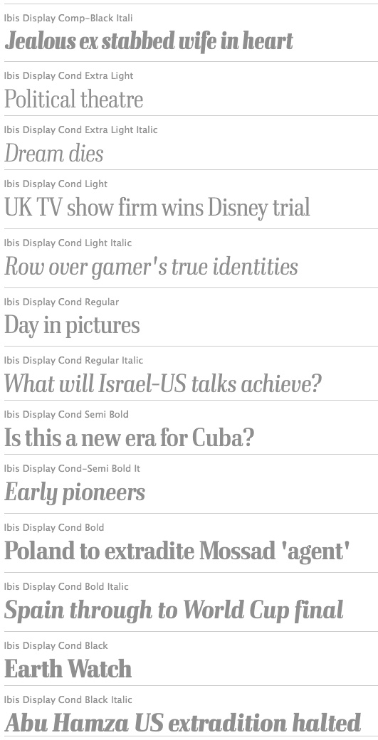
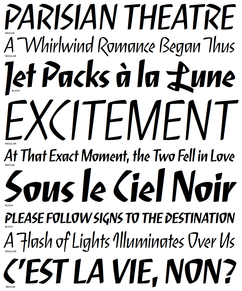
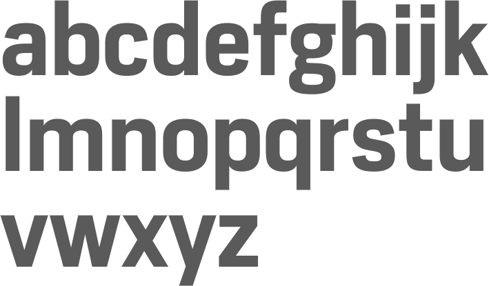
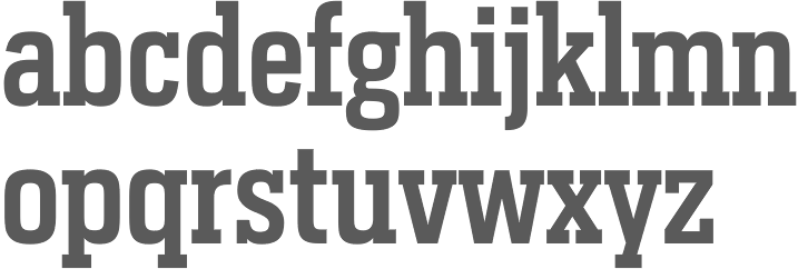
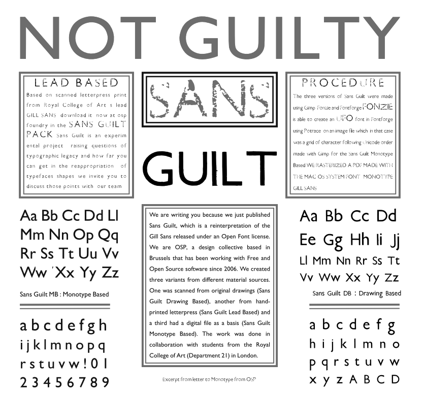
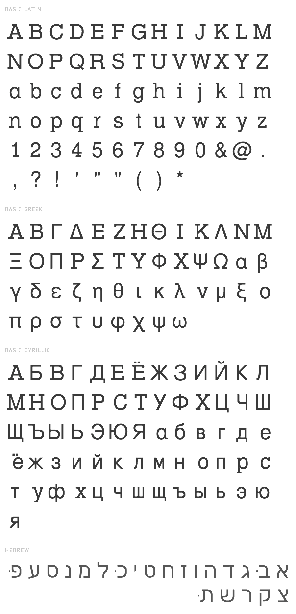
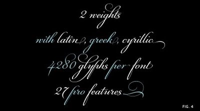
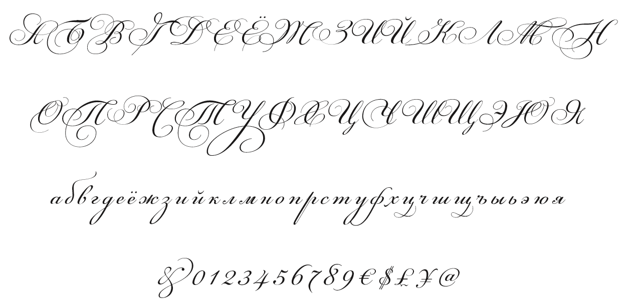
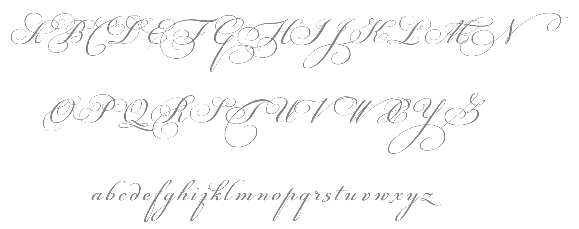
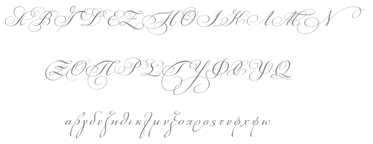
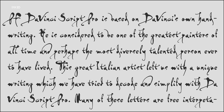
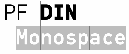
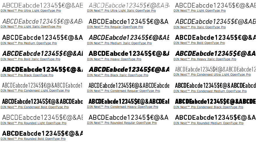
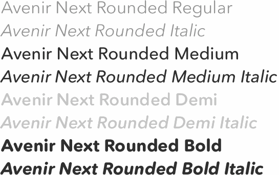
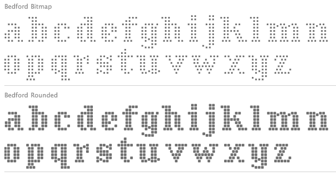
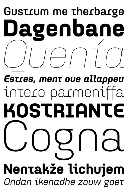
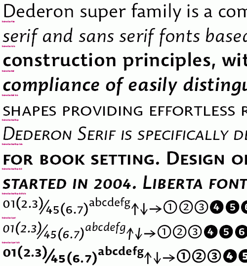
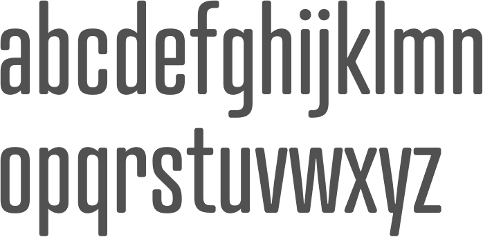
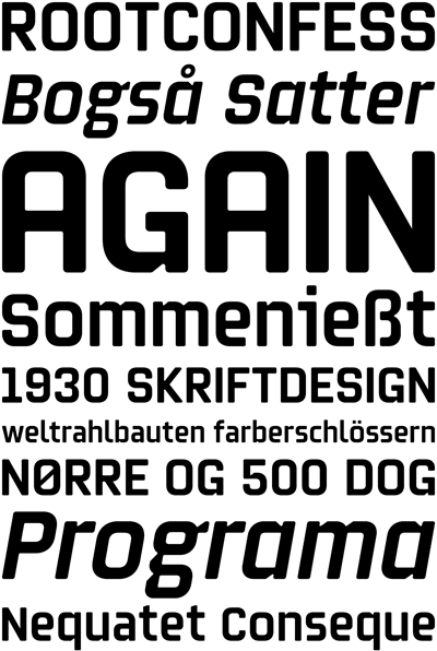
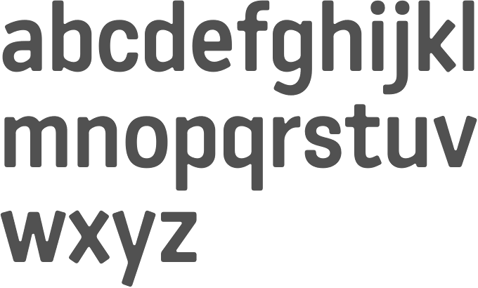
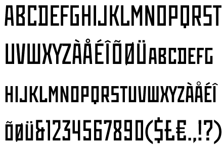
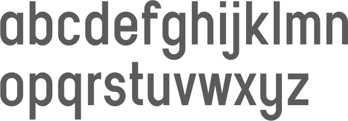
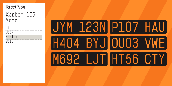
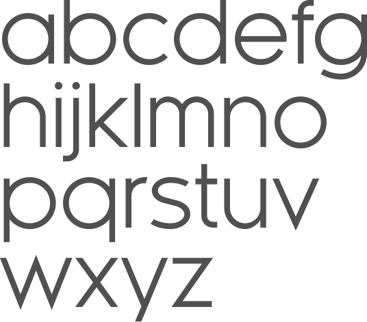
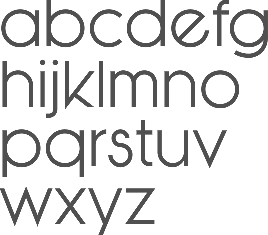
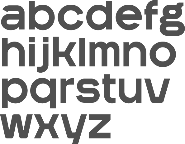
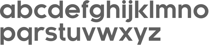
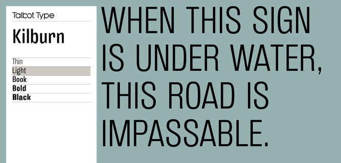
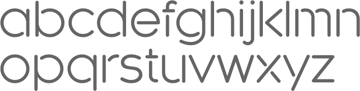
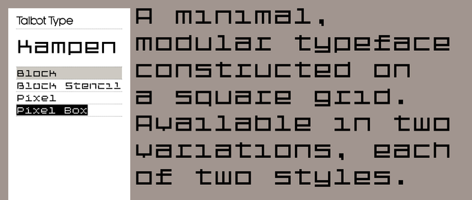
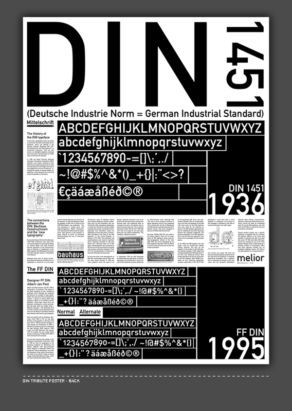
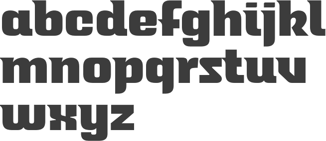
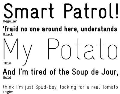
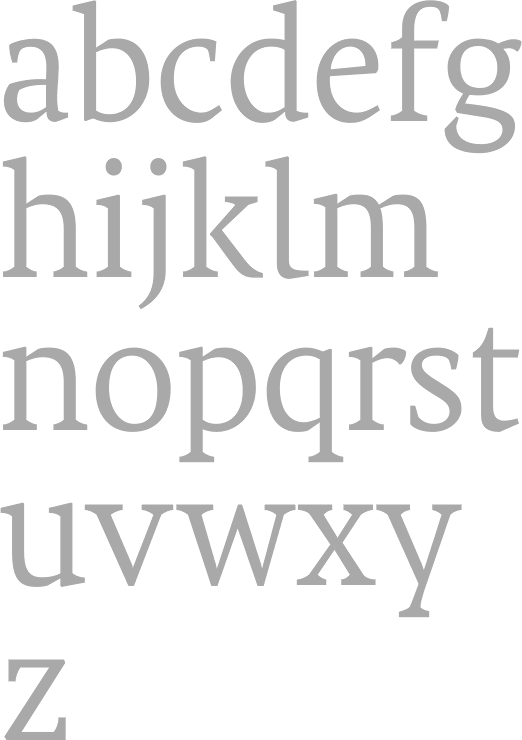
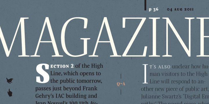
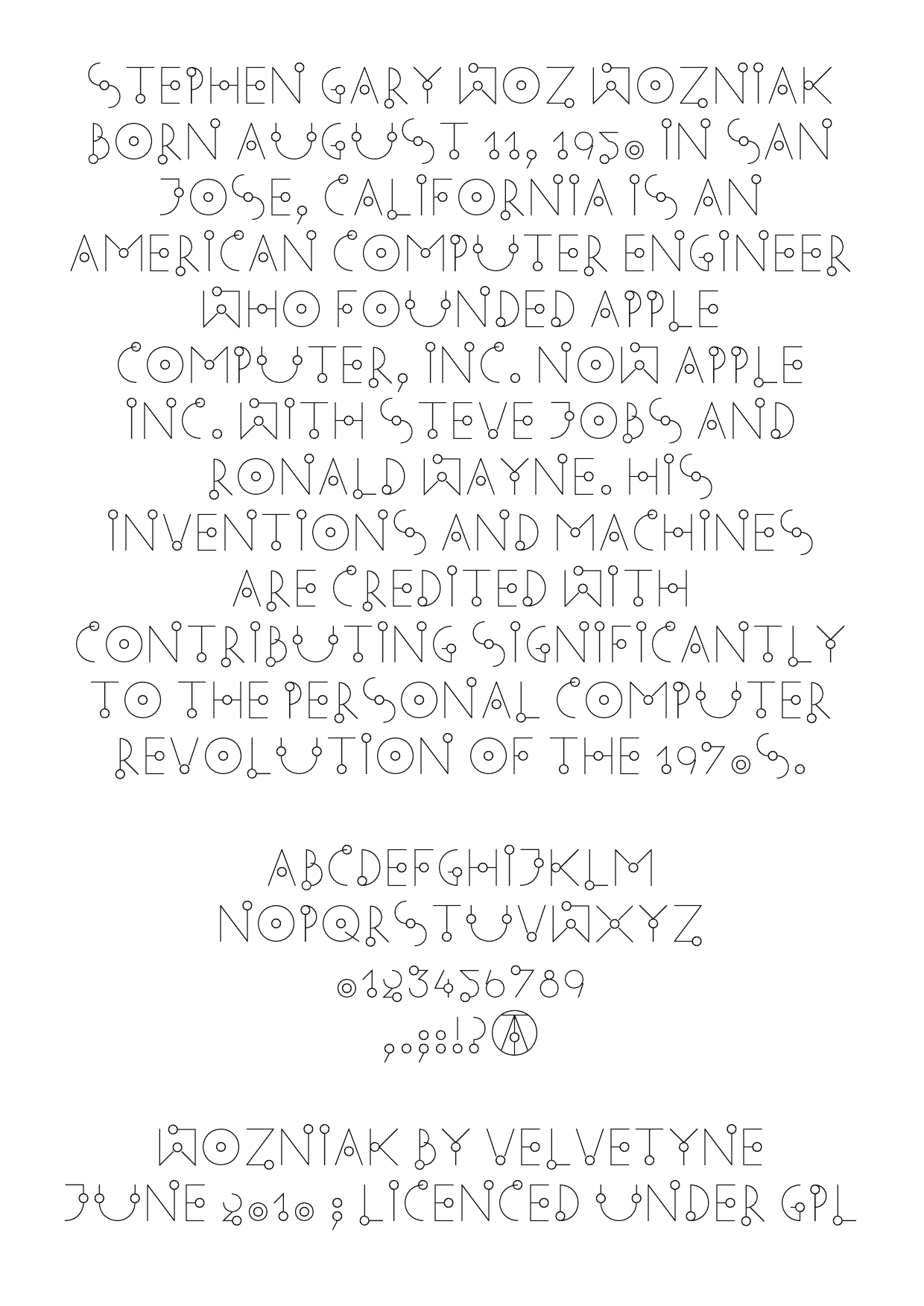
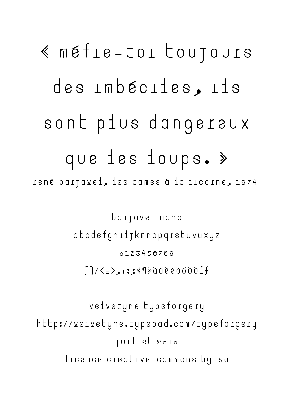
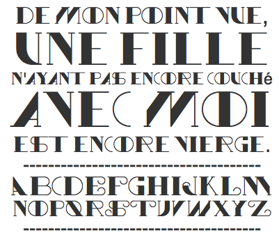
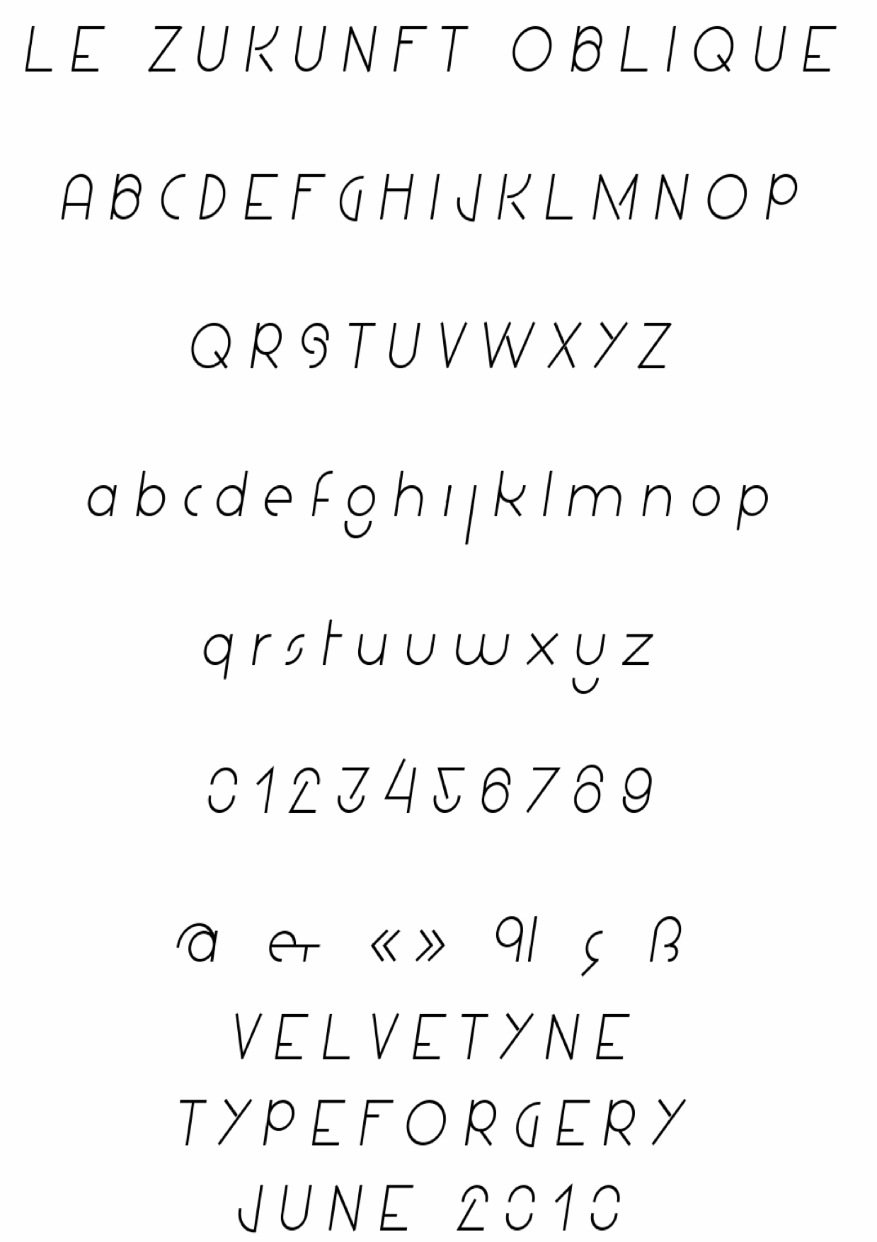
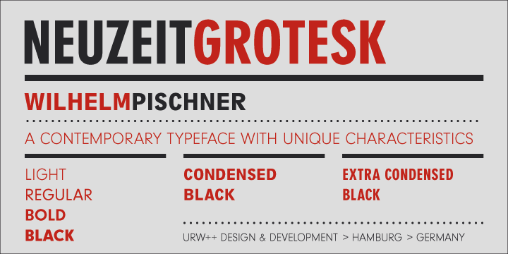
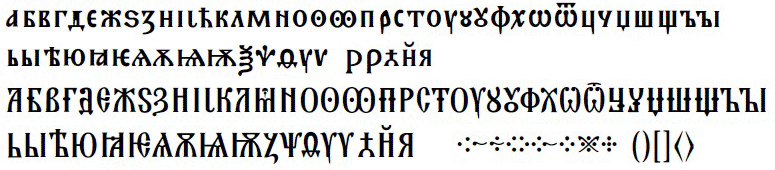
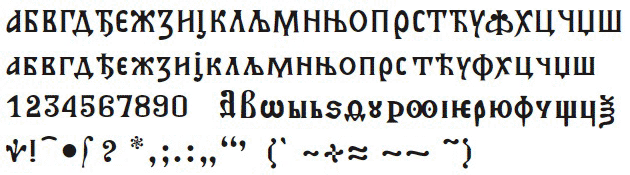