TYPE DESIGN INFORMATION PAGE last updated on Mon Jun 8 18:22:48 EDT 2026
FONT RECOGNITION VIA FONT MOOSE

|
|
|
|
California Type Foundry (21st century)
[Dave Lawrence]
This type foundry was started in 2019 by Dave Lawrence, perhaps to honor and revive the California Type Foundry from the 20th and 19th centuries. Their typefaces:
|
EXTERNAL LINKS |
| | |


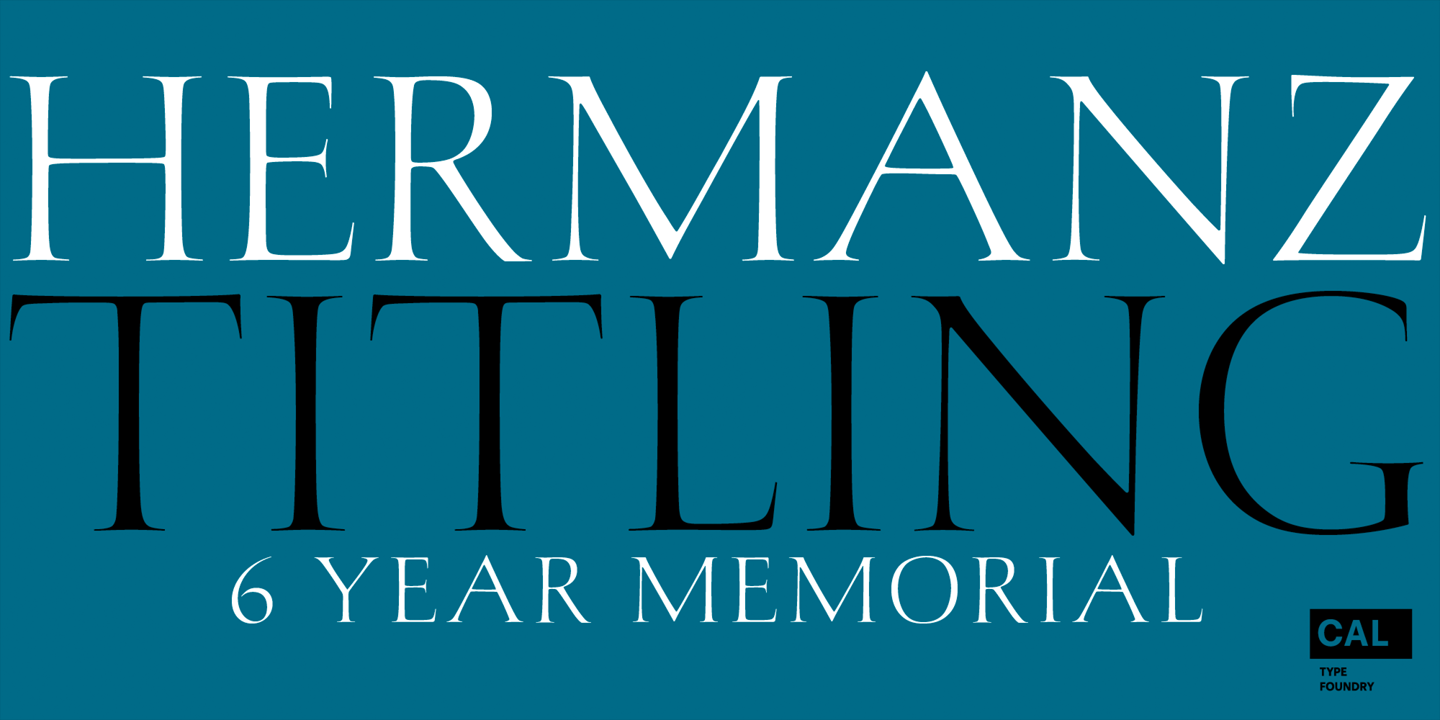
file name: California Type Foundry Hermanz Titling 2021 1
file name: California Type Foundry Hermanz Titling 2021 2
file name: California Type Foundry Hermanz Titling 2021 3

file name: California Type Foundry Hermanz Titling 2021 4

file name: California Type Foundry Hermanz Titling 2021

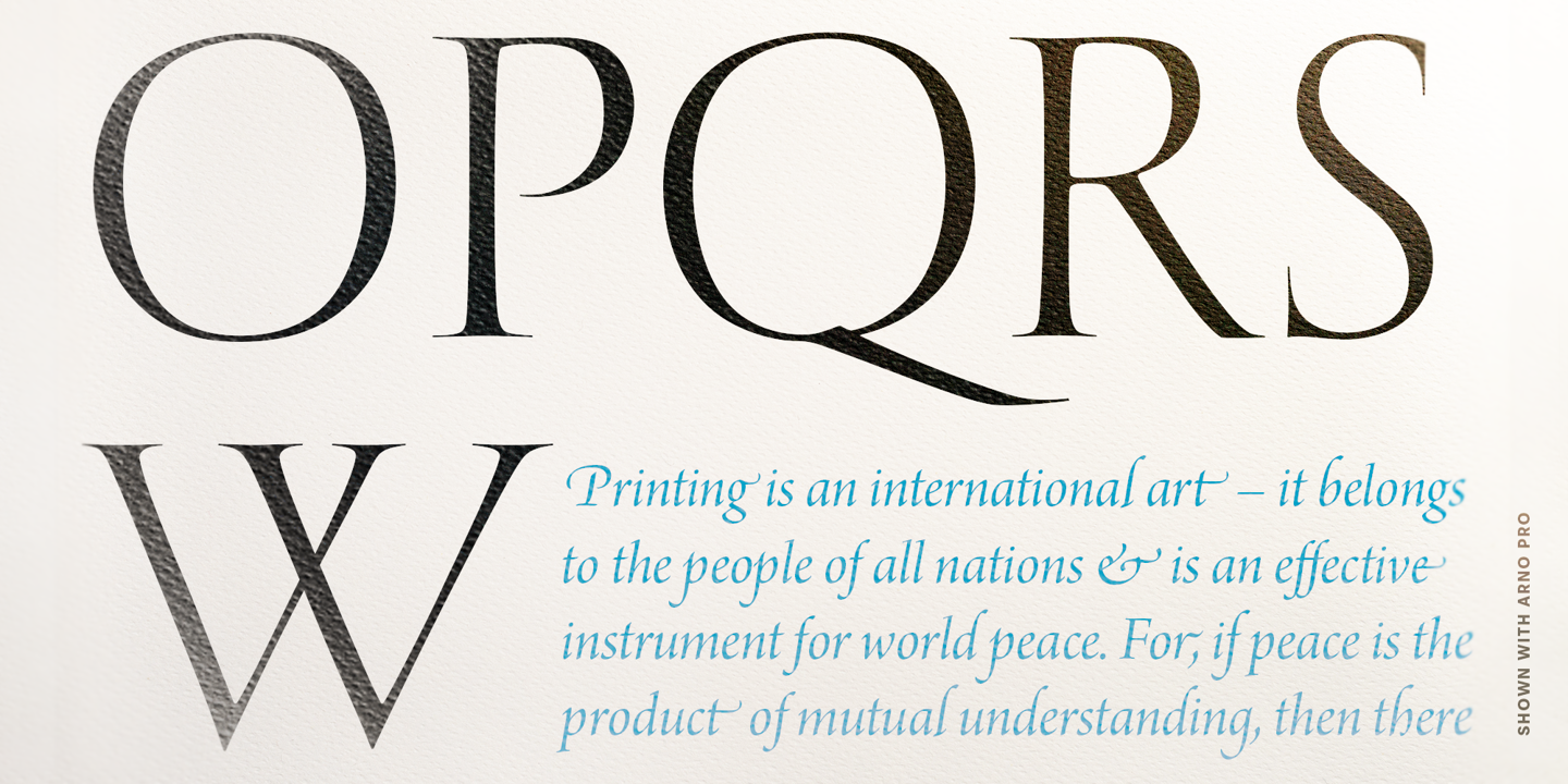
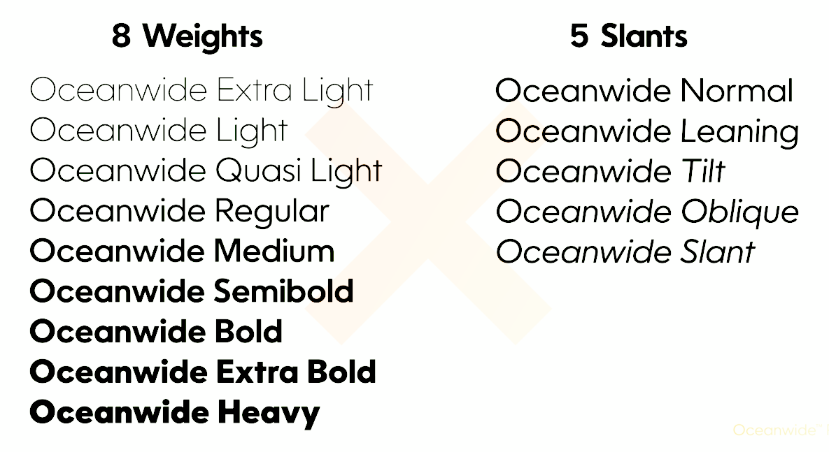
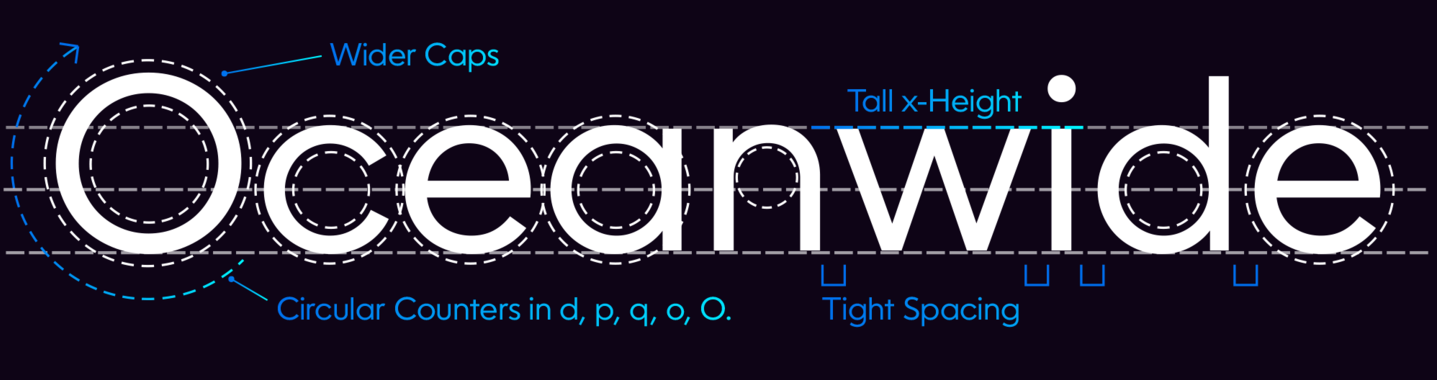
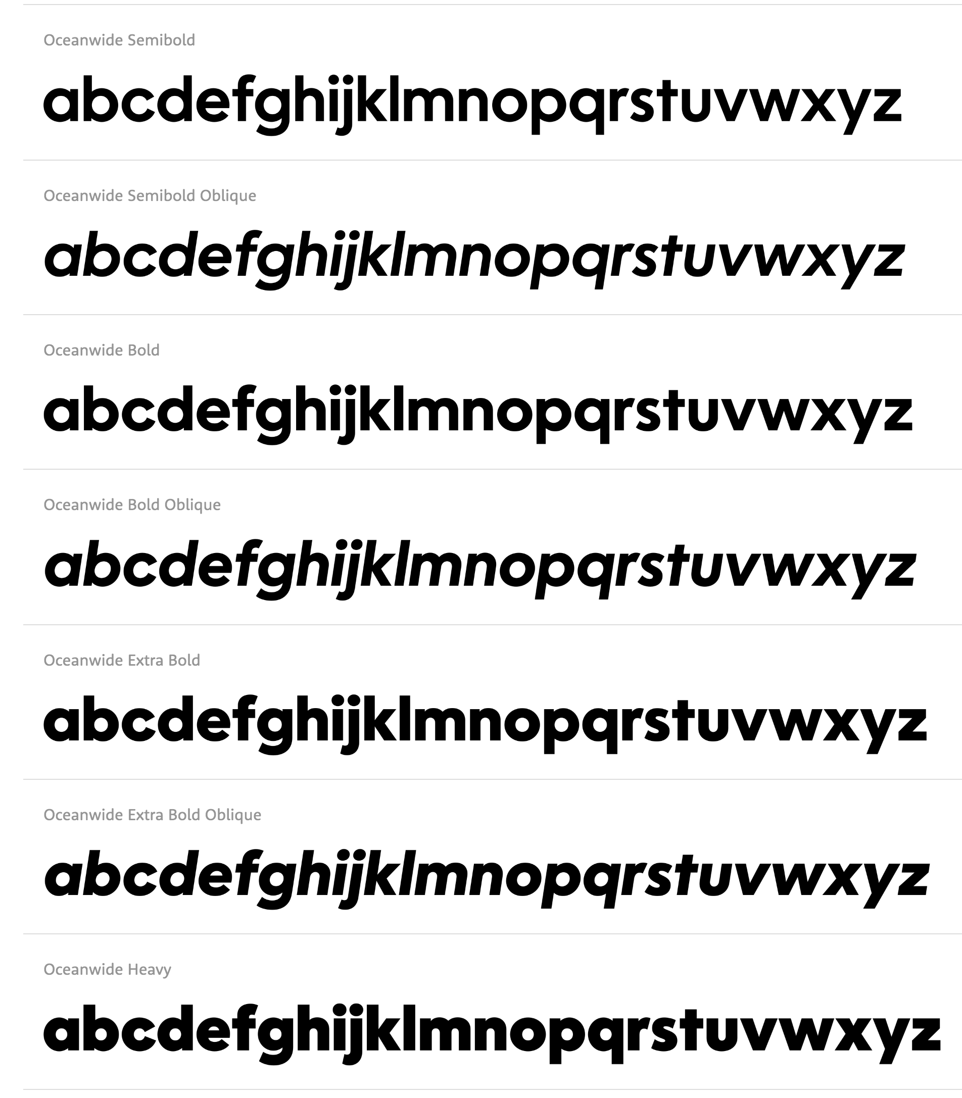
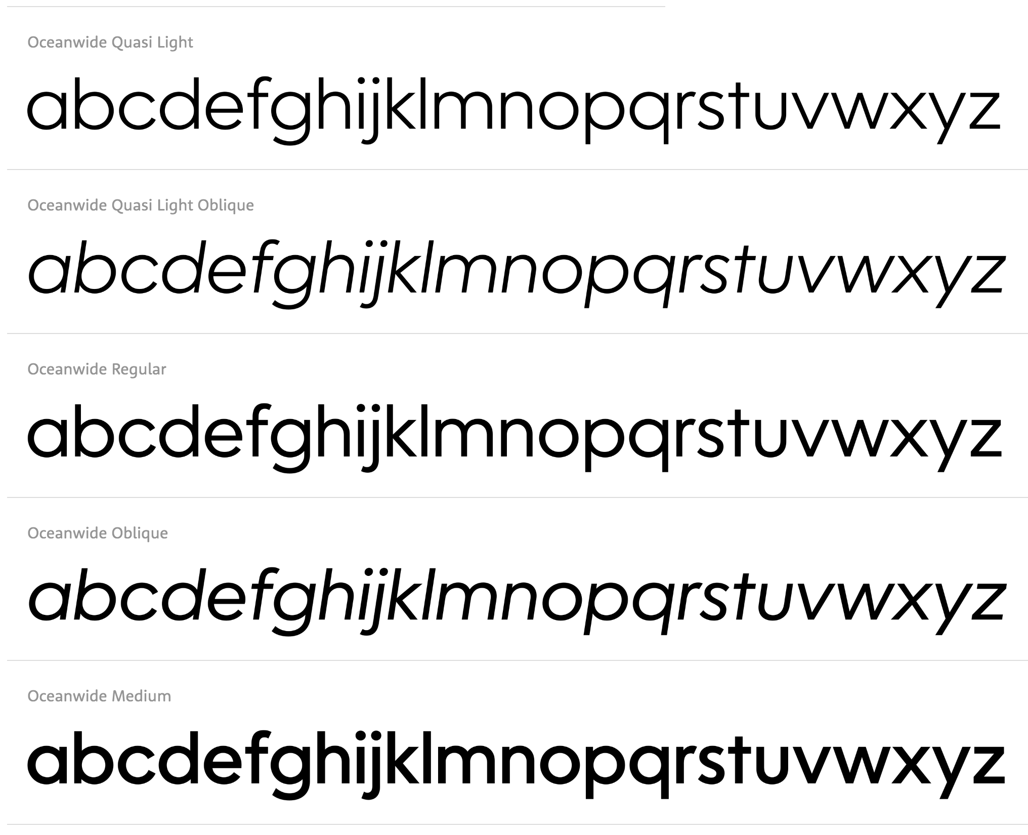
file name: Dave Lawrence Oceanwide Pro 2021
file name: Dave Lawrence Oceanwide Pro 2021
file name: Dave Lawrence Oceanwide Pro 2021
file name: Dave Lawrence Oceanwide Pro 2021
file name: Dave Lawrence Oceanwide Pro 2021
file name: Dave Lawrence Oceanwide Pro 2021
file name: Dave Lawrence Oceanwide Pro 2021

file name: Dave Lawrence Oceanwide Pro 2021

file name: Dave Lawrence Oceanwide Pro 2021
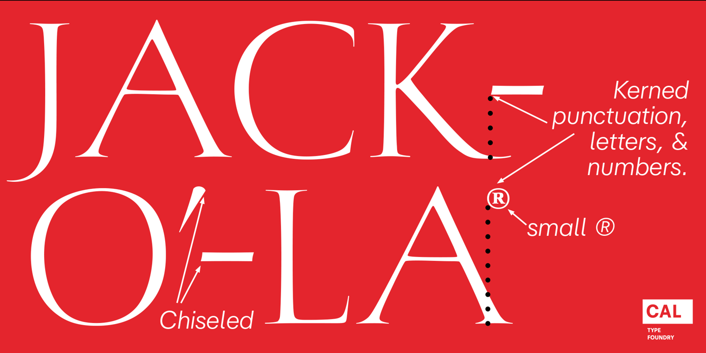
file name: California Type Foundry C A L Bodoni Ferrara Origin 2020 342291
file name: California Type Foundry C A L Bodoni Ferrara Origin 2020 342292
file name: California Type Foundry C A L Bodoni Ferrara Origin 2020 342293
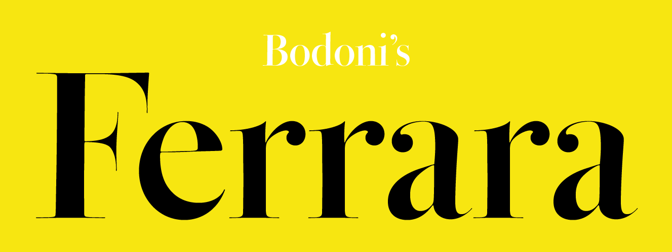
file name: California Type Foundry C A L Bodoni Ferrara Origin 2020 342294

file name: California Type Foundry C A L Bodoni Ferrara Origin 2020
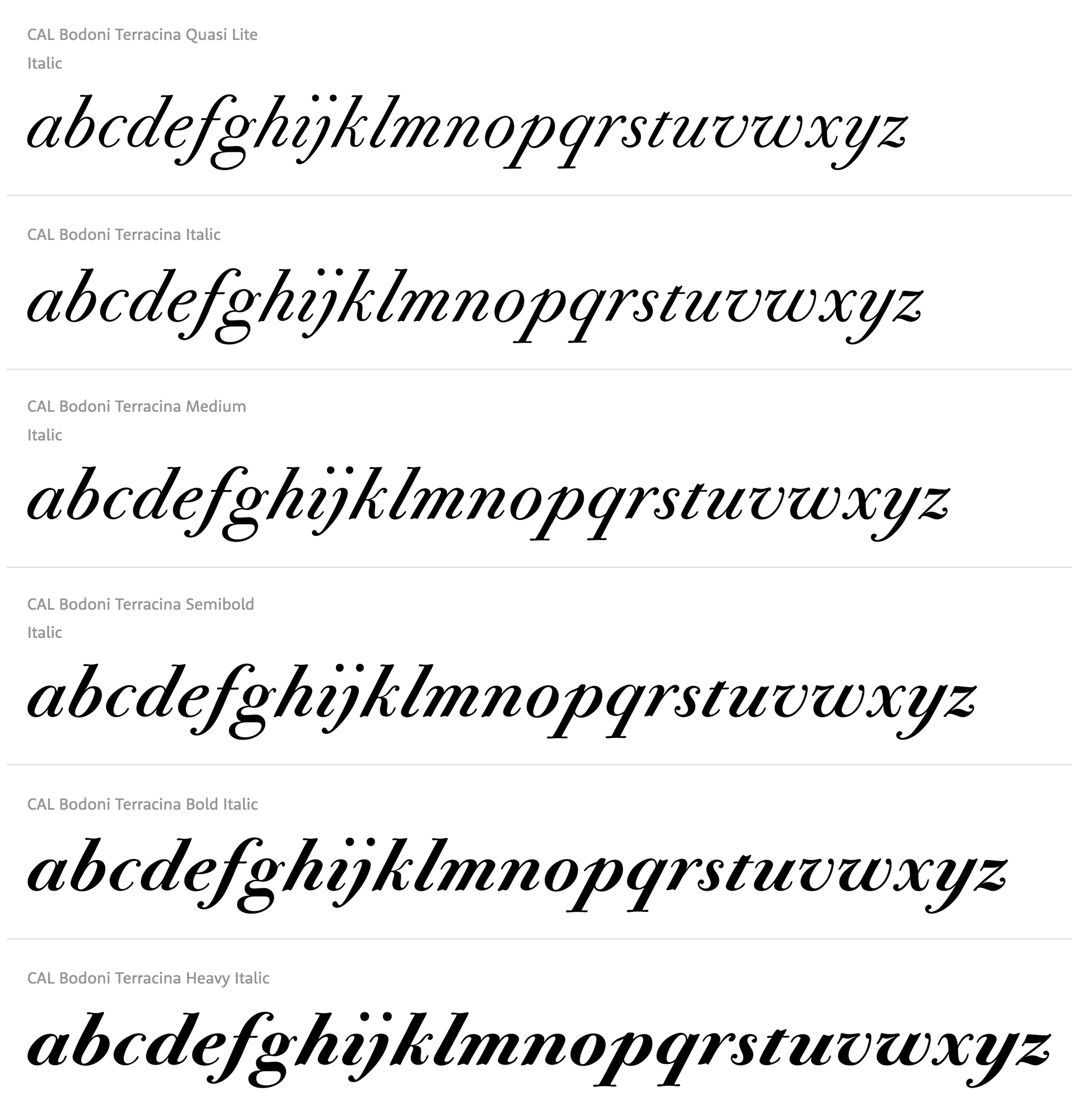
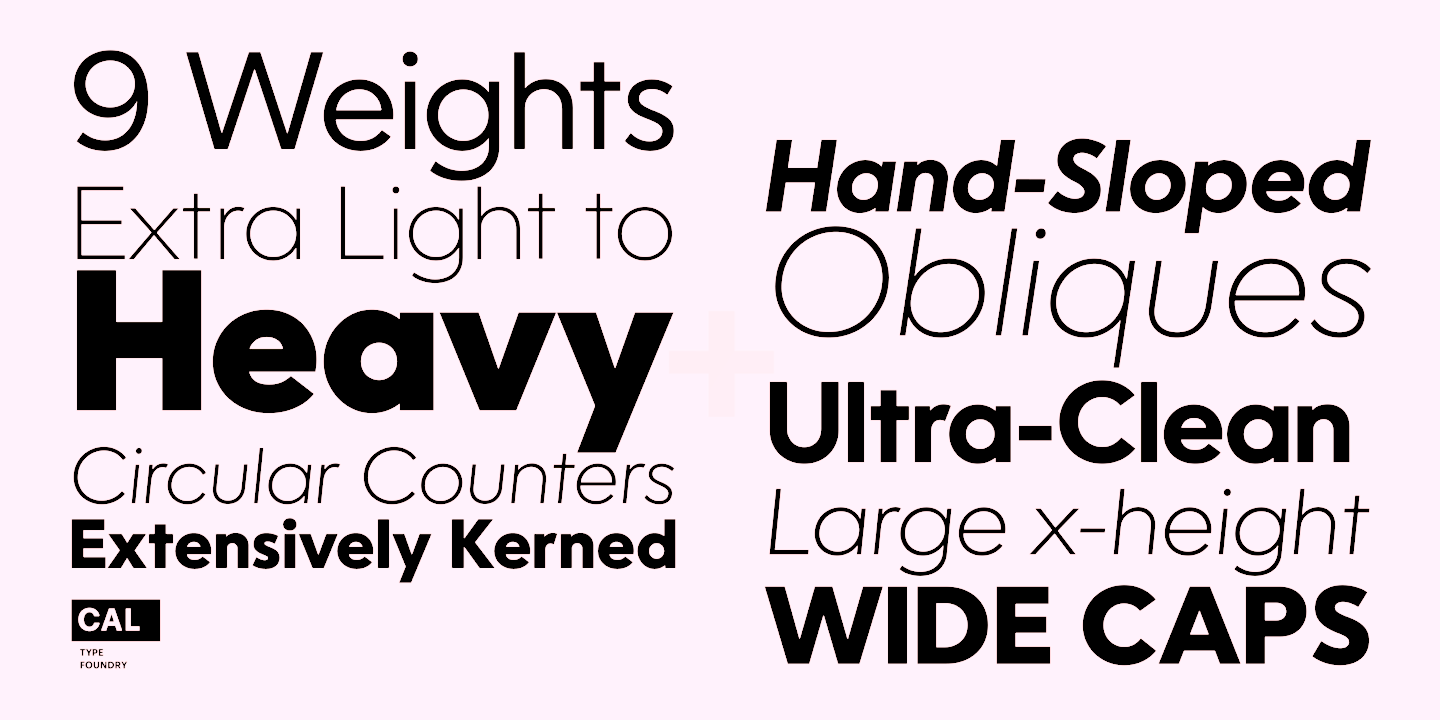
file name: California Type Foundry C A L Bodoni Terracina 2020 3
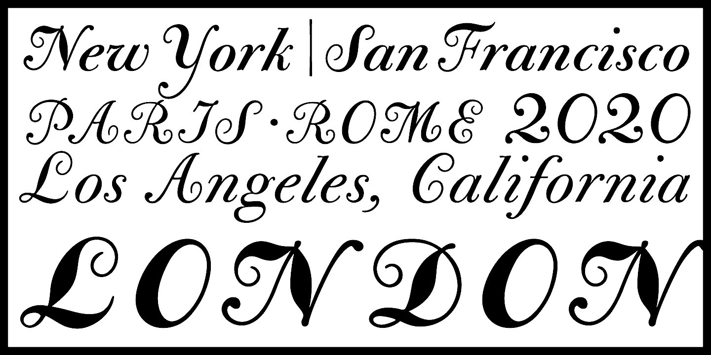
file name: California Type Foundry C A L Bodoni Terracina 2020 339285
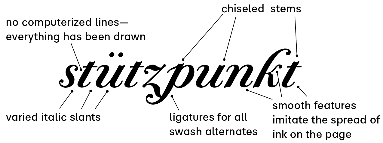
file name: California Type Foundry C A L Bodoni Terracina 2020 339291
file name: California Type Foundry C A L Bodoni Terracina 2020 339295

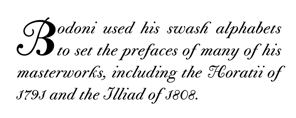
file name: California Type Foundry C A L Bodoni Terracina 2020
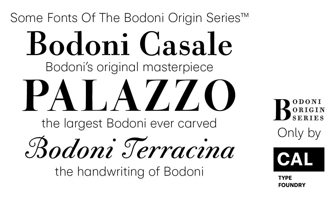
file name: Dave Lawrence C A L Bodon Palazzo 2020 338593
file name: Dave Lawrence C A L Bodon Palazzo 2020 338597
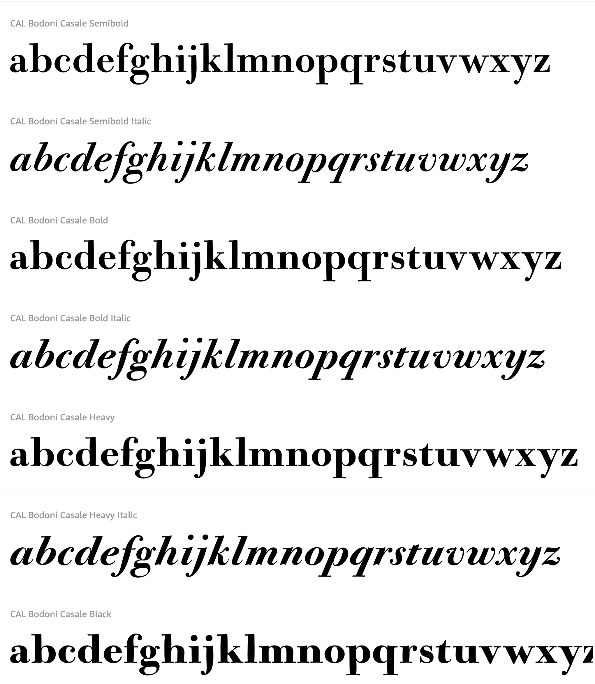
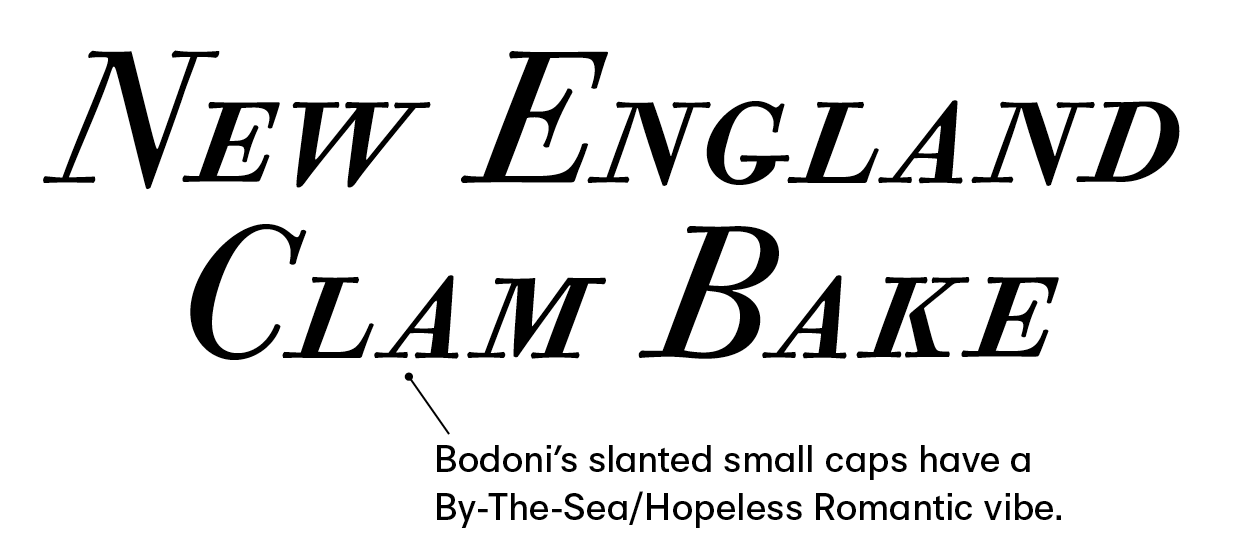
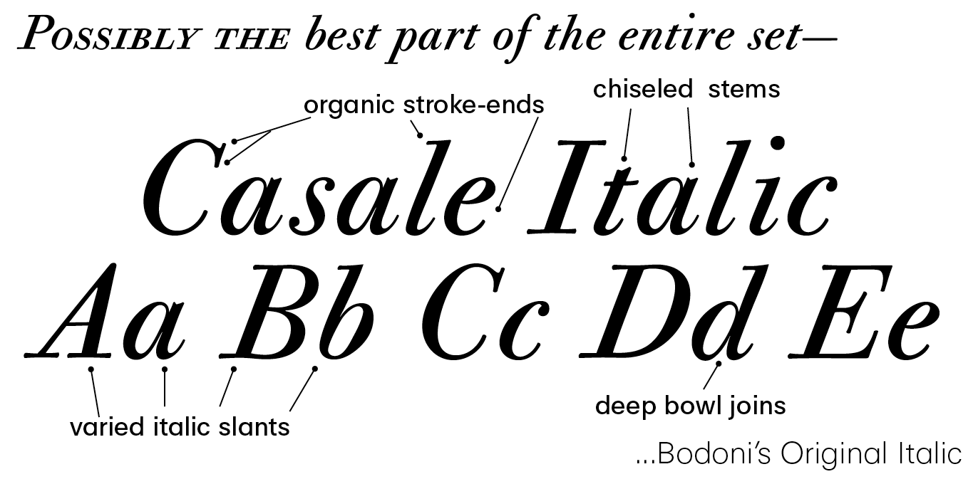
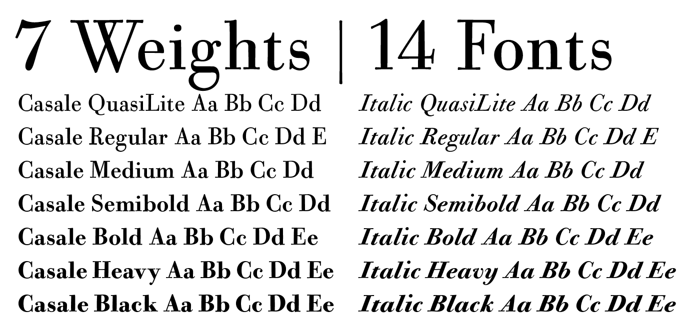
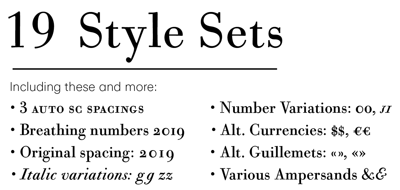
file name: California Type Foundry C A L Bodoni Casale 2019 315118
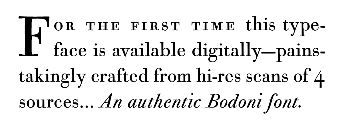
file name: California Type Foundry C A L Bodoni Casale 2019 315119 002
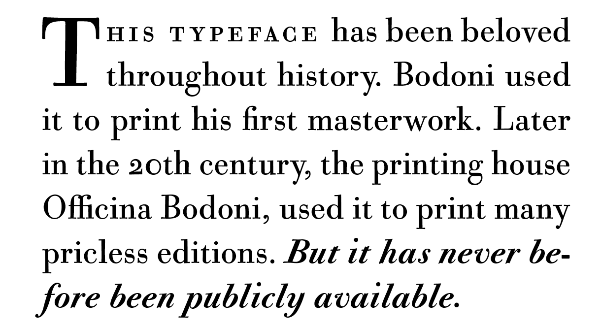
file name: California Type Foundry C A L Bodoni Casale 2019 315120 002
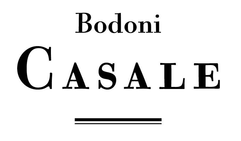
file name: California Type Foundry C A L Bodoni Casale 2019 315121 002
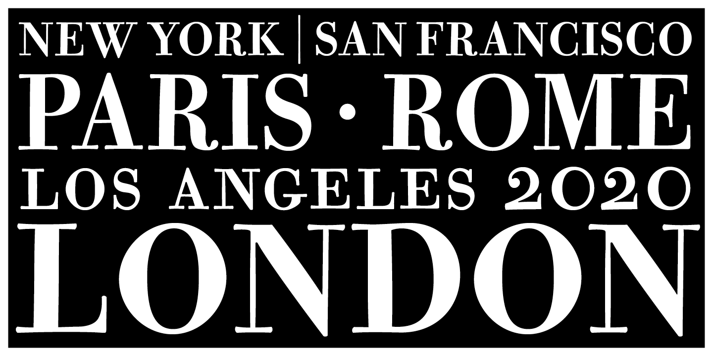
file name: California Type Foundry C A L Bodoni Casale 2019 315122 002

file name: California Type Foundry C A L Bodoni Casale 2019
file name: Dave Lawrence C A L Bodoni Casale 2019
file name: Dave Lawrence C A L Bodoni Casale 2019 315114
file name: Dave Lawrence C A L Bodoni Casale 2019 315115
file name: Dave Lawrence C A L Bodoni Casale 2019 315116
file name: Dave Lawrence C A L Bodoni Casale 2019 315117
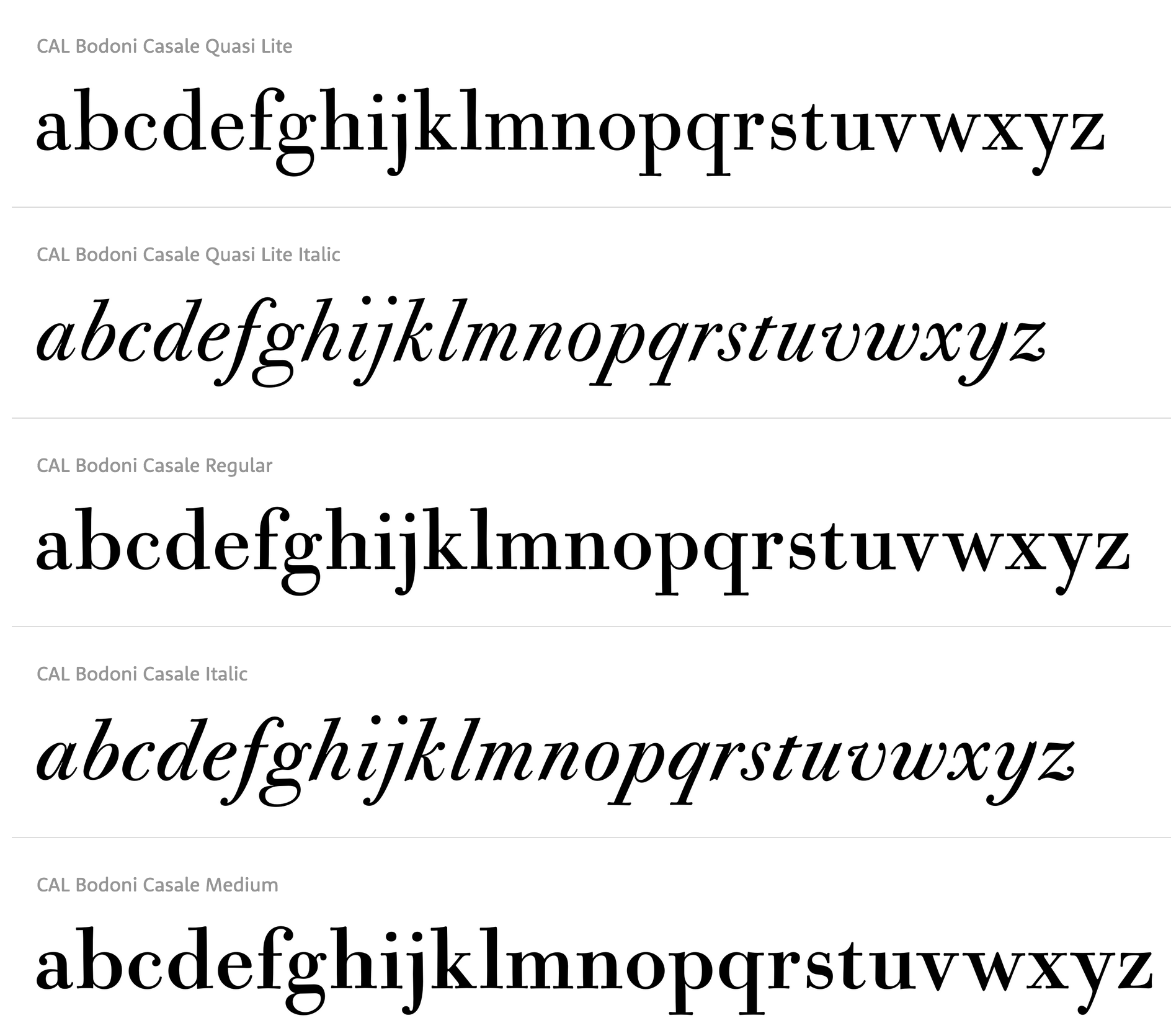
file name: Dave Lawrence C A L Bodoni Casale 2019
| | |
|
Luc Devroye ⦿ School of Computer Science ⦿ McGill University Montreal, Canada H3A 2K6 ⦿ lucdevroye@gmail.com ⦿ https://luc.devroye.org ⦿ https://luc.devroye.org/fonts.html |