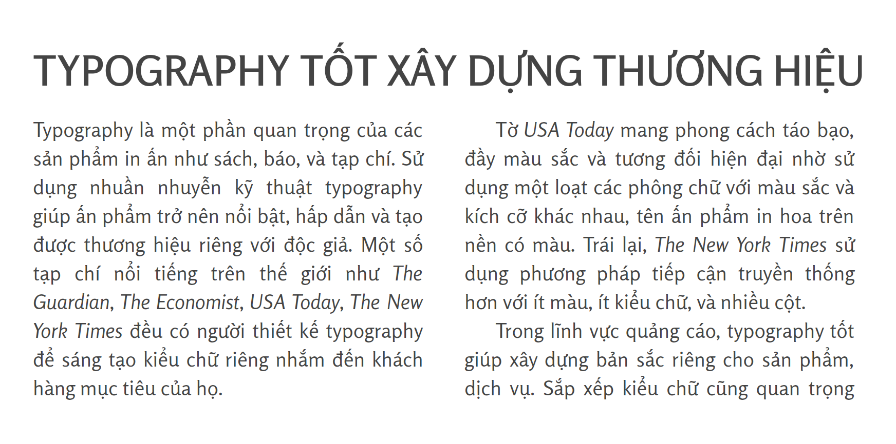
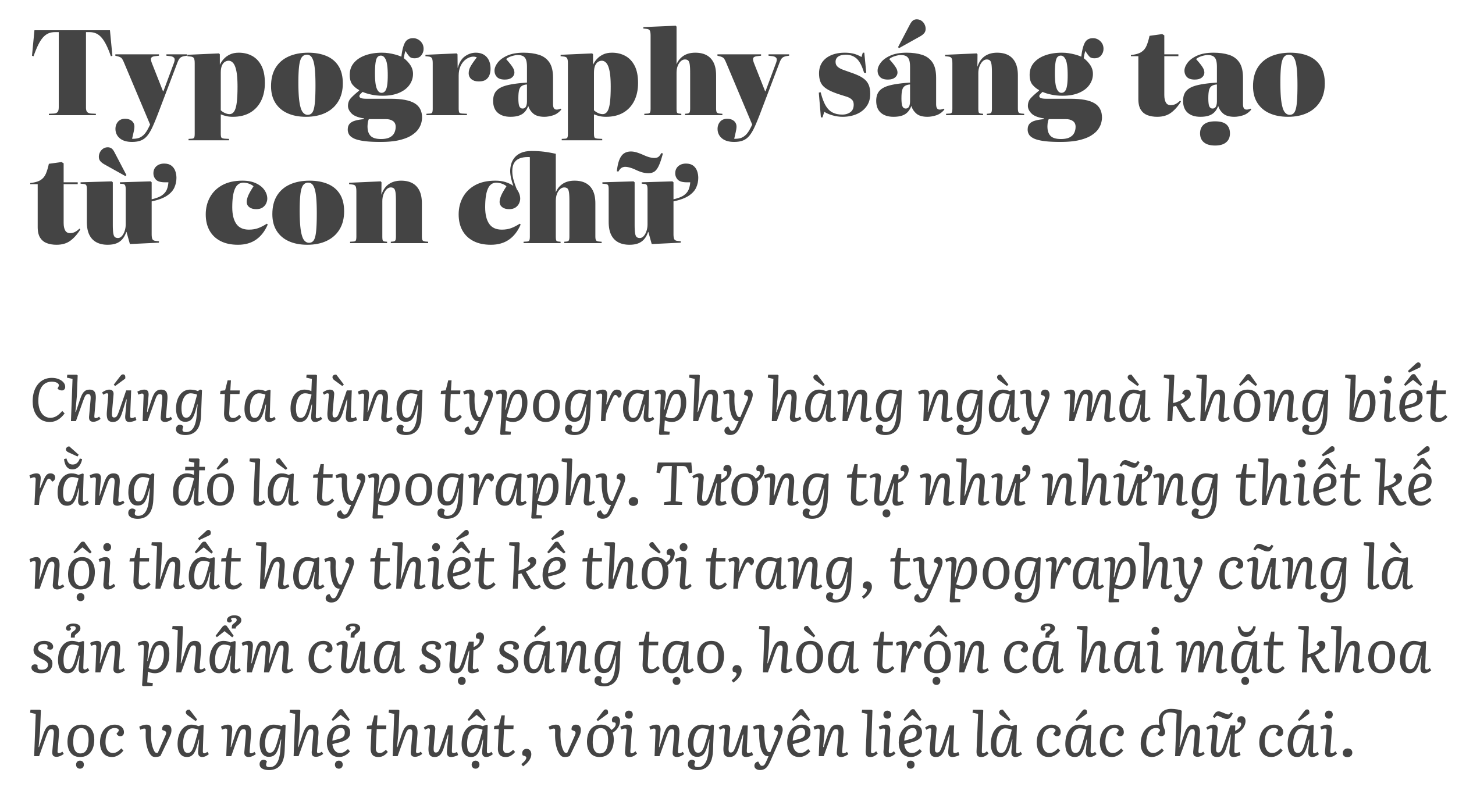
|
Vietnamese: recommended typefaces
[Donny Truong]
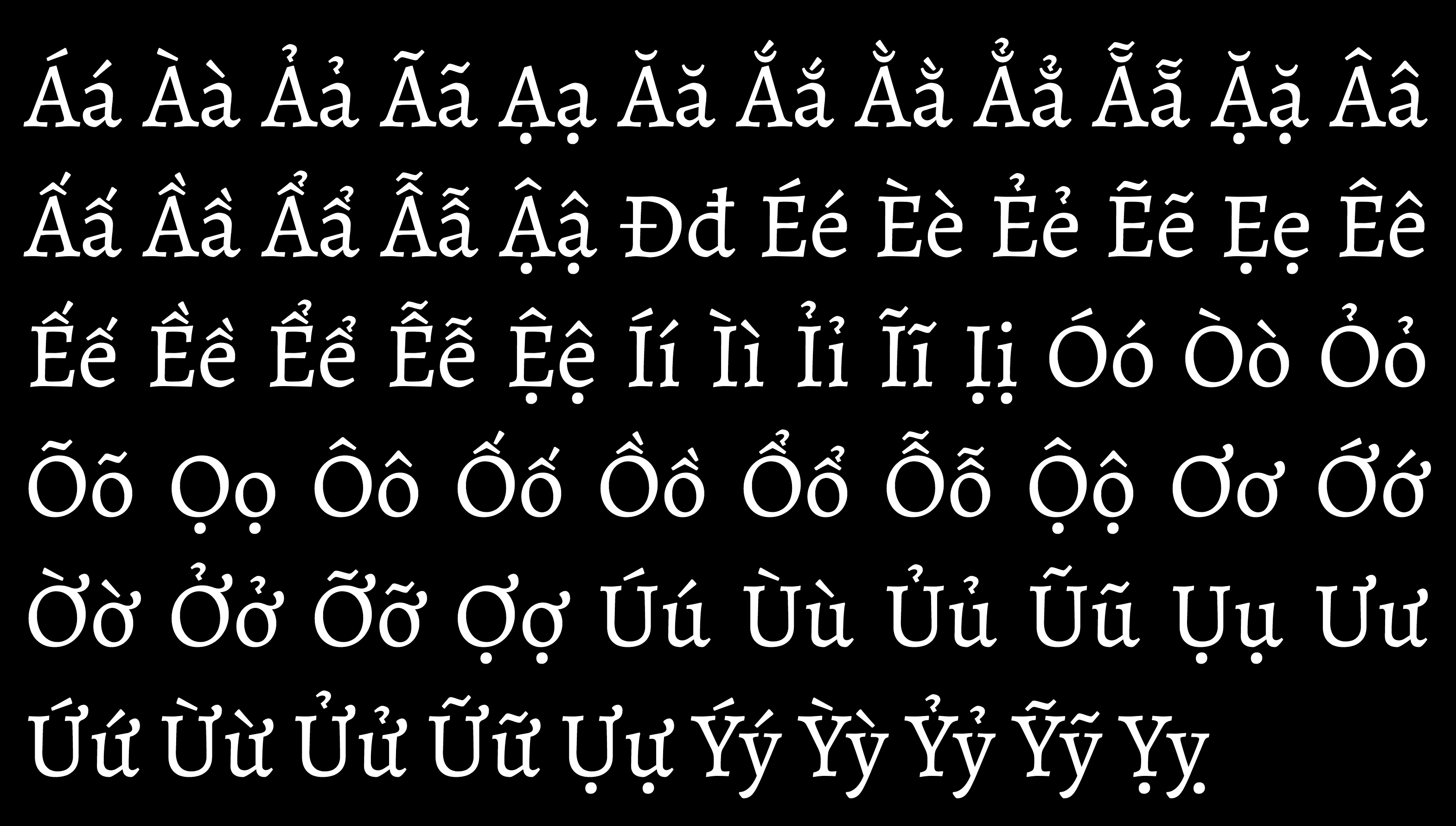
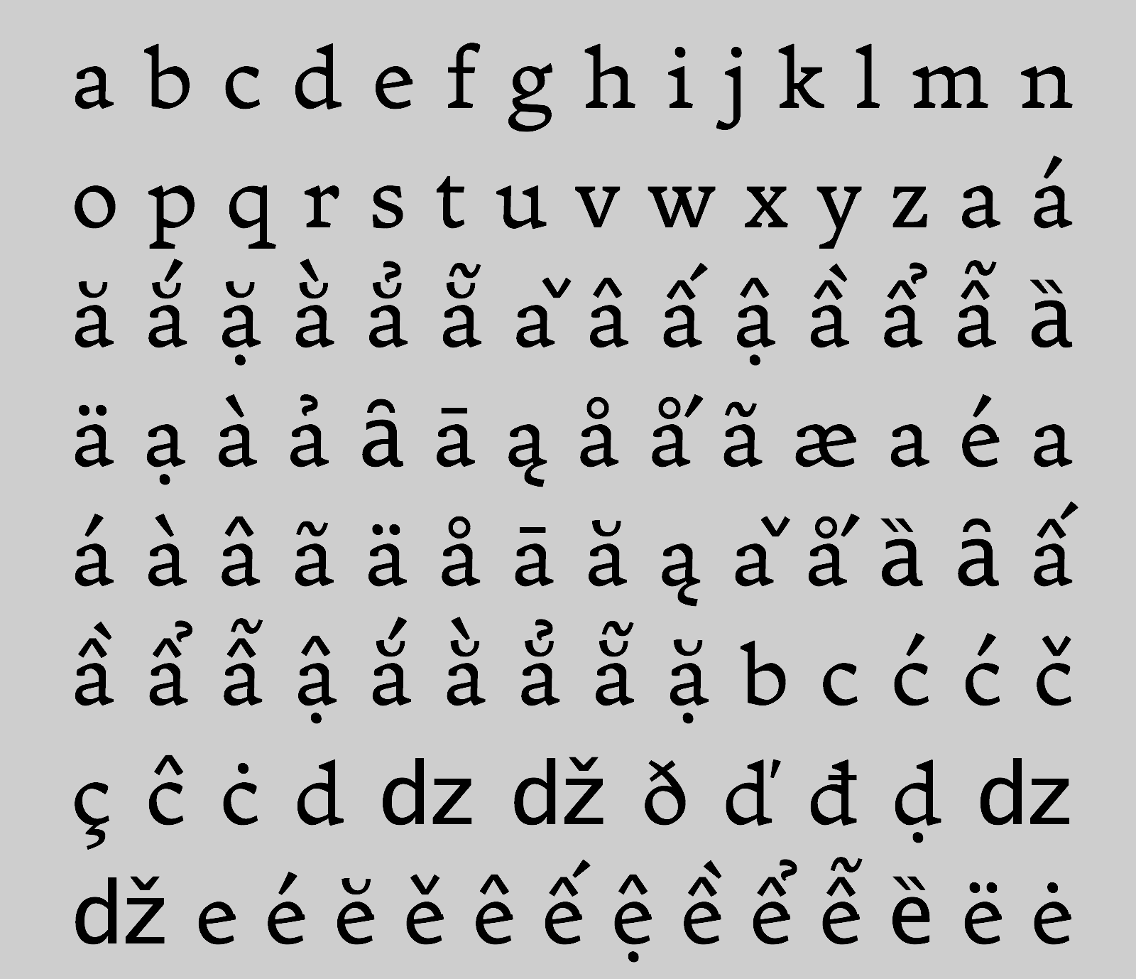
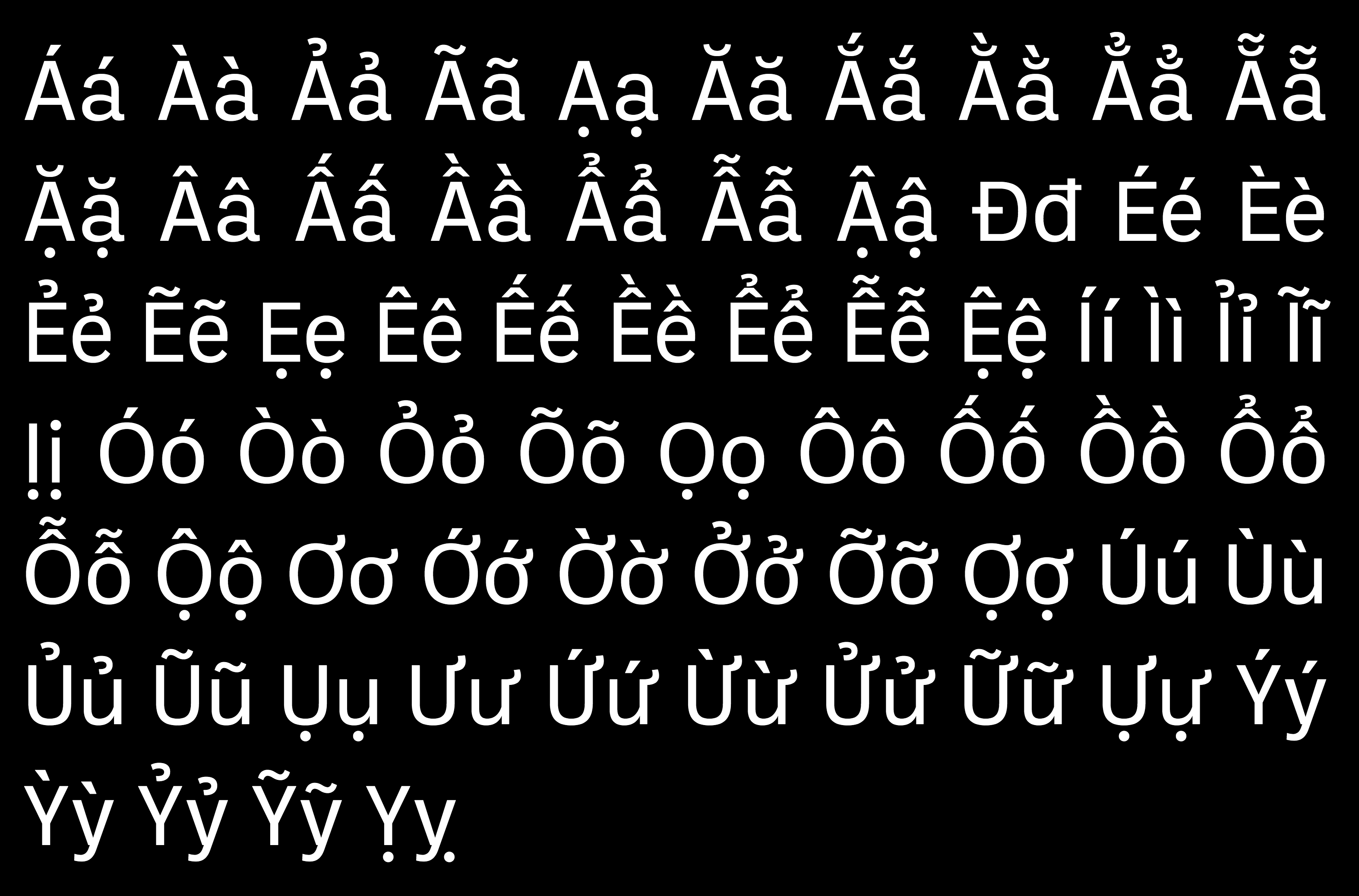
As part of his on-line book, Vietnamese Typography (2018), Donny Truong lists his favorite typefaces for Vietnamese typesetting. I reproduce his list and his comments verbatim. Please support his on-line book! Donny Truong's list: - Adapter (2019). By William Montrose, Slava Jevcinova and David Brezina, Rosetta Type: True to its name, Adapter adapts to any typographic environment. From text to display, straight to slant, thin to thick, Adapter takes advantage of variable font technology to offer a modern sans serif typographic system that supports many languages. For Vietnamese, its acute, grave, and hook above stack to the right of its circumflex.
- Adelle Sans (2012). By Veronika Burian and José Scaglione, at Type Together: With exuberant personality and clean appearance, Adelle Sans provides flexible typesetting for every situation and supports a wide range of languages. For Vietnamese, its acute and grave stack on top of its circumflex while its hook above stacks right.
- Alegreya (2011). By Juan Pablo del Peral at Huerta Tipografica: With dynamic rhythm and calligraphic character, Alegreya offers a pleasant reading experience for literary text. Alegreya equips with well-built diacritics for Vietnamese. Its hook above, in particular, has a slight tilt, which makes it unique and legible. Alegreya Sans completes its humanist superfamily.
- Alright (2019). By Jackson Showalter-Cavanaugh, Okay Type: Alright is a friendly, flexible humanist sans with a wide range of weights, widths, and languages. For Vietnamese, its acute, grave, and hook above stack to the right of its circumflex.
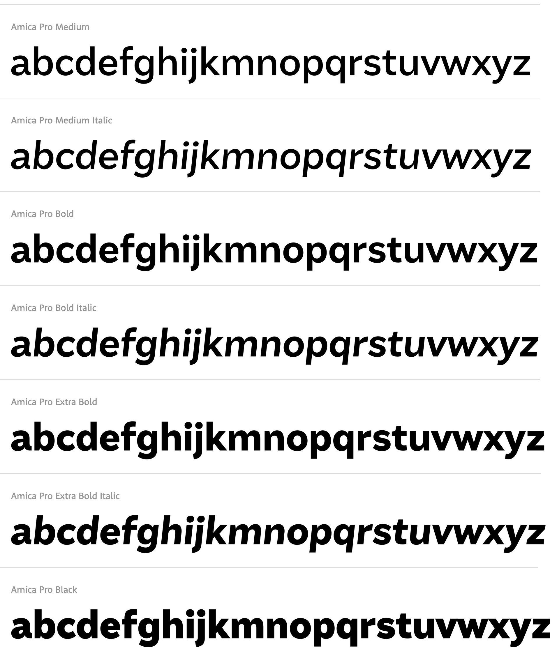
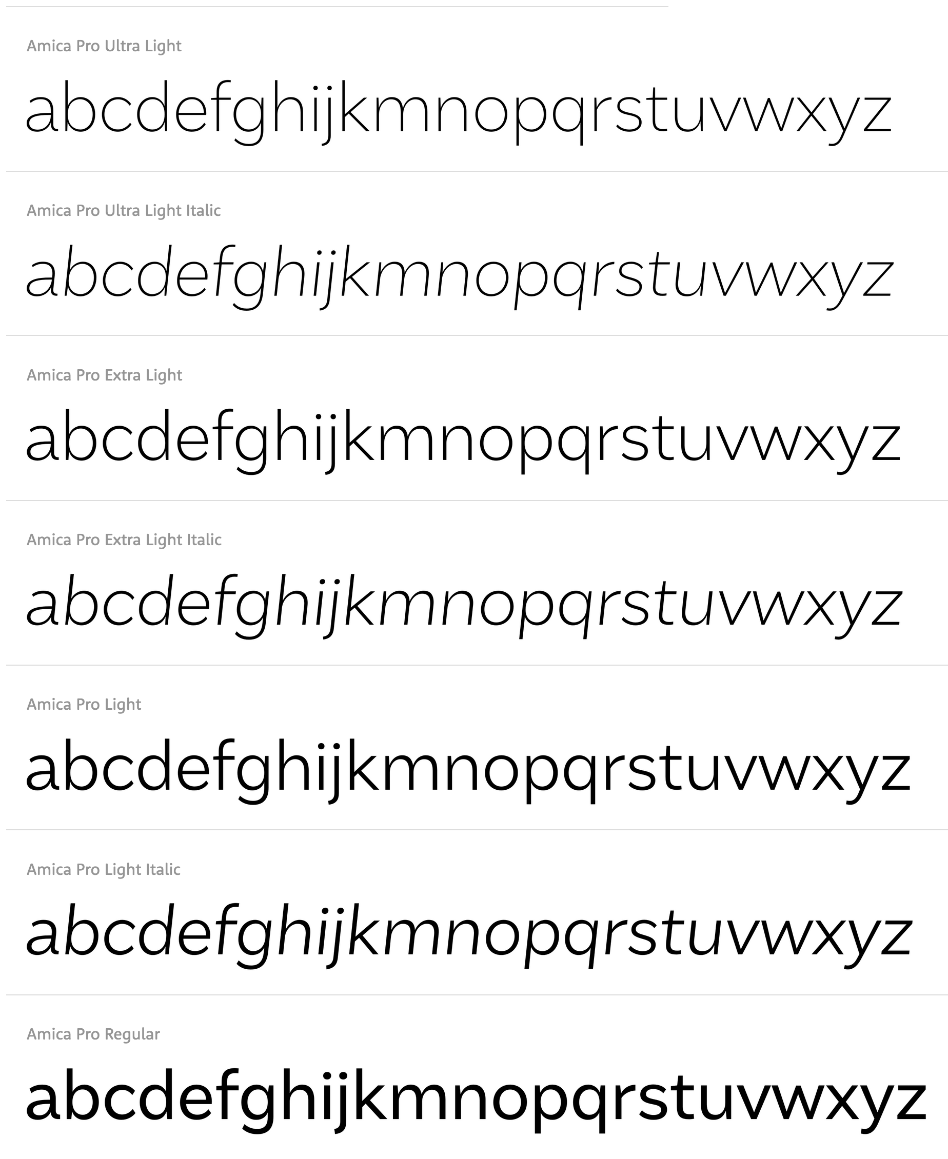
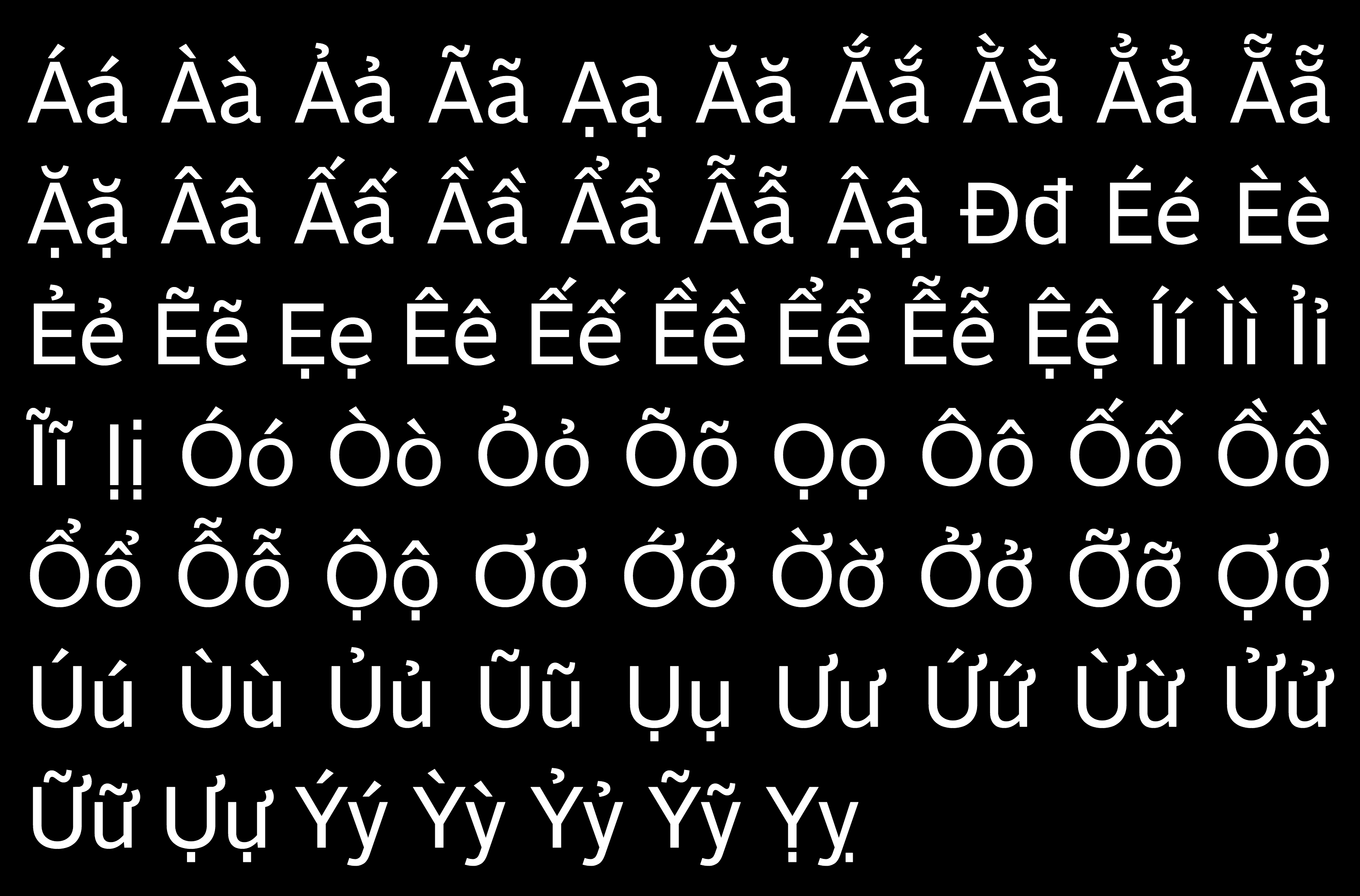
- Amica Pro (2019). By Dave Rowland, Schizotype: With generous x-height and reduced ascenders and descenders, Amica Pro offers approachable typesettings from user-interface design to online reading. For Vietnamese, its acute, grave, and hook above stack on top of its circumflex.
- Ballinger (2018). By Max Phillips of Signal Type: With large counters and a generous x-height, Ballinger offers flexible typography for clear communications. Its open apertures and amble curves lend comfort and friendliness to user interface design as well as print publications. Ballinger has solid diacritics for Vietnamese. Its acute, grave, and hook above stack on top of its circumflex.
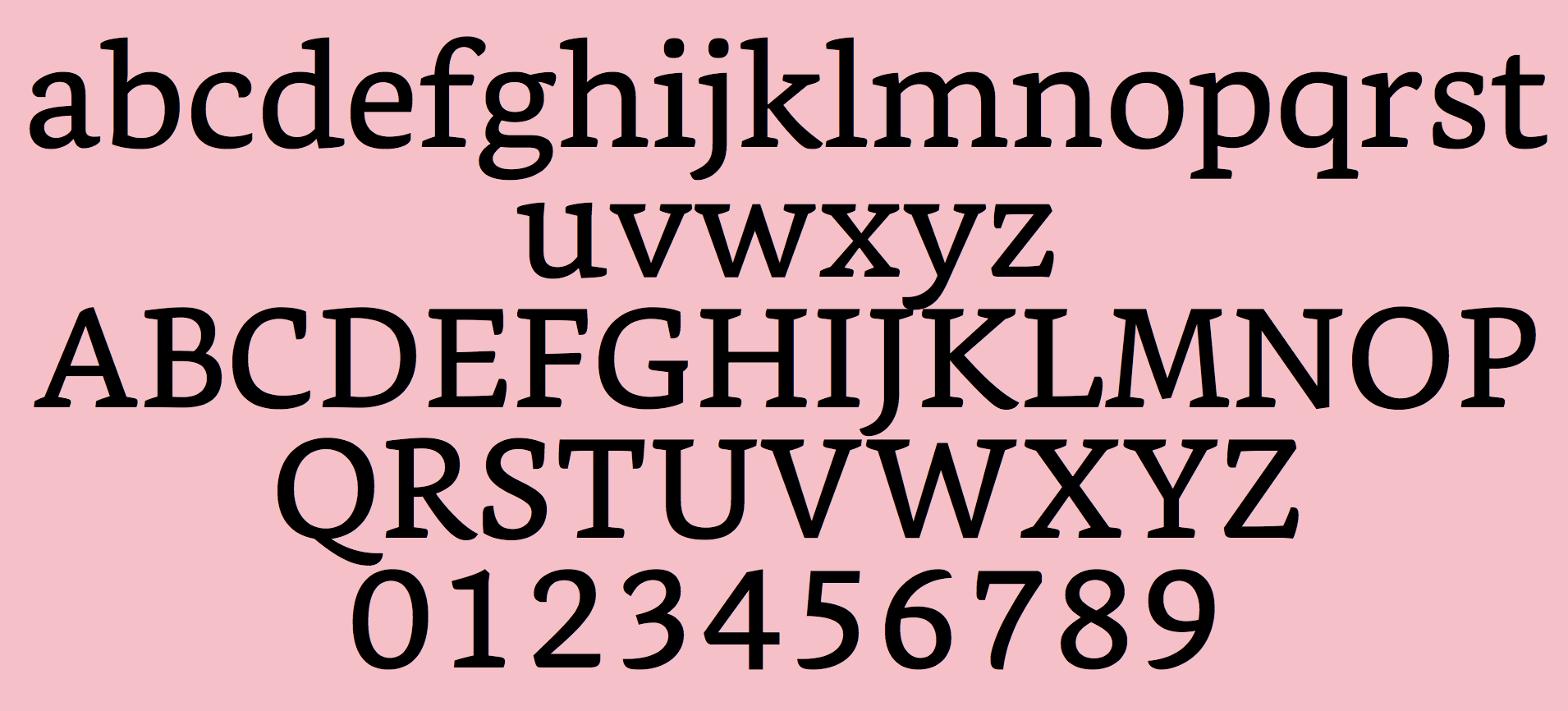
- Bitter (2010). By Sol Matas of Huerta Tipografica: With large x-heights and humanist subtleties, Bitter is a slab serif text face designed on a pixel grid for online reading. Bitter has excellent Vietnamese diacritics with its acute, grave, and hook above stack to the right of its circumflex.
- Bookerly (2015). By Dalton Maag: With humanist forms and meaty serifs, Bookerly brings book reading experience to Amazon's Kindle devices. Bookerly comes with chunky diacritical marks for Vietnamese. Its hook above, in particular, is well-balanced and distinguishable at small sizes. Its acute, grave, and hook above stack to the right of its circumflex.
- Cabin (2011). An open source font by Pablo Impallari of Impallari Type: Inspired by Edward Johnston's humanist sans, Cabin brings a new vibe of modernism with the integration of new geometric structures and optical adjustments. Cabin expands with prominent diacritics. For Vietnamese, its acute, grave, and hook above stack to the right of its circumflex.
- Crimson Pro (2018). An open source font by Jacques Le Bailly: Based on Sebastian Kosch's Crimson and Crimson Prime, Crimson Pro delivers optimal reading experience for textbook and long-form text on screen. Crimson Pro equips with solid diacritics for readability. For Vietnamese, its acute, grave, and hook above stack to the right of its circumflex.
- Exchange (2006-2017). By Frere-Jones Type, license at Commercial Type: Inspired by the British Ionic style of slab serif, Lynn B. and M. F. Benton's Century Expanded, and C.H. Griffith's Bell Gothic, Exchange offers typesetting in limited space including newspaper and mobile devices. Exchange has clear, well-balanced diacritics. Its acute, grave, and hook above stack to the right of its circumflex. Its tilde positions slightly toward the right of its circumflex.
- Fern. By David Jonathan Ross: Fern is an elegant Venetian typeface that lends strength and grace to text on screens. Fern strikes the balance between humanist qualities and chunkiness forms. For Vietnamese, its acute, grave, and hook above stack to the right of its circumflex. Its tilde positions slightly toward the right of its circumflex.
- Fragen (2019). by Lucas Descroix at The Designers Foundry: With sturdy slab serifs complemented by exuberant italics, Fragen is an eclectic-yet-harmonious type family inspired by nineteenth century Antiques and typewriter. While Fragen's low contrast makes it legible for reading text, its distinctive feature makes it swell for display typography. Fragen comes with well-crafted diacritics for Vietnamese. Its acute, grave, and hook above stack to the right of its circumflex.
- Frequenz (2018). By Sebastian Losch at Kilotype: With sound-wave inspiration, nonconformist rhythm, and optically adjusted appearance, Frequenz offers an unorthodox, uncompromising sans serif text face that surprisingly does not get in the way with the flow of reading. Frequenz has conventional diacritics with its acute, grave, and hook above stack to the right of its circumflex.
- Halyard. By Joshua Darden, Eben Sorkin & Lucas Sharp at Darden Studio: A grotesque sans with historical forms drawn from Schelter+Giesecke, Miller and Richard, and Morris Fuller Benton, Halyard offers a full range of typographic utility. The Halyard superfamily provides flexibility and robustness to work in any situation. For Vietnamese, its acute and hook above stack to the right of its circumflex, but its grave stacks to the left.
- Harriet (2012). by Jackson Showalter-Cavanaugh of Okay Type: Reimagining of Baskerville and Scotch Roman, Harriet is a multifaceted serif family ranging from exhilarating display to essential reading text. Harriet has superb Vietnamese diacritics. Its acute, grave, and hook above stack to the right of its circumflex.
- Literata (2019). An open source typeface by Vera Evstafieva, Veronika Burian, Irene Vlachou & José Scaglione at TypeTogether: Drawing inspiration from Scotch and Old Style Roman, Literata---designed for Google Play Books' pleasurable reading experiences for digital books thanks to its less mechanical structure, varied proportions, organic texture, and slanted stress. It has sturdy, blunt diacritics---the hook above in particular. Its acute and hook above stack to the right of its circumflex, but its grave stack to the left.
- Petrona (2011). an open source font by Ringo R. Seeber: With generous x-height, open apertures, and low contrast, Petrona is a fine serif family intended for print and online editorial design, particularly for culinary. Petrona's personal characteristics swell at large sizes and recede at small sizes without comprising legibility. Petrona comes with well-built diacritics. For Vietnamese, its acute and grave stack on top of its circumflex. Its hook above is oddly attached to the top of its circumflex.
- Pliego (2019). By Juanjo Lopez: Named after Pliegos de Cordel, Pliego offers a delightful reading experience with humanist forms and even textures. Its calligraphic details ebb at small sizes for comfortable reading, but flow at large sizes for playful display. Its diacritics are crafted with care to retain the humanist and calligraphic qualities throughout. Its acute, grave, and hook above stack to the right of its circumflex.
- Recursive Sans (2018-2019). By Stephen Nixon at Arrow Type: Using the power of variable font technology, Recursive family offers flexible, expressive typography from a single font file. With five variable axes (sans serif to monospace, linear to casual, light to extra black weights, slant, and cursive), Recursive provides limitless creativities and possibilities. Recursive supports a wide range of languages. For Vietnamese, its acute, grave, and hook above stack to the right of its circumflex. See also Recursive Mono.
- Rosario (2003). An open source font by Hector Gatti at Omnibus-Type: Named after the largest city in the central Argentina province of Santa Fe, Rosario is an elegant sans-serif typeface with classic proportions and low contrast designed for both online and print publications. Rosario has solid Vietnamese diacritics with acute, grave, and hook above stack above its circumflex.
- Roslindale. By David Jonathan Ross: Inspired by De Vinne, Roslindale strikes the balance between utility and personality. Roslindale has rounded diacritics. Its acute, grave, and hook above stack to the right of its circumflex.
- Schotis (2017). By Juanjo Lopez at Huy Fonts: Inspired by Scotch Romans in the nineteenth and twentieth centuries, Schotis is a workhorse text face for editorial and long-form text. Schotis has rounded, well-balanced diacritics. Its reversed tilde for italic appears playful for display text, but odd for reading text. Its acute, grave, and hook above stack to the right of its circumflex.
- Skolar (2008-2012). By David Brezina at Rosetta Type: A robust serif family with conventional proportions and subtle personal styles, Skolar intends to solve complex typography across platforms and purposes. Skolar has solid, sturdy diacritical marks. While its acute and grave on lowercase letters stack to the right of its circumflex, they stack above on capital letters. Its counterpart, Skolar Sans, fills the need of early days for responsive web typography. See also Skolar Sans.
- Source Sans (2012). An open source font by Paul D. Hunt at Adobe Fonts: Inspired by the simple forms of News Gothic and Franklin Gothic, Source Sans provides solutions for user interface design as well as long text on the web. Source Sans offers proportional, clear diacritics. Its acute and hook above stack to the right of its circumflex, but its grave stack to the left. Source Serif, designed by Frank Griesshammer, compliments Source Sans.
- Spectral (2017). By Jean-Baptiste Levée at Production Type: A versatile serif family, Spectral---designed for Google Docs and Sheets---lends efficiency and elegance to immersive reading on screens. While its sharp, pointed diacritical marks, particularly acute and grave, create clear contrast, they are a bit too short at small sizes. In combined accents, its acute positions to the right, its grave to the left, and its hook above and tilde on top.
- Vollkorn (2005). An open source font by Friedrich Althausen: Vollkorn, which means wholemeal in German, is a modest text face with sturdy serifs intended for everyday bread-and-butter use. Vollkorn equips with well-built Vietnamese diacritical marks positioned close to its base letters. Its acute, grave, and hook above stack to the right of its circumflex.
|
EXTERNAL LINKS
Vietnamese: recommended typefaces
MyFonts search
Monotype search
Fontspring search
Google search
INTERNAL LINKS
Vietnamese ⦿
|