TYPE DESIGN INFORMATION PAGE last updated on Sat May 16 08:50:37 EDT 2026
FONT RECOGNITION VIA FONT MOOSE

|
|
|
|
Fonts for dyslexics: comments by Stephan Peters
[Stephan Peters]
Stephan Peters gives his opinions on fonts for dyslexics (in 2020) based on opinions by dyslexics.
He adds: There's a lot of misinformation out there about "dyslexic fonts." Dyslexie is OK, but looks awful artistically. Open Dyslexic, which attempts to emulate Dyslexie is REALLY TERRIBLE! It is a disservice to people with dyslexia. Studies show it is not a helpful font [...] It has a high x-height, which leads to lower ascenders. p and q are just reversed, b and d are just reversed.... Terrible kerning... m looks like the Latin ligature rn... I could go on and on. [...] In reality, line height and font size have more to do with readability than the actual font, there are studies that show this, too. |
EXTERNAL LINKS |
| | |
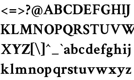
file name: Charles Nix D Din Bold 2017
file name: Charles Nix D Din Condensed Bold 2017
file name: Charles Nix D Din Exp 2017

file name: Paulo Goode Carrig 2014
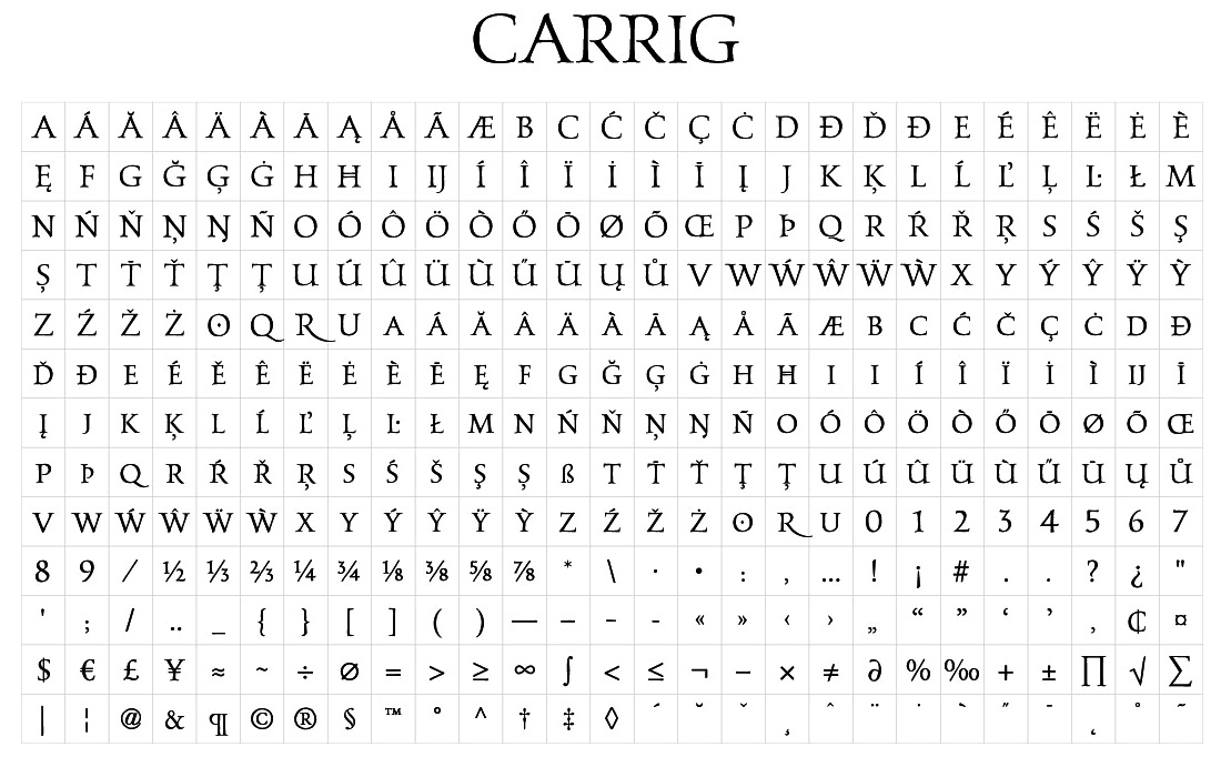
file name: Paulo Goode Carrig 2014a
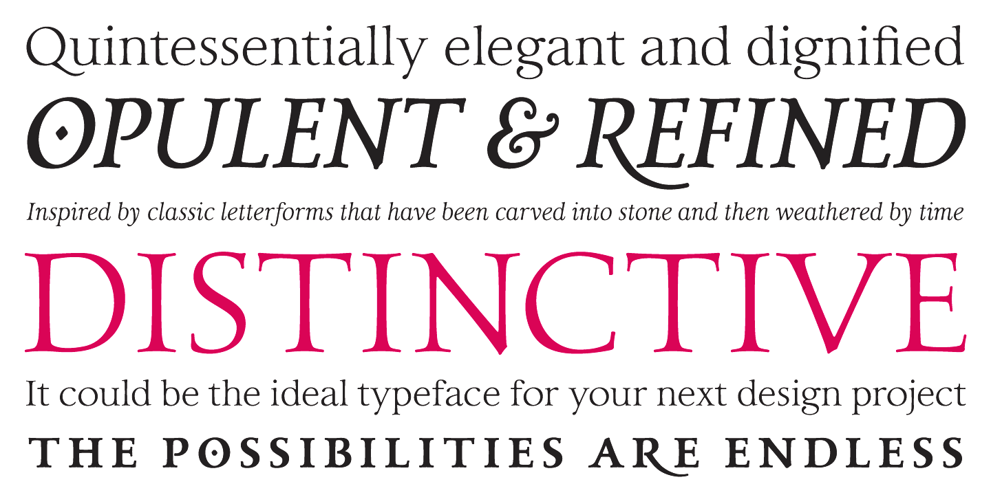
file name: Paulo Goode Carrig 2015 184437
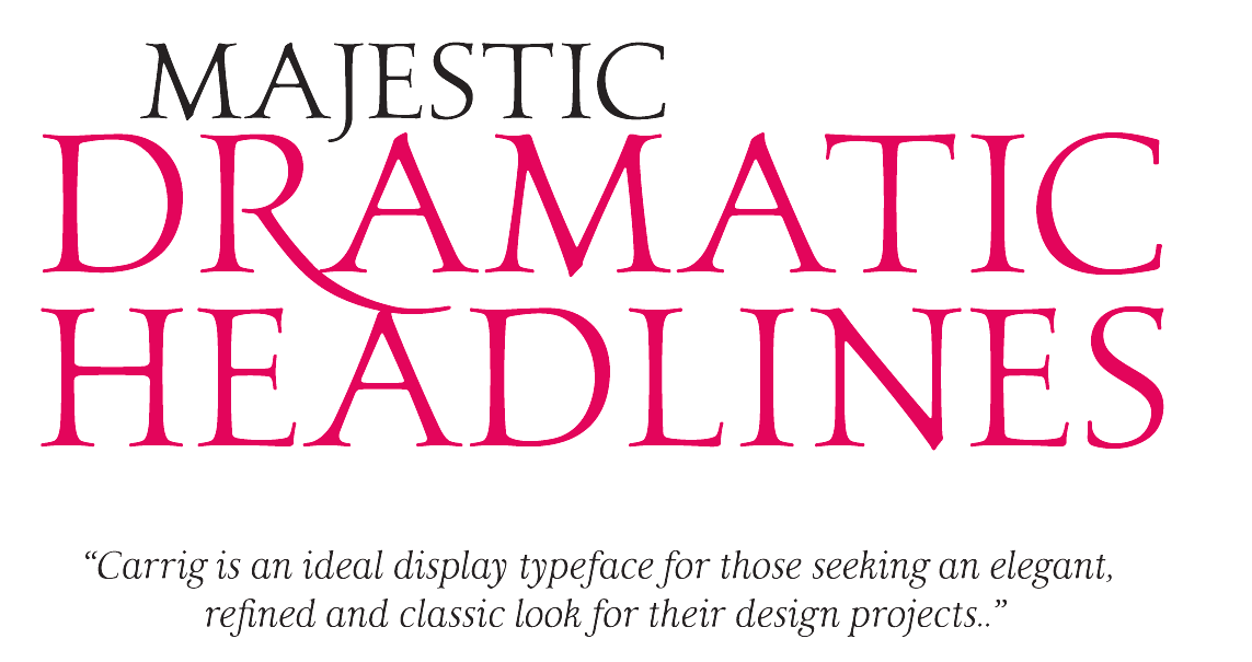
file name: Paulo Goode Carrig 2015 184444

file name: Paulo Goode Carrig 2015
file name: Paulo Goode Carrig 2014b
file name: Paulo Goode Carrig 2014d
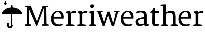
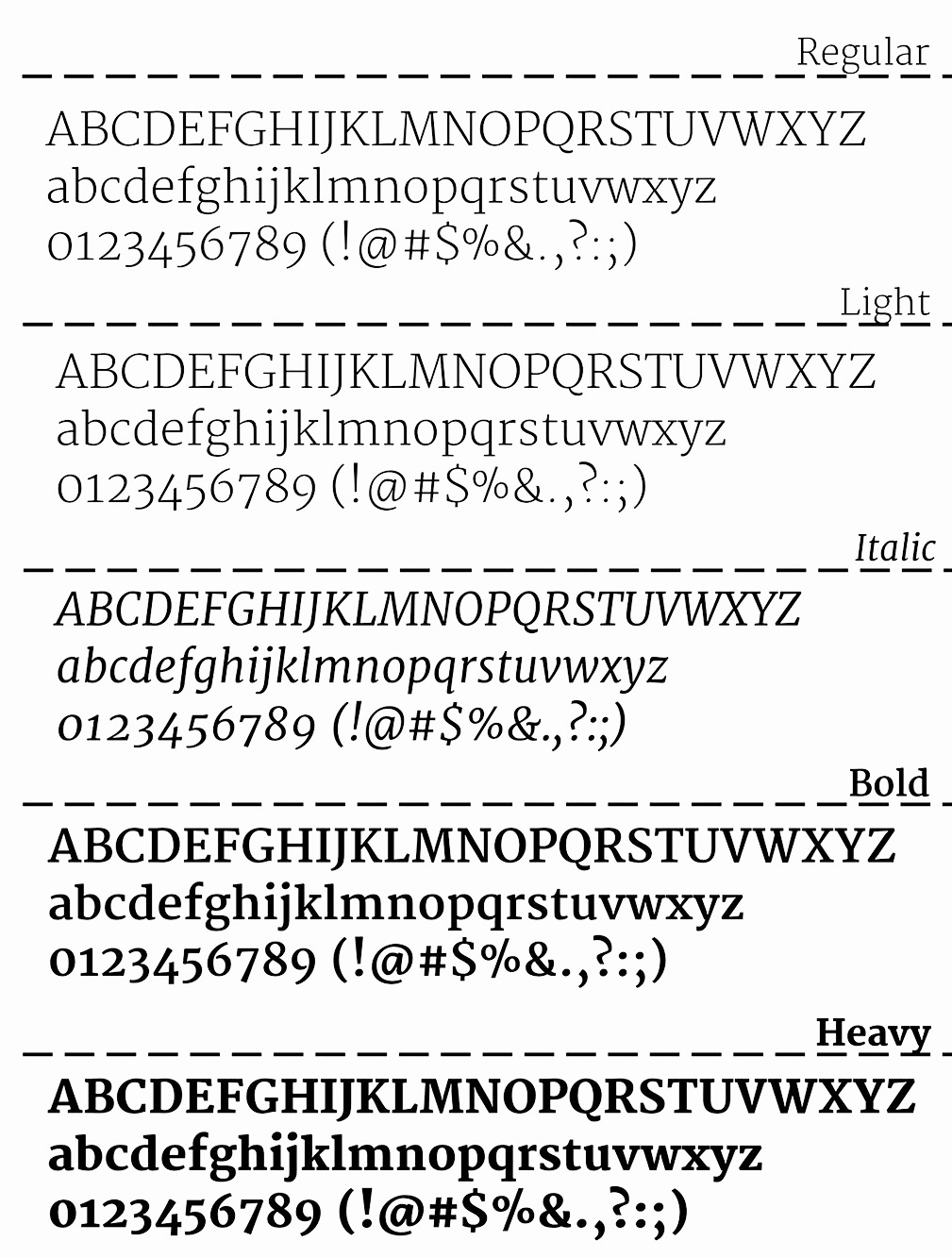
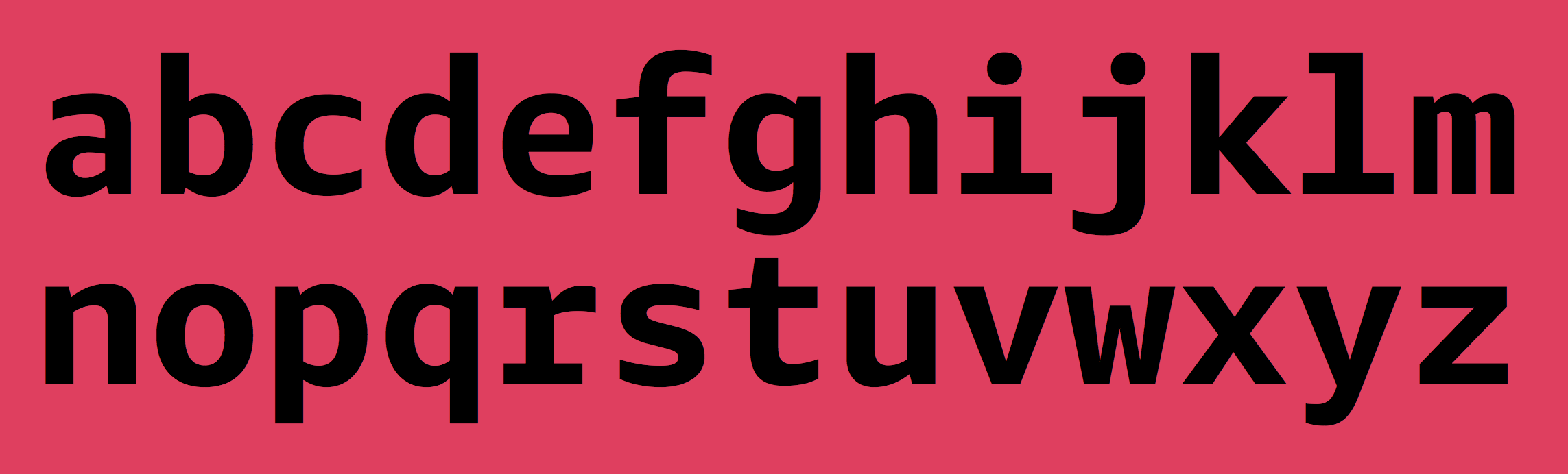
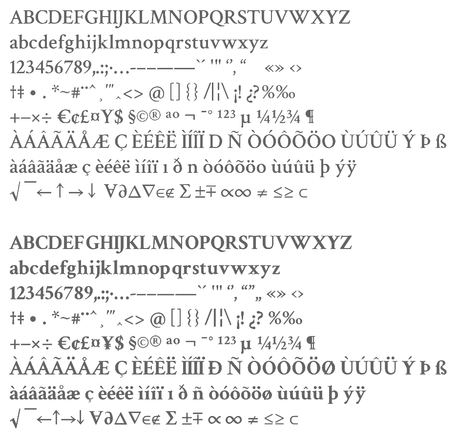
file name: Eben Sorkin Merriweather 2010
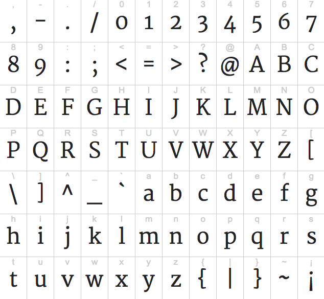
file name: Eben Sorkin Merriweather 2010b
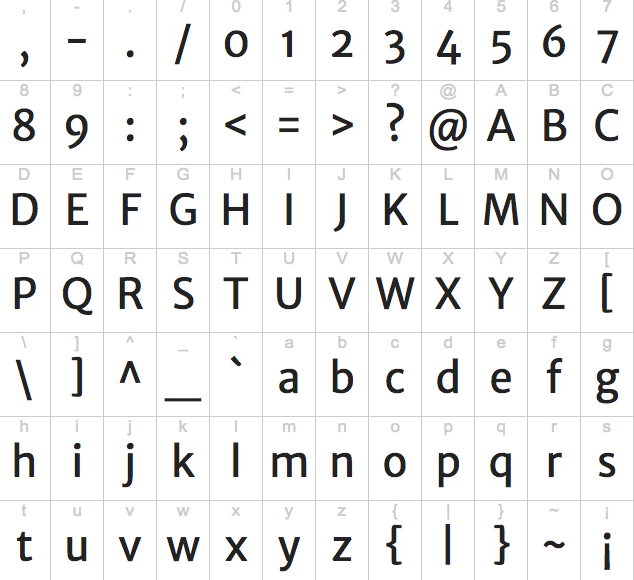
file name: Eben Sorkin Merriweather Sans 2010b

file name: Eben Sorkin Merriweather Sans 2010
file name: Eben Sorkin Merriweather 2010 Poster by Luiz Felipe Severo 2014
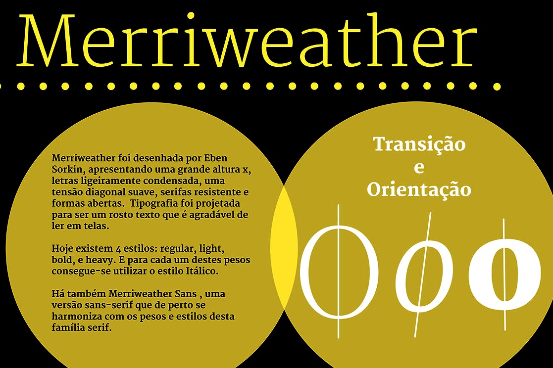
file name: Eben Sorkin Merriweather 2010 Poster by Luiz Felipe Severo 2014b
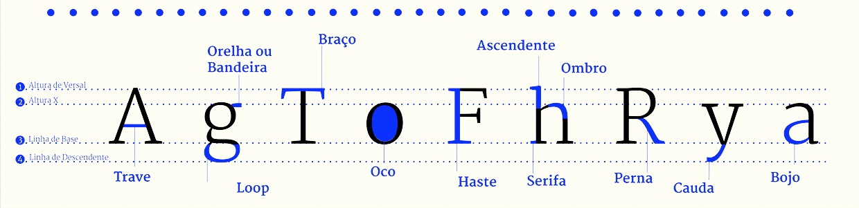
file name: Eben Sorkin Merriweather 2010 Poster by Luiz Felipe Severo 2014c
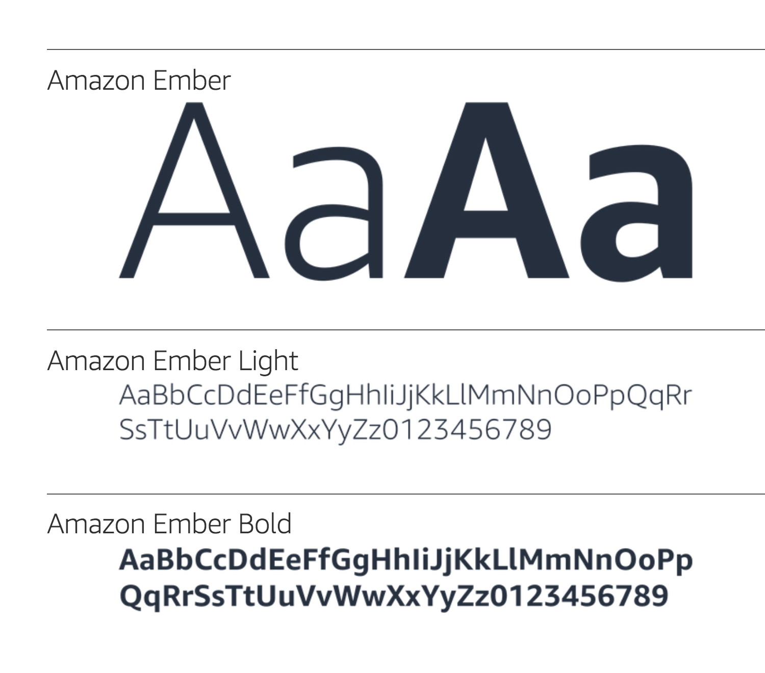
file name: Dalton Maag Amazon Ember 2015 2017
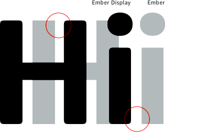
file name: Dalton Maag Amazon Ember Display 2017
file name: Dalton Maag Amazon Ember Mono Bold 2018
file name: Dalton Maag Amazon Ember Thin 2014

file name: Dalton Maag Amazon Ember 2015
file name: Dalton Maag Amazon Ember 2015

file name: Dalton Maag Amazon Ember 2015b
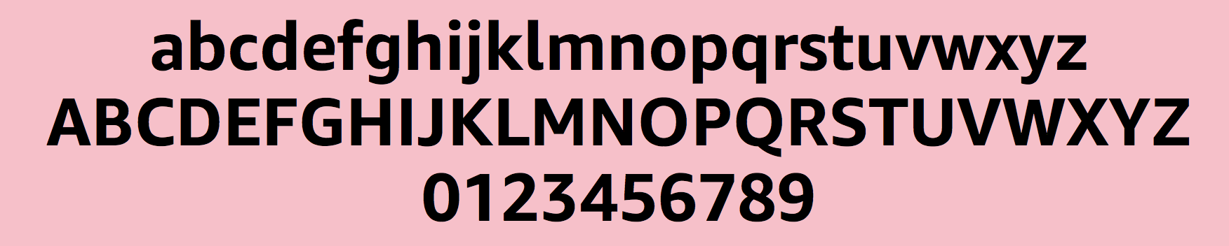
file name: Dalton Maag Amazon Ember Bold 2015
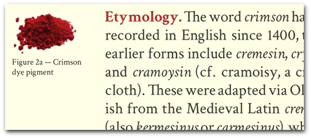
file name: Sebastian Kosch Crimson Text 2010
file name: Sebastian Kosch Crimson Text 2010b
file name: Sebastian Kosch Crimson Text 2010c
file name: Barrington Stoke Font 2020
file name: Barrington Stoke Font 2020
file name: Barrington Stoke Font 2020
| | |
|
Luc Devroye ⦿ School of Computer Science ⦿ McGill University Montreal, Canada H3A 2K6 ⦿ lucdevroye@gmail.com ⦿ https://luc.devroye.org ⦿ https://luc.devroye.org/fonts.html |