TYPE DESIGN INFORMATION PAGE last updated on Sat Jun 28 07:49:02 EDT 2025
FONT RECOGNITION VIA FONT MOOSE

|
|
|
|
The Lexend Project
[Bonnie Shaver-Troup]
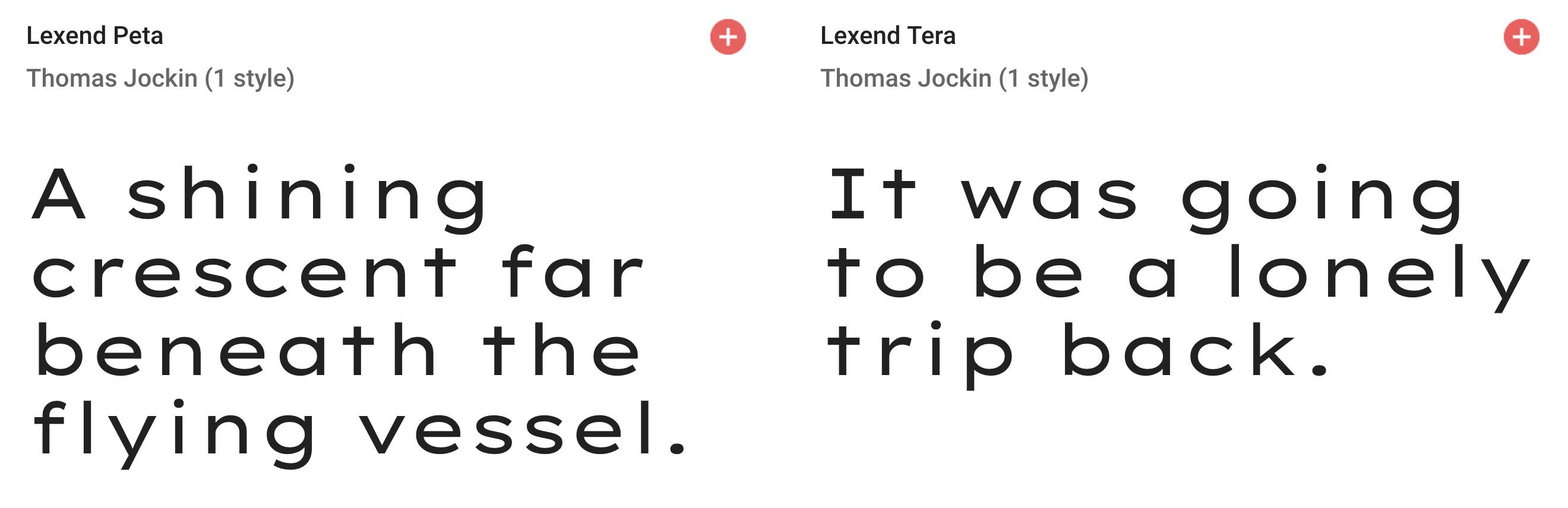
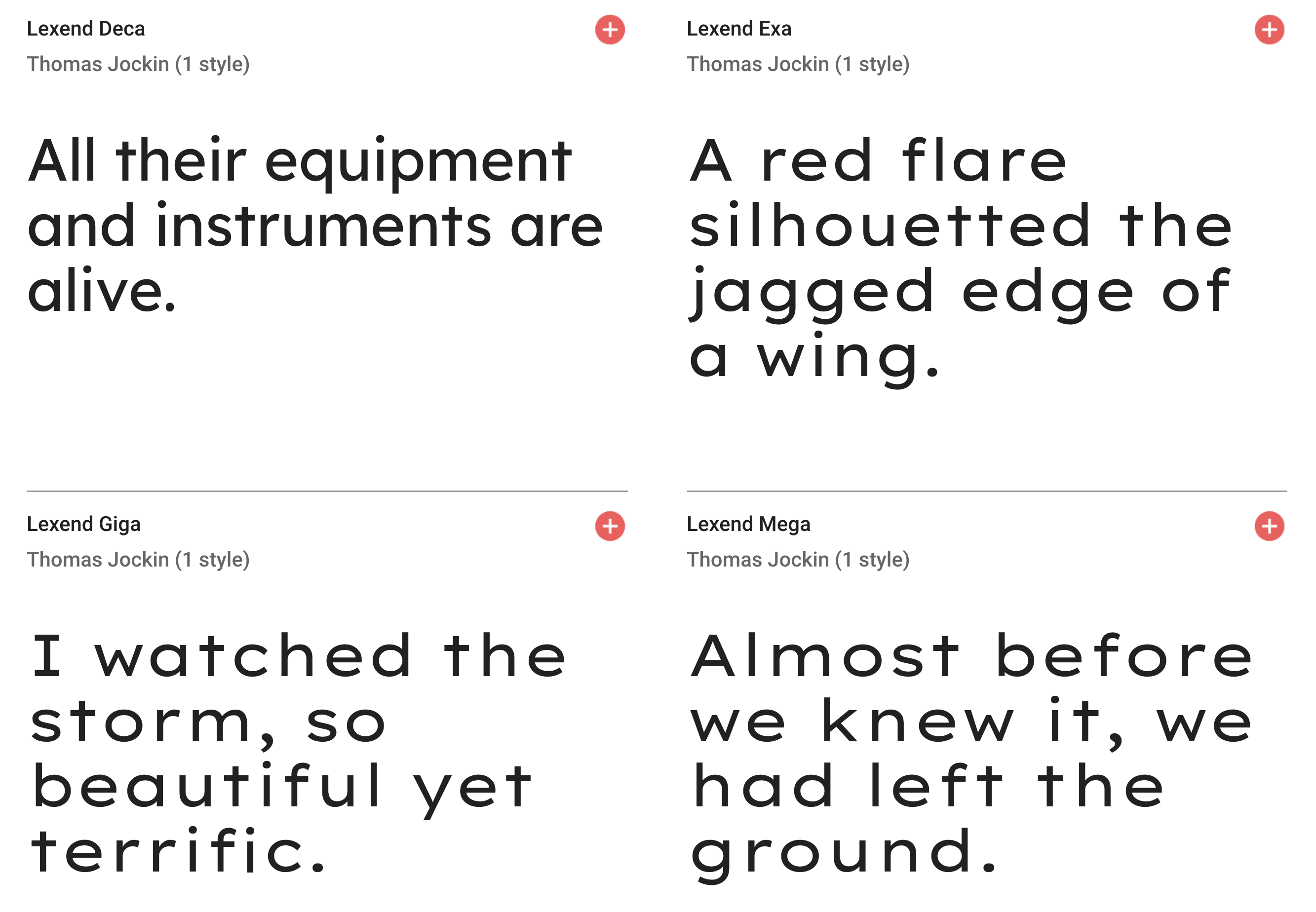
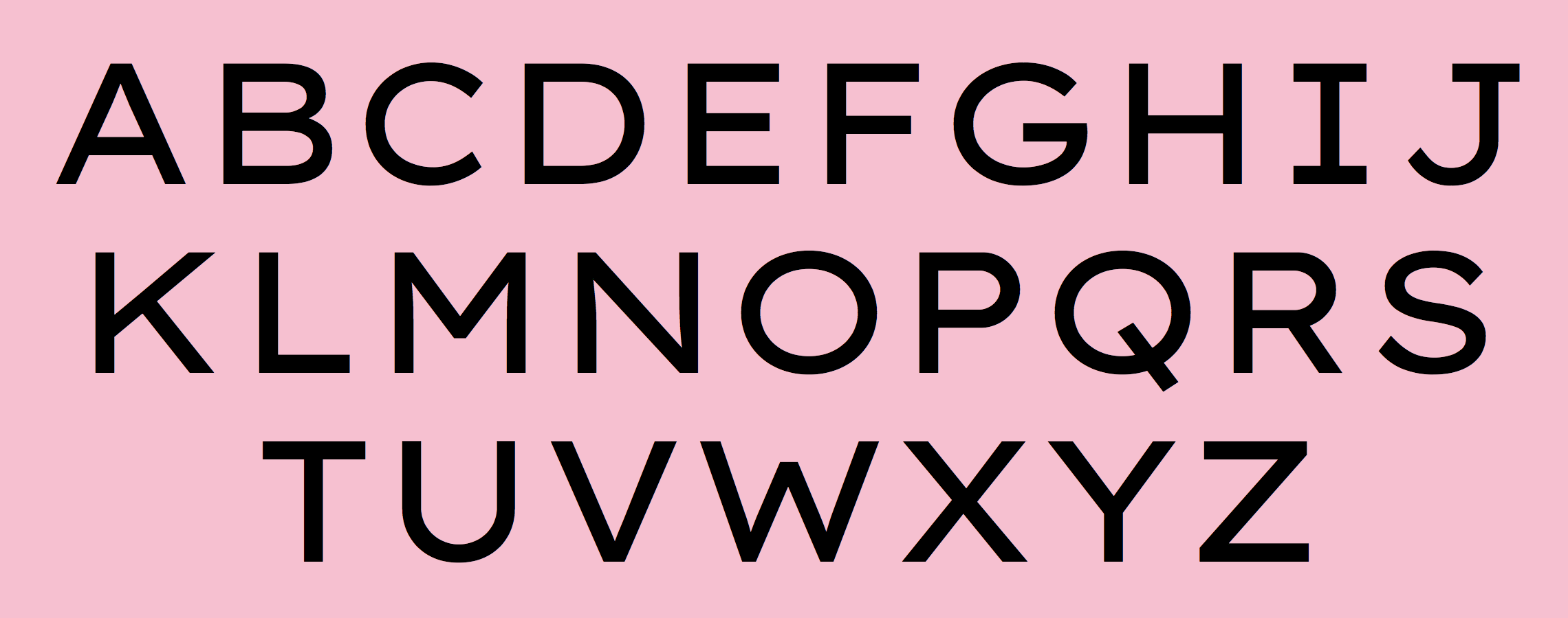
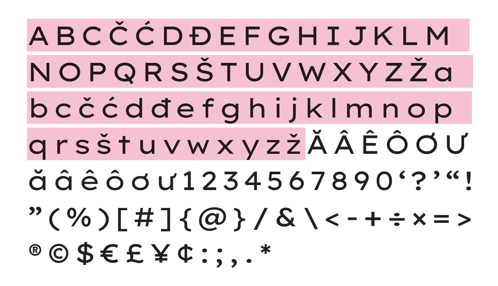
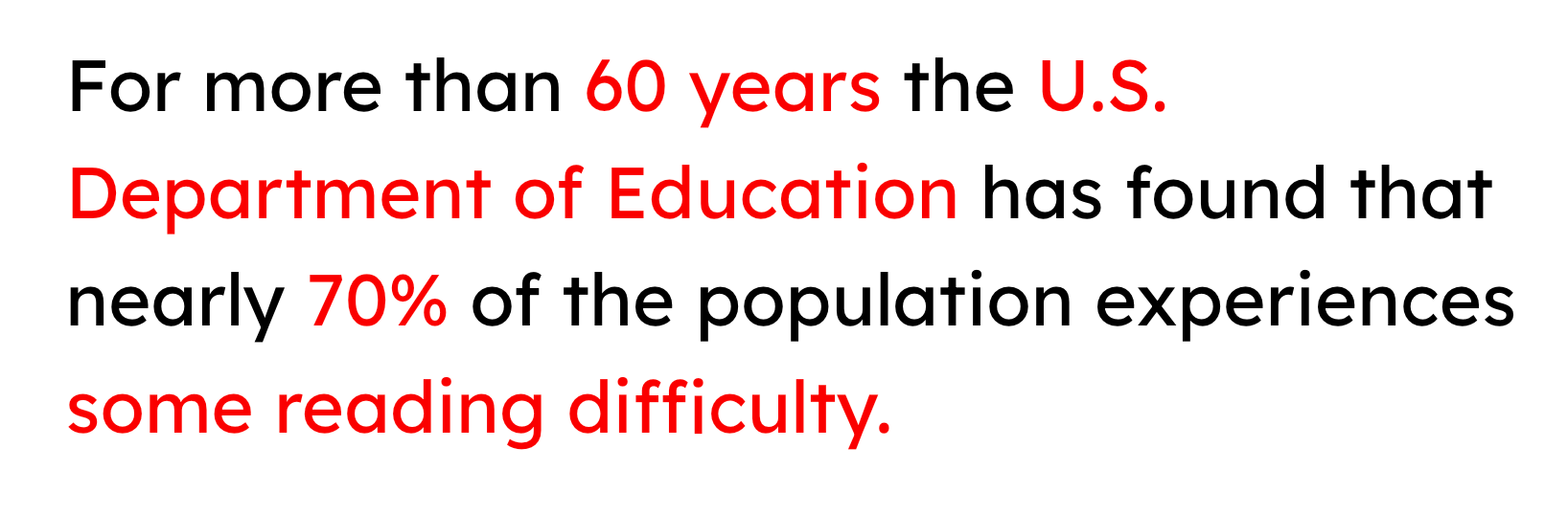
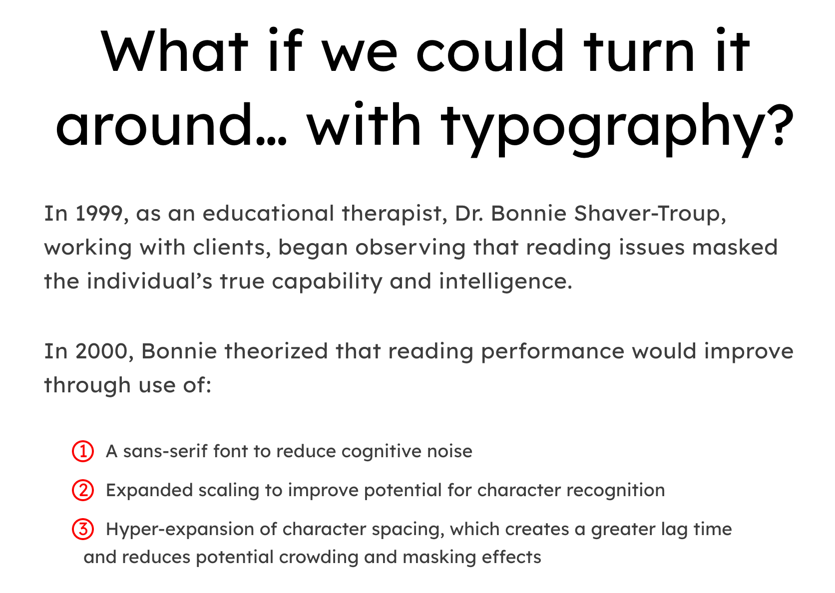
Bonnie Shaver-Troup, EdD, the creator of the Lexend project (which is based in Irvine, CA), is focused on making reading easier for everyone. As an educational therapist, Bonnie created the first Lexend typeface in early 2001 aiming to reduce visual stress and to improve reading performance for those with dyslexia and other struggling readers. Today, Bonnie's goal is to make the Lexend fonts accessible to a larger spectrum of users. Bonnie writes: Lexend is a variable typeface designed by Bonnie Shaver-Troup and Thomas Jockin in 2018. Applying the Shaver-Troup Individually Optimal Text Formation Factors, studies have found readers instantaneously improve their reading fluency. Lexend was expanded to Arabic in January 2020. The Shaver-Troup Formulation was applied to Arabic with advise from Arabic typeface designer, Nadine Chahine. Lexend is based on the Quicksand project from Andrew Paglinawan, initiated in 2008. Quicksand was improved in 2016 by Thomas Jockin for Google Fonts. Thomas modified Quicksand for the specialized task of improving reading fluency in low-proficiency readers (including those with dyslexia. In 2019, Thomas Jockin released the free seven font family Lexend (Deca, Exa, Giga, Mega, Peta, Tera and Zetta) at Google Fonts, together with Bonnie Shaver-Troup. Github link. Dedicated site. Thomas Jockin writes that Lexend is empirically shown to significantly improve reading-proficiency. As prescription eyeglasses achieve proficiency for persons with short-sightedness, Lexend's families were developed using Shaver-Troup Formulations. We will eventually release all seven families as a single variable font featuring its own custom axis. Lexend is thus an implementation of Bonnie Shaver-Troup's 2000 study, in which she theorized that reading performance would improve through the use of (1) hyper expansion of character spacing [which creates a greater lag time and reduces potential crowding and masking effects], (2) expanded scaling, and (3) a sans-serif font [to reduce noise]. Lexend is indeed hyper-widely spaced. |
EXTERNAL LINKS |
| | |

file name: Thomas Jockin Lexend Mega 2019
file name: Thomas Jockin Lexend Mega 2019
file name: Thomas Jockin Lexend Mega 2019
file name: Thomas Jockin Lexend Mega 2019

file name: Bonnie Shaver Troup Thomas Jockin Lexend 2019 2021
file name: Bonnie Shaver Troup Thomas Jockin Lexend 2019 2021
file name: Bonnie Shaver Troup Thomas Jockin Lexend 2019 2021
file name: Bonnie Shaver Troup Thomas Jockin Lexend Semi Bold 2019 2021

file name: Bonnie Shaver Troup Pic
| | |
|
Luc Devroye ⦿ School of Computer Science ⦿ McGill University Montreal, Canada H3A 2K6 ⦿ lucdevroye@gmail.com ⦿ https://luc.devroye.org ⦿ https://luc.devroye.org/fonts.html |