TYPE DESIGN INFORMATION PAGE last updated on Mon Apr 15 06:54:26 EDT 2024
FONT RECOGNITION VIA FONT MOOSE

|
|
|
|
Fred Shallcrass
Type designer active at New York-based Frere-Jones Type, who grew up in New Zealand, designing magazines, lettering and type for cultural and commercial clients. His typefaces:
|
EXTERNAL LINKS |
| | |

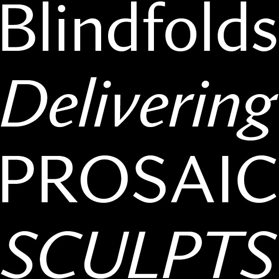
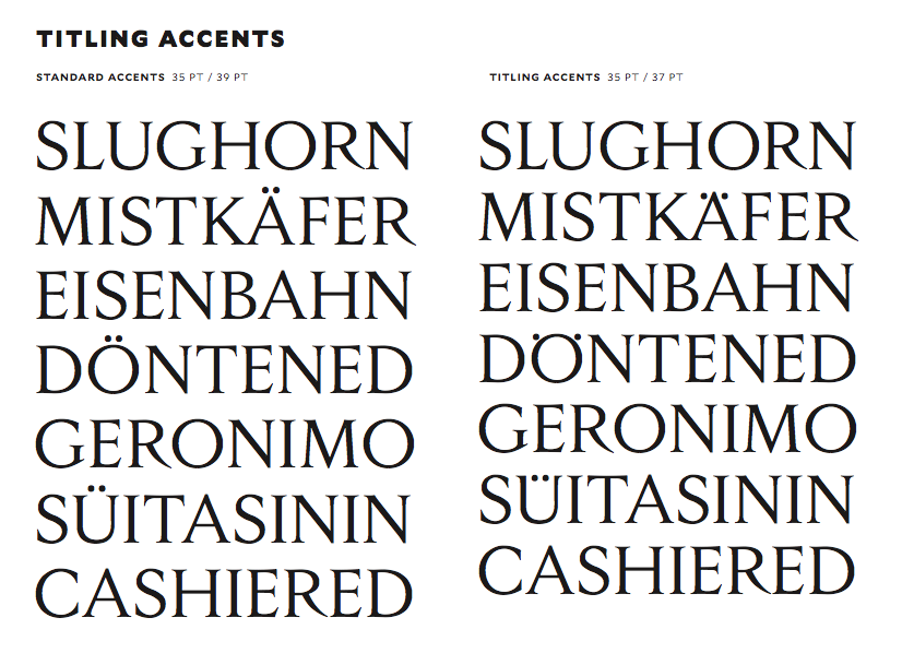
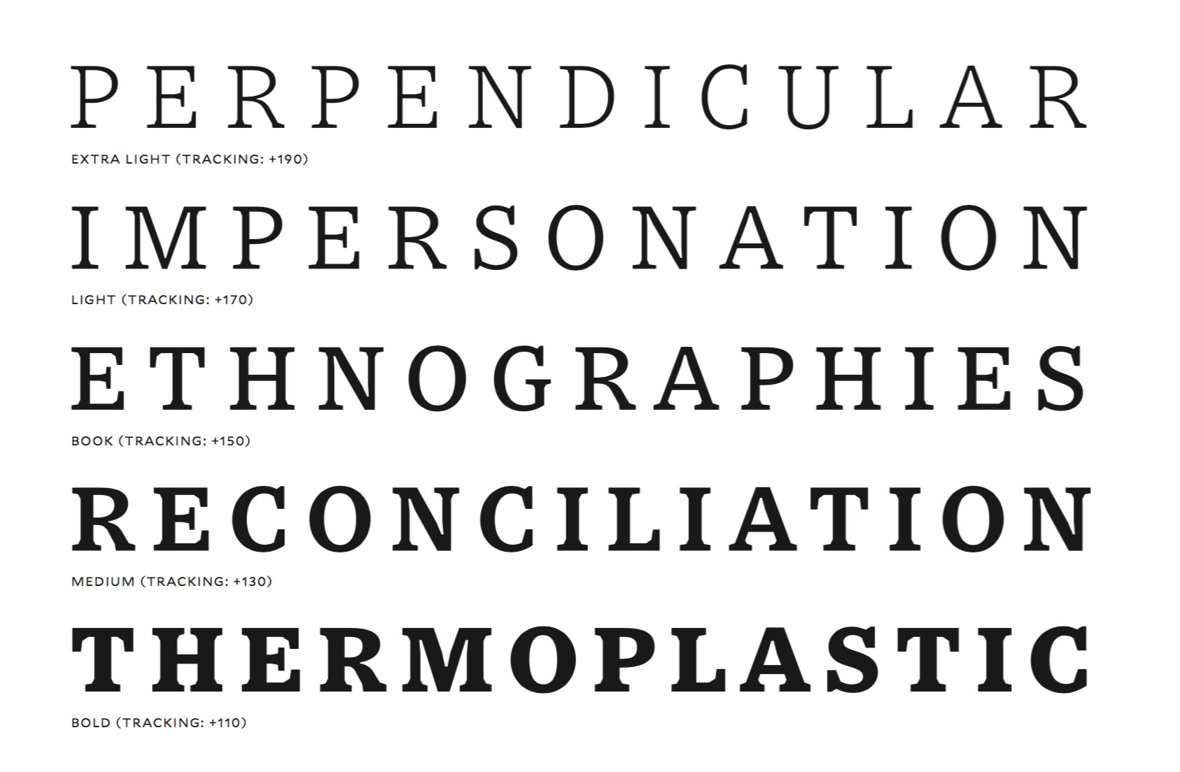
file name: Tobias Frere Jones Nina Stoessinger Fred Shallcrass Seaford 2021

file name: Tobias Frere Jones Nina Stoessinger Fred Shallcrass Seaford 2021
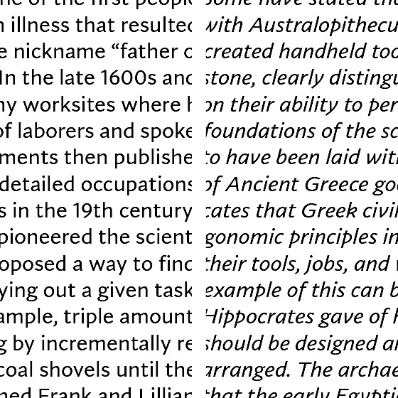
file name: Tobias Frere Jones Nina Stoessinger Fred Shallcrass Seaford 2021
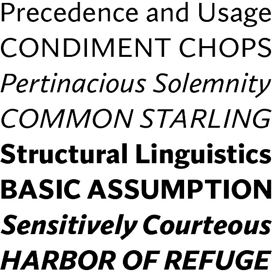
file name: Tobias Frere Jones Nina Stoessinger Fred Shallcrass Seaford 2021
file name: Tobias Frere Jones Nina Stoessinger Fred Shallcrass Seaford 2021
file name: Microsoft Corporation Seaford Bold 2020
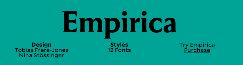
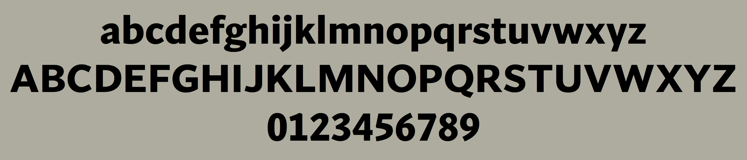
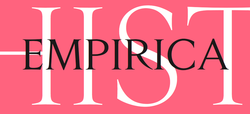
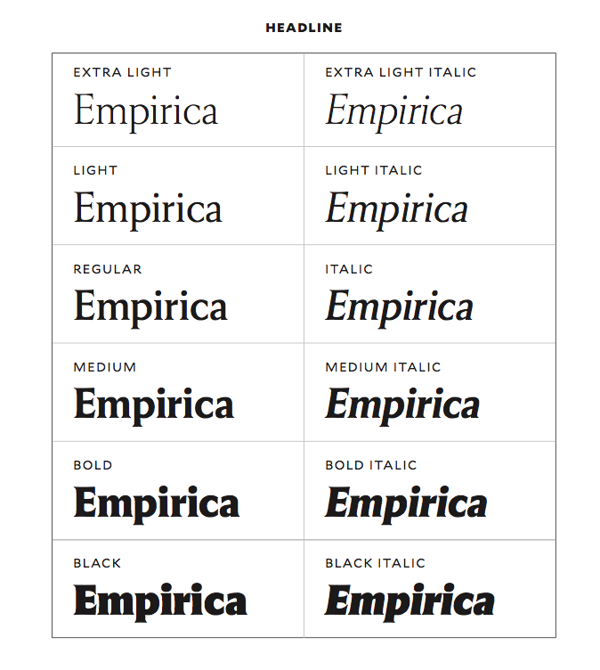
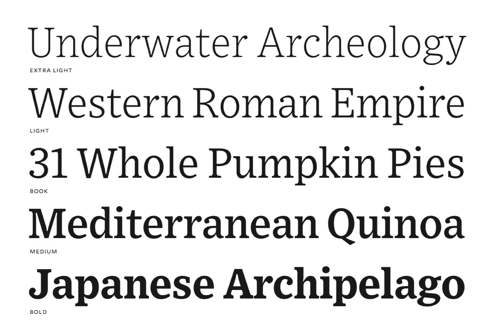
file name: Tobias Frere Jones Nina Stossinger Empirica 2018
file name: Tobias Frere Jones Nina Stossinger Empirica 2018b
file name: Tobias Frere Jones Nina Stossinger Empirica 2018c
file name: Tobias Frere Jones Nina Stossinger Empirica 2018d
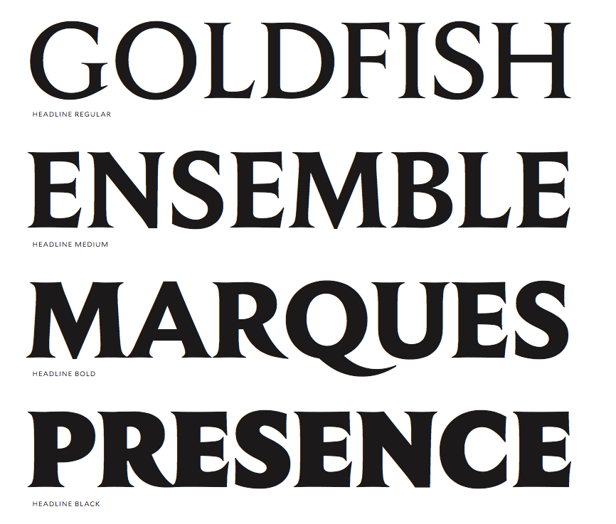
file name: Tobias Frere Jones Nina Stossinger Empirica 2018e

file name: Tobias Frere Jones Nina Stossinger Empirica 2018f
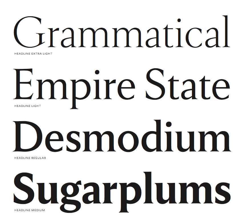
file name: Tobias Frere Jones Nina Stossinger Empirica 2018g
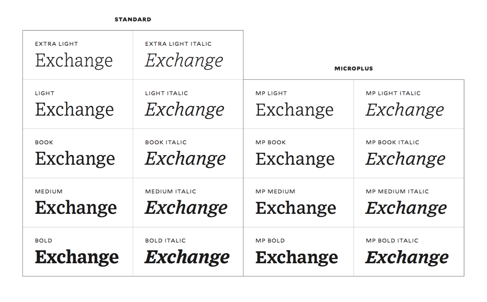
file name: Tobias Frere Jones Exchange 2017
file name: Tobias Frere Jones Exchange 2017
file name: Tobias Frere Jones Exchange 2017
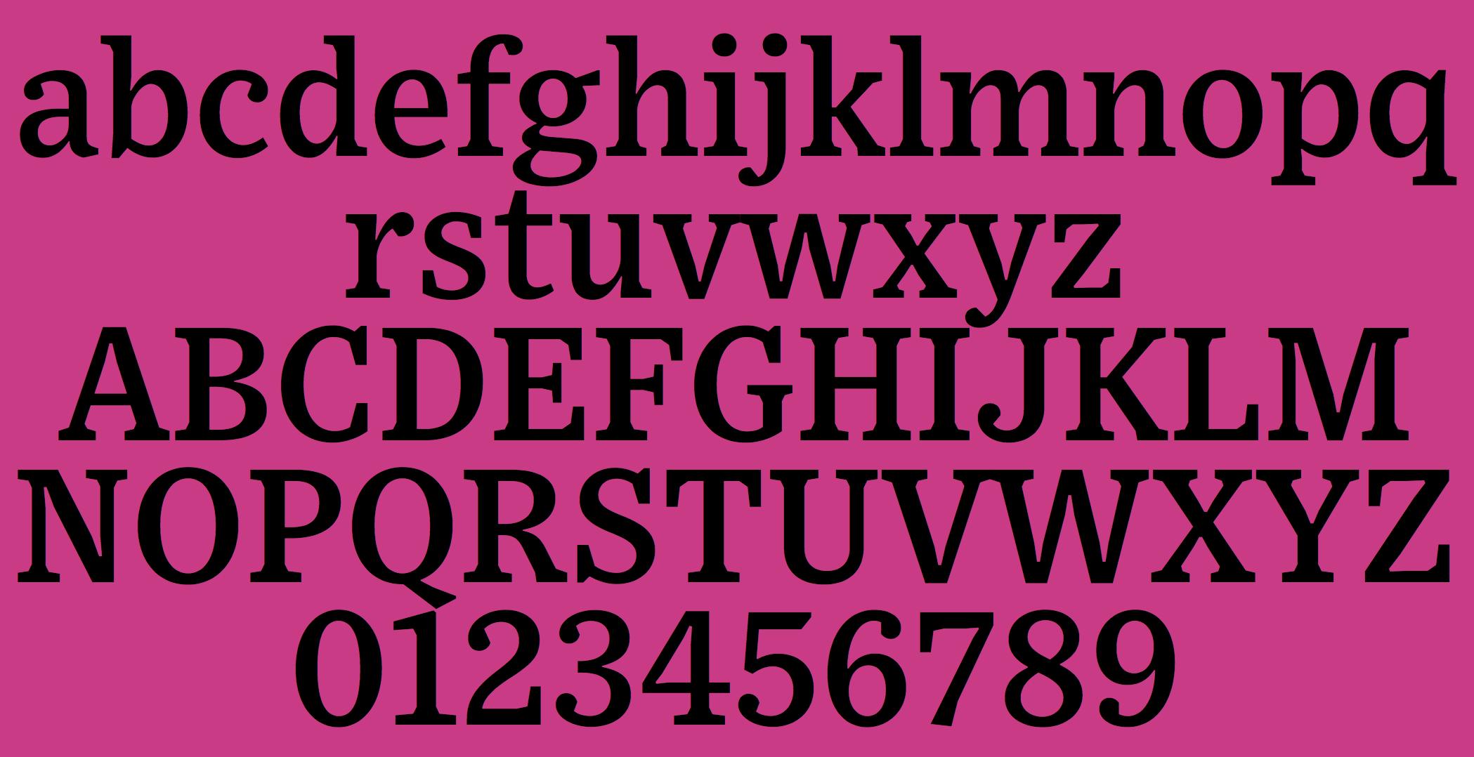
file name: Tobias Frere Jones Exchange 2017
| | |
|
Luc Devroye ⦿ School of Computer Science ⦿ McGill University Montreal, Canada H3A 2K6 ⦿ lucdevroye@gmail.com ⦿ http://luc.devroye.org ⦿ http://luc.devroye.org/fonts.html |