TYPE DESIGN INFORMATION PAGE last updated on Thu Jul 16 07:13:16 EDT 2026
FONT RECOGNITION VIA FONT MOOSE

|
|
|
|
Charles Mazé
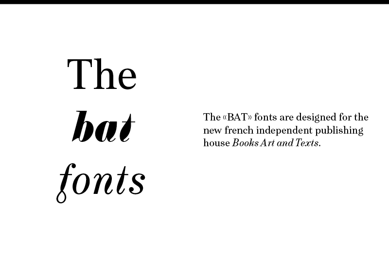
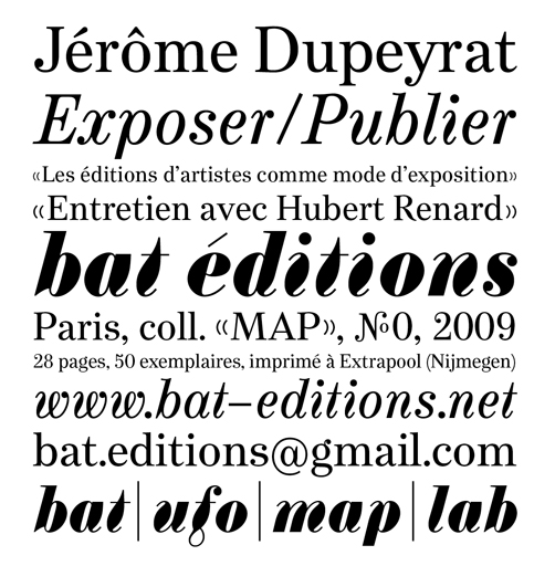
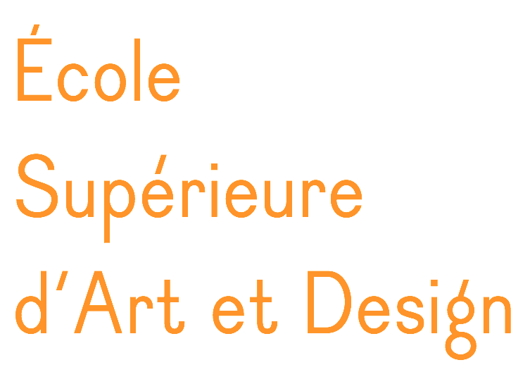
Charles Mazé is a graduate of the Type and Media program at KABK, 2009. There, he designed a didone typeface (Bat Font) that has more warmth than classical didones in the hope of making scientific texts set in modern typefaces less boring. He did this by fattening up the italics. After graduation he moved to Brussels but now he is back in Paris. In 2009, he started a revival of Mercator, a sanserif typeface by Dick Dooijes and G. W. Ovink designed in 1959 at the Amsterdam Type Foundry. He set up Cataloged in Brussels with Coline Sunier. In 2012, Stéphanie Vilayphiou, Alexandre Leray, Coline Sunier and Charles Mazé co-designed the readable typeface Dauphine Regular, which can be downloaded from Github and Open Font Library. See it in action on the web site of ESAD (Ecole Supérieure d'Art et de Design). Dauphine is a sans-serif font inspired by lettering in late 19th and early 20th century maps. Github link for Dauphine. He works with Coline Sunier since 2009. They were fellows at the French Academy in Rome's Villa Medici in 2014 and 2015, and are now graphic designers in residency at Contemporary Art Center CAC Brétigny. Charles is part of the teaching staff of Atelier National de Recherche Typographique (ANRT) in Nancy, France. At Abyme, he published two typefaces:
|
EXTERNAL LINKS |
| | |


file name: Charles Maze Mercure 2021

file name: Charles Maze Mercure 2021

file name: Charles Maze Mercure 2021

file name: Charles Maze Mercure 2021

file name: Charles Maze Mercure 2021

file name: Charles Maze Bat Fonts 2 2009
file name: Charles Maze Bat Fonts 2009
file name: Charles Maze B A T 2009

file name: Mercator Tetterode specimen p77 6390
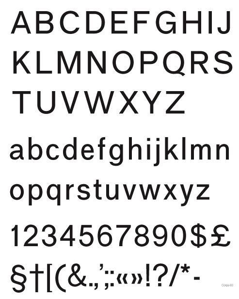
file name: Charles Maze Mercator 2009
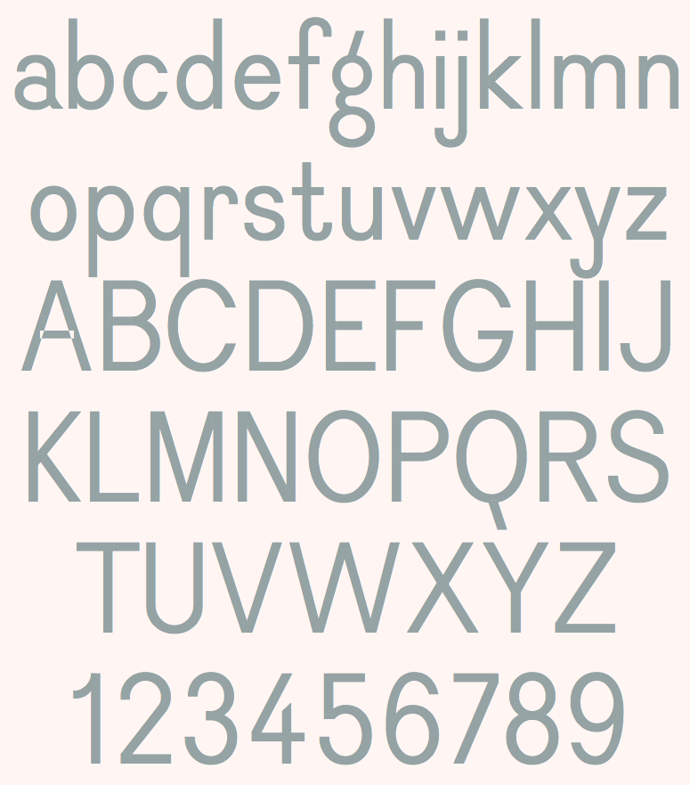
file name: Stephanie Vilayphiou Alexandre Leray Coline Sunier Charles Maze Dauphine Regular 2012
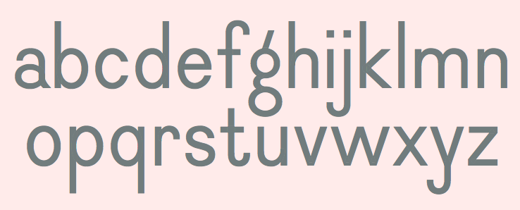
file name: Stephanie Vilayphiou Alexandre Leray Coline Sunier Charles Maze Dauphine Regular 2012a
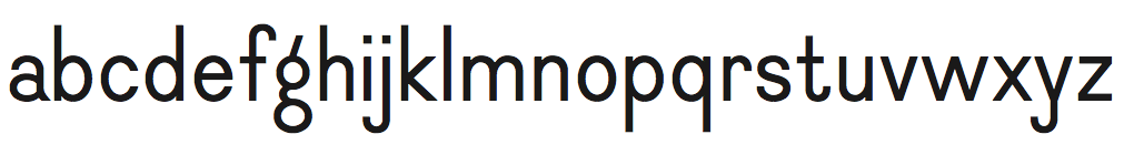
file name: Stephanie Vilayphiou Alexandre Leray Coline Sunier Charles Maze Dauphine Regular 2012f

file name: Stephanie Vilayphiou Alexandre Leray Coline Sunier Charles Maze Dauphine Regular 2012g
file name: Stephanie Vilayphiou Alexandre Leray Coline Sunier Charles Maze Dauphine Regular 2012b

file name: Stephanie Vilayphiou Alexandre Leray Coline Sunier Charles Maze Dauphine Regular 2012c

file name: Charles Maze Berthe 2020

file name: Charles Maze Berthe 2020

file name: Charles Maze Berthe 2020

file name: Charles Maze Berthe 2020
| | |
|
Luc Devroye ⦿ School of Computer Science ⦿ McGill University Montreal, Canada H3A 2K6 ⦿ lucdevroye@gmail.com ⦿ https://luc.devroye.org ⦿ https://luc.devroye.org/fonts.html |