TYPE DESIGN INFORMATION PAGE last updated on Thu Apr 16 22:25:08 EDT 2026
FONT RECOGNITION VIA FONT MOOSE

|
|
|
|
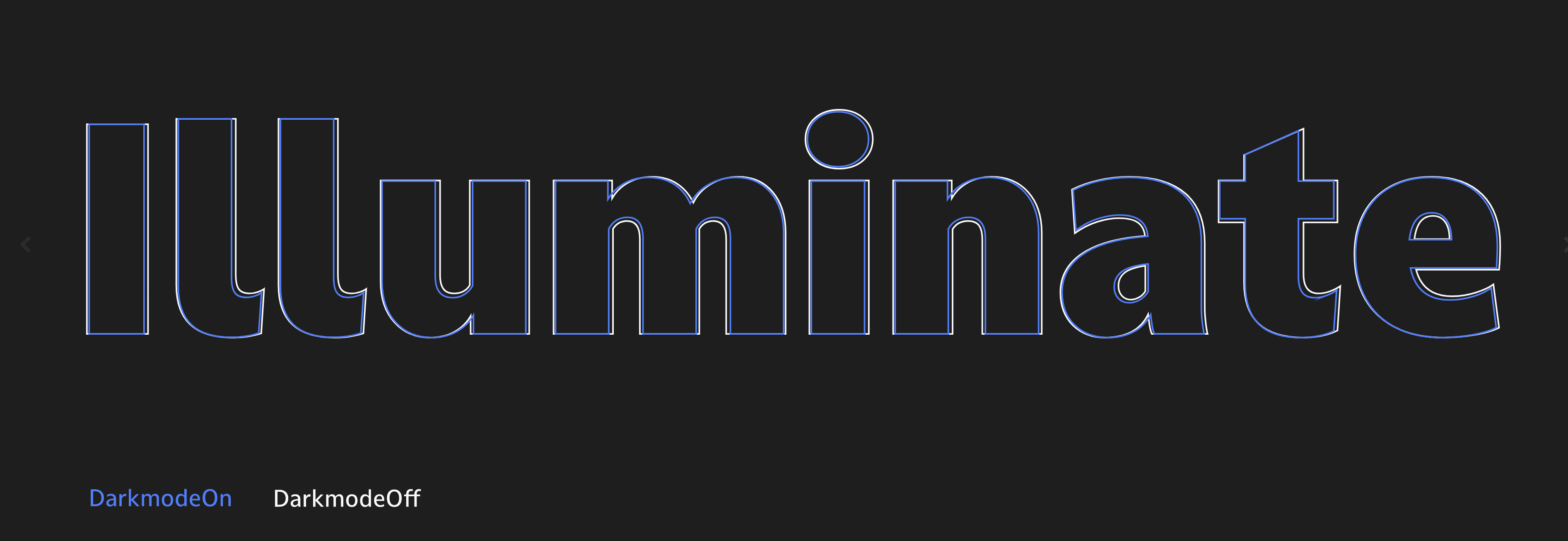
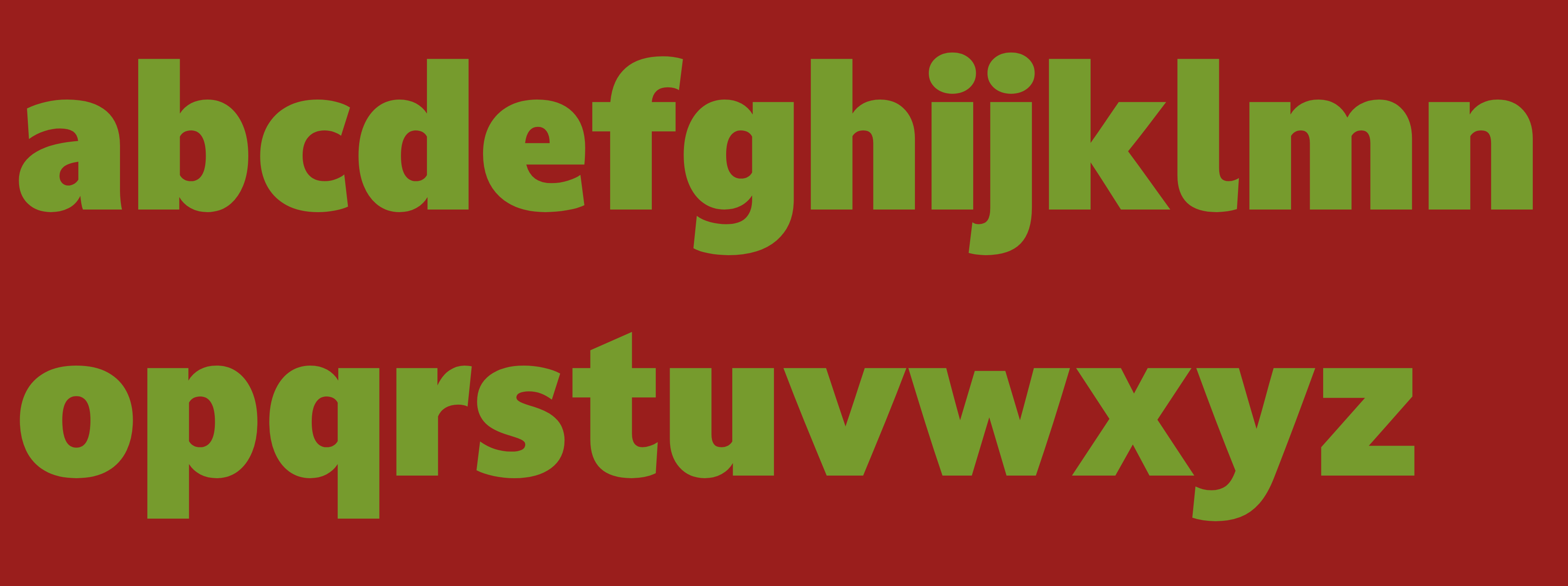
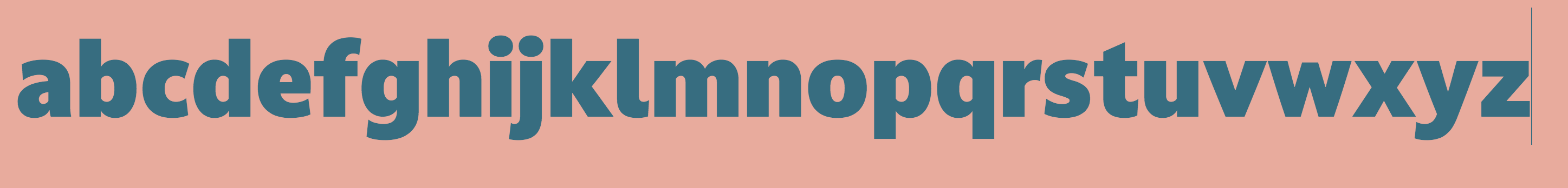
Darkmode
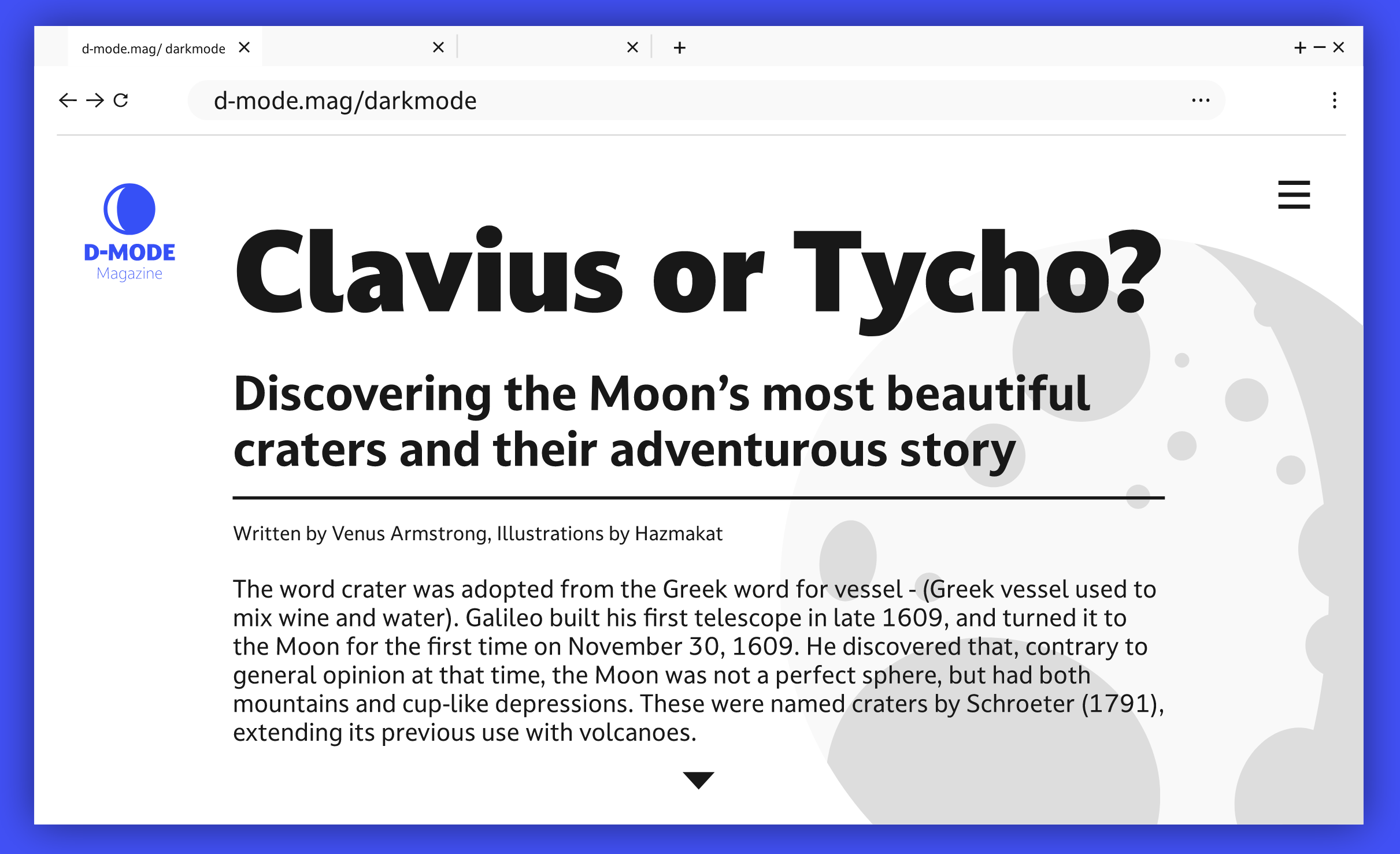
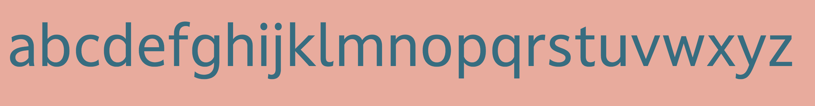
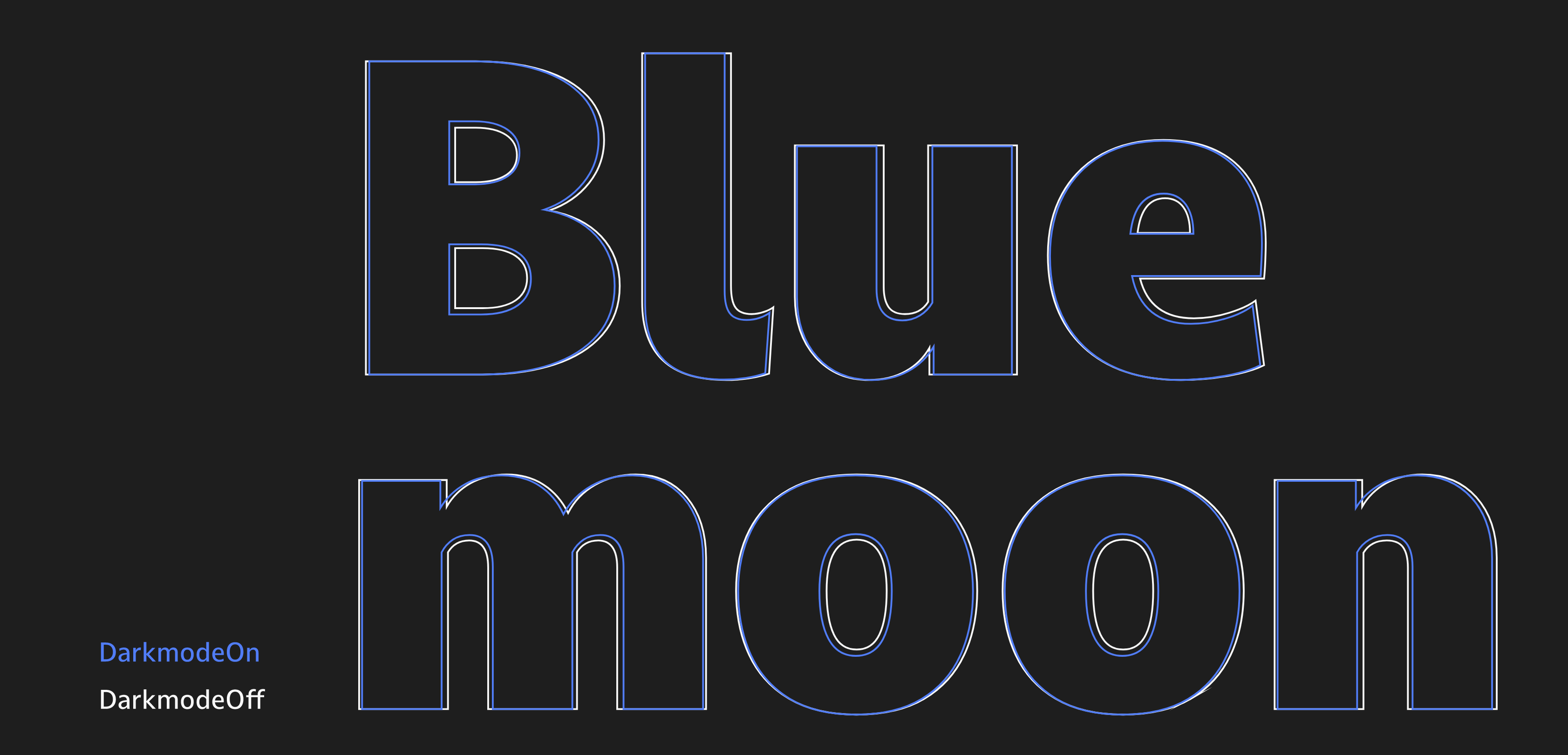
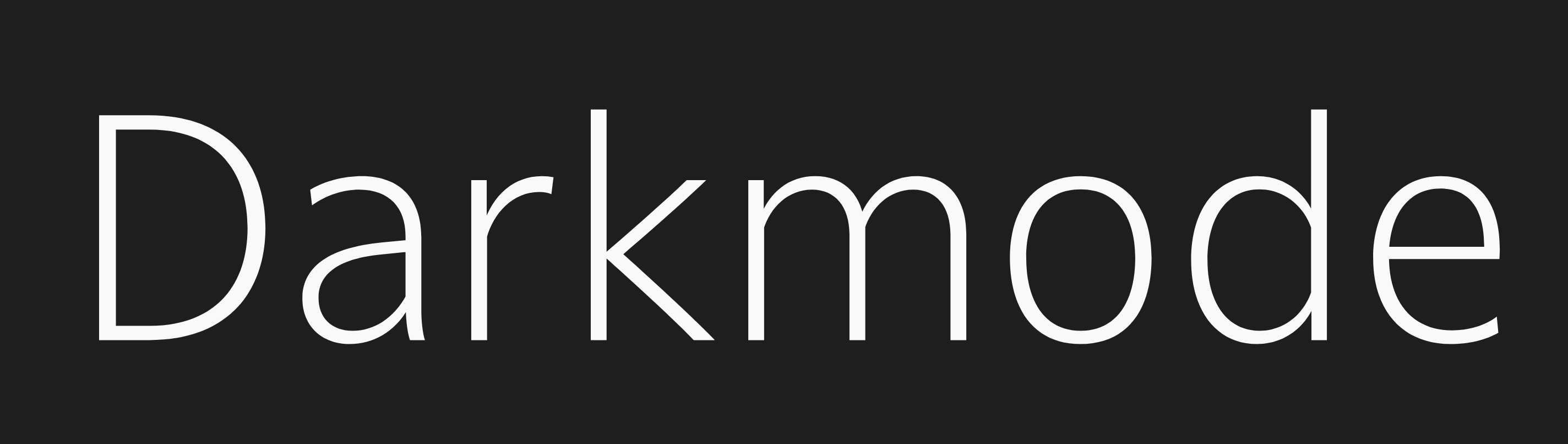
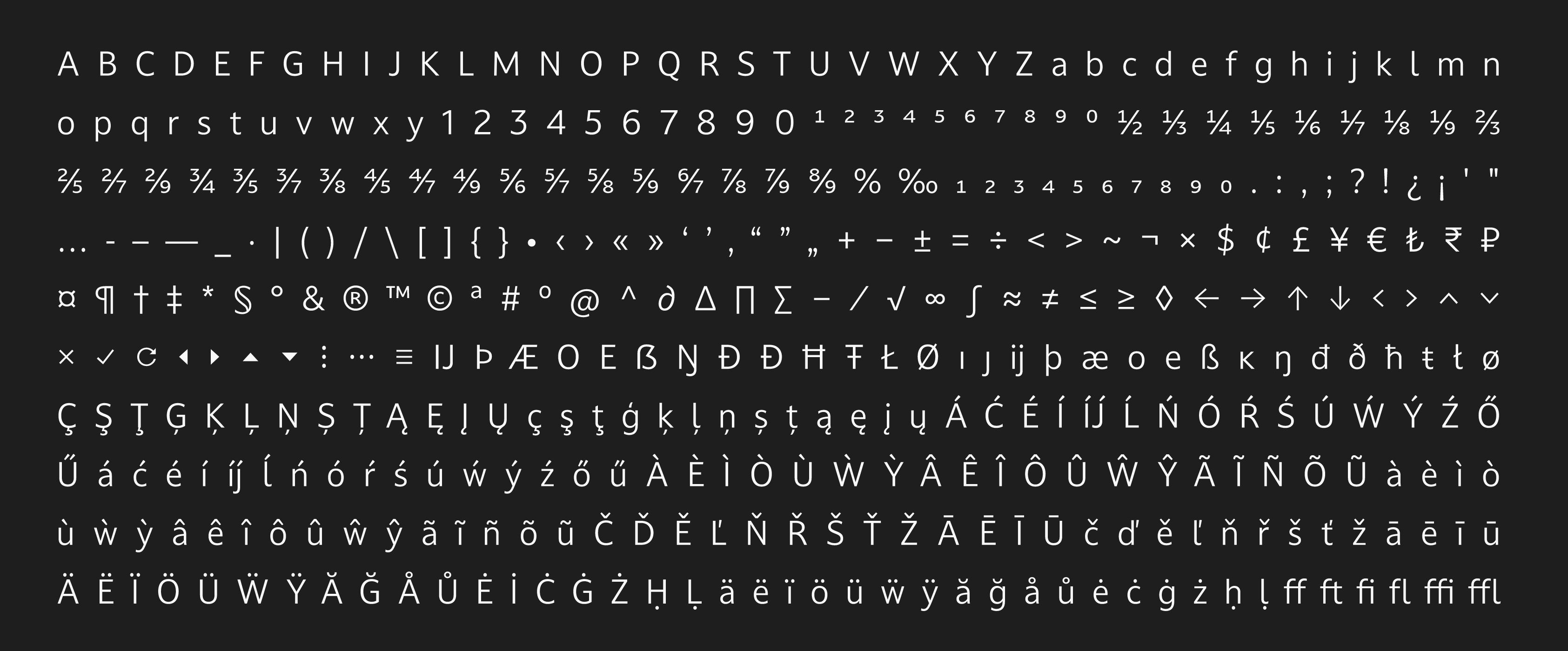
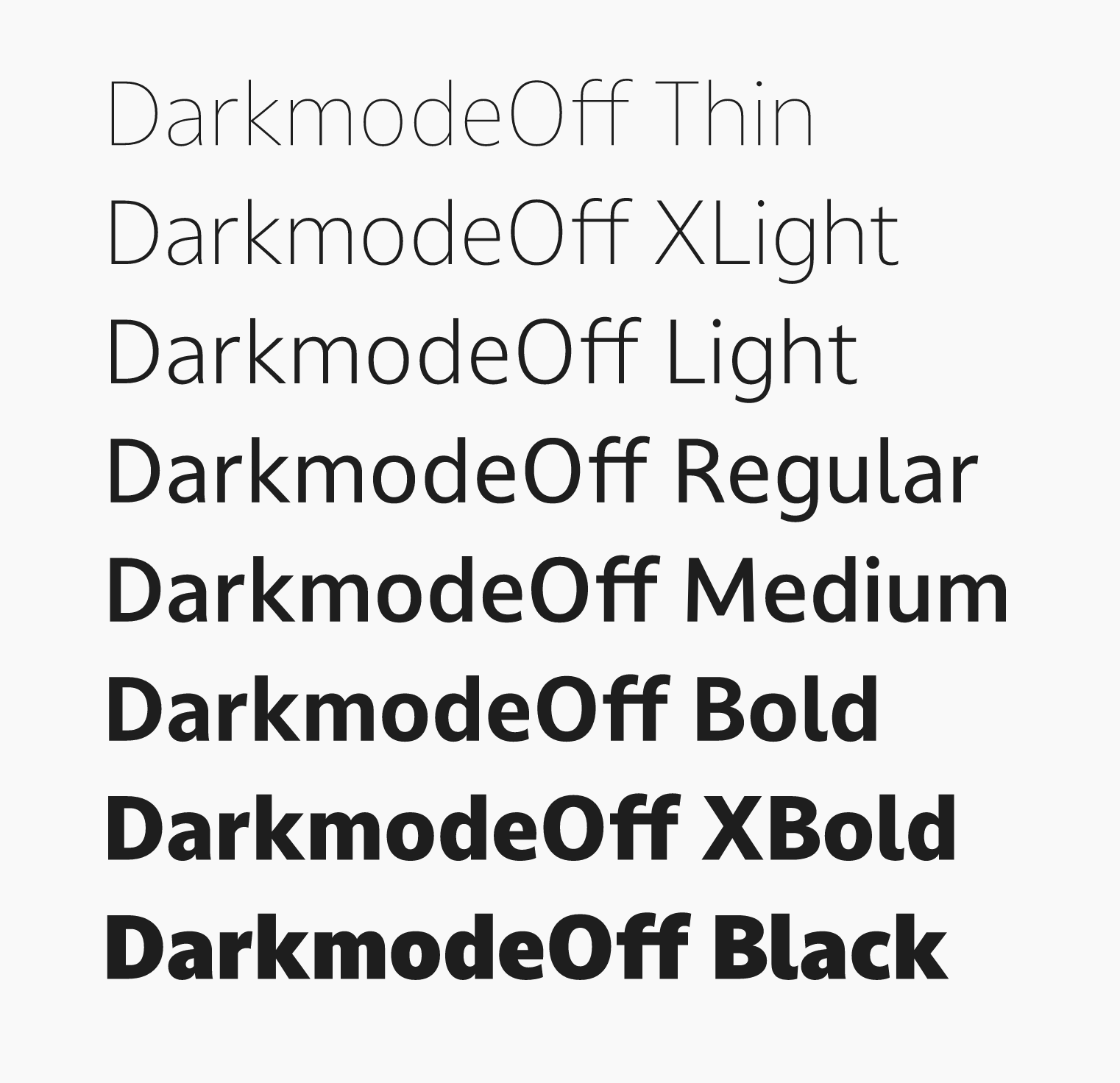
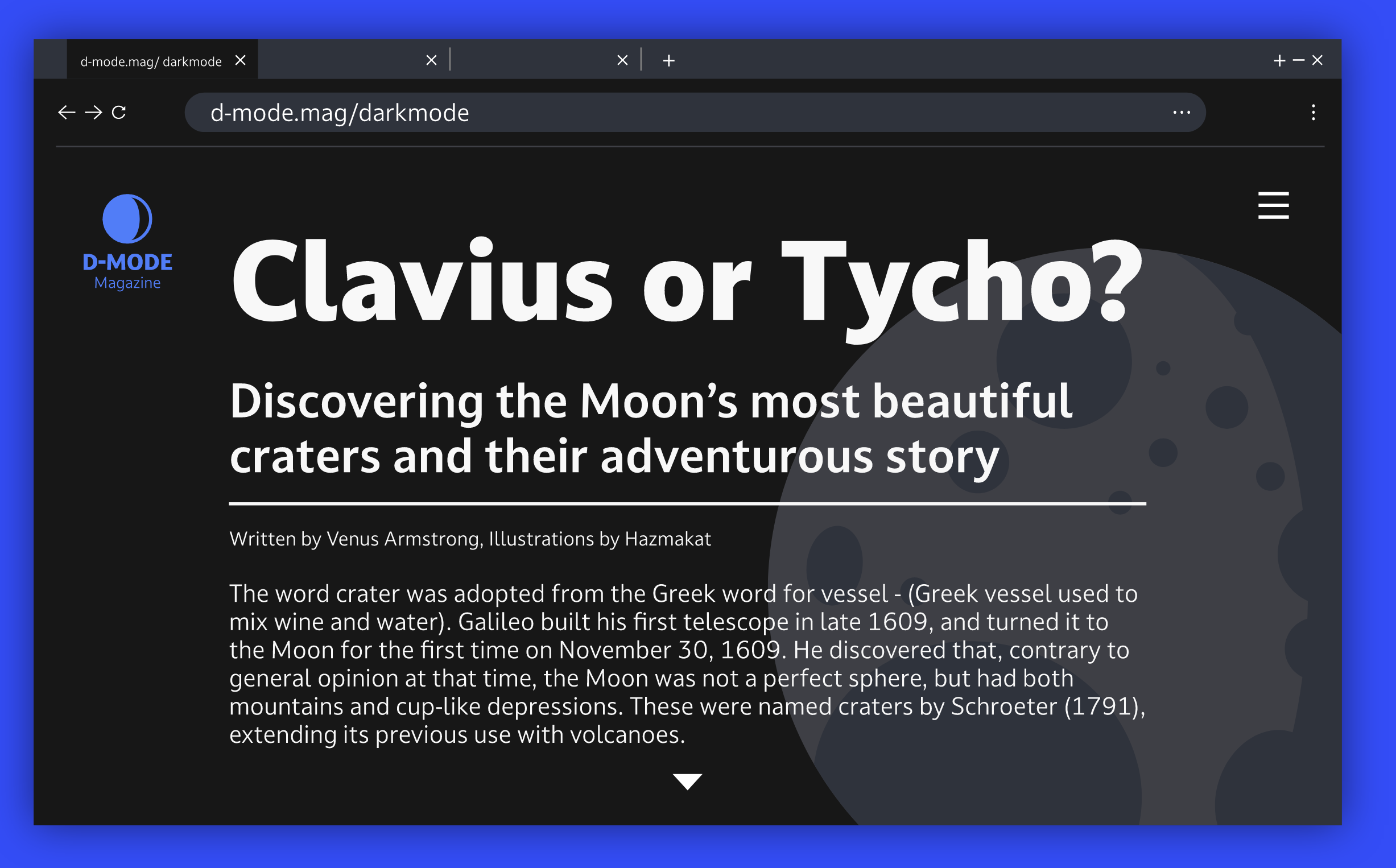
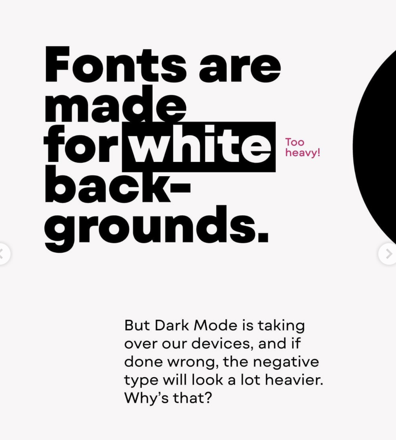
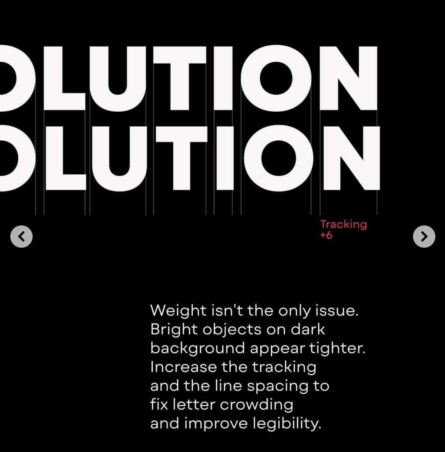
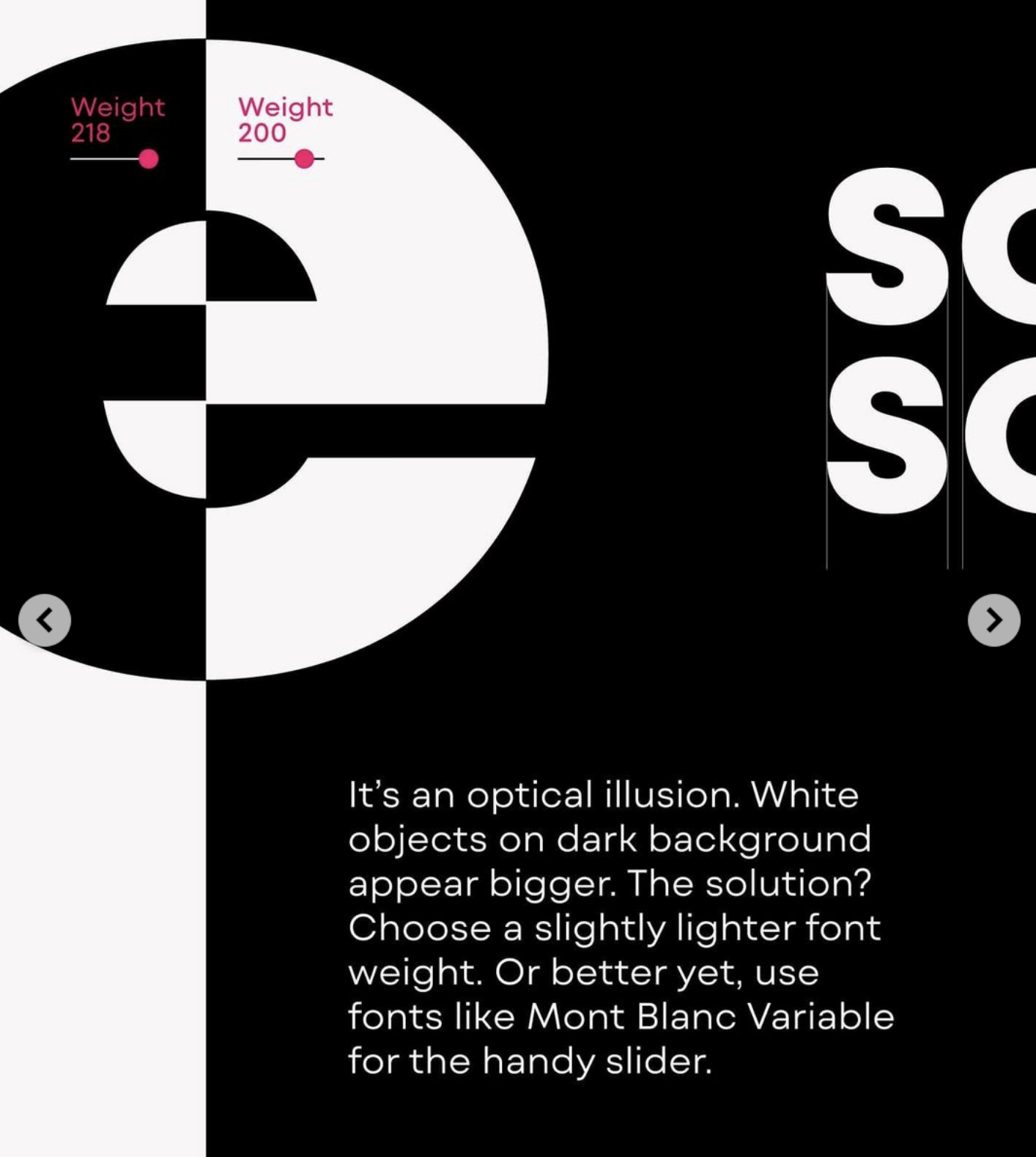
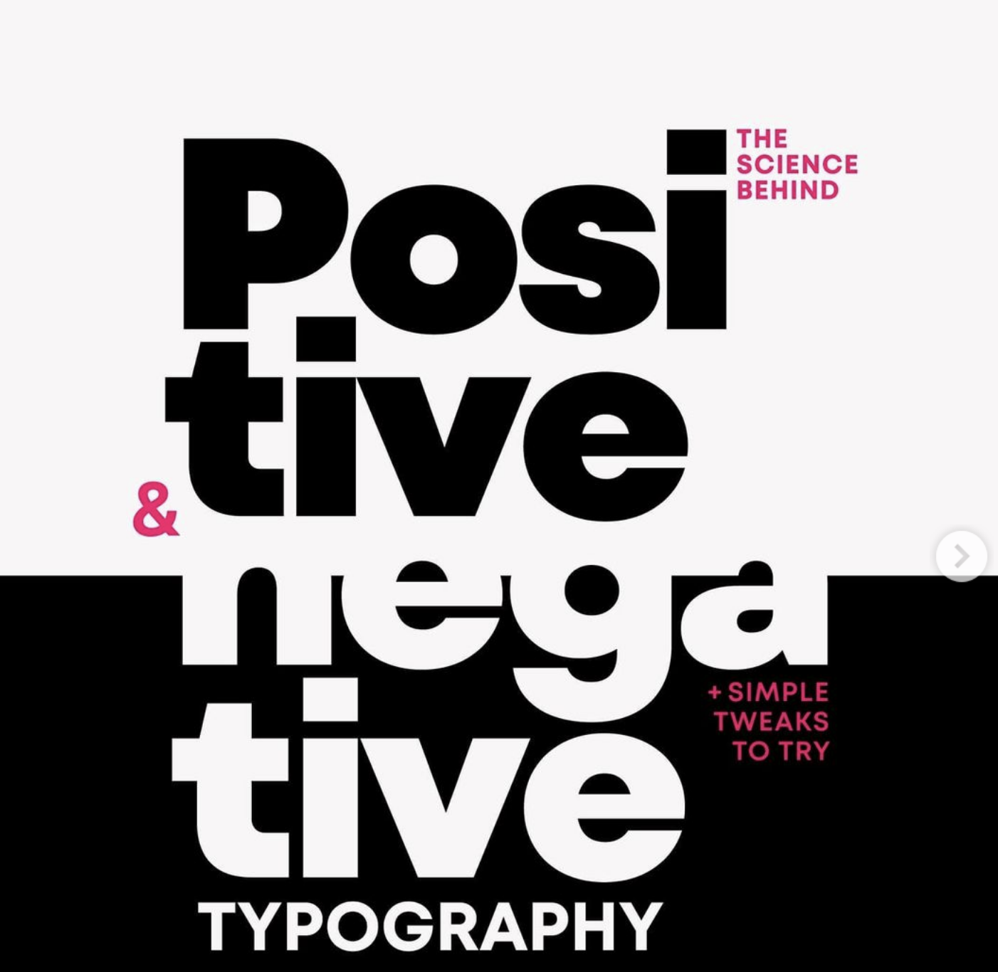
Darkmode refers to white type on black background. It is generally understood that for white type on dark printed matter should be bolder (than its black on white counterpart), while white text on a black screen should be thinner as the screen spews white in the reader's direction. Dalton Maag, in its presentation of its Darkmode typeface family writes: There are well-known optical and psychological effects in design which result in text presented white-on-black being perceived as larger and bolder than the same text presented black-on-white. This presents a challenge for consistent visual hierarchy on different backgrounds, especially when designing for emissive displays. Dalton Maag's Darkmode (2020-2021) is an adaptation of an earlier font by them, Stroudley, which was created for physical signage and wayfinding: Our [Dalton Maag's] aim for Darkmode was to translate Stroudley's fundamental characteristics of accessibility, readability, and legibility to on-screen reading, digital navigation, and electronic signage. Darkmode's open counters, tall x-height, humanist proportions, and clear and distinguishable characters all contribute to a comfortable reading experience, even at low resolutions or small sizes. The Darkmode family consists of eight static weights, ranging from Thin to Black, plus a variable font (VF) file, with both weight and darkmode [on/off] axes. Additional references include
|
EXTERNAL LINKS |
| | |

file name: Dalton Maag Darkmode 2021
file name: Dalton Maag Darkmode 2021
file name: Dalton Maag Darkmode 2021
file name: Dalton Maag Darkmode 2021
file name: Dalton Maag Darkmode 2021
file name: Dalton Maag Darkmode 2021
file name: Dalton Maag Darkmode 2021
file name: Dalton Maag Darkmode 2021
file name: Dalton Maag Darkmode 2021
file name: Dalton Maag Darkmode 2021

file name: Dalton Maag Darkmode 2021
file name: Dalton Maag Darkmode 2021
file name: Nikolay Petroussenko Darkmode Discussion 2021
file name: Nikolay Petroussenko Darkmode Discussion 2021
file name: Nikolay Petroussenko Darkmode Discussion 2021
file name: Nikolay Petroussenko Darkmode Discussion 2021
file name: Nikolay Petroussenko Darkmode Discussion 2021
file name: Nikolay Petroussenko Darkmode Discussion 2021
| | |
|
Luc Devroye ⦿ School of Computer Science ⦿ McGill University Montreal, Canada H3A 2K6 ⦿ lucdevroye@gmail.com ⦿ https://luc.devroye.org ⦿ https://luc.devroye.org/fonts.html |