TYPE DESIGN INFORMATION PAGE last updated on Sat Jul 20 15:05:34 EDT 2024
FONT RECOGNITION VIA FONT MOOSE

|
|
|
|
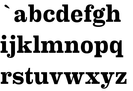
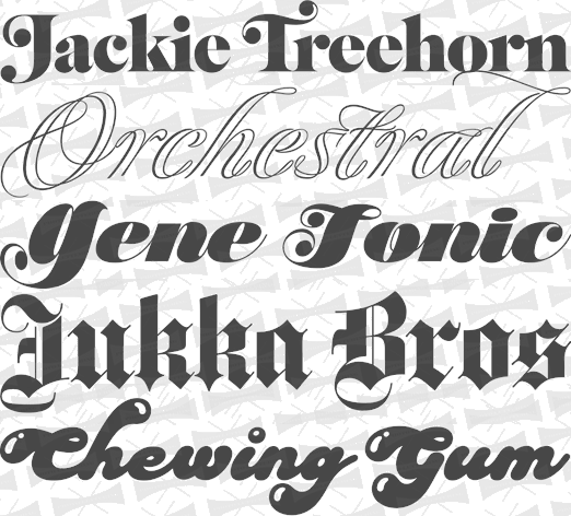
The New Clarendons in 2020--2021
A curated list published by "Proof&Co" in March 2021. They preface the list by writing that Clarendons are the cicadas of the type world---emerging every 20 years or so to have their day in the sun, then fade back into memory and myth. The types listed here are the stewards of the Clarendon legacy, incubating the genre for the time when they're called up to swarm and take over again.
|
EXTERNAL LINKS |
| | |


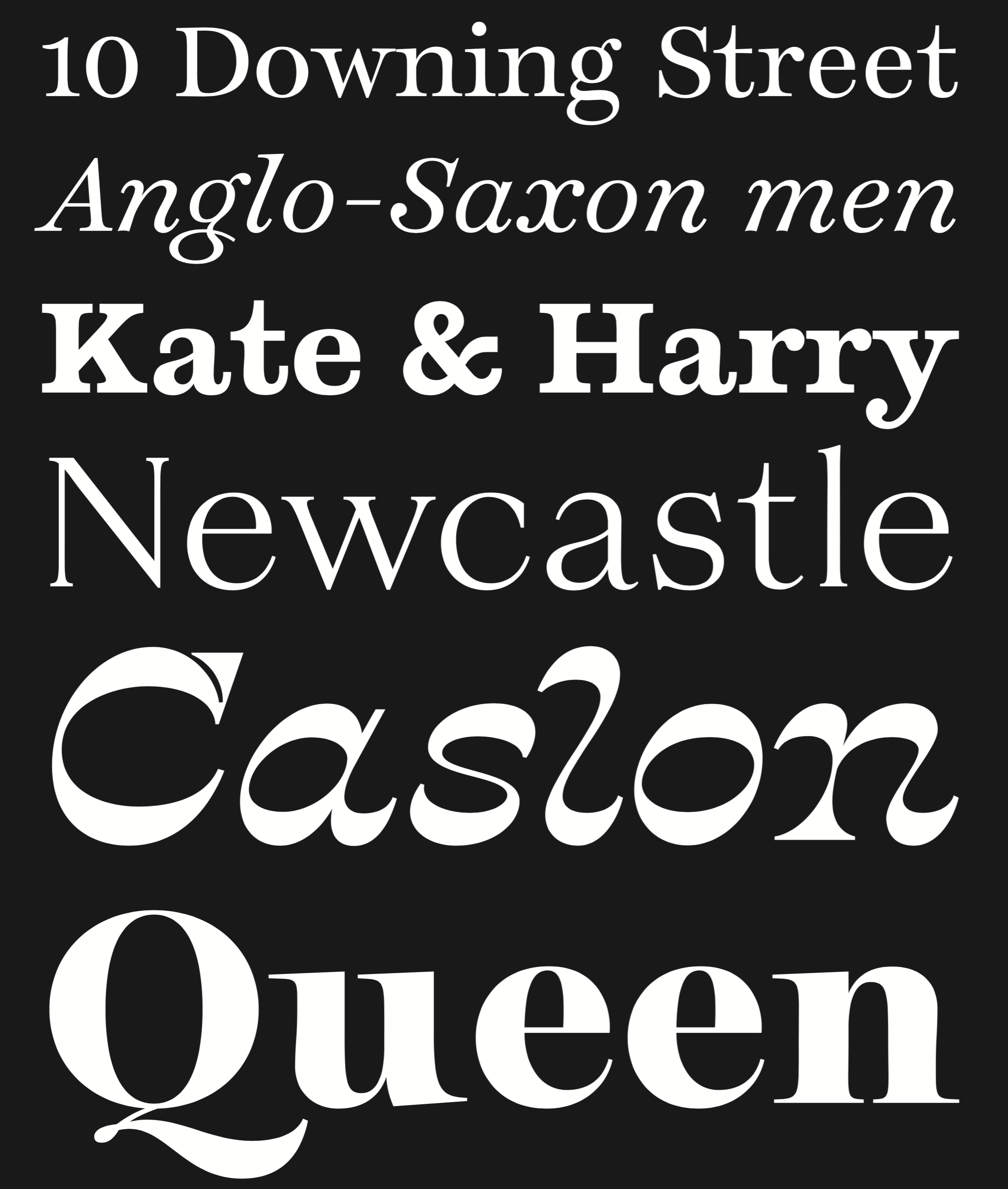
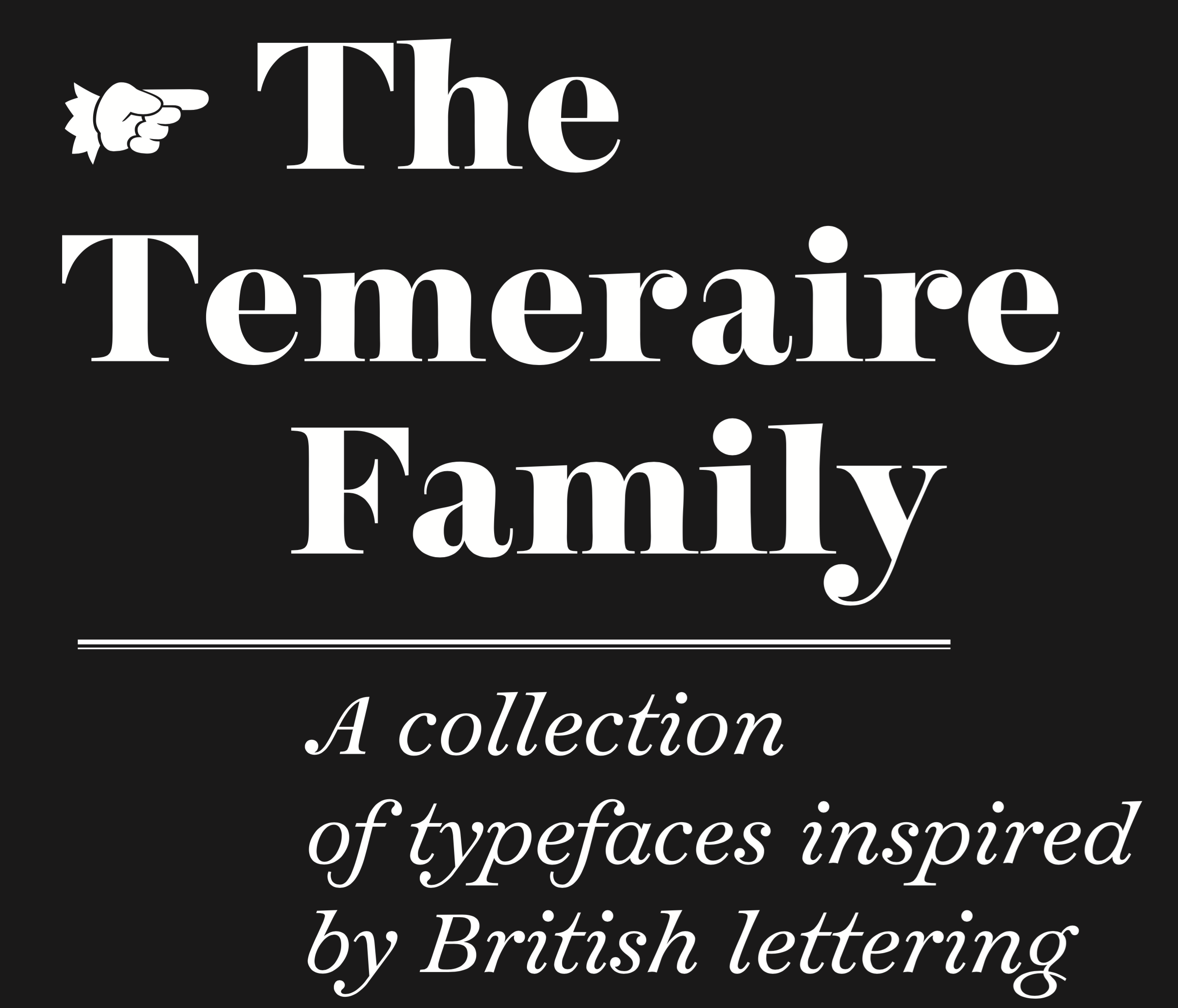
file name: Quentin Schmerber Temeraire 2016e
file name: Quentin Schmerber Temeraire 2016f
file name: Quentin Schmerber Temeraire 2016g
file name: Quentin Schmerber Temeraire 2016h

file name: Quentin Schmerber Temeraire 2016i

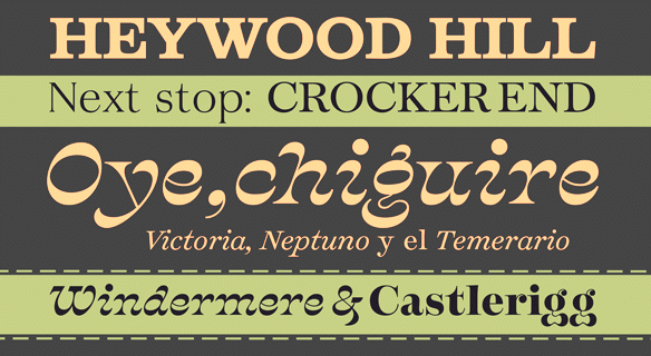
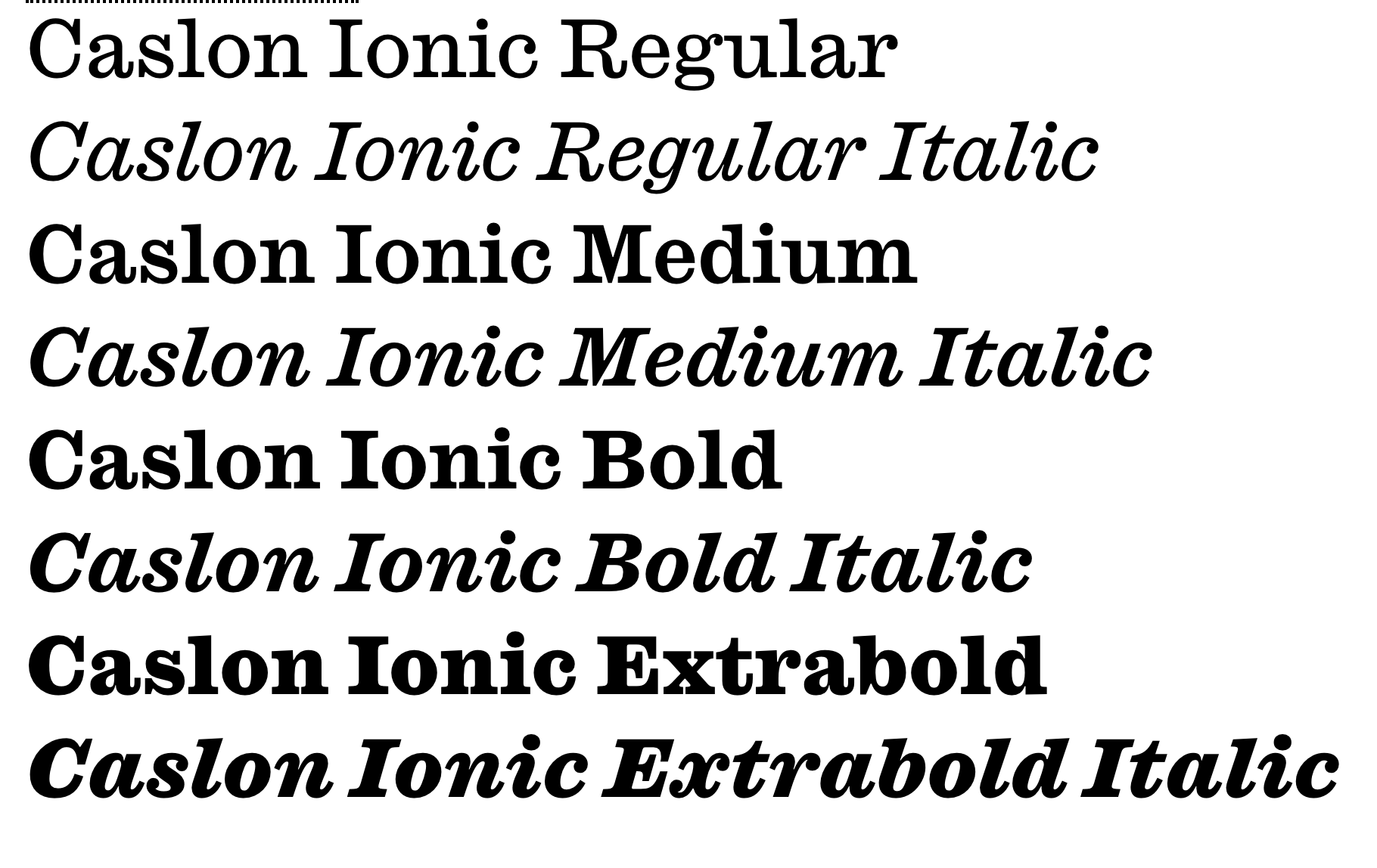
file name: Paul Barnes Greg Gazdowicz Caslon Ionic 2019

file name: Paul Barnes Greg Gazdowicz Caslon Ionic 2019
file name: Paul Barnes Greg Gazdowicz Caslon Ionic 2019
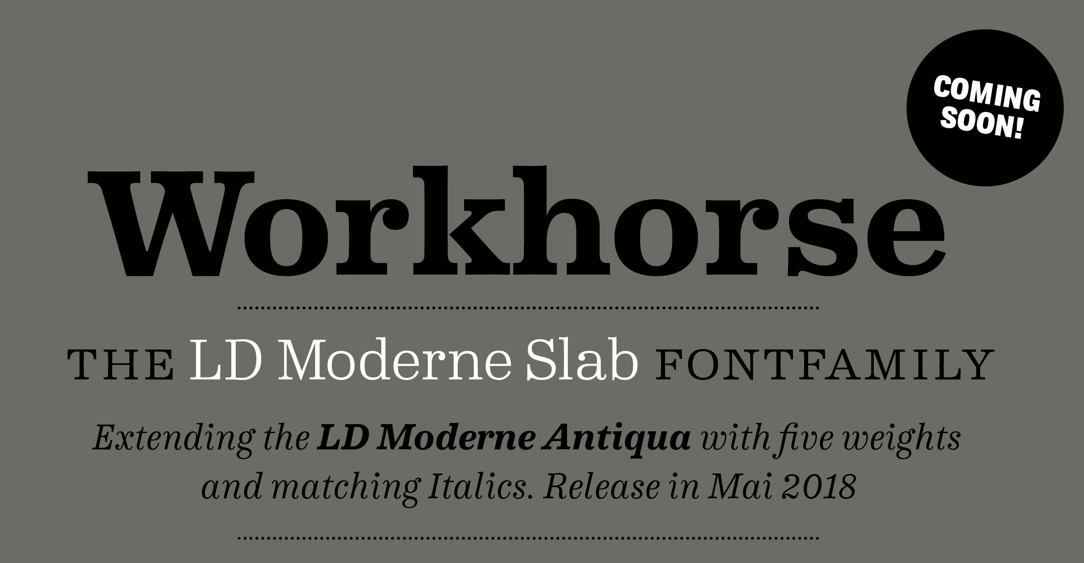
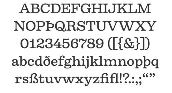
file name: Kai Bueschl L D Moderne Slab 2018
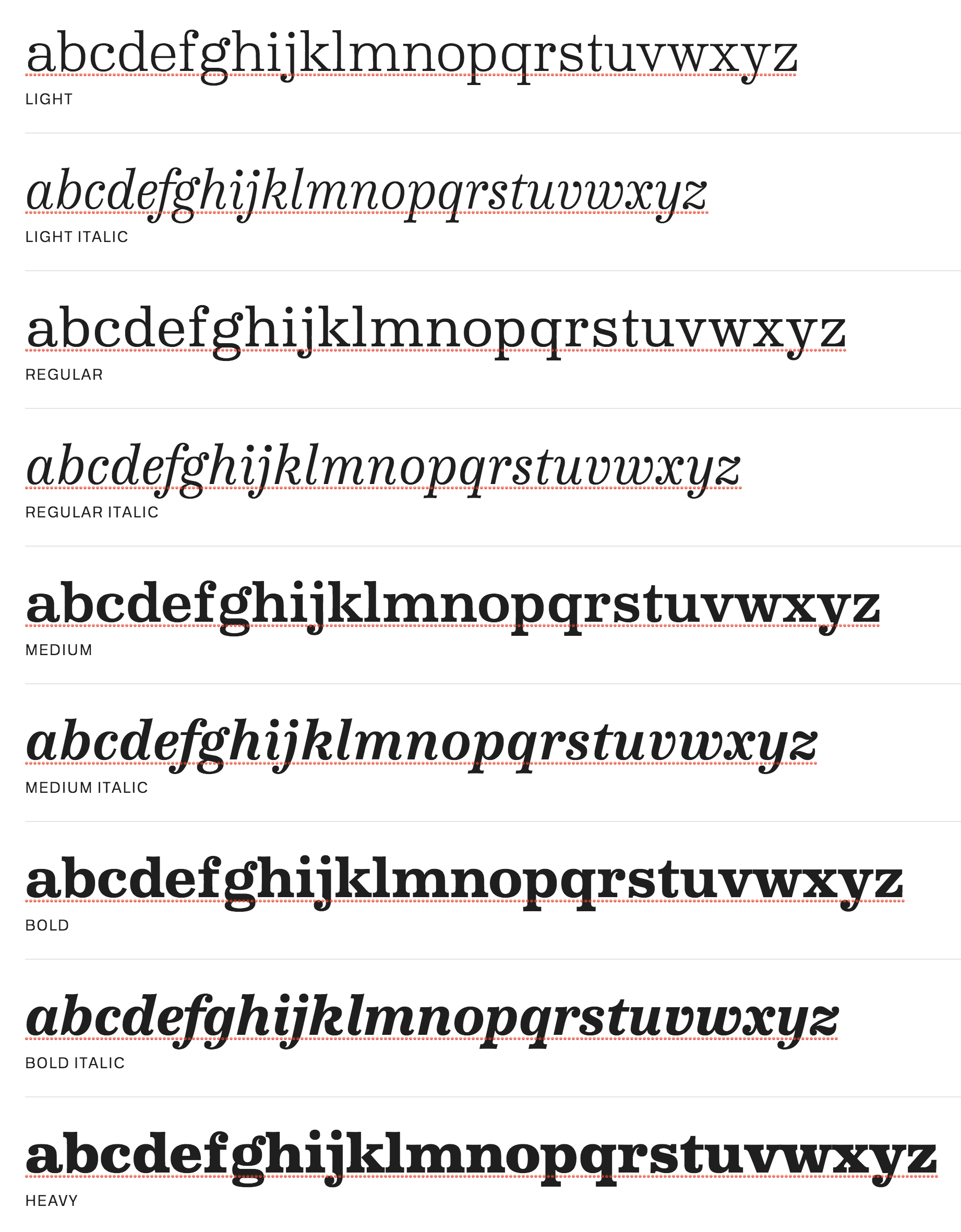
file name: Kai Bueschl L D Moderne Slab 2018
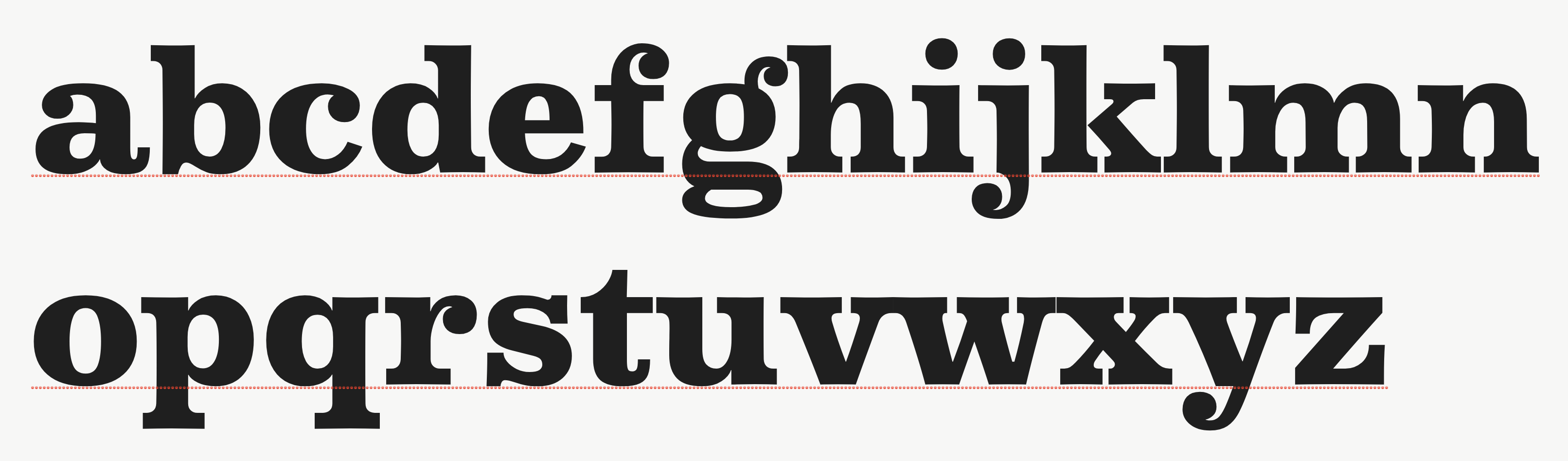
file name: Kai Bueschl L D Moderne Slab 2018

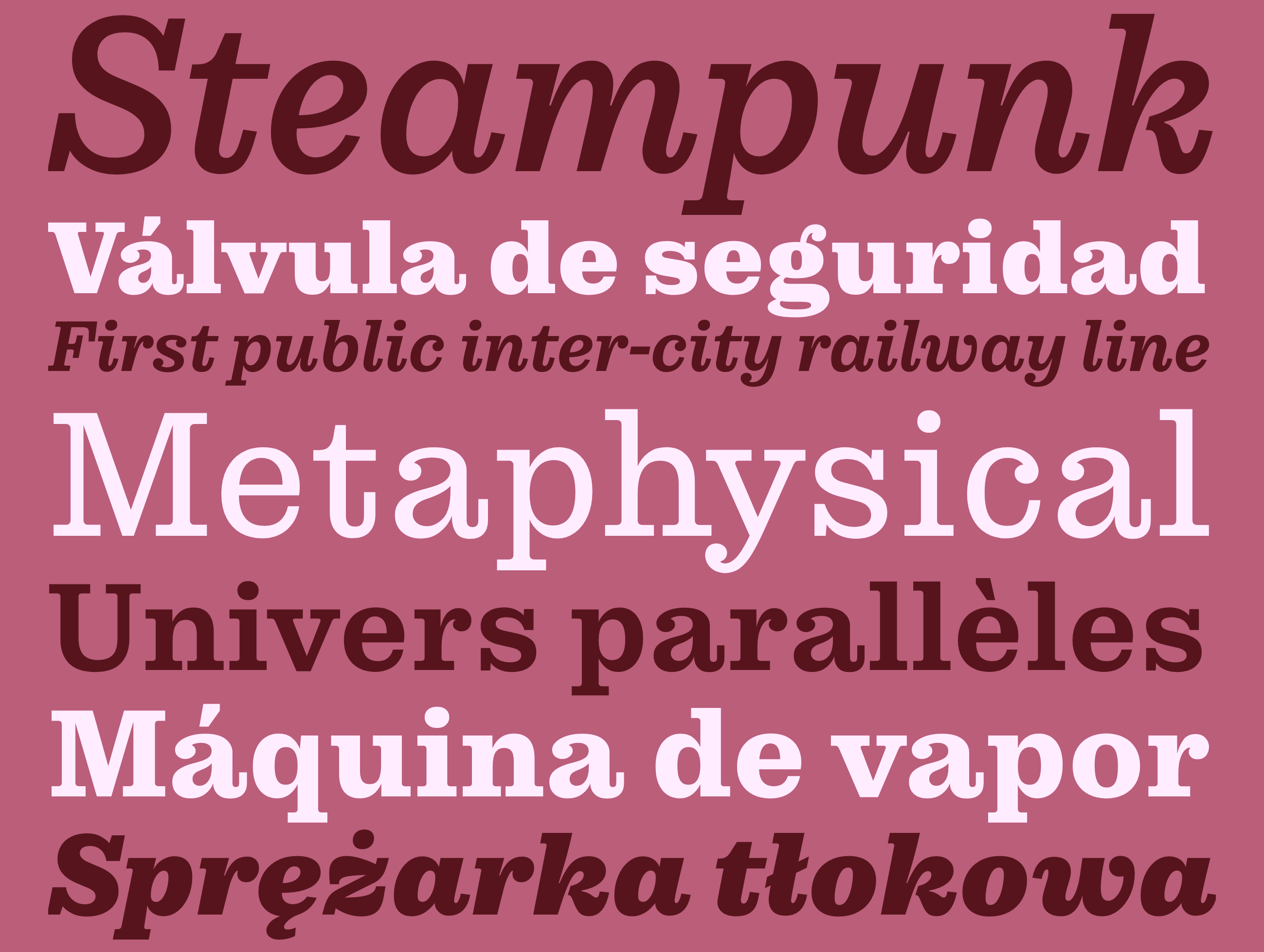
file name: Typejockeys Firelli 2020 1

file name: Typejockeys Firelli 2020 4
file name: Typejockeys Firelli 2020 5

file name: Typejockeys Firelli 2020

file name: Teddy Derkert Firelli 2020

file name: Teddy Derkert Firelli 2020

file name: Teddy Derkert Firelli 2020
file name: Teddy Derkert Firelli 2020
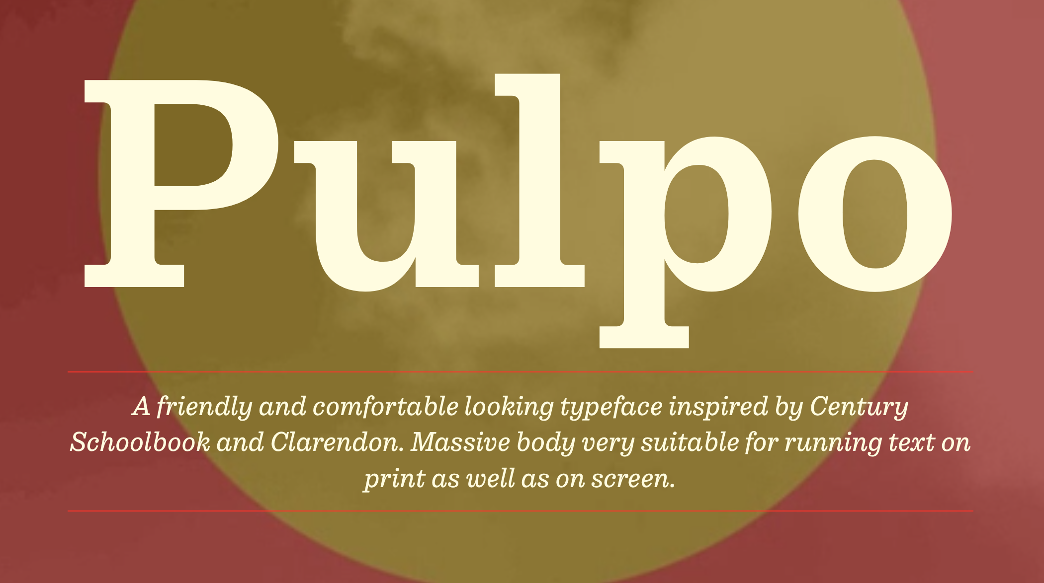
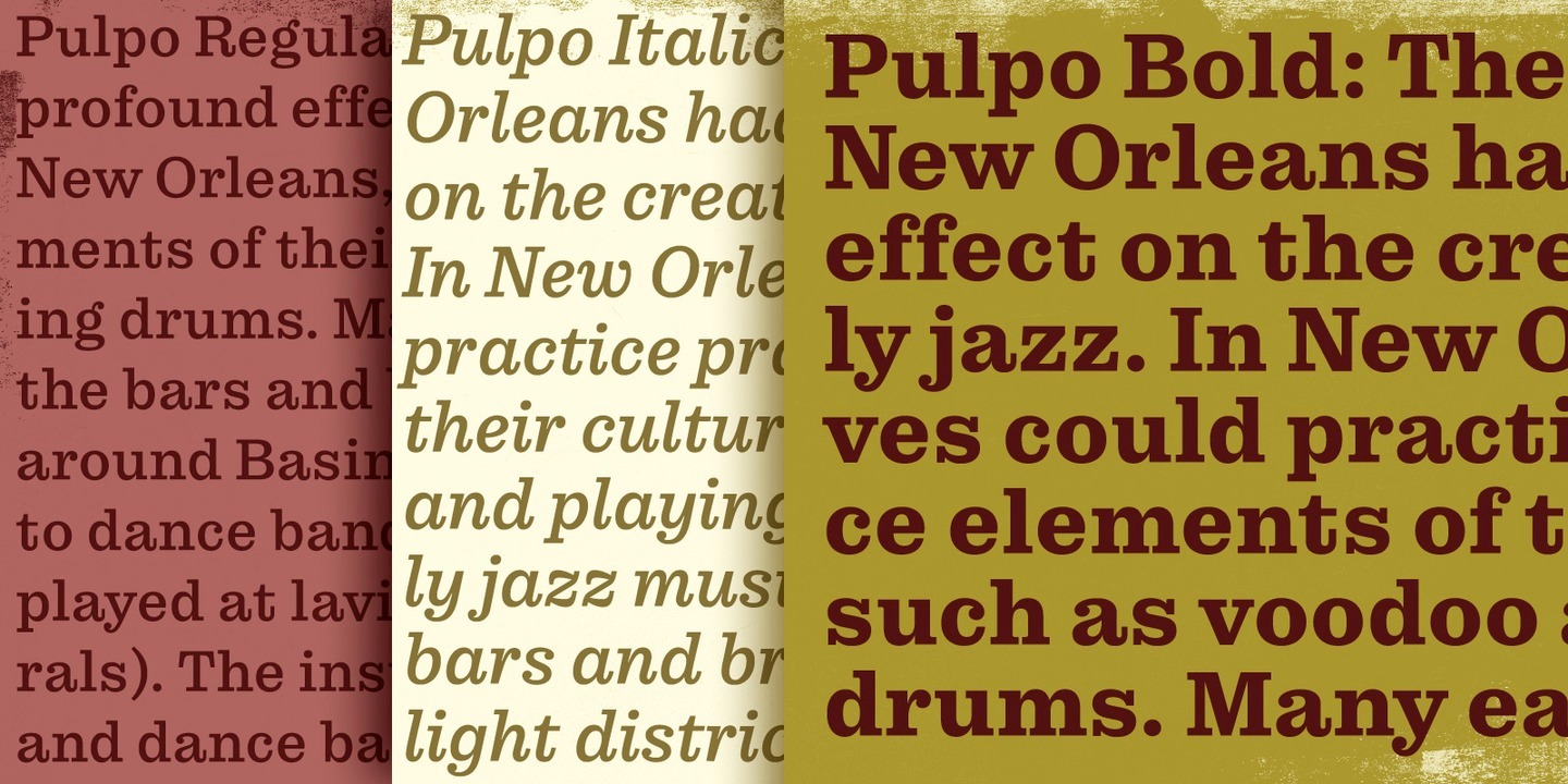
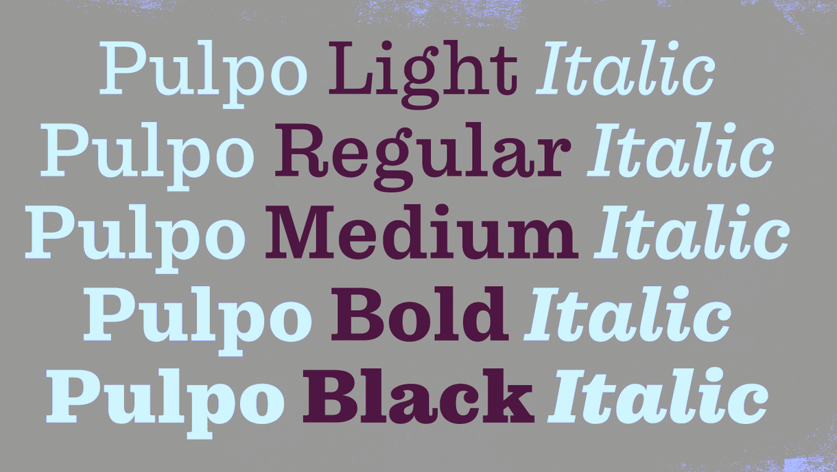
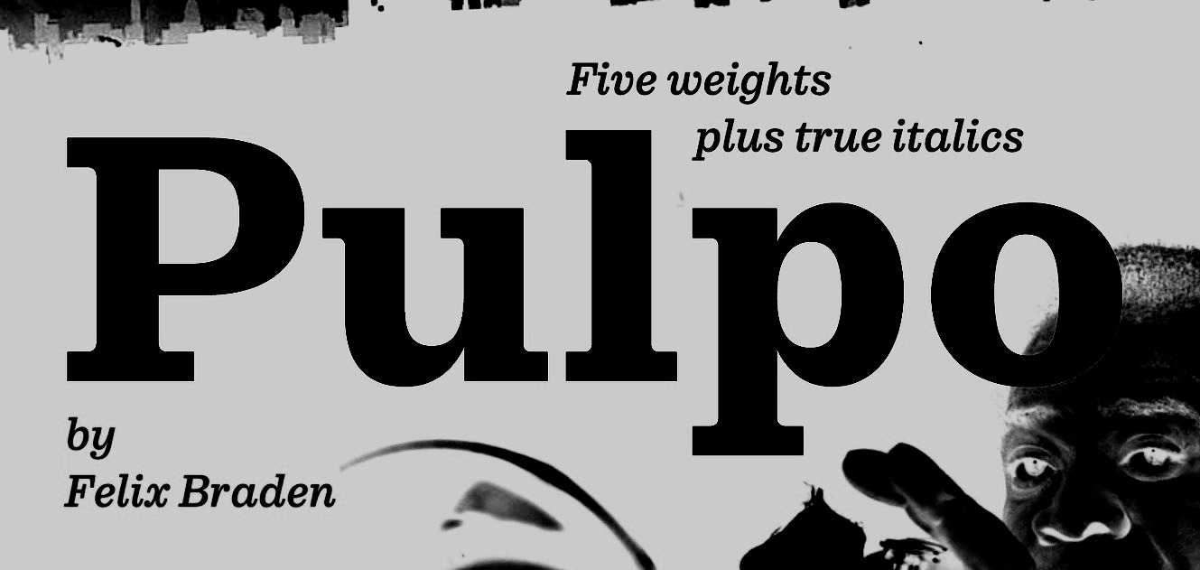
file name: Felix Braden Pulpo 2019
file name: Felix Braden Pulpo 2019
file name: Felix Braden Pulpo 2019
file name: Floodfonts Pulpo 2019
file name: Floodfonts Pulpo 2019 291630
file name: Floodfonts Pulpo 2019 291632 002

file name: Floodfonts Pulpo 2019 291633 002
file name: Floodfonts Pulpo 2019 291634 002

file name: Floodfonts Pulpo 2019

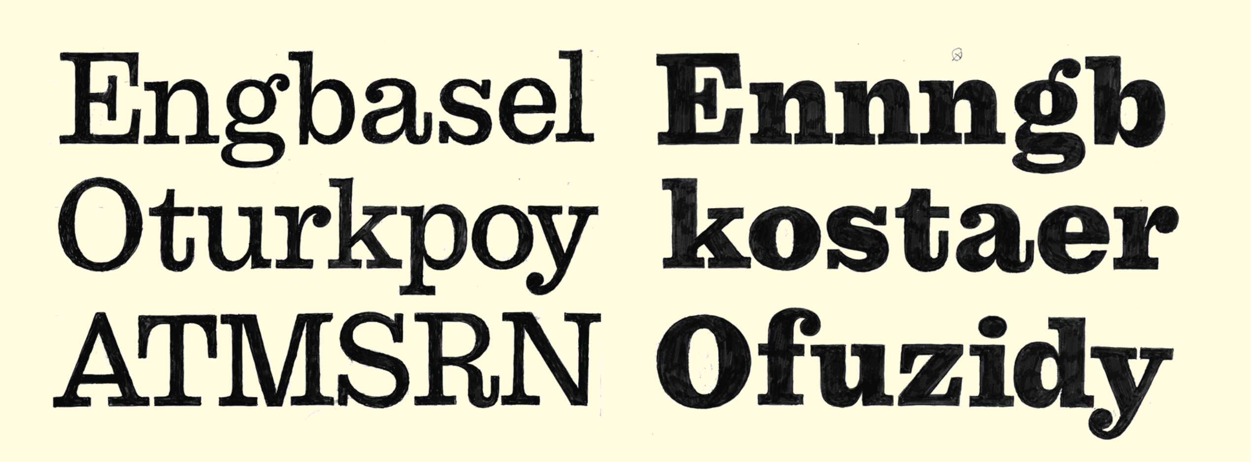
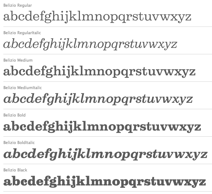
file name: David Berlow Belizio 1987 Poster by Jenny O Grady 2015
file name: David Berlow Belizio 1987 Poster by Jenny O Grady 2015a
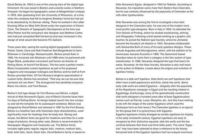
file name: David Berlow Belizio 1987 Poster by Jenny O Grady 2015b
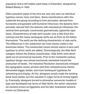
file name: David Berlow Belizio 1987 Poster by Jenny O Grady 2015d
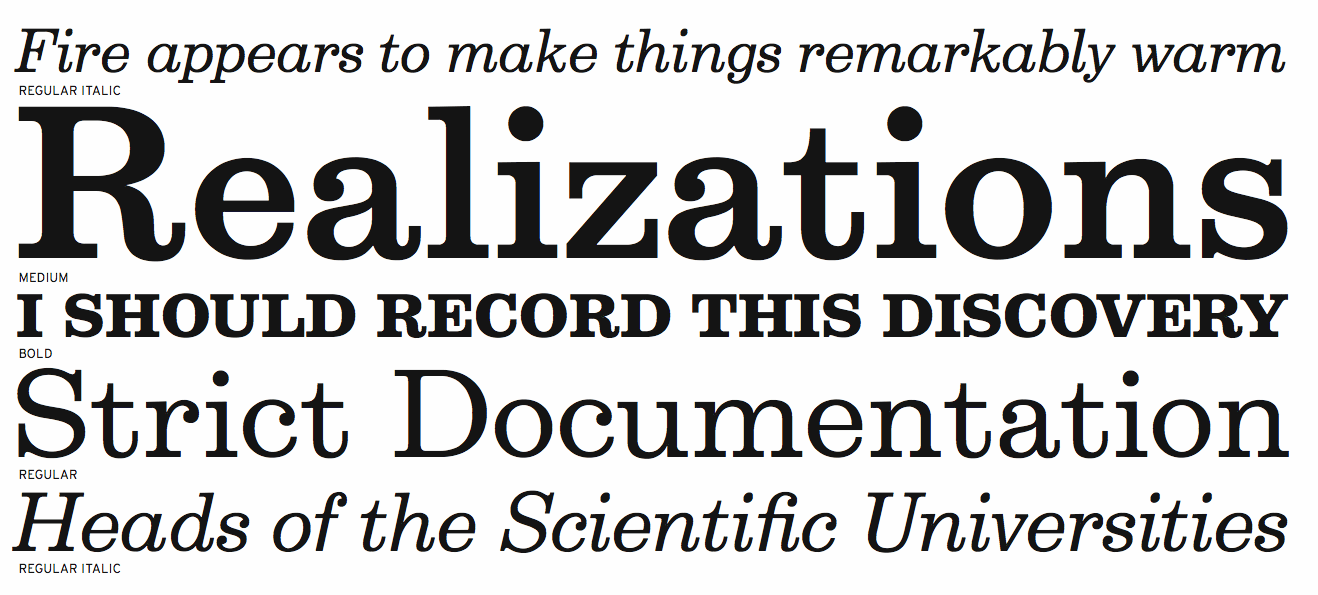
file name: Font Bureau Belizio 1987 1988

file name: David Berlow Belizio Black 1987
file name: David Berlow Belizio Black 1987b

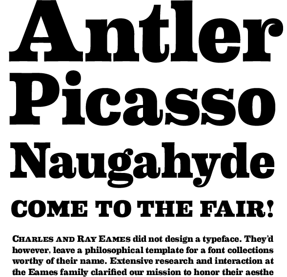
file name: House Eames Century Modern Alternate Serifs 2010
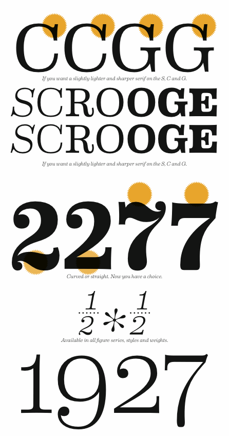
file name: House Eames Century Modern Alternates 2010
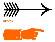
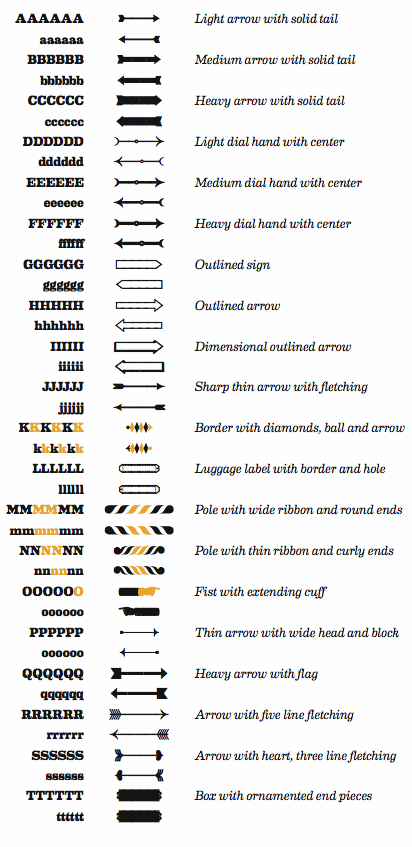
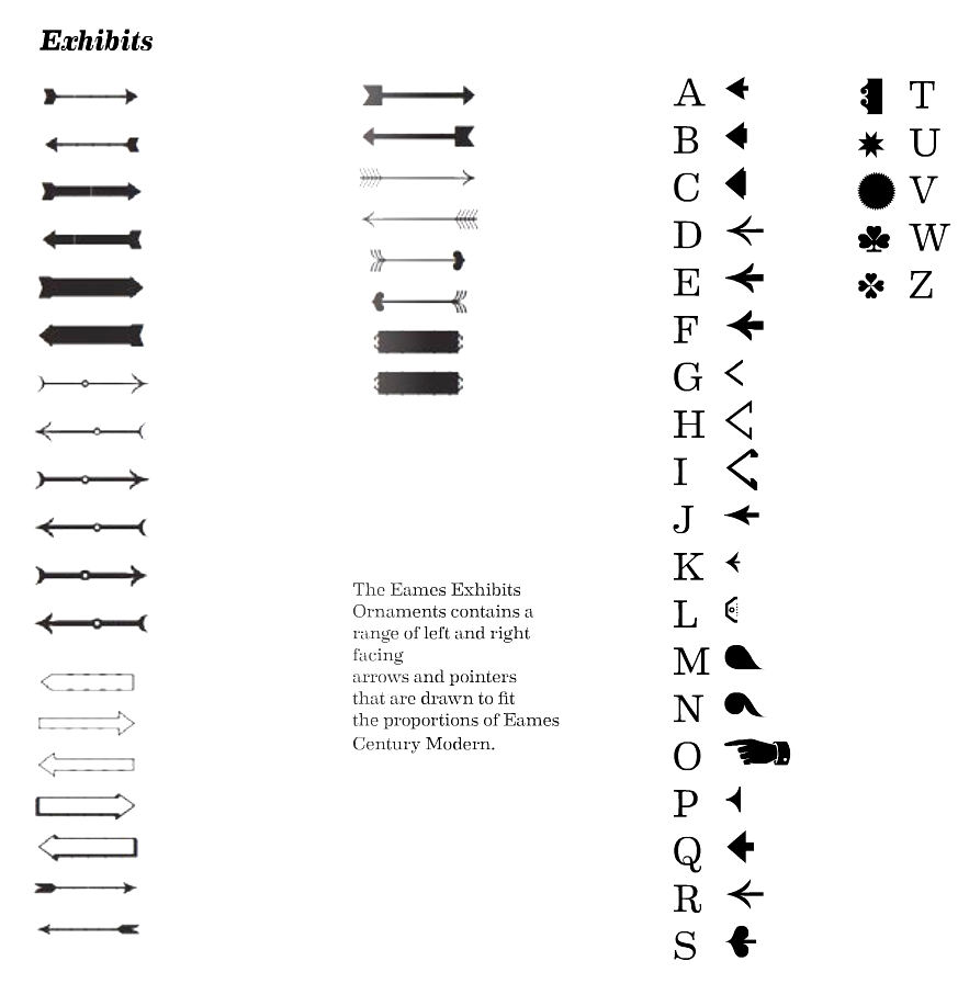
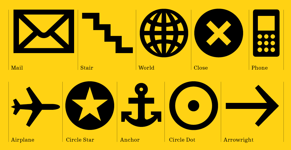
file name: House Eames Century Modern Arrows Fists 2010

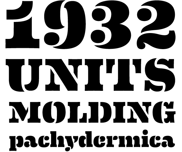
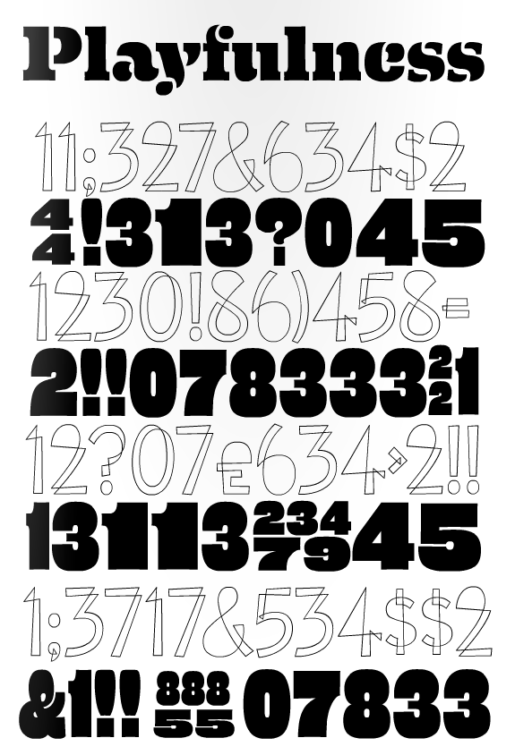
file name: House Eames Century Modern Black 2010

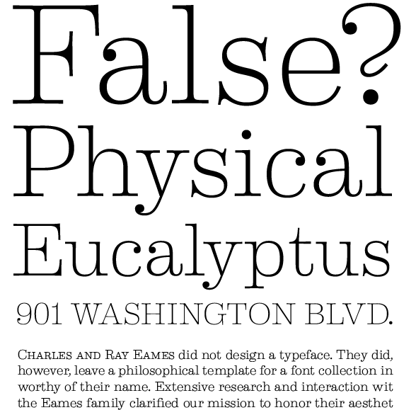
file name: House Eames Century Modern Cover Numerals 2010
file name: House Eames Century Modern Extra Bold 2010

file name: House Eames Century Modern Logo 2010
file name: House Eames Century Modern Ornaments 2010
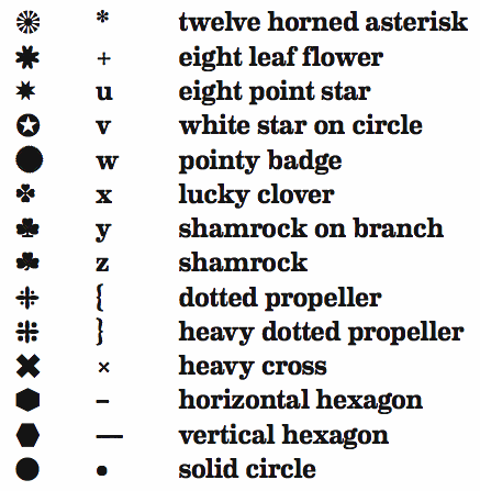
file name: House Eames Century Modern Ornaments 2010b
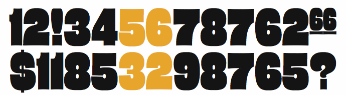
file name: House Eames Century Modern Poster Numerals 2010
file name: House Eames Century Modern Stencil Stencil 2010
file name: House Eames Century Modern Thin 2010

file name: House Eames Century Modernligatures 2010
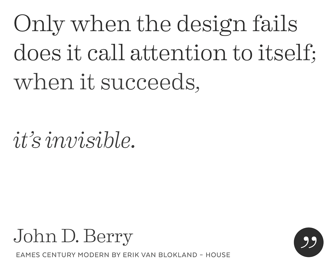
file name: Erik Van Blokland House Eames Century Modern 2010 Poster by Bill Dawson 2015
file name: Erik Van Blokland House Eames Century Modern 2010 Poster b

file name: Erik Van Blokland House Eames Century Modern 2010 Poster by Valeria Aufiero 2015
file name: Erik Van Blokland House Eames Century Modern 2010 Poster by Valeria Aufiero 2015b
file name: Erik Van Blokland House Eames Century Modern 2010 Poster by Valeria Aufiero 2015d
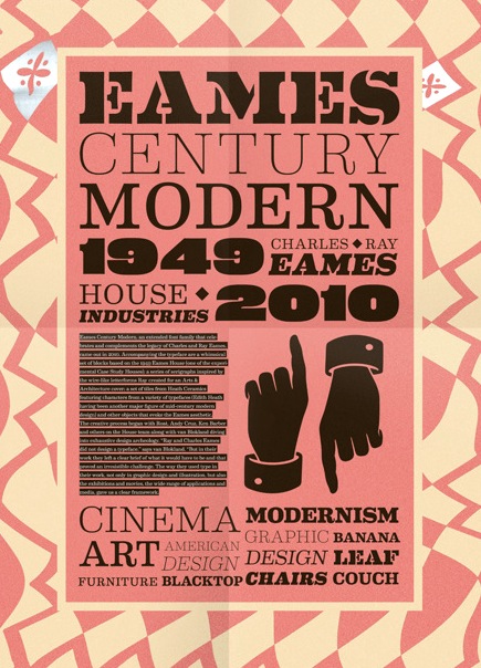
file name: House Industries Eames Century Modern 2010 after Charles Ray Eames 1949 Poster by Bruno Tome 2014

file name: House Eames Medium 2010
file name: House Eames Regular Light 2010
file name: House Eames Thin 2010

file name: House Eames 2010
file name: House Eames Century Modern Bold 2010
file name: House Industries Logo
file name: House Industries Photo Lettering 2011
file name: Liza Rasskazova Co Fo Robert 2018
file name: Liza Rasskazova Co Fo Robert 2018
file name: Liza Rasskazova Co Fo Robert 2018

file name: Liza Rasskazova Co Fo Robert 2018
file name: Liza Rasskazova Co Fo Robert 2018
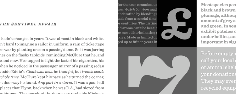
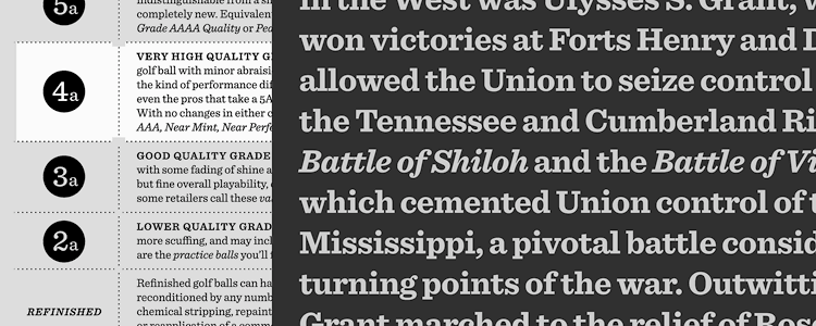
file name: Hoefler Frere Jones Sentinel 1999
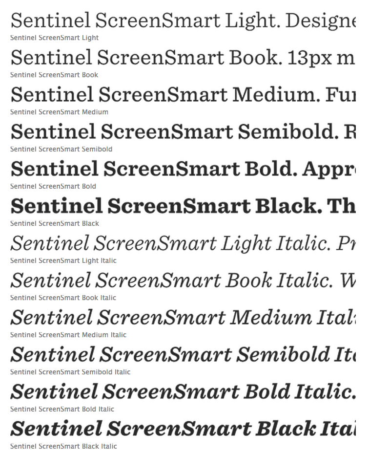
file name: Hoefler Frere Jones Sentinel 1999a
file name: Hoefler Frere Jones Sentinel 1999b
file name: Hoefler Frere Jones Sentinel 1999c
file name: Hoefler Frere Jones Sentinel 1999d

file name: Hoefler Frere Jones Sentinel 1999e
file name: Hoefler Frere Jones Sentinel 1999f

file name: Hoefler Frere Jones Sentinel 1999g

file name: Hoefler Frere Jones Sentinel 1999h

file name: Hoefler Frere Jones Sentinel 1999i

file name: Hoefler Sentinel Ornaments 2020

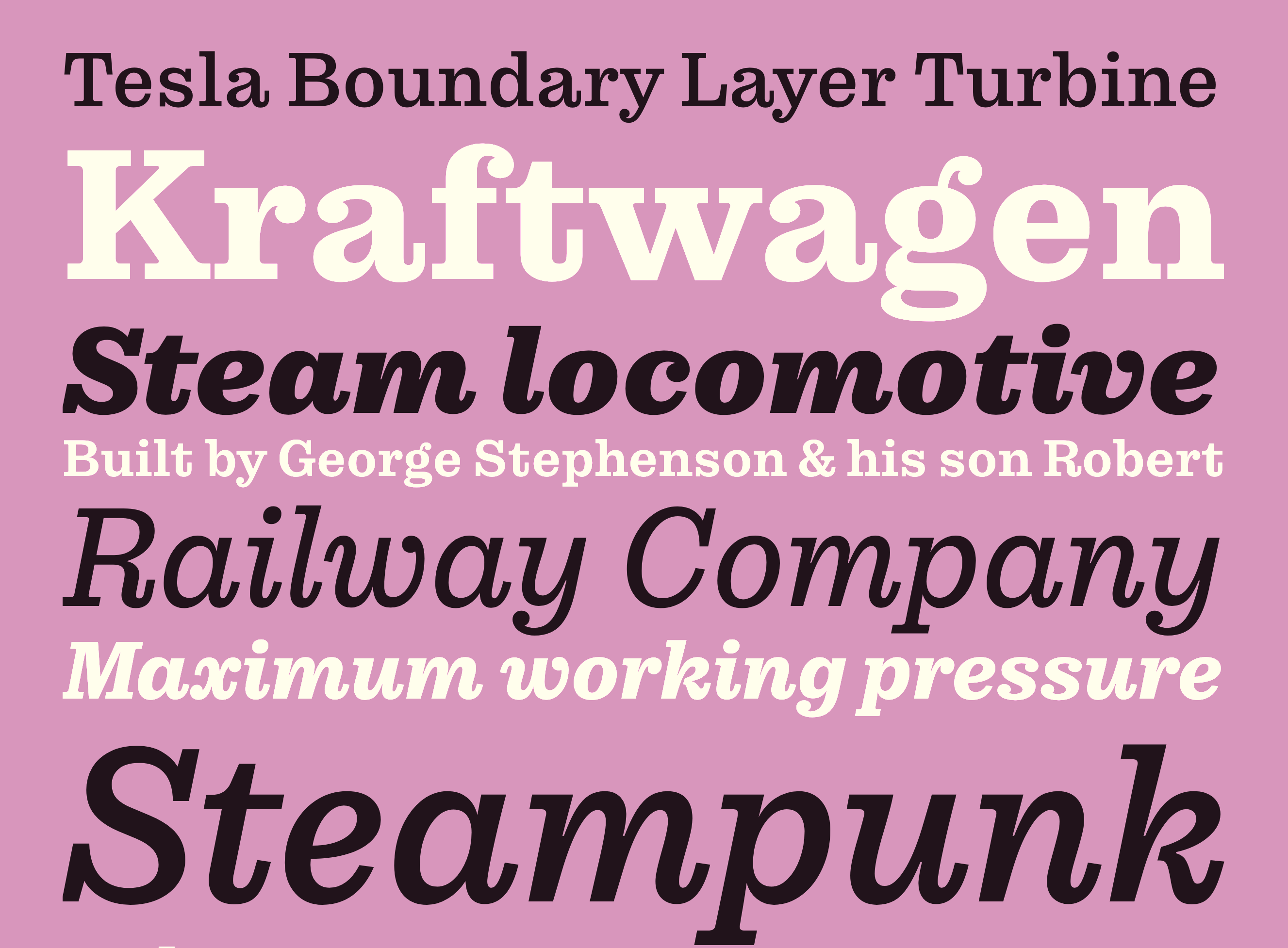
file name: Marc Droz Colroy 2014d

file name: Marc Droz Colroy 2014e

file name: Marc Droz Colroy 2014f
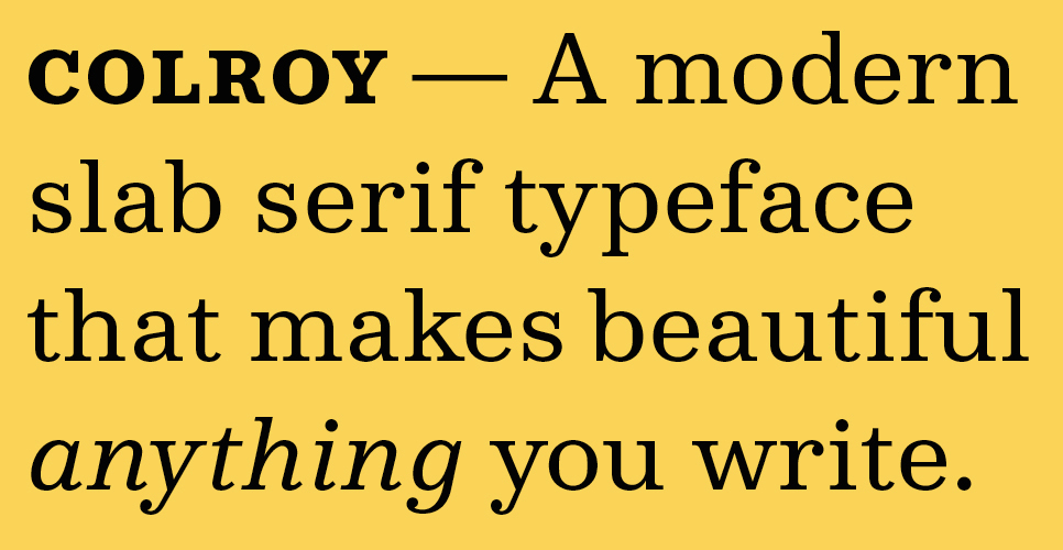
file name: Marc Droz Colroy 2014g
file name: Marc Droz Colroy 2014h
| | |
|
Luc Devroye ⦿ School of Computer Science ⦿ McGill University Montreal, Canada H3A 2K6 ⦿ lucdevroye@gmail.com ⦿ http://luc.devroye.org ⦿ http://luc.devroye.org/fonts.html |