TYPE DESIGN INFORMATION PAGE last updated on Thu Jul 16 06:46:52 EDT 2026
FONT RECOGNITION VIA FONT MOOSE

|
|
|
|
Novo Typo (was: Atelier van Wageningen)
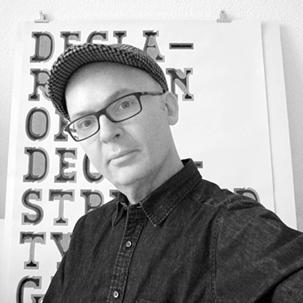
[Mark van Wageningen]
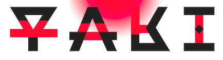
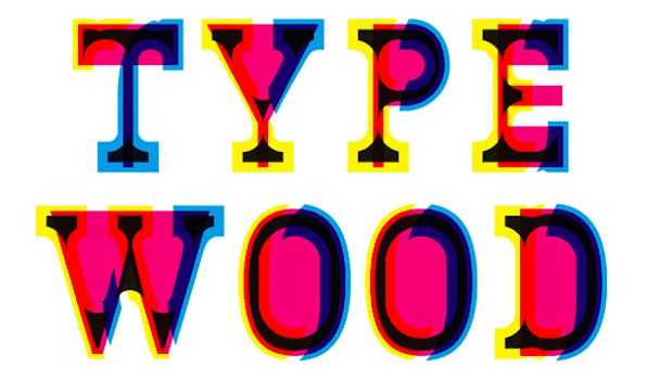
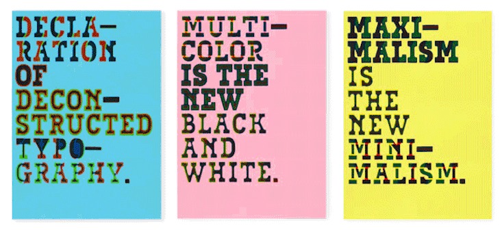
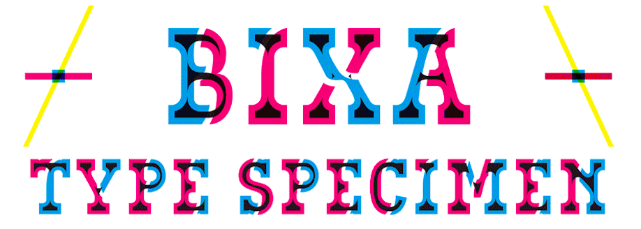
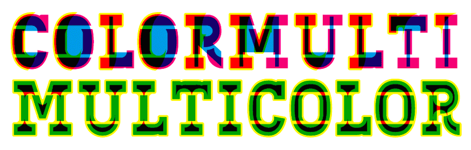
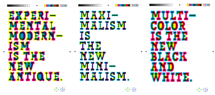
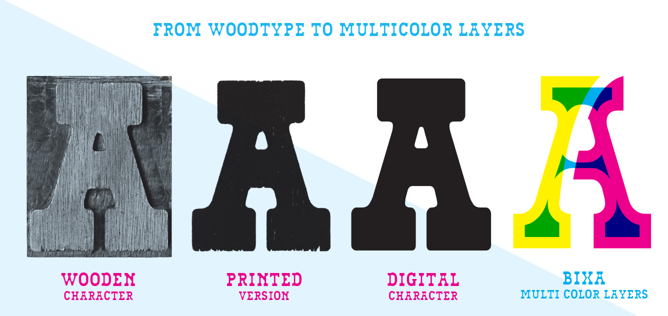
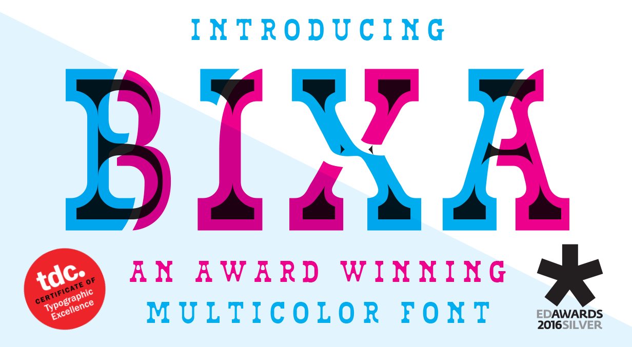
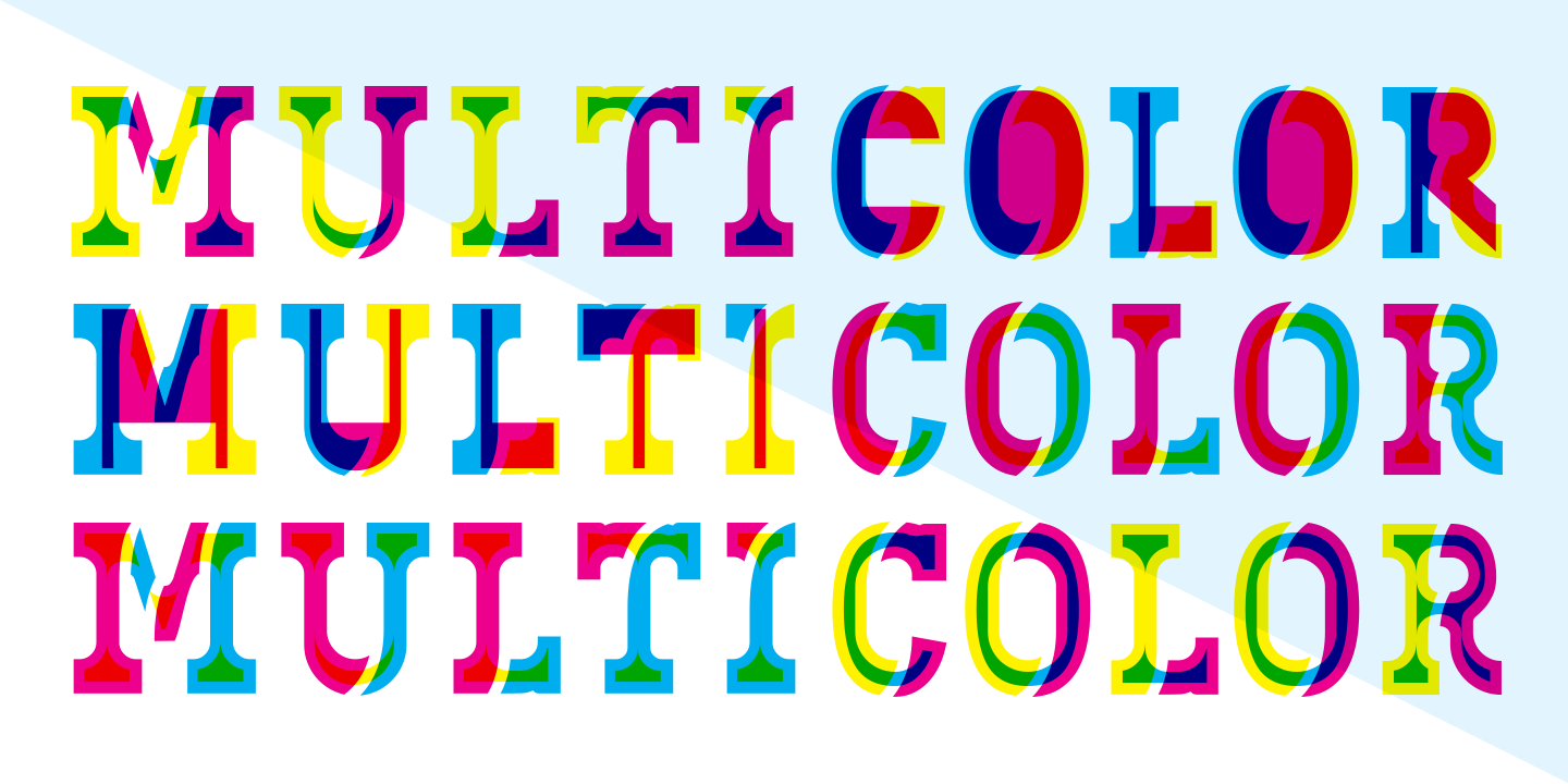
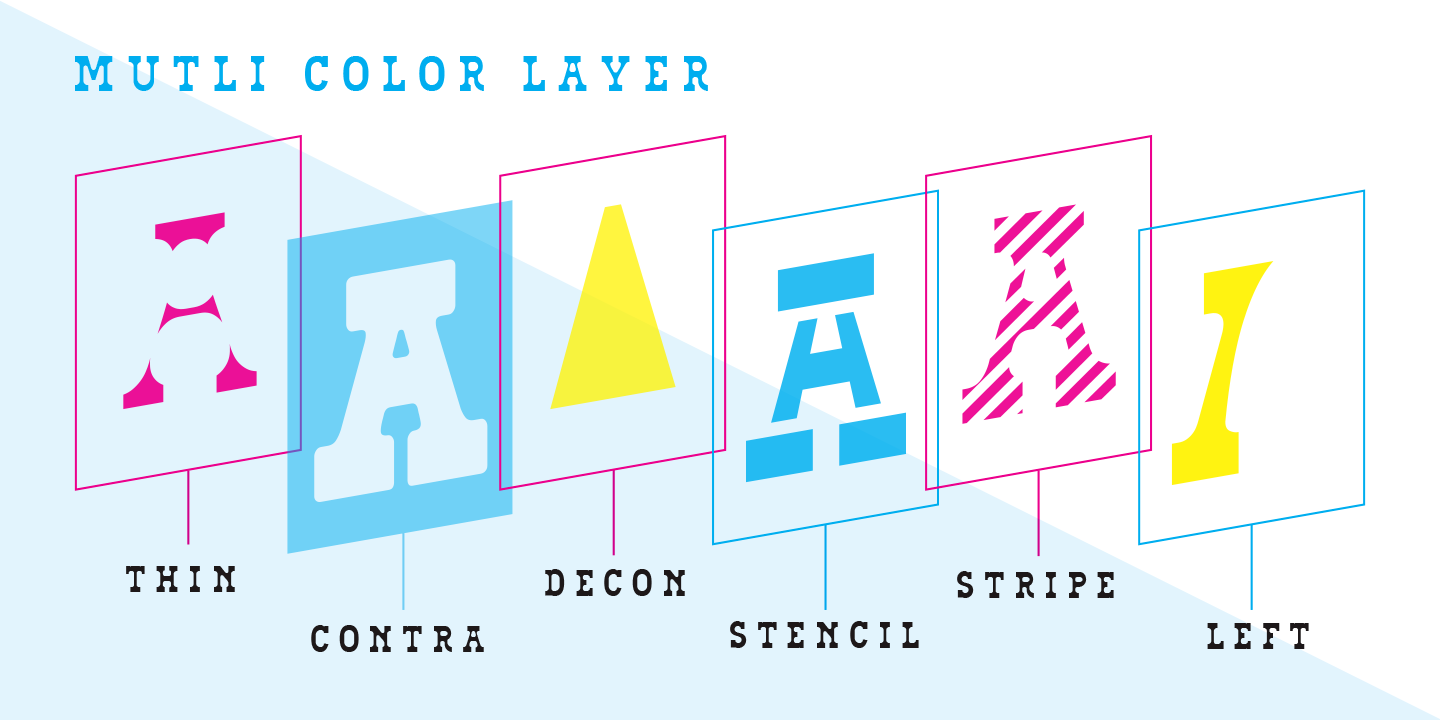
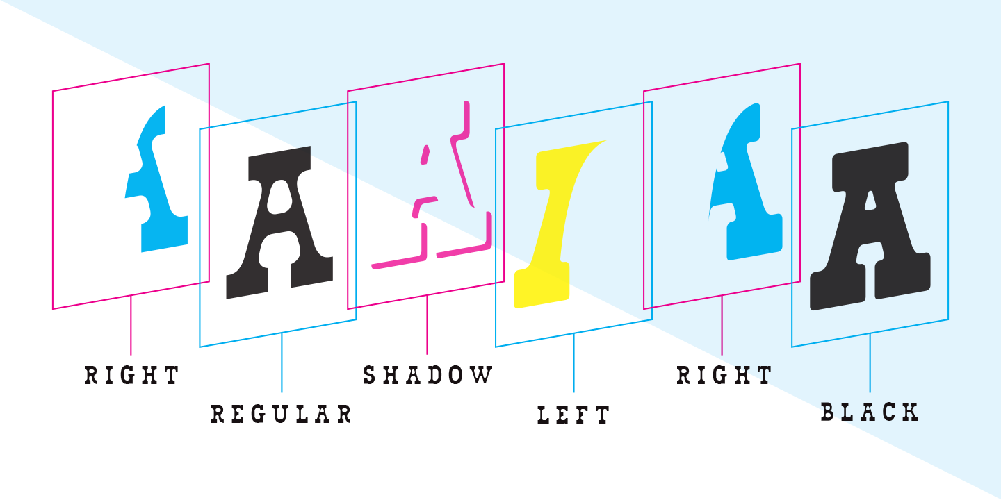
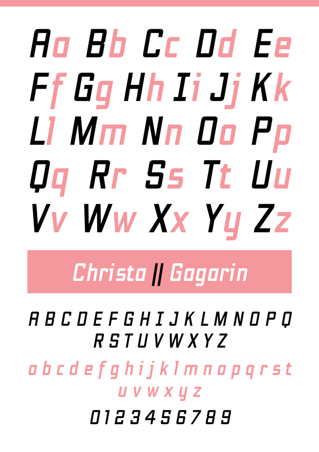
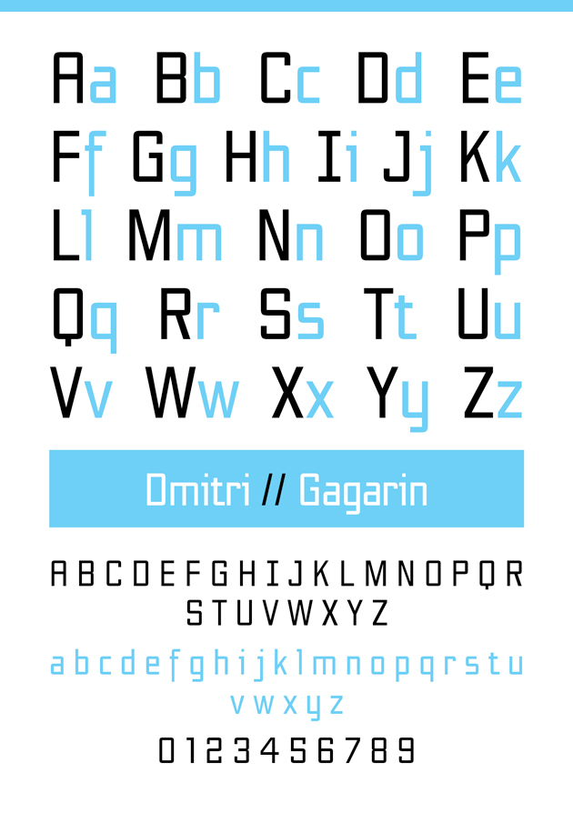
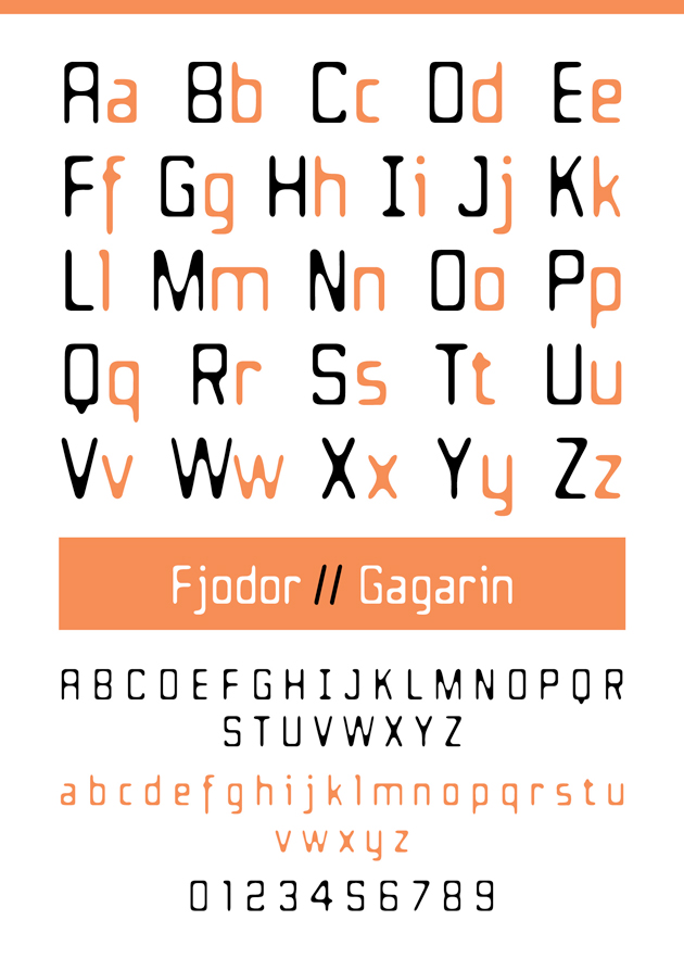
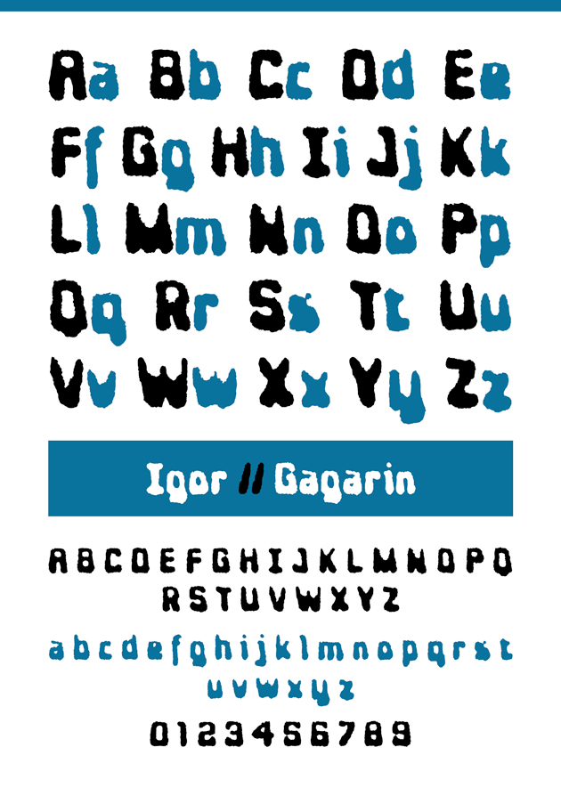
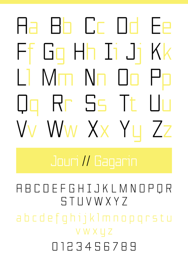
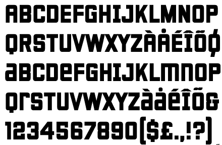
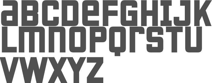
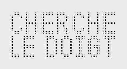
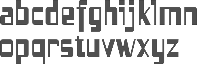
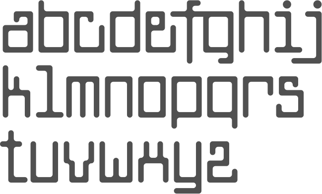
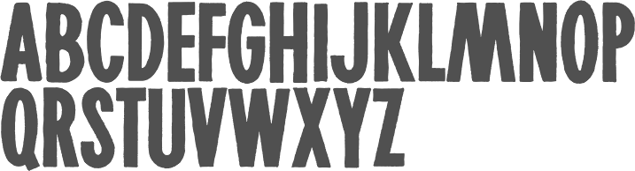
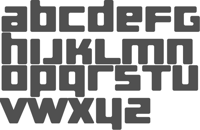
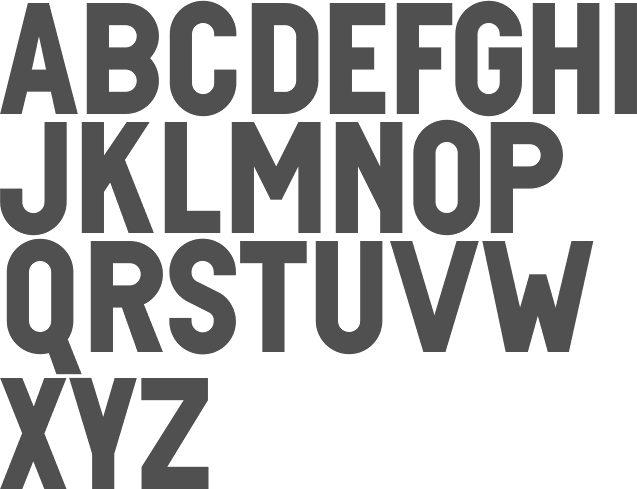
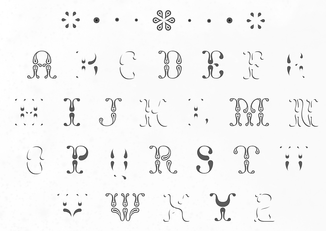
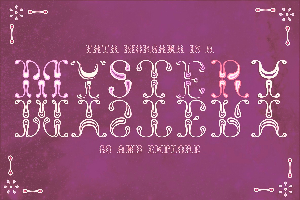
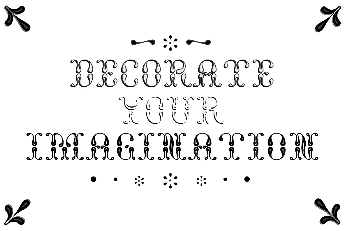
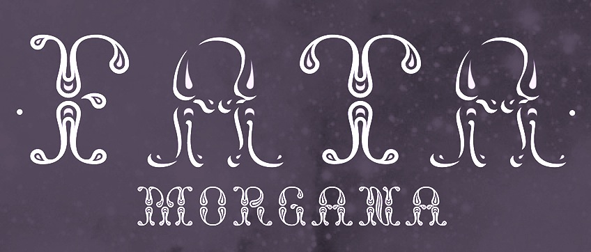
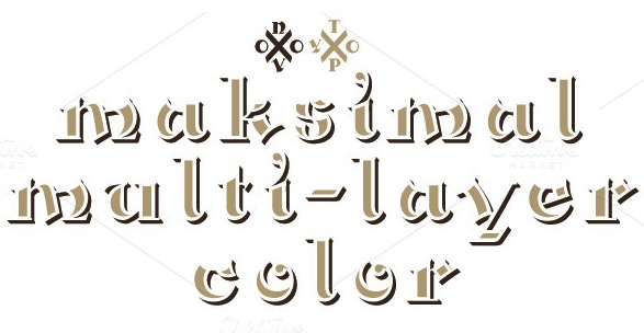
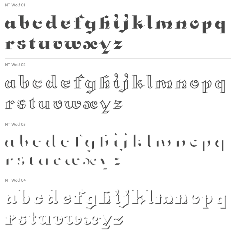
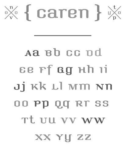
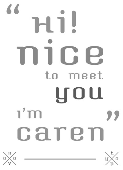
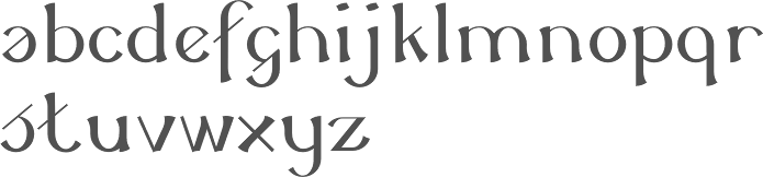
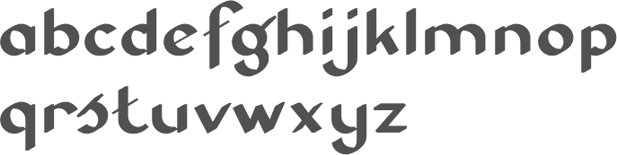
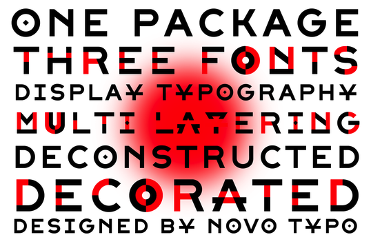
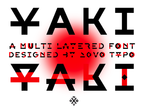
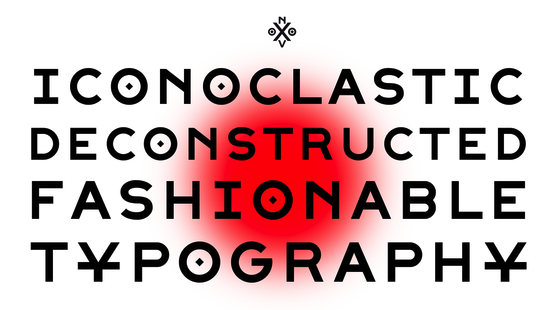
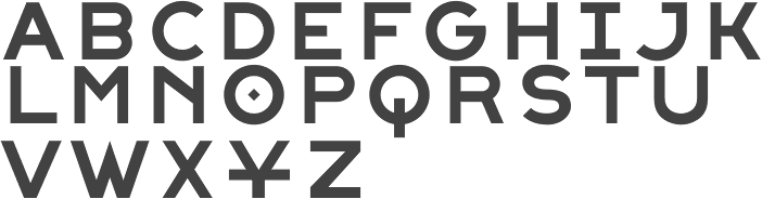
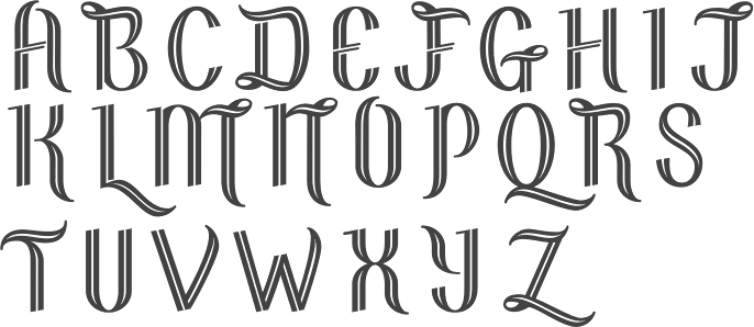
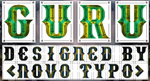
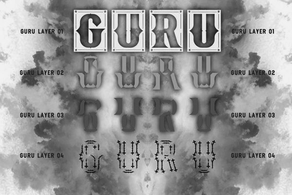
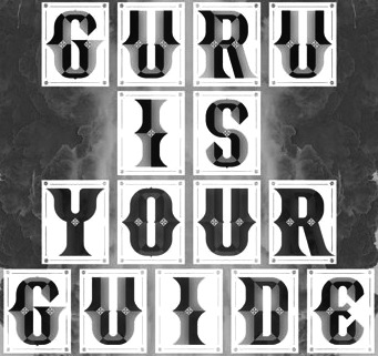
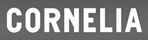
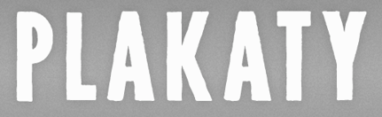
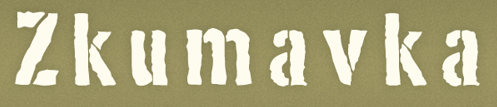
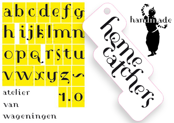
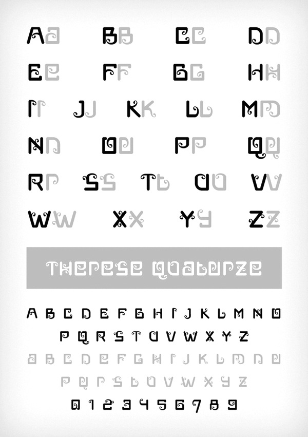
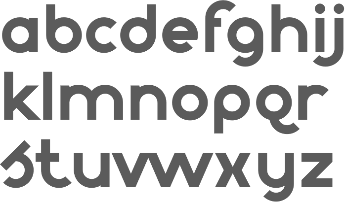
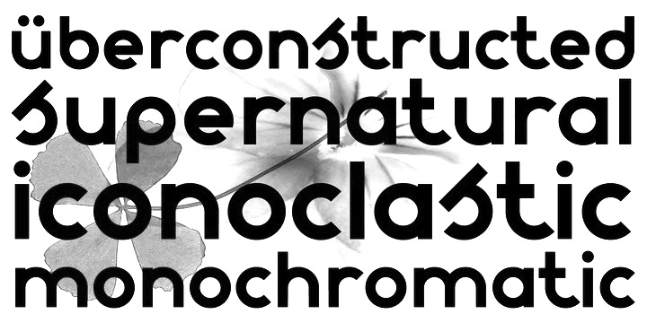
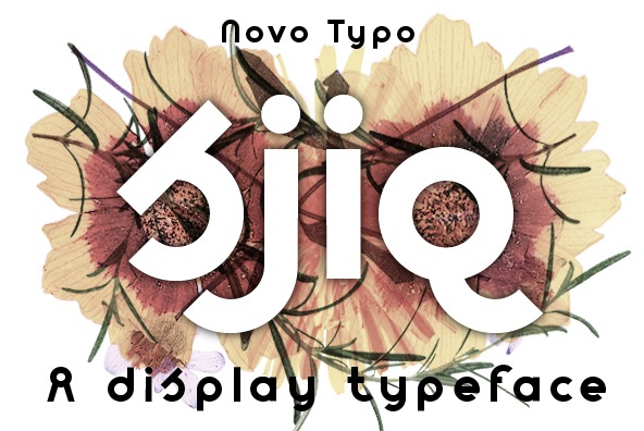
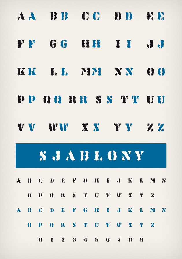
Mark van Wageningen is a Dutch type designer. Born in 1969, Mark studied graphic design at the Amsterdam Graphic School and at the Gerrit Rietveld Academy in Amsterdam before he founded Novo Typo in 2012. Mark lives in Amsterdam. Novo Typo is the type foundry of Atelier van Wageningen. In January 2015 Mark started the Typewood project. Typewood is a research project about designing, deconstructing, and transforming multicolored digital typefaces into wooden type for letterpress. Ziza, a corresponding project with lead type, followed in 2016. Both projects show the future of multicolored typeface design through the revitalization and deconstruction of typographic traditions. Mark wrote several books about chromatic type design such as the Novo Typo Color Book (2017) and Color and Type (Princeton Architectural Press, 2019). The display type Stavba (inspired by Rodchenko's constructivist lettering) appeared in 1994 as a part of his presentation for his final examination at the Gerrit Rietveld Academie in Amsterdam, and was later renamed Ärst. He continues making display types on his own account. He created the fonts Linotype Cerny (1995, caps only), Linotype Laika and Linotype Sjablony (a roughened stencil font) in 1997. Fontshop and 2Rebels sell his Gagarin family (2000), which include Anna (constructivist and unicase), Boris, Christa, Dmitri (MICR), Eleno, Fjodor, Gregor, Hektor (stencil), Igor, Youri, Leonora (with Nele Reyniers), Magda (with Nele Reyniers), Ossip and Petrov (LED simulation). As he tells it, four Russians, Gustav Klucis, Vladimir Majakovski, Alexander Rodchenko en Gregory Rasputin each had an affair with Anna Gagarin, and out of all that came forth Boris, Christa, Dimitri, Elena, Fjodor, Gregor, Hektor, Igor, Jouri, Kurt, Leonora, Magda, Nina, Ossip, Petrov, Quirina, Rudolf and Sonia. Atelier Van Wageningen made the curly typeface HC type (2010) for packaging. Typefaces from 2012 include NT Lucien, NT Plakaty (poster font), NT Theo, the NT Gagarin family, NT Zkumavka (rough stencil based on stencils from the 1920s in Russia; first published in 1995-2002 at Two Rebels), NT Cornelia (wood type caps), NT Novo (with Novo Alla, Bila, Cela, Dada, Enno, Fika, Gigo, Halu (art deco)), Louis Douze and Therese Quatorze, Caren (a soft-edged corporate typeface for a Dutch women's organization, Vrouwen van Nu). Typefaces from 2013: NT Guru (a layered ornamental type system), Sjiq (with a crazy roofed lower case s), and flower photographic typefaces such as Fall, Lily and Pure. Novo Typo also made several corporate typefaces. Typefaces from 2014: NT Wolf (layered typeface), NT Yaki (hipster layered font family), NT Fest (a curly inline caps face). Typefaces from 2015: NT Fata (a layered decorative font family), NT Rashmir (Indic simulation inspired by Sanskrit; styles Amal, Baya and Cyra), Bixa (Bixa Color minisite: a multicolored wood type; winner at TDC 2016 and ProtoType in 2016). Creative Market link. Behance link. Linotype link. FontShop link. Another Behance link. Klingspor link. |
EXTERNAL LINKS |
| | |

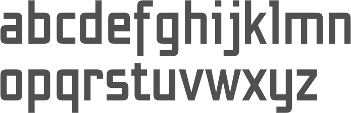
file name: Mark Van Wageningen Bixa 2015
file name: Mark Van Wageningen Bixa 2015b
file name: Mark Van Wageningen Bixa 2015c
file name: Mark Van Wageningen Bixa 2015d
file name: Mark Van Wageningen Bixa 2015e
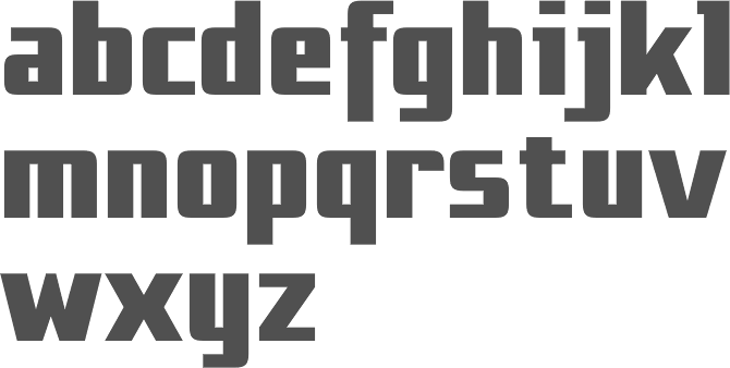
file name: Novo Typo Bixa 2017 248344
file name: Novo Typo Bixa 2017 248349
file name: Novo Typo Bixa 2017 248350
file name: Novo Typo Bixa 2017 248351
file name: Novo Typo Bixa 2017 248352

file name: Novo Typo Bixa 2017
file name: Novo Typo Gagarin Christa 2000
file name: Novo Typo Gagarin Dmitri 2000

file name: Novo Typo Gagarin Elena 2000
file name: Novo Typo Gagarin Fjodor 2000
file name: Novo Typo Gagarin Igor 2000
file name: Novo Typo Gagarin Jouri 2000
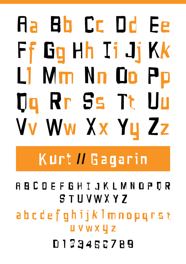
file name: Novo Typo Gagarin Kurt 2000
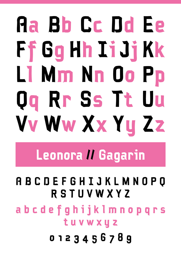
file name: Novo Typo Gagarin Leonora 2000
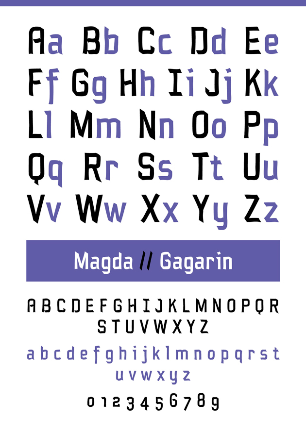
file name: Novo Typo Gagarin Magda 2000
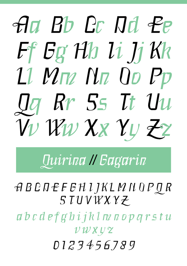
file name: Novo Typo Gagarin Quirina 2000
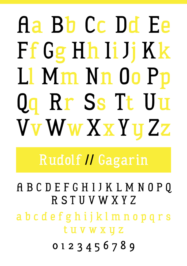
file name: Novo Typo Gagarin Rudolf 2000
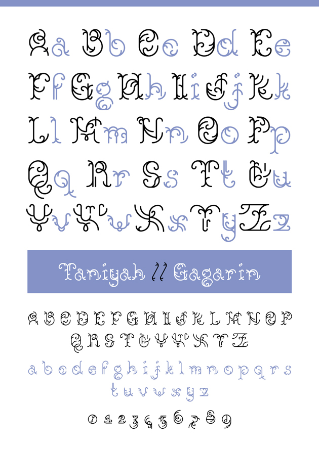
file name: Novo Typo Gagarin Taniyah 2000
file name: Mark Van Wageningen Gagarin Anna 2000
file name: Mark Van Wageningen N T Gagarin Anna 2000
file name: Mark Van Wageningen N T Gagarin Boris 2000
file name: Mark Van Wageningen Gregr Gagarin 2000
file name: Mark Van Wageningen N T Gagarin Hektor 2000
file name: Mark Van Wageningen N T Gagarin Ossip 2000
file name: Mark Van Wageningen N T Gagarin Petrov 2000
file name: Mark Van Wageningen N T Gagarin Sonia 2000
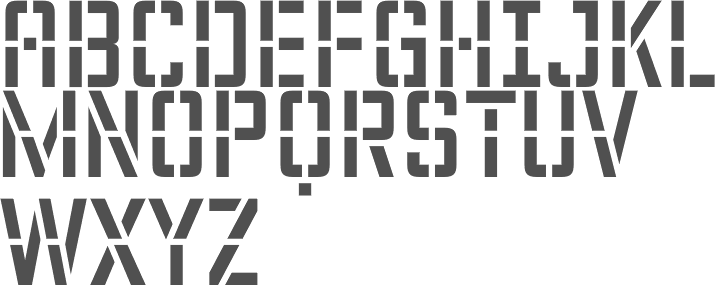
file name: Mark Van Wageningen N T Plakaty 2012
file name: Mark Van Wageningen N T Theo 2012
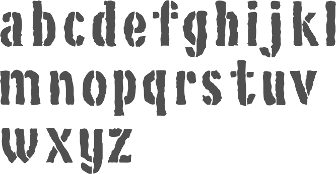
file name: Mark Van Wageningen N T Zkumavka 2012
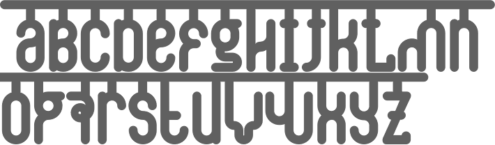
file name: Mark Van Wageningen N T Cornelia 2012
file name: Mark Van Wageningen N T Fata 2015

file name: Mark Van Wageningen N T Fata 2015
file name: Mark Van Wageningen N T Fata 2015b
file name: Mark Van Wageningen N T Fata 2015c
file name: Mark Van Wageningen N T Fata 2015d

file name: Mark Van Wageningen N T Fata 2015e
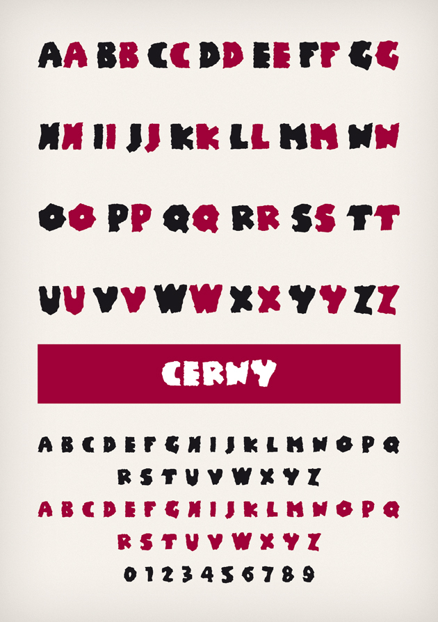
file name: Novo Typo Cerny 1995
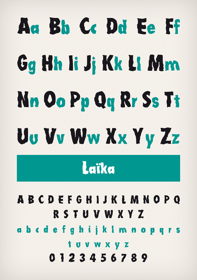
file name: Novo Typo Laika 1995
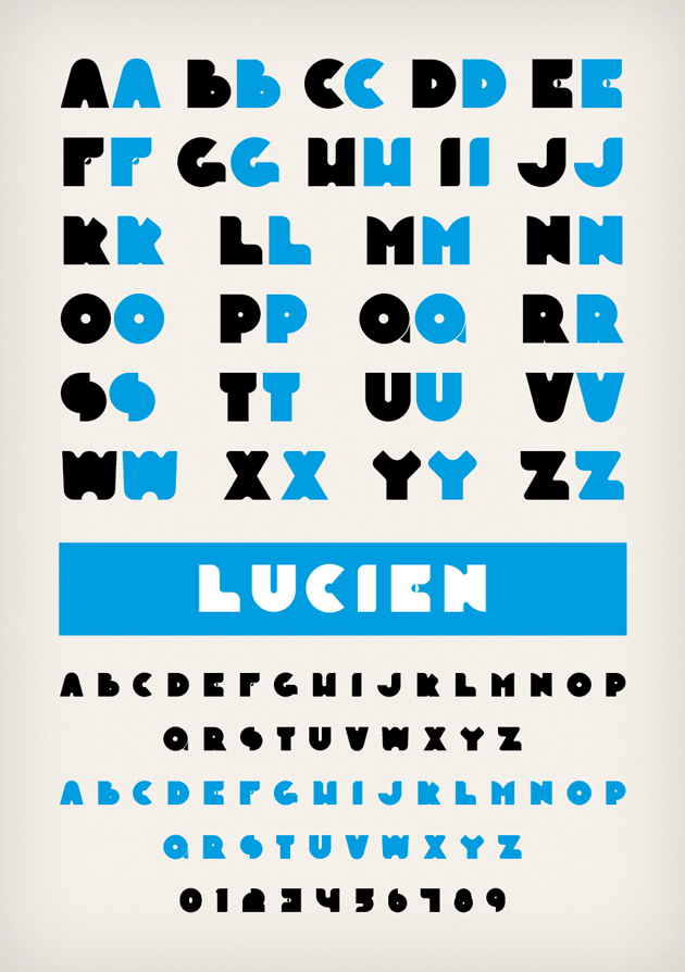
file name: Novo Typo Lucien 2012
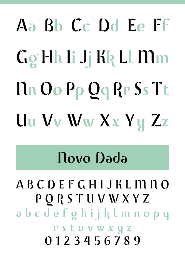
file name: Novo Typo Novo Dada 2012
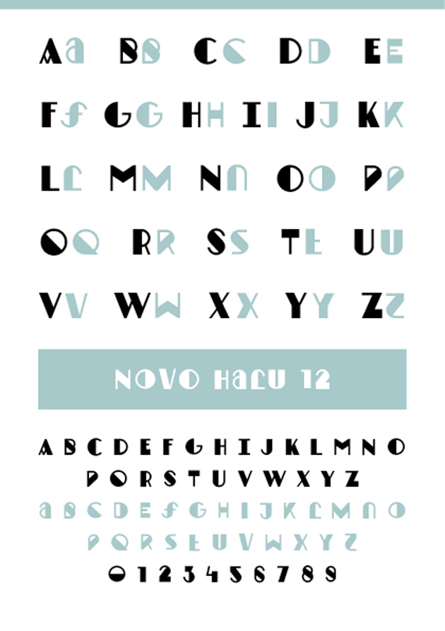
file name: Novo Typo Novo Halu 2012
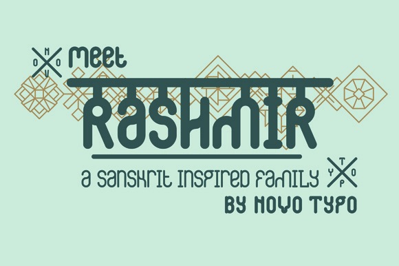
file name: Novo Typo N T Rashmir 2015
file name: Novo Typo N T Rashmir Amal 2015

file name: Novo Typo N T Rashmir 2015b
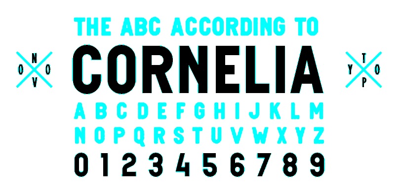
file name: Novo Typo Cornelia 2013b
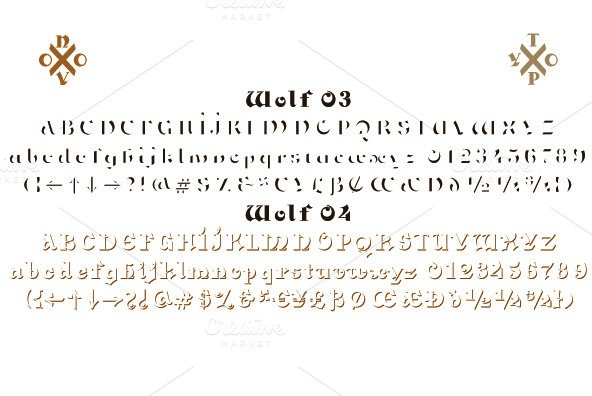
file name: Novo Typo N T Wolf 2014
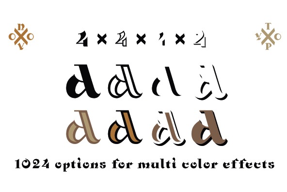
file name: Novo Typo N T Wolf 2014b
file name: Novo Typo N T Wolf 2014c
file name: Novo Typo N T Wolf 2014a
file name: Novo Typo Caren 2012
file name: Novo Typo Caren 2012b
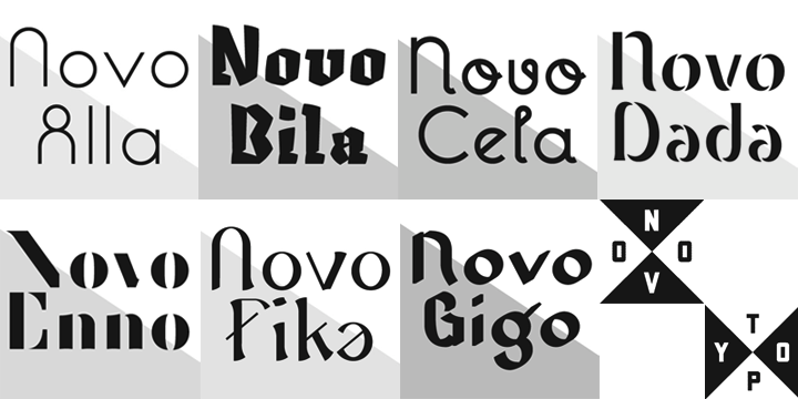
file name: Novo Typo N T Novo 2012
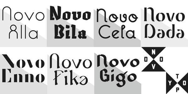
file name: Novo Typo N T Novo 2012b
file name: Novo Typo N T Novo Bila 2012
file name: Novo Typo N T Novo Enno 2012
file name: Novo Typo N T Novo Fika 2012
file name: Novo Typo N T Novo Gigo 2012

file name: Novo Type N T Yaki 2014a
file name: Novo Type N T Yaki 2014b
file name: Novo Type N T Yaki 2014c
file name: Novo Type N T Yaki 2014d
file name: Novo Type N T Yaki One 2014
file name: Novo Typo N T Fest 2014
file name: Mark Van Wageningen Guru 2013
file name: Mark Van Wageningen Guru 2013b
file name: Mark Van Wageningen Guru 2013c

file name: Mark Van Wageningen Guru 2013d

file name: Mark Van Wageningen Guru 2013e

file name: Mark Van Wageningen Lily 2013
file name: Novo Typo Cornelia 2013
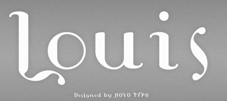
file name: Novo Typo Louis 2013
file name: Novo Typo Plakaty 2013

file name: Novo Typo Theo 2013
file name: Novo Typo Zkumavka 2013
file name: Atelier Van Wageninghen H C Type 2010

file name: Mark Van Wageningen Louis Douze 2012
file name: Mark Van Wageningen Therese Quatorze 2012
file name: Mark Van Wageningen N T Sjiq 2013
file name: Mark Van Wageningen Sjiq 2013b
file name: Mark Van Wageningen Sjiq 2013c

file name: Mark Van Wageningen Linotype Sjablony 1997
file name: Novo Typo Sjablony 1997
file name: Mark Van Wageningen Type Con 2016

file name: Mark Van Wageningen Pic
| | |
|
Luc Devroye ⦿ School of Computer Science ⦿ McGill University Montreal, Canada H3A 2K6 ⦿ lucdevroye@gmail.com ⦿ https://luc.devroye.org ⦿ https://luc.devroye.org/fonts.html |