2008. I will quote Bill Troop from the latter article. As for Burgess - - has a shred of independent evidence emerged to support the theory that this man, never hitherto associated with type - - was capable of designing TNR or any other typeface? Has a single page of a single book in Times printed before 1932 emerged? Where are the secret 'bonds' between the corporations that Mike Parker talks about? I retain my belief that Mike Parker has perpetrated a marvellous prank. There is not a single piece of verifiable evidence to support it as history.
If anything were more decisive than another, it would be Jim Rimmer's unimpeachable statement that the italic attributed to 'Burgess' was in fact designed by him. That's OK. We know Jim Rimmer is a type designer and a very, very good one. We know little of Starling Burgess except that he was never a type designer. Nobody has ever shown an original drawing. Everything we have been allowed to see has been digitized. And all the 'secret agreements' from 1960 which Mike Parker speaks of - - where are they? Why has nobody managed to photograph or scan one of them? And why has nobody, a hundred years later, been able to discover a single page printed in TNR before 1932?
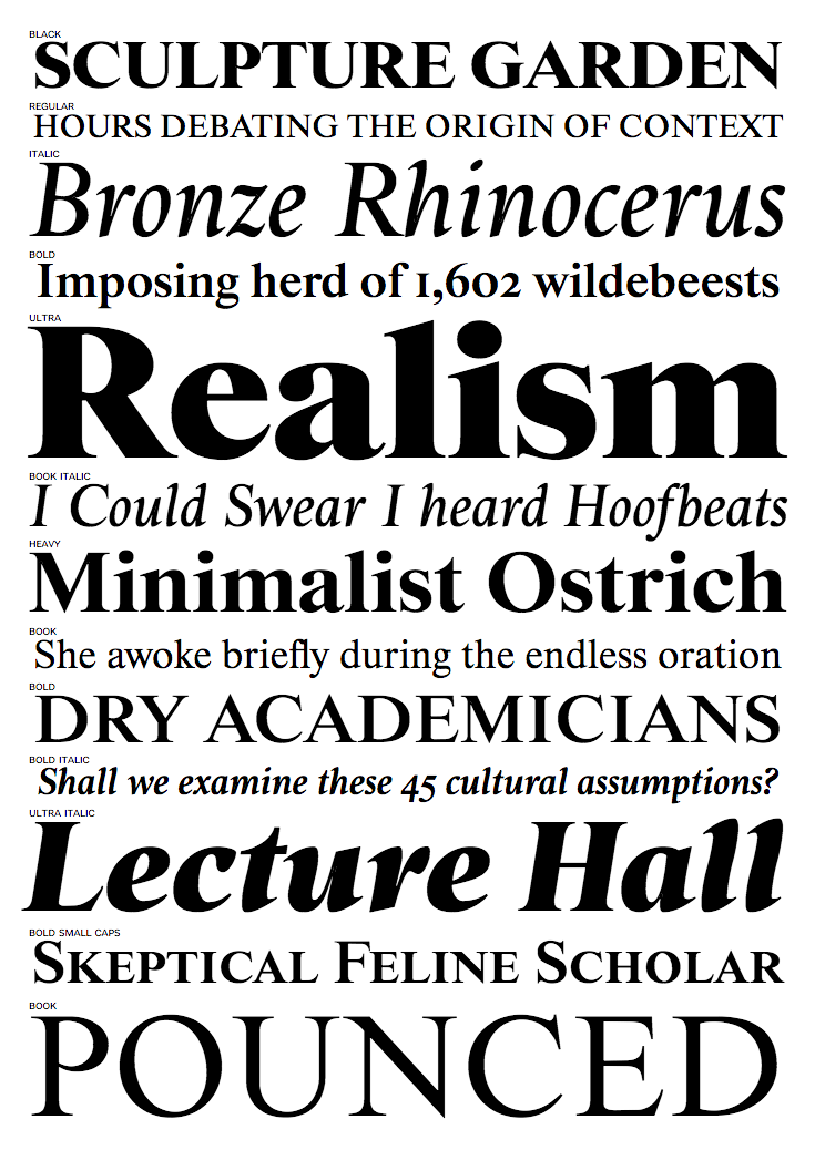
This is just an amusing hoax that doesn't even rise to the level of the pranks that are occasionally inserted into the august Grove Dictionary of Music and Musicians. However, it has served its purpose, which was to distentangle Giampa from Monotype's legal eagles. Now that Gerald's Lanston/Monotype establishment doesn't seem to exist anymore, why doesn't everyone just come clean? Even Trever-Roper admitted he had been had. It doesn't seem to have done irreparable harm, long-term, to his reputation. Joel Alas reports it differently, as he tells how Mike Parker created a new font, Starling, in 2009, in honor of Burgess, but a Times-Roman lookalike. Excerpts from his piece:
William Starling Burgess was born into a wealthy Boston family in 1878, and is best remembered as an accomplished naval and aeronautical designer, the builder of yachts for the America's Cup and aircraft for the Wright brothers. But before embarking on his stellar career on wind and water, Parker believes Burgess had a short but brilliant dalliance with typography.
An old photograph of William Starling William Starling Burgess When Giampa started investigating the Lanston Monotype archives, he claimed to have found correspondence between the company and Burgess, who, in 1904, ordered the manufacture of a font series to be used for company documents at his shipyard in Marblehead, Massachusetts. But before Lanston Monotype could complete the order, Giampa claimed, Burgess witnessed an early flight by the Wright brothers and abandoned his interest in type in favour of aviation. His original drawings were filed at the company as Number 54, and remained on a shelf for years.
Parker says that in 1921 Lanston Monotype tried unsuccessfully to sell the Number 54 font to a fledgling news magazine called Time. Sometime after that, Burgess's drawings fell into the hands of Stanley Morison, a type consultant at the Monotype Corporation in Britain, by way of Frank Hinman Pierpont, an American who managed that company's factory in Surrey and who made a career out of reviving old fonts.
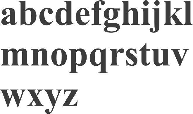
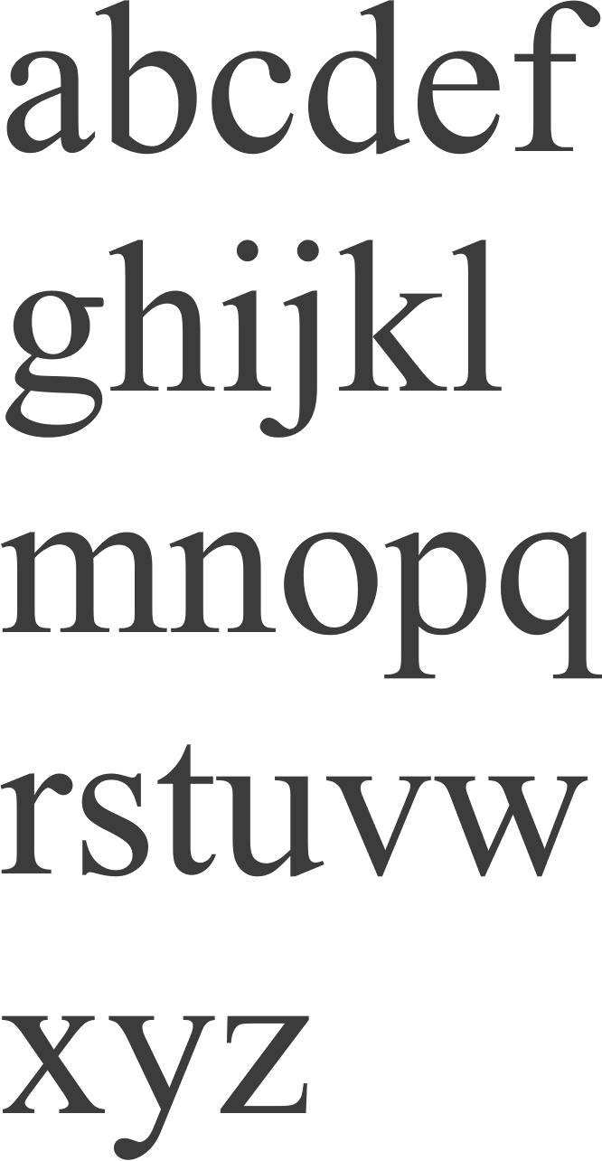
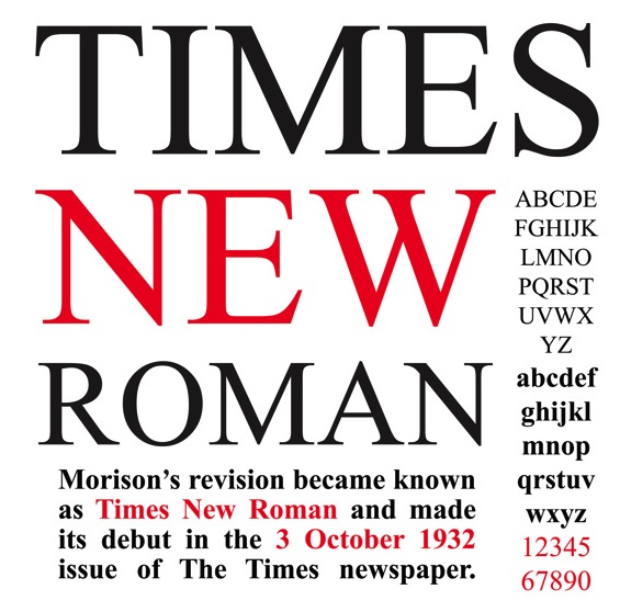
In the early 1900s typography was progressing rapidly, but newspapers were failing to keep up with the advances. The Times of London used a chunky serif font that was hard on the eye and wasteful of ink and paper. When Morison criticised The Times for its typeface in 1929, the newspaper challenged him to come up with something better. In his writings, Morison says that he looked to old-style fonts for inspiration, and set upon modifying a 16th-century typeface called Plantin. A sketch sheet was handed to Victor Lardent, a staff illustrator for The Times, who finalised the design. The Morison-Lardent drawings were accepted, and on October 3 1932, The Times went to print with its proud new typeface. [...]
"Morison knew no bounds," says Parker, who has numerous anecdotes about their many encounters that paint a picture of a cunning and devious man. Morison never took credit for designing the font himself, but claims only to have "excogitated" it. [...]
To date, no one but Giampa and Parker have claimed to have seen most of the evidence that supports the Burgess story. Sadly, no one else is likely to have the chance to verify their claims. In 1918, a fire tore through Burgess's shipyard, incinerating any documents that might have shed light on his activities during 1904, when Parker suggests he made the original drawings for the new font. On the other side of the Atlantic, a bomb blast near the London offices of Monotype Corporation in 1941 destroyed much information about Morison's activities during the redesign of The Times's typeface. The surviving brass B pattern plate of Starling The surviving brass pattern plate at the centre of the font controversy All that remained were the Lanston Monotype archives in Giampa's possession, until they too met with disaster. In January 2000, Giampa's house was flooded, and a century's worth of printing history was lost. "The bulk of the files ended up in a dumpster," Giampa said. FontBureau (see also here) perpetuates the story: In 1904 William Starling Burgess, gifted American polymath, drew his second type for Lanston Monotype, designated Lanston No. 54. A few years later, Burgess would abandon type for a distinguished career designing experimental aircraft, racing yachts, and the Dymaxion automobile. The type languished for decades until Frank Hinman Pierpont, American head of the British Monotype factory, passed on proofs of the design to Stanley Morison, who was developing a new roman for The Times of London. Mike Parker found the original drawings, now housed at the Smithsonian Institution, to be superior and prepared the Starling series for Font Bureau.
[Note: Images below by Alex Delgado.]
