TYPE DESIGN INFORMATION PAGE last updated on Mon Jul 20 20:57:22 EDT 2026
FONT RECOGNITION VIA FONT MOOSE

|
|
|
|
Robert Wiebking
Born in Schwelm, Germany, 1870, Robert Wiebking emigrated to the United States in 1881 with his father Hermann Wiebking, and became an apprentice engraver in Chicago. After another apprenticeship in 1884, with C.H. Hanson in Chicago, he became an independent professional matrix engraver in 1892 in that city for several American and English founders and for Ludlow, who cut many of Goudy's types, as well as types for Bruce Rogers and Robert H. Middleton. In 1894 Robert Wiebking and Henry H. Hardinge (also from Chicago) built the first successful machine for engraving type matrices. In 1896, they became partners and set up Wiebking, Hardinge & Co in 1901, manufacturing matrices for type foundries. This led them to set up the Advance Type Foundry in Chicago. He died in 1927 in Chicago. Designer of these typefaces:
Bio at No Bodoni. FontShop link. Linotype link. Klingspor link. |
EXTERNAL LINKS |
| | |


file name: Robert Wiebking Venus Bold Extended 1924

file name: Scangraphic Digital Type Collection Venus S B 2014

file name: Font Bureau Scout 2014

file name: Linotype Venus 2014
file name: Robert Wiebking Bauersche Venus Light Extended 1907

file name: U R W Venus 2014
file name: U R W Venus U R W Medium 2010

file name: U R W Venus U R W after Robert Wiebking Bauersche Venus 1907 1927

file name: U R W Venus U R W Bold after Robert Wiebking Bauersche Venus 1907 1927
file name: U R W Venus U R W Cond Light after Robert Wiebking Bauersche Venus 1907 1927
file name: Nick Curtis Venusian Ultra N F 2014 after Bauersche Venus 1907 1927

file name: Typodermic Akazan 2014

file name: Emboss Eurydome 2014

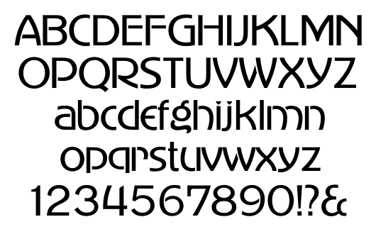
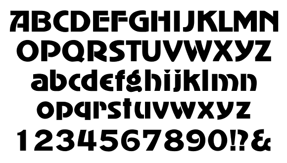
file name: Red Rooster Collection Steelplate Gothic Pro 2017 238976
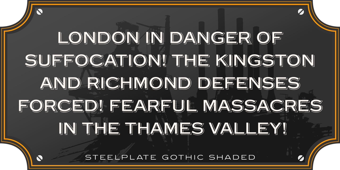
file name: Red Rooster Collection Steelplate Gothic Pro 2017 238979

file name: Red Rooster Collection Steelplate Gothic Pro 2017 238982

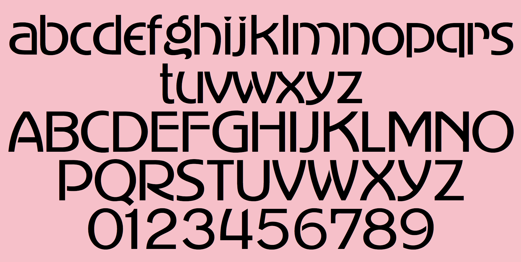
file name: U R W Artcraft 2001 after Robert Wiebking Artcraft 1912
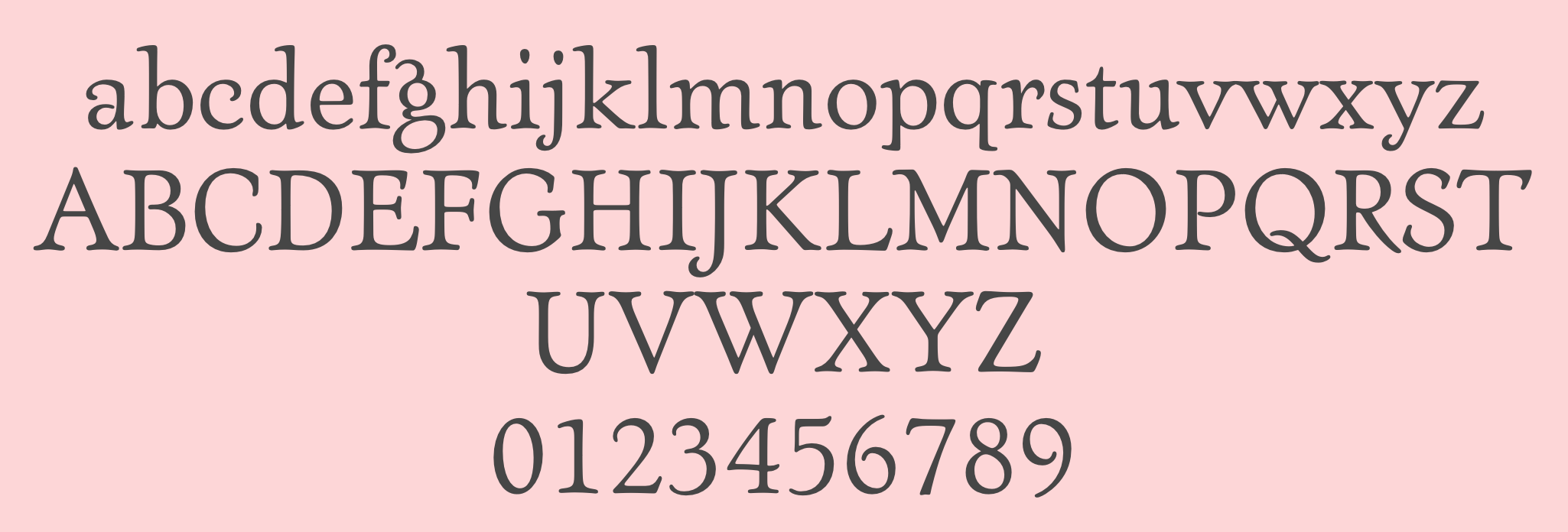
file name: Jim Ford Ascender Artcraft Pro 2007 after Robert Wiebking 1912
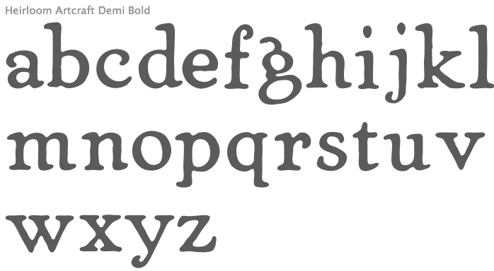
file name: Nathan Williams Heirloom Artcraft Demi Bold 2013

file name: Advance Type Foundry Art Craft Series from American Printer 1913
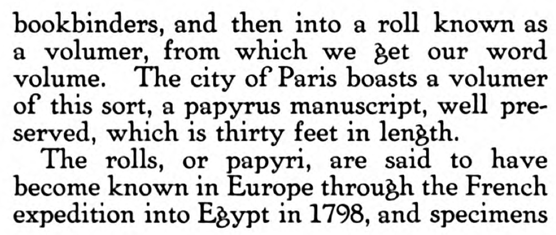
file name: Advance Type Foundry Art Craft Series from American Printer 1913b
file name: Castcraft O P T I Artcraft Light C 1990 1991

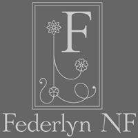
file name: Nick Curtis Federlyn Initials N F 2011
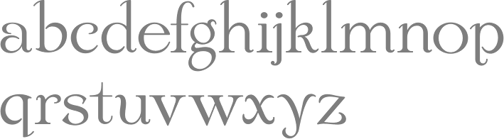
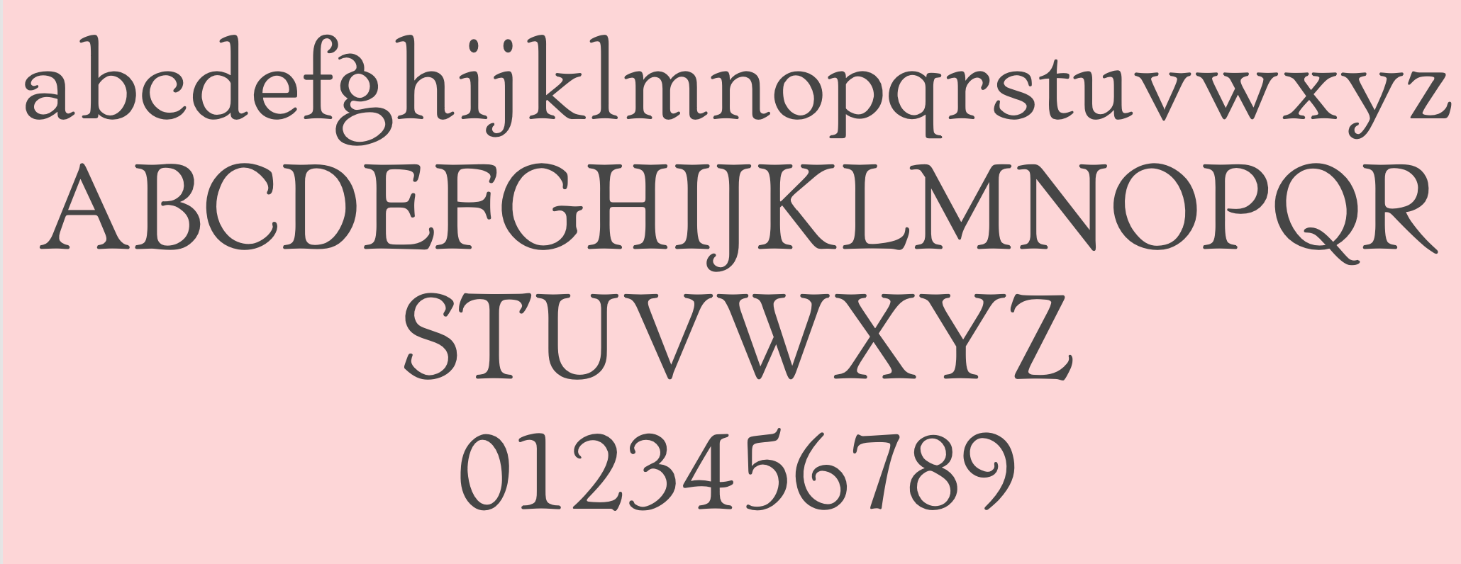
file name: Nick Curtis Federlyn N F 2011
file name: Nick Curtis Federlyn N F 2011b

file name: Robert Wiebking Advertisers Gothic 1917
file name: Robert Wiebking Advertisers Gothic 1917b
file name: Robert Wiebking Advertisers Gothic 1917c
file name: Monotype Advertisers Gothic 2016 after Robert Wiebking 1917

file name: Softmaker Advertisers Gothic after1917 Robert Wiebking 2010
| | |
|
Luc Devroye ⦿ School of Computer Science ⦿ McGill University Montreal, Canada H3A 2K6 ⦿ lucdevroye@gmail.com ⦿ https://luc.devroye.org ⦿ https://luc.devroye.org/fonts.html |