TYPE DESIGN INFORMATION PAGE last updated on Mon Jun 8 17:57:39 EDT 2026
FONT RECOGNITION VIA FONT MOOSE

|
|
|
|
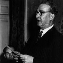
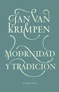
Jan van Krimpen
Major Dutch typographer and type designer, b. Gouda, 1892, d. Haarlem, 1958. He studied at the Koninklijke Academie van Beeldende Kunsten in Den Haag (1908-1912) and joined Enschedé in 1925. He had a considerable influence on the next generation of type designers. His typefaces include:
Van Krimpen had a difficult character. Lines&Splines wrote this: Alastair Johnston, from an issue of Ampersand, once posed the question, "Do you have to be an asshole to be a good type designer?" Gerard Unger replied to the effect that even to this day, people will look over their shoulders before discussing Van Krimpen. One can almost imagine Van Krimpen waving one of his sharp serifs over his head like a stick, flailing against the difficulties of his everyday relations, his nostrils flared as they were in every portrait taken of him. MyFonts page. CV at Linotype. FontShop link. Some of his work and correspondence can be found at the University of Amsterdam. A list of typefaces based on Jan Van Krimpen's work:
Author of On Designing and Devising Type (1957, New York: the Typophiles, & Heemstede). |
EXTERNAL LINKS |
| | |

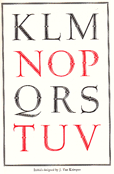
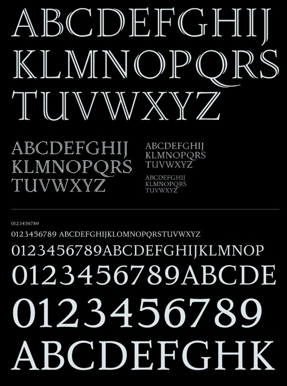
file name: Jan Van Krimpen Curwen Initials 1928 A R Types Version

file name: Ari Rafaeli Curwen Initials after Jan Van Krimpen 1925

file name: A R Types Curwen Initials 2008 J V K
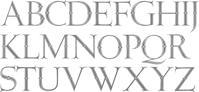
file name: Jan Van Krimpen Initials 1931
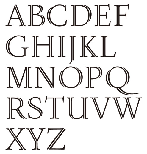
file name: Jan Van Krimpen Open Kapitalen 1928

file name: hostetler/hostetler 26
file name: Holger Koenigsdoerfer Romanee 2017
file name: Holger Koenigsdoerfer Romanee 2017b
file name: Holger Koenigsdoerfer Romanee 2017c
file name: Holger Koenigsdoerfer Romanee 2017d
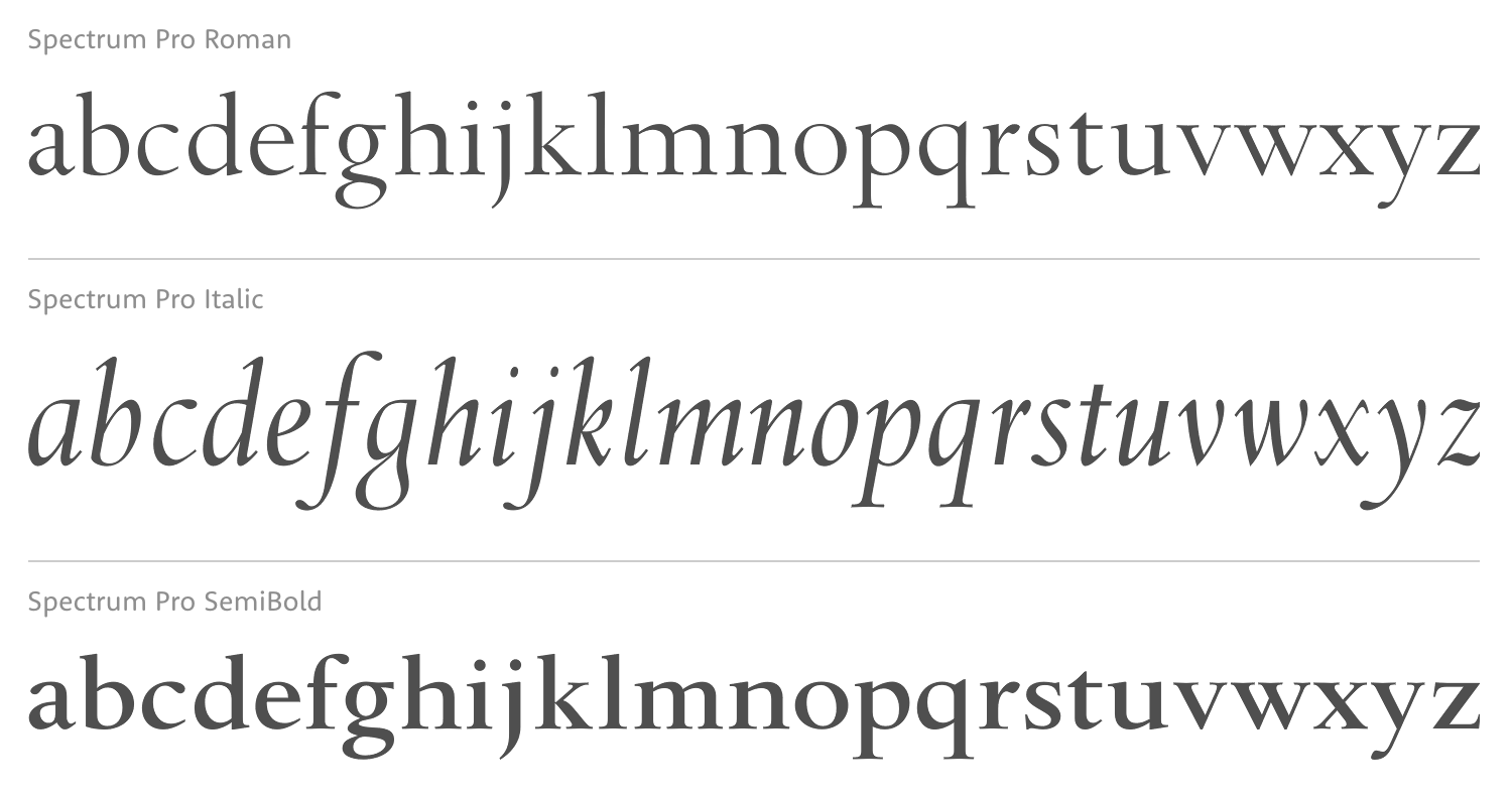
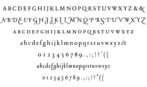
file name: Monotype Spectrum 1955 after Jan Van Krimpen Spectrum 1941 1943
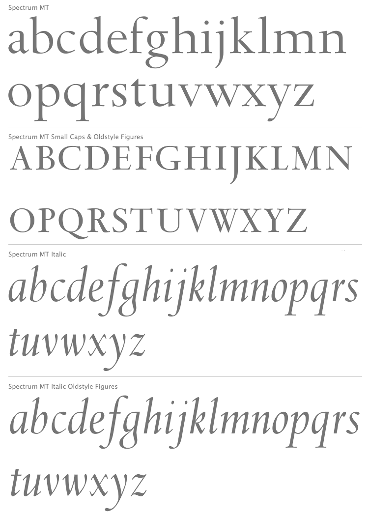
file name: Jan Van Krimpen Spectrum M T 1941 1943
file name: Jan Van Krimpen Spectrum M T 1942
file name: hostetler/hostetler 25 medium
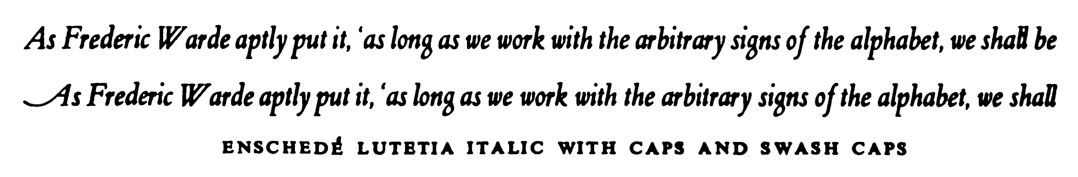
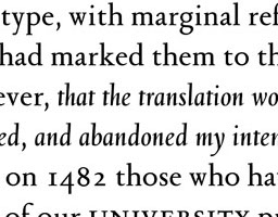
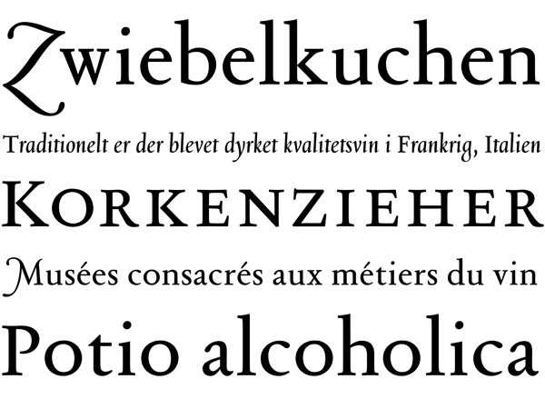
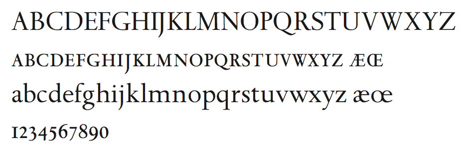
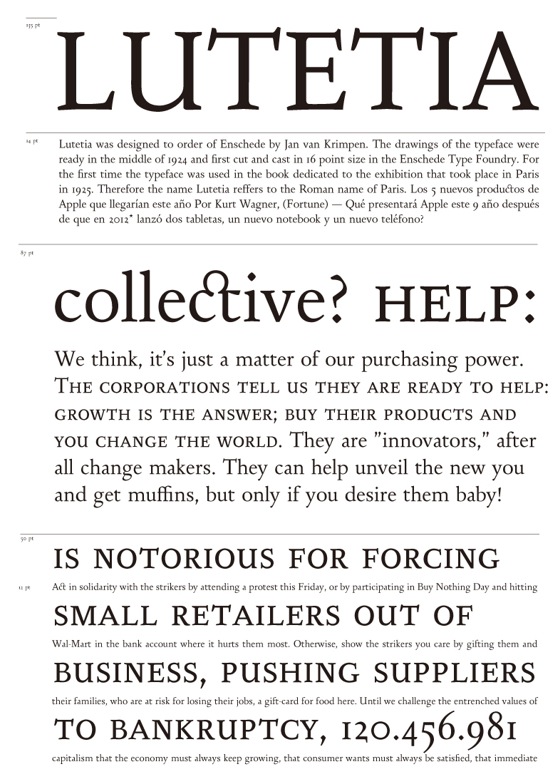
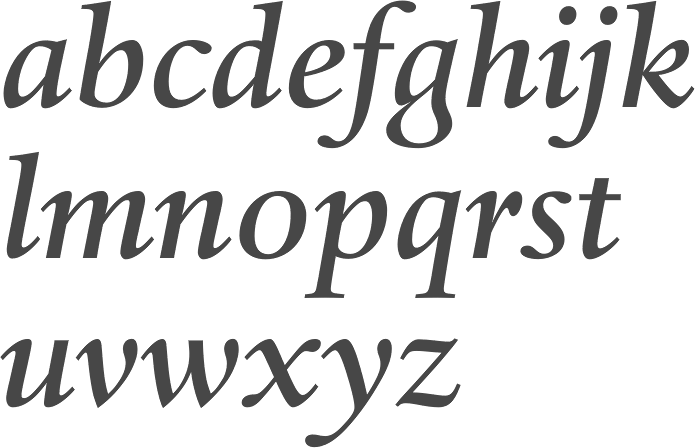
file name: Jan Van Krimpen Enschede Lutetia Italic 1925

file name: Jan Van Krimpen Enschede Lutetia Roman 1925

file name: Jan Van Krimpen Lutetia Open 1925
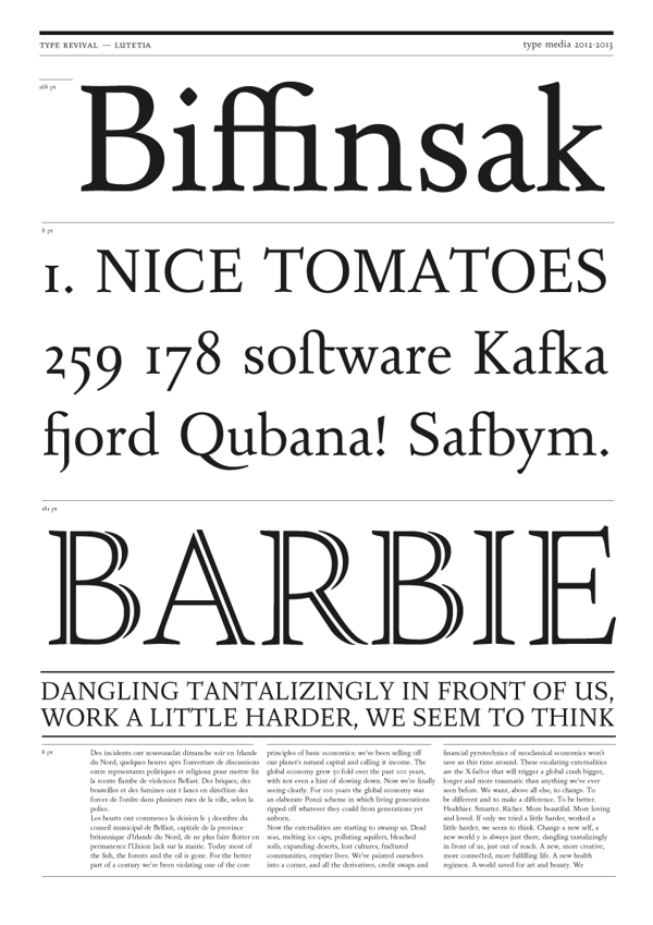
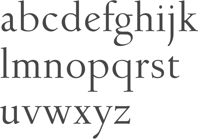
file name: Barbara Bigosinska Lutetia 2013
file name: Barbara Bigosinska Lutetia 2013b
file name: Barbara Bigosinska Lutetia 2013c
file name: Barbara Bigosinska Lutetia 2013d
file name: Barbara Bigosinska Lutetia 2013e
file name: Ralph M Unger Lutetia Nova 2014 after Jan Van Krimpen Lutetia 1924
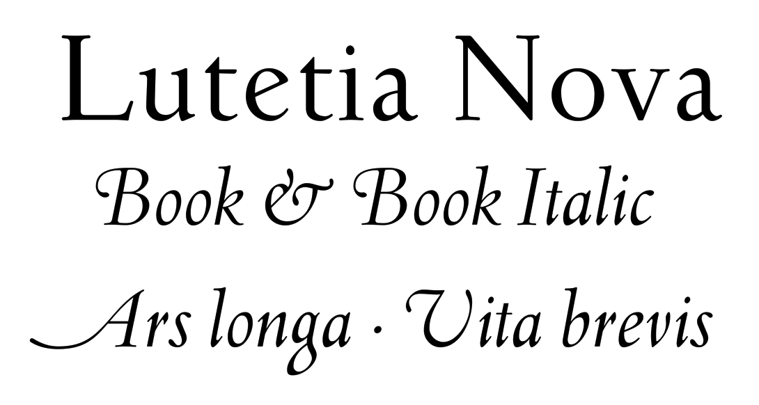
file name: Ralph M Unger Lutetia Nova 2014 after Jan Van Krimpen Lutetia 1924b
file name: Ralph M Unger Lutetia Nova Book Italic 2014 after Jan Van Krimpen Lutetia 1924
file name: hostetler/hostetler 27 medium
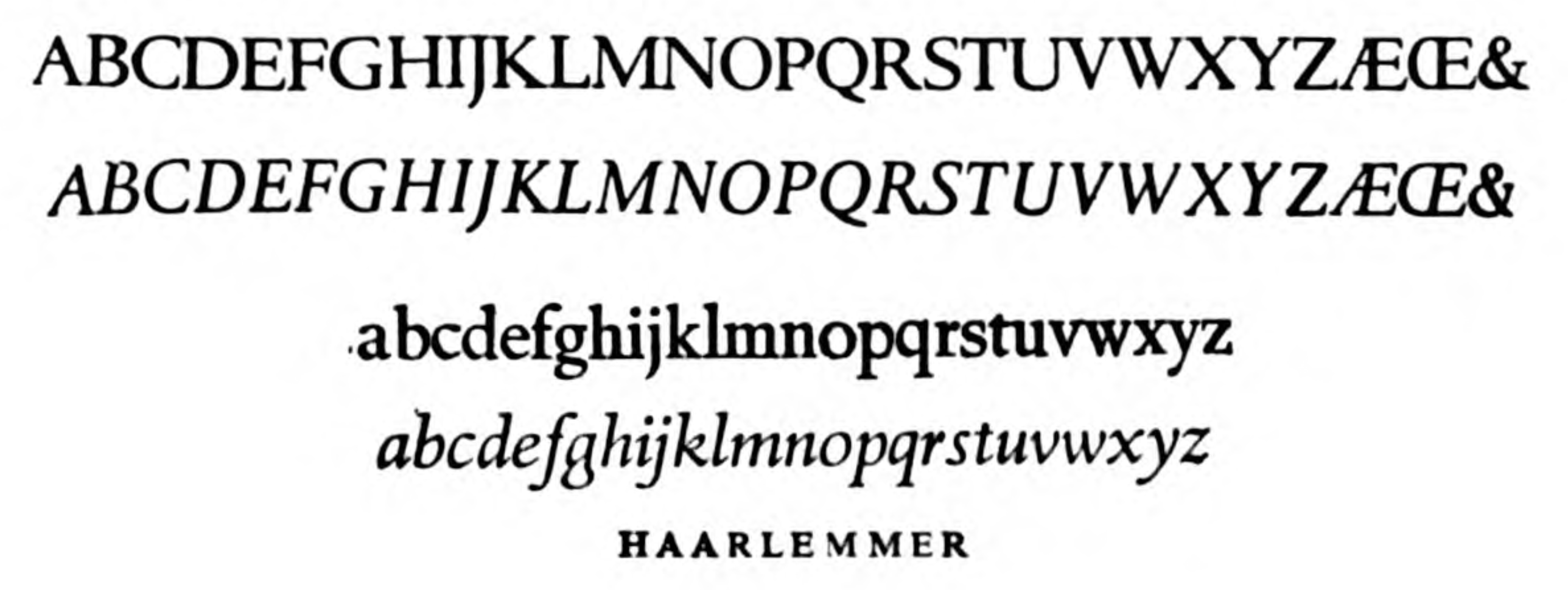
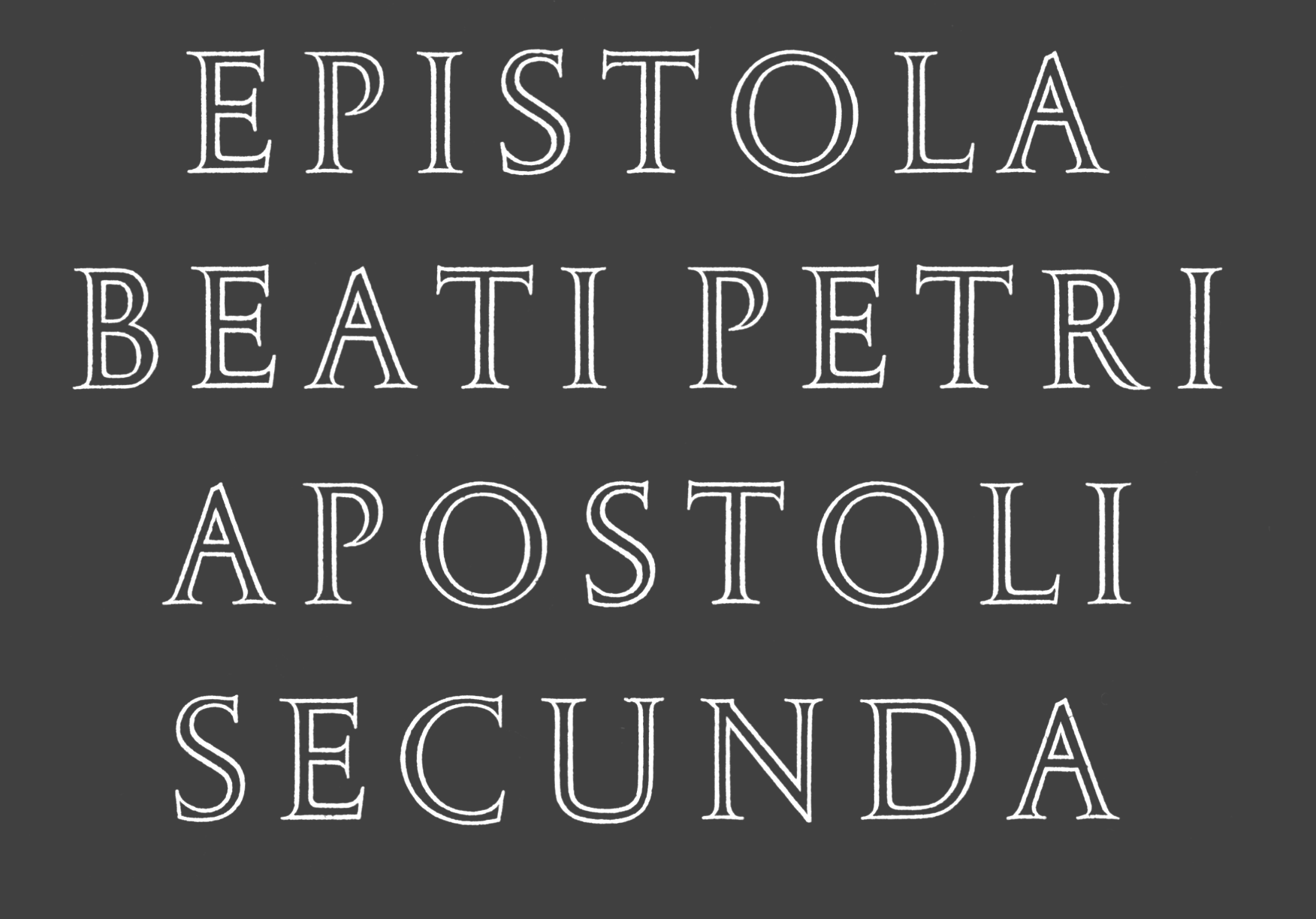
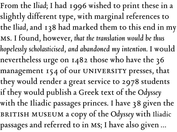
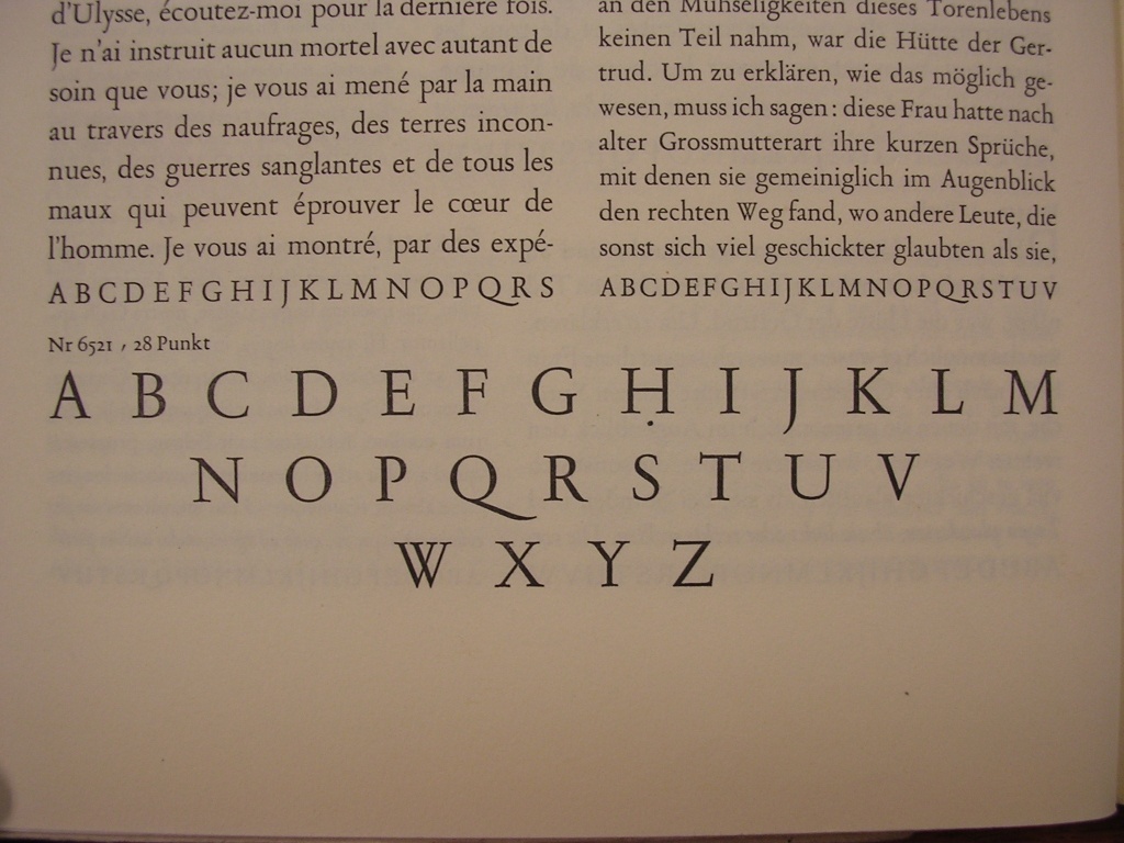
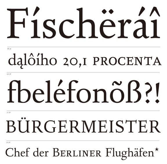
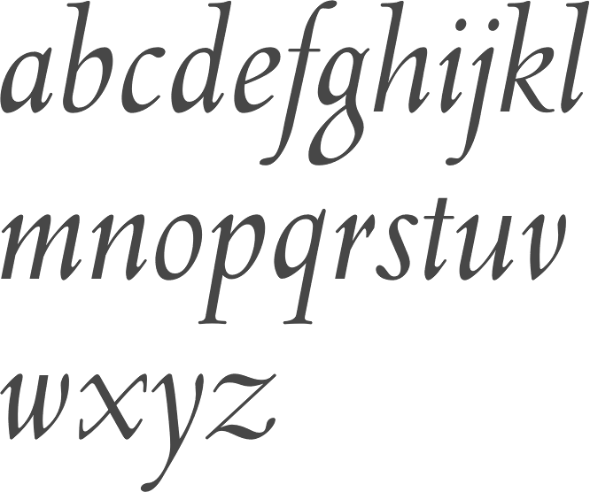
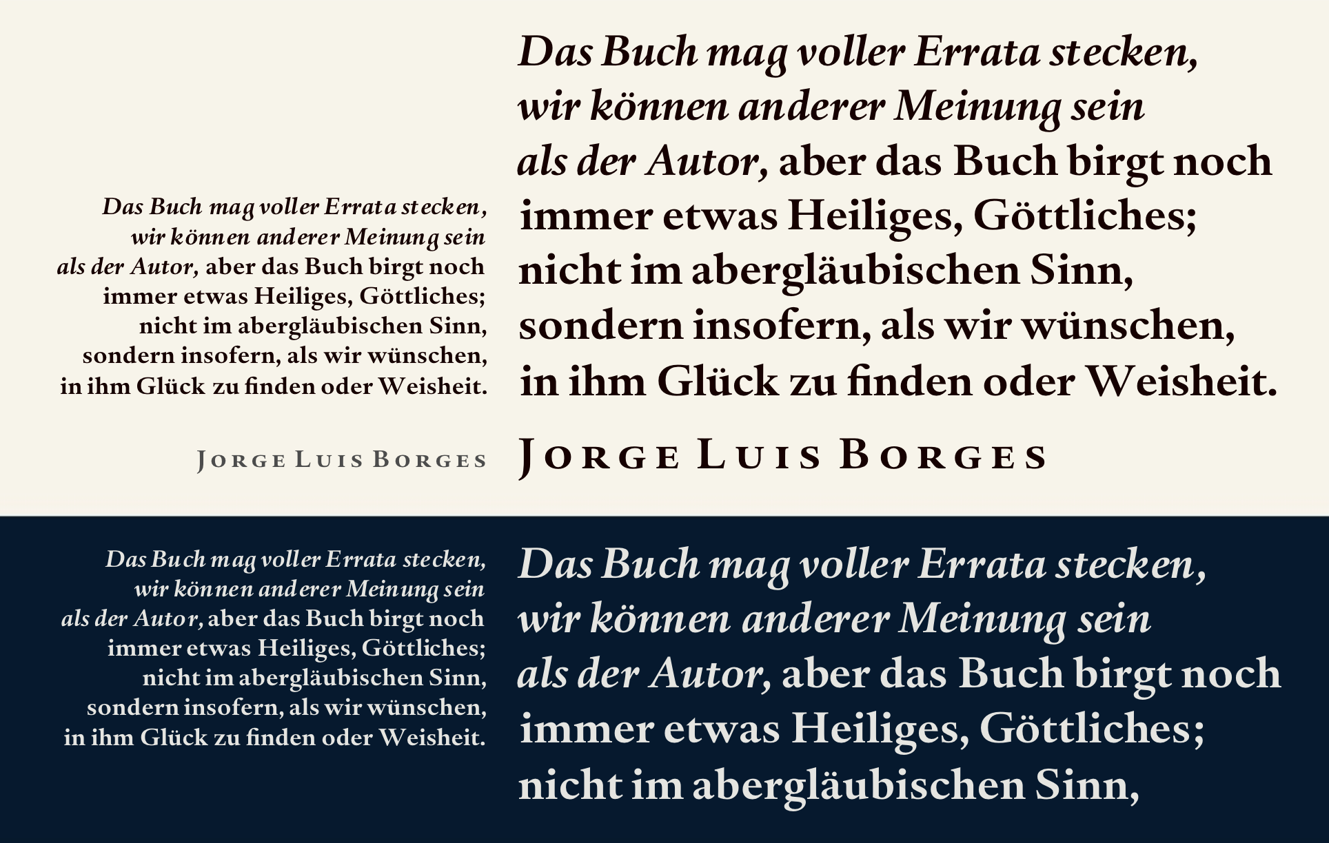
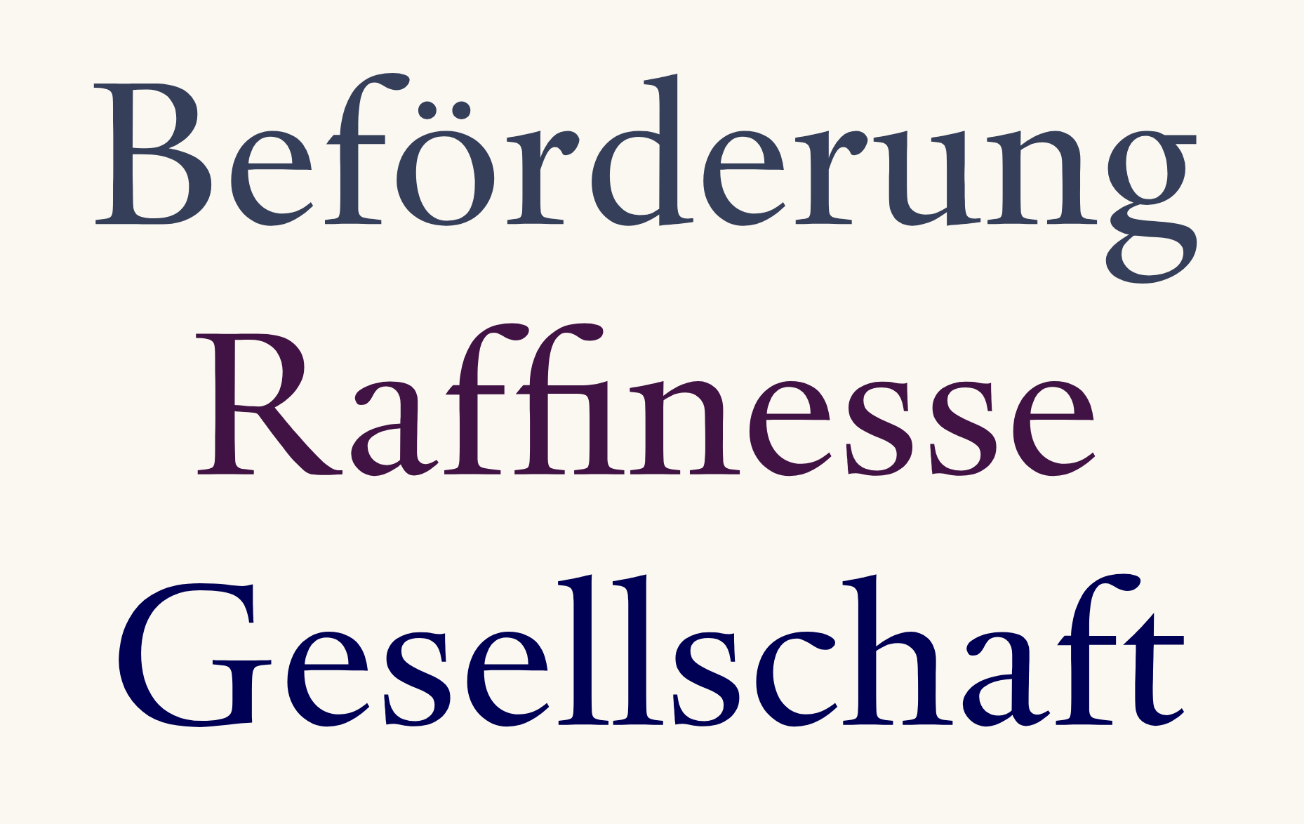
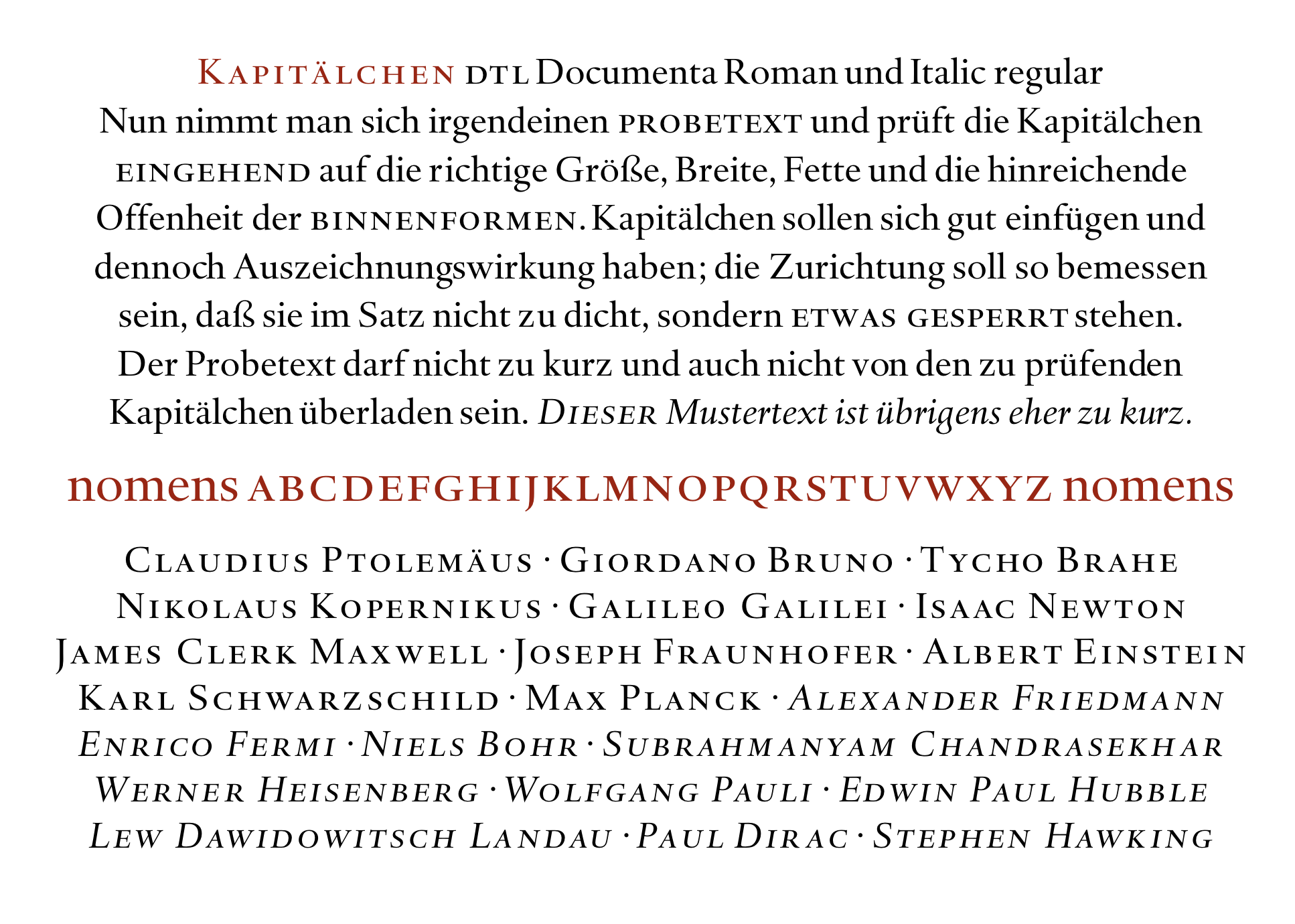
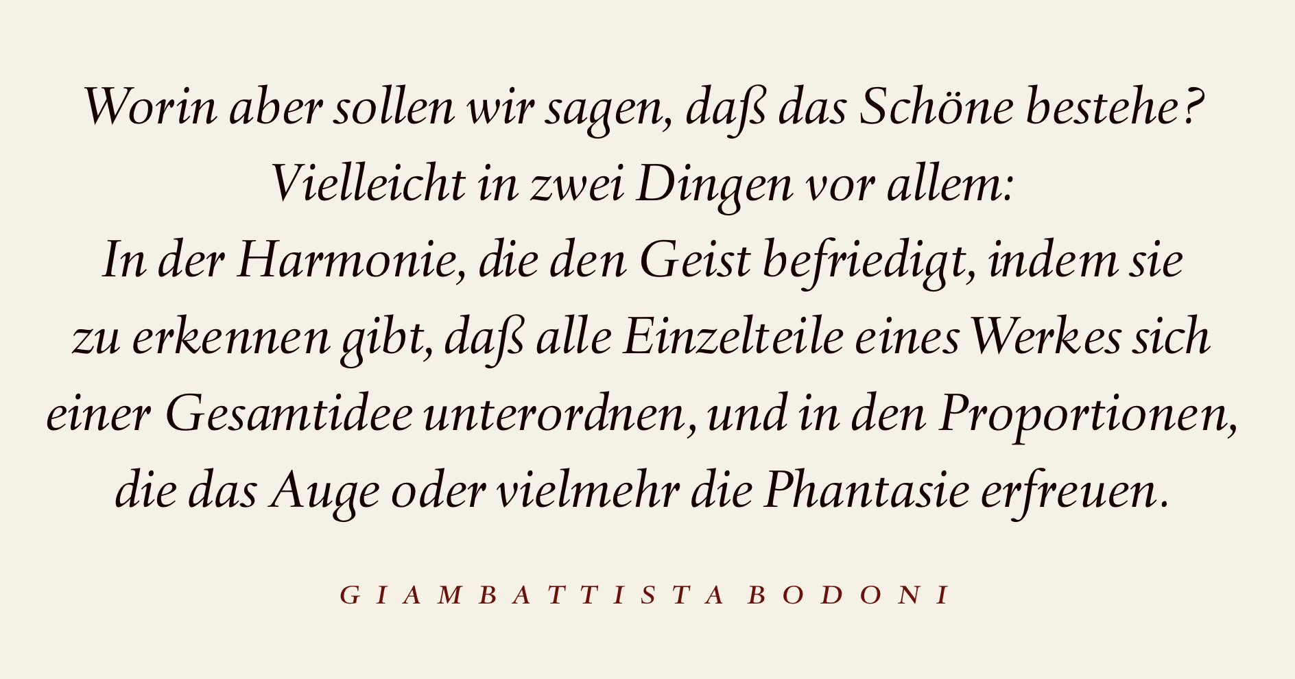
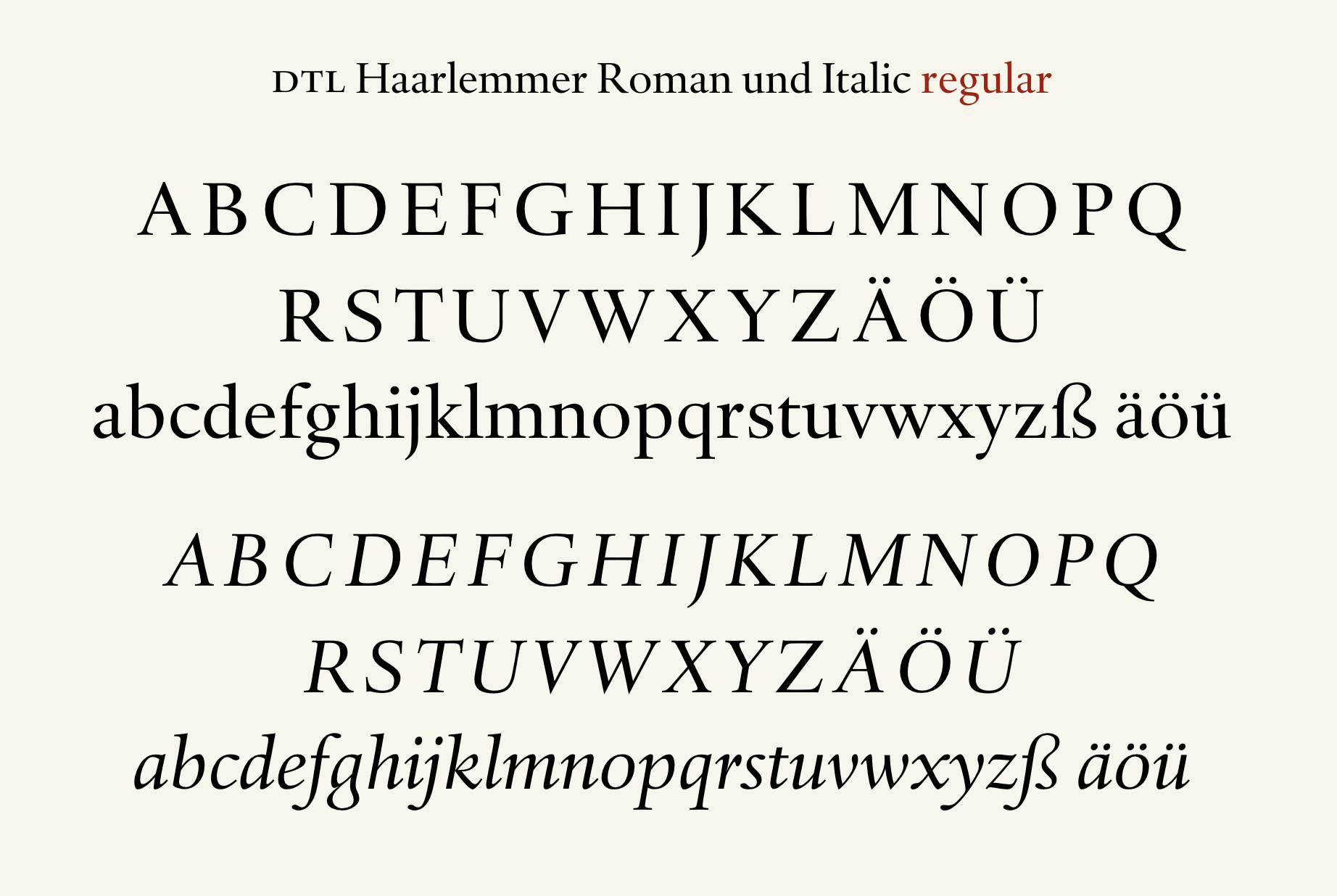
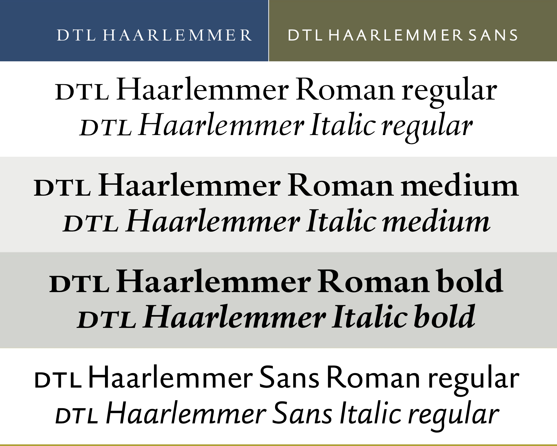
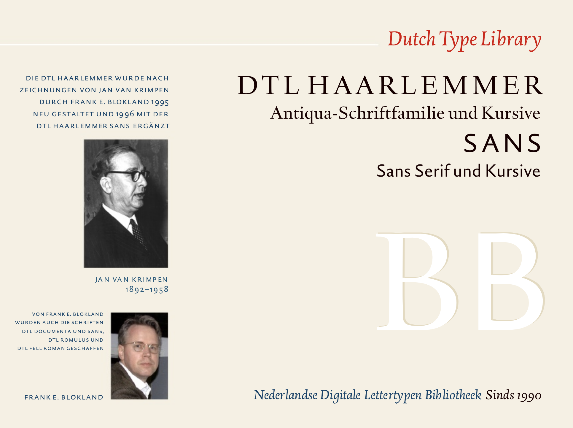
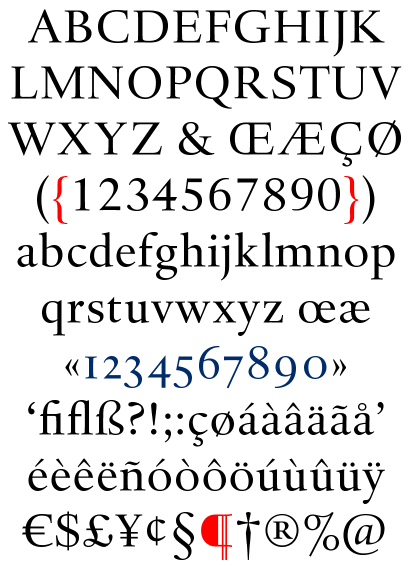
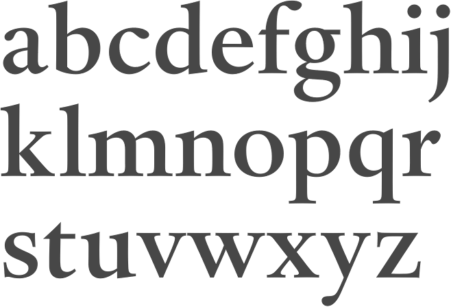
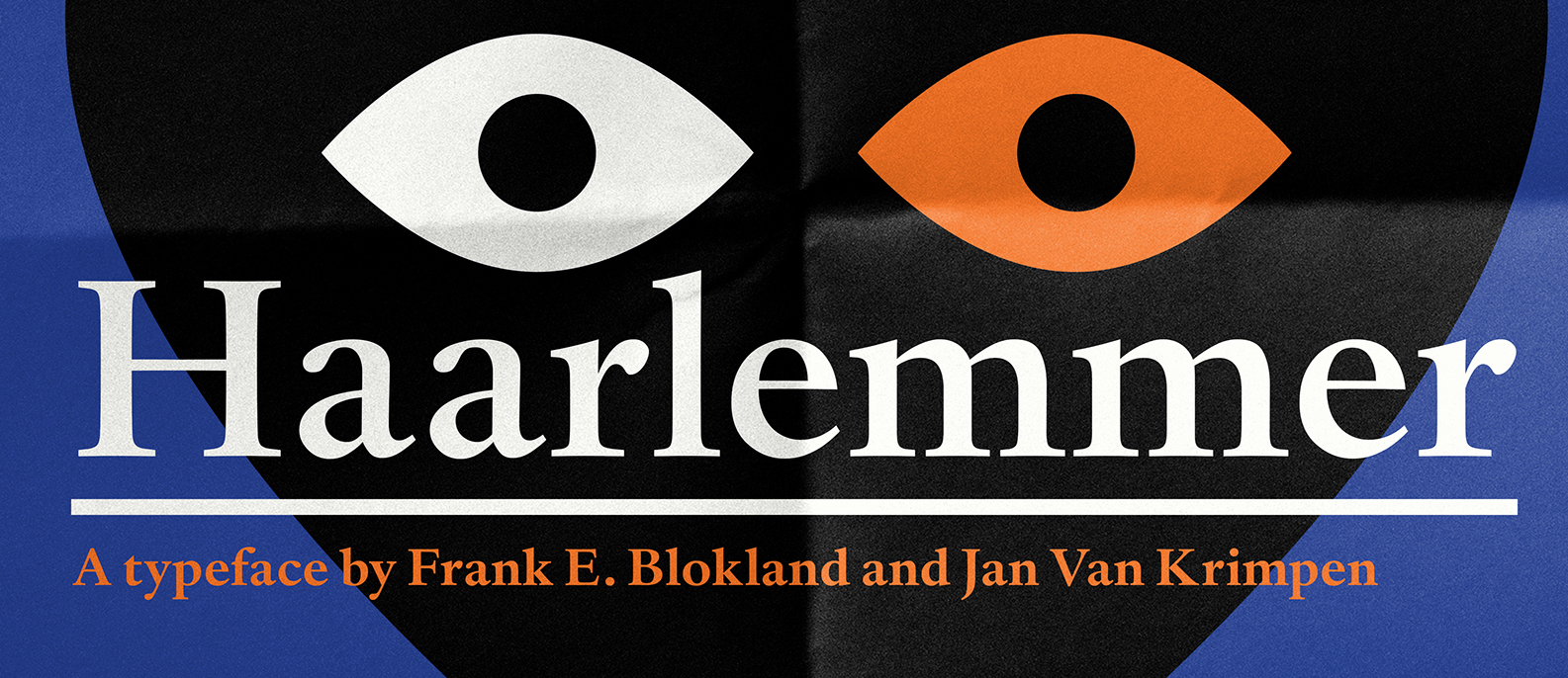
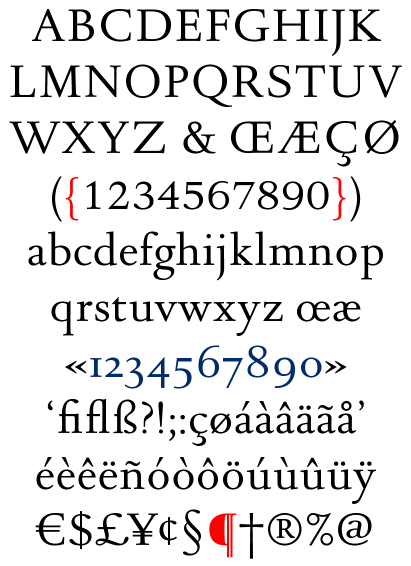
file name: Jan Van Krimpen Haarlemmer 1938
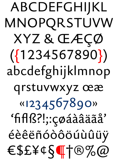
file name: Frank E Blokland D T L Haarlemmer 1994 after Jan Van Krimpen 1938
file name: Frank E Blokland D T L Haarlemmer 1994 after Jan Van Krimpen 1938b
file name: Frank E Blokland D T L Haarlemmer 1994 after Jan Van Krimpen 1938c
file name: Frank E Blokland D T L Haarlemmer 1994 after Jan Van Krimpen 1938d
file name: Frank E Blokland D T L Haarlemmer 1994 after Jan Van Krimpen 1938e
file name: Frank E Blokland D T L Haarlemmer 1994 after Jan Van Krimpen 1938f

file name: Frank E Blokland D T L Haarlemmer 1994 after Jan Van Krimpen 1938g
file name: Frank E Blokland D T L Haarlemmer 1994 after Jan Van Krimpen 1938h

file name: Frank E Blokland D T L Haarlemmer 1994 after Jan Van Krimpen 1938i
file name: Frank E Blokland D T L Haarlemmer 1994 after Jan Van Krimpen 1938j
file name: Frank E Blokland D T L Haarlemmer 1994 after Jan Van Krimpen 1938k
file name: Frank E Blokland D T L Haarlemmer 1994 after Jan Van Krimpen 1938l
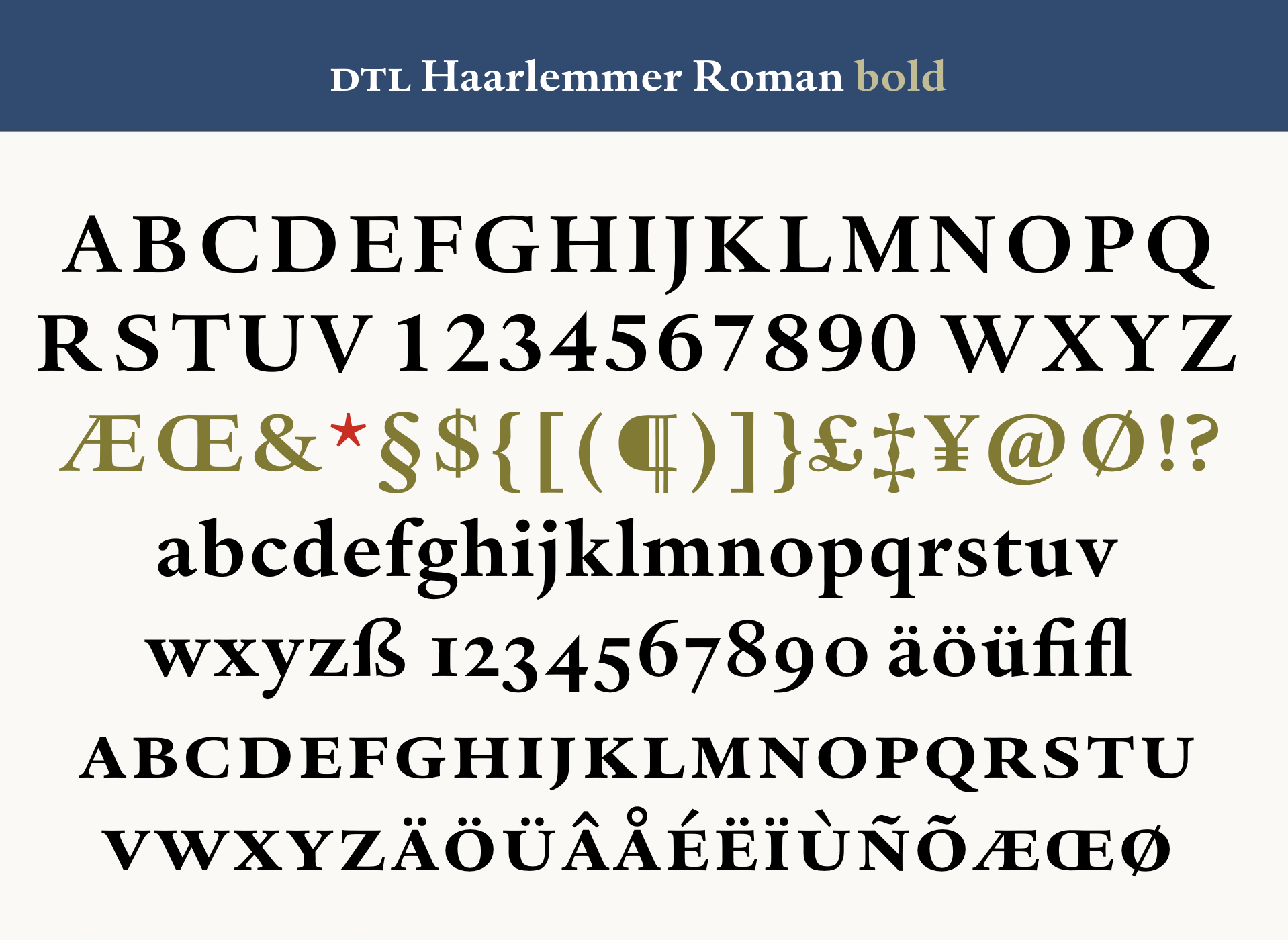
file name: Jan Van Krimpen D T L Haarlemmer
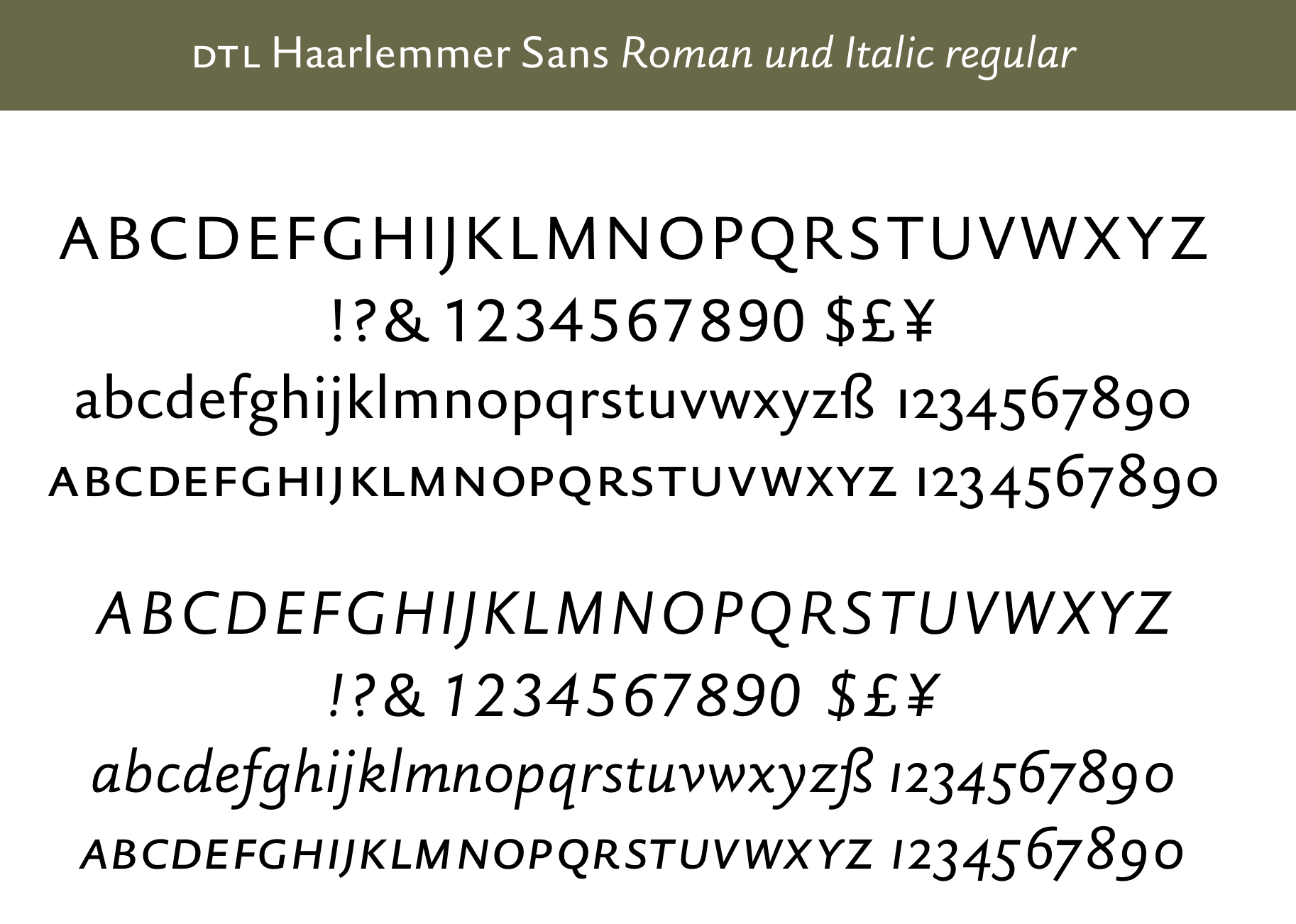
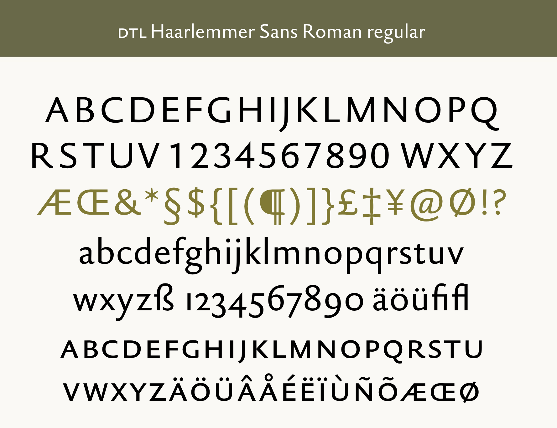
file name: Jan Van Krimpen D T L Haarlemmer Sans
file name: Frank E Blokland Haarlemmer Std Medium Monotype 1998 after Jan Van Krimpen
file name: Frank E Blokland Haarlemmer Std Medium Italic Monotype 1998 after Jan Van Krimpen
file name: Frank E Blokland Haarlemmer Std Medium Monotype 1998 after Jan Van Krimpen Poster by Michael Sallit 2017
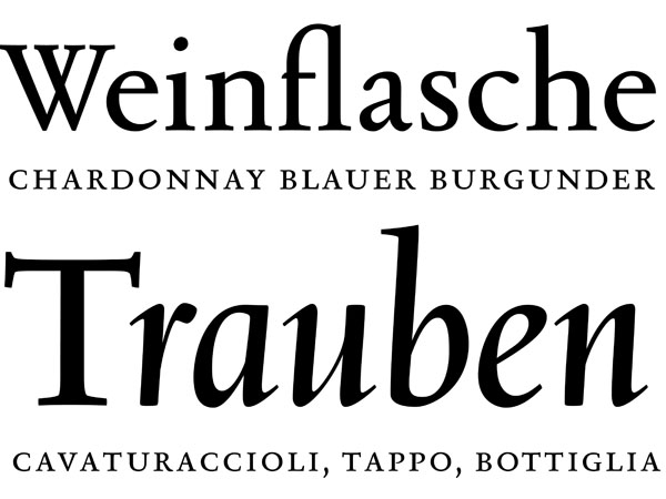
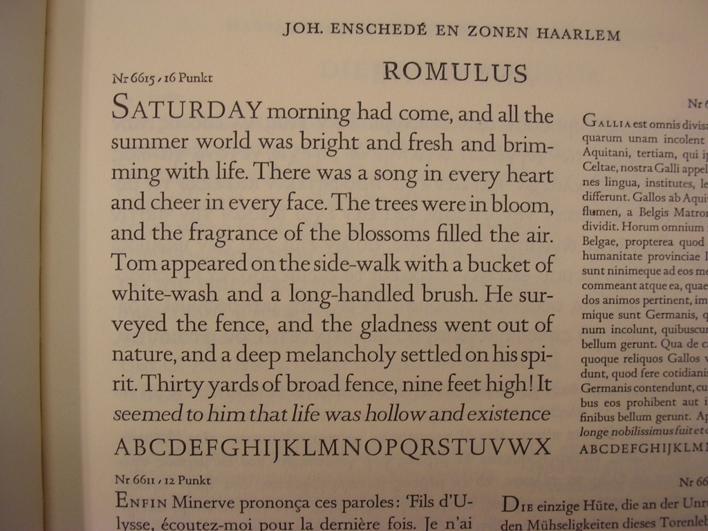
file name: Jan Van Krimpen D T L Romulus
file name: Jan Van Krimpen Pic
file name: Jan Van Krimpen Circulo De Tipografos 2009
| | |
|
Luc Devroye ⦿ School of Computer Science ⦿ McGill University Montreal, Canada H3A 2K6 ⦿ lucdevroye@gmail.com ⦿ https://luc.devroye.org ⦿ https://luc.devroye.org/fonts.html |