|
Emil Gursch
German foundry based in Berlin, active from 1866 until 1917, when it was acquired by H. Berthold AG. Klingspor's file on Gursch. Typefaces published by them include: - Accidenz-Versierungen.
- Akademisch.
- Alexandra (<1897).
- Antiqua No. 2 through 9.
- Apollo Grotesque (1897).
- Alt-Gotisch (1899) mager&halbfett. Altgothische initialen.
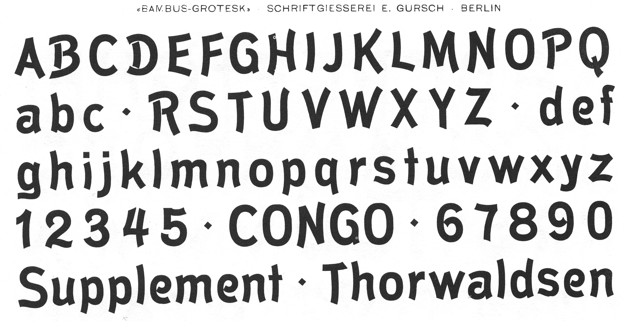
- Bambus Grotesque (1896).
- Berliner Fraktur (ca. 1897).
- Briefschrift Deutsch (<1899).
- Britannia-Versalien (1902).
- Continental Grotesque.
- Dekorative Vignetten (1899).
- Egyptienne.
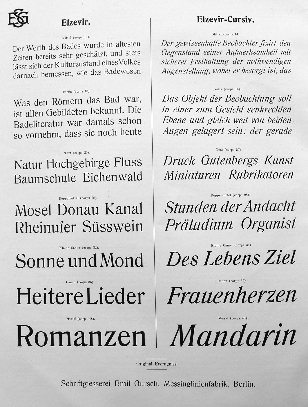
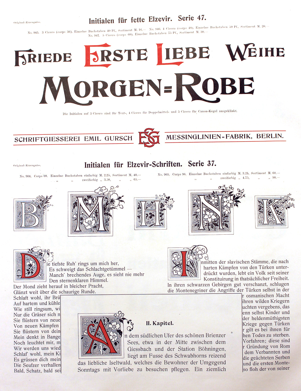
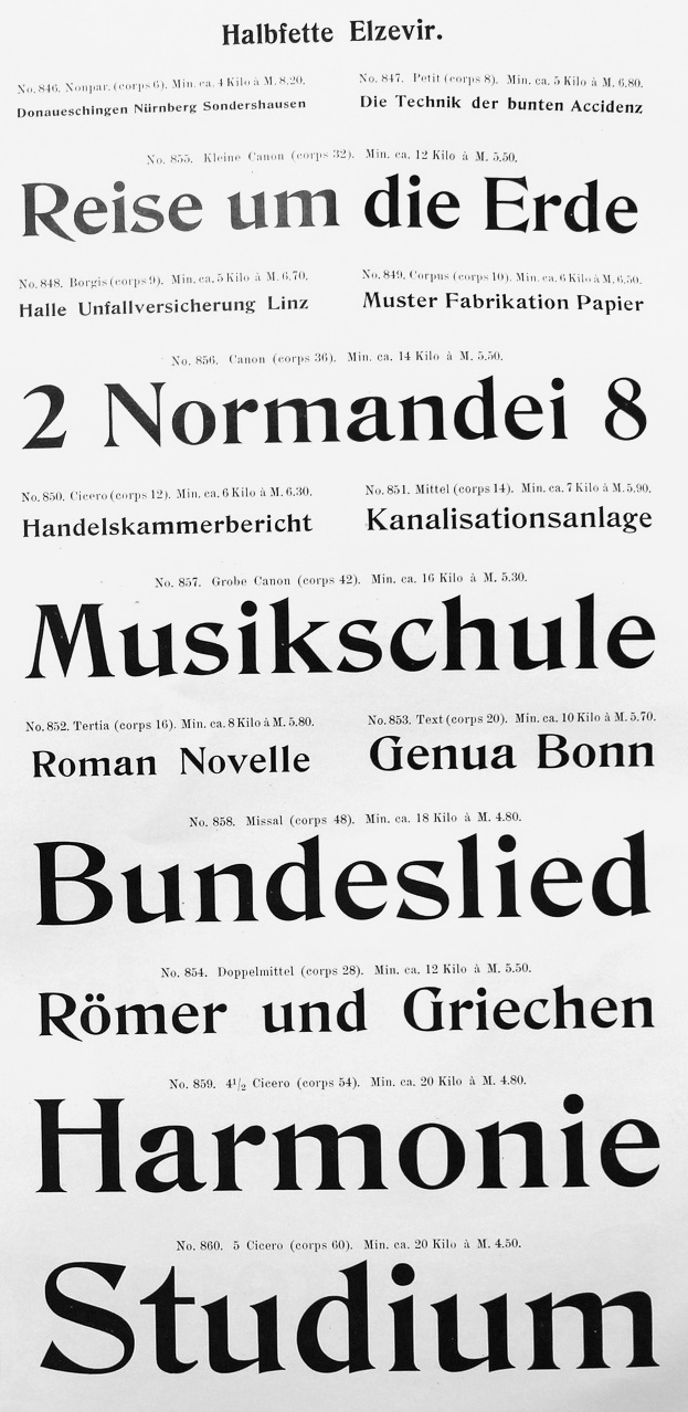
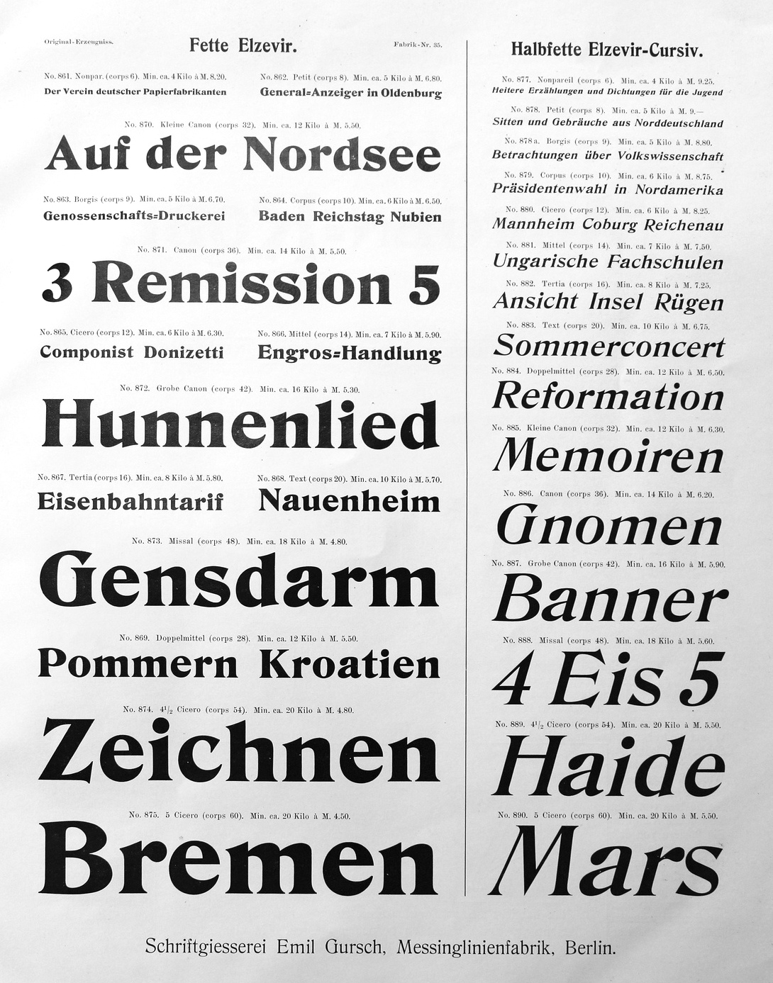
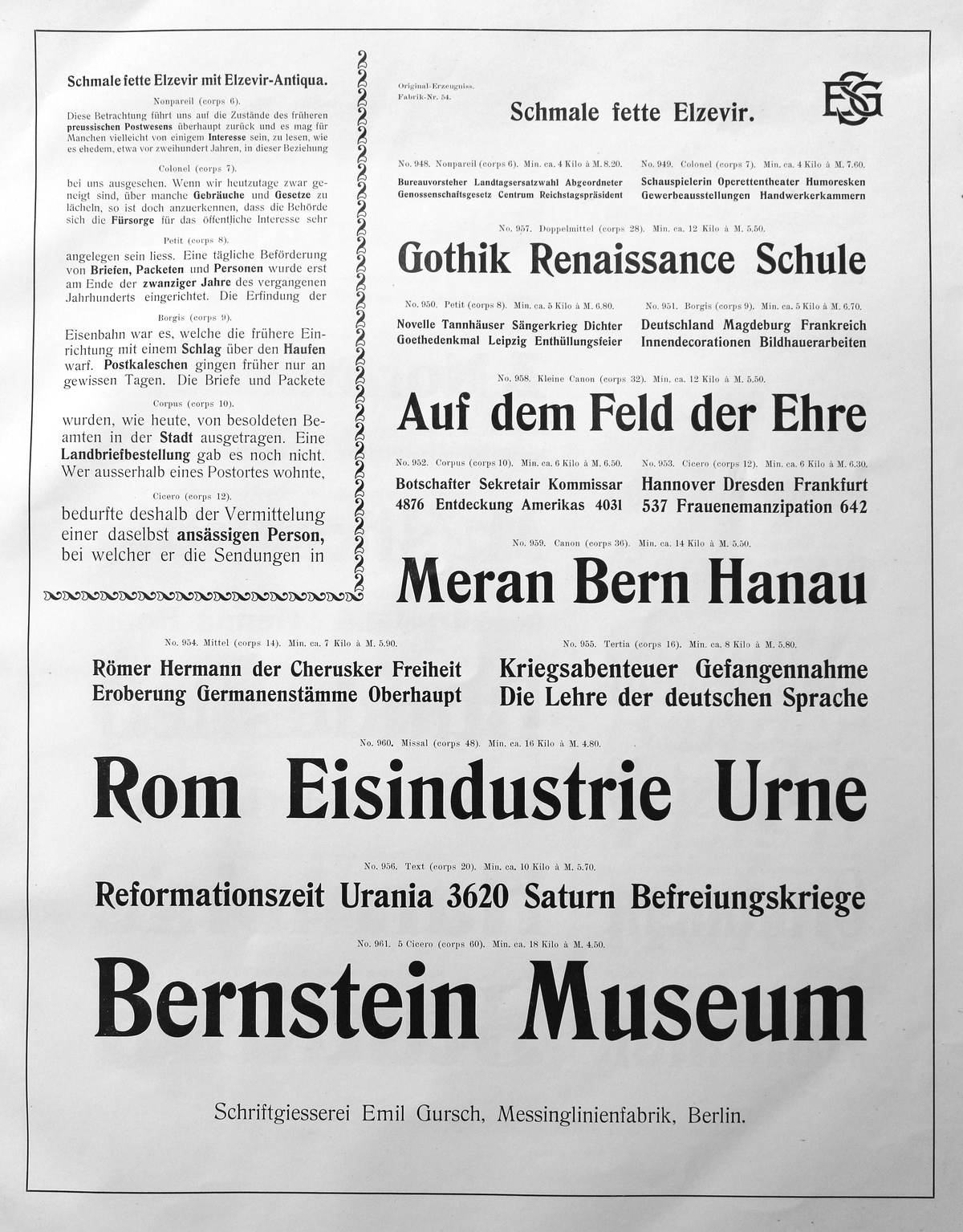
- Elzevir, ca. 1899: many weights and styles.
- Eskorial (1909) and Eskorial halbfett (1908) by Eduard Lautenbach, published by Emil Gursch.
- Flächer Ornamente (1899).
- Fraktur 14g (1910), Fraktur 14 halbfett (1915), Fraktur 16 (1916), Fraktur No.4 through No.8. Halbfette and Moderne schmale halbfette Fraktur, Schmale Fette Zeitungs-Fraktur, Fette Fraktur.
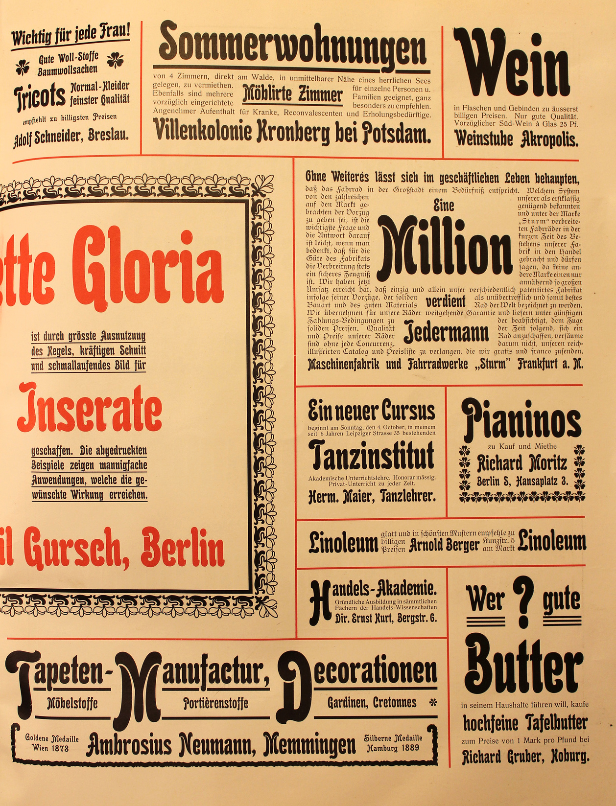
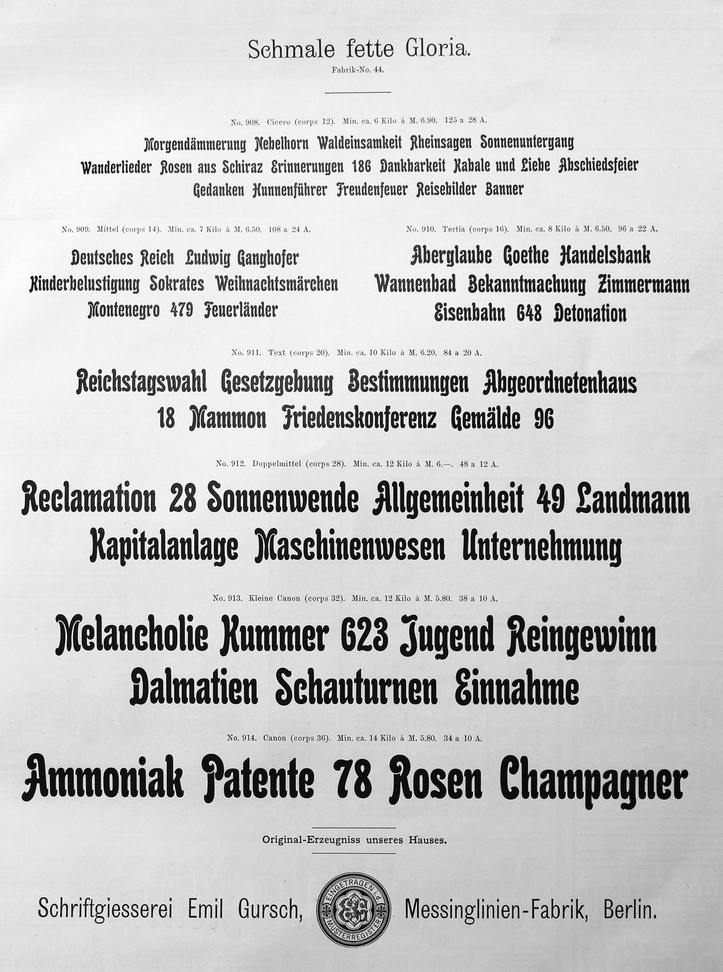
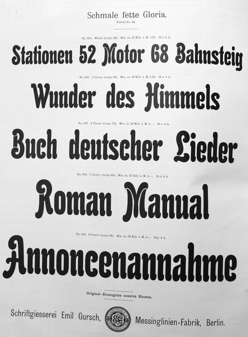
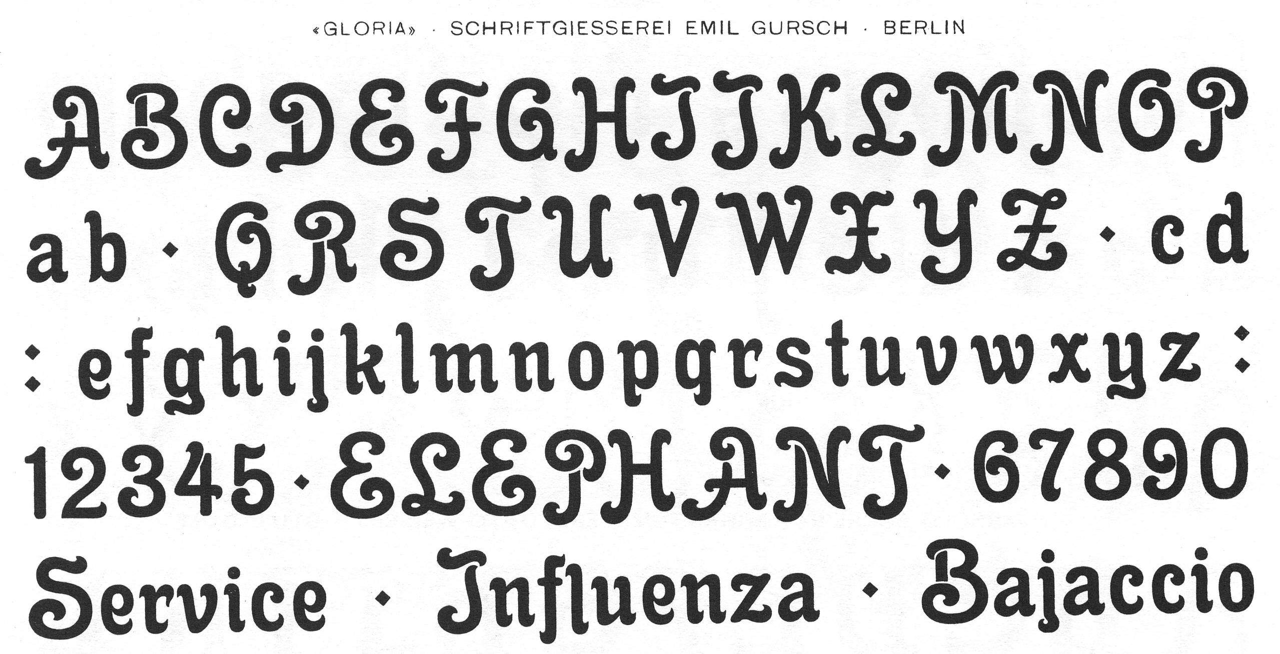
- Gloria (1898), Fette Gloria Kursiv (1904), Gloria fett (1902), Gloria schmalfett. Gloria Kuric schmalfett. Digitally revived in 2019 by Ralph M. Unger as RMU Gloria.
- Gothisch (schmale enge, Courante and Accidenz), Renaissance Gothisch (1902: eng, magere and halbfette), Fette Gothisch (neueste and breite). Gothische Federzüge.
- Grandezza I and II (1904) by Hermann Zehnpfundt.
- Grotesque.
- Hermes Grotesque (1897).
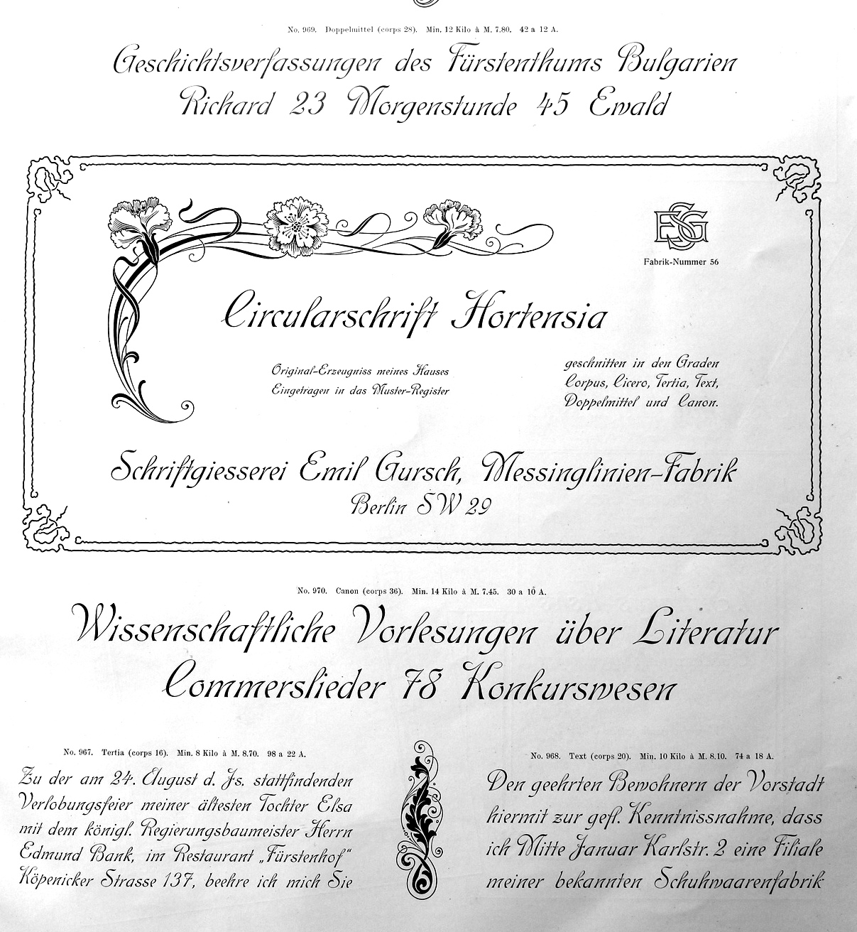
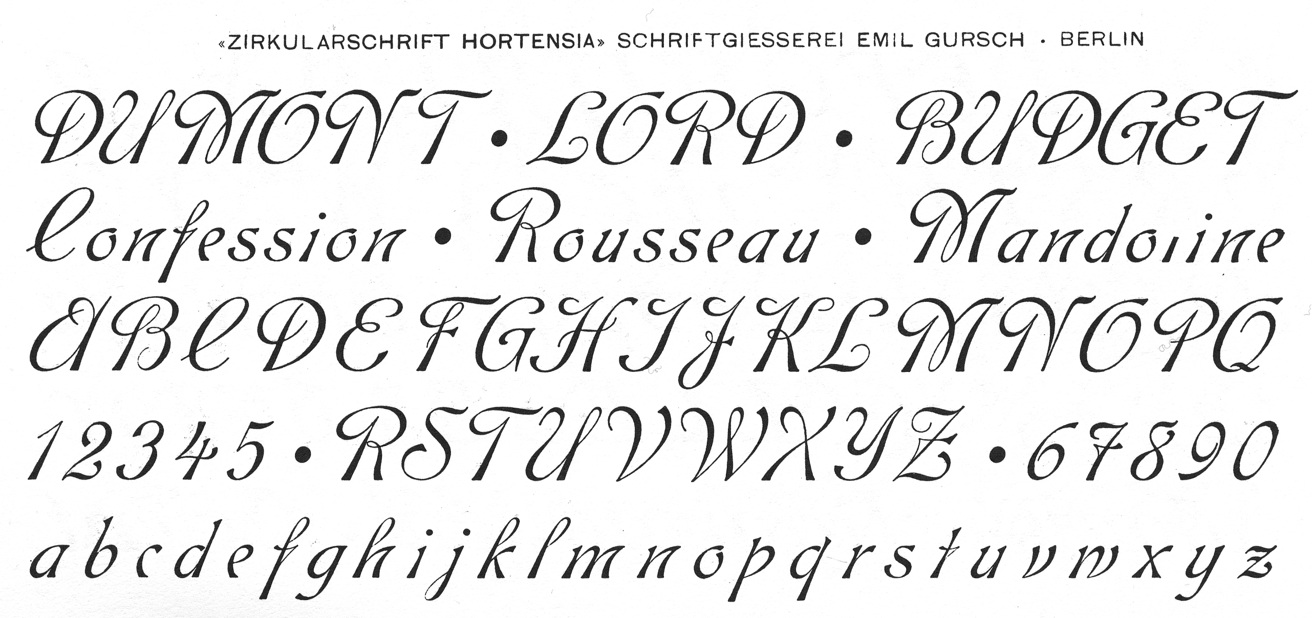
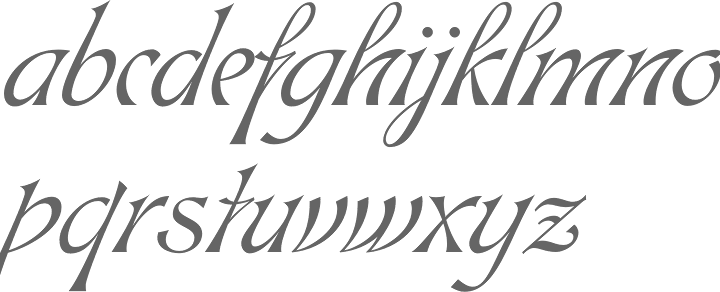
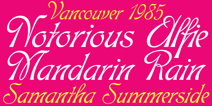
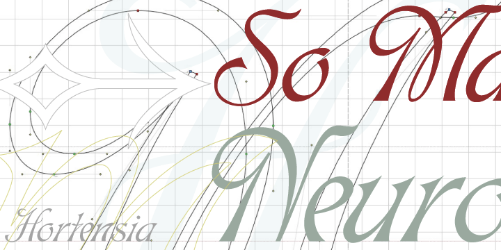
- Hortensia (<1902). A digital version of this Victorian script was finished in 2009 as Hortensia by Canada Type: Hortensia was Gursch's most popular typeface, used extensively and prominently in many beautiful type catalogs, and a commonly seen design element in Germany for quite a while after its release.
- Industria (1913, a grotesk designed for ads). Weights include Zart, Halbfett, Fett and Zephyr. By Hermann Zehnpfundt.
- Journal (1912-1913) by Hermann Zehnpfundt. Weights include Antiqua, Kursiv, Antiqua Halbfett.
- Breite Kanzlei, Moderne halbfette Kanzlei, Antike Kanzlei (wow!).
- Kavalier (1910) by Hermann Zehnpfundt.
- Klinger (1919, +Antiqua) by Julius Klinger.
- Koenig-Type (1903-1907, Heinz König), Koenig Schwabacher (1912-1913, Heinz König), Koenig-Fraktur (1910, Heinz König. This is also called Gursch Fraktur),
- Kontinental Grotesk.
- Korona (1905, + Halbfett) by Albert Auspurg.
- Mediaeval, Cursiv, Mediaeval Cursiv.
- Monument (+Halbfett).
- Moderne Schreibschrift.
- Phönix-Cursiv (1897).
- Polygon Undine (1904).
- Roma (ca. 1897).
- Rubens (1905) by Albert Auspurg.
- Rundschrift.
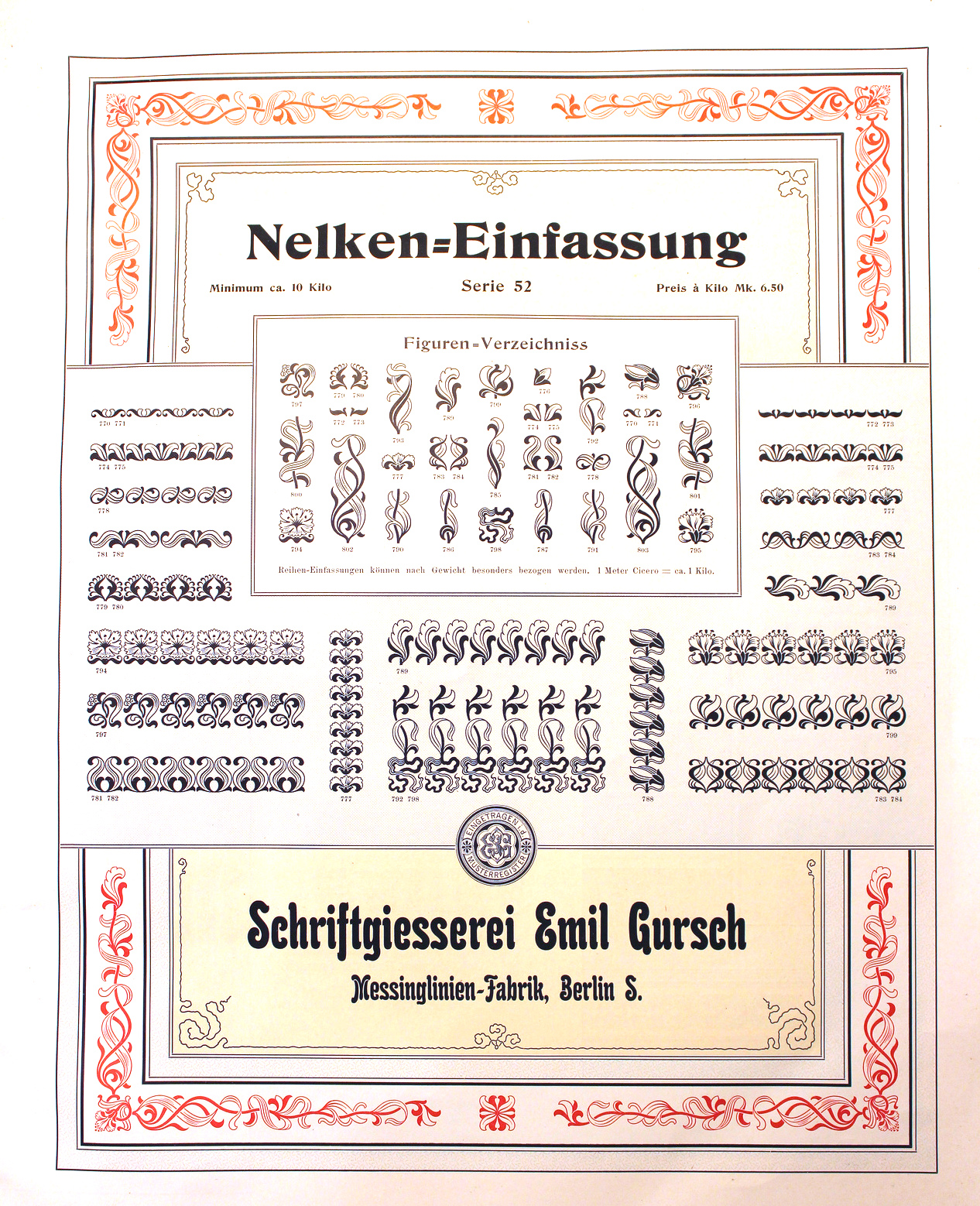
- Saxonia Einfassung (borders).
- Schwabacher, Fette Schwabacher (1899).
- Schwarze Hände, and many great math and astrological sets.
- Senefelder (1908).
- Sirius Ornamente (1908).
- Skulptur (1901): has styles called Halbfett and Licht.
- Sütterlin Unziale (+Halbfett), made in 1905 by Ludwig Sütterlin himself.
- uncial gotisch or Morris Gotisch. For a digital version, see Morris Gotisch by Gerhard Helzel.
- Versierte Italienne.
- Werk Fraktur (fett, halbfett), done before 1907.
- Zierschrift Roma, Zierschrift Apollo, Zierschrift Gloria, Boston Zierschrift.
- Zirkular Kursiv (1913) by F. Müller-Münster.
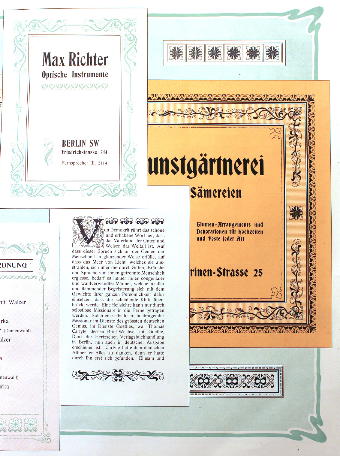
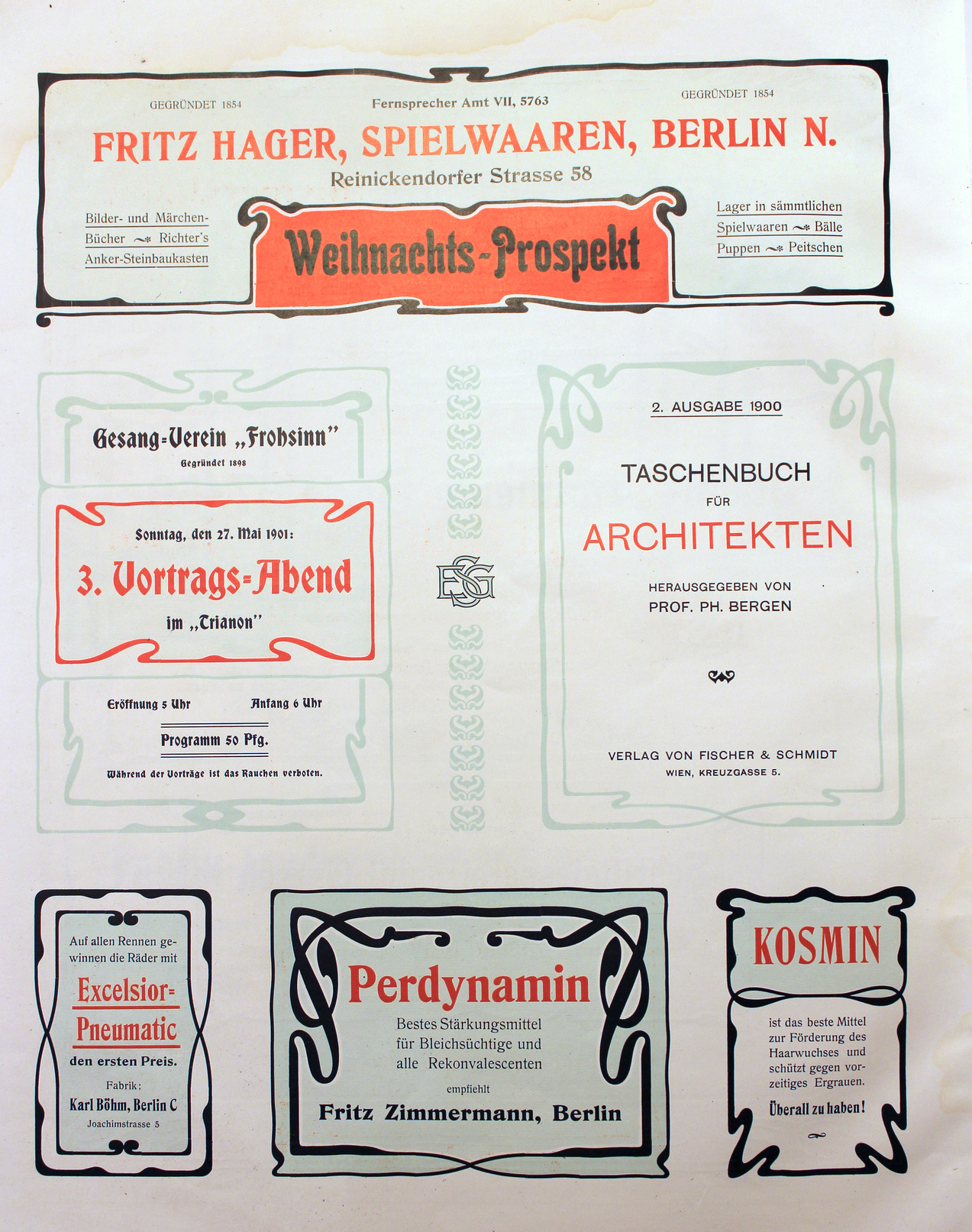
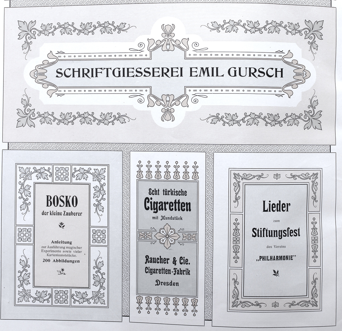
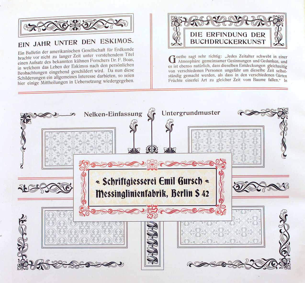
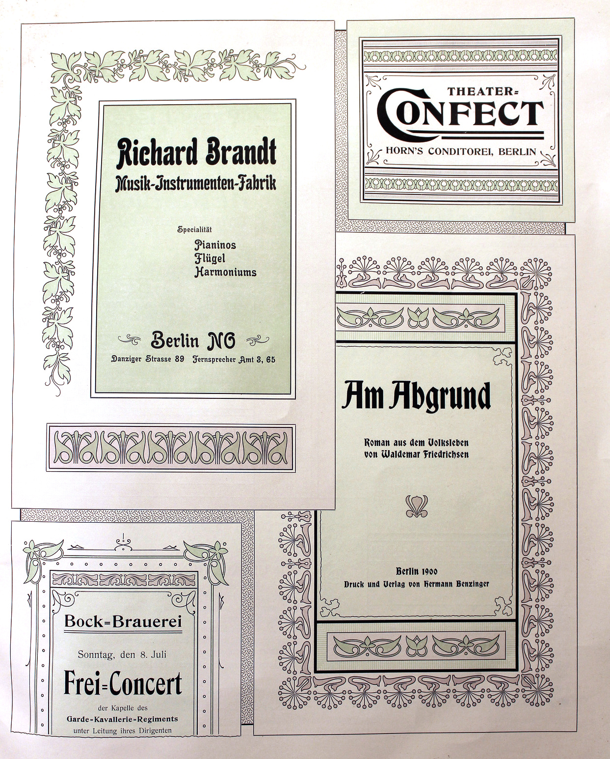
There were also numerous ornaments and vignettes. Published documents include Industria, eine charaktervolle Reklame-Grotesk (1913), Polygon-Undine. Fette Gloria-Kursiv (1904), Nachtrag zur Handprobe. Neue Erzeugnisse aus den Jahren 1898-1901 (1902), Munster-Sammlung der Schriftgiesserei Emil Gursch, Berlin S., Messinglinien-Fabrik und Gravir-Anstalt (1899). That last book is their main publcation, 112 pages of nicely presented specimens covering all lettertypes and ornaments in detail. A peek into one of Gursch's specimen books. PDF prepared by Klingspor Museum.
|
EXTERNAL LINKS
Emil Gursch
 [Designer info] [Designer info]
MyFonts search
Monotype search
Fontspring search
Google search
INTERNAL LINKS
Extinct 20th century foundries ⦿
Blackletter fonts ⦿
German type scene ⦿
School fonts ⦿
Bastarda / Bâtarde / Schwabacher ⦿
Ronde (Rondo, Rundschrift): Upright scripts ⦿
Victorian typefaces ⦿
Elzevir ⦿
|