TYPE DESIGN INFORMATION PAGE last updated on Mon Jul 20 20:57:30 EDT 2026
FONT RECOGNITION VIA FONT MOOSE

|
|
|
|
Freeman Jerry Craw
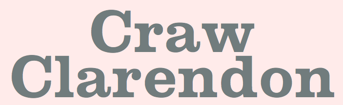
Or Freeman Godfrey Craw. Type designer from East Orange, New York, born in 1917, who was associated with ATF. He died in 2017. Excerpts of his obituary in the Star Ledger: Graphic artist and designer renowned internationally as innovator in visual identity field, created many recognizable typefaces that bear his name. Freeman Godfrey Craw, 100, of Tinton Falls, N.J., passed away peacefully on Monday, May 1, 2017. Mr. Craw had lived in Tinton Falls since 2001. Prior to that, he had been a long-time resident of Short Hills, N.J. Known to family and friends as Jerry, he forged a highly distinguished and decorated career in graphic art, calligraphy, and topography. Born and raised in East Orange, N.J., Jerry graduated from Cooper Union For The Advancement of Science and Art in 1939. Upon graduation he became a designer with the American Colortype Company in New York City. In 1943, he joined Tri-Arts Press Inc. as its art director, and in 1958, he was named vice president of the company. In that capacity, he had complete graphic control over the most interesting and impressive printing produced in the U.S. during the 1950s and 1960s. During this time, he created unique visual identity programs for numerous prestigious business and institutional clients, including CBS and IBM. In 1968, he left Tri-Arts to establish his own company, Freeman Craw Design as a specialist in design-for-printing. As an independent design consultant and art director, Jerry maintained a full-time office of designers and artists to better serve the complete needs of his clientele. He provided a broad range of graphic and production services, including photography, typography, illustration, composition, platemaking and printing. He also served as manager of production and graphics for Rockefeller University Press at that time. Jerry was considered one of the best graphic artists in the world, and his body of work has been described by colleagues and industry insiders as "legendary." He was best known to fellow topographers for his many type designs commissioned by American Type Founders Company. Among these are Craw Clarendon, Craw Clarendon Book, Craw Clarendon Condensed, Craw Modern, Craw Modern Bold, Craw Modern Italic, Ad Lib, Canterbury, Chancery Cursive, Classic, CBS Sans and CBS Didot. Jerry's calligraphic works were held in such high regard that permanent collections were established at the of the Museum of Modern Art and the Cooper-Hewitt Museum of New York, a division of the Smithsonian Institution, as well as the Whitney Museum of American Art. He also had a number of one-man exhibitions in New York, Chicago, and London, and was an honorary member of the Gutenberg Museum in Mainz, Germany. Additionally, in 1946, he was a founding member of the Type Directors Club, which today is still the leading international organization devoted to excellence in topography. He was also the recipient of numerous national and international awards and citations for excellence in graphic design. Jerry wrote and designed for the following publications: American Artist, Fortune, Graphis, Print Magazine and the Saturday Evening Post, to mention only a few. He even found time as a guest lecturer at institutions including Yale University, Rensselaer Polytechnic Institute, Kean University, The New York School of Visual Arts, as well as the Universities of Alabama, Utah, and Maryland. His obituary contains this paragraph about Jerry's great personality: Jerry was warmhearted, gregarious, and passionate about his art. His intelligence and gentle nature always shined through. He was good humored, loved to be around people, and always seemed to get along with everyone, even strangers. He considered himself a "hopeless Francophile," and was heavily influenced by School of Paris painters like Degas, Braque, Picasso, and particularly Modigliani. Having traveled extensively throughout France, he developed a keen appreciation of French culture, French architecture and, of course, French wine. He even taught himself the language and became fluent in it. Jerry loved a good bottle of Chateauneuf du Pape, but would love sharing it with family and friends even more. His warmth, humor, and creativity will be sorely missed by all who knew and loved him. Designer of
|
EXTERNAL LINKS |
| | |


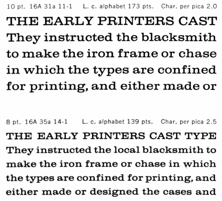
file name: A T F Craw Clarendon 1955
file name: Castcraft O P T I Craw Clarendon 1990 1991
file name: Castcraft O P T I Craw Clarendon 1990 1991b
file name: Castcraft O P T I Craw Clarendon 1990 1991c
file name: Castcraft O P T I Craw Clarendon Book 1990 1991
file name: Castcraft O P T I Craw Clarendon Book 1990 1991b

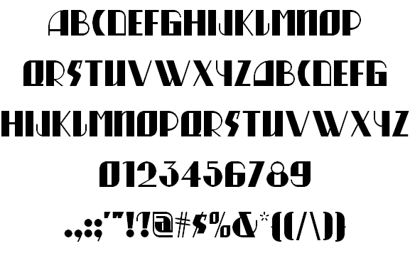
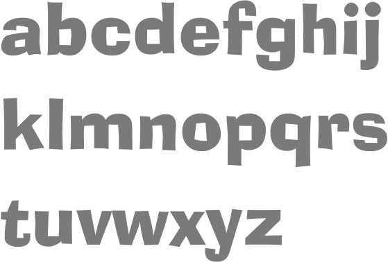
file name: Nick Curtis Oo Boodlio Doo N F 2011 adfter Freeman Craw Ad Lib 1961
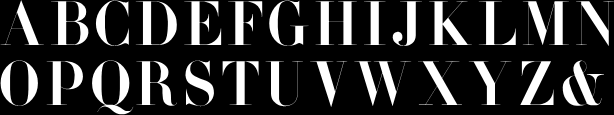
file name: Freeman Craw Ad Lib 1961 Bitstream Version
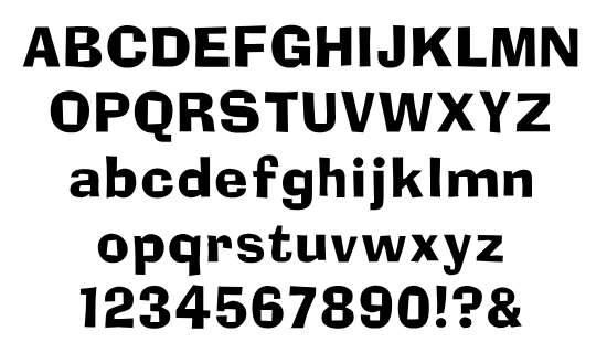
file name: Freeman Craw Ad Lib 1961
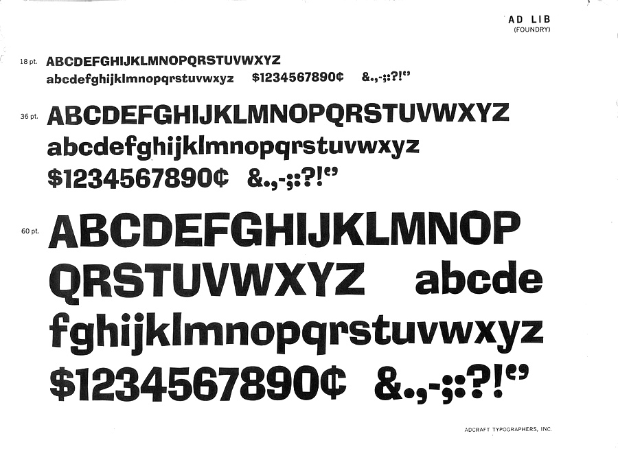
file name: Freeman Craw Ad Lib 1961
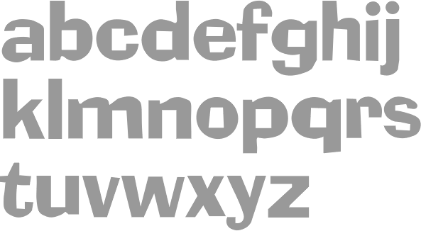
file name: Soft Maker Ad Lib 2010 after Freeman Craw 1961
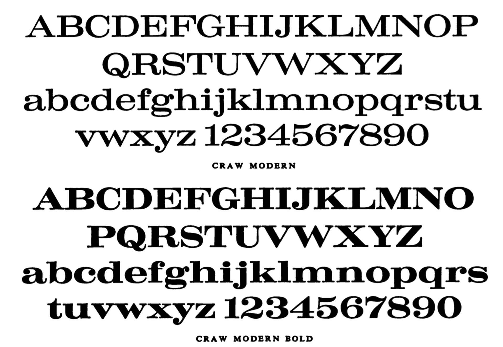
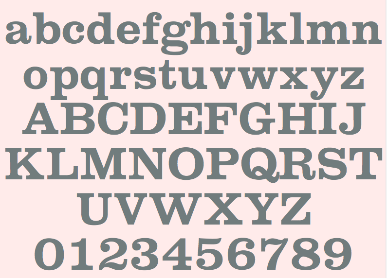
file name: Freeman Craw Craw Modern 1958 1960
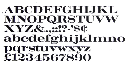
file name: Freeman Craw Craw Modern Bold
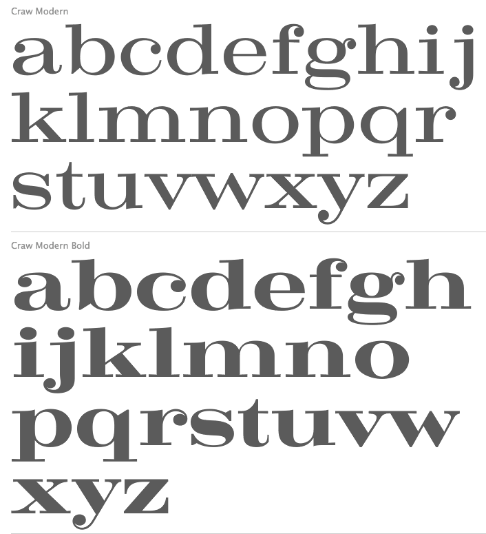
file name: Group Type Craw Modern 2012 after Freeman Craw Craw Modern 1958
file name: Monotype Craw Clarendon
| | |
|
Luc Devroye ⦿ School of Computer Science ⦿ McGill University Montreal, Canada H3A 2K6 ⦿ lucdevroye@gmail.com ⦿ https://luc.devroye.org ⦿ https://luc.devroye.org/fonts.html |