TYPE DESIGN INFORMATION PAGE last updated on Thu Apr 16 21:59:06 EDT 2026
FONT RECOGNITION VIA FONT MOOSE
|
|
|
|
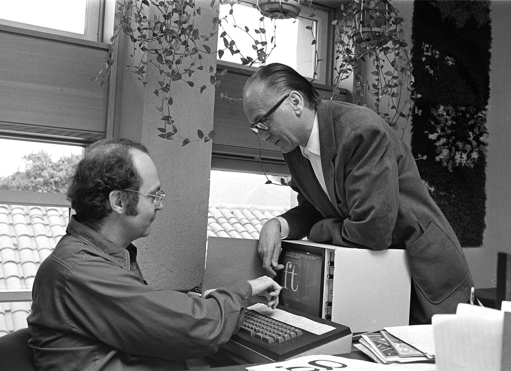
Prolific master calligrapher and type designer, born in Nuremberg in 1918. Most of his life, he lived in Darmstadt, where he died in 2015. He is best known for Palatino, Optima, Melior, Zapf Dingbats, Zapfino, and ITC Zapf Chancery. He created alphabets for metal types, photocomposition and digital systems. He studied typography from 1938 until 1941 in Paul Koch's workshop in Frankfurt. From 1946 until 1956, he was type director at D. Stempel AG type foundry, Frankfurt. In 1951 he married Gudrun von Hesse. From 1956 until 1973, he was consultant for Mergenthaler Linotype Company, Brooklyn and Frankfurt. From 1977 until 1987, he was vice president of Design Processing, Inc., New York (which he founded with his friends Aaron Burns and Herb Lubalin), and professor of Typographic Computer Programs, Rochester Institute of Technology, Rochester, New York. Students at RIT included Kris Holmes and Charles Bigelow, who together created the Lucida type family. Other prominent students include calligrapher/font designer Julian Waters and book designer Jerry Kelly. From 1987 until 1991, he was chairman of Zapf, Burns&Company, New York. He retired in Darmstadt, Germany, but consulted on many font projects until a few years before his death. In the 1990s, Zapf developed the hz program for kerning and typesetting. It was acquired by Adobe who used ideas from it in InDesign. Awards:
Some publications by Hermann Zapf: List of his typefaces:
Books and references about him include:
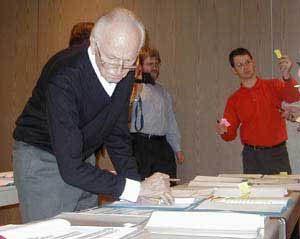
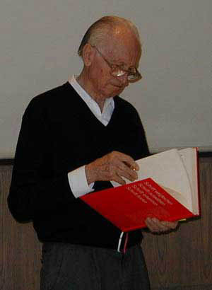
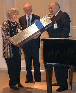
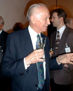
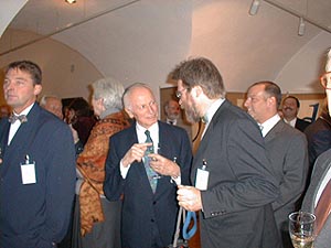
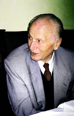
Pictures of Hermann Zapf: with Lefty, with Rick Cusick, in 2003, with Frank Jonen, with Jill Bell, with Linnea Lundquist and Marsha Brady, with Rick Cusick, with Rick Cusick, with Stauffacher, a toast, with Werner Schneider and Henk Gianotten, with Chris Steinhour, at his 60th birthday party. Pictures of his 80th birthday party at Linotype [dead link]. |
EXTERNAL LINKS |
| | |

file name: Optima Nova
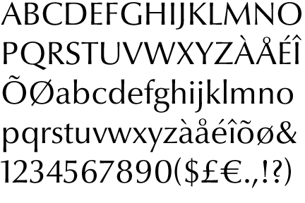
file name: Optima Nova
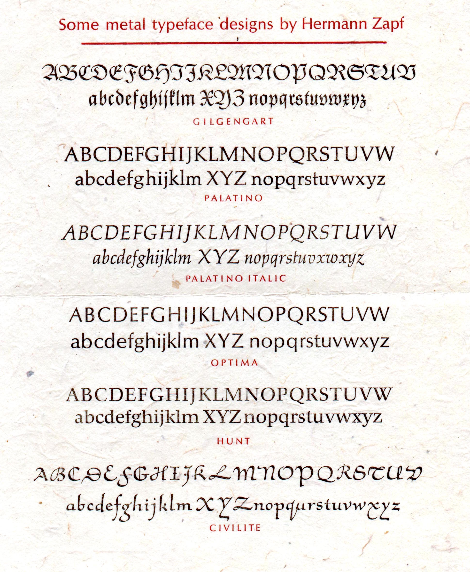
file name: Hermann Zapf Metal Typefaces poster by Jerry Kelly 2019

file name: Hermann Zapf Zapfino
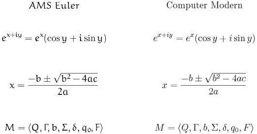
file name: Knuth Zapf A M S Euler vs Computer Modern
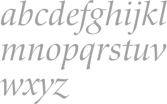
file name: Scangraphic Zapf Renaissance Antiqua No2 S B 2004

file name: Scangraphic Zapf Renaissance Antiqua S H 2004
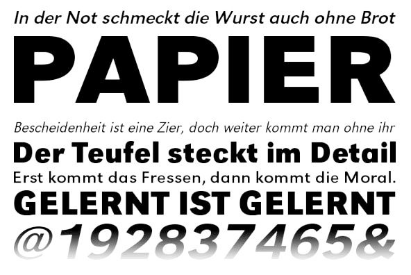
file name: Hermann Zapf U R W Grotesk 1985
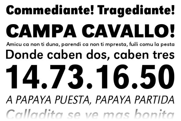
file name: Hermann Zapf U R W Grotesk 1985b
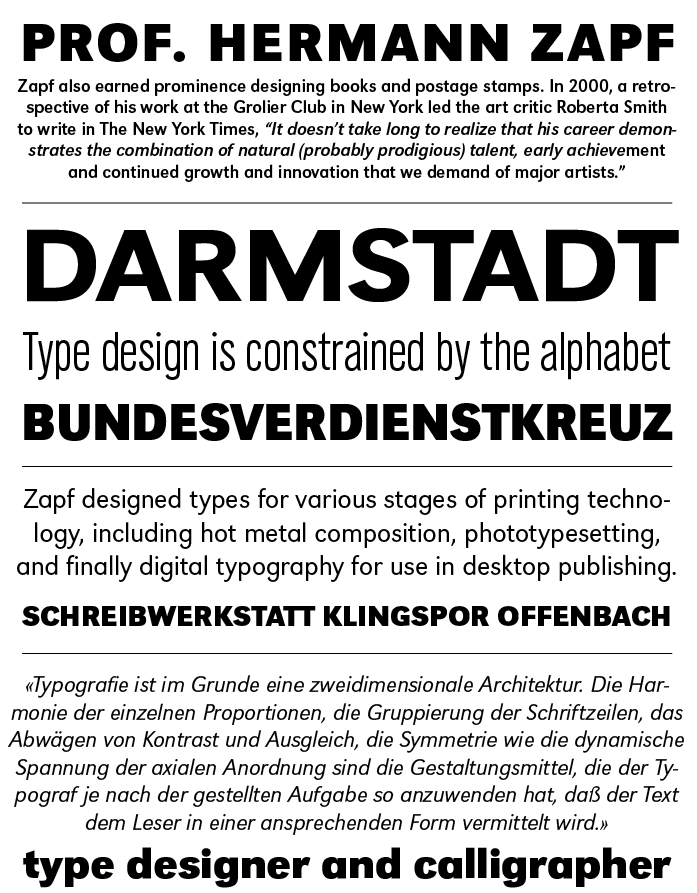
file name: Hermann Zapf U R W Grotesk 1985f
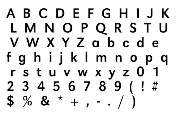
file name: Hermann Zapf U R W Grotesk 1985c
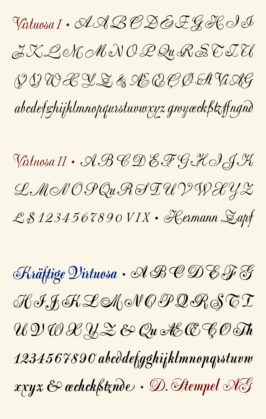
file name: Hermann Zapf Virtuosa 1952 Stempel
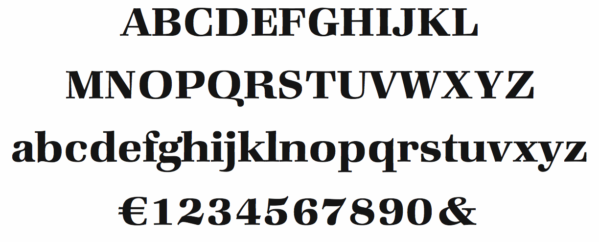
file name: Hermann Zapf I T C Zapf Book Demi
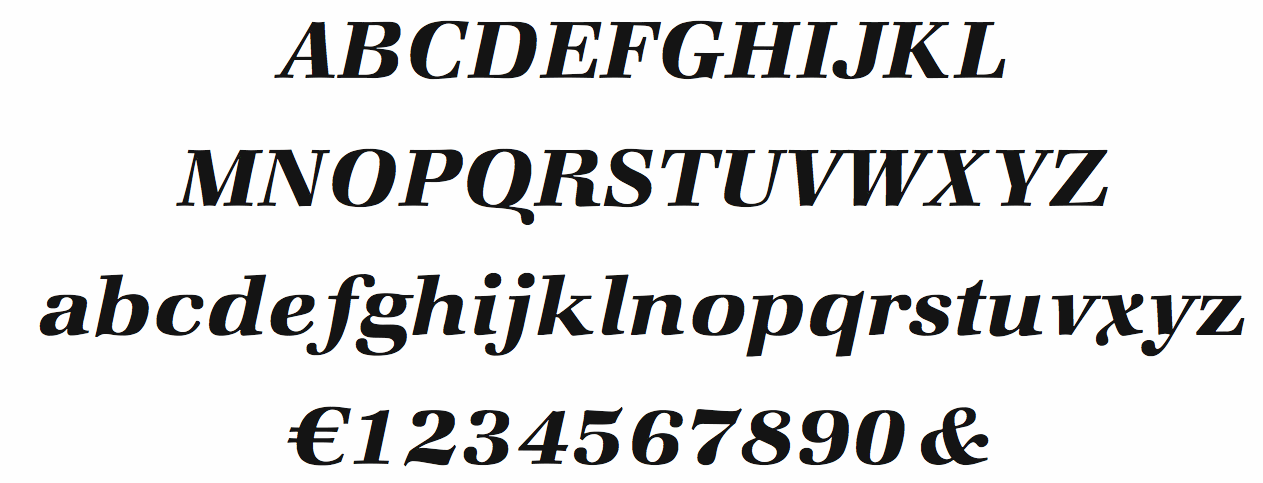
file name: Hermann Zapf I T C Zapf Book Demi Italic
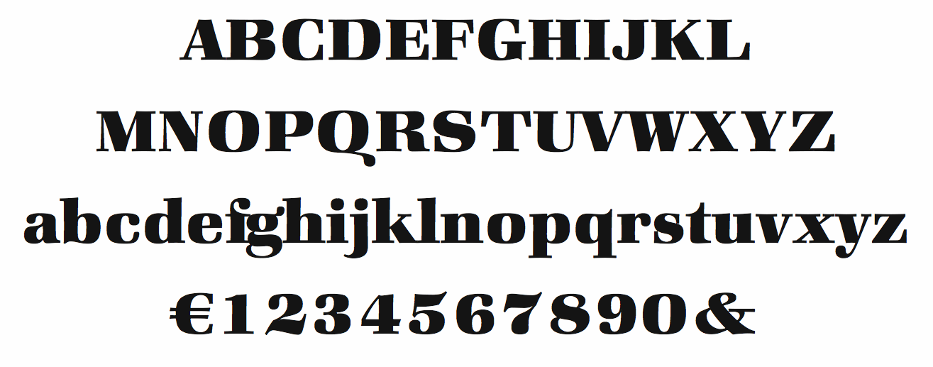
file name: Hermann Zapf I T C Zapf Book Heavy
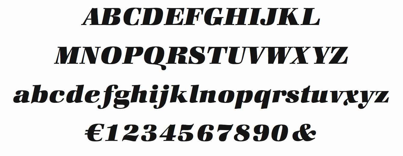
file name: Hermann Zapf I T C Zapf Book Heavy Italic
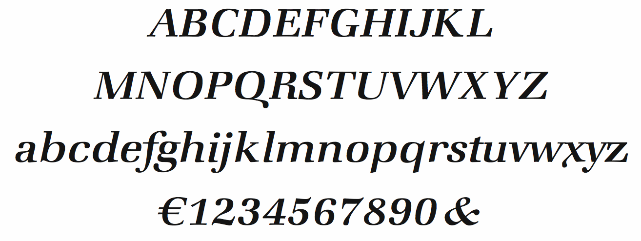
file name: Hermann Zapf I T C Zapf Book medium Italic
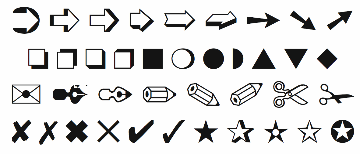
file name: Hermann Zapf I T C Zapf Dingbats 1978
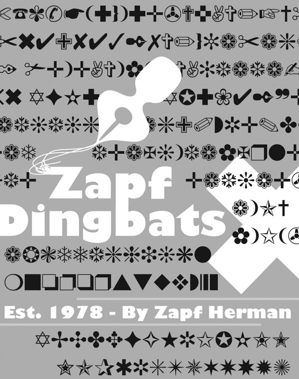
file name: Hermann Zapf Zapf Dingbats 1978 Poster by Jessica Rauch
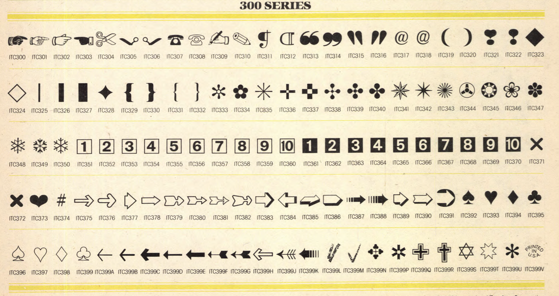
file name: Hermann Zapf I T C Zapf Dingbats U L C 1978
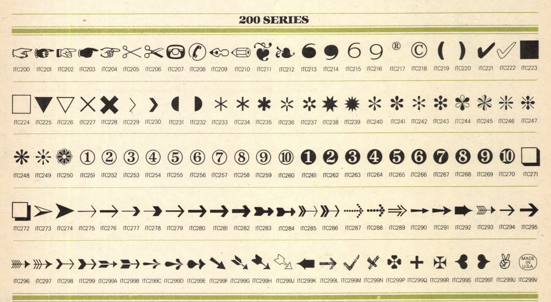
file name: Hermann Zapf I T C Zapf Dingbats U L C 1978
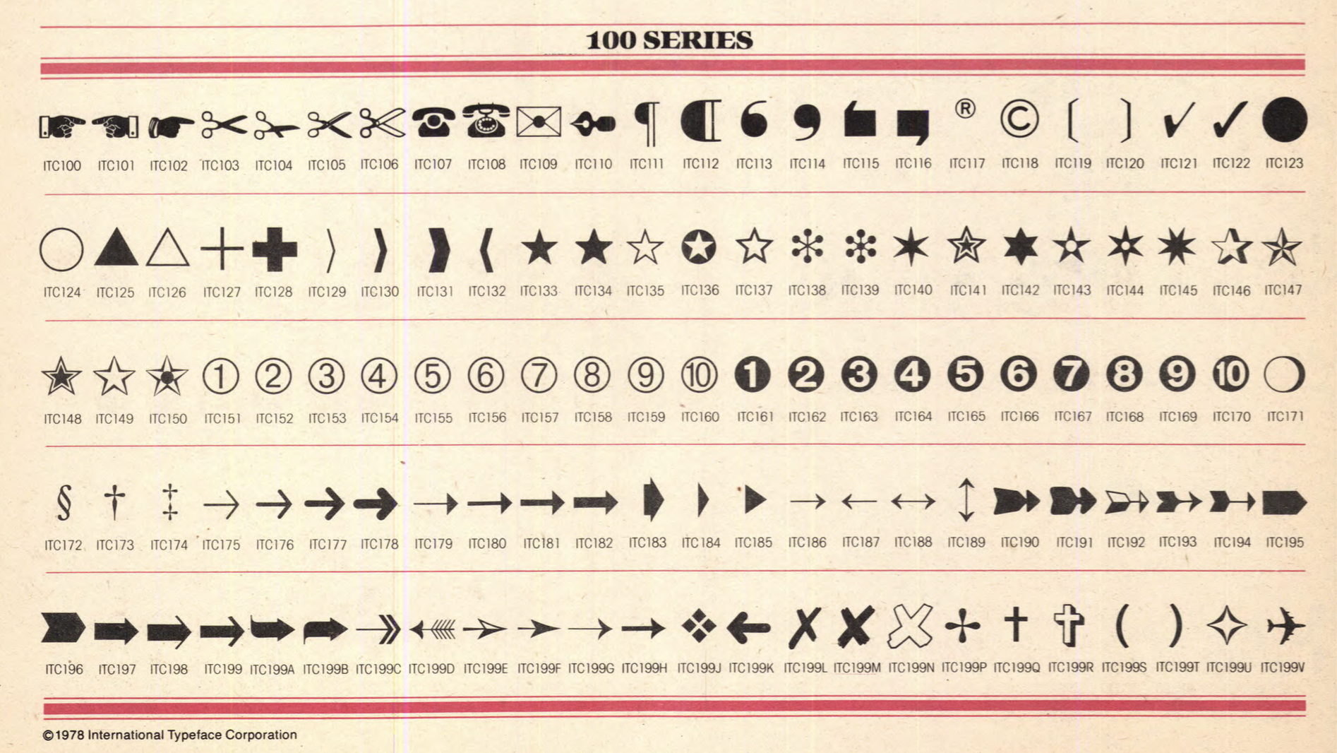
file name: Hermann Zapf I T C Zapf Dingbats U L C 1978
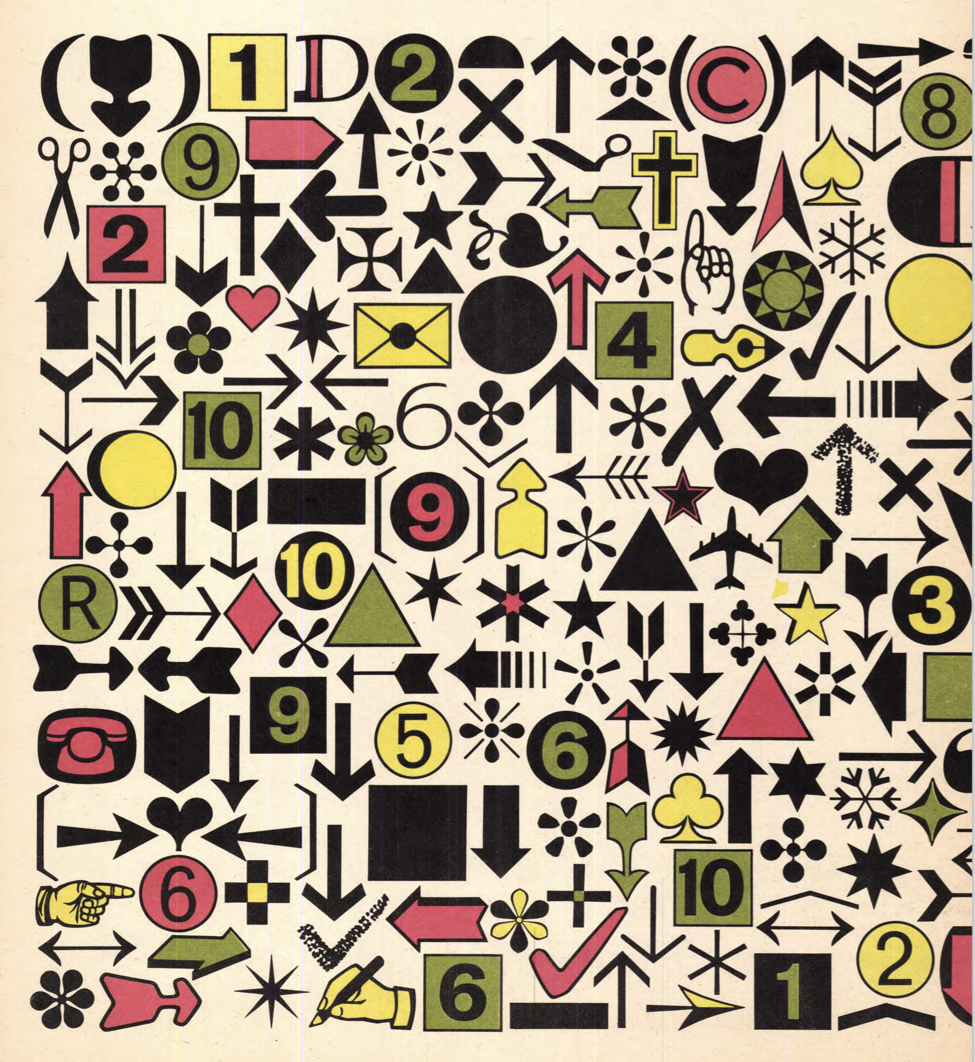
file name: Hermann Zapf I T C Zapf Dingbats U L C 1978
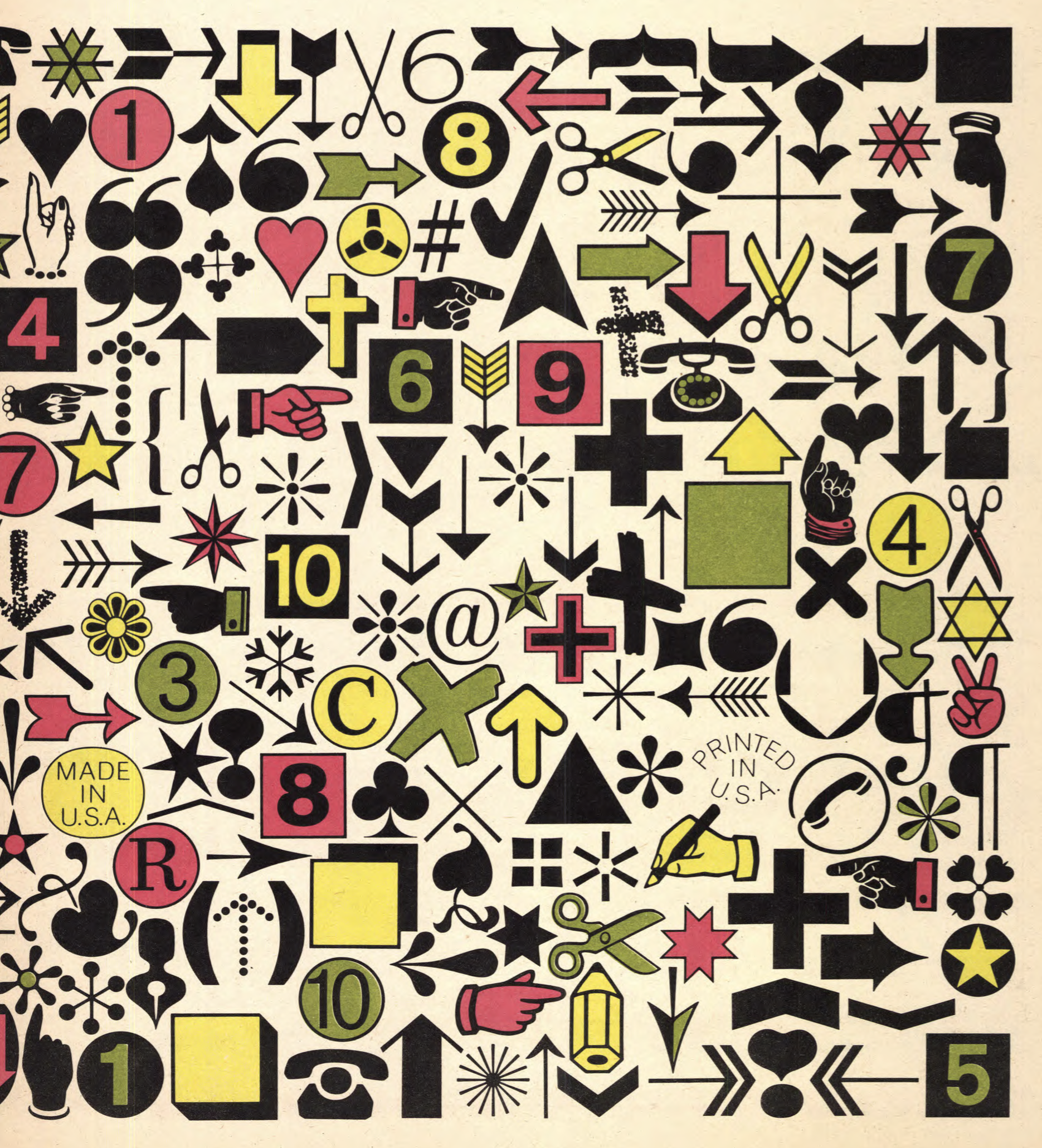
file name: Hermann Zapf I T C Zapf Dingbats U L C 1978
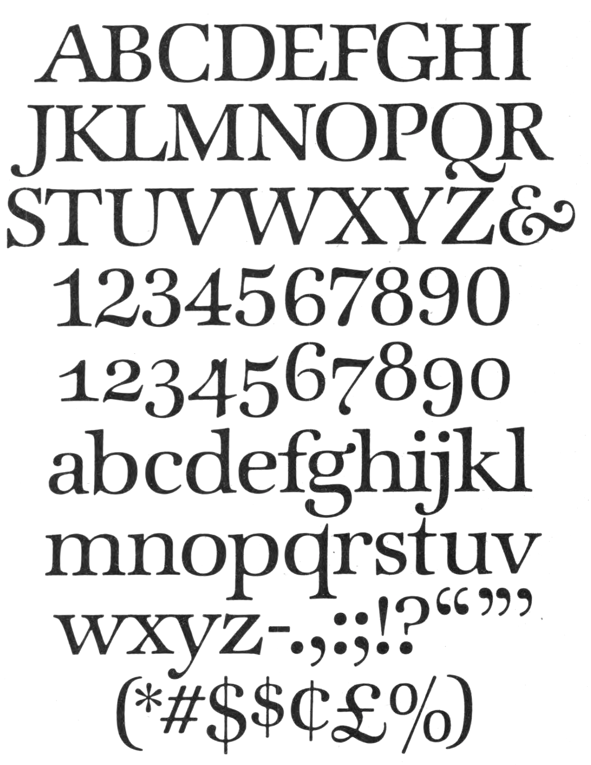
file name: Hermann Zapf I T C Zapf International
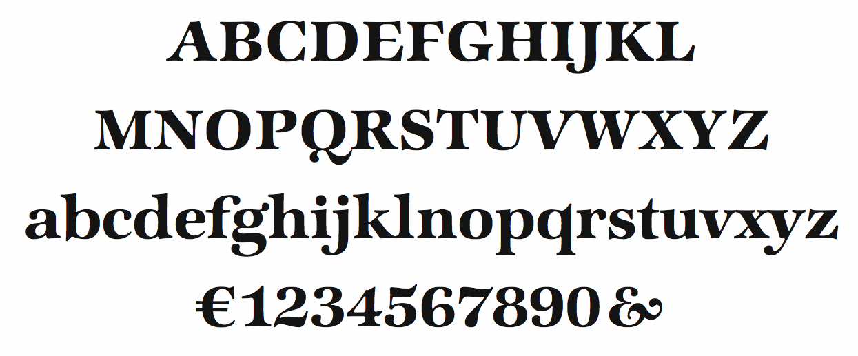
file name: Hermann Zapf I T C Zapf International Demi 1977
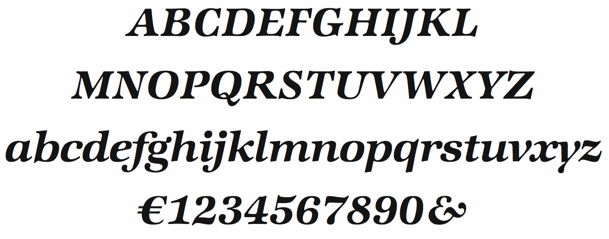
file name: Hermann Zapf I T C Zapf International Demi Italic 1977
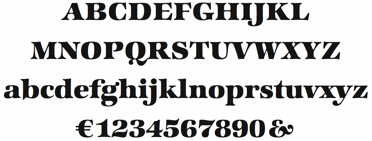
file name: Hermann Zapf I T C Zapf International Heavy 1977
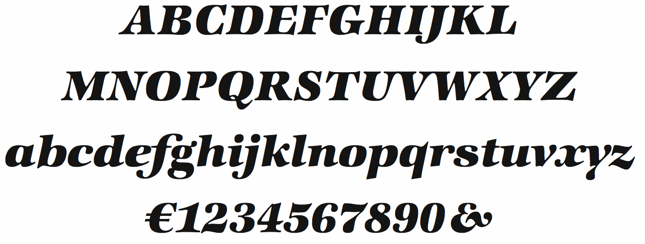
file name: Hermann Zapf I T C Zapf International Heavy Italic 1977
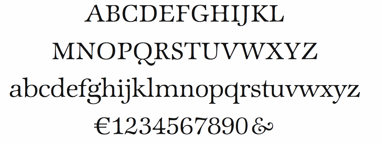
file name: Hermann Zapf I T C Zapf International Light 1977

file name: Hermann Zapf I T C Zapf International Light Italic 1977
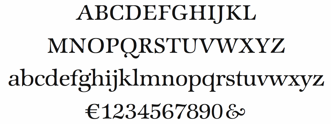
file name: Hermann Zapf I T C Zapf International Medium 1977
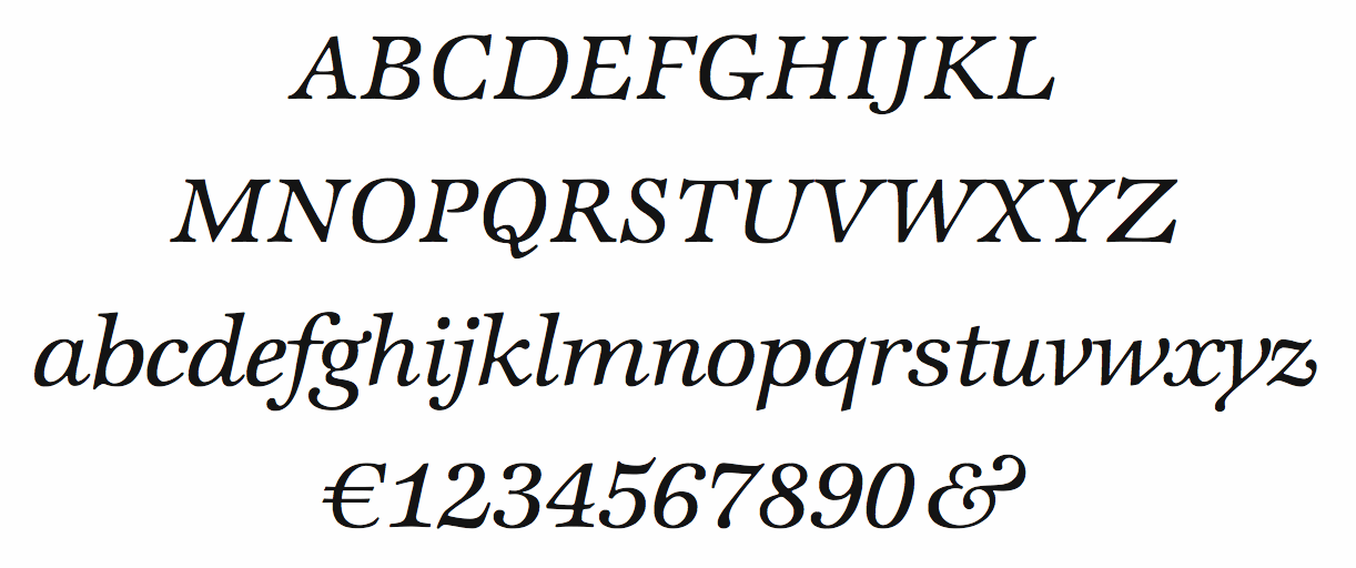
file name: Hermann Zapf I T C Zapf International Medium Italic 1977
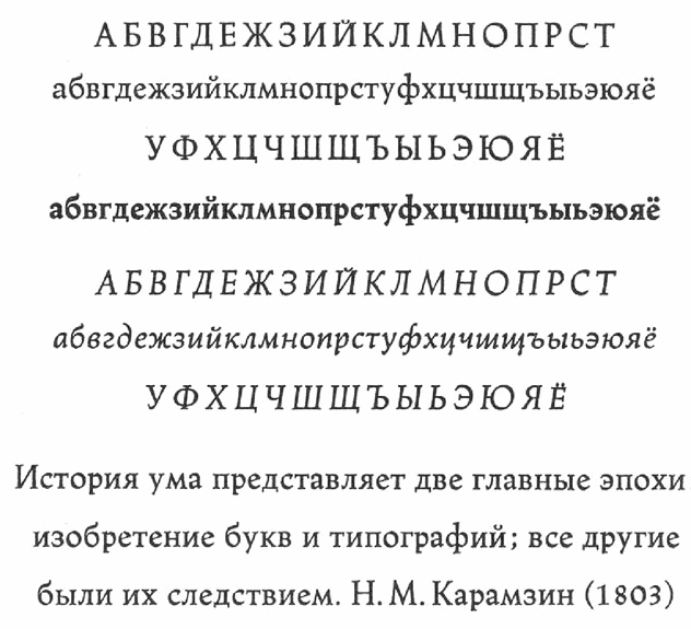
file name: Hermann Zapf Linotype Trajanus Cyrillic 1957

file name: Ralph M Unger R M U Gilgengart 2020 1
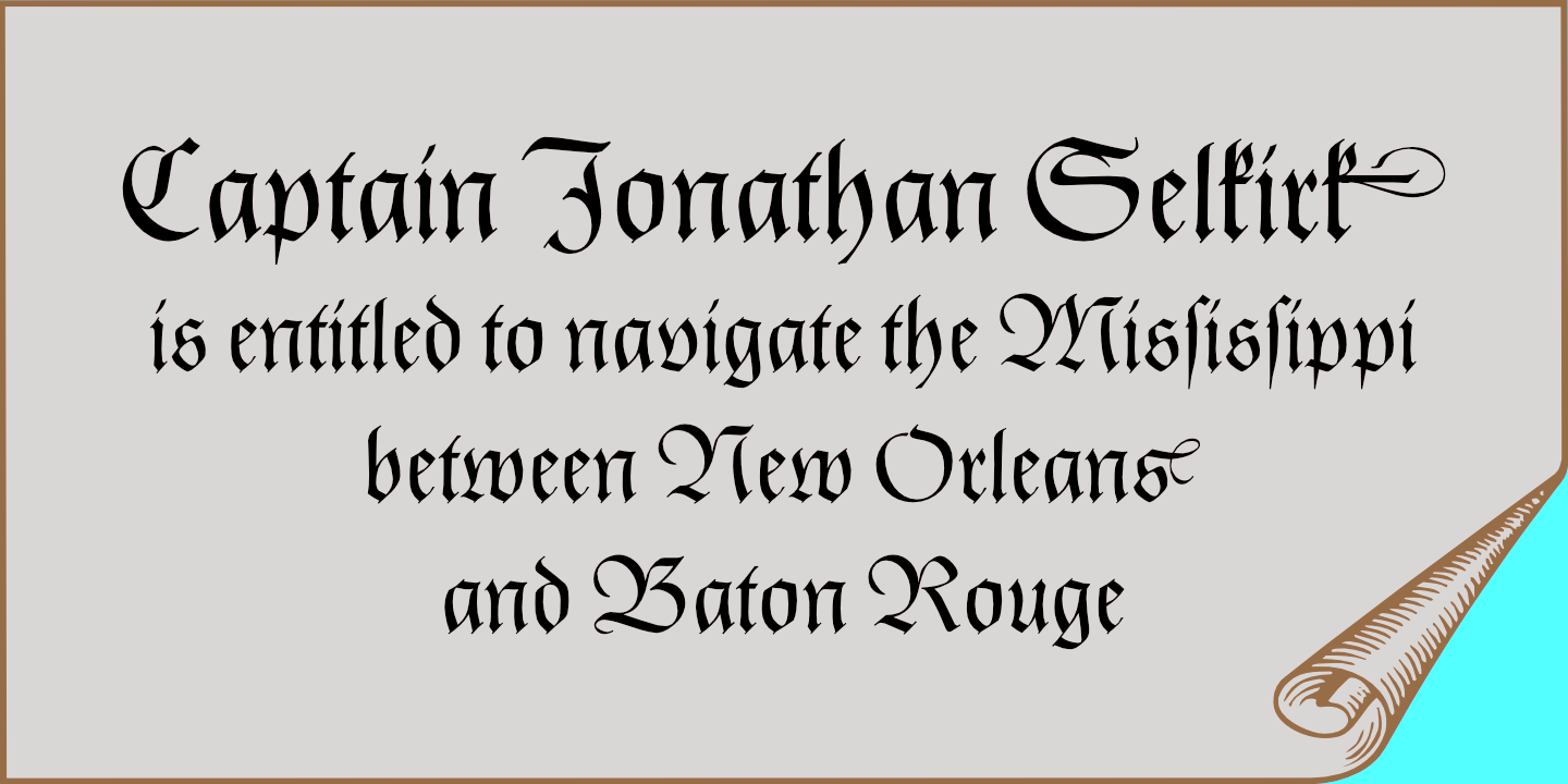
file name: Ralph M Unger R M U Gilgengart 2020 2

file name: Ralph M Unger R M U Gilgengart 2020

file name: Gerhard Helzel Gilgengart after Hermann Zapf 1940 1949
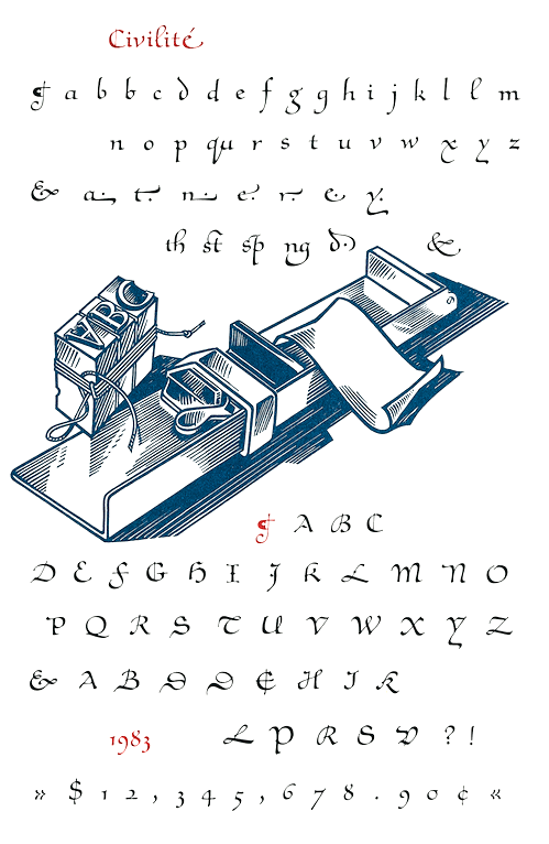
file name: Hermann Zapf Civilite 1985
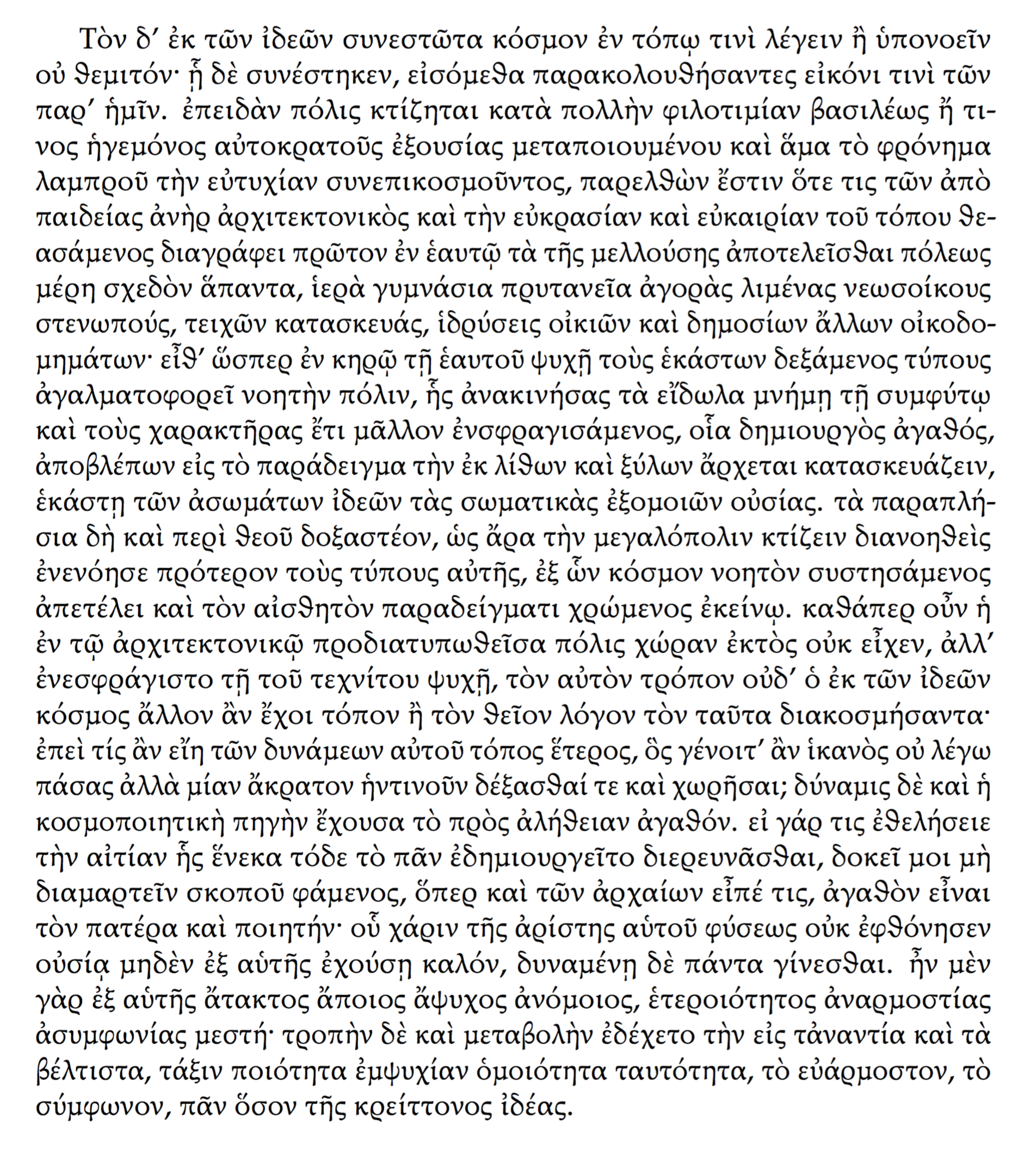
file name: George Matthiopoulos Antonis Tsolomitis Daniel Benjamin Miller G F S Heraklit 2020

file name: George Matthiopoulos Antonis Tsolomitis Daniel Benjamin Miller G F S Heraklit 2020
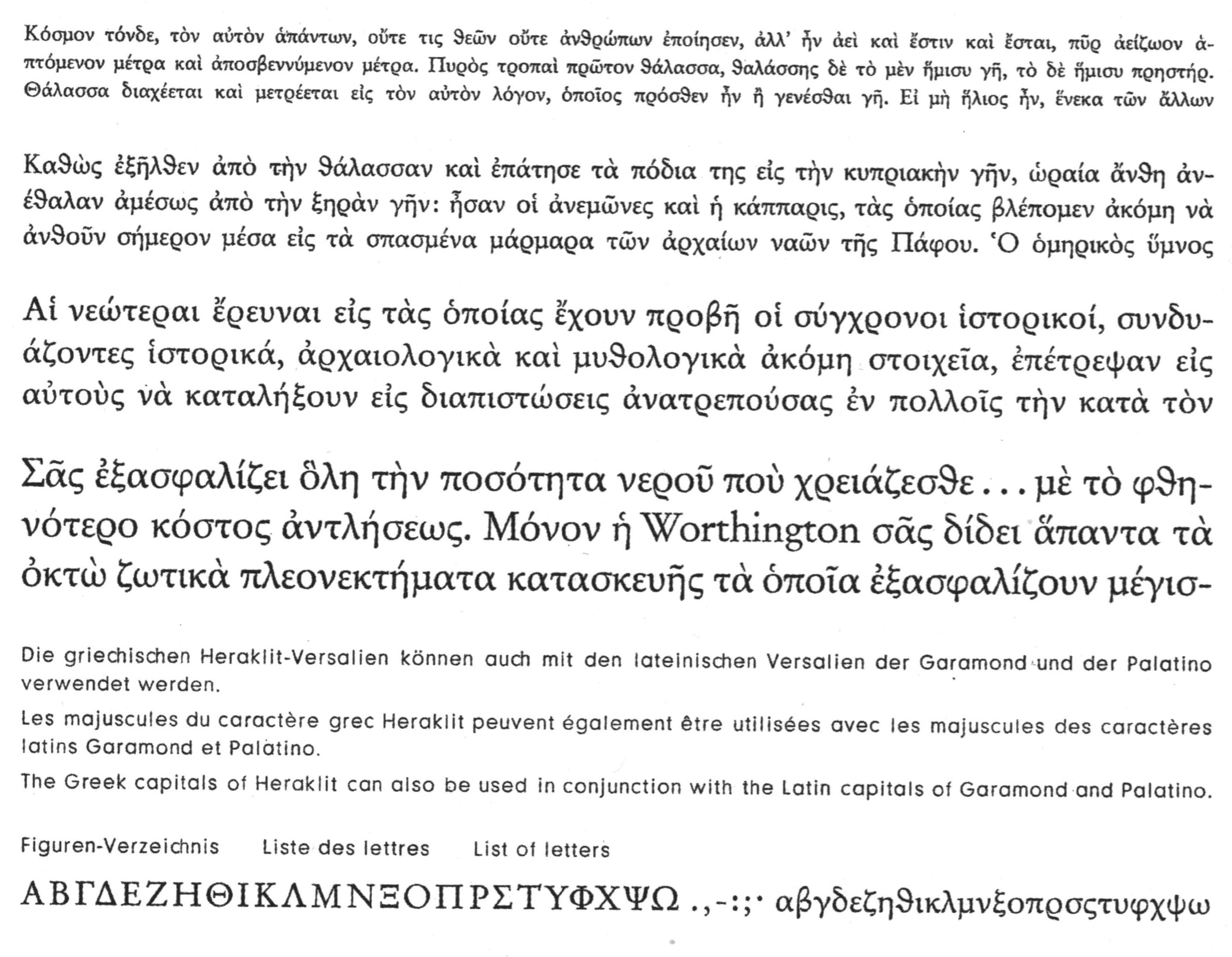
file name: Hermann Zapf Heraklit 1957
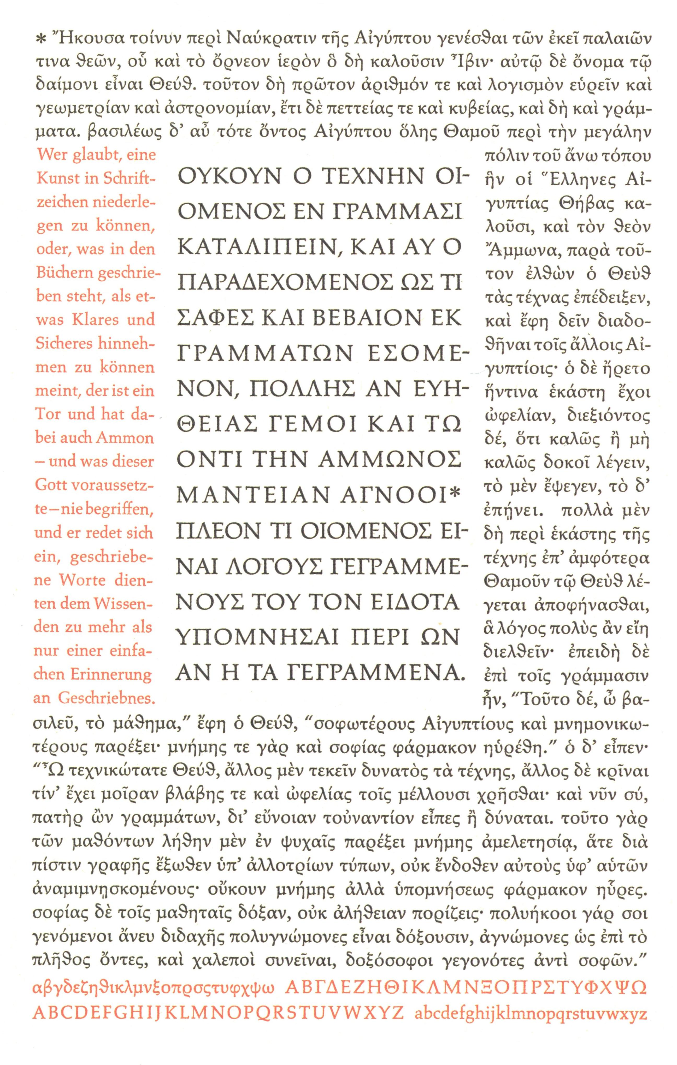
file name: Hermann Zapf Heraklit 1957 Platos Phaedrus 1968
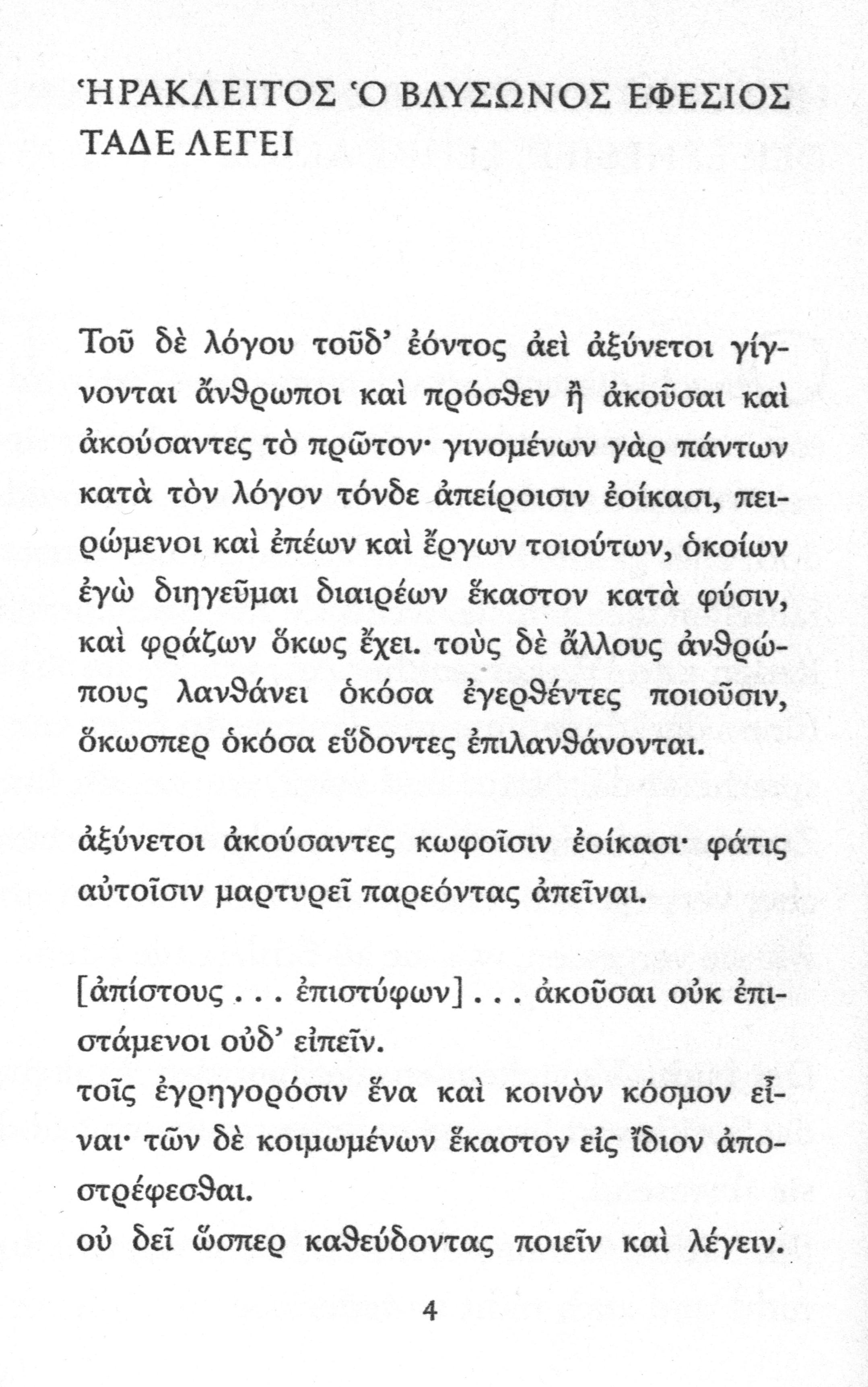
file name: Hermann Zapf Heraklit 1957
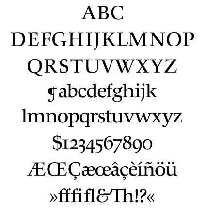
file name: Hermann Zapf Hunt Roman 1961 1962
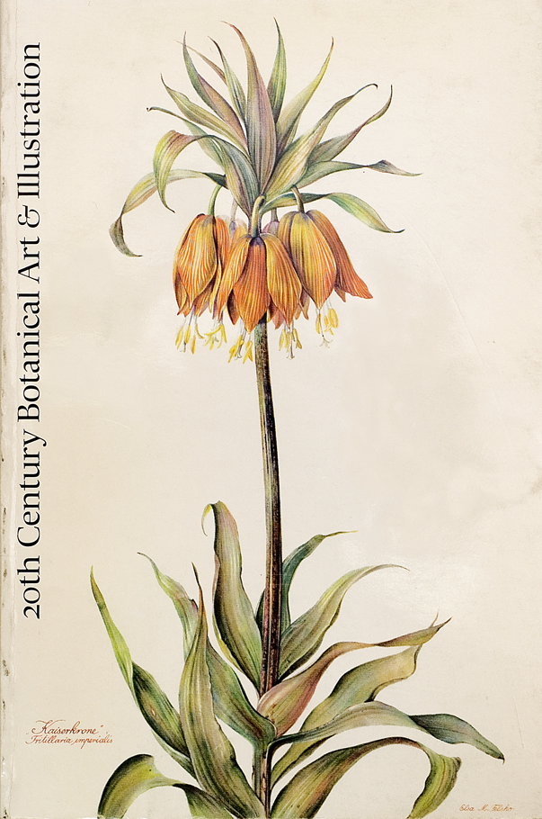
file name: Hermann Zapf Hunt Roman 1961 1962b
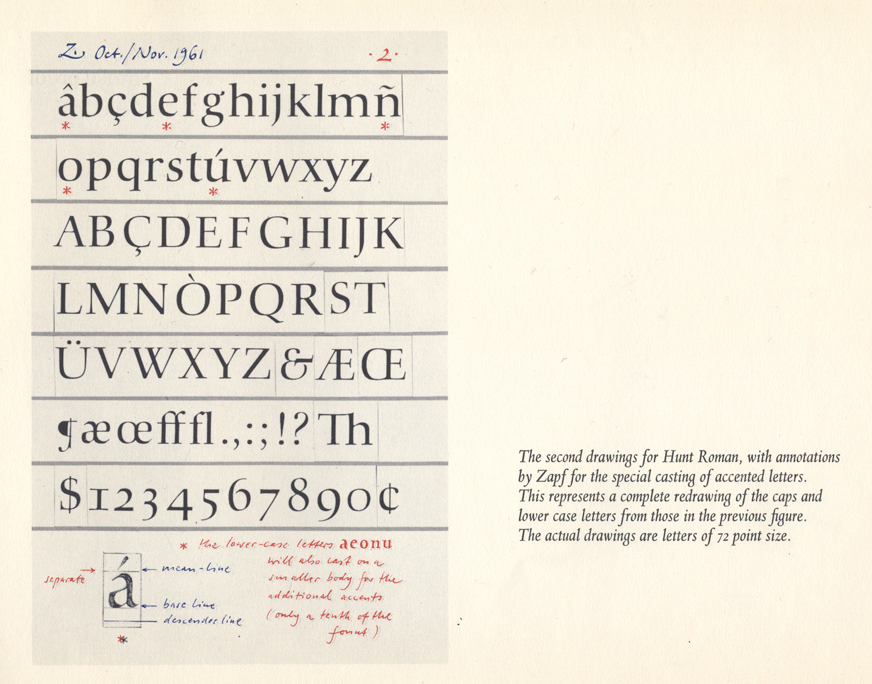
file name: Hermann Zapf Hunt Roman 1961 1962b
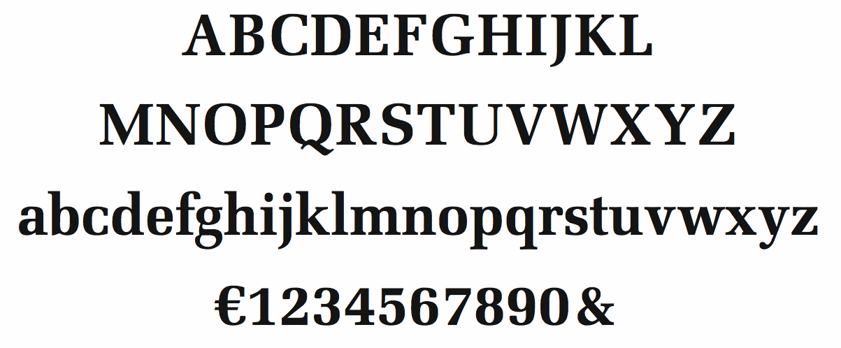
file name: Hermann Zapf Melior Bold 1952
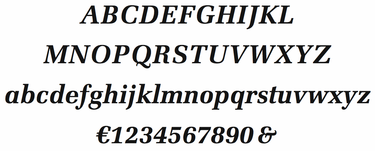
file name: Hermann Zapf Melior Bold Italic 1952
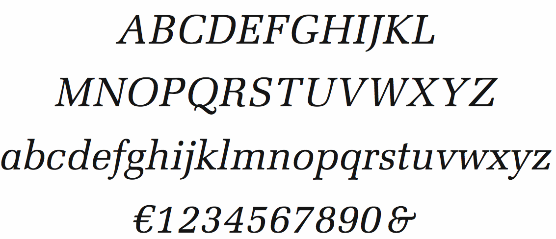
file name: Hermann Zapf Melior Italic 1952
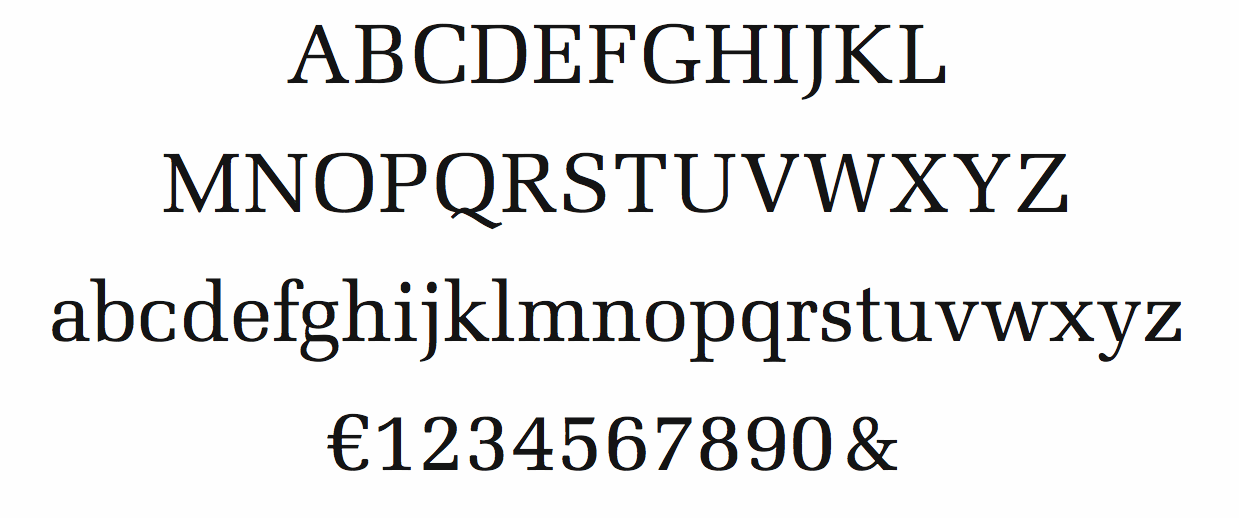
file name: Hermann Zapf Melior Roman 1952
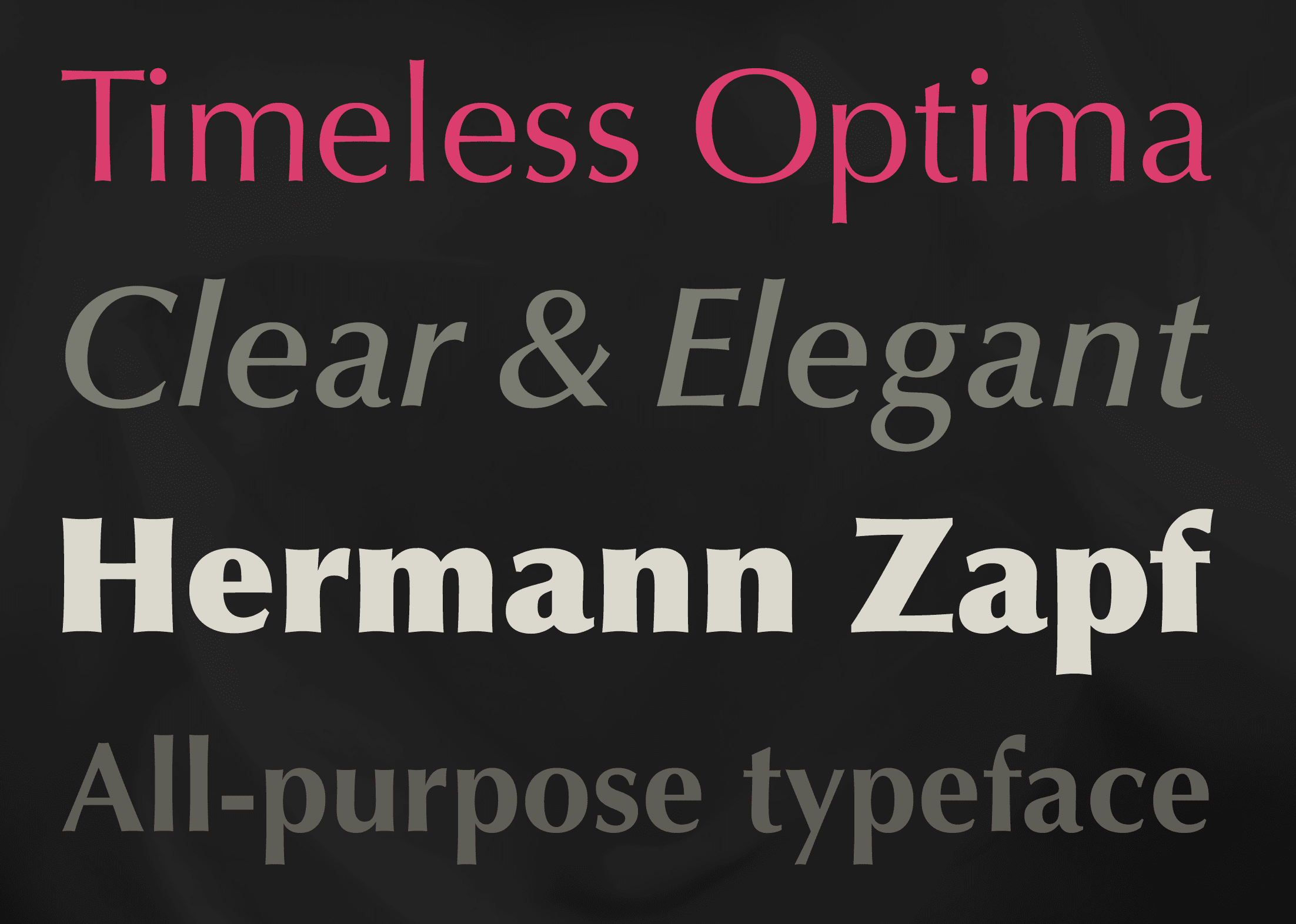
file name: Hermann Zapf Optima 1950
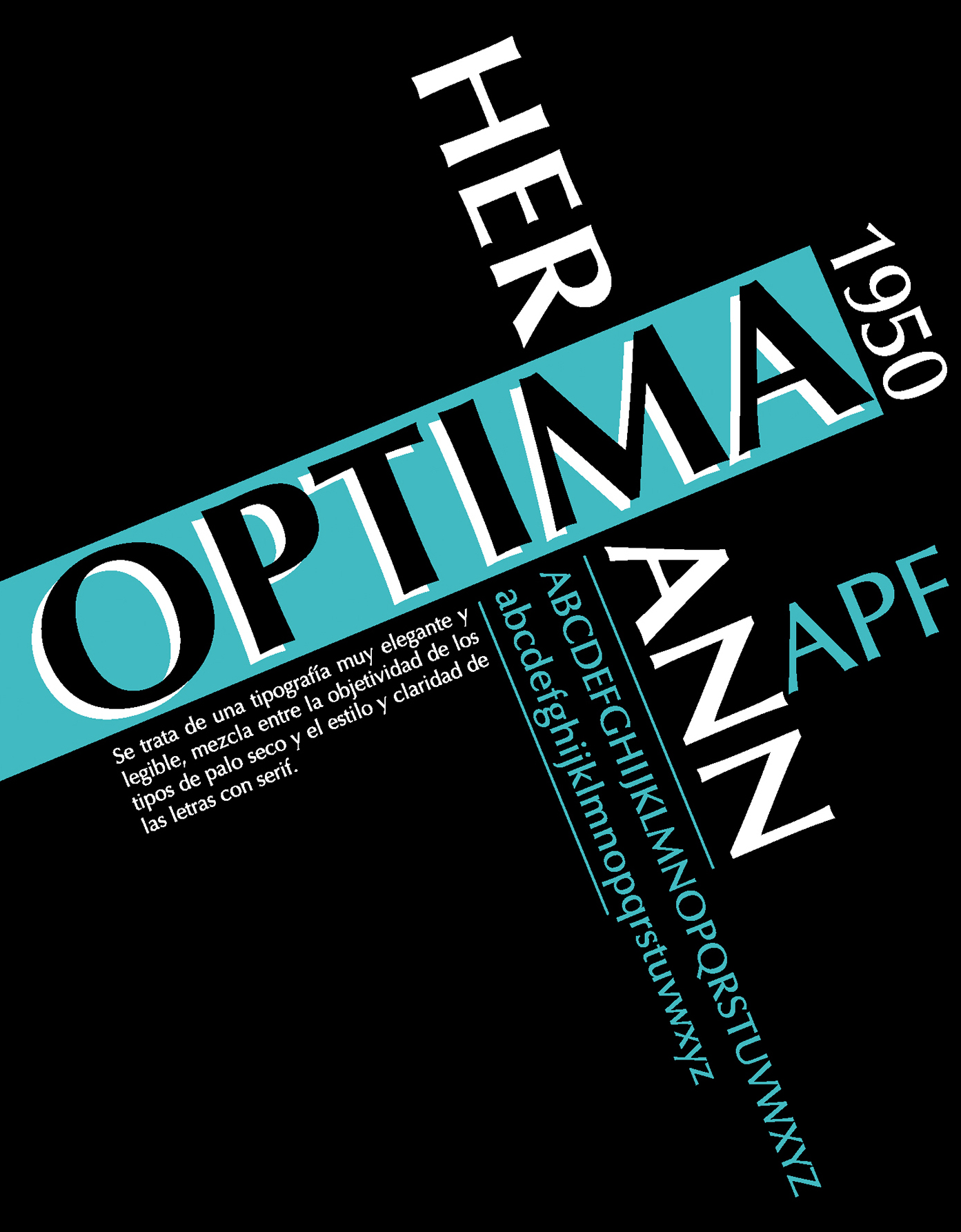
file name: Hermann Zapf Optima 1950 Poster by Nicolas Moretta 2016
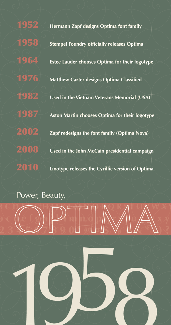
file name: Hermann Zapf Optima 1950 Poster by Ashley Olinger 2014
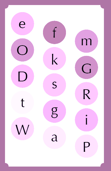
file name: Hermann Zapf Optima 1950 Poster by Megan Holzwarth 2016
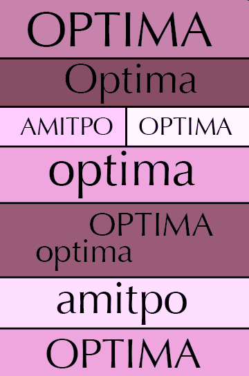
file name: Hermann Zapf Optima 1950 Poster by Megan Holzwarth 2016c
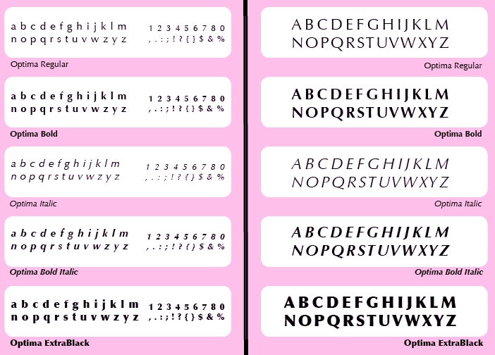
file name: Hermann Zapf Optima 1950 Poster by Megan Holzwarth 2016d
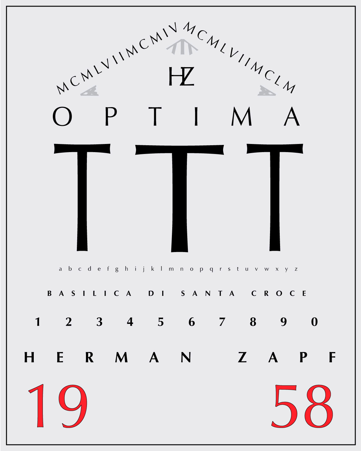
file name: Hermann Zapf Optima 1950 Poster by Carlos Casillas 2016
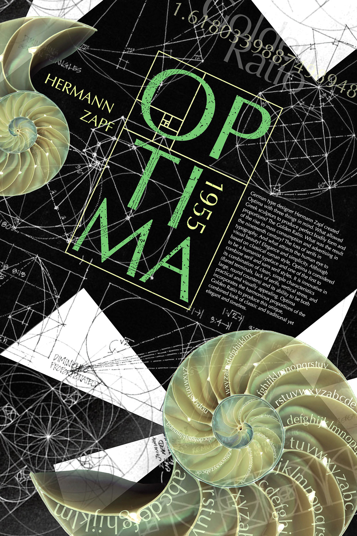
file name: Hermann Zapf Optima 1950 Poster by Alessia Catena 2016
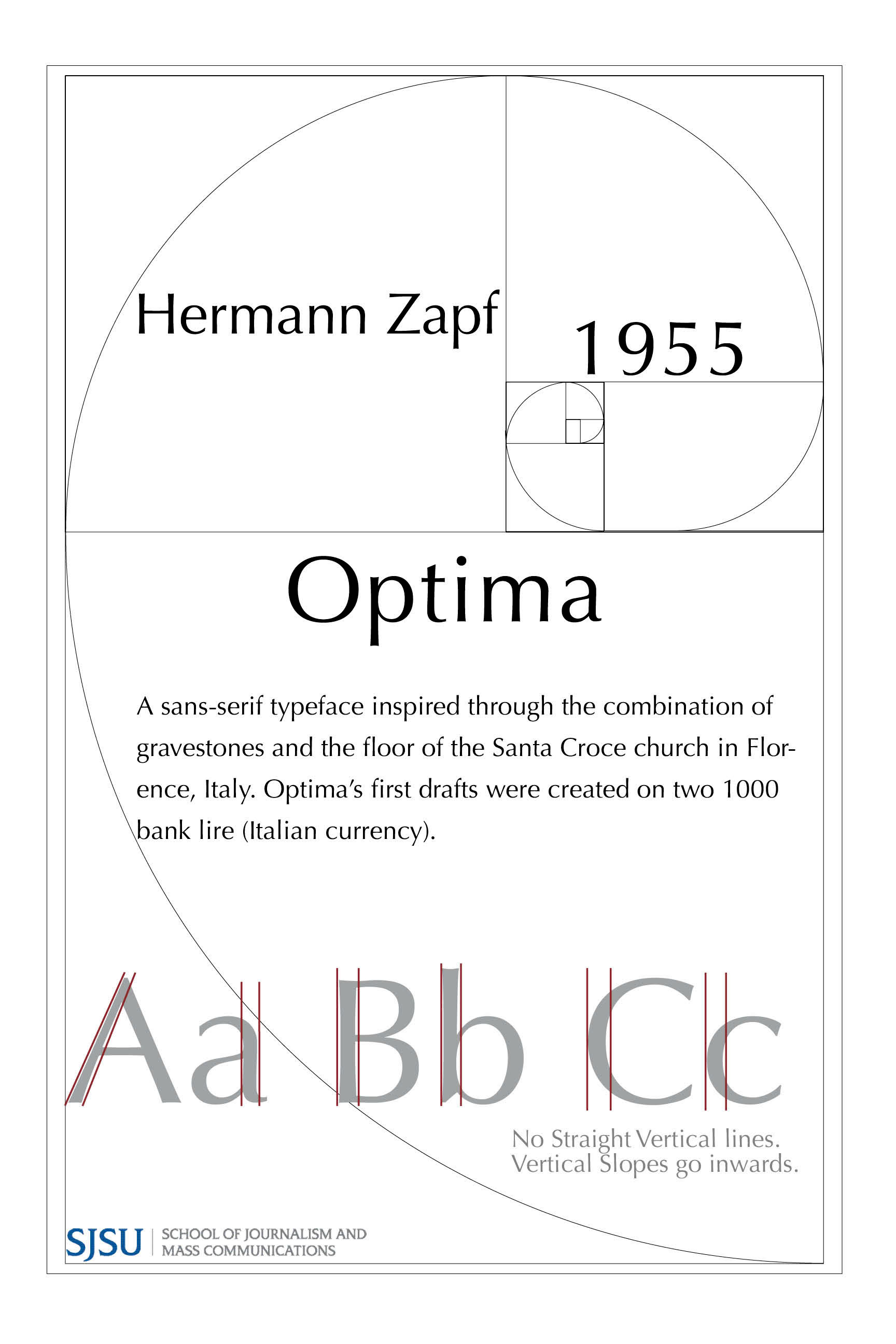
file name: Hermann Zapf Optima 1950 Poster by Robert Medina 2017
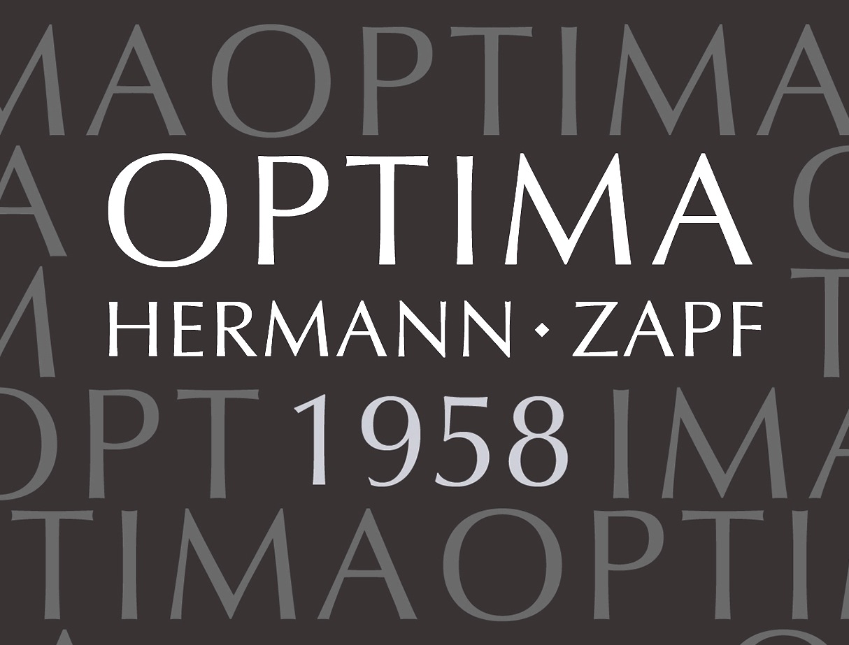
file name: Hermann Zapf Optima 1958 Poster by Abbey Hansen 2015
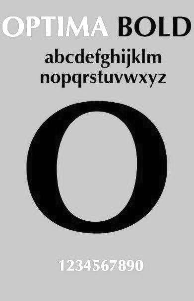
file name: Hermann Zapf Optima Bold Poster by Latice Washington
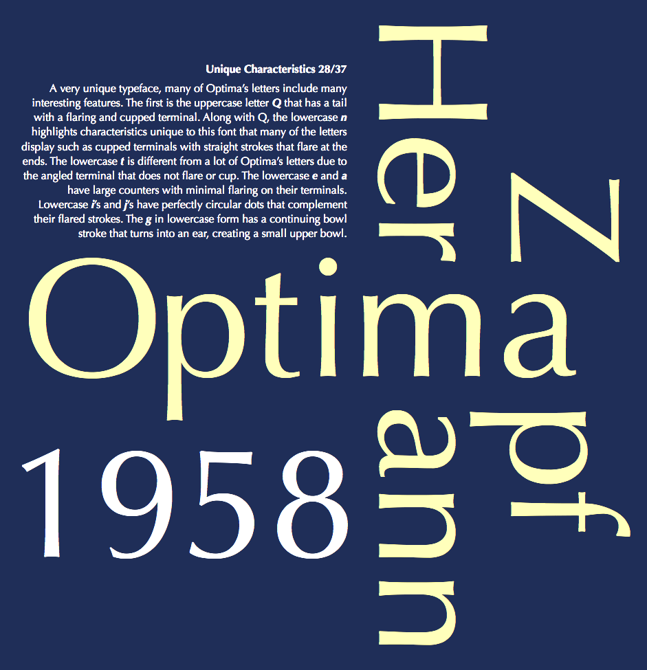
file name: Hermann Zapf Optima 1950 Poster by Kaylee Huber 2014
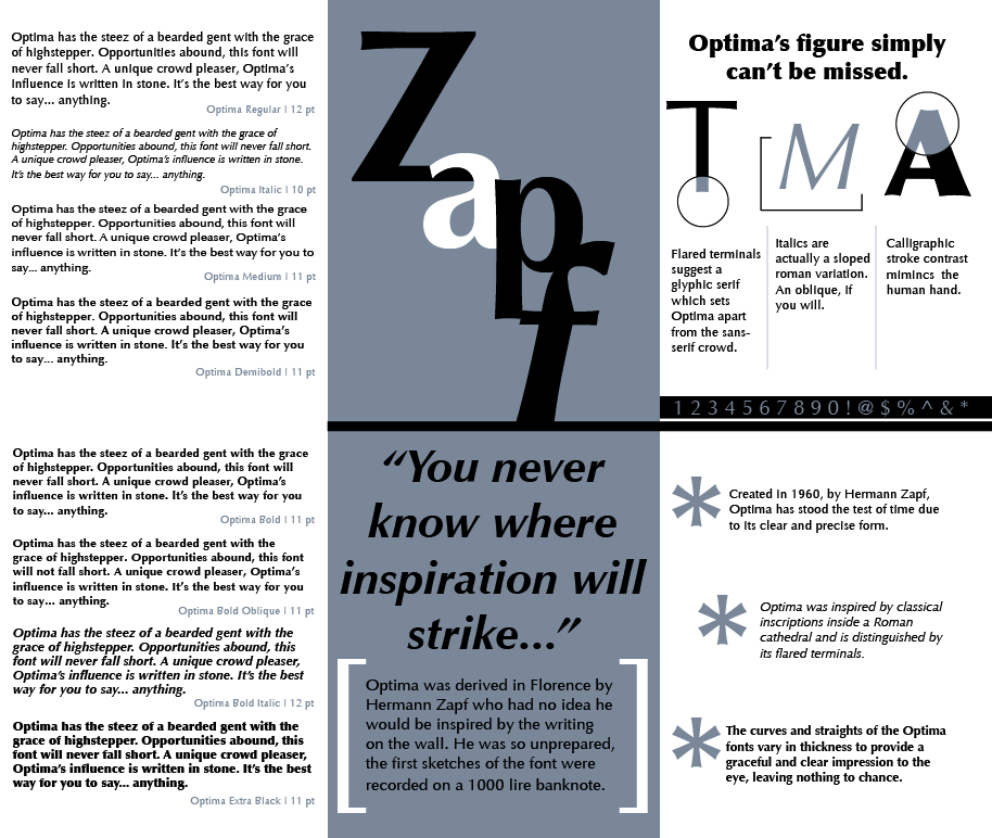
file name: Hermann Zapf Optima 1950 Poster by Amanda Pullano 2014
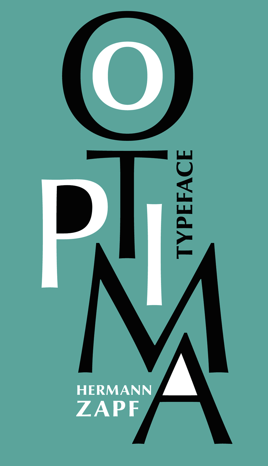
file name: Hermann Zapf Optima 1950 Poster by Lina Besedina 2015

file name: Hermann Zapf Optima 1950 Poster by Lina Besedina 2015b
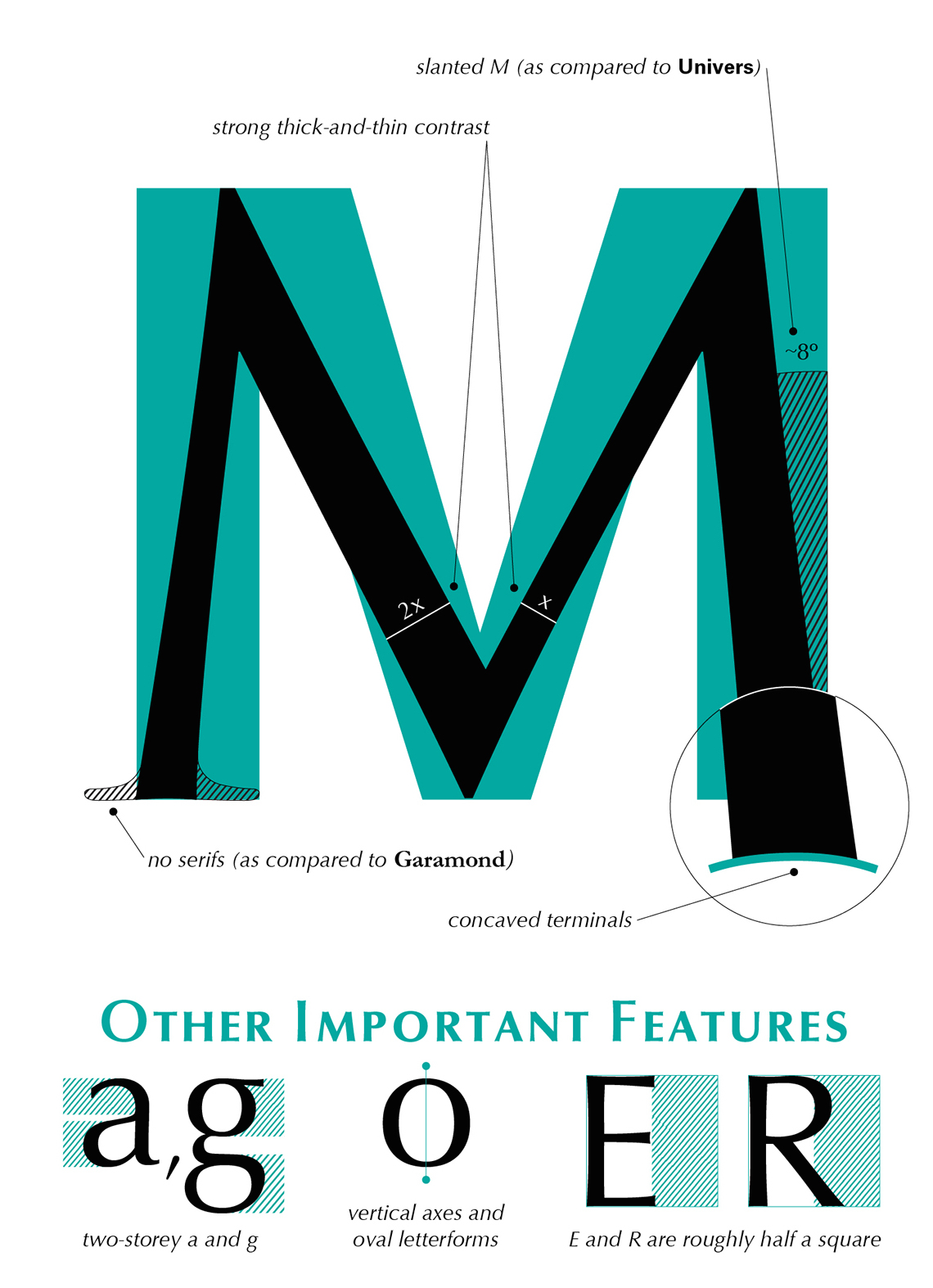
file name: Hermann Zapf Optima 1950 Poster by Lina Besedina 2015d
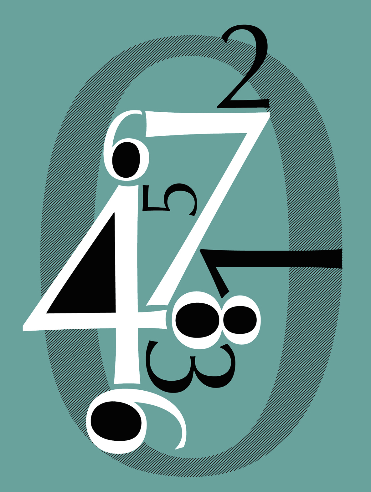
file name: Hermann Zapf Optima 1950 Poster by Lina Besedina 2015e

file name: Hermann Zapf Optima 1950 Poster by Lina Besedina 2015f
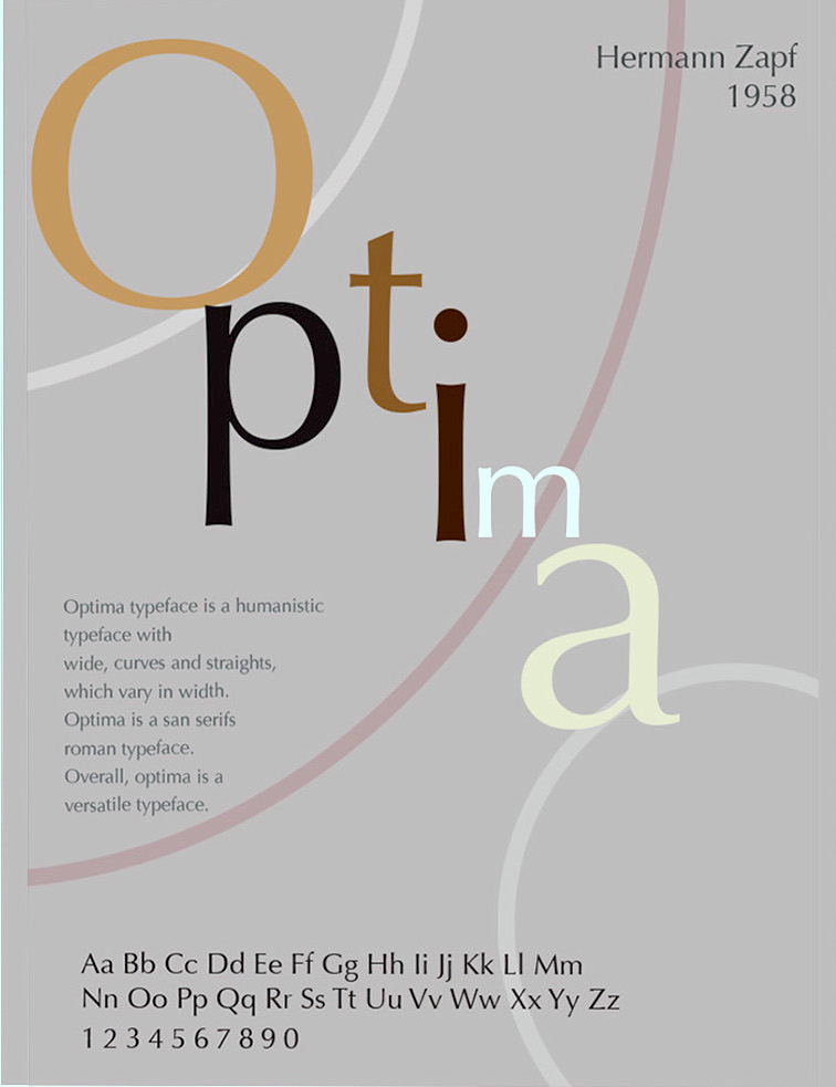
file name: Hermann Zapf Optima 1958 Poster by Ichaya Pongpitak 2015
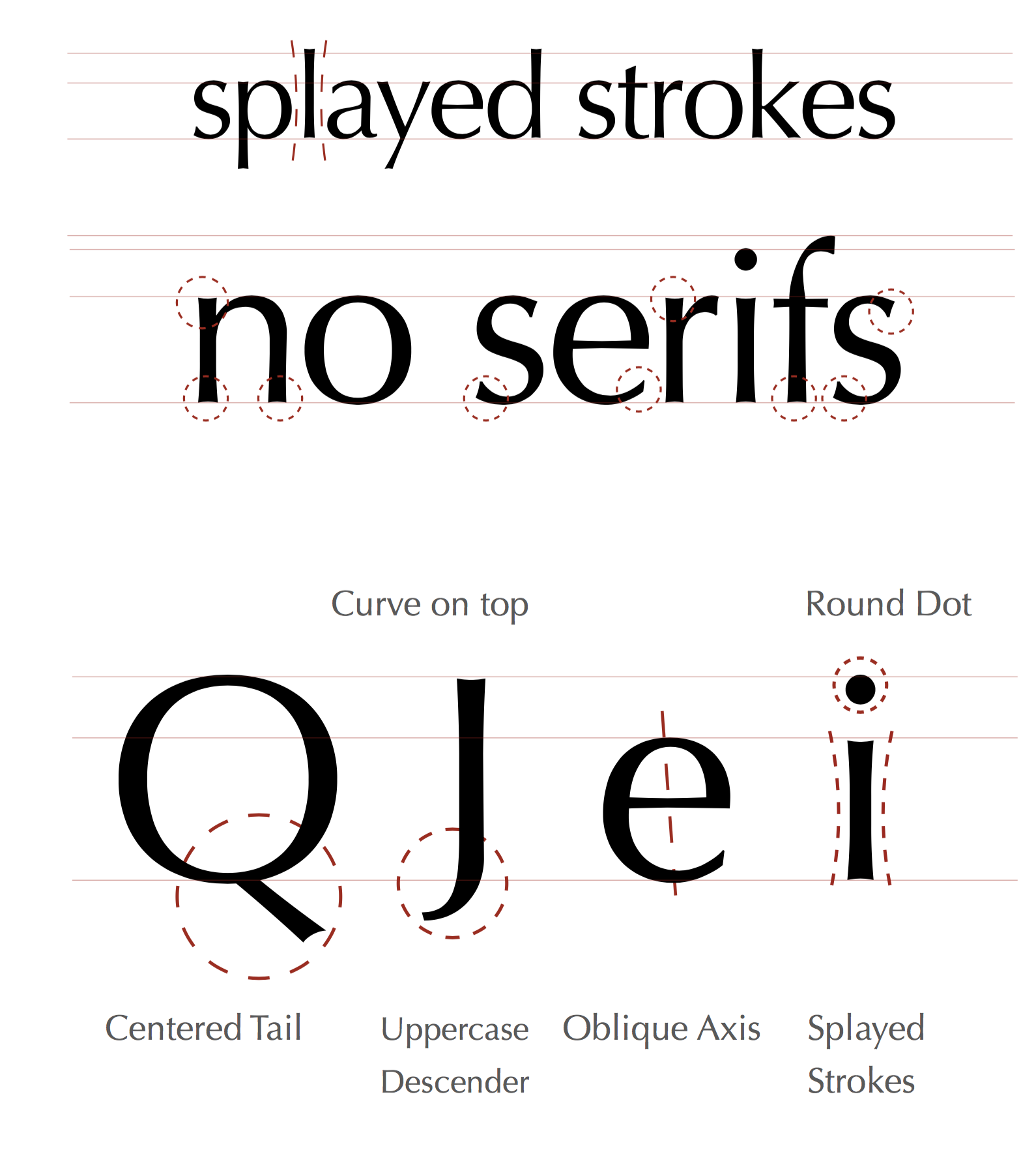
file name: Hermann Zapf Optima 1952 1955 Poster by Fabio Principe 2016
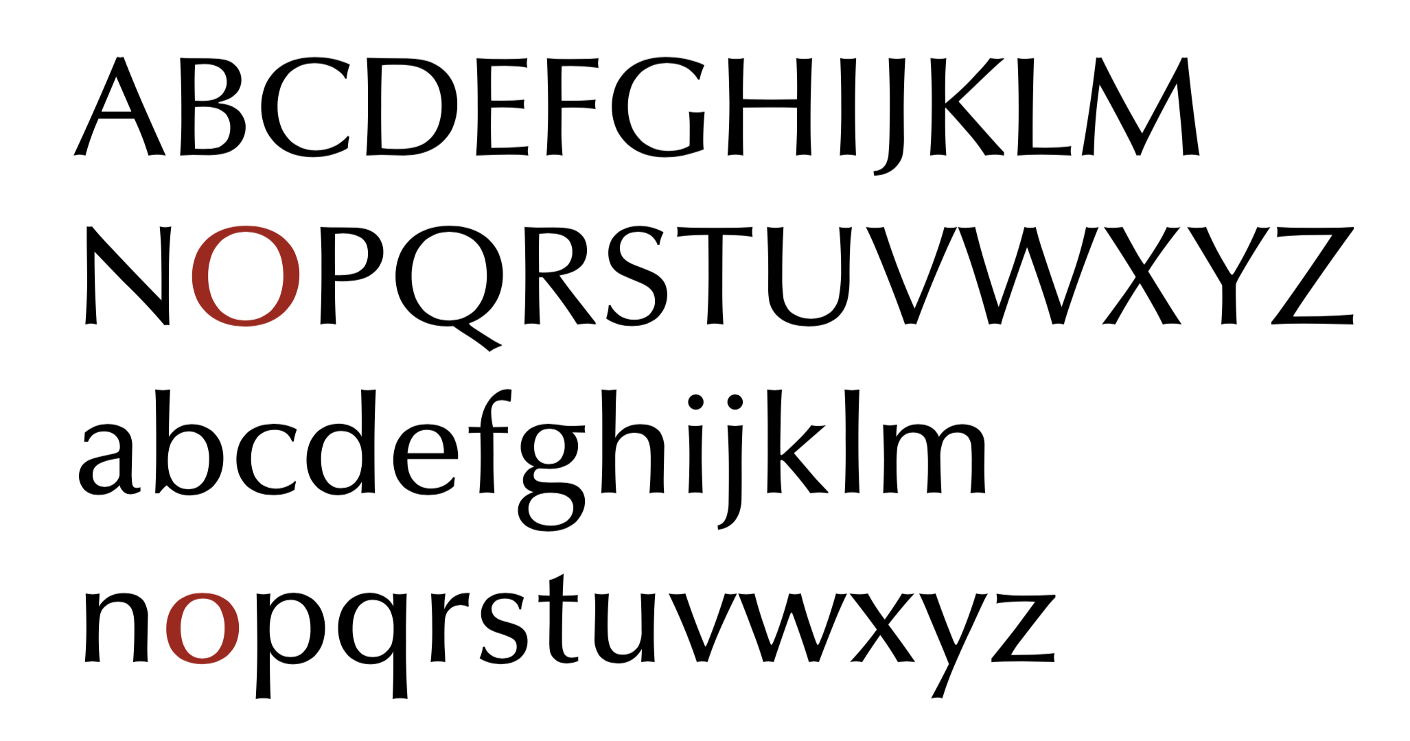
file name: Hermann Zapf Optima 1952 1955 Poster by Fabio Principe 2016b
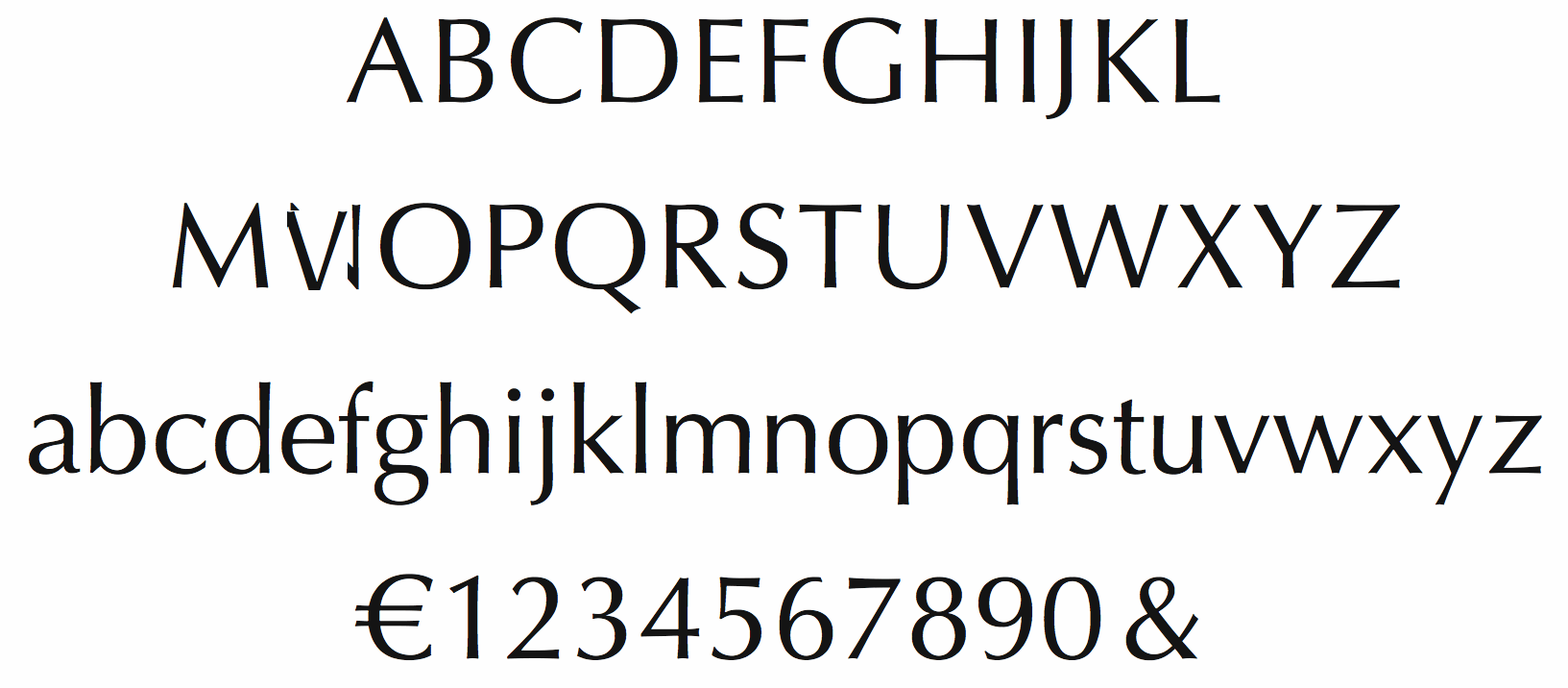
file name: Hermann Zapf Optima 1958
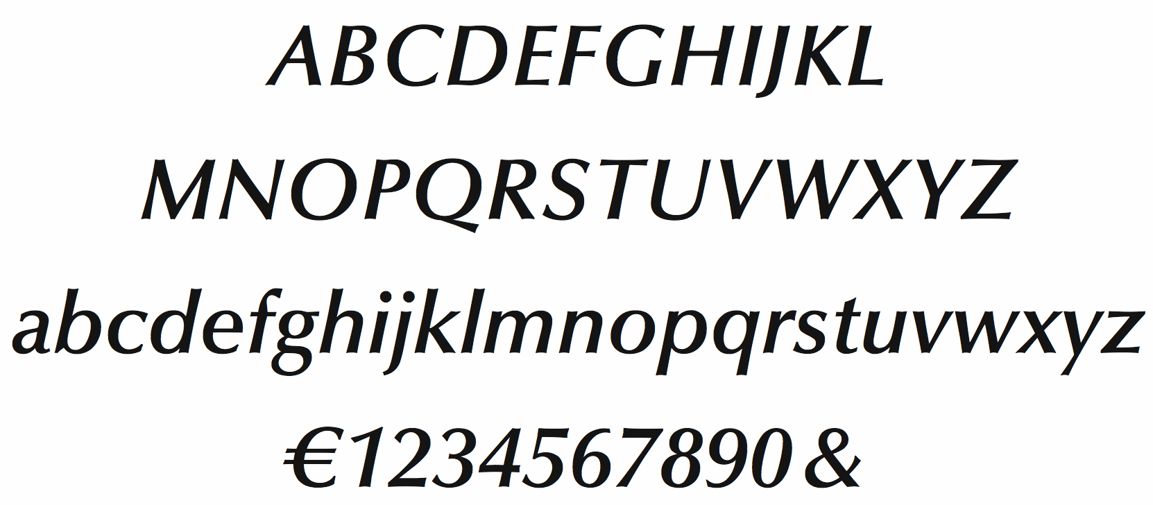
file name: Hermann Zapf Optima Demibold Italic
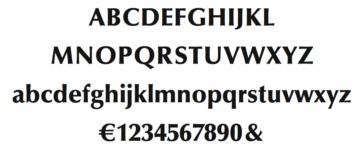
file name: Hermann Zapf Optima Black 1958
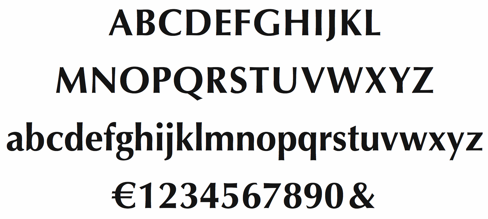
file name: Hermann Zapf Optima Bold 1958

file name: Hermann Zapf Optima 1948 Poster by Michelle Mullin 2014
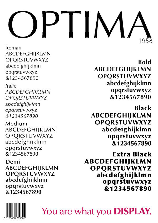
file name: Hermann Zapf Optima 1958
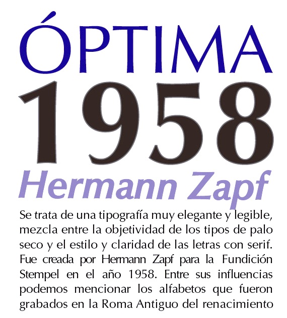
file name: Hermann Zapf Optima 1958 Poster by Paula Quintana 2015
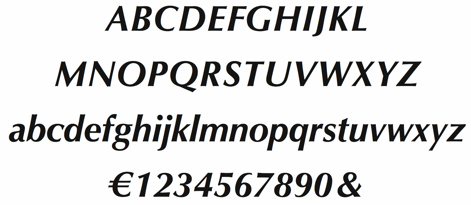
file name: Hermann Zapf Optima Bold Italic 1958
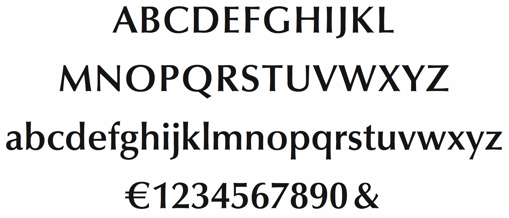
file name: Hermann Zapf Optima Demi Bold 1958
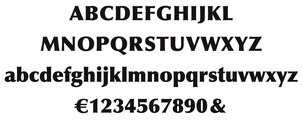
file name: Hermann Zapf Optima Extra Black 1958
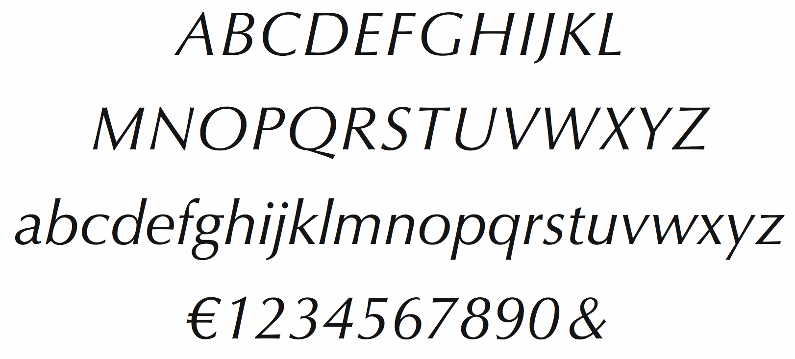
file name: Hermann Zapf Optima Italic 1958
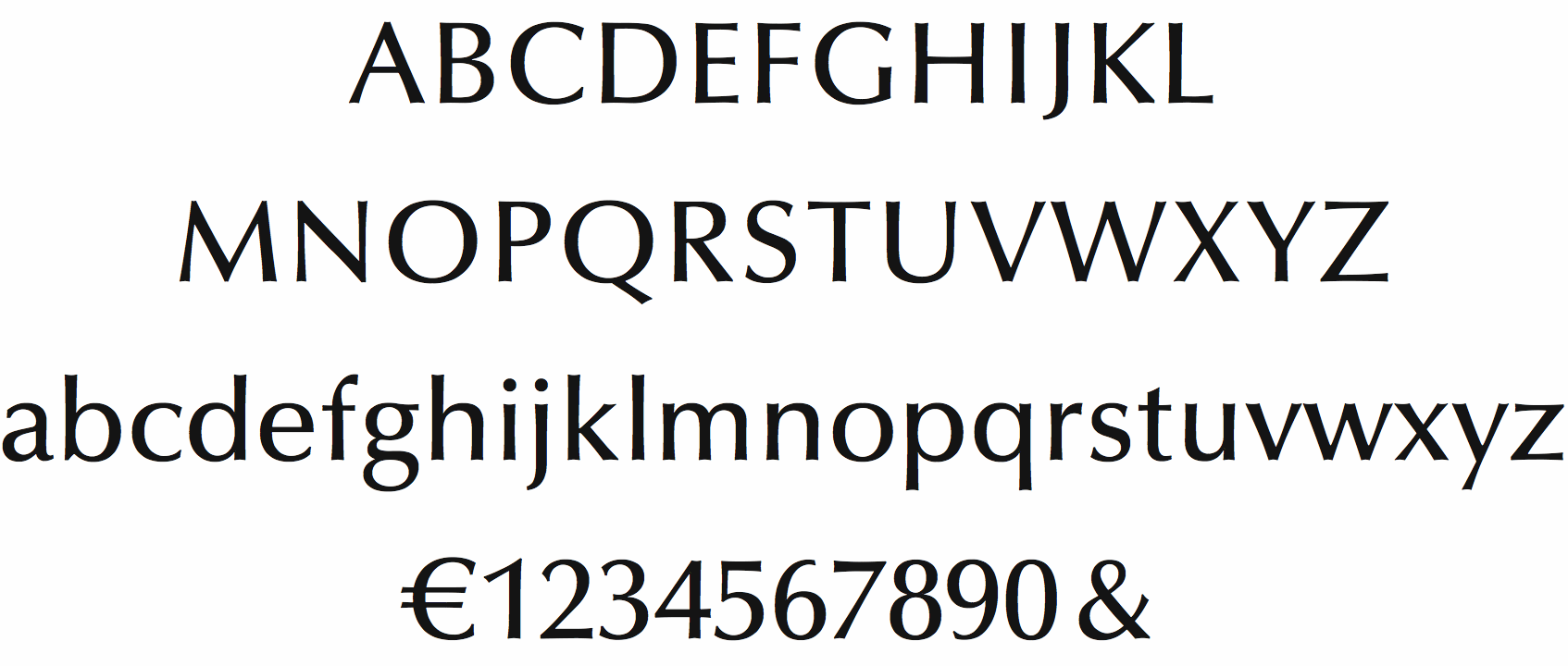
file name: Hermann Zapf Optima Medium 1958
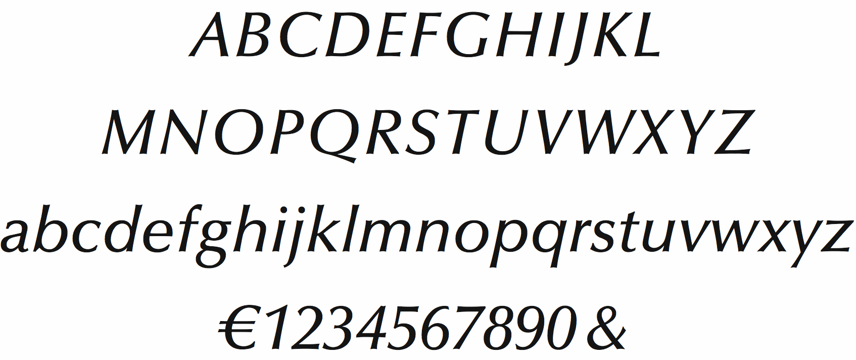
file name: Hermann Zapf Optima Medium Italic 1958
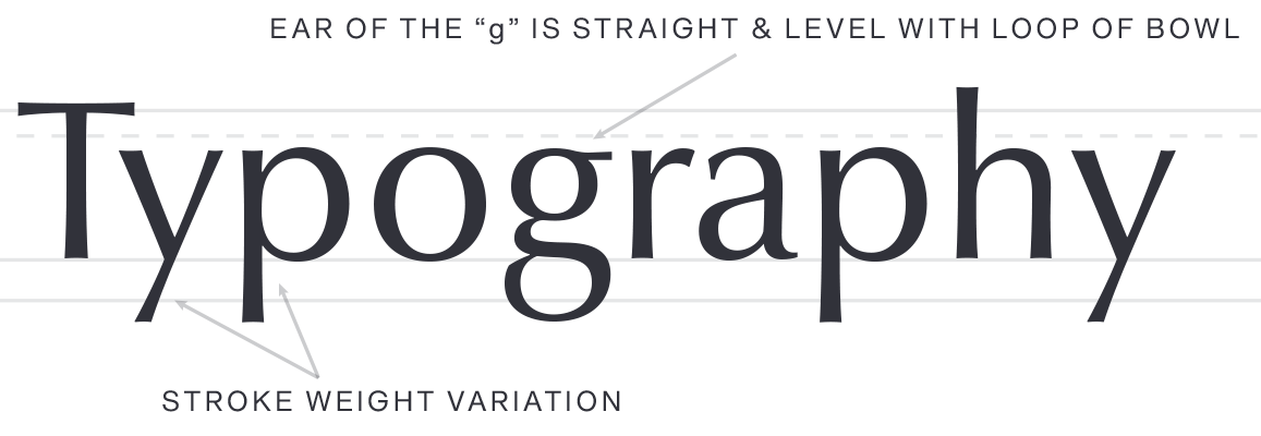
file name: Hermann Zapf Akira Kobayashi Optima Nova 2002
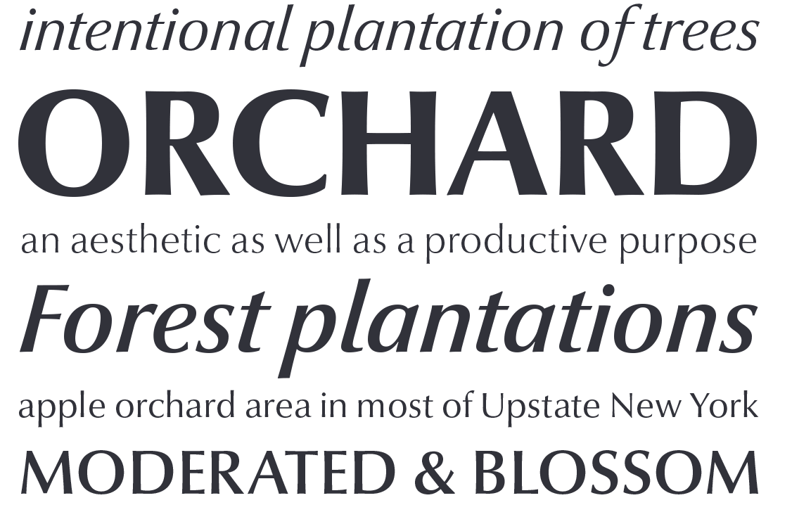
file name: Hermann Zapf Akira Kobayashi Optima Nova 2002
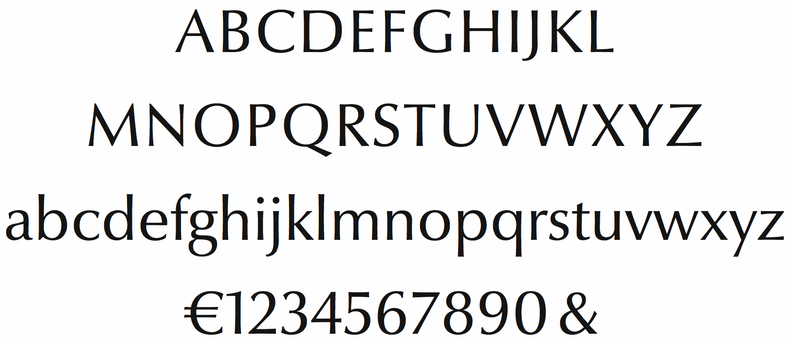
file name: Hermann Zapf Optima Nova Regular
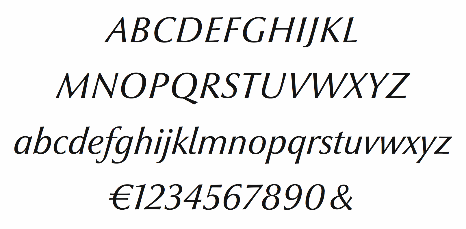
file name: Hermann Zapf Optima Novatalic

file name: Softmaker Columbia Serial Heavy 2010

file name: Softmaker Columbia Serial Light 2010
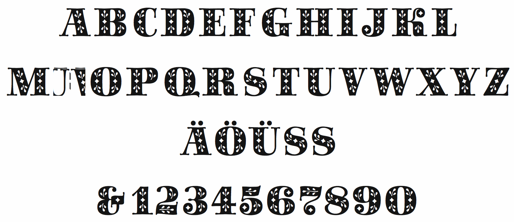
file name: Hermann Zapf Saphir 1953
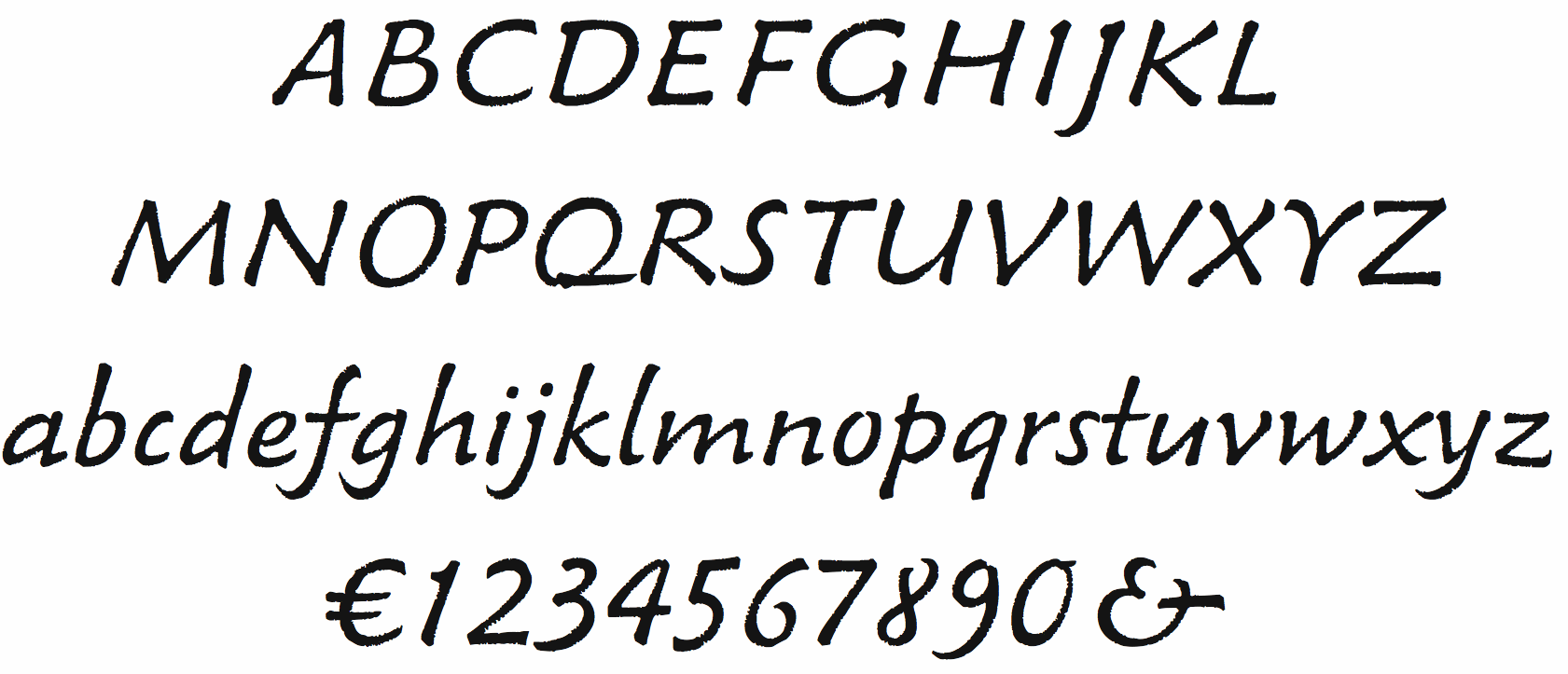
file name: Hermann Zapf Venture Script 1969
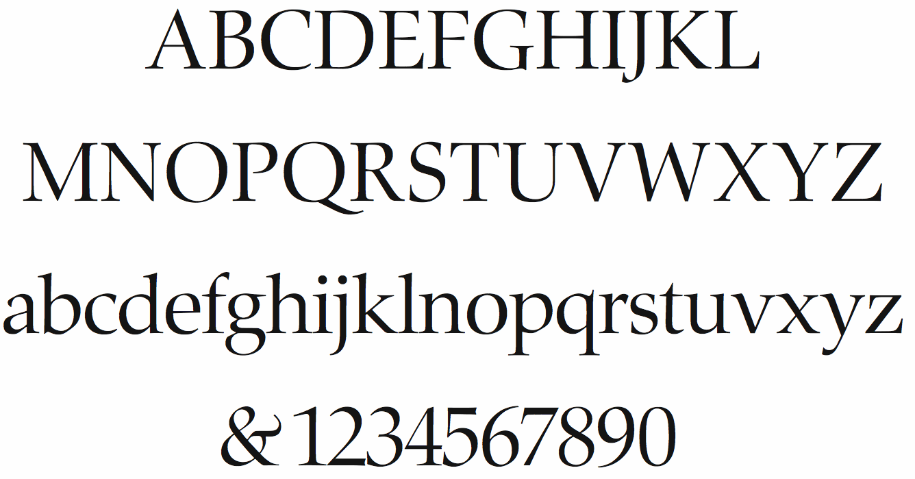
file name: Hermann Zapf Zapf Renaissance Antiqua 1985
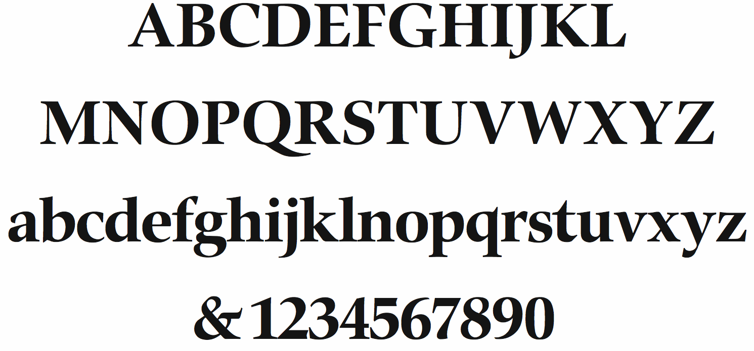
file name: Hermann Zapf Zapf Renaissance Antiqua Bold 1985
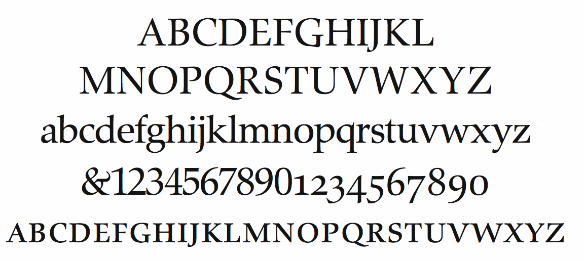
file name: Hermann Zapf Zapf Renaissance Antiqua Book 1985
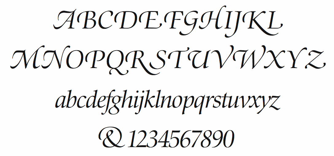
file name: Hermann Zapf Zapf Renaissance Antiqua Light Italic 1985
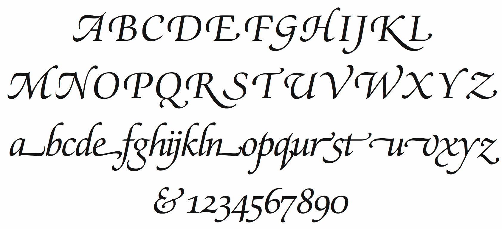
file name: Hermann Zapf Zapf Renaissance Antiqua Swashed Book Italic 1985
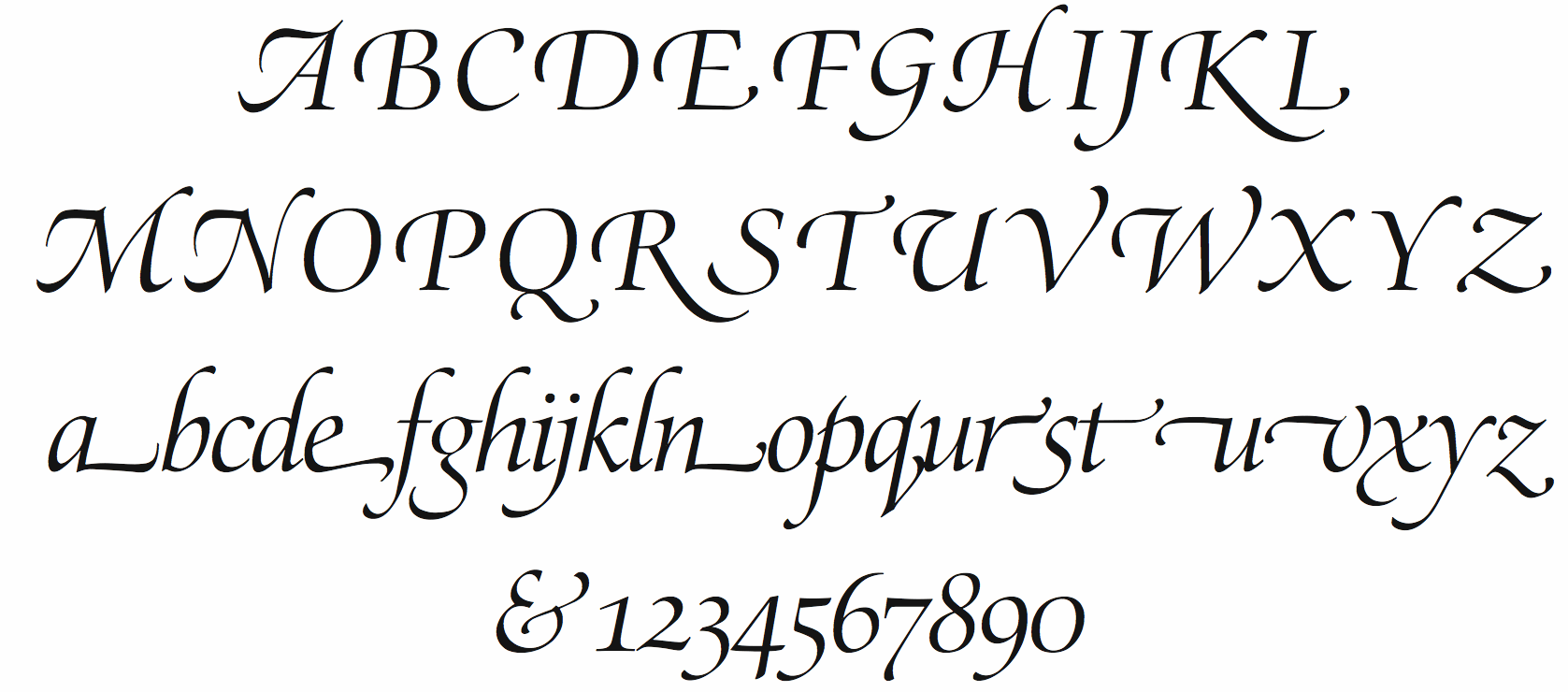
file name: Hermann Zapf Zapf Renaissance Antiquaswash Italic 1985
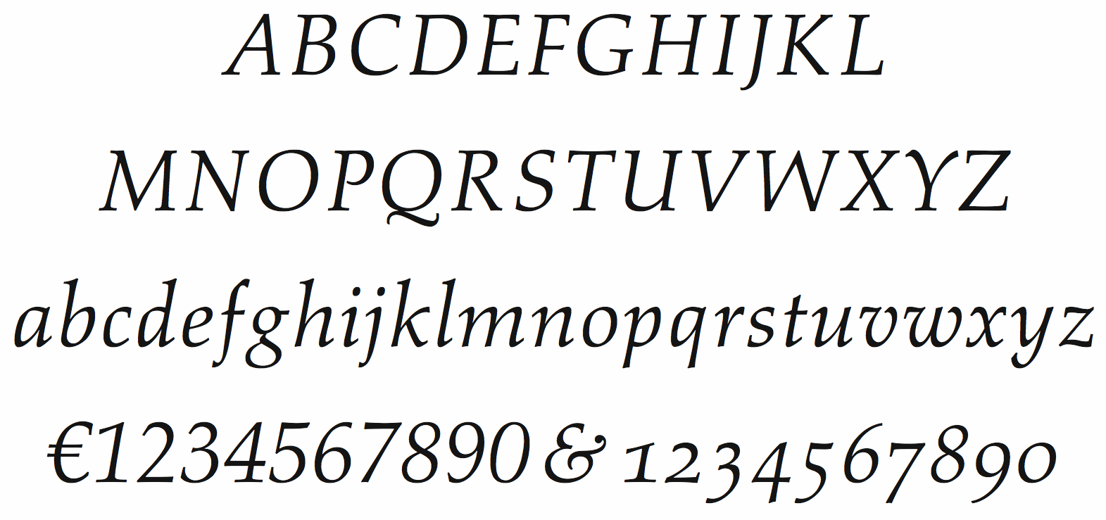
file name: Hermann Zapf Aldus Italic 1954
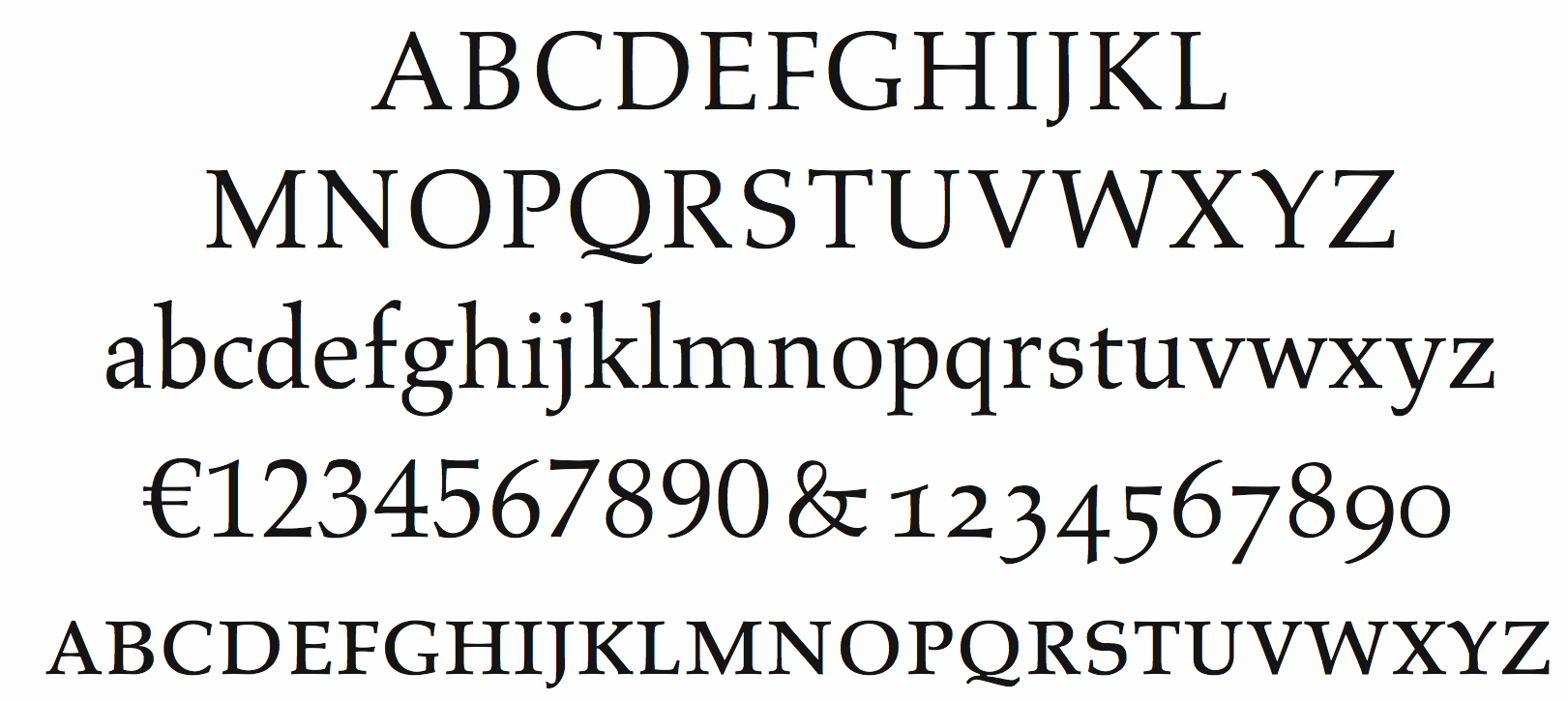
file name: Hermann Zapf Aldus Roman 1954

file name: Hermann Zapf Aldus 1954 Adobe Version

file name: Hermann Zapf Aldus L T 1954c
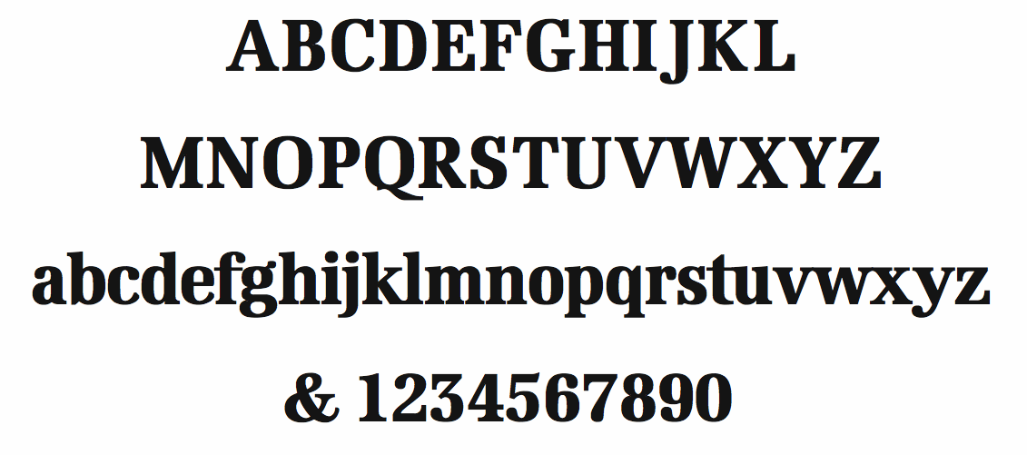
file name: Hermann Zapf Edison Bold Condensed
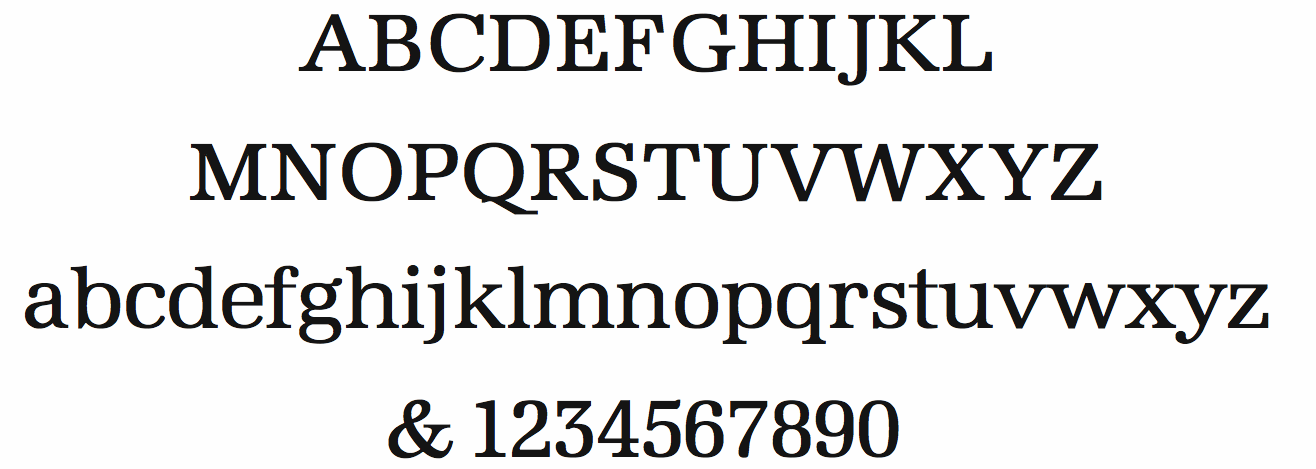
file name: Hermann Zapf Edison Book 1978
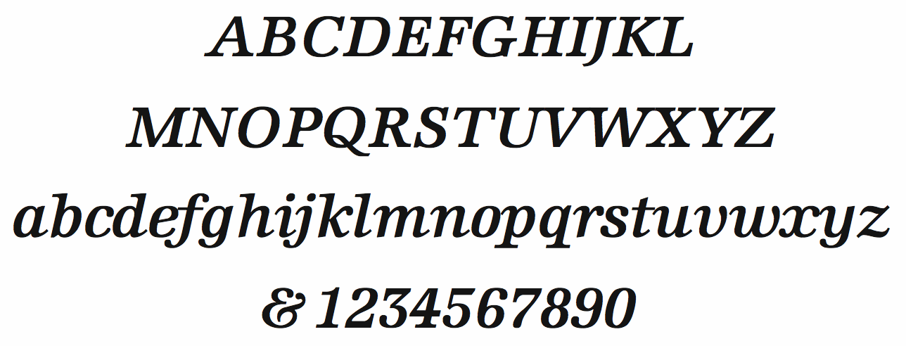
file name: Hermann Zapf Edison Semibold Italic
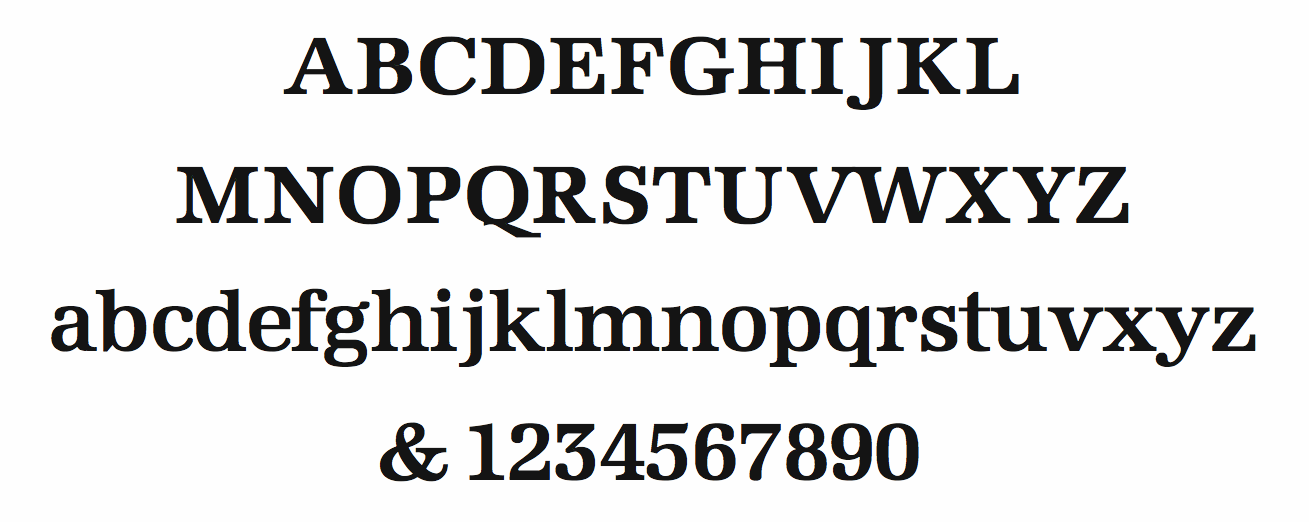
file name: Hermann Zapf Edison Semibold
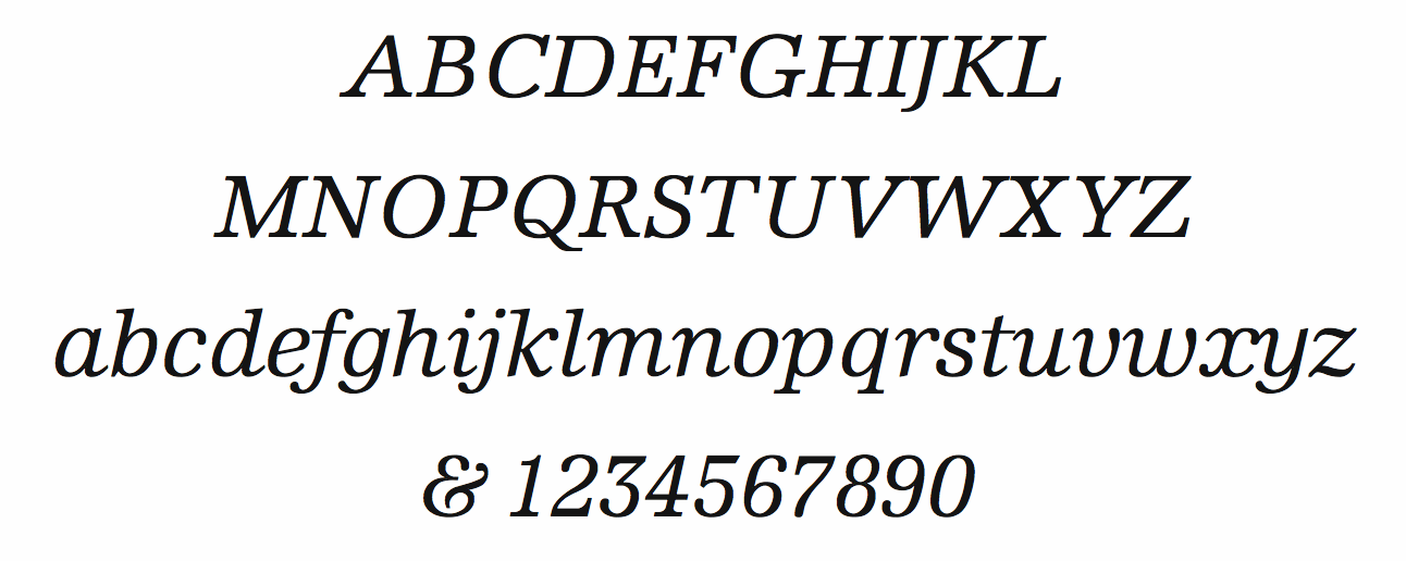
file name: Hermann Zapf Edison Book Italic
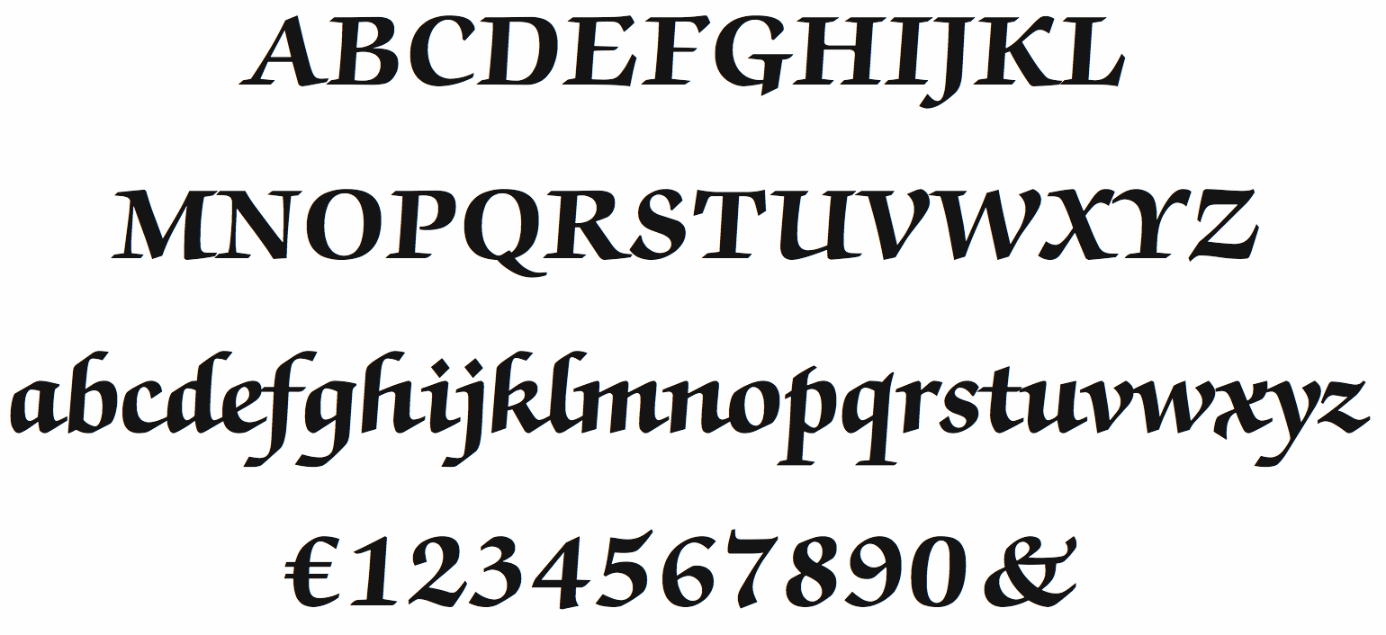
file name: Hermann Zapf I T C Zapf Chancery Bold
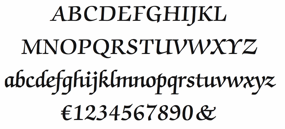
file name: Hermann Zapf I T C Zapf Chancery Demi
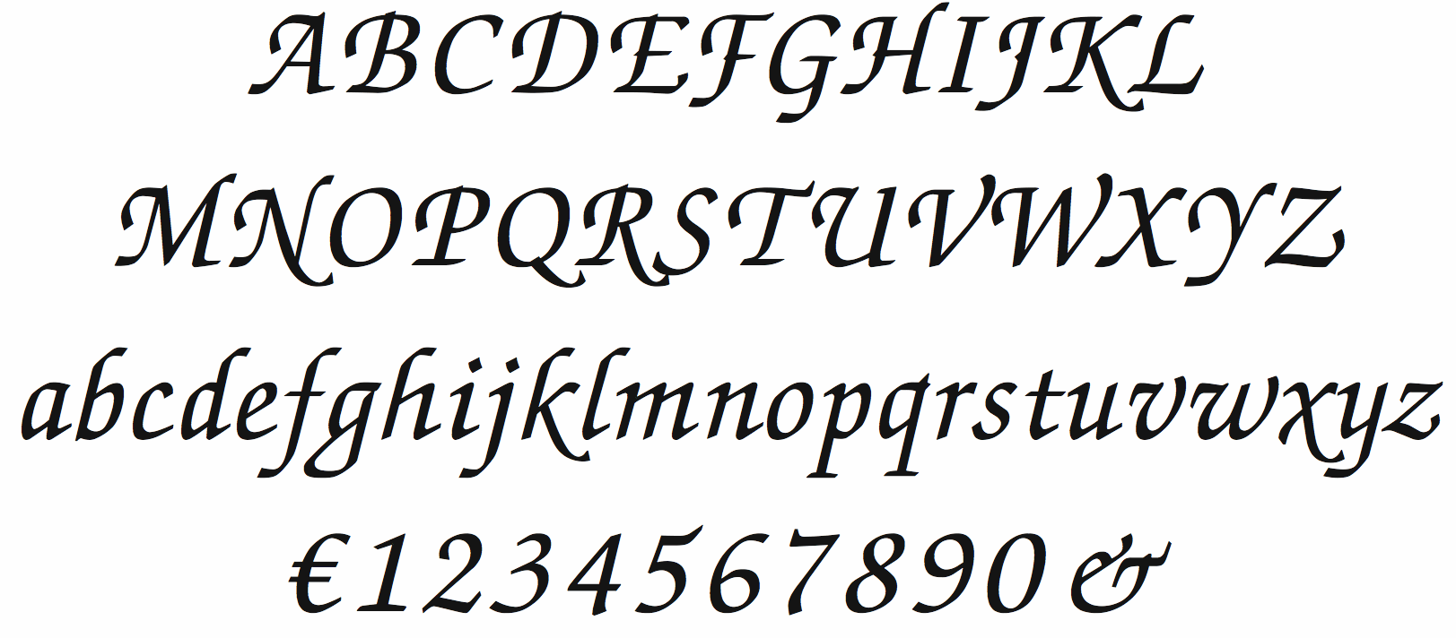
file name: Hermann Zapf I T C Zapf Chancery Italic
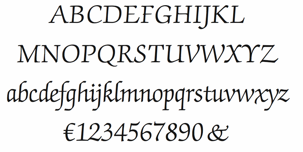
file name: Hermann Zapf I T C Zapf Chancery Light
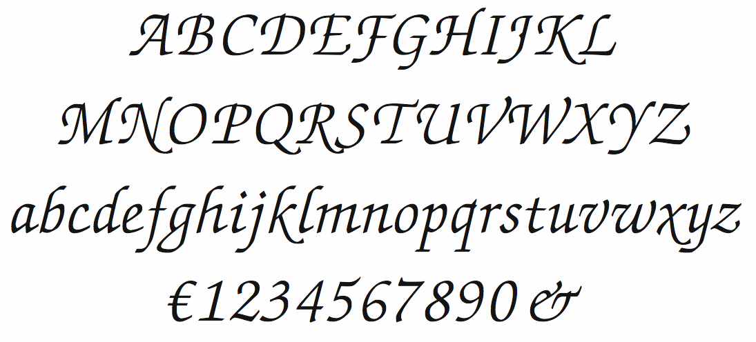
file name: Hermann Zapf I T C Zapf Chancery Light Italic
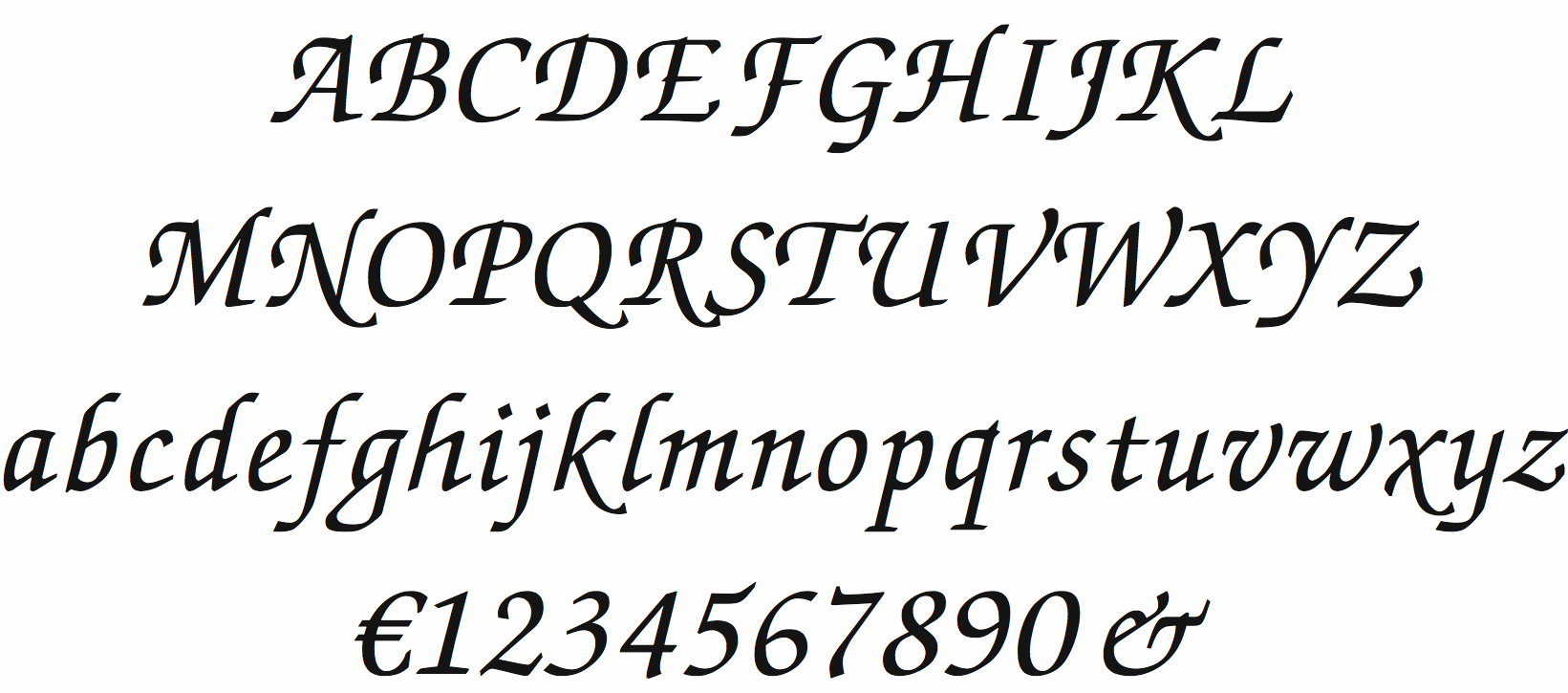
file name: Hermann Zapf I T C Zapf Chancery Medium Italic
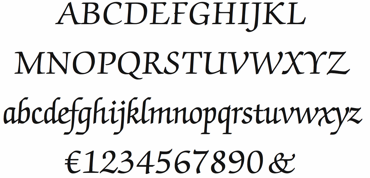
file name: Hermann Zapf I T C Zapf Chancery Roman
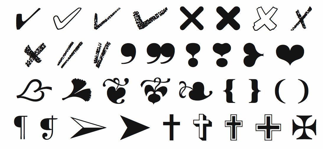
file name: Hermann Zapf Essentials Markers
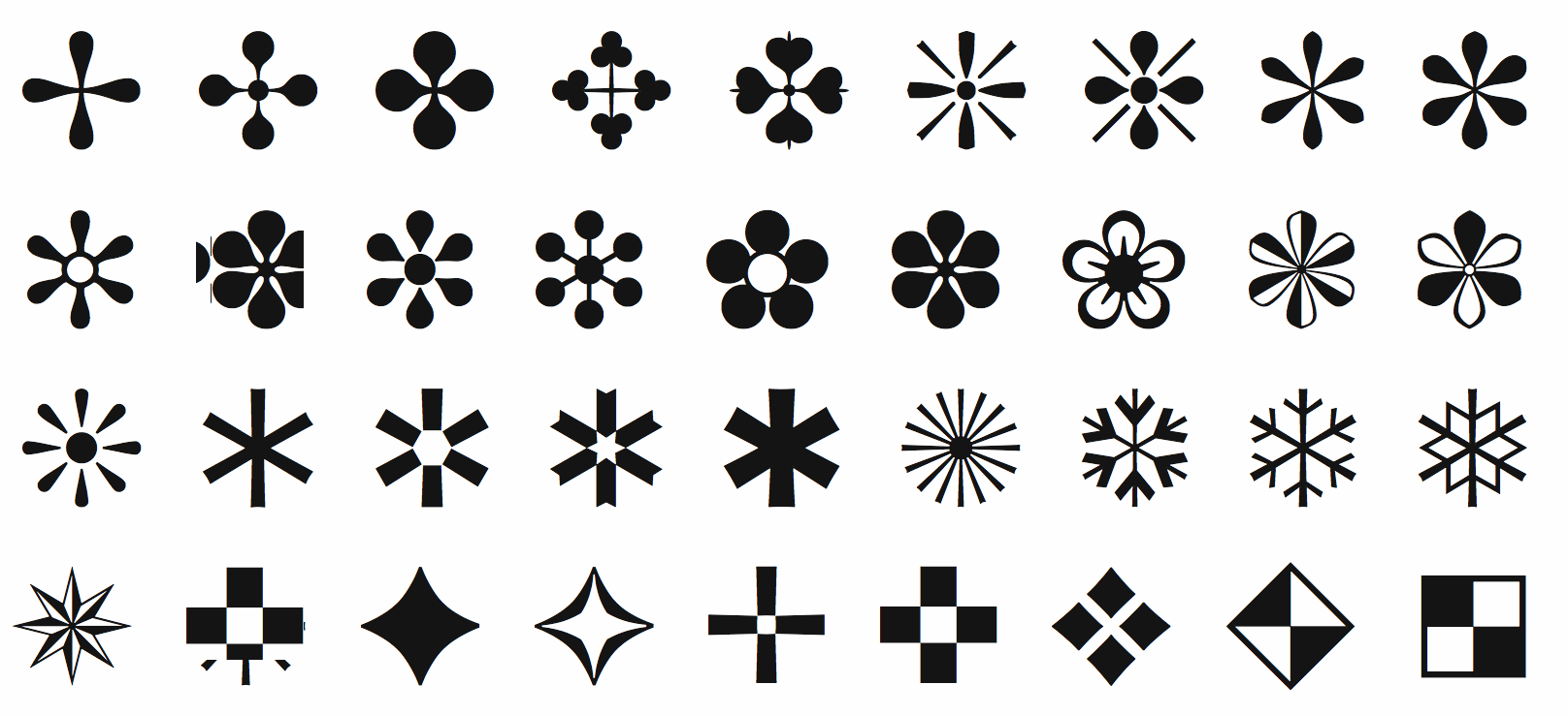
file name: Hermann Zapf Essentials Ornaments
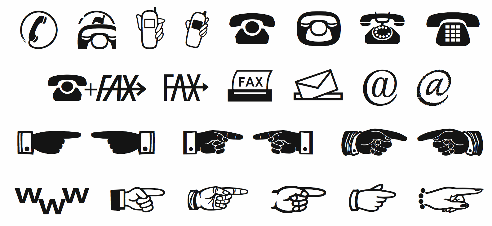
file name: Hermann Zapf Essentialscommunication

file name: Hermann Zapf Essentialsoffice

file name: Hermann Zapf I T C Zapf Essentials Arrows One
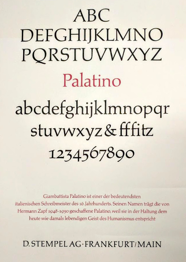
file name: Hermann Zapf Palatino 1953
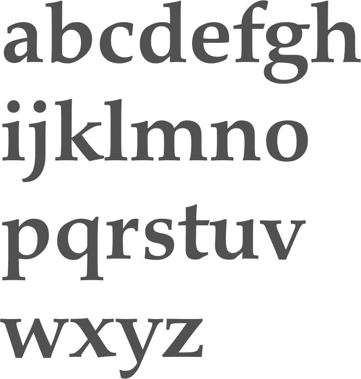
file name: Hermann Zapf Palatino Etext Bold 2013
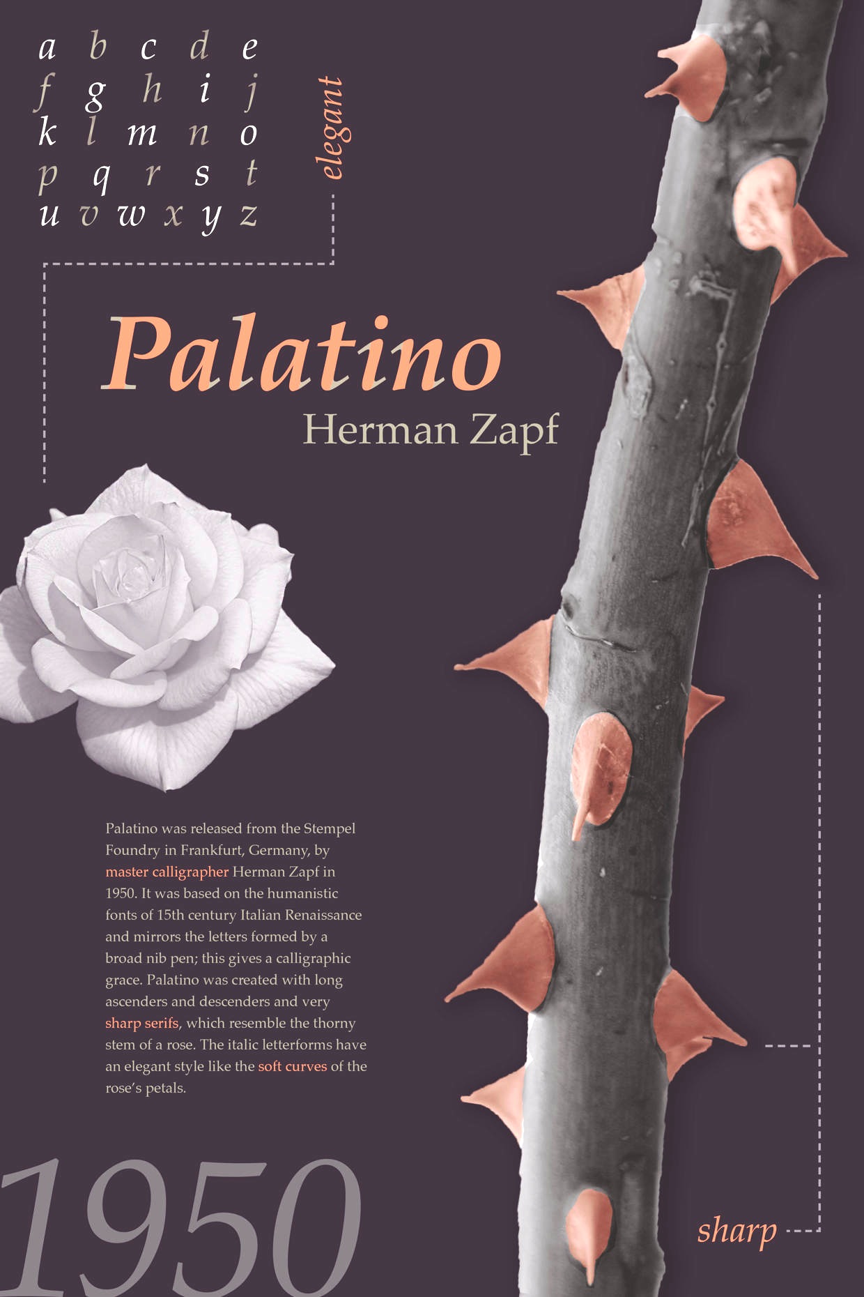
file name: Hermann Zapf Palatino 1948 Poster by Rachael Alling 2015
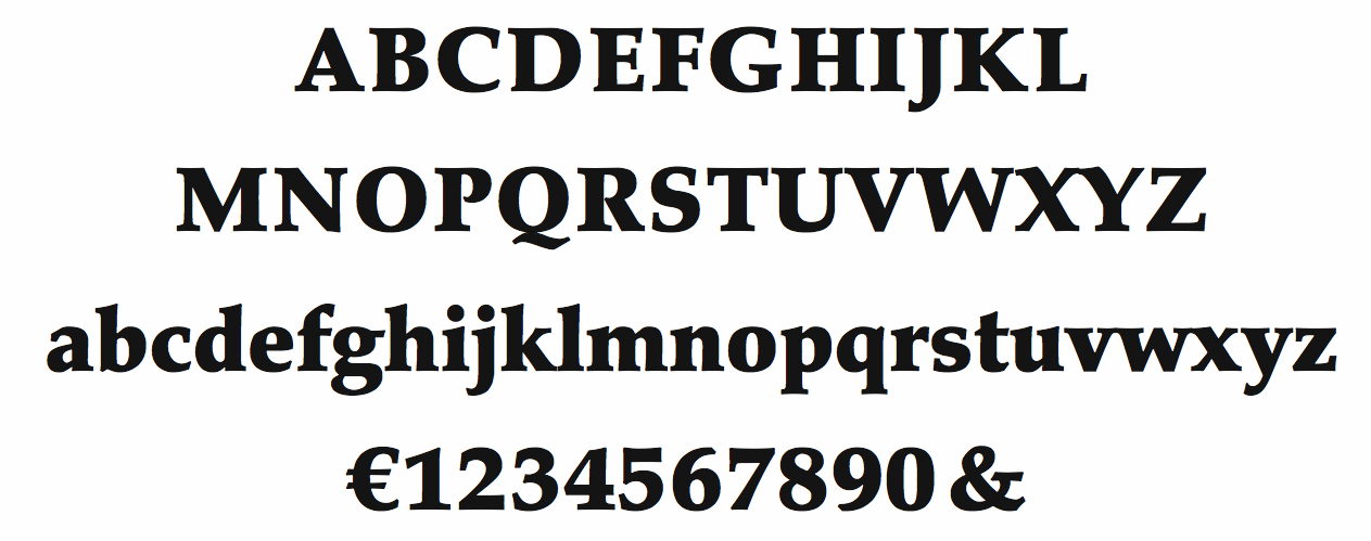
file name: Hermann Zapf Palatino Black 1986
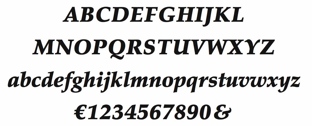
file name: Hermann Zapf Palatino Black Italic 1986
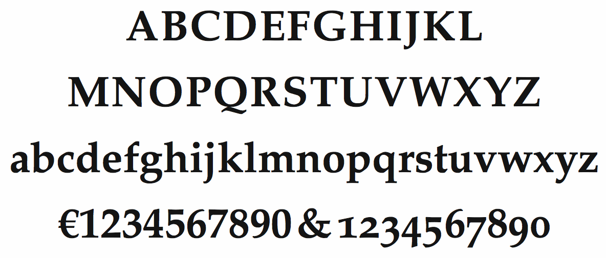
file name: Hermann Zapf Palatino Bold 1986
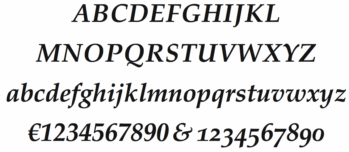
file name: Hermann Zapf Palatino Bold Italic 1986
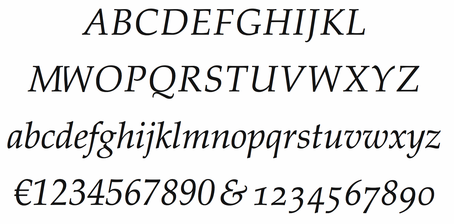
file name: Hermann Zapf Palatino Italic
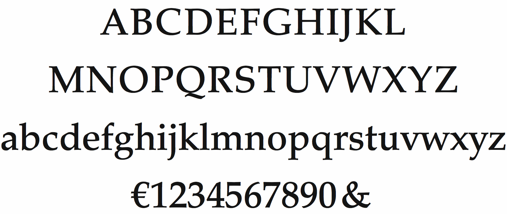
file name: Hermann Zapf Palatino Medium
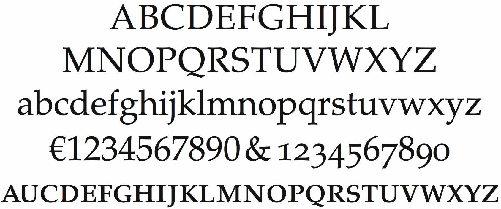
file name: Hermann Zapf Palatino Roman S C 1986
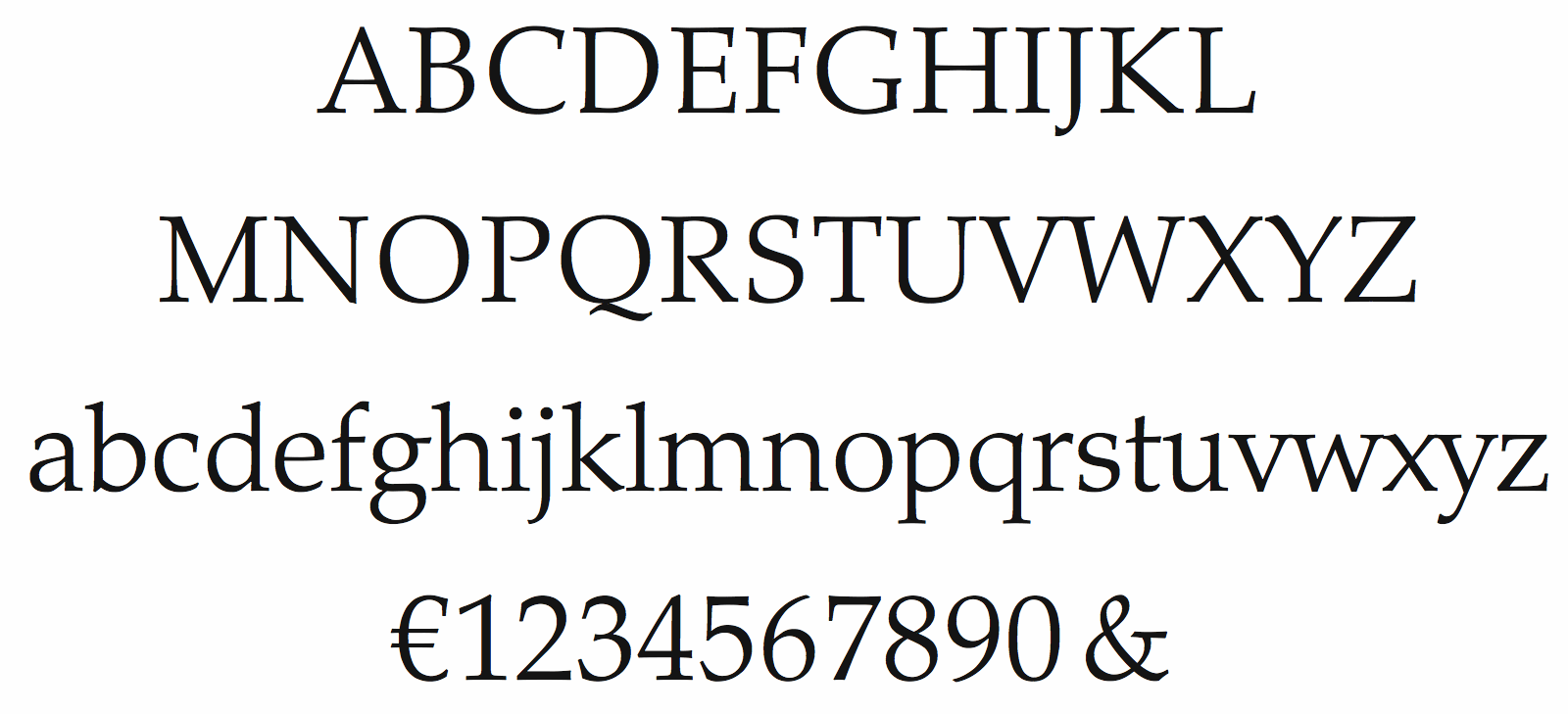
file name: Hermann Zapf Palatinolight 1986
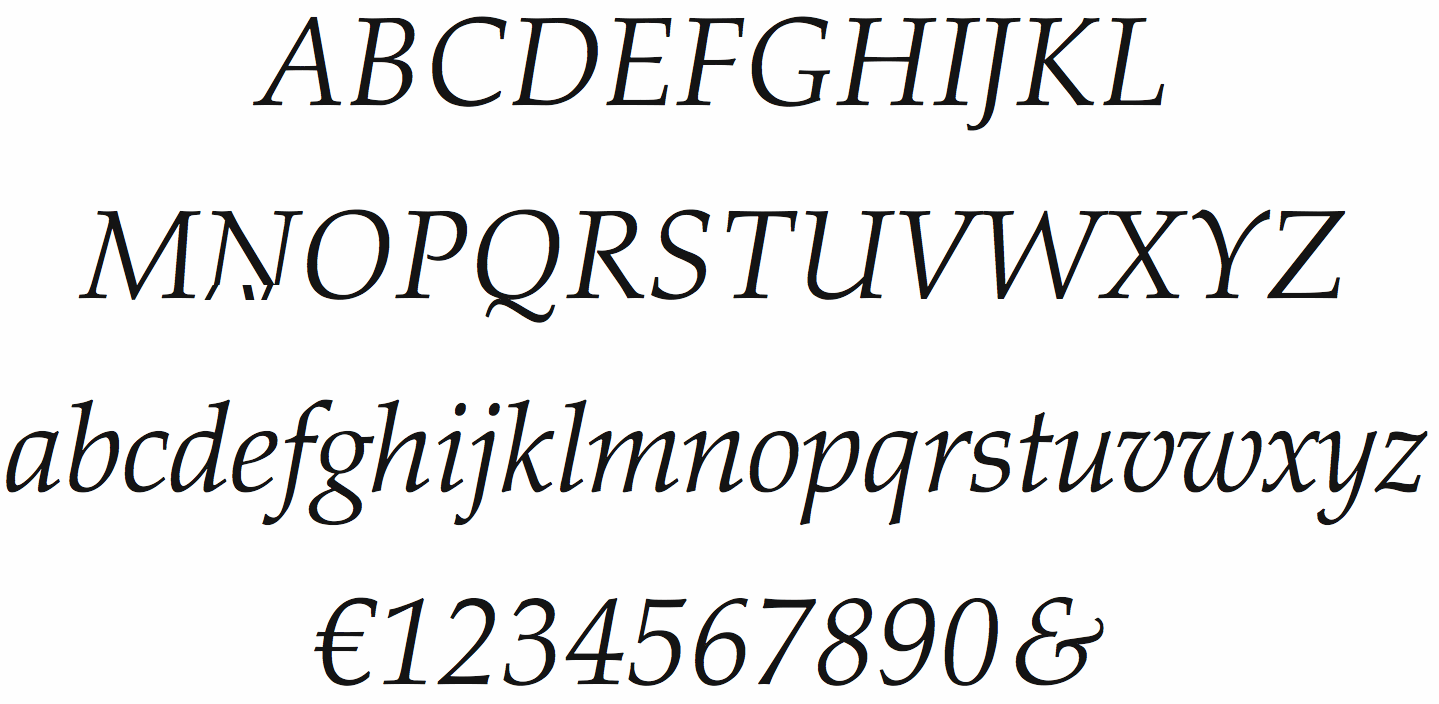
file name: Hermann Zapf Palatinolight Italic 1986

file name: Hermann Zapf Palatino 1948
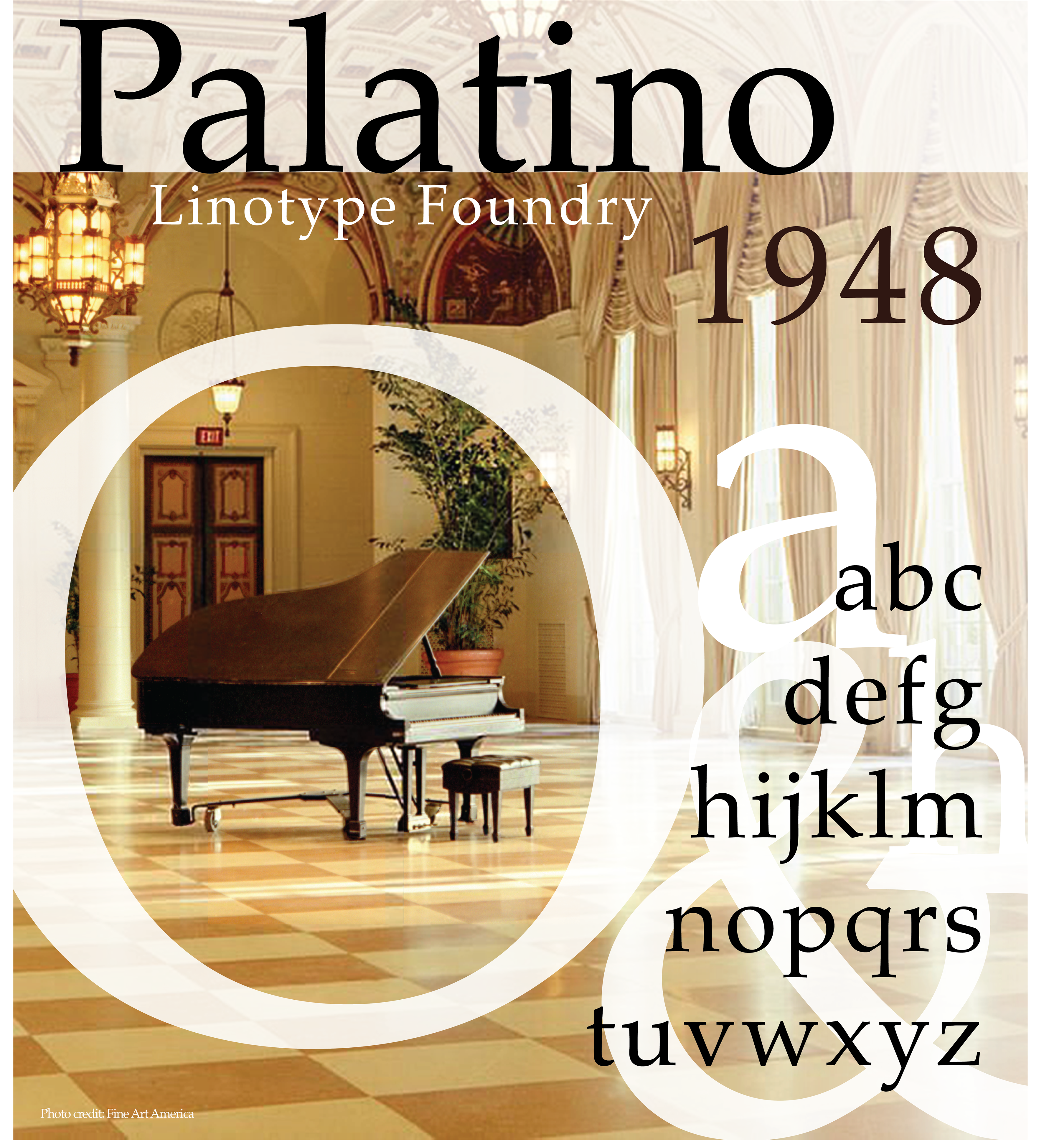
file name: Hermann Zapf Palatino 1948 Poster by Mayte Menchaca 2017b
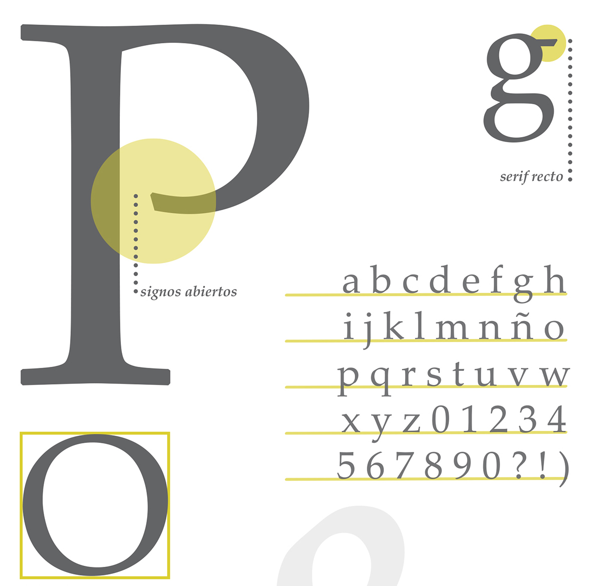
file name: Hermann Zapf Palatino 1948 Poster by Guillermina Luna 2016
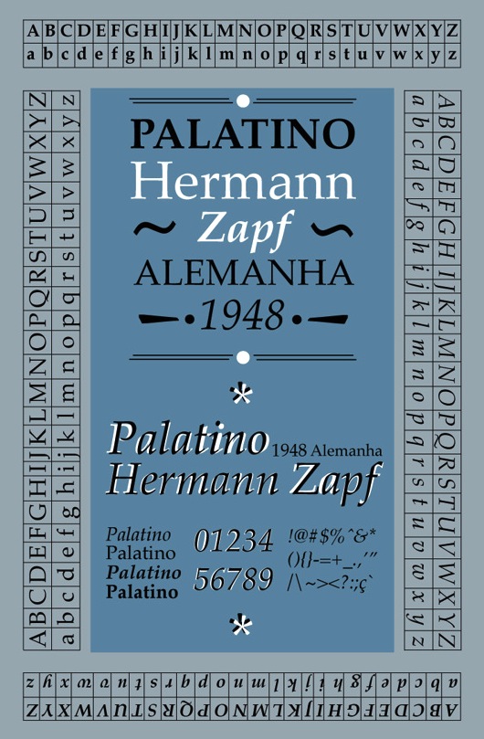
file name: Hermann Zapf Palatino 1948 Poster by Leticia Leao 2013
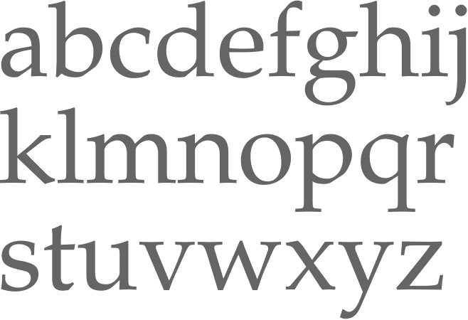
file name: Hermann Zapf Palatino Pro Roman 1950
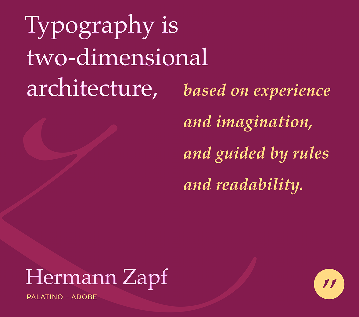
file name: Hermann Zapf Palatino 1948 Poster by Bill Dawson 2015

file name: Hermann Zapf Palatino Pro Black Linotype Version 1986
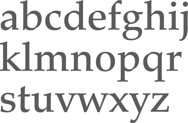
file name: Hermann Zapf Palatino Pro Medium Linotype Version 1986
file name: Hermann Zapf Palatino 1948 Poster by Maria Jose Ricaurte Arriaga 2014

file name: Hermann Zapf Palatino 1948 Poster by M Tuna Kahya 2012
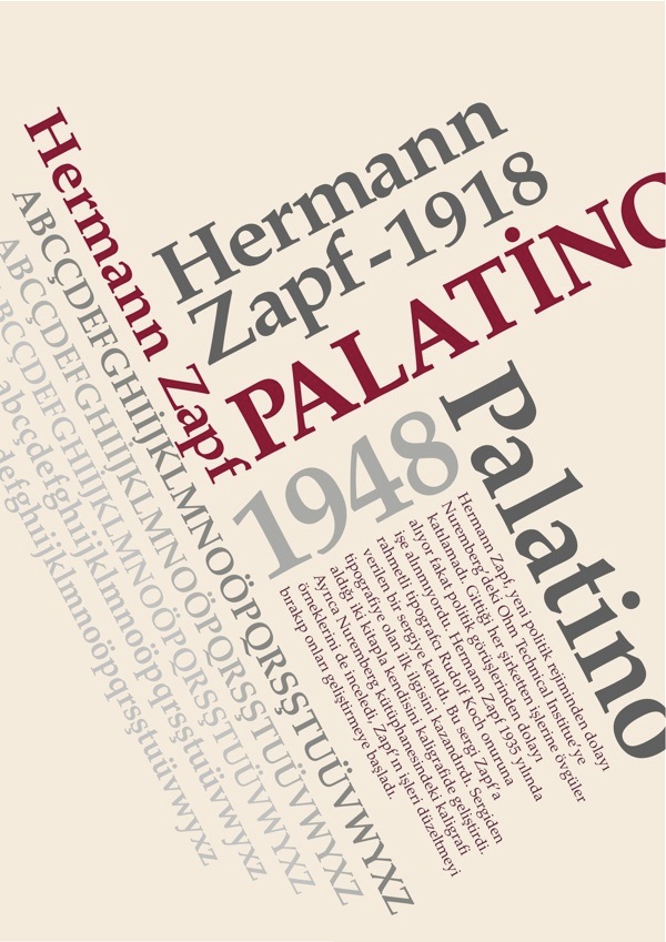
file name: Hermann Zapf Palatino 1948 poster by M Tuna Kahya 2013
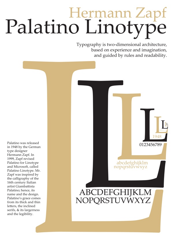
file name: Hermann Zapf Palatino 1948 Poster By Wayne Y M H 2012

file name: Hermann Zapf Palatino 1948 Poster by Alexandra Ferreira 2014
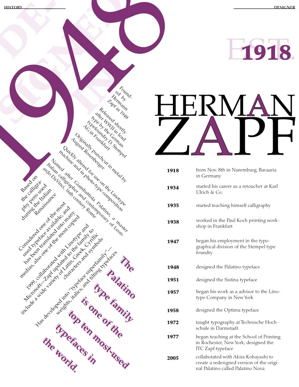
file name: Hermann Zapf Palatino 1948 Poster by Alexandra Ferreira 2014b
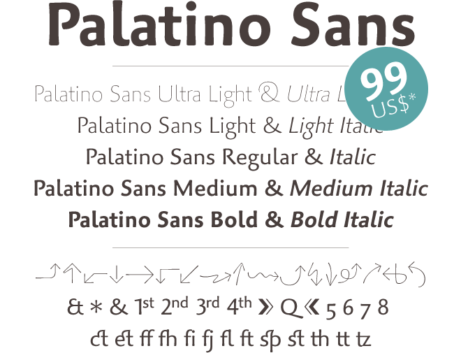
file name: Akira Kobayashi Hermann Zapf Palatino Sans 2006
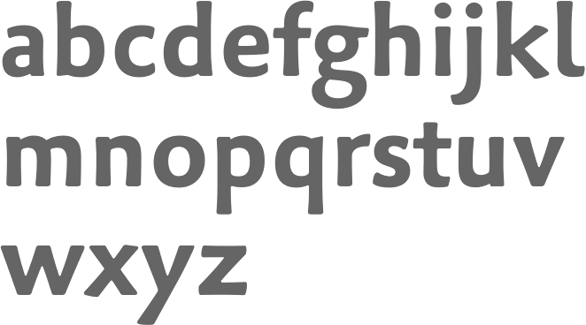
file name: Akira Kobayashi Hermann Zapf Palatino Sans Pro Bold 2006

file name: Akira Kobayashi Hermann Zapf Palatino Sans Pro Regular 2006
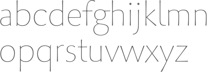
file name: Akira Kobayashi Hermann Zapf Palatino Sans Pro Ultralight 2006
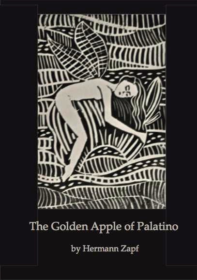
file name: Elena Shkarupa Golden Apple Of Palatino Poster 2013

file name: U R W Palladio U R W Medium 2010
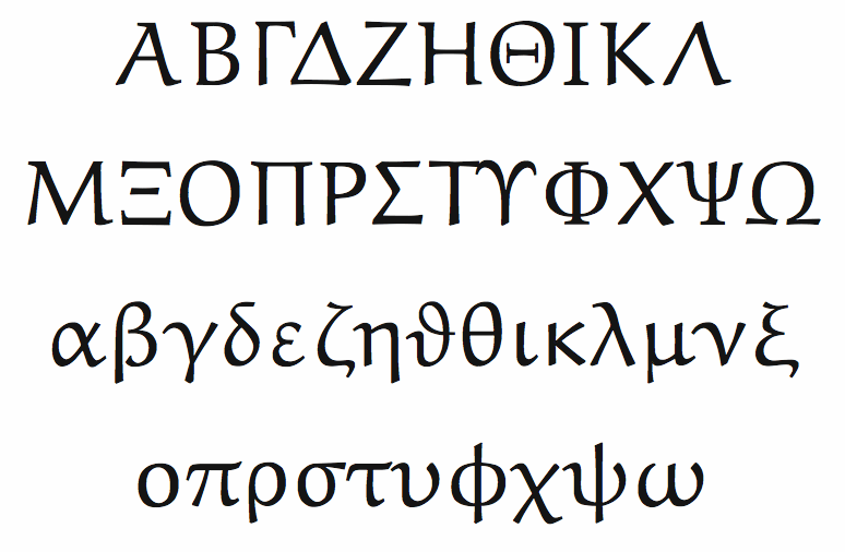
file name: Hermann Zapf Donald Knuth A M S Euler Text Greek 1983
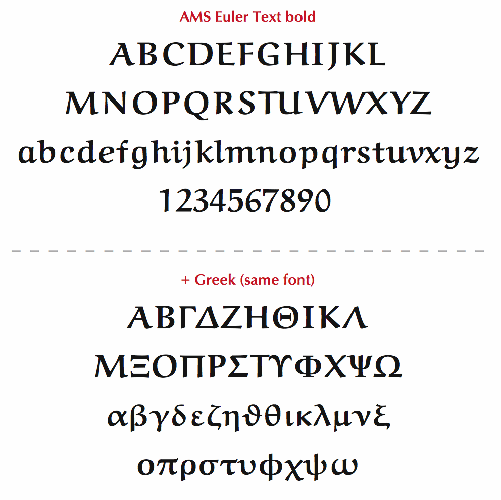
file name: Hermann Zapf Donald Knuth A M S Euler Text Bold Greek 1983
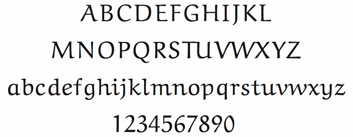
file name: Hermann Zapf Donald Knuth A M S Euler Text 1983
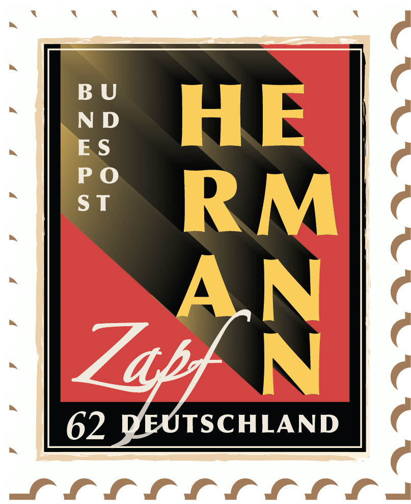
file name: Hermann Zapf Stamp by Nikita Sharma 2018

file name: Berthold Hermann Zapf Michelangelo 1950
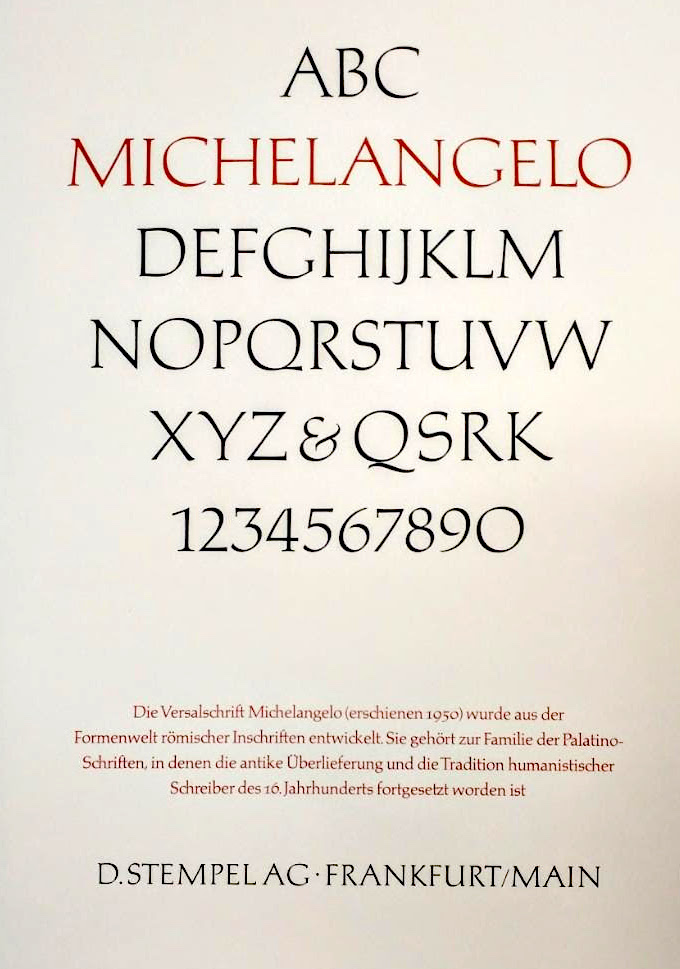
file name: Hermann Zapf Michelangelo 1953

file name: Hermann Zapf Michelangelo B Q 2010

file name: Hermann Zapf German Postage Stampof Ottmar Mergenthaler 1954
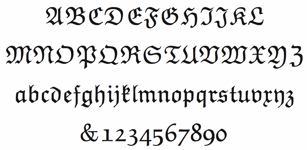
file name: Hermann Zapf A M S Euler Fraktur
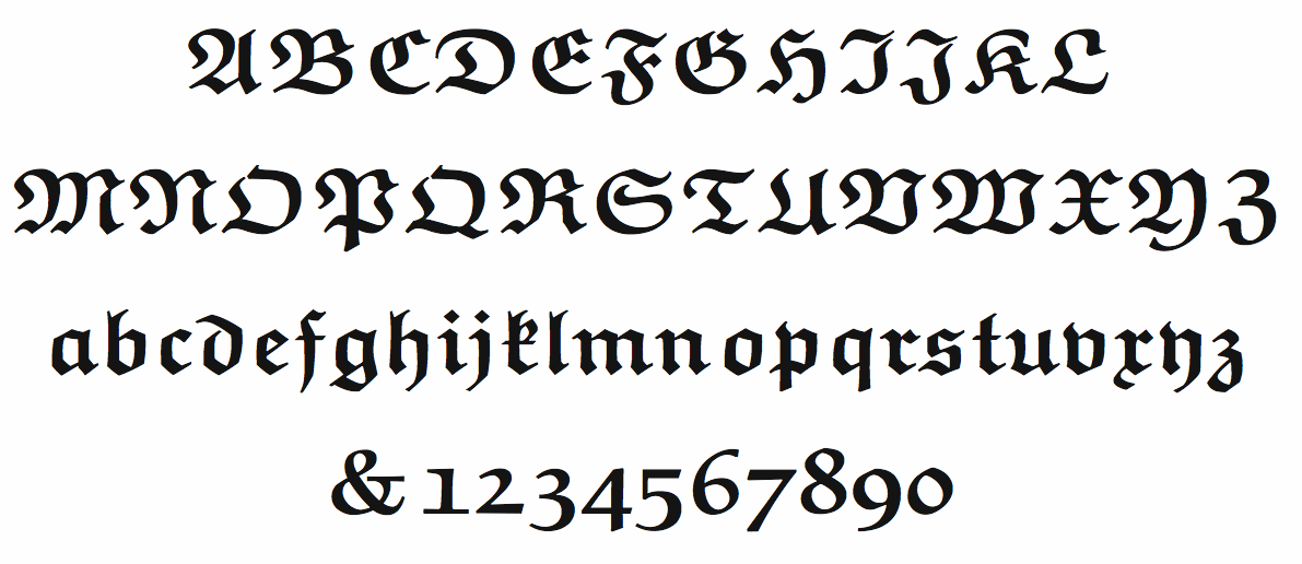
file name: Hermann Zapf A M S Euler Fraktur Bold
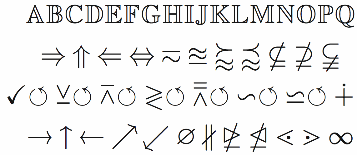
file name: Hermann Zapf A M S Euler Math
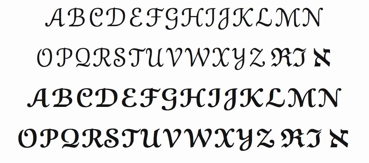
file name: Hermann Zapf A M S Euler Script
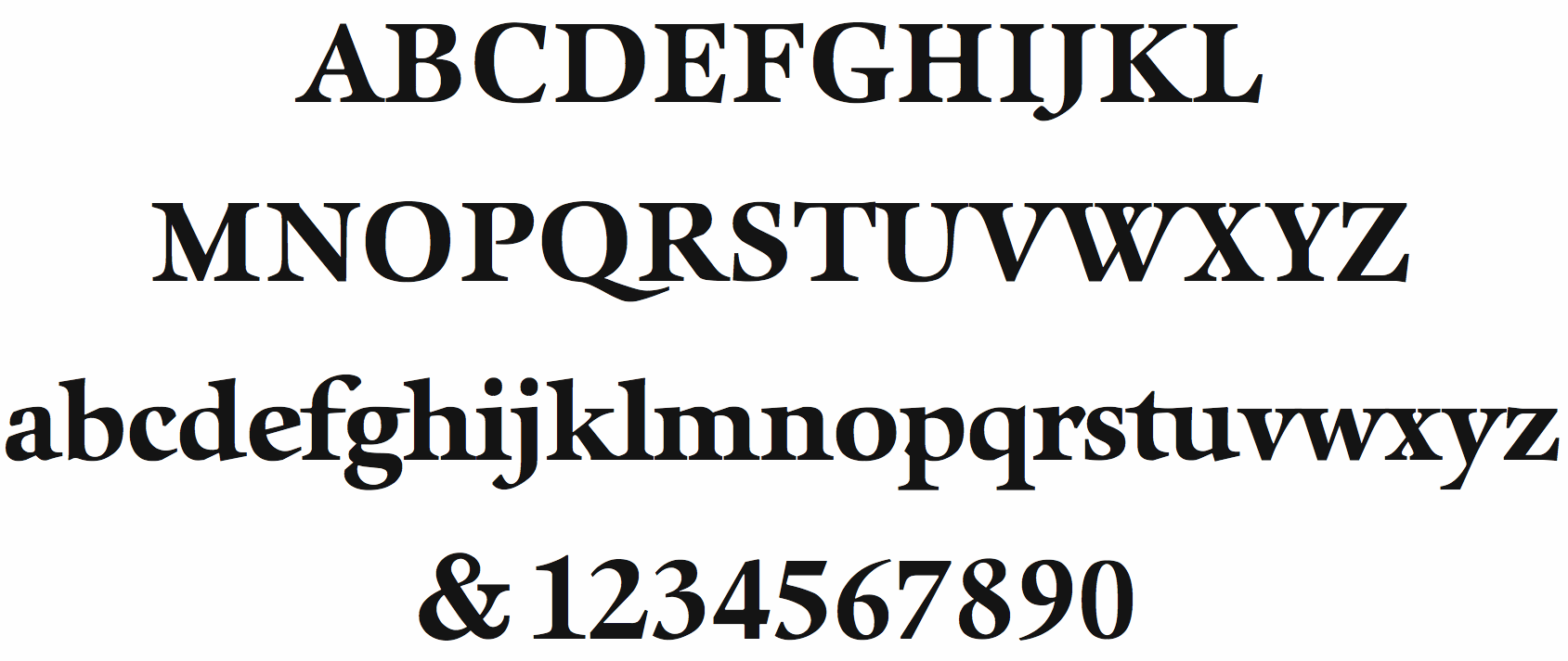
file name: Hermann Zapf Aurelia Bold 1985

file name: Hermann Zapf Aurelia Book 1985
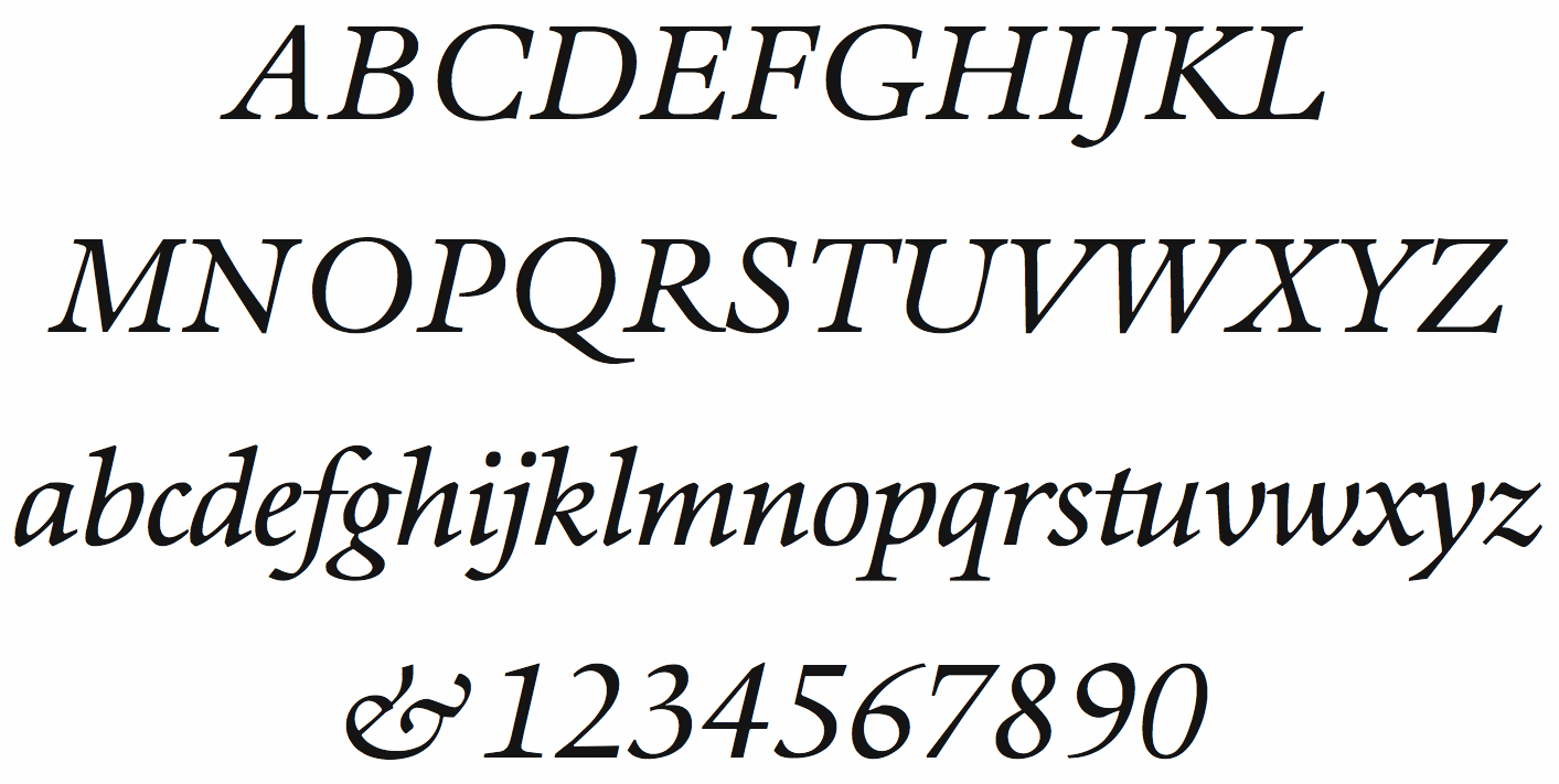
file name: Hermann Zapf Aurelia Book Italic 1985
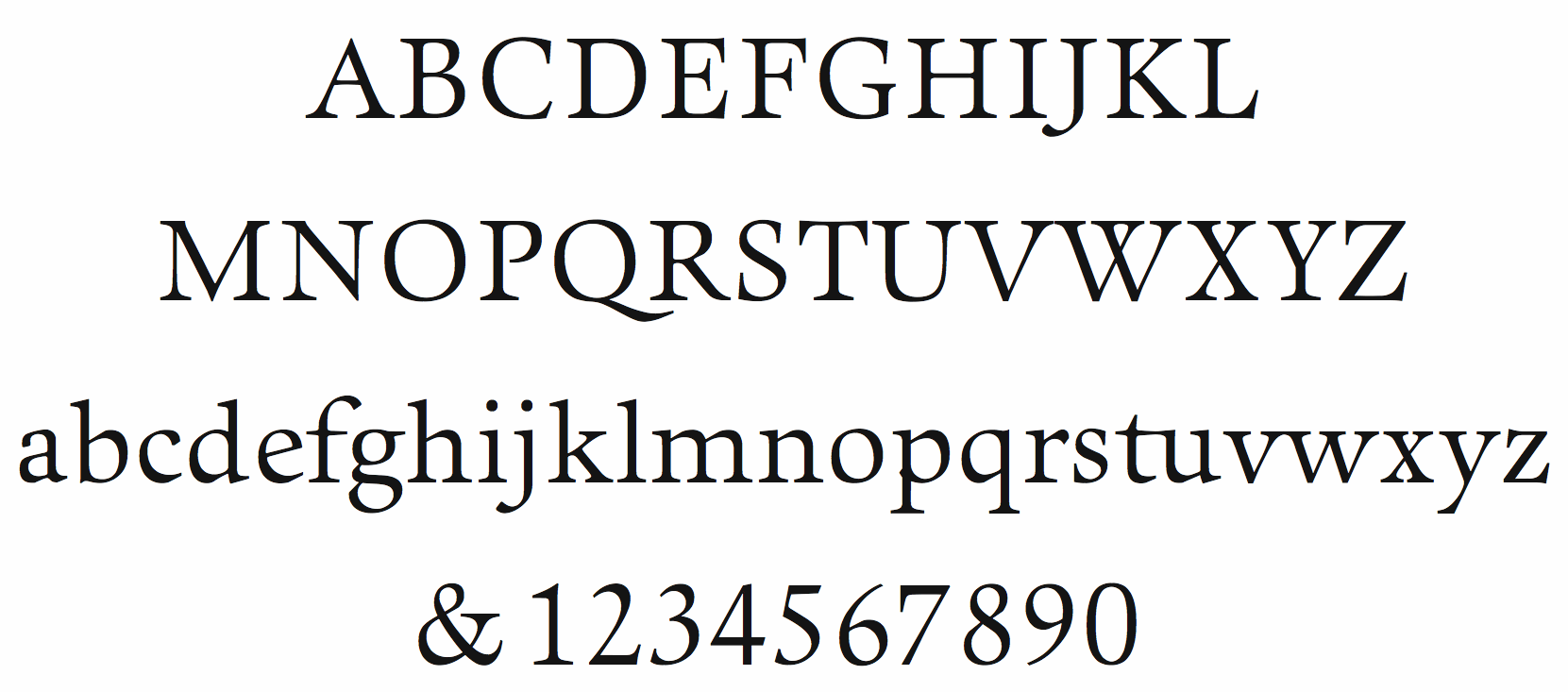
file name: Hermann Zapf Aurelia Light 1985
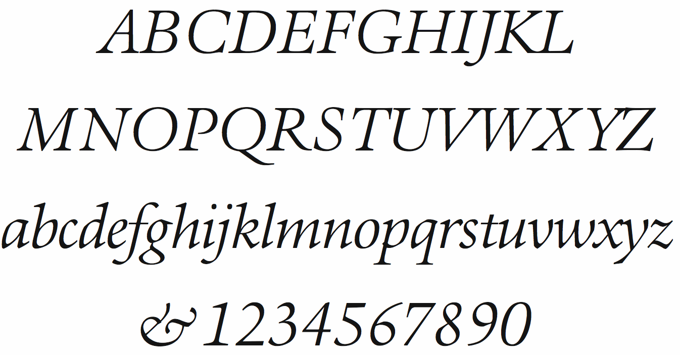
file name: Hermann Zapf Aurelia Light Italic 1985
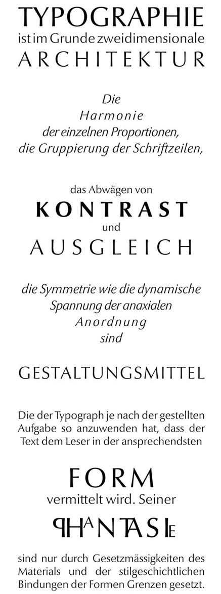
file name: Hermann Zapf Manuale Typographicum 1954
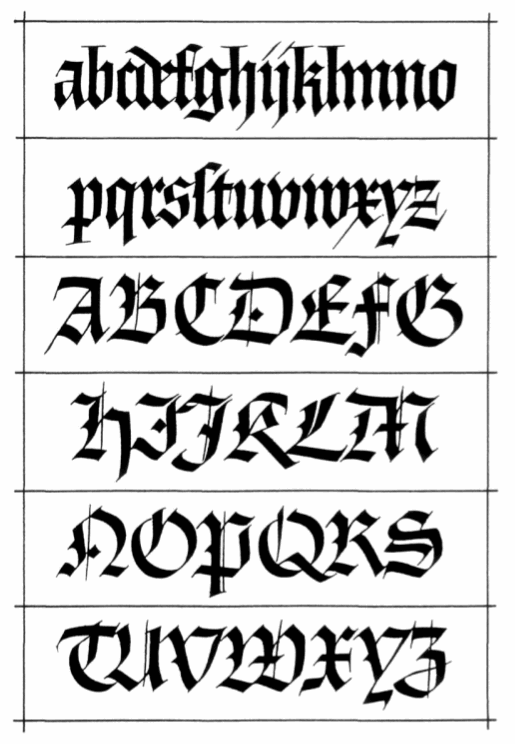
file name: Hermann Zapf From Feder Und Stichel Trajanus Presse Frankfurt 1949
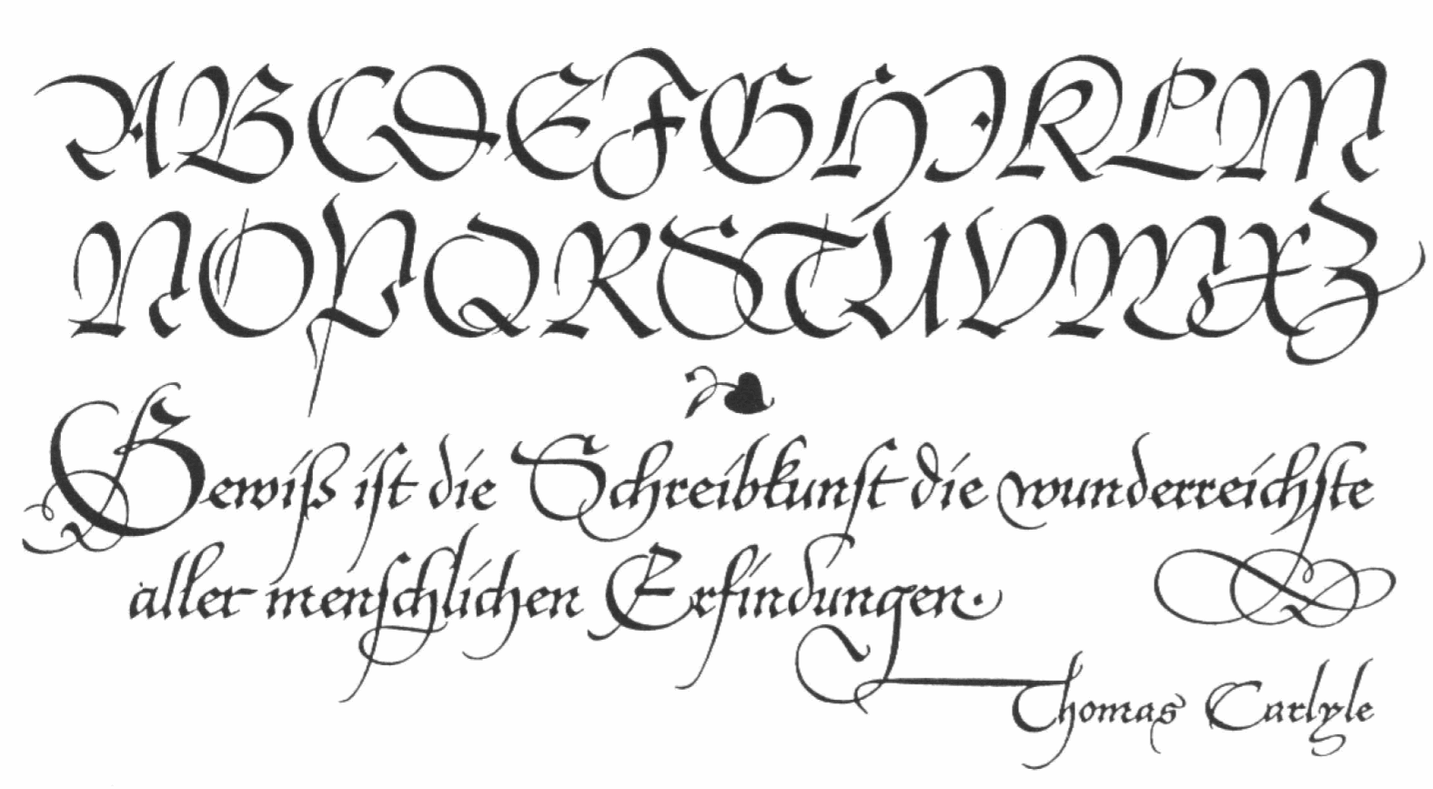
file name: Hermann Zapf Page21 of Feder Und Stichel Trajanus Presse Frankfurt 1952
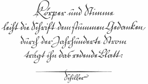
file name: Hermann Zapf Schreibschrift in Feder Und Stichel 1952 Trajanus Presse

file name: Berthold Hermann Zapf Comenius 1976

file name: Berthold Hermann Zapf Comenius Bold 1976
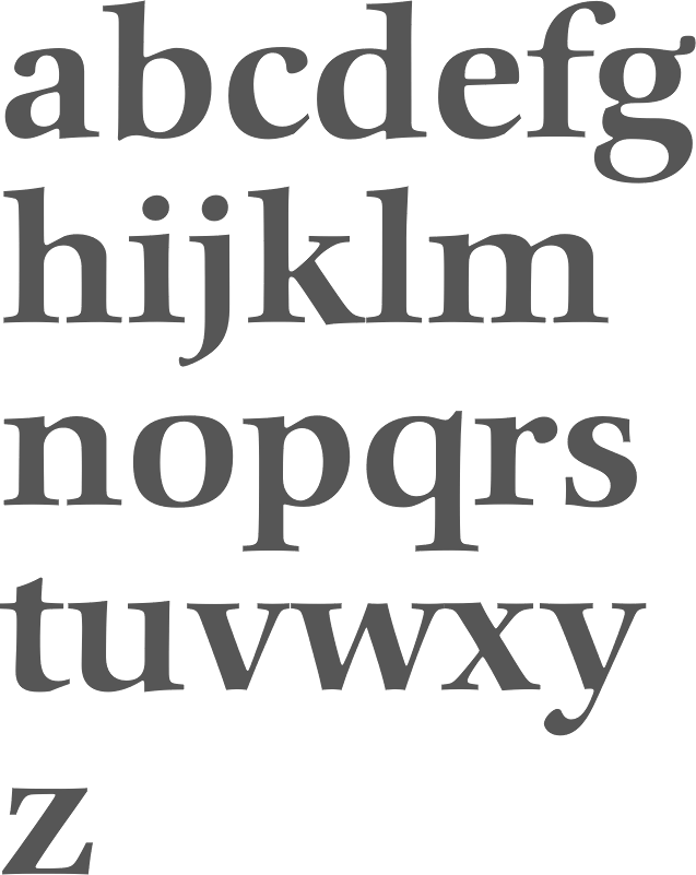
file name: Hermann Zapf Comenius B Q 1976
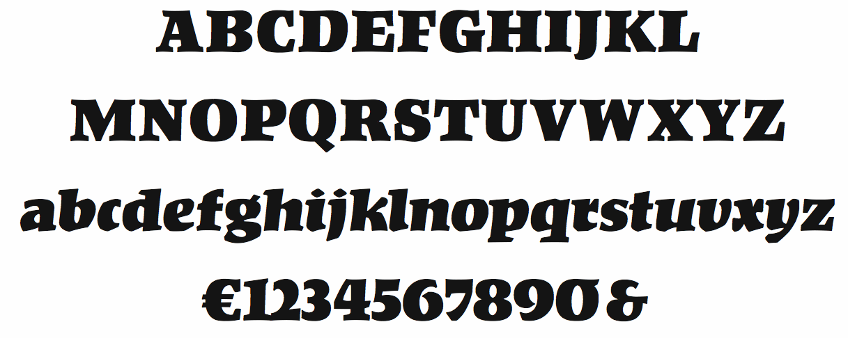
file name: Hermann Zapf Kompakt 1954
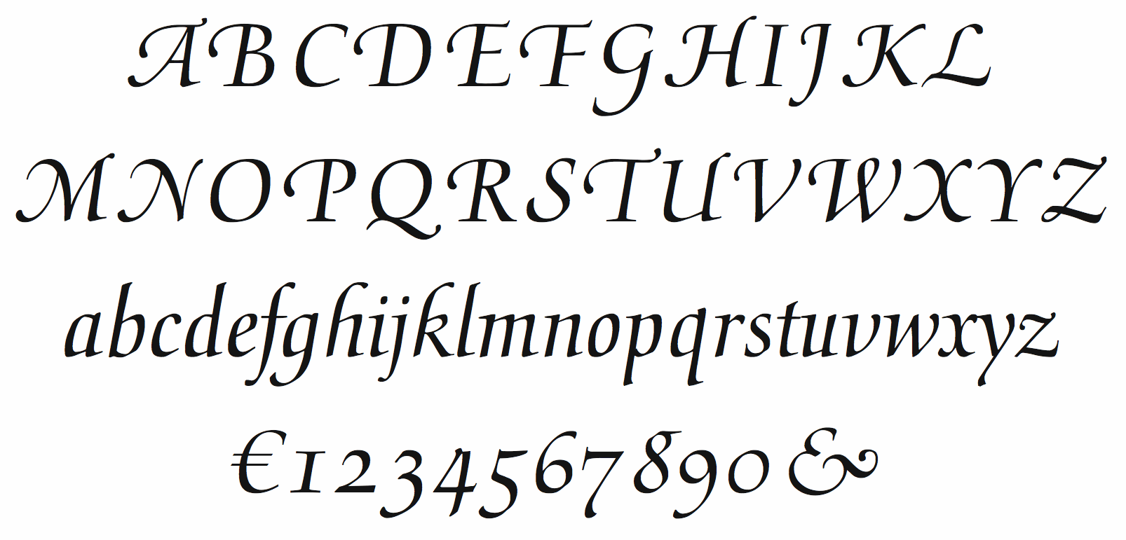
file name: Hermann Zapf Medici Script 1971
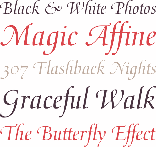
file name: Hermann Zapf Medici Script 1971b
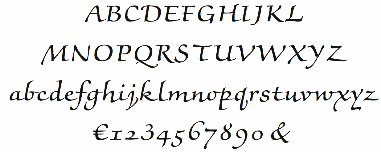
file name: Hermann Zapf Noris Script 1976
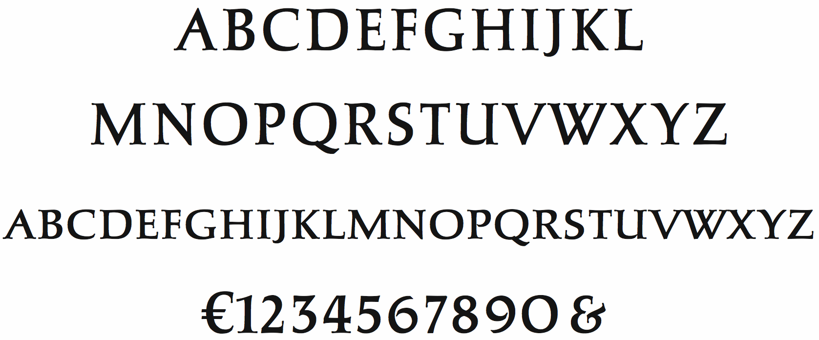
file name: Hermann Zapf Sistina 1951
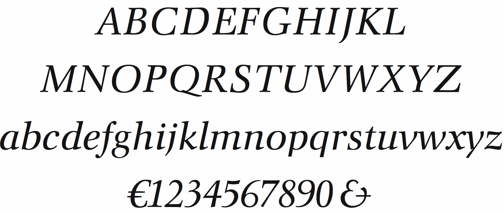
file name: Hermann Zapf Orion Italic 1974
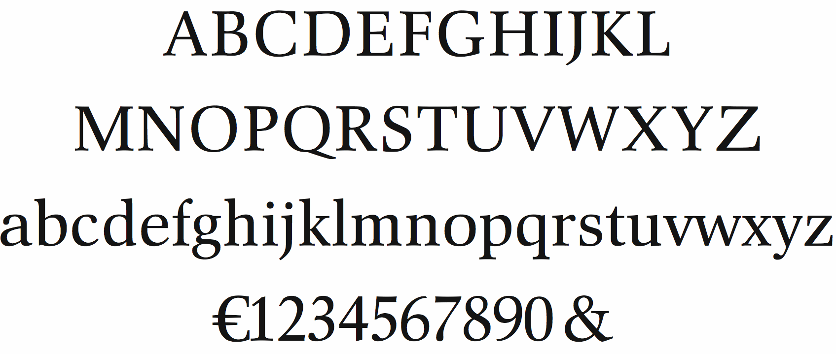
file name: Hermann Zapf Orion Roman 1974
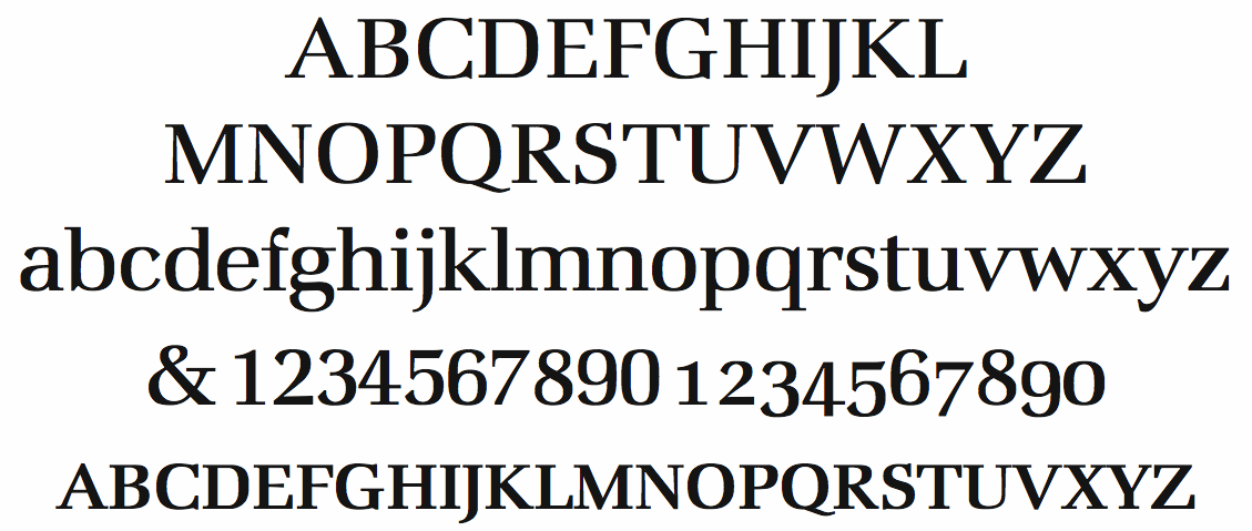
file name: Hermann Zapf Marconi Book 1976
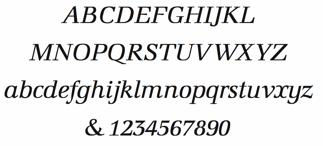
file name: Hermann Zapf Marconi Book Italic 1976
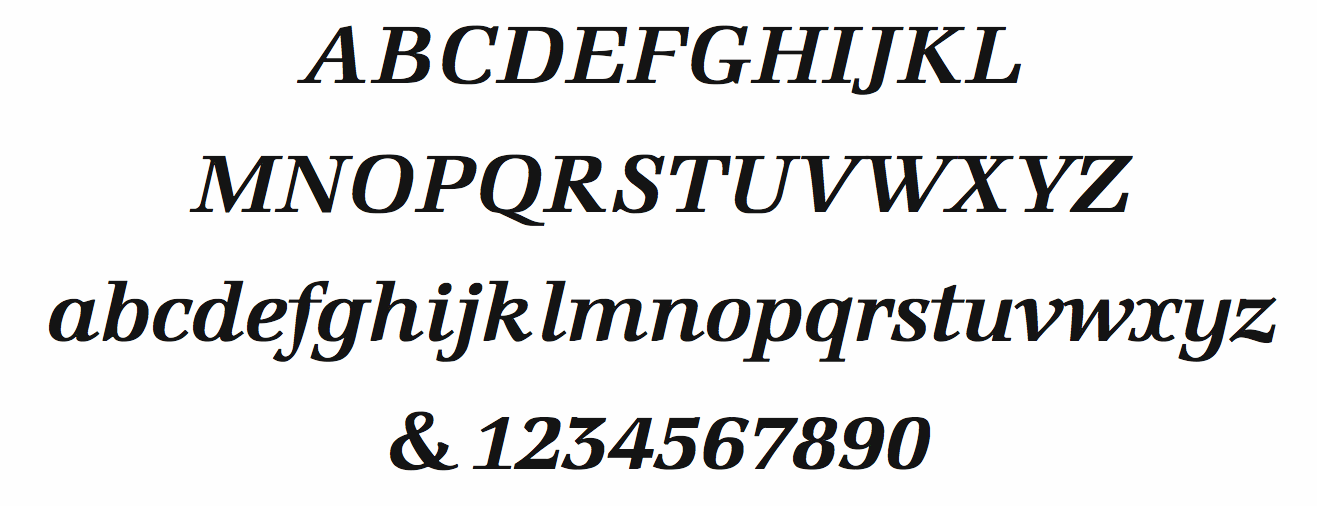
file name: Hermann Zapf Marconi Semibold Italic
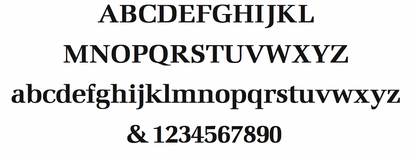
file name: Hermann Zapf Marconi Semibold
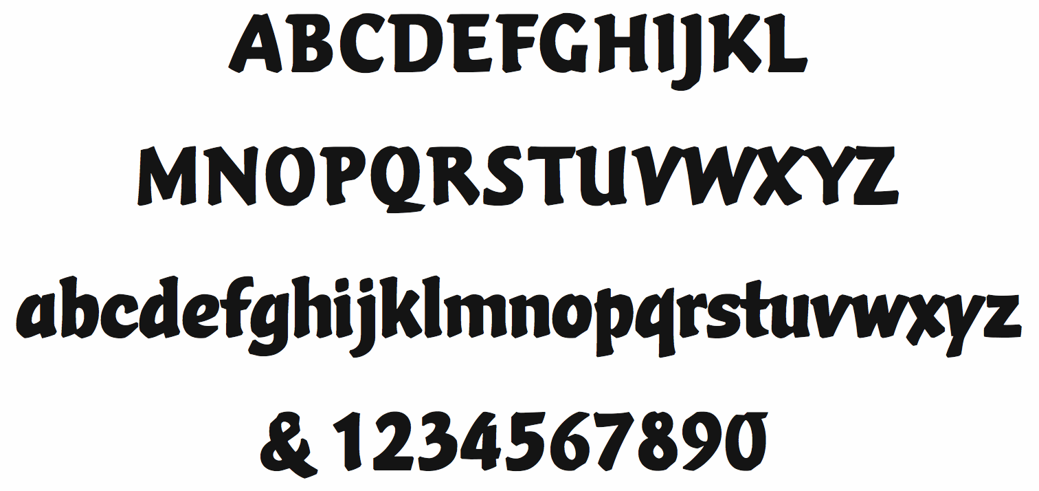
file name: Hermann Zapf Vario 1982
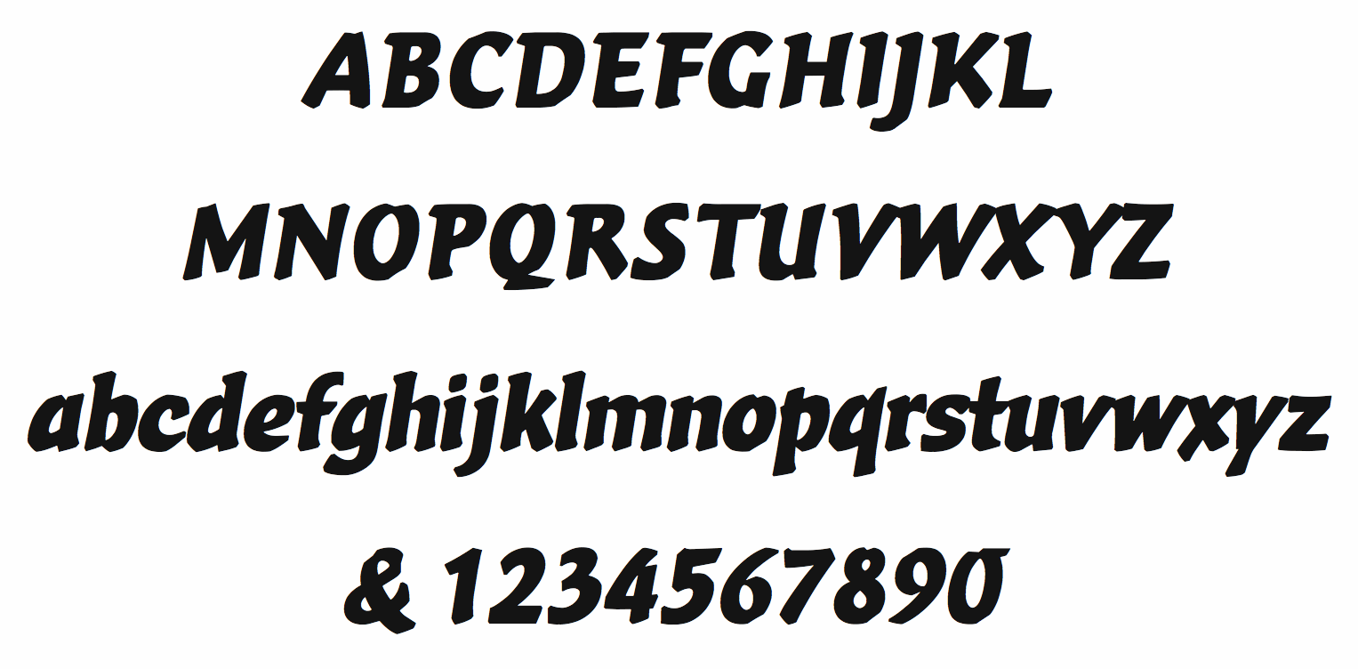
file name: Hermann Zapf Vario Italic 1982
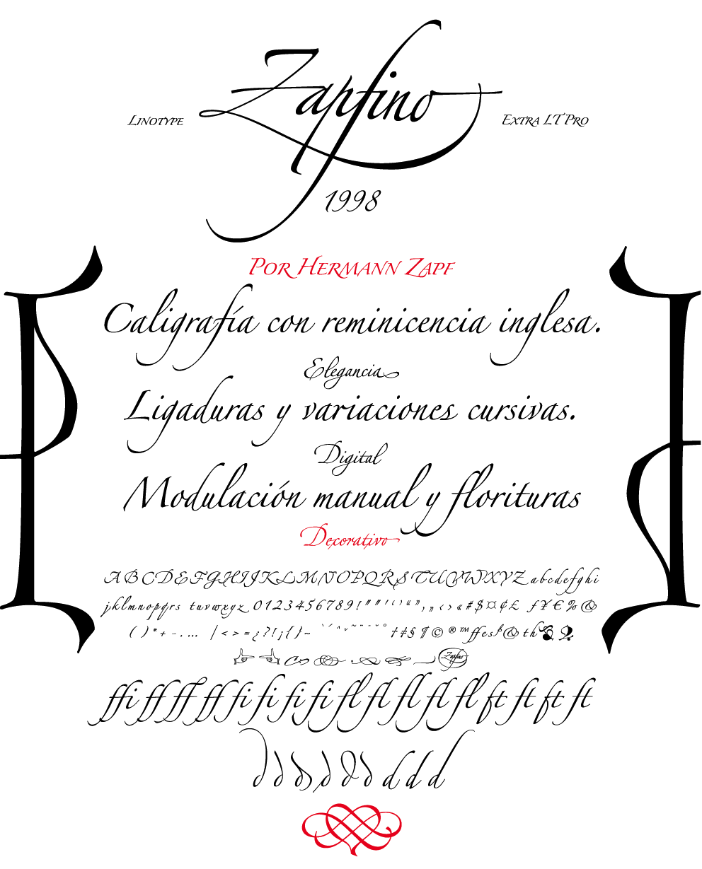
file name: Hermann Zapf Linotype Zapfino 1998 Poster by Sebastian Marquez 2014
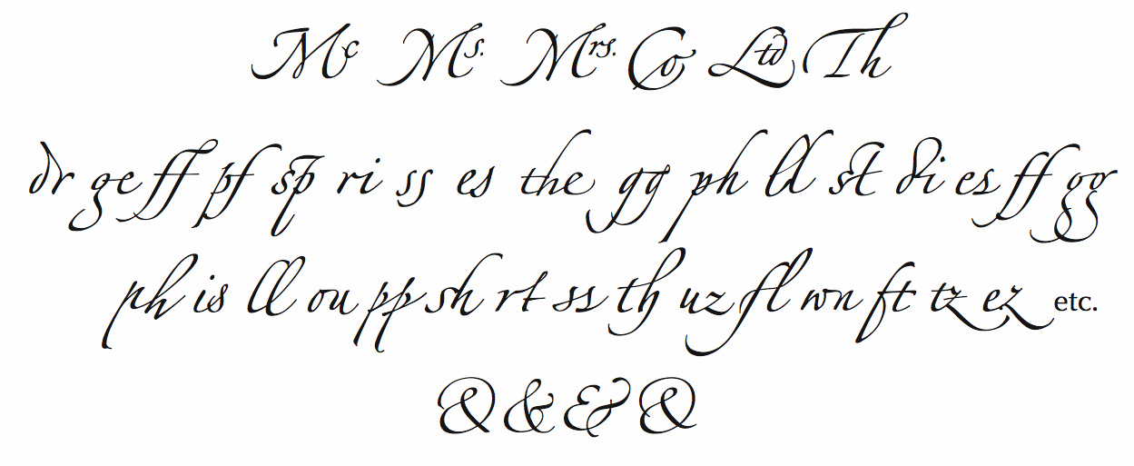
file name: Hermann Zapf Linotype Zapfino Ligatures

file name: Hermann Zapf Zapfino

file name: Hermann Zapf Linotype Zapfino Ornaments

file name: Hermann Zapf Linotype Zapfino ornaments Fists
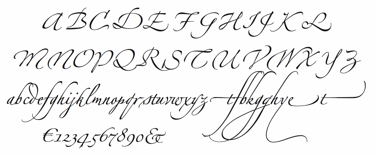
file name: Hermann Zapf Linotype Zapfino Four
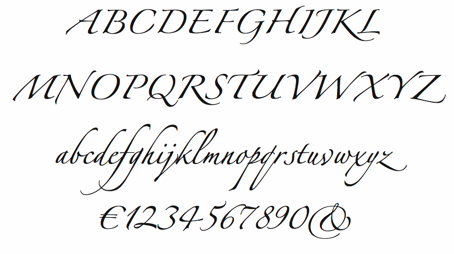
file name: Hermann Zapf Linotype Zapfino One 1998
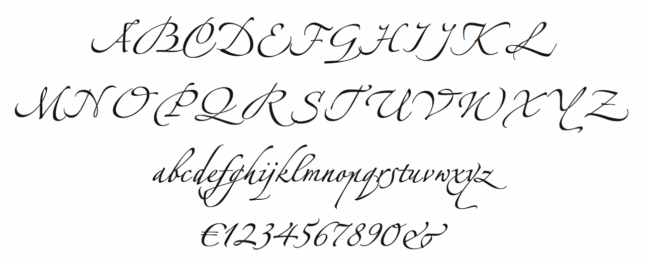
file name: Hermann Zapf Linotype Zapfino Three
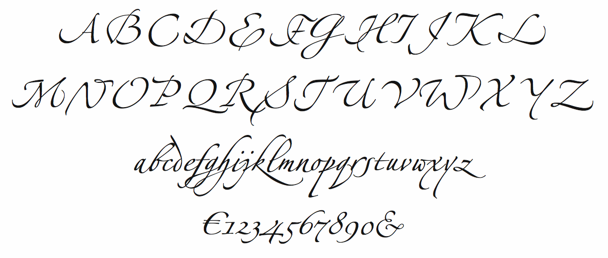
file name: Hermann Zapf Linotype Zapfino Two
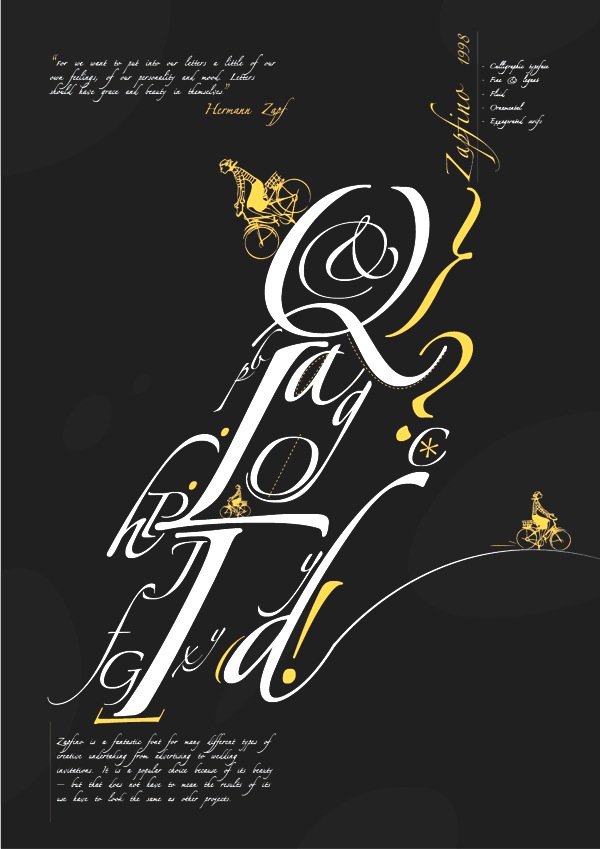
file name: Hermann Zapf Zapfino Poster by Nayla Masood 2013
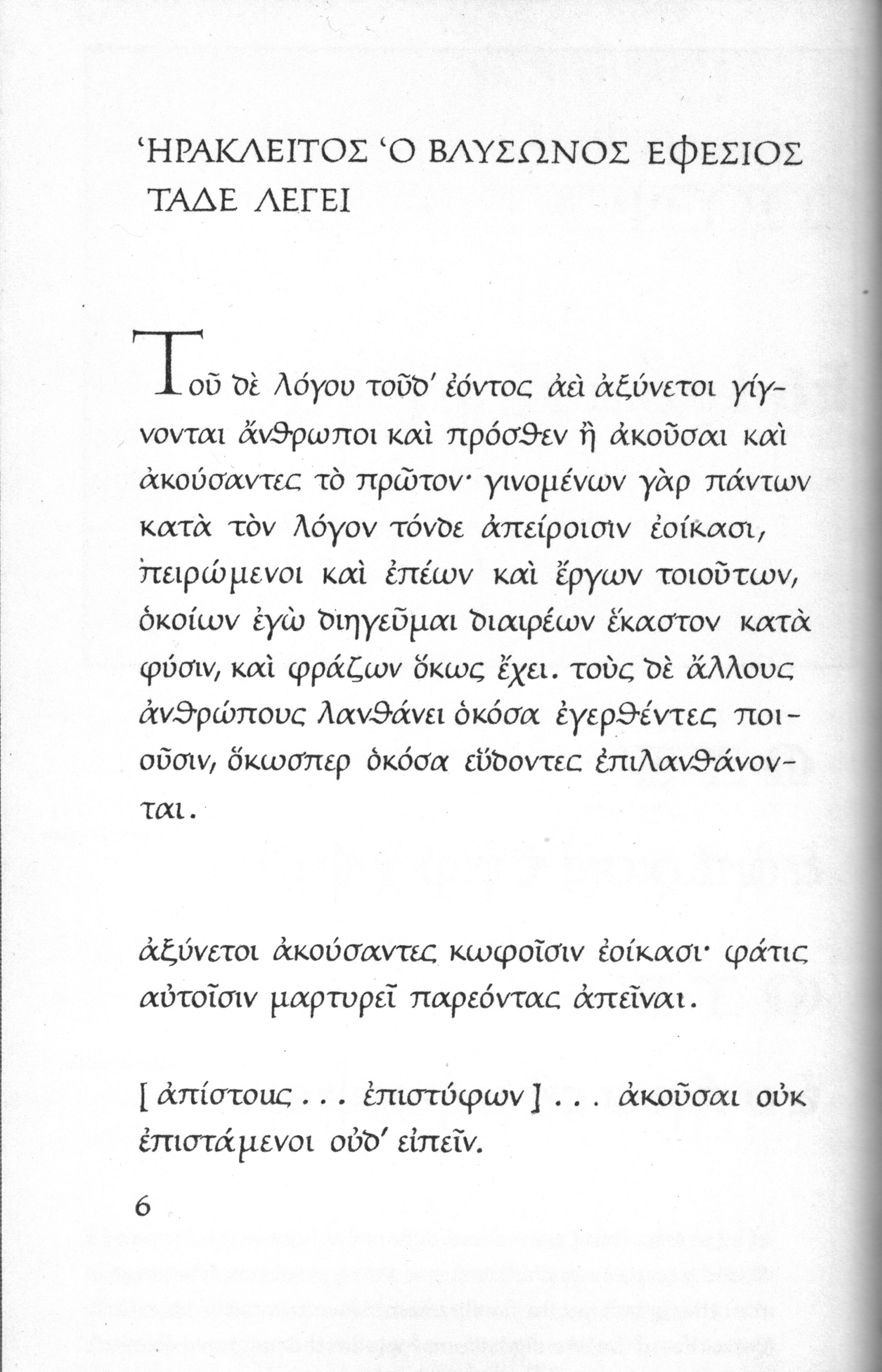
file name: Zapf Greekhandwriting1952
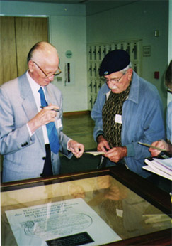
file name: Pic Hermann Zapf 2 C Lefty

file name: Pic Hermann Zapf2003
file name: Pic Hermann Zapf 2003b
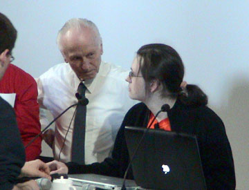
file name: Pic Hermann Zapf 20 20 Frank Jonen
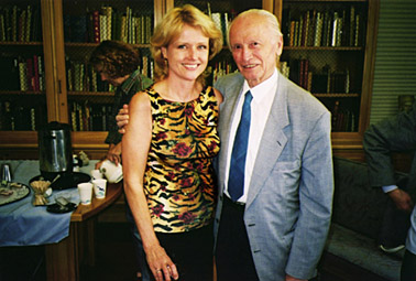
file name: Pic Jill Bell Hermann Zapf

file name: Pic Linnea Lundquist 2 C Marsha Brady 2 C Zapf
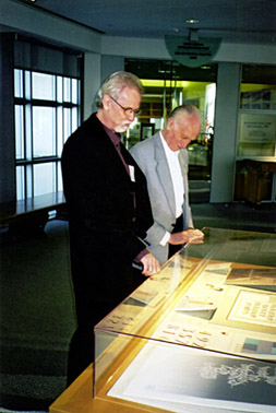
file name: Pic Rick Cusick 2 C Hermann Zapf L I B
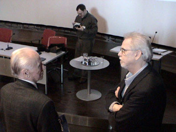
file name: Pic Rick Cusick20and 20 Hermann Zapf20audit 20
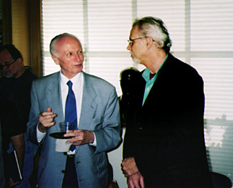
file name: Pic Hermann Zapf Rick Cusick

file name: Pic zapf jackstauffacher
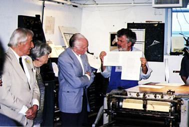
file name: Pic Stauffacher the Zapfs
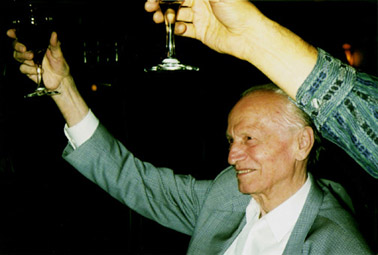
file name: Pic Toast Zapf
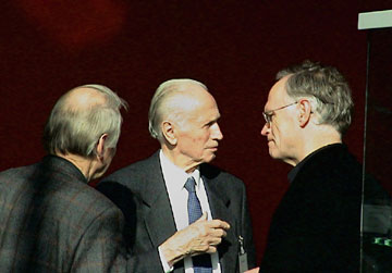
file name: Pic Werner Schneider 20 Hermann Zapf 20 Henk Gianotten
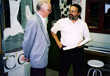
file name: Pic Zapf Chris Steinhour
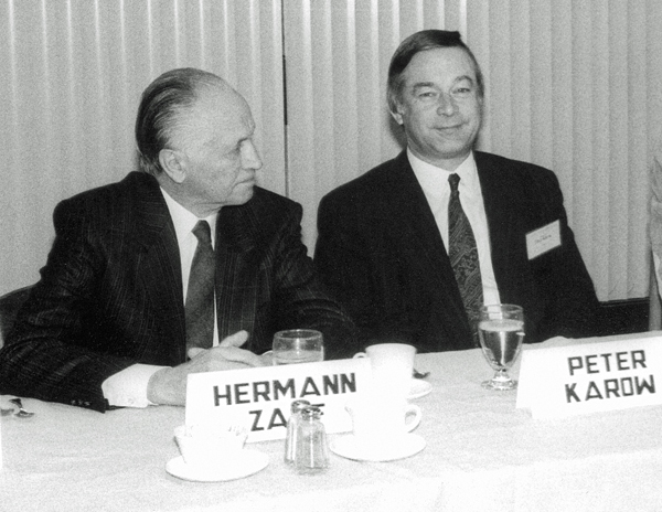
file name: Peter Karow Hermann Zapf at R I T 1989 pic by Peter Karow

file name: Pic zapf meier2003
file name: Pic zapf porchez
file name: Knuth Zapf Stanford 1980
file name: Pic zapf

file name: Pic zapf2
file name: Pic zapf geschenk2 steinert
file name: Pic zapf k
file name: Pic zapf otmarhoefer
file name: Pic 60 Hermann Zapf
| | |
|
Luc Devroye ⦿ School of Computer Science ⦿ McGill University Montreal, Canada H3A 2K6 ⦿ lucdevroye@gmail.com ⦿ https://luc.devroye.org ⦿ https://luc.devroye.org/fonts.html |


