|
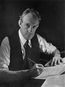
Oswald Bruce Cooper

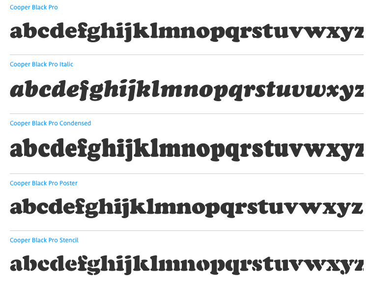
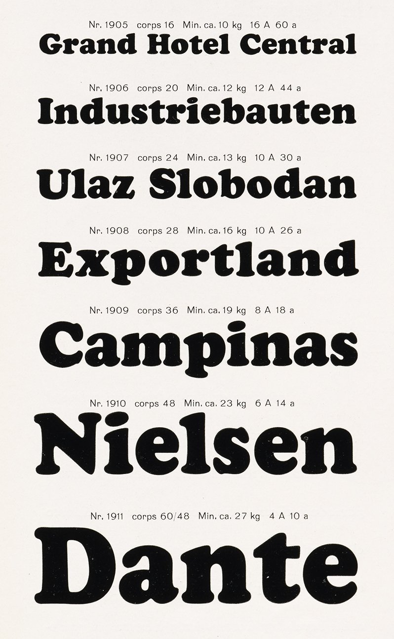
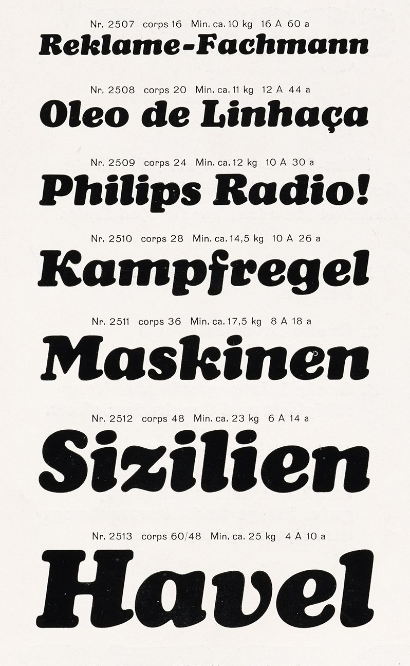
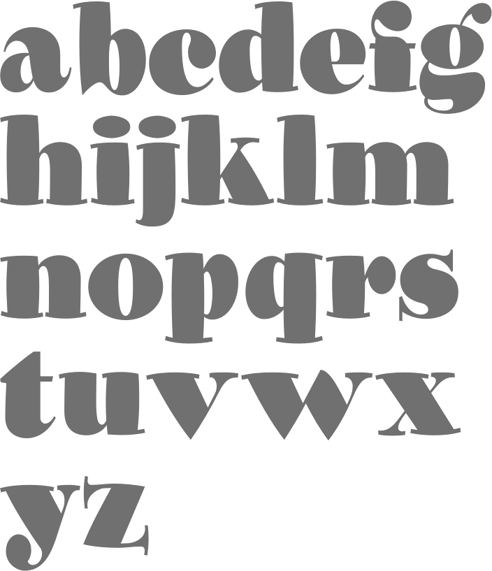
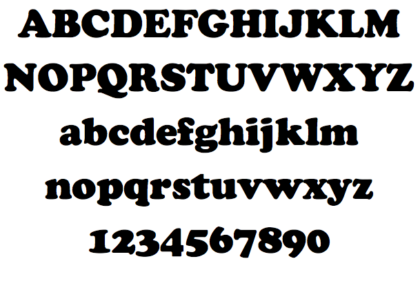
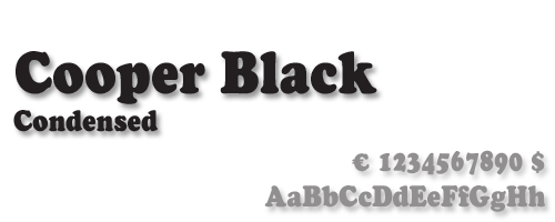
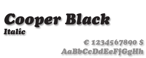
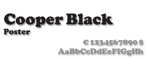
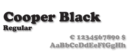
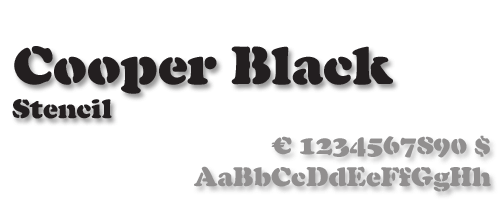
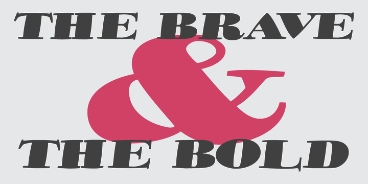
Influential designer and type designer, motivated by beautiful advertising type (b. Mountgilead, Ohio, 1879, d. Chicago, 1940). Picture. He was angry at Goudy for his Goudy Heavyface (1925), which resembles Cooper Black a bit too much (check this 2002 video). MyFonts link. Cooper died of cancer. His typefaces include: - The well-known Cooper family done at Barnhart Brothers&Spindler: Cooper (1918-19), Cooper Stencil (1921), Cooper Black (1922; Linotype version, acquired from Barnhart Brothers&Spindler in 1924 by Schriftguß AG in Dresden; Elsner&Flake version; other versions exist by ParaType, Bitstream, Scangraphic, Mecanorma, Adobe, and URW++), Cooper Italic (1924), Cooper Old Style (1919), Cooper Initials (1925), Cooper Hilite (1925), Cooper Black Condensed (1926), Cooper Black Italic (1926), Cooper Fullface (1928). Bitstream offers an 11-style Cooper family. Cooper Black made it to American Typefounders (ATF). One of the original drawings for Cooper Fullface was rejected by ATF but digitally revived by Nick Curtis in 2008 as Ozzi Modo Plump NF and Ozzi Modo Squooshed NF in 2008.
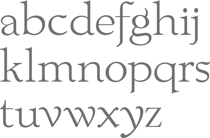
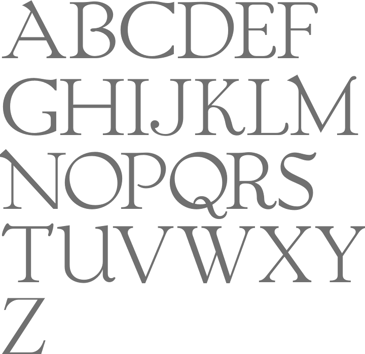
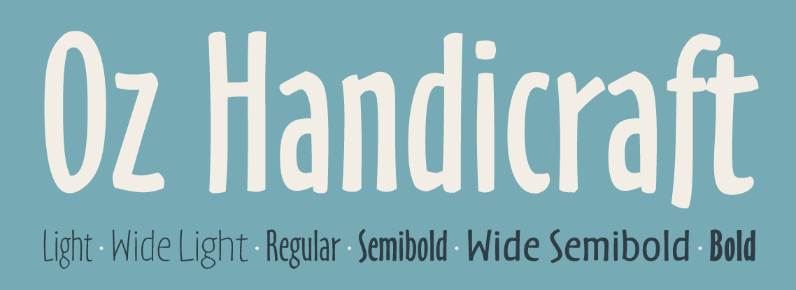
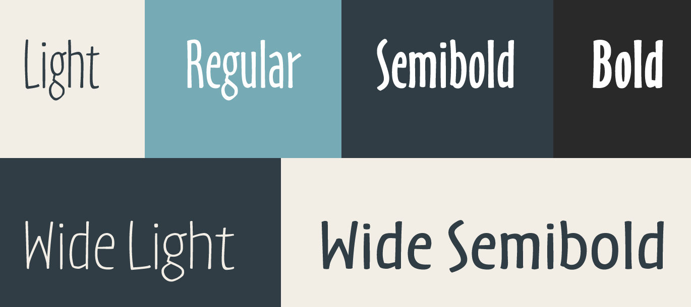
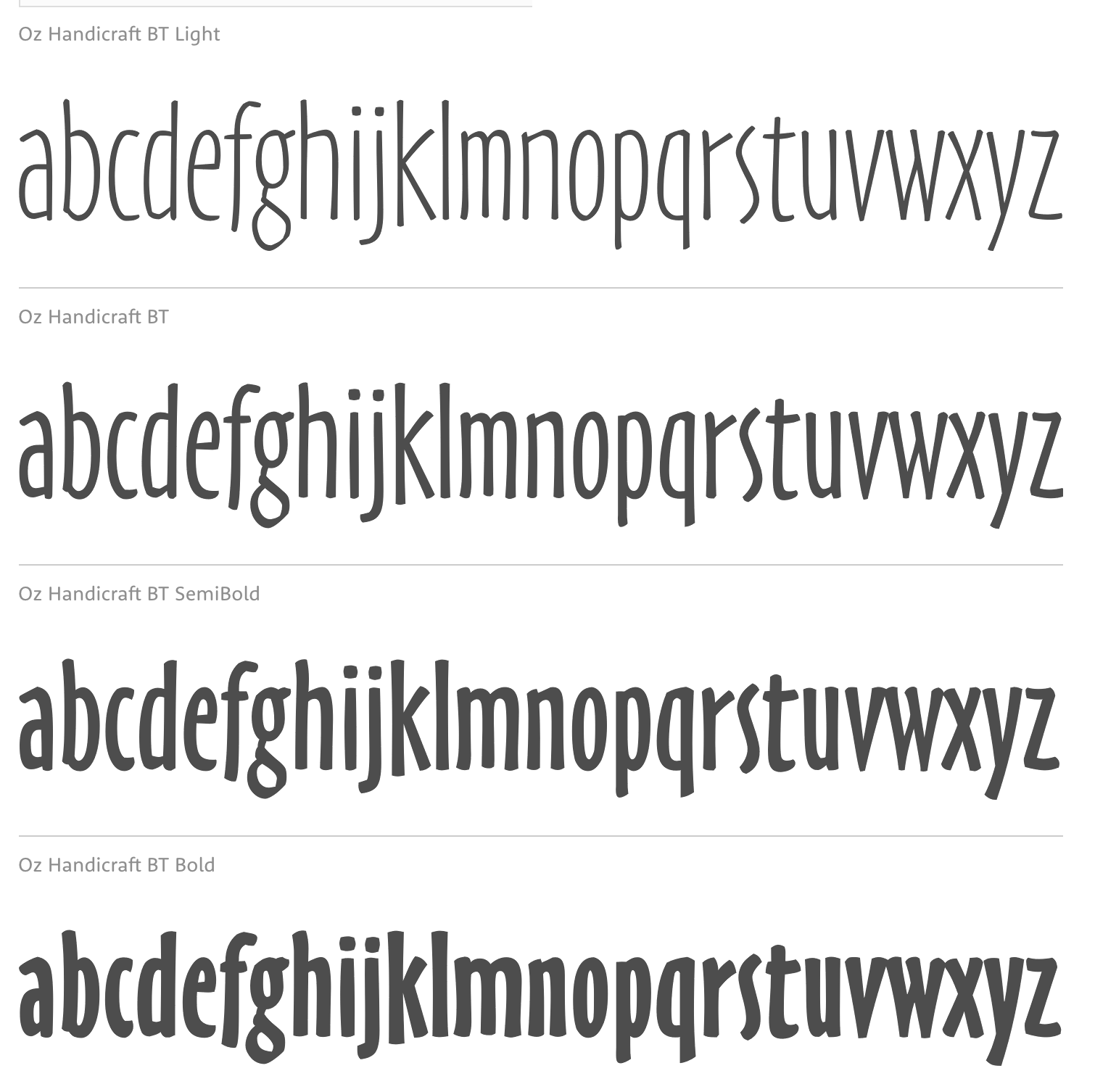
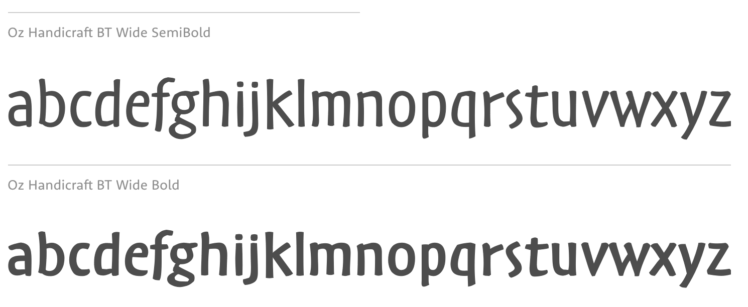
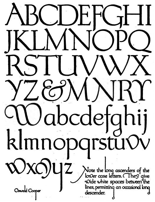
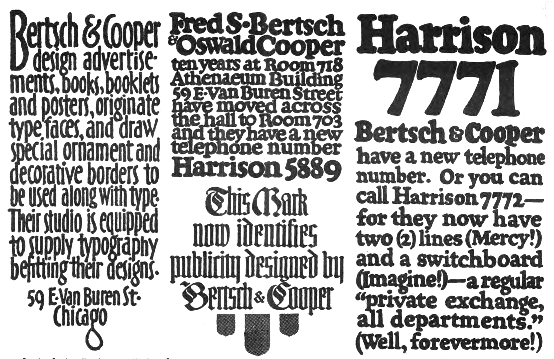
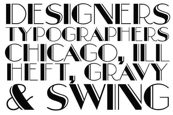
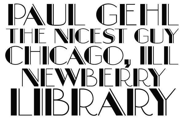
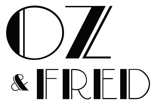
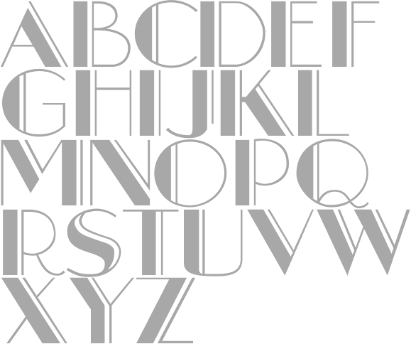
Ian Lynam revived many styles from 2010-2013, under names such as Cooper Old Style, Cooper Initials, Cooper Italic, Cooper Fullface Italic. Lynam writes: Cooper OldStyle is the result of Barnhart Brothers&Spindler type foundry representatives Richard N. McArthur and Charles R. Murray having met with Oswald Cooper and his business partner Fred Bertsch in 1917. Due to other commercial design firms adopting Cooper's style of lettering throughout the Midwest, both companies came to an agreement to create a family of types based on Cooper's advertising lettering. McArthur and Murray saw the biggest potential in the super-bold advertising lettering that would become Cooper Black, but agreed that a roman weight old style should be executed first, the logical progenitor to a family or related types. The foundry requested that the roman have rounded serifs so as to more specifically correlate to the planned bold. This was the first of many tactical strategies in type design between type designer and foundry, most specifically McArthur and Cooper, whose back-and-forth relationship in designing, critiquing, and modifying letterforms was integral in shaping the oeuvre of type designs credited to Cooper. While it was Cooper's sheer talent in shaping appealing and useful alphabets that made his work so popular, McArthur's role as critic and editor has gone largely un-noted in the slim amount of writing of length about Cooper's work. Cooper and McArthur went back and forth over the design of the roman typeface for nearly two years with Cooper, constantly redrawing and revising the typeface to get it to a castable state. The capitals were successively redrawn by Cooper, with particular care paid to the "B" and "R" to make them relate formally. The lowercase was redrawn numerous times, as were experiments in shaping the punctuation. McArthur requested a pair of dingbats to accompany the typeface, along with a decorative four leaf clover ornament "for luck". Cooper included a slightly iconoclastic, cartoonish paragraph mark, as well as decorative end elements, a centered period, and brackets with a hand-drawn feel. The final typeface is a lively, bouncy conglomeration whose rounded forms dazzle and move the eye. Originally called merely "Cooper" in early showings, the name was later revised to "Cooper Oldstyle". The typeface met with a warm reception upon release in 1919, the public favoring its advertising-friendly, tightly-spaced appearance. Sales were moderate, and the typeface was considered a success. Cooper originally drew the figures the same width as the "M" of the font, but revised them to the width of the "N" at the request of McArthur. Early versions of drawings of the slimmer figures are noted as "cruel stuff" in accompanying notes by Cooper, though they were versioned out into far more elegant numerals than the earlier stout figures. Both versions of the numerals are included in the digital release, as are the ornamental elements. In 1925, McArthur and Murray requested a set of ornamental initials. Cooper designed the initials open-faced on a square ground surrounded by organic ornament. The initials were "intended to be nearly even in color value with that of normal text type". The letterforms themselves are a medium-bold variation on the Cooper OldStyle theme, lacking the balance of Cooper's text typefaces, but charming nonetheless. SoftMaker did a complete Cooper Black Pro series in 2012, including Cooper Black Pro Stencil. - Oz Handicraft BT (Bitstream, 1991) was created by George Ryan in 1990 from a showing of Oswald Cooper's hand lettering found in The Book of Oz Cooper (1949, Society of Typographic Arts, Chicago). In that book, you can also find two great essays by Cooper written in 1936-1937, Leaves from an Imaginary Type Specimen Book and As an experiment: 15 serifs applied to stems of similar weight to test serif influence in letter design. Modern Roman Capitals.
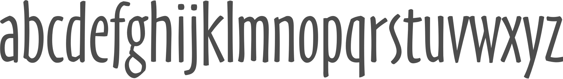
- Fritz (Font Bureau, 1997) was created by Christian Schwartz who was inspired by a characteristic handlettered ad from 1909, as well as the single word "Robusto" drawn for Oz Cooper's own amusement. In 1998, Fritz was honored by the NY Type Directors Clubs TDC2 competition.
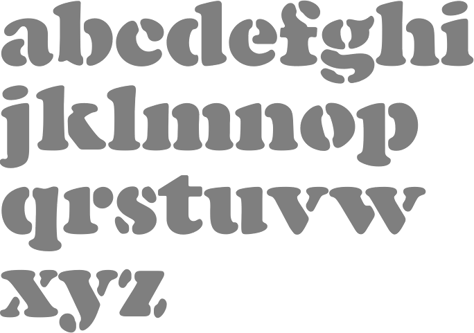
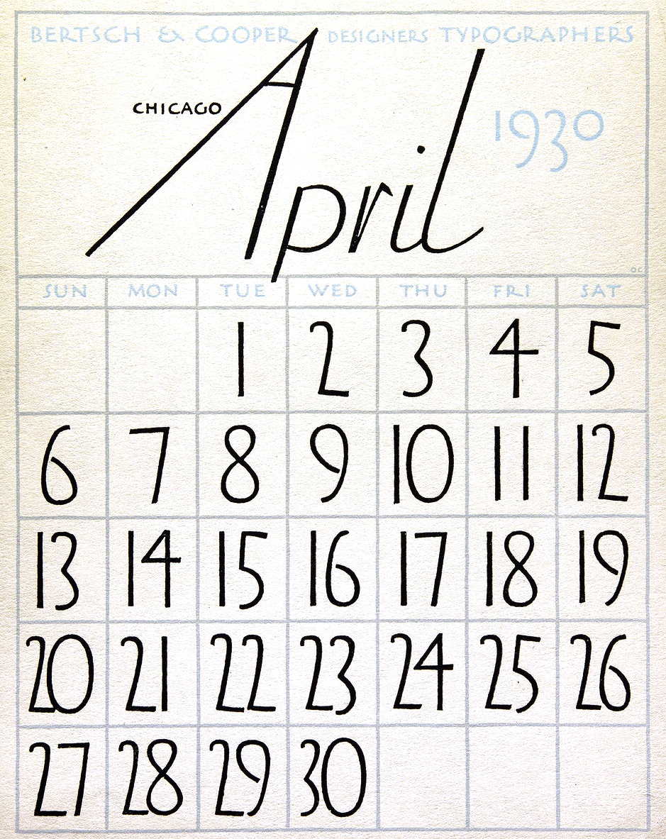
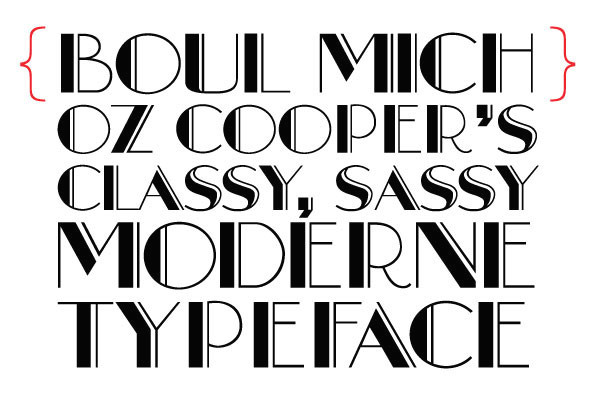
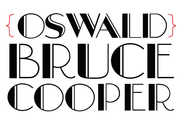
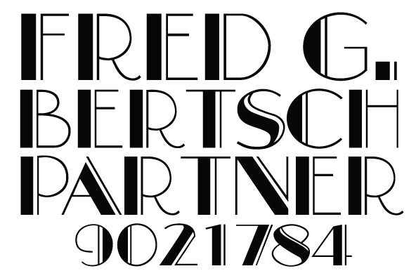
- Boul Mich. Mac McGrew: Boul Mich. During the period of "modernistic" typography of the 1920s, BB&S, the large Chicago type foundry, brought out Boul Mich in 1927, the name being an advertising man's idea for a tie-in with the fashion advertising of the smart shops on Chicago's Michigan Boulevard [Avenue], according to Richard N. McArthur, then advertising manager of BB&S. An unidentified clipping with a bit of hand-lettering had been sent to the foundry; Oswald Cooper of Cooper Black fame was asked to sketch the missing letters to guide the foundry's pattern makers in cutting a new face, but he disclaimed any credit for the design. Apparently there is no truth in the persistent myth that Boul Mich was named for Boulevard Saint-Michel in Paris. Compare Broadway. Digitally revived in 2010 by Ian Lynam at Wordshape and a few years earlier by Dan Solo as well.
- Dietz Text.
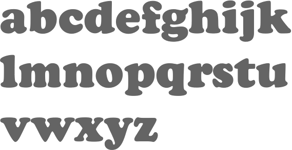
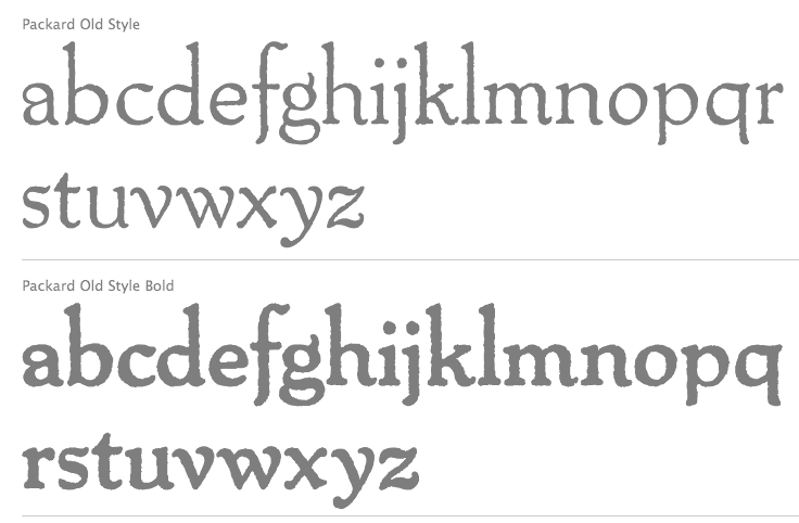
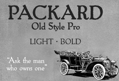
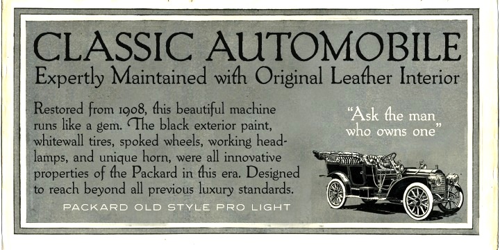
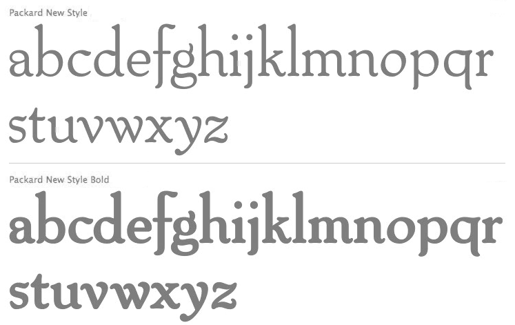
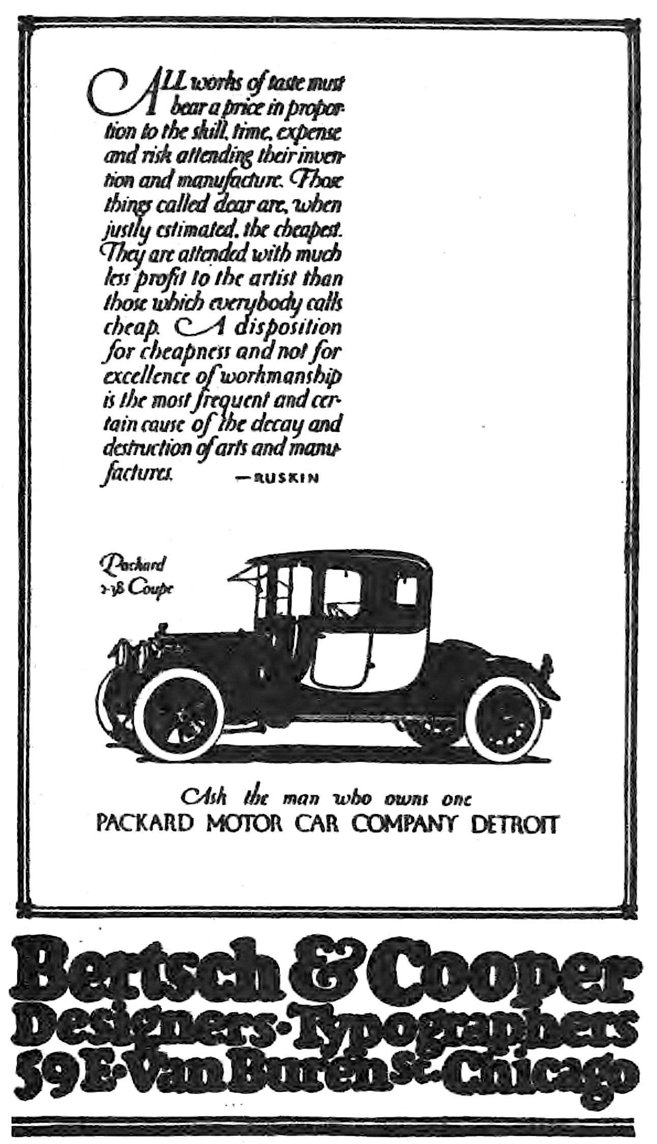
- Packard, first handlettered for use in ads for the Packard Motor Company in 1913, and later converted to metal by BB&S. The bold weight is credited to Morris Fuller Benton (ATF, 1916), but it is highly probable that Benton did the adaptation for both weights. A digital version of this was done by Nick Curtis in 2008 under the name Packard Patrician NF. Steve Jackaman and Ashley Muir created Packard New Style in 2011, and the slightly grungier Packard Old Style also in 2011. Mac McGrew: Packard is ATF's adaptation of a distinctive style of lettering done by Oswald Cooper in advertisements for the Packard Motor Car Company, in 1913. Packard Bold followed in 1916. The latter is credited to Morris Benton, again closely following Cooper's original lettering, and it is quite likely that Benton did the actual adaptation of the first typeface also. These typefaces retain a handlettered appearance partly by the slightly irregular edges of strokes, partly by a number of alternate characters. Both were quite popular for several years.
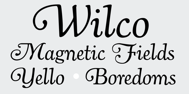
- Pompeian Cursive (1927): a calligraphic script designed for BBS to compete with Lucian Bernhard's Schoenschrift. Ian Lynam found the original drawings and based his Pompeian Cursive (2010) on it.
- Cooper's handlettering also inspired Matt Desmond, who created the beautiful typeface Cagliostro (2011, free at Google Web Fonts).
- The Bitstream font Oz Handicraft BT (1991) was created by George Ryan in 1990 from a showing of Oswald Cooper's hand lettering found in The Book of Oz Cooper, published in 1949 by the Society of Typographic Arts in Chicago). A refresh was done in 2016.
Klingspor link. FontShop link. Linotype link.
|
EXTERNAL LINKS
Oswald Bruce Cooper
 [Designer info] [Designer info]
Monotype link
Klingspor Museum page
MyFonts search
Monotype search
Fontspring search
Google search
INTERNAL LINKS
Type designers ⦿
Type designers ⦿
Type scene in Ohio ⦿
Type scene in Illinois ⦿
Nick Curtis ⦿
Calligraphic typefaces ⦿
Stencil fonts ⦿
Cooper Black ⦿
Frederic William Goudy ⦿
Morris Fuller Benton ⦿
|
