TYPE DESIGN INFORMATION PAGE last updated on Mon Jun 8 17:58:05 EDT 2026
FONT RECOGNITION VIA FONT MOOSE

|
|
|
|
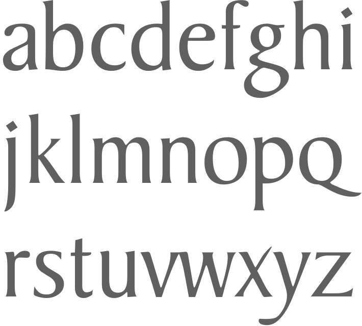
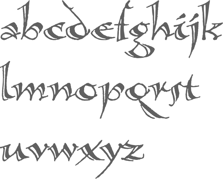
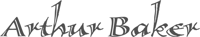
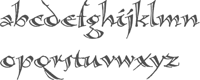
Arthur Baker Designs (or: Glyph Systems)
[Arthur Baker]
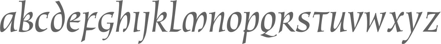
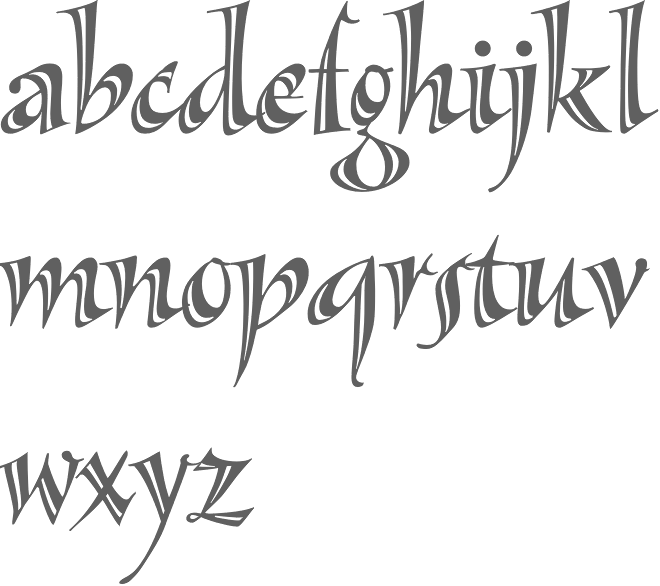
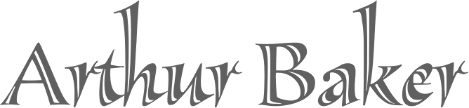
American calligrapher in Andover, MA, who worked for many foundries, and ran several studios. He ran Glyph Systems in Andover, MA, and before that, Alpha Omega and Maverick Designs. Baker grew up in Berkeley, CA, and attended school on the West Coast and New York City. After serving in the U.S. Army, he studied under calligrapher Oscar Ogg and had private lessons with George Salter and Tommy Thompson. Some of Baker's earliest designs were made available through Photo-Lettering Inc., and his first widely-available commercial typeface was published in 1965. Baker's first book was published in 1973. Arthur Baker died in 2016 at the age of 86. Tribute by Allan Haley. His typefaces were all calligraphic:
Some explanations by Freddy Nader: The Baker Argentina and Danmark typefaces were variations on his Signet. Baker originally made Signet for Headliners International in the 1960s, where he worked full time. In 1972 he was approached by VGC and told that they would pay him royalties as well if he made the same typeface for them. Royalties were a relatively new thing back then - Tommy Thompson was the very first person to ever earn royalties in type (in 1944 for his Thompson Quill script for Photo Lettering Inc), and he wasn't a type designer per se, he was a calligrapher. Lured by the idea of royalties coming his way from two different directions for the same face, Baker did a Signet for VGC. When Bob Evans, owner of Headliners, found out, he threatened to sue VGC for trademark infringement (copyright for typefaces was unheard of at the time - every major photo type house had "similar" fonts, and whenever someone got exclusives made by outside designers under a royalty program, it was only a matter of weeks before they were knocked off and changed slightly by other type houses, big and small). So in order to avoid a trademark infringement lawsuit, VGC called their typeface Baker Signet, instead of just Signet, and went further by asking Arthur Baker to make a lighter version and a condensed version. The lighter version was called Baker Argentina, the condensed version was called Baker Danmark. The "Number One" prefix was added to both so that when the inevitable knockoffs happened, type buyers would know which type was made first. About Baker Sans, Freddy writes: The Baker Sans was a knockoff of Helvetica. It was a massive family of a lot of fonts, rendered very ugly by camera stretching and slanting. Eddie Bauer used it as their corporate typeface for a long time in order to avoid the expensive fees of licensing Helvetica. Tim Ryan ended up digitizing it for Arthur Baker in the mid 1990s for a lot of money. That digital version is now being sold by ITF under one of its many companies (either Arthur Baker Design, or Arthur Baker Designs, or maybe Maverick Designs). MyFonts link. Klingspor link. View Arthur Baker's typefaces. Linotype link. MyFonts page. Another MyFonts page. And still another MyFonts page. FontShop link. View Arthur Baker's typefaces. |
EXTERNAL LINKS |
| | |


file name: Arthur Baker Baker Signet 2001
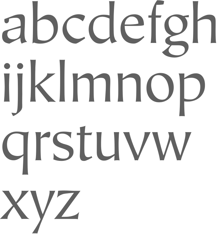
file name: Arthur Baker Calligraphica 1995
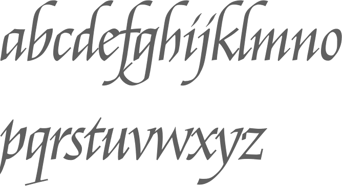
file name: Arthur Baker Calligraphbica Italic 1995
file name: Arthur Baker Calligraphica 1995c

file name: Arthur Baker Collier Script 1995
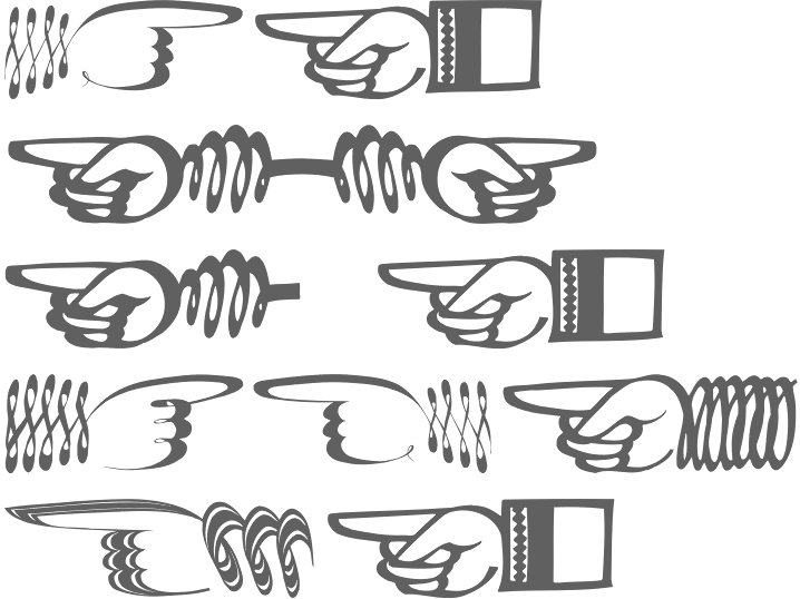
file name: Arthur Baker Hands 1995
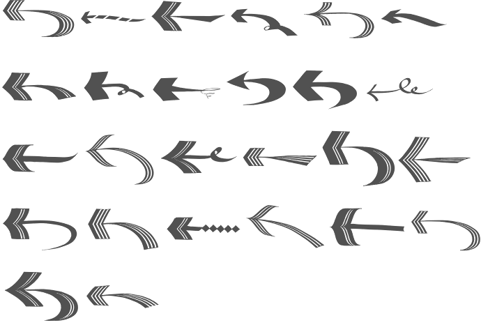
file name: Arthur Baker Arrows 1995
file name: Arthur Baker Hiroshige Sans 1995
file name: Arthur Baker Mercator 1995
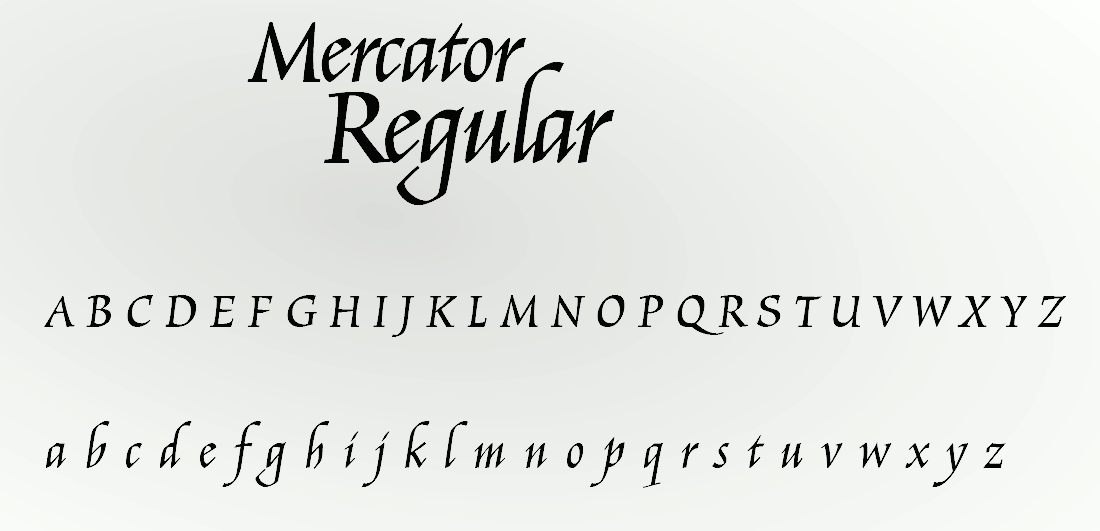
file name: Arthur Baker Mercator 1995 108934
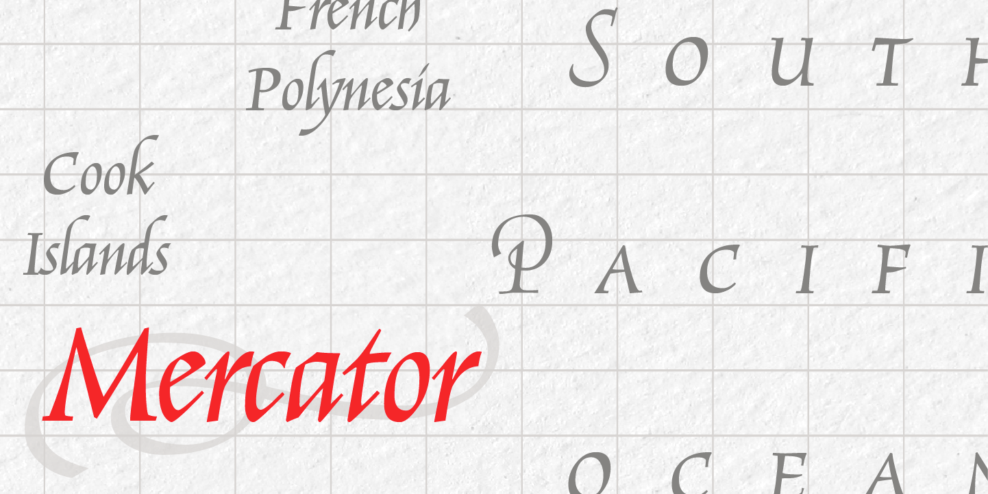
file name: Arthur Baker Mercator 1995 128056

file name: Arthur Baker New Amigo 1994

file name: Arthur Baker New Oxford 1994
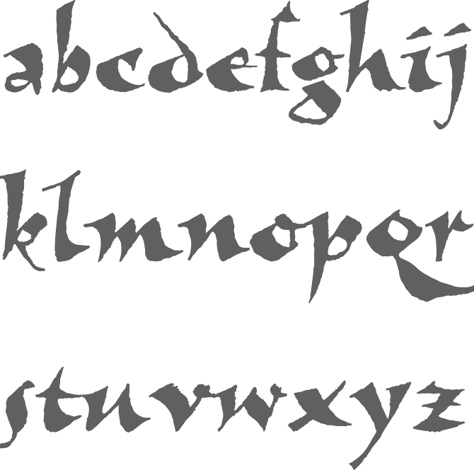
file name: Arthur Baker New Visigoth 1994
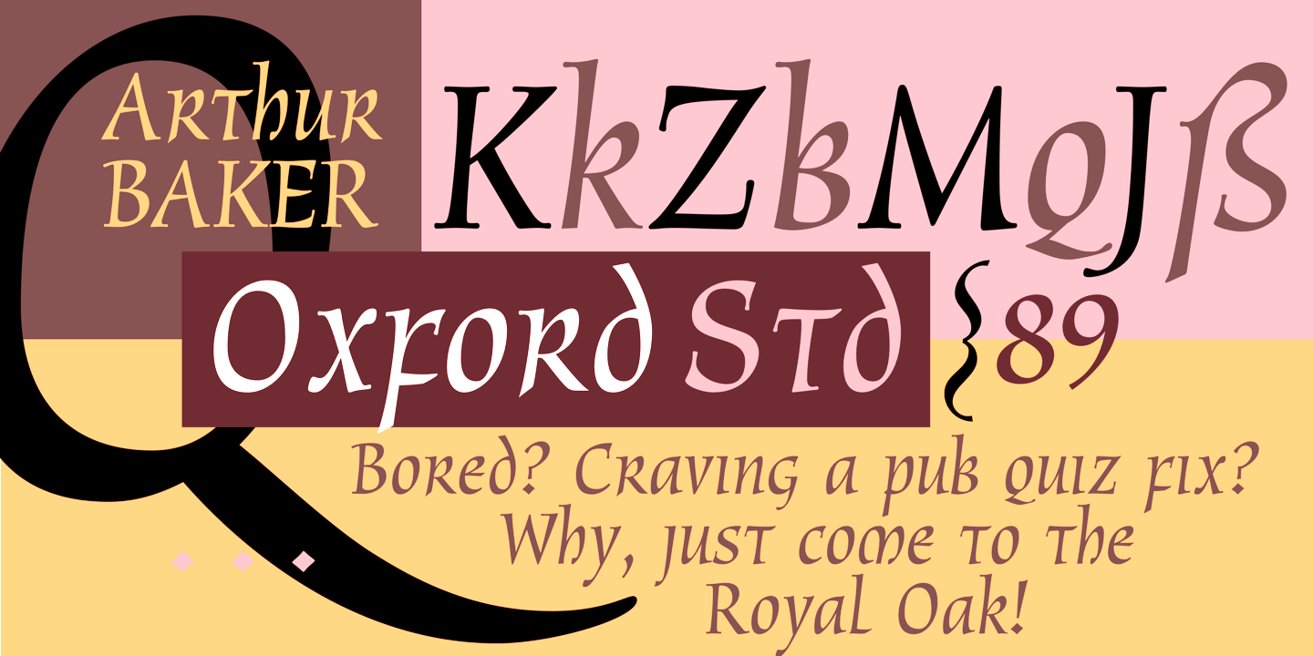
file name: Arthur Baker Oxford 1989 102978
file name: Arthur Baker Oxford 1989
file name: Arthur Baker Sassafras 1995
file name: Arthur Baker Sassafras 1995b
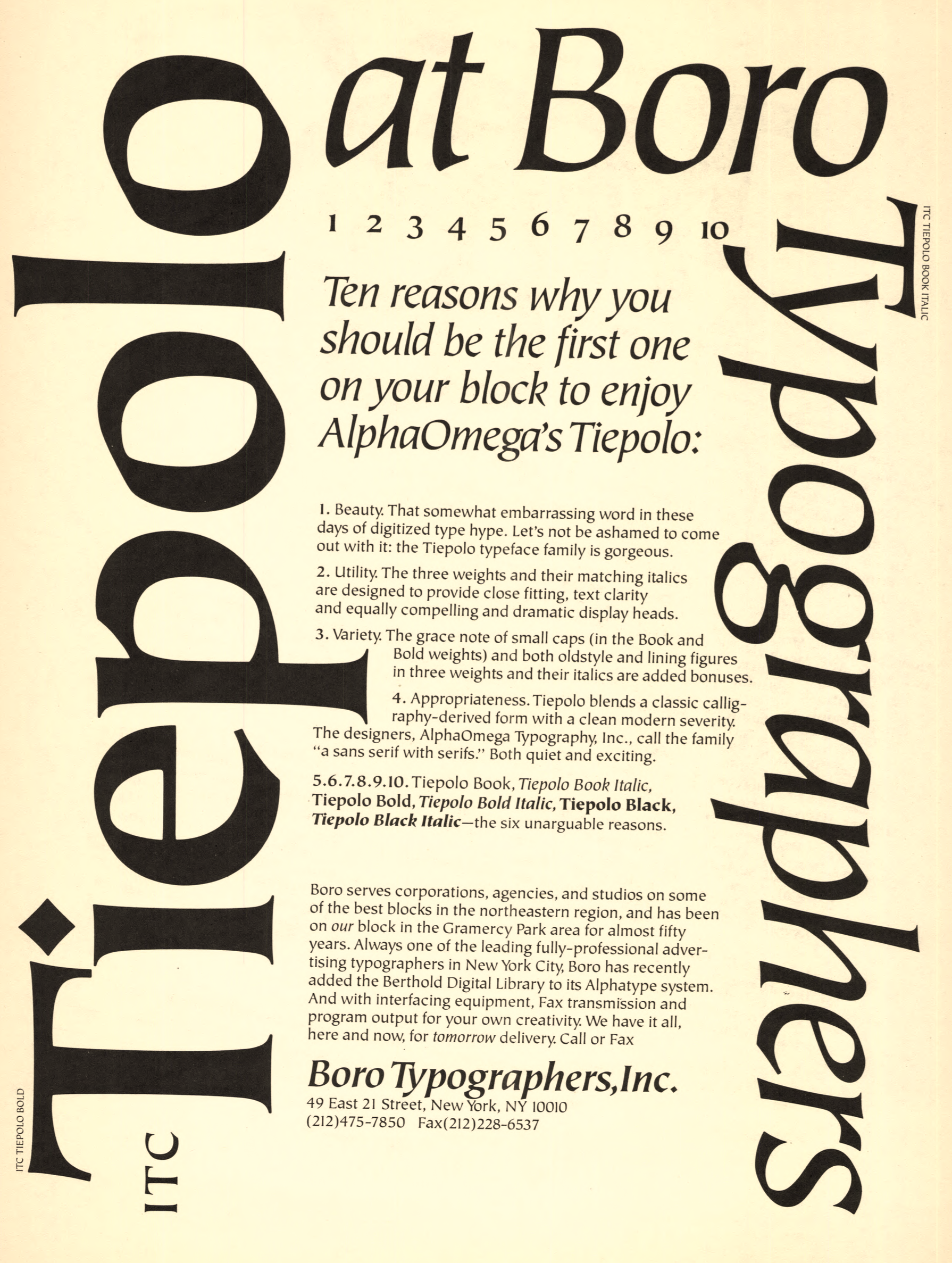
file name: Alpha Omega I T C Tiepolo Bold 1987
| | |
|
Luc Devroye ⦿ School of Computer Science ⦿ McGill University Montreal, Canada H3A 2K6 ⦿ lucdevroye@gmail.com ⦿ https://luc.devroye.org ⦿ https://luc.devroye.org/fonts.html |