TYPE DESIGN INFORMATION PAGE last updated on Sat May 16 08:25:12 EDT 2026
FONT RECOGNITION VIA FONT MOOSE

|
|
|
|
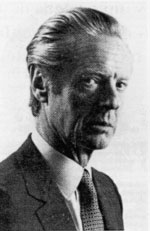
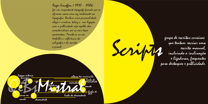
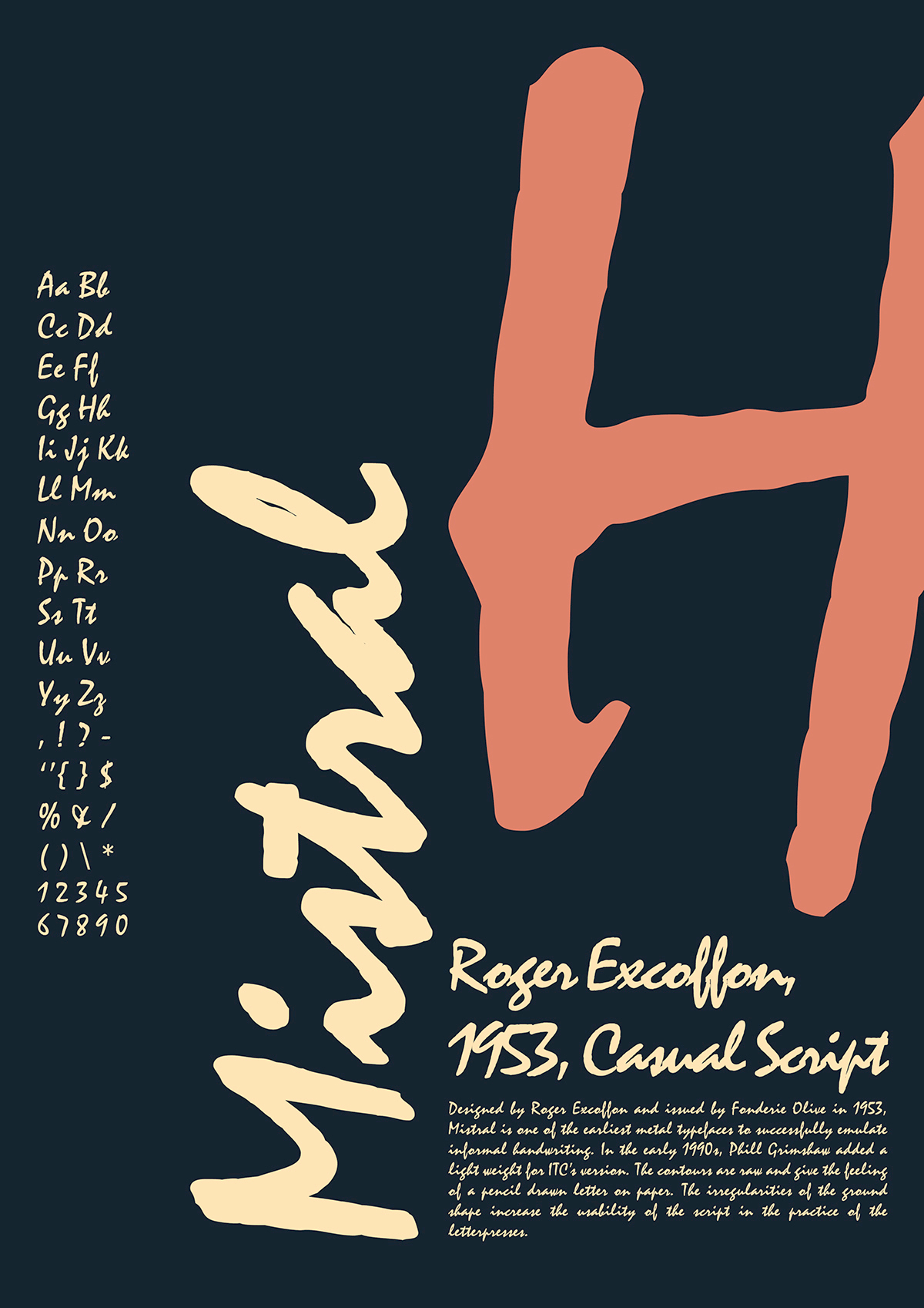
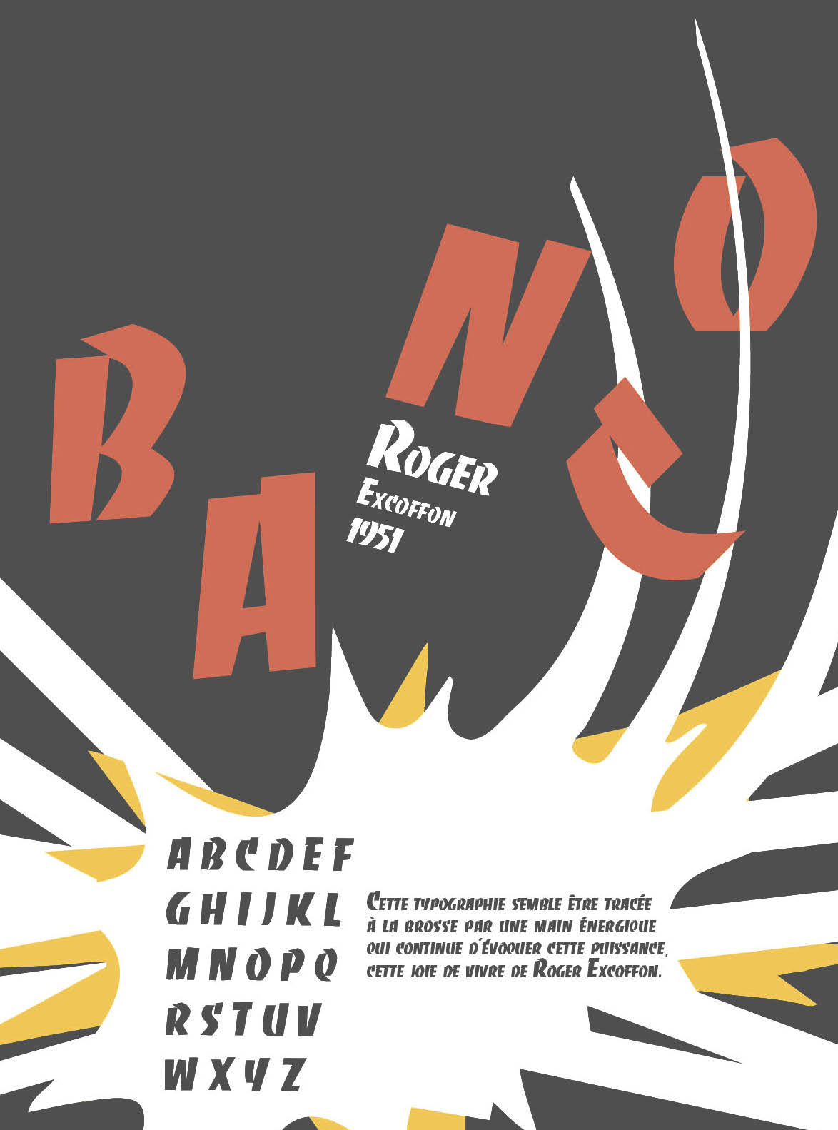
Roger Excoffon
Born in Marseille in 1910, Roger Excoffon died in Paris in 1983. Co-founder of the Urbi et Orbi advertising agency in Paris, he was a graphic artist and type designer. He created the image of Air France, designed the symbols of the 1968 Winter Olympics in Grenoble, and designed many fonts. Porchez mentions that he lived from 1911-1984, not 1910-1983. Books about him:
Visual hommage by Peter Gabor. Picture. Signature. Some drawings by him: i, ii, iii. His typefaces include
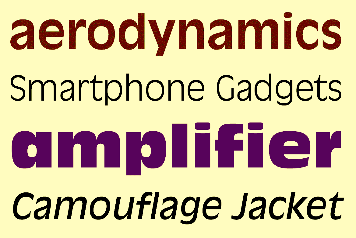
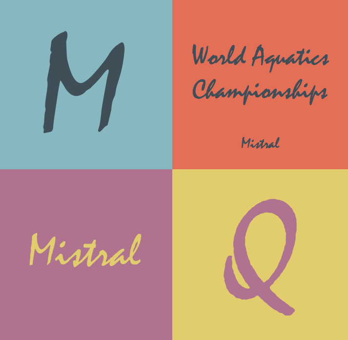
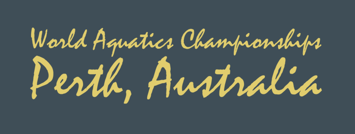
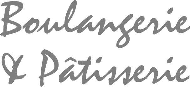
Linotype link. Article by John Dreyfus: The Speed and Grace of Roger Excoffon. FontShop link. View Excoffon's typefaces. View Roger Excoffon's type designs and all digital revivals. Subpage with many digital versions of Mistral. |
EXTERNAL LINKS |
| | |


file name: Pic rogerexcoffon

file name: Mark Solsburg Mark Simonson Diane Script 2008 after Roger Excoffon Diane 1956

file name: Mark Solsburg Mark Simonson Diane Script 2008

file name: Mark Solsburg Mark Simonson Diane Script 2008b
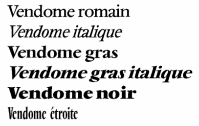
file name: Roger Excoffon Francois Ganeau Vendome Fonderie Olive Stempel 1951 1954
file name: Roger Excoffon Choc Linotype 1955
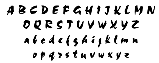
file name: U R W Choc
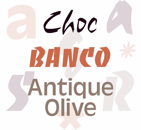
file name: Roger Excoffon Banco Choc Antique Olive

file name: Roger Excoffon Phil Grimshaw Choc

file name: Roger Excoffon Choc 1954 Linotype Version
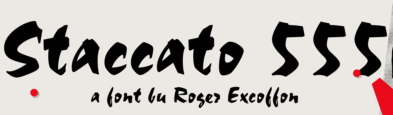
file name: Bitstream Staccato555 after Roger Excoffon Choc 1954 Poster by Michael Sallit 2017
file name: Bitstream Staccato555 after Roger Excoffon Choc 1954b
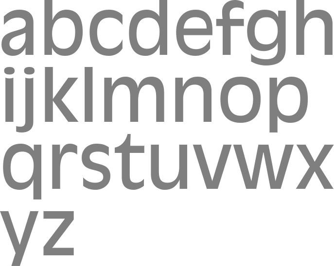
file name: U R W Antique Olive after Roger Excoffon
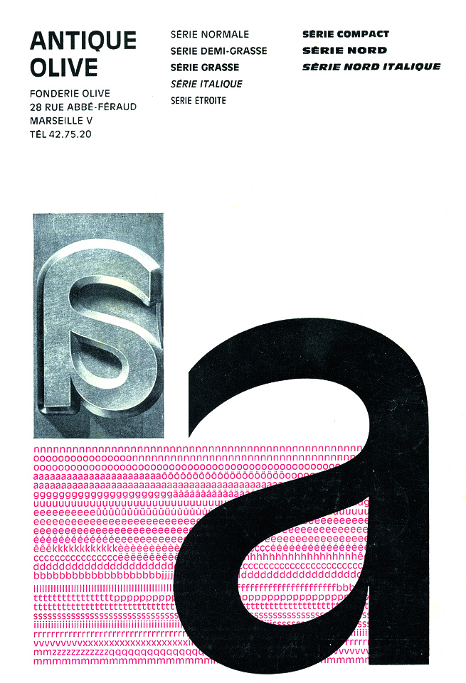
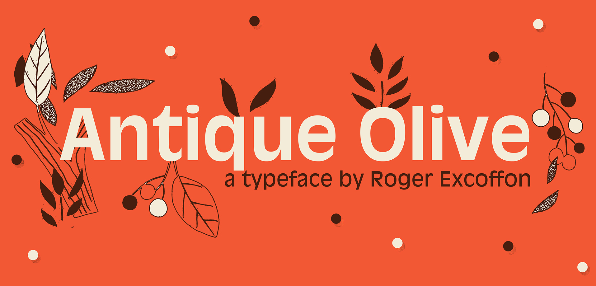
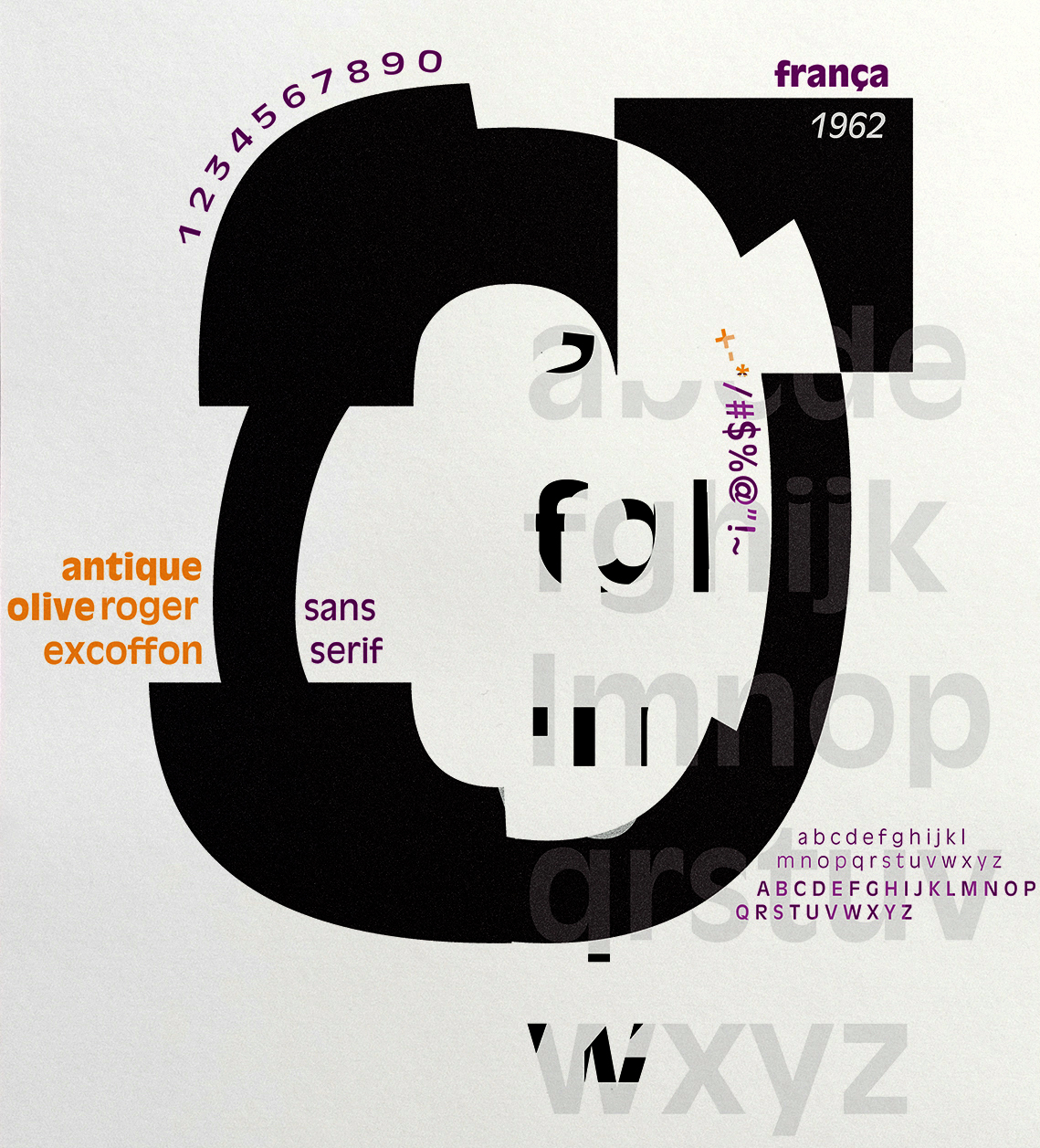
file name: Roger Excoffon Antique Olive 1960
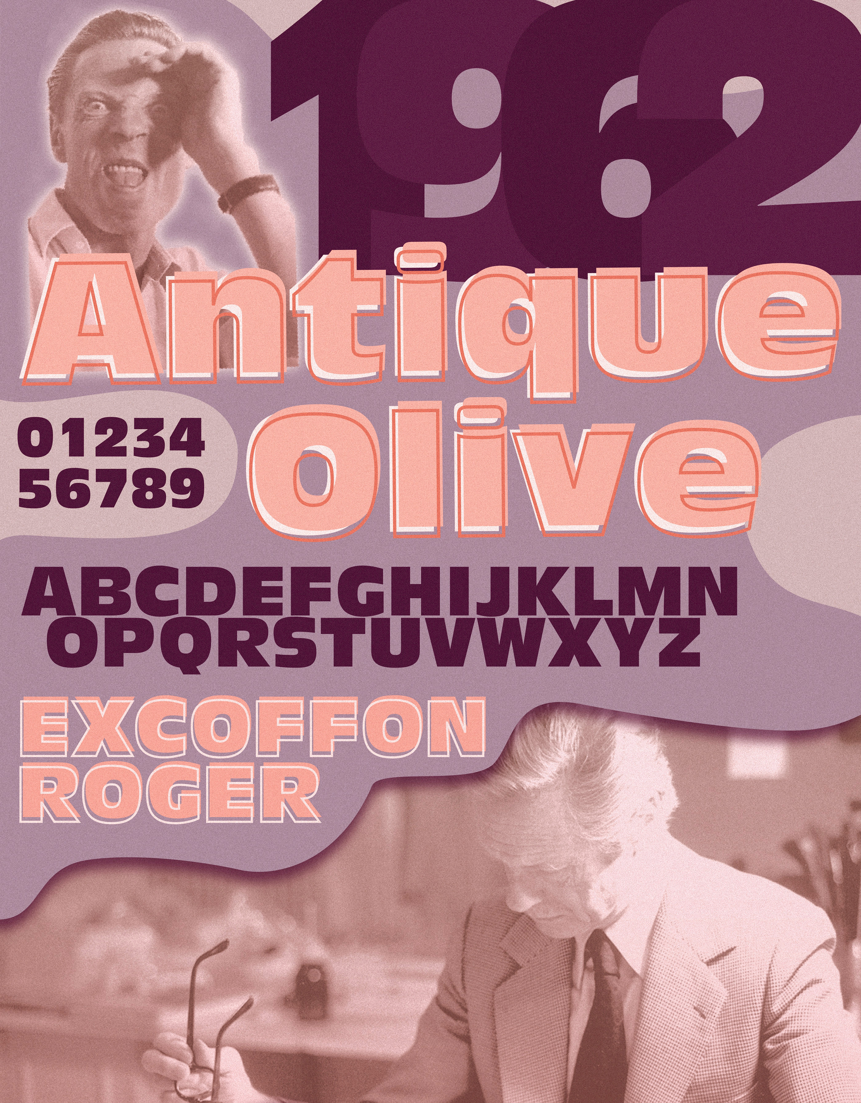
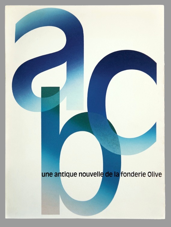
file name: Roger Excoffon Antique Olive 1962 poster by Sandra Pulido 2019
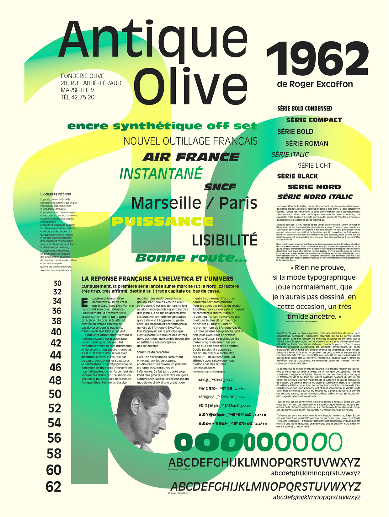
file name: Roger Excoffon Antique Olive 1962 Poster by Camille Jamart 2015

file name: Stempel Antique Olive
file name: Roger Excoffon Antique Olive Roman 1963
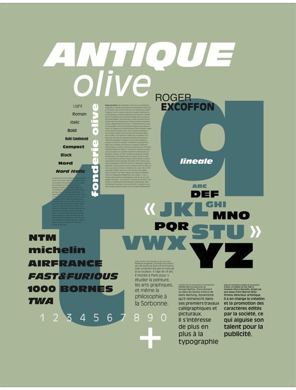
file name: Roger Excoffon Antique Olive 1963 Poster By Alexandre Carre 2013
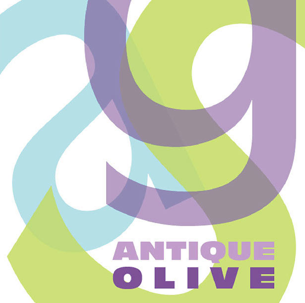
file name: Roger Excoffon Antique Olive 1962 Poster by Melina Mac Farlane 2015
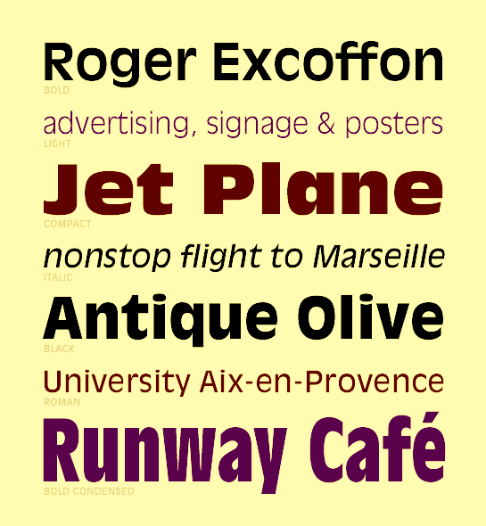
file name: Roger Excoffon Antique Olive 1963c
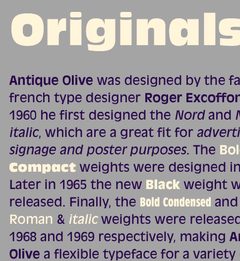
file name: Roger Excoffon Antique Olive 1963d
file name: Roger Excoffon Antique Olive 1963e
file name: Roger Excoffon Antique Olive 1963f
file name: Roger Excoffon Antique Olive 1962 Poster by Michael Sallit 2017
file name: Roger Excoffon Antique Olive 1962 Poster by Mafalda Joao 2017
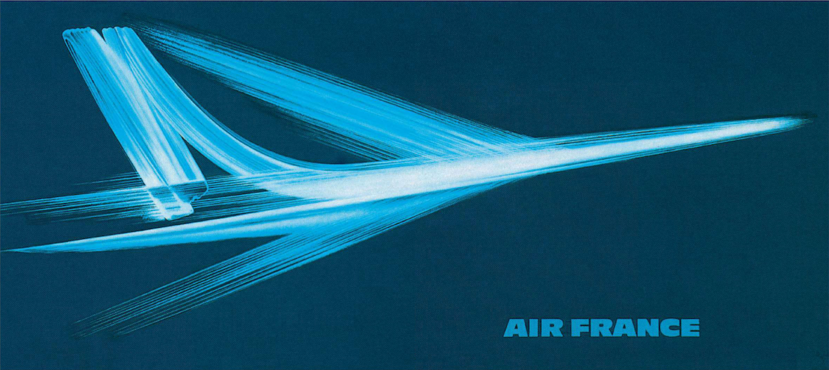
file name: Roger Excoffon Air France Concorde
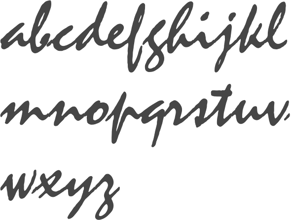
file name: Linotype Mistral 2000 197284
file name: Linotype Mistral 2000 197284

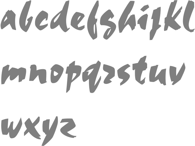
file name: Roger Excoffon Mistral 1953
file name: Roger Excoffon Mistral 1953b
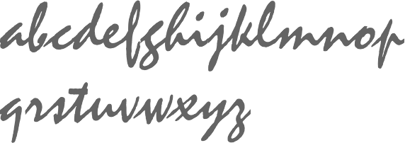
file name: Roger Excoffon Mistral 1953
file name: Roger Excoffon Mistral 1953 Mecanorma Version

file name: Mecanorma Collection Mistral 2005
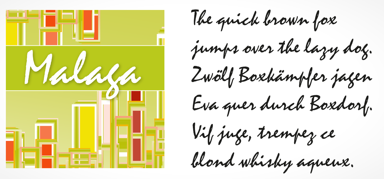
file name: Soft Maker Malaga Pro 2016 209901
file name: Soft Maker Malaga Pro 2016 209902

file name: Soft Maker Malaga Pro 2016
file name: Roger Excoffon Mistral 1953 Poster by Olga Brito 2015

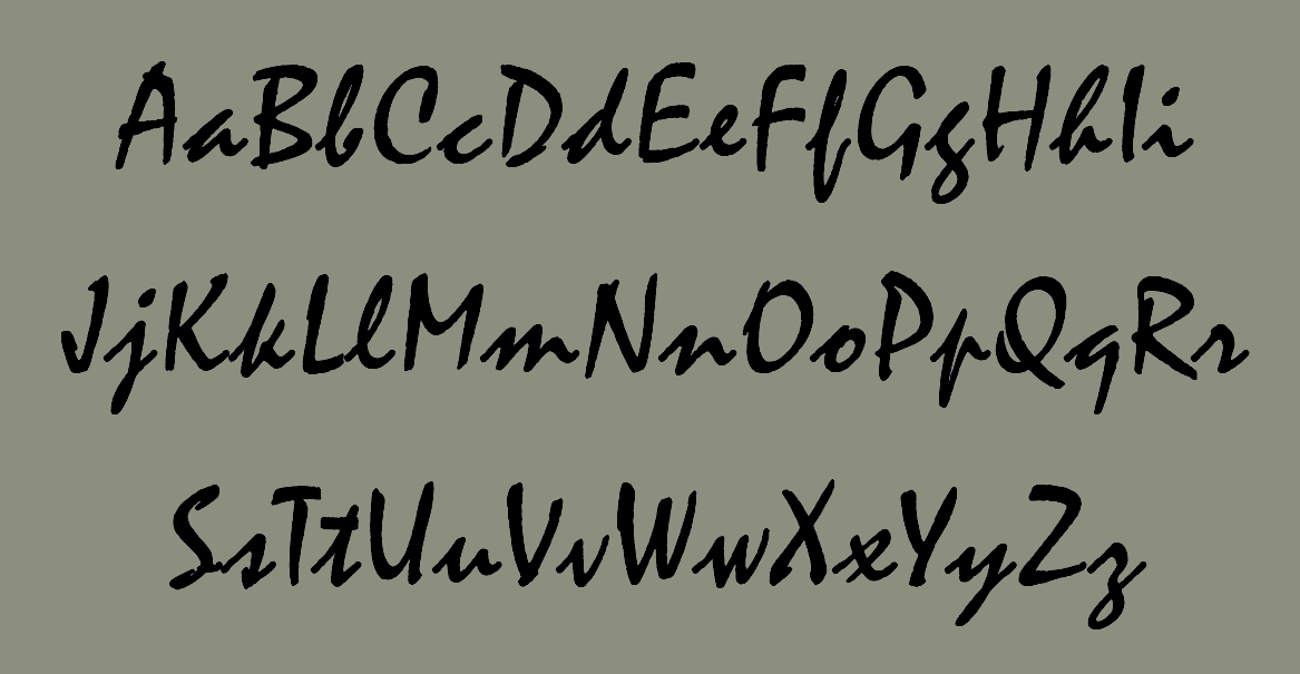
file name: Castcraft O P T I Mistral Graff

file name: U R W Mistral 1992
file name: Roger Excoffon Mistral 1953 poster by Cagri Arslan 2017
file name: Bitstream Staccato222 after Roger Excoffon Mistral 1953

file name: Bitstream Staccato222 after Roger Excoffon Mistral 1953b
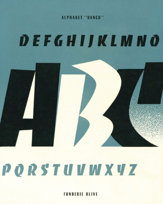
file name: Roger Excoffon Banco 1951 Poster by Charlotte Boquet 2014
file name: Dan Solo Banco
file name: Phil Grimshaw Banco 1997 based on Roger Excoffon 1952
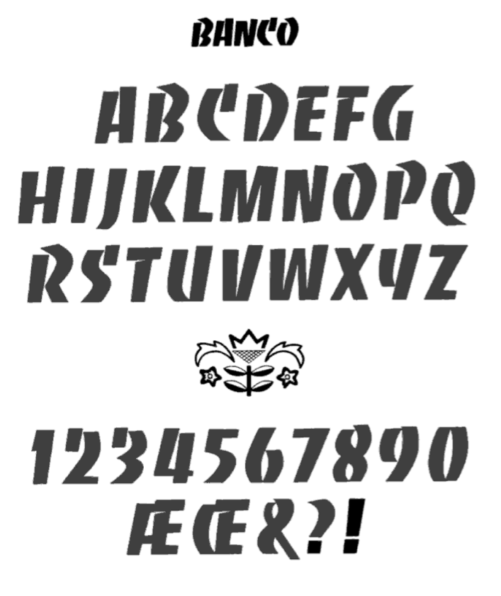
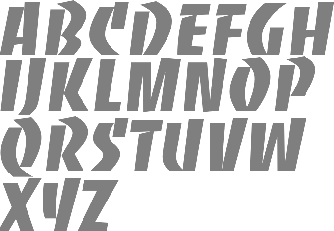
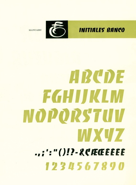
file name: Roger Excoffon Banco 1951
file name: Roger Excoffon Banco 1951b
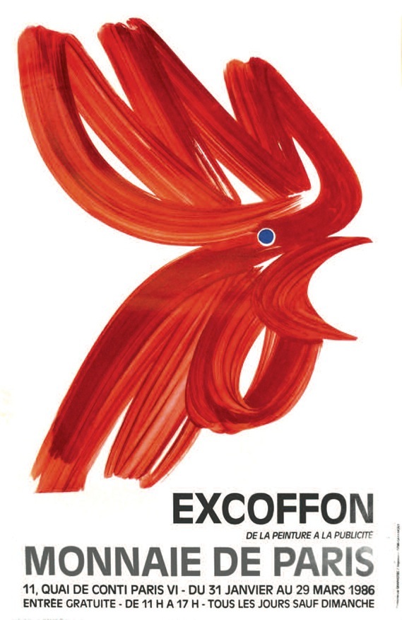
file name: Roger Excoffon Painting For French Exhibition In Montreal 1963
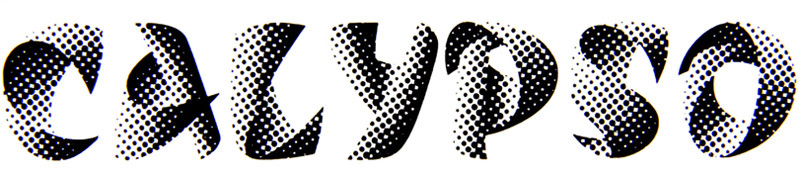
file name: Roger Excoffon Calypso

file name: Ralph M Unger calypso 2005 after Roger Excoffon Calypso 1958

file name: Ralph M Unger Calypso 2005

file name: Martin Pfeiffer Calypso 1996
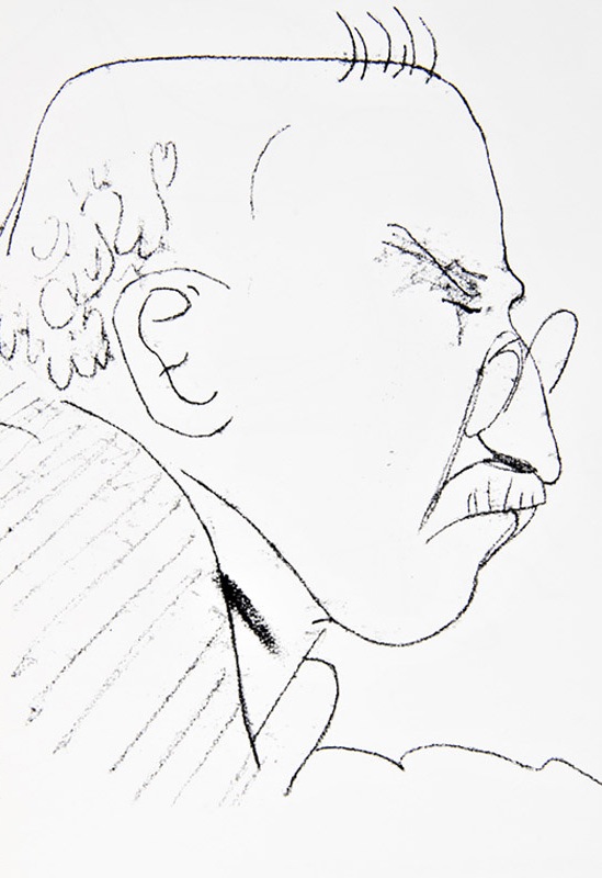
file name: Roger Excoffon Drawing b
file name: Roger Excoffon Drawing c
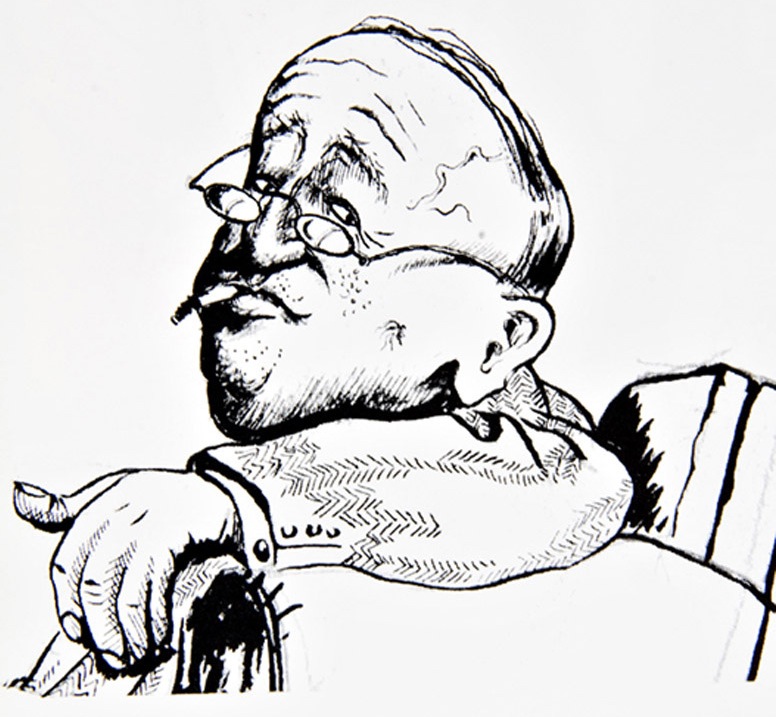
file name: Roger Excoffon Drawing
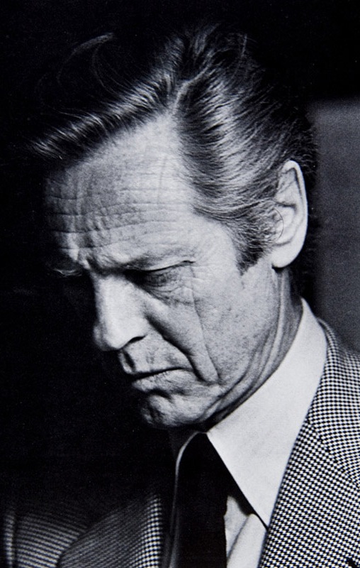
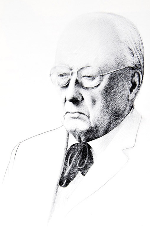
file name: Roger Excoffon Pic
file name: Roger Excoffon Signature
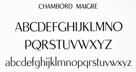
file name: Roger Excoffon Chambord Maigre
file name: Roger Excoffon Chambord Gras 1945
file name: Stempel Chambord
| | |
|
Luc Devroye ⦿ School of Computer Science ⦿ McGill University Montreal, Canada H3A 2K6 ⦿ lucdevroye@gmail.com ⦿ https://luc.devroye.org ⦿ https://luc.devroye.org/fonts.html |