TYPE DESIGN INFORMATION PAGE last updated on Mon Jul 13 21:18:13 EDT 2026
FONT RECOGNITION VIA FONT MOOSE

|
|
|
|
OurType
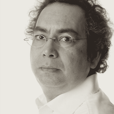
[Fred Smeijers]
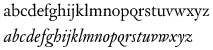
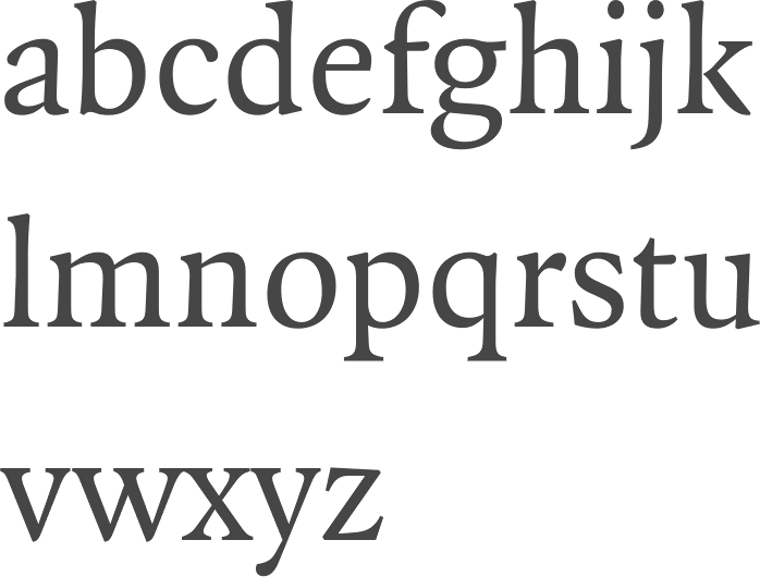
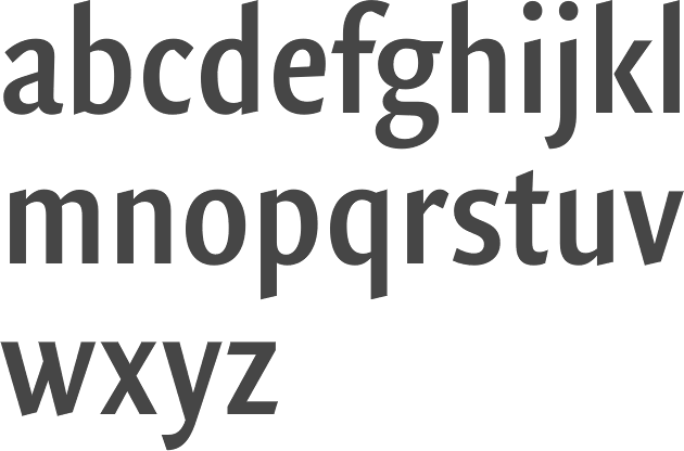
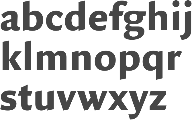
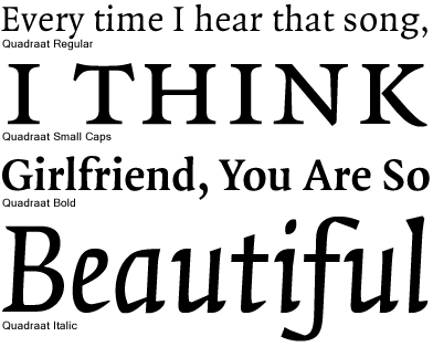
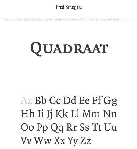
OurType was Fred Smeijers' web site and foundry established in 2002 (formally launched in 2004). OurType was set up by four partners: Fred Smeijers, Corina Cotorobai with Rudy Geerarts and Martine Leloup (both of FontShop Benelux). Fred and Corina were the creative lead of OurType foundry, Rudy and Martine were in charge with sales. In 2017 Fred and Corina stopped their collaboration with OurType concentrating on several other projects, including a new type label. Fred and Corina are also co-partners in Type Tailors (established in 2008), offering type design development, publishing, custom type and typographic consultancy. Smeijers's fonts can now be found at Type By. Smeijers is research fellow at Plantin Museum in Antwerp, and professor of type design at the Hochschule für Grafik und Buchkunst in Leipzig, and visiting professor at the Royal Academy of Arts in The Hague. In April 2018, Fred Smeijers and Corina Cotorobai announced that they would be starting a new foundry. Fred Smeijers (b. 1961) studied at the School of Art at Arnhem, and he worked as a typographic advisor to the reprographic company Océ, then became a founding member of the graphic design practice Quadraat, which provided the name for his first published typeface (FontFont, 1992). He created the following typefaces:
Author of Counterpunch: Making type in the sixteenth century, designing typefaces now, London, Hyphen Press, 1996 [PDF file] [a second edition followed in 2011], and Type Now: A Manifesto (2003, London, Hyphen Press; reviewed by John Berry). In February 2001, Smeijers received the (second) Gerrit Noordzij Award 2000 (an initiative of the post-graduate department Type&Media at the Royal Academy in The Hague in cooperation with the Museum Meermanno). In 2016, the Society of Typographic Aficionados awarded Smeijers the SOTA Typography Award. OurType's offices were in DePinte, Belgium. Speaker on historical stencil forms at ATypI 2006 in Lisbon. Currently he also is professor of digital media and Dean at the Hochschule für Grafik und Buchkunst in Leipzig. Speaker at ATypI 2011 in Reykjavik. Speaker at ATypI 2013 in Amsterdam (on Spatial relationships among 16th-century matrices (and what they tell us), a close look at surviving matrices at the Plantin-Moretus Museum) and keynote speaker at ATypI 2018 in Antwerp (on zooming in and zooming out; and old beer, new type). |
EXTERNAL LINKS |
| | |


file name: Fred Smeijers Puncho 2012
file name: Fred Smeijers Puncho 2012b
file name: Smeijers custodia2

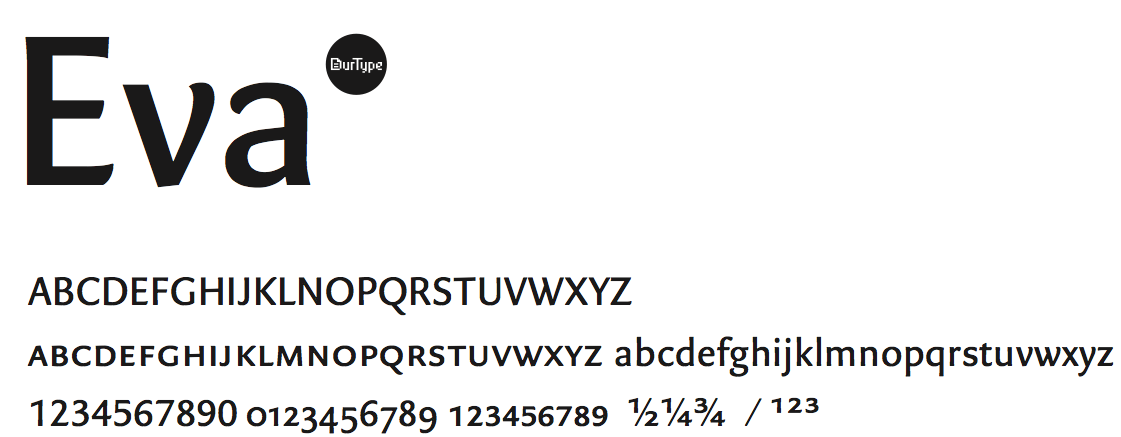
file name: Merel Matzinger Eva Black 2006

file name: Merel Matzinger Eva Bold 2006

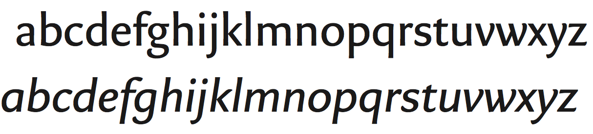
file name: Merel Matzinger Fred Smeijers Eva 2010
file name: Merel Matzinger Fred Smeijers Eva 2010b
file name: Merel Matzinger Fred Smeijers Eva 2010c
file name: Merel Matzinger Fred Smeijers Eva 2010d
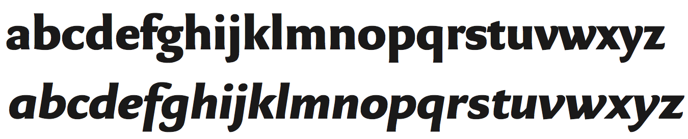
file name: Merel Matzinger Fred Smeijers Eva 2010e
file name: Merel Matzinger Fred Smeijers Eva 2010f
file name: Merel Matzinger Fred Smeijers Eva 2010g
file name: Merel Matzinger Fred Smeijers Eva 2010h

file name: Merel Matzinger Fred Smeijers Eva 2010i
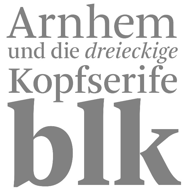
file name: Fred Smeijers Arnhem 1998
file name: Ourtype Arnhem Pro Blond

file name: Fred Smeijers Renardthree roman
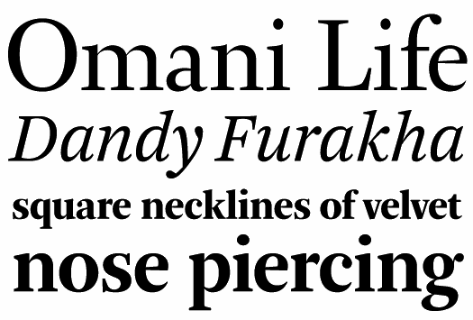
file name: Fred Smeijers F F Quadraat Offc Regular 1997 1998
file name: Fred Smeijers F F Quadraat Sans O T Condensed Demi Bold 1997 1998
file name: Fred Smeijers F F Quadraat Sans Pro Black 1997 1998
file name: Quadraat Scanby Fontasm 2010
file name: Fred Smeijers Quadraat Poster by Emily Feng
file name: Fred Smeijers Ludwig 2010
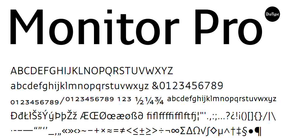
file name: Fred Smeijers Monitor Pro 2011
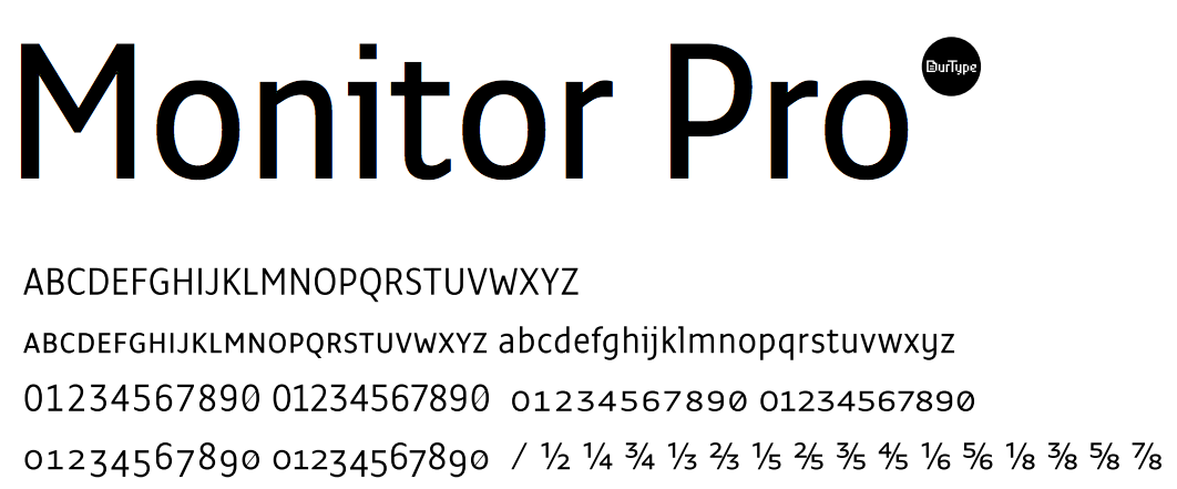
file name: Fred Smeijers Monitor Pro 2002 2004
file name: Fred Smeijers Monitor Pro 2002 2004b

file name: Fred Smeijers Monitor Pro 2002 2004c

file name: Fred Smeijers Monitor Pro 2002 2004d

file name: Fred Smeijers Monitor Pro 2002 2004e

file name: Fred Smeijers Monitor Pro 2002 2004f

file name: Sjoerd H De Roos D T L Nobel
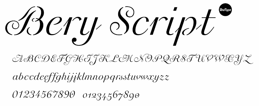
file name: Our Type B Bery Script 2012
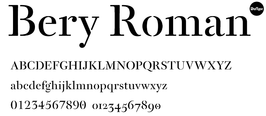
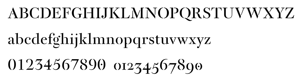
file name: Our Type Bery Roman
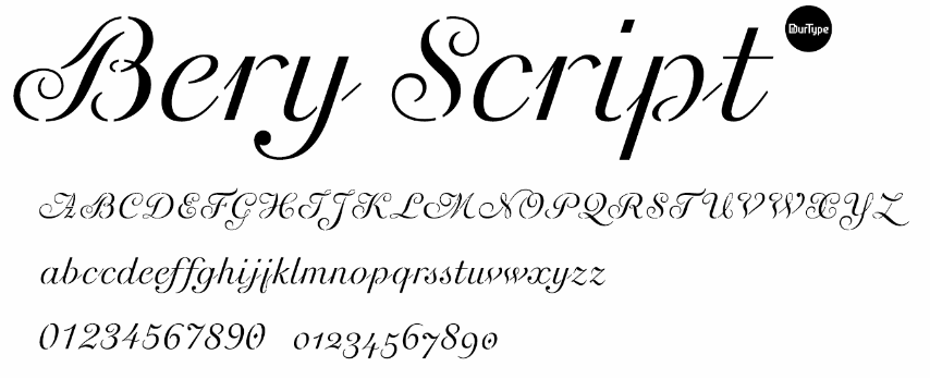
file name: Our Type Bery Script
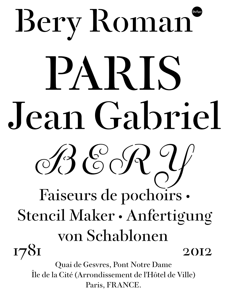
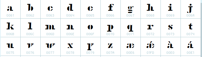
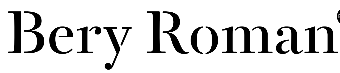
file name: Fred Smeijers Bery Roman 2012 after Jean Gabriel Bery 1781
file name: Fred Smeijers Bery Roman 2012 after Jean Gabriel Bery 1781b
file name: Fred Smeijers Bery Roman 2012 after Jean Gabriel Bery 1781c
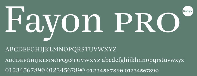
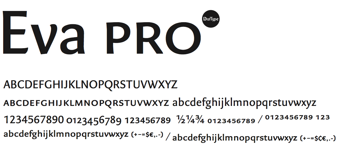
file name: Our Type Fayon Pro
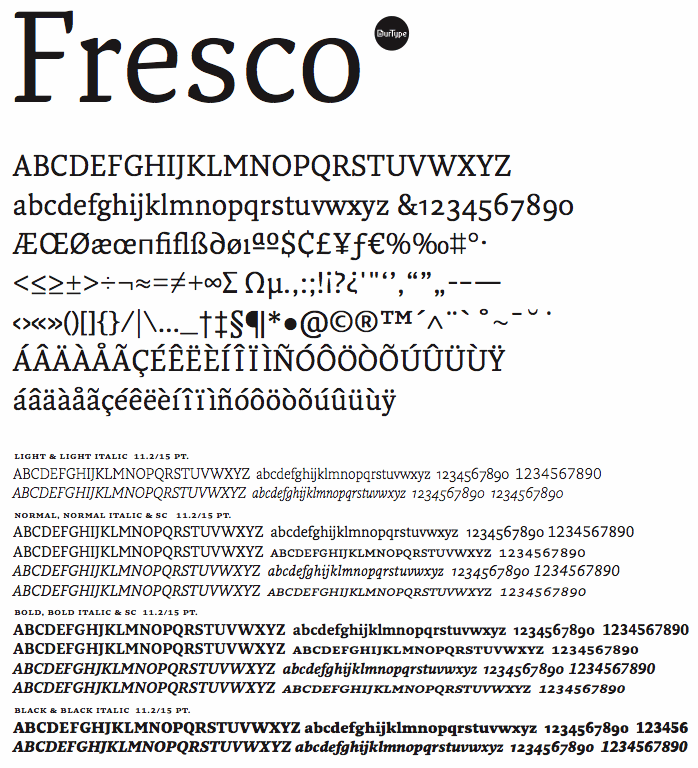
file name: Ourtype Fresco

file name: Ourtype Fresco Sans
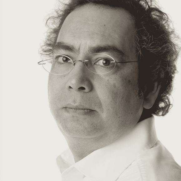
file name: Fred Smeijers Pic
file name: Pic Smeijers Khoury
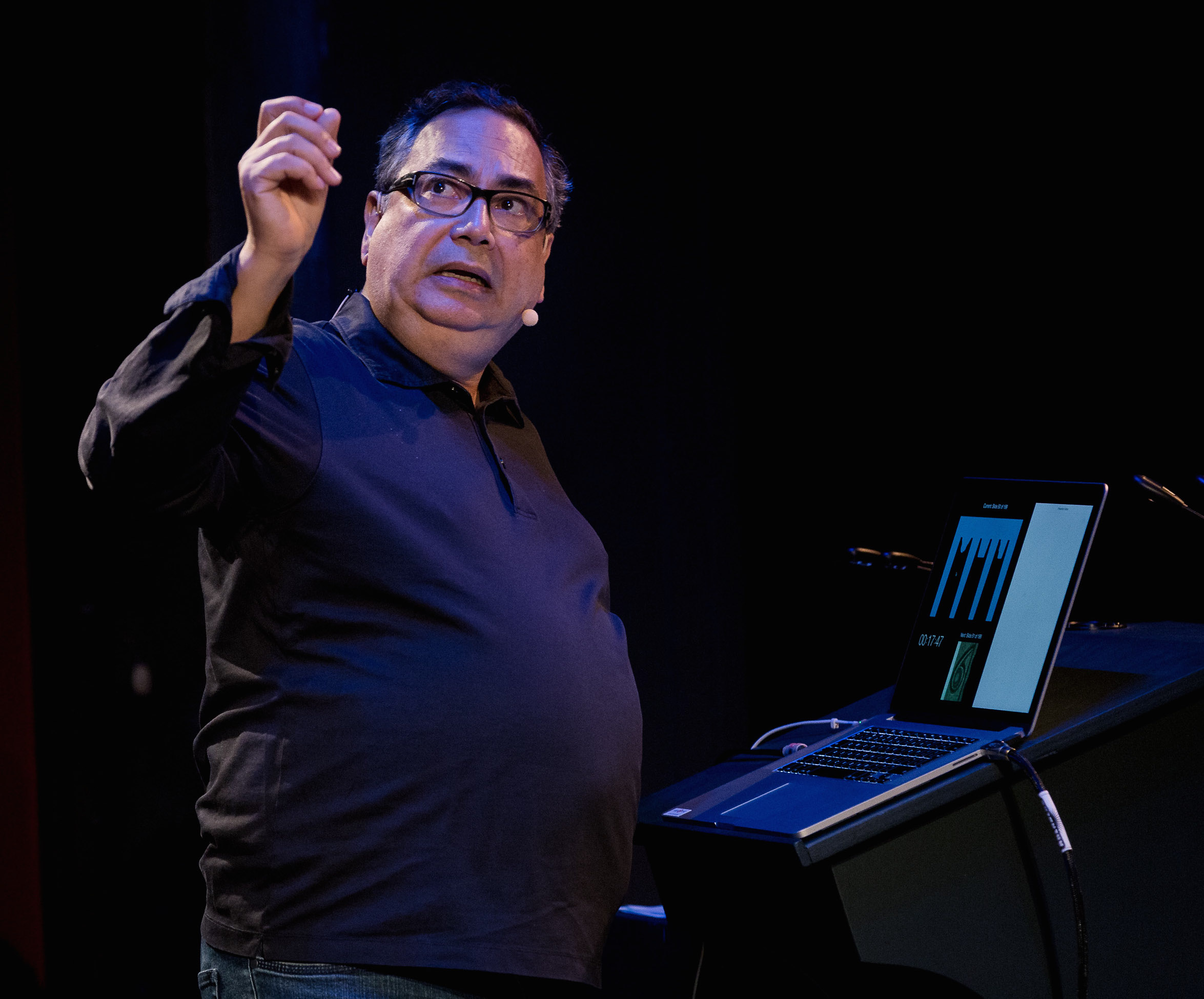
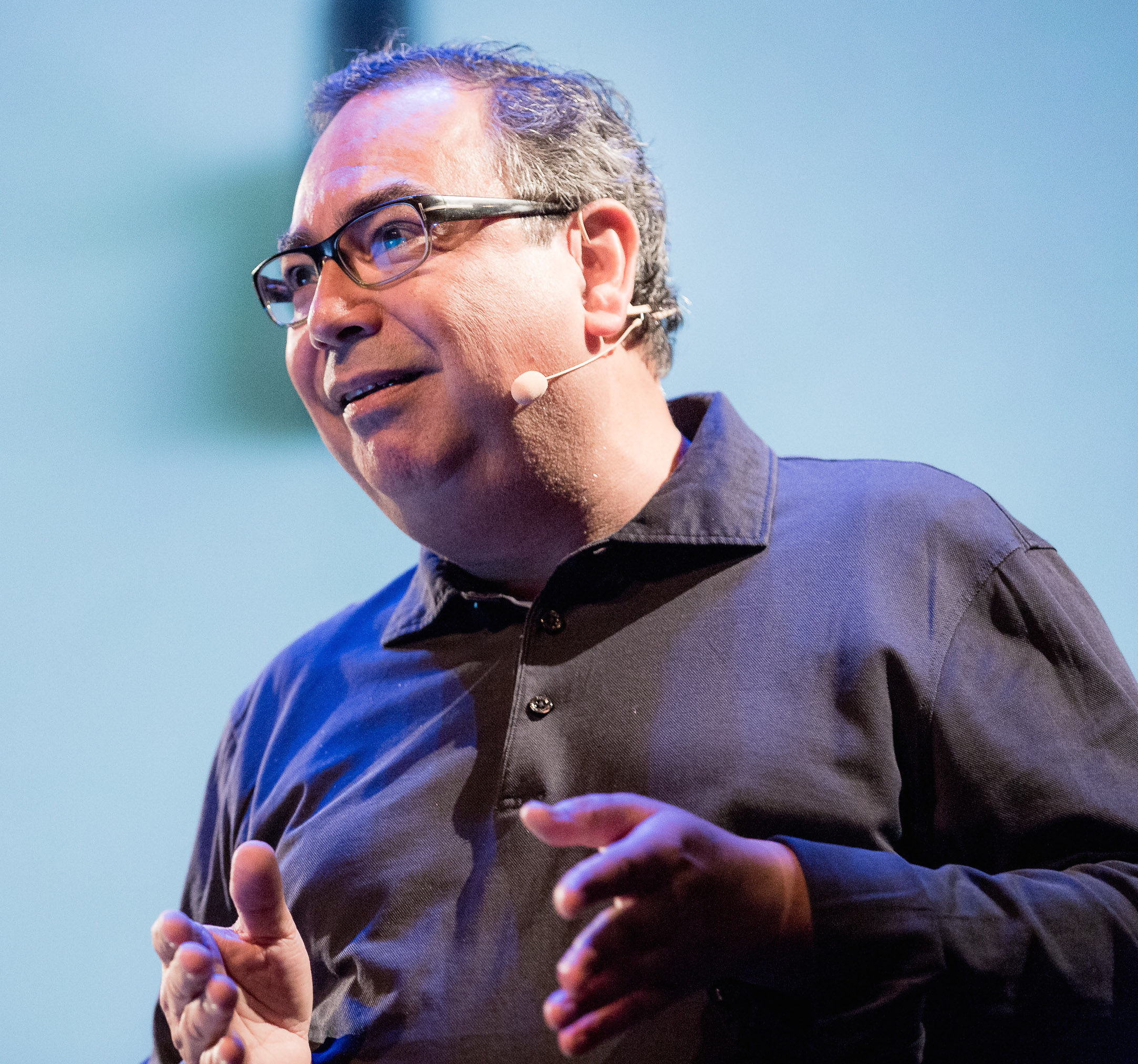
file name: Fred Smeijers A Typ I2018 photo by Michael Bundscherer
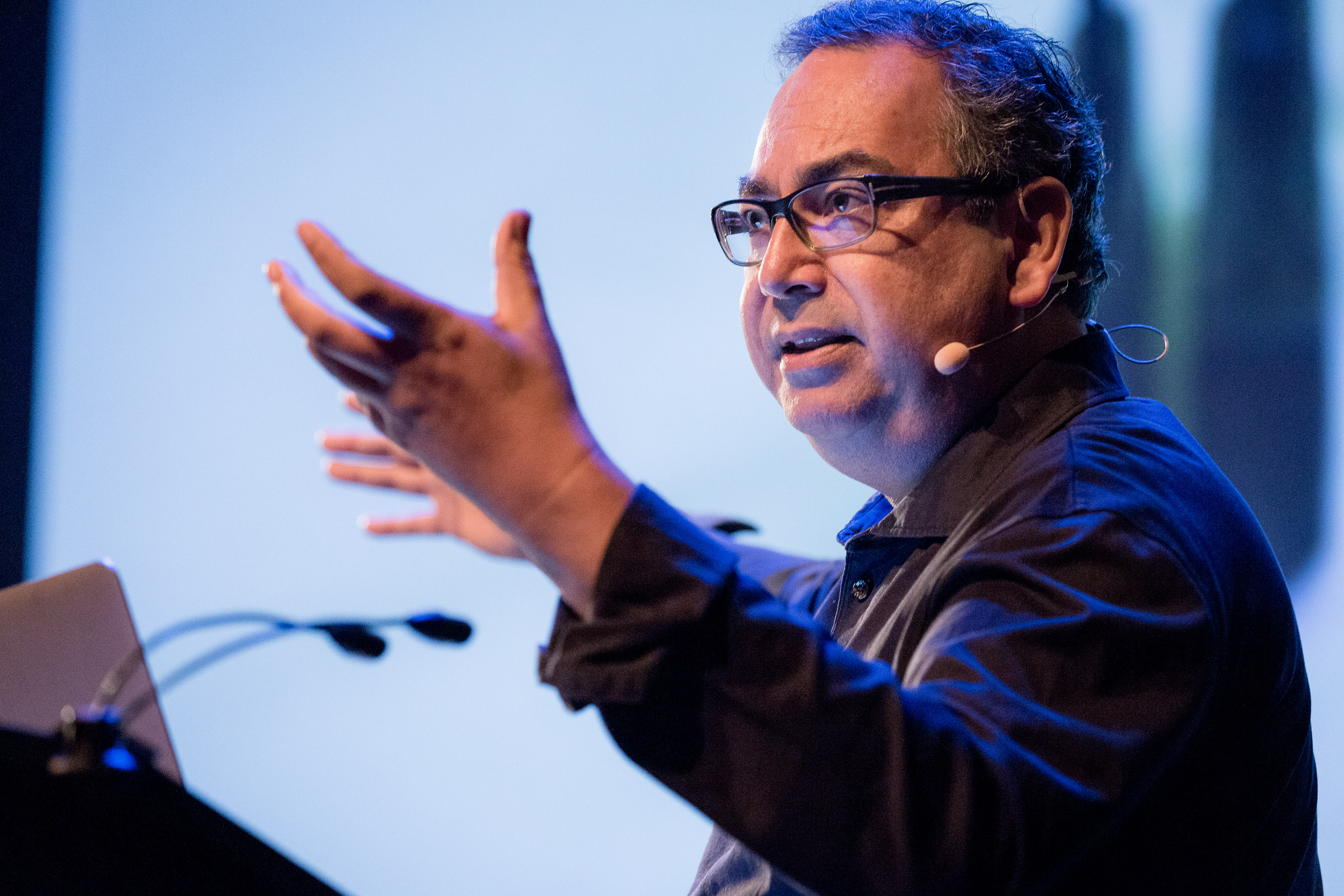
file name: Fred Smeijers A Typ I2018 photo by Michael Bundscherer
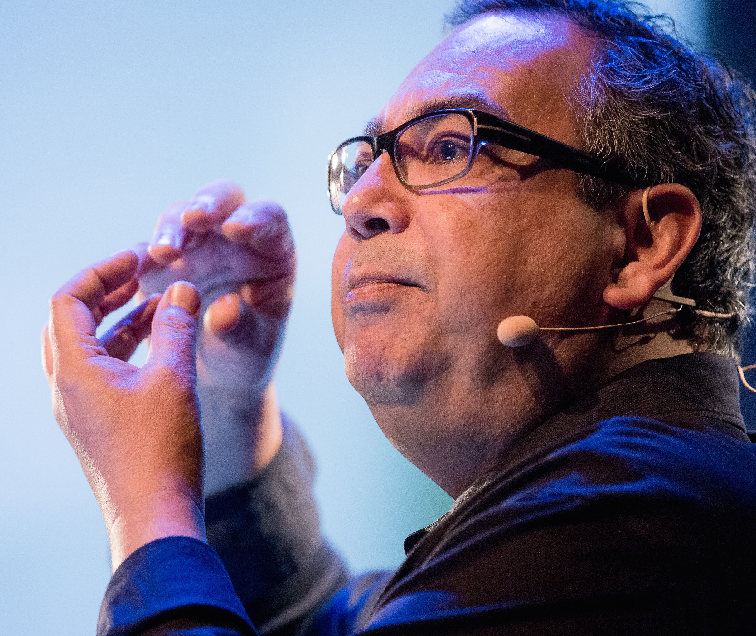
file name: Fred Smeijers A Typ I2018 photo by Michael Bundscherer
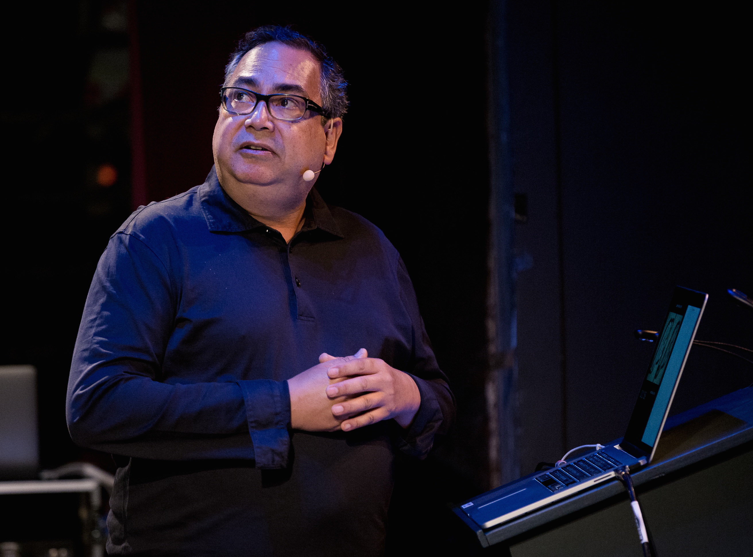
file name: Fred Smeijers A Typ I2018 photo by Michael Bundscherer
file name: Fred Smeijers A Typ I2018 photo by Michael Bundscherer
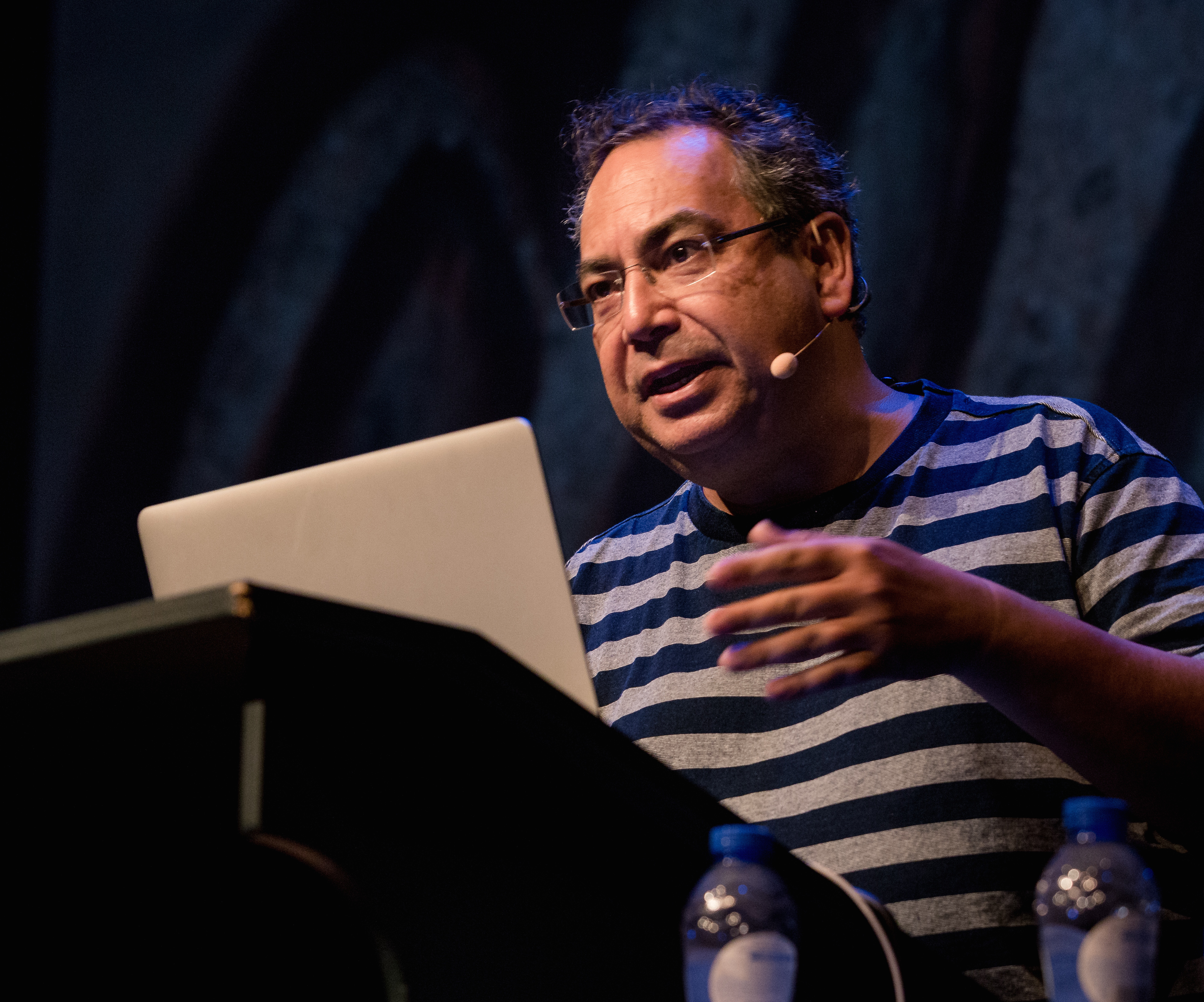
file name: Fred Smeijers A Typ I2018 photo by Michael Bundscherer
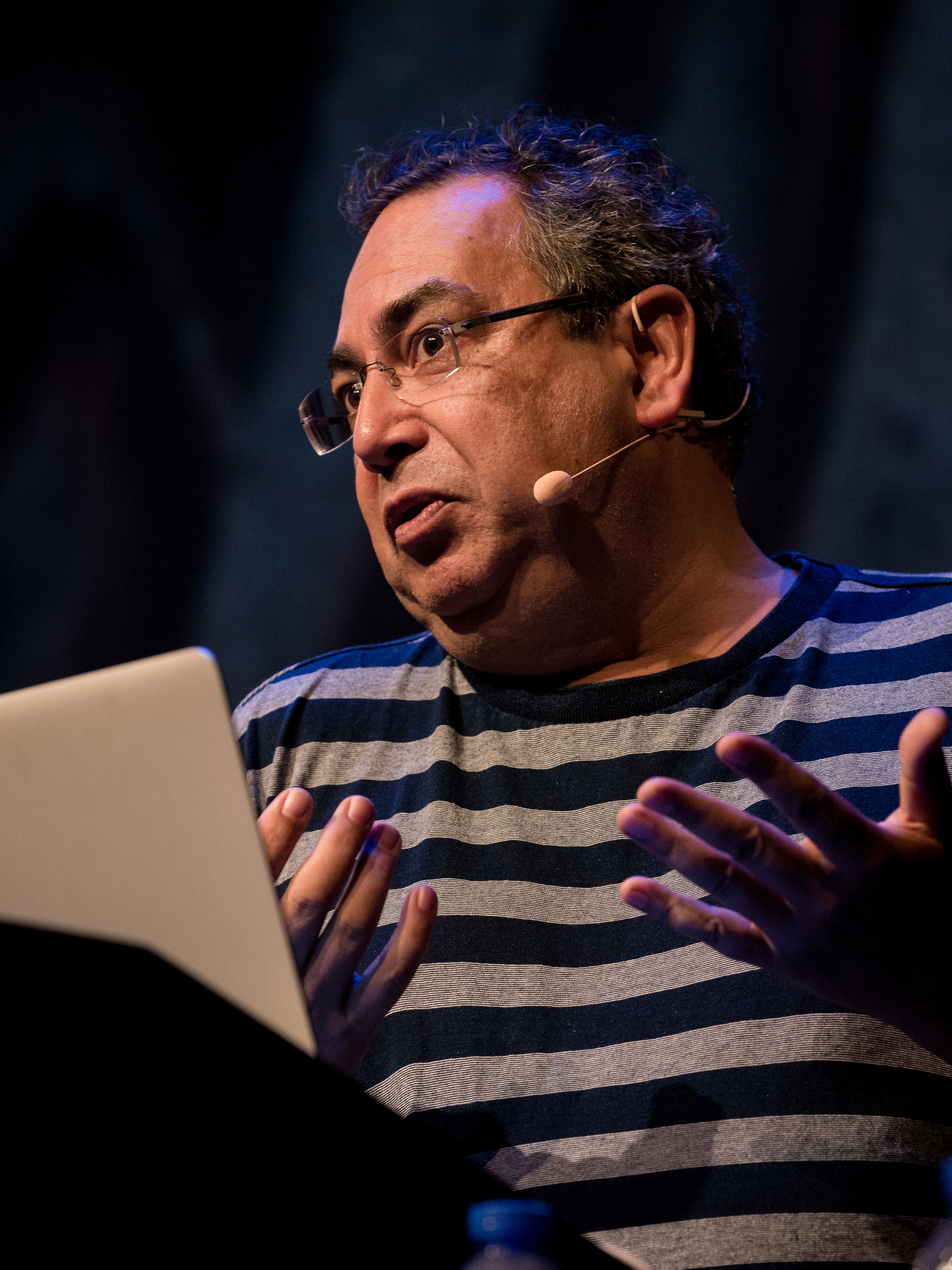
file name: Fred Smeijers A Typ I2018 photo by Michael Bundscherer
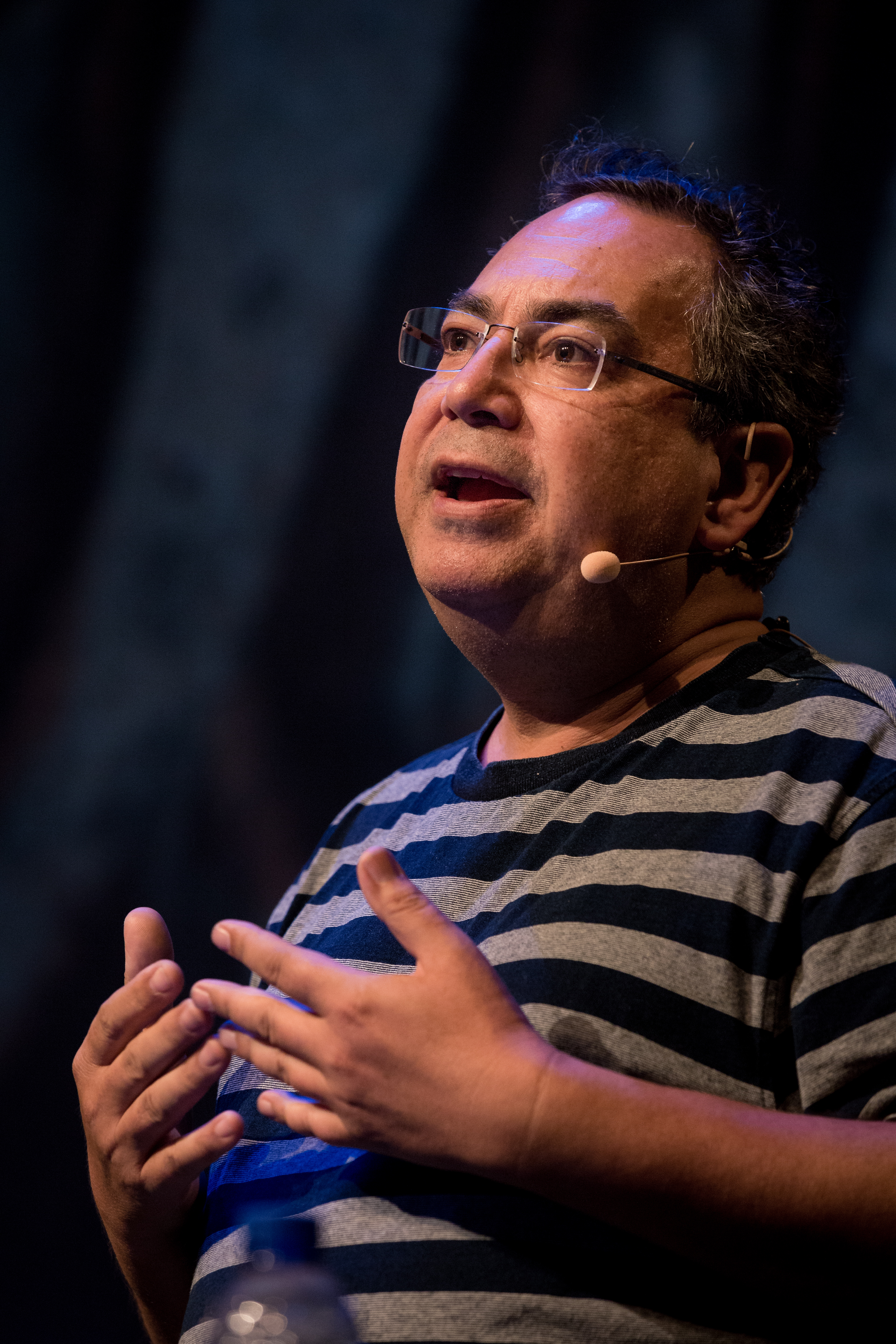
file name: Fred Smeijers A Typ I2018 photo by Michael Bundscherer
| | |
|
Luc Devroye ⦿ School of Computer Science ⦿ McGill University Montreal, Canada H3A 2K6 ⦿ lucdevroye@gmail.com ⦿ https://luc.devroye.org ⦿ https://luc.devroye.org/fonts.html |