TYPE DESIGN INFORMATION PAGE last updated on Thu Apr 16 21:59:21 EDT 2026
FONT RECOGNITION VIA FONT MOOSE
|
|
|
|
David Berlow (b. Boston, 1955) entered the type industry in 1978 as a letter designer for the Mergenthaler, Linotype, Stempel, and Haas typefoundries. He joined the newly formed digital type supplier, Bitstream, Inc. in 1982. After Berlow left Bitstream in 1989, he founded The Font Bureau, Inc. with Roger Black. Font Bureau has developed more than 300 new and revised type designs for The Chicago Tribune, The Wall Street Journal, Entertainment Weekly, Newsweek, Esquire, Rolling Stone, Hewlett Packard and others, with OEM work for Apple Computer Inc. and Microsoft Corporation. The Font Bureau Retail Library consists mostly of original designs and now includes over 1,000 typefaces. In a video made for Mike Parker's TDC medal in 2011, Mike Parker says that David Berlow is the most talented type designer he ever met. David lives in Martha's Vineyard. At ATypI 2004 in Prague, David spoke about Daily types. At ATypI 2009 in Mexico City, he spoke on The heart of my letter, (and the online version). Since that time he has been very active and vocal on the issue of high quality web fonts. Speaker at ATypI 2011 in Reykjavik and at ATypI 2014 in Barcelona. David Berlow Type Specimens (free pdf). Another type specimen booklet. Interview by A List Apart in 2009. Speaker at ATypI 2010 in Dublin. FontShop link. www.typovideo.de/david-berlow. David Berlow on web fonts. Interview by The Boston Globe. His typefaces:
View David Berlow's typefaces. Another catalog of David Berlow's fonts. Speaker at ATypI 2018 in Antwerp. |
EXTERNAL LINKS |
| | |

file name: Font Bureau Desdemona 1992

file name: David Berlow Windy Hair
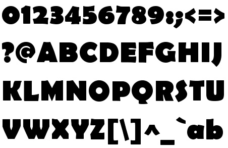
file name: Font Bureau Berlin Sans F B Bold 1997
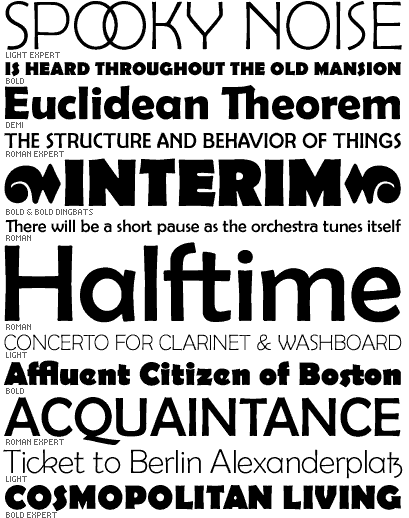
file name: David Berlow Matthew Butterick Berlin Sans 1994b
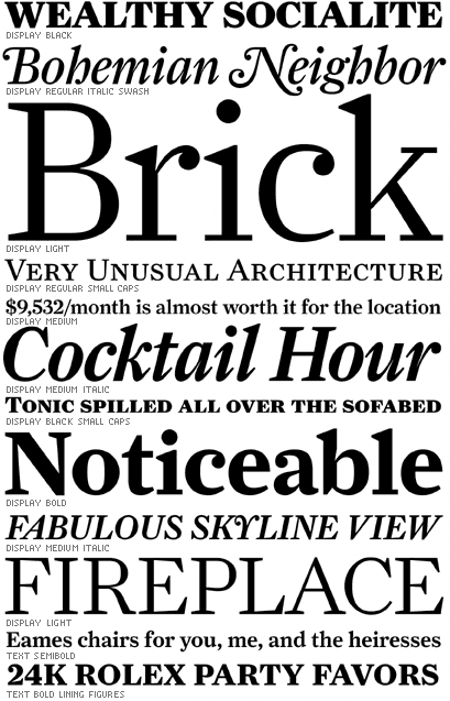
file name: Font Bureau Farnham
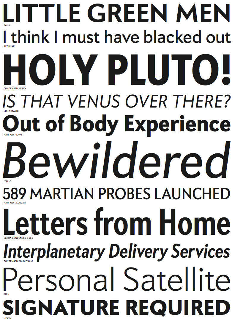
file name: David Berlow Apres 2008
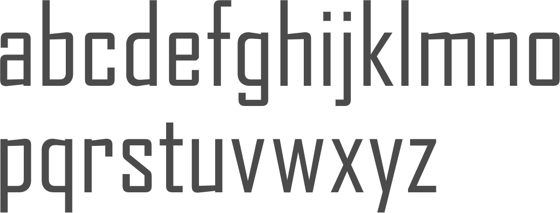
file name: David Berlow Agency F B 1995

file name: Font Bureau Agency F B in use Zero Dark Thirty Movie Poster 2012
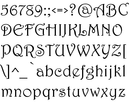
file name: Font Bureau Harrington 1992

file name: Matthew Carter David Berlow Skia 1993
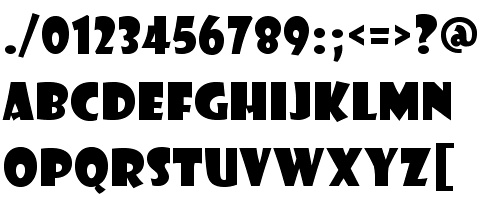
file name: Font Bureau Showcard Gothic 1997
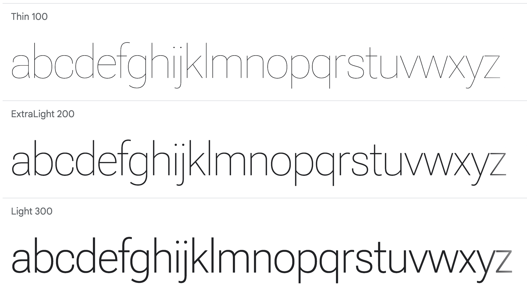
file name: Font Bureau David Berlow Santiago Orozco Irene Vlachou Ilya Ruderman Yury Ostromentsky Mikhail Strukov Roboto Flex 2022
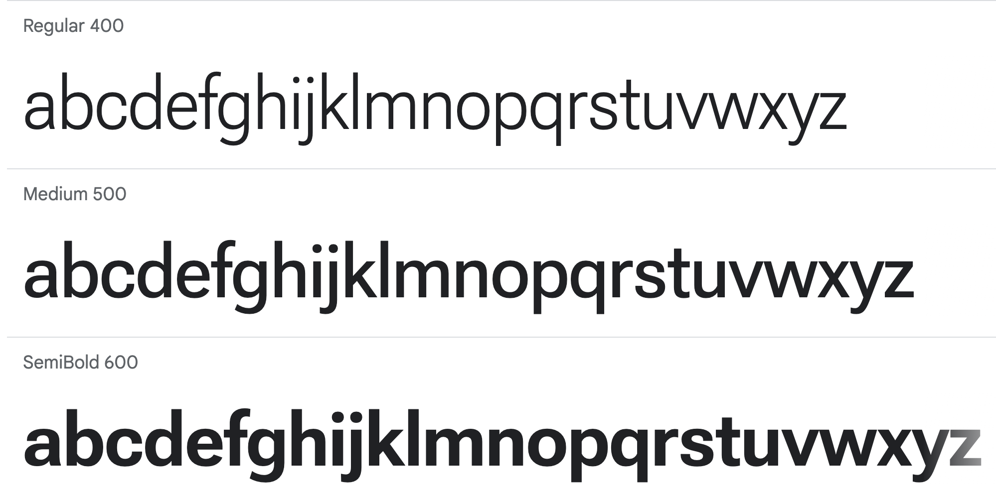
file name: Font Bureau David Berlow Santiago Orozco Irene Vlachou Ilya Ruderman Yury Ostromentsky Mikhail Strukov Roboto Flex 2022

file name: Font Bureau David Berlow Santiago Orozco Irene Vlachou Ilya Ruderman Yury Ostromentsky Mikhail Strukov Roboto Flex 2022
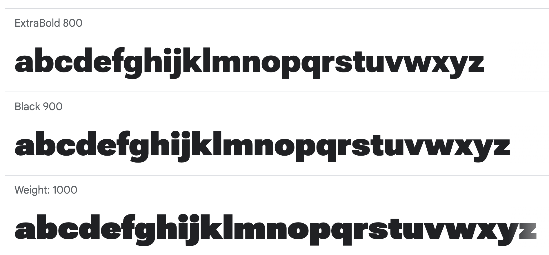
file name: Font Bureau David Berlow Santiago Orozco Irene Vlachou Ilya Ruderman Yury Ostromentsky Mikhail Strukov Roboto Flex 2022
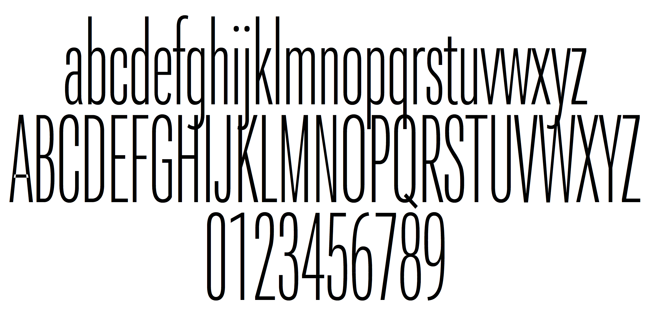
file name: David Berlow Roboto Flex 2017
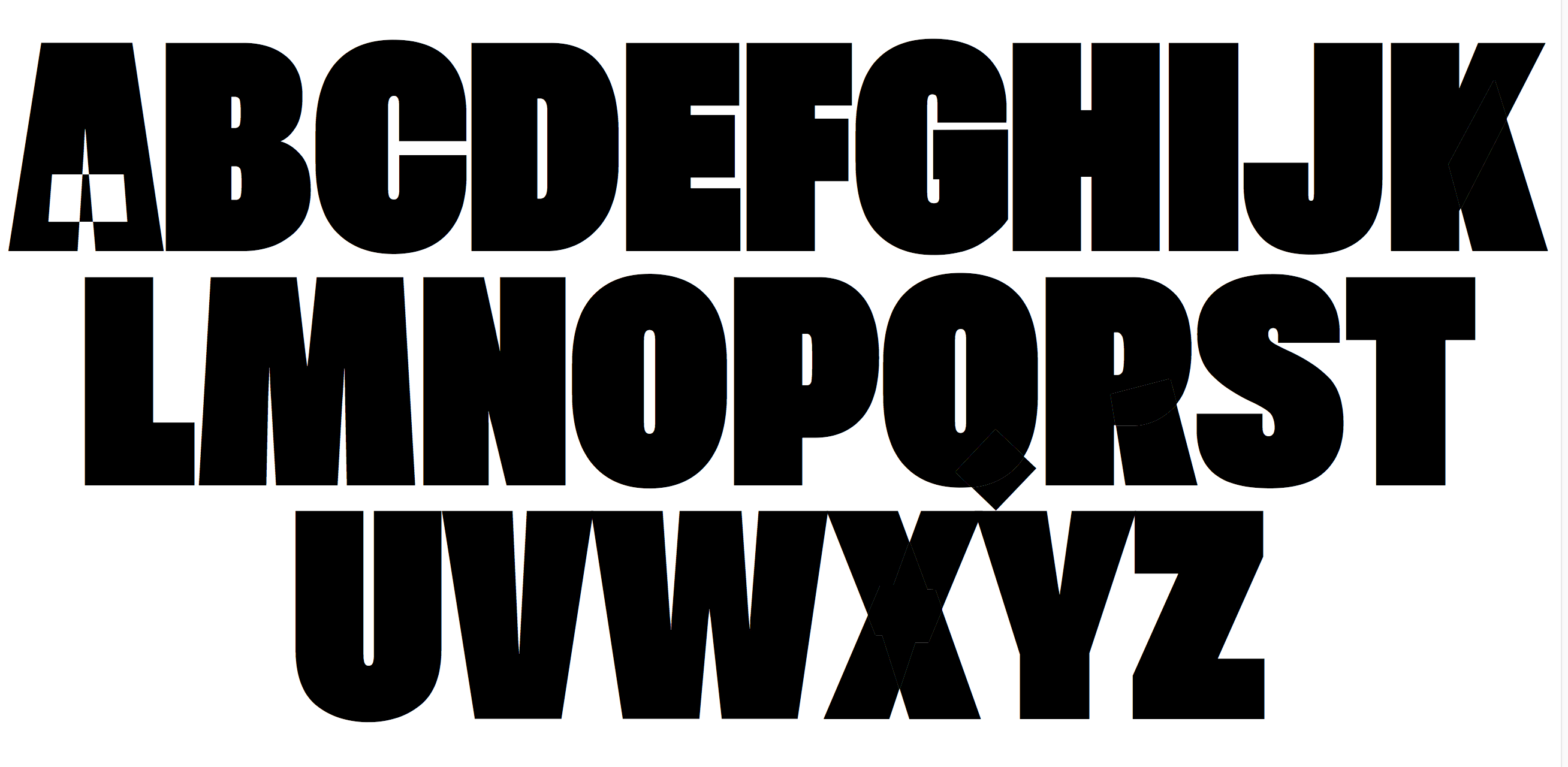
file name: David Berlow Roboto Flex 2017
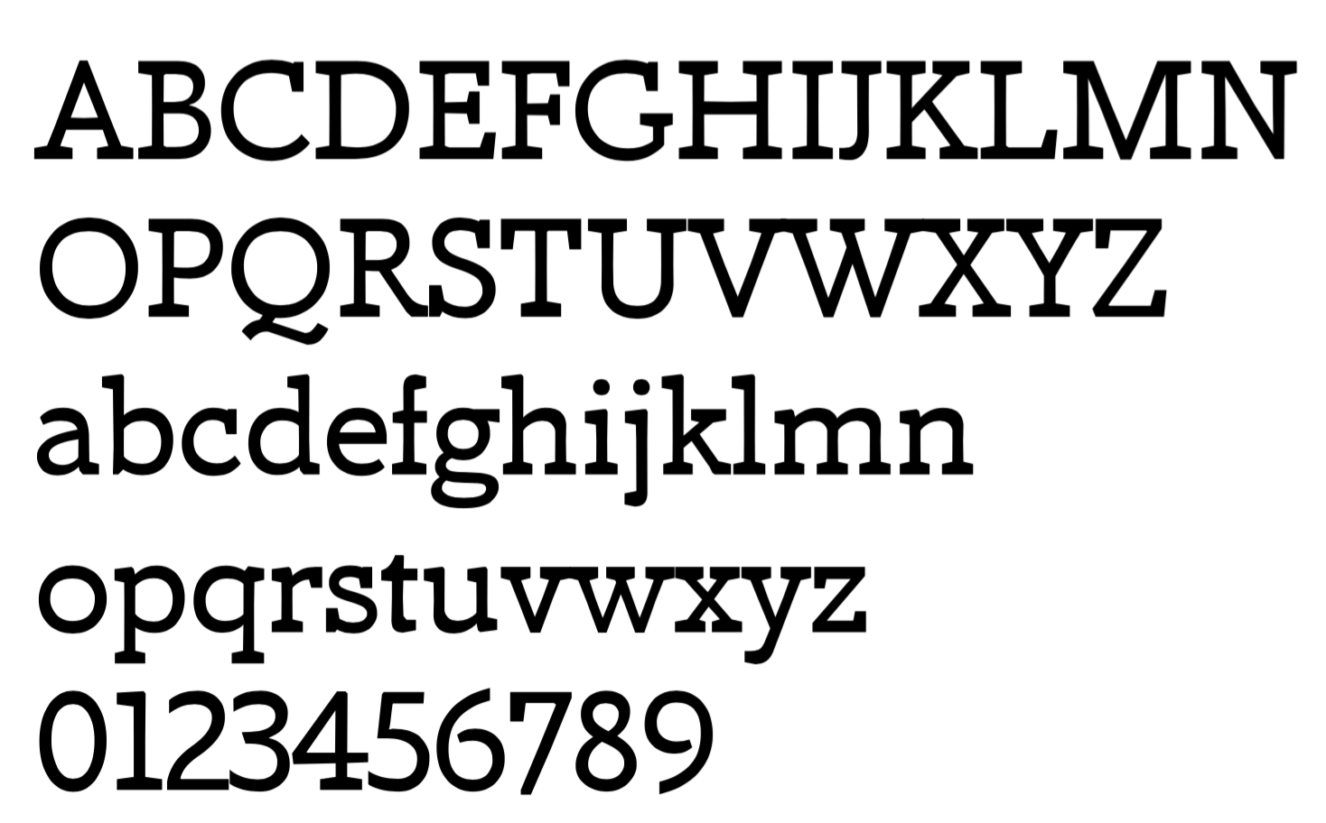
file name: David Berlow Amstelvar 2017
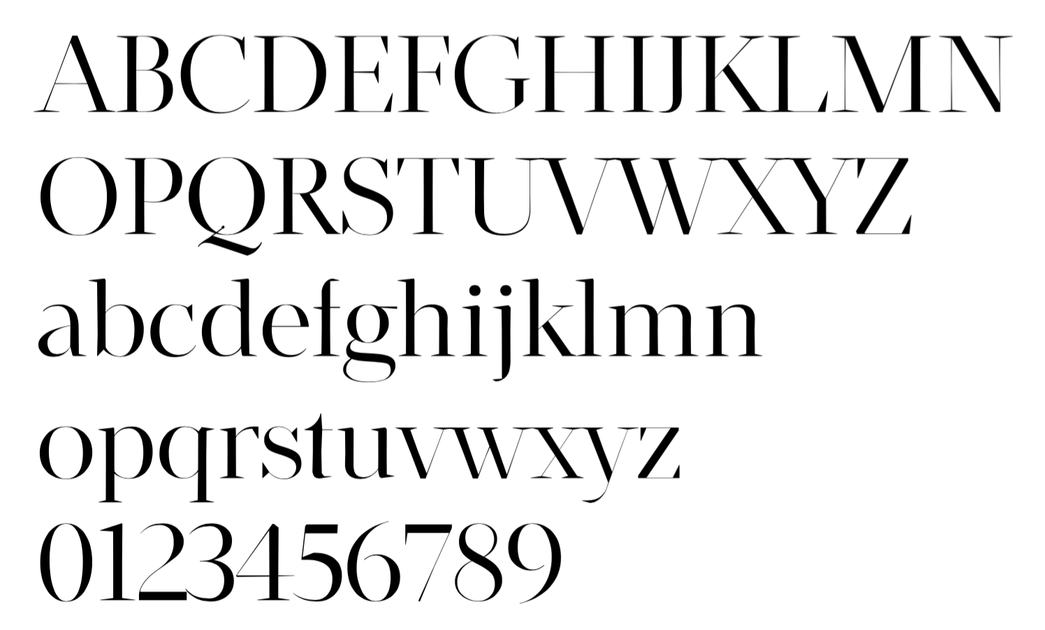
file name: David Berlow Amstelvar 2017b
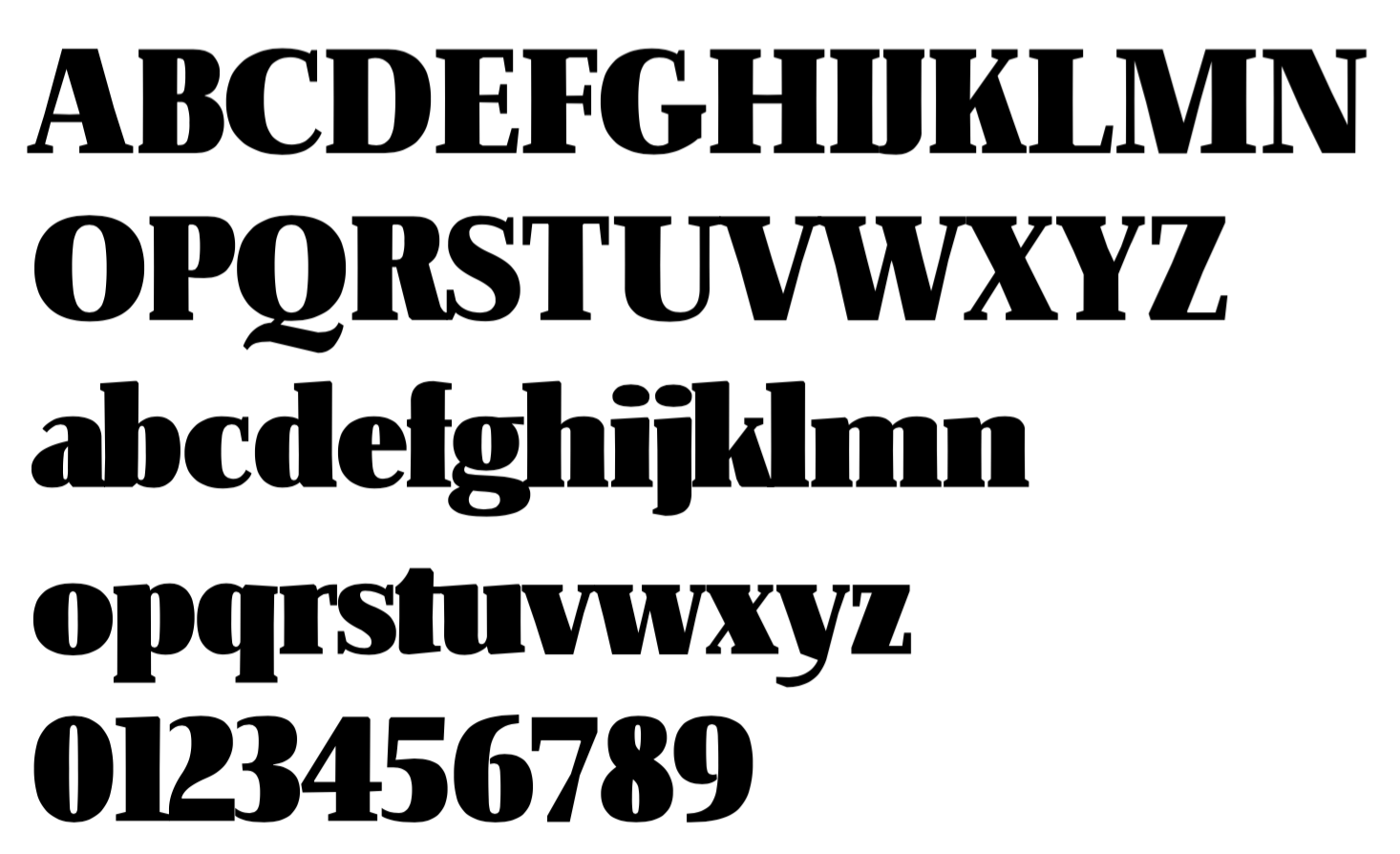
file name: David Berlow Amstelvar 2017c
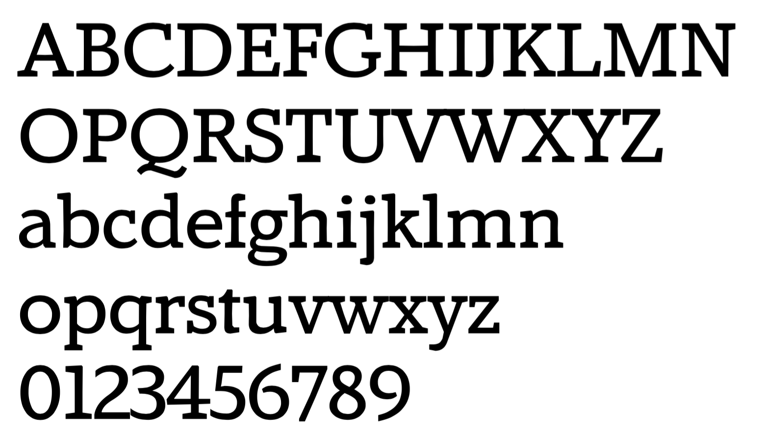
file name: David Berlow Amstelvar 2017d
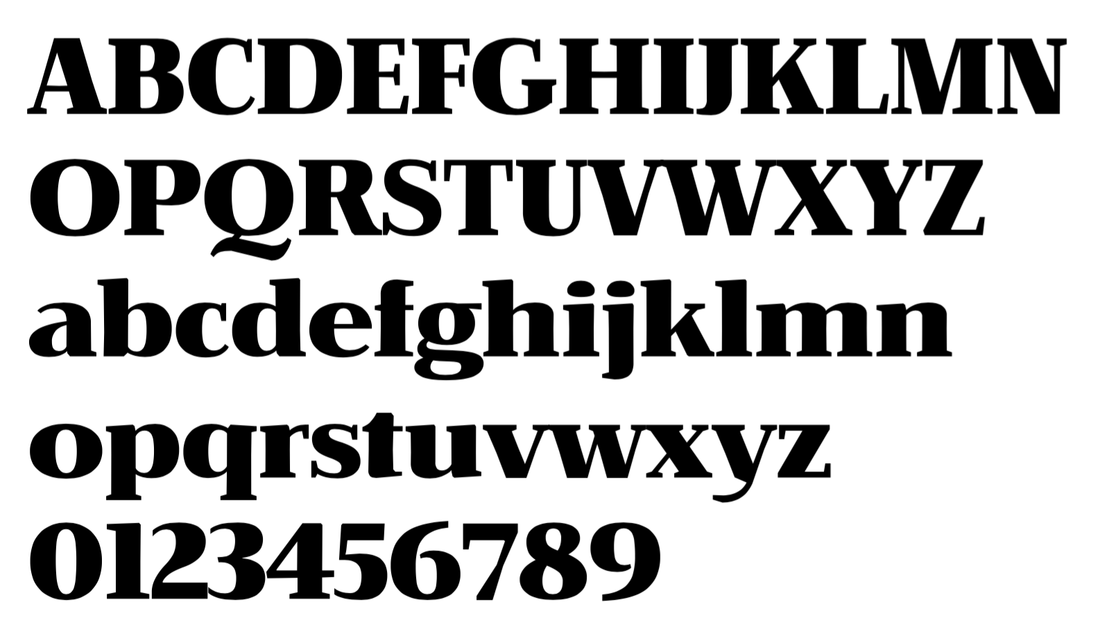
file name: David Berlow Amstelvar 2017e

file name: David Berlow Decovar 2017

file name: David Berlow Decovar 2017
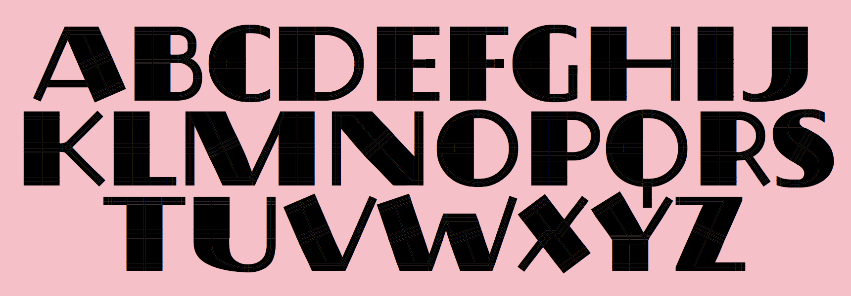
file name: David Berlow Decovar 2017a
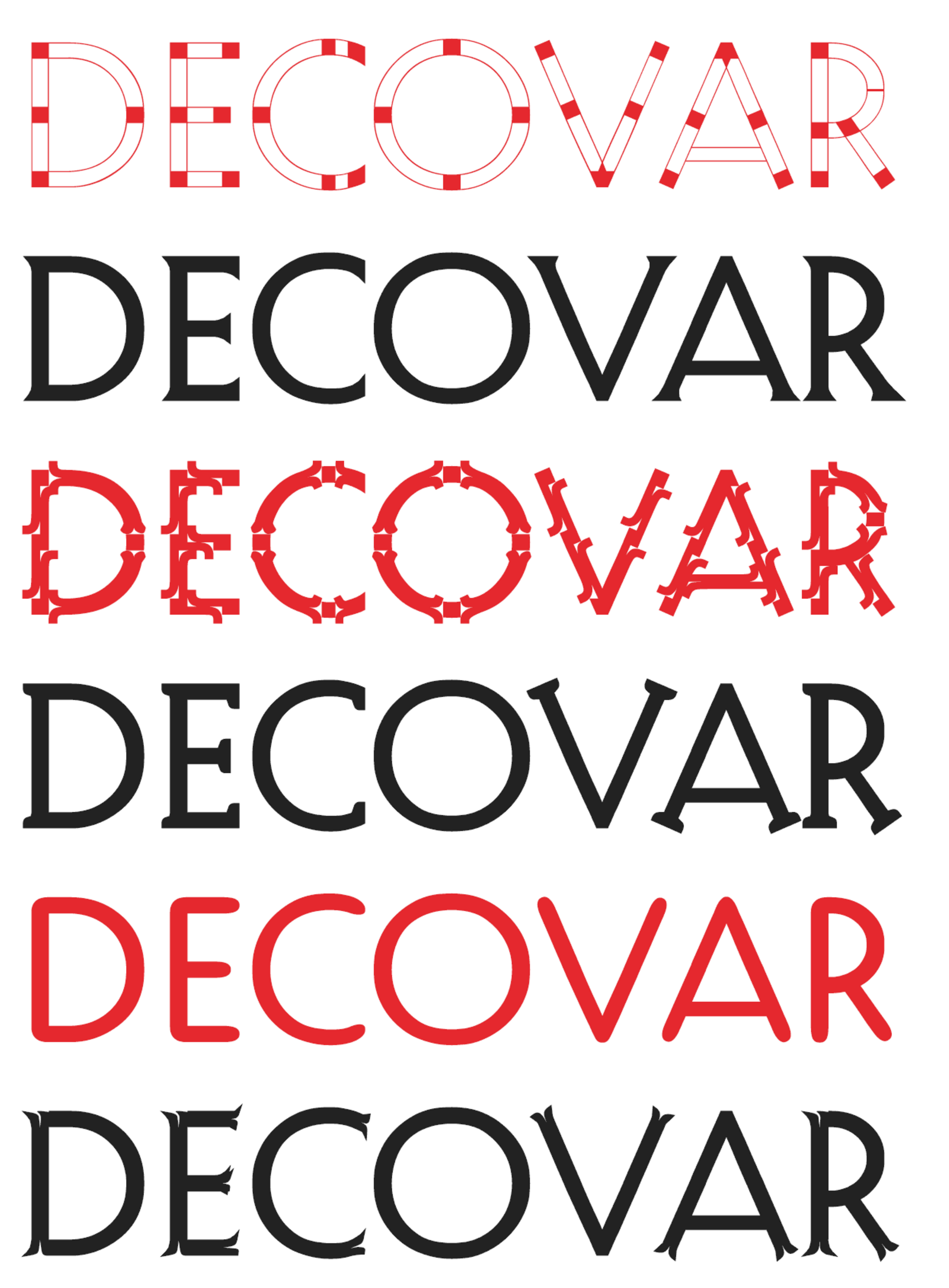
file name: David Berlow Decovar 2017b

file name: David Berlow Decovar 2017c

file name: David Berlow Decovar 2017d
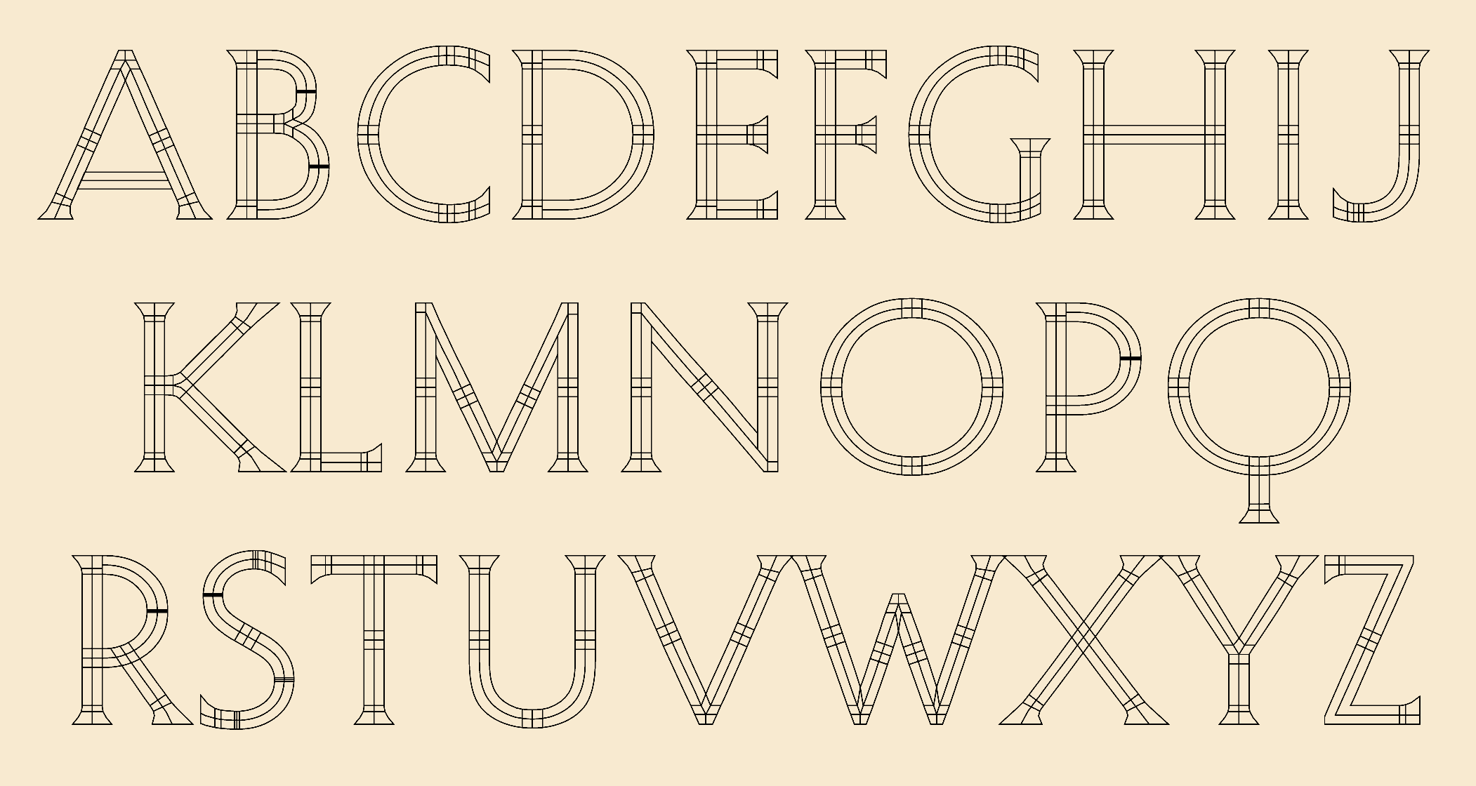
file name: David Berlow Decovar 2017e

file name: Font Bureau Whitman Display 2010
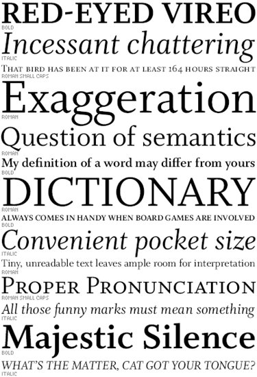
file name: Font Bureau Whitman
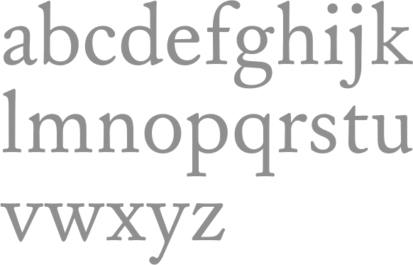
file name: Font Bureau William Caslon Text 2010
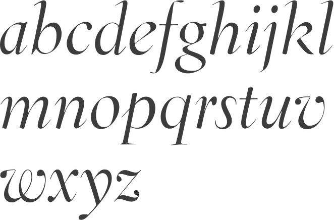
file name: David Berlow Jane Patterson Tobias Frere Jones Tom Rickner Eldorado Display Italic 1993 1994

file name: David Berlow Jane Patterson Tobias Frere Jones Tom Rickner Eldorado Display Roman 1993 1994
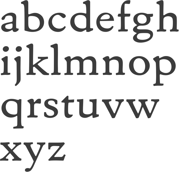
file name: David Berlow Jane Patterson Tobias Frere Jones Tom Rickner Eldorado Micro Roman 1993 1994

file name: David Berlow Jane Patterson Tobias Frere Jones Tom Rickner Eldorado Text Light S C 1993 1994
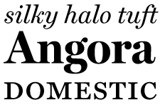
file name: Font Bureau Miller
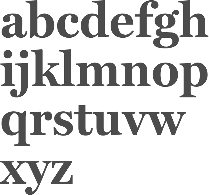
file name: Matthew Carter Cyrus Highsmith Tobias Frere Jones Font Bureau Miller 1997
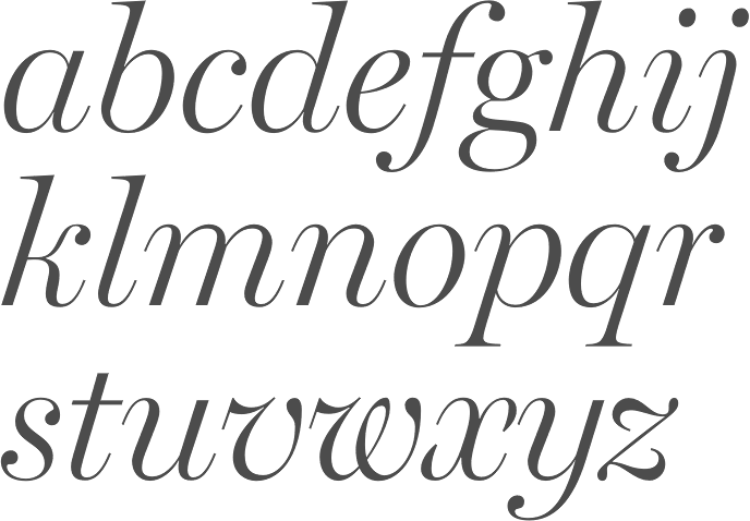
file name: Matthew Carter Cyrus Highsmith Tobias Frere Jones Font Bureau Miller 1997b
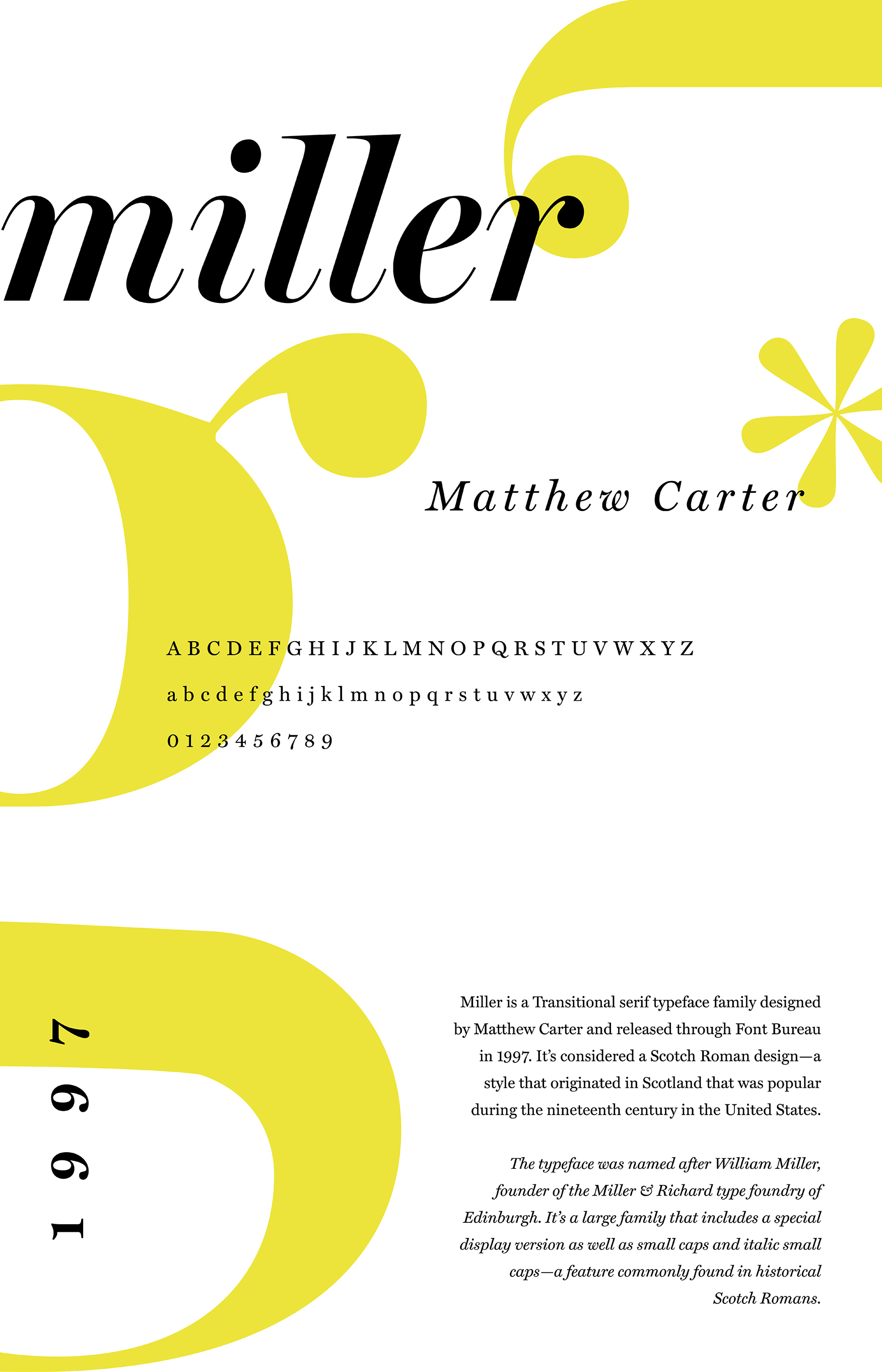
file name: Matthew Carter Cyrus Highsmith Tobias Frere Jones Font Bureau Miller 1997 poster by Soumya Jain 2018
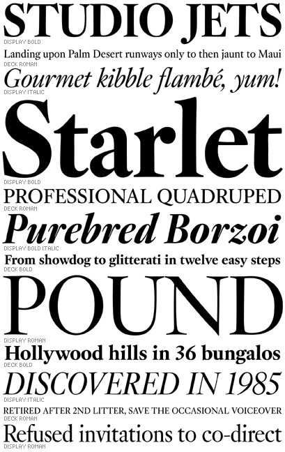
file name: David Berlow Kis F B 2007

file name: David Berlow Giza 1994

file name: David Berlow Giza
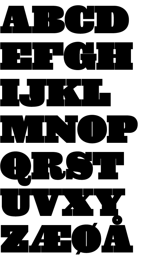
file name: David Berlow Giza

file name: David Berlow Letras Oldstyle 1998
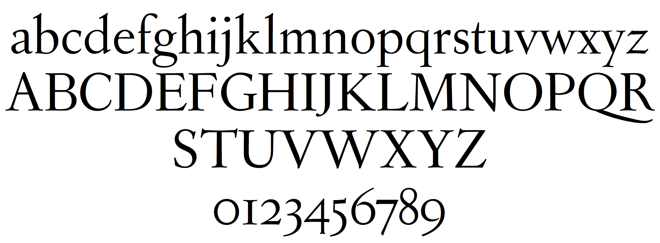
file name: David Berlow Letras Oldstyle 1998a

file name: David Berlow Letras Oldstyle 1998b

file name: David Berlow Letras Oldstyle 1998c
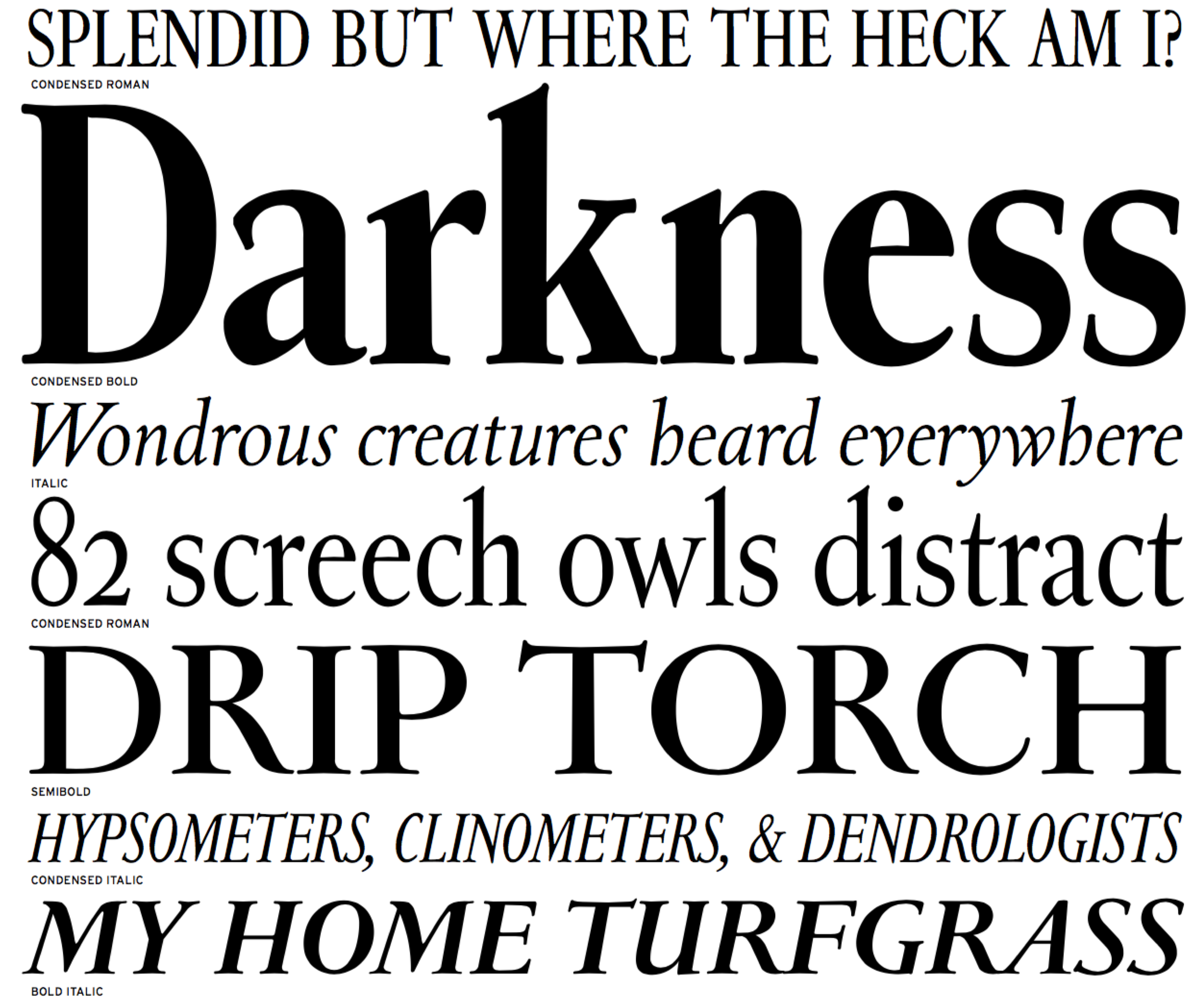
file name: David Berlow Letras Oldstyle 1998d
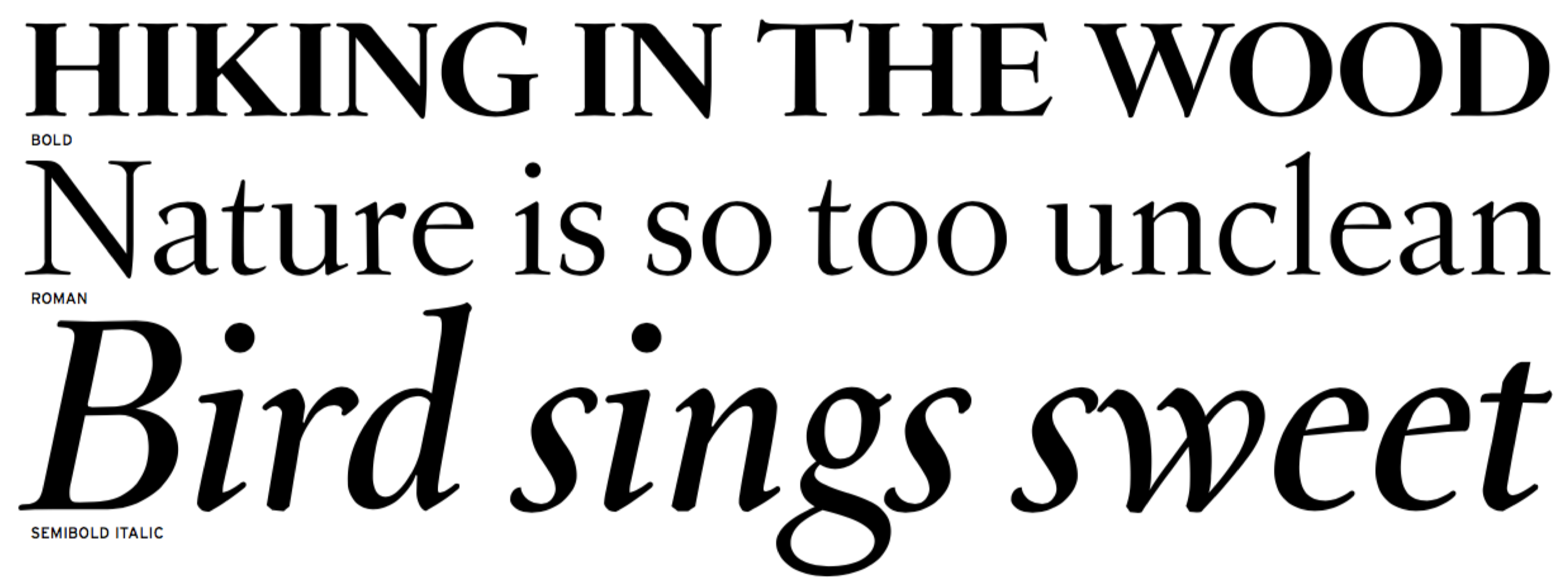
file name: David Berlow Letras Oldstyle 1998e

file name: David Berlow Custer R E 2014

file name: David Berlow Custer R E 2014b
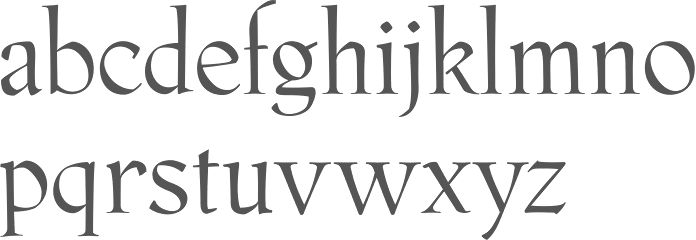
file name: Just Van Rossum David Berlow Phaistos 1990 1991
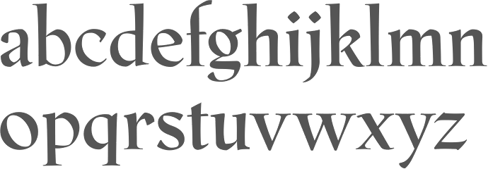
file name: Just Van Rossum David Berlow Phaistos Bold 1990 1991
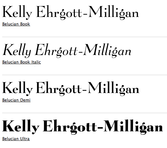
file name: Kelly Ehrgott Milligan David Berlow Belucian 1990 after Lucian Bernhard 1928

file name: Kelly Ehrgott Milligan David Berlow Belucian Demi 1990 after Lucian Bernhard 1928
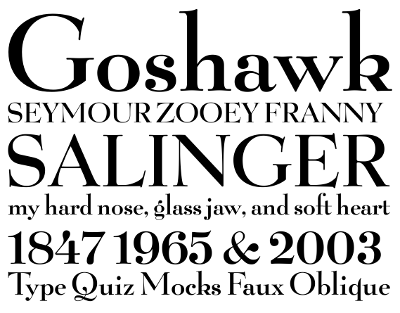
file name: Kelly Ehrgott Milligan David Berlow Belucian Demi 1990 after Lucian Bernhard 1928b
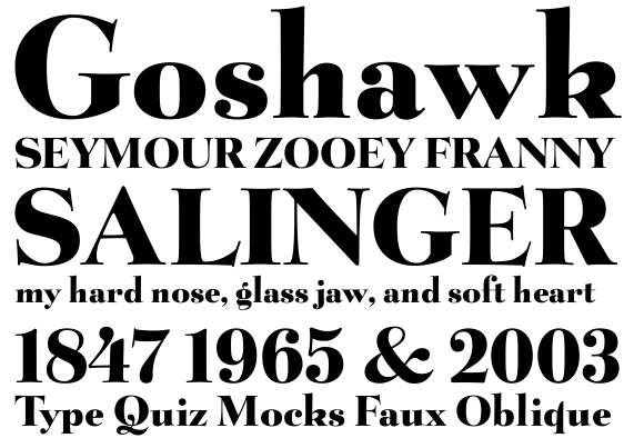
file name: Kelly Ehrgott Milligan David Berlow Belucian Ultra 1990 after Lucian Bernhard 1928

file name: Kelly Ehrgott Milligan David Berlow Belucian Ultra 1990 after Lucian Bernhard 1928b
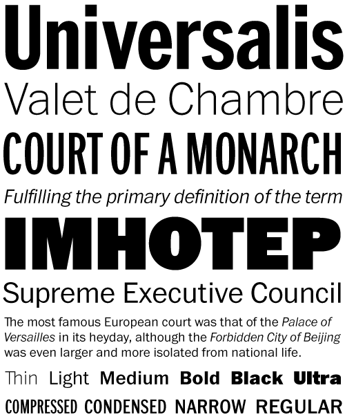
file name: David Berlow I T C Franklin 2010version
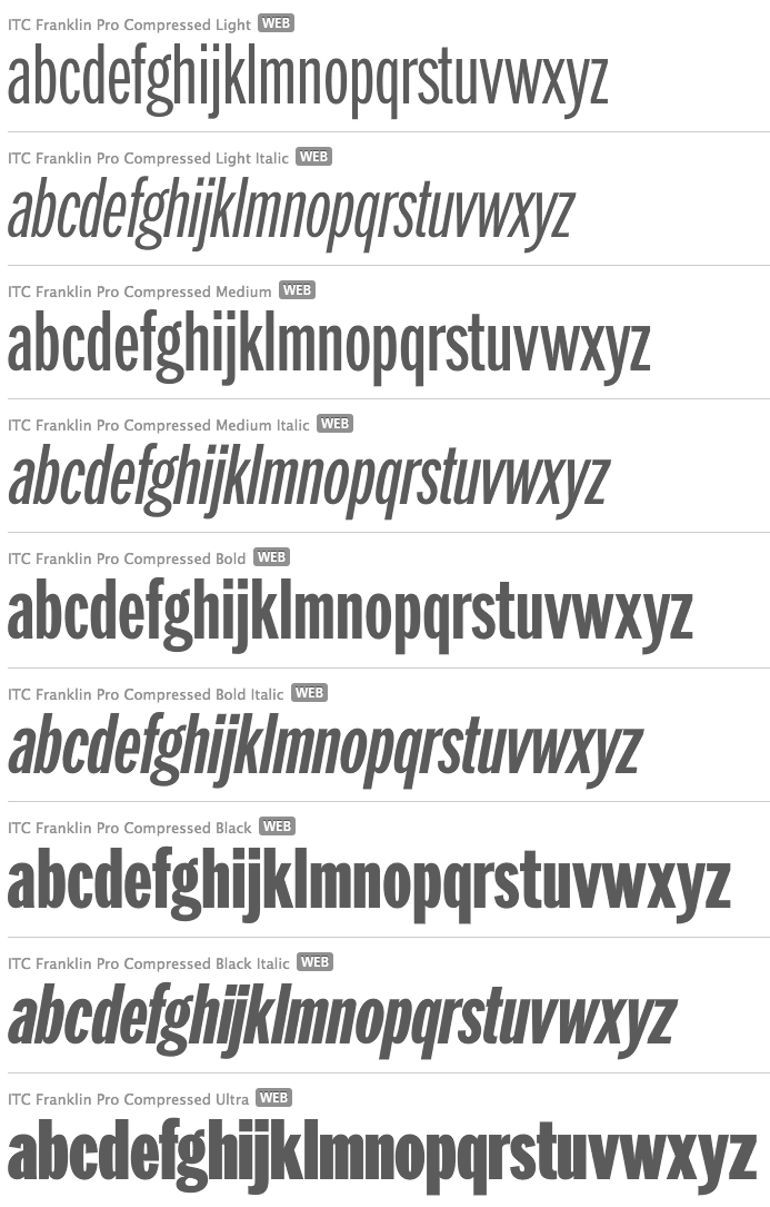
file name: David Berlow I T C Franklin Pro Compressed 1991 2008

file name: David Berlow I T C Franklin Pro Ultra 1991 2008
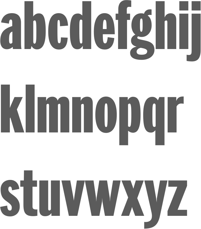
file name: David Berlow I T C Franklin Std Compressed Black 1991 2008

file name: David Berlow I T C Franklin Std Narrow Ultra 1991 2008

file name: David Berlow Meyer Two 1994 after L B Meyer 1926
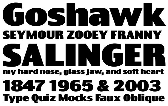
file name: David Berlow Truth Ultra 2005

file name: David Berlow Juliana Text Roman S C 2010

file name: David Berlow Titling Gothic F B Normal Light 2005b

file name: David Berlow Titling Gothic F B Skyline Bold 2005b

file name: David Berlow Titling Gothic F B Skyline Medium 2005b

file name: David Berlow Titling Gothic F B Skyline Medium 2005c

file name: David Berlow Richard Lipton Moderno F B Comp Bold 1995

file name: David Berlow Richard Lipton Moderno F B Comp Light 1995
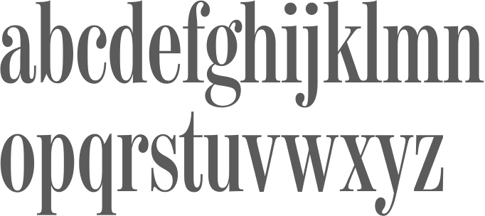
file name: David Berlow Richard Lipton Moderno F B Comp Regular 1995

file name: David Berlow Richard Lipton Moderno F B Comp Semibold Italic 1995
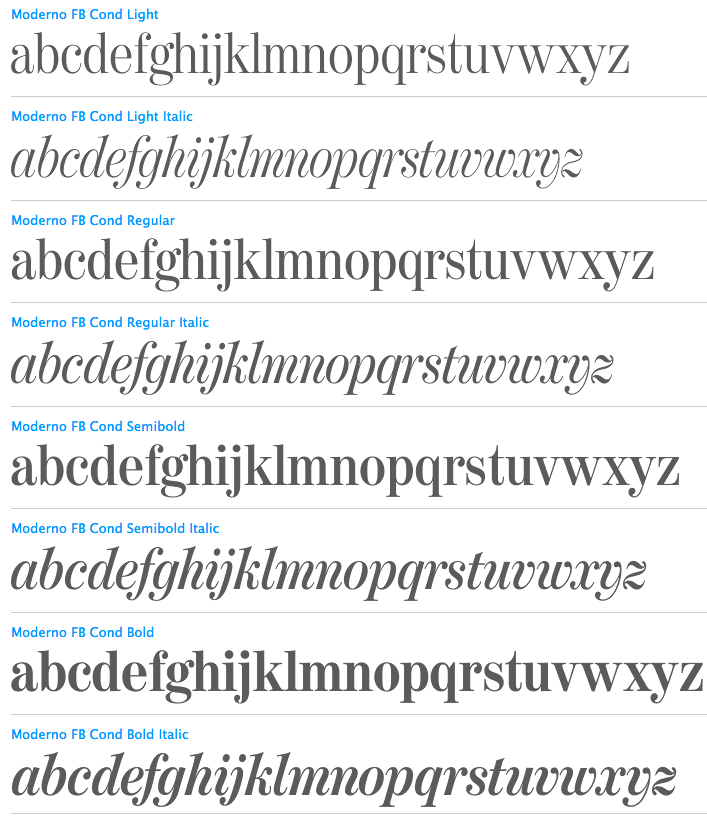
file name: David Berlow Richard Lipton Moderno F B Cond 1995

file name: David Berlow Belizio 1987 Poster by Jenny O Grady 2015
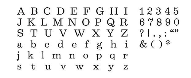
file name: David Berlow Belizio 1987 Poster by Jenny O Grady 2015a
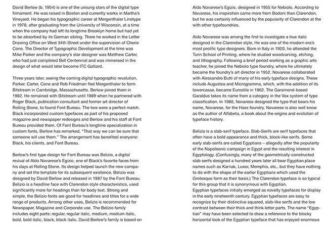
file name: David Berlow Belizio 1987 Poster by Jenny O Grady 2015b
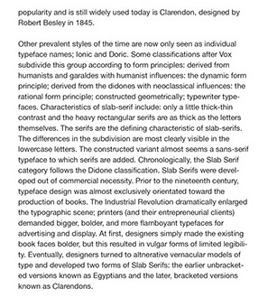
file name: David Berlow Belizio 1987 Poster by Jenny O Grady 2015d
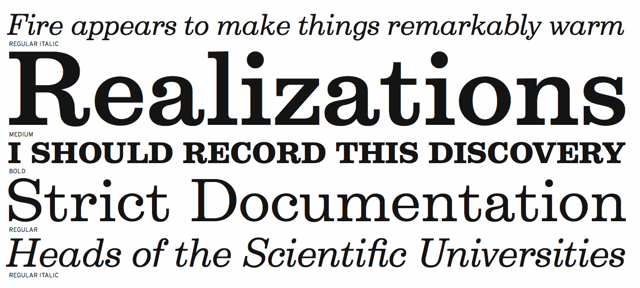
file name: Font Bureau Belizio 1987 1988

file name: David Berlow Belizio Black 1987
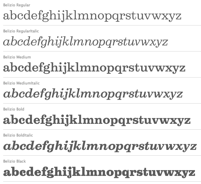
file name: David Berlow Belizio Black 1987b

file name: David Berlow Millenium B T Bold Extended 1989
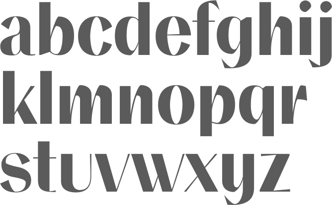
file name: David Berlow Numskill 1990
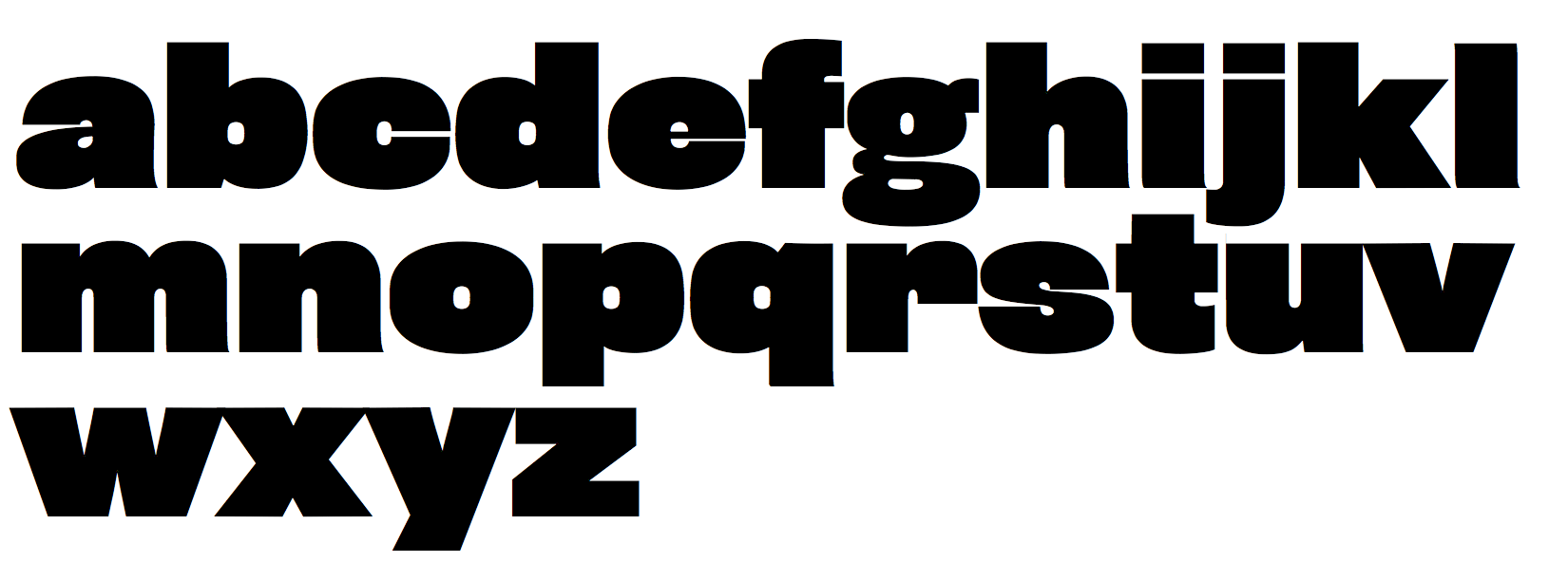
file name: Font Bureau Rhode Black Normal 1997.b
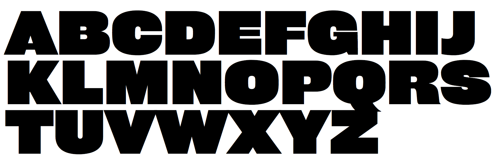
file name: Font Bureau Rhode Black Normal 1997
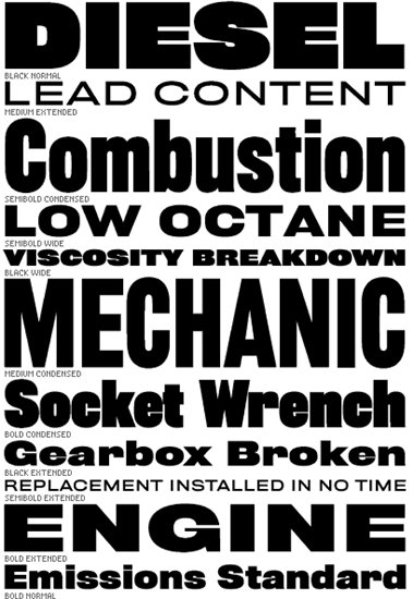
file name: Font Bureau Rhode

file name: David Berlow Portrait 2018

file name: David Berlow Pic

file name: David Berlow A Typ I2018 photo by Michael Bundscherer

file name: David Berlow A Typ I2018 photo by Michael Bundscherer
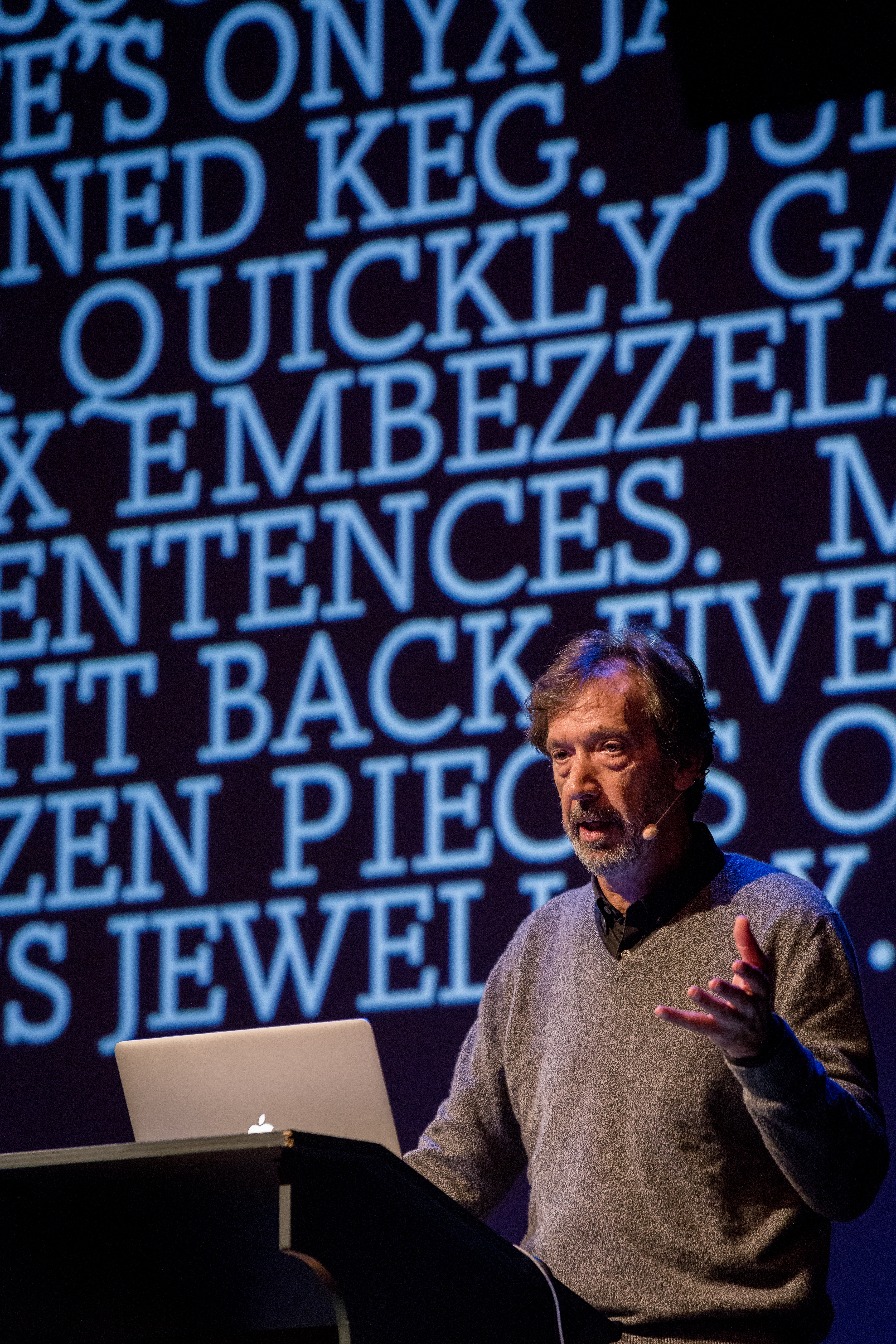
file name: David Berlow A Typ I2018 photo by Michael Bundscherer

file name: David Berlow A Typ I2018 photo by Michael Bundscherer
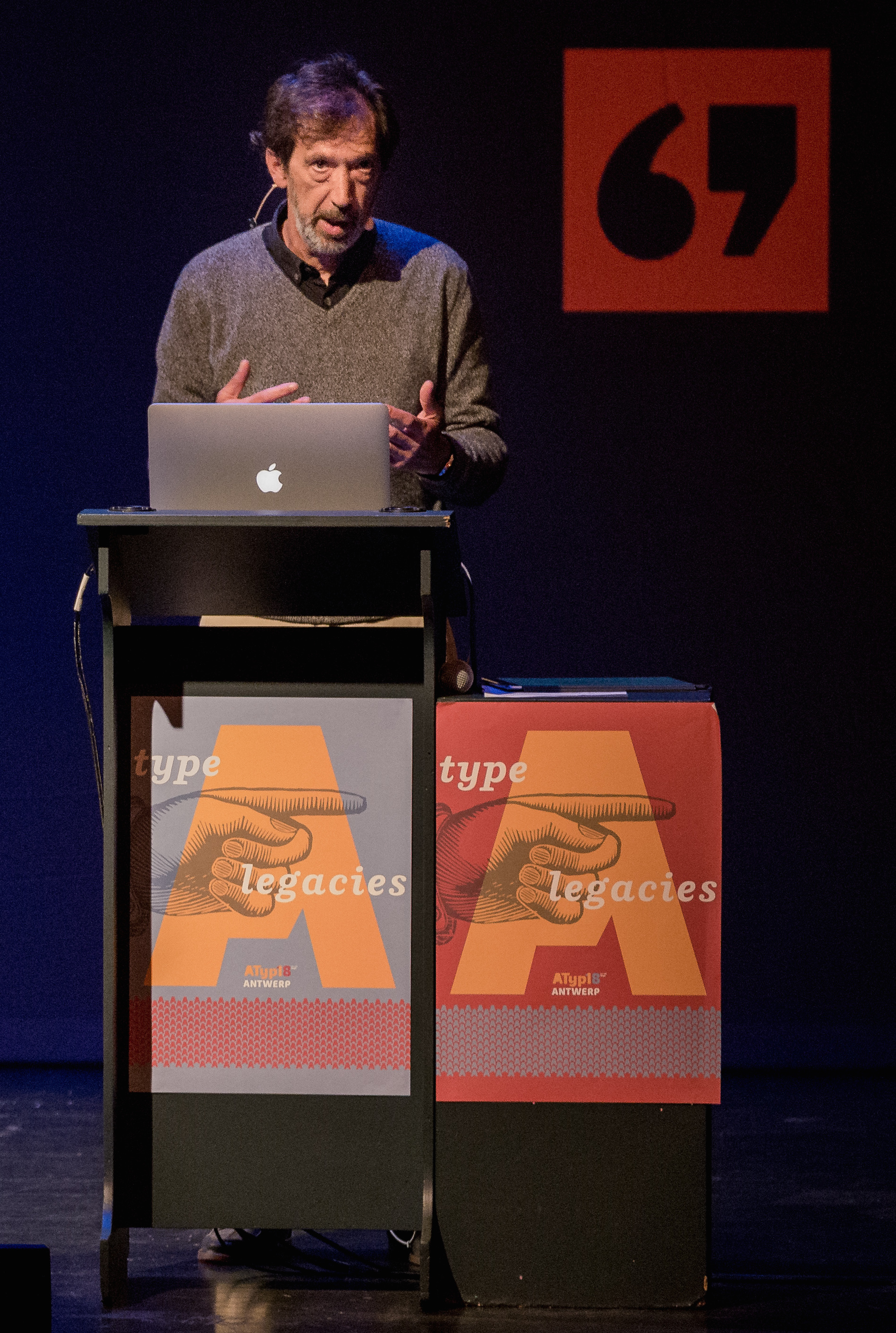
file name: David Berlow A Typ I2018 photo by Michael Bundscherer
| | |
|
Luc Devroye ⦿ School of Computer Science ⦿ McGill University Montreal, Canada H3A 2K6 ⦿ lucdevroye@gmail.com ⦿ https://luc.devroye.org ⦿ https://luc.devroye.org/fonts.html |

