|
Typography for Lawyers
[Matthew Butterick]

Great pages about typography and the choice of fonts for law documents. Written by type designer and civil litigation attorney, Matthew Butterick. Eloquent and convincing, these pages are good reading for any typographer. Summarizing his advice: - Typography is always important because presentation is always important.
- Good typography makes your written documents more professional and more persuasive.
- Sure, typography is important because presentation is important. But the substance of your argument and the quality of your writing is still the most important of all.
- Straight quotes should never, ever appear in your documents.
- You must always put exactly one space between sentences.
- In a printed document, don't underline. Ever.
- If everything is emphasized, then nothing is emphasized.
- Centered text is generally overused. It is like ordering plain cheese pizza--safe but boring.
- All-caps text, meaning text where all the letters are capitalized, is best used sparingly.
- A paragraph mark or section mark should always be followed by a nonbreaking space so that the mark stays joined with the numerical reference that follows.
- A nonbreaking space should usually be used in front of any numerical or alphabetic reference. It should definitely appear after paragraph marks and section marks.
- Novelty fonts, weird fonts, outline fonts, shadow fonts have no place in any document created by a lawyer. Save it for your next career as a designer of breakfast-cereal boxes.
- Avoid using the core operating system fonts in printed documents. On Windows, that means Arial, Calibri, Cambria, Candara, Comic Sans, Courier, Georgia, Helvetica, any flavor of Lucida, Palatino, Trebuchet, and Verdana. On the Mac, that means Arial, Courier, Helvetica, Palatino, Skia, and Verdana. Subject to a few exceptions, you should also avoid Times New Roman.
- Monospaced fonts were invented to suit the mechanical limitations of the typewriter. They were not invented because anyone liked them. Monospaced fonts are hard to read and they waste space.
- Hyphenation does not improve text legibility, so other things being equal, you should turn it off.
- Avoid squishing type (or stretching it to get expanded type). If you need a condensed or expanded typeface, get one that was designed for the purpose.
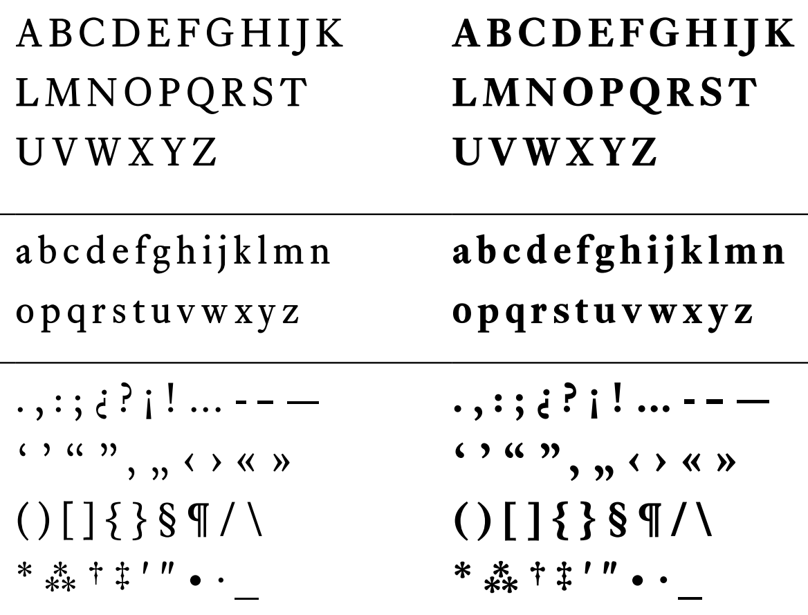
- Real small caps are so rare that when they actually show up in a legal document, it's like a beacon of classiness. As far as bang for the buck, there are few deals in this website better than small caps. Once you use them, you won't go back.
- I like fonts that seem to be at home in a legal document---clean, authoritative, but not relentlessly humdrum or self-consciously offbeat. I also look for fonts that have noncontroversial italic and bold styles, because lawyers use those frequently. [He mentions Galliard, Sabon, Stempel Garamond, Minion, Arno, Goudy Old Style and Bembo, and warns about Bodoni, Bookman and any sans face.]
|
EXTERNAL LINKS
Typography for Lawyers
MyFonts search
Monotype search
Fontspring search
Google search
INTERNAL LINKS
Choice of fonts ⦿
David and Goliath ⦿
Frederic William Goudy ⦿
Bembo ⦿
|