|
Type Supply
[Tal Leming]

Type Supply, Tal Leming's company, designs typefaces for corporations and publications. For example, they created - Baxter. An informal face used as a casula typeface in MyPublisher's BookMaker software. Commissioned by Christian Schwartz.
- Bullet (House). Bullet is based on a bit of lettering drawn by Ken Barber for the House Industries Pop Art package.
- Burbank. Signage, animation, or pakage lettering face.
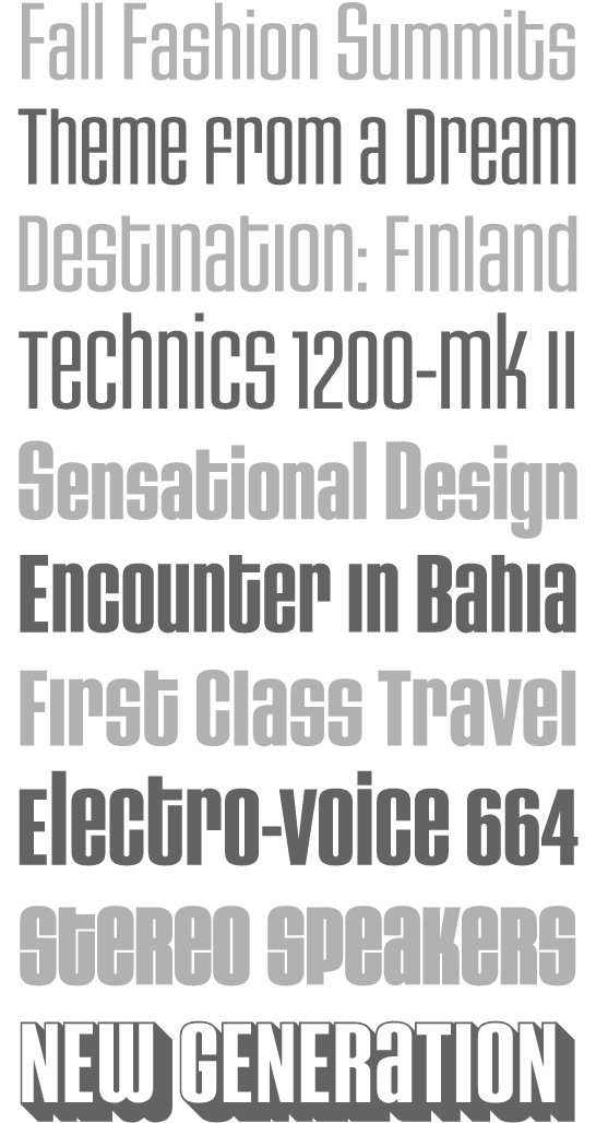
- House Gothic 23. Tal Leming writes: The family was originally designed by Allen Mercer for use on the company's commissions, most notably the legendary promotions for Custom Papers Group. In 1995, House released the family to the public with modest success, but it was largely relegated to the back of House's catalogs. House went through a bit of a sans serif obsession in the early 2000s and decided that it was time to give House Gothic its time in the spotlight. Rich Roat asked me to polish up House Gothic and make it a bit more usable. I completely reworked Allen's original drawings, making the letterforms work better in headlines, added accented glyphs, reorganized the styles and more. Once that was done, I added completely new Extended and Text styles. The family more than doubled its size into 23 total fonts and was rechristened House Gothic 23.
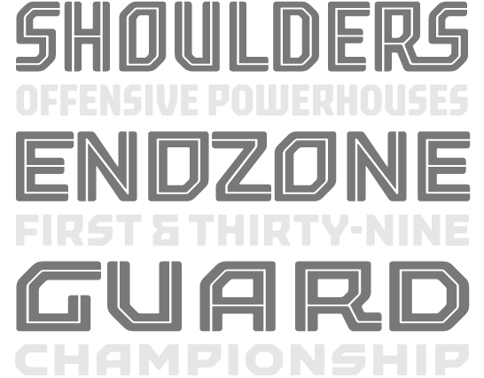
- Mission and Control. An athletic lettering family commissioned by Reebok for their 2008 NFL Sideline and NHL Center Ice collections.
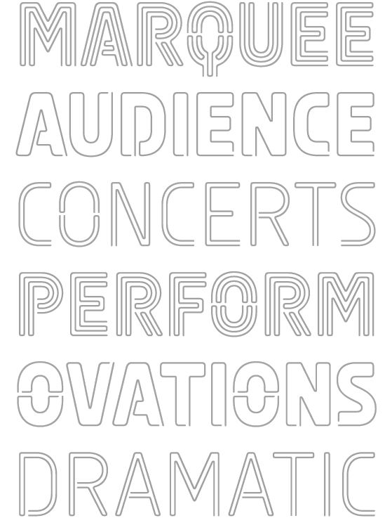
- Ohm. A neon type family.
- Runway (House). Runway is an ode to House's sans serif obsession of the early 2000s.
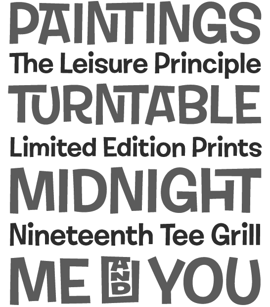
- Shag Lounge. a signage family: When I was working at House Industries, we decided that we should develop a font kit inspired by the work of Josh "Shag" Agle. Josh hadn't done much lettering work so we asked him to send us samples of lettering that he liked. Many of the things he sent featured whimsical, hand-cut lettering from the 1960s. We were really into this as well, so that formed the starting point for Shag Lounge. The typeface evolved into an amalgamation of a neo-grotesque style sans serif and hand-cut lettering.
- Torque. An octagonal family with a great inline style.
- United Ark. A military stencil face: Clint Schultz hired me to create a custom version of United for use on props in a Paramount feature film. The main goal of the project was to perfectly match stenciled lettering seen in a film released 27 years earlier. How exciting was it to make a typeface for a sequel to a classic film that I grew up with? Very, very, very, very exciting. This font is not, and will never be, available for relicensing, so please don't ask.
- United. House industries commissioned me to develop the United family as an homage to stereotypical U.S. Military lettering styles. [...] United has become quite popular since its release and it has been seen just about everywhere from NFL coverage on FOX to the New York Times editorial page.
Its designer and principal is Baltimore, MD-based Tal Leming: Tal Leming is a type designer, lettering artist and type technology specialist living and working in Baltimore, Maryland. After graduating from Louisiana State University in 1997 he worked for DSI-LA where he specialized in corporate identity and communication design. After his tenure at DSI-LA, he handled brand and promotion design duties at Zoom Design (now Bochanis Rogan Zoom) for a wide array of national and international clients. In 2001 he joined the legendary type foundry House Industries as a resident jack of all trades. While at House, he designed and produced a staggering number of over-inked, hyper-detailed catalogs and advertisements in addition to developing new typefaces for the House library. In 2005 he set out on his own to found Type Supply where he focuses on developing original typefaces and lettering while pushing the boundaries of type technology.
|
EXTERNAL LINKS
Type Supply
 [Designer info] [Designer info]
MyFonts search
Monotype search
Fontspring search
Google search
INTERNAL LINKS
|