TYPE DESIGN INFORMATION PAGE last updated on Tue Aug 26 11:02:56 EDT 2025
FONT RECOGNITION VIA FONT MOOSE

|
|
|
|
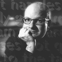
Steve Mehallo
Steve Mehallo was born in San Francisco in 1967. He is a freelance graphic designer, educator, illustrator and font designer specializing in brand strategies, custom font development and logos. His clients have included Monotype, Microsoft, Ascender Corp, The Unicode Consortium, Netscape, TiVo, Nike, The David and Lucile Packard Foundation, The Learning Company and several more. He is also a past president of the Art Directors and Artists Club of Sacramento, board member of Another Poster for Peace, was the lead curator of the contemporary graphic design exhibition Spoken With Eyes at the UC Davis Design Museum and has taught design courses at UC Davis, Santa Clara University, The Art Institute of California and Sacramento-based American River College. First Redwood City, CA, and now Sacramento, CA-based. Creator of these fonts:
|
EXTERNAL LINKS |
| | |


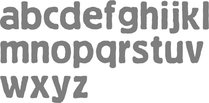
file name: Steve Mehallo Niedermann Grotesk 2011

file name: Steve Mehallo Niedermann Grotesk 2011b

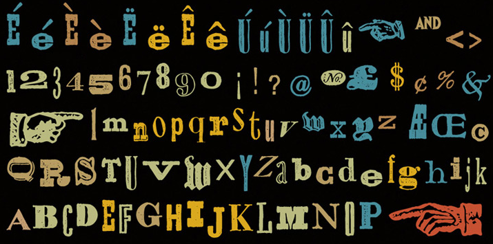
file name: Steve Mehallo Jeanne Moderno 2009

file name: Steve Mehallo Jeanne Moderno2009
file name: Steve Mehallo 1994 Alta California
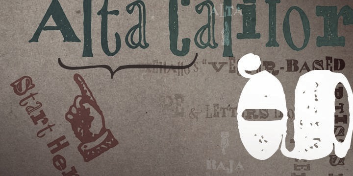
file name: Steve Mehallo Alta California 2008
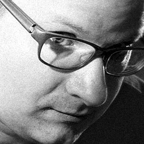
file name: Steve Mehallo Pic
file name: Steve Mehallo Pic
| | |
|
Luc Devroye ⦿ School of Computer Science ⦿ McGill University Montreal, Canada H3A 2K6 ⦿ lucdevroye@gmail.com ⦿ https://luc.devroye.org ⦿ https://luc.devroye.org/fonts.html |