TYPE DESIGN INFORMATION PAGE last updated on Mon Jul 13 21:18:35 EDT 2026
FONT RECOGNITION VIA FONT MOOSE

|
|
|
|
Terrestrial Design
[Carl Crossgrove]
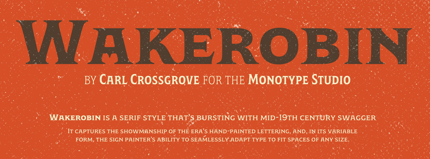
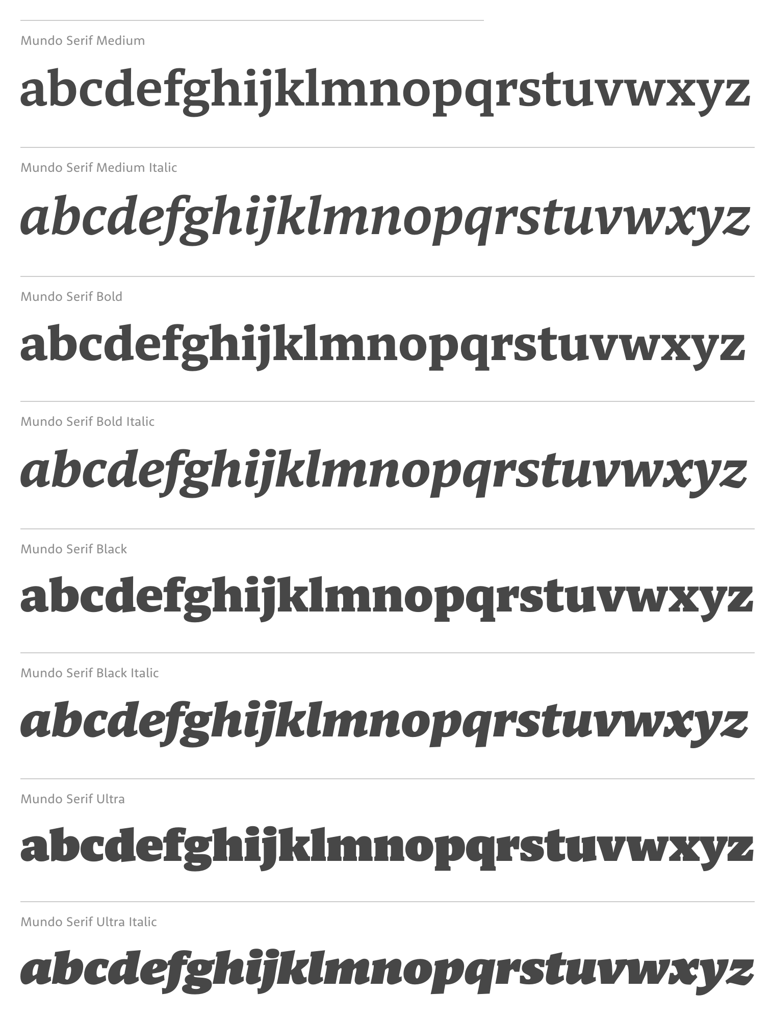
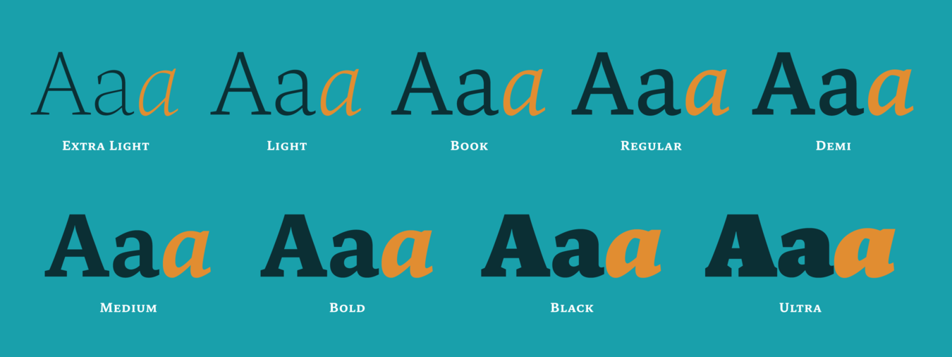
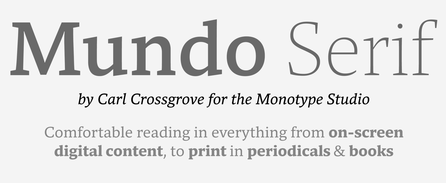
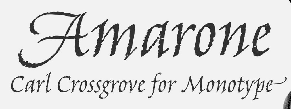
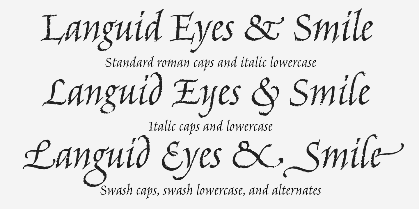
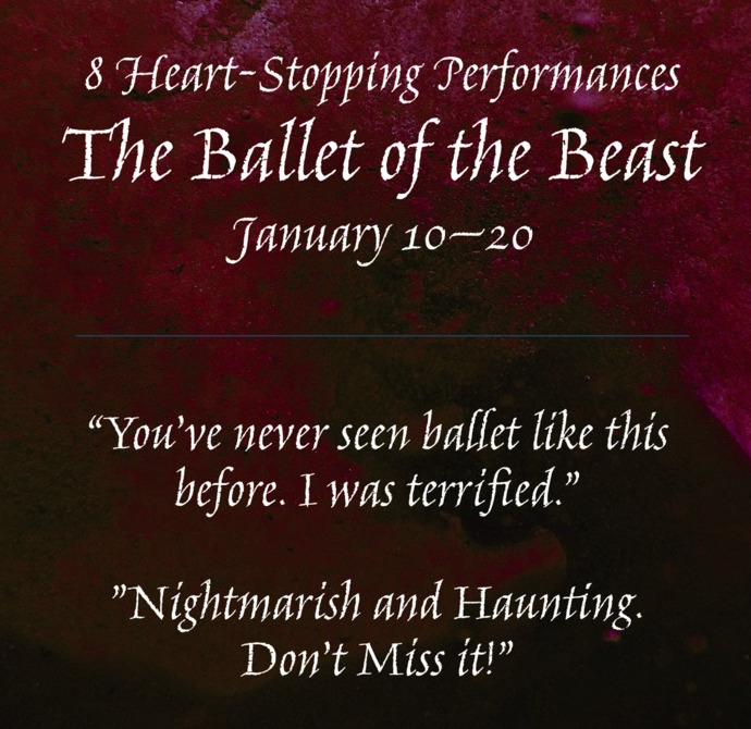
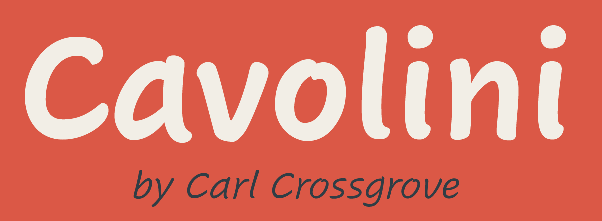
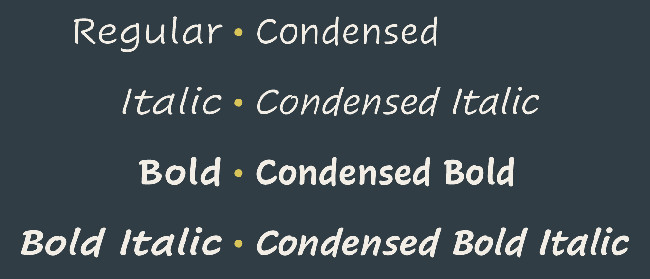
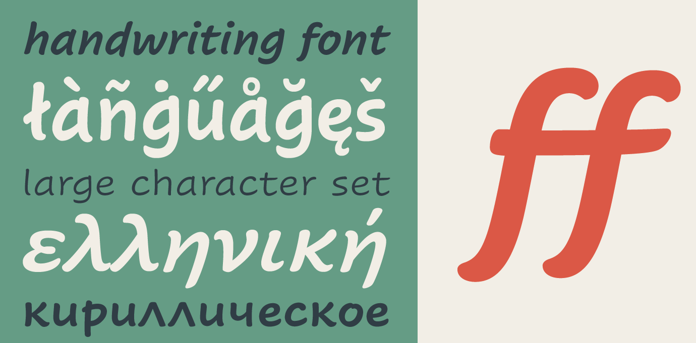
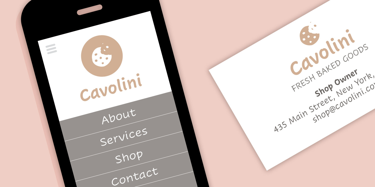
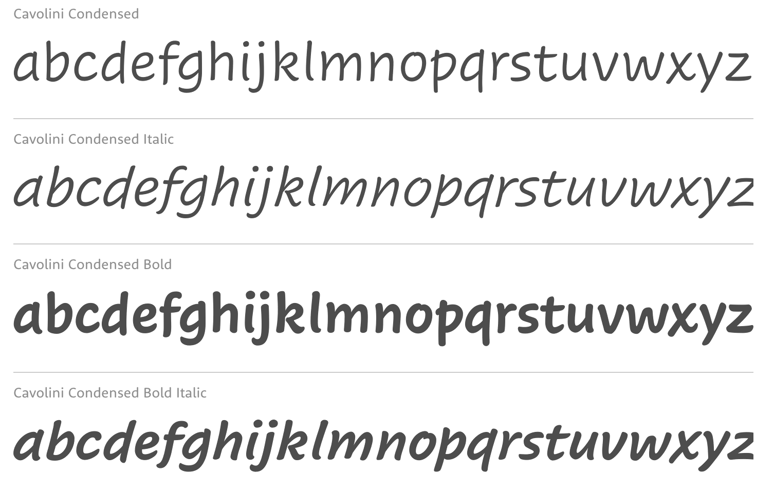
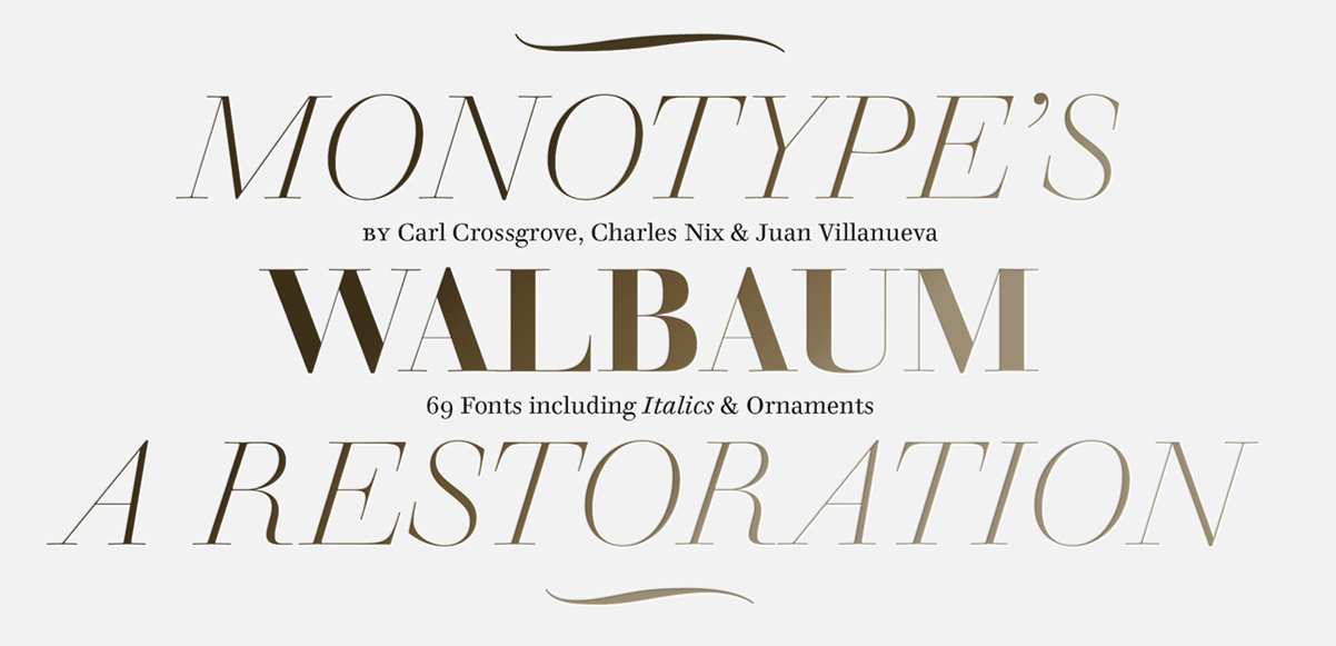
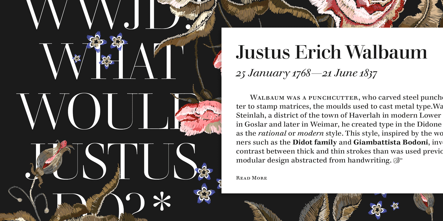
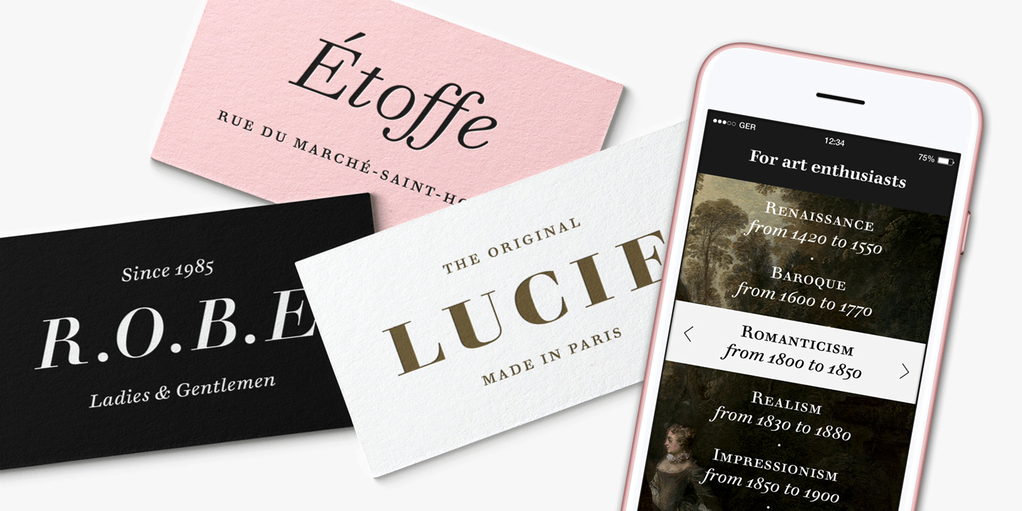
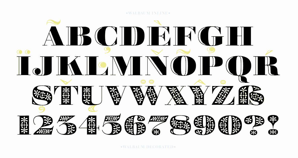
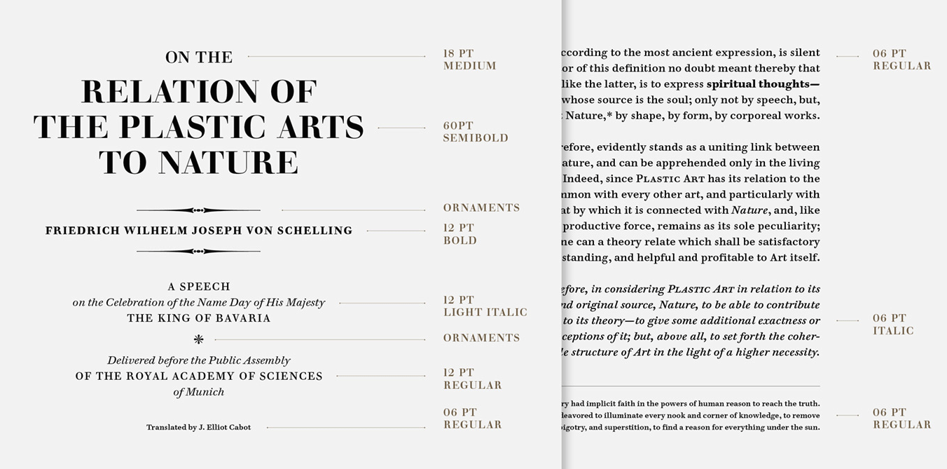
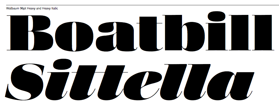
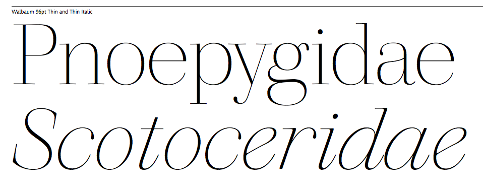
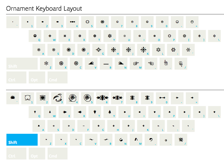
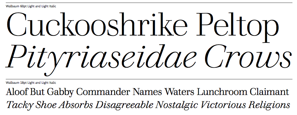
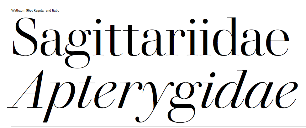
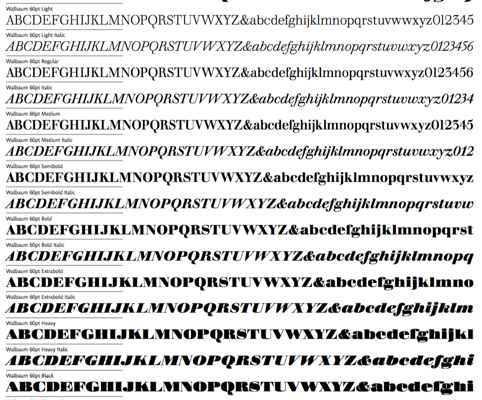
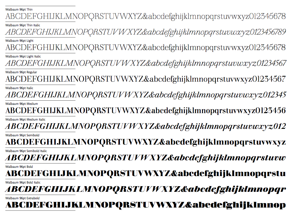
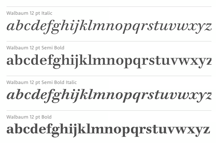
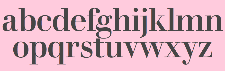
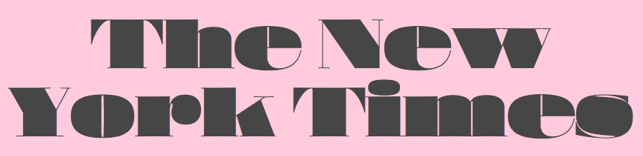
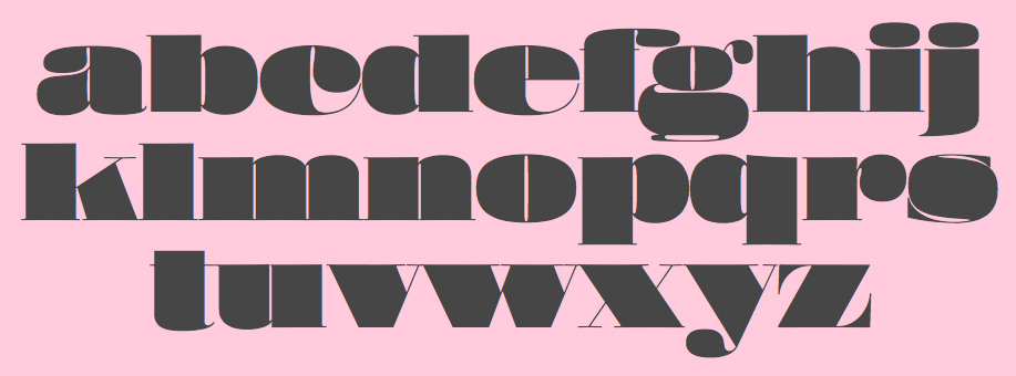
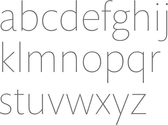
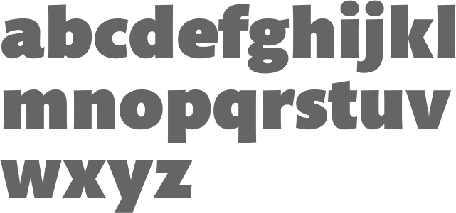
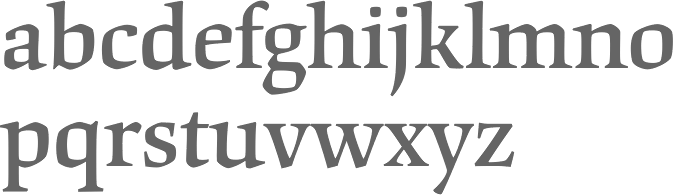
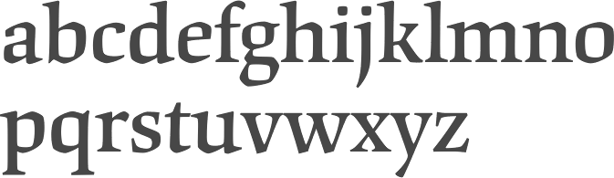
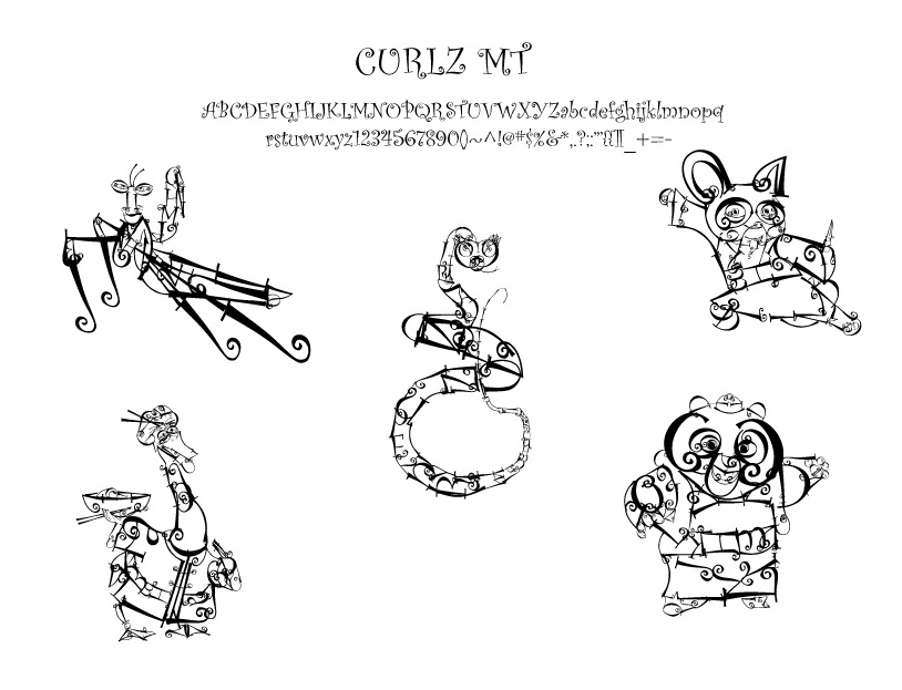
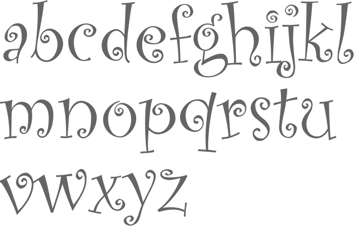
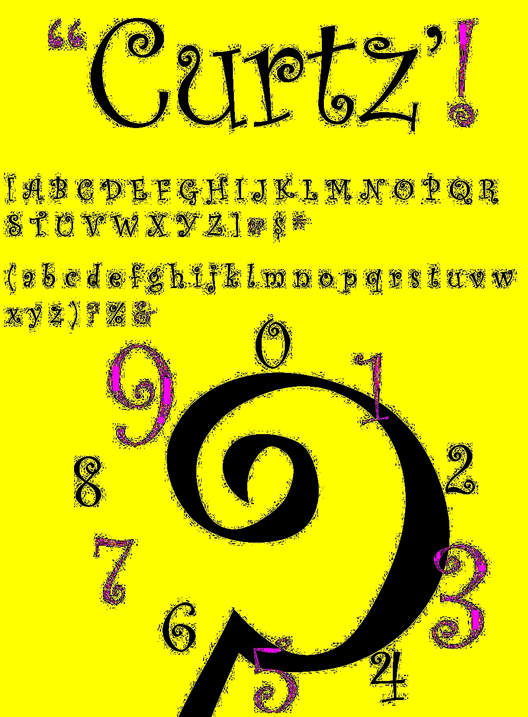
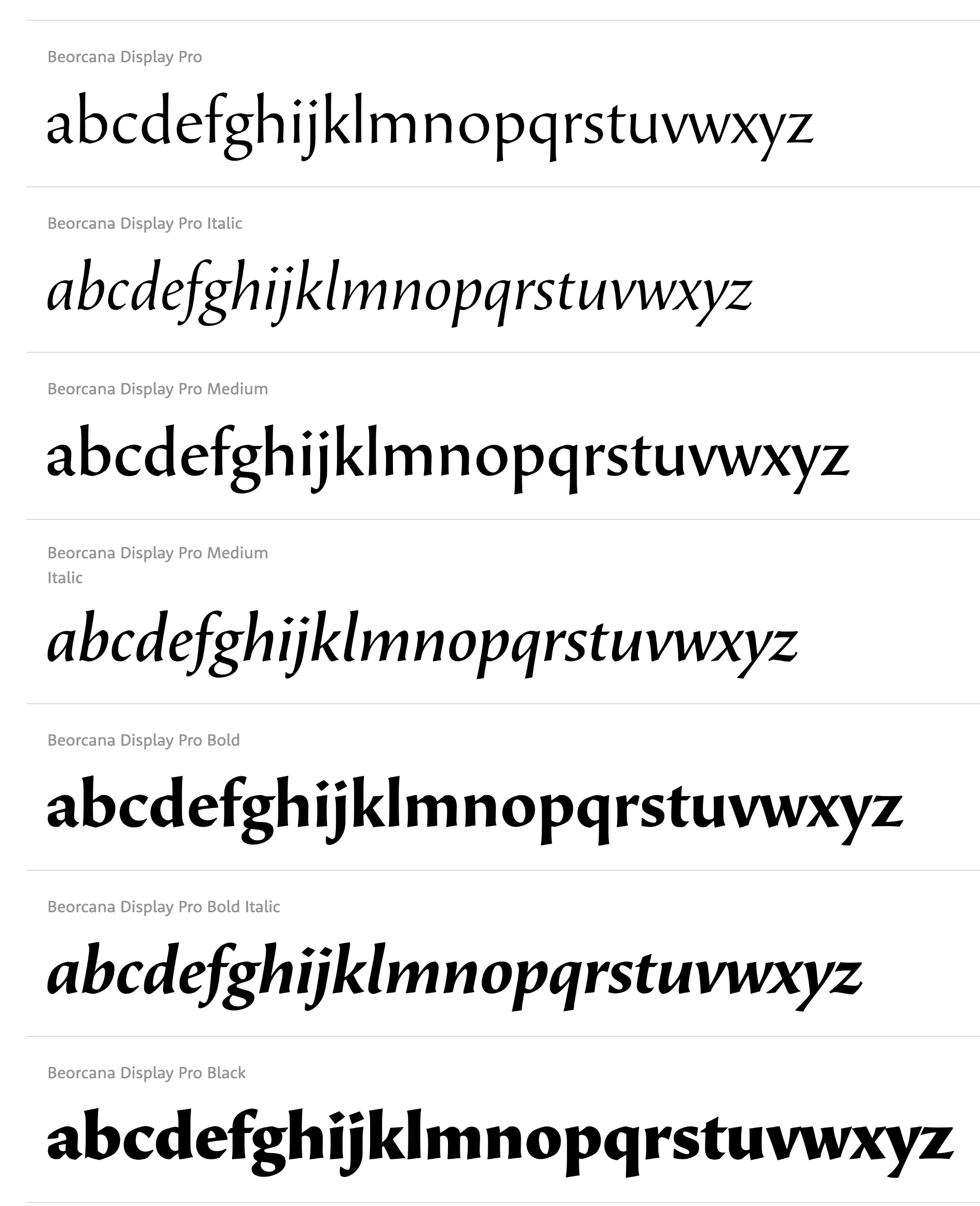
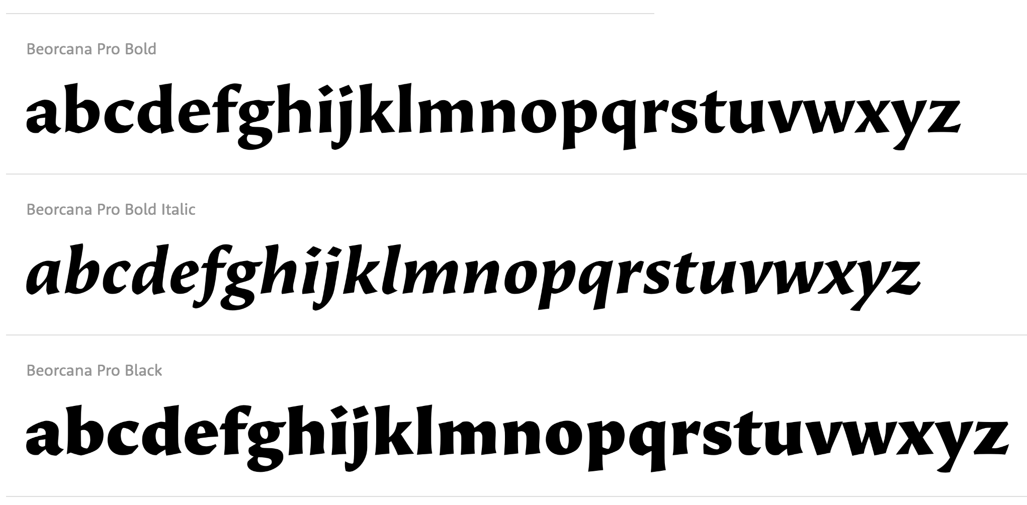
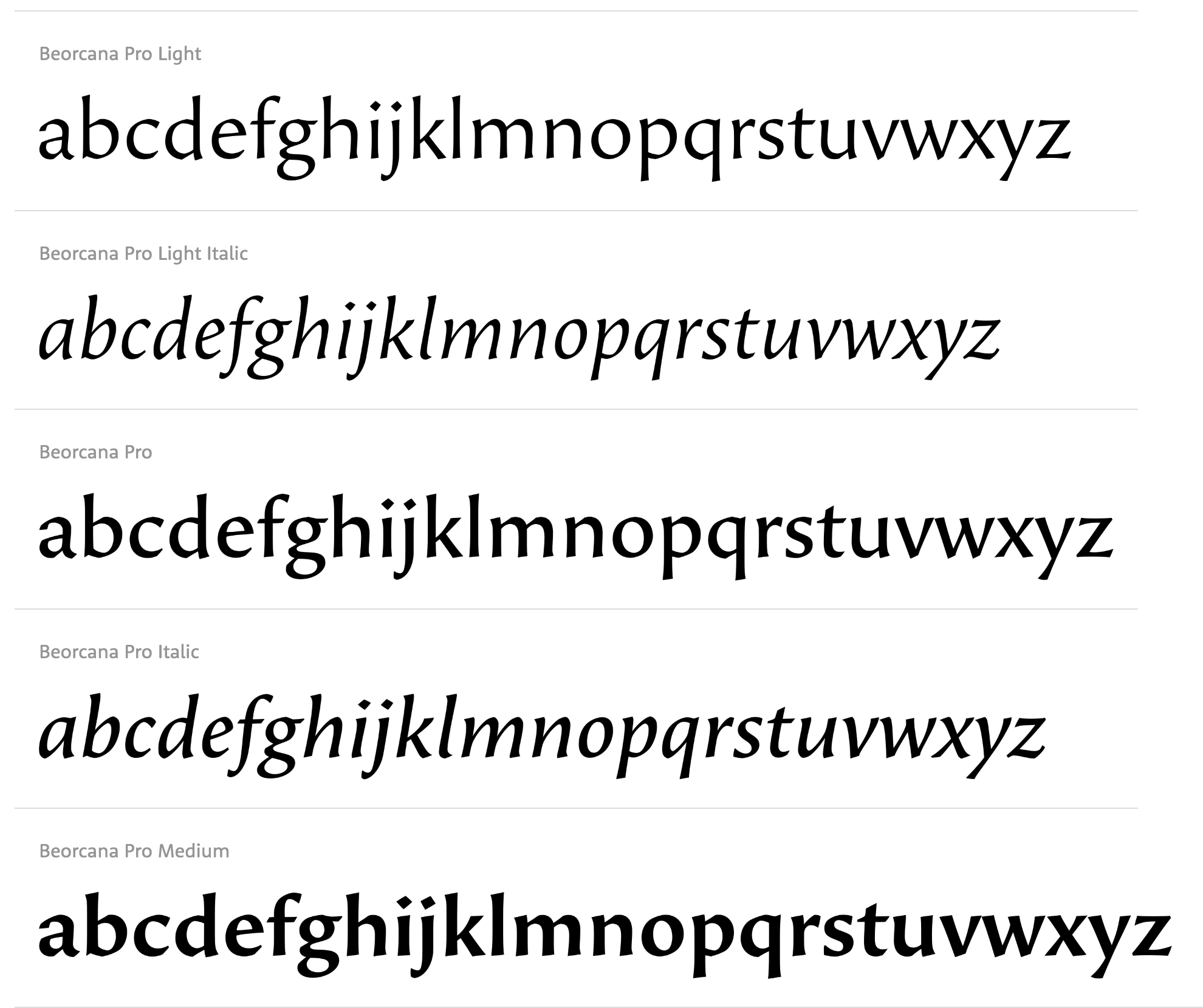
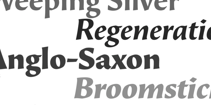
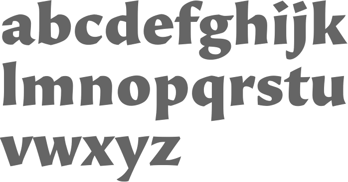
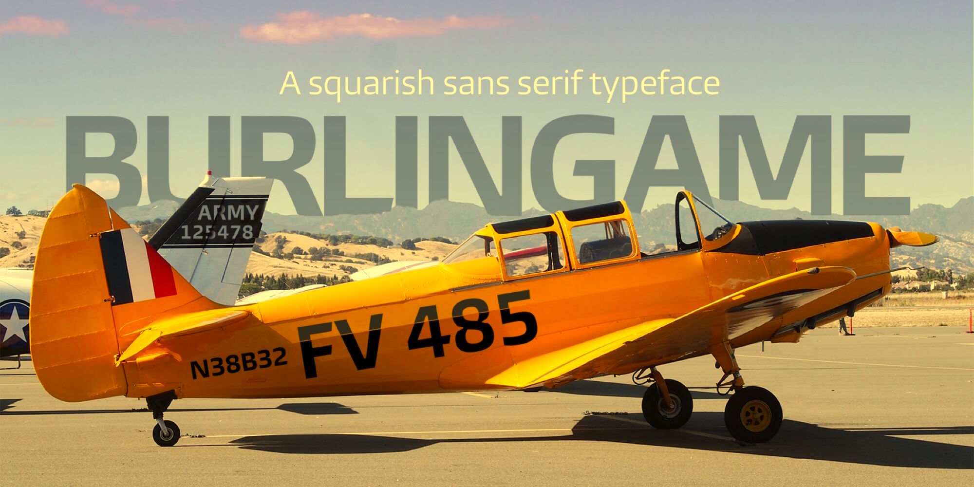
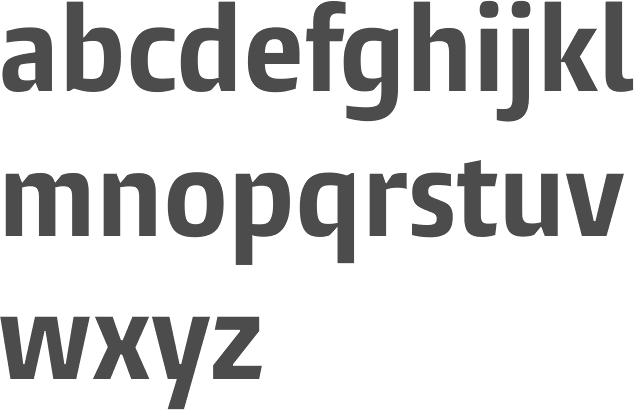
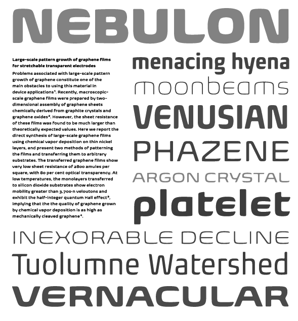
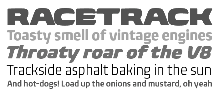
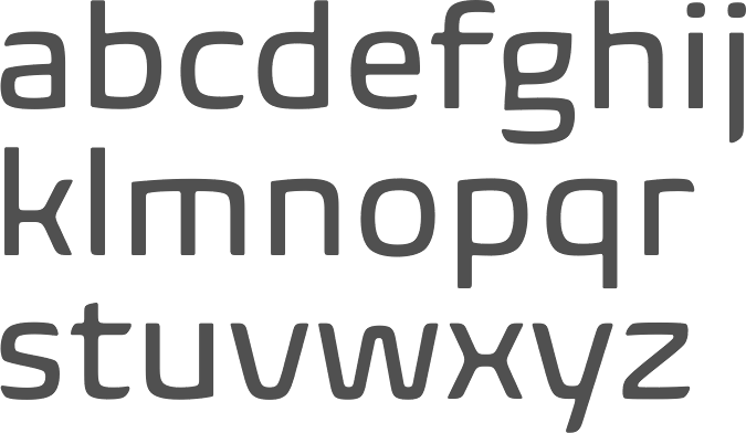
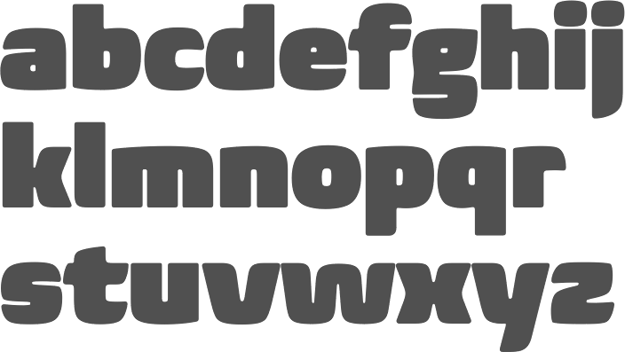
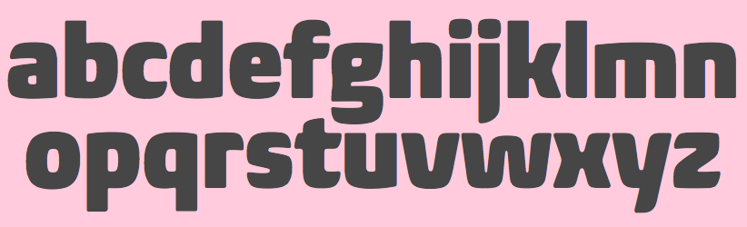
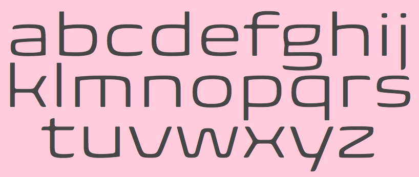
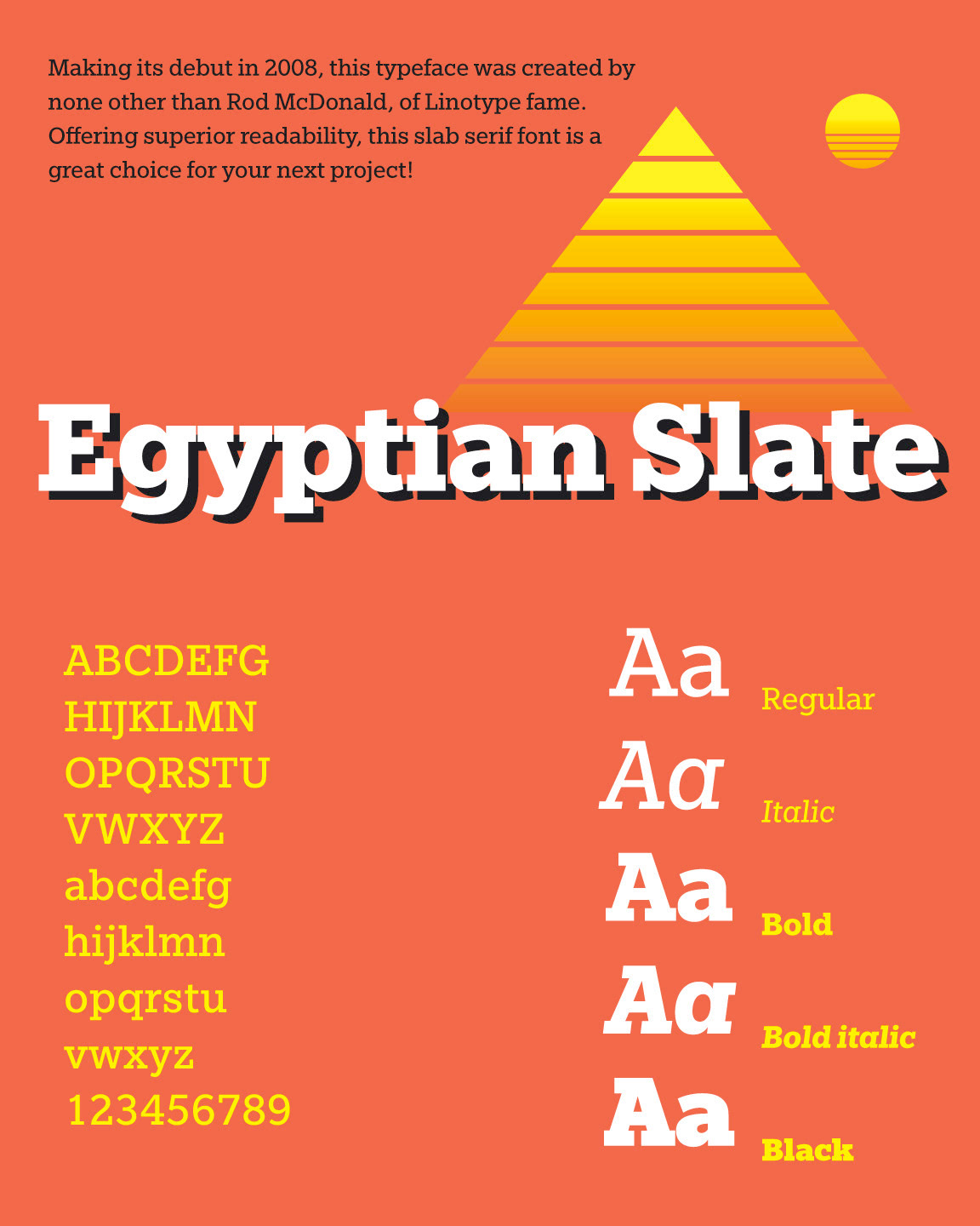
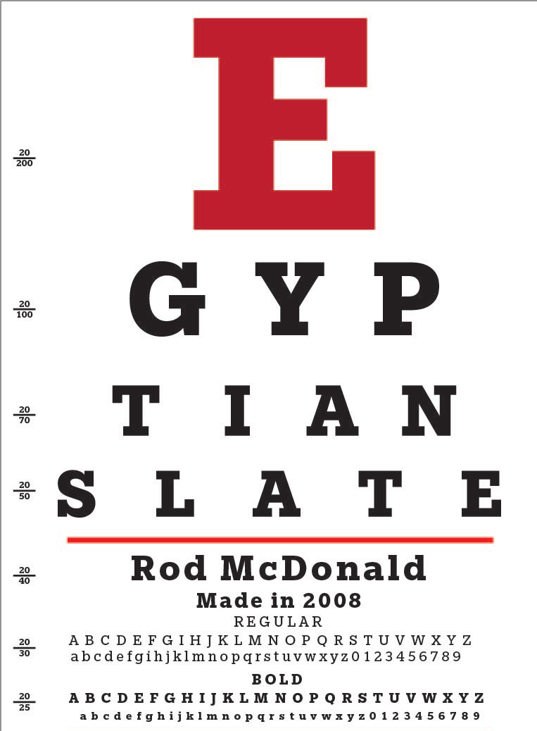
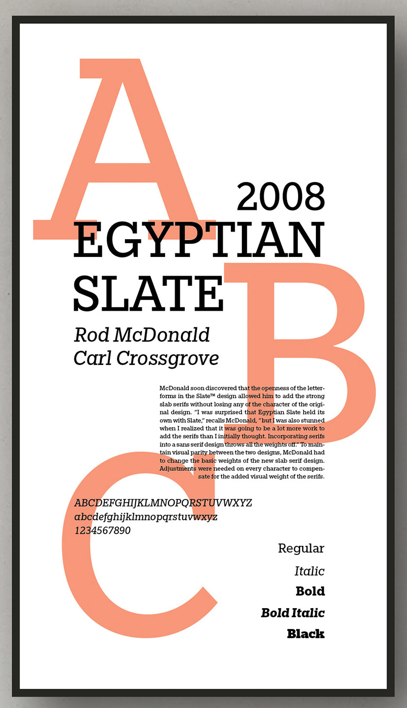
Terrestrial Design is Carl Crossgrove's web site. Crossgrove graduated from Rochester Institute of Technology in Printing /Typography, and has shown a life-long interest in calligraphy and lettering. Now based in San Francisco, he has worked at Adobe, where he designed the Multiple Master hand-printed (semi-Celtic or stone-carved) families Reliq (1998), Reliq Std Active and Reliq Std ExtraActive in 2002, and where, with the help of Kim Buker Chansler and Carol Twombly, he co-designed the Western fonts (Adobe's Wood Series) Origami (hookish, in the expressionist style of Menghart and Preissig), Pepperwood (1994), Ponderosa (1990), Rosewood (1994) and Zebrawood (1994). He was also active at ITC (ITC Minska, 1996) and Agfa Monotype (Origami, a Menhart or Preissig style family; and Mundo Sans, 2002: a 14-weight humanist family, which includes a fantastic hairline sans). Other fonts by Crossgrove include Othello (2002, with Steve Matteson), Wakerobin (based on hand-painted billboards, posters and signage lettering of the mid-19th century), Scripsit (which was named Judges' Choice in Serif Magazine's 1996 type design competition), Tarantella Script, Ranunculus, Penmark, Curlz MT (1995, Monotype; with Steve Matteson). Beorcana (2006) is a 28-part serifless roman in the style of Optima or typefaces like Albertus, Stellar, Tiepolo, Barbedor, Lydian and Amira. In the making since 1992, this flared calligraphic book typeface was released by Monotype in 2006. Stephen Coles states: Beorcana is Crossgrove's best and most complete design yet. I can declare from personal experience that it is beautifully drawn and sets very well, small or large, thanks to three optical size masters. It will be a hit with fans of calligraphic sans serifs like Optima. It won an award at TDC2 2007 and was one of the best types of 2007. Florian Hardwig writes: The typeface has no serifs, yet its the opposite of a grotesque. It exhibits the rhythmic contrast and the humanist proportions of a renaissance roman. Its letters please with vividly dancing forms in every detail. However, this obvious calligraphic derivation never seems inappropriately fancy even the spruce swash italics are down-to-earth in a convenient way. The Thin isn't anemic and the Ultra isn't heavy-handed. Crossgrove really knows his stuff. Beorcana Pro (2006-2013) comes in Regular, Display and Micro styles. Nebulon (2008) is an organic typeface that won an award at TDC2 2009. This retro-futuristic, soft superelliptical display sans-serif design was renamed Biome a year later. With Rod McDonald, he created Egyptian Slate (2009, Monotype). Linotype published ITC Galliard Etext in 2013, after the 1978 garalde typeface by Matthew Carter called ITC Galliard. It lists Carl Crossgrove as its designer. In 2014, Crossgrove published the Burlingame typeface family at Monotype. He calls this sans collection sturdy, muscular and decisive. From 2003 until 2014, he designed the OEM Monotype font Halesworth Etext. In 2017, he published the comic book typeface family Cavolini at Monotype. Still in 2017, Karl Leuthold, Juan Villanueva and Carl Crossgrove co-designed the breezy script typeface Sagrantino (Monotype) in Regular, Highlight and Shadow substyles. In 2018, Monotype's Carl Crossgrove, Charles Nix, Juan Villanueva and Lynne Yun co-designed Walbaum, a reimagined superfamily with 69 total fonts, in five optical sizes. Monotype writes: Walbaum was meticulously crafted by Monotype's Carl Crossgrove, Charles Nix, and Juan Villanueva to bring Justus Erich Walbaum's high contrast didone style masterpiece to the 21st century. Walbaum has over 600 glyphs with OpenType typographic features like small capitals, old style and lining figures, proportional and tabular figures, fractions and ligatures. Also included in the family are three decorative and ornament fonts. At the end of 2018, he published the rough-edged calligraphic typeface Amarone at Monotype. Typefaces from 2019: Mundo Serif (Monotype). Linotype page. Adobe's page. MyFonts page. FontShop link. Klingspor link. |
EXTERNAL LINKS |
| | |


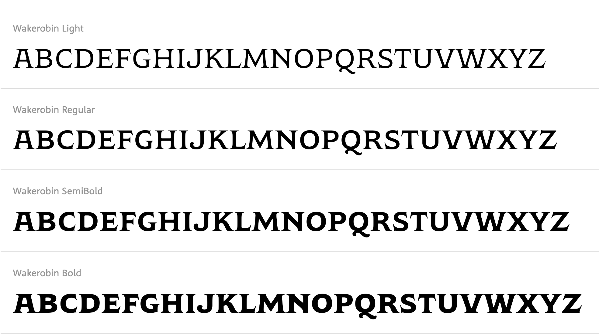
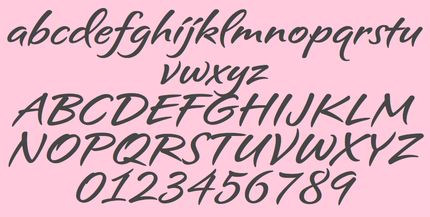
file name: Monotype Wakerobin 2020

file name: Monotype Wakerobin 2020

file name: Monotype Wakerobin Compressed 2020
file name: Monotype Wakerobin 2020 356697
file name: Monotype Wakerobin 2020 356698
file name: Monotype Wakerobin 2020 356699
file name: Monotype Wakerobin 2020 356700

file name: Carl Crossgrove Mundo Serif 2019 294881
file name: Carl Crossgrove Mundo Serif 2019

file name: Monotype Mundo Serif 2019 294883
file name: Monotype Mundo Serif 2019 294884
file name: Monotype Mundo Serif 2019 294885
file name: Monotype Mundo Serif 2019 295216 002

file name: Monotype Mundo Serif 2019
file name: Monotype Amarone 2018 283606 002
file name: Monotype Amarone 2018 283608 002
file name: Monotype Amarone 2018 283609 002
file name: Monotype Amarone 2018 283610 002
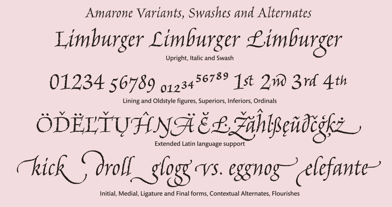
file name: Monotype Amarone 2018
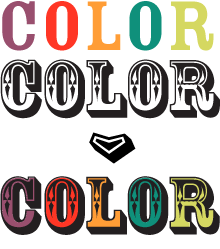
file name: Carl Crossgrove Cavolini 2017 233918
file name: Carl Crossgrove Cavolini 2017 233919
file name: Carl Crossgrove Cavolini 2017 233920
file name: Carl Crossgrove Cavolini 2017 233921

file name: Carl Crossgrove Cavolini 2017
file name: Carl Crossgrove Cavolini 2017
file name: Charles Nix Carl Crossgrove Juan Villanueva Lynne Yun Walbaum 2018 266394
file name: Charles Nix Carl Crossgrove Juan Villanueva Lynne Yun Walbaum 2018 266395

file name: Charles Nix Carl Crossgrove Juan Villanueva Lynne Yun Walbaum 2018 266396
file name: Charles Nix Carl Crossgrove Juan Villanueva Lynne Yun Walbaum 2018 266397
file name: Charles Nix Carl Crossgrove Juan Villanueva Lynne Yun Walbaum 2018 266398
file name: Charles Nix Carl Crossgrove Juan Villanueva Lynne Yun Walbaum 2018 266401

file name: Charles Nix Carl Crossgrove Juan Villanueva Lynne Yun Walbaum 2018
file name: Charles Nix Carl Crossgrove Juan Villanueva Lynne Yun Walbaum 2018 F I S T
file name: Charles Nix Carl Crossgrove Juan Villanueva Lynne Yun Walbaum 2018b
file name: Charles Nix Carl Crossgrove Juan Villanueva Lynne Yun Walbaum 2018c
file name: Charles Nix Carl Crossgrove Juan Villanueva Lynne Yun Walbaum 2018d
file name: Charles Nix Carl Crossgrove Juan Villanueva Lynne Yun Walbaum 2018e
file name: Charles Nix Carl Crossgrove Juan Villanueva Lynne Yun Walbaum 2018f
file name: Charles Nix Carl Crossgrove Juan Villanueva Lynne Yun Walbaum 2018g
file name: Charles Nix Carl Crossgrove Juan Villanueva Lynne Yun Walbaum 2018h
file name: Charles Nix Carl Crossgrove Juan Villanueva Lynne Yun Walbaum 2018i
file name: Charles Nix Carl Crossgrove Juan Villanueva Lynne Yun Walbaum 2018j
file name: Charles Nix Carl Crossgrove Juan Villanueva Lynne Yun Walbaum12 Pt 2018
file name: Charles Nix Carl Crossgrove Juan Villanueva Lynne Yun Walbaum60 Pt Medium 2018

file name: Charles Nix Carl Crossgrove Juan Villanueva Lynne Yun Walbaum96 Pt Black 2018
file name: Charles Nix Carl Crossgrove Juan Villanueva Lynne Yun Walbaum96 Pt Extra Black 2018
file name: Charles Nix Carl Crossgrove Juan Villanueva Lynne Yun Walbaum96 Pt Extra Black 2018b

file name: Charles Nix Carl Crossgrove Juan Villanueva Lynne Yun Walbaum96 Pt Light 2018

file name: Charles Nix Carl Crossgrove Juan Villanueva Lynne Yun Walbaum96 Pt Medium 2018
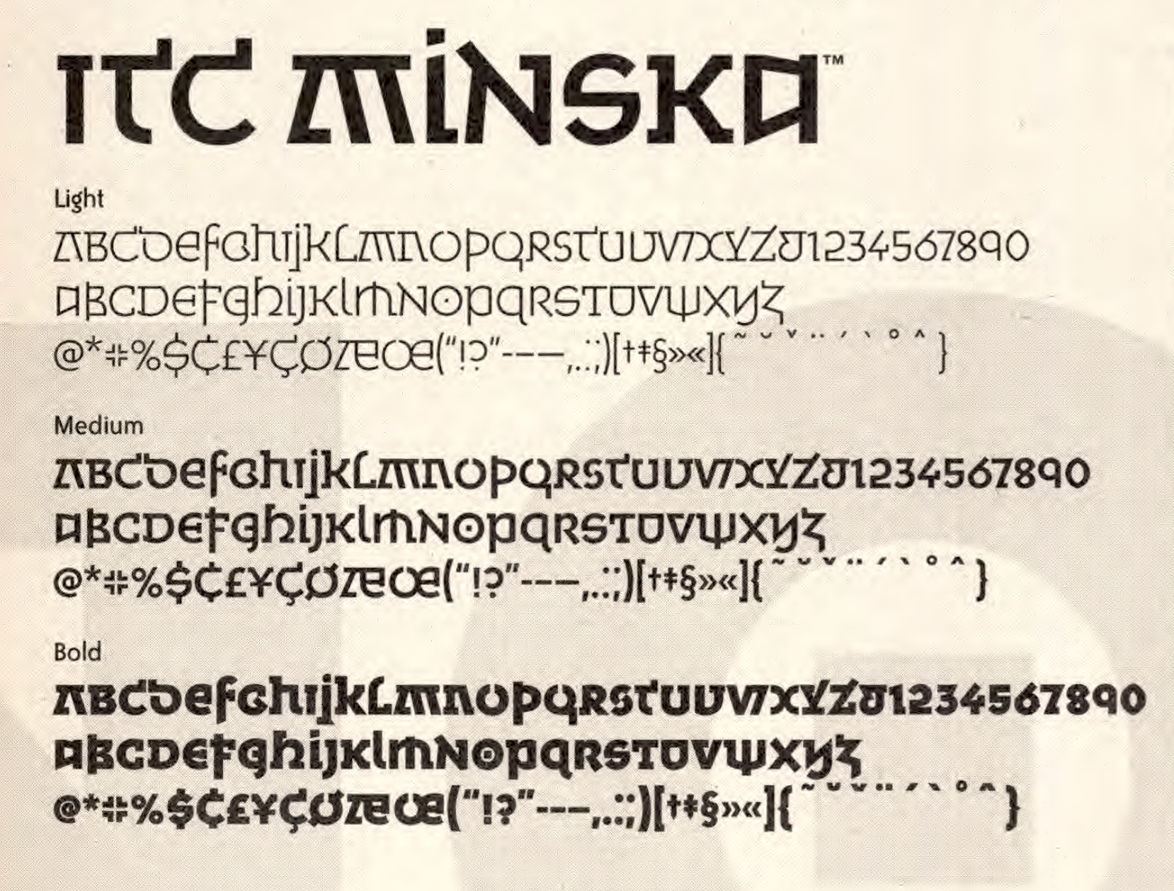
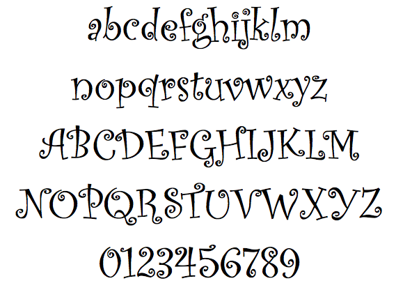
file name: Carl Crossgrove I T C Minska 1996
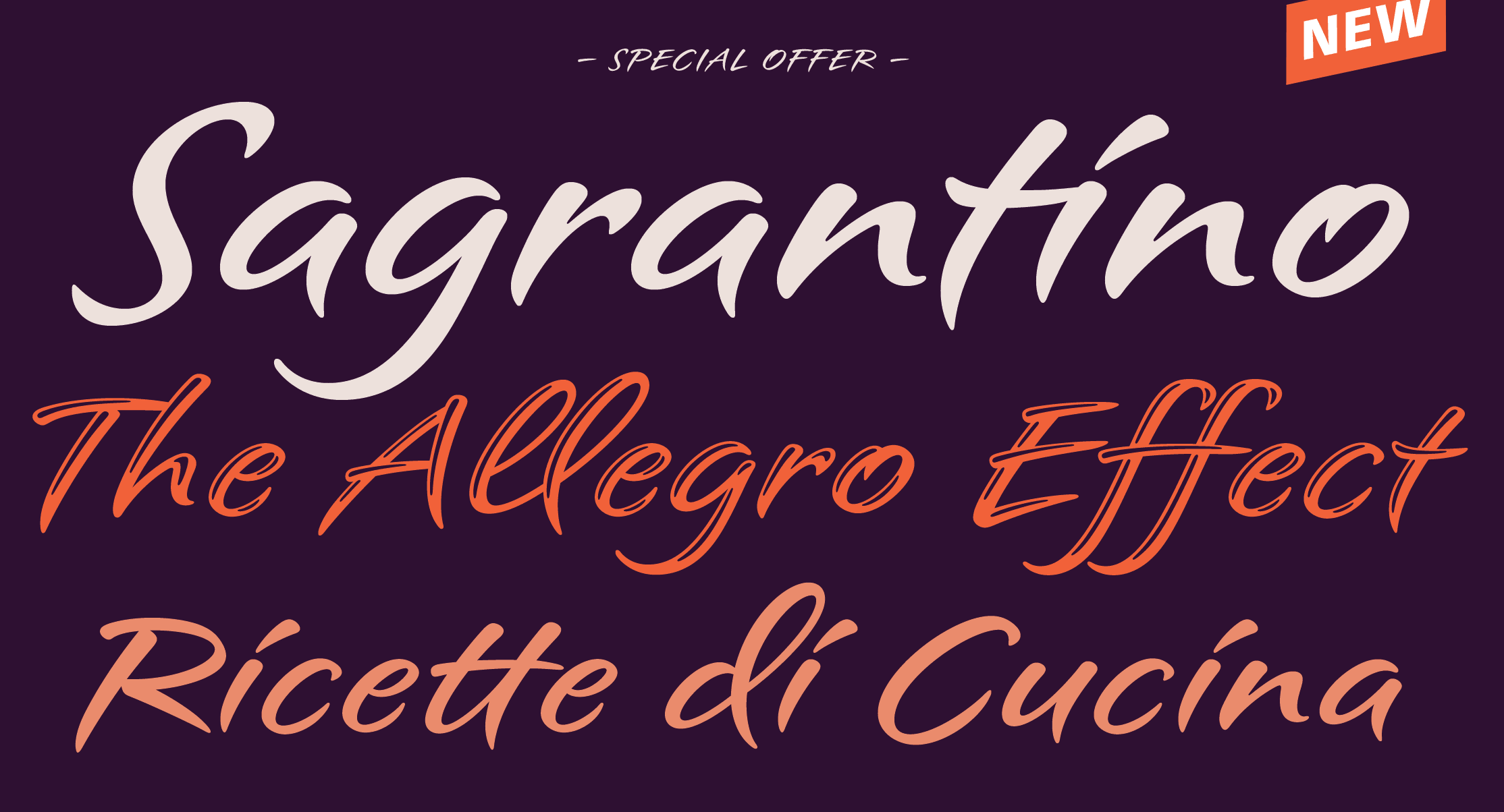
file name: Karl Leuthold Juan Villanueva Carl Crossgrove Sagrantino 2017b
file name: Karl Leuthold Juan Villanueva Carl Crossgrove Sagrantino 2017

file name: Kim Buker Chansler Carol Twombly Carl Crossgrove Rosewood 1994
file name: Carl Crossgrove Rosewood Fill
file name: Kim Buker Chansler Carol Twombly Carl Crossgrove Zebrawood 1994
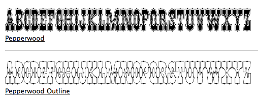
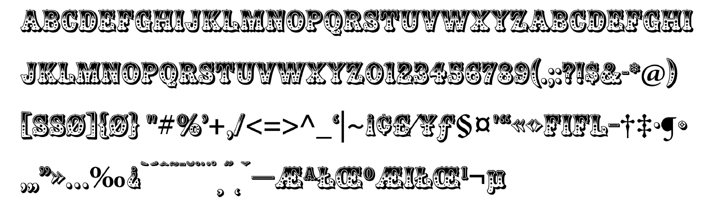
file name: Kim Buker Chansler Pepperwood 1994
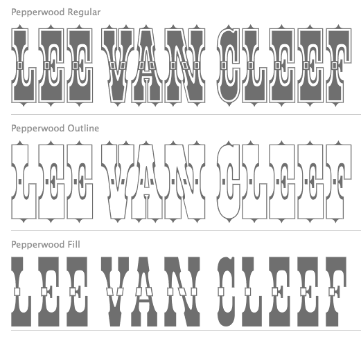
file name: Pepperwood 2000
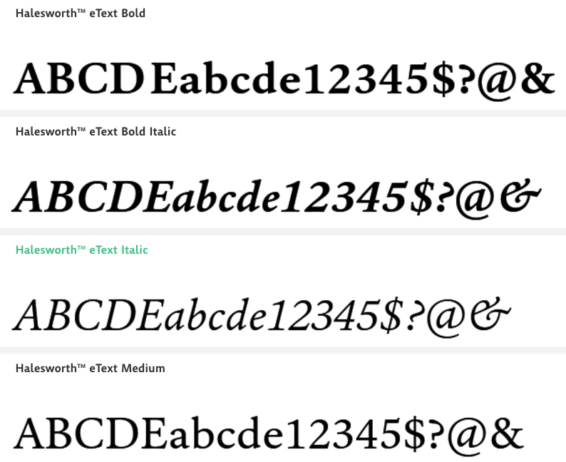
file name: Carl Crossgrove Halesworth Etext Medium 2003 2014
file name: Carl Crossgrove Halesworth Etext Medium 2003 2014a
file name: Kim Buker Chansler Ponderosa 1990
file name: Kim Buker Chansler Ponderosa 1990c
file name: Carl Crossgrove Mundo Extra Light 2002

file name: Carl Crossgrove Mundo Sans Pro Light 2002
file name: Carl Crossgrove Mundo Sans Ultra 2002
file name: Carl Crossgrove Origami Medium
file name: Carl Crossgrove Origami Std Medium

file name: Carl Crossgrove Reliq Calm 1998
file name: Steve Matteson Carl Crossgrove Curlz Pro 1995 Poster by Afiq Lezz 2018
file name: Steve Matteson Carl Crossgrove Curlz Pro 1995
file name: Steve Matteson Carl Crossgrove Curlz Pro 1995 Based on a Poster by Tiny Flores 2015

file name: Carl Crossgrove I T C Galliard Etext 2013
file name: Curlz M T
file name: Carl Crossgrove Beorcana
file name: Carl Crossgrove Beorcana Pro 2013
file name: Carl Crossgrove Beorcana Pro 2013
file name: Carl Crossgrove Beorcana Pro 2013
file name: Terrestrial Design Beorcana Pro 2022 1

file name: Terrestrial Design Beorcana Pro 2022
file name: Carl Crossgrove Beorcana Display Pro Light 2006
file name: Carl Crossgrove Beorcana Display Pro Ultra 2006

file name: Carl Crossgrove Beorcana Pro 2006
file name: Carl Crossgrove Beorcana Pro 2006b
file name: Carl Crossgrove Beorcana Pro Black 2006
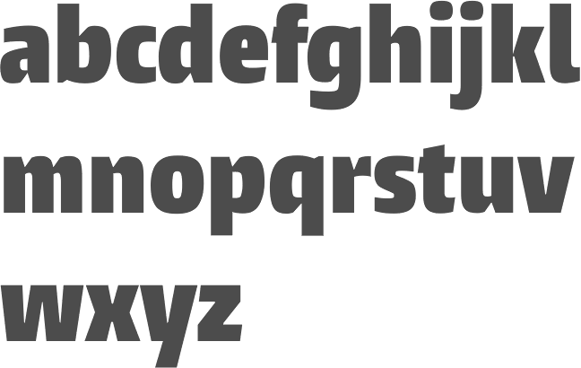
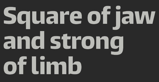
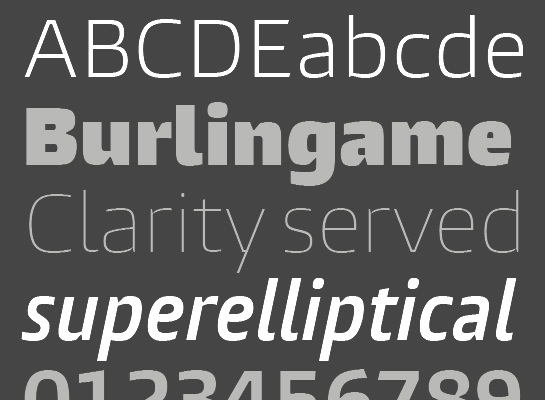
file name: Carl Crossgrove Burlingame 2014b

file name: Carl Crossgrove Burlingame Condensed 2014b
file name: Carl Crossgrove Burlingame Condensed Bold 2014
file name: Carl Crossgrove Burlingame Condensed X Black 2014

file name: Carl Crossgrove Burlingame 2014
file name: Carl Crossgrove Burlingame Condensed 2014e
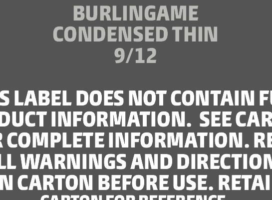
file name: Carl Crossgrove Burlingame Condensed 2014f
file name: Carl Crossgrove Burlingame Condensed 2014g
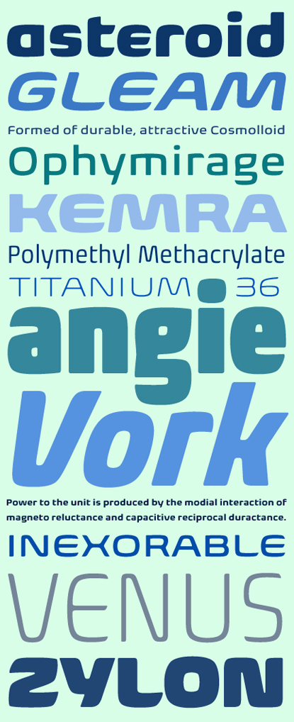
file name: Carl Crossgrove Nebulon2008
file name: Carl Crossgrove Nebulon T D C55 Award
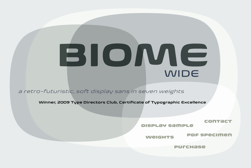
file name: Carl Crossgrove Biome 2010
file name: Carl Crossgrove Biome 2012h
file name: Carl Crossgrove Biome 2010b
file name: Carl Crossgrove Biome Std Ultra 2010
file name: Carl Crossgrove Biome Pro Black Narrow 2012
file name: Carl Crossgrove Biome Pro Light Wide 2012

file name: Carl Crossgrove Steve Matteson Othello 2002
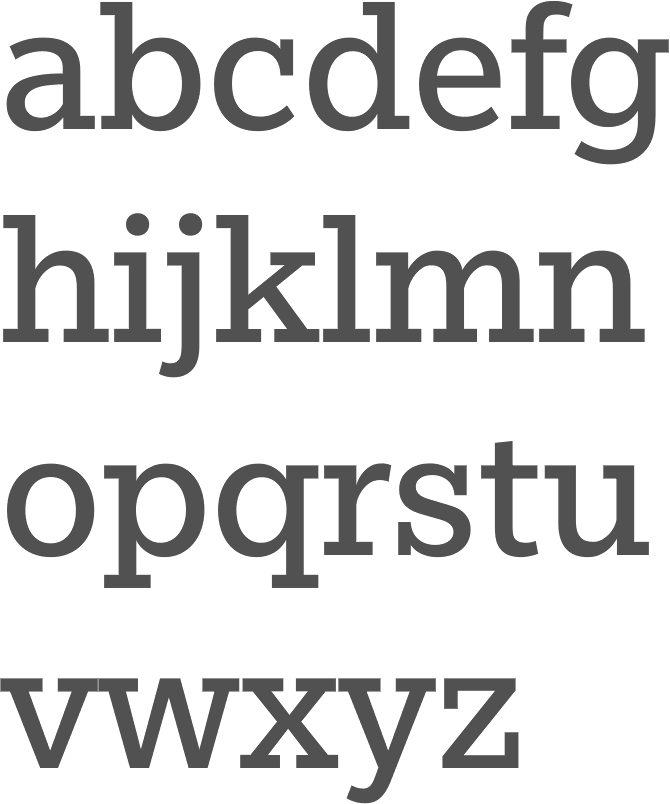
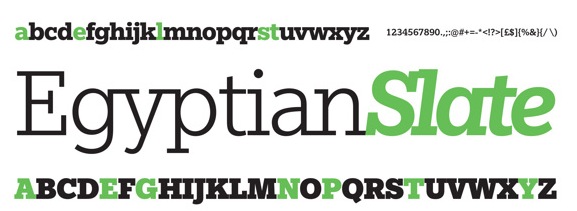
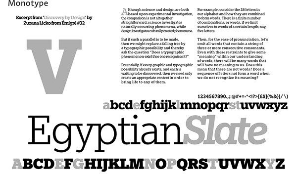
file name: Rod Mc Donald Carl Crossgrove Egyptian Slate 2009
file name: Rod Mc Donald Carl Crossgrove Egyptian Slate 2009 Poster by Erick Reilly 2019
file name: Rod Mc Donald Carl Crossgrove Egyptian Slate 2009 Poster by Logan Grounds 2019
file name: Rod Mc Donald Carl Crossgrove Egyptian Slate 2009 Poster by Audrey Thompson 2018
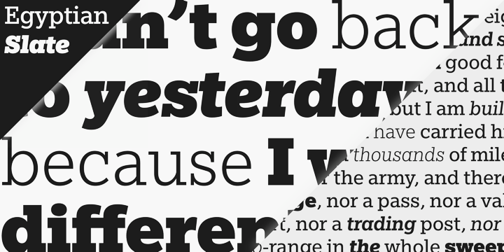
file name: Rod Mc Donald Carl Crossgrove Egyptian Slate 2009b
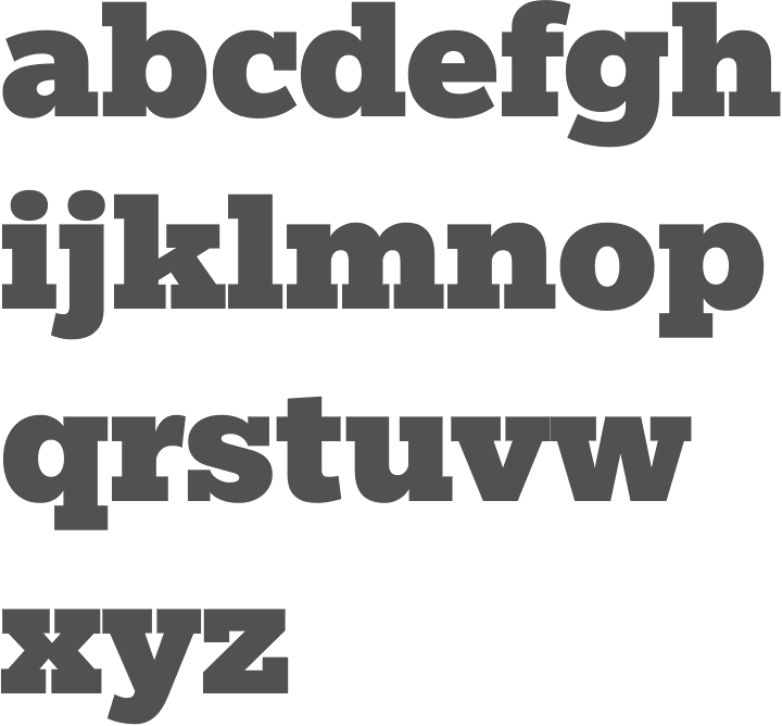
file name: Rod Mc Donald Carl Crossgrove Egyptian Slate Pro Black 2009
file name: Rod Mc Donald Carl Crossgrove Egyptian Slate 2009 Poster by Tom Smith 2014
file name: Rod Mc Donald Carl Crossgrove Egyptian Slate 2009 Poster by Tom Smith 2014b
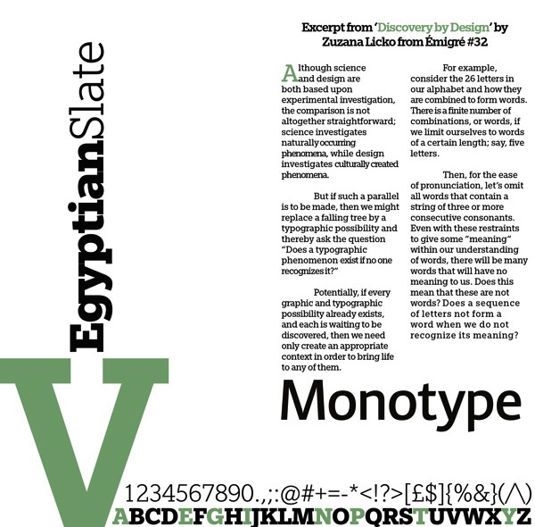
file name: Rod Mc Donald Carl Crossgrove Egyptian Slate 2009 Poster by Tom Smith 2014c
file name: Carl Crossgrove Pic

file name: Carl Crossgrove Pic
| | |
|
Luc Devroye ⦿ School of Computer Science ⦿ McGill University Montreal, Canada H3A 2K6 ⦿ lucdevroye@gmail.com ⦿ https://luc.devroye.org ⦿ https://luc.devroye.org/fonts.html |