TYPE DESIGN INFORMATION PAGE last updated on Sun Jul 12 22:13:42 EDT 2026
FONT RECOGNITION VIA FONT MOOSE

|
|
|
|
Feliciano Type Foundry
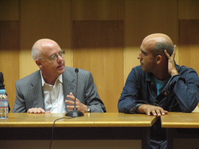
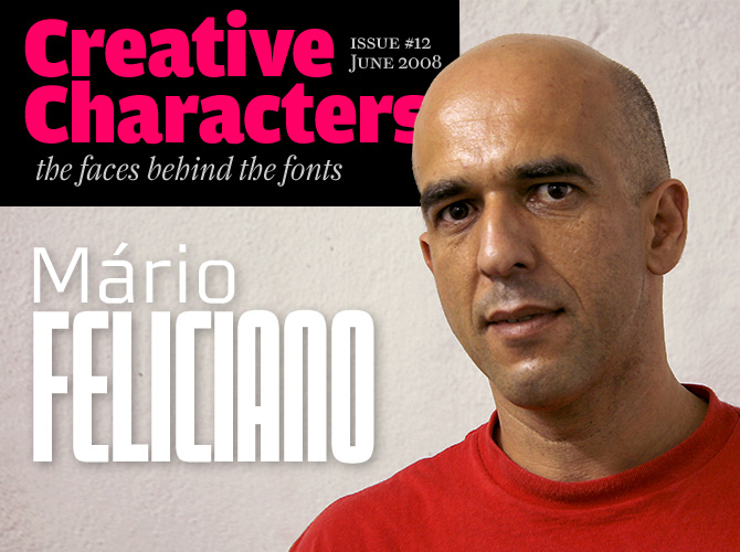
[Mário Feliciano]
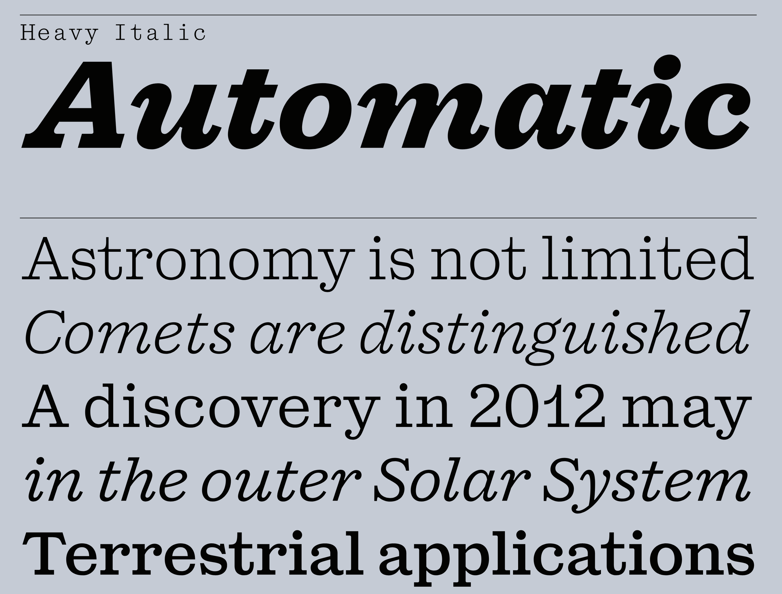
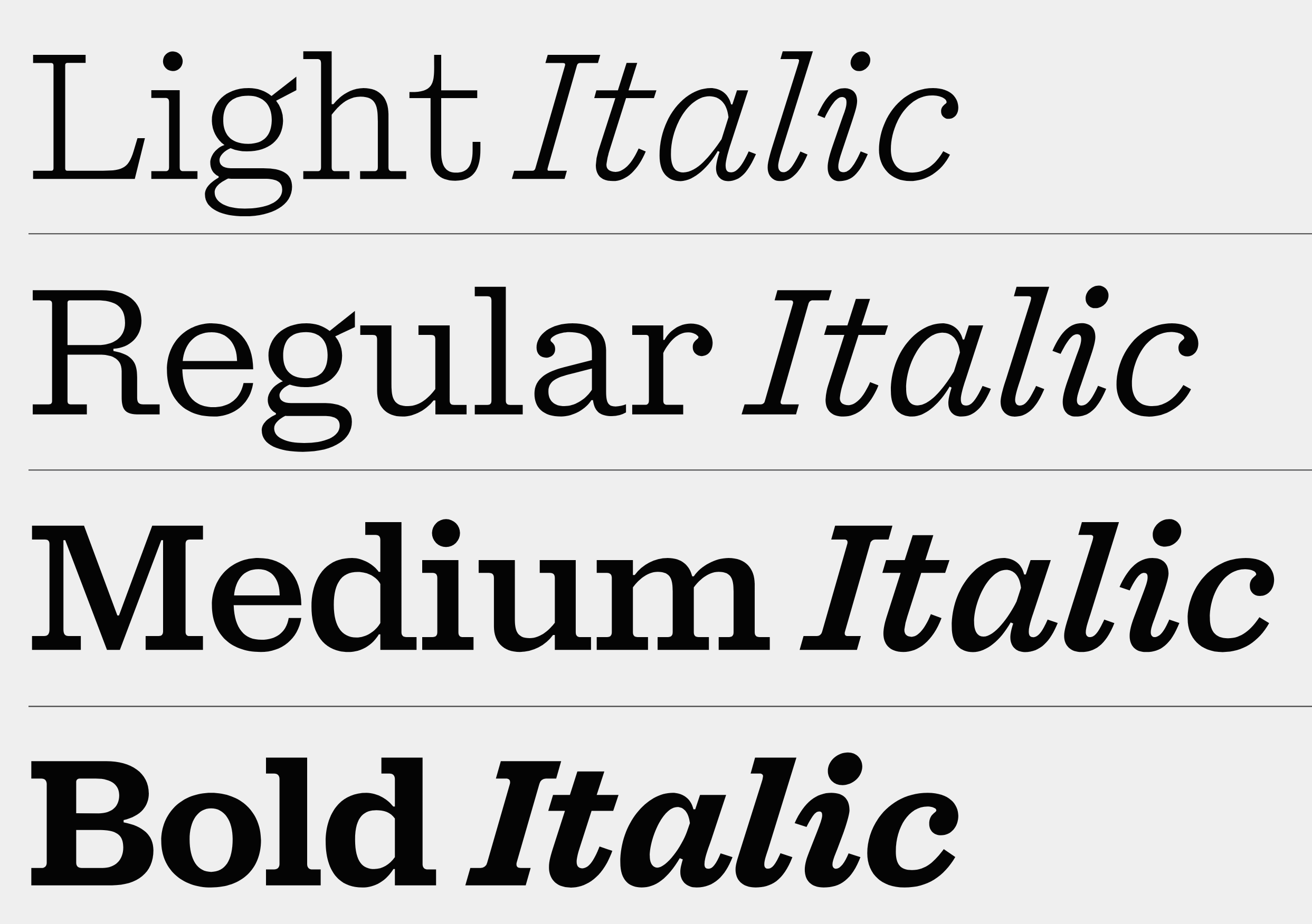
Feliciano Type was established in 2001 by Mario Feliciano. The foundry's main design studio in Lisbon, Portugal, with two additional offices, in Povoa de Varzim, Portugal, and in The Hague, Netherlands. Mário Feliciano (b. 1969, Caldas da Rainha, Portugal). Feliciano studied graphic design at IADE, Lisbon, and began working as a graphic designer at Surf Portugal magazine in 1993, where he stayed as art director until 2000. In 1994 he founded the design studio Secretonix in Lisbon. He has been heavily involved in type design since. In 2005, he joined the type coop Village. John Berry reviews Mario's oeuvre. His gorgeous creations include the following:
Feliciano designed custom typefaces for the Portuguese weekly newspaper Expresso [a font called Expresso], for the Swedish newspaper Svenska Dagbladet [a font called Sueca], for the Spanish newspaper El Pais [a font called Majrit] and for Banco Espirito Santo [a font called BesSans]. |
EXTERNAL LINKS |
| | |


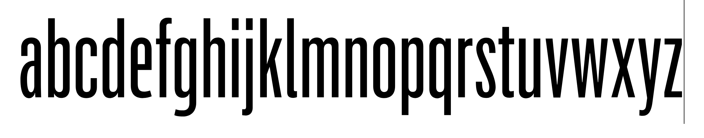
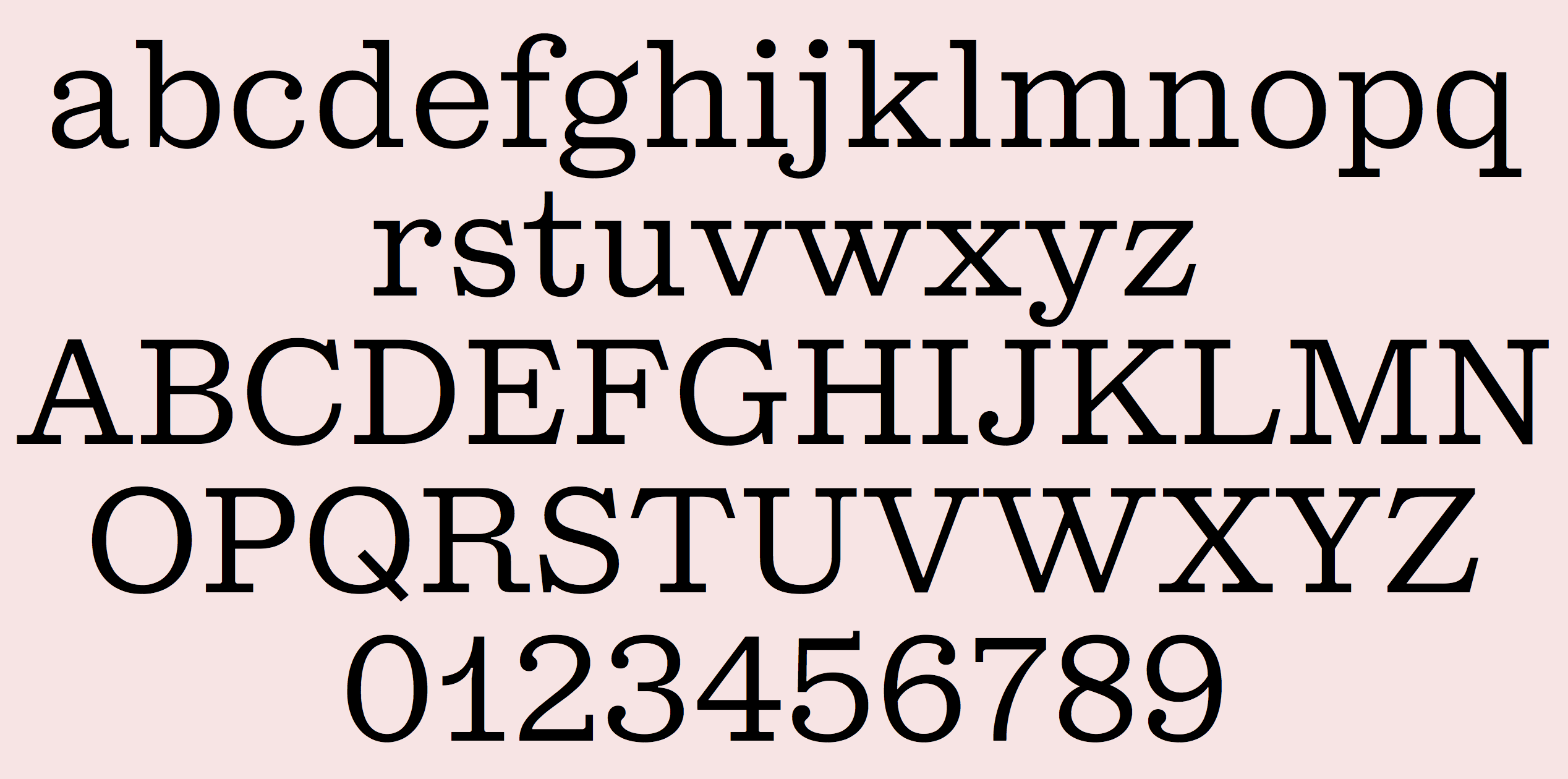
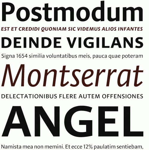
file name: Mario Feliciano Flama 2002
file name: Mario Feliciano Flama 2002
file name: Mario Feliciano Flama 2002
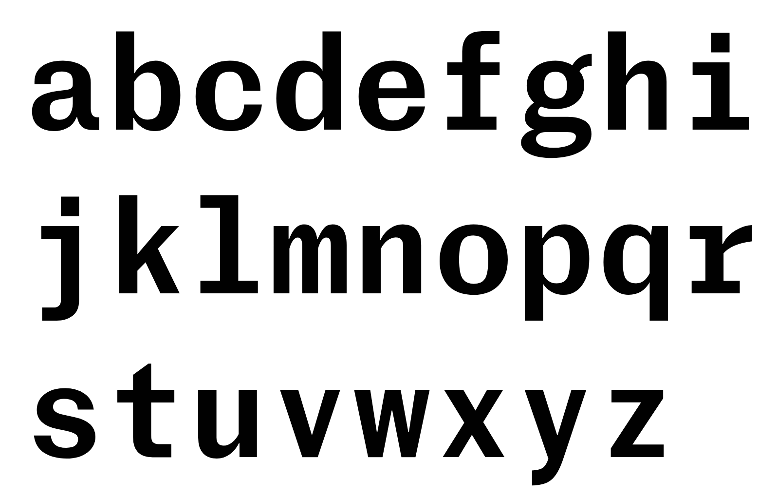
file name: Mario Feliciano Grosa 2020 2021
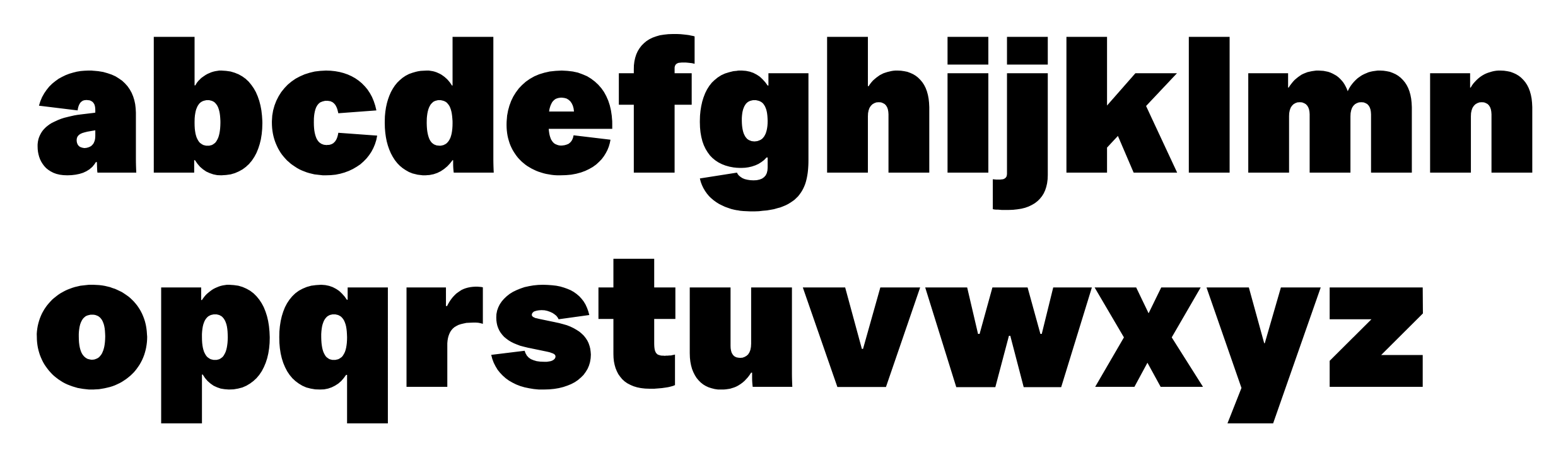
file name: Mario Feliciano Grosa 2020 2021
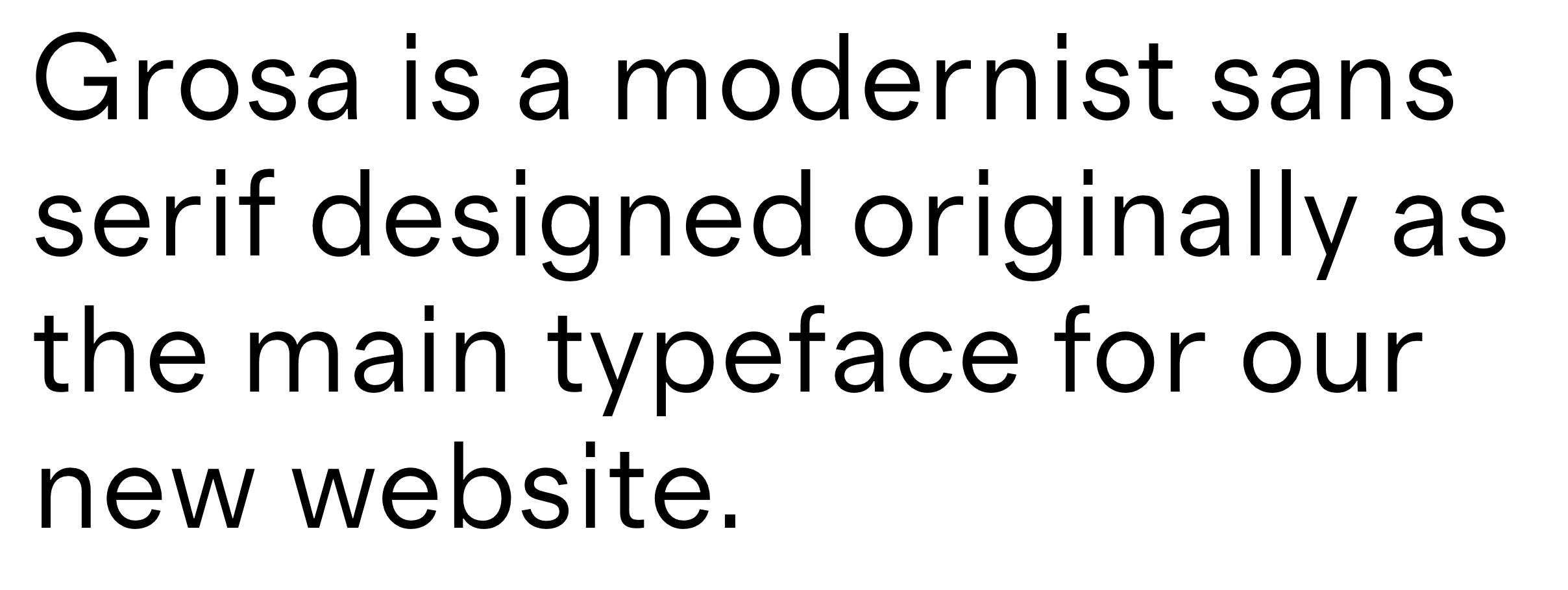
file name: Mario Feliciano Grosa 2020 2021
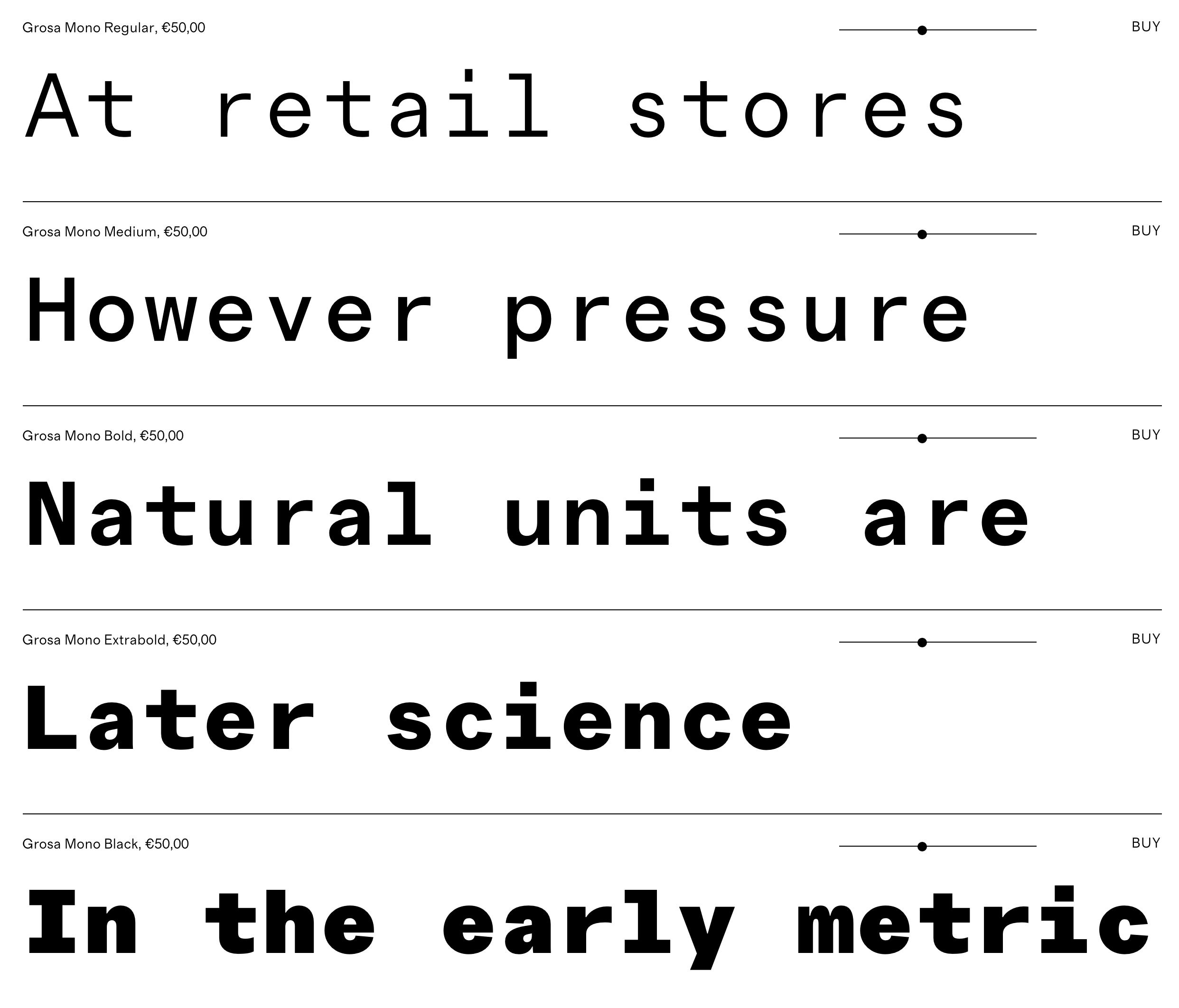
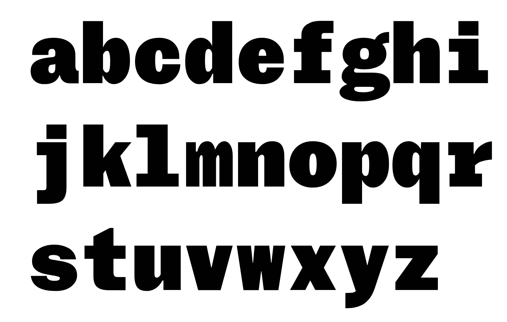
file name: Mario Feliciano Grosa Mono 2020 2021

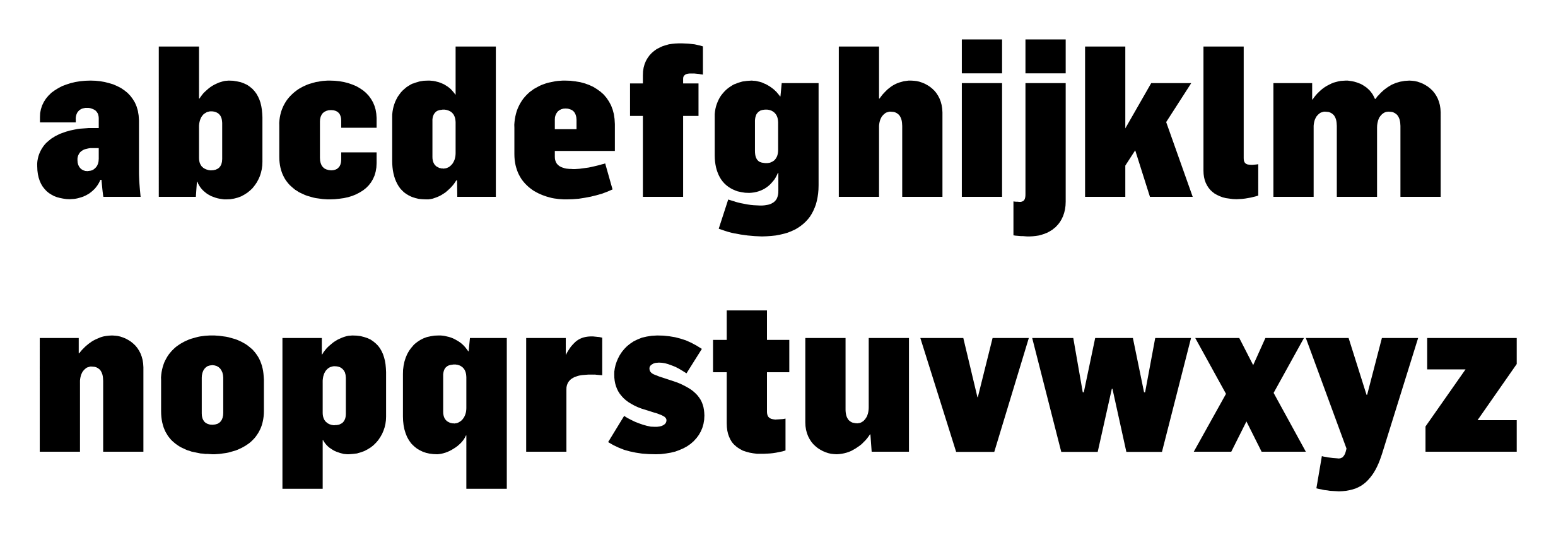
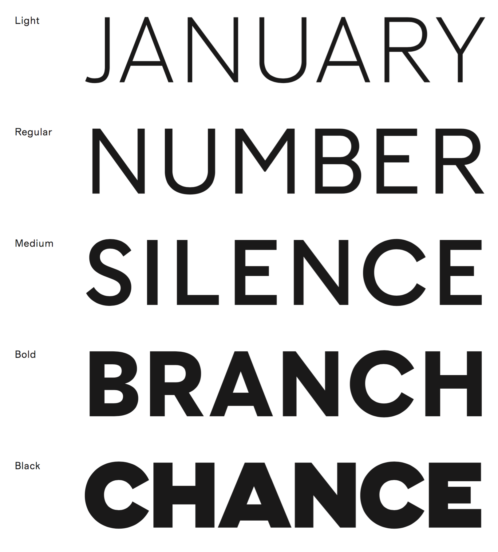
file name: Mario Feliciano Hiper Sans 2021
file name: Mario Feliciano Hiper Sans 2021
file name: Mario Feliciano Hiper Sans 2021
file name: Mario Feliciano Hiper Sans 2021
file name: Mario Feliciano Hiper Sans 2021
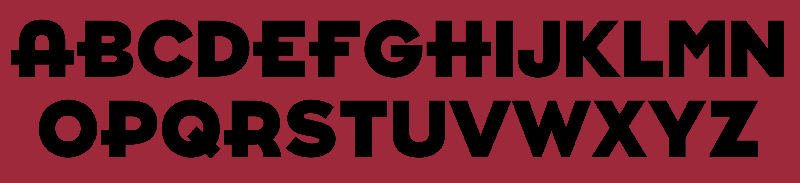
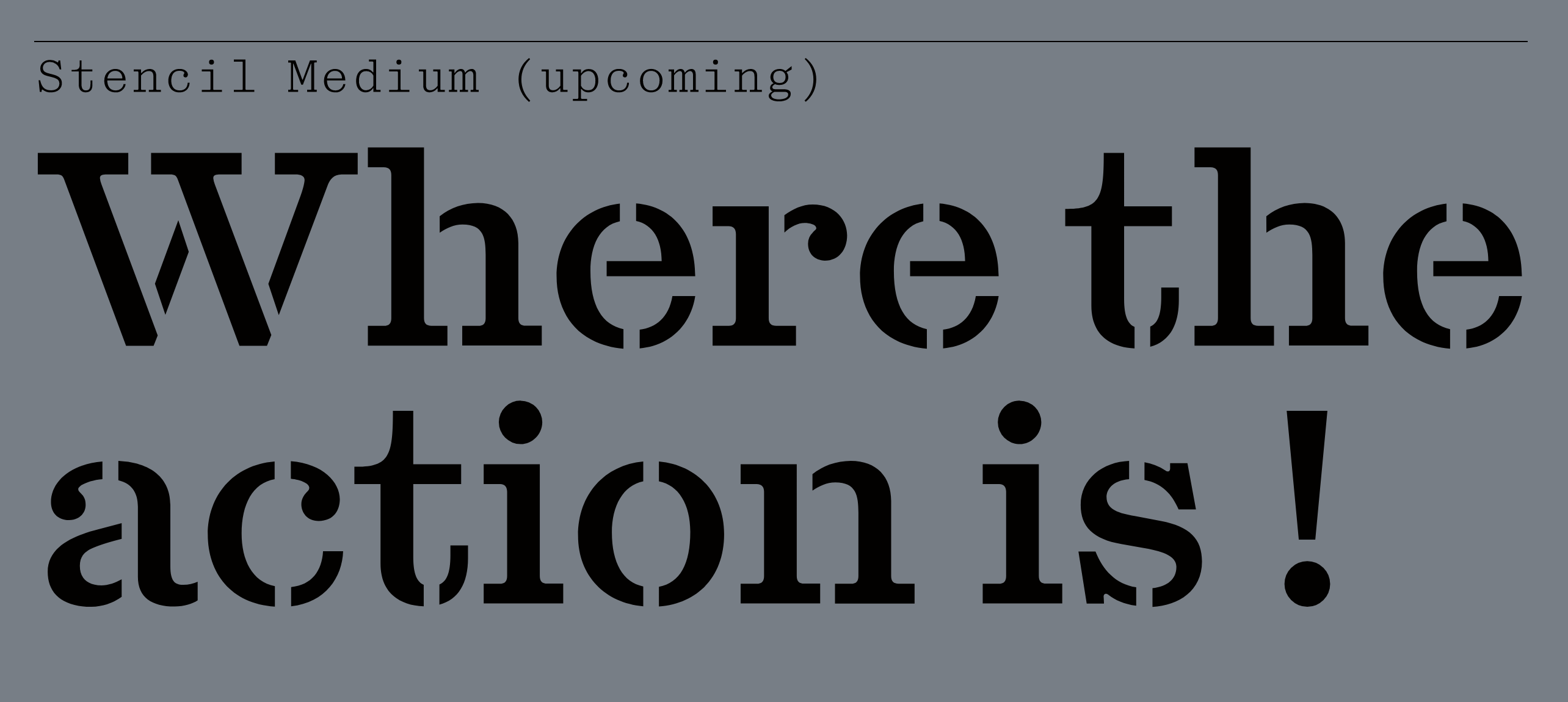
file name: Mario Feliciano Korrodi 2020 after Otto Weisert Arnold Bocklin 1904
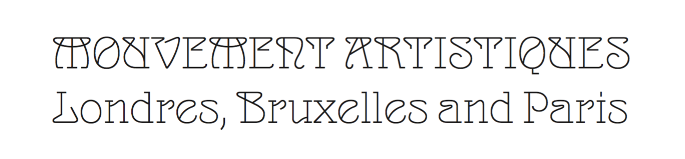
file name: Mario Feliciano Korrodi 2020 after Otto Weisert Arnold Bocklin 1904
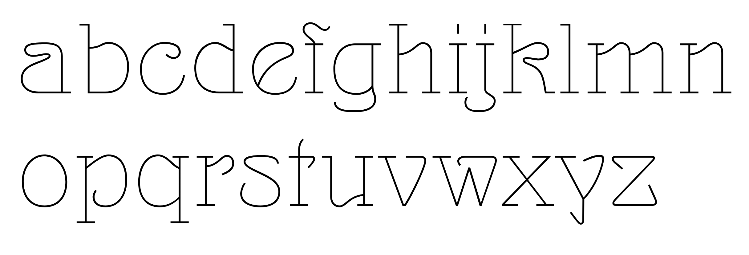
file name: Mario Feliciano Korrodi 2020 after Otto Weisert Arnold Bocklin 1904
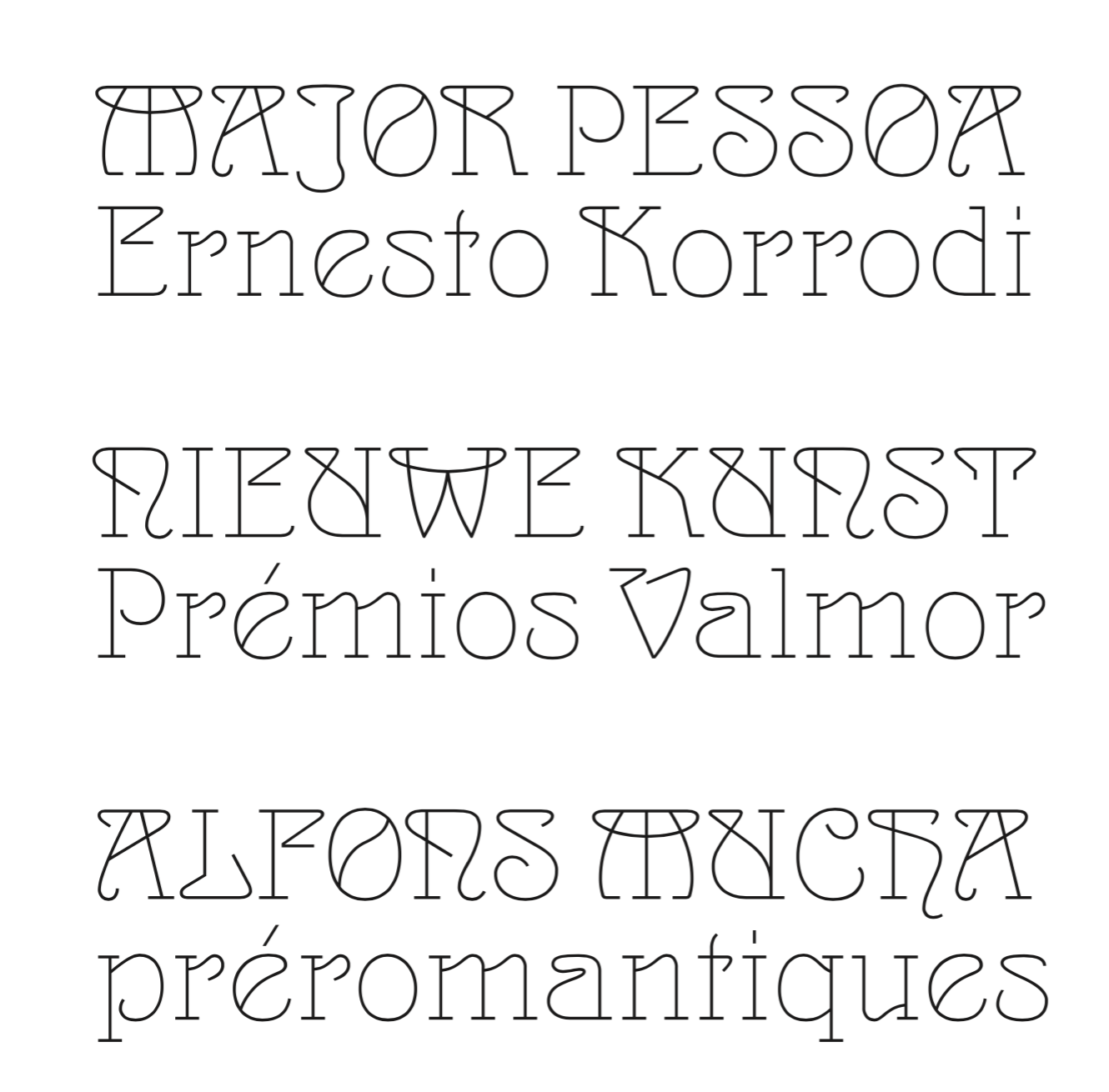
file name: Mario Feliciano Korrodi 2020 after Otto Weisert Arnold Bocklin 1904
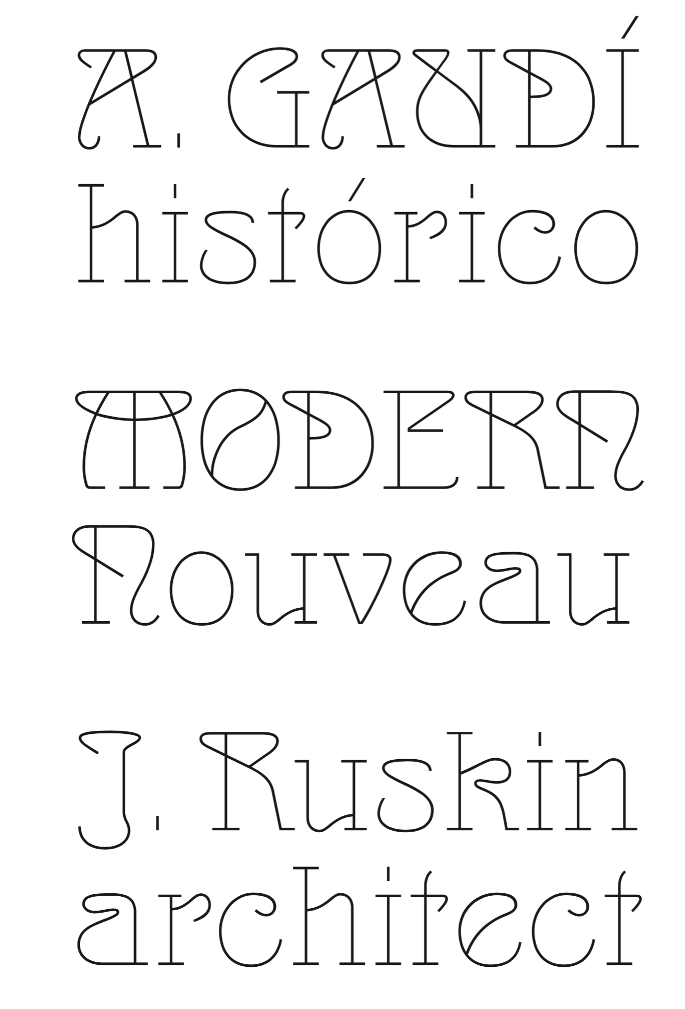
file name: Mario Feliciano Korrodi 2020 after Otto Weisert Arnold Bocklin 1904
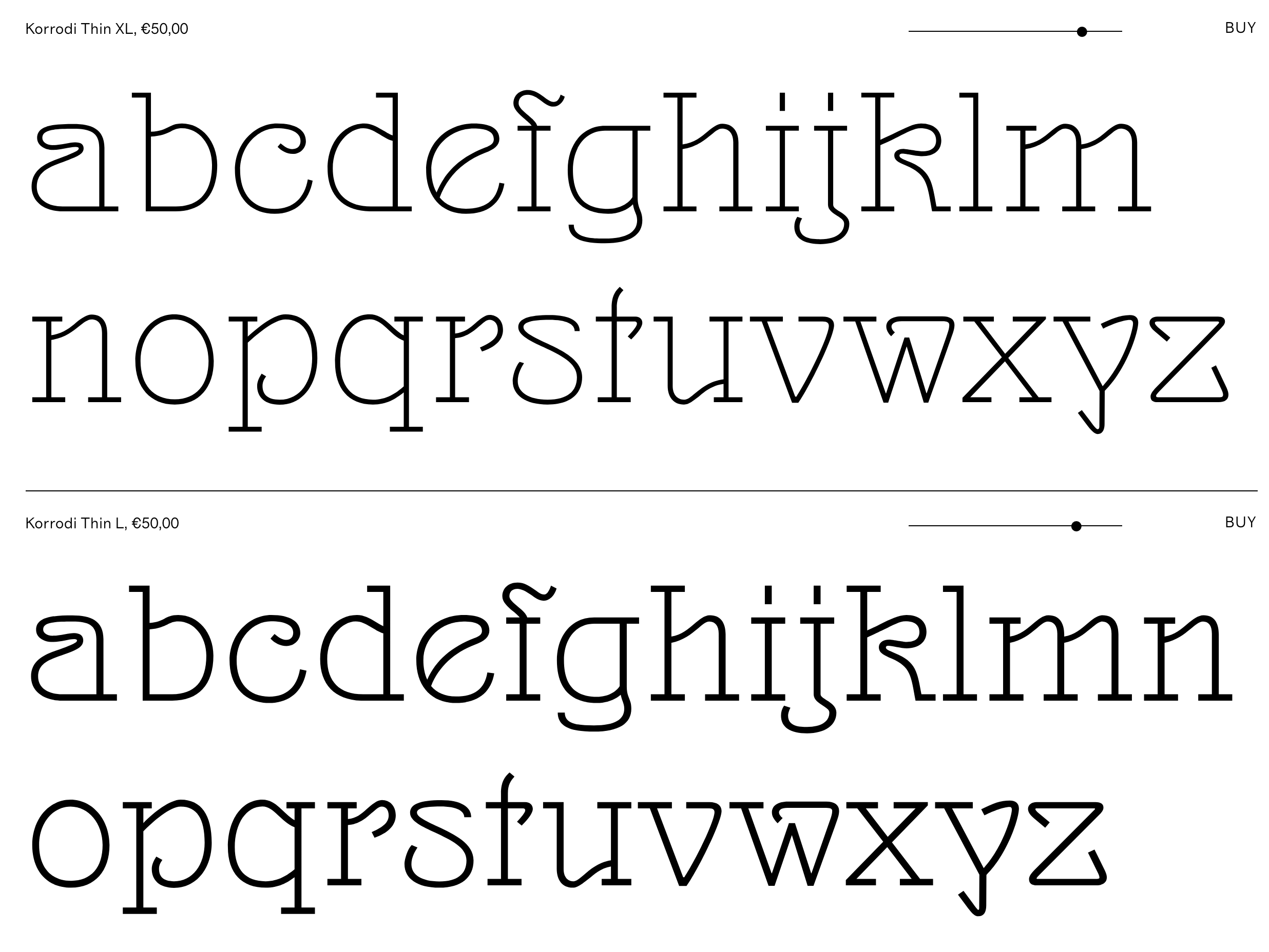
file name: Mario Feliciano Korrodi 2020 after Otto Weisert Arnold Bocklin 1904
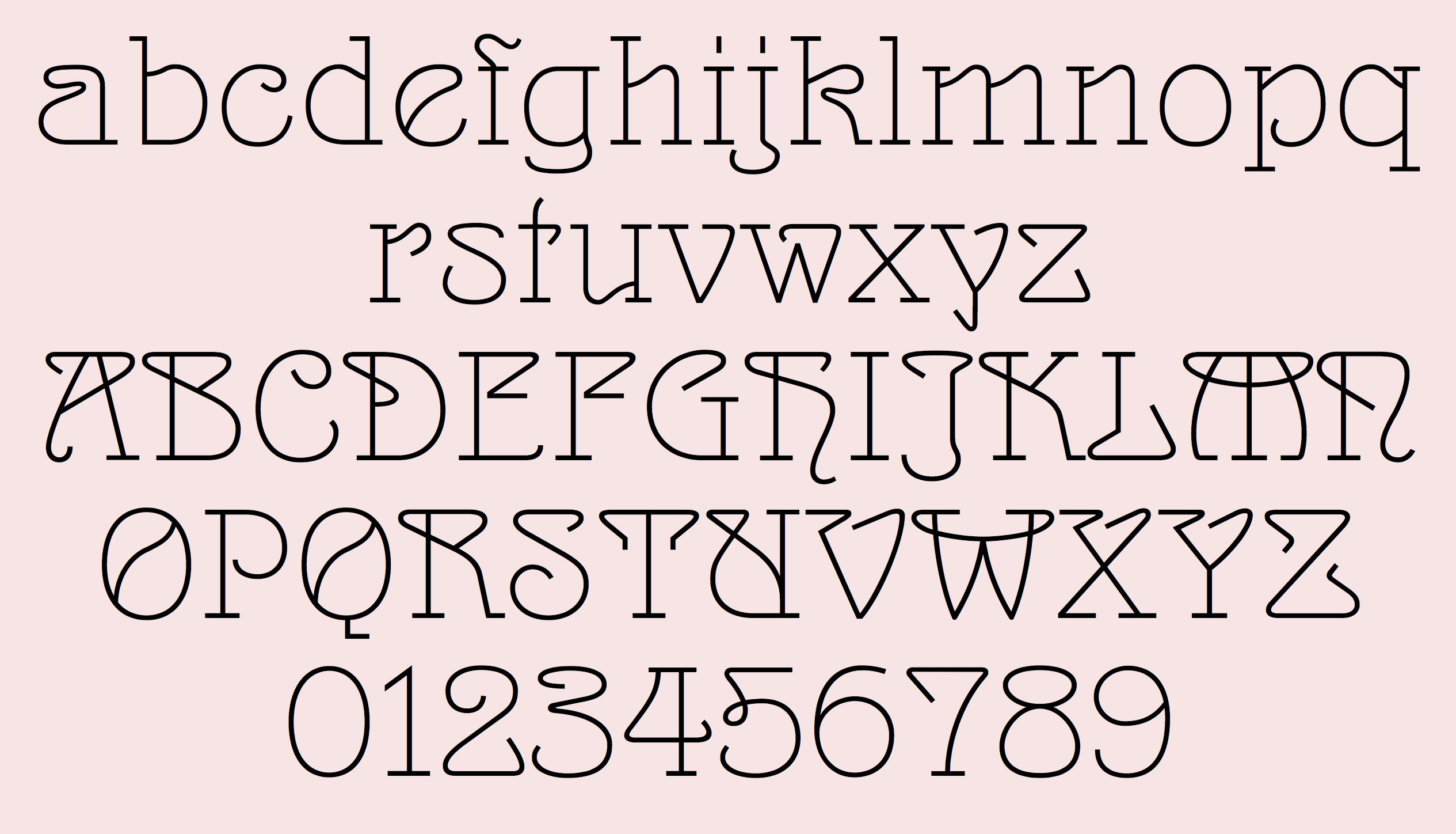
file name: Mario Feliciano Korrodi 2020 after Otto Weisert Arnold Bocklin 1904
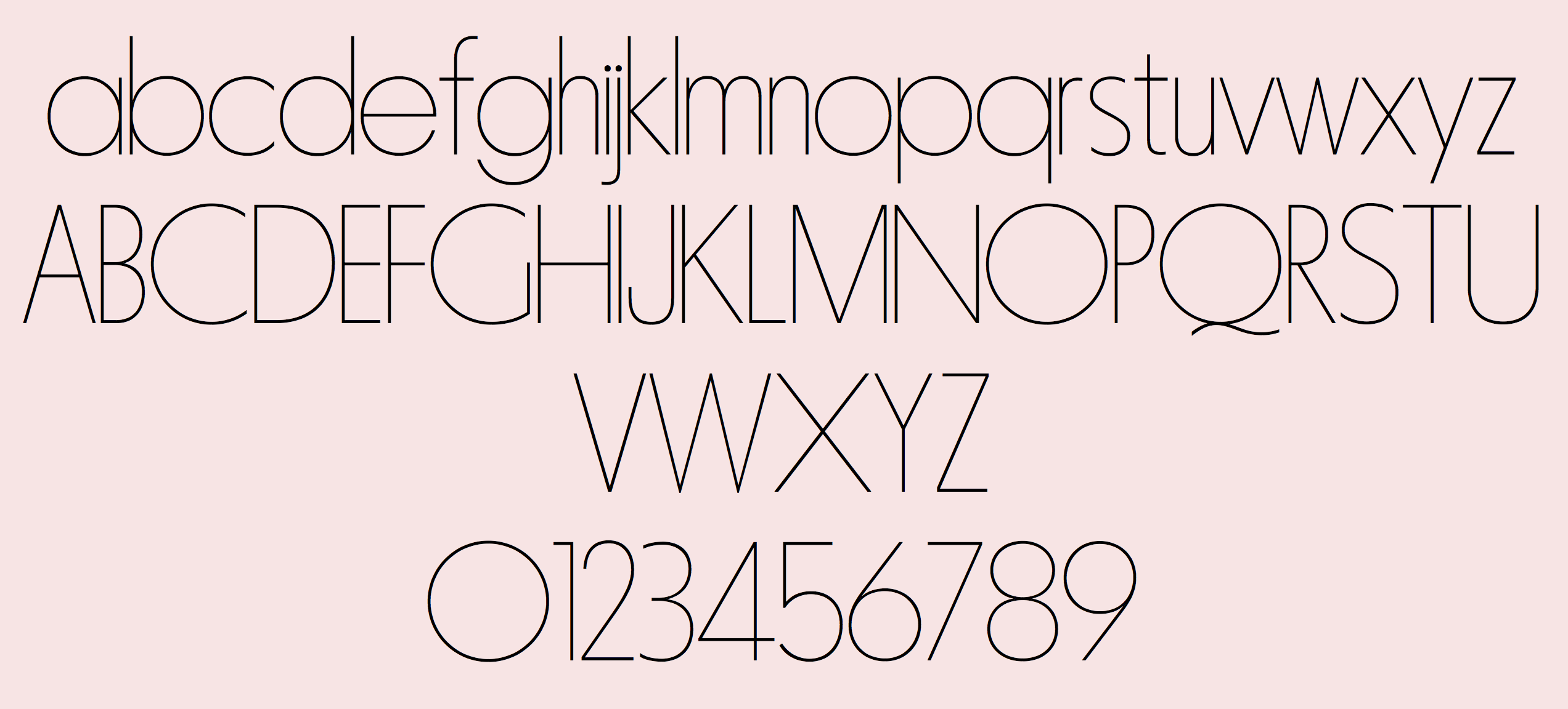
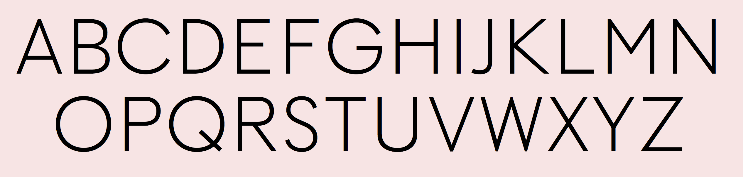
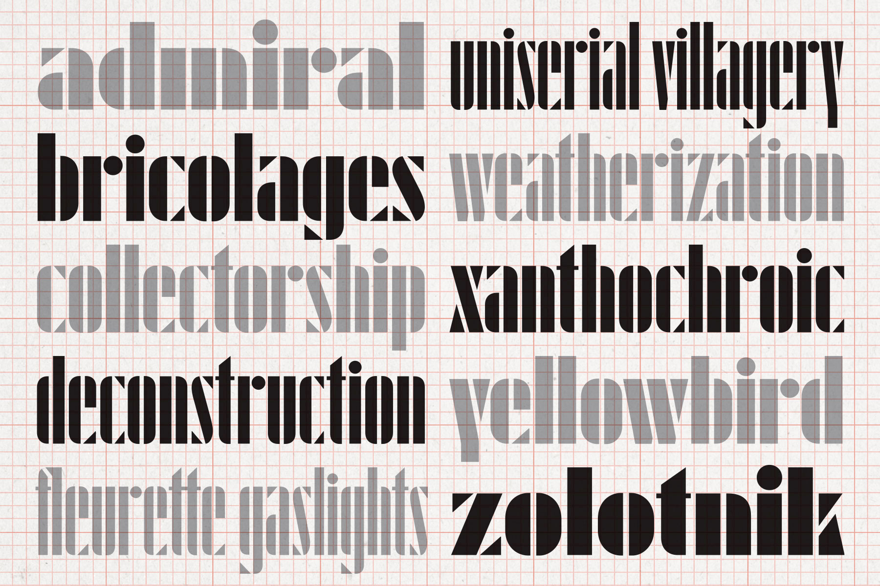
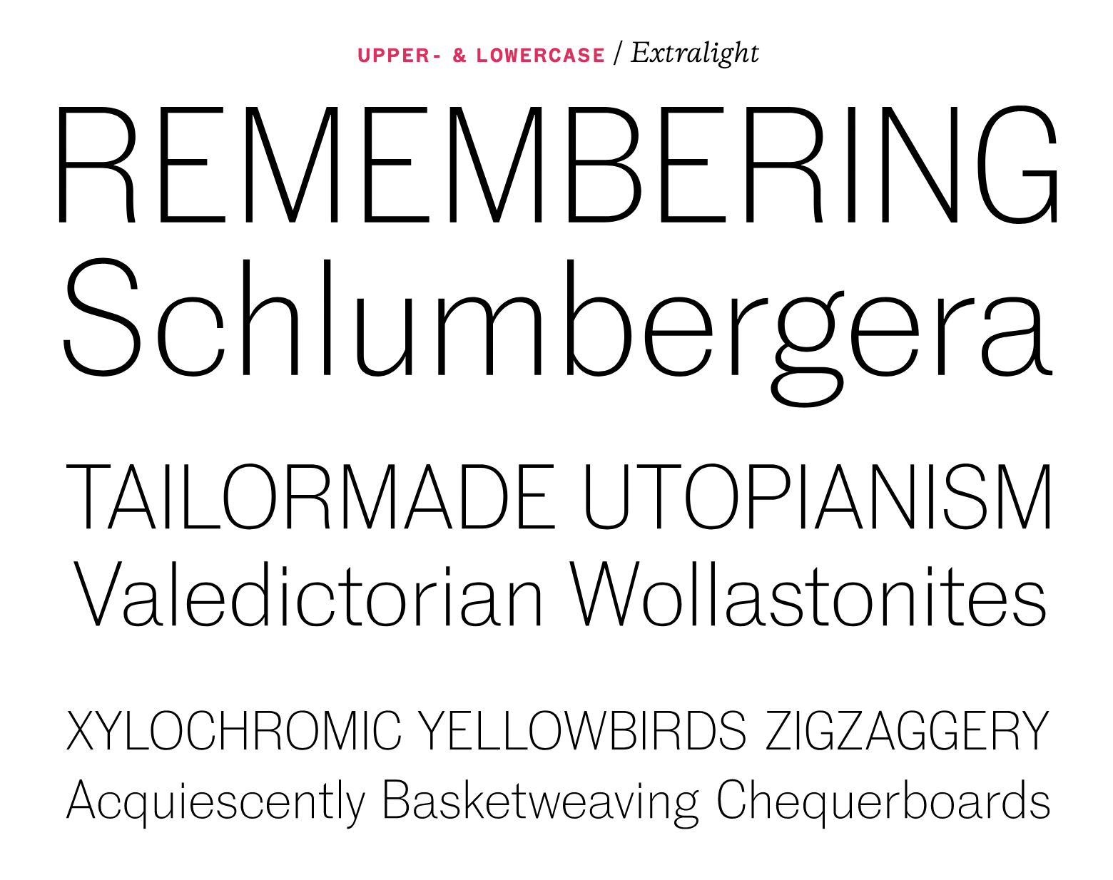
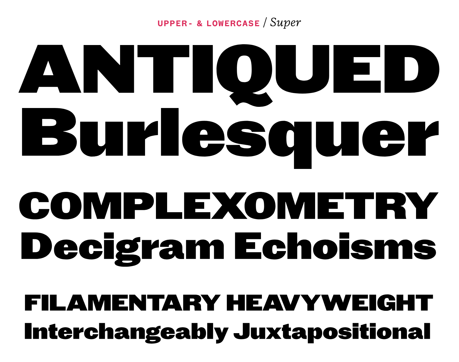
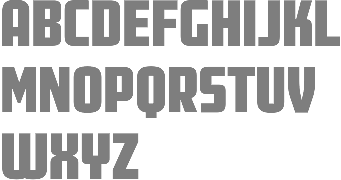
file name: Mario Feliciano Miletus Grotesk 2020 2021 after Keystone Standard Gothic 1906
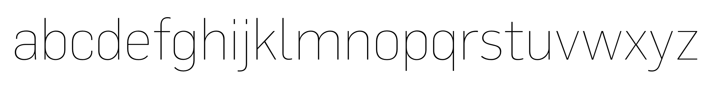
file name: Mario Feliciano Optional 2020 2021
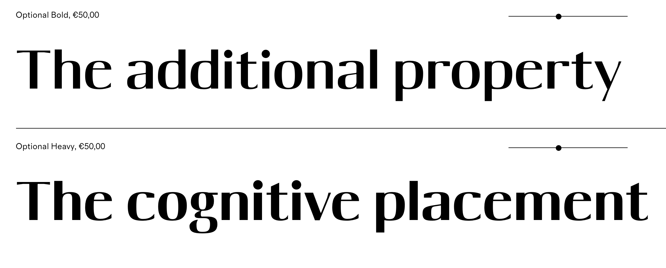
file name: Mario Feliciano Optional 2020 2021
file name: Mario Feliciano Parafina 2021
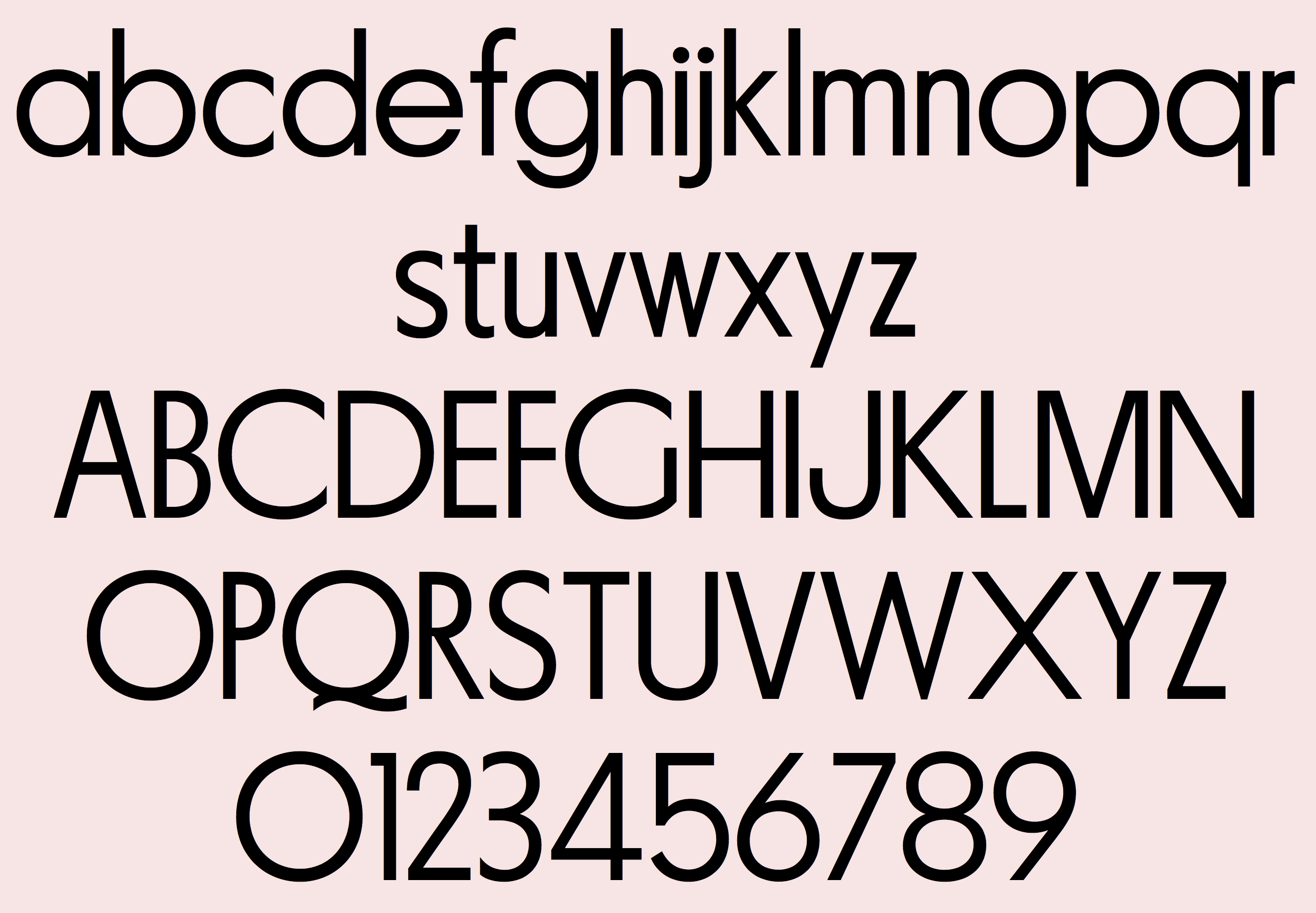
file name: Mario Feliciano Parafina 2021
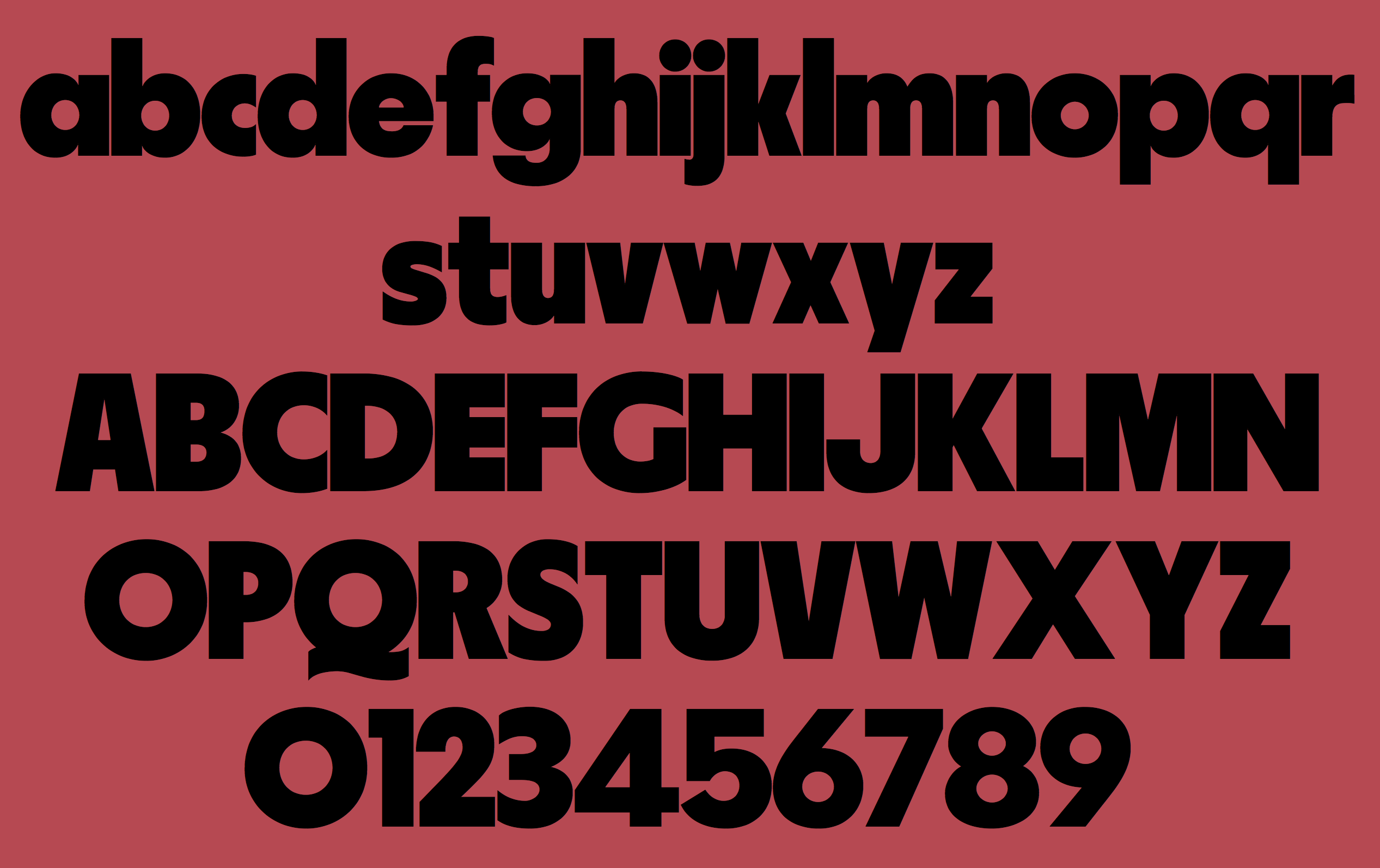
file name: Mario Feliciano Parafina 2021
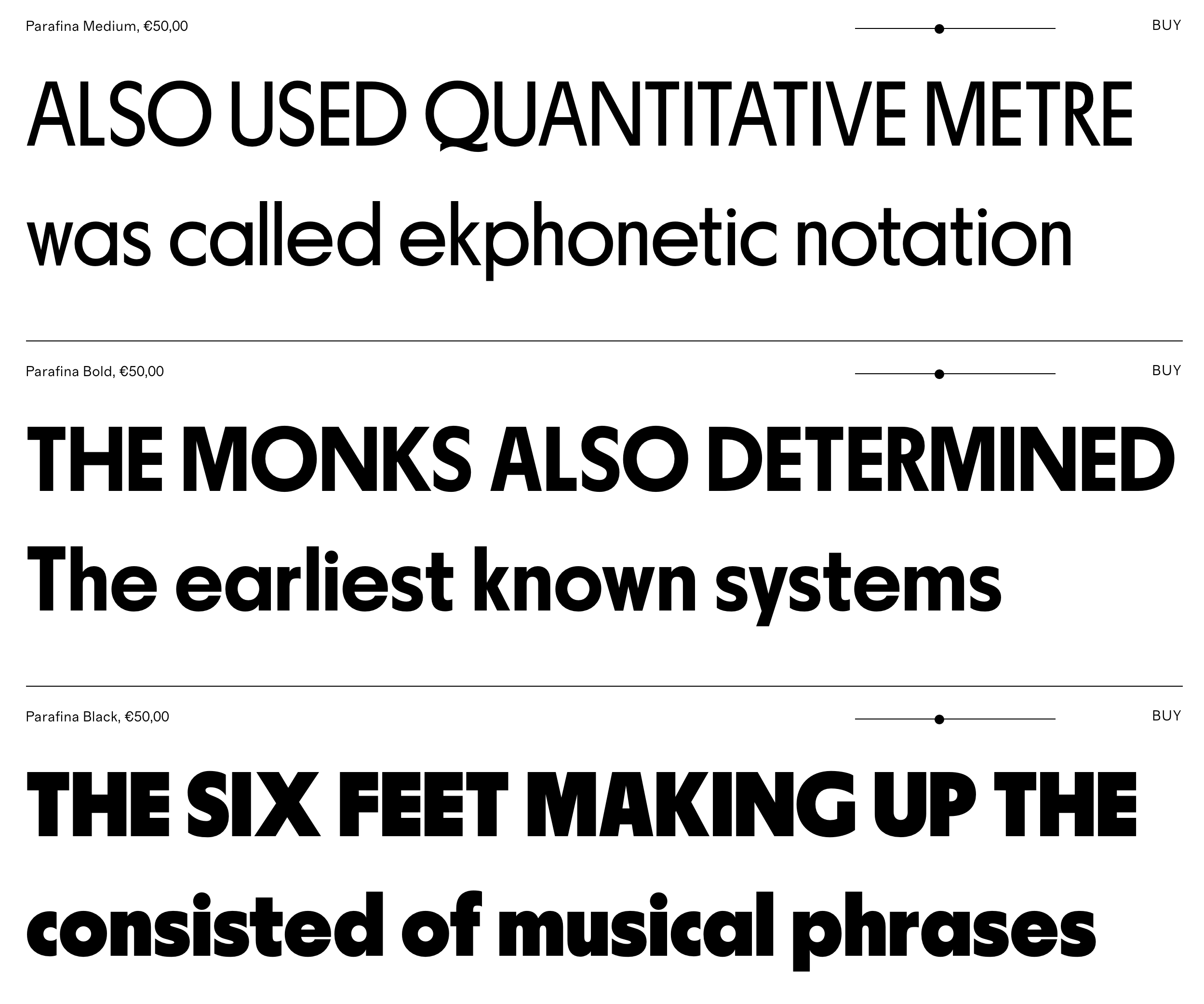
file name: Mario Feliciano Parafina 2021
file name: Mario Feliciano Penina 2021
file name: Mario Feliciano Rotep Alvor 2020
file name: Mario Feliciano Rotep Alvor 2020
file name: Mario Feliciano Rotep Alvor Black 2020
file name: Mario Feliciano Rotep Bornes 2020
file name: Mario Feliciano Rotep Bornes Light 2020
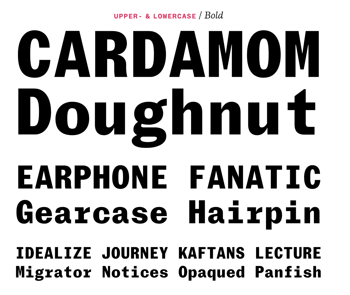
file name: Mario Feliciano Sebenta Bold 2020
file name: Mario Feliciano Sebenta Regular 2020

file name: Mario Fleciano Sebenta 2020 2021
file name: Mario Fleciano Sebenta 2020 2021

file name: Mario Fleciano Sebenta 2020 2021
file name: Mario Fleciano Sebenta 2020 2021

file name: Mario Fleciano Sebenta 2020 2021
file name: Mario Fleciano Sebenta 2020 2021
file name: Mario Fleciano Sebenta 2020 2021
file name: Mario Fleciano Sebenta 2020 2021
file name: Mario Fleciano Sebenta 2020 2021
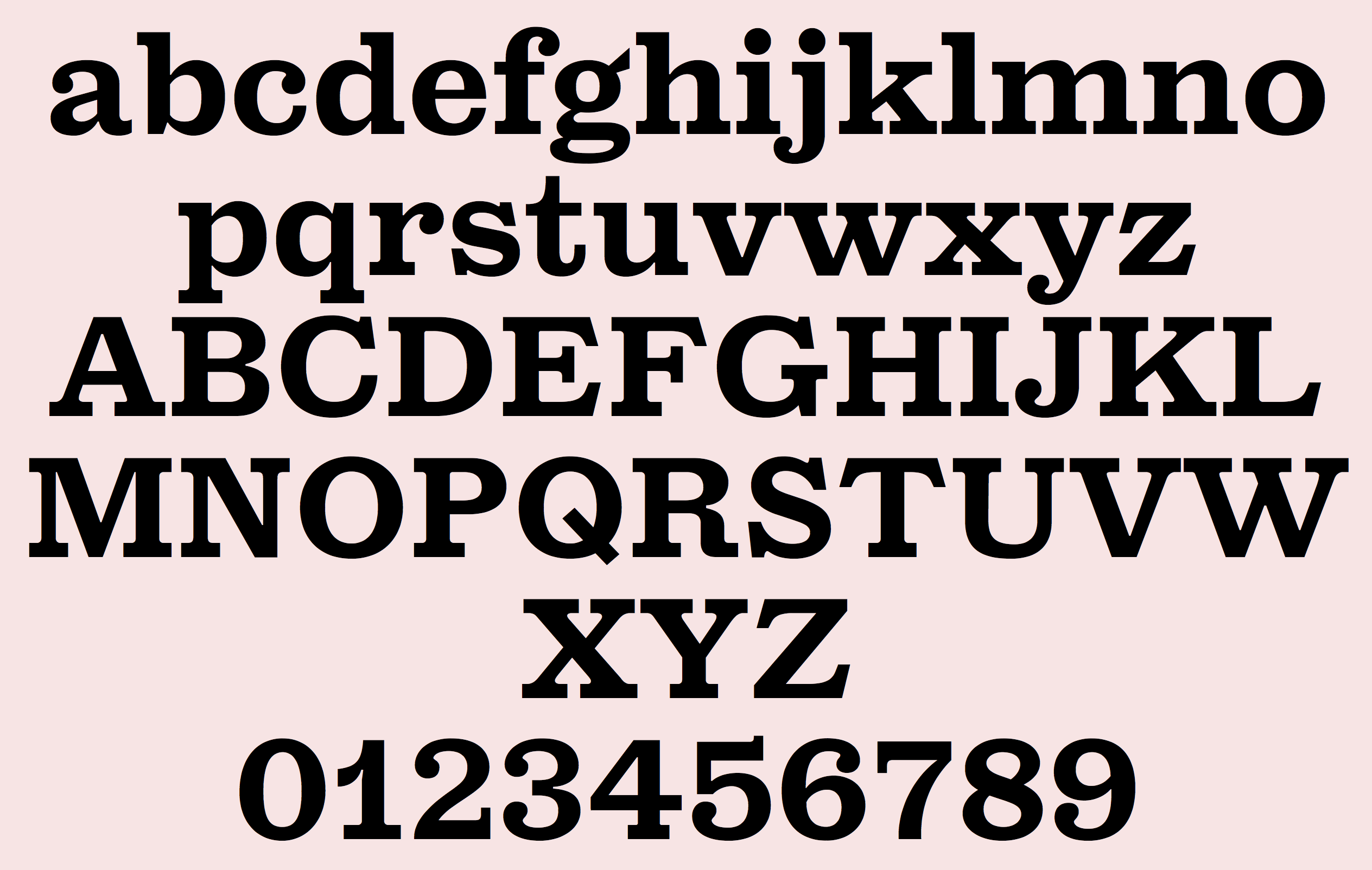
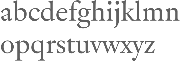
file name: Mario Feliciano Crisol 2019
file name: Mario Feliciano Crisol 2019
file name: Mario Feliciano Crisol 2019
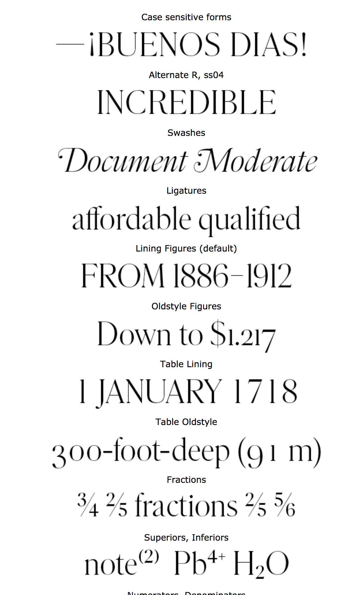
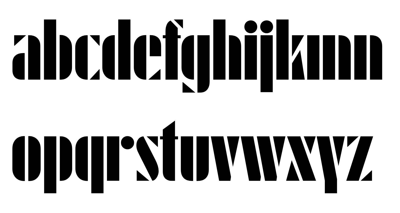
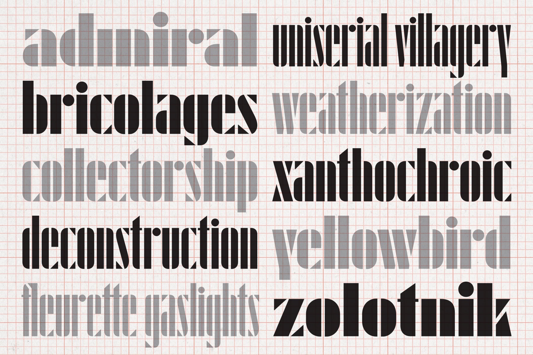
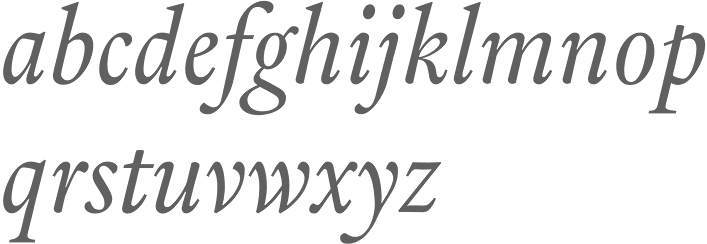
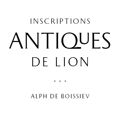
file name: Mario Feliciano Parnaso 2019
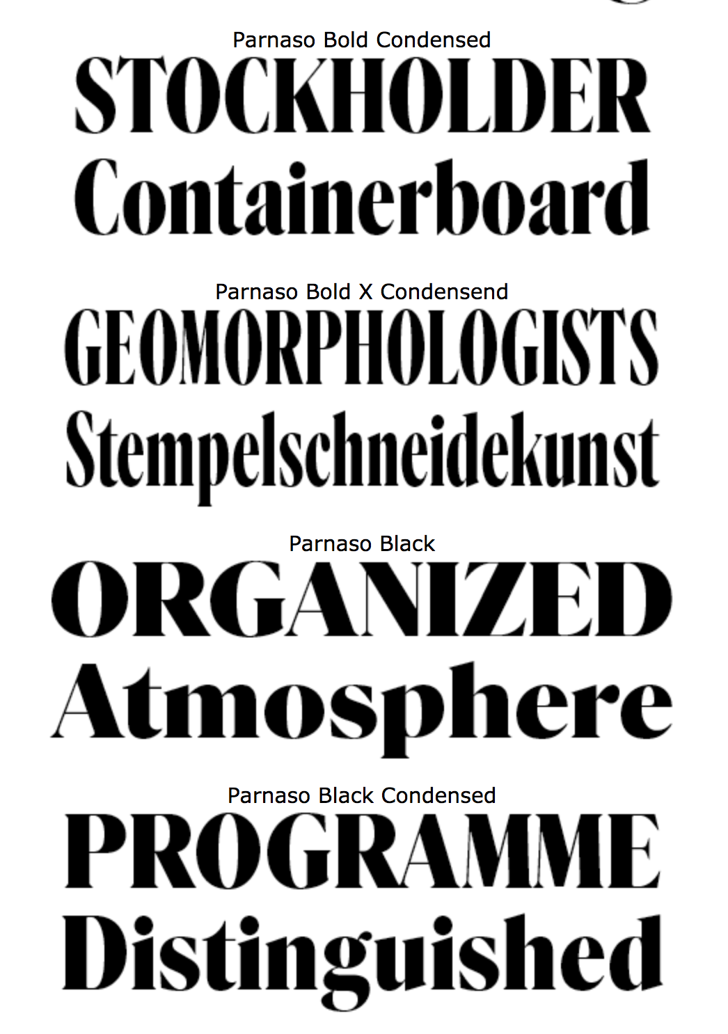
file name: Mario Feliciano Parnaso 2019
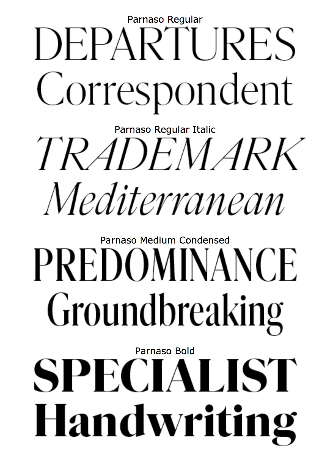
file name: Mario Feliciano Parnaso 2019
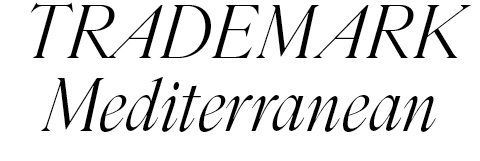
file name: Mario Feliciano Parnaso 2019
file name: Mario Feliciano Mazagan 2019
file name: Mario Feliciano Mazagan 2019
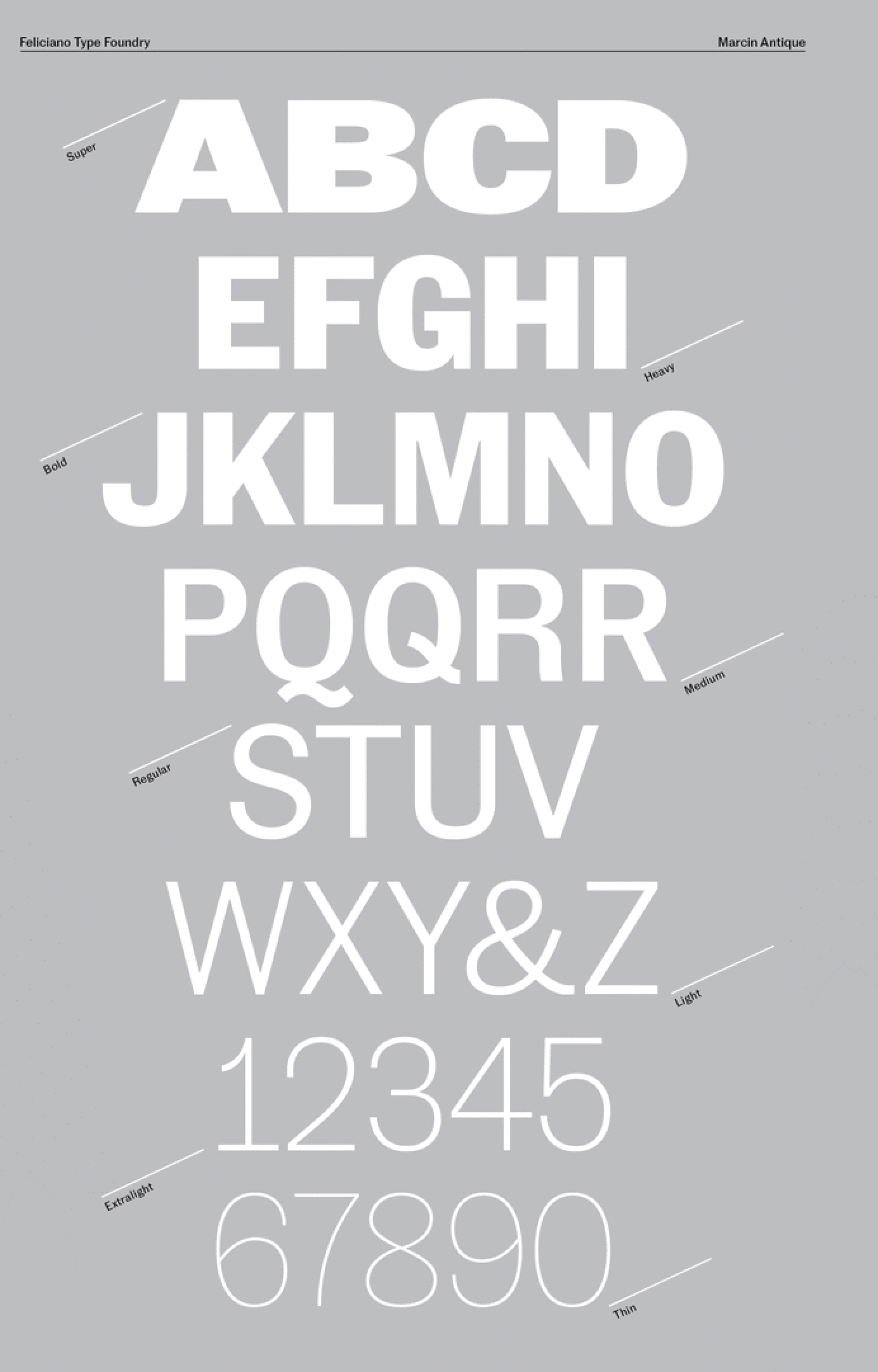
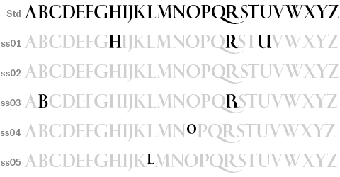
file name: Mario Feliciano Marcin Antique 2017
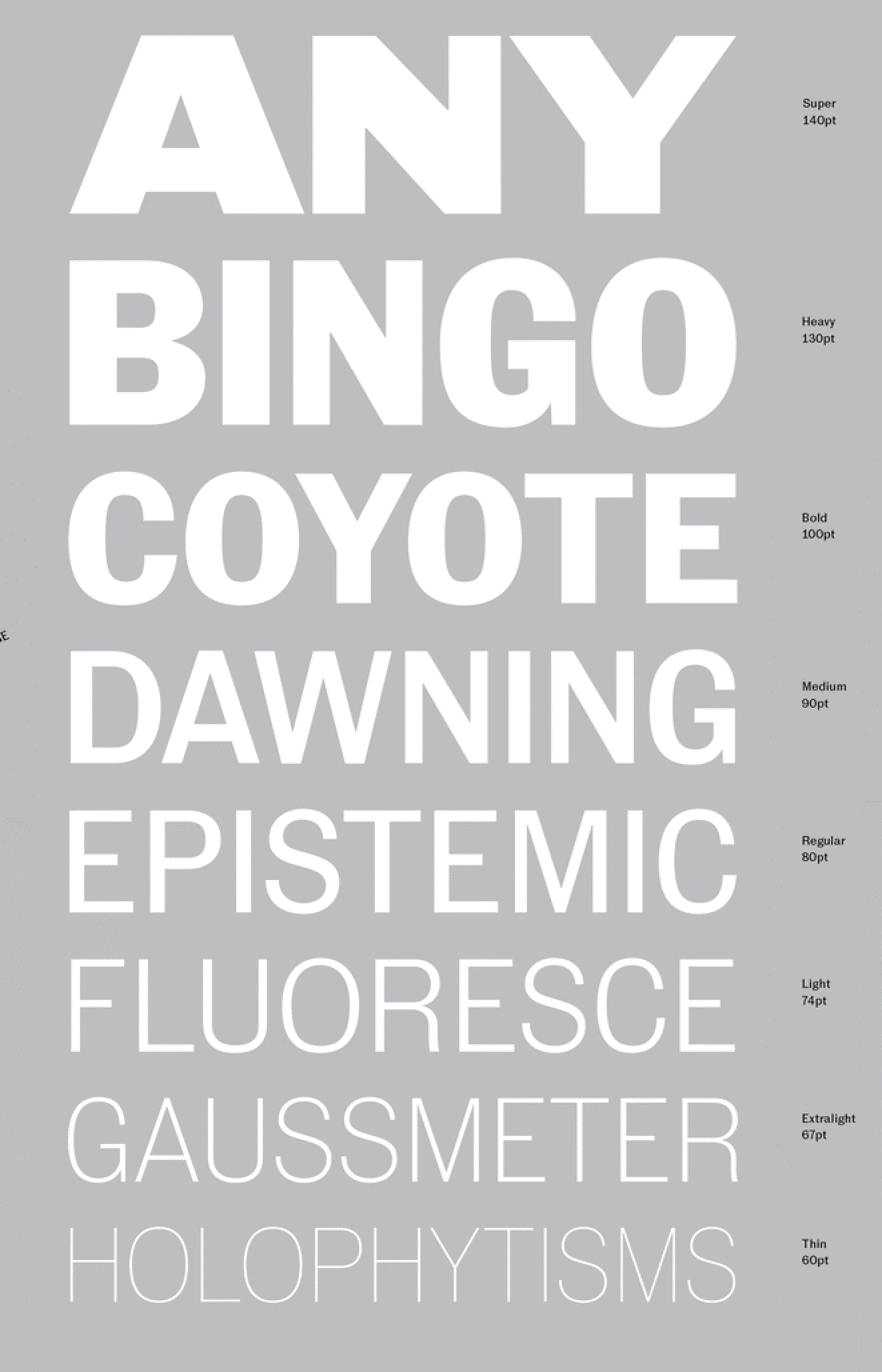
file name: Mario Feliciano Marcin Antique 2017
file name: Mario Feliciano Marcin Antique 2017
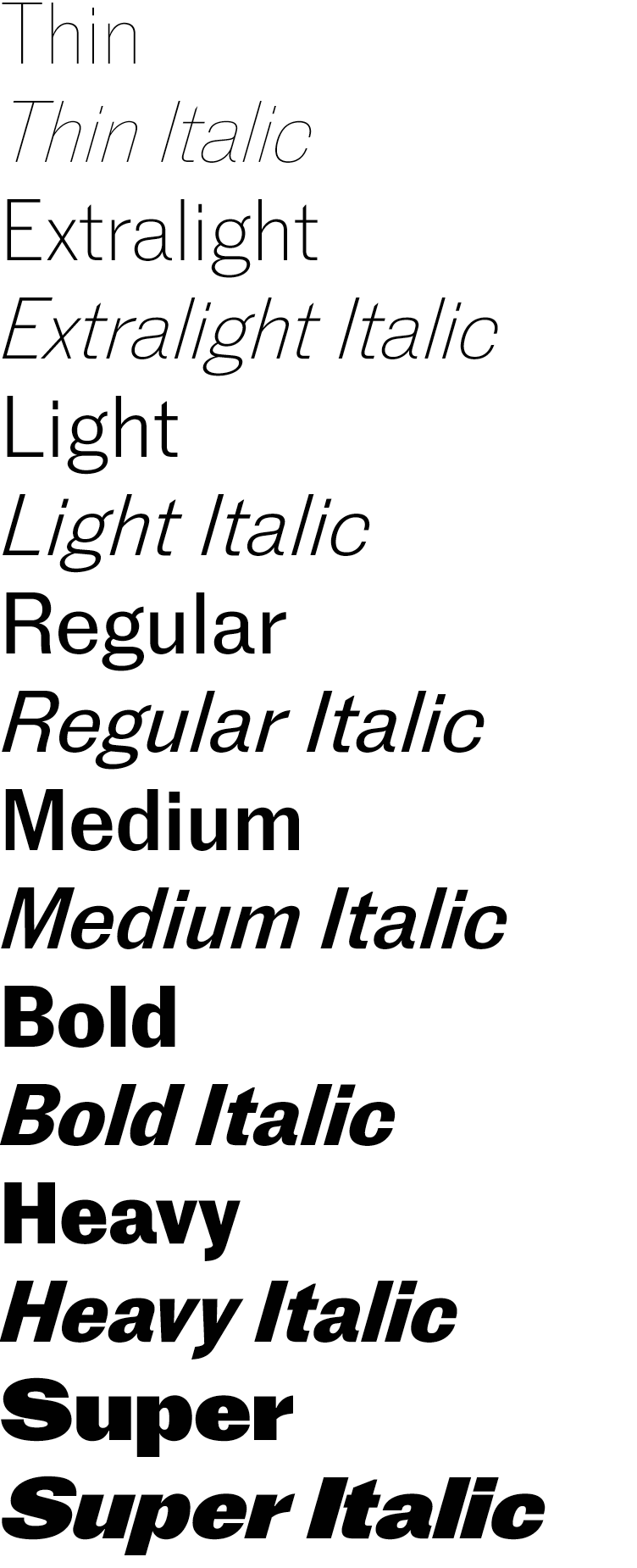
file name: Mario Feliciano Marcin Antique 2017b
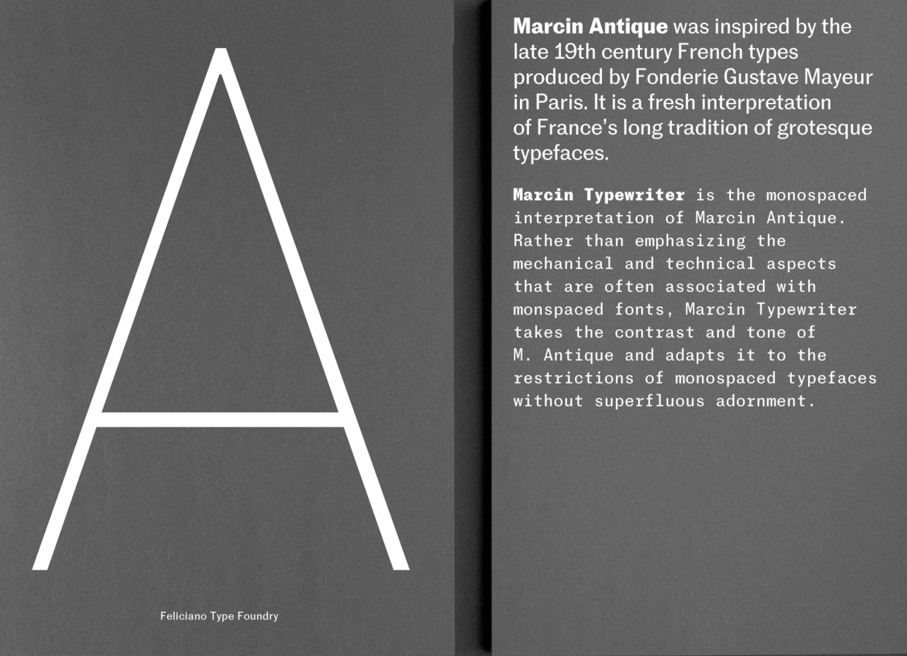
file name: Mario Feliciano Marcin Antique 2017c
file name: Mario Feliciano Marcin Antique Extra Light 2017
file name: Mario Feliciano Marcin Antique Heavy 2017
file name: Mario Feliciano Marcin Antique Light 2017
file name: Mario Feliciano Marcin Antique Super 2017
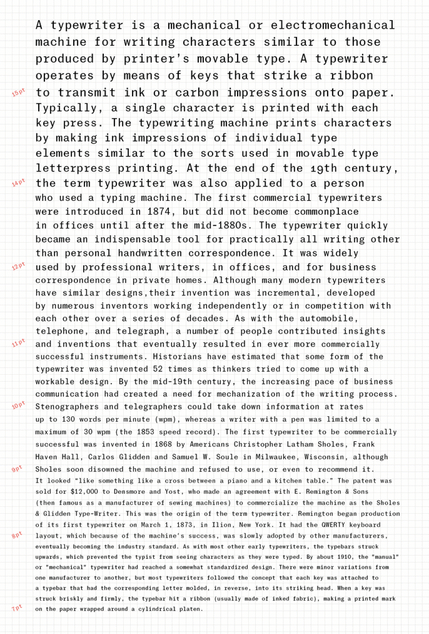
file name: Mario Feliciano Marcin Typewriter 2017
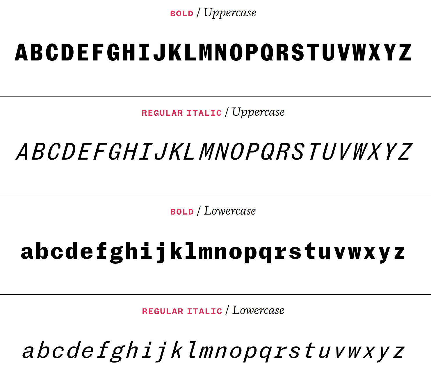
file name: Mario Feliciano Marcin Typewriter 2017
file name: Mario Feliciano Marcin Typewriter 2017b
file name: Mario Feliciano Marcin Typewriter Medium 2017
file name: Mario Feliciano Marcin Typewriter Super 2017
file name: Feliciano Rongel Tb Osf 2012 01 01
file name: Feliciano Rongel Tb Osf Italic 2012 01 01
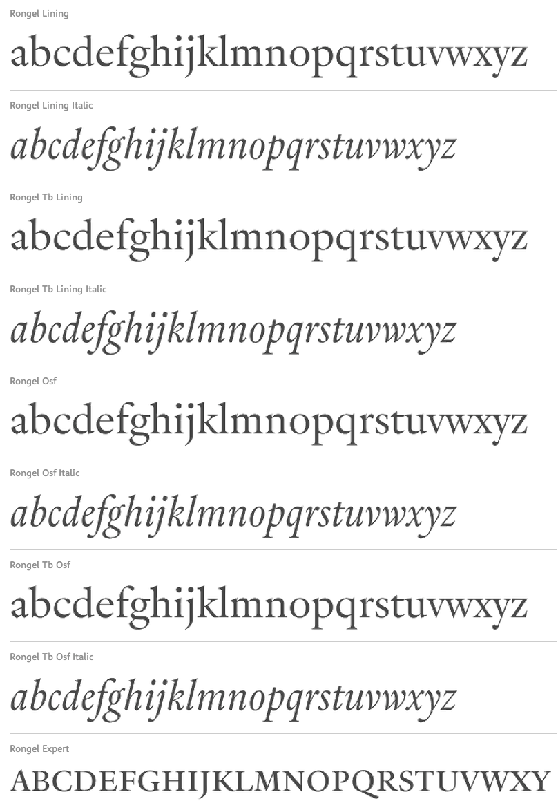
file name: Mario Feliciano Rongel 2001
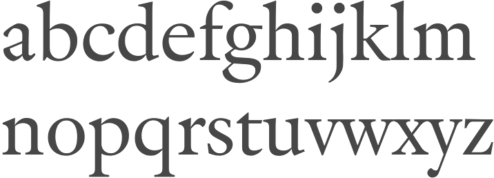
file name: Mario Feliciano Rongel 2001b

file name: Mario Feliciano Aurea Ultra 1997
file name: Mario Feliciano Grotzec Cond Regular 2015
file name: Mario Feliciano Grotzec More
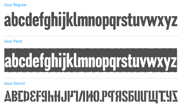
file name: Mario Feliciano Gazz 1997
file name: Mario Feliciano Eudald News Medium 1998 2009
file name: Mario Feliciano Merlo Tx 2004

file name: Mario Feliciano Merlo T B 1998 2005
file name: Mario Feliciano Merlo T B 1998 2005b
file name: Mario Feliciano Stella 2001

file name: Mario Feliciano B S Kombat Alternate 1998
file name: Mario Feliciano Morgan Poster Black 2001
file name: Mario Feliciano Garda Nova 1998 2005
file name: Mario Feliciano Garda Nova 1998 2005
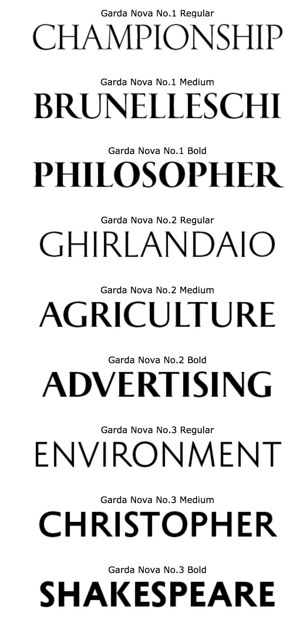
file name: Mario Feliciano Garda Nova 1998 2005
file name: Mario Feliciano F T F Garda Titling 1998 2005

file name: Mario Feliciano T E F F Geronimo
file name: Mario Feliciano Geronimo 2010
file name: Mario Feliciano Geronimo 2010b

file name: Mario Feliciano Pic
file name: Pic Black Feliciano Lisbon
file name: Pic Mario Feliciano
| | |
|
Luc Devroye ⦿ School of Computer Science ⦿ McGill University Montreal, Canada H3A 2K6 ⦿ lucdevroye@gmail.com ⦿ https://luc.devroye.org ⦿ https://luc.devroye.org/fonts.html |