TYPE DESIGN INFORMATION PAGE last updated on Sat Jun 22 21:40:10 EDT 2024
FONT RECOGNITION VIA FONT MOOSE

|
|
|
|
Bill Troop
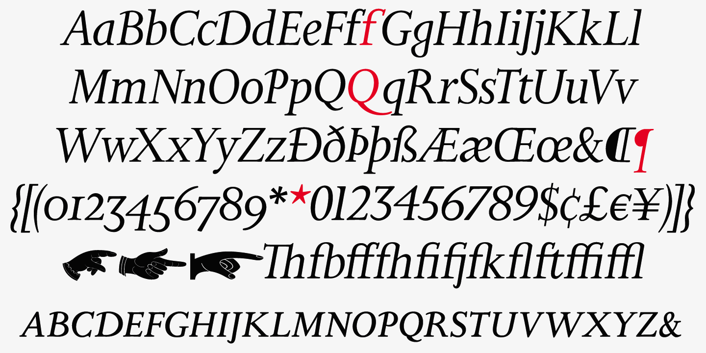
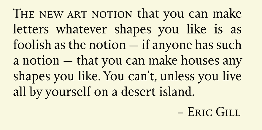
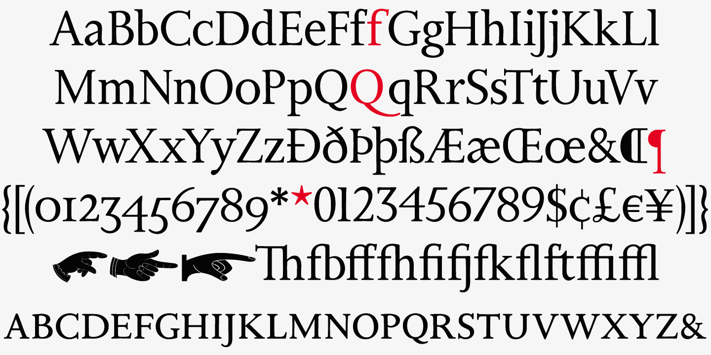
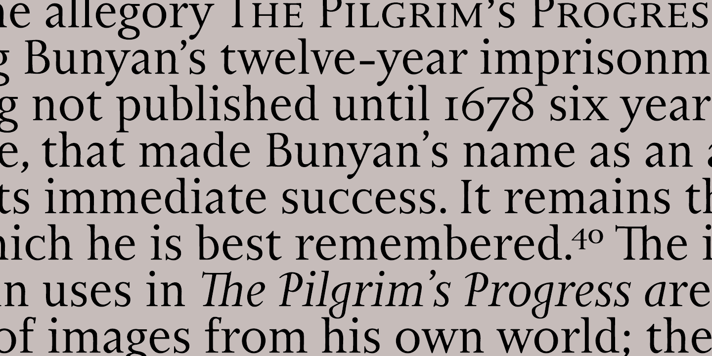
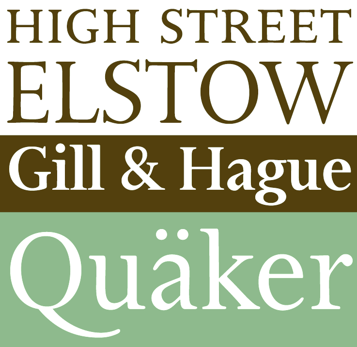
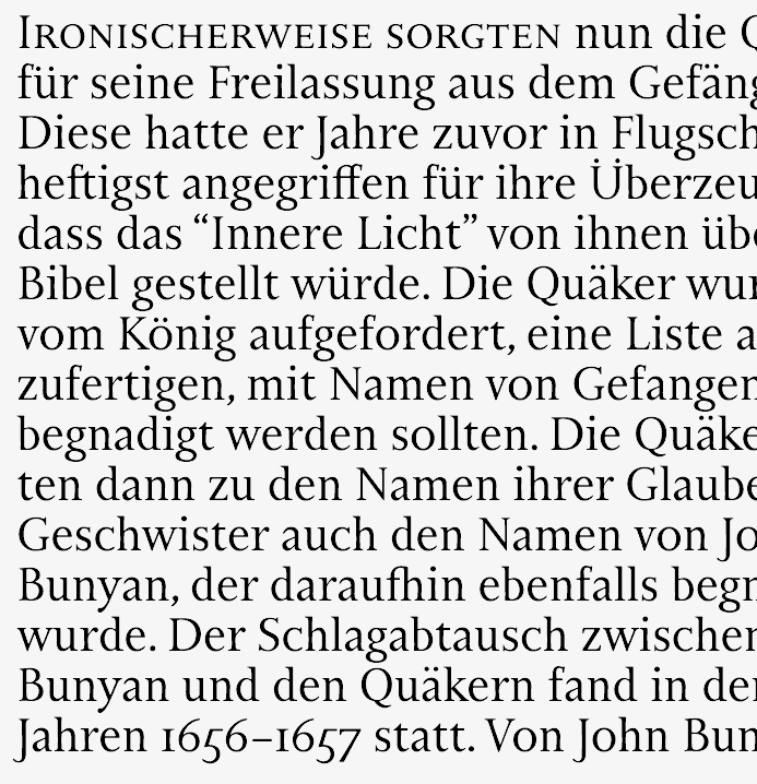
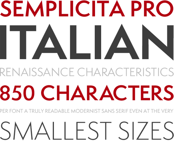
Bill Troop, a phenomenal wordsmith, runs Graphos. Just read this quote: Typeface Design is obtuse, incomprehensible, unsuitable, unremunerable, and irresistable. With the aid of the computer, it has never been easier to design a typeface, and never easier to manufacture one. Because of PostScript, TrueType, and font creation programs like Fontographer, Font Studio, and Font Lab, there have never been more typeface designs available, nor have there ever been so many typeface designers active. Yet, just as at all times and places there is very little good of anything to be had, so there are remarkably few fine typefaces available today. Printers now have merely a fraction of the first rate types they had in 1930. He is active in the typophile community, where he is a fervent supporter of high quality and ethical typography. Bill Troop (b. Montreal) grew up in New York and London. He studied classical piano, type design, photography and writing. He is married to the novelist Elspeth Barker, and lives in England. Bill designed Busted (2008, Canada Type: grunge family) and the luxurious families Didot Headline (2009, Canada Type) and Didot Display. From 2009 until 2011, he cooperated with Patrick Griffin at Canada Type on a monumental revival of Alessandro Butti's Semplicità typeface---the new family is called Semplicità Pro. The designers write: Bill and I spent some time looking closely at Futura, the instant popularity of which in the late 1920s triggered Butti's design. This was for the most part a pleasant process of rehashing what constitues a geometric typeface, musing over the fundamental phallacy of even having such a classification in type while in reality very little geometry is left after the application of the optical adjustments inherently needed in simplified alphabet forms, trying to understand how far such concepts can go before entering into minimalism, and scoping the relativity between form simplicity and necessary refinement. Mostly academic, but very educational and definitely worth the ticket. [...] For an answer to Futura, Semplicità was certainly quite adventurous and ahead of its time. It introduced aesthetic genetics that can be seen in popular typefaces to this very day, which is to say eighty years later. Though some of that DNA was too avant-garde for the interwar period during which Semplicità lived out its popularity, much of it remains as an essential aesthetic typographers resort to whenever there is call for modern, techno, or high-end futuristic appeal. The most visibly adventurous forms at the time were the f and t, both which having no left-side crossbar, with the f's stem also extended down to fully occupy the typeface's descender space. Aside from those two letters, Semplicità's radical design logic and idiosyncracy become more apparent when directly compared with Futura. [...] Futura attempted to go as far as geometry could take it, which ultimately made it too rigid and considerably hurt its viability for text setting. Renner himself acknowledged some of its flaws, and even proposed alternate fucntionality treatments, with a more humanist aproach applied to some forms, all of which went nowhere because Futura's momentum and revenue were deemed undisruptable by some- thing so trivial as aesthetic or functionality. William Dwiggins' Metro design, a direct descendent of the Renner's design, went almost diametrically the opposite way of Futura, with the deco facets considerably magnified and the geometry toned down. Butti decided a design that finds the middle ground in that aesthetic tug of war was probably a better idea than either extreme. In 2016, Patrick Griffin and Bill Troop co-designed Bunyan Pro, which is the synthesis of Bunyan, the last face Eric Gill designed for hand setting in 1934 and Pilgrim, the machine face based on it, issued by British Linotype in the early 1950s---the most popular Gill text face in Britain from its release until well into the 1980s. |
EXTERNAL LINKS |
| | |


file name: Bill Troop Didot Display 2009
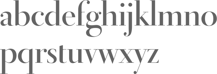
file name: Bill Troop Didot Display 2009c
file name: Bill Troop Didot Display 2009d
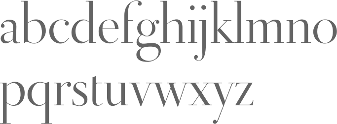
file name: Bill Troop Didot Display Bold 2009b
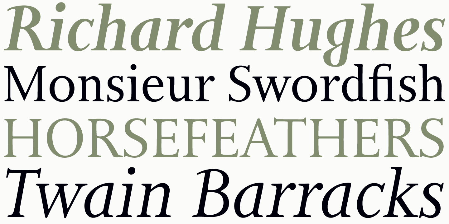
file name: Patrick Griffin Bill Troop Bunyan Pro 2016 after Eric Gill Bunyan 1934 205859
file name: Patrick Griffin Bill Troop Bunyan Pro 2016 after Eric Gill Bunyan 1934 205861
file name: Patrick Griffin Bill Troop Bunyan Pro 2016 after Eric Gill Bunyan 1934 205862
file name: Patrick Griffin Bill Troop Bunyan Pro 2016 after Eric Gill Bunyan 1934 205865
file name: Patrick Griffin Bill Troop Bunyan Pro 2016 after Eric Gill Bunyan 1934 205867
file name: Canada Type Bunyan Pro 2016 205860
file name: Canada Type Bunyan Pro 2016 205860

file name: Canada Type Bunyan Pro 2016 205863
file name: Canada Type Bunyan Pro 2016 205866
file name: Canada Type Bunyan Pro 2016 205868

file name: Canada Type Bunyan Pro 2016 205869

file name: Canada Type Bunyan Pro 2016 205869

file name: Canada Type Bunyan Pro 2016

file name: Patrick Griffin Bill Troop Semplicita vs Futura
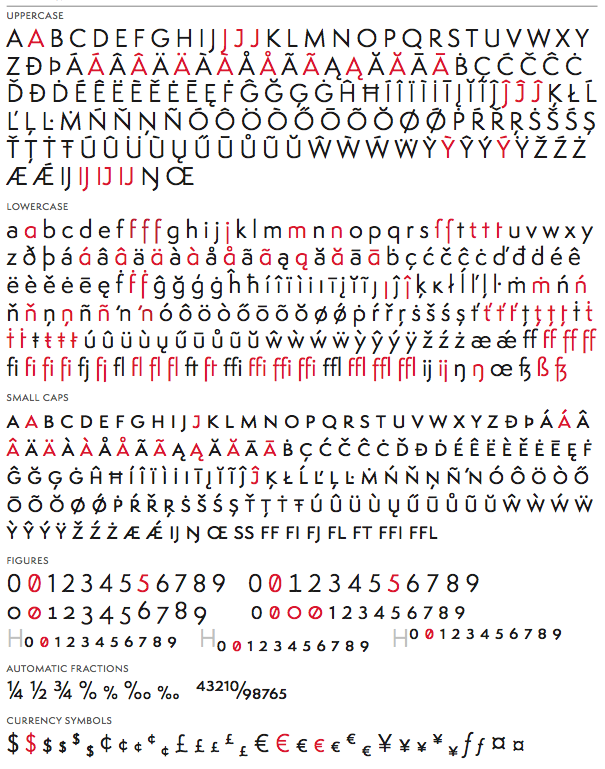
file name: Patrick Griffin Bill Troop Semplicita Pro Regular 2011
file name: Patrick Griffin Bill Troop Semplicita Pro Regular 2011d

file name: Patrick Griffin Bill Troop Semplicita Pro 2011c

file name: Patrick Griffin Bill Troop Semplicita Pro Medium 2011

file name: Bill Troop Didot Display Bold2009

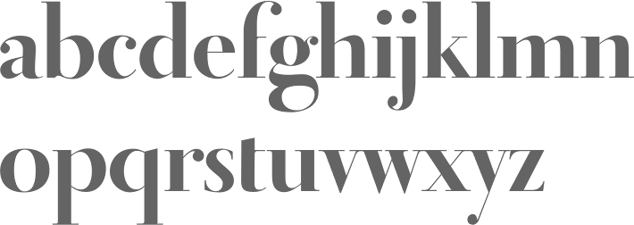
file name: Bill Troop Didot Headline2009
| | |
|
Luc Devroye ⦿ School of Computer Science ⦿ McGill University Montreal, Canada H3A 2K6 ⦿ lucdevroye@gmail.com ⦿ http://luc.devroye.org ⦿ http://luc.devroye.org/fonts.html |