TYPE DESIGN INFORMATION PAGE last updated on Wed May 6 16:10:38 EDT 2026
FONT RECOGNITION VIA FONT MOOSE

|
|
|
|
Laura Meseguer
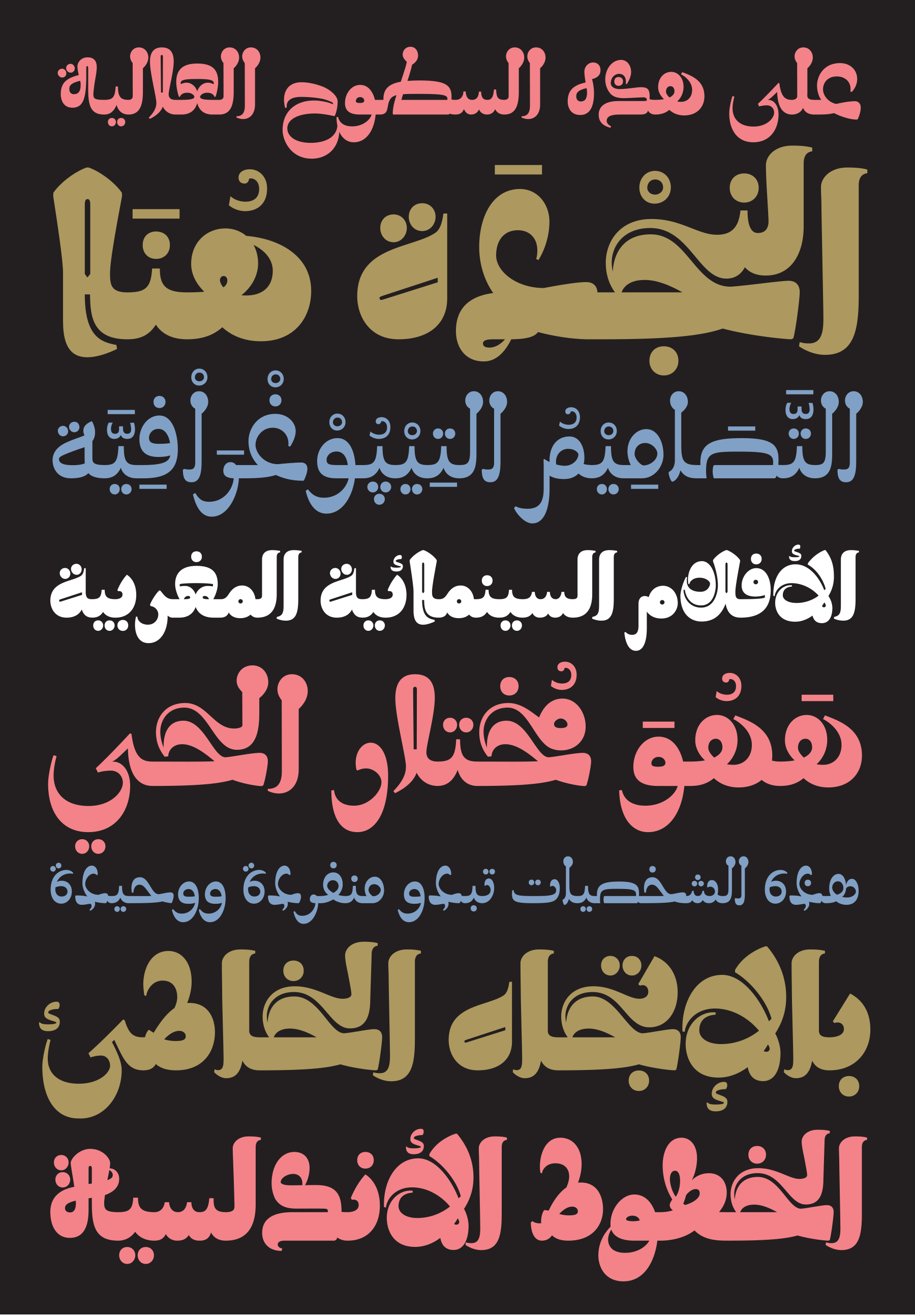
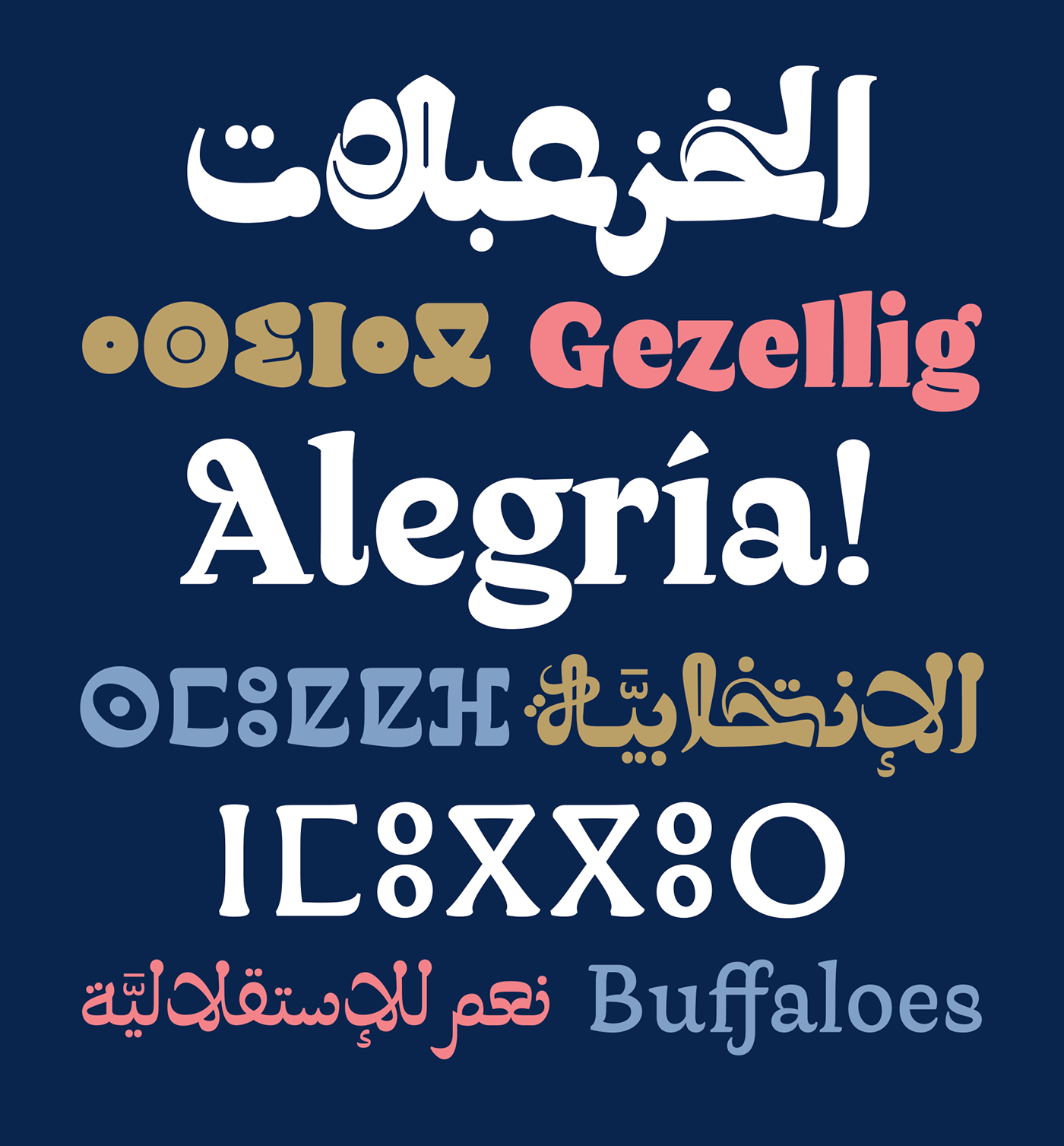
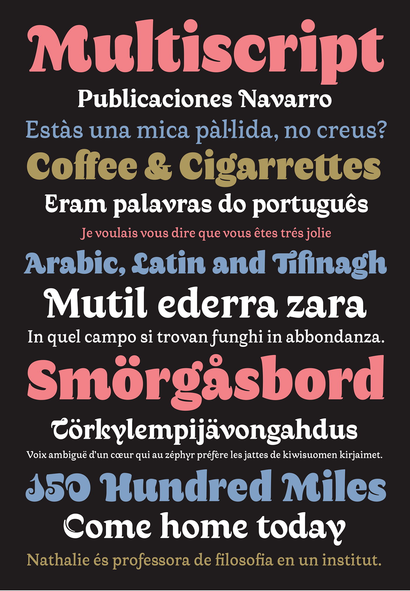
Designer (b. Barcelona, 1968) at type-o-tones in Barcelona. She publishes as well as promotes all her type designs through her own type foundry, Type-o-Tones. In 2003-2004, she took a year off and took the postgraduate Type and Media course at KABK (Royal Academy of Art) in The Hague, Holland. She is a professor of typography in Spain. Author of TypoMag. Typography in Magazines (IndexBook). In 2012, Cristobal Henestrosa, Laura Meseguer and José Scaglione coauthored Como Crear Tipografias (Brizzolis S.A., Madrid, Spain). MyFonts link. Fontshop link. Her typefaces: Interview by MyFonts. Speaker at ATypI 2016 in Warsaw on A Typographic Maghribi Trialogue. In this talk, he explains, together with Juan Luis Blanco and Krystian Sarkis, the Typographic Matchmaking in the Maghrib project of the Khatt Foundation, which tries to facilitate a cultural trialogue as well as shed a typographic spotlight on the largely ignored region of the Maghreb in terms of writing and design traditions. The specific goal of the collaboration is the research and development of tri-script font families (for Latin, Arabic and Tifinagh) that can communicate harmoniously. |
EXTERNAL LINKS |
| | |

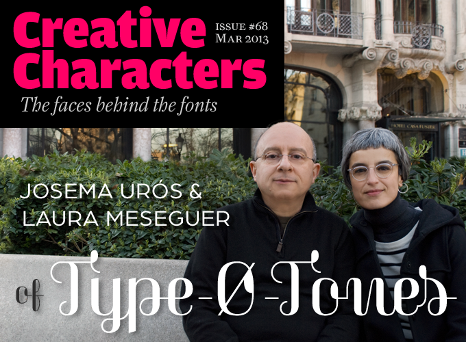
file name: Josema Uros Laura Meseguer Pic
file name: Laura Meseguer Solis for Accu Weather 2019
file name: Laura Meseguer Solis for Accu Weather 2019
file name: Laura Meseguer Solis for Accu Weather 2019
file name: Laura Meseguer Solis for Accu Weather 2019copy

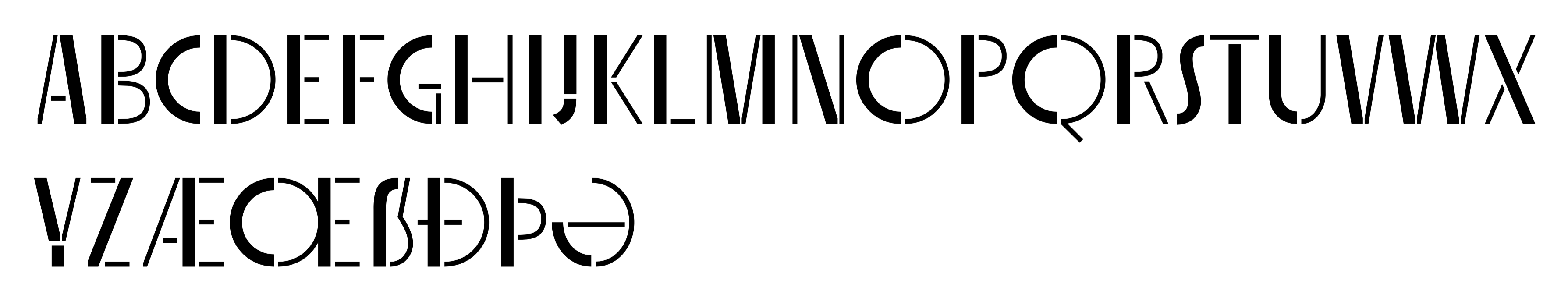
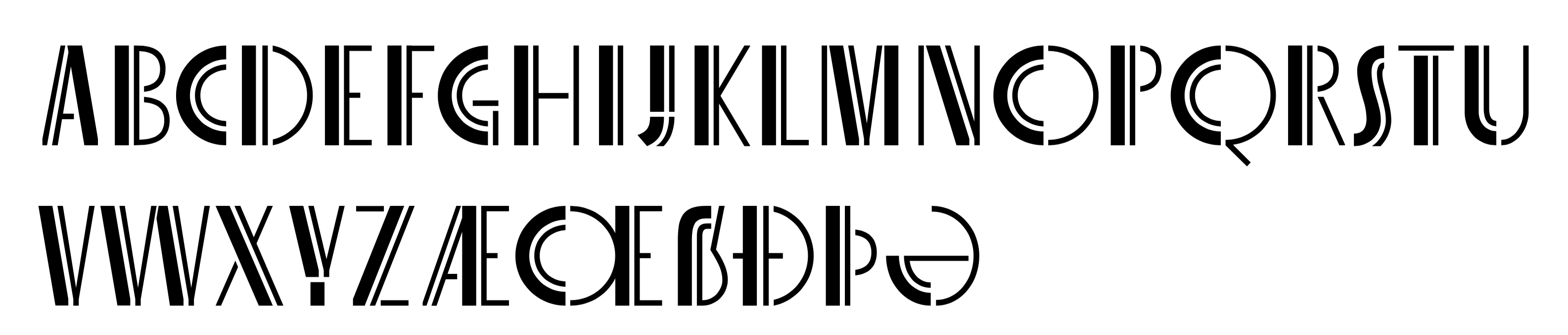
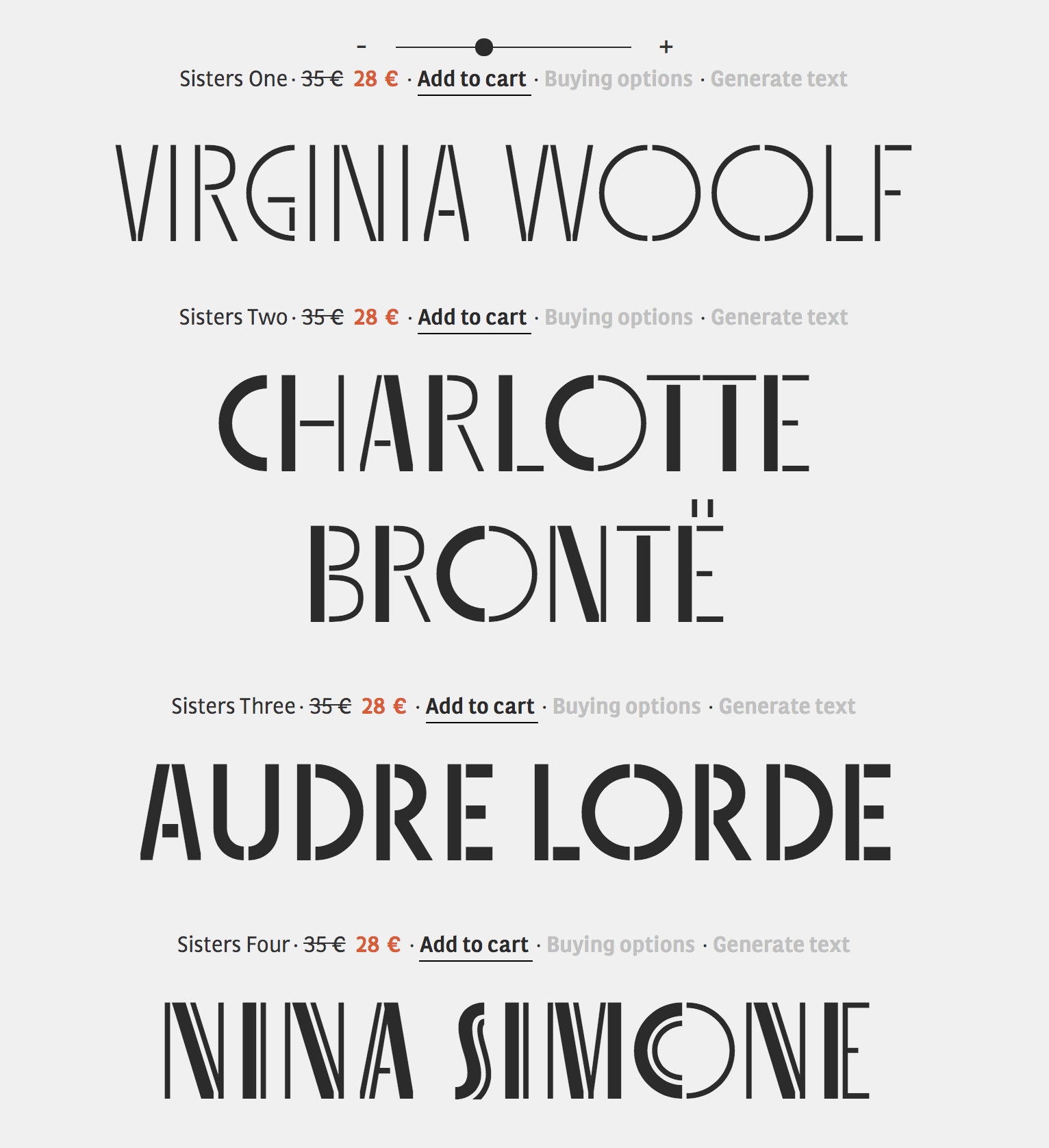
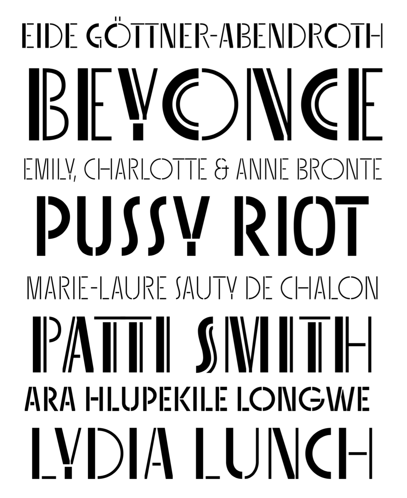
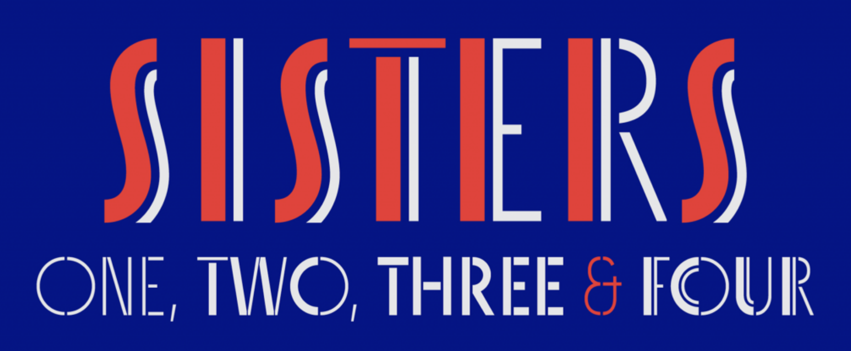
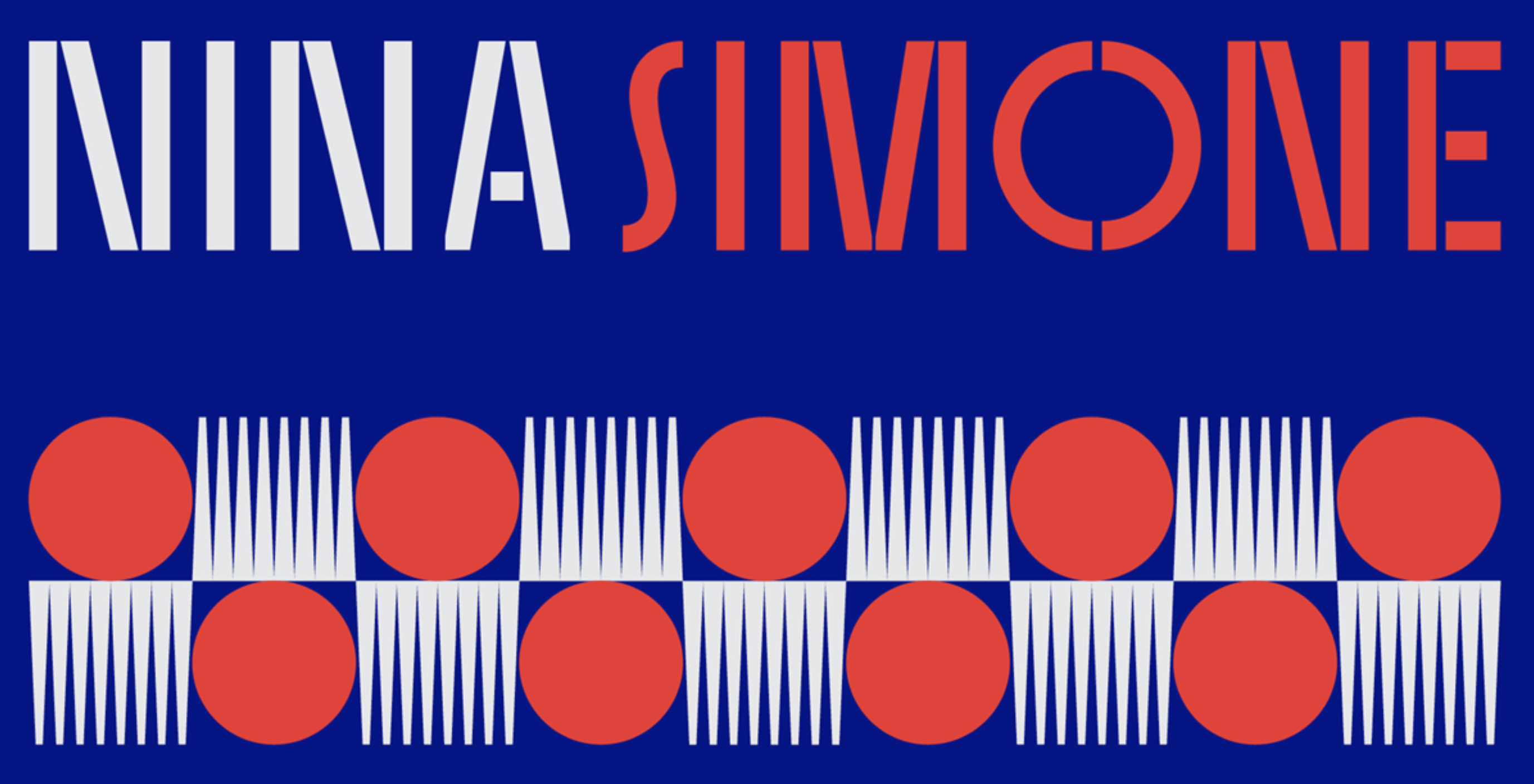
file name: Laura Meseguer Sisters 2020

file name: Laura Meseguer Sisters 2020

file name: Laura Meseguer Sisters 2020
file name: Laura Meseguer Sisters 2020
file name: Laura Meseguer Sisters 2020
file name: Laura Meseguer Sisters 2020
file name: Laura Meseguer Sisters 2020

file name: Laura Meseguer Sisters 2020
file name: Laura Meseguer Sisters 2020
file name: Laura Meseguer Sisters 2020
file name: Laura Meseguer Sisters 2020
file name: Laura Meseguer Sisters 2020

file name: Laura Meseguer Sisters 2020
file name: Laura Meseguer Sisters 2020

file name: Laura Meseguer Sisters 2020
file name: Laura Meseguer Sisters 2020
file name: Laura Meseguer Sisters 2020
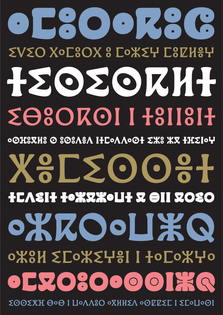
file name: Laura Meseguer Qandus 2019
file name: Laura Meseguer Qandus 2019
file name: Laura Meseguer Qandus 2019
file name: Laura Meseguer Qandus 2019

file name: Type o Tones Brushland 2019 291493

file name: Type o Tones Brushland 2019

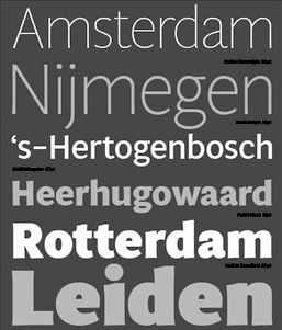
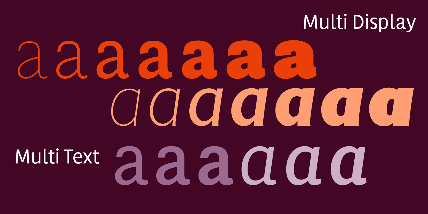
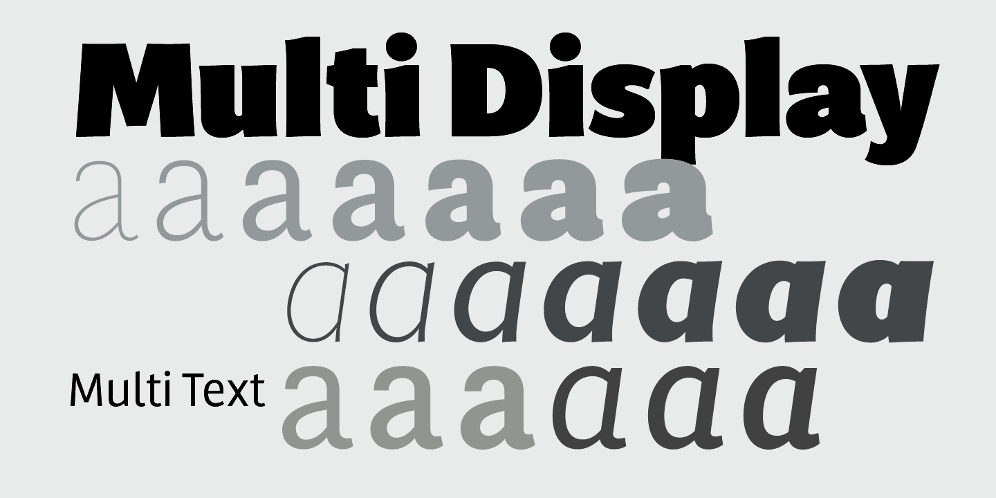
file name: Laura Meseguer Multi 2012b
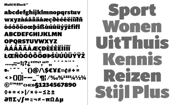
file name: Laura Meseguer Multi H Black 2012
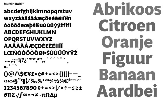
file name: Laura Meseguer Multi H Bold 2012
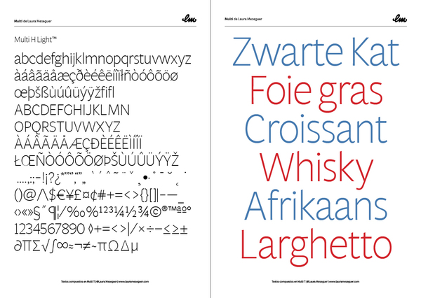
file name: Laura Meseguer Multi H Light 2012
file name: Laura Meseguer Multi 2011 2016 289507 002
file name: Laura Meseguer Multi 2011 2016 289511 002

file name: Laura Meseguer Multi 2011 2016
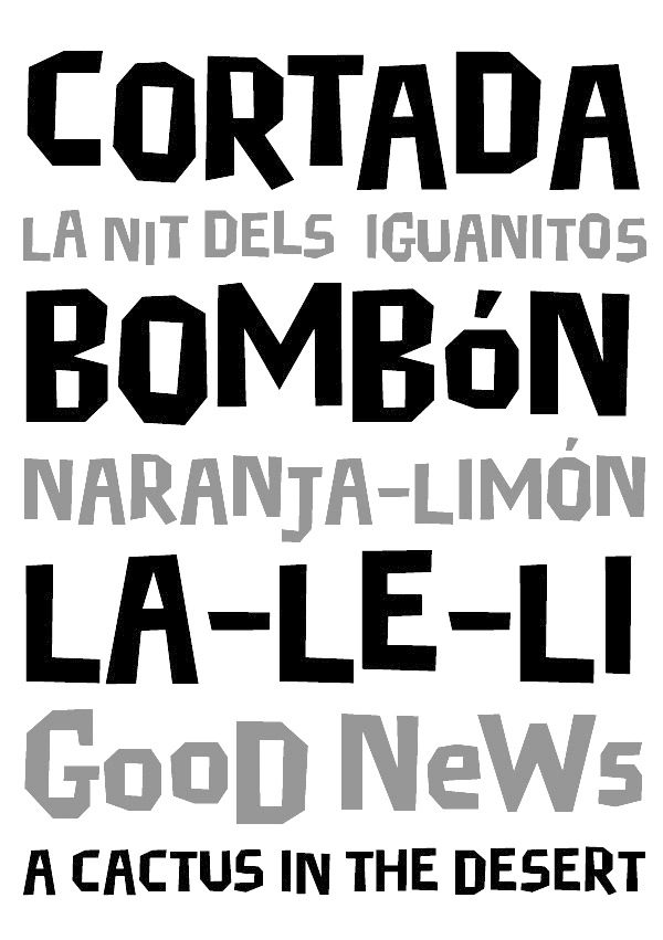
file name: Laura Meseguer Cortada
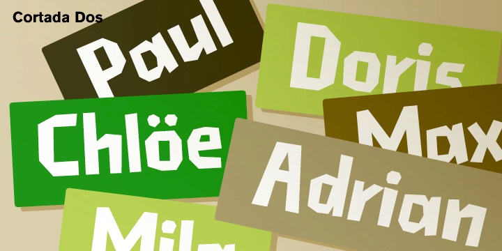
file name: Laura Meseguer Cortada Dos 2012
file name: Laura Meseguer Juan Davila Frankie 1992

file name: Laura Meseguer Juan Davila Frankie 1992
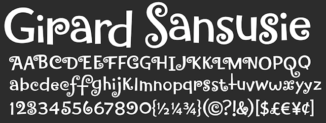
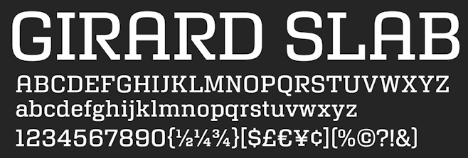
file name: House Girard Sansusie 2009
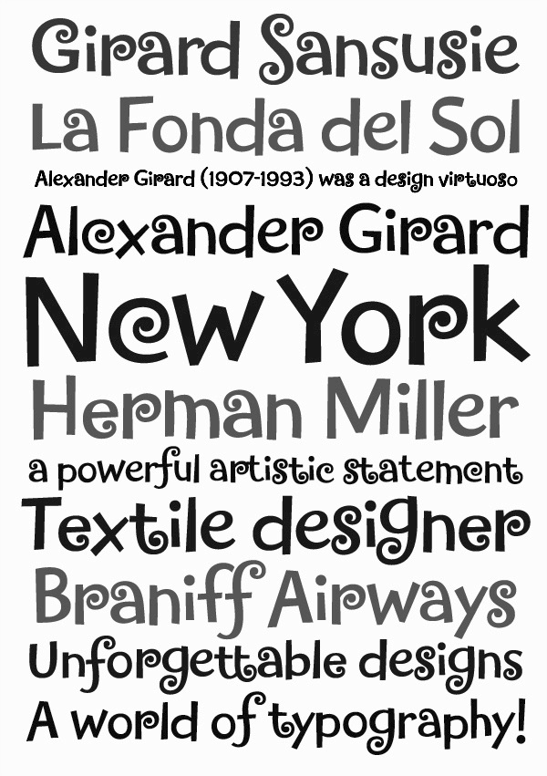
file name: Laurameseguer Girard Sansusie 2012
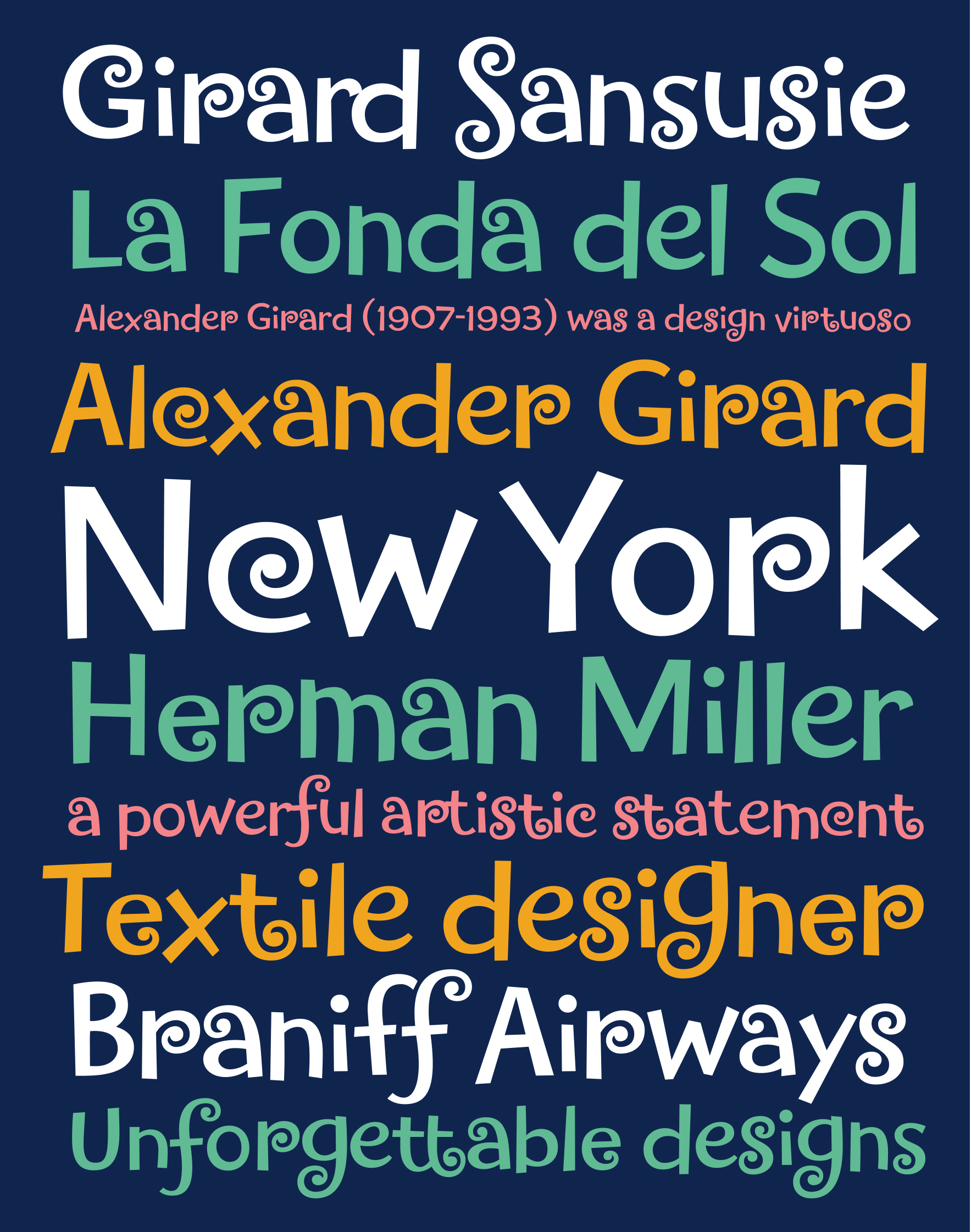
file name: Laura Meseguer Girard Sansusie 2005
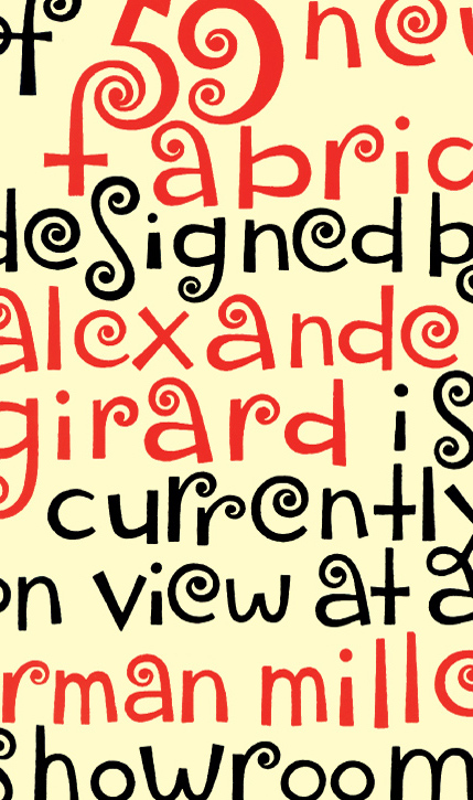
file name: Laura Meseguer Girard Sansusie 2009
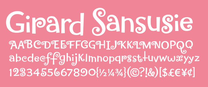
file name: Laura Meseguer Girard Sansusie 2009
file name: Adela De Bara Laura Meseguer Adelita Fina 1993
file name: Adela De Bara Laura Meseguer Adelita Fina 1993b
file name: Adela De Bara Laura Meseguer Adelita Topos 1993

file name: Adela De Bara Laura Meseguer Adelita Topos 1993b
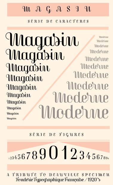
file name: Laura Meseguer Magasin 2013
file name: Laura Meseguer Magasin 2013b
file name: Laura Meseguer Magasin 2015
file name: Laura Meseguer Magasin 2013c

file name: Laura Meseguer Magasin 2013d

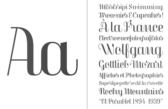
file name: Laura Meseguer Rumba 2005
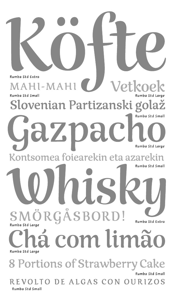
file name: Laura Meseguer Rumba 2003 2007b

file name: Laura Meseguer Rumba 2003 2007
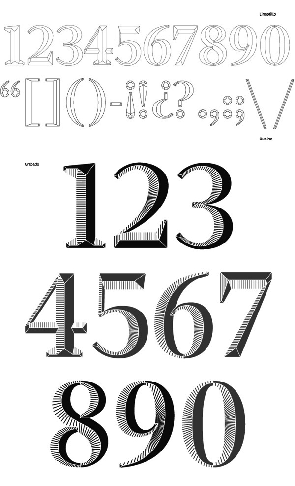
file name: Laura Meseguer Dauro 2013

file name: Laura Meseguer Dauro 2013b

file name: Laura Meseguer Dauro 2013c
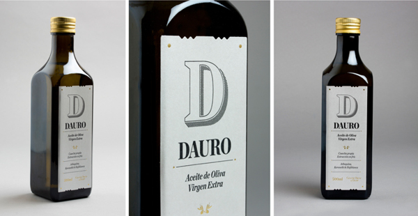
file name: Laura Meseguer Dauro 2013d
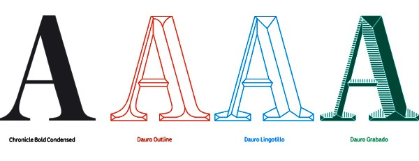
file name: Laura Meseguer Dauro 2013e
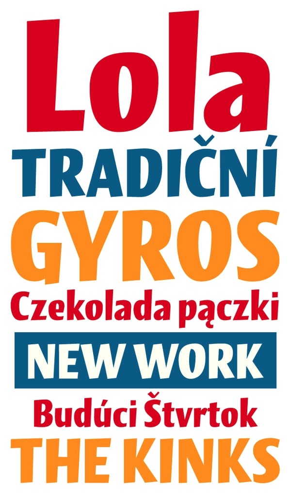
file name: Laura Meseguer Lola 2013

file name: Laura Meseguer Lola 2013b
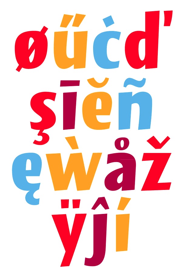
file name: Laura Meseguer Lola 2013c

file name: Laura Meseguer Lalola Cyrillic 2019

file name: Laura Meseguer Lalola Cyrillic 2019
file name: Laura Meseguer Lalola Cyrillic 2019

file name: Laura Meseguer Lalola Cyrillic 2019
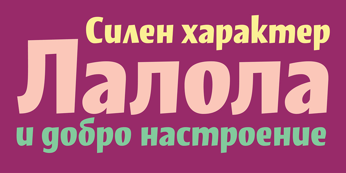
file name: Laura Meseguer Lalola Cyrillic 2019
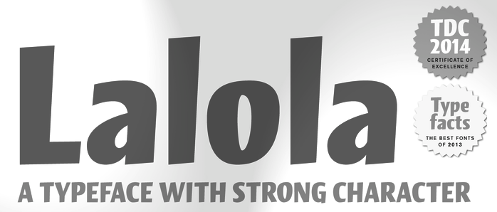
file name: Laura Meseguer Lalola T D C Award 2014
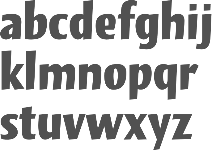
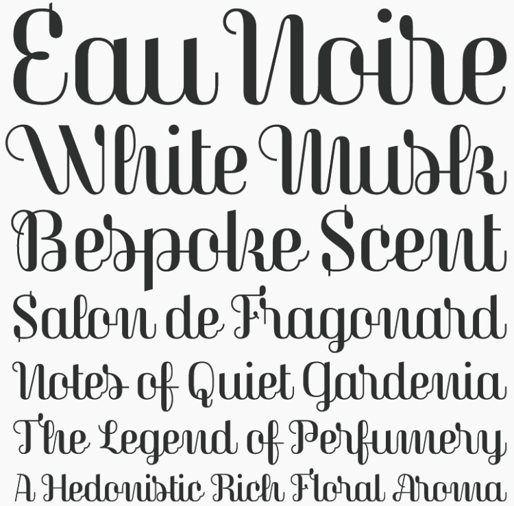
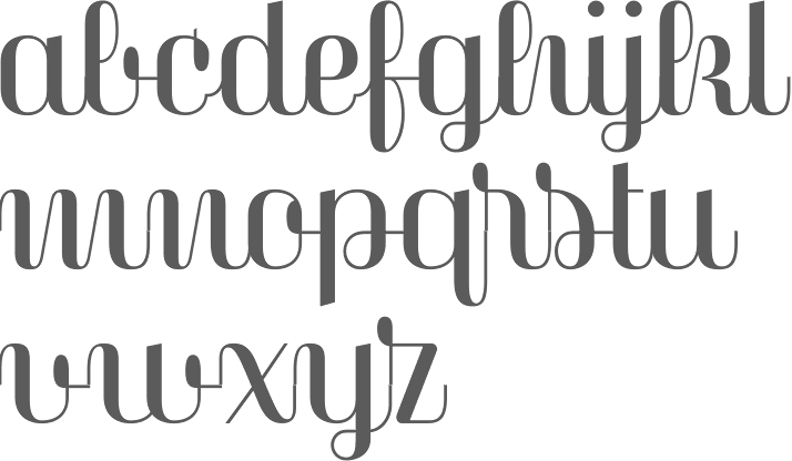
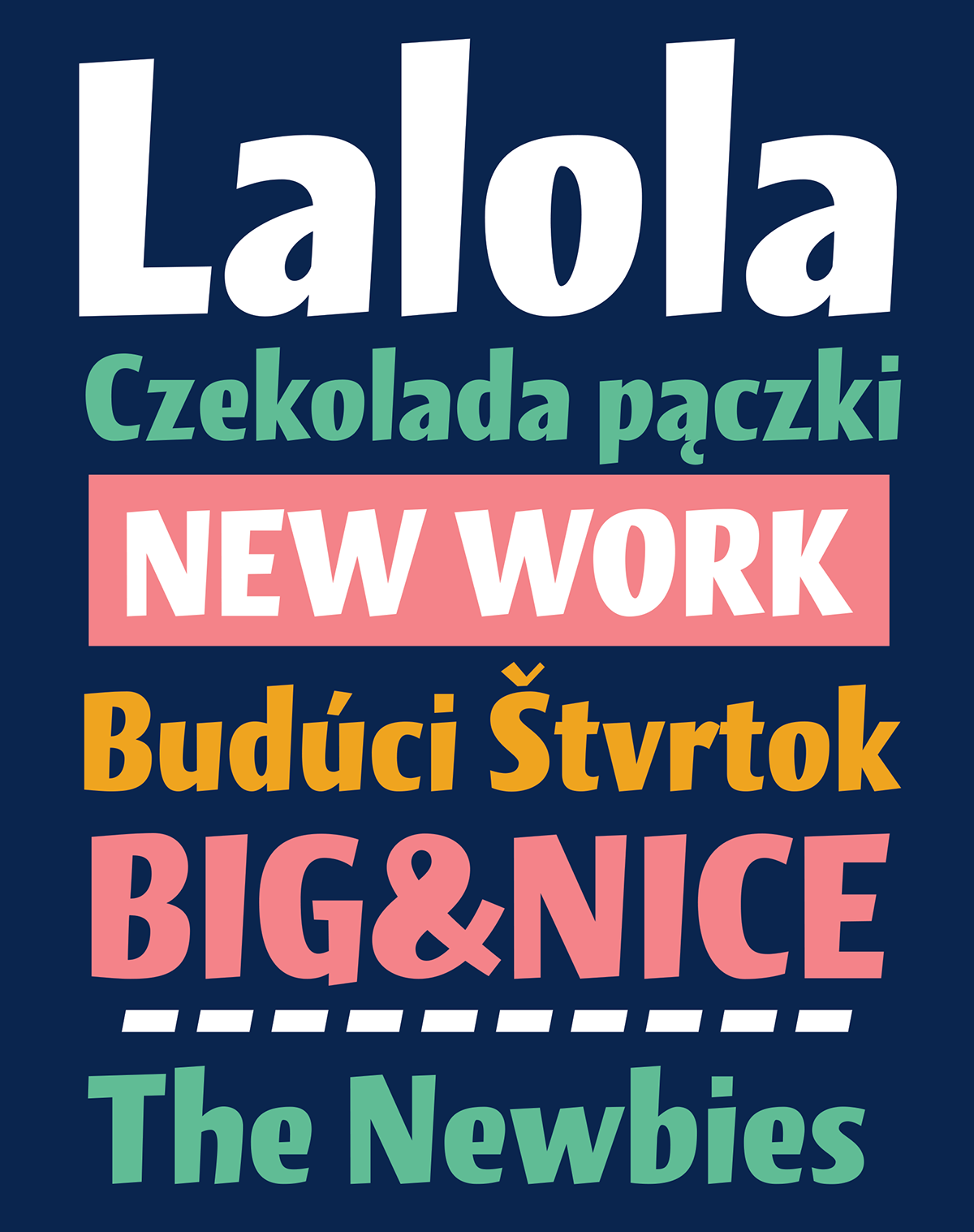
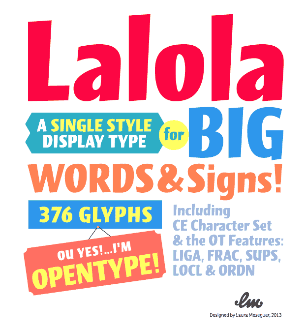
file name: Laura Meseguer Lalola 2013

file name: Laura Meseguer Lalola 2013b
file name: Laura Meseguer Lalola 2013c

file name: Laura Meseguer Poster 2013
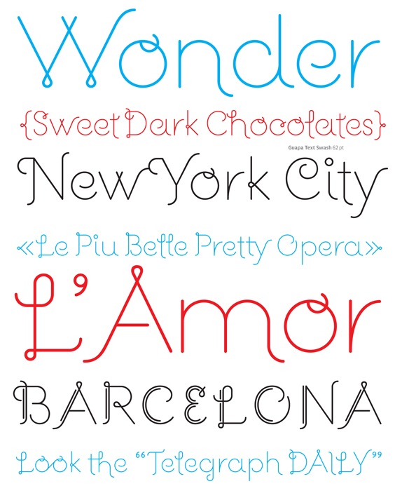
file name: Laura Meseguer Guapa 2012
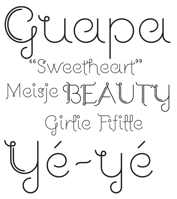
file name: Laura Meseguer Guapa 2012b
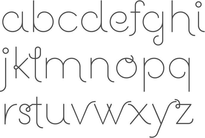
file name: Laura Meseguer Guapa 2012
file name: Laura Meseguer Guapa Deco 2012
| | |
|
Luc Devroye ⦿ School of Computer Science ⦿ McGill University Montreal, Canada H3A 2K6 ⦿ lucdevroye@gmail.com ⦿ https://luc.devroye.org ⦿ https://luc.devroye.org/fonts.html |