TYPE DESIGN INFORMATION PAGE last updated on Thu Jul 3 17:52:25 EDT 2025
FONT RECOGNITION VIA FONT MOOSE

|
|
|
|
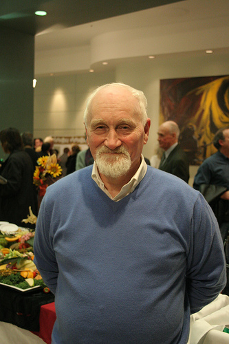
Jim Rimmer
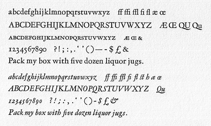
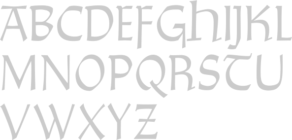
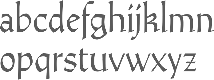
Jim Rimmer (b. Vancouver, 1934, d. 2010) was one of the great contemporary type designers whose creations had a lot of flair, individuality, and charm. Based in New Westminster (near Vancouver, BC), Jim Rimmer was also an illustrator. Obituary in the Globe and Mail, dated April 27, 2010. He designed Albertan (Albertan No.977, Albertan No.978 Bold) and Cloister (2000; a roman type family originally done by Morris Fuller Benton) in the Lanston collection. He also designed typefaces like Juliana Oldstyle (1984), Nephi Mediaeval (1986), Kaatskill (1988; a 1929 typeface by Goudy, revived and optimized for Lanston in type one format; the Kaatskill Italic was done by Rimmer based on Goudy's Deepdene), RTF Isabelle (Roman and Italic; 2006. A pair of delicate serif typefaces based on typefaces by Elizabeth Friedlander) and Fellowship (1986). ATypI link. Jim began work as a letterpress compositor in 1950. He entered the field of graphic design in 1963, working as a designer lettering artist and illustrator, and freelanced in this capacity from 1972 to 1999 in the same capacity. In 1960, he began collecting letterpress printing and typefounding equipment, and operated a private press and foundry (Pie Tree Press&Type Foundry). FontShop link. His metal typefaces at Pie Tree Press include:
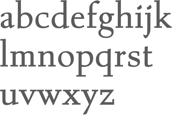
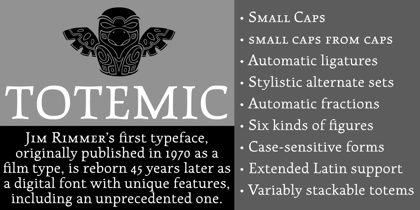
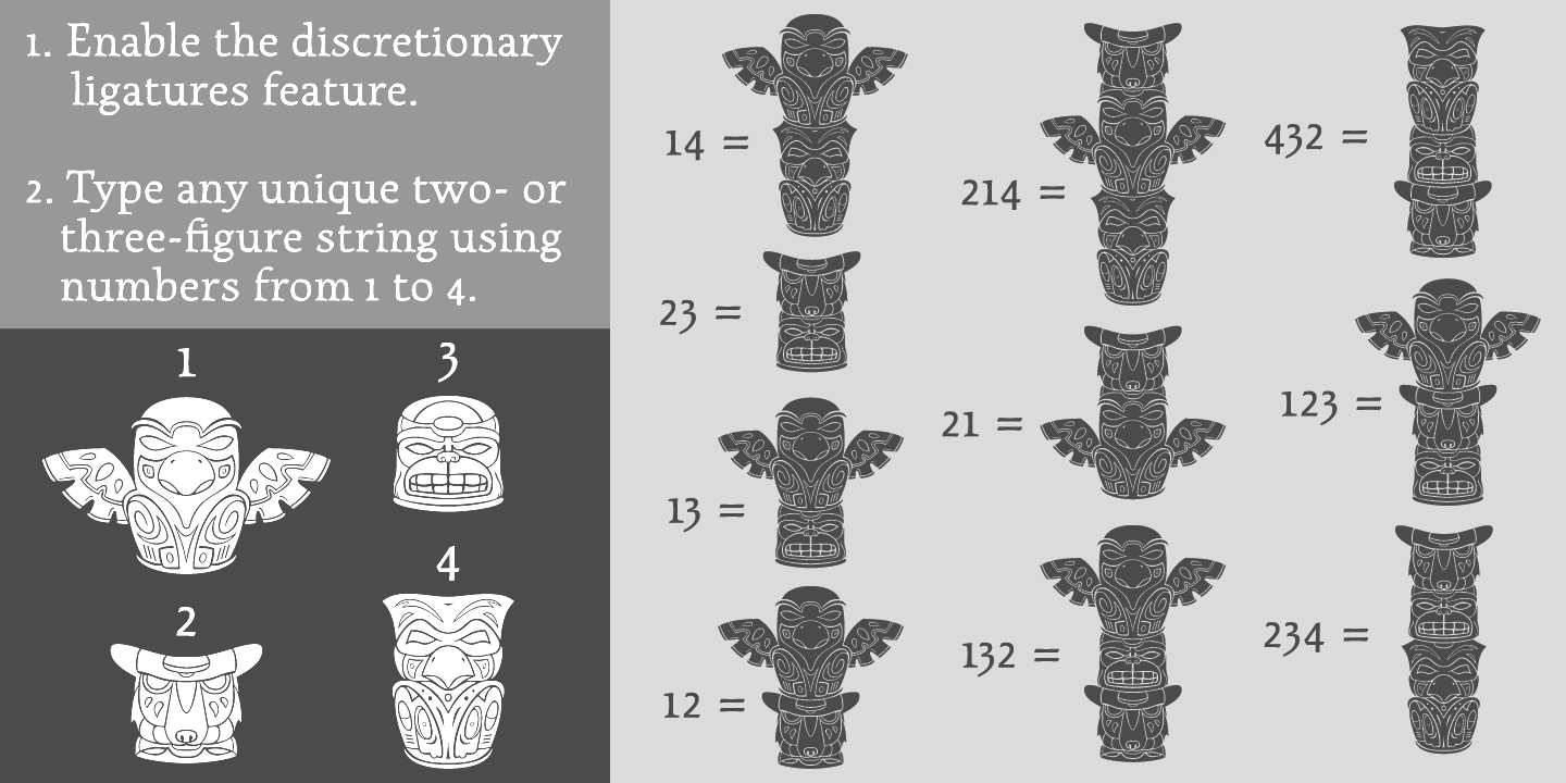
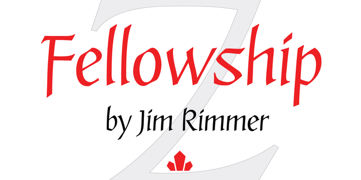
In 1970, Jim made his first film type, Totemic. This sturdy text type was revived in 2015 by Canada Type as Totemic, and contains as an extra a et of stackable totems. Jim has designed and produced a collection of digital types, and over the past 20 years has designed and cut six metal types. He recently completed a Monotype Large Comp type named Hannibal Oldstyle, is currently cutting 14 point matrices for Cartier Roman, and is making drawings for the cutting of a 14 point Western and Eastern Cree. Samples and discussion of his Cree typeface. Jim in action in 2003. According to Gerald Giampa from Lanston, Jim is the most talented type designer alive in 2003. About his typefaces, I quote McGrew: Fellowship was designed and cut by Jim Rimmer in Vancouver in 1986, and cast by him for private use. He says, "The design is the result of the feeling of joviality and 'fellowship' I experienced at the meeting (American Typecasting Fellowship in Washington, D.C.). The design was not so much drawn as it was written. The letters were written quickly in a calligraphic manner with an edged pencil and then enlarged and inked to make a dry transfer sheet. As in my two previous designs (see Juliana Oldstyle and Nephi Mediaeval), Fellowship was cut not in steel, but in type metal, and then electroplated to make castable matrices." Juliana Oldstyle was designed and cut in 1984, as a private type. He says, "It represents my first attempt at cutting a metal type. I drew my letters completely freehand, hoping to capture a punchcut look. My artwork was then reduced and made into a dry transfer sheet, which I rubbed onto type-high typemetal blanks. I then cut the letters and electroformed copper matrices." Nephi Mediaeval was designed and cut in 1986, for private use. He says it "was inspired by the Subiaco type of the Ashendene Press and by its inspiration, the type of Sweynheym and Pannartz. My design breaks away from those types slightly in form and is softer in general feeling. In time I will cut other sizes." In 2012, Rimmer Type Foundry was acquired by Canada Type. The press release: Canada Type, a font development studio based in Toronto, has acquired the Rimmer Type Foundry (RTF) from P22 Type Foundry, Inc. The RTF library contains the complete body of work of Canadian design icon Jim Rimmer (1934-2010), who was an enormous influence on Canadian type design and private press printing, and the subject of Richard Kegler's documentary, Making Faces: Metal Type in the 21st Century. The RTF library contains many popular font families, such as Albertan, Amethyst, Credo, Dokument and Stern, as well as quite a few analog designs that were never produced in digital. Now that Rimmer's work has been repatriated, it will be remastered and expanded by Canada Type, then re-released to the public, starting in the fall of 2012. Jim's analog work will also be produced digitally and available to the public alongside his remastered and expanded work. Once Jim's designs are re-released, part of their sales will be donated to fund the Canada Type Scholarship, an award given annually to design students in Canada. This will be done in coordination with the Society of Graphic Designers of Canada (GDC), the national professional association that awarded Jim Rimmer with the prestigious GDC Fellowship in 2007. Jim Rimmer digitized Elizabeth (+Italic). From 2006 until 2012, the Rimmer Type Foundry collection was offered by P22. It included:
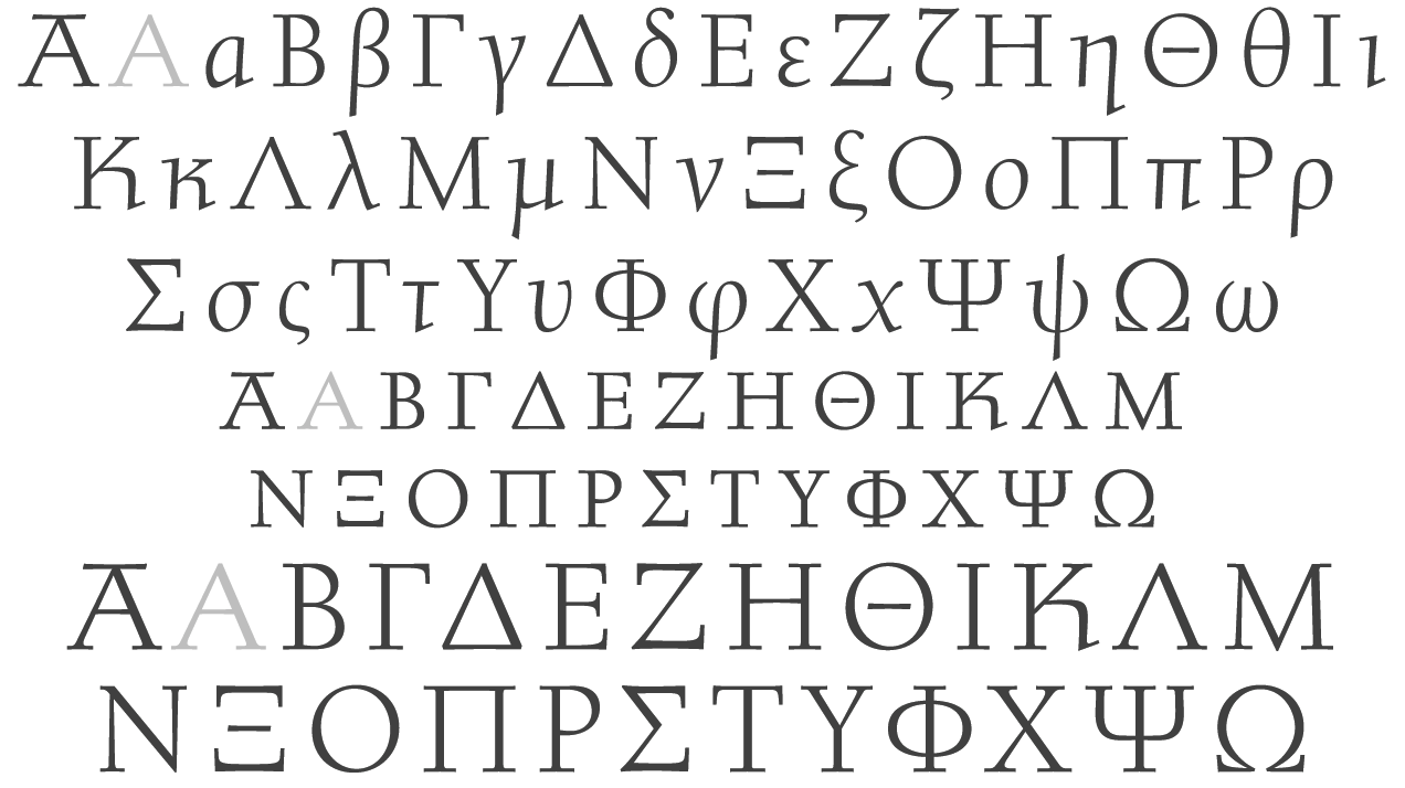
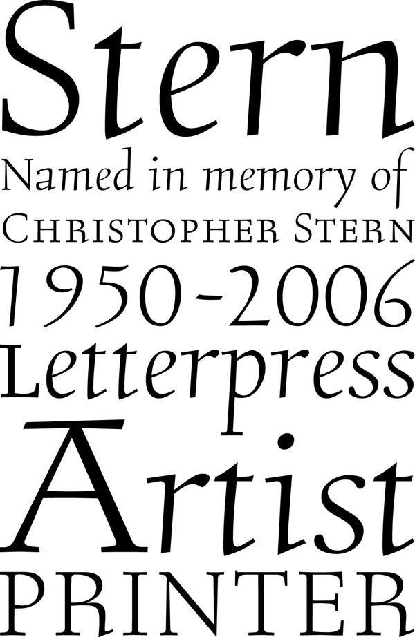
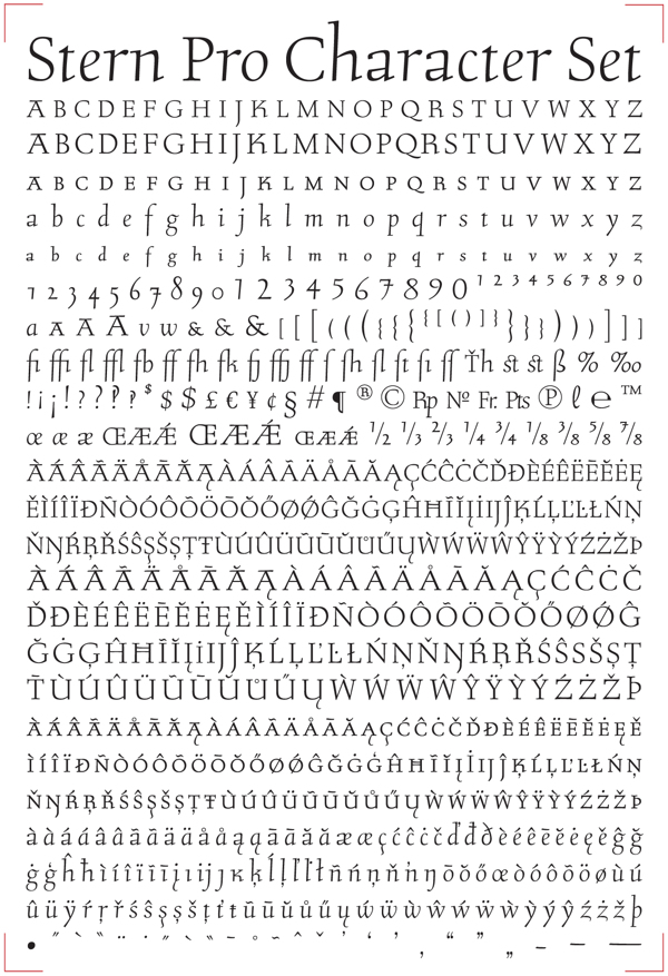
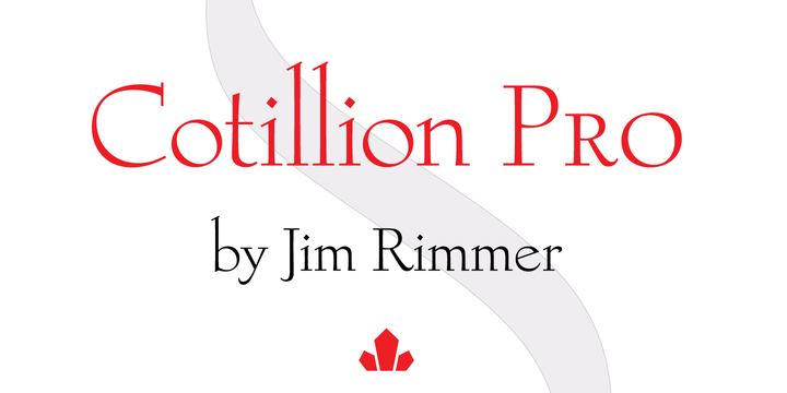
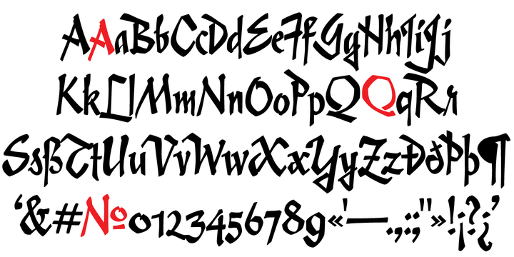
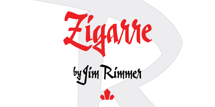
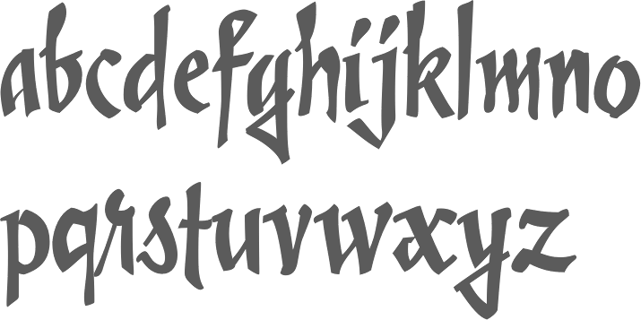
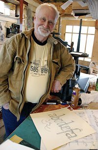
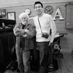
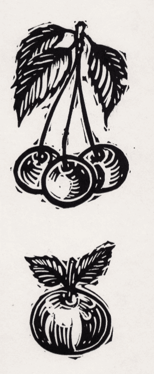
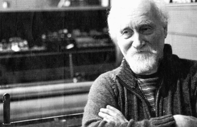
Jim Rimmer passed away early on January 8, 2010. His friend Richard Kegler (P22) wrote this obituary the next day: Jim was a multi-talented type designer, graphic artist, bookbinder, printer, letterer, technician and a most generous teacher. He was never glory-seeking and turned down most speaking engagements offered to him, not out of vanity or indifference, but rather thinking that he was not worthy of being given a spotlight. Jim offered free typecasting instruction to anyone who asked and came to visit him in his studio in New Westminster BC. He took as much time as needed and was generous to a fault. Anyone who took him up on this open invitation can attest to the intense and elegant chaos of his studio and work habits. I was fortunate enough to know Jim but for only a few years. What started as a business arrangement grew into a mutual respect and ongoing correspondence that I can only describe as life changing for me. His kindness and generosity were exceptional and his diplomacy even when given the opportunity to speak ill of anyone else was measured and kind. Jim's dedication to the craft of type design and related arts was beyond most if not all contemporaries. After his "retirement" from his professional life as a graphic artist and illustrator, he tirelessly worked on type designs for book projects where all aspects of his skills were applied. His book "Leaves from the Pie Tree" (I encouraged him to change the title from his original plan to call it "Droppings from the Pie Tree"...a truly self-effacing Jim Rimmerism) is the best single tome that summarizes his life and work. He designed the book�s typeface in Ikarus (as he had with the 200+ other type design he created), cut the matrices and cast the type, wrote the text using an autobiographical introduction and continued to explain the process he used to cut pantographic matrices for his metal typefaces. The multi-colored lino cut illustrations, book design, individual tipped in sheets and attention to press work and binding would be impressive for one specialist to complete on each component. The fact that Jim did all of this himself is awe inspiring. A trade edition of this book has been printed by Gaspereau press but does not hint at the grandeur of the beautiful book that is Pie Tree. Jim's follow up of his edition of Mark Twain's Tom Sawyer (set in his Hannibal Oldstyle font designed for and fitted onto on a monotype composition caster) was recently completed and is equally if not more imposing as a fine press book, but with a sympathetic humor and humanity that would knock the stuffing of any other fine press attempt at the same material. Almost two years ago I visited Jim for a week and filmed footage for a documentary on his cutting of the Stern typeface. For various reasons the finishing of the film has been delayed. I truly regret that Jim could not see the finished version. With the film and his Pie Tree book, Jim generously conveys information on making metal type that has otherwise been largely lost and previously limited to a now defunct protective guild system. It was his wish that the information and craft be kept alive. Jim's last email to me was in classic Jim form hinting at his tireless dedication to his work: details of a new type family for a new book. He was one of the great ones. He will be missed. Sumner Stone: Jim's insights into Goudy's typefaces in particular, and his devotion to doing everything in his own shop made me think he was perhaps Fred's reincarnation, but it took me awhile to realize this due to the self-deprecating personality you so accurately describe. His passing is truly a great loss to our craft. Rod McDonald: I would like to relate a telephone conversation I had with Jim last month because I believe it shows his incredible spirit, and wonderful sense of humor. My wife and I visited Jim in November and were delighted to hear that his doctors had pronounced him cancer free. He looked good, just a little tired, but that was to be expected after his recent radiation treatment. Of course he was also anxious to get back to work. Less than two weeks later I received an email from him informing me that they had discovered that the cancer had spread to his lungs and, not only was it inoperable, he now only had six months to live. This sudden turn of affairs was devastating for me and I called him, hoping I think, to hear that it wasn't as bad as it sounded. He said it was bad and apparently nothing could be done. However he felt he would outlive the six months and in fact we even talked of getting together in the fall. The conversation then turned to his latest type family and when I gently asked him how long he thought it it would take to complete he simply said "I've got lots of time, after all I'm only going to be dying during the last fifteen minutes". I knew Jim for thirty-five years and will miss him more than his work, and that's saying a great deal. In 2012, Canada Type, which had purchased Rimmer's designs started publishing some of Jim's lesser known designs. These include Cotillion Pro (2012, a very graceful typeface with high ascenders), Fellowship (2013, calligraphic), Poster Paint (2012, a take on Goudy Stout), Zigarre Script and Zigarre Rough (2012, brush scripts that were actually drawn with a marker), and Alexander Quill (2012, a calligraphic monastic typeface). In 2013, Canada Type remastered several of Rimmer's typefaces, including in particular Isabelle Pro: Isabelle is the closest thing to a metal type revival Jim Rimmer ever did. The original metal typeface was designed and cut in late 1930s Germany, but its propspects were cut short by the arrival of the war. This was one of Jim's favourite typefaces, most likely because of the refined art deco elements that reminded him of his youthful enthusiasm about everything press-related, and the face's intricately thought balance between calligraphy and typography. Not to mention one of the most beautiful italics ever made. Lancelot Pro (2013) is a calligraphic all caps typeface based on Rimmer's digital original from 1999. Pictures: Jim Rimmer casts 48pt ATypI keepsake (by John Hudson), Remembering Jim Rimmer (Facebook group), In his studio, a picture taken by the Globe and Mail. Another pic. Making Faces (trailer) (movie by Richard Kegler). Klingspor link. ContentDM collection. Jim Rimmer at the Fine Press Book Association. Rimmer Type Foundry link. View all typefaces by Jim Rimmer. An alphabetical listing of Jim Rimmer's typefaces. Catalog of Jim Rimmer's typefaces. |
EXTERNAL LINKS |
| | |


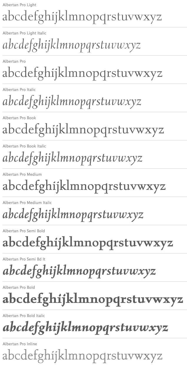
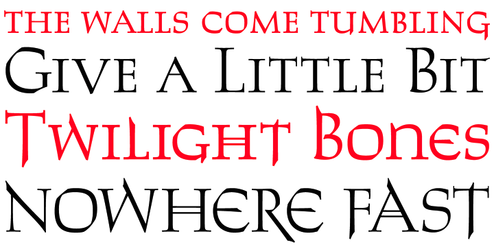
file name: Jim Rimmer Canada Type Albertan Pro 2013
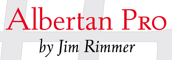
file name: Jim Rimmer Canada Type Albertan Pro 2013b
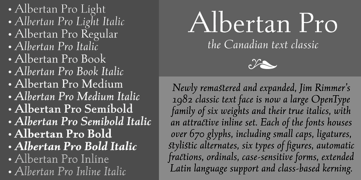
file name: Jim Rimmer Canada Type Albertan Pro 2013c
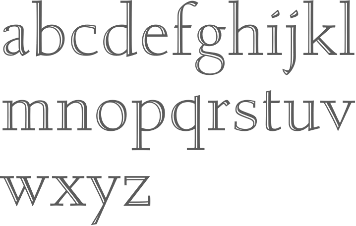
file name: Jim Rimmer Canada Type Albertan Pro Inline 2013
file name: Jim Rimmer Canada Type Albertan Pro Medium 2013
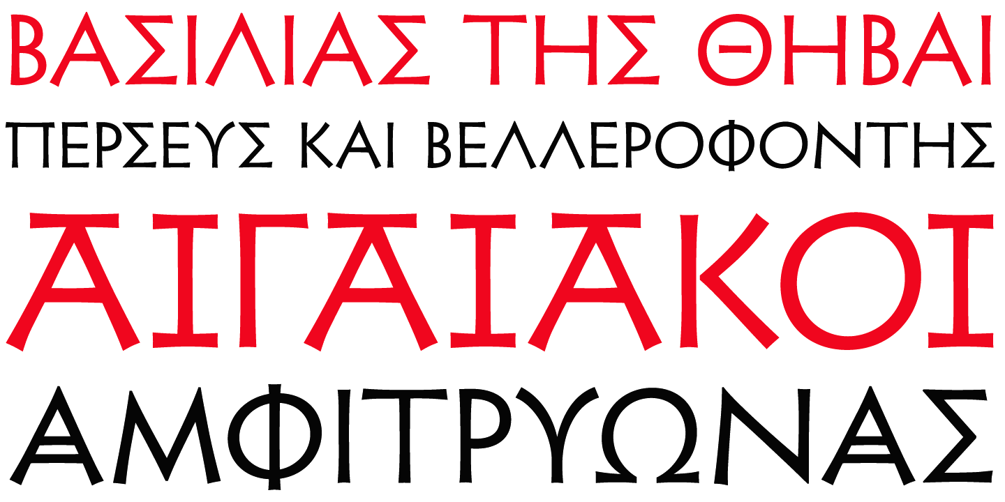
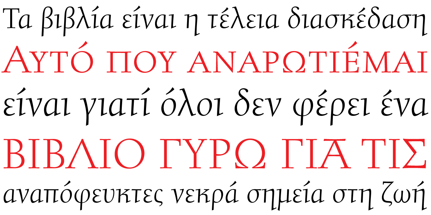
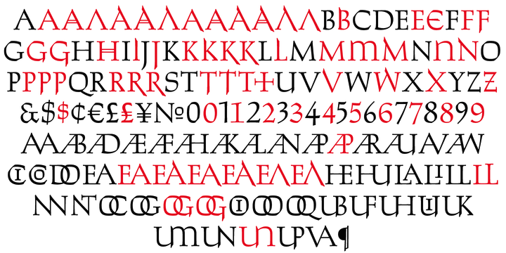
file name: Canada Type Jim Rimmer Cadmus Pro 2016 205875
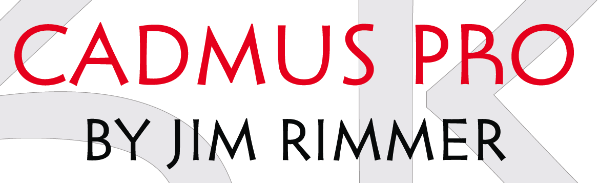
file name: Canada Type Jim Rimmer Cadmus Pro 2016 205876
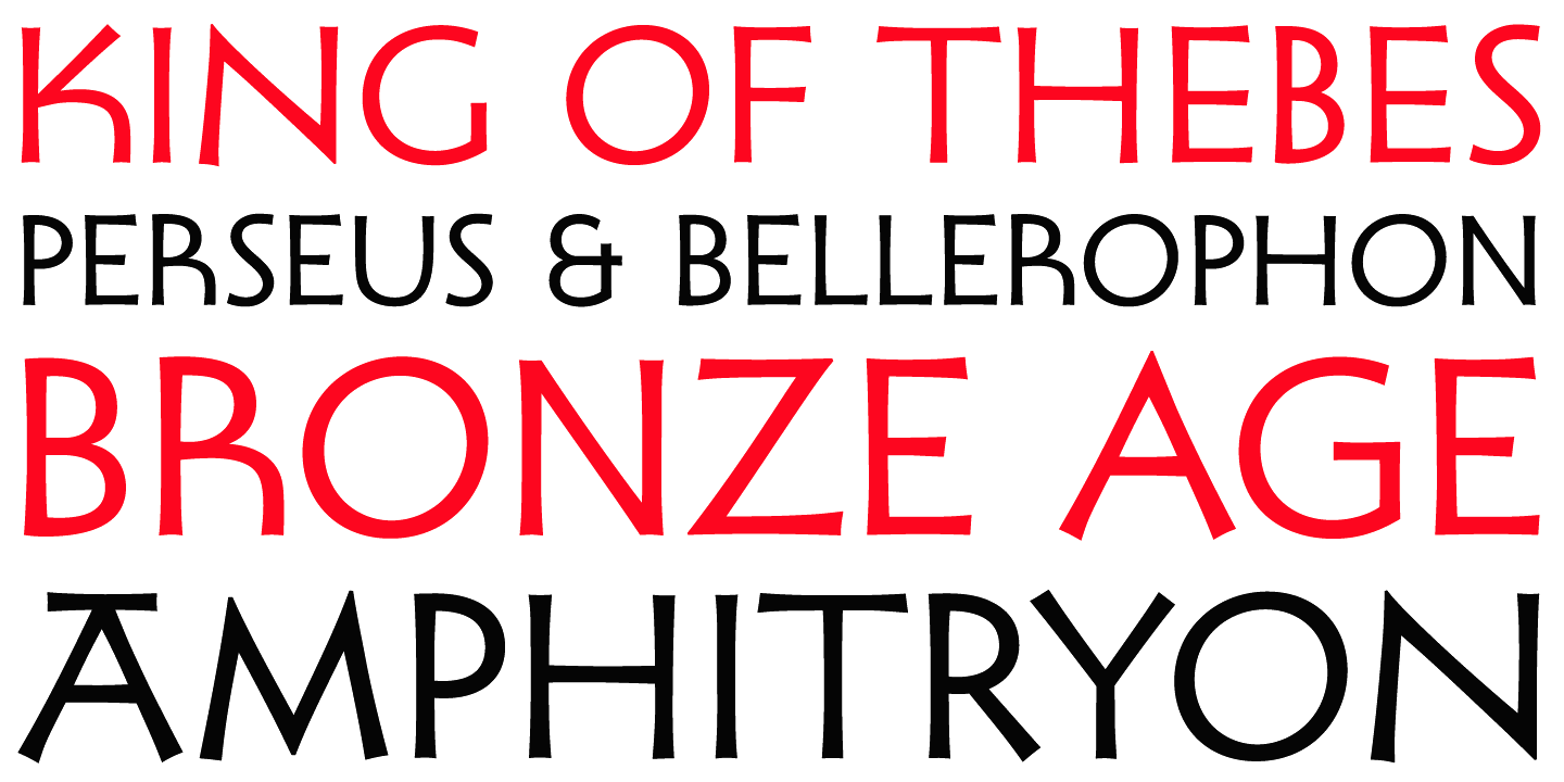
file name: Canada Type Jim Rimmer Cadmus Pro 2016 205878
file name: Canada Type Jim Rimmer Cadmus Pro 2016 after Robert Foster Pericles 1934 205872
file name: Canada Type Jim Rimmer Cadmus Pro 2016 after Robert Foster Pericles 1934 205874

file name: Canada Type Jim Rimmer Cadmus Pro 2016 after Robert Foster Pericles 1934 205879

file name: Canada Type Jim Rimmer Cadmus Pro 2016
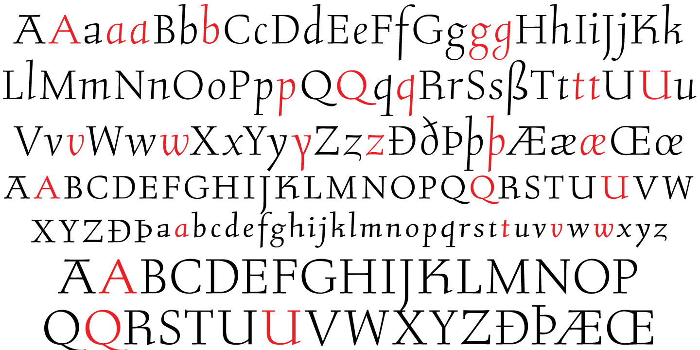
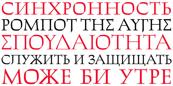
file name: Jim Rimmer Canada Type Isabelle Pro 2013
file name: Jim Rimmer Canada Type Isabelle Pro 2013b
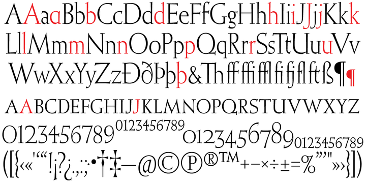
file name: Jim Rimmer Canada Type Isabelle Pro 2013c
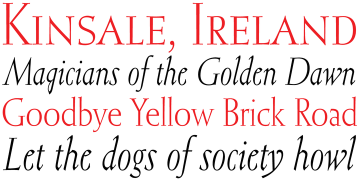
file name: Jim Rimmer Canada Type Isabelle Pro 2013d
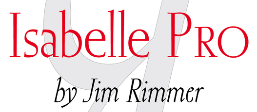
file name: Jim Rimmer Canada Type Isabelle Pro 2013e
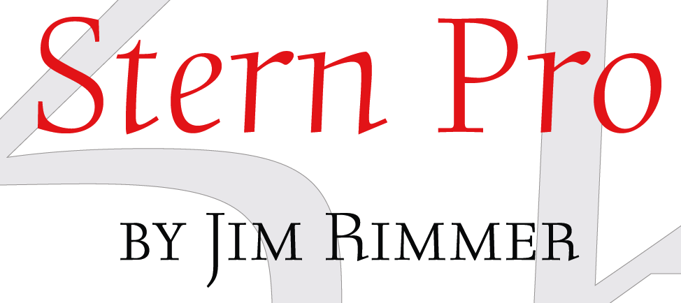
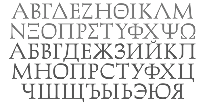
file name: Jim Rimmer Canada Type Stern Pro 2013b
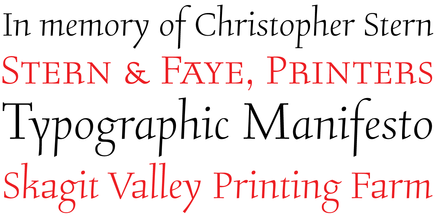
file name: Jim Rimmer Canada Type Stern Pro 2013c
file name: Jim Rimmer Canada Type Stern Pro 2013d
file name: Jim Rimmer Canada Type Stern Pro 2013e
file name: Jim Rimmer Canada Type Stern Pro 2013f
file name: Jim Rimmer Canada Type Stern Pro 2013g
file name: Jim Rimmer Canada Type Stern Pro 2013h
file name: Jim Rimmer Canada Type Stern Pro 2013i
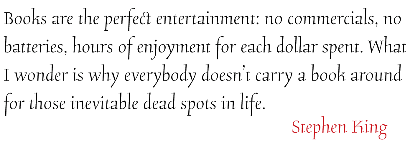
file name: Jim Rimmer Canada Type Dokument Pro 2014
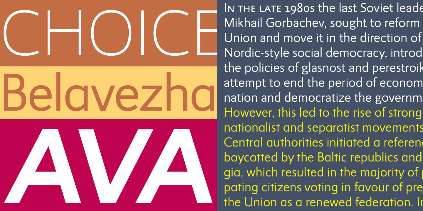
file name: Jim Rimmer Canada Type Dokument Pro 2014b
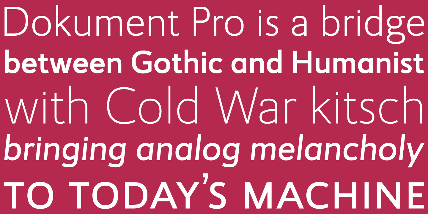
file name: Jim Rimmer Canada Type Dokument Pro 2014c
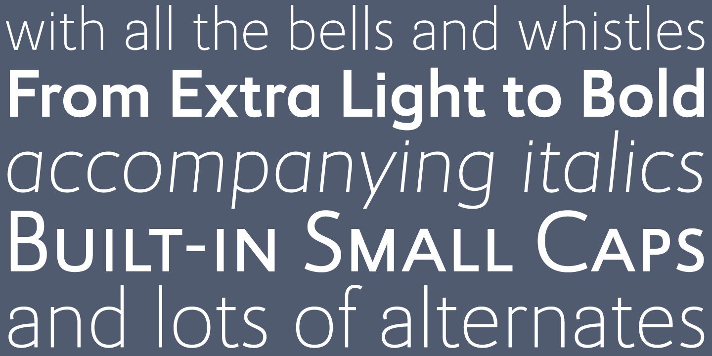
file name: Jim Rimmer Canada Type Dokument Pro 2014d
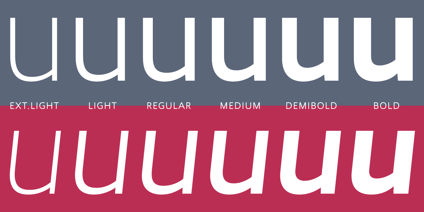
file name: Jim Rimmer Canada Type Dokument Pro 2014e
file name: Jim Rimmer R T F Cotillion 2006
file name: Jim Rimmer Cotillion Pro 2012

file name: Jim Rimmer Cotillion Pro 2012b
file name: Jim Rimmer Cotillion Pro 2012c
file name: Jim Rimmer Cotillion Pro 2012d
file name: Jim Rimmer Cotillion Pro 2012e
file name: Canada Type Totemic 2015 after Jim Rimmer 1970

file name: Canada Type Totemic 2015 after Jim Rimmer 1970b
file name: Canada Type Totemic 2015 after Jim Rimmer 1970c
file name: Canada Type Totemic 2015 after Jim Rimmer 1970d
file name: Canada Type Totemic 2015 after Jim Rimmer 1970e
file name: Canada Type Totemic 2015 after Jim Rimmer 1970f

file name: Jim Rimmer Canada Type Lancelot Pro 2013

file name: Jim Rimmer Canada Type Lancelot Pro 2013b
file name: Jim Rimmer Canada Type Lancelot Pro 2013c
file name: Jim Rimmer Canada Type Lancelot Pro 2013d
file name: Jim Rimmer Canada Type Lancelot Pro 2013e
file name: Jim Rimmer Canada Type Lancelot Pro 2013f
file name: Jim Rimmer Canada Type Lancelot Pro 2013g
file name: Jim Rimmer Canada Type Lancelot Pro 2013h
file name: Jim Rimmer Canada Type Fellowship 2013
file name: Jim Rimmer Canada Type Fellowship 2013b
file name: Jim Rimmer Canada Type Fellowship 2013c
file name: Jim Rimmer Canada Type Fellowship 2013d
file name: Jim Rimmer Canada Type Fellowship 2013e
file name: Jim Rimmer Fellowship
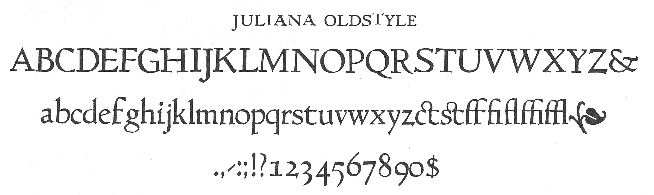
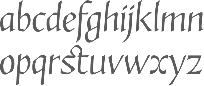
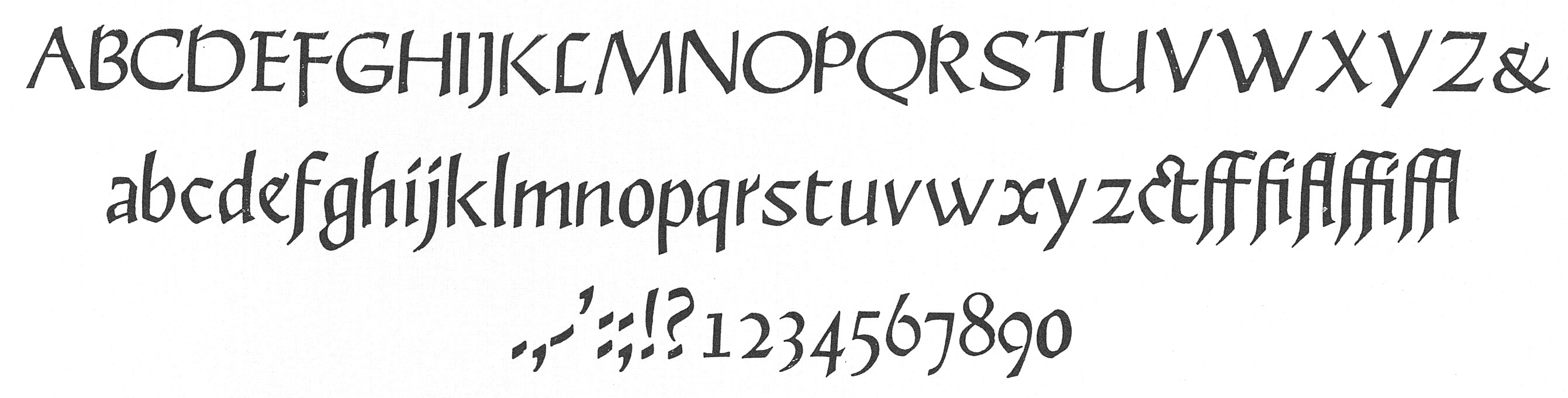
file name: Jim Rimmer Juliana Oldstyle
file name: Jim Rimmer Kaatskill Frederic Goudy Original Kaatskill
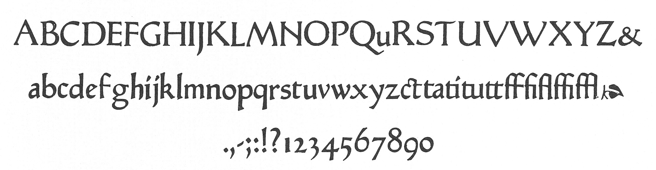
file name: Jim Rimmer Nephi Mediaeval
file name: Jim Rimmer Zigarre 2012
file name: Jim Rimmer Zigarre 2012b
file name: Jim Rimmer Zigarre Script 2012
file name: Jim Rimmer Garamont
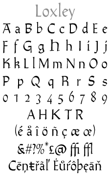
file name: Jim Rimmer R T F Loxley 2010
file name: Jim Rimmer R T F Loxley 2010e
file name: Jim Rimmer Loxley 2013
file name: Jim Rimmer Loxley 2013b
file name: Jim Rimmer Loxley 2013c

file name: Jim Rimmer Loxley 2013d

file name: Jim Rimmer Loxley 2013e

file name: Jim Rimmer Name 2010
file name: Jim Rimmer Alexander Quill 2012
file name: Jim Rimmer Alexander Quill 2012b
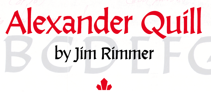
file name: Jim Rimmer Alexander Quill 2012c

file name: Jim Rimmer Poster Paint 2012 101437
file name: Jim Rimmer Poster Paint 2012 89227
file name: Jim Rimmer Poster Paint 2012
file name: Jim Rimmer R T F Poster Paint Canada Type Version 2012

file name: Jim Rimmer
file name: Jim Rimmer 2
file name: Rimmer Type Foundry Logo

file name: Jim Rimmer 3 N O
file name: Jim Rimmer 4 N O
file name: Jim Rimmer 5 N O
file name: Jim Rimmer Cherries Apple
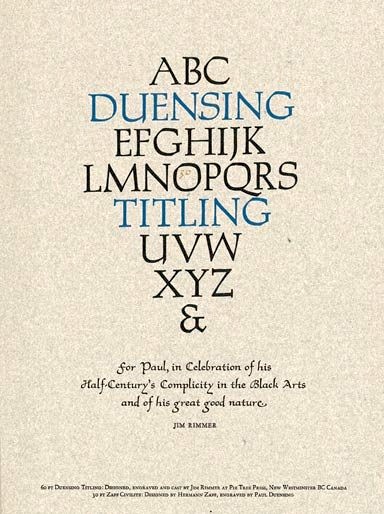
file name: Jim Rimmer Duensing Titling
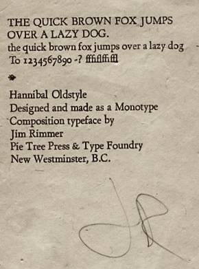
file name: Jim Rimmer Hannibal Oldstyle Preliminary Proof
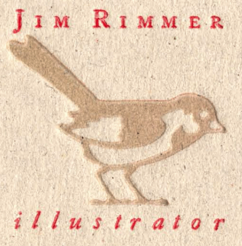
file name: Jim Rimmer Illustrator
file name: Jim Rimmer Pic Globe And Mail 2010
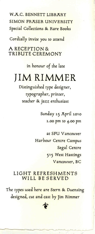
file name: Jim Rimmer Stern Duensing

file name: Jim Rimmer Pic8
| | |
|
Luc Devroye ⦿ School of Computer Science ⦿ McGill University Montreal, Canada H3A 2K6 ⦿ lucdevroye@gmail.com ⦿ https://luc.devroye.org ⦿ https://luc.devroye.org/fonts.html |