TYPE DESIGN INFORMATION PAGE last updated on Mon Jul 20 20:59:25 EDT 2026
FONT RECOGNITION VIA FONT MOOSE

|
|
|
|
Charles Robert Ashbee
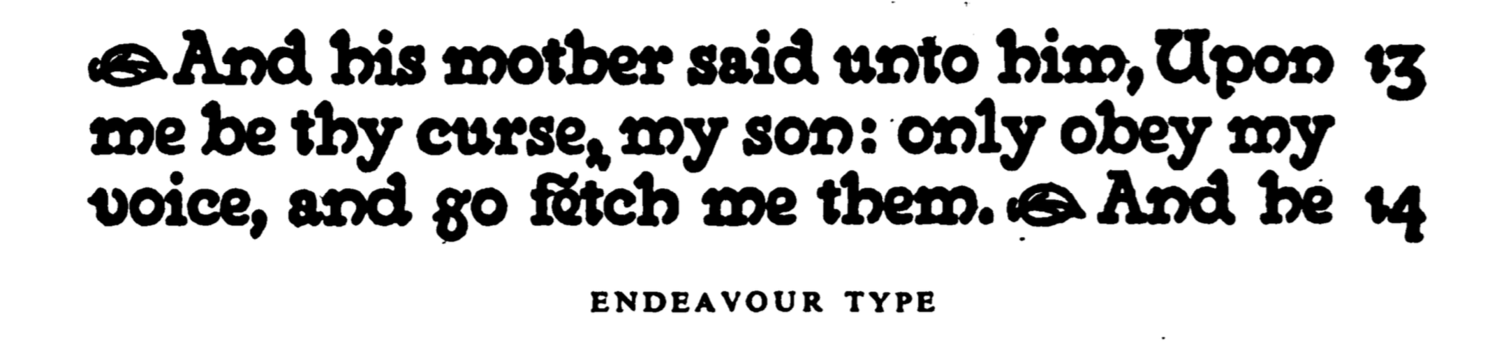
British type designer, b. Isleworth, 1863, d. Kent, 1942. He made Endeavour Type (1901) and Prayer Book Type (1903). Part of the Arts and Crafts movement, [quoting Wikipedia] he was the son of businessman and erotic bibliophile Henry Spencer Ashbee. His Jewish mother developed suffragette views, and his well-educated sisters were progressive as well. Ashbee went to Wellington College and read history at King's College, Cambridge from 1883 to 1886, and studied under the architect George Frederick Bodley. Ashbee was involved in book production and literary work. He set up the Essex House Press after Morris's Kelmscott Press closed in 1897. Between 1898 and 1910 the Essex House Press produced more than seventy books. Ashbee designed two typefaces for the Essex House Press, Endeavour (1901) and Prayer Book (1903), both of which are based on William Morris's Golden Type. Quoting wikipedia again: Despite his father's amateur career as an enthusiastically heterosexual pornographer, Ashbee was gay. He came of age in a time when homosexuality was illegal and "the love that dare not speak its name". He is thought to have been a member of the Order of Chaeronea, a secret society founded in 1897 by George Ives for the cultivation of a homosexual ethos. To cover his homosexuality, he married Janet Forbes, daughter of a wealthy London stockbroker. CRA, as he was known, had admitted his sexual orientation to his future wife shortly after he proposed. They wed in 1898 and, after 13 years of rocky marriage (including a serious affair on the part of Janet), had children: Mary, Helen, Prue and Felicity. Berry, Johnson and Jaspert write: A black face with heavy serifs, designed by C.R. Ashbee, the punches cut by E.P. Prince. This is perhaps the most exotic of the private press types. Few of the letters have a normal design. The bowls of the B are divided diagonally. H has a very high bar. The M has slab serifs and very short middle strokes. W has foot serifs and brief middle strokes. In the lower case e is a cursive form, g has no link and a contorted tail, in the h, m and n the last stroke is curved and descends below the line, w has the foot serifs of the capitals. Ascenders and descenders are short. The ampersand is curious. The name is derived from the title of the first book in which the type was used, An Endeavour towards the Teachings of Ruskin and Morris. The Prayer Book Type of 1903, is the same design in Great Primer. |
EXTERNAL LINKS |
| | |

file name: Charles Robert Ashbee Endeavour Type 1901
| | |
|
Luc Devroye ⦿ School of Computer Science ⦿ McGill University Montreal, Canada H3A 2K6 ⦿ lucdevroye@gmail.com ⦿ https://luc.devroye.org ⦿ https://luc.devroye.org/fonts.html |