TYPE DESIGN INFORMATION PAGE last updated on Mon Jul 13 21:19:42 EDT 2026
FONT RECOGNITION VIA FONT MOOSE

|
|
|
|
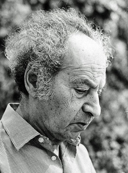
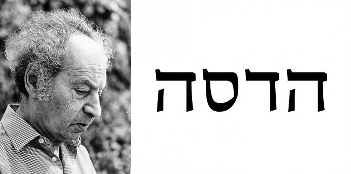
Henri Friedlaender
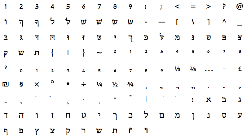
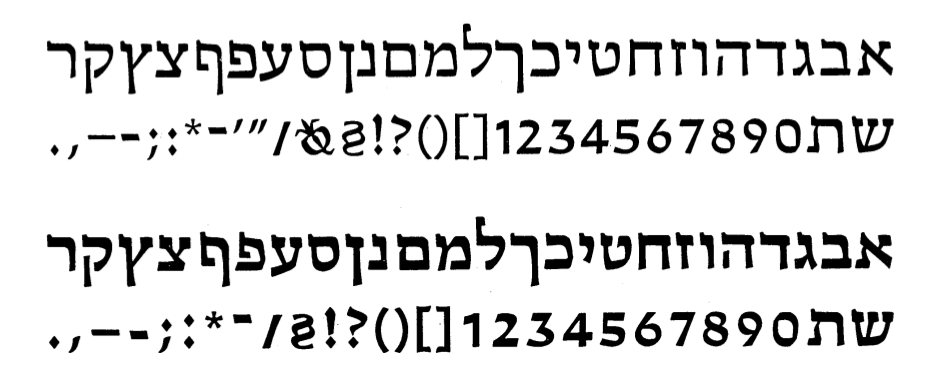
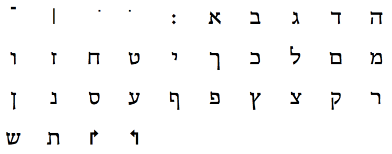
Born in Fulnek, Sudetenland, in 1904, he died in Jerusalem in 1996, after having spent most of his life as head of the Hadassah College in Jerusalem. He designed Hadassah Hebräisch (1958). Winner of the Gutenberg Prize in 1971. Henri Friedlaender designed Aviv, Hadar, and Shalom for IBM. Discussion of the Haddasah type by William C. Fontaine. William C. Fontaine writes in the Dartmouth College Library: In 1931 Henri Friedlaender was the foreman of the typesetting division of the Offizin Haag-Drugulin, an eminent Leipzig publisher that specialized in the printing of books in semitic languages. That year the Schocken Publishing Company placed a request for a twentieth-century, modern Hebrew typeface; it was a query that would captivate Friedlaender for the rest of his life. At the time, he was still a young man of twenty-seven, but another twenty-seven years would pass before his work would come to fruition with the creation of the Hebrew Hadassah typeface. The lack of a modern Hebrew type was acutely felt by the publishing industry in the early twentieth century. All of the existing typefaces were fatally flawed and barely legible. In addition, they had a medieval appearance that was wholly inappropriate for most printing jobs. In order to appreciate the magnitude of this problem, imagine having to read the New York Times in a gothic font because no other typefaces were available. Henri Friedlaender was the first to admit he was ill-prepared for this formidable challenge, but his knowledge of calligraphy and printing, as well as his aesthetic vision, gave him the tools to succeed where others had failed. As with any pioneering effort, the landscape was characterized by the complete absence of any guideposts. He had no idea what the final design would look like; indeed, he did not even know whether or not it would have serifs. His only guides would be his own aesthetic sensibilities and philosophy of typography. He knew the type would have to be simple, modern, and elegant, yet transparent to the reader. Without the quality of transparency, any type design would fail, no matter how good it might be otherwise. In the end, the type would attract too much attention to itself and defeat its efforts to communicate the author's text to the reader. To begin his work, Friedlaender made a survey of the existing Hebrew fonts. While everyone knew the existing Hebrew types were unsatisfactory, no one had made a thorough study to find out what made them so. The main problem, according to Friedlaender's research, was that the Hebrew alphabet never made an adequate transition from manuscript letter to typeface as had Roman letters. The Hebrew typefaces were more or less copies of the manuscript letters, incorporating all of their deficiencies and exhibiting few of their virtues. Some designers tried to apply the principles of Roman typography to Hebrew in an effort to avoid the extensive work that would be required to make this transition. These attempts failed miserably. The principles of Roman typography, known as Didot-Bodoni, emphasized horizontal lines with bold, dark, strokes and minimized vertical lines with hairline strokes. When this technique was used to produce Hebrew type, the result was barely tolerable. Obviously, Friedlaender's new design could not emerge from improving on any of the existing fonts. He would have to design a new typeface from scratch, from the fundamental basic forms of the Hebrew alphabet. Only then would he be able to create a type that would be a true typeface, and not merely a copy of the written letter. It was clear that he would have to conduct a thorough study of Hebrew writing in an attempt to discover its basic, fundamental forms; but a historical catalog of Hebrew letters did not exist, so Friedlaender began the daunting task of compiling his own. He photographed examples of different styles wherever he could find them: from tombstones, manuscripts, books, and anything that contained Hebrew letters from different periods and in different styles. It was here that his training in calligraphy in Leipzig during the 1920s came to the fore. Hermann Delitzsch, one of Friedlaender's teachers, was an expert in the scribal methods of copying old manuscripts. He had taught Friedlaender how to dissect a manuscript letter and determine what kind of writing implement was used as well as the angle needed to produce the various components of each letter. Friedlaender used these techniques to analyze the letters and isolate their most fundamental basic forms. From his study he saw the emergence of two major styles of Hebrew lettering: the Ashkenazi, which is the heritage of the Jews of Europe, and the Sephardi, which is of the Orient and Mediterranean. Written with a wide-nibbed reed, the Sephardi letters had strong horizontal and vertical lines that minimized the contrast among the lines in each letter. However, as the Sephardi style developed, a thinner reed was used to introduce more contrast within the letters. Ironically, the script became less legible. A number of letters could be easily confused. In addition, Friedlaender felt that some of the letters were too dark, especially the aleph. It was this late Sephardi script after which most early typefaces were modeled, and the defects of this script were subsequently inherited by these typefaces. The Ashkenazi style, however, employed a quill instead of a reed, which permitted much more contrast because of its ability to make heavy lines as well as very thin lines. This enabled the scribes to introduce new basic forms that helped distinguish some letters from others. However, this style was very ornate and was by its very nature gothic in appearance. Friedlaender began to see the direction his new type would take when he examined his scroll of Esther, which was copied by a scribe in the late eighteenth century. He could recognize the strengths of the Ashkenazi form as well as the improvements that the scribe made to minimize its weaknesses. In addition, the scribe did not slavishly follow the ornate tendencies of the Ashkenazi style. The result was a script that capitalized on the basic forms in both the Sephardic and Ashkenazic styles and lacked the usual gothic appearance. While Delitzsch's technique for analyzing letters was invaluable, it was his training under Rudolf Koch that he drew upon for designing the new typeface. Friedlaender's first full-time job was in the late 1920s as a typesetter in Ofenbach at the Klingspor workshop, and it was there that he came in to contact with Koch. In the evenings he attended Koch's calligraphy workshop. Although Koch was a gifted artist, Friedlaender noted that what was most important was his contact with the man. For here was an artist whose life embodied the spirituality and beauty that were evident in his work. It was a quality that many remarked on, and it struck a sympathetic chord with Henri Friedlaender, a student of Jewish mysticism and the wisdom of the East. Another source that would influence Friedlaender's project was Hugh J. Schonfield's The New Hebrew Typography, which was sent to him by the typographer Stanley Morison. After reading this book Friedlaender realized that he had to expand his goal from creating a single Hebrew typeface to a family of type: normal, bold, and cursive styles as well as punctuation and numerals. He also faced the question of designing the type for typesetting machines, which would require that each letter be the same width whether it was in normal, bold, or cursive form. As the situation in Germany worsened, it became clear to Friedlaender that he would have to leave. By 1932 the Nazi party had become the largest one in the Reichstag and was growing in power. So, in that year, he left the country where he had spent twenty-two of his twenty-eight years and went to the Netherlands to work as the art director at the Mouton publishing house in The Hague. There he became involved in designing book jackets and doing freelance work for other publishers. In 1936 he began his career as an educator, teaching typography and lettering in Amsterdam. All the while he continued his work on his Hebrew typeface, trying to capture the basic forms in his drawings. By 1941 he completed the first draft. In May of that same year, the Netherlands was invaded by Germany, and Friedlaender knew he would soon have to go underground. In the beginning of 1942, he packed up his drawings and photographs and buried them in his back yard in the hope that both he and his work would survive the war. While he was in hiding, he kept his professional and spiritual life alive through his calligraphy, producing excerpts from Biblical texts as well as wisdom from Hassidic and Eastern sages. The Netherlands was liberated in 1945 and although much of his work was destroyed, the drawings and photographs of his letters survived. Once again, he was able to support himself by doing freelance book-design work. He now began the task of looking for a type foundry that would work with him on casting the type. A number of obstacles stood in the way, the least of which was that the foundries already had more work than they could handle. In addition, no one at the foundries was in a position to evaluate the quality of Friedlaender's design. For all they knew, it would be a complete failure. But with the intercession of G.W. Ovink, a noted Dutch typographer, Friedlaender was able to convince the Lettergieterij Amsterdam to take a chance on his Hebrew type in 1949. A year later, Friedlaender took up the role of teacher by moving to Israel to become the head of the Hadassah Apprentice School of Printing in Jerusalem. There he began training the new generation of Israeli printers and graphic artists. Meanwhile, he continued his work with the Lettergieterij Amsterdam on the new typeface. When the first trial casting was made in 1950, it revealed a number of defects in the type. The normal and bold typefaces were entirely too dark. In addition, they were too stiff and rigid. Here Friedlaender's extensive study of Hebrew characters paid off again. He realized that Hebrew letters, unlike Roman letters, do not consist of any completely straight lines. The only solution was to redraw all the letters using a ruler and a french curve, a time-consuming and arduous process. The problems with the cursive typeface were so extensive that it had to be completely redesigned, and as a result, it was shelved. When the photographic copies of the new drawings came back in 12- and 24-point size, it was clear that more changes needed to be made. The type had a constricted feeling, and it was only after he cut apart the letters into separate pieces that he saw the solution to the problem. A number of letters appeared narrower than they actually were, and by shifting parts of some of the letters (the he, het, and taw), he changed the cramped feeling the type had on the page. Friedlaender described it as a striking confirmation of one of the fundamentals of the 'secret doctrine' of writing -- and mutatis mutandis of all art and all life: the non-written forms, the remaining white space, both between the letters and inside of them, is more significant than the written forms themselves. (Lao-Tze's eleventh Saying already deals with this.) After this breakthrough, a number of other minor corrections were made, and in 1958, the work on the text and boldface type was completed. Named after the Hadassah Apprentice School of Printing, the typeface became very popular both inside Israel and out. Perhaps the reason for this is Henri Friedlaender's guiding principle for type design. The typographer, if he is successful, will remain anonymous to the reader. The type should be pleasant and be a means of artistic expression, but only on a subliminal level; the typographer should remain in the background, focusing the reader's attention on the text. Friedlander's success at following this principle is evident from the many contemporary Hebrew texts using his type. He did, however, receive recognition for his contribution to typography and book design, when in 1971 he was presented the Gutenberg Prize, the highest honor for typographers. The Hadassah Hebrew type came to Dartmouth in an indirect way, a journey which began, in a sense, even before Henri Friedlaender undertook its creation. In 1926 Joseph Blumenthal established the Spiral Press in New York City. His aim was to enjoy himself in the pursuit of his livelihood, which meant producing fine books to the highest typographic standards. He made several trips to Europe, including one in 1928 that took him to Rudolf Koch's workshop in Offenbach. When he met this master printer and typographer, he expected to be granted only a short interview. But instead he was given an extensive tour of the workshop and spent a better part of the day with Koch, discussing graphic arts. His connections to the European world of printing benefited him throughout his professional life. And they paid off handsomely when, in the late 1950s, he was asked by the Limited Editions Club to produce a fine bilingual edition of the section of the Talmud known as Pirke Avot, or 'The Wisdom of the Fathers.' Dissatisfied with the available Hebrew fonts, which he thought 'looked like Kosher delicatessen signs,' he searched for a suitable type. Through his contacts he was able to discover Friedlaender's Hadassah design and obtain an advance casting from Amsterdam. The Spiral Press, which for forty-five years had lived up to its purpose, was closed in 1971 by Joseph Blumenthal. A few years later, Mr. Lathem purchased the remaining printing equipment, including this Hadassah Hebrew type, from Mr. Blumenthal. He presented this equipment to the College when, together with Mr. Lansburgh and Mr. Stinehour, he helped bring about the re-establishment of the Graphic Arts Workshop. Author of Toward a modern Hebrew, Printing & Graphic Arts 7:43-56, 1959, of Modern Hebrew lettering, Ariel: A Quarterly Review of the Arts and Sciences in Israel, 4:6-15, 1962, of Modern Hebrew type typefaces, Typographica, 16:4-9, 1967, and of The making of Hadassah Hebrew, pp. 67-84, in: The development of the square letter by Moshe Spitzer. In his writings, Friedlaender severely criticizes the Hebrew typefaces Chayim and Aharoni. Hadassah, he writes, was influenced by three typefaces from H. Berthold AG (Meruba, Frank Ruehl, Stam), a typeface designed by Marcus Behmer commissioned by the Soncino Gesellschaft der Freunde des Juedischen Buches society, which used it to print the Pentateuch in the Officina Serpentis printing press in Berlin in the 1930s, and letters drawn by Berthold Wolpe. |
EXTERNAL LINKS |
| | |

file name: Kivun Hadassah 1991 1993
file name: Hadassah
file name: Kivun Hadassah 1991 1993b
file name: Henri Friedlaender Pic
| | |
|
Luc Devroye ⦿ School of Computer Science ⦿ McGill University Montreal, Canada H3A 2K6 ⦿ lucdevroye@gmail.com ⦿ https://luc.devroye.org ⦿ https://luc.devroye.org/fonts.html |