|
Vox type classification
[Maximilien Vox]
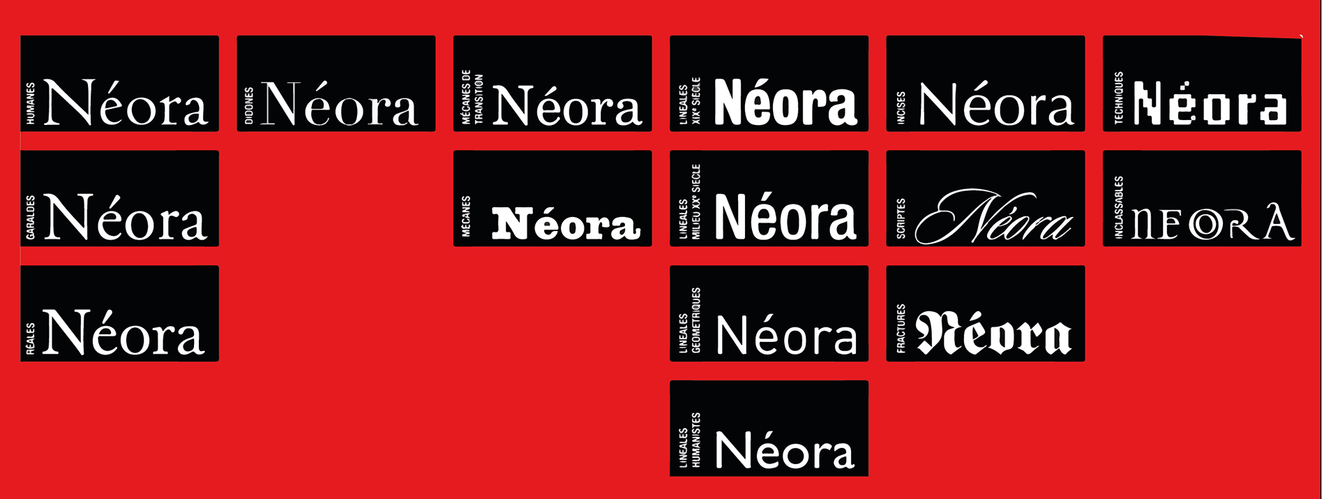
In 1954, Maximilien Vox published his type classification system: - Humane
- Garalde. This term, a combination of Aldine and Garamond, was coined by Vox.
- Réale
- Didone
- Mécane
- Linéale. Also a term invented by Vox. The term remnained in use until the 1980s when it was replaced by sans serif.
- Incise
- Scripte
- Manuaire
- Fractures
- Non-Latines
The type classification scheme's into nine categories translates as follows in French: manuaire, humane, garalde, réale, didone, mécane, linéale, incise, scripte. ATypI proposed the addition of two more, (in French) fractur and orientale, to get eleven styles. See also here. English translation of that French list by Paul Hunt. Invented by Maximilien Vox in 1952, it was adopted in 1962 by the Association International Typographique (ATypI). Quoted from that English translation, with corrections: - The humanists: Humanist typefaces gathers the first character Romans created with the 15th century typefaces by the Venetian printers, taking as a starting point the humanist manuscripts of the time. These typefaces, rather round in opposition to the Gothics of the Middle Ages, are characterized by short and thick serifs, and a weak contrast between full and untied. These typefaces are inspired in particular by the Carolingian minuscule, imposed by Charlemagne in his empire.
- The garaldes: This group is named in homage to Claude Garamond (16th century) and Aldus Manutius. The garaldes have finer proportions than the humanists, and a stronger contrast between downstroke and upstroke.
- The realists (réales): The realists are the result of the will of Louis XIV to invent new typographical forms, on the one hand to find a successor in the Garamond, on the other hand to compete in quality with different the printers from Europe. More contrast than in the previous two groups, the types are more rational and the axis is quasi-vertical.
- The didones: The didones are named after Didot and Bodoni. These typefaces, dating from the end of the 18th and the beginning of the 19th century, recognizable thanks to their great contrast, the verticality of the characters and their horizontal and fine footings. They correspond to the Didot of Thibaudeau's classification.
- the mécanes: The name of this group evokes the very mechanical aspect of these types, which are characteristic of the industrial age, the middle of the 19th century. There is almost no contrast, and rectangular slabs hold up the characters. These are also called slab serifs or egyptians.
- The lineals: This group combines all typefaces without serifs (called sans-serif). These correspond to the antiques of the Thibaudeau classification.
- The incised types: evoking the engraving in stone or metal. Small and triangular footings, almost like sans-serifs.
- The scripts: The scripts cover types based on formal penmanship. They seem to be written with the quill, with a strong slope. The letters can often be connected to eachother. The famous English typefaces form part of this family.
- The manuaires: the manuaires are based upon letters traced with a feather.
- The blackletters: also called gothic, these typefaces are characterized by pointed and angular forms.
- The non-Latin typefaces.
|
EXTERNAL LINKS
Vox type classification
MyFonts search
Monotype search
Fontspring search
Google search
INTERNAL LINKS
Typeface Classification ⦿
Type design in France ⦿
Modern style [Bodoni, Didot, Walbaum, Thorowgood, Computer Modern, etc.] ⦿
Carolingian typefaces ⦿
|
