TYPE DESIGN INFORMATION PAGE last updated on Mon Jun 8 17:59:48 EDT 2026
FONT RECOGNITION VIA FONT MOOSE

|
|
|
|
Jean Jannon
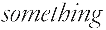
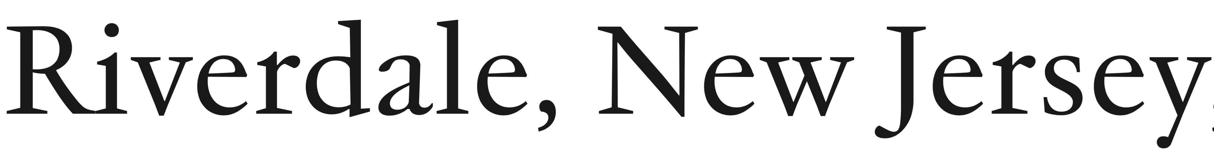
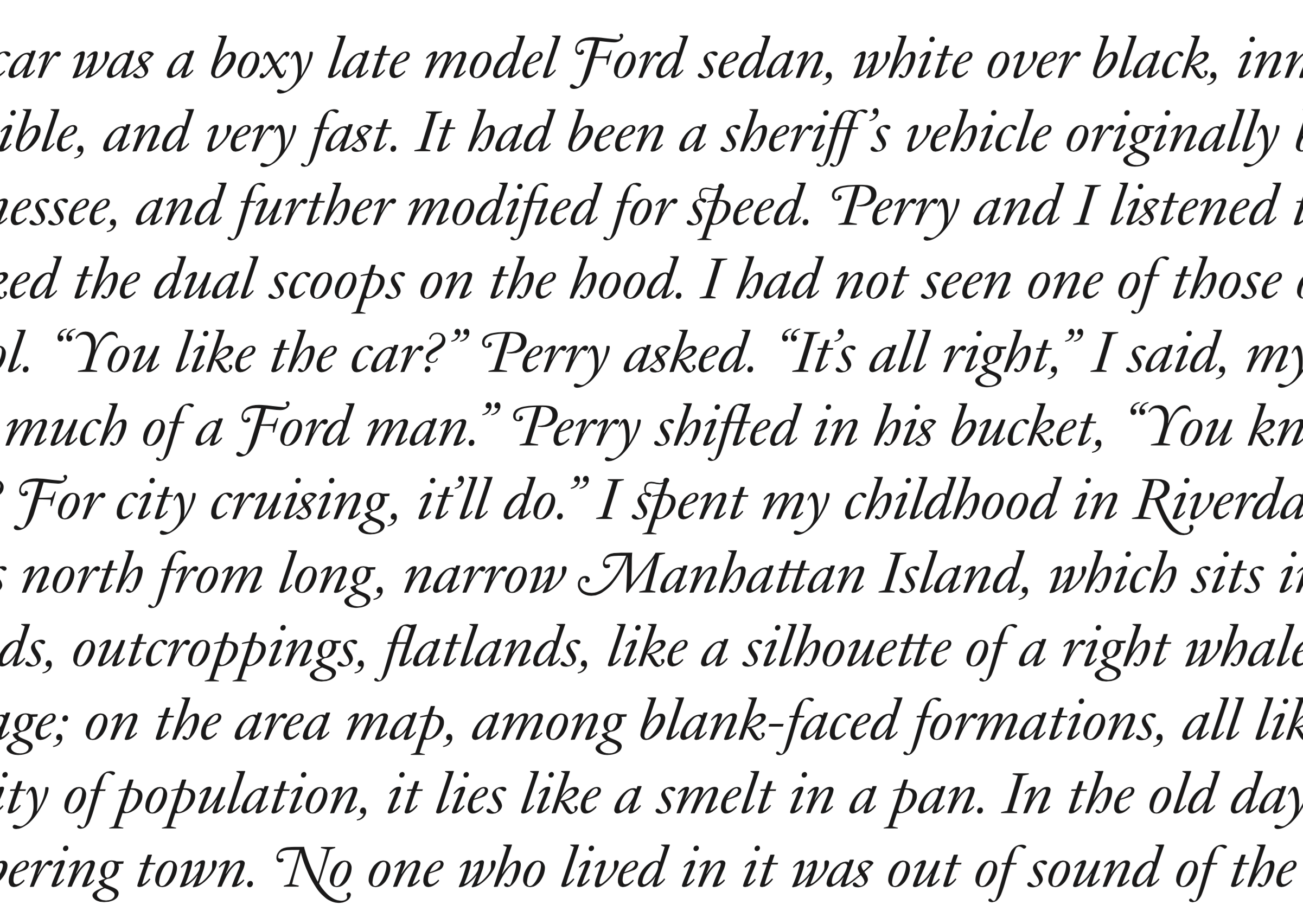
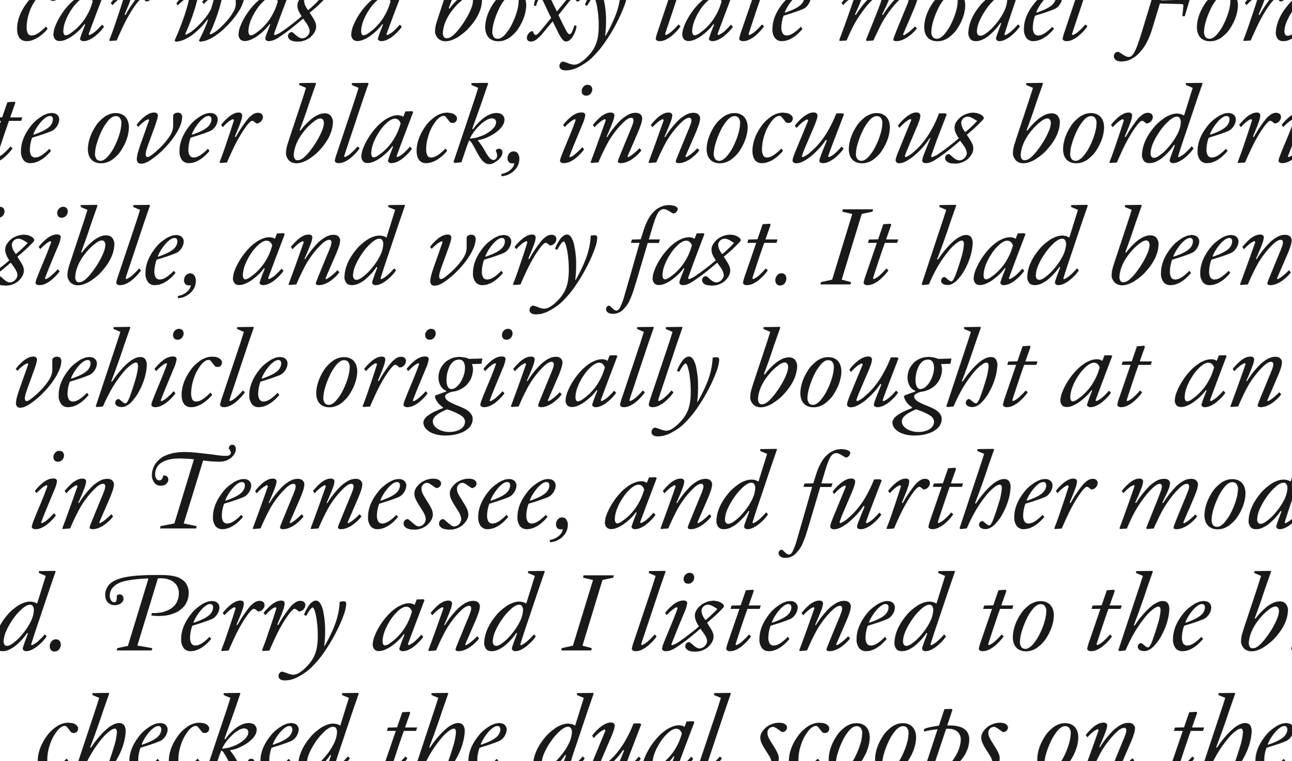
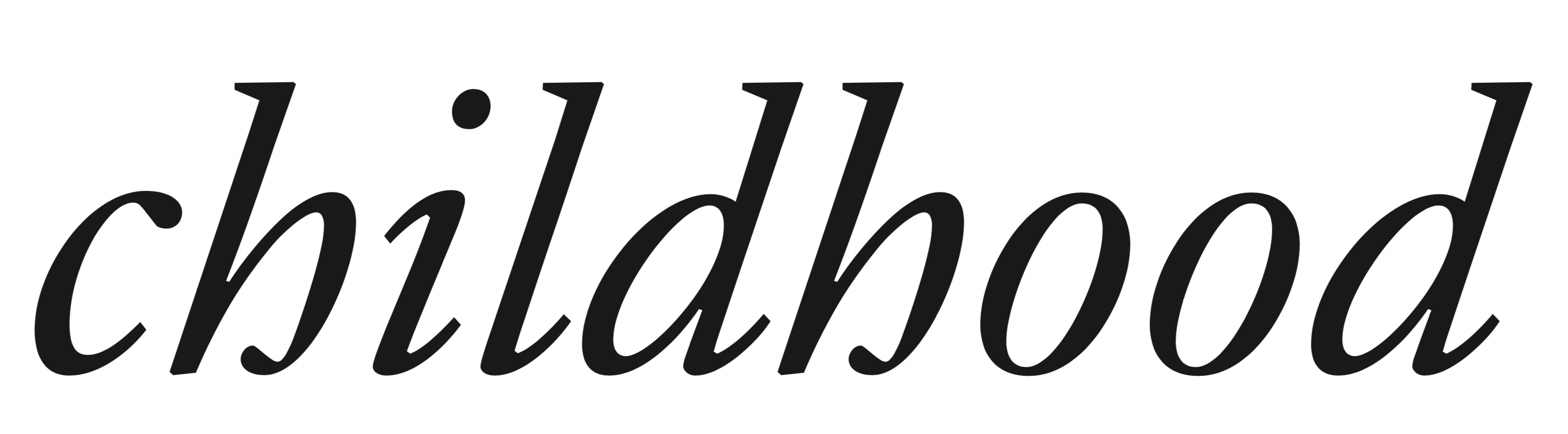
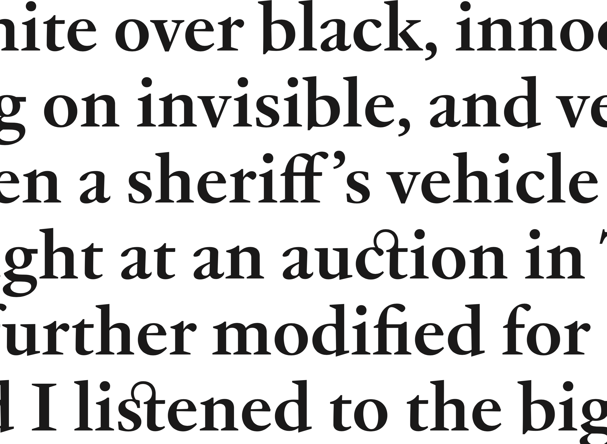
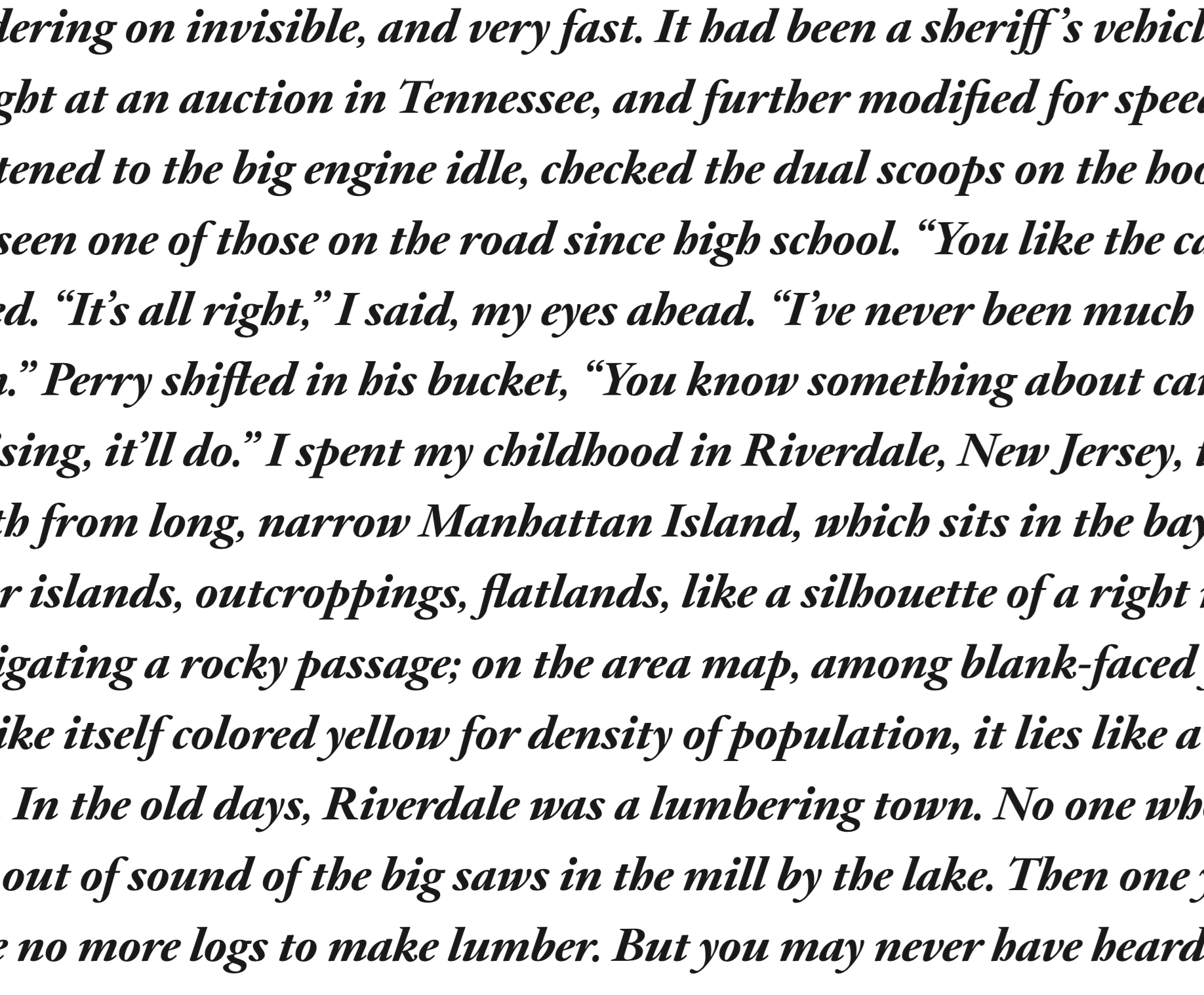
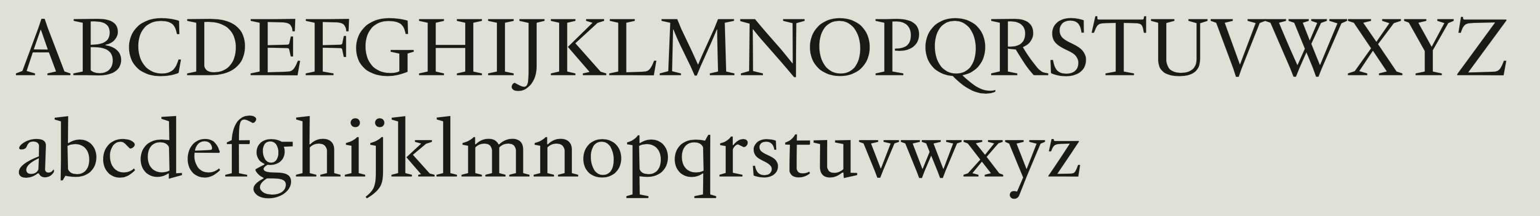
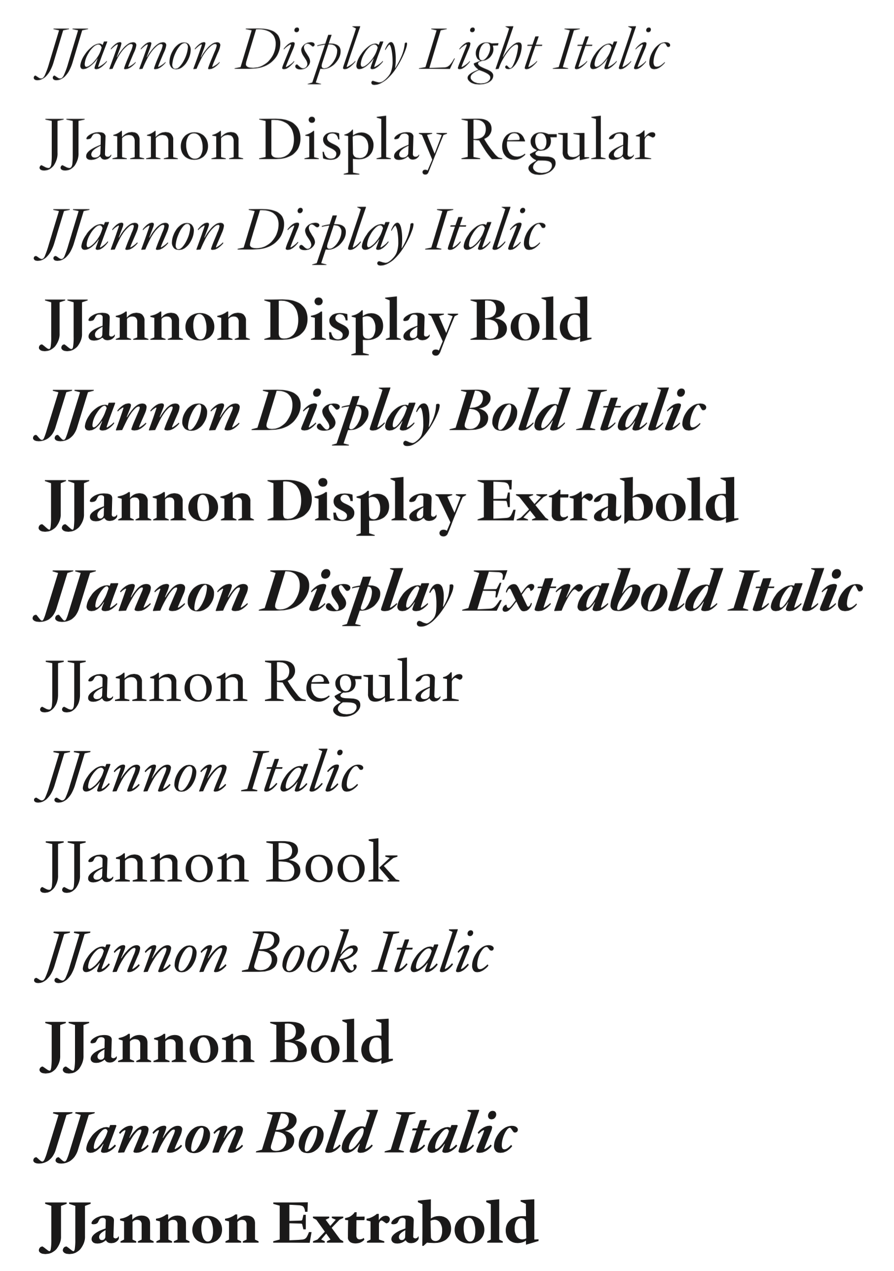
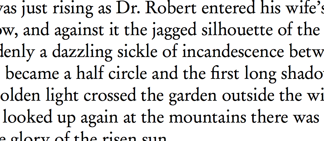
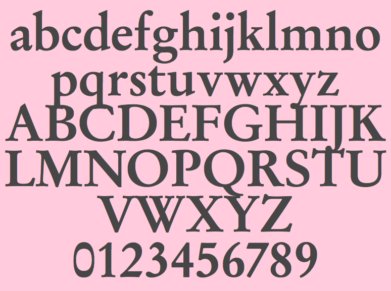
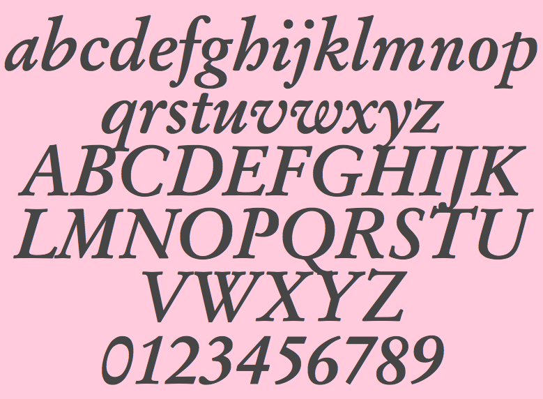
French type designer and punchcutter, 1580-1658, born in Switzerland, who worked at the Estienne printing atelier in Paris before escaping to Sedan, to avoid persecution for his Protestant beliefs. He then worked as a printer for the Calvinist Academy where he began to cut his own letters. In 1641, he received a commission from the Imprimerie Royale from which Caractères de l'UniversitĂé originated. Until the middle of the 20th century, his letters were misattributed to Claude Garamond. Many of today's Garamond style typefaces are in fact due to Jannon, as first pointed out by Beatrice Warde. Frantisek Storm writes this: The engraver Jean Jannon ranks among the significant representatives of French typography of the first half of the 17th century. He was born in 1580, apparently in Switzerland. He trained as punch-cutter in Paris. From 1610 he worked in the printing office of the Calvinist Academy in Sedan, where he was awarded the title "Imprimeur de son Excellence et de l'Academie Sédanoise". He began working on his own alphabet in 1615, so that he would not have to order type for his printing office from Paris, Holland and Germany, which at that time was rather difficult. The other reason was that not only the existing type typefaces, but also the respective punches were rapidly wearing out. Their restoration was extremely painstaking, not to mention the fact that the result would have been just a poor shadow of the original elegance. Thus a new type typeface came into existence, standing on a traditional basis, but with a life-giving sparkle from its creator. In 1621 Jannon published a Roman type typeface and italics, derived from the shapes of Garamond's type typefaces. As late as the start of the 20th century Jannon's type typeface was mistakenly called Garamond, because it looked like that type typeface at first sight. Jannon's Early Baroque Roman type face, however, differs from Garamond in contrast and in having grander forms. Jannon's italics rank among the most successful italics of all time. They are brilliantly cut and elegant. Author of Epreuve de caractères nouvellement taillez A Sedan par Iean [Jannon] imprimeur de l'Académie (1621). In 1927, Paul Beaujon (Beatrix Warde) published a facsimile entitled The 1621 Specimen of Jean Jannon, Paris & Sedan, designer & engraver (London). The headline of this page is set in New G8 (2012, Michael Sharpe), which in turn is a digital descendant of URW Garamond No. 8. For a recent digital revival, see JJannon (2019, François Rappo). |
EXTERNAL LINKS |
| | |

file name: Francois Rappo J Jannon 2019
file name: Francois Rappo J Jannon 2019
file name: Francois Rappo J Jannon 2019
file name: Francois Rappo J Jannon 2019
file name: Francois Rappo J Jannon 2019
file name: Francois Rappo J Jannon 2019
file name: Francois Rappo J Jannon 2019
file name: Francois Rappo J Jannon 2019
file name: Garamond No8 2000
file name: Garamond No8 Medium 2000
file name: Garamond No8 Medium Italic 2000

file name: Michael Sharpe New G8 2012 Jean Jannon
| | |
|
Luc Devroye ⦿ School of Computer Science ⦿ McGill University Montreal, Canada H3A 2K6 ⦿ lucdevroye@gmail.com ⦿ https://luc.devroye.org ⦿ https://luc.devroye.org/fonts.html |