TYPE DESIGN INFORMATION PAGE last updated on Thu Jul 16 06:49:16 EDT 2026
FONT RECOGNITION VIA FONT MOOSE

|
|
|
|
The Philidor Company
[Scott-Martin Kosofsky]
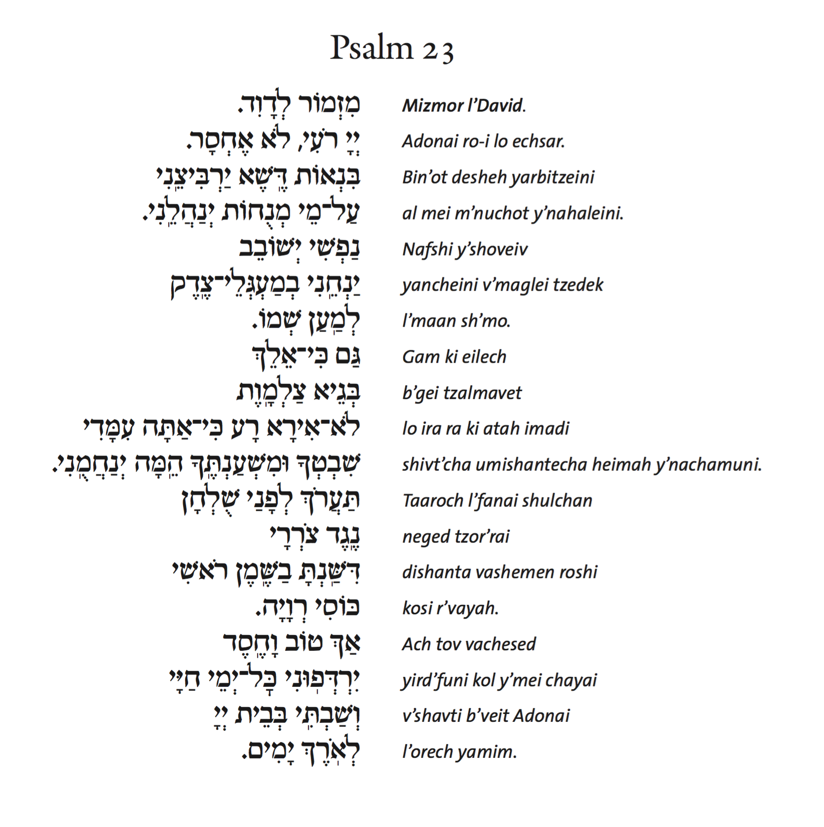
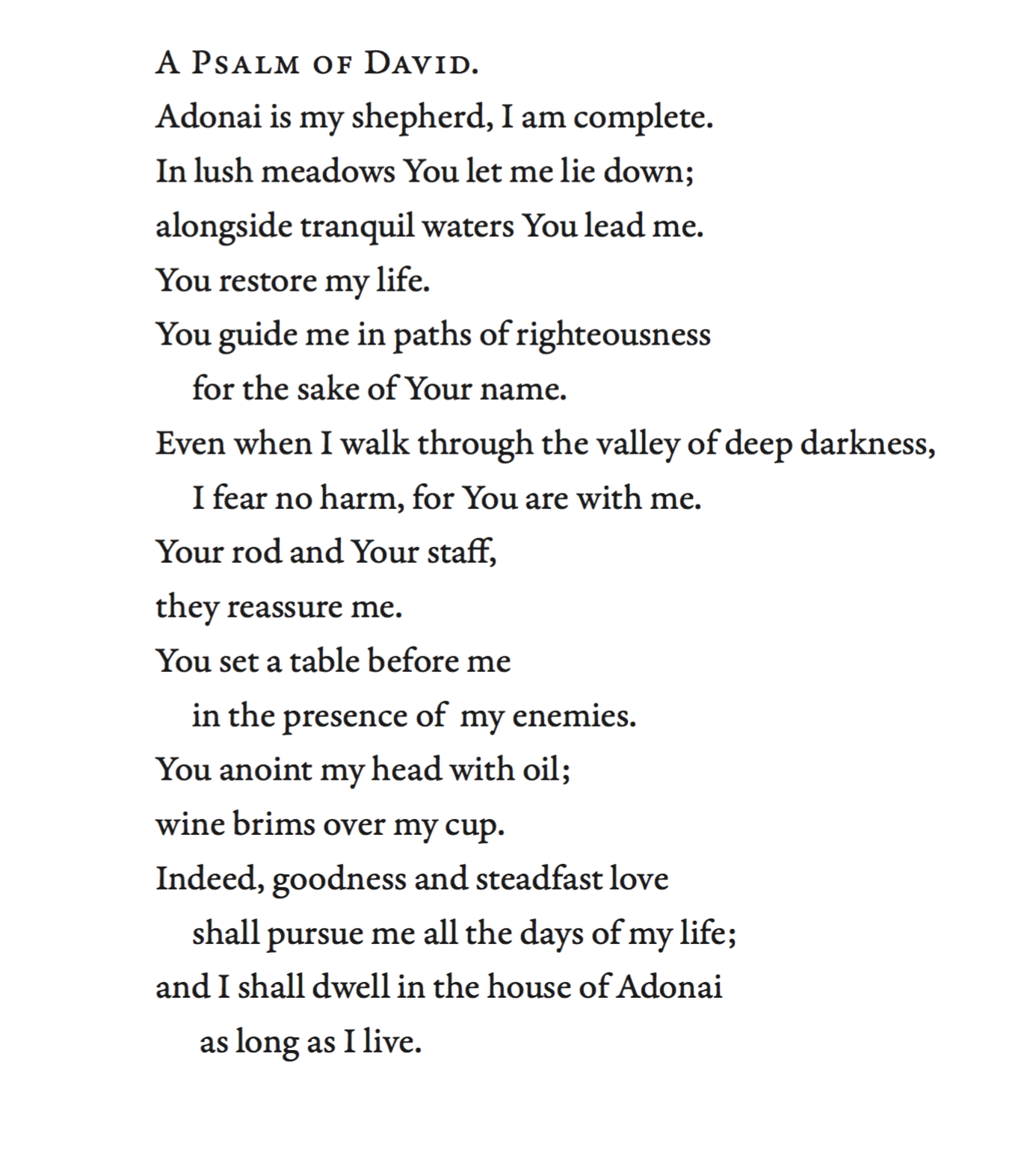
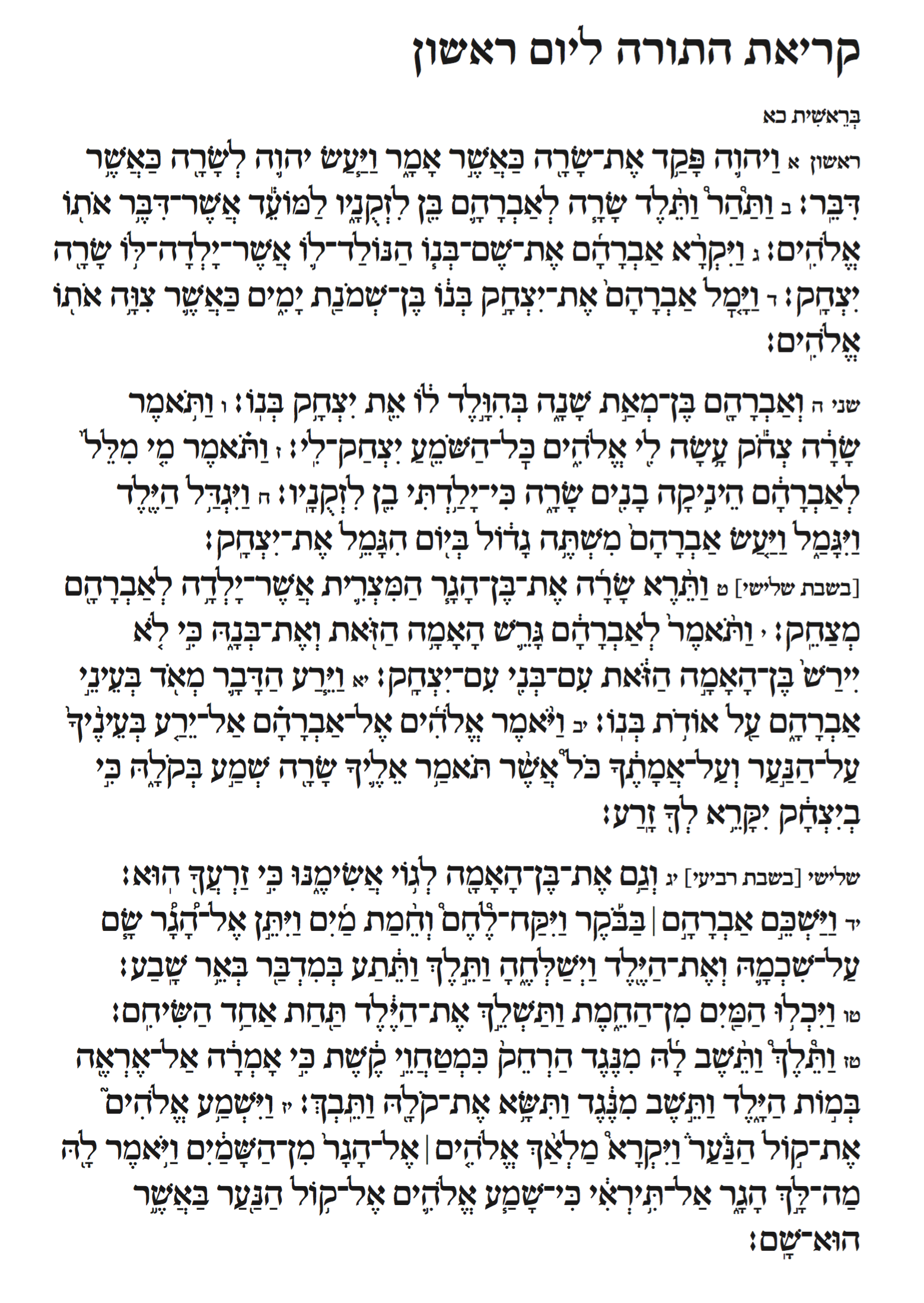
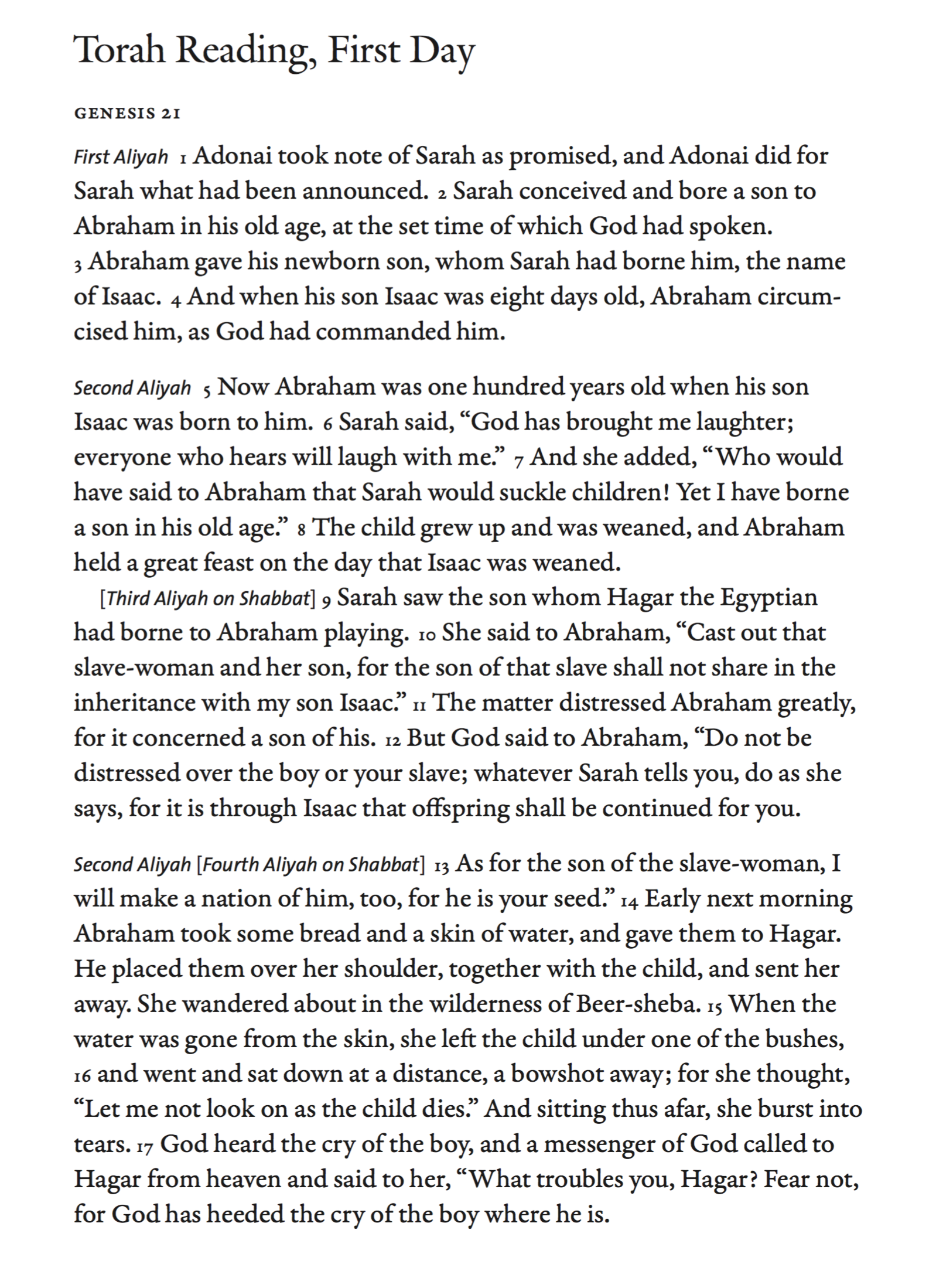
Scott-Martin Kosofsky (b. 1953) was based in Boston for 40 years, and is now located in Rhinebeck, NY, where he heads The Philidor Company. Among many other things, he was also the principal designer of most Titanic Records packaging, and designed a book on the holocaust. He designed a number of Hebrew types for his own use---several are licensed to various major rabbinic organizations. Over the years he has become the leading designer, producer, and editor of the bilingual Jewish prayer books that are used by the majority of Jews in the English-speaking world. Some of his type designs:
|
EXTERNAL LINKS |
| | |
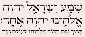
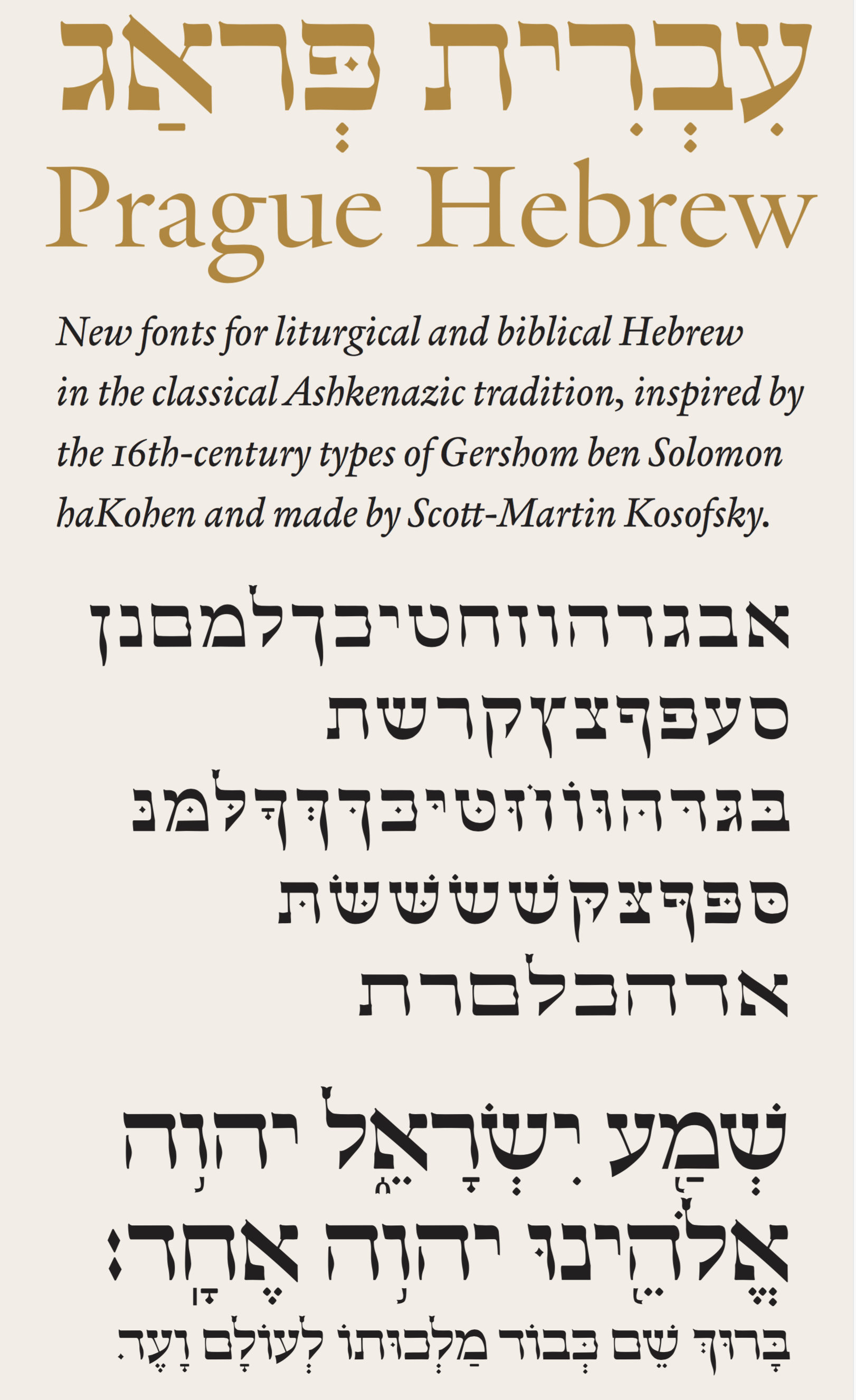
file name: Scott Martin Kosofsky Prague Hebrew 2020
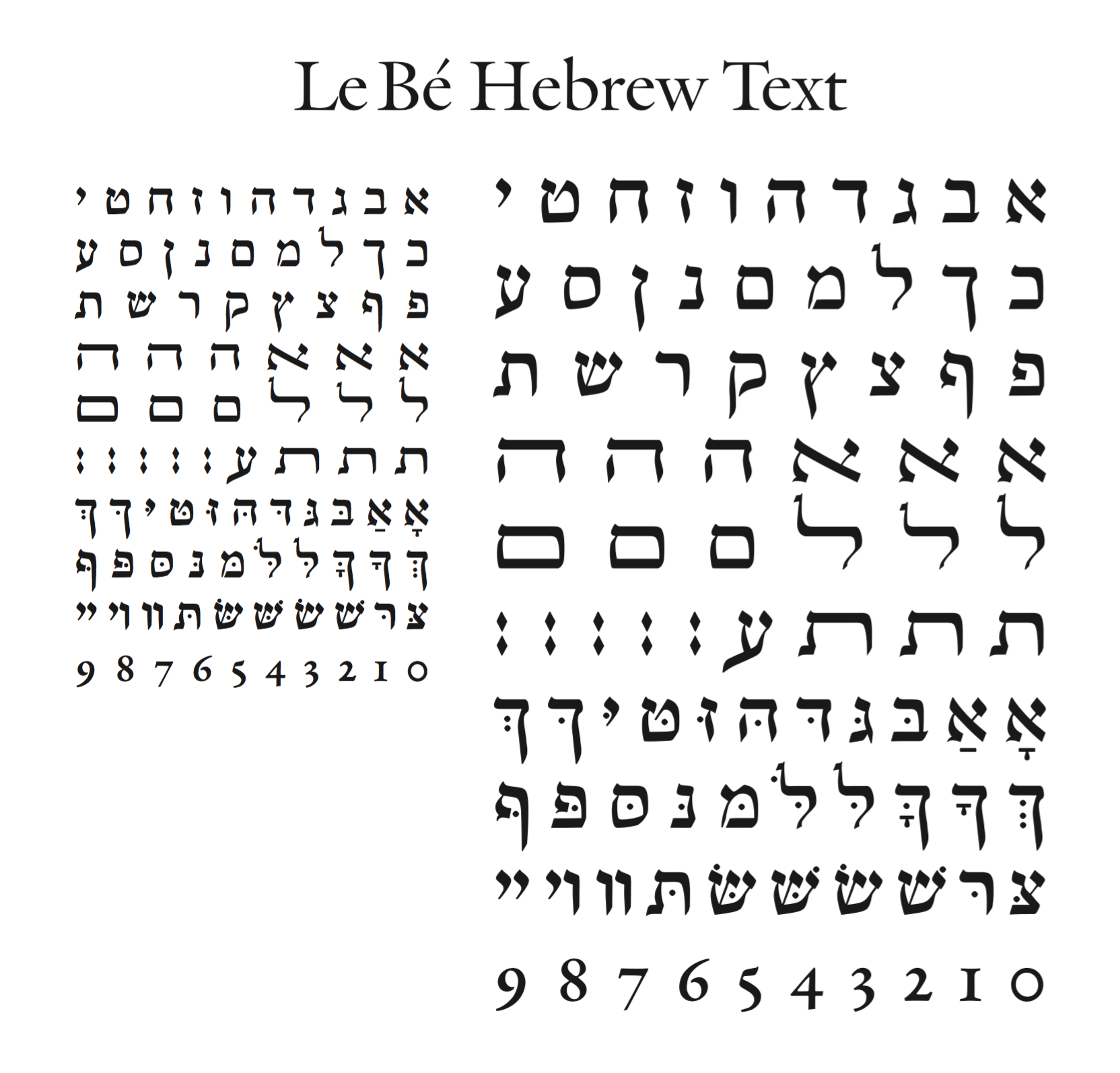
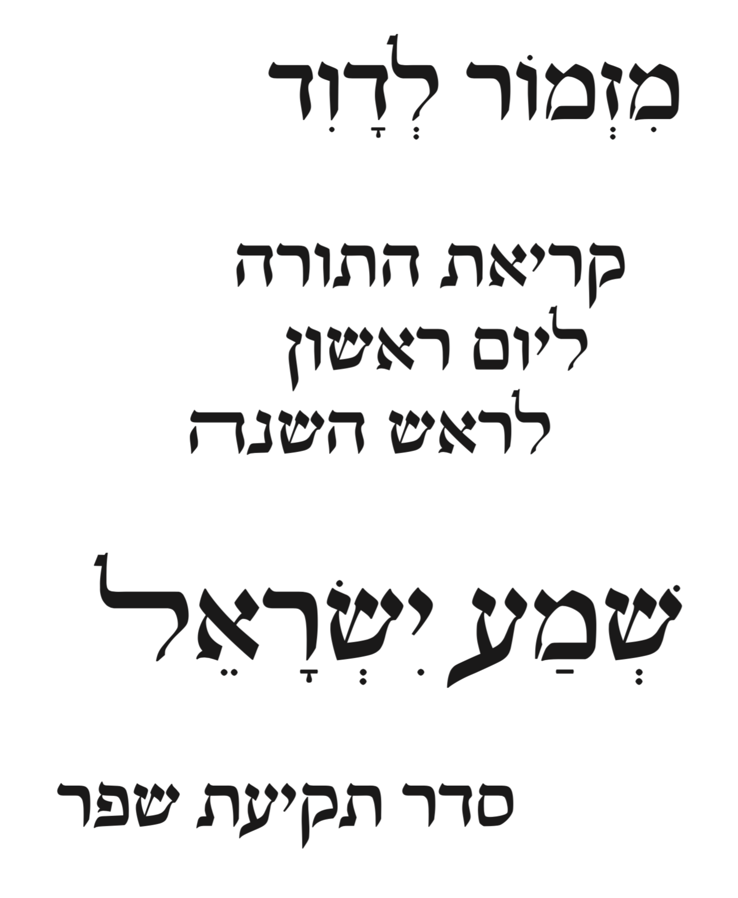
file name: Matthew Carter Scott Martin Kosofsky Le Be Hebrew Text 2010 00
file name: Matthew Carter Scott Martin Kosofsky Le Be Hebrew Text 2010 01
file name: Matthew Carter Scott Martin Kosofsky Le Be Hebrew Text 2010 02
file name: Matthew Carter Scott Martin Kosofsky Le Be Hebrew Text 2010 03
file name: Matthew Carter Scott Martin Kosofsky Le Be Hebrew Text 2010 04
file name: Matthew Carter Scott Martin Kosofsky Le Be Hebrew Text 2010 05
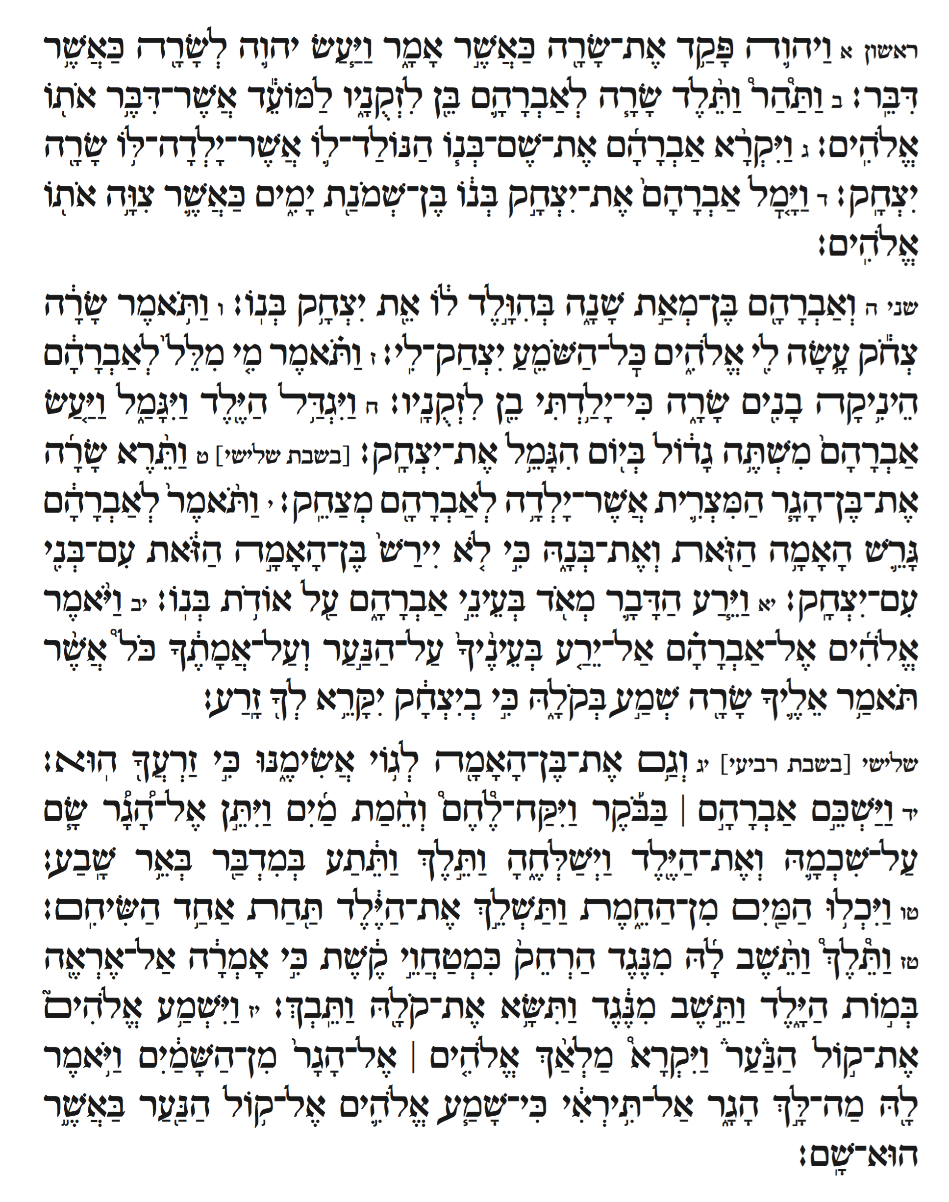
file name: Matthew Carter Scott Martin Kosofsky Le Be Hebrew Text 2010 06
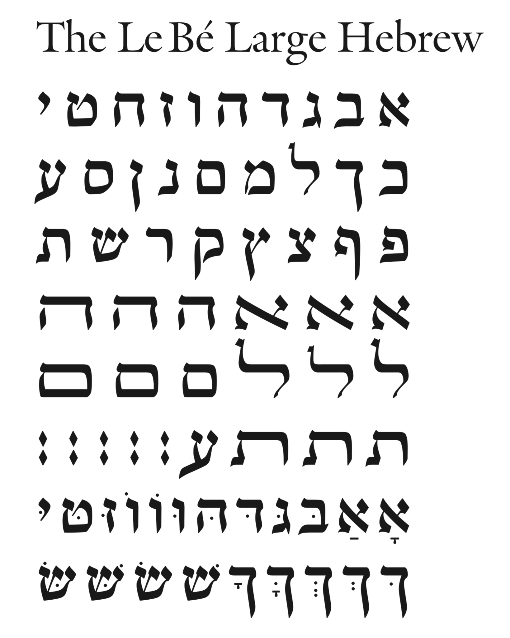
file name: Matthew Carter Scott Martin Kosofsky Le Be Large Hebrew 2010
file name: Matthew Carter Scott Martin Kosofsky Le Be Large Hebrew 2010
| | |
|
Luc Devroye ⦿ School of Computer Science ⦿ McGill University Montreal, Canada H3A 2K6 ⦿ lucdevroye@gmail.com ⦿ https://luc.devroye.org ⦿ https://luc.devroye.org/fonts.html |