TYPE DESIGN INFORMATION PAGE last updated on Thu Jul 16 06:49:18 EDT 2026
FONT RECOGNITION VIA FONT MOOSE

|
|
|
|
Jock Kinneir
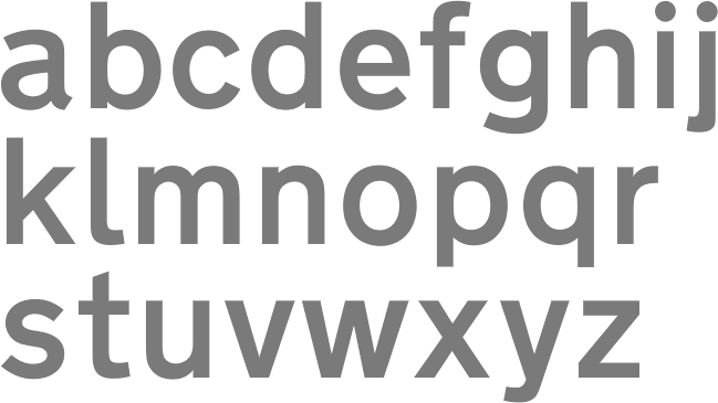
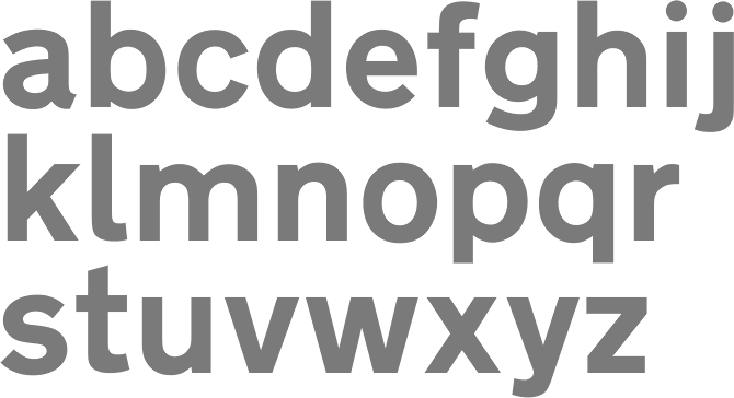
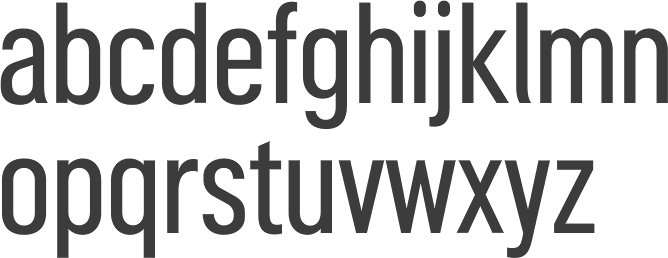
British type designer, born in 1917. Designed TransportD in 1963 together with Margaret Calvert, in a project for the British Government started in 1957. Two fonts were made, Transport Medium and Transport Heavy. The Akzidenz-Grotesk-inspired typeface is used in countries around the world, such as the crown dependencies, British overseas territories and in Commonwealth states or former nations of the British Empire. The typeface is also used in Hong Kong, Ireland, Iceland, Italy, Greece and Spain. Rail Alphabet (1965) was also designed by both, this time as a rebranding typeface for British Rail. The font can still be seen in station signage. Wikipedia states that Rail Alphabet is similar, but not identical, to a bold weight of Helvetica. Andrea Bergamini, who is involved in Italian road signage type, writes: The story is a bit complicated and confused. The road and highway signage is based on relatively international standards, that also involve the fonts to be used. From the beginning of the '60s Italy used the font designed (from 1957 to 1967) specifically for street signs in the UK. The designers of the sign layouts and the of the font in use are Jock Kinneir and Margaret Calvert, and the font is Transport (URW, 1980). The laws on Italian signage (quite depressing) are on any complete edition of the Italian “Codice della Strada” -Manual of road laws and rules, that has specimens of all the alphabets to be used. Some engineers from the Public Works Department, one of which maybe was called Cecilia, worked on it. The system designed by Kinneir and implemented in 1963 is an example of stylistic durability. In an article called “Roadside traffic sign” (originally published on the British magazine Design No. 178, 1963) Anthony Froshaug proved that there was no reason for an improvement of that signage system. The Italian license plates are designed by the IPZS, the Istituto Poligrafico. In Spring 2003 the Triennale in Milano hosted a very interesting show called “Asfalto, the character of the city”. In my research, I found that Traffic Type Spain D (from an unknown designer), as it appears here is a lot closer in look to what appears on the Italian highways than Kinneir's Transport, (1957-67), even in its Heavy variant. My opinion is that the font that is being used took its shape from Kinneir's original design (the similarity with it is out of doubt), but was redrawn and applied without consideration of what were the lighting and optical problems concerned. Jock Kinneir and Margaret Calvert also created Motorway as a companion to Transport. That typeface was extended by Keith Bates in Motorway (2015). |
EXTERNAL LINKS |
| | |


file name: Keith Bates Motorway 2015b
file name: Keith Bates Motorway Regular 2015
file name: Margaret Calvert Jock Kinneir Transport Bold D 1963
file name: Margaret Calvert Jock Kinneir Transport Medium D 1963
| | |
|
Luc Devroye ⦿ School of Computer Science ⦿ McGill University Montreal, Canada H3A 2K6 ⦿ lucdevroye@gmail.com ⦿ https://luc.devroye.org ⦿ https://luc.devroye.org/fonts.html |