|
The Raster Tragedy
[Beat Stamm]

An authoritative look by Microsoft's Beat Stamm at different methods for rendering outline fonts on screens or gridded devices. First written in 1997, it was updated in 2011, and is now available as a useful web-based essay/book. Excerpts from his conclusions: - Prima facie it would seem that turning outline fonts into pixels is a straightforward if not trivial problem: The outlines are blessed by the designer, scaling the outlines is mathematically exact, and turning on interior pixels follows strict rules. In theory, this doesn't sound like it requires any rocket science. In practice, however, we are still rendering fonts on the wrong side of the Nyquist limit, regardless of the anti-aliasing methods.
- Given the resolutions of 96 to 120 DPI on today's desktop or laptop screens, I can not single out a combination of rendering method and hinting strategy that, simultaneously, satisfies every end-user's preferences, addresses both scalable and reflowable layouts, and always best represents the type designer's intent.
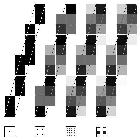
- It may come as a surprise that the type designer's intent is not readily encoded in the outline font format---certainly not in the TrueType format. TrueType outlines are partitioned lists of control points along with flags making them on or off-curve points. But that's just about it: there are no explicit concepts of stems, crossbars, or serifs, let alone concepts like positioning crossbars at the visual center between the baseline and the cap height.
- Most of the Raster Wars I read about in the blogosphere become supremely futile fights in cyberspace. Really! What's the point? Some people like broccoli, some people don't---however healthy it may be. People's tastes vary, be it in cuisine or in typography. But if done properly, hinting can cater to the varying tastes in font rendering.
- Whether or not you need hinting at 300 DPI, despite all of today's anti-aliasing, depends on your typophile standards. If they are anything like those of die-hard audiophiles, preferring 192kHz/24bit or even Vinyl over CD---let alone MP3---playback, then hinting doesn't go away, even at 200 or 300 DPI. Instead, advanced hinting can be extended to more sophisticated opportunities such as Optical Scaling and other aspects of Micro-Typography.
- Back in 1990, when the first scalable font formats appeared on the market to render text in black-and-white on low resolution screens, hinting was a necessary evil. To turn scattered pixels into coherent---if pixilated---characters and make text somewhat readable, you had to use some form of hinting. Today I see hinting as an opportunity to get on-screen text rendering as close to the art of printing as the available screen technologies allow.
|
EXTERNAL LINKS
The Raster Tragedy
MyFonts search
Monotype search
Fontspring search
Google search
INTERNAL LINKS
Truetype font software ⦿
Font software ⦿
Pixel/bitmap fonts ⦿
Modern style [Bodoni, Didot, Walbaum, Thorowgood, Computer Modern, etc.] ⦿
|