|
Robin Nicholas
Born in Westerham, KE (1947). He joined the Monotype drawing office in 1965 and moved to the type design department in 1968, where he became manager in 1982. In 2009, he is head of typography at Monotype. Klingspor link. Robin Nicholas's typefaces: - With Patricia Saunders and a team of ten, he co-designed the Arial family at Monotype, an outgrowth of a program for low resolution sans typefaces started in 1982. I do not have to add anything here---Arial was made to mimic Helvetica and to adopt the same metrics. No other motivation. No higher artistic ideals. No admission from Nicholas, and no apologies. Arial is a stained 1982 stamp on the rest of Robin Nicholas' life.
- Still at Monotype, he made Nimrod (1980), which was first used by the Leicester Mercury in its year of introduction. Nimrod became a popular newspaper type.
- He created Plantin Headline Condensed (1995).
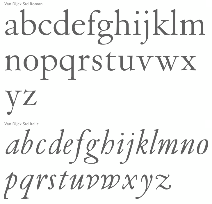
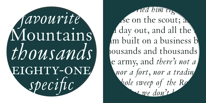
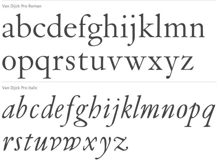
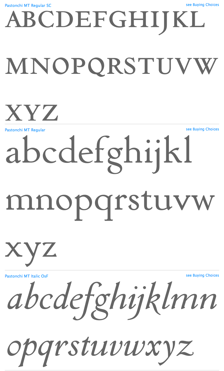
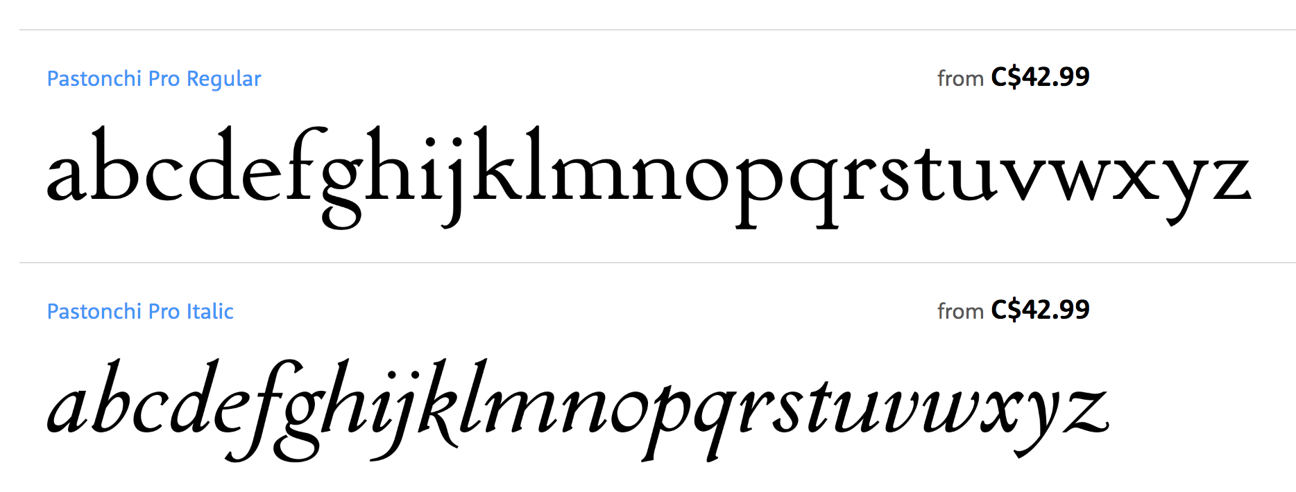
- He had a hand in the development and revival of Bell, Centaur, Clarion (a newspaper text face), Janson, Van Dijck and Walbaum, all between 1982 and 1989, all at Monotype. A blurb: Nicholas has directed the design of fonts such as the Clarion and Columbus fonts, as well as the digital versions of many Monotype typefaces including the Bell, Centaur, Dante, Monotype Janson, Fournier, Van Dijck, Monotype Walbaum, Bulmer and Pastonchi designs.
- He had a hand in Columbus (1992, Monotype). Ascender writes: Columbus has a fresh and lively hand-drawn feel but works well with today's computer systems and printers. An excellent text face, Columbus can also be used for display in advertising, posters, flyers and headlines, where the true elegance and beauty of the letters can be seen. Columbus was designed by Patricia Saunders and directed by Robin Nicholas in 1992 to celebrate the quincentenary of the voyage from Spanish shores by Christopher Columbus. The regular weight is based on types used in Spain by Jorge Coci circa 1513, and the italic is derived from a font cut by Robert Granjon circa 1543 and used by Bartolome de Najera in 1548 to print a famous manual by the writing master Juan de Yciar.
- He has done custom font projects for British Airways, Scandinavian Airlines, Barclays Bank, Opel automobiles (see Opel Sans; more here on this derivative of Futura; posted here), and Ikea (Ikea Sans is based on Futura and Ikea Serif on New Century Schoolbook).
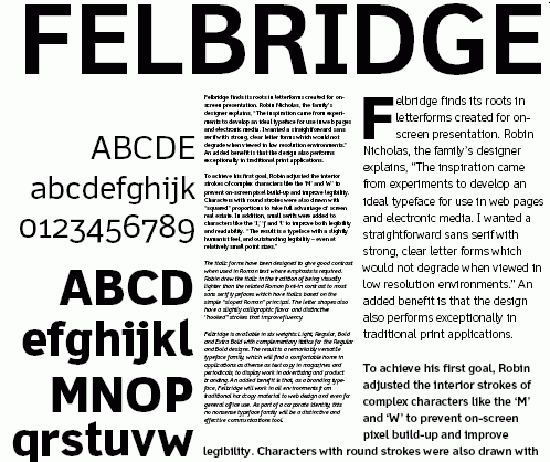
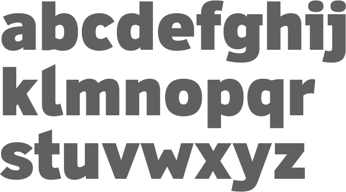
- In 2003, he published the Felbridge family and Fairbank MT (a chancery hand) at Agfa-Monotype.
- Cambria, Jelle Bosma's 2006 typeface for Ascender and Microsoft, was a joint effort with Steve Matteson and Robin Nicholas.
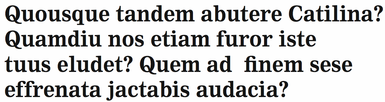
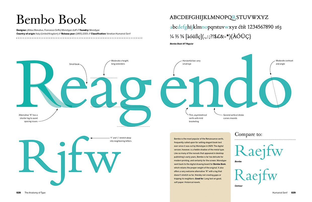
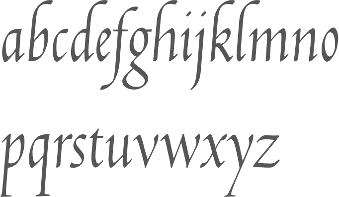
- In a project started in 2002 at Monotype, and finished in 2005, he created Bembo Book. Monotype's page explains: Originally drawn by Monotype in 1929, Bembo was inspired by the types cut by Francesco Griffo and used by Aldus Manutius in 1495 to print Cardinal Bembo's tract de Aetna. A beautiful design with tall ascending lowercase and elegant letterforms, Bembo has been a favourite for book setting for over 70 years. No italic was used in the Aldine de Aetna work so another source was needed. This was found in a publication by the writing master, Giovantonio Tagliente, produced in Venice circa 1524. Considered by many to be one of Stanley Morisons finest achievements during his tenure as Typographical Advisor to the Monotype Corporation, Bembo has consistently been a best selling typeface, both in its original hot metal form and in todays digital formats. Not intended to be a facsimile of Manutius work, Bembo was drawn to embody the elegance and fine design features of the original but marry them with the consistency of contemporary production methods and to ensure that the typeface would work satisfactorily with high speed printing techniques. The first phototypesetting and digital versions were based on hot metal 9 point drawings. This gave good legibility in small sizes, due to a comparatively large x height, but lacked some of the elegance present in larger hot metal sizes. This new digital version of Bembo, called Bembo Book, has been designed to be more suited to text setting in the size range from 10 point to 18 point. Based on the hot metal 10/18 point drawings, which were used to cut all sizes from 10 point to 24 point, this new typeface has been carefully drawn to produce similar results to those achieved from the hot metal version when letterpress printed. The project started in 2002 when a high quality UK Printing House asked for a digital version of Bembo which would give a similar appearance on the page to the 13 point hot metal they were currently using. Hot metal drawings were digitised and extensive editing was carried out on the resultant outlines to ensure that design features and overall colour from the digital output remained close to that of the letterpress product. The resultant typeface is slightly narrower than existing digital versions of Bembo, it is a little more economical in use and gives excellent colour to continuous pages of text. Ascending lowercase letters are noticeably taller than capitals, giving an elegant, refined look to the text.
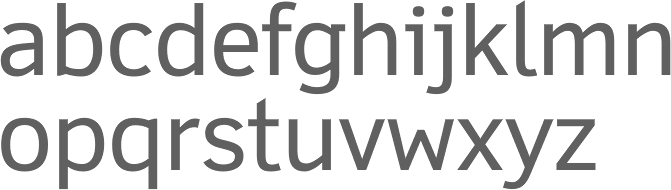
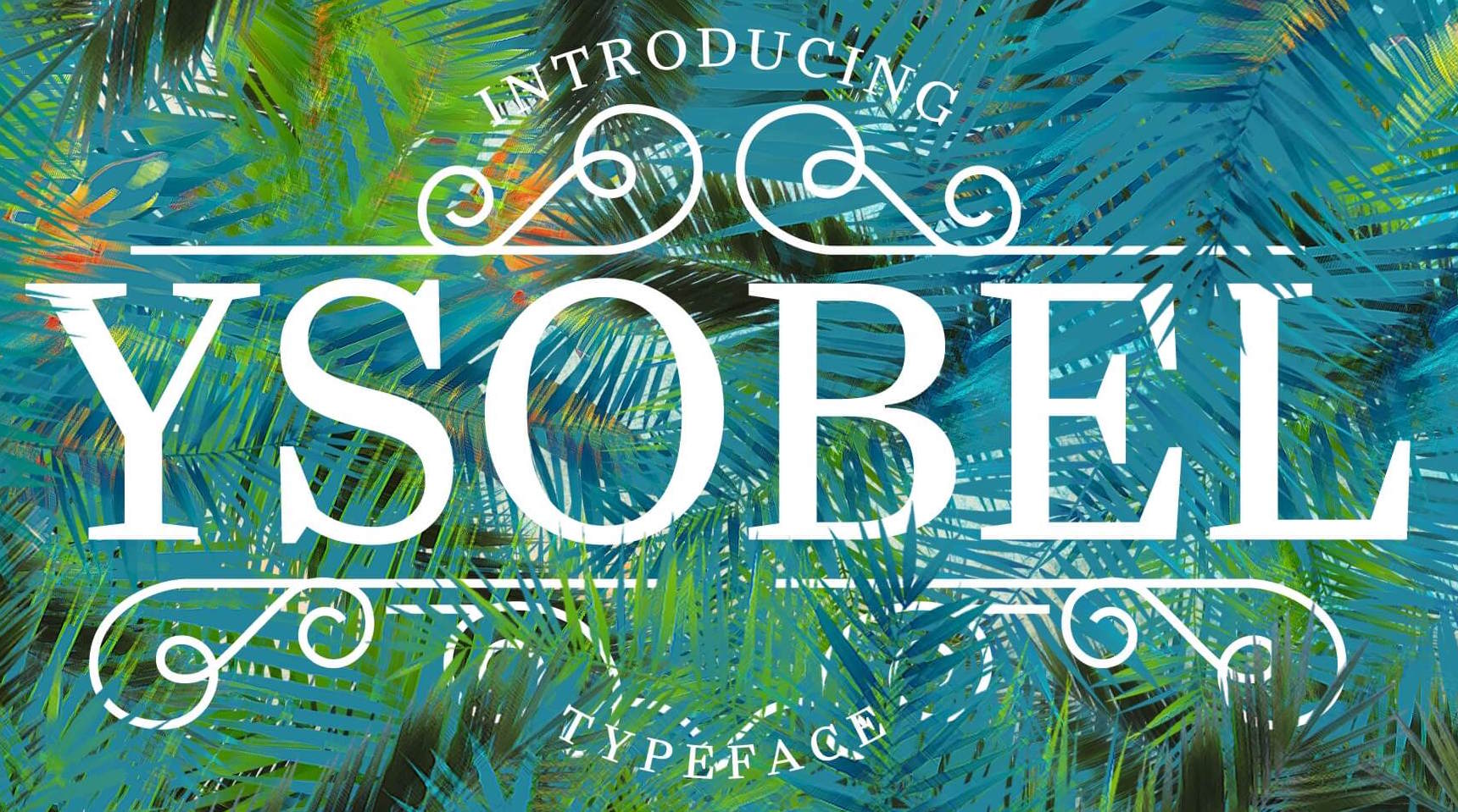
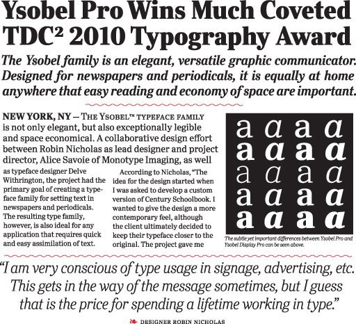
- In 2009, he co-designed Ysobel (Monotype; winner of an award at TDC2 2010) with type designers Alice Savoie, also working at Monotype Imaging's UK subsidiary, and Delve Withrington based in the U.S. The sales pitch: According to Nicholas, the idea for the Ysobel typefaces started when he was asked to create a custom, updated version of the classic Century Schoolbook typeface, which was designed to be an extremely readable typeface - one that made its appearance in school textbooks beginning in the early 1900s.. The web version by Linotype in 2013 is called Ysobel eText Pro. It has larger x-height and wider spacing.
View the typefaces made by Robin Nicholas.
|
EXTERNAL LINKS
Robin Nicholas
 [Designer info] [Designer info]
Klingspor Museum page
MyFonts search
Monotype search
Fontspring search
Google search
INTERNAL LINKS
Type designers ⦿
Type designers ⦿
Type scene in Kentucky ⦿
Modern style [Bodoni, Didot, Walbaum, Thorowgood, Computer Modern, etc.] ⦿
Chancery hand, cancellaresca ⦿
Letterpress ⦿
Fournier ⦿
Bembo ⦿
|