TYPE DESIGN INFORMATION PAGE last updated on Mon Jun 8 17:59:56 EDT 2026
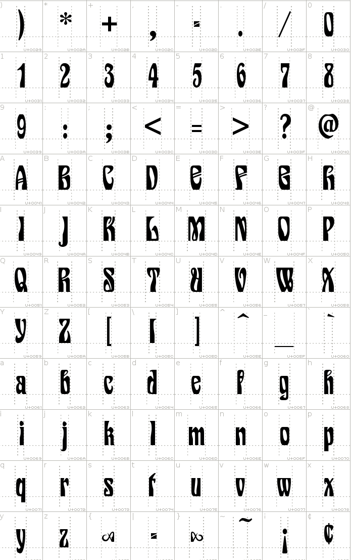
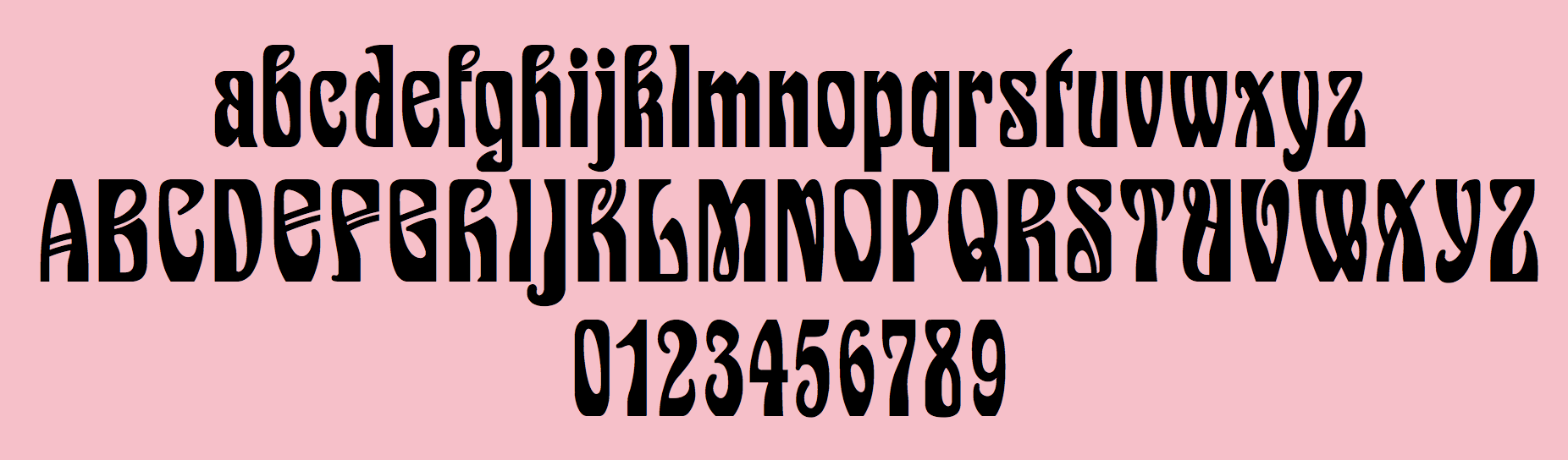
FONT RECOGNITION VIA FONT MOOSE

|
|
|
|
Wilhelm Woellmer
Wilhelm Woellmer is a German type designer who ran a foundry which published typefaces such as Deutsche Reichsschrift (1910, a Fraktur digitally revived by Gerhard Helzel). The earliest publication is from 1886, and the latest one from 1933. The Wilhelm Woellmers Schriftgießerei in Berlin ceased operations in 1938. Most matrices are now in the possession of Typoart, formerly Schriftguss KG. Designers who published at Woellmer's foundry, which was located in Berlin, include:
Berry, Johnson and Jaspert write about Kolonial: A heavy display roman, rather like CHELTENHAM. It is somewhat condensed and has short ascenders and descenders. Serifs are thick, blunt and horizontal (except on the d). The K has a very high waist, the middle strokes of the M descend only half-way, the R has a tapering tail. The ear of the g points north-east. The arches of the h, m and n are splayed. The italic has the serifs of the roman and some swash capitals. There are also a Shaded and an Extended face. Before World War II the type was also sold as Columbia by the Amsterdam Typefoundry, and is the Buffalo of the H.C. Hansen Foundry of Boston. It belongs with Morland (Blanchard of the Inland Type Foundry) to the group of heavy display types of which many American foundries had their own version. Its similarity with Cheltenham applies particularly to the original Cheltenham drawings. Notes on revivals of selected typefaces:
The main specimen book of the foundry is Muster-Sammlung von Wilhelm Woellmer's Schriftgiesserei und Messinglinienfabrik (Berlin, 1896 or 1898). |
EXTERNAL LINKS |
| | |


file name: Wilhel Woellmer Schriftgiesserei1898
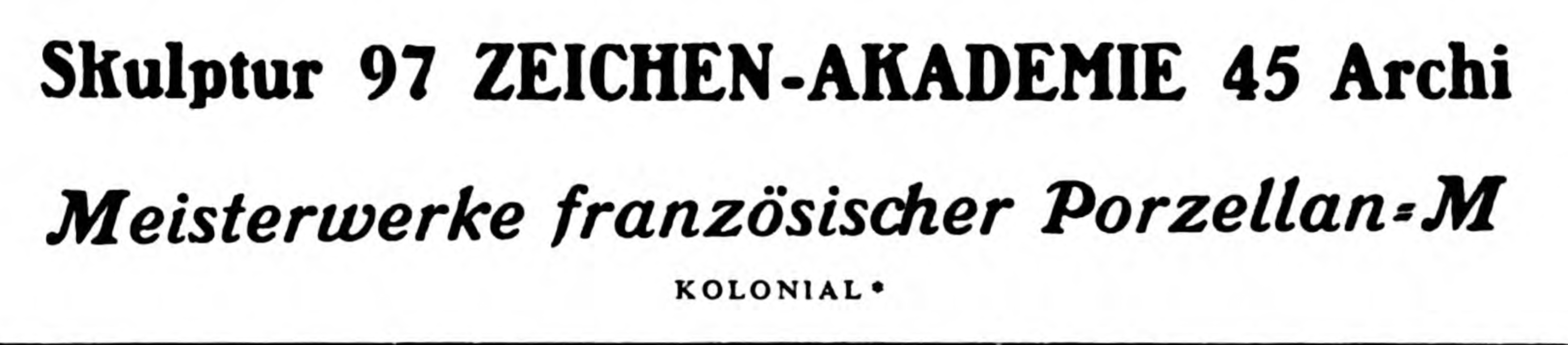
file name: Woellmer Kolonial 1904
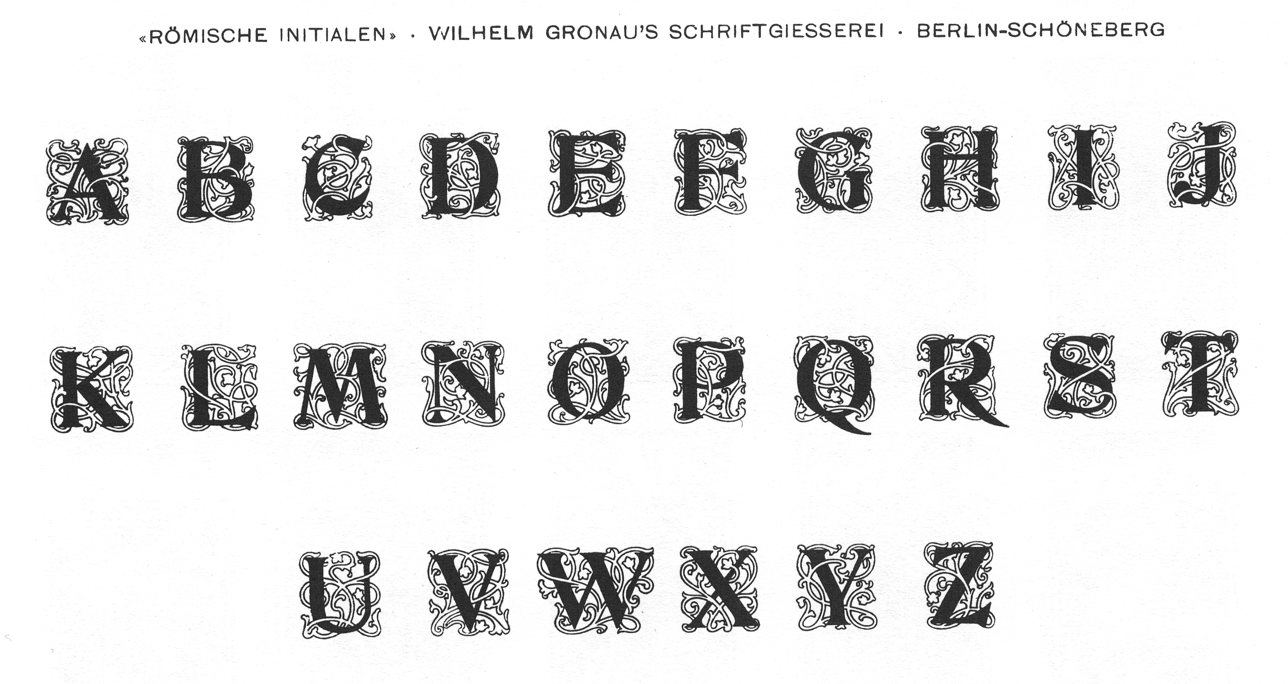
file name: Wilhelm Gronau Roemische Initialen
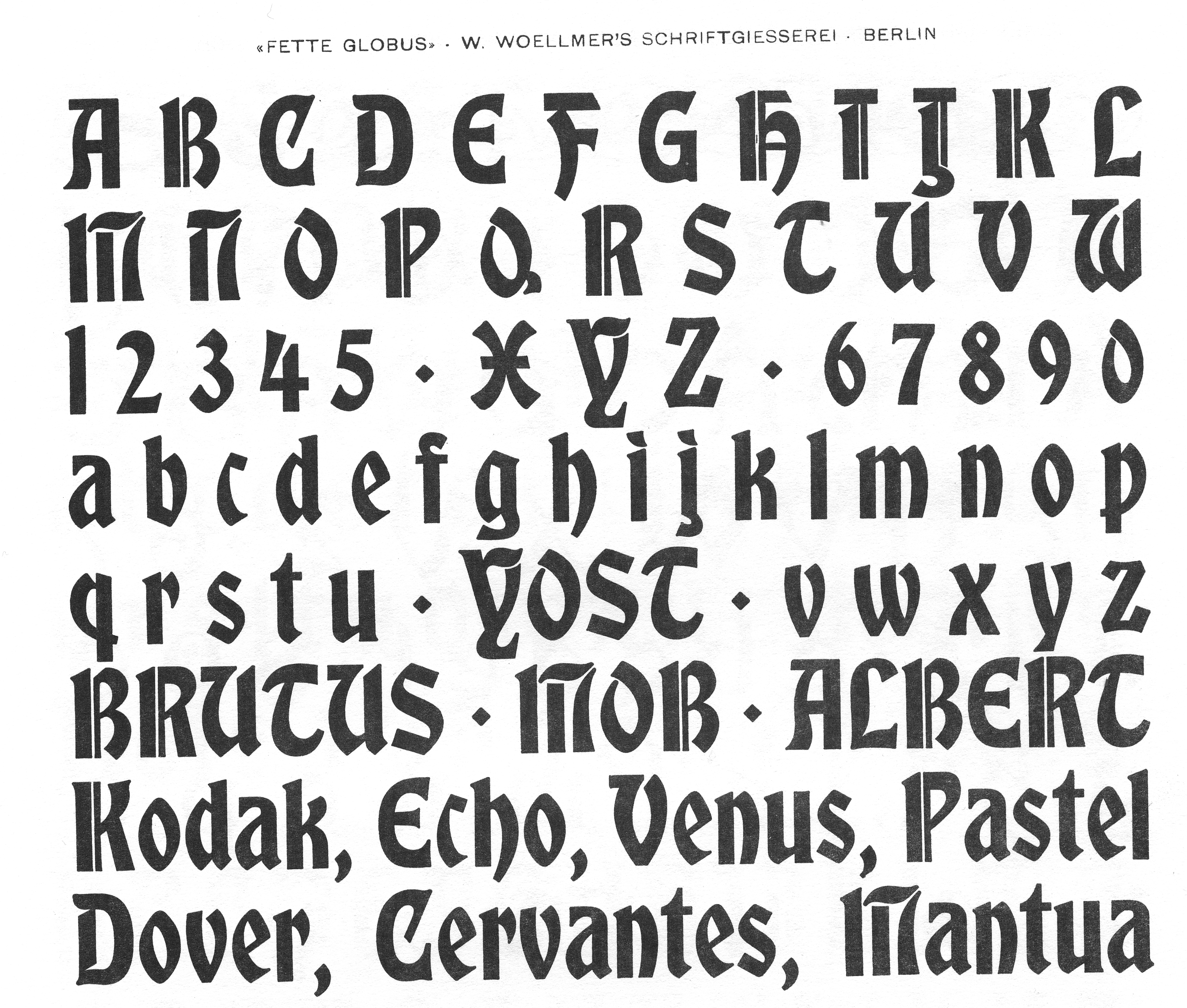
file name: Wilhelm Woellmer Fette Globus

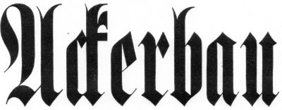
file name: wilhelm woellmer siegfried 1900
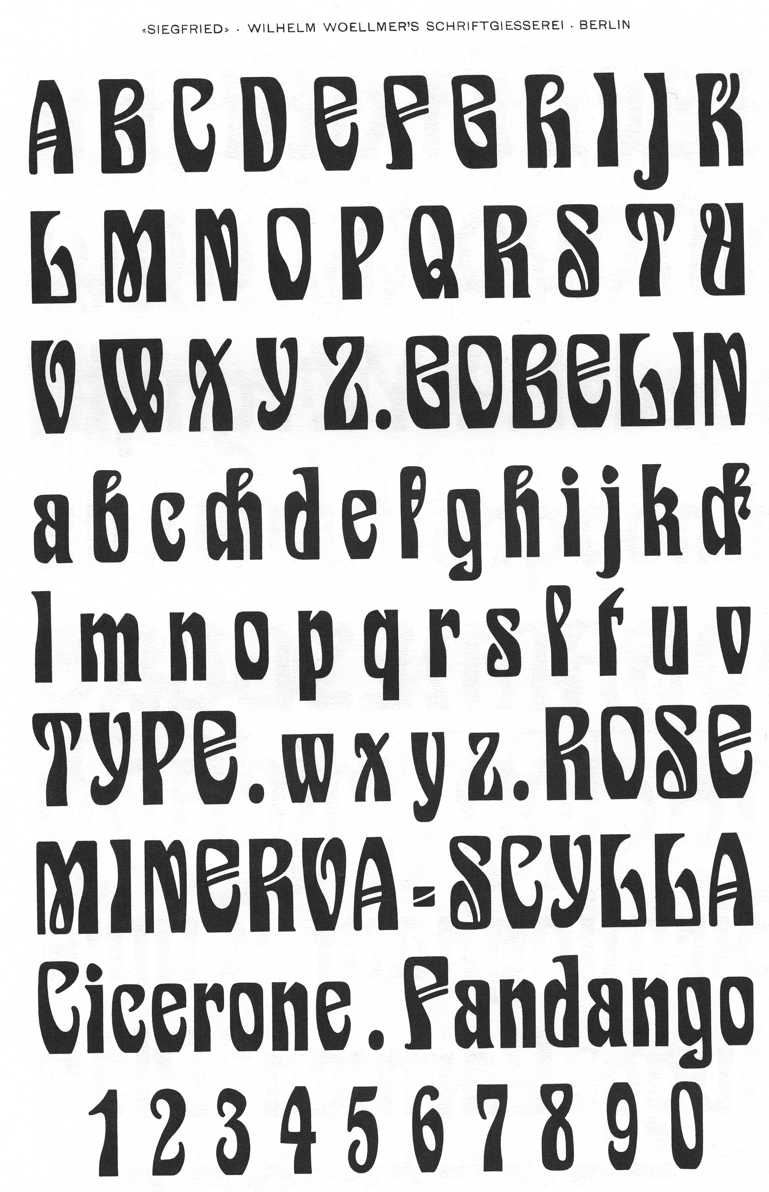
file name: Wilhelm Woellmer Siegfried
file name: Dieter Steffmann Siegfried 2001

file name: Ralph M Unger Siegfried Pro 2017 after Wilhelm Woellmer Siegfried 1900
file name: Ralph M Unger Siegfried Pro 2017 after Wilhelm Woellmer Siegfried 1900a

file name: Ralph M Unger Siegfried Pro 2017 after Wilhelm Woellmer Siegfried 1900b

file name: Ralph M Unger Siegfried Pro 2017 after Wilhelm Woellmer Siegfried 1900c

file name: Ralph M Unger Siegfried Pro 2017 after Wilhelm Woellmer Siegfried 1900d
file name: Wilhelm Woellmer Moderne Schmale Halbfette Fractur 1885
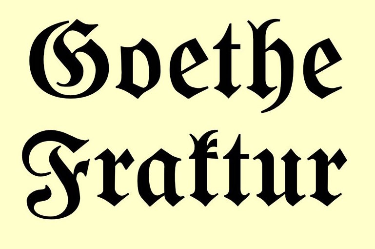
file name: R M U Goethe Fraktur 2022 1
file name: R M U Goethe Fraktur 2022 2
file name: R M U Goethe Fraktur 2022 3
file name: R M U Goethe Fraktur 2022 4

file name: R M U Goethe Fraktur 2022

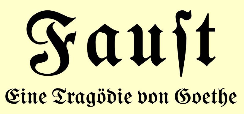
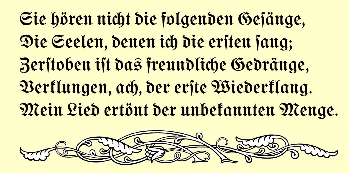
file name: Wilhelm Woellmer Goethe Fraktur 1910

file name: Gerhard Helzel Goethe Fraktur after W Wellmer
file name: Dan Solo Marshall Normal 2004 after Wollmer 1900
file name: Reymund Schroeder Stephan Mueller Consul after Wilhelm Woellmer Consul 1903 1907

file name: Gerhard Helzel Deutsche Reichsschrift after Wilhelm Woellmer 1910

file name: Breitemagere Mediavalm. Zierschrift Initialenfrom Wilhelm Woellmers 1894
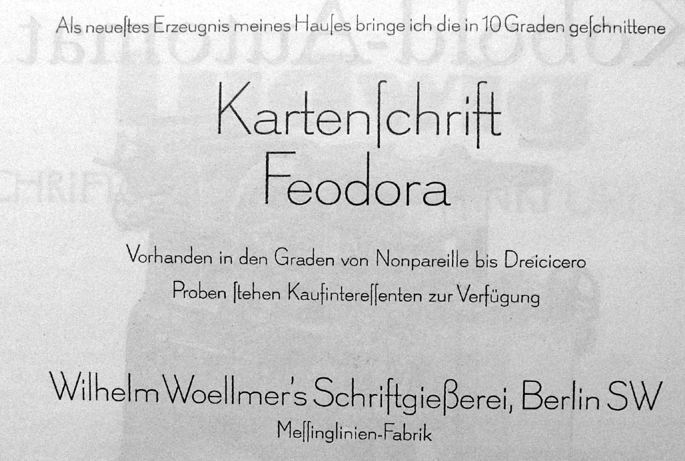
file name: Wilhelm Woellmer Kartenschrift Feodora
| | |
|
Luc Devroye ⦿ School of Computer Science ⦿ McGill University Montreal, Canada H3A 2K6 ⦿ lucdevroye@gmail.com ⦿ https://luc.devroye.org ⦿ https://luc.devroye.org/fonts.html |