|
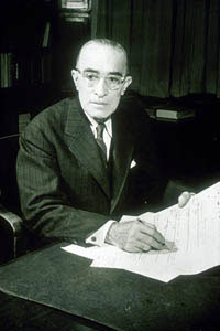
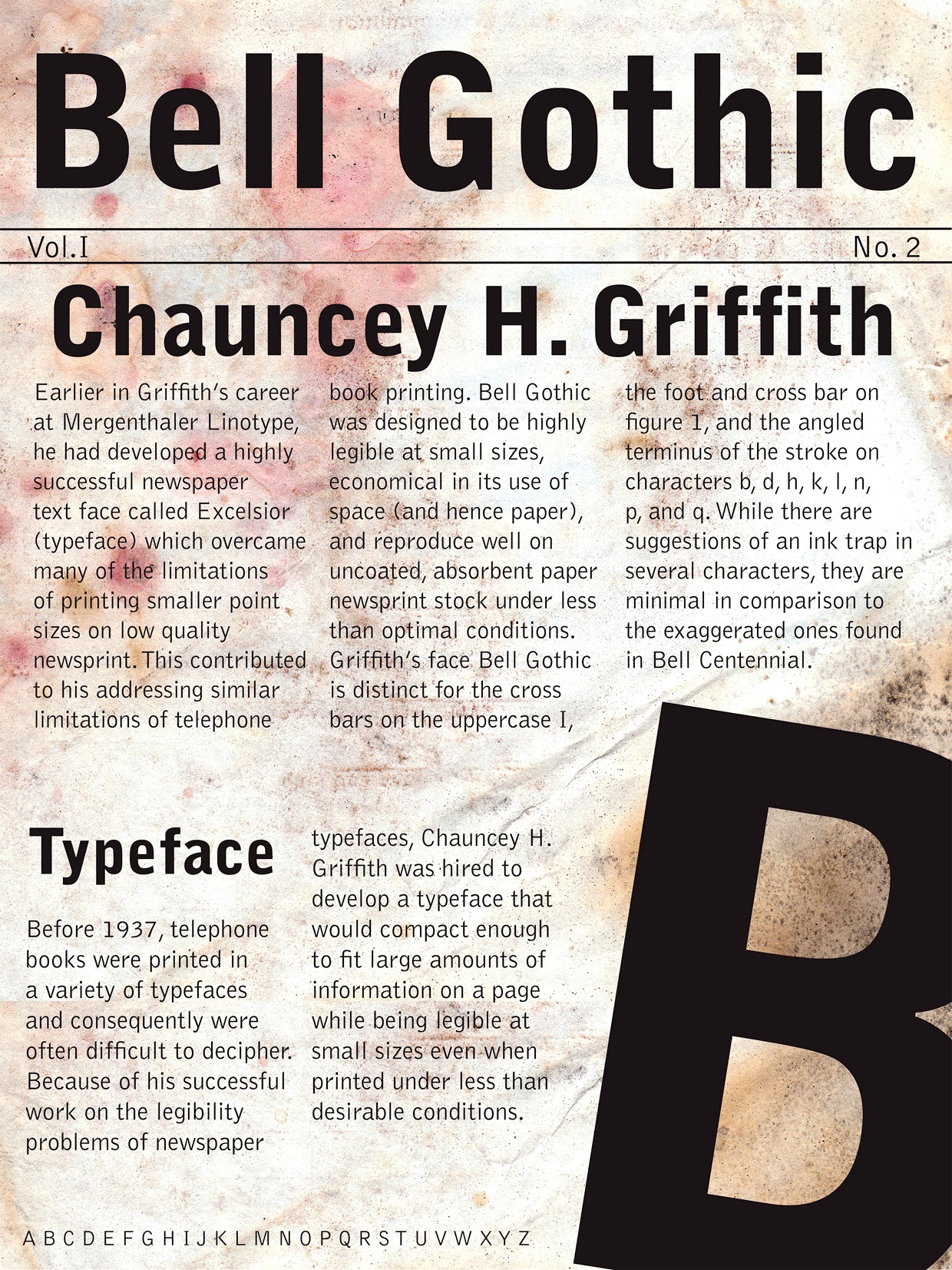
Chauncey H. Griffith
Kentucky-based type designer and printer, 1879-1956. He was a Linotype salesman who directed the growth of the Linotype library from 1915 to 1948, and improved the look of the world's newspapers. He worked to establish Linotype as the composing machine of choice in America. He continued as a consultant to Linotype well into his retirement. Claus Eggers Sorensen writes: In 1922 Chauncey H. Griffith was promoted to Vice President of Typographic Development at Mergenthaler Linotype. He immediately started the development of new typefaces to replace the prevailing modern style typefaces. The issue troubling the moderns was their high contrast design. Especially the hairline parts of the cast lines could break of while printing, and counters could clog with ink and pulp. Faster printing meant transferring the cast lines with the stereotype process to a letterpress cylinder for high-speed rotary printing on endless rolls of paper stock. C. H. Griffith's new approach was to engineer new typefaces to the printing method. That meant drawing inspiration from the Egyptienne style as seen in the Clarendon typeface, with its very sturdy lower contrast design, and Theodore Low De Vinne and Linn Boyd Benton's Century Roman, which possessed elegance and legibility. The first product of these efforts was Ionic No. 5. It was an instant success, within eighteen months it was used by more than 3000 newspapers all over the world. C. H. Griffith and Mergenthaler Linotype continued to refine the design in subsequent iterations: Excelsior (1931), Paragon (1935), Opticon (1935), Corona (1941). These became known as the Legibility group. Ionic No. 5, Excelsior and Paragon form the Linotype Legibility Group. He designed or co-designed the following fonts, all at Mergenthaler: - Baskerville (1939, Linotype).
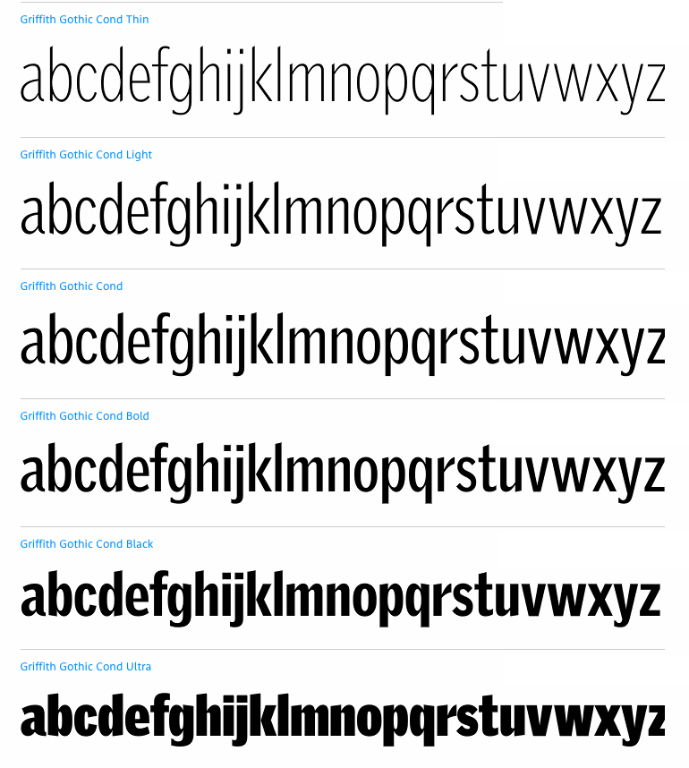
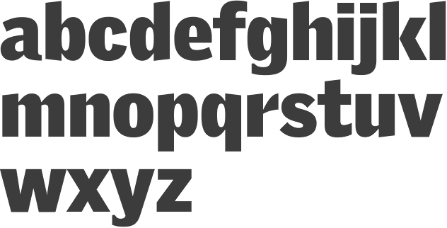
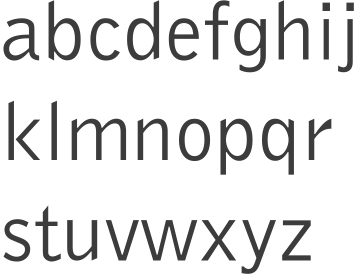
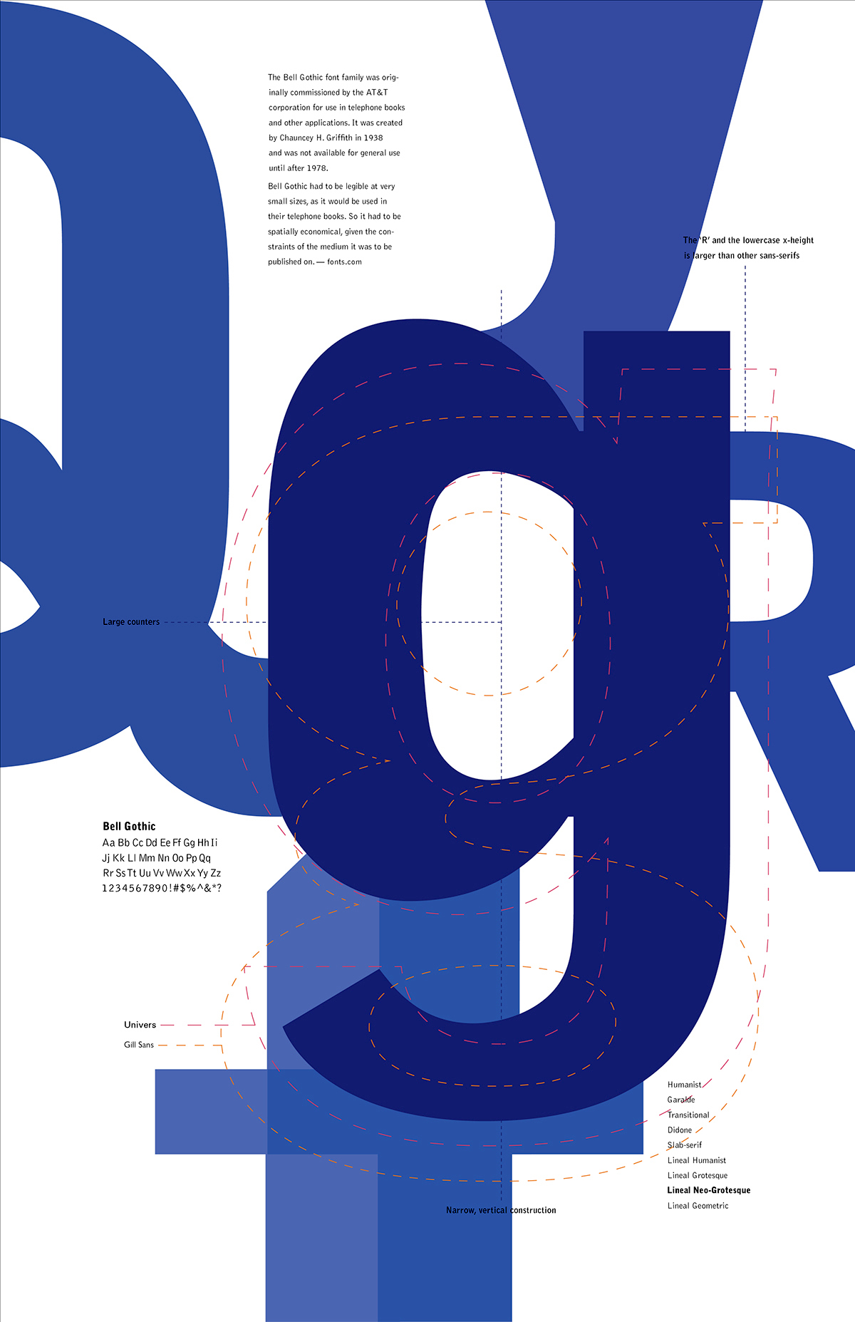
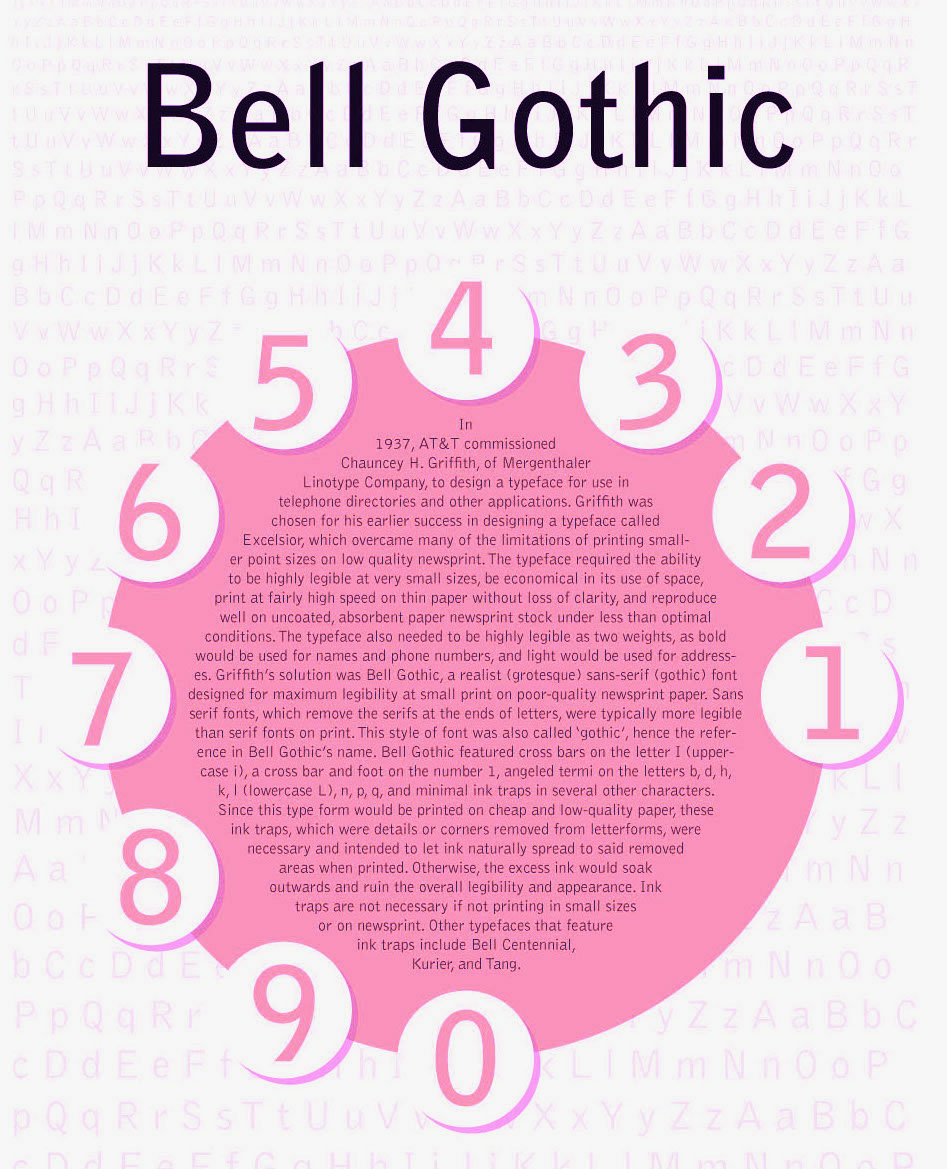
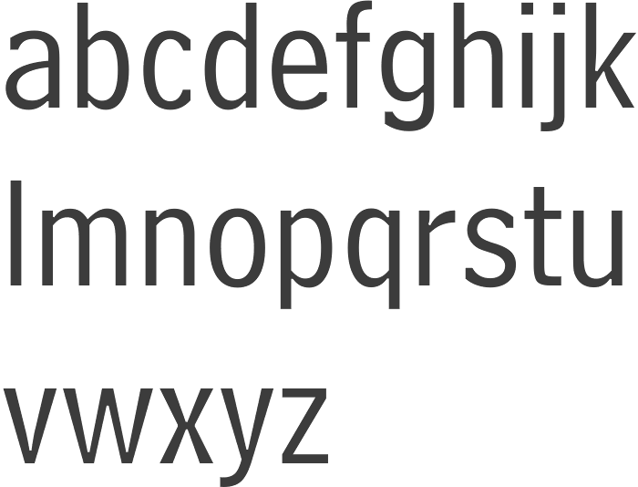
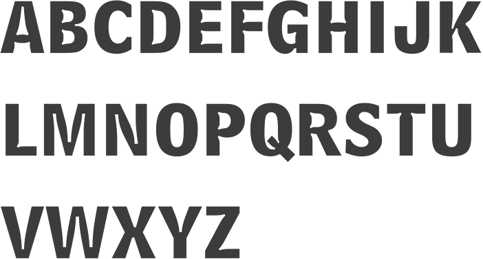
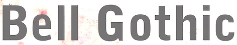
- Bell Gothic (1937-1938). Now available at Bitstream. Font Bureau has its own version, Griffith Gothic (1997-2000, by Tobias Frere-Jones): Of all his work, Chauncey Griffith claimed one type, Bell Gothic, as his own design. Griffith Gothic is a revival of the 1937 Mergenthaler original, redrawn as the house sans for Fast Company. Tobias Frere-Jones drew a six weight series from light and bold, removing linecaster adjustments and retaining the pre-emptive thinning of joints as a salient feature. Mac McGrew: Bell Gothic was developed in 1937 by C. H. Griffith of Mergenthaler Linotype, primarily for use in the New York City telephone directory, but quickly became standard for telephone books nationwide. The aim was to eliminate roman types with objectionably thin serifs and hairlines. Furlong and Market Gothic were specialized adaptations of this typeface for newspaper work, the former with special figures and other characters for setting racetrack results, the latter in 1941 with other special characters for stock market details. The basic Bell Gothic was also cut by Intertype in 1939. Compare No. 11 and No. 12, shown under Numbered Faces, previously used for directory work. Imitations include OPTI Benet (Castcraft). Poster by Jaime Schweitzer. View digital versions of Bell Gothic.
- Bookman (1936, after the 1960 original by Alexander Phemister at Kingsley ATF).
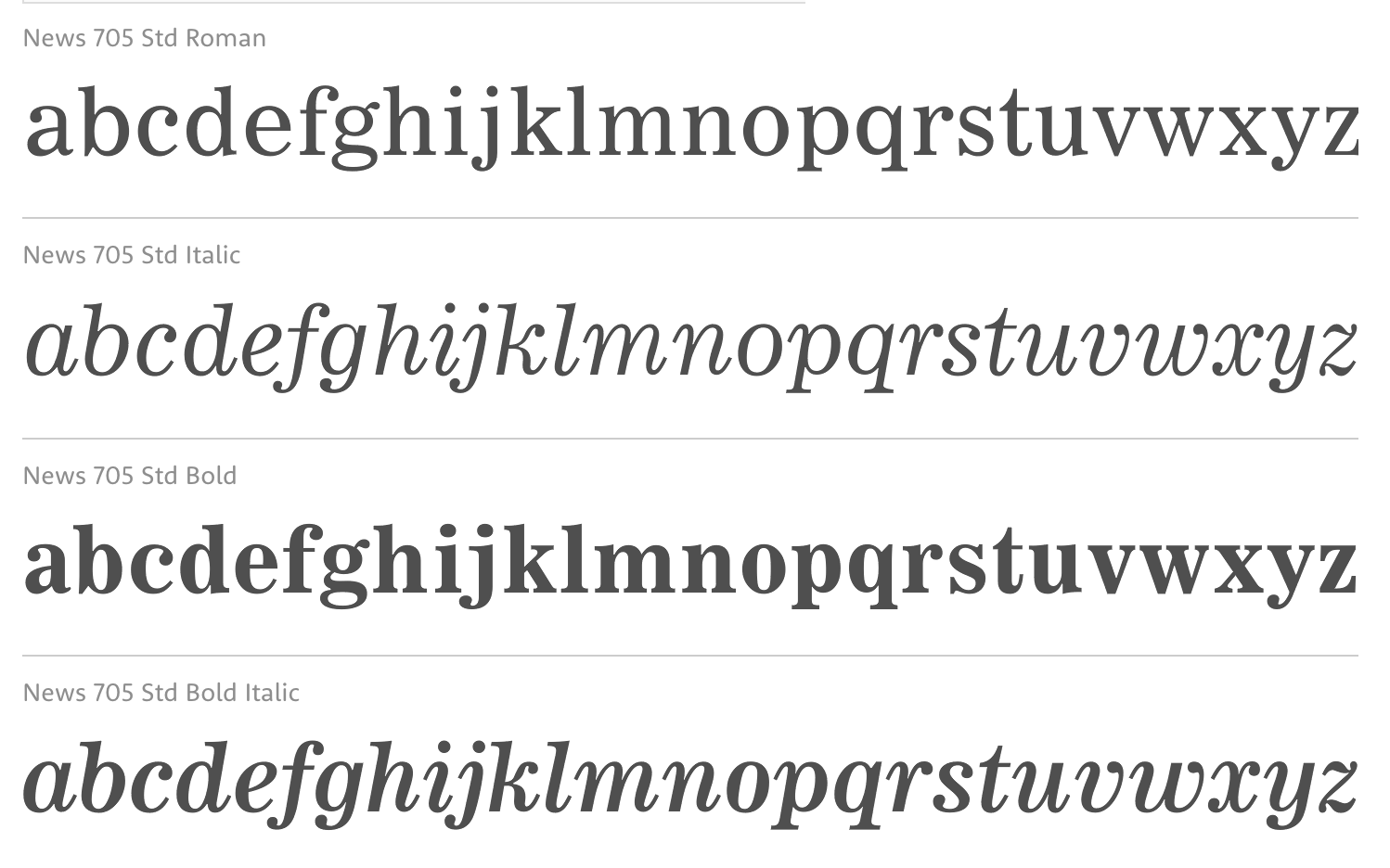
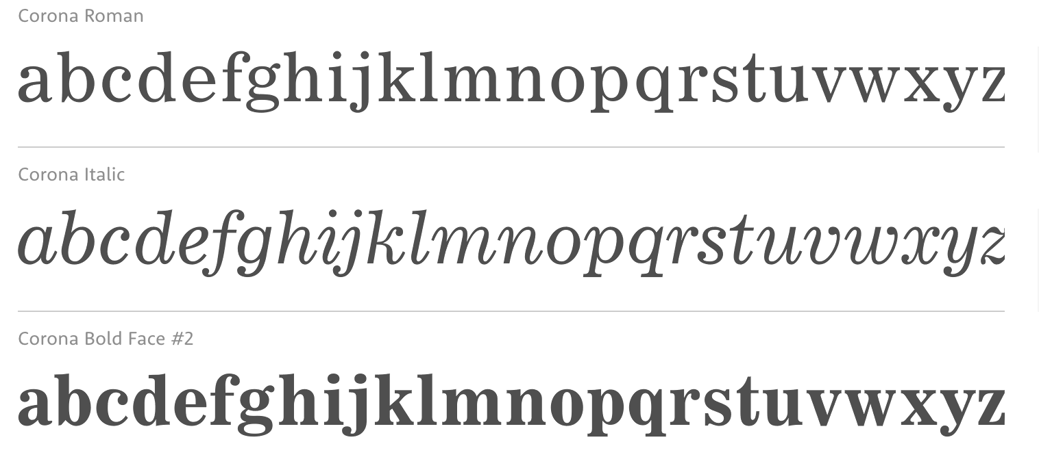
- Corona (1941), a narrow newspaper typeface with large x-height. Corona was designed to meet the rigorous requirements of high-speed printing, and is still the chosen type of many American daily newspapers. Mac McGrew: Corona was drawn and cut by Linotype under the direction of C. H. Griffith in 1941. It is a member of the "Legibility Group" of faces designed for easy reading under newspaper conditions of stereotyping and high-speed printing with inks that could be trapped in close quarters. Royal on Intertype is a 1960 copy of Corona. Digital revivals include C795 Roman (Softmaker), News 705 BT (Bitstream).
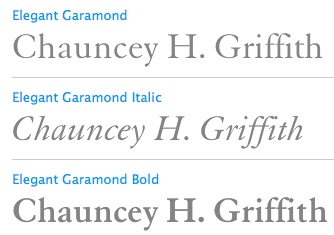
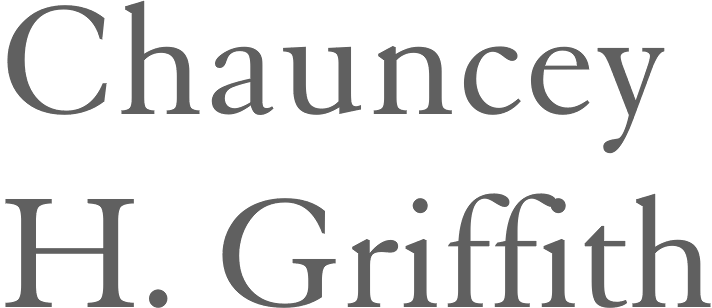
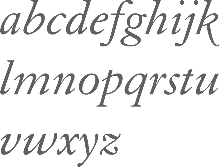
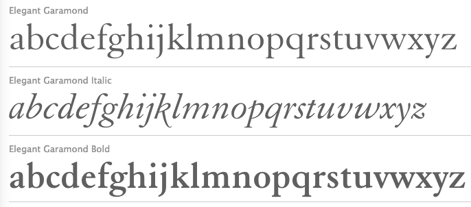
- Elegant Garamond (Bitstream). This Granjon design was made by Chauncey H. Griffith based on models by George William Jones, and before that, Robert Granjon.
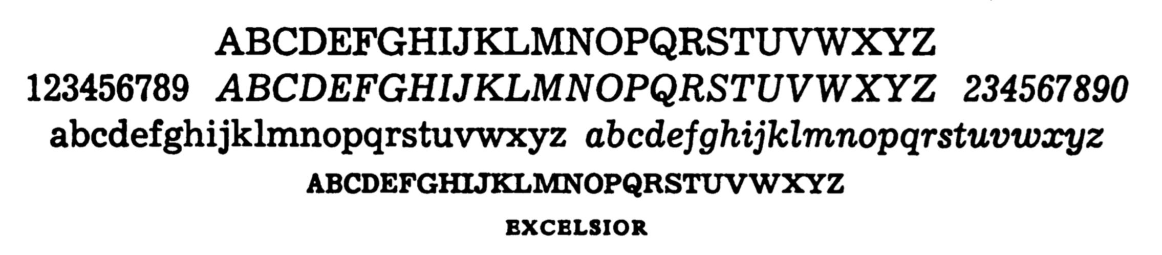
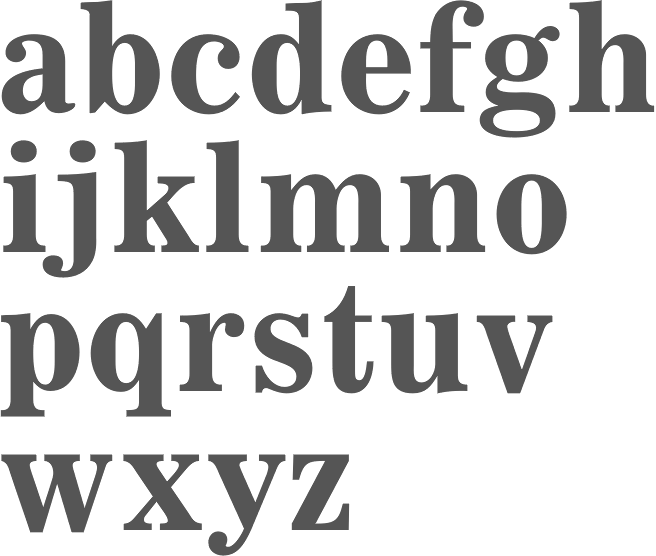
- The didone-style newspaper typeface Excelsior (1931, Linotype). At Bitstream, this is News 702. URW calls it Excius, and SoftMaker's version is Exemplary. Mac McGrew: Excelsior was cut for Linotype in 1931 under the direction of C. H. Griffith. It is a plain type, but designed for the utmost readability, with only slight variation from thick to thin, and careful fitting that makes the characters flow into easily recognizable words. Long or short descenders are available in certain sizes. Like a number of Linotype typeface intended primarily for newspaper work, Excelsior is available in closely graded sizes, including odd and some half-point multiples.
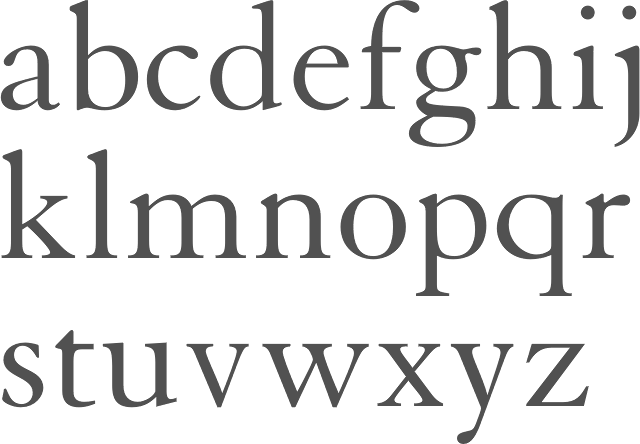
- Granjon (1928-1930, with George William Jones at Linotype). MyFonts: Claude Garamond's late Texte (16 point) roman was the model used by George W. Jones when he designed this typeface for Linotype&Machinery in 1928. To avoid confusion with the Garamond romans based on Jannon's seventeenth century work, L&M called the typeface Granjon, after the designer of the italic used as a model, thus creating confusion with the typefaces based on Granjon's romans, Plantin and Galliard. Granjon is a little less crisp in cut than either Sabon, Stempel Gararmond or Berthold Garamond, but makes a magnificent and most readable text face, as shown in Reader's Digest since its founding. Mac McGrew: Granjon was designed for Linotype in 1928 by George W. Jones, distinguished English printer, to meet his own exacting requirements for fine book and publication work. It is derived from classic Garamond sources, but with refinements made possible by modern methods of punch cutting. In fact, one critic has called it "the purest form of Garamond." It is named for Robert Granjon, mid-sixteenth-century punch cutter noted in particular for his italics, from which the present Granjon Italic was derived. Granjon Bold, by C. H. Griffith, was added in 1931. Lanston Monotype acquired reproduction rights to the typeface from Mergenthaler.
- Ionic No. 5 (Linotype, 1925). Mac McGrew: Ionic is a general name for a style of typeface which is closely related to the Clarendons (q.v.). Plain, sturdy designs with strong serifs and little contrast, the Ionics were popular in the latter part of the nineteenth century. Although many founders offered them, they were generally gone by early in this century. A few received a new lease on life when they were copied by Monotype, Linotype, or Intertype. Two new Ionics appeared in this century. Ionic No.5 was designed by C. H. Griffith in 1926 for Linotype, as a newspaper text face. It features a large lowercase with short ascenders and descenders, with no fine lines or serifs to break down in stereotyping, and no small openings to fill up with ink. This is one of a few typefaces made in many closely graded sizes: 5-, 51/2-, 6-, 61/2-, 63/4-, 7-, 71/2-, 8-, 9-, 10-, and 12-point. Intertype's Windsor, developed in 1959, is comparable. Ionic Condensed was designed by Griffith in 1927, also for Linotype. It is a refinement of traditional designs, intended for newspaper head- ings, and has most of the general characteristics of the text face. Ionic Extra Condensed is essentially the same, a little narrower and without lowercase, also for newspaper headlines.
- Janson (1932). Mac McGrew: Janson is adapted from types often attributed to Anton Janson, seventeenth-century Dutch letter founder, although researchers have shown that the originals were cut by Nicolas Kis, a Hungarian punchcutter and printer. The Linotype version was done in 1932 under the direction of C. H. Griffith, based on the 14-point size of about 1660. The Monotype version was adapted by Sol Hess in 1936, in collaboration with Bruce Rogers. Both versions are sharp and clear cut, and rather compact. They bear some resemblance to the types of William Caslon, which were based on later, similar Dutch types.
- Memphis (1929): the prototypical Egyptian of Rudolf Wolf. Mac McGrew: Memphis is the Linotype copy of the popular German square-serif typeface known as Memphis or Girder, designed by Rudolf Weiss about 1929, which did much to revive interest in this old style. Memphis Light and Bold were introduced by Linotype in 1933, Italics and Unique Caps in 1934, Medium in 1935, and other variations up to 1938. The Extra Bold versions were designed by C. H. Griffith. Alternate characters are available in some versions to more nearly approximate the appearance of Stymie or Beton (q.v.). The Lining versions are comparable to small caps in the regular versions, being propor- tionately wider and heavier than caps, and have no lowercase; there are several sizes each in 6- and 12-point, permitting various cap-and-small-cap combinations, in the manner of Copperplate Gothic. Also see Ward; compare Cairo, Karnak. Digital versions are everywhere. The Bitstream version is Geometric Slabserif 703.
- Linotype Monticello was designed by Griffith in 1946. Its design is based on James Ronaldson's Roman No.1 and Oxford Typefaces from American Type Founders and was revised by Matthew Carter while he was working at Linotype between 1965-1981. Mac McGrew: Monticello is a Linotype recreation of America's first great typeface, Binny&Ronaldson's Roman No.1, cut about 1796 by Archibald Binny in Philadelphia. His was the first permanent American type foundry. After about 30 years, the Binny typeface fell into disuse. The matrices survived, though, and a few fonts were cast about 1892 and the typeface was renamed Oxford (q. v.). In 1943 Princeton University Press announced plans for publishing a 52-volume edition of The Papers of Thomas Jefferson. As President, Jefferson had personally written to friends in France, introducing a Binny&Ronald- son representative who was seeking a source of antimony to replenish the shortage which threatened the young typefounding industry in this country. Jefferson also referred in this letter to the importance of type to civilization and freedom. In addition, the popularity of this typeface coincided with the most prominent years of Jefferson's life. Therefore Linotype suggested that a recutting of the typeface would be most appropriate for the Jefferson books, and the publisher heartily agreed. C. H. Griffith, Linotype typographic consultant, made a detailed study of Binny's type and redrew it in 1946 for the requirements of Linotype composition and modern printing conditions. It is a vigorous transitional face, somewhat similar to Baskerville but slightly heavier and a little crisper.
- Opticon (1935, Linotype). Mac McGrew: Opticon was designed in 1935 by C. H. Griffith for Linotype. It is a member of what that supplier calls its Legibility Group of typefaces designed primarily for newspaper use. It is essentially the same as Excelsior, but with stems and thick lines weighted slightly, for printing on hard-surfaced paper.
- Paragon (1935, Linotype). Mac McGrew: Paragon was designed by C. H. Griffith for Linotype in 1935. It is a member of that company's Legibility Group of typefaces, planned primarily for sharp and clean printing under the difficult inking and printing conditions of newspaper production, but also useful and popular for other periodical work. This typeface is lighter and airier than most such typefaces; otherwise it is much the same style. Compare Excelsior, Ionic, Opticon, Textype.
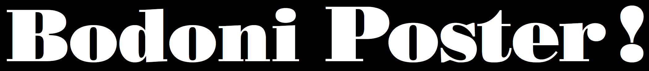
- Poster Bodoni (1920). Digital versions of Poster Bodoni or a textured ornamental version of it include Poster Bodoni (Bitstream), Modern 721 (Bitstream), OPTI Poster Bodoni Compressed (Castcraft), Bodoni Poster (Softmaker), Bodnoff (Corel), Poster Bodoni (Tilde), Poster Bodoni WGL4 (Bitstream), Saphir (Linotype), Bodoni Poster (Linotype), Bodoni poster (Adobe; same as the Linotype version), and Bodoni Ornamental (FontMesa).
- Ryerson Condensed was designed by C. H. Griffith in 1940 for Linotype, as a modernization of Globe Gothic Condensed.
- Textype (1929, Linotype). Mac McGrew: Textype was designed in 1929 by C. H. Griffith for Linotype. Although intended as a newspaper face, Textype with its smaller x-height and longer ascenders than most newspaper typefaces also became popular for magazines and other publications, as well as for a certain amount of advertising and general printing. There is an 18-point size in roman with italic, also a bold and bold italic. The 18-point size and the bold italic are both rare in newspaper typefaces. Compare Excelsior, Ionic, Rex, etc.
- Non-Latin typefaces: Porson and Metro Greek; thirteen Arabic designs adaptable for use throughout the Moslem world; Hebrews; the Indian scripts devanagari, Gujarati, and Bengali; Sinhalese for use in Ceylon, Tamil, and Syriac.
Klingspor link. Linotype link. FontShop link. Font Bureau link. Pic.
|
EXTERNAL LINKS
Chauncey H. Griffith
 [Designer info] [Designer info]
Monotype link
Behance page
Klingspor Museum page
MyFonts search
Monotype search
Fontspring search
Google search
INTERNAL LINKS
Type designers ⦿
Type designers ⦿
Type scene in Kentucky ⦿
Modern style [Bodoni, Didot, Walbaum, Thorowgood, Computer Modern, etc.] ⦿
Copperplate ⦿
Garalde or Garamond typefaces ⦿
Caslon ⦿
Telephone directory typefaces ⦿
Clarendon ⦿
Letterpress ⦿
Baskerville ⦿
Typefaces based on Nicolas Kis's work ⦿
Bookman ⦿
|