|
Minion
[Robert Slimbach]
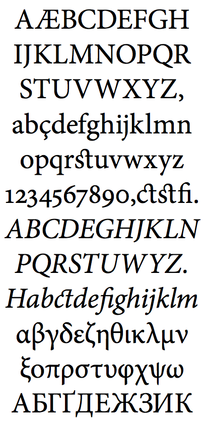
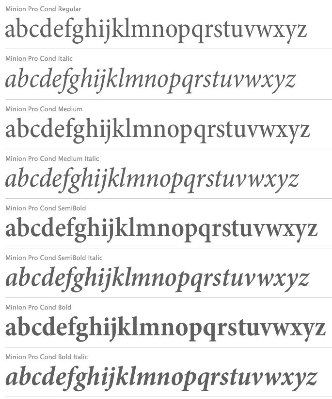
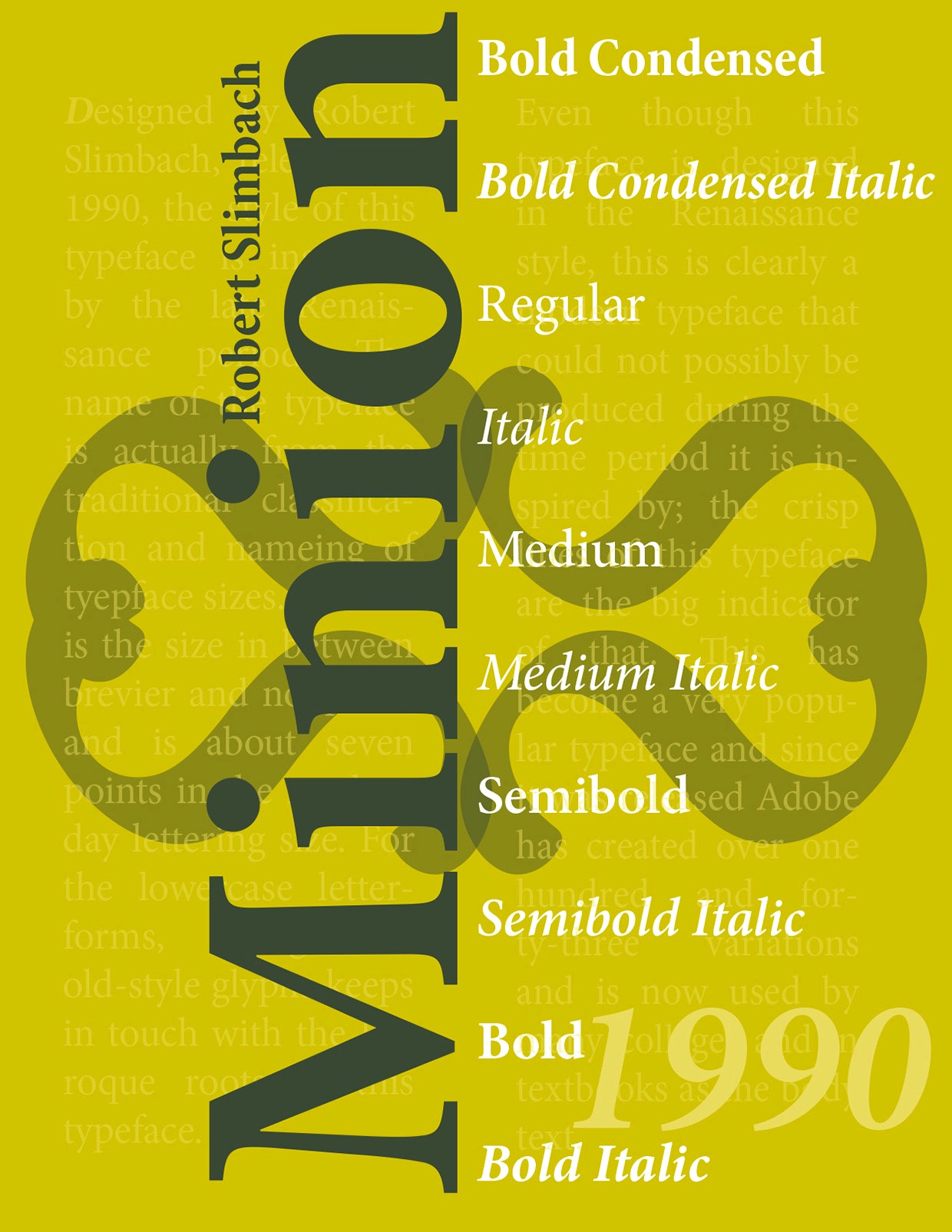
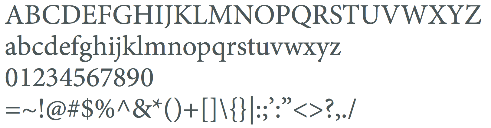
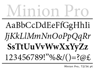
Minion was developed at Adobe between 1990 and 1997 by Robert Slimbach. It won many awards. This classical text typeface featured 32 styles by 2021. Opinions on Minion from various experts: - Paul Neubauer: I guess that what you see a lot of will depend greatly on the field. I see comparatively little Minion (other than what I do myself, that is:-). I use Minion in an academic journal that I do the prepress work for and find it extremely well suited for that purpose. Elegant is one of the last adjectives I would apply to Minion, however. It's highly utilitarian, sets very economically, clean, clear, unobtrusive, contemporary without being trendy, but certainly not elegant. Agaramond is much closer to being elegant, but I do see a lot more of it than Minion. A lot is going to depend on the sorts of projects that you have in mind. Faces like Bulmer or Minion are sufficiently condensed that you cannot sensibly use them in longish lines, as in letters or reports with a single column on letter size or A4 paper. They go well in multiple columns. For letters and single column reports, something like Janson Text or Utopia works much better. For literature, I'd be much more tempted to go with Adobe Jenson Pro or Bembo of the more "humanist" typefaces or Baskerville or Bulmer in the "transitional" line. "Modern" typefaces like Didot or Bodoni are good for horror stories, but I'd stay away from them for anything of a "warmer" nature.
- Thierry Bouche: Well, since Bringhurst used Minion, it is almost the default font for many typography related books&brochures. It is also somwhat overused by Adobe, being its corporate design. Moreover, a growing part of magazines and newspapers switch to Minion, here in France, when they go for a new layout. the probable explanation for this is that it is as economical as Times, but adds a touch of class and distinction. Another one could be that it's almost free, being bundled with so many Adobe software. The italic is not as nice, though: a bit pedantic with its pseudo-calligraphic shape, and relatively hard to read.
|
EXTERNAL LINKS
Minion
MyFonts search
Monotype search
Fontspring search
Google search
INTERNAL LINKS
Choice of fonts ⦿
Garalde or Garamond typefaces ⦿
|