|
Jean Midolle

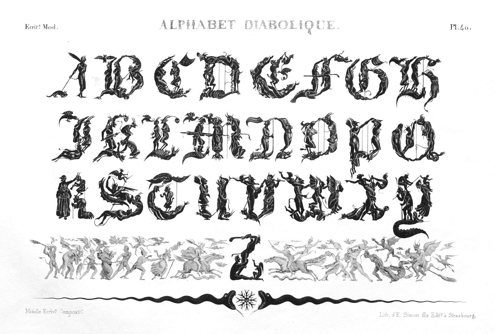
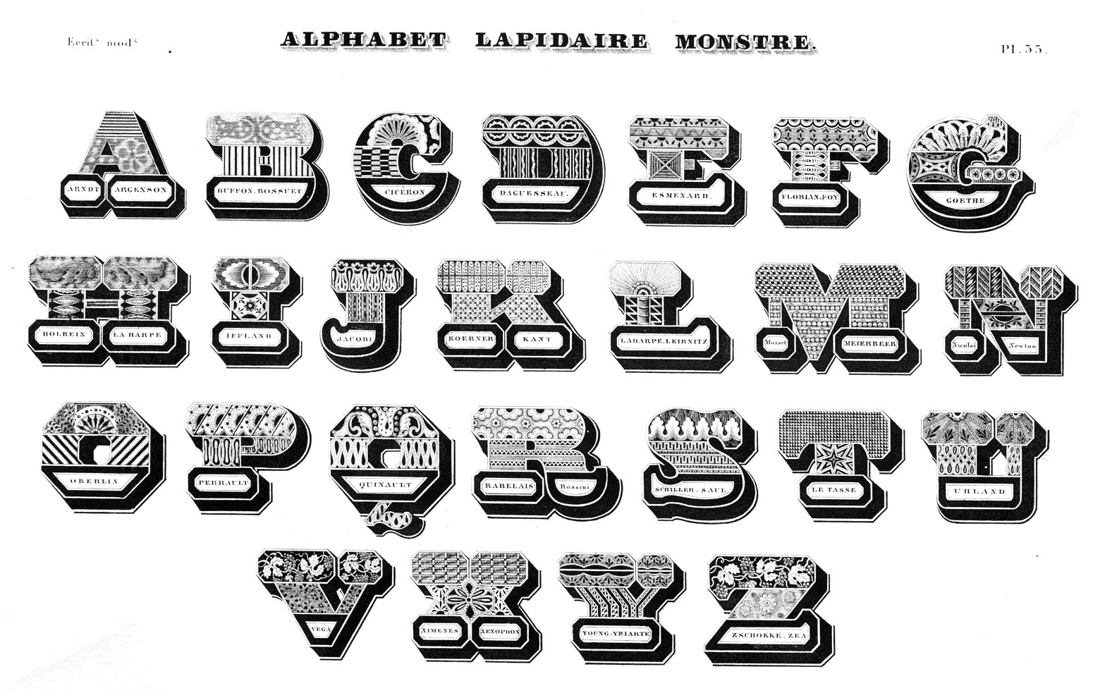
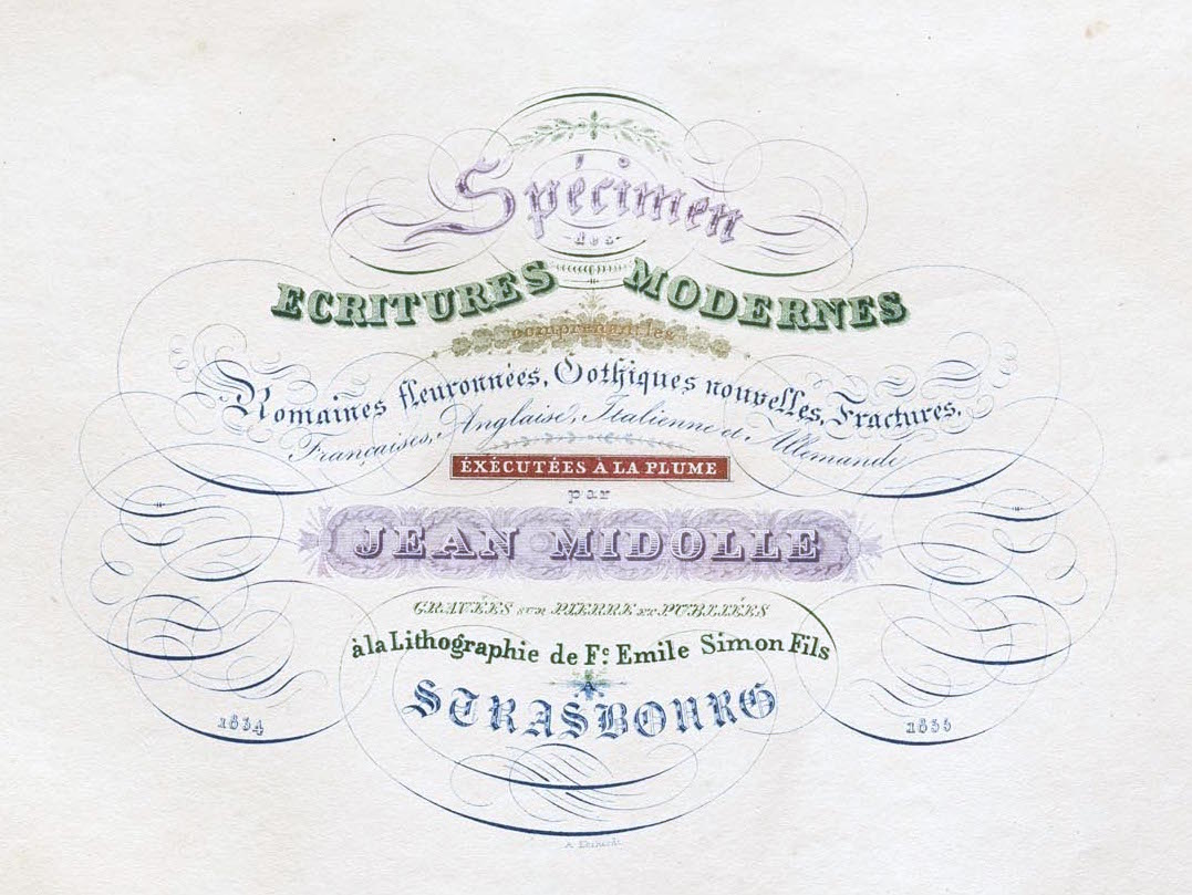
French calligrapher and graphic artist, b. 1794, Besançon. He lived and worked in Geneva, Mulhouse, St. Gallen, Strasbourg, and finally, Belgium. Author of Spécimen des écritures modernes (Emile Simon fils press, Strasbourg, France, 1835), a book that contains many chromolithographs. His alphabets include: - Alphabet Diabolique and the Alphabet Lapidaire Monstre (1834). Initials depicting the devil and other monsters. Jessica Slater digitized it (as Diabolique) in 2001 and writes: This alphabet was designed by Jean Midolle and published in Strasbourg in 1834. During the previous 50 years the French had seen violent revolution (1789-1799), and the Napoleonic wars (1803-15), followed by the restauration of a monarchy that was increasingly reactionary, intent on augmenting the influence of the wealthy classes, and curbing civil liberties (Louis XVIII 1814-24; Charles X 1824-30). The July Revolution of 1830 restored what promised to be a more moderate monarchy under Louis Philippe. But this new government was not to respond to the economic needs and political desires of the lower classes, and further discontent became inevitable. Within this context, the often tasteless images of this "Alphabet diabolique" may be better understood as portraying through satire the harsh realities that the French people had faced within a single lifetime.
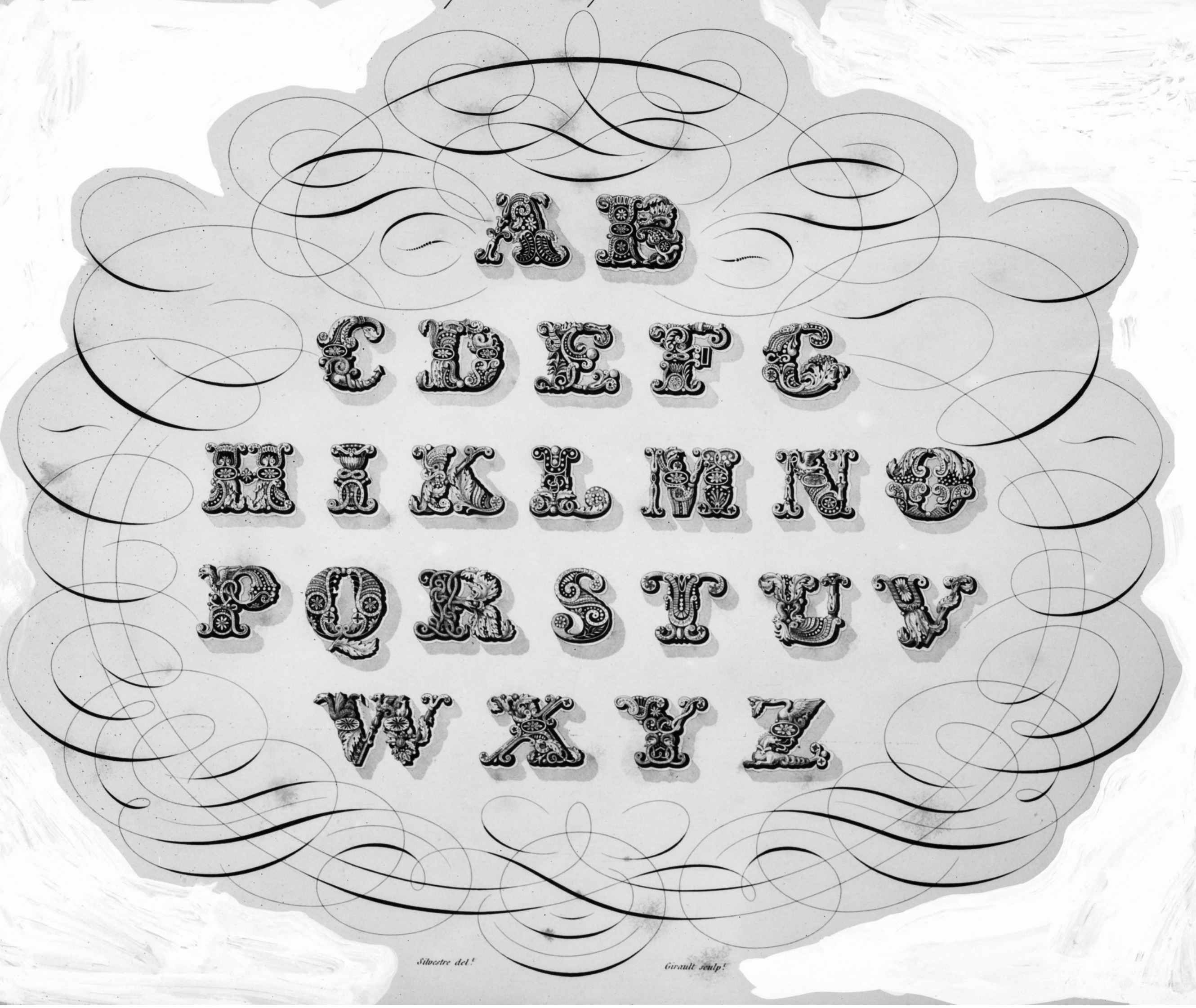
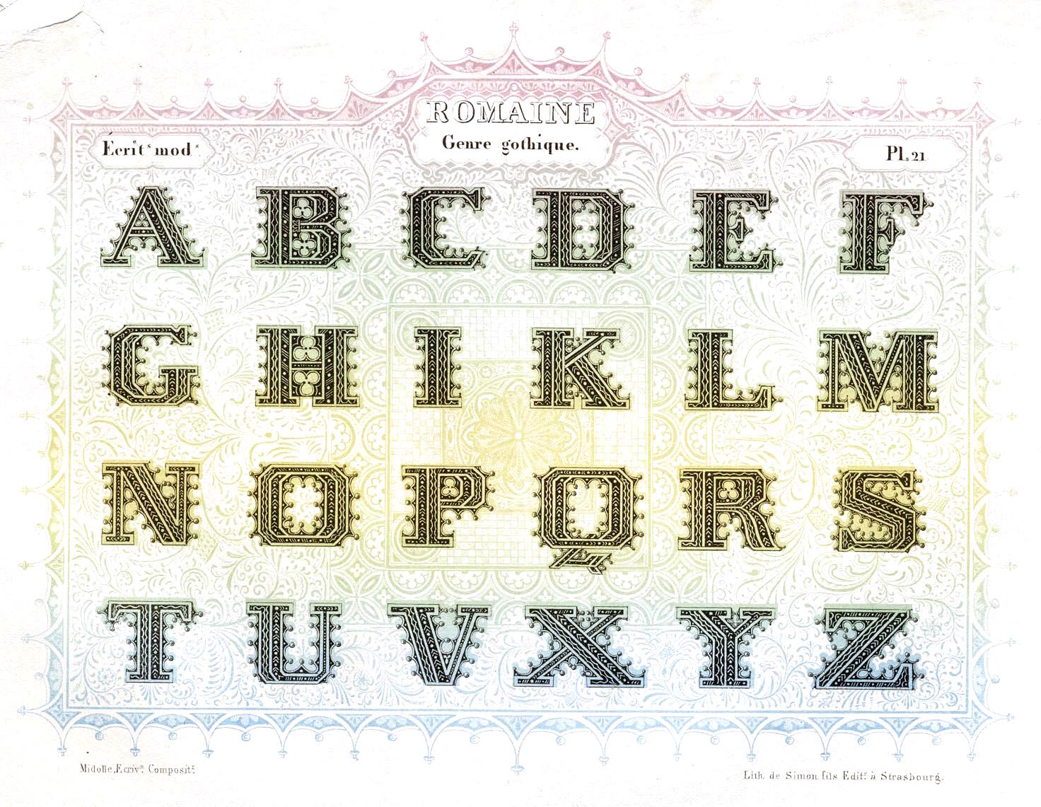
- Romaine Midolline (1835) and Midoline (ca. 1840, at Julius Klinkhardt in Leipzig). There is a digital revival also called Midoline by Gerhard Helzel. Dan Reynolds writes: About fifteen years after this portfolio's publication, the printing and typefounding company of Eduard Haenel in Berlin produced a typeface that was also named Midolline. Its letterforms are similar to those in Midolle's print. Since we do not know the date of Midolle's death, it is difficult to imagine how this typeface actually came about. I suspect that Haenel might have produced it as a posthumous tribute to Midolle, for display at the 1851 Great Exhibition at the Crystal Palace in London but that is just a guess. What is certain is that many other typefoundries across Europe acquired matrices for the Midolline types. The design was eventually sold in the U.K. as Saxon Text by the Edinburgh and London-based Miller & Richard type foundry. After the American Civil War, multiple foundries in the United States would carry it, too. They sold it under the name Composite. In 1854/55, just a few years after Haenel's Midolline had been produced, the Trowitzsch & Sohn printing and typefounding firm published a derivative typeface called Schmale Midolline. In the United States, Schmale Midolline was sold as Composite Condensed. For a time Midolline became a type classification term in Germany, used to describe all blackletter-roman hybrids. Other German typefoundries---like Flinsch in Frankfurt am Main---created additional designs that were also marketed with the term Midolline (or Midoline) in their names, such as Halbfette Midolline, Moderne Midolline, and Schmale Midolline. Because so many Midolline types had been in circulation, late-19th and early-20th century German typographers were not certain which foundry had been responsible for first bringing it into the world.
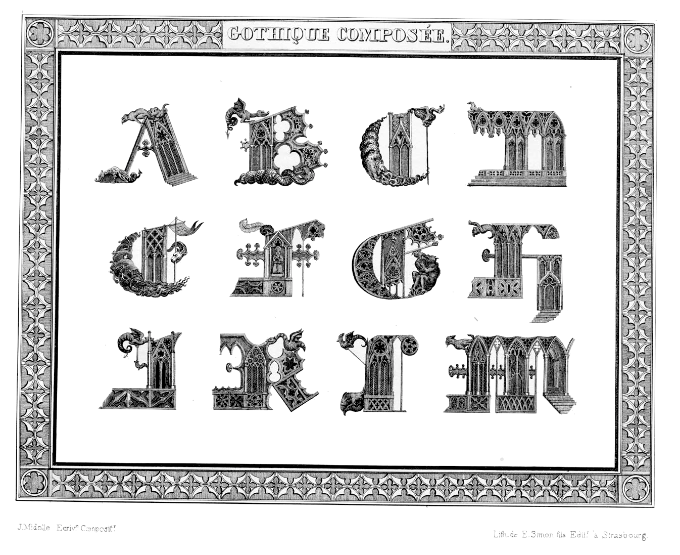
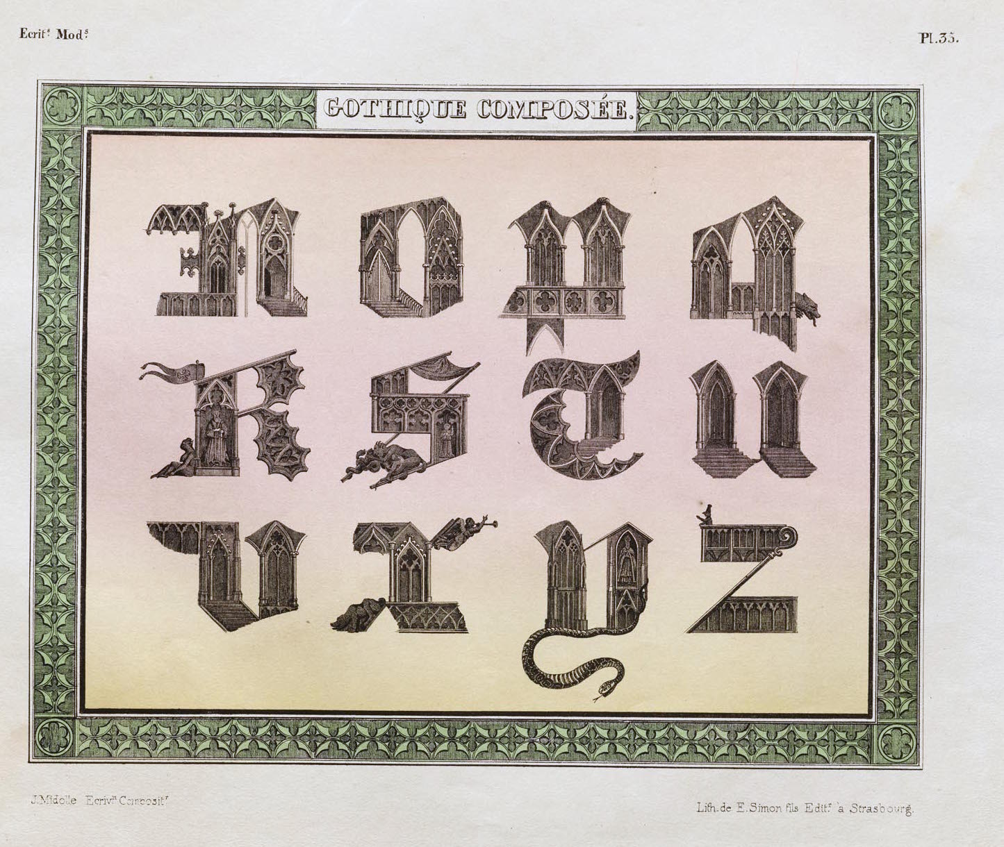
- Gothique Composée (1835).
|
EXTERNAL LINKS
MyFonts search
Monotype search
Fontspring search
Google search
INTERNAL LINKS
Ornamental caps typefaces ⦿
Type designers ⦿
Type designers ⦿
Blackletter fonts ⦿
Type design in France ⦿
|


