TYPE DESIGN INFORMATION PAGE last updated on Thu Apr 16 22:01:12 EDT 2026
FONT RECOGNITION VIA FONT MOOSE

|
|
|
|
Emil Ruder
Swiss typographer (b. Zürich 1914, d. Basel, 1970), and type guru in the 50s and 60s. Ruder taught at the Basel School of Design (Kunstgewerbeschule), and founded the International Center for the Typographic Arts in New York, 1962. Author of Typographie: Ein Gestaltungslehrbuch - A Manual of Design - Un Manuel de Creation (Teufen: Niggli, 1967), and Typographie. Ein Gestaltungslehrbuch. Mit über 500 Beispielen (7th edition in 2001, Niggli). The Road to Basel (Helmut Schmid) is an homage to Emil Ruder by Helmut Schmid, one of Ruder's students, who headed a group of other ex-students and organized their contributions. The former students who participated are Harry Boller, Roy Cole, Heini Fleischhacker, Fritz Gottschalk, André Gürtler, Hans-Jürg Hunziker, Hans-Rudolf Lutz, Fridolin Müller, Marcel Nebel, Åke Nilsson, Bruno Pfäffli, Will van Sambeek, Helmut Schmid, Peter Teubner, Wolfgang Weingart, and Yves Zimmermann. Karl Gerstner and Kurt Hauert also contributed. Paul Shaw reviews this book and Ruder's contributions. Quotes from Shaw's piece:
IDEA Mag's special issue #332 entitled Ruder Typography Ruder Philosophy (2009), with articles by Leon Maillet (Tessin), Armin Hofmann (Lucerne), Karl Gerstner (Basel), Kurt Hauert (Basel), Lenz Klotz (Basel), Wim Crouwel (Amsterdam), Adrian Frutiger (Paris), Hans Rudolf Bosshard (Zurich), Andre Gutler (Basel), Juan Arrausi (Barcelona), Ake Nilsson (Uppsala), Fridolin Muller (Stein am Rhein), Harry Boller (Chicago), Maxim Zhukov (New York), Taro Yamamoto (Tokyo), Fjodor Gejko (Düsseldorf), Helmut Schmid (Osaka), and Susanne Ruder-Schwarz (Basel). |
EXTERNAL LINKS |
| | |

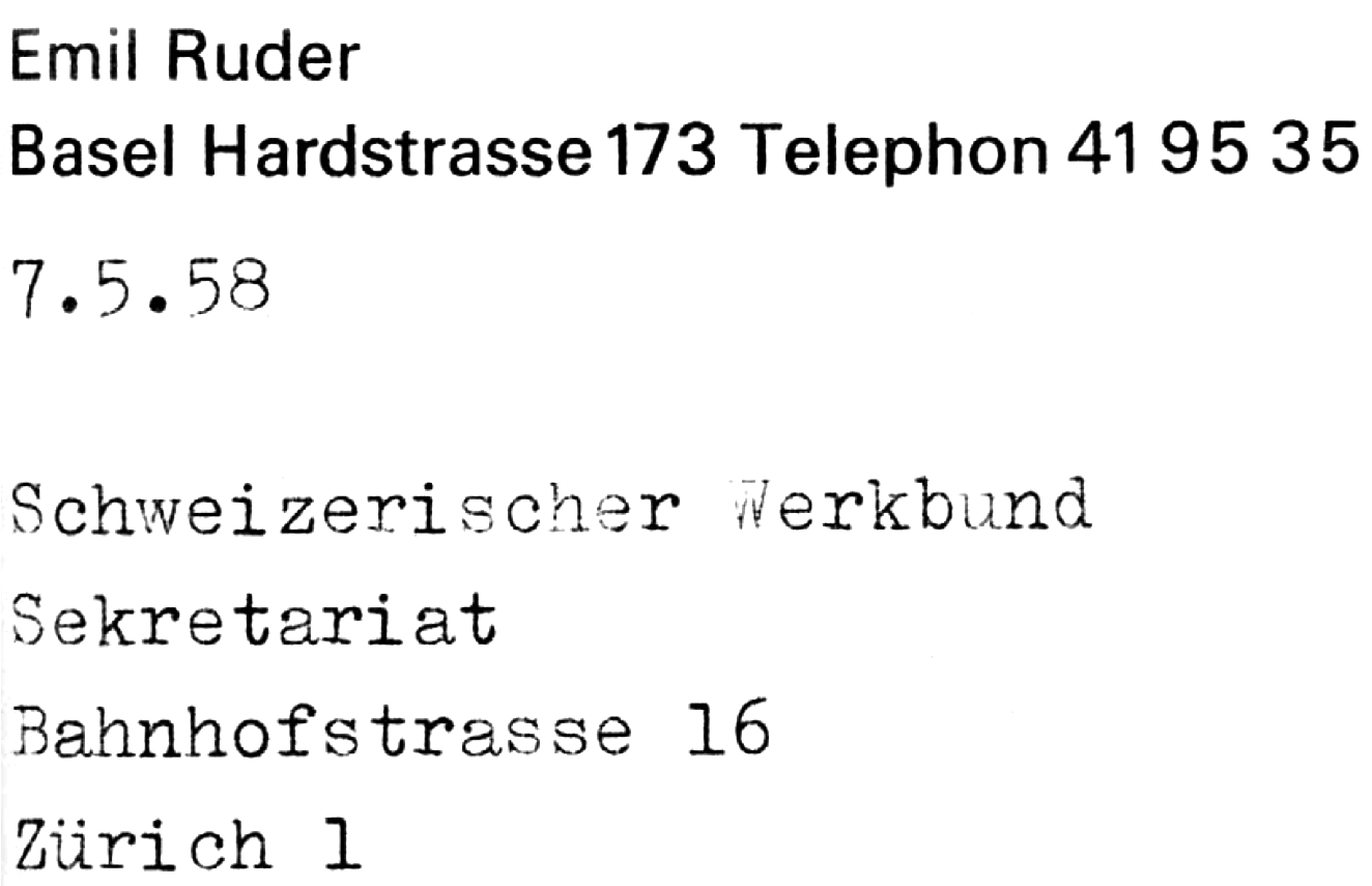
file name: Emil Ruder Address
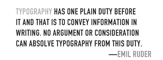
file name: Emil Ruder Saying
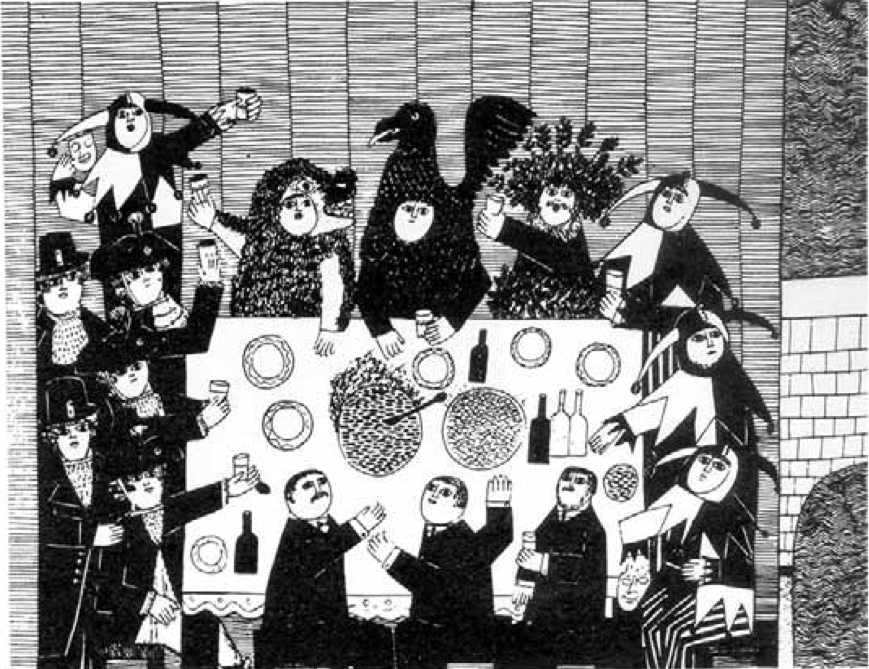
file name: Emil Ruder Typo Illustration
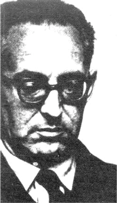
file name: Emil Ruder Pic
| | |
|
Luc Devroye ⦿ School of Computer Science ⦿ McGill University Montreal, Canada H3A 2K6 ⦿ lucdevroye@gmail.com ⦿ https://luc.devroye.org ⦿ https://luc.devroye.org/fonts.html |